Intimidation Game

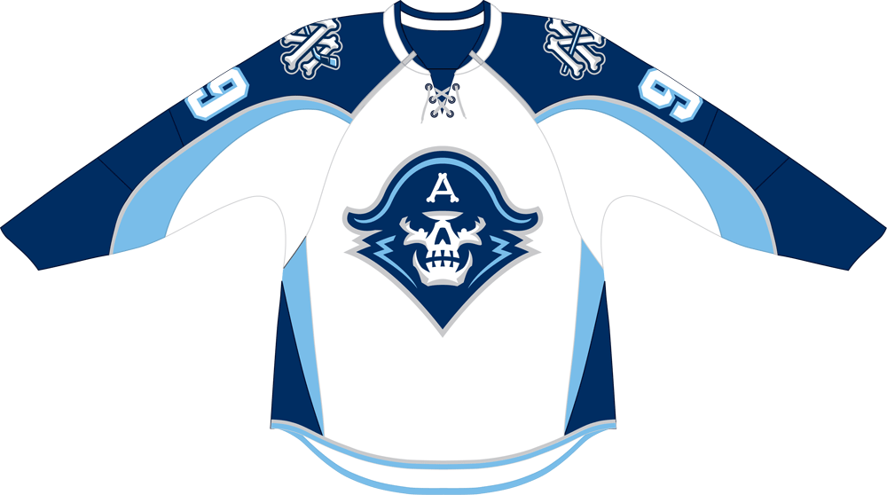
(Est. 1970) "The Milwaukee Admirals are a professional ice hockey team in the American Hockey League. They play in Milwaukee, Wisconsin, USA at the BMO Harris Bradley Center. They have been affiliated with the NHL's Nashville Predators since that team's founding in 1998."
Design by: Studio Simon (Louisville, KY)
Opinion/Notes: When I first saw the Google results for the old logo I couldn't believe that that was the real thing. But, indeed it was and it was totally bonkers. Everything about it was so wrong but in such a charming, naive way that it's actually kind of sad to see it go. Still, no team sporting that logo can be taken seriously and the new logo invokes the Pirates of the Caribbean vibe with a menacing skull and some extra spiky typography. The skull/hat/uniform drawing is okay for what it is — minor league hockey — and it now works like a proper sports logo. The wordmark is not my cup of tea but it's admirable what they did with the "S" to get rid of the space between it and the "L" and to make the logo symmetrical. The better elements of the identity are the detail "A" on the admiral's hat and the "MA" bone alternate logo. As far as bone-based logos go those are top notch.
Related Links: Admirals press release
Admirals uniform sheet
Select Quote: The new logo is an evolution of the Admirals last logo and features a more fierce and determined sailor. The sailor is accented by the upper portion of a naval uniform and a hat that was inspired by the one worn by the Admirals "Captain Crunch" logo from the late 70s and early 80s. The hat is adorned with an "A" composed by three bones.
The Admirals secondary mark, dubbed the M&A, is the letters "M" and "A" interwoven in bone script and connected with a hockey stick for the horizontal bar of the "A".