Shared posts

10 Jul 19:36

Top 10 Most Popular Explorer & Landranger Ordnance Survey Maps

by Brilliant Maps

Top 10 Most Popular Explorer & Landranger Ordnance Survey Maps

If you’re not British, or spent much time in the United Kingdom, you may never have heard of the Ordnance Survey.

The Ordnance Survey is Britain’s national mapping agency and has been producing maps for the public since 1801 (For a complete history have a look at: Map of a Nation: A Biography of the Ordnance Survey)

While they have produced a huge variety of map related products over the years, their two flagship products remain the Explorer & Landranger map series that cover the entire island of Great Britain.

However, have you ever wondered which maps in each series are the most popular? Below we take a look at the 10 most popular maps from each series, revealing where Britons are most likely to go on holiday or perhaps where they are most worried about getting lost.

Top 10 Most Popular Explorer OS Maps

The Explorer series of maps is the more popular of the two and is said to be ideal for walking, running, mountain biking and horse riding. The maps are 1:25,000 scale which means 4cm on the map equals 1 km on the ground. Details include footpaths and open access areas.

1. Map of Snowdon (Conwy Valley)

OS Explorer Map of Snowdon

Sheet Number: OL17
Publication Date: 10/06/2015

Description: Map sheet number OL17 in the OS Explorer map series is the ideal map for exploring the mountain scenery in Snowdon. This area, famous for its fantastic walking routes, is home to the highest mountain in Wales. Take one of the six well mapped routes to the summit of Mount Snowdon and enjoy the views!

Highlights: Snowdon (Yr Wyddfa), Llanberis Path, Conwy, The Menai Strait and Colwyn Bay, Llandudno, Beddgelert, Conwy, Bethesda, Betws-y-Coed, Bangor and Caernarfon. Also includes other popular landscape features in the Snowdonia range such as Carnedd Llewelyn, Carnedd Dayfydd, Glyder Fawr, Glyder Fach, Tal y Fan and Tryfan.

Purchase: Buy on OS Website and Buy on Amazon.

2. Map of The Peak District – White Peak Area (Buxton, Bakewell, Matlock & Dove Dale)

OS Explorer Map of The Peak District

Sheet Number: OL24
Publication Date: 10/06/2015

Description: Map sheet number OL 24 in the OS Explorer series covers the Peak District area surrounding Buxton, Bakewell, Matlock and Dove Dale and is the perfect map to use when exploring the White Peak area. The scenery is a treat for outdoors enthusiasts who will be able to see the outcrops of light coloured limestone that give the area its name.

Highlights: Castle rock, Middleton Dale, Derbyshire Dales, The Roaches, Buxton, Bakewell, Matlock, Dovedale, Chatsworth House, limestone caves, and the thermal springs at Middleton Stoney.

Purchase: Buy on OS Website and Buy on Amazon

3. Map of North York Moors (Western area)

Sheet Number: OL26
Publication Date: 02/06/2016

Description: Map sheet number OL26 in the OS Explorer series covers the Cleveland Hills, the western area of the North York Moors and a small section of the Howardian Hills.

Highlights: Saltburn-by-the-Sea, Guisborough, Helmsley, and Roseberry Topping.

Purchase: Buy on OS Website and Buy on Amazon.

4. Map of The Lake District: South-eastern area (Windermere, Kendal & Silverdale)

OS Explorer Map of The Lake District

Sheet Number: OL7
Publication Date: 05/09/2016

Description: Map sheet number OL7 in the OS Explorer map series, The English Lakes: South-eastern area is the ideal map to use when exploring the south-east area of the Lake District. With the impressive lakeside scenery around Windermere and the dramatic mountains that make up the region, this area is perfect for hiking holidays and days out.

Highlights: Windermere, Orrest Head, The Dales walk, Kendal, Shap Fells, and Silverdale.

Purchase: Buy on OS Website and Buy on Amazon.

5. Map of Yorkshire Dales – Southern & Western Area (Whernside, Ingleborough & Pen-y-ghent)

OS Explorer Map of Yorkshire Dales

Sheet Number: OL2
Publication Date: 05/09/2016

Description: Map sheet number OL2 in the OS Explorer map series is the ideal map to use when exploring the South and West areas of the Yorkshire Dales including Whernside, Ingleborough and Pen-y-ghent.

Highlights: The Yorkshire three peaks, The Devils Bridge at Kirkby Lonsdale, Leeds to Liverpool Canal at Skipton, The Pennine Way, Settle, and Old Town.

Purchase: Buy on OS Website and Buy on Amazon.

6. Map of Ben Nevis & Fort William (The Mamores & The Grey Corries Kinlochleven & Spean Bridge)

OS Explorer Map of Ben Nevis & Fort William

Sheet Number: 392
Publication Date: 16/05/2016

Description: Map sheet number 392 in the OS Explorer map series is the perfect map to use when exploring the mountainous area of Ben Nevis, Fort William, The Mamores and The Grey Corries Kinlochleven and Spean Bridge. The area is frequented by mountain climbers and hikers or those wishing to soak up the scenery.

Highlights: Ben Nevis, Glen Nevis, River Nevis, Loch Leven, The Munros, Kinlochleven, Glen Coe, Loch Leven Heritage Trail, The Mamores, The Grey Corries, Spean Brideg, Loch Leven, and Ballachulish.

Purchase: Buy on OS Website and Buy on Amazon.

7. Map of New Forest (Southampton, Ringwood, Ferndown, Lymington, Christchurch and Bournemouth)

OS Explorer Map of New Forest

Sheet Number: OL22
Publication Date: 10/06/2015

Description: Map sheet number OL22 in the OS Explorer map series is the perfect map for holiday makers and day trippers to use when visiting the New Forest. The national park is famous for its excellent walks and rides and is home to New Forest ponies and heath land scenery.

Highlights: New Forest National Park, Lyndhurst, Brockenhurst, Ringwood, Lymington, Beaulieu, Lepe, Bucklers Hard, Boldre, Ashurst, Cadnam, Fritham, Burley, Sway, Christchurch, Fordingbridge, Verwood, New Milton, Milford-on-Sea, and Hengistbury Head.

Purchase: Buy on OS Website andBuy on Amazon.

8. Map of Brecon Beacons National Park (Western Area)

OS Explorer Map of Brecon Beacons National Park

Sheet Number: OL12
Publication Date: 05/01/2017

Description: Map sheet number OL12 in the Explorer map series is the ideal map for those seeking outdoor adventure. The landscape of the Brecon Beacons attracts walkers, cyclists and riders to its rolling hills, valleys, caves and waterfalls.

Highlights: The Beacons Reservoir, Brecon, Fan Faw, The Black Mountains, Brecon Canal, Merthyr Tydfil, River Towy, and Trecastle.

Purchase: Buy on OS Website and Buy on Amazon.

9. Three Peaks Challenge Map (Scafell Pike, Ben Nevis and Snowdon)

OS Explorer Three Peaks Challenge Map

Sheet Number: NA
Publication Date: 16/06/2016

Description: Planning to do the Three Peaks challenge? Find a pre-planned route for each peak plus essential safety information. Every map contains the mapping for ALL Three Peaks. Select your favourite cover image when you buy yours.

Highlights: A safe and approved walking route for each peak, a quick guide to the history of each peak, hazard warnings, map legend exclusively for this map and Parking information.

Purchase: Buy on OS Website and Buy on Amazon.

10. Map of Purbeck and South Dorset (Poole, Dorchester, Weymouth & Swanage )

OS Explorer Map of Purbeck and South Dorset

Sheet Number: OL15
Publication Date: 01/12/2016

Description: Sheet number OL15 in the OS Explorer map series is the ideal map for exploring the Purbeck coast and South Dorset. The Jurassic coast is a major draw for many outdoors enthusiasts and the beautiful countryside of South Dorset is perfect for walks and rides.

Highlights: Kimmeridge, Chesil Beach, Brownsea Island, Dorchester, Weymouth, River Frome, Swanage, and Wareham.

Purchase: Buy on OS Website and Buy on Amazon.

Top 10 Most Popular Landranger OS Maps

The Landranger series of maps cover a larger area but shower fewer details than the Explorer series. They are ideal for long distance cycling, driving and holidays. The maps are 1:50,000 scale which means 2cm on the map equals 1 km on the ground.

1. Map of Chichester & the South Downs (Bognor Regis & Arundel)

OS Landranger Map of Chichester & the South Downs

Sheet Number: 197
Publication Date: 24/02/2016

Description: Map sheet number 197 in the OS Landranger series is the ideal map to use when planning a trip to the Chichester and South Downs area. The area has much to offer visitors including stunning sand dunes, historical buildings and rolling hills.

Highlights: Chichester Cathedral and the Market Cross, East Head, The South Downs Way and Goodwood.

Purchase: Buy on OS Website and Buy On Amazon.

2. Map of Penrith & Keswick (Ambleside)

OS Landranger Map of Penrith & Keswick

Sheet Number: 90
Publication Date: 30/01/2017

Description: Map sheet number 90 in the OS Landranger map series is the perfect map for planning holidays and day trips to the Penrith and Keswick area of the Lake District. The area is ideal for holiday makers wanting to partake in hikes, rides or water sports as there are fantastic trails, activities and scenery to be found throughout the area.

Highlights: Helvellyn, Scafell Pike, Derwent Water and Buttermere.

Purchase: Buy on OS Website and Buy On Amazon.

3. Map of Exeter & Sidmouth (Exmouth & Teignmouth)

OS Landranger Map of Exeter & Sidmouth

Sheet Number: 192
Publication Date: 24/02/2016

Description: Map sheet number 192 in the OS Landranger map series is the ideal map for planning days out and holidays to Exeter and Sidmouth. Explore the east of Devon including the city of Exeter and towns of Honiton and seaside towns such as Exmouth, Sidmouth, Teignmouth, Seaton and Budleigh Salterton.

Purchase: Buy on OS Website and Buy on Amazon.

4. Map of Snowdon (Caernarfon)

OS Landranger Map of Snowdon

Sheet Number: 115
Publication Date: 24/02/2016

Description: Map sheet number 115 in the OS Landranger map series is the ideal map for planning your walking trips and holidays in the Snowdon area. Well known for its stunning scenery, challenging walks and climbs, Snowdon is the perfect spot for all outdoors enthusiasts.

Highlights: Snowdon, Bangor, Caernarfon, and Anglesey.

Purchase: Buy on OS Website and Buy on Amazon.

5. Map of The Solent & Isle of Wight (Southampton & Portsmouth)

OS Landranger Map of The Solent & Isle of Wight

Sheet Number: 196
Publication Date: 24/02/2016

Description: Map sheet number 196 in the OS Landranger map series is the ideal map to use when planning a day trip or holiday in the Solent and Isle of Wight area. The area is famous for sailing, coastal walks and the New Forest national park.

Highlights: Lyndhurst, Southampton, Calshot Beach and Ventnor.

Purchase: Buy on OS Website and Buy on Amazon.

6. Map of Gloucester & Forest of Dean

OS Landranger Map of Gloucester & Forest of Dean

Sheet Number: 162
Publication Date: 24/02/2016

Description: Map sheet number 162 in the OS Landranger series covers the Forest of Dean, Gloucester, Monmouth (Trefynwy), Nailsworth, Dursley, Stroud, Ross-on-Wye, Thornbury and Chepstow (Cas-Gwent).

Highlights: The north-western area of the Cotswolds Hills, the River Severn and the Offa’s Dyke Path

Purchase: Buy on OS Website and Buy on Amazon.

7. Map of Wensleydale & Upper Wharfedale

OS Landranger Map of Wensleydale & Upper Wharfedale

Sheet Number: 98
Publication Date: 19/12/2016

Description: Map sheet number 98 in the OS Landranger map series is the ideal map for planning your day trips and holidays to the Yorkshire Dales including Wensleydale and Upper Wharfedale.

Highlights: Striking limestone and gritstone scenery, The Pennine Way, sailing on the Grimworth Reservoir, and the Wensleydale Cheese Factory.

Purchase: Buy on OS Website and Buy on Amazon.

8. Map of Alnwick & Morpeth (Rothbury & Amble)

OS Landranger Map of Alnwick & Morpeth

Sheet Number: 81
Publication Date: 24/02/2016

Description: Map sheet number 81 in the OS Landranger map series covers an area of the Northumberland National park as far as Sharperton in the east and the Northumbrian coastline from just south of Blyth to Craster.

Highlights: Morpeth, Rothbury, Amble, Alnwick Castle, Druridge Bay, Fontburn Reservoir, Alnmouth, Netherwitton, Longhorsley, Warkworth Castle and Coquet Island

Purchase: Buy on OS Website and Buy on Amazon.

9. Map of Ben Nevis (Fort William & Glen Coe)

OS Landranger Map of Ben Nevis

Sheet Number: 41
Publication Date: 24/02/2016

Description: Map sheet number 41 in the OS Landranger map series is the ideal map to use when planning a trip to the Ben Nevis, Fort William and Glen Coe area. The area is famous for its spectacular views and challenging walks. It is a great place to get away from it all.

Highlights: Loch Treig, Glen Roy, Ben Nevis, and Spean Bridge.

Purchase: Buy on OS Website and Buy on Amazon.

10. Map of Bournemouth & Purbeck (Wimborne Minster & Ringwood)

OS Landranger Map of Bournemouth & Purbeck

Sheet Number: 195
Publication Date: 24/02/2016

Description: Map sheet number 195 in the OS Landranger map series covers the Dorset coast, Bournemouth, Poole Bay, Poole Harbour, Isle of Purbeck, the Purbeck Hills, Swanage, Christchurch Bay, Ringwood, Wimborne Minster, New Milton, Milford on Sea, Wareham and Corfe Castle.

Purchase: Buy on OS Website and Buy on Amazon.

Note: Popularity is based on the sort order found for each series on the Ordnance Survey Website. It was accurate at the time of publication but is subject to change at any time. You can see the latest popularity for each series on their respective pages: Explorer OS Maps and Landranger OS Maps.

Enjoy this post or know someone else who would? Please help us by sharing it:

10 Jul 18:14

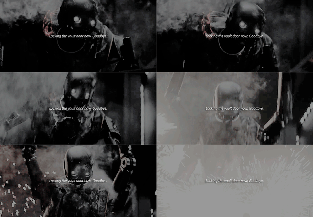
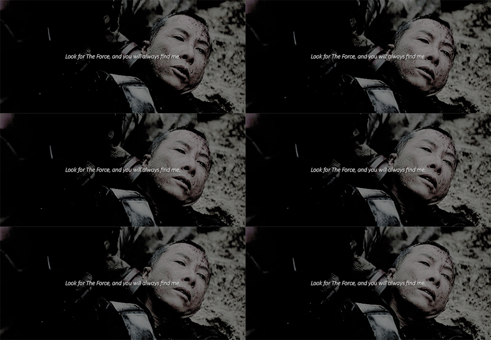
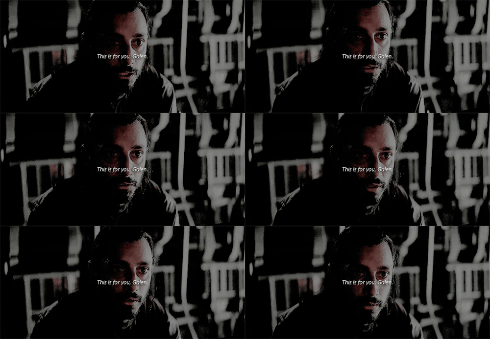
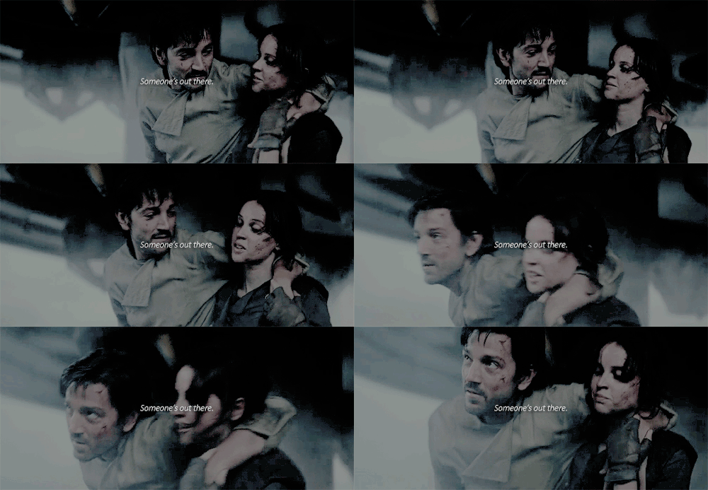
ahsokacassian:Rogue One + final words


ahsokacassian:

Rogue One + final words

26 Jun 20:39

archatlas: Daniel Picard

18 Jun 01:58

Photo


17 Jun 22:03

A Monster

by Reza

10 Jun 20:27

serpentsaints: Otep - Generation Doom 2016


serpentsaints:

Otep - Generation Doom 2016

01 Jun 06:42

grumpychangeling: evemoneypenny-deactivated201609: Government...


grumpychangeling:

evemoneypenny-deactivated201609:

Government agents from A Vague Yet Menacing Agency were in the back, watching. (x)

this is — yes

23 May 05:44

lameust: faptop: WHY AM I LAUGHING SO HARD WHY IS MY SENSE OF...


lameust:

faptop:

WHY AM I LAUGHING SO HARD WHY IS MY SENSE OF HUMOR THIS TERRIBLE


23 May 05:41

stephendann: brunhiddensmusings: kineticpenguin: tenthcorner: ...


stephendann:

brunhiddensmusings:

kineticpenguin:

tenthcorner:

supapoopa:

peterfromtexas:

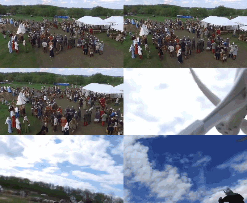
Reenactor throws a spear at a drone

What a time to be alive.

“The medieval warrior, realizing the consequences of his impulsive act, immediately approached the owner of the drone and offered to pay for the damage.

The owner of the drone was so impressed by the brilliant attack that he suggested organizing a competition for bringing down “dragons” with short spears next year.

Drone owners have another year to develop a unique “dragon-like” design for their flying machines.” (x)

I am 100% cooler with this knowing that the spear-thrower realized “oops maybe I shouldn’t have done that” and tried to make it right, and that the guy who the drone belonged to was cool with it

just so everyone knows, this has already been memorialized in a runestone


Everything about this post blesses those involved with a +4 on their next Today is Good Day roll

11 May 02:42

bless


bless

02 May 20:12

Travel Time from Ancient Rome

by Brilliant Maps

Travel Time from Ancient Rome

Map created by Stanford University’s ORBIS project

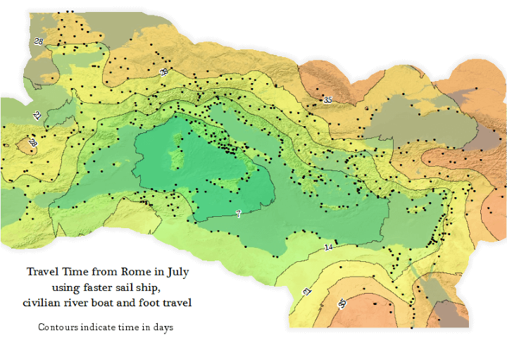
The map above is an Isochrone map which shows how long it would have taken someone to travel from Rome to the farthest reaches of the Roman Empire at its peak (roughly 200 CE/AD).

Travelling within the core of the Empire could have be done in under a week, but travelling all the way to the fringes would have taken someone more than a month.

Contrast that with Travel Times From London in 2016 vs 1914. By 1914 you could have reached almost any point on earth within 40 days and by 2016 you could reach almost any point on earth within 2 days.

If you’re curious about the project, here’s a very brief introduction:

ORBIS: The Stanford Geospatial Network Model of the Roman World reconstructs the time cost and financial expense associated with a wide range of different types of travel in antiquity. The model is based on a simplified version of the giant network of cities, roads, rivers and sea lanes that framed movement across the Roman Empire. It broadly reflects conditions around 200 CE but also covers a few sites and roads created in late antiquity.

The model consists of 632 sites, most of them urban settlements but also including important promontories and mountain passes, and covers close to 10 million square kilometers (~4 million square miles) of terrestrial and maritime space. 301 sites serve as sea ports. The baseline road network encompasses 84,631 kilometers (52,587 miles) of road or desert tracks, complemented by 28,272 kilometers (17,567 miles) of navigable rivers and canals.

You can learn more about the project and play with an interactive version on the ORBIS homepage.

For other maps of the Roman Empire have a look at:

And to learn even more about the Roman world have a look at:

19 Apr 00:37

gameraboy:Cyberpunk


gameraboy:

Cyberpunk

09 Apr 23:03

Gender Bias Riddles

by DEVORAH BLACHOR

A father and son get in a car crash and are rushed to the hospital. The father dies. The boy is taken to the operating room and the surgeon says, “I can’t operate on this boy, because he’s my son.”

How is this possible?

40-75% of people can’t solve this riddle because they’re unable to imagine the surgeon is a woman. The surgeon is the boy’s mother.

- - -

A boss and his secretary are at a hotel for a business conference. They’re given rooms on the eleventh floor. There’s a fire in the hotel before the conference begins. The hotel burns to the ground and everybody dies. The secretary says, “At least I got to see the PowerPoint presentation.”

How is this possible?

65-90% of men can’t solve this riddle because they’re unable to think about anything other than porn after reading the first sentence.

- - -

A forty-something celebrity actress visits her holiday home on a tropical island. A hurricane strikes, destroying the oceanfront property. The actress manages to escape and save Pebbles, her teacup Chihuahua. Afterwards, she says she feels blessed because all she needs in life is to be with precious Pebbles. No one who reads the news story the following day believes her.

How is this possible?

100% of people who follow celebrity news cannot imagine a childless forty-something actress feeling blessed or fulfilled.

- - -

A group of STEM professors assess identical resumes. Half are told that the applicant is called ‘Jennifer’ while the other half are told the job seeker is called ‘John.’ Overall, Jennifer is perceived as less competent, is offered a lower salary, and is deemed to be more likely to mishandle a nerve agent and cause the death of thousands.

How is this possible?

Despite their purported objectivity, 70-85% of male biologists, chemists and physicists possess the same emotional maturity as Mr. Morris, your 8th grade Earth Science teacher who interrupted a lesson on metamorphic rocks to guess the bra sizes of the girls.

- - -

A seasoned journalist travels to a tropical island to cover the story of a calamitous hurricane which has destroyed the beachfront property of a famous celebrity and left thousands of people homeless. Her in-depth reporting on ordinary people facing poverty and hardship wins a prestigious human interest journalism award. One month later, she’s turned down for the job of television news presenter.

How is this possible?

The journalist is a woman over the age of 50 and… do I really need to explain this one to you?

- - -

Jennifer, a junior executive, is told by her boss that her coworkers find her to be passive, aggressive, passive-aggressive, overly masculine, overly feminine, overly emotional, bitchy, bitchy resting face-y, undeserving of bonuses, and generally offensive for having had a baby and taken the four week family leave package offered by the company. Meanwhile, her colleague John is promoted.

How is this possible?

John’s wife had a baby and his staff threw him a surprise party with his favorite cream cheese topped carrot cake. 93-95% of the staff gushed about how “natural” and “gracious” John was at the party. The CEO felt he had no choice but to promote him.

- - -

A journalist who was recently turned down for the job of news presenter writes a memoir about her time as a war correspondent in Afghanistan and Iraq. The book becomes a bestseller and is optioned to be made into a movie with a major film studio. A male author is asked to write a review of three different war correspondent memoirs and lauds two of them, but describes this one as “whiny” and “self-absorbed.” He also attributes its success to “dumb luck.”

How is this possible?

The male author had just asked a woman out on a date and felt assured of receiving a positive response since she was 10-15% older than his usual companions. She said no.

- - -

John asks Jennifer if she wants to have sex on his desk and she tells him to fuck off.

How is this possible?

John can’t believe it either! He and the male author are commiserating at a strip club this very moment.

- - -

An actress whose holiday home was destroyed in a hurricane auditions to play the role of a war correspondent in a film based on a true story. She reads a heart-wrenching scene in which her love interest is killed in a drone strike and the director is brought to tears. The role is given to Dakota Johnson.

How is this possible?

Dakota is so hot right now. There’s an 80-90% chance that John and the male author are talking about her hotness in the strip club.

- - -

A woman graduates at the top of her university class and has an enormously successful career as a lawyer and public servant. With her extensive experience, formidable knowledge and composed temperament, she runs for a powerful government position. Yet the election is won by a two-bit blowhard salesman who has limited understanding of the world and the impulse control of an untrained teacup Chihuahua. He and his male cabinet proceed to destroy everything in their path with a unique combination of racism, arrogance, and stupidity.

How is this possible?

46% of voters are like, “You had me at I have a big penis.”

09 Apr 04:49

Pete Souza’s Alternate Timeline

by Adrienne LaFrance

In the days leading up to the presidential inauguration in January, Barack Obama’s supporters began mourning the outgoing White House administration.

Prolonged disbelief over the outcome of the 2016 presidential election had given way to the realization that even deep disappointment would not stop the march of time. People shared their grief for the future and their gratitude for the quickly dissolving present where they share everything these days: on the web.

Pete Souza was among them. In the twilight of the Obama presidency, Souza—who served as the White House photographer for Barack Obama and Ronald Reagan—used his official Instagram account to publish some of his favorite images from the Obama years.

There was the president, making snow angels with his daughters after a 2010 blizzard. There was the president, painting the tiny section of a monarch butterfly’s wing on a mural of Martin Luther King Jr. There was the president, feet on desk, in the drab office where his Senate career began. There was the president on the White House basketball court, chucking a ball into the air with a grin.

And, finally, there was the president and the first lady relaxing with their daughters—Malia between them and Sasha on her father’s lap. It was the last photo Souza posted to the account. “So proud of this family and how they have represented our country the past eight years,” Souza wrote in a caption. “A great honor to have documented their lives for history.”

That was it. The next president would be inaugurated two days later, and Souza’s official Instagram account and its 2,113 photos were handed over to the National Archives and Records Administration, saved for history and frozen in time.

But then Souza started posting again.

This time, he published photos from a personal account with the user name petesouza. The first image he shared, on Inauguration Day, was an overhead view of the president exiting the east door of the Oval Office for the last time. A few more images followed—another view of Obama leaving the Oval Office, a shot of him waving from the steps of a helicopter after the inauguration, and a photo showing Obama looking out of the window of the aircraft at the White House below. “Farewell,” the final caption read.

Souza said in the caption of one of these photos that he planned to take “a little break” from Instagram. That little break, if he ever took one, didn’t last. To the delight of Obama devotees, Souza began sharing photos of Obama that seemed to take little digs at the new president. On January 21, amid reports that Donald Trump redecorated the Oval Office with buttery gold drapes, Souza shared an image of the office as Obama had decorated it. “I like these drapes better than the new ones,” Souza wrote. “Don’t you think?”

“I like the president more than the current one, too,” one commenter replied.

Souza’s Instagram feed has continued this way—with occasional breaks for other subject matter. (“I realize people want their daily Obama fix,” he said in a caption to a non-Obama photo in January.) On January 24, as the new White House press secretary attempted to defend President Trump’s unsubstantiated claims of widespread voter fraud, Souza shared an image of a TV screen broadcasting a press conference from when Obama was still president. On January 25, amid questions about when Melania Trump and Trump’s 11-year-old son would move into the White House, Souza shared an image of Obama carrying his daughter, Sasha, in a White House elevator.

For Souza’s fans—and Obama’s—the Instragram account has been a source of solace during the chaotic beginning to Trump’s presidency. The responses to Souza’s recent photos of are full of comments like this:

“Missing him terribly.”

“Thank you for continuing to share. It’s comforting to see!”

“I miss him sooo much!”

“No Drama Obama I wish you were still my POTUS”

“Beautiful, saudade.”

“I miss our president.”

There’s some criticism for Obama in the comments, too, but the overwhelming tone is one of homesickness for the recent past. One person who commented on one of Souza’s photos called his recent feed “almost a form of therapy” during a Trump presidency, saying, “I look at them to calm down and things feel a little more peaceful for a bit.”

Souza’s account demonstrates the power of nostalgia as a salve for anxiety. (Ironically, Trump tapped into this same sentiment with his presidential slogan: “Make America Great Again.”) But Souza’s photo choices aren’t merely wistful; they’re often playful and pointed.

After The New York Times reported that Trump’s aides had to “confer in the dark because they cannot figure out how to operate the light switches in the cabinet room,” Souza published an image of an Obama-era meeting in the room with a short caption and winky-face emoticon: “Those damn lights ;)”

Those damn lights ;)

A post shared by Pete Souza (@petesouza) on

In January, with Trump’s questionable ties to Russia making headlines, Souza shared an image of Obama meeting with Vladimir Putin taken several years ago. In February, the day after Trump’s national security advisor, Michael Flynn, resigned, Souza posted another image of Obama and Putin. (Flynn was forced out after admitting he had misled the vice president about his communications with a Russian diplomat.)

Two days after Trump signed a sweeping immigration ban, Souza posted a photograph of Obama smiling and chatting with a young refugee in 2015. The next day, Souza shared a photo of Obama meeting with a 6-year-old boy who had written to him about “the Syrian boy in the ambulance,” an iconic image of 5-year-old Omran Daqneesh, bloodstained and caked in dust. “Can you please go get him and bring him to [my home]?” the boy had written to Obama, “Park in the driveway or on the street and we will be waiting for you guys with flags, flowers, and balloons. We will give him a family and he will be our brother.” On March 6, when Trump signed an updated version of his controversial immigration ban, Souza shared an image of Obama meeting with students at the Islamic Society of Baltimore Mosque and Al-Rahmah School.

Viewed one way, Souza is giving a masterclass in presidential criticism—highlighting the differences between Obama and Trump in a way that portrays Obama as far more thoughtful and dignified than his successor. As the Republican health-care proposal fell apart last month, for instance, Souza shared an image of Obama working on his own push for health-care reform—the photo shows a heavily marked-up speech that Obama would give to Congress six months before the Affordable Care Act passed.

Some images are more nuanced than others—and require close attention to current events for context. On Monday, as Trump tweeted about meeting with the president of Egypt at the White House, Souza posted an image of the Situation Room in 2011, when protesters in Cairo were calling for then-President Hosni Mubarak to resign. It was, Souza wrote in a caption, “the only time during hundreds of meetings in the Situation Room that I ever remember the TV being turned on.” This is an interesting tidbit in and of itself, but also a possible jab at Trump, who is known as a dedicated viewer of cable news. On the day the Senate confirmed Trump’s controversial pick for secretary of eduction, Betsy DeVos, Souza posted an image of Obama meeting with a pre-kindergarten class in 2013. And after a phone call between Trump and Malcolm Turnbull, Australia’s prime minister, that was reportedly tense, Souza posted an image of Obama laughing with Turnbull and the former prime minister of New Zealand.

It is these images—presented without explicit commentary about today—that create the most dissonance for the person casually scrolling through Instagram. Encountering them can leave the fleeting impression that Obama is still the president. They force the viewer to seek parallels to the current political moment. And Souza can remain mischievously quiet about why he’s publishing certain photos at certain times. (Souza didn’t respond to an interview request for this story.)

Still, taken as a collection, even his subtlest photo choices seem meaningful. It’s hard to ignore the possibility of metaphor in, for example, Souza’s decision to share an image of a dark storm cloud gathered over the Washington Monument.

In other cases, Souza’s commentary is clear. The day Trump nominated Neil Gorsuch to the Supreme Court, Souza shared an image of Obama and former Vice President Joe Biden meeting with Merrick Garland, Obama’s Supreme Court nominee whom Republicans refused to consider. Souza’s caption: “Merrick Garland. Just saying.”

After the Mexican president, Enrique Peña Nieto, cancelled his meeting with Trump, Souza posted an image of Obama and  Peña Nieto sampling tequila together during a meeting in 2013. On the day of Trump’s meeting with Justin Trudeau, the prime minister of Canada, Souza posted a photo of Obama and Trudeau meeting. And in early February, as Trump’s administration took shape—his cabinet is more white and more male than any president’s since Reagan’s—Souza published a floor-level photo he took of Obama meeting with three top advisors. Obama is in slacks and dress shoes, his advisors are all in skirts and heels. “I guess you’d say I was trying to make a point,” Souza acknowledged in the caption.

Meeting with top advisors. This is a full-frame picture. I guess you'd say I was trying to make a point.

A post shared by Pete Souza (@petesouza) on

Souza’s Instagram account also highlights the different approaches to photographing the 44th and 45th presidents of the United States. For a president who so highly values having his own direct line of communication to the American people, Trump’s administration seems strangely unconcerned with the president’s public visual representation so far. Consider the photos that dominated in the press after Trump’s meeting with Trudeau in February, for instance. One widely shared image showed a skeptical-looking Trudeau looking at Trump’s hand—perhaps considering Trump’s tendency to yank the hands of fellow world leaders during public events, some suggested.

Justin Trudeau and Donald Trump meet for a photo-opp in the Oval Office in February 2017.
(Kevin Lamarque / Reuters)

These images, juxtaposed against Souza’s photograph of Obama and Trudeau appearing at ease together, seem to be further evidence of a rocky start to the Trump presidency—especially when depicting as close an ally to the United States as Canada. (Or Germany, for that matter.)

Allies.

A post shared by Pete Souza (@petesouza) on

That’s in part because Shealah Craighead, Trump’s official photographer, has shared little of her work so far. Trump’s Facebook page has a special photo gallery dedicated to the first 50 days of his administration, but most of the photos are from events—meaning they resemble the sort of imagery already available in news stories. The president can be seen giving a thumbs-up to a crowd, shaking hands with colleagues at official events, and posing for photos with the vice president. There’s nothing yet that approaches the level of intimacy in Souza’s depictions of Obama. The one photo that comes closest shows Ivanka Trump holding her baby son while talking on the phone in the East Colonnade of the White House.

Farewell.

A post shared by Pete Souza (@petesouza) on

Instead, as Sean O’Kane pointed out in an essay for The Verge, some of the most iconic images of the early Trump administration have come from “bystanders taking photos with their phones, like when a Mar-A-Lago guest snapped a photo of Trump using his cell phone’s flashlight to look at what appeared to be sensitive documents.” It’s possible, O’Kane says, that the public will glean a more accurate representation of the president from photos taken without his explicit approval. Souza’s images for the White House may have appeared candid and authentic, but he was still working for the president, after all.

“Many people are surprised to learn I also worked as a White House photographer for President Reagan,” Souza wrote in the caption to a 2009 photo depicting Obama and Nancy Reagan, which he posted to Instagram on January 24. “I have always looked at this job as documenting for history. It was never about politics.”

Now that Souza’s job in the White House is over, however, he seems to be relishing his ability to extract political context from his rich trove of Obama images. And those who miss their old president appear to be charmed by Souza’s newfound political streak. For others, remembering the former president now that Trump has replaced him may be too much to bear.

One commenter, in response to one of Souza’s recent images of Obama on Instagram, seemed frantic: “Please! OMG, PLEASE COME BACK!”

“Don’t go,” wrote another commenter on the image of Obama in a helicopter flying over the White House.

And another: “COME BACK!!! Come back!”

09 Apr 04:43

jessfink: A comic I made a while ago about...


jessfink:

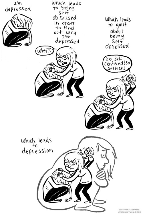
A comic I made a while ago about depression.
http://jessfink.com/kwe/?id=189

23 Mar 05:28

The Like Button Ruined the Internet

by James Somers

Here’s a little parable. A friend of mine was so enamored of Google Reader that he built a clone when it died. It was just like the original, except that you could add pictures to your posts, and you could Like comments. The original Reader was dominated by conversation, much of it thoughtful and earnest. The clone was dominated by GIFs and people trying to be funny.

I actually built my own Google Reader clone. (That’s part of the reason this friend and I became friends—we both loved Reader that much.) But my version was more conservative: I never added any Like buttons, and I made it difficult to add pictures to comments. In fact, it’s so hard that I don’t think there has ever been a GIF on the site.

I thought about building new social features into my clone until I heard my friend’s story. The first rule of social software design is that more engagement is better, and that the way you get engagement is by adding stuff like Like buttons and notifications. But the last thing I wanted was to somehow hurt the conversation that was happening, because the conversation was the whole reason for the thing.

Google Reader was engaging, but it had few of the features we associate with engagement. It did a bad job of giving you feedback. You could, eventually, Like articles that people shared, but the Likes went into an abyss; if you wanted to see new Likes come in, you had to scroll back through your share history, keeping track in your head of how many Likes each share had the last time you looked. The way you found out about new comments was similar: You navigated to reader.google.com and clicked the “Comments” link; the comments page was poorly designed and it was hard to know exactly how many new comments there had been. When you posted a comment it was never clear that anyone liked it, let alone that they read it.

When you are writing in the absence of feedback you have to rely on your own judgment. You want to please your audience, of course. But to do that you have to imagine what your audience will like, and since that’s hard, you end up leaning on what you like.

Once other people start telling you what they like via Like buttons, you inevitably start hewing to their idea of what’s good. And since “people tend to be extremely similar in their vulgar and prurient and dumb interests and wildly different in their refined and aesthetic and noble interests,” the stuff you publish will start looking a lot like the stuff that everybody else publishes, because everybody sort of likes the same thing and everybody is fishing for Likes.

What I liked about Reader was that not knowing what people liked gave you a peculiar kind of freedom. Maybe it’s better described as plausible deniability: You couldn’t be sure that your friends didn’t like your latest post, so your next post wasn’t constrained by what had previously done well or poorly in terms of a metric like Likes or Views. Your only guide was taste and a rather coarse model of your audience.

Newspapers and magazines used to have a rather coarse model of their audience. It used to be that they couldn’t be sure how many people read each of their articles; they couldn’t see on a dashboard how much social traction one piece got as against the others. They were more free to experiment, because it was never clear ex-ante what kind of article was likely to fail. This could, of course, lead to deeply indulgent work that no one would read; but it could also lead to unexpected magic.

Is it any coincidence that the race to the bottom in media—toward clickbait headlines, toward the vulgar and prurient and dumb, toward provocative but often exaggerated takes—has accelerated in lock-step with the development of new technologies for measuring engagement?

You don’t have to spend more than 10 minutes talking to a purveyor of content on the web to realize that the question keeping them up at night is how to improve the performance of their stories against some engagement metric. And it’s easy enough to see the logical consequence of this incentive: At the bottom of article pages on nearly every major content site is an “Around the Web” widget powered either by Outbrain or Taboola. These widgets are aggressively optimized for clicks. (People do, in fact, click on that stuff. I click on that stuff.) And you can see that it’s mostly sexy, sexist, and sensationalist garbage. The more you let engagement metrics drive editorial, the more your site will look like a Taboola widget. That’s the drain it all circles toward.

And yet we keep designing software to give publishers better feedback about how their content is performing so that they can give people exactly what they want. This is true not just for regular media but for social media too—so that even an 11-year-old gets to develop a sophisticated sense of exactly what kind of post is going to net the most Likes.

In the Google Reader days, when RSS ruled the web, online publications—including blogs, which thrived because of it—kept an eye on how many subscribers they had. That was the key metric. They paid less attention to individual posts. In that sense their content was bundled: It was like a magazine, where a collection of articles is literally bound together and it’s the collection that you’re paying for, and that you’re consuming. But, as the journalist Alexis Madrigal pointed out to me, media on the web has come increasingly un-bundled—and we haven’t yet fully appreciated the consequences.

When content is bundled, the burden is taken off of any one piece to make a splash; the idea is for the bundle—in an accretive way—to make the splash. I think this has real consequences. I think creators of content bundles don’t have as much pressure on them to sex up individual stories. They can let stories be somewhat unattractive on their face, knowing that readers will find them anyway because they’re part of the bundle. There is room for narrative messiness, and for variety—for stuff, for instance, that’s not always of the moment. Like an essay about how oranges are made so long that it has to be serialized in two parts.

Conversely, when media is unbundled, which means each article has to justify its own existence in the content-o-sphere, more pressure than most individual stories can bear is put on those individual stories. That’s why so much of what you read today online has an irresistible claim or question in the title that the body never manages to cash in. Articles have to be their own advertisements—they can’t rely on the bundle to bring in readers—and the best advertising is salacious and exaggerated.

Madrigal suggested that the newest successful media bundle is the podcast. Perhaps that’s why podcasts have surged in popularity and why you find such a refreshing mixture of breadth and depth in that form: Individual episodes don’t matter; what matters is getting subscribers. You can occasionally whiff, or do something weird, and still be successful.

Imagine if podcasts were Twitterized in the sense that people cut up and reacted to individual segments, say a few minutes long. The content marketplace might shift away from the bundle—shows that you subscribe to—and toward individual fragments. The incentives would evolve toward producing fragments that get Likes. If that model came to dominate, such that the default was no longer to subscribe to any podcast in particular, it seems obvious that long-running shows devoted to niches would starve.

* * *

People aren’t using my Reader clone as much anymore. Part of it is that it’s just my friends on there, and my friends all have jobs now, and some of them have families, but part of it, I think, is that every other piece of software is so much more engaging, in the now-standard dopaminergic way. The loping pace of a Reader conversation—a few responses per day, from a few people, at the very best—isn’t much match for what happens on Twitter or Facebook, where you start getting likes in the first few minutes after you post.

But the conversations on Reader were very, very good.

16 Mar 20:01

JR East Unveils Luxury Sleeper Train Designed by Ferrari Designer Ken Okuyama

by Johnny

all photos courtesy Nikkei

It’s been almost 3 years since the announcement that JR East was investing 5 billion yen to create a luxury sleeper train. Yesterday, that train was unveiled at a ceremony in Tokyo. Dubbed the Train Suite Shikishima, it was designed by Ken Okuyama, a Japanese industrial designer and the only non-Italian to have designed a Ferrari.

Okuyama incorporated wood and washi paper into the interiors to create the luxurious sleeper train, which begins operating in May 2017. But with a maximum capacity of 34, the exclusive cars come at a price. There is a high-end, 2-floor suite with a private onsen bath and heated kotatsu to keep travelers warm as they speed through the landscape. Here, a 3-night, 4-day journey through Japan costs 950,000 yen (about $8000) per person. But rooms are already booked for 6 months out.

Perhaps in the magical spirit of the Hogwarts Express, the Train Suite Shikishima will have its own dedicated “platform 13.5” at Ueno Station in Tokyo.

If you want to learn more you can visit the website where there’s contact information and numbers to call to make reservations. There’s also a sales office at Tokyo Station.

The sleeper train offers various packages depending on the season and below is a map of two of them. On the left is the Spring – Fall 3-night package that begins in Ueno and makes a large loop up North extending all the way to Hokkaido. On the right is a shorter Spring – Fall 1-night package that begins in Ueno and makes a central loop through Aizu Wakamatsu.

14 Mar 20:23

A recent cartoon for New Scientist.


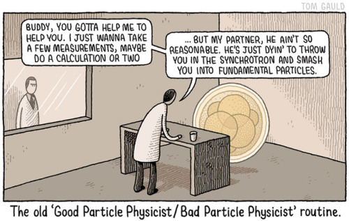
A recent cartoon for New Scientist.

07 Feb 04:54

Photo


23 Jan 05:08

Moral Polarization and Many Pussyhats

by John Holbo

I agree with a lot in this piece by Will Wilkinson. But I disagree with stuff he says after asking the question ‘why is our moral culture polarizing?’

One place to start is to ask why it is that people, as individuals, gravitate to certain moral and political viewpoints. Jonathan Haidt’s “moral foundations” theory—which shows that conservatives and liberals have different moral sensibilities, sensitive to different moral considerations—is perhaps the best-known account. But there are others.

In a 2012 piece for the Economist, I surveyed some of the research in personality psychology that indicates a correlation between political ideology and a couple of the “Big Five” dimensions of personality—conscientiousness and openness to experience, in particular—and then connected that to evidence that people have self-segregated geographically by personality and ideology. It’s an interesting post and you should read it.

The upshot is that liberals (low conscientiousness, high openness to experience) and conservatives (high conscientiousness, low openness) have distinctive personalities, and that there’s reason to believe we’ve been sorting ourselves into communities of psychologically/ideologically similar people.

Wilkinson goes on to talk about other, non-Haidt stuff that contributes to polarization. I like that better. (I think Wilkinson does, too.) But I want to grouse about Haidt, who I think has done interesting empirical work but who commits what I regard as terrible howlers when it comes to moral theory, and when it comes to reasoning about practical, normative implications of his work.

Let me start with a logic problem, pointing to a crack in the empirical work. (Plus pussyhats and protests, for topical value.) Haidt is highly bothered about two problems he sees with liberalism on campus – and in other environments in which lefties predominate. He’s written a lot of popular stuff about this.

1) An unbalanced moral ecology. Allegedly liberals have a thinner base of values, whereas conservatives have a broader one. Everyone, liberal and conservative alike, is ok with care/no harm/liberty – although liberals are stronger on these. Conservatives are much stronger on the loyalty/authority/purity axis, since allegedly liberals are weak-to-negligible here. (Haidt used to say there were five, now there are six foundations. I’m not going to quibble about that.) So: not enough conservatives in liberal environments to ensure a flexible, broad base of values. How illiberal!

2) Political correctness. Haidt has a real bug in his ear about this one.

The logic problem is this. If 2) is a problem, 1) is necessarily solved. And if solving 2) is important, then the proposed solution to 1) is wrong (or at least no reason has been given to suppose it is right).

To explain: if the absolute very worst that Haidt says about PC run amuck is utterly true, then campus liberals/progressives are, in terms of his moral foundations scheme, shooting through the roof along the loyalty/authority/purity axis. Because that’s what PC is. An authoritarian insistence on ‘safe spaces’ and language policing, trigger warnings and other stuff. If it’s true that universities have turned into PC prison camps – narrow, orthodox, rigid authoritarian, etc. – then it logically follows that universities have successfully broadened their moral bases to flexibly encompass all 6 values. The university is, by hypothesis, filthy with folks who are strong on all 6 value axes: SJW’s, as they are called.

In short, if 2) is a problem, it is logically impossible for 1) to still be a problem, if ever it was.

There is another way to put it: Haidt likes the irony that liberal refusal to see the value of tribalism has made them paradoxically narrow – hence tribal. This seems like the joke is on liberals. But, so far as I can tell, the joke is also on Haidt. The problem solves itself. If the problem is as Haidt says.

Now, outside the groves of academe, and in the news: protests. Why is everyone wearing pussyhats at Protest Marches? (More power to them!) Because the Prez is a professed pussy-grabber, which is a harm but also (this is important) a purity violation. Sacred values are often sacred spaces. Women’s bodies. Trump – who has never attempted to purify himself for former violations – is now in violation of a second sacred space, the White House. It’s wrong for a guy like that to be sullying the White House with his presence. Also, the Russians. That’s a purity violation of the election, to put it mildly.

I’m not saying liberals/progressives just have some sort of weird cult of purity. Not at all. They care about justice. But, quite understandably, symbols and issues and talking points that reach out and grab you not just up here but down there (pardon my locker room banter) are more potent. They touch upon that-which-should-not-be-touched (without performance of proper rites, i.e. getting consent from the proper authorities over that space.)

And conservatives are unmoved by all this protest. They’re all boys-will-be-boys. (And the Russians love their children, too!) Maybe women should be open to new experiences! Not so uptight!

No, obviously conservatives have their own purity values. No transgenders in wrong bathrooms! Don’t say they lack old time religion.

What do we conclude from all this? First, I don’t think it would be sensible to grant Haidt’s premise that universities are PC hellscapes. I argued that IF they are, THEN it follows that universities must be very morally broad-based places, by Haidt’s lights. What we should conclude is not that PC is, or is not, a problem, but that having a broad moral base, in Haidt’s sense, is not as automatically ecologically sound as it sounds; neither here nor there with regard to the question of how to avoid problems of moral narrowness and rigidity, in individuals or communities or institutions. Haidt has a sense that he wants some kind of pluralistic, healthy ecology of values. But his recipe for that has no obvious tendency to correlate with anything of the sort. Why would it?

More generally – and relevantly to Wilkinson’s discussion – I think we should be highly skeptical of the practical, political significance of these correlations between personality-types and political ideologies. I want to be careful here, too, because there is interesting empirical work. But my suspicion is that we have a relatively small effect (the correlations are not that strong) that is going to be totally swamped, overwhelmed, by the vastly stronger tides of tribalism and group identity. It may be that liberals-progressives are marginally less tribalistic – more open and all that – because they have stronger cosmopolitan values of care and no-harm.

Well, I would like to think so.

But, honestly, I doubt systematic personality differences explain much about current polarization patterns, either to liberals’ credit or discredit, on Haidt’s story.

(Setting sociology aside: what matters, morally, is that liberal-progressive symbols of purity violation – pussyhats – and conservative symbols of purity violation – transgender bathrooms – point us towards justice issues, concerning which those on the left are in the right, those on the right in the wrong. I think. I have my doubts about any holiness that bends towards injustice. Why would it do that? Haidt tends to assume liberals are unaware of non-liberal values, rather than aware-but-skeptical.)

Getting back to Wilkinson: he’s right that we should try hard to understand both the mechanisms behind polarization and how – someday – we might get to a better place. I think Haidt’s foundations stuff has something to it, as moral psychology. That stuff has obviously bearings on partisanship, as a normal state of the human moral mind. But it has not much mechanical bearing on political differences between liberals and conservatives. There isn’t some piety gap, and the partisan warfare isn’t asymmetrical. As a result, the stuff Haidt (and others) say at Heterodox Academy mostly makes no sense whatsoever.

I feel bad that Trump is President. But the hats are much appreciated.

21 Jan 18:40

Kayashima: The Japanese Train Station Built Around a 700 Year Old Tree

by Johnny

a 700-year old camphor tree pokes its head out of Kayashima Station (photo by Kosaku Mimura/Nikkei)

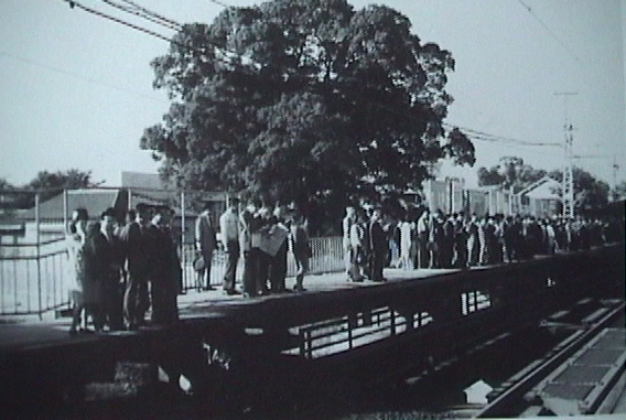
In the Northeast suburbs of central Osaka stands a curious train station unlike any other. Kayashima Station features a rectangular hole cut into the roof of the elevated platform and, from inside, a giant tree pokes its head out like a stalk of broccoli. It’s almost like a railway version of Laputa.

The large camphor tree is older than most records but officials believe it to be around 700 years old. The story of how this tree and station became, quite literally, intertwined, varies depending on who you ask. It certainly has to do with a great reverence for nature, but also a fair amount of superstition.

Kayashima Station in 1968, 4 years before plans to cut it down (photo via “me de miru neyagawashi no hyakunen)

Kayashima Station first opened in 1910 and, at the time, the camphor tree stood right next to the station. For the next 60 years the station remained largely unchanged. But an increase in population and overcrowding began to put pressure on the station and plans for an expansion where approved in 1972, which called for the tree to be cut down.

But the camphor tree had long been associated with a local shrine and deity. And when locals found out that station officials planned to remove the tree there was a large uproar. Tales began to emerge about the tree being angry, and unfortunate events befalling anyone who attempted to cut it down. Someone who cut a branch off later in the day developed a high fever. A white snake was spotted, wrapped around the tree. Some even saw smoke arise from the tree (it was probably just a swarm of bugs).

And so the station officials eventually agreed to keep the tree and incorporate it into the new elevated platform’s design. In 1973 construction began and the new station was completed in 1980. The station even surrounded the base of the tree with a small shrine. To this day, the tree still stands thanks to a strong, local community and a little bit of superstition.

photo by Studio Ohana

photo by Studio Ohana

photo by Studio Ohana

photo by Studio Ohana

20 Jan 23:09

Guerrilla Guidance: DIY Street Signs Make Urban Life More Interesting

by SA Rogers
[ By SA Rogers in Art & Street Art & Graffiti. ]

guerrilla-street-signs-5

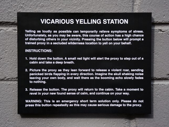
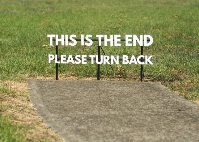
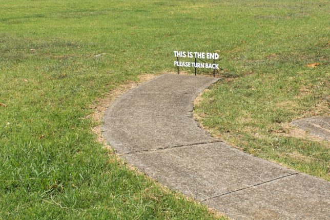
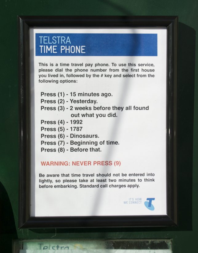
You’re hurrying along the sidewalk on the way to work, running late and not in the greatest mood, when you see a sign in the adjacent field that simply reads “PLEASE WAIT HERE, YOUR FUTURE SELF WILL MEET YOU SHORTLY.” How does that affect your day? Little moments like these can bring some much-needed levity to the world around us, especially in dark times.

marquez-signs-3

guerrilla-street-signs

guerrilla-street-signs-2

Impeccably produced, often enticing you to push a button or take a card, these guerrilla installations look pretty legit until you stop to read what they say. They’re easy to miss, if you’re hustling too quickly and tuning out your surroundings – but if you take a moment to notice them, they might just make you smile.

marquez-signs-1

marquez-signs-2

guerrilla-street-signs-6

guerrilla-street-signs-7

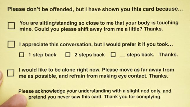
Artist Michael Pederson (aka Miguel Marquez Outside) creates these little interventions and puts them up all over his home city. Sometimes they’re site-specific, referring to things that can be found in the local environment, like a hole in the curb or a sidewalk that ends abruptly.

guerrilla-street-signs-3

guerrilla-street-signs-4

guerrilla-street-signs-8

The personal space cards would actually be pretty handy, and who wouldn’t be tempted by a time travel pay phone? Check out more of Pederson’s work at his tumblr and Instagram.

Surprise! 20 Subversive Works of Urban Guerrilla Street Art

It’s all too easy to get stuck in a routine, walking through the city on autopilot without even noticing what’s around you. Urban guerrilla street artists seek to shake things up, force you ...

The World is Watching: Urban Intervention Goes Ocular

How much more welcoming would a city environment seem if it were filled with friendly creatures? German artist Timm Schneider is filling Weisbaden with very strange beings that are not only ...

Playful in Paris: Life-Sized Interactive Street Art

Everyday objects and imperfections in the urban surfaces of Paris become part of strange and unexpected scenes as French artist Levalet incorporates them into life-sized street art. A bull head ...

Share on Facebook

[ By SA Rogers in Art & Street Art & Graffiti. ]

[ WebUrbanist | Archives | Galleries | Privacy | TOS ]


14 Jan 00:14

The 12 Most Scenic Train Trips In the World

by Patrick Allan

Traveling by train is one of the simplest ways to get around, and it can also be the most photogenic. These 12 routes from around the world are so visually striking you’ll be glued to your railroad car’s window for the entire trip.

Read more...

22 Dec 20:06

destinyrush: teealwayschillin: nevaehtyler: this is...


destinyrush:

teealwayschillin:

nevaehtyler:

this is iconic

This shit is so hilarious

Dude: Do you wanna get married?
Girl: Yes.
Dude: …..I gotta…..

21 Dec 19:11

Photo


17 Dec 19:27

Monopoly and Regulation: Excerpt from Two Lessons book

by John Quiggin

Here’s another excerpt from my book-in-progress, Economics in Two Lessons. Rather than work sequentially, I’m jumping between:

Lesson 1: Market prices reflect and determine opportunity costs faced by consumers and producers.
and
Lesson 2: Market prices don’t reflect all the opportunity costs we face as a society.

In the section over the fold, I’m looking at monopoly and regulation. Next up, public ownership.

As usual, praise is welcome, useful criticism even more so. You can find a draft of the opening sections here.

A crucial requirement of Lesson 1 is that prices are determined in competitive markets. But free markets are not necessarily competitive. If the technology of production involves economies of scale, as is the case for most kinds of manufacturing and many services, large firms will have lower average costs than small ones.

Over time, therefore, the number of firms will shrink through exits or mergers, until economies of scale are exhausted. In the limiting, but not unrealistic, case of natural monopoly, unrestrained competition will lead to the emergence of a single dominant firm.

Once a firm attains a dominant position, it can hold that position for a long time, even after any initial advantages have disappeared. Suppliers and dealers can be locked into long term contracts. If vital parts are produced to a standard design, patents over those parts can be used to exclude competitors. As an example, the AT&T Bell monopoly in the United States required that only phones made by its subsidiary, Western Electric, could be connected to its network. This and other restrictions excluded all competition for decades.

In a natural monopoly industry, production by a single firm is technically efficient. But the price that maximises profits will be higher than the opportunity cost of production. Some of the potential benefits of technical efficiency will be lost, while the bulk of what remains will go to the monopolist rather than to consumers [in a very simple model of monopoly pricing, the monopolist gets half of the potential benefits from the supply of the good, consumers get a quarter and the remaining quarter is lost because of the divergence between price and opportunity cost]

The situation is even worse where monopoly is maintained through costly devices used to exclude competitors. Not only will prices be higher than opportunity costs, they will exceed the competitive market price. Even the monopolist will dissipate much of its profit in its efforts to exclude competitors (Tullock).

These problems first emerged on a large scale in the late 19th century, as the growth of rail networks made it possible, and profitable, for firms to operate on a national scale. The railways themselves were one of the most important industries in which the benefits of scale economies, along with the appeal of potential monopoly profits, led to an rash of mergers.

These mergers were often undertaken using a legal device known as a ‘trust’, and the term came to be applied to monopolies and cartels in general. The most famous trust was John D Rockefeller’s Standard Oil company, which secured a near-monopoly (88 per cent in 1890 https://en.wikipedia.org/wiki/Standard_Oil) over the refined oil market. One of Standard Oil’s main advantages was the capacity to secure lower prices from railway companies in return for higher volumes.

The initial response, commonly referred to as ‘trustbusting’ involved breaking up large corporations into separate firms that were expected to compete against one another. Standard Oil was broken into 34 firms, the most successful of which were the Standard Oil Company of New York (later Mobil) and Standard Oil of New Jersey (later Exxon). Under the influence of the Chicago school of economics, trustbusting policies were gradually abandoned in the late 20th century. The last big corporate breakup was that of the former AT&T telephone monopoly in the 1970s. The shifting in thinking was symbolised by the 1999 merger of Exxon and Mobil to produce one of the largest corporations in the world, comparable in many ways to Standard Oil.

The logic of opportunity cost applies here, as usual. Breaking up monopolies reduces the extent of monopoly power, at the cost of forgoing opportunities for improved scale economies arising from mergers.

For much of the 20th century, the loss of scale economies was seen as an acceptable price to pay to keep monopoly in check. However, with the resurgence of free market ideas from the 1970s onwards, support for antitrust policies waned. The last big example of trustbusting was the breakup of the AT&T telephone monopoly, which took place in 1982 after nearly a decade of litigation.

As trustbusting has declined, attention has turned to various forms of regulation. The core idea of regulation is to fix the prices charged by monopolies at levels that reflect the opportunity cost of resources used in production, but not to allow the extraction of monopoly profits. In practice this balance has proved hard to achieve. The common result has been that regulated monopolies have been highly profitable.

One illustration of this is the fact that the ‘asset base’ of a regulated monopoly is typically valued at around 40 per cent more than the cost of its provision, as estimated by the regulator. This asset base premium reflects the fact that the regulated price is more than the opportunity cost of the resources used in production.

Regulation constrains the exploitation of monopoly power but it entails compliance and enforcement costs and may prevent firms and consumers from reaching bargains that are mutually beneficial. Where a natural monopoly business involves large scale investment, it may prove difficult to set a price that accurately reflects opportunity costs, while providing incentives for efficient investment.

The crucial trade-offs involve the distribution of income and property rights. To encourage appropriate levels of investment, it is desirable to offer high rates of return. However, this implies that monopoly profits will be enhanced at the expense of the community as a whole. One solution, discussed in the next section, is public ownership.

30 Nov 07:47

Bujinga Sumi-e Portraits of Star Wars Characters by Masayuki Kojo

by Johnny

star-wars-bujinga-fb

Bujinga is a very specific Japanese art form that evolved in the Kamakura period. Bujin (武人) means warrior and ga (画) is painting. And so the bujinga portraits were depictions of samurai warriors intended to capture the legacy of the brave and pass them on to future generations.  In a contemporary iteration, bujinga artist Masayuki Kojo captures characters from Star Wars, creating versions of Darth Vadar and the Storm Troopers like never seen before.

êØä‘ëÂêÌäGä™ ê{ìkñµìló¨îc

You might recognize Kojo’s work from the popular manga Vagabond, Naruto or One Piece but he’s a 38-year old bujinga artist who has, in recent years, been sought after for his stylistic ink paintings that capture a certain strength and intensity of the subject.

“Bujin does not refer to those who fight, but rather to those who await their destiny,” says Kojo, explaining the essence of his muses. And it’s with that same interpretation that Kojo is creating a series of paintings that depict the characters from Star Wars.

The project consists of 3 different designs that will be reproduced 10 times by hand so each will be original paintings. Kojo will be selling the paintings for 198,000 yen each, or about $1,760. They will go on sale December 3, the same date of the global opening of Rogue One. But they’re only going to be available at the Shinjuku showroom of furniture retailer IDC Otsuka. Here’s a map in case you want to go get in line right now.

star-wars-bujinga-3

êØä‘ëÂêÌäGä™ ïêêlà√çïã®

22 Nov 21:58

(via Stop The Alt-Right | Arin Fishkin Graphic Design) Nazi...

15 Nov 05:17

A timeline of human population growth

by Jason Kottke

From the American Museum of Natural History, an animated timeline map of human population growth from 100,000 BCE to the present.

It took 200,000 years for our population to reach 1 billion. And only 200 years to reach 7 billion.

Interesting to see that the only sustained decline in the world’s overall population over the past 2000 years was during the bubonic plague outbreak during the Middle Ages.

Tags: maps   population   timelines   video
28 Oct 23:13

This Map of the World Just Won Japan’s Prestigious Design Award

by Johnny

authagraph-world-map

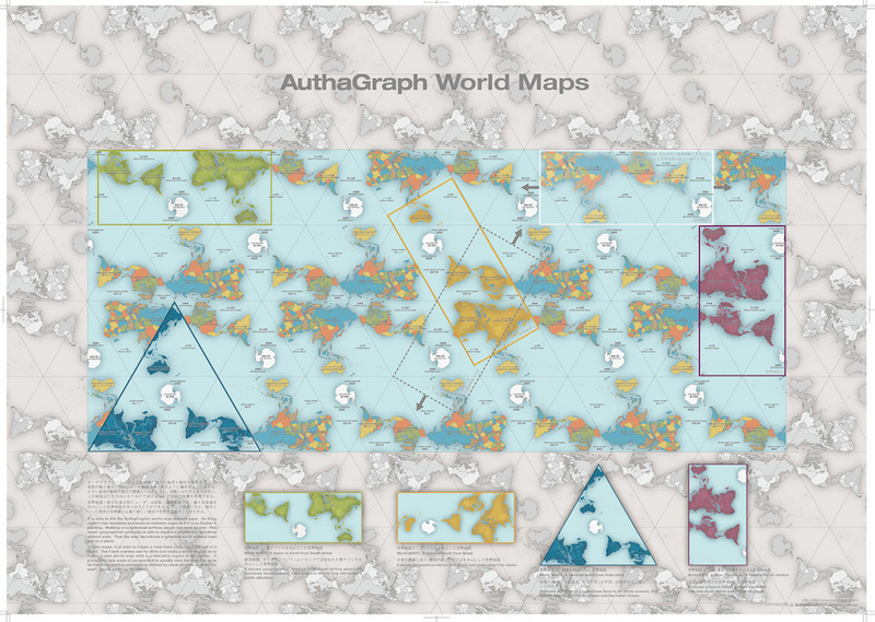
The 2016 Good Design Award results were announced recently with awards going to over 1000 entries in several different categories. But the coveted Grand Award of Japan’s most well-known design award, given to just 1 entry, was announced today. Last year the winner was a personal mobility chair and the year before that it was a robotic arm. This year, the grand prize went to a world map.

authagraph-world-map-1


authagraph-world-map-1

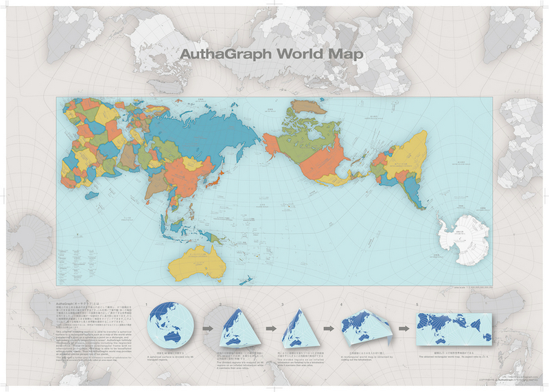
But the map of the world has been around for hundreds of years. So what’s so special about this map? To begin, Tokyo-based architect and artist Hajime Narukawa has a problem with our current map and he’s been working for years to try and fix it. In 1569 geographer Gerardus Mercator revealed his world map and, to this day, it’s the generally accepted image we have of this planet. But it has major flaws in that it dramatically distorts the sizes of Antarctica and Greenland.

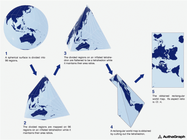
Narukawa developed a map projection method called AuthaGraph (and founded a company of the same name in 2009) which aims to create maps that represent all land masses and seas as accurately as possible. Narukawa points out that in the past, his map probably wasn’t as relevant. A large bulk of the 20th century was dominated by an emphasis on East and West relations. But with issues like climate change, melting glaciers in Greenland and territorial sea claims, it’s time we establish a new view of the world: one that equally perceives all interests of our planet.

authagraph-world-map-2

AuthaGraph not only faithfully represents all oceans and continents, but the map can be tessellated just like an MC Escher painting. Much in the same way that we can traverse the planet without ever coming to an end, “the AuthaGraphic world map provides an advanced precise perspective of our planet.”

Go here to find out where you can purchase posters and globes based on the AuthaGraph project. There’s an online shop that carries them too.

authagraph-world-map-3