(via Old-Meets-New in Modern Renovation of An Old Church - Design Milk)
Julianamarquesque lugar lindo

Architects: Leyk Wollenberg Architects
Location: Jean-Monnet-Straße 2, Berlin, Germany
Architect In Charge: Leyk Wollenberg Architects
Design Team: Dietmar Leyk, Petra Wollenberg with Inken Blum, Florian Spaelty, André Rossmann
Area: 320 sqm
Year: 2012
Photographs: diephotodesigner.de


The restaurant for the German headquarters of the French energy company Total, designed by lwa, has been completed. The new headquarters are sited at Europaplatz in Berlin, in the newly built Tour Total, close to Berlin main station.

The employee restaurant plays a key role during the daily life of the 600 Total employees. The understanding that the restaurant should be inextricably a part of everyday worklife establishes the starting point for this design. It represents the most important place for informal communication between all hierarchies of the company.

The design is based on a basic „room in room“ concept. An L-shaped space of the restaurant, the frame, defines the dining area. In between frame and food counter a continuous white floor creates the neutral light background for the whole set of elements and provides a generous space for movement. Both, dining area and food counter are crafted from oak wood stained in black. To accomplish a high grade of depth these surfaces are structured with a rhythm of vertical wooden strips. The light interior forms a strong contrast with the solid outer appearance. Partition screens create a forest of 750 champagne coloured anodized aluminium tubes with different diameters. They divide the large dining area into small private spheres. At the same time these screens act as filter to allow visual connections and create intimacy. Through its specific colour and its diverse light reflexions they evoke a unique sensuality and establish a warm atmosphere. The inner surface of the frame and its furniture are made of white glazed oak wood, which covers floor, walls and ceiling. All furnishing, tables and seating are designed as pure basic elements made from the same wood as the inner frame.

A variety of different dining situations offer areas for comfortable dining, spontaneous stopovers, espresso breaks, or even smaller conferences.
The drinking water well, a special element, which represents a traditional element in the companies’ rituals, has been integrated in the screen.

The lighting of the whole restaurant was designed in relation to its character as dining-living room for relaxation, to underline its fluid spatial arrangement, and to accentuate its sensitive materialization. The dining area is illuminated by a number of miniature energy saving LED-lights to create a large variety of different mood scenarios. Depending on the culinary experience or the kind of festivity the lighting changes in regards to a pre-programmed digitally controlled setting. All lights are integrated in such a way that not the light as object but the orchestration of light in space stands in the foreground.


Restaurant Tour Total / Leyk Wollenberg Architects originally appeared on ArchDaily, the most visited architecture website on 15 May 2013.
send to Twitter | Share on Facebook | What do you think about this?


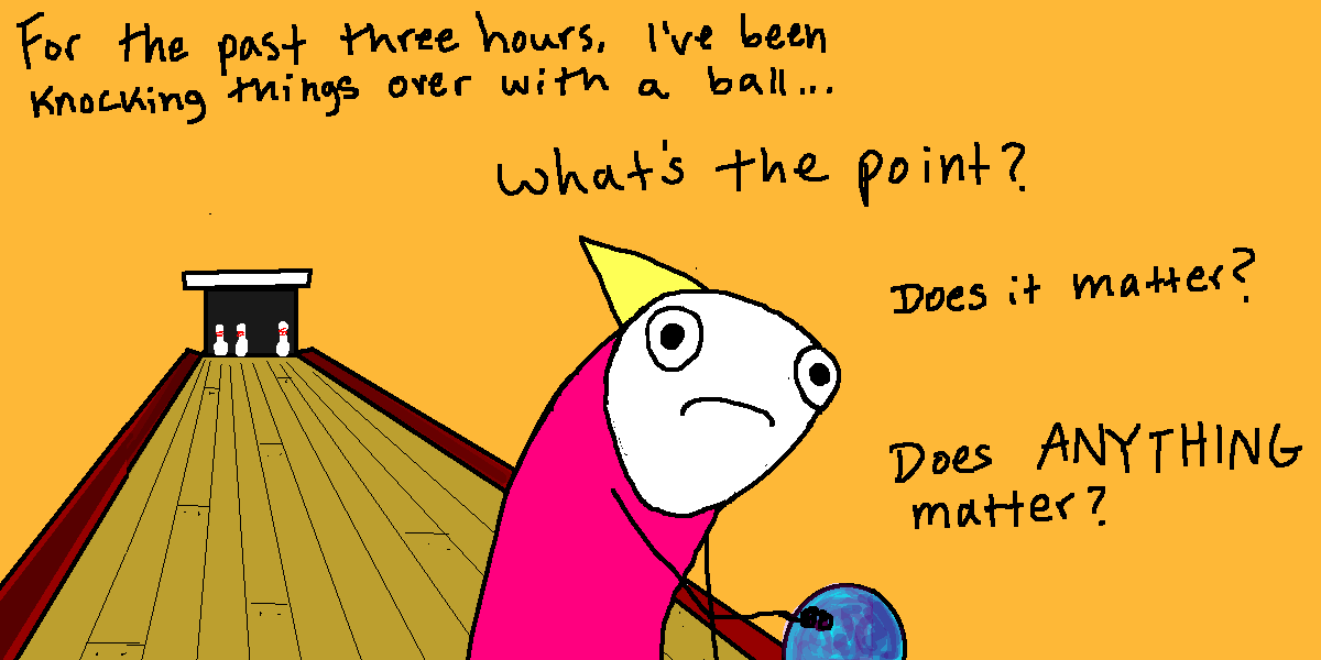
February 13, 2013 - the day Canada’s Parliament debated the zombie apocalypse. (x)
this is very important
Julianamarquesuma pessoa ficou para na escada rolante pq ela parou de funcionar.
Go home, internet. You are drunk.


The post 35 of the Dumbest Things Said on the Internet appeared first on POPHANGOVER.
Julianamarqueseu fico variando entre a raiva e o nada, mas na maioria das vezes sinto rava quando as pessos ignora meus peixes mortos e acham que é só e fazer uma forcinha e eles vão ressucitar.


portrait of the villain as a baby

Architects: Barry J. Hobin & Associates Architects Inc
Architect In Charge: Barry J. Hobin & Associates Architects Inc
Structural: A.J. Garwood & Associates
Landscape: John K. Szczepaniak
Area: 4800.0 sqm
Year: 2012
Photographs: Courtesy of Barry J. Hobin & Associates Architects Inc


Interiors: Oblio Design
Contractor: Terra Nova Building Corp

The project replaces a 2-car garage and indoor pool house with a new lavish spa, multipurpose lounge, guest house as well as a 4-car garage. The initiative is to integrate new indoor living spaces with a new landscaped terrace with pool, hot tub and outdoor dining experience.

An outdoor covered walkway was re-invented as indoor glass link connecting the new addition and main house and also providing a secondary entrance to the home. The glass walls help retain the notion of an outdoor experience while providing a year round connection between the two separate living areas.

In the addition, the ground floor layout offers a Scandinavian like atmosphere, featuring a fitness room, massage room, and steam room in addition to a large versatile gathering room with full amenities for food preparation and indoor lounging. With the patio doors open, the rusticated stone piers transform the west facing rooms into a continuous arcade expanding out onto the pool terrace and providing an uninterrupted connection between indoor and outdoor spaces. As a result spaces within the arcade also benefit from shade and shelter during warm summer months.

The guest house component is concealed from the streetscape within a copper roofscape and accessed via glass link connecting two separate suites on the second floor. The living spaces reveal themselves on the west elevation with sliding glass walls tucked below generous roof awnings for shade and privacy. The guest house is strategically positioned on the 2nd floor to optimize privacy and views out onto the grove of evergreens. 2 Large upper roof terraces offer expanded vistas of the pool and property below.


299 Soper Place / Barry J. Hobin + Associates Architects Inc originally appeared on ArchDaily, the most visited architecture website on 07 May 2013.
send to Twitter | Share on Facebook | What do you think about this?
Julianamarquesvamo lá Lori


People keep saying “there should be a Doctor Who bar!”
May I introduce you to Brooklyn’s “The Way Station”?
For the record, the Tardis photographed above really is larger on the inside.
I shit thee not.
Larger. On. The. In. Side.
Plus, it’s been autographed by Matt Smith and Karen Gillian.
On the inside.
Which is larger than the outside.
I have been inside it and I can attest to the truth of this statement.

Pra tornar a faculdade deles (Rochester Institute of Technology, NY) um lugar mais conhecido, os caras resolveram criar um mito.
E estão fazendo isso direitinho, com direito a blogs, programas de tv fake e ensaios na wikipedia.
Dê uma olhada e tire sas conclusões.
Pra descobrir como foi feito, só doando para incentivar a causa.
O vídeo é incrível. E aí, como você acha que eles fizeram? Deixe sua opinião nos coments.
Aqui está o site complementar onde eles descrevem o trabalho elaborado de criar um mito moderno. Infelizmente, o prazo acabou antes que eles conseguissem o valor a ser arrecadado.
    
|

Architects: AZL architects
Location: Nanjing, Jiangsu Province, China
Architect In Charge: Zhang Lei
Design Team: Zhang Lei, Jeffrey Cheng, Wang Wang, Wang Yi
Collaborator: Architectural Design & Planning Institute, NJU
Area: 500 sqm
Year: 2008
Photographs: Yao Li


Situated in Laoshan Forest to the west of central Nanjing city, China International Practical Exhibition of Architecture (CIPEA) began in 2003 to bring twenty-four renowned international & domestic architects together onto one site. CIPEA consist of four public buildings and twenty small houses, in accordance with the brief, the houses should have at least five bedrooms, public spaces, and hospitality accommodations on 500 square meters.

The Number Four “Blockhouse” sits on a particularly valley site, nestling the house into the landscape. In the spirit of a pagoda, four cubic floors are stacked vertically, allowing for minimal site excavation and land use. The ground floor features living and dining spaces quietly enveloped in the surrounding forest and overlooking a stream, and a communal roof terrace rises to just above the trees. The roof merges into the landscape as another living space, complete with pool and wooden deck within the panorama of the forest. The geometric shape is sculpted from concrete and finished in a white protection surface.

The concept of Blockhouse is almost the living attitude of many Chinese: a minimal opening to the surrounding landscape is the only perforation of the richness inside the house. The horizontal break of each floor—in combination with larger unique curved apertures on each floor—frame vistas in the spirit of Chinese landscape scrolls. Prescribed views have a long tradition in Chinese art history and traditional Chinese gardens, designed to make the viewer reconsider and contemplate the landscape.


CIPEA No.4 House / AZL architects originally appeared on ArchDaily, the most visited architecture website on 05 May 2013.
send to Twitter | Share on Facebook | What do you think about this?
Julianamarquesachei tão bonito

As strange as it looks, the Canvas furniture, showcased at Milan Design Week 2013, is a real object and not a simple avant-garde painting with baroque details. We’ve spotted this peculiar furniture item on This is Colossal and we found out that Canvas, a canvas shaped chair with a drawing of a chair, is the work of YOY, a Japanese design studio that pays a special interest in creating unusual design, that definitely stands out and makes an impression on whoever ends up seeing it.

Canvas is cool, lightweight and ingenious. “A frame made of wood and aluminum is covered by an elastic fabric printed with texture of a canvas and a drawing of chair.” You can use this “work of art” by leaning it against a wall. The Canvas furniture comes in three different shapes, so basically you can choose from a stool, an armchair or a sofa (a two-person seat). The fun part is that your guests will have no idea that the exquisite work of art you keep in your house is actually real furniture. In case you have an edgy sense of style and you are not “afraid” of avant-garde, you can definitely upgrade your home with intriguing furniture items and completely transform it!


You're reading Intriguing Furniture You Can Lean Against The Wall By YOY Design originally posted on Freshome.
The post Intriguing Furniture You Can Lean Against The Wall By YOY Design appeared first on Freshome.com.
Julianamarquesmatrix +mãe <3
(via Nikol Hasler)![]()
|
|
Julianamarquesaff, procê ver minina
Presented without comment…
Julianamarquesmy worst frenemie

Ann Friedman writes, "In my ongoing quest for the perfect framework for understanding haters, I created The Disapproval Matrix." With Ann's helpful diagram, one can more easily "separate haterade from productive feedback." [annfriedman.com]![]()
|
|
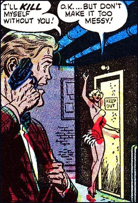
…Don’t Make it Too Messy!
Julianamarquesusaria qualquer um desses vestidos se tivesse dinheiro/ocasião. ou talvez nem ocasião, quem sabe iria assim na padaria?


Quanto mais nos aproximamos da estreia de “O Grande Gatsby” mais novidades temos! A revista VOGUE Austrália divulgou o seu conteúdo de maio, e o artigo de destaque claramente é o esperado longa de Baz Luhrmann (mesmo diretor de “Moulin Rouge – Amor em Vermelho”). A beleza dos anos 20 da atriz Carey Mulligan estampa a capa e muitas páginas – assim como cada integrante do elenco do filme que aparece em outras páginas.
A revista aborda a famosa trilha sonora original, a produção e a direção de arte que tomou atenção dos críticos, internautas e das redes sociais.
 O filme, no momento, tem grandes chances de ser indicado na maioria das categorias técnicas do Oscar 2014 – entre elas, figurino. Há especialistas que também apostam numa possível indicação de Mulligan em Melhor Atriz e de Leonardo Di Caprio como Melhor Ator.
Para quem não sabe, essa é a quinta adaptação cinematográfica do livro de F. Scott Fitzgerald. Nesta nova versão:
A história acompanha o escritor aspirante Nick Carraway enquanto ele deixa o meio-oeste em direção a Nova York na primavera de 1922, uma época em que a moralidade tornava-se menos rígida, o jazz explodia e bebidas ilegais criavam impérios.
Em busca de sua própria versão do Sonho Americano, Nick acaba vizinho de um misterioso milionário festeiro, Jay Gatsby, quando vai viver do outro lado da baia com sua prima, Daisy, e o marido dela, o filantropo de sangue-azul, Tom Buchanan.
É nesse ambiente que Nick é atraído ao mundo cativante dos super-ricos, suas ilusões, amores e traições. Nick então usa essa experiência para escrever um conto de amores impossíveis, sonhos incorruptíveis e tragédias que espelha os nossos próprios tempos e conflitos.
Leonardo Di Caprio interpreta Jay Gatsby, Tobey Maguire fica responsável em ser Nick Carraway e a bela Carey Mulligan vive Daisy Buchanan. O elenco também é composto por Joel Edgerton (Tom Buchanan), Jason Clarke (George Wilson), Amitabh Bachchan (Meyer Wolfsheim), Elizabeth Debicki (Jordan Baker) e Isla Fisher (Myrtle Wilson).
“O Grande Gatsby” será lançado nos cinemas brasileiros em 7 de junho.
Veja todas as fotos da revista, abaixo:


Julianamarquesengraçado eu já fiz um projet quase idêntico a esse

Like an insect with wings poised to lift off. A metal grasshopper coiled for action. Foxground House by Louise Nettleton Architects sits lightly on the site with a roof line that promises flight. Corrugated steel is the material of choice referencing the Australian history of the corrugated iron shed in the bush. Indoor and outdoor meet seamlessly in this stylish contemporary home.


Julianamarquessweet fucking baby jesus:O
Uuuuuhhhh… so this is an actual science test.


These kids are a portion of the future of America…

Someone needs to teach these kids that dinosaurs did exist. AND this is totally how they became extinct, duh…

The post This is An Actual 4th Grade Science Test From a School in South Carolina appeared first on POPHANGOVER.
Julianamarquesesse é um tipo de projeto de casa que eu gosto muito. As linhas são contemporâneas, mas ao mesmo tempo tempoque tem rigidez formal tem uma integração com a topografia e um combinação de texturas linda e ambientações que tornam tudo aconchegante. é o tipo de projeto em que cabe tudo: móveis de design, com móvis de brechó e herdados. porque o espaço é bom, não precisa de decoração pra torná-lo bom. os objetos podem ter valor sentimental, por que eles não estão ali para ~compor~ o ambiente. eles estão ali porque o dono quis.

It's one that got away. A time capsule of 60s cool. Stepping down a sloping block in Fern Tree, Tasmania is this brick and glass split level designed by David McGlashan. A tweak of the bathrooms and kitchen, move in my West German pottery collection, switch on the Bitossi lamps and rub the danish oil all over the teak table. I'd be in heaven. Alas I missed it but can still dream. Link here while it lasts.


Julianamarquesnão não deu

a vida, né?
rindo histericamente.
 Sara Carpenter
Last night in New York, the Museum of Arts & Design hosted a panel on the Practice of Patronage as part of an ongoing exhibition, After the Museum: The Home Front 2013. Dan Rubenstein, co-curator of After the Museum and Editor of Surface magazine, moderated the presentation and discussion between artist David Wiseman and Zesty Meyers of R 20th Century. The trio discussed Wiseman’s reprisal of the once common practice for artists and its role in his creative process.
Sara Carpenter
Last night in New York, the Museum of Arts & Design hosted a panel on the Practice of Patronage as part of an ongoing exhibition, After the Museum: The Home Front 2013. Dan Rubenstein, co-curator of After the Museum and Editor of Surface magazine, moderated the presentation and discussion between artist David Wiseman and Zesty Meyers of R 20th Century. The trio discussed Wiseman’s reprisal of the once common practice for artists and its role in his creative process.
For a young artist, commissioned work can nurture and shape their potential career, allowing them the means to explore new methods and materials. While it is common practice for artists and designers to produce works in collaboration with manufacturers, the practice of personal commissions seems to belong to eras past. Unless you’ve commissioned a work of art yourself, today the mysterious process is rarely discussed in detail. Wiseman and Meyer’s insight to the process of patronage helped uncover some of that mystery.
From an early point in his career, Wiseman found inspiration in nature. Moved by fallen trees he found “too precious not to haul back to [his] studio,” he decided to create pieces that brought nature indoors. These manifested in the form of 3-dimensional wall ornaments he dubbed ‘wall forests.’ Rodman Primack, an interior designer and champion of this early work, approached Wiseman with a proposal to extrapolate the small pieces into a larger work to cover a client’s ceiling. And so the first of many commissions was born.

The Platanus bibliotechalis installation at the West Hollywood Library took cues from Sycamore trees in a nearby park. Faced with a short deadline for the commission, Wiseman chose to integrate the challenge into his design rather than let it live as a concession in the process. Photo by: Mark Hanauer.
For artist David Wiseman, commissioned work has proven a rewarding way to create. He isn’t interested in repeating previous works and takes an old world approach to commissions—creating pieces that are not only site specific, but carry significant meaning to the client. He immerses himself with patrons to learn their history and character and is emphatic that while they need not have a specific vision, they must be excited. Through client interaction and visits to the site he finds creative direction. Many of the final pieces are so tied to the clients they could be likened to a modern day version of the family crest. He describes the process as collaborative though he is clear that he has set parameters that prevent him from compromising his artistic integrity.
As patronage has become integral to his career, it’s no wonder he used a fictitious client as inspiration for his first solo show with R 20th Century (curated by Rodman Primack). A dining table tableau created for the imaginary client incorporated features from his past work and commissions. Wiseman enjoys the process of creating “something for somebody,” finding work arbitrary otherwise; a reason patronage may be a natural fit for his career.
Information on future discussions and programs taking part at MAD during the Home Front 2013 can be found here.

Acho que poucas frases me intrigam tanto, hoje, quanto “não existe feminismo mas, sim, feminismoS“. Eu coloco letra maiúscula no S porque quase posso ver. A pessoa dando ênfase. E fazendo cara de tolerante e multi-antenada com a complexidade do mundo contemporâneo. Então eu fico olhando pra cara dessa pessoa*. Essa pessoa líquida. E espero o que ela vai dizer. E geralmente é uma tentativa, né? De conciliar algum hábito constrangedor com esta que um dia foi uma teoria revolucionária. Daí a pessoa diz assim “feminismo é também buscar o chinelo pro maridinho. Por que não???”. Ué. Porque não. Não é isso que é feminismo. Claro que eu dei um péssimo exemplo. Vou melhorar. Eu sou feminista. Eu adoro chocolate. Aí eu posto uma foto minha comendo uma torta de chocolate. Com a legenda. “Feminismo é também torta de chocolate. Hmmm“. E não. Não é. Você ainda pode dizer que eu tô implicando. E que não é o feminismo que é. Mas as feministas. E que tudo isso significa que eu posso, sim, ser feminista e buscar chinelo. Ser feminista e comer torta de chocolate. E, bem. Não. Por motivos diferentes. Buscar chinelo é resquício de machismo**. Comer chocolate diz respeito a outras características que eu tenho. Feminista não é uma condição totalitária. E também não exige coerência. É mais um processo mesmo. De transformação e blábláblá. Mas é um processo de transformação. PESSOAL e social. Mas começa, sim, como auto descoberta e tal. E essa ânsia de querer transformar tudo em feminismo, faz com o foco do que é feminismo se perca. Claro que cada um faz o que quer. É tão óbvio isso que nem sei porque tô dizendo. Você pode colocar foto até do seu duodeno nas redes sociais. Óbvio. A questão é querer instaurar o feminismo do duodeno. Porque aí, eu estrilo. Pra você fundar uma corrente dentro do feminismo, precisa mais do que vontade, amiguinha.
Então Katie Roiphe. Prazer, Mary W. Não conhecia***. Fiquei tão feliz de conhecer. Adorei o texto. E a apresentação que tem dela na revista. Anyway. No artigo, ela diz que as mulheres estão vivendo uma tal de mommy culture. E que, nas redes sociais, as mulheres tem substituído a própria imagem pela imagem das crianças etc. Na foto do perfil, ela diz. Qualquer pessoa que tenha meia dúzia de amigos sabe que isso é verdade. Que o Facebook de grande parte das mulheres é tomado pelos filhos. E as minhas, as suas, as nossas amigas usam mesmo. Foto de criança no perfil. E aí temos feminismo, people. Porque essa é uma luta. A maternidade tem problemas, sim. Um monte de problemas, sim. E parece haver, sim, uma tentativa de resgatar uma suposta realização que só sendo mãe teríamos. E me parece significativo que as pessoas não citem a parte do texto da Roiphe em que ela reitera a importância da maternidade etc. Pode ser que seja outra ~cultura~ essa. De não ler texto inteiro. Que está se tornando uma praga. Pode ser que a mamadeira tenha fervido. Não importa. O caso que ela diz (e nem sei se eu concordo):
Os filhos são uma importante realização na vida de alguém e, indiscutivelmente, a mais importante realização – o que não significa que eles sejam quem você é.
Tem como ser mais didática que isso? Então as críticas que eu vi dizem respeito ao título (?!?) do texto. POIS É. Mulheres inteligentes, independentes e interessantes alienando-se nos filhos é uma derrota do feminismo. Claro que é exagerado. Mas o texto é uma provocação. É encrenqueiro. Porque, né? Imagino que grande parte das pessoas que ela ama esteja nessa situação. Da parte que me toca, digo que uns 80% estão. E são meninas. Não tem homem no meu facebook fazendo nada equivalente. A caixa de comentários do texto é tão recalcada que faria a alegria da Glória Perez. Em determinado momento alguém fala em “feminismo caga-regras“. Aí as outras gritam “êêê! esse não é meu feminismo. meu feminismo é OUTRO“. E então eu volto ao começo. Algumas coisas tem q existir para que seja feminismo. Senão caímos no abismo pós moderno e tudo pode ser qualquer coisa. Emancipação da mulher é uma dessas coisas. Essa emancipação passa necessariamente por problematizar os papéis tradicionais. Filhos demais, maridos demais, cosmético demais. É longa a lista Nero Wolf. Tem que ser problematizado. Não porque o feminismo tá cagando regra. Mas porque são as questões ué. Então você me diz que gasta muito dinheiro em maquiagem e roupa. E que tem obsessão pela aparência. OK. Mas não diga que feminismo também é isso. Porque não é. E você pode viver a vida sem aderir 100% ao feminismo. Porque não se trata de adesão simplesmente. É um oOLHAR. Um movimento e uma TEORIA. Que problematiza um conjunto de coisas etc. Você pode gostar de sexo hardcore. Ninguém te expulsa do feminismo. Mas apanhar na cama NÃO é feminista. Eu não sei se eu estou sendo clara no que eu quero dizer. Porque aí aparece aquele alinhamento também. “Ah, se apanhar na cama não é feminista, então eu não sou feminista“. GENTE. Vamos maneiras na burrice? Não tô aguentando mais o abandono das sutilezas. Apanhar na cama pode não ser feminista. Mas não significa que faça o arco e vá parar no machismo. Apanhar na cama é uma coisa que eu faço e ok. Não entra como algo que coloque em xeque a minha militância. Mas é algo que eu problematizo, né? Tanta gente querendo apanhar na cama, revela, hein? Um monte de coisa sobre sexo na sociedade ocidental etc.
Enfim.
Pra dizer isso. Sim, parece haver uma mommy culture. Sim, isso é uma derrota para o feminismo. Não. Ninguém está cagando regra. Só constatando uma tendência.
*É uma retumbante mentira que eu olho pra cara dessa pessoa porque basicamente eu vejo isso do S pela internet.
**Digo resquício porque pressuponho que a buscadora se declare feminista. Tem buscadoras que não se declaram e vivem o machismo plenamente etc.
***Culpa minha mesmo. Parece que ela é bem conhecida nos EUA.
ESSE TEXTO FOI DURAMENTE CRITICADO AQUI.