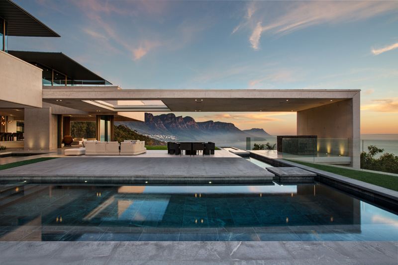
SAOTA together with interior designer Debra Parkington, have designed a new home in Bantry Bay, Cape Town, South Africa.
Shared posts
Hunger Games star Amandla Stenberg explains the nuances of cultural appropriation
 “Cultural appropriation” is a tricky concept to understand. When does appreciating another culture’s traditions cross over into usurping and/or disrespecting them? Read the rest
AMB House / Bernardes + Jacobsen Arquitetura
Julianamarquesoutro dia estava projetando uma casa bem parecida com essa, rola um espírito do tempo ou excesso de referência?

Architects: Bernardes, Jacobsen Arquitetura
Location: Guarujá – SP, Brazil
Architect In Charge: Paulo Jacobsen
Design Team: Fabiana Porto (coordinator), Edgar Murata, Henrique Carvalho, Marina Nogaró.
Area: 810.0 sqm
Year: 2011
Photographs: Leonardo Finotti
Interior Design: Bernardes + Jacobsen Arquitetura
Team: Eza Viegas (author), Tatiana Kamogawa
Landscape: Jundu Paisagismo
Lighting Design: Lightworks – Airton Pimenta
Facilities: Grau Engenharia
Air Conditioning: Grau Engenharia
Structure: Leão & Associados
Construction: EUM
Site Area: 1310m²

From the architect. The AMB House is situated on the coast of São Paulo, Guaruja City in the middle of the Atlantic Forest. From the street you can only see one of the three floors of the house because the terrain has accentuated slopes that give different views of an almost untouched natural landscape.

The most common situation, where the rooms are upstairs and social rooms are downstairs, was reversed on the design of this residence. On the entrance of the house we have a hall that serves as a mezzanine overlooking the double ceiling living room with proximally 6,00m height and wood frame glass windows with a view looking at the swimming pool and the forest. In the lateral of the hall, the balcony outside is surrounded by large wooden bench, serving as a protection.

In the intermediate floor are the social areas: the living room and dining room, which join the outdoor kitchen, outdoor deck and infinity swimming pool. Downstairs is the intimate area with five suites. It is this strategy of reversing the usual array of social and intimate area that makes the rooms, even overlooking the sea, have the privacy afforded by the trees that are at that level.

The house can be called the balcony house with large glass panels that allow visual contact with the surrounding areas of the residence and the natural landscape of the region. The windows of the rooms have wooden Cumarú shutters .This wood is also present on the deck of the balconies and floors of rooms. In the living room two bamboo plants sprout from the middle of the floor, bringing the forest into the house

This is how the house shows its relationship with the local landscape, barely visible through the dense forest in the access road, but grows and can be seen on the other side along with the look of a coastline and a stunning tropical forest.


AMB House / Bernardes + Jacobsen Arquitetura originally appeared on ArchDaily, the most visited architecture website on 15 Apr 2015.
send to Twitter | Share on Facebook | What do you think about this?
Clinomanias unite! ✋ Follow my bro @8factapp to know what you...
JulianamarquesClinomania
Think less but see it grow
Like a riot, like a riot, oh!

Clinomanias unite! ✋
Follow my bro @8factapp to know what you don’t know!
"Since her death in 1979 the woman who discovered what the universe is made of has not so much as..."
|
Courtney
shared this story
from |
“Since her death in 1979, the woman who discovered what the universe is made of has not so much as received a memorial plaque. Her newspaper obituaries do not mention her greatest discovery. […] Every high school student knows that Isaac Newton discovered gravity, that Charles Darwin discovered evolution, and that Albert Einstein discovered the relativity of time. But when it comes to the composition of our universe, the textbooks simply say that the most abundant atom in the universe is hydrogen. And no one ever wonders how we know.”
-
Jeremy Knowles, discussing the complete lack of recognition Cecilia Payne gets, even today, for her revolutionary discovery. (via alliterate)
OH WAIT LEMME TELL YOU ABOUT CECILIA PAYNE.
Cecilia Payne’s mother refused to spend money on her college education, so she won a scholarship to Cambridge.
Cecilia Payne completed her studies, but Cambridge wouldn’t give her a degree because she was a woman, so she said fuck that and moved to the United States to work at Harvard.
Cecilia Payne was the first person ever to earn a Ph.D. in astronomy from Radcliffe College, with what Otto Strauve called “the most brilliant Ph.D. thesis ever written in astronomy.”
Not only did Cecilia Payne discover what the universe is made of, she also discovered what the sun is made of (Henry Norris Russell, a fellow astronomer, is usually given credit for discovering that the sun’s composition is different from the Earth’s, but he came to his conclusions four years later than Payne—after telling her not to publish).
Cecilia Payne is the reason we know basically anything about variable stars (stars whose brightness as seen from earth fluctuates). Literally every other study on variable stars is based on her work.
Cecilia Payne was the first woman to be promoted to full professor from within Harvard, and is often credited with breaking the glass ceiling for women in the Harvard science department and in astronomy, as well as inspiring entire generations of women to take up science.
Cecilia Payne is awesome and everyone should know her.
(via bansheewhale)
Oh yessssss!

I swear I have been staring at this photo for 10 minutes. What a dreamy space. The fireplace, moldings, and mirror are to die for, and then add in that velvet sofa...*SIGH*

This makes me want a black bedroom desperately. Throw in a gorgeous marble fireplace and a Serge Mouille light and I would never ever get out of bed.

This is just cool.
Photos by Matthew Williams
#Sincerão da Sophia Loren
Muitos provavelmente já devem ter visto essa foto icônica de 1957, em que a novata Sophia Loren, recém chegada da Itália à Hollywood deu uma bela encarada no decotão de Jayne Mansfield, que roubou a cena em uma festa que a italiana deveria ser o destaque principal.
Mas será que o clique não foi apenas uma coincidência? Um momento em que Sophia abaixou o olhar e o fotógrafo registrou a infeliz cena? Não, não… Esse olhar é justamente o que parece, e em entrevista recente à revista Entertainment Weekly, a atriz confirmou que sim, ela estava pensando exatamente o que você já imaginou que ela estivesse pensando…
“A Paramount tinha organizado uma festa para mim. Todos da indústria estavam lá, foi incrível. E então vem a Jayne Mansfield, a última a chegar veio direto para minha mesa. Ela sabia que todo mundo estava observando e sentou-se”, disse. “Olhe para a foto. Onde estão os meus olhos? Eu estou olhando para os mamilos dela porque eu estava com medo que eles caíssem no meu prato. Dá para perceber o medo que eu estava no meu rosto. Estou tão assustada porque seu vestido iria explodir e BOOM, derramar por toda a mesa”, revelou.
E mesmo depois que as duas foram pegas conversando e sorrindo, Sophia disse que o vestido e o decote não saiam de sua mente. “Não, não. Pode até existir outras fotografias, mas está é a única imagem. Essa mostra como aconteceu”.
E mesmo não conseguindo tirar seus olhos dessa imagem, a atriz italiana disse que não gosta de ser associada com a fotografia. “Muitas vezes me dão essa foto para eu autografar e eu nunca o faço. Eu não quero ter nada a ver com isso e também tenho respeito por ela, até porque ela não está mais entre nós”, explicou.
Foto: Fotolog SweetVintage, Vanity Fair.
tsū: a rede social que promete pagar pelo que você publica
Julianamarquese aí famos ficar rykos?
Já pensou se você fosse pago por todo o tempo que passa no Facebook ou no Twitter?
Pois uma nova rede social promete dividir com você os lucros de publicidade pela visualização do conteúdo que você posta.
O quê? Como? ONDE?
Calma!
Trata-se do tsū, o tsunami digital da vez. Além do apelo óbvio de ser pago fazendo algo que você já faz de graça, ele toca em um ponto muito delicado para o equilíbrio do novo modelo de negócios das redes sociais.
É mais ou menos assim: você entra em uma rede social para receber informações e notícias de alguém. Mas o tempo dedicado por esse alguém para criar o conteúdo que você consome não é remunerado.
É mais ou menos isso que o vídeo abaixo explica, como filosofia central do tsū:
O sistema de pagamento é um pouco confuso, mas é mais ou menos assim: 90% das receitas de publicidade são divididas com os usuários. 50% para quem publicou o conteúdo, o restante é compartilhado entre quem está na “árvore” daquele usuário e compartilhar o conteúdo, e assim por distante. Cada vez que você acumular 100 dólares, poderá trocar.
Parece um esquema de pirâmide bizarro, não é? Bom, francamente, parece ser mesmo, apesar do startup ter levantado 7 milhões de dólares do Fundo de investimentos Sancus Capital Prive.
Mas esse sistema de “árvore” está fazendo com que as pessoas espalhem convites à rodo pela internet. Afinal, sistemas assim priorizam aqueles que entram antes.
Pelo sim, pelo não, entrei nessa. O feeling é de um Facebook com algumas funções legais, como filtros e efeitos para suas fotos. E o interessante mesmo é esse botão do menu com um $, com relatórios de visualização de seu conteúdo para monetização.

Bom, se você ficou curioso ou se empolgou, a porta está aberta. É só clicar nesse link: http://tsu.co/rafaellosso
Vai que a gente descobre sem querer uma nova vida digital com muito luxo e ostentação, né!?
You need to login or register to bookmark/favorite this content.
The post tsū: a rede social que promete pagar pelo que você publica appeared first on Update or Die!.
Colorful Penthouse Bursting with Personality in the Heart of Istanbul, Turkey
Julianamarquesessa escada: acho maravilhosa porém teria um infarto toda vez que fosse usa.

Have a look at this colorful penthouse envisioned by Yasemin Arpac & Sabahattin Emir of Ofsit Studio and situated in the heart of Istanbul! The location of Karakoy Loft, as well as the personality, way of living and needs of the client (a 45-year-old bachelor) were the main parameters in the design of this project.
The structural approach of the house was to open up to get more light and view. The previous small window openings on the front façade were enlarged and the new folding window frames slide the width of the building to transform the living room into a balcony, since the apartment is missing one. And a large rectangular skylight was inserted just below the peak of the pitch to provide light and view to the mezzanine.
 One of the longitudinal walls was resolved as storage. A very simple system was designed with iron rods climbing two floors and running the length of the house, without categorizing it as living room, kitchen, library or bedroom. 12mm iron rods coming out of the wall and 16mm rods connected to them create a 60x60cm grid over the wall surface. Various shelving units and accessories were designed to fit this system, such as a single shelf, double or triple story shelves, vertical separators or hanging units. The user may arrange and utilize this storing system however he likes; as a library, a woodshed, kitchen storage, or a wardrobe.
The cast-concrete block surface which was created to form the kitchen counter framed in an iron structure, steps down into a cantilevering dining table and ends up as a short plinth as the hearth, which allows extra seating around the table.[Photos and information provided via e-mail by Ofsit]
The post Colorful Penthouse Bursting with Personality in the Heart of Istanbul, Turkey appeared first on Freshome.com.
Carta à Lucia Santaella
Julianamarquesas pessoas chegaram num nível ridículo demais plmdds
Cara Lucia Santaella,
“conheço” você dos livros de semiótica adotados nos diversos cursos de comunicação Brasil afora. No primeiro ano da faculdade de jornalismo, você foi palestrar no nosso departamento. Perguntei a um amigo se ele iria à sua palestra. Ele respondeu: “vou e vou levar um cartaz: Santaellaaaaaaa, I wanna have your babyyy”. Isso virou uma espécie de bordão depois. Bons e bobos tempos. Enfim.
Qual não foi meu espanto ao ver seu mimimi classe média sofre compartilhado na minha timeline. Incrível como a perda de um privilégio (e veja que estamos falando de um privilegiozinho de nada, que é poder estacionar seu carro aqui ou mais acolá) esteja levando até pessoas inteligentes como você a soltar os argumentos mais rasos.
Uma simples pesquisa no Google revelaria à senhora que vermelho é uma cor muito utilizada para sinalizar ciclovias mundo afora:
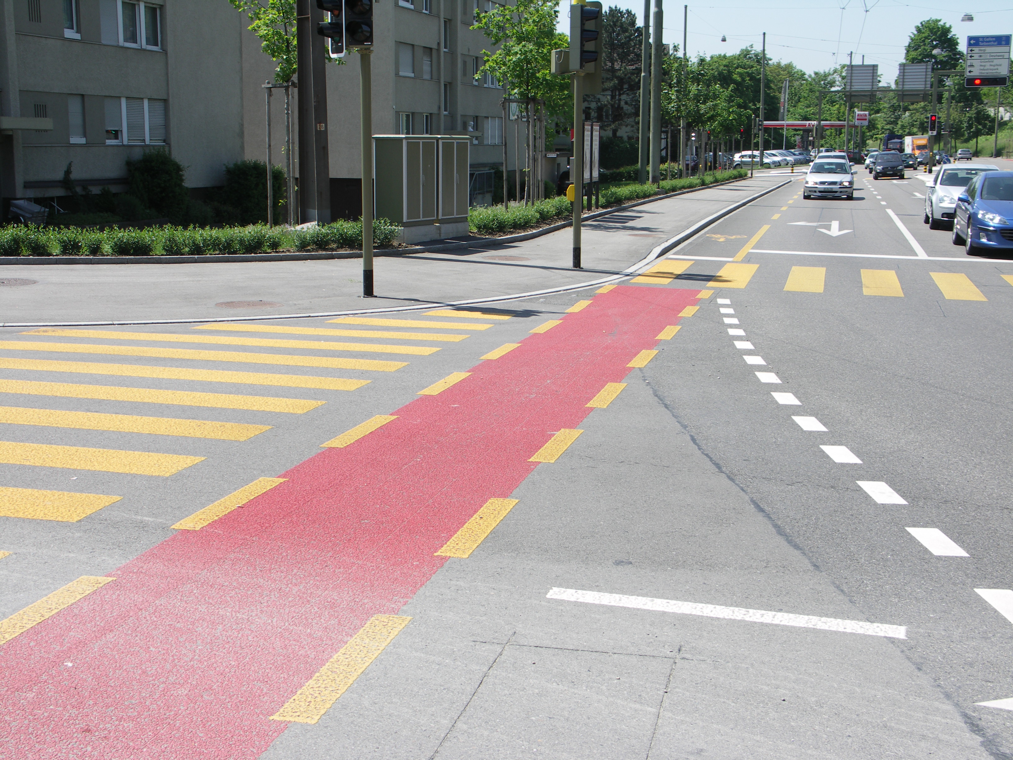
Winterthur, Suíça
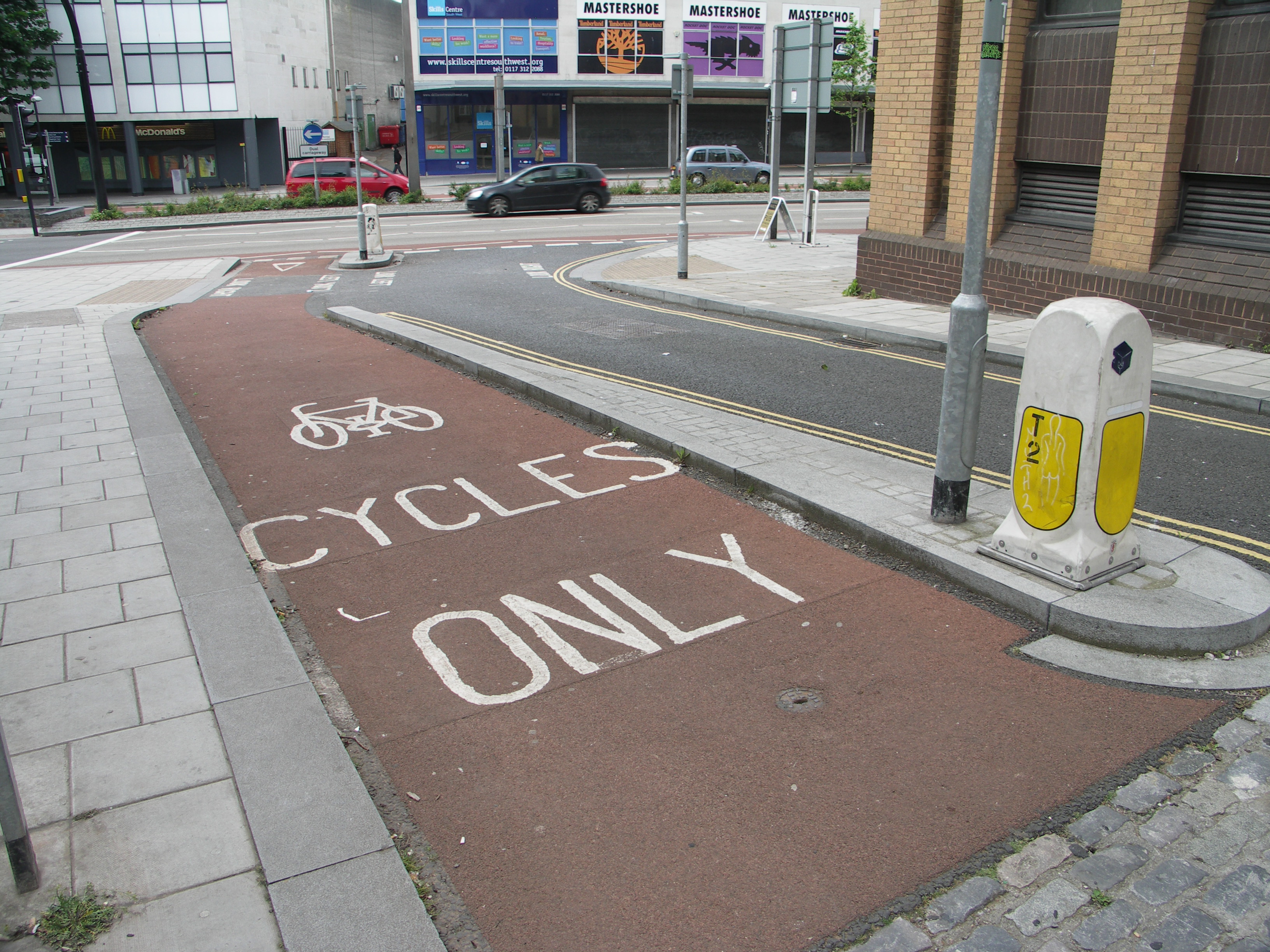
Bristol, Inglaterra

Madison, Wisconsin — ou seja: nos Estados Unidos, lugar que, todos sabemos, é um antro comunista.
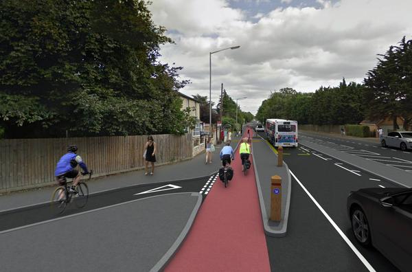
Cambridge, Inglaterra
Diversas cidades brasileiras (com prefeitos de vários partidos) também possuem ciclovias em vermelho.
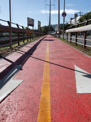
Porto Alegre

Curitiba

Santos, SP

Indaiatuba, SP
Não consta que os habitantes destas cidades tenham ficado mais agressivos, agitados ou estressados desde que as ciclovias vermelhas foram implementadas.
Posso também te dar meu testemunho pessoal. Há quase dois anos moro em Utrecht, na Holanda, e trabalho em Amsterdam. Ambas têm ciclovias vermelhas. Pedalo na primeira cidade e uso o transporte público na segunda. Não sinto que meu sistema nervoso central esteja entrando em parafuso. Eu e as pessoas à minha volta parecem muito bem, obrigada.
Aliás, nunca me senti menos estressada do que hoje em dia, dona Lucia. Pedalar tem me feito um bem danado. Sabe quando eu era agressiva, agitada, acelerada e estressada? Nos seis anos em que morei em São Paulo. Passava quase três horas presa no ônibus para ir ao trabalho e à faculdade. Isso, num dia normal. Se chovesse…
Quando a empresa me mandava fazer uma pauta no outro lado da cidade e essa pauta acabava por volta das seis da tarde, nem o conforto do táxi pago pelo patrão compensava o suplício de ficar horas dentro dele. Quantas vezes me vi presa na Marginal, presa na Teodoro Sampaio, presa na Faria Lima, presa-presa-presa. Todos, sozinhos em seus carros com espaço para mais quatro pessoas, presos-presos-presos. Xingando o motorista da frente. Respirando poluição. Aguentando a poluição sonora. Me diga com sinceridade, Santaella: o que tem mais chances de te fazer entrar em parafuso, viver desse jeito ou ver um pouquinho de vermelho todo dia?
Não precisa responder. Toma mais Google rápido: 1) São Paulo tem índices de ansiedade e depressão semelhantes a zonas de guerra. 2) Especialista diz que trânsito de São Paulo pode ocasionar doenças. 3) Pesquisa da IBM relaciona níveis de estresse e a mobilidade das cidades.
Outra coisa que o Google poderia ter te mostrado é que Haddad não está permitindo que os ciclistas também utilizem as vias, ao pintar as ciclovias no chão. A bicicleta já é prevista como meio de transporte no código de trânsito. Com ou sem ciclovia, o ciclista sempre teve o direito de circular ali. O que a ciclofaixa faz é dar mais segurança ao ciclista — coisa que se faz muito necessária numa cidade como São Paulo, onde os motoristas se acham os donos das ruas e muitas vezes resolvem “dar um susto” no ciclista para ele “saber seu lugar”. Se o motorista paulistano se finge de surdo, que o aviso para respeitar os ciclistas seja em vermelho berrante então.
Vale lembrar que, na Holanda, nem todas as ruas possuem demarcações no chão. Mas os ciclistas são bem-vindos em todas as ruas, a não ser que seja explicitamente dito o contrário. Assim também é no código de trânsito de Sampa.
Aliás, falando em Holanda, devo dizer que a parte que mais me incomoda do teu “desabafo” é quando você diz “será que Haddad pensa que vivemos em plena Amsterdam?”. É uma frase recorrente. Já vi mjitas vezes nos comentários de portais de notícias: “tá pensando que isso aqui é Amsterdam?”. E aí eu pergunto: por que, cara pálida, São Paulo não pode ser como Amsterdam? O que é que Amsterdam tem de tão especial, tão inatingível, que São Paulo sequer possa tentar ter?
A ideia de que existe algo especial e inatingível em Amsterdam está contida no uso da palavra “plena” na sua frase. Veja só que irônico, Santaella. Nunca pensei que usaria o que aprendi nos seus livros para analisar você. Este “plena” está tão carregado de síndrome de vira-lata que acho surpreendente que você mesma não veja.
Amsterdam não nasceu tendo ciclovias em todo canto. Para se tornar o que é hoje, houve muitos protestos. Veja:
Os holandeses não pedalam porque são seres iluminados, super preocupados com o futuro do planeta. Ou porque querem ser saudáveis e se exercitar todo dia. Eles pedalam porque é preciso. Porque há políticas públicas que priorizam a bicicleta. O transporte público na Holanda é caro e o serviço muitas vezes deixa a desejar (só para se ter uma ideia de quào caro é, quando cheguei aqui, não sabia andar de bicicleta. Em quatro meses, gastei mais de mil euros só com transporte. Quanto aos probleminhas que me fazem dizer que ele deixa a desejar, deixo para outro post porque tenho comigo vários mimimis). Os carros, como o vídeo diz, não têm acesso aos centros das cidades — e os estacionamentos são uma fortuna. Andar de bicicleta é então a opção mais econômica e mais rápida — e às vezes a única forma de chegar a um determinado destino.
Essas políticas públicas, vale repetir, não vieram sem luta. E é essa luta que está acontecendo agora no Brasil. A estrutura da cidade está começando a mudar, como nos anos 1970 a Holanda começou a mudar.
Eu sei que São Paulo não é Amsterdam. Andar de bicicleta em Amsterdam, que é toda plana, é mais fácil. São Paulo tem ladeiras que eu jamais me arriscaria a enfrentar. Mas não pense que aqui é mamão com açúcar: chove com frequência e venta muito (e a lei de Murphy faz com que esse vento seja sempre frontal, não importa pra onde você vire). Quando neva, o chão fica escorregadio. Se tem ciclista disposto a enfrentar as intempéries na Holanda, com certeza tem ciclista disposto a enfrentar uma subidinha em São Paulo.
São Paulo também é consideravelmente maior que Amsterdam. A primeira tem 10 milhões de habitantes, contra 800 mil da segunda. Mas o fato de ser maior é mais um argumento a favor da bicicleta. Não faz sentido que uma cidade enorme, com tanta gente, priorize o meio de transporte individual, que mais ocupa espaço.
Todo mundo sabe que a mobilidade em São Paulo entrou em colapso, e faz tempo. Talvez a senhora também devesse perceber isso, antes de xingar muito no twitter Facebook.
SDM Apartment / Arquitectura en Movimiento Workshop
Julianamarquesessa escada

Architects: Arquitectura en Movimiento Workshop
Location: Mumbai, Maharashtra, India
Project Area: 528.0 m2
Photography: Courtesy of Arquitectura en Movimiento Workshop

From the architect. Located in central Mumbai, our client builds a 6 story building, 2 for each apartment, we simultaneously perform 3 interior design projects for 3 different clients, all from the same family; parents, (an older couple) and 2 families of young couples with children, each with different needs and personalities, this is how we address the same space with different distributions, each had a different reason on which interiors are designed, a concept far from typical housing in India, a space for living inside, contrasting with its urban context, with its social environment.

Specifically in the SDM apartment, after a talk with each member of the family, we got a well defined program based on the customs of each user and each space, the staircase located at the center of the apartment. It was designed as a sculpture in the space with more light and natural ventilation; with very subtle lines but protagonist of the space, it can be seen almost from anywhere in the public areas, it becomes the articulator of spaces and is replicated in other architectural elements such as blinds and ceiling; every space, every detail meets a special character of the users, every color, every picture, every kitchen utensil, every linen was specifically chosen to complete this project and to make it unique.

The pooja room or prayer room was the subject of a major investigation that is expressed in each element, color and lighting, the carving work for the board is a real craft, integrating these elements in a contemporary way was our way to achieve a space for contemplation, spiritual communion, peace and harmony.

Each bedroom has a different atmosphere and they have been specially furnished with pieces selected from the furniture fair in Milan, we can see a wide variety of exclusive designs, artwork, rugs and tapestries, mosaics applications, arabescato marble and walnut wood contrasting with the white of the general area.

The bedroom is a place where the ceiling is an important element and which subtly illuminates the area, the movement generated in it responds to the frame beams that form the structure, ie, we have taken advantage of the space between beams to gain the maximum possible height.

The kitchen as element for family reunion has been designed on simple lines which together with the materials create a serene and elegant atmosphere.


SDM Apartment / Arquitectura en Movimiento Workshop originally appeared on ArchDaily, the most visited architecture website on 12 Aug 2014.
send to Twitter | Share on Facebook | What do you think about this?
não passarão
Woman Can Sing Two Notes At Once, Sounds Unworldly
 UPDATE: Also added a video of Anna-Maria in concert.
This is a video of polyphonic singer Anna-Maria Hefele demonstrating her ability to sing high and low notes at the same time, producing sounds not unlike the ones you hear in your head after huffing nitrous. Does Anna-Maria remind anybody else of Elizabeth from Bioshock Infinite, or is that just me? Come on, somebody validate me. "Yes, she does." No, I meant like, tell me I'm handsome or something, I've been feeling pretty low lately.
Keep going for the worthwhile video, but feel free to skip around. Also, not to brag or anything. But I've sung two separate notes at the same time before. "Burping and farting simultaneously doesn't count." WELL IT SHOULD.
UPDATE: Also added a video of Anna-Maria in concert.
This is a video of polyphonic singer Anna-Maria Hefele demonstrating her ability to sing high and low notes at the same time, producing sounds not unlike the ones you hear in your head after huffing nitrous. Does Anna-Maria remind anybody else of Elizabeth from Bioshock Infinite, or is that just me? Come on, somebody validate me. "Yes, she does." No, I meant like, tell me I'm handsome or something, I've been feeling pretty low lately.
Keep going for the worthwhile video, but feel free to skip around. Also, not to brag or anything. But I've sung two separate notes at the same time before. "Burping and farting simultaneously doesn't count." WELL IT SHOULD.Seongdong Cultural & Welfare Center / UnSangDong Architects
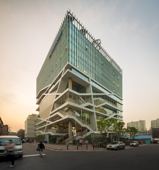
Architects: UnSangDong Architects
Location: Seongsu, 300-1 Seongsu-dong 2(i)-ga, Seongdong-gu, Seoul, South Korea
Architect In Charge: Jang Yoon Gyoo, Shin Chang Hoon
Design Team: Kim Sung Min, Kim Min Tae, Seo Hye Lim, Ryu Sam Yeol, Ahn Hye Joon, Kim Won Il, Ahn Boo Young, Kim Mi Jung, Jo Eun Chong
Area: 1014.0 sqm
Year: 2012
Photographs: Fernando Guerra | FG+SG
Structural Engineer: Thekujo
Mechanical Engineer, Mechanical Engineer: HIMEC

From the architect. The city is required the concept of urban regeneration which renews the abandoned and polluted environment. The current concept of urban regeneration is well used as the strategies of new town development. It has the meaning of creating rehabilitation and revival of urban environment, industry, economy, and the culture by providing new programs and physical architectural environments to the decaying existing cities. Rather than simple architectural esthetic controls, new composition of circulation system, which induces new transformation of environment, is required. It has been developed in the direction of cultural device and the community of governance concept to improve the quality of city dwellers’ life.

Seongdong Cultural & Welfare Center is a crucial issue because it is not a simple concept of creating government office. It provides the governance concept of cultural & welfare center. The welfare center is provided in the center of the poorest factory district in Seongsudong, and this cultural & welfare center functions as the headquarters which changes the city. If the function of government office is mainly administration, the architecture of governance concept is like the seed of role which changes the city and society.

Seongdong Cultural & Welfare Center also performs as the role of rearrangement and helps the inhabitants’ life in the factory district. It was interesting premise that the city and society can be changed through architecture. And Guggenheim Bilbao Museum, Kunsthaus Graz, Tate Modern in London, Laban Centre, and Will Alsop’s Peckham Library are the examples. It has been strewn like the seeds in the slum area and functions as a successful architectural device which changes the neighboring society.

Architecture as a public plaza
(Public Space as Public Plaza)
The architecture, breaking away from the concept of government office which creates exclusiveness and distances, is suggested. A Cultural & Welfare Center is suggested as open three-dimensional plaza by planning different elements, interests, and impressive programs which contain culture. It becomes an open architectural place which accommodates changing culture and welfare at the same time. It became the citizenry’s favorite place, and it is also the main place for welfare and its benefit. And it is the open public architecture. A pivot of civil activity, cultural, and informative events, is suggested.
Architecture as a set of green and urban structure

(Public Space as City Structure & Green Structure)
The urban structure provides horizontal, vertical, and three-dimensional plaza in the building by actively accommodating horizontal streets and plaza. And the architecture, which integrates the urban structure, is suggested. A living welfare & culture center is proposed by adding diverse elements, interests, and impressive programs. Also Moving circulation devices, movement contents, and cultural contents actively accommodate new senses of citizenry. And futuristic and experimental changes have been suggested. Not only the structures constructed by buildings, but also the green elements which are necessary in the city have been included in the urban structure. And it functions as a device for approaching the richness and emotional stability.


Seongdong Cultural & Welfare Center / UnSangDong Architects originally appeared on ArchDaily, the most visited architecture website on 29 Sep 2014.
send to Twitter | Share on Facebook | What do you think about this?
ivyarchive: mymodernmet: Illustrator Lili Chin's...


Illustrator Lili Chin's adorable series Dogs of the World illustrates 192 breeds of dogs grouped according to geographical origin.
More:
John Oliver Just MURDERED the Miss America Pageant…
JulianamarquesO vídeo do gifset, Osias
From Emma Watson’s incredible U.N. speech on gender equality this weekend, to John Oliver destroying the Miss America Pageant on Last Week Tonight, this is turning out to be a truly amazing week…
And this really is the funniest thing I’ve seen in a very, very long time.
Describing Donald Trump as “mummified foreskin and cotton candy” is a description that will be burned in my memory forever.
THEY ASKED ONE OF THE CONTESTANTS TO SOLVE ISIS…IN 20 SECONDS. I should not be laughing this hard but I can’t help but laugh this hard.
The post John Oliver Just MURDERED the Miss America Pageant… appeared first on POPHANGOVER.
Okay: Zombie Head And Arm Out Of The Grave Chia Pets
 These are the new line of Chia Zombies. They come in 'Lifeless Lisa', 'Creepy Holden' and 'Restless Arm' varieties and all retail for $17. Amazingly, I've never actually grown a Chia pet. Which is weird because I love plants and have a green thumb. See? "Yeah, but what's up with the brown ring finger?" FORGET WHAT YOU SAW HERE.
Thanks to me, for wishing I had a yard to grow fruits and vegetables. Ooh -- and flowers to cut and arrange inside. I really am a horticulturist at heart.
These are the new line of Chia Zombies. They come in 'Lifeless Lisa', 'Creepy Holden' and 'Restless Arm' varieties and all retail for $17. Amazingly, I've never actually grown a Chia pet. Which is weird because I love plants and have a green thumb. See? "Yeah, but what's up with the brown ring finger?" FORGET WHAT YOU SAW HERE.
Thanks to me, for wishing I had a yard to grow fruits and vegetables. Ooh -- and flowers to cut and arrange inside. I really am a horticulturist at heart.Wat Ananda Metyarama Thai Buddhist Temple / Czarl Architects

Architects: Czarl Architects
Location: Block 116 HDB Jln Bukit Merah, 116 Jalan Bukit Merah, Singapore 160116
Design Team: Carl Lim, Anditya Dwi Saputra, MingFu Weng, Nic Chan
Area: 1526.0 sqm
Year: 2014
Photographs: MingFu Weng
Collaborator: Logam Designs Pte Ltd – Interiors and Z+N Group Pte Ltd
C&S Engineer: PTS Consultants
M&E Engineer: AE&T Consultants Pte
Contractor: Ang Cheng Guan Construction Pte Ltd
Landscape Designer: Nature Landscapes Pte Ltd
Lighting Consultant: Sharon Lee
Cost Consultant: YSCA Consultancy Singapore Pte Ltd

From the architect. Wat Ananda Metyarama Thai Buddhist Temple is the oldest and only Thai Buddhist Temple in Singapore that receives royal patronage from the Thai Royal Family . With its long monastic tradition of ordaining monks, the temple will celebrate its 90th anniversary since its inauguration by expanding its current facilities by adding a new block next to its existing historic Main Shrine. The new commemorative structure will have to replace the current 3 storey Monks Quarters and will need double its current 600 sq.m built in floor area. The program for the extension block not only calls for more monks quarters, it would include additional prayer halls, meditation centres , Dharma classrooms, a Museum and an large space for communal festivities during key dates in the Buddhist calendar.

Site Context
Located on the small plot of land on top of a hill site, the temple, with its golden roof and soaring stupas is a distinctive icon, visible from its northern and eastern low lying neighbourhood . The temple back against a high way on its west side while its south side faces a strip lush vegetation on a vacant plot of State land.

Design Approach
At the onset of the project , the Client has specifically requested that the temple extension should aspire to not to follow the architectural traditions of Thai temples but rather be a “reflection “ of it. The design for the extension block is developed from the narrative of the Buddha attaining his Enlightenment while meditating under a Boddhi tree. Conceptually, the Boddhi Tree can be considered as the original House of the Buddha and the idea of a tree as a one that shelters, protects and nurtures springs forth as a key notion of our proposed threefold architectural strategy. The new structure would also necessarily form a frame that defines boundaries of a space/ form of a void as suggested by common visuals of the Buddha meditating below the Boddhi Tree where the tree is essentially a frame. The void space would also inform the absence of the existing Stupa which would be removed eventually.

Strategy 1 : V -shaped Planning
Taking on a “V” shaped plan that back against the highway, the design of the new building would frame a large front courtyard space that could hold major religious communal festivities. The branching off of either wing of the V shaped plan would accommodate the various program as required on various levels. Systematically, the programmatic requirements would be arranged and distributed in various levels accordance to the notion that traces the growth of a Buddhist based on the following;1. Discovery 2. Learning 3. Meditation4. Sermon/ Discourse

Strategy 2 : Fragmentation and Displacement of Volumes
To emphasize the hierarchy associated with the above , either wing of the new block would comprise staggered arrangement of displaced and sometimes cantilevered boxes that is supported by skewed buttress like columns. Accentuating this volumetric displacement is a play of solidness and transparency applied on the envelope of the volumes. For example, the meditation hall at the 4 th floor is loft space enclosed by openable glass panels that allows maximize natural light and view out to the green terraces beyond. Sky gardens , long planters are also integrated into envelope design of the building to allow “break up “ the building and allow for much greenery. This gives the illusion of an urban “tree” building, one that would offer a visual relief to the residents nearby.
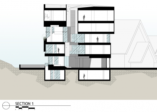
Strategy 3 : Fenestration
Abstraction of light filtering through the gaps between the leaves of the Boddhi tree are necessarily mapped onto the facade to create an organic random pattern of triangular windows. While seemingly random, the position and size of windows are actually tabulated in relation to the degree for natural lighting as required to by the interior space. The constant changing and dramatic of play of light and shadow through these windows can be best experienced in the Prayer Halls , reminding oneself that change and impermanence of life is the only constant.


Wat Ananda Metyarama Thai Buddhist Temple / Czarl Architects originally appeared on ArchDaily, the most visited architecture website on 15 Sep 2014.
send to Twitter | Share on Facebook | What do you think about this?
Beer labels match brewed contents to Pantone color
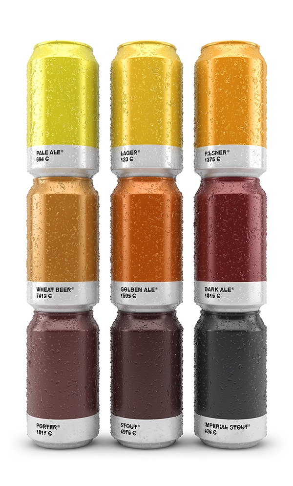
Spanish creative agency Txaber created a series of beer packaging labels in which each brew type is presented with a corresponding Pantone color. Read the rest
Constitución 8 / Proyecto Cafeína

Architects: Proyecto Cafeína
Location: Puebla, Puebla, Mexico
Project Area: 1159.0 m2
Project Year: 2014
Photographs: Patrick López Jaimes, Leonardo Neve Sánchez
Collaborators: Leonardo Neve, Diego Vilatela, Jesús Quintana, Olivia Gil, Carolina Ojeda, Ángel Valerio, Andrés Miranda

From the architect. Constitución 8 is a residential apartment building in the city of Puebla, Mexico, located in an area of high growth. It emerges as a real estate development for sale under the premise of making every single apartment unique. The project idea repels the typical plan from its conception under the principle of maximum adaptability, generating 10 different and expressive apartments.

The creation of individual spaces is achieved through the offset in both plan and section. The volumes of the apartments move freely in and out, up and down. The horizontal offsets generate wider spaces in the interiors of the apartments while at the upper level they generate terraces and balconies. The vertical offsets generate double heights in some areas and level changes in others. Making it a characteristic and dynamic project.

Another guiding idea for the project is to integrate it into the context by finding lighting and ventilation in all spaces, integrating interesting views of the city and the surrounding nature. Different areas of leisure and conviviality were generated. A common garden on the ground floor and a panoramic rooftop terrace, achieving to dominate the neighboring landscape.

The building keeps an industrial aesthetic inspired by the design trend of the Loft, achieving open spaces that respond to the contemporary way of living. Exposed materials such as glass, block and partitions were selected for warmth as well as low maintenance cost.
For the interior of the apartments, we designed individually all elements of carpentry (closets and kitchens), lighting (lights and exposed pipes) and fittings (handles and keys). Thus achieving an atmosphere of exclusivity, personalized and distinct.

Constitución 8 becomes a building with a bold and sophisticated design, where elements with a dominant character achieve pleasant spaces.


Constitución 8 / Proyecto Cafeína originally appeared on ArchDaily, the most visited architecture website on 12 Sep 2014.
send to Twitter | Share on Facebook | What do you think about this?
Bagrecha Residence / Cadence
Architects: Cadence
Location: Bengaluru, Karnataka, India
Architect In Charge: Smaran Mallesh, Narendra Pirgal, Vikram Rajashekar
Project Architects: Smitha Lukose, Komal Bhulani, Sangeetha Patrick, Aishani Nath
Area: 2200.0 ft2
Year: 2013
Photographs: Anand Jaju

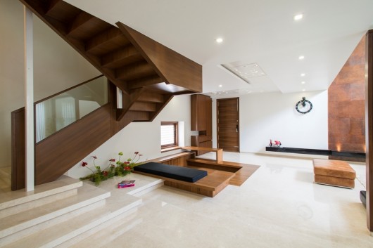
From the architect. Placed in a residential context, the site is located at a corner and is abutted by roads on two sides. The context didn’t allow for too much interaction, hence the design required us to create a dynamic interaction between the spaces within the house. Transitional areas between the public and private spaces help separate functions and enables intermingling of spatial volumes.

An introverted plan enabled us to have minimalist surfaces on the exterior. As per the client’s requirements, all private spaces were to be on one floor. Public spaces were at the first floor, with services and a car park on the ground level. Owing to the constraints of the small size of the site, it was crucial to maximise spaces allocated to various functions. This was achieved by playing with volumes. A double height living room gave a sense of expanse and it provided a visual connect from the second level. In order to break the monotony of the built versus un-built, a courtyard was introduced on the first level. To compliment the double height volumes on the inside, the courtyard was also made double height and accessible at the second level, thereby internalising it and it acts as an extension of the private spaces. With the introduction of the double height courtyard, the facade appears hollowed out and fitted with a play of planes and materials.

The next challenge was to add functional spaces to the terrace level without adding to the height of the building. A truss roof, which sloped upwards, gives the perception that the roof is diminishing. The terrace has a deck which interacts with the external landscape and acts as a public space for the residents. Use of complimenting materials and surface finishes from the ground level to the terrace; add to the design of the house. Rough concrete finishes contrast with smooth plastered surfaces, wooden panelling in contrast to dressed stone tiles helps balance out the raw minimalist feel of the house.




Bagrecha Residence / Cadence originally appeared on ArchDaily, the most visited architecture website on 10 Sep 2014.
send to Twitter | Share on Facebook | What do you think about this?
Skow Residence / Colorado Building Workshop + DesignBuildBLUFF
Julianamarquesadoro esse telhado
Architects: Colorado Building Workshop, DesignBuildBLUFF
Location: Navajo Mountain, Navajo Mountain, UT 86044, USA
Faculty Team: Rick Sommerfeld, Director Colorado Building Workshop, Hank Louis, Director DesignBuildBLUFF, Andrew Foster, Craig Harren
Student Team: Ellen Adams, Brett Blackmon, Lura Blumfield, Jay Burkhalter, Glen Camuso, Jacob Ebling, William Koning, William Murray, Rebecca Sockwell, JD Signom
Structural Engineer: Christopher O’Hara Studio NYL
Area: 882.0 ft2
Year: 2013
Photographs: Jesse Kuroiwa

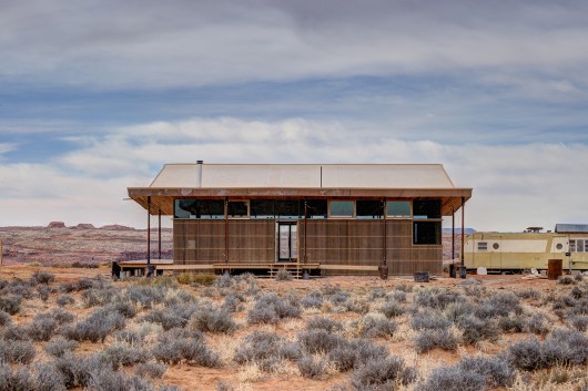
From the architect. Having received a typical Navajo “home build kit”, the clients, Harold and Helena Skow, had already completed a CMU foundation to accept a traditional rectangular gable-trussed home. Unable to complete the building the Skows turned to students from University of Colorado Denver and DesignBuidlBLUFF. The students decided to utilize the existing foundation and virtually all of the build kit materials stock piled on site in their design.

While walking the site with the clients on their first visit some students took note that Harold wore a large brimmed hat which shielded the harsh sun from his face and neck. When asked about the protective garment Harold commented that everyone should have a sombrero in the desert. Inspired by his comment and resisting the idea of a traditional gable roof house, the team chose to turn the trusses upside down and create a sombrero for Skow’s home.

Programmatically, the 800 sf, two-bedroom home is separated into two volumes. The private volume, containing the bedrooms, is wrapped in highly insulative straw bale construction and is located to the north, providing a sense of comfort surrounded by natural earthen plaster and security from the desert elements. The public volume containing the living room and kitchen/dining room opens up to the southwest, providing spectacular views and a connection to the landscape while allowing direct solar gain, in the winter, through two walls of orientation-specific solar glazing. A large deck wraps the western and southern sides of the home and brings the ‘livable’ space outdoors for much of the year, while an eastern entry porch provides shaded outdoor space to gather during summer afternoon hours.

About the Design Build Program
Since 2010 the University of Colorado Denver has partnered with DesignBuildBLUFF at the University of Utah to design a home for a family living on the Navajo Reservation. Master of Architecture students spend the spring and summer semesters living in Denver designing the home and working on construction drawings. They make frequent visits to Navajo Nation meeting the client, surveying the land and presenting their ideas. After the design is finished students spend the fall semester living in Bluff, UT where they construct the home. Faculty from the University of Colorado Denver and the University of Utah help throughout the year-long program.


Skow Residence / Colorado Building Workshop + DesignBuildBLUFF originally appeared on ArchDaily, the most visited architecture website on 01 Sep 2014.
send to Twitter | Share on Facebook | What do you think about this?
Manul – the Cat that Time Forgot
 Although the Manul is only the size of the domestic cat, reaching about 26 inches in length its appearance makes it appear somewhat larger. It is stocky and has very lengthy, thick fur, which gives it, perhaps to human eyes, an unintentional appearance of feline rotundity. Yet although it appears stout and somewhat ungainly it has a natural elegance and poise – exactly what you would expect from the genus Felis in other words. Plus it can certainly look after itself in a fight!
The main reason for its survival throughout the ages has been its isolation. In the wild it lives on the Asian steppes at substantial heights – up to 13,000 feet. Based in India, Pakistan, western China and Mongolia as well as Afghanistan and Turkemistan, it has even been discovered recently in the wilds of the Sayan region of Siberia. In these places it prefers rocky areas, semidesert and barren hillsides. In other words places where we are less likely to live – but even having said that you will no doubt be able to hazard a guess which species is the Manul’s greatest enemy.
Take a close look at the eyes of the Manul. Do you see a difference between it and the domestic cat? That’s right, the pupils of the Manul are round, not slit-like. Proportionally too, the legs are smaller than cats we know and they can’t run anywhere near as quickly. As for the ears, well, when you actually can catch sight of them they are very low and much further apart than you would see in a domestic cat.
 It also has a much shorter face than other cats, which makes its face look flattened. Some people, when they see their first Manus mistakenly believe that it is a monkey because of its facial appearance and bulky looking frame. It is easier to see why, from some angles.
 The Manus has not been studied a great deal in the wild, where it is classified as near threatened. This is because it is distributed very patchily throughout its territory, not to mention the fact it is still hunted despite protection orders made by the various governments who create human law in its range. Before it was legally protected tens of thousands of Manuls were hunted and killed each year, mostly for their fur.
It is thought that the cat hunts mostly at dawn and dusk where it will feed on small rodents and birds. Ambush and stalking are their favorite methods of conducting a hunt and although they tend to shelter in abandoned burrows in the day they have been seen basking in the sun. In other words, behaviorally they are much like the domesticated moggy that we know and love.
The Manul is a solitary creature and individuals do not tend to meet purposefully when it is outside the breeding season and will avoid the company of others of its kind where possible. When it is threatened it raises and quivers the upper lip, Elvis like, revealing a large canine tooth.
When breeding does happen the male has to get in quickly as oestrus usually only lasts just under two days. It usually births up to six kittens, very rarely a single one, and it is believed that the size of its litters reflect the high rate of mortality the infant cats can expect. Yet they are expected to be able to hunt at sixteen weeks and are very much on their own and independent by six months. Although their life expectancy in the wild is unknown in captivity they have lived to over eleven years.
Don’t rush to your local pet store, however. The Manul does not domesticate and even if it did they are incredibly hard to breed in captivity with many kittens dying. This is thought to be because in the wild, due to its isolation, the cat’s immune system did not have a need to develop and so when they come in contact with us and other species, this under-developed immune system lets them down.
Yet as a living, breathing glimpse in to twelve million years of feline history these amazing animals are irreplaceable. Unique is a word which, in this day and age, is mightily overused. Yet these cats are quite simply just that – unique.
Sit On the Edge of Your Seat with the 60 Red Chair
The 60 Red Chair is giving the phrase “sitting on the edge of your seat” a whole new meaning. Designed by XYZ Integrated Architecture, the sleek red chair is at a perpetual slant, creating a sense of tension for the user. Each chair is handmade from steel, and each one is unique.
Photos by Nakani Mamasaxlisi.
A 1950′s Post & Beam Home Gets a Modern Addition
The Sycamore House is a project from Aaron Neubert Architects that restores a 1950′s post & beam house in Los Angeles while also incorporating a 1,500-square-foot addition. Careful attention was paid to the design of the new addition as the lot’s peninsular shape and sloping terrain played a huge factor into how it could be laid out. Sycamore trees on the property meant a lot to the homeowner so keeping them around was mandatory, making things difficult as one was planted in the primary location for the addition.
The addition was positioned perpendicularly between the exiting residence and the street setback. The interior living spaces are still kept relatively private, while the home opens up towards the hillside view.
They used multiple cantilevers within the addition that extend out over the hillside giving them the square footage they desired.
One of the beloved sycamore trees is actually incorporated into the house, piercing through the kitchen, family room, master suite, and the roof deck.
Helping blend the old with the new, the existing wood beams and the new steel structure are all painted red and all of the fixed windows are black.
Completely in love with the jagged black and white lines that start in the kitchen and move through the living room.
The large windows help bring the outdoors in and make you feel like you’re perched within the trees.
Photos by Brian Thomas Jones.
FOO / APOLLO Architects & Associates

Architects: APOLLO Architects & Associates
Location: Yokohama, Kanagawa Prefecture, Japan
Architect In Charge: Satoshi Kurosaki
Area: 190.0 sqm
Year: 2007
Photographs: Masao Nishikawa
Structure Engineer: Masaki Structure (Kenta Masaki)
Facility Engineer: Shimada Architects (Zenei Shimada)
Construction: JP home

From the architect. The site is located in a residential area on a plateau in Yokohama-city. The characteristic façade is designed with exposed concrete and wooden lattices of Serangan batu wood, taking the horizon into consideration. It is a classic of modern design that is conscious of harmony with the surrounding greens and peaceful townscape. This two-family house successfully creates a dignity and formality that are unique to the residence.

The husband who likes playing golf and the wife who loves gardening desired a garden, which can be seen from the central living room on the first floor, as the center of the house. They also desired a continuation between East and West, and assurance of privacy. The solid teak wood on the ceilings and floors, and the hard expression of the high-strength concrete create a contrast. They provide a sense of unity to the space, along with the natural walnut house fixtures, oak table and chairs.

The space for family of the son, who likes surfing, is placed on the second floor that is connected through the open ceiling, in order to facilitate spontaneous communication between the families. In contrast to the closed exterior appearance, the interior is all airy. Even the dining kitchen at the back of the first floor is well lit by characteristic lights from the high side window in the open ceiling.

The roof balcony is accessible from the second floor bedroom and the children’s room through the opening. The roof terrace with deck-flooring behind the outdoor stairs is a common oasis for the two families, where the surrounding town can be viewed. By tactfully using the wooden lattices and plantings, a perfect sense of distance and privacy are created between the building and the street, while enabling the enjoyment of the appropriate openness. It functions as a well-balanced urban house.


FOO / APOLLO Architects & Associates originally appeared on ArchDaily, the most visited architecture website on 10 Aug 2014.
send to Twitter | Share on Facebook | What do you think about this?
