Shared posts

12 Aug 04:53

LUZ shirokane / Kawabe Naoya Architects Design Office

by Fabian Cifuentes

Architects: Kawabe Naoya Architects Design Office
Location: Shirokane, Minato, Tokyo, Japan
Area: 500.0 sqm
Year: 2011
Photographs: Akinobu Kawabe

From the architect. Place in common space It is a housing complex in five story and 13 households that builts like overcrowding the small factory and the house in surroundings. In the situation in which the site was almost enclosed in the building, it was thought that it had not only relies on the surrounding for the dwelling environment but also it made it . A common space plays the role here. The lighting, ventilation ,and view, and the element requested outside is usually taken in construction, and shared with each unit.

A common part is related around according to the number of stories and the direction the accumulated unit that continues from ground to the roof through the stairs and the open ceiling, and choosing the omission on the roof of the road and the near unoccupied land and the neighboring house. The wind comes off through an upper and lower floor, and the light of the sun enters from various directions through a day . Externals are composed of an window that doesn’t distinguish an unit and a common space . A common space in each floor is a place like the interior attached to each unit by a little expanding or more width than a usual passage ,and as a similar scale to the unit.

As for a common space, it thought even about the detail as the same interior as the unit so that the other side of the room window might make depth with a continuous feeling as another whereabouts . The aluminium sash of ready-made goods turns a wooden frame to all sides in flat as the wall for how from the reason for the weather flashing like the outside to see it, and erases the detail as the aluminium sash. Moreover, because a usual intercom gives the impression of the place like the hall, the plate of the same specification as the indoor switch is used .

The table, the bench, and the shelf designed for exclusive use according to the characteristic and the usage of the place are put on the interior. Time is piled by the book and planting’s being put by the living person, and being used in daily life. It wishes a common space not only the tenant but also to tie to the person to person, and the environment to person exceeding the role even if the ambient surrounding changes by rebuilding.

LUZ shirokane / Kawabe Naoya Architects Design Office © Akinobu Kawabe LUZ shirokane / Kawabe Naoya Architects Design Office © Akinobu Kawabe LUZ shirokane / Kawabe Naoya Architects Design Office © Akinobu Kawabe LUZ shirokane / Kawabe Naoya Architects Design Office © Akinobu Kawabe LUZ shirokane / Kawabe Naoya Architects Design Office © Akinobu Kawabe LUZ shirokane / Kawabe Naoya Architects Design Office © Akinobu Kawabe LUZ shirokane / Kawabe Naoya Architects Design Office © Akinobu Kawabe LUZ shirokane / Kawabe Naoya Architects Design Office © Akinobu Kawabe LUZ shirokane / Kawabe Naoya Architects Design Office © Akinobu Kawabe LUZ shirokane / Kawabe Naoya Architects Design Office © Akinobu Kawabe LUZ shirokane / Kawabe Naoya Architects Design Office © Akinobu Kawabe LUZ shirokane / Kawabe Naoya Architects Design Office © Akinobu Kawabe LUZ shirokane / Kawabe Naoya Architects Design Office © Akinobu Kawabe LUZ shirokane / Kawabe Naoya Architects Design Office © Akinobu Kawabe LUZ shirokane / Kawabe Naoya Architects Design Office © Akinobu Kawabe LUZ shirokane / Kawabe Naoya Architects Design Office © Akinobu Kawabe LUZ shirokane / Kawabe Naoya Architects Design Office First Floor Plan LUZ shirokane / Kawabe Naoya Architects Design Office Second Floor Plan LUZ shirokane / Kawabe Naoya Architects Design Office Third Floor Plan LUZ shirokane / Kawabe Naoya Architects Design Office Fourth Floor Plan LUZ shirokane / Kawabe Naoya Architects Design Office Fifth Floor Plan LUZ shirokane / Kawabe Naoya Architects Design Office Section
10 Aug 05:17

Photo

Julianamarques

um mantra


06 Aug 04:41

Breathtaking Interpretation of the Traditional Californian Ranch House and Farm Tower

by Ada Teicu

Low Rise House by Spiegel Aihara Workshop Breathtaking Interpretation of the Traditional Californian Ranch House and Farm Tower

This astounding home located on a half acre lot in Silicon Valley was imagined as a re-interpretation of traditional shapes corrupted by the need to live a comfortable, low maintenance lifestyle in privacy and alongside family and friends. Designed by architects Spiegel Aihara Workshop, the home known as Low/Rise House uses the principles of traditional Californian ranch house and farm tower to create a high life through modern design. Natural ventilation and solar energy use are two of the home’s eco-traits – they mirror the use of volumes, textures and transparency for comfort and connection.

Low Rise House by Spiegel Aihara Workshop 1 Breathtaking Interpretation of the Traditional Californian Ranch House and Farm Tower

The traditional Californian ranch house and farm tower become a contemporary shelter and socialization spot immersed into the site via environmentally-friendly choices. Photographed by Bruce Damonte, the 4.500 square feet in Menlo Park, California, is home for two professors with grown children who needed their home to “accommodate varying use patterns, creating an intimate environment for their own use as a couple, yet allowing for a spacious and integrated configuration for ten or more family members, and several hundred party guests. This complex programmatic request inspires the specific massing and siting of the building.”

Low Rise House by Spiegel Aihara Workshop 2 Breathtaking Interpretation of the Traditional Californian Ranch House and Farm Tower

With a poetic ambiance radiating through, the Low/Rise House boasts a first floor shaped by “two long and narrow structures that intersect in an open kitchen, providing distinct programmatic areas and settling into the tree-lined landscape, allowing yards to surround and permeate each room. Subtle rotations of the geometry assist in way-finding, as well as identification of the more public and more private functions. The private master suite opens into a fern garden in the eastern corner of the site, while large sliding glass doors suspend the living room within the landscape for family gatherings or larger events. A compact and vertical guest tower is sited at the western corner of the lot amongst tall evergreens, allowing for a more private guest experience, more compact floor plan, and the ability to effectively shut off (socially and energy-wise) the guest spaces zone by zone during typical daily use. Atop the 30-foot tower, a roof deck emerges through the trees, providing a unique vantage point of the structure below and the surrounding townscape.”

Brilliant dream home integrating a new type of suburban living, merging urban and rural, don’t you think so?

Low Rise House by Spiegel Aihara Workshop 3 Breathtaking Interpretation of the Traditional Californian Ranch House and Farm Tower Low Rise House by Spiegel Aihara Workshop 4 Breathtaking Interpretation of the Traditional Californian Ranch House and Farm Tower Low Rise House by Spiegel Aihara Workshop 5 Breathtaking Interpretation of the Traditional Californian Ranch House and Farm Tower Low Rise House by Spiegel Aihara Workshop 6 Breathtaking Interpretation of the Traditional Californian Ranch House and Farm Tower Low Rise House by Spiegel Aihara Workshop 7 Breathtaking Interpretation of the Traditional Californian Ranch House and Farm Tower Low Rise House by Spiegel Aihara Workshop 8 Breathtaking Interpretation of the Traditional Californian Ranch House and Farm Tower Low Rise House by Spiegel Aihara Workshop 9 Breathtaking Interpretation of the Traditional Californian Ranch House and Farm Tower Low Rise House by Spiegel Aihara Workshop 10 Breathtaking Interpretation of the Traditional Californian Ranch House and Farm Tower Low Rise House by Spiegel Aihara Workshop 11 Breathtaking Interpretation of the Traditional Californian Ranch House and Farm Tower Low Rise House by Spiegel Aihara Workshop 12 Breathtaking Interpretation of the Traditional Californian Ranch House and Farm Tower Low Rise House by Spiegel Aihara Workshop 13 Breathtaking Interpretation of the Traditional Californian Ranch House and Farm Tower Low Rise House by Spiegel Aihara Workshop 14 Breathtaking Interpretation of the Traditional Californian Ranch House and Farm Tower Low Rise House by Spiegel Aihara Workshop 15 Breathtaking Interpretation of the Traditional Californian Ranch House and Farm Tower Low Rise House by Spiegel Aihara Workshop 16 Breathtaking Interpretation of the Traditional Californian Ranch House and Farm Tower Low Rise House by Spiegel Aihara Workshop 17 Breathtaking Interpretation of the Traditional Californian Ranch House and Farm Tower Low Rise House by Spiegel Aihara Workshop 18 Breathtaking Interpretation of the Traditional Californian Ranch House and Farm Tower Low Rise House by Spiegel Aihara Workshop 19 Breathtaking Interpretation of the Traditional Californian Ranch House and Farm Tower Low Rise House by Spiegel Aihara Workshop 20 Breathtaking Interpretation of the Traditional Californian Ranch House and Farm Tower Low Rise House by Spiegel Aihara Workshop 21 Breathtaking Interpretation of the Traditional Californian Ranch House and Farm Tower Low Rise House by Spiegel Aihara Workshop 22 Breathtaking Interpretation of the Traditional Californian Ranch House and Farm Tower Low Rise House by Spiegel Aihara Workshop 23 Breathtaking Interpretation of the Traditional Californian Ranch House and Farm Tower Low Rise House by Spiegel Aihara Workshop 24 Breathtaking Interpretation of the Traditional Californian Ranch House and Farm Tower

The post Breathtaking Interpretation of the Traditional Californian Ranch House and Farm Tower appeared first on Freshome.com.

05 Aug 22:38

Woman Uses Nike Run-Tracking App To Run In Penises

run-drawing-1.jpg Claire Wyckoff (pretty please be pronounced wackoff) uses the Nike+ run-tracking app to run in penis shapes, which she then posts to her Tumblr 'Running Drawing'. She doesn't JUST do penises though, just a LOT of penises (she's also done a unicorn, middle finger, Slimer from Ghostbusters, and a space invader). Clearly, Claire knows how to make cardio fun. Because if there was a giant penis waiting at the finish line every time I went for a run I'd be a lot more inclined to exercise. Wait, that came out wrong. I meant a giant vagina. No, that's not quite right either. I'll settle for a hotdog and a beer. Keep going for more of Claire's exercise art.
05 Aug 05:37

Dasgupta Saucier Residence by The Raleigh Architecture Co.

by Erin
Julianamarques

olha Lori um revestimento tipo enferrujado

The Raleigh Architecture Co. have recently completed the Dasgupta Saucier Residence in
North Carolina.

ds_040814_01

ds_040814_03 ds_040814_04 ds_040814_05 ds_040814_06 ds_040814_07 ds_040814_08 ds_040814_09

Project description

The Dasgupta-Saucier residence is situated on a narrow downtown infill lot in a Raleigh, NC. Facing a busy thoroughfare, the house uses natural topography and carefully placed openings to alleviate sound and establish privacy. The residence pays homage to its southern roots by creating deep recessed front and rear porches with a cantilevered upper story. An open central volume provides abundant natural daylight to the lower story while a steel staircase twists upwards, unifying all of the spaces of the house together. Warm cypress siding roots the residence into the landscape and weathered steel panels protect the private upper story.

A second floor level of private bedrooms is stacked on an open lower level of living areas. The second floor “bar” is split, pushing the children’s bedrooms north and a master suite south. This simple shift creates a covered front and rear porch while simultaneously providing a double height kitchen space in the center for a new family passionate about the culture of cooking. A wrapping steel staircase leads upwards to a working office for each of the clients, while a private terrace on the third floor links the house to its landscape and provides views to downtown. The residence and a neighboring home share a landscaped courtyard that is shielded from the busy street, providing a space for both families to gather.

Roof: Standing seam galvanized metal & TPO roofing. Siding: Cor-ten steel panels w/ 100% recycled content, clear finish cypress (locally sourced). Systems: Geothermal & mini-split HVAC system, instant hot water heater w/ recirculation loop. Windows: Aluminum clad wood windows.

ds_040814_01 ds_040814_02 ds_040814_03 ds_040814_04 ds_040814_05 ds_040814_06 ds_040814_07 ds_040814_08 ds_040814_09 ds_040814_10 ds_040814_11 ds_040814_12 ds_040814_13 ds_040814_14 ds_040814_15

Architect: The Raleigh Architecture Co.
General Contractor: The Raleigh Construction Co.
Photography by Raymond Goodman

03 Aug 05:35

Photo


03 Aug 00:40

AD Classics: Thorncrown Chapel / E Fay Jones

by Andrew Galloway

Hidden in the middle of the forests surrounding Arkansas’ Ozark Mountains, Thorncrown Chapel rests amongst the oaks, pines and maples. The humble chapel, designed by Euine Fay Jones, is less than 35 years old – yet it’s on the U.S. Historic register, has been named one of the AIA’s top ten buildings of the 20th century, and has even been called the best American building since 1980.

In the late 1970’s retired schoolteacher Jim Reed purchased the property where Thorncrown chapel would be located – originally as a space for his retirement cabin. But, after seeing tourists stop along the highway to view the beauty of the area, his vision changed. He imagined a non-denominational chapel, a spiritual place — one that Jones would later describe as a “place to think your best thoughts.” Perhaps its simplicity is what draws over 2000 daily visitors –it is architecture that everyone, not just architects, can understand and appreciate.

The remarkable glass and wooden structure was dreamt up by E Fay Jones while he was both practicing in Little Rock and working as Dean at the University of Arkansas School of Architecture in 1978.

With over 425 glass windows and a repeated column and truss structure, the vertical chapel is like a “forest within a forest,” reaching 48 feet high, 60 feet long and a mere 24 feet wide. A central skylight allows generous portions of light to spill through onto those below. Custom lanterns adorn each column and at night reflect off the glass – as if they were lit somewhere off in the forest.

For Jones, the process of construction was just as important as the final object. His practice was unique in that he employed not only young architects, but craftsmen, such as stonemasons and carpenters, whose influence is evident in the Chapel. Every truss was made of local pine – “no larger than what two men could carry through the woods.” 2×4’s, 2×6’s and 2×12’s were assembled on site and subsequently erected, leaving minimal site impact. In fact, the only visible steel in the project is the diamond-shaped patterns centered in each truss.

Born in the small town of Pine Bluff, Arkansas in 1921, Jones never had the desire to become as famous as his close friend and influence Frank Lloyd Wright. Indeed, perhaps the words at the entrance of Thorncrown Chapel encapsulate E Fay Jones and his humble architecture best: Please Come In And Sit Awhile, Just As You Are.

Sources

“AIArchitect, December 19, 2005 – Thorncrown Chapel Wins AIA 2006 Twenty-five Year Award.” AIA.org. Web. 29 Jul. 2014.

“The Architecture of Thorncrown Chapel.” Thorncrown Chapel. Web. 01 Aug. 2014.

“Fay Jones Collection, University of Arkansas Libraries.” Fay Jones Collection, University of Arkansas Libraries. Web. 29 Jul. 2014.

“Special Collections.” Manuscript Collection 1373 | University of Arkansas Libraries. Web. 29 Jul. 2014.

Architects: E. Fay Jones
Location: 12968 U.S. 62
Architect In Charge: E. Fay Jones
Area: 1440.0 ft2
Year: 1980
Photographs: Flickr User Anirban Ray, Flickr User Nathan Hughes Hamilton, Flickr User Steve Snodgrass, Flickr User nwlynch, Flickr User Brenda Fike, Flickr User Brad Holt, Flickr User Clinton Steeds, Flickr User Josh Bozarth

AD Classics: Thorncrown Chapel / E Fay Jones © Flickr User Anirban Ray AD Classics: Thorncrown Chapel / E Fay Jones © Flickr User Nathan Hughes Hamilton AD Classics: Thorncrown Chapel / E Fay Jones © Flickr User Steve Snodgrass AD Classics: Thorncrown Chapel / E Fay Jones © Flickr User nwlynch AD Classics: Thorncrown Chapel / E Fay Jones © Flickr User Brenda Fike AD Classics: Thorncrown Chapel / E Fay Jones © Flickr User Brad Holt AD Classics: Thorncrown Chapel / E Fay Jones © Flickr User Clinton Steeds AD Classics: Thorncrown Chapel / E Fay Jones © Flickr User Josh Bozarth AD Classics: Thorncrown Chapel / E Fay Jones © Flickr User Josh Bozarth
02 Aug 18:32

A Modern Beach House at the Jersey Shore

by Caroline Williamson

A Modern Beach House at the Jersey Shore

Located on the Jersey Shore in Strathmere, New Jersey, this beach house, dubbed Love Shack, brings forth a mixture of casual beach-y and minimal modern resulting in the perfect summer getaway for a family.

A Modern Beach House at the Jersey Shore in main architecture Category

The house, designed by Ambit Architecture, is situated on a barrier island, affording views of both the ocean and the bay from the top floor.

A Modern Beach House at the Jersey Shore in main architecture Category

The scaled back interior does nothing to obstruct the floor-to-ceiling views.

A Modern Beach House at the Jersey Shore in main architecture Category

They flipped the layout from the typical one and put the living room, dining room, and kitchen on the top floor so the views can be utilized in the areas where the most time is spent.

A Modern Beach House at the Jersey Shore in main architecture Category

The kitchen area may be small but the design is incredible. I love the zig zagged wood panel that separates the kitchen. I also like how they built the kitchen around that window so plenty of light floods into the middle part of the house.

A Modern Beach House at the Jersey Shore in main architecture Category

On this side, you can sit back and enjoy a meal with that incredible view.

A Modern Beach House at the Jersey Shore in main architecture Category

On the beach side, there’s another seating area to kick back in.

A Modern Beach House at the Jersey Shore in main architecture Category

There are four bedrooms and two bathrooms that round out the design.

A Modern Beach House at the Jersey Shore in main architecture Category

The house is clad in a white cedar and painted cement board panels that both age beautifully and look natural.

A Modern Beach House at the Jersey Shore in main architecture Category

A Modern Beach House at the Jersey Shore in main architecture Category

A Modern Beach House at the Jersey Shore in main architecture Category

A Modern Beach House at the Jersey Shore in main architecture Category


31 Jul 04:38

mimimi da copa

by Patricia C.
Julianamarques

acho que foi o único texto sobre a copa que li, mas achei bem legal.

Demorei para postar, pois precisava antes escrever sobre a copa e tudo que ela movimentou em mim.

Gosto de acreditar que na teoria dos universos paralelos, em algum deles, o Brasil conseguiu ganhar em casa. Serei bem sincera. O fator humilhação, para mim, é o de menos. Foi sim a maior humilhação em copas, mas esse não é o meu ponto. O ponto é o fantasma precisando ser exorcizado desde 50. Há gente que não quer outra copa nunca mais no Brasil. Eu quero 100. Até fazer esse fantasma subir e ir embora das nossas vidas. Galvão disse no tetra em 94 que o Brasil estava exorcizando o último fantasma que restava, a cobrança dos pênaltis. Eu discordo. O último fantasma é ganhar em casa. E mais uma vez não conseguimos. Há quem procure culpados, está cheio de textos por aí, não defendo e não condeno nenhum dos nomes citados. Minha única defesa vai pro Barbosa, que merecia esse título mais do que qualquer um de nós. Gosto de pensar que, em outro universo, ele foi feliz conquistando o primeiro campeonato em 50, jamais tendo escutado a palavra Maracanazo e, quiçá, com outro termo inventado El Maracanón donde solamente gana cabrón de Brasil.

As pessoas não fazem ideia, né? Do que era aquele momento para o Brasil. Li resenhas aos montes dizendo como o 7x1 foi pior. E apenas o meu minuto de silêncio para quem, além de desconhecer a história do futebol, desconhece a história do Brasil. A primeira efervescência do orgulho negro está intimamente ligada a dois fatores: o candomblé e o samba. O percurso foi longo até conseguirem o respeito da elite branca, até, por exemplo, Heitor Villa-Lobos chamar o quarteto de ouro - Cartola, Donga, João da Baiana e Pixinguinha - para cantar para outro maestro famoso que agora não sei o nome. Era não só a elite branca olhando para o negro pela primeira vez sem desdém, como também era para o negro uma afirmação da sua importância. O Brasil e principalmente o Rio de Janeiro borbulhavam em 50 numa expectativa de ser a nova França/Paris. A confiança naquele time era absurda. E veio o revés, 2 x 1 Uruguai e o nosso bode expiatório foi o goleiro Barbosa. Uma horrível teoria antiga voltou com toda força, a de que estávamos fadados ao fracasso por causa da miscigenação. Barbosa e Bigode, o responsável pela marcação do Varela, eram negros. De onze pessoas em campo, caiu sobre eles a responsabilidade da vergonha nacional.

Nelson Rodrigues, 8 anos mais tarde, escreveu a crônica "Complexo de vira latas". Foi escrita às vésperas do início da copa na Suécia e falava sobre a falta de motivação das pessoas com frases naipe "Brasil nem se classifica" etc. Era um sentimento de pessimismo em relação à seleção que viria se consagrar campeã pela primeira vez. E o Nelson vai discorrendo sobre como esse é um problema iniciado na derrota de 50. Como as pessoas acreditavam muito naquele título, não poderiam sofrer novamente, então o pessimismo acabava sendo uma válvula de escape. Não passava na cabeça do Nelson que ali ele tinha definido o estereótipo do brasileiro. "Somos uma merda, o estrangeiro é sempre melhor". Esse sentimento sintetizado no tumblr só no brazil. Iguais essas comparações que a gente vê hoje no facebook, Ronaldo Nazario (calado é um poeta - parte II) dizendo que a Alemanha tem 100 Nobel e o Brasil nenhum e essa é a verdadeira goleada. É um acinte, né? Esquece da nossa colonização durante 300 anos. Esquece todos os pormenores. É a mesma coisa se fizermos uma comparação entre ganhadores homens e mulheres ou ganhadores brancos e negros e daí tirarmos equivocadamente que a mulher e o negro são inferiores. Falta olhar para o fundo da nossa história. A maioria das pessoas só olha a nossa superfície. A copa de 50 foi muito pior porque definiu a identidade nacional. O vira lata complexado. Ninguém ergueu a cabeça depois dos 7x1, porque ninguém recuperou o orgulho depois de 50, nem com o título em 58, nem com as outras copas, nem sendo o maior campeão. Veja bem. Ainda estamos no topo e nos comportamos como ralé.

Aqui entra outra reflexão. Quando o futebol sai da elite e passa a ser de massa, ele traz a crítica imbecil da alienação do povo. O futebol passa a ser o principal responsável de todas as nossas mazelas. Chamam o povo de alienado, de massa de manobra. Tudo isso por causa do futebol (e do carnaval também, mas isso é papo pra outro post). Como se o futebol tivesse todo esse imenso poder, como se a alienação não fosse fruto da falta de incentivo ao pensamento plural. E quem trata a população dessa forma não percebe (ou será que percebe?) o quanto esse discurso é preconceituoso. Tachar o povo de ignorante e sem condições de pensar tem outro nome senão o preconceito? Quem desmerece o esporte, lhe tira a visão de cultura. Tira o mérito, não consegue enxergar.

Por isso as coisas para mim são mais amplas. Não me atenho aos vilões ou heróis, a esquemas táticos ou confederações corruptas. Vai me interessar sempre o sentimento, a marcação da identidade nacional. Somos o país com mais títulos e ainda sim cornetamos a nossa seleção há anos. Faz parte da nossa identidade. Nunca temos o melhor time, sempre temos perna de pau. Cornetamos não apenas na derrota, mas antes dela e até mesmo na vitória. A tristeza que fica nessa copa não é a humilhação dos 7x1, mas a oportunidade perdida para vingarmos Barbosa. A oportunidade perdida para curarmos essa ferida que nos foi herdada. A ferida de quem não conseguiu ganhar em casa.
21 Jul 06:29

Terrace-House in El Limón / Villar Watty Arquitectos

by AD Editorial Team

Architects: Villar Watty Arquitectos
Location: Jalisco, Mexico
Project Architects: Gerardo Villar Watty y Alberto Villar Watty
Design Team: Daniel Villanueva, Paola García
Project Area: 263 sqm
Project Year: 2012
Photographs: Diego Serratos

Structures: TADE diseño estructural
Construction: Enrique Sahagún

From the architect. The “El Limón” development is located in the Lake Chapala area, famous for having one of the best climates in the world, with mountain scenery and a close relationship with the lake.

In a plot of 962 m2 with a significant slope and a clear visual axis (mountain-lake), the terrace-house arises from the need for a weekend residence that will eventually become permanent for a retired couple who can entertain, and for which an outdoor space as a terrace was required.

The house is placed on the highest part of the land, where there is the best view of the lake, and it is designed on a single level, respecting the maximum allowable height in the area.

The distribution of the house arises from the idea of using service spaces to delimit living spaces and orient them towards the view of the lake, so that the house can be used as a large open space that integrates the terrace with the pool, living room, dining room and kitchen into a single room, all the while maintaining the privacy of the bedroom area.

The base and the bush-hammered oxidized concrete roof in combination with the wooden prisms, support the directionality of the space.

Casa -Terraza en El Limón / Villar Watty Arquitectos © Diego Serratos Casa -Terraza en El Limón / Villar Watty Arquitectos © Diego Serratos Casa -Terraza en El Limón / Villar Watty Arquitectos © Diego Serratos Casa -Terraza en El Limón / Villar Watty Arquitectos © Diego Serratos Casa -Terraza en El Limón / Villar Watty Arquitectos © Diego Serratos Casa -Terraza en El Limón / Villar Watty Arquitectos © Diego Serratos Casa -Terraza en El Limón / Villar Watty Arquitectos © Diego Serratos Casa -Terraza en El Limón / Villar Watty Arquitectos © Diego Serratos Casa -Terraza en El Limón / Villar Watty Arquitectos © Diego Serratos Casa -Terraza en El Limón / Villar Watty Arquitectos © Diego Serratos Casa -Terraza en El Limón / Villar Watty Arquitectos © Diego Serratos Casa -Terraza en El Limón / Villar Watty Arquitectos © Diego Serratos Casa -Terraza en El Limón / Villar Watty Arquitectos © Diego Serratos Casa -Terraza en El Limón / Villar Watty Arquitectos © Diego Serratos Casa -Terraza en El Limón / Villar Watty Arquitectos © Diego Serratos Casa -Terraza en El Limón / Villar Watty Arquitectos © Diego Serratos Casa -Terraza en El Limón / Villar Watty Arquitectos Plan Casa -Terraza en El Limón / Villar Watty Arquitectos Elevation Casa -Terraza en El Limón / Villar Watty Arquitectos Section Casa -Terraza en El Limón / Villar Watty Arquitectos Elevation Casa -Terraza en El Limón / Villar Watty Arquitectos Elevation Casa -Terraza en El Limón / Villar Watty Arquitectos Scheme
20 Jul 18:03

House of the Infinite

by Camille

L’architecte Alberto Campo Baeza vient de rénover cette ancienne usine de pêche à Cádiz pour en faire une incroyable résidence. La piscine placée sur le toit de la maison offre une vue imprenable sur l’océan. L’architecte a créé un contraste harmonieux avec l’architecture moderne et contemporaine face à la nature.

House of the Infinite by Alberto Campo Baeza 1 House of the Infinite by Alberto Campo Baeza 8 House of the Infinite by Alberto Campo Baeza 7 House of the Infinite by Alberto Campo Baeza 6 House of the Infinite by Alberto Campo Baeza 5 House of the Infinite by Alberto Campo Baeza 4 House of the Infinite by Alberto Campo Baeza 3 House of the Infinite by Alberto Campo Baeza 2
18 Jul 03:51

joaquin phoenix’s forehead


joaquin phoenix’s forehead

14 Jul 03:32

bye losers!


bye losers!

13 Jul 03:34

Chile Vacation Home Uses Angled Support Columns to Add to Aesthetics and Preserve the Views

by Evelyn M
Julianamarques

nossa que projeto lindo

angled-support-columns-create-vs-vacation-home-1-exterior.jpg

Rambla House is a weekend home located in Zapallar, Valparaiso Region, along the central coast of Chile about 175km from Santiago. The site is exposed to strong south winds and intense sun from the west and LAND Arquitectos designed Rambla House to be protected from the winds and sun while at the same time focusing on the panoramic ocean views and an indoor-outdoor lifestyle.

angled-support-columns-create-vs-vacation-home-2-site.jpg

The home is built over concrete beams that provide ventilation for the structure to prevent the coastal humidity to transfer into the interior zones.

angled-support-columns-create-vs-vacation-home-3-exterior.jpg

Pine wood volumes are built over top of the concrete beams and the Pine has all been treated with a white protective coating that also helps deflect heat from the intense summer sun.

angled-support-columns-create-vs-vacation-home-4-exterior.jpg

A concrete block wall protects the structure from the steep slope behind.

angled-support-columns-create-vs-vacation-home-5-wall.jpg

The concrete blocks have large central voids that allow light to pass through, creating a geometric shadow play in the process.

angled-support-columns-create-vs-vacation-home-6-wall.jpg

The wall is tied into the home at the roof level.

angled-support-columns-create-vs-vacation-home-7-pool.jpg

Steel V formation posts are used throughout Rambla House as the main structural detail.

angled-support-columns-create-vs-vacation-home-8-pool.jpg

The terrace stretches out towards the ocean and features a deck level pool as well as bench seating on its perimeter.

angled-support-columns-create-vs-vacation-home-9-trampoline.jpg

There is also an onsite trampoline next to the house as well as an ocean front public promenade below the house that leads to the city center.

angled-support-columns-create-vs-vacation-home-10-social.jpg

The social zone of Rambla House is within its own glass wrapped volume.

angled-support-columns-create-vs-vacation-home-11-social.jpg

The repeating element of the V supports creates a dynamic element within the neutral interior that is only rivaled by the ocean beyond.

angled-support-columns-create-vs-vacation-home-12-living.jpg

The living room furnishings have an outdoor aesthetic perfectly in tune with the amazing views through the walls of glazings.

angled-support-columns-create-vs-vacation-home-13-dining.jpg

the dining room also plays up the outdoor experience with its bench seating - and when the glazings are slid and stacked out of the way, it really is as though the social zone is outside.

angled-support-columns-create-vs-vacation-home-14-dining.jpg

The V supports on both the inside and the outside adds to the blurring of the two zones.

angled-support-columns-create-vs-vacation-home-15-bbq.jpg

While there is a small kitchen behind the dining room, the piece de resistance is the large outdoor BBQ area next to the social zone; it features its own ceiling void for easy venting of cooking smoke while flooding the space with natural light at the same time.

angled-support-columns-create-vs-vacation-home-16-bbq.jpg

When the glazings are slid and stacked, the BBQ area is just a few uninterrupted feet away from the dining room.

angled-support-columns-create-vs-vacation-home-17-bed.jpg

On the other side of the BBQ area is a 2nd volume that houses both the bedroom and the bathroom.

angled-support-columns-create-vs-vacation-home-18-plan.png

LAND Arquitectos
Photography by Sergio Pirrone

09 Jul 07:45

The Abyss Table by Christopher Duffy for Duffy London

by Caroline Williamson

The Abyss Table by Christopher Duffy for Duffy London

The visuals on The Abyss Table are more than enough to make your jaw drop, which is no surprise given Duffy London’s history for clever, unforgettable designs. This time, Christopher Duffy is taking you straight to the depths of the ocean with a dramatic coffee table that will never cease being a conversation piece.

The Abyss Table by Christopher Duffy for Duffy London in main home furnishings Category

Pairing layers of wood and glass, the table becomes a geological cross section of the ocean, showing various depths.

The Abyss Table by Christopher Duffy for Duffy London in main home furnishings Category

After a trip to the glass factory and seeing how thick glass darkened the more layers added, much like the way the sea does as the ocean floor becomes deeper, Duffy used this effect to show a piece of the ocean’s bed. The team spent a year experimenting with sculpted glass, Perspex, and wood to achieve the three-dimensional model of a geological map with the final result being a mesmerizing, abyss-like, sculptural table.

The Abyss Table by Christopher Duffy for Duffy London in main home furnishings Category

The Abyss Table is made by hand upon order and is limited to an edition of 25. Each piece is made from sustainable materials.

The Abyss Table by Christopher Duffy for Duffy London in main home furnishings Category

The Abyss Table by Christopher Duffy for Duffy London in main home furnishings Category

The Abyss Table by Christopher Duffy for Duffy London in main home furnishings Category

The Abyss Table by Christopher Duffy for Duffy London in main home furnishings Category

Photos by Duffy London.


26 Jun 23:06

O que é, afinal, fazer coisas “como uma menina”?

by Jacqueline Lafloufa

O mais recente vídeo da P&G em uma campanha para a marca de absorventes Always faz uma interessante reflexão sobre o que seria fazer coisas ‘como uma menina’.

Em uma audição, convidou garotos e garotas mais velhas a encenar situações que eram descritas assim: correr como uma menina, lutar como uma menina, jogar uma bola como uma menina.

Os resultados eram caricaturas de comportamentos, que quando interpretadas por meninos ficavam ainda mais estereotipadas.

Mas o legal mesmo é ver o que acontece depois, quando meninas mais novas são convidadas a interpretar as mesmas descrições de cenas. Ao mostrar o que era correr como uma menina, elas não se fizeram de rogadas e deram o melhor de si, seja correndo no lugar ou saindo pelo set de filmagem. O mesmo aconteceu com todos os outros pedidos, que foram feitos com garra e com vontade. Questionada sobre o que significava ‘correr como uma menina’, a garotinha de vestido rosa esclareceu: “correr o mais rápido que eu puder”.

Para a P&G, esse conceito negativo da comparação como uma menina só se torna um insulto no início da adolescência, entre os 10 e 12 anos, depois que garotas e garotos já se cansaram de ouvir que atividades que não são feitas com uma determinada ‘qualidade’ são coisa de menina.

O intuito da marca, através da campanha Always #likeagirl é mostrar que isso pode significar coisas incríveis, se deixarmos de usar essa expressão como uma forma de humilhar ou diminuir alguém.

No último trecho, a P&G incentiva os mais velhos que participaram da audição a refletirem sobre a atuação que fizeram, e pede que, dessa vez, mostrem como seria ‘rebater como uma menina’ sem pensar em estereótipos. O resultado é completamente diferente do inicial.

Uma bonita campanha de empoderamento feminino.

A criação é da Leo Burnett de Chicago, Toronto e Londres.

Brainstorm9Post originalmente publicado no Brainstorm #9
Twitter | Facebook | Contato | Anuncie

26 Jun 14:12

Making the Leap

by Grant
25 Jun 21:11

Photo

Julianamarques

minha vida nesse momento


28 May 05:11

Wet Dog: Quirky Portraits of Dogs Captured Mid-Bath by Sophie Gamand

by Christopher Jobson

Wet Dog: Quirky Portraits of Dogs Captured Mid Bath by Sophie Gamand portraits humor dogs

Wet Dog: Quirky Portraits of Dogs Captured Mid Bath by Sophie Gamand portraits humor dogs

Wet Dog: Quirky Portraits of Dogs Captured Mid Bath by Sophie Gamand portraits humor dogs

Wet Dog: Quirky Portraits of Dogs Captured Mid Bath by Sophie Gamand portraits humor dogs

Wet Dog: Quirky Portraits of Dogs Captured Mid Bath by Sophie Gamand portraits humor dogs

Wet Dog: Quirky Portraits of Dogs Captured Mid Bath by Sophie Gamand portraits humor dogs

Wet Dog: Quirky Portraits of Dogs Captured Mid Bath by Sophie Gamand portraits humor dogs

Wet Dog: Quirky Portraits of Dogs Captured Mid Bath by Sophie Gamand portraits humor dogs

New York photographer Sophie Gamand has spent the last four years photographing dogs as part of a larger project to better understand humans. Her latest series, Wet Dog, captures hilarious and awkward photos of small dogs as they are bathed with the help of professional groomer Ruben Santana in the Bronx. Fascinated by the domestication of dogs as one of the first forms of artificial selection, Gamand explores the differences and similarities in animals and humans, making the the distinction that dogs ceased being “animals” long ago as they acquired human attributes and became pets.

The Wet Dog series won first place in the Portraiture category of the 2014 Sony World Photography Awards, and the photos you see here will be included in a book to be published by Grand Central Publishing in the fall of 2015. Prints are available here, and you can also follow Gamand on Instagram. All images courtesy the photographer. (via Feature Shoot)

24 Apr 19:07

This Hamster is Stuffing His Face with Baby Carrots Like He’s Going Through a Breakup..

by Georgie
Julianamarques

um bom uso pra meme amo/sou

We’ve all been there: Someone breaks your heart and you head straight for the Mac n’ Cheese and ice cream.  But I don’t think any of us have “been there” like this hamster…
 

Damn.  This hamster eatin’ those carrots like he just found out Taylor Swift left him for King Joffrey, post-mortem.


“Does this carrot make me look fat?”  Yes.  Yes, it does.  And I love you.

The post This Hamster is Stuffing His Face with Baby Carrots Like He’s Going Through a Breakup.. appeared first on POPHANGOVER.

13 Apr 06:18

ryancrobert: fucking show-off


ryancrobert:

fucking show-off

12 Apr 08:34

Boy Builds Lil Excavator With Plastic Syringe Hydraulics

homemade-excavator-model.gif This is a video of a Brazilian boy who built himself a little model excavator using plastic syringe hydraulics. Most impressive. I'd pretend I could have made something like that growing up, but I'd be lying. The only thing I was making at his age were messes in my pants. "He's like twelve!" Damn, I thought he was sixteen. Keep going for so much air scooping it's sick.
17 Mar 19:37

Shapes in Nature

by Camille

Ce magnifique projet personnel par Chaotic Atmospheres est destiné à expérimenter l’érosion sur différents terrains. Des formes géométriques prennent en effet place au milieu de ces immenses terrains naturels. Une série de photographies originales à découvrir de manière complète dans la suite de l’article.

Shapes in Nature 0 Shapes in Nature 5 Shapes in Nature 4 Shapes in Nature 3 Shapes in Nature 7 Shapes in Nature 6
12 Jan 02:09

Versatile and Alluring: Odu Rocker and Daybed by Confused Direction

by Lavinia
Julianamarques

é uma rede acolchoada, acho que eu gostaria

design odu daybed Versatile and Alluring: Odu Rocker and Daybed by Confused DirectionA functional mix between a bed and a rocking chair, the Odu Rocker envisioned by Flo Florian and Sascha Akkermann from Confused-Direction is eye-catching and original. Initially spotted by Freshome on Trendir, the swaying daybed features a a curvacious shell like base, complete with a comfy-textured finishing material, that makes the overall design quite inviting. An interesting feature is that by adjusting his or her position, the user can automatically shift the gravitational center of the rocker, transforming it from an armchair into a daybed and vice versa.
design rocker daybed odu rosconi 2 Versatile and Alluring: Odu Rocker and Daybed by Confused DirectionThe name “Odu”  is Hungarian for “cavern” which the designers stated it is a hint towards it generous size. As for the technical details, the producers unveiled that the large outer shell is made of fiber laminate and epoxy resin, while the inner core is upholstered in soft, skin friendly micro fiber available in 20 different colors. This makes the item customizable for a variety of modern interiors.
rocker daybed Versatile and Alluring: Odu Rocker and Daybed by Confused Direction rocker daybed odu rosconi chair Versatile and Alluring: Odu Rocker and Daybed by Confused Direction rocker daybed odu rosconi Versatile and Alluring: Odu Rocker and Daybed by Confused Direction    odu daybed 5 Versatile and Alluring: Odu Rocker and Daybed by Confused Direction odu daybed 6 Versatile and Alluring: Odu Rocker and Daybed by Confused Direction odu daybed 7 Versatile and Alluring: Odu Rocker and Daybed by Confused Direction odu daybed 8 Versatile and Alluring: Odu Rocker and Daybed by Confused Direction

You're reading Versatile and Alluring: Odu Rocker and Daybed by Confused Direction originally posted on Freshome.

The post Versatile and Alluring: Odu Rocker and Daybed by Confused Direction appeared first on Freshome.com.

15 Dec 20:55

Fight Sexist Stereotypes With Shampoo

by Stacey Goguen
Julianamarques

feminismo pra vender shampoo, como lidar? (é uma pergunta honesta)

This ad actually does a pretty nice job of summing up in a minute the power and persuasion of some of the current sexist stereotypes floating around our culture.

However, in an expected non-twist (it being a commercial), the video ends with the advice that, in order to avoid these double standards, one should just buy the right shampoo.

I find it extra amusing (and bemusing) that the ad can’t even demonstrate the efficacy of its own advice.  The woman at the very end supposedly has beaten the “show off” stereotype with her shiny hair, but…there’s nothing in the ad showing that to be the case. The word “show off” has miraculously melted from the sidewalk beneath her feet, but the suggestion is still in our heads.  I found myself still easily fitting the woman under the heading of “show off.” The ad created no cognitive dissonance that might allow one to undermine the force of these stereotypes.

So really, this commercial is a great showcase for why individual willpower/gusto/innovation sometimes just can’t beat a cultural stereotype.  It doesn’t matter how great your hair looks. In fact, the better it looks, the more of a show-off you may seem.

I find it fascinating when people can so brilliantly articulate one piece of a puzzle and then immediately fail so hard at framing the adjacent pieces.
(See also: anyone who has moved you to tears with their articulation of one form of oppression to only turn around and spout tone-deaf nonsense about the others.)


11 Dec 06:22

Proof That “The Beatles” Were the World’s First Trolls…

by Georgie


Why we all love Ringo…


He knew.


The post Proof That “The Beatles” Were the World’s First Trolls… appeared first on POPHANGOVER.

03 Dec 12:29

Sinceridade de classe

by Juliana Cunha

Há uns meses eu escrevi aqui no blog sobre duas figuras que, para mim, são muito mais pit bulls do elitismo do que os “colunistas de direita” que todo mundo conhece e identifica nesses termos, como Pondé ou Reinaldo Azevedo. Não coincidentemente, as duas figuras que eu havia citado eram mulheres — Nina Horta e Danuza Leão. De lá para cá, Danuza saiu da Folha, mas foi de certo modo substituída por Tati Bernardi.

Tati Bernardi é a nova Danuza. Os estilos são diferentes: Danuza trabalhava uma vibe senhora de família abastada que dá dicas aos mortais. Já Tati tenta chamar o leitor para o seu lado, convidando-o a se identificar com os absurdos que ela fala, que são naturalizados e vistos como “sinceridade”, “prontofalei”. Tati faz um trabalho ideológico muito mais bem feito que o de Pondé já que ideologia boa é ideologia naturalizada, que passa como senso comum. O próprio “nome artístico” que ela escolheu já colabora nesse projeto: enquanto Danuza escrevia olhando para baixo, Tati quer ser chamada pelo apelido, é nossa igual.

Quando digo que não coincidentemente todas essas figuras são mulheres é porque cabe à mulher, de quem não se espera um discurso de poder, fazer esse trabalho ideológico de formiguinha, construindo o pensamento conservador nas ações diárias. Não foi isso que Tati fez desde sua primeira coluna, quando tentou convencer as outras mulheres de que somos mesmo invejosas e fúteis e que a única possibilidade de discordância desse estereótipo é a hipocrisia?

A coluna de Tati Bernardi é a coluna de um homem, só que assinada por uma mulher. Esse é o papel dessa moça no jornal (e na sociedade): ela serve para veicular a opinião média masculina na voz de uma mulher, legitimando tudo que os homens pensam sobre as mulheres, sobre si mesmos, sobre o mundo. A coluna dela não faz sentido se analisada individualmente: ela compõe a base para que os colunistas homens brilhem, tanto os colunistas homens de direita, com seu machismo chique e refinado, cheio de referências intelectualizadas; quanto os colunistas homens de esquerda, com seu machismo cordial e “deixa disso”.

O leitor do jornal tem acesso à opinião dos colunistas de direita que acham que toda mulher é puta, à opinião dos colunistas de esquerda, sempre queixosos de que a sensibilidade tenha mudado e já exista quem questione a pureza de intenções desses “homens que gostam de mulheres”, e à opinião de, veja só, um exemplar da raça que vem a público confirmar as expectativas de todos e dar a real sobre O Que São As Mulheres e o que Elas Pensam da Vida.

O que uma mulher como Tati ganha? Reconhecimento? Ser vista como igual pelos colunistas homens de direita ou de esquerda? Claro que não. Tudo que ela ganha é um certificado de que ela não é chata. Ela sim é uma mulher sincera e engraçadinha.

Chama atenção a insistência em chamar mulheres de chatas. Chata aparentemente é tudo que uma pessoa feita para o entretenimento não devia ser. Mas algumas (e cada vez mais) são: veja se o colunista de esquerda, aquele mesmo que ama as mulheres, não tem todas as razões do mundo para se afundar na melancolia.

Esta semana, Tati nos presenteou com um texto em que critica jovens do meio “artístico” e editorial — roteiristas, publicitários, jornalistas, escritores — que trabalham de graça. Segundo ela, a culpa do mercado ser do jeito que é certamente é dessas pessoas.

Que tal usarmos a máxima “don’t blame the victim” em relação a esse texto que todos estão compartilhando como se fosse a expressão máxima da sinceridade? De quem é a culpa das relações de trabalho precárias no meio “artístico” e editorial? Na minha simplória opinião, a culpa é dos órgãos fiscalizadores das relações de trabalho (ministério, delegacias), que não cumprem seu papel; dos sindicatos inoperantes e dos trabalhadores mais experientes e estabelecidos que, em vez de se organizarem ou darem um mínimo de suporte moral aos iniciantes, simplesmente os tratam como “inexperientes e deslumbrados”.

Para essa senhora “madura”, a culpa é dos trabalhadores (opa, a classe média não gosta de se enxergar assim) que estão começando a engatinhar em um mercado viciado onde o sujeito passa de voluntário à freela fixo, faz uma breve e gloriosa estadia na CLT e — logo que começa a ganhar um salário mais razoável — é lançado pro pjotinha.

Claro, a culpa só podia ser do trabalhador. Se você for pensar bem a culpa da escravidão também era do negro. Sabia que durante o Brasil Colônia os escravos eram maioria? E nem assim revidavam? Quer dizer, eram muito otários mesmo…

Nem passa pela cabeça dessa moça que o poder real de mudar a situação esteja com os órgãos de fiscalização do trabalho (cadê a visita semestral aos jornais, revistas e agências de publicidade?); com os sindicatos e com os veteranos que, além de maduros, deviam arrumar um tempo para serem organizados e com um pinguinho de consciência de classe.

Do jeito que está, a única forma de um iniciante se inserir nesse mercado é aceitando trabalhar de graça ou em esquemas degradantes. Aliás, será que essa longa fase de voluntariado também não é um filtro para garantir que o meio “artístico” e editorial basicamente só tenha pessoas com origem na classe média? Será que isso explica em parte o notório branqueamento desses setores? Não, acho que não, acho que é mesmo tudo culpa de jovens de 20 anos deslumbrados por uma cadeira de design.

03 Dec 12:26

Esse texto não é sobre o Lulu e o Tubby

by Autoras Convidadas

Texto de Felipe Pacheco.

Estou faz tempo para escrever sobre isso. De toda a polêmica de Lulu/Tubby o que mais me incomoda – e assusta – é a noção do que é igualdade para alguns homens. Algo próximo ao nível de pensamento de uma criança de 12 anos.

[+] App para mulher avaliar rapazes, Lulu vira hit e já é usado como vingança.

[+] Aplicativo para avaliar mulheres, ‘Tubby’ abre descadastro.

Tenho coletado vários exemplos de hashtags que vários caras disseram que gostariam de taguear as mulheres em um aplicativoinverso do Lulu. Algumas deles são: #BucetaFedida, #DáNoPrimeiroEncontro, #DáABunda, #DáDeQuatro, #FazComMaisDeUm, #MamaEuEUzamigos. Isso sem contar o que o Tubby já promete, como #EngoleTudo e #CurteTapas. Em todas as reclamações que vi de caras que davam exemplos de hashtags, não encontrei nenhuma que não fale de sexo.

Aí que começa o que tem me incomodado. Essa noção de “Putz, ela falou que uso Rider, deixa eu revidar falando que ela tem uma buceta fedida!” ou “Vadia, disse que eu valho menos que um pão na chapa. Vou lá escrever que ela dá a bunda pra todo mundo saber a putinha que ela é”. Uma coisa não é a revanche da outra, não. Existe até uma política do Lulu de, em coisas relacionadas ao sexo, ele fala bem, mas não fala mal. Tanto que #TrêsPernas existe e o #NãoFazNemCócegas já saiu na última revisão porque viram que não tinha a cara do aplicativo.

Nem preciso entrar no assunto da diferença da opinião pública entre o “homem bom de cama” – o que #CaiDeBoca, o #SafadoNaMedidaCerta – e a “garota boa de cama” – que #EngoleTudo, que #CurteTapas –, né? É só perguntar quantos caras gostariam de ser vistos com essas hashtags e quantas mulheres, considerando a sociedade “é puta” em que vivemos.

A mesma coisa com a visão do “homem objetificado”. Quem realmente acha que o Lulu está sendo um equilíbrio, uma revanche completa de toda a objetificação que as mulheres sofrem diariamente, nunca teve uma namorada ou nunca conversou com qualquer mulher. Nunca teve que acalmar uma garota que volta chorando de raiva depois de ser assediada na rua. Nenhum cara chega na garota no metrô, encosta o pau na bunda dela e fala em seu ouvido: “você tem uma carinha de quem curte Romero Britto”. Não, caras. Estamos bem longe de sofrer o que qualquer uma delas sofre.

A gente vive num mundo em que a garota que beija o brasão do time na camiseta e mostra sem querer o sutiã – SUTIÃ! – na transmissão do jogo de futebol vira piadinha não só na internet, como dos próprios comentaristas do jogo na televisão. Jornalistas que formam opinião, que deveriam ajudar na educação.

Aí, depois ainda tem gente que fala que o homem branco é quem sofre preconceito, que ele é injustiçado, que nada trabalha ao seu favor. Que é um absurdo existir Delegacia da Mulher, mas não existir uma para homens. Quem dera não precisar existir uma delegacia só para mulheres, é aí que teríamos igualdade. Não quando existe uma delegacia para mulheres e outra para homens, mas quando todos se tratassem como iguais a ponto de NÃO PRECISAR existir.

Ah! Ainda tem aqueles que acham que não precisa de Delegacia da Mulher mesmo. Ou pior! Aqueles que afirmam que, por causa da Lei Maria da Penha, por exemplo, “as mulheres os desrespeitam mais”. E não são poucos que pensam isso, não! 37%! MAIS DE UM TERÇO. Vale dizer que esses são, normalmente, os que dizem que “o homem só bate porque a mulher provoca” (29% dos homens). Isso sem contar os milhares de casos de estupro cuja culpa é da roupa que a garota usa e não do estuprador, né? E isso não é opinião de qualquer um não. É opinião de policiais, juízes, o que for, homens que definem as leis. Realmente… Não precisamos de delegacia para mulher.

É claro que, nas redes sociais, conversamos com gente com um nível de educação parecido e tal, onde “uma situação dessas seria improvável” (sic) e, por isso, acredito que muita gente tenha esse tipo de visão do que é o equilíbrio de direitos entre homens e mulheres.

Enfim, esse texto não é sobre Lulu, Tubby, nem nenhum outro aplicativo com vida útil limitada. É sobre essa visão distorcida de que o homem precisa de um Tubby, de uma delegacia para homens ou de qualquer outro artifício para “se defender das feminazi”, de que isso sim é igualdade. Ah vá, né cara? Uma dica? Conversa um pouquinho mais com as garotas que vc conhece, ouça suas histórias e pelo que passam todos os dias.

[+] Tubby trava na hora de deletar perfis e diz que mulheres ´arregam´.

[+] Saiba como impedir que aplicativos puxem seus dados do Facebook.

—–

Felipe Pacheco é publicitário e trabalha com planejamento em redes sociais. Apaixonado por viagens, abandonou a agência para ter a liberdade de viver em qualquer lugar do mundo. Este texto foi originalmente publicado em seu perfil no Facebook.

02 Dec 21:54

Compulsory Monogamy in The Hunger Games

by Mimi Schippers PhD
Julianamarques

eu tava super torcendo pelo poliamor

TSP_Assigned_pbk_978-0-393-28445-4
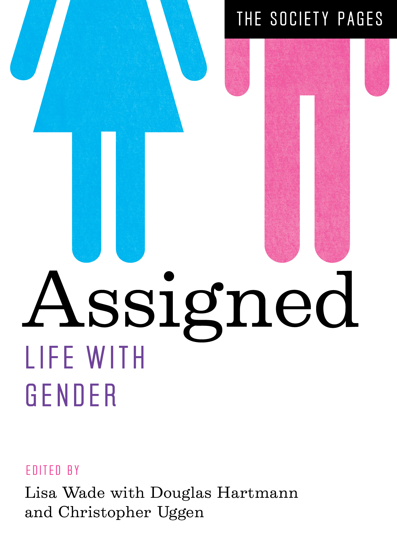
Assigned: Life with Gender is a new anthology featuring blog posts by a wide range of sociologists writing at The Society Pages and elsewhere. To celebrate, we’re re-posting four of the essays as this month’s “flashback Fridays.” Enjoy! And to learn more about this anthology, a companion to Wade and Ferree’s Gender: Ideas, Interactions, Institutions, please click here.

.

Compulsory Monogamy in The Hunger Games, by Mimi Schippers, PhD

NPR’s Linda Holmes wrote a great article about the gender dynamics in The Hunger Games: Catching Fire and concluded, “…you could argue that Katniss’ conflict between Peeta and Gale is effectively a choice between a traditional Movie Girlfriend and a traditional Movie Boyfriend.”  I do love the way Holmes puts this.  Gender, it seems, is not what one is, but what one does.  Different characteristics we associate with masculinity and femininity are available to everyone, and when Peeta embodies some characteristics we usually see only in women’s roles, Peeta becomes the Movie Girlfriend despite being a boy.

Though I find this compelling, I want to take a moment to focus on the other part of this sentence… the part when Holmes frames Katniss’ relationship to Peeta and Gale as a “conflict between” and a “choice.”  I think that, in some ways, the requirement to choose one or the other forces Katniss’ to, not only “choose” a boyfriend, but also to choose gender—for herself.

hgcf

Depending on whether she’s relating to Peeta or Gale, she is either someone who takes charge, is competent in survival, and protects her partner (traditionally the masculine role) or someone who lets another lead and nurtures instead of protects (the feminine role).  As Candace West and Don Zimmerman suggested many years ago in their article “Doing Gender,” we do gender in relationship to other people.  It’s a conversation or volley in which we’re expected to play the part to the way others are doing gender.

When Katniss is with Peeta, she does a form of masculinity in relationship and reaction to his behavior and vice versa.  Because Peeta “calls out” protection, Katniss steps up.  When Gale calls out nurturing, she plays the part.  In other words, not only is gender a “doing” rather than a “being,” it is also an interactive process.  Because Katniss is in relationship to both Peeta and Gale, and because each embodies and calls out different ways of doing gender, Katniss oscillates between being the “movie boyfriend” sometimes and the “movie girlfriend” other times and, it seems, she’s facile and takes pleasure in doing all of it.  If Katniss has to “choose” Peeta or Gale, she will have to give up doing gender in this splendid, and, dare I say, feminist and queer way in order to “fit” into her and her “girlfriend’s” or “boyfriend’s” relationship.

Now imagine a world in which Katniss wouldn’t have to choose.

What if she could be in a relationship with Peeta and get her needs for being understood, nurtured, and protective while also getting her girl on with Gale?  In other words, imagine a world without compulsory monogamy where having two or more boyfriends or girlfriends was possible.

I’m currently working on a book on monogamy and the queer potential for open and polyamorous relationships. I’m writing about the ways in which compulsory monogamy fits nicely into and perpetuates cultural ideas about masculinity and femininity and how different forms of non-monogamy might open up alternative ways of doing, not just relationships, but also gender.

Forcing Katniss to choose is forcing Katniss into monogamy, and as I suggested above, into doing gender to complement her partner.  Victoria Robinson points out in her article, “My Baby Just Cares for Me,” that monogamy compels women to invest too much time, energy, and resources into an individual man and limits their autonomy and relationships with others.  What Robinson doesn’t talk about is how it also limits women’s range of how they might do gender in relationship to others.

It also limits men’s range of doing gender in relationships.  Wouldn’t it be nice if Peeta and Gale never felt the pressure to be something they are not?  Imagine how Peeta’s and Gale’s masculinities would have to be reconfigured to accommodate and accept each other?

Elisabeth Sheff, in her groundbreaking research on polyamorous people, found that both women and men in polyamorous relationships say that the men have to rethink their masculinities to be less possessive, women have room to be more assertive about their needs and desires, and men are more accommodating.

What this suggests is that monogamy doesn’t just limit WHO you can do; it also limits WHAT you can do in terms of gender.  Might I suggest that Katniss is such a well-rounded woman character precisely because she is polyamorous?  She’s not just the phallic girl with the gun… or bow in this case… or the damsel in distress.  She’s strong, vulnerable, capable, nurturing, and loyal, and we get to see all of it because she does gender differently with her boyfriends.  And therein, I believe, is one way that polyamory has a queer and feminist potential.  It can open up the field of doing gender within the context of relationships.

I don’t know how her story ends, but I for one, am hoping that, if there is a happily-ever-after for Katniss, it’s not because girl gets boy; its because girl gets both boys.

Mimi Schippers, PhD is an Associate Professor of Sociology at Tulane University.  Her new book on the radical potential of non-monogamy is called Beyond Monogamy: Polyamory and the Future of Polyqueer Sexualities. You can follow her at Marx in Drag.

Originally posted in 2013 at Marx in Drag. Cross-posted at Huffington Post, and Jezebel. Images from IMDB

(View original at https://thesocietypages.org/socimages)

30 Nov 03:15

You know that medication you spent $50 on to prevent pregnancy? If you weight 11 lbs more than average, it’s completely useless.

by Stacey Goguen
Julianamarques

pois é

Mother Jones reports that an emergency contraception pill in Europe–which is basically the same thing as the only sort of emergency contraception available without a prescription in some places, like the US, is completely ineffective if you weigh more than 80 kg, aka 176 lbs. And it’s less effective for women weighing upward of 165 pounds, so much so that the European labels are gonna suggest you not take it at all.
__

I’m gonna repeat that.

In certain places (e.g., the United States), Plan B is not really that effective for the average woman, and if you weigh 11 pounds more than average,  You Are Completely Incapable of getting a working form of emergency contraception without a prescription.  (Oh I’m sorry, did you want this $50 medication to also work? Because I thought maybe you just wanted the nice-looking box.)
__

I’m gonna repeat that yet again, quoting MJ:

“The European manufacturer of an emergency contraceptive pill identical to Plan B, also known as the morning-after pill, will warn women that the drug is completely ineffective for women who weigh more than 176 pounds and begins to lose effectiveness in women who weigh more than 165 pounds.”

__

Now let’s put on our anti-oppressive hierarchy hat, and translate that into societal implications:

A medication that is $50 a pop and is many people’s only reasonably accessible form of emergency contraception, is Completely. Useless. for those of us who are a staggering eleven pounds heavier than average. (I know, it took a lot of burritos, shunning of any physical activity whatsoever, and willful ignorance to get to this point. And then it took even more burritos to make up for all the calories I was burning via unprotected sex. )

Oh hey, and who normally gets the trope stuck to them that they’re stupid and make bad life decisions, like failing to prevent a pregnancy they don’t want and certainly can’t afford?: poor fat women. And guess who can’t use Plan B and probably also can’t afford the alternatives: Poor fat women. So who’s been looking like they’re confirming their own inherent laziness and stupidity when really they weren’t told that a medication marketed to everyone doesn’t work for them: poor fat women.  Thank God at least poor women aren’t more likely to be fat than women of higher socio-economic status. Then we would have a really doozy of a combo on our hands.

Bonus Round Pop Quiz:  How many top athletes also can’t use  one of the most popular forms of emergency contraception without reduced effectiveness?
__

“Huh?” You say after all that. Don’t worry. I got you covered.

TL;DR:

Plan B is useless to you if you weigh more than 176 pounds.
__

If all this is really true, I’m allowed to set something on fire, right?