
patrick
Shared posts
28 Nov 16:25
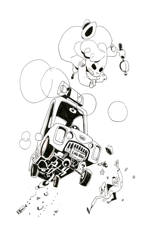
Matchbox Space Shuttle | iainclaridge.net
by researchinstitute
David Pelaez, Cooper Griggs and one other like this


28 Nov 12:04

Nature Imitates Andy Goldsworthy: Rare Ice Disk Forms in North Dakota River
by Christopher Jobson
When I first saw this giant rotating ice disk spotted in North Dakota this week, I assumed it had to be some kind of human-created object, perhaps a new piece by famed land artist Andy Goldsworthy. The video above was shot by retired engineer George Loegering while hiking along the Sheyenne River. He estimates the rotating disk was some 55 feet in diameter and must have been forming for some time. The St. Paul Pioneer Press spoke with National Weather Service hydrologist Allen Schlag:
The cold, dense air—the air pressure Saturday in nearby Fargo was a record high for the city for the month of November, according to Gust—turned the river water into ice, but since the water was relatively warm it didn’t happen all at once. Floating bits of ice got caught in the eddy and started to spin in a circle.
“It’s not a continuous sheet of ice,” Schlag said. “If you were to throw a grapefruit-size rock on it, it would go through. It’s not a solid piece of ice—it’s a collection of ice cubes.”

Photo by Brook Tyler

Photo by Pål Sigurd

Photo by Evan Gregg / Reservoir Productions
Although extremely rare, ice disks do indeed appear naturally from time to time when conditions are perfect. Above are a few examples of people who have been lucky enough to stumble onto one while holding a camera. Learn more over on St. Paul Pioneer Press. (thnx Ben + all)

27 Nov 11:53

Ornate Mixed Media Assemblages by Kris Kuksi
by Christopher Jobson
 Unveiled Obscurity, 2013. Mixed media assemblage. 32″ x 46″ x 12″.
 Unveiled Obscurity, detail.
 Neo-Hellenism, 2013. Mixed media assemblage. 37″ x 35″ x 11″.
 Neo-Hellenism, detail.
 Intelligent Redesign, 2013. Mixed media assemblage. 40″ x 50″ x 12″.
 Intelligent Redesign, detail.
 Expulsion, 2013. Mixed media assemblage. 24″ x 32″ x 9″.
 Expulsion, detail.
 Der Ubermensch of the Post-Post World Calamity Variety, 2013. Mixed media assemblage. 54″ x 48″ x 16″.
This week Kansas-based artist Kris Kuksi (previously) opened his fourth solo show, Revival, at Joshua Liner Gallery. Kuksi continues his use of ornate assemblage to create wildly complex sculptures that comment on history, life, death, and spiritual conflict. In the words of director Guillermo del Toro:
“A postindustrial Rococo master, Kris Kuksi obsessively arranges characters and architecture with an exquisite sense of drama. Instead of stones and shells he uses screaming plastic soldiers, miniature engine blocks, towering spires and assorted debris to form his landscapes. The political, spiritual, and material conflict within these shrines is enacted under the calm gaze of remote deities and august statuary. Kuksi manages to evoke, at once, a sanctum and a mausoleum for our suffocated spirit.
Revival will be on view through January 18, 2014 and you can see many more pieces from the exhibition in this gallery.
Juan Pablo Astorga, Ninadarkangel likes this
25 Nov 18:31


Suicide of elderly French couple stirs euthanasia debate
by Kim Willsher
Georgette and Bernard Cazes, 86, were found in a room at the Lutetia hotel in Paris, having planned their deaths carefully
The discovery of letters left by an elderly couple who checked into a luxury Paris hotel to commit suicide has reopened the debate in France about the right of individuals to choose to die.
Georgette and Bernard Cazes, 86, were found lying peacefully holding hands on a bed in a room at the Lutetia hotel in the left-bank Saint-Germain district, having planned their deaths in meticulous detail.
Police found two documents in the room, which was undisturbed: one, a letter for the couple's family; the other, a typewritten missive addressed to the French public prosecutor demanding "the right to die in a dignified manner".
In it Georgette Cazes voiced her anger at not being allowed to leave the world "peacefully" and declared her letter a formal legal complaint for the "non respect of my liberty".
She wrote that she had asked her son to pursue the case after her death.
He told Le Parisien newspaper, which published romantic black and white pictures of the Cazes as youngsters walking hand in hand through Paris, that his parents had been planning their double suicide "for decades".
"They feared being separated and being dependent a lot more than they feared death," he said.
The story of Georgette and Bernard's life, love and death has touched more than hearts here in France, where euthanasia is the next battleground for the the country's traditionally conservative Catholic community, still furious over recent legislation allowing same-sex marriage.
Euthanasia is illegal in France, but Socialist president François Hollande made changing the law one of his 2012 election campaign pledges.
Various opinion polls have suggested the French public broadly supports euthanasia. A recent survey by Ifop found 92% of those asked believe assisted suicide should be allowed for those suffering from an incurable or terminal illness.
A six-month study last year recommended that "active euthanasia", deemed an act by a third person intended to cause death, should remain banned. And members of an ethics committee consulted by the government announced earlier this year that a majority of its members opposed any legalisation allowing any form of euthanasia or assisted suicide.
In her letter, Georgette Cazes criticised the law "banning access to any lethal pill that would allow a gentle death". She added: "Isn't my liberty being limited by that of others? What law prevents a person who has no responsibilities, whose tax affairs are in order, who has worked all the years she wanted and then carried out voluntary work in social services, what law forces her into cruel practices when she wants to leave life peacefully?"
After checking into The Lutetia on Thursday evening, the Cazes, who had been inseparable since they married as student sweethearts sixty years ago, ensured their bodies would be discovered quickly by ordering a room-service breakfast for the following morning.
The pair, who met as students in post-war Bordeaux and were described as "brilliant intellectuals", had two sons. The youngest, Vincent, died in a car accident in 1976 aged 21.
Their elder son, who was not named by Le Parisien, explained his parents had chosen the palatial Art Déco hotel, popular with Pablo Picasso and Little Prince author Antoine de Saint Exupéry, because it was where Georgette Cazes was reunited with her father when he returned to France after five years in a German prison camp duringthe second world war.
A former Latin professor, Georgette wrote school books and was involved in voluntary work teaching French during retirement. Her husband, an economist and philosopher, was a high-ranking civil servant and wrote books and literary reviews.
An official inquiry by a "citizens' committee" into the subject is expected to be published on 16 December and Hollande has said a parliamentary bill on assisted suicide may be introduced in the Assemblée Nationale before the end of the year.
theguardian.com © 2013 Guardian News and Media Limited or its affiliated companies. All rights reserved. | Use of this content is subject to our Terms & Conditions | More Feeds
patrick likes this

24 Nov 15:47


Inktober Catch-Up! I finally got around to scanning last...
Inktober Catch-Up! I finally got around to scanning last week’s drawings.
Just about a week left of Inktober to go—expect to see some more drawings soon. Be good, everybody!
Lucas Vigroux, patrick and -1 others like this
23 Nov 14:48

Take a Vertigo-Inducing Walk into the Infinite Inside Yayoi Kusama’s Infinity Rooms at David Zwirner in New York
by Christopher Jobson

Infinity Mirrored Room – The Souls of Millions of Light Years Away / Courtesy David Zwirner and Yayoi Kusama Studio Inc.

Infinity Mirrored Room, detail – The Souls of Millions of Light Years Away / Courtesy David Zwirner and Yayoi Kusama Studio Inc.

Love is Calling, 2013. Wood, metal, glass mirrors, tile, acrylic panel, rubber, blowers, lighting element, speakers, and sound. / Courtesy David Zwirner and Yayoi Kusama Studio Inc.
 Yayoi Kusama in her 2013 solo exhibition I Who Have Arrived in Heaven at David Zwirner, New York. Courtesy David Zwirner and Yayoi Kusama Studio Inc. Photo: Will Ragozzino.

Courtesy Rebecca Dale Photography

Courtesy Steven Meidenbauer
In an impressive display of new work, artist Yayoi Kusama (previously) recently opened a solo show, I Who Have Arrived In Heaven, at David Zwirner Gallery in New York. Now in her mid-80s, the prolific artist is showing twenty-seven new large-scale paintings, and not one but two of the artist’s famous Infinity Rooms (pictured above). The immersive mirrored environments can be entered by gallery visitors for a vertigo-inducing walk through an infinitely reflected field of stars and organic forms. The collected artwork and installation spaces span all three of David Zwirner’s galleries in Chelsea at 519, 525 and 533 West 19th Street and will be on view through December 21, 2013. Imagery courtesy David Zwirner Gallery, Steven Meidenbauer, and Rebecca Dale Photography. (via designboom)
Madamluna24, Satpreet Singh and 3 others like this

22 Nov 12:56
X__X • 死 者 の 顔 • - James Harvey
by antbaena

patrick, Randy Laue and one other like this

22 Nov 12:54
 Claude Vorilhon - Raël. Fondation Raëlienne. 1975.
Les extra-terrestres m'ont emmené sur leur planète
by Filo Loco

Filo Loco
patrick likes this
22 Nov 12:26
The record-breaking Lambretta Record | Italian Ways
by cascade

Cooper Griggs, Nuno Cruz and 2 others like this
21 Nov 15:06


Aldi and Lidl mince pies beat Fortnum & Mason's in Which? taste test
by James Meikle
'Lush, spicy and juicy' Aldi mince pies, the cheapest tested out of entries from a dozen retailers, top pre-Christmas contest
The bargain-basement supermarkets Aldi and Lidl have felled the posh-nosh royal warrant holder Fortnum & Mason in a taste test of that most traditional of Christmas foods, the mince pie.
The low-price competitors, whose stock has been rising since the credit crunch hit, delivered the latest blow to their upmarket rivals by coming first and joint second in an annual competition run by the consumer group Which?
Aldi's specially selected luxury mince pies – the cheapest tested at £1.69 for a pack of six – beat the likes of Selfridges and Fortnum's, whose £12.95 traditional mince pies came last out of entries put forward by a dozen retailers.
Lidl's £1.79 Snowy Lodge luxury mince pies and Marks & Spencer's handcrafted ultimate all-butter mince pies, at £4 for four, came joint second.
Judges tasted each pie warm and rated appearance, aroma, texture and taste. Aldi's was "lush, spicy and juicy while the rich golden pastry is thin, crisp and light", but Fortnum's "flat-tasting, soft and crumbly" pastry got a thumbs down.
Aldi and Lidl have been attracting more affluent customers with luxury foods such as lobster tails and Serrano ham. Tony Baines, Aldi's UK managing director of buying, said: "Everybody likes to treat themselves at Christmas, and by doubling the size of our Christmas range we have ensured that our customers can do just that without either breaking the bank or compromising on quality."
Fortnums, based in Piccadilly, London, kept a predictably stiff upper lip. "Our traditional mince pies are a delicious product and we're very proud of them. Our customers agree and we are trading significantly higher than last year, " it said.
theguardian.com © 2013 Guardian News and Media Limited or its affiliated companies. All rights reserved. | Use of this content is subject to our Terms & Conditions | More Feeds
patrick likes this

20 Nov 18:24


Drawing Line
by johno
In the spring of 2012, Stefania Malmsten became the new Creative Director of Swedish fashion & culture magazine Rodeo. Stefania was living in New York at the time, working with Swedish and American clients from the collaborative workspace Studiomates in Dumbo, Brooklyn. She had decided to move back to Sweden where she had started her career with designing iconic magazines like Pop and Bibel.
Stefania is known for the attention to typography in her design work:
“I’m very passionate about photography and I’m very passionate about typography. I never wanted to choose between being a graphic designer and an art director and that’s why I love working with magazines and titles for film. Working with Göran on this project has been very luxurious, creating almost like a main character for the magazine.”

For the redesign of Rodeo Magazine Stefania chose Lyon and Benton Sans, two stylish yet traditional text faces. In contrast, she needed something more expressive for headlines, drop caps and graphic elements.
“I created a strict 12 column grid and nice legible styles for the main typography but I felt I needed something to interfere with this. Rodeo wanted to keep it’s big format (245 x 330 mm) and there was something about these big pages… I got this idea of a line that went through the whole magazine, like someone had been writing with a thin pen over the grid system.”
To explain her ideas, she made a mood board which became the creative brief for the typeface. The plan was to create a monoline script, but definitely not a traditional one.
Monoline letters, Arabic shapes, scribble, graffiti & tags, lettering, swashes, and different types of handwriting — all of this became inspiration for the new Rodeo Magazine typeface.

When the project started Göran Söderström was on parental leave and had limited time to work with the project, but this was a rare opportunity he couldn’t pass up. Göran explains:
“I’ve always admired designers and art directors who have the courage and vision to not settle for existing type and instead work towards something new. This is quite uncommon in Sweden, but suddenly it happened.”
Göran jumped at the chance to work with Stefania, whose work he holds in high regard. In the beginning he received photo updates with inspiration Stefania had found on the streets of New York.
Inspiration from the streets of New York.
After some time Göran responded with some sketches he thought could work. Stefania, who was still in New York, replied with more sketches and comments — the collaboration was in motion.
One of Göran’s first drawings.
Swashes had to look different from traditional script typefaces. Stefania made this and it became a point of departure for more.
Sketch for the type composition on the cover.
Testing how thin the lines should be.
The result on the printed magazine.
Inside the first issue.
This project needed a font editor where the letters could be drawn with open contours (rather than closed shapes) and with a possibility to test different line thickness live while editing. The new font editor Glyphs had a function that could work but it was not behaving quite like Göran wanted. Amazingly, Georg Seifert (the inventor of Glyphs) added the missing functionality in a matter of days and suddenly the whole project became more concrete. Now letters could be drawn with just a single stroke and exported with varying stroke weight.
Left: open contours. Right: closed.
Glyphs made it possible to draw with just a single stroke.

Every idea was tested, but somewhere the line had to be drawn; was it supposed to be a typeface or a set of illustrations? Naming this typeface was also bit tricky, but in the end it was named after what it was – lines.
The formula.
Line comes in 5 super thin styles. With the formula 100, 65, 40, 25, 20 it’s easy to create compositions with same stroke weight across different point sizes. This was also a feature from Rodeo. Stefania was working with three styles in three different sizes, looking as if they were coming from the same pen.
The 5 styles in Line.
We deliberately avoided making an OpenType showcase out of this font. There’s an exquisite joy in unpacking a new font, similar to that of a Lego set. Rather than large, extravagant glyphs, the final typeface consists of a basic character set with some alternate letters, plus a large number of modular embellishments which attach to letters in different ways. The embellishments (or krussiduller in Swedish) are perfect for starting or finishing words, and some are flexible enough to do both. And just like the possibilities with Legos, this brings huge variation to the typeface.
Rather than hundreds of alternate letters, these are simply kerning pairs.
How alternate versions of ‘s’ connect to ‘a’.
Lowercase h, m and n also have “normal” versions (stylistic set 04).

Letters from Sweden has a new website in the works and Line will be available from our new webshop very soon. Until then you can send us an email if you’re interested in licensing Line for desktop, web or apps.
Follow us on Twitter, Facebook or signup for our Newsletter to stay updated.

Stefania Malmsten is an art director and a graphic designer with clients mainly in the fields of art, fashion and film. She was one of the founders of Pop and Bibel magazines in Sweden and is a former art director at Vogue Hommes International in Paris. Stefania Malmsten received The Berling Prize, Swedens most prestigious graphic design-prize, for 2006. On the fourth of July 2013 Stefania founded the new design studio Malmsten Hellberg together with designer Ulrika Hellberg. Stefania is currently the Creative Director at Rodeo Magazine in Sweden.
Göran Söderström is the founder of Letters from Sweden and has been designing type since 2006. He is self taught and has previously published his work through Psy/Ops, Fountain and FontFont. At FamiljenPangea Göran has designed custom typefaces for ATG, ICA, LO, SEB, WyWallet and others. His commercial typefaces are used pretty much all over the world by companies like Red Bull, Pitchfork, The New Republic, SVT and Expressen. One of Göran’s typefaces has been carved in stone.
Text, photos and illustrations: Copyright © 2013 Stefania Malmsten & Göran Söderström. All rights reserved. No portion of this article may be reproduced without the authors written approval.

Sponsored by H&FJ.
and
Drawing Line
Juan Pablo Astorga, patrick likes this
20 Nov 18:01
http://ffffound.com/image/843214359e5d5b603868fbbeabac100f2c0a894a
by brandpowder

Sarahbelfit, patrick and one other like this

20 Nov 17:29

Polish Concert Pianist Builds a ‘Viola Organista’ Based on a 500-Year-Old Leonardo Da Vinci Sketch
by Christopher Jobson

Viola Organista built by Slawomir Zubrzycki

Codex Atlanticus by Leonardo Da Vinci, (page 93r)
Buried in the pages of Leonardo Da Vinci’s famous 15th century notebooks, amongst the sketches of flying machines, parachutes, diving suits, and armored tanks, was a curious idea for a musical instrument that merged the harpsichord and cello. The Italian Renaissance polymath referred to it as the viola organista. The general idea for the instrument was to correlate keyboard fingerwork with the sustained sound of a stringed instrument, but among the dozens of ideas pursued by the gifted artist and inventor, this was one he never explored further. Nearly 100 years would pass before an organist in Nuremberg would build the first functional bowed keyboard instrument, and many others would try throughout history to realize Da Vinci’s vision with various levels of success.
Now, after an estimated 5,000 hours of work over three years and nearly $10,000 invested in the project, Polish concert pianist Slawomir Zubrzycki has unveiled his own version of the viola organista. Not only is the new instrument gorgeous, it’s fully functional and Zubrzycki demonstrated it in public for the first time at the 5th International Royal Krakow Piano Festival a few weeks ago. Above is a video of that performance where you can hear how beautiful the strange instrument sounds. Via the Hindustan Times:
The flat bed of its interior is lined with golden spruce. Sixty-one gleaming steel strings run across it, similar to the inside of a baby grand. Each one is connected to the keyboard complete with smaller black keys for sharp and flat notes. But unlike a piano, it has no hammered dulcimers.Instead, there are four spinning wheels wrapped in horse tail hair, like violin bows. To turn them, Zubrzycki pumps a peddle below the keyboard connected to a crankshaft.
As he tinkles the keys, they press the strings down onto the wheels emitting rich, sonorous tones reminiscent of a cello, an organ and even an accordion. The effect is a sound that da Vinci dreamt of, but never heard; there are no historical records suggesting he or anyone else of his time built the instrument he designed.
Here’s an additional interview with Zubrzycki, where you can see the instrument up close (click the “CC” icon for English captions):
You can learn more about Zubrzycki and the history of the viola organista over at the History Blog.

18 Nov 14:13


Bruno Munari - Speak Italian: The Fine Art of the...
patricklearn to speak bruno bolla
Bruno Munari - Speak Italian: The Fine Art of the Gesture
“Speak Italian was first published in 1958 by artist, photographer and sculptor Bruno Munari. The photographs capture something from a time long since past, but the gestures themselves are still as current as can be. The book (a bilingual edition) was reissued a number of years ago by Chronicle Books.”
patrick likes this
18 Nov 14:10
The Big Album of Random
by brandpowder

Andy Zeigert, David Pelaez and 2 others like this
18 Nov 14:07
http://ffffound.com/image/a99fb67d56819c7a02d572e89006e1e3ed36fa52
by tak

Chelsea, Patryk T Kawalarz and 5 others like this

14 Nov 15:52

inFORM: An Interactive Dynamic Shape Display that Physically Renders 3D Content
by Christopher Jobson


While it’s debatable whether we’ll ever be able to teleport objects or people around the world at the speed of light, the inFORM system from Tangible Media Group at MIT might be the seeds of the next best thing. inFORM facilitates the real-time movement of physical “pixels” on a table surface that move in accordance with data from a Kinect motion sensing input device. The system allows people to remotely manipulate objects from a distance, physically interact with data or temporary objects, and could open the door to a wide variety of gaming, medical, or other interactive scenarios where people might be in remote locations.
One can only imagine the possibilities as the resolution of such a device increases. As mind-blowing as the video is above, the inFORM demonstrated has a relatively low resolution of 30×30 resulting in 900 moving “pixels”. As technology allows, what happens if the resolution doubles or quadruples and 3D content begins to appear exponentially more lifelike.
inFORM is currently under development at MIT’s Tangible Media Group and was designed by Daniel Leithinger, Sean Follmer, Hiroshi Ishii with help from numerous other software and hardware engineers. You can learn more about it here.
patrick and -1 others like this