We’ve seen no shortage of projects using layers of glass to simulate bodies of water the last few days. First we had glass sculptures by Ben Young, followed by several amazing river and lake tables Greg Klassen. Now we have designer Christopher Duff of Duffy London who has released concept images of the Abyss Table, a carefully layered table made from sculpted Perspex and wood that creates a geographic cross-section of the ocean. The tables will be limited to a series of 25 and are available for purchase here.
It should be noted that these are digital renderings of what the final piece should look like, it will be great to see photos of the actual tables once they are built. You can see a few more renderings on their Facebook page. (via designboom)
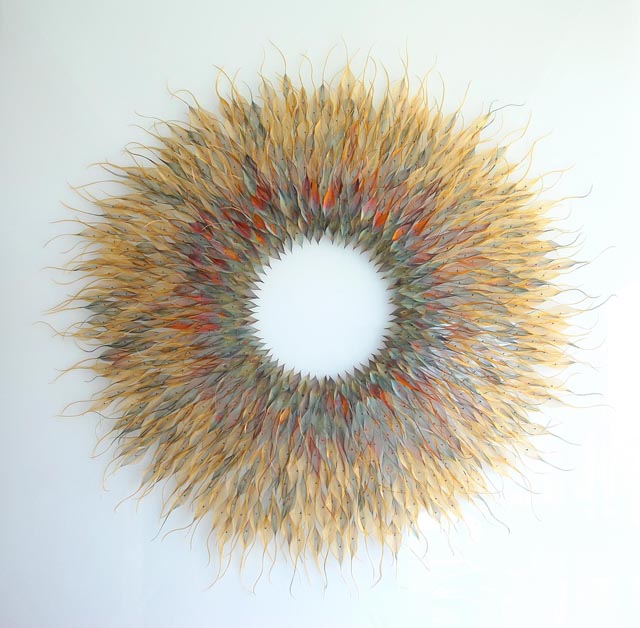
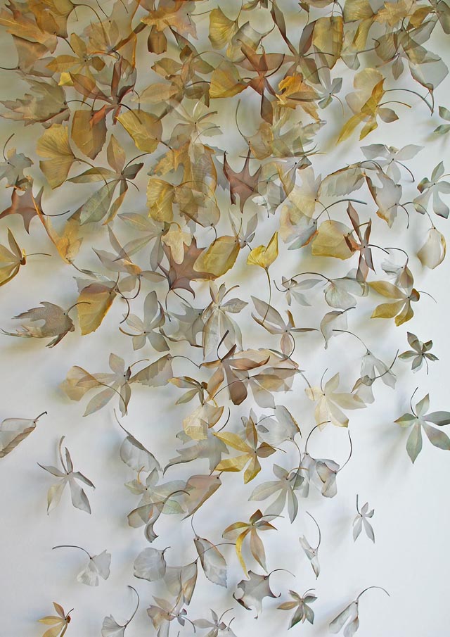
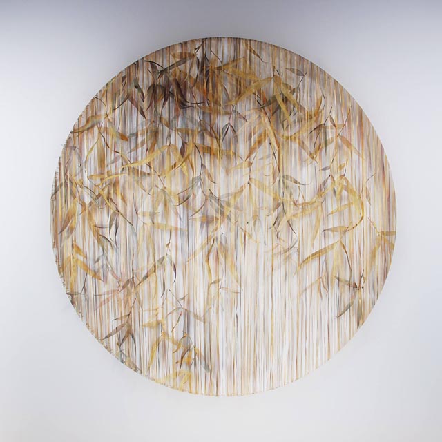
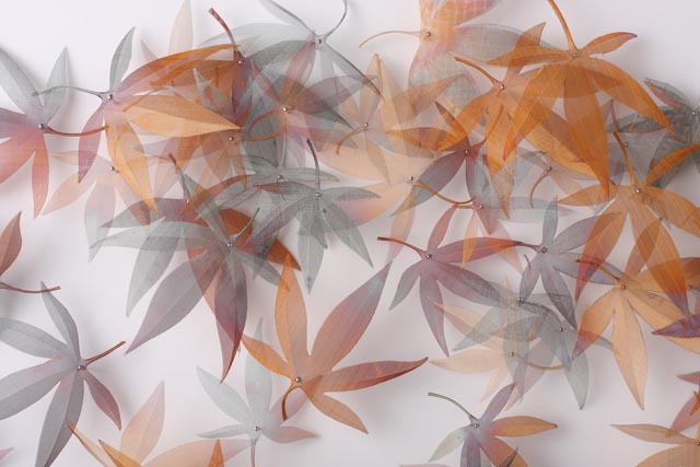
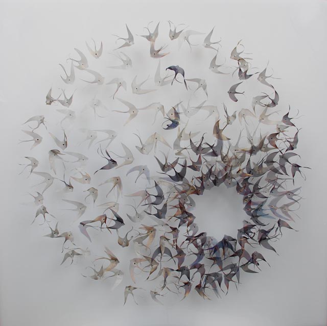
Artist Michelle Mckinney uses translucent woven metal to create remarkably delicate leaves, butterflies, and other natural forms which she arranges in beautiful abstract sculptures. She has more work on her Facebook page.
The art showcased here by David Szauder is from his “Fading Memory” series. Inspired by the connections between human and digital memory, he has crafted a series that is thought-provoking and visually stimulating which deals with these fascinating topics in a new light. You really feel that you are witnessing a true connection between artificial intelligence and human memory when viewing these pieces of art.
Artist Jared Muralt has drawn a lot of cool things from WWII comic book art to images for gig posters, but what stands out for me is his Moleskine doodles that indeed look natural, without any preparation and beautifully show imperfections. Selected here are nine drawings made with Faber-Castell fiber-tip pens from various sketchbooks.
Animator Ainslie Henderson used yarn to make this beautiful stop motion animated music video for “Moving On” by James. Henderson has posted some behind the scenes photos from the project on his Tumblr blog.
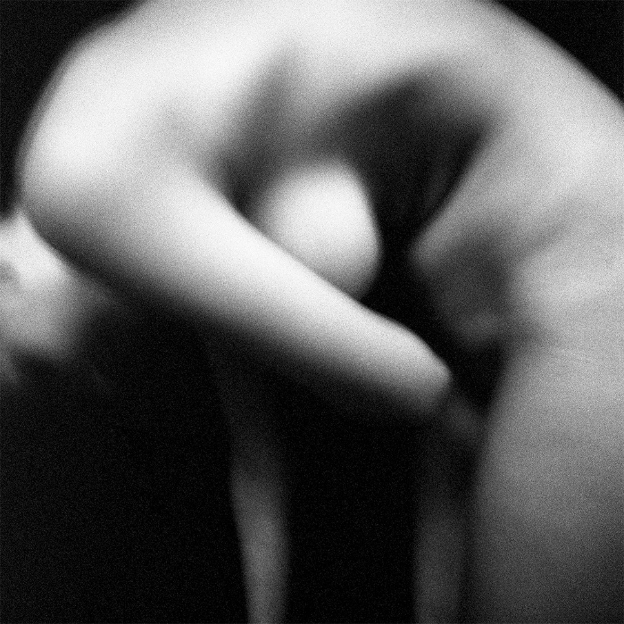
St. Petersburg artist Veronica Azaryan informs me that the two close-up shots are studies and the rest are final images for various campaigns promoting Mousson Atelier’s high-end jewelry. She envisions everything from makeup to framing the shot, and the end result is remarkable with women painted in solid colors and some splattered with gold paint or sprinkled with colored pigments to create beautiful textures. Adding the makeup can take up to 4 hours, and although Azaryan often does it herself, she sometimes invites a hairstylist and makeup artist to help out. Above all these photos are her works of art that she states: “simply comes from the soul.”
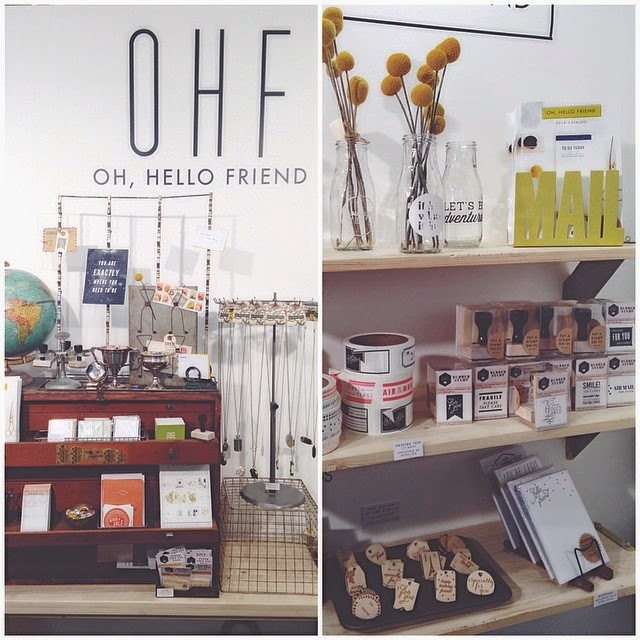
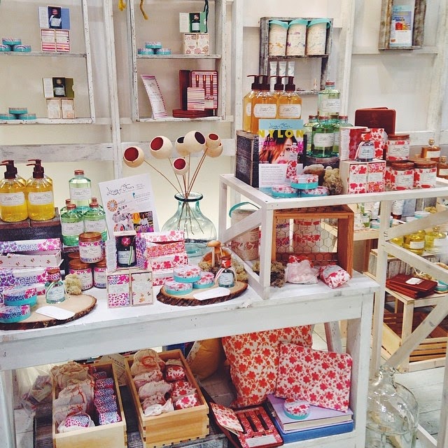
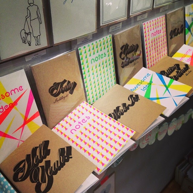
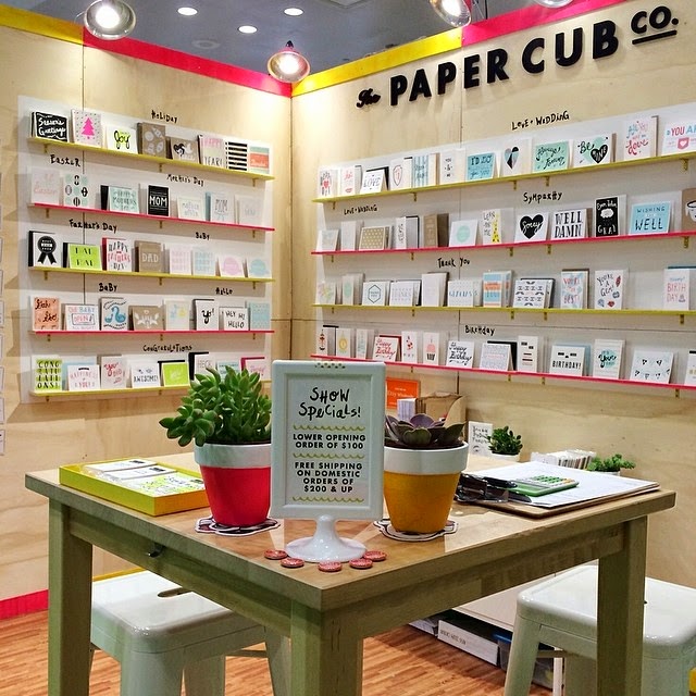
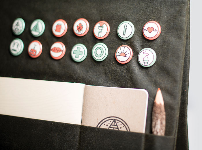
The National Stationery Show started this past weekend and we thrilled to share a little instagram round-up from it! Looks like it was a great show this year! Below 1Canoe2's beautiful booth. Photo from 1Canoe2's instagram.
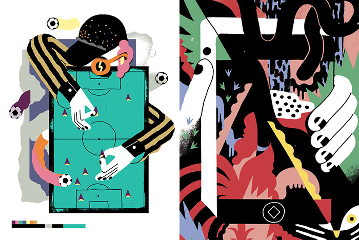
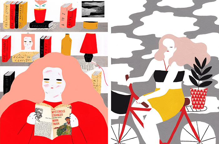
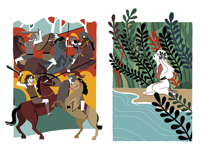
There’s an undercurrent in Italian illustration that I quite enjoy—a certain exuberance rendered quietly, layered on in color-blocked shapes. Each of this week’s badass lady creatives have their own distinct style, but you can still detect this influence of flat color fields throughout.
Linked websites are possibly NSFW: each person on this list has at least one project which includes illustrated ladybits.
Sarah is a freelance illustrator from Milan and Bologna, Italy who is quite active in the creative scene: she co-curates Teiera (an “illustration and comics independent label”), teaches workshops, gives talks, collaborates on books, and participates in exhibitions. Much of Sarah’s work is for editorial clients, like Anorak Magazine, Plansponsor, and The New York Times. Her ongoing abstract illustrations for Rivista Studio (Studio Magazine) are particularly interesting. Website
Left: Gouache painting for 100 Years Gallery / Right: from her “Still” painting series
Like Gloria, Alessandra no longer lives in Italy; she is based in London, where she works on collaborations and commissions. For those itching to get their hands off the computer and onto some art supplies, Alessandra’s portfolio is a real treat: her projects feature gouache paintings and Riso-printed (swoon!) zines. I love a good “cool girls” series, especially rendered in Alessandra’s style—voluptuous curves and squinty eyes. Website
Libretto Postale, animali in viaggio (collective exhibition)
Gloria is an Italian expatriate now living in France. Between a couple different all-female collectives, Gloria works on projects in furniture, fashion, and product design. Gloria’s illustrations feature beautiful line-work, moody color palettes, and exaggerated curves. Though her style changes a bit from project to project, I’d say much of her work looks like a Little Golden Book illustrated by Fafi(slightly NSFW) in the 1950s. Website
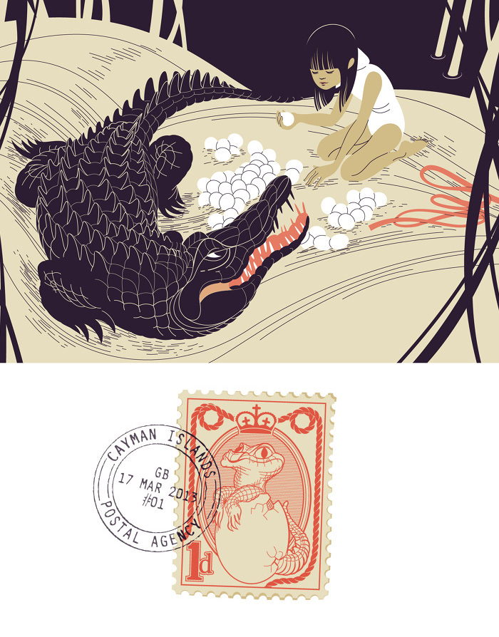
Random pages from Miti Romani (Roman Myths), written by Carola Susani
Rita is a Rome-balanced freelancer whose work spans book covers and interiors, advertising, editorial illustrations, comics, and fine-art exhibitions. Her figures are rendered in a relatively simple style, but carry so much expression. That’s a strength you usually see in illustrators working in animation and character design, so it’s not surprising that Rita’s book illustrations are particularly successful. Personal favorites include Storie di Bambini Molto Antichi and Miti Romani. Website
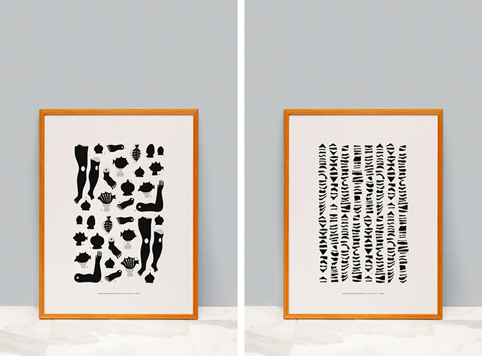
Valentina is a designer-illustrator whose work carries an airy, minimal aesthetic. Similar to some of her compatriots, there’s a hint of a cut-paper influence on her vector illustrations. Valentina is also the founder and director of Quintilio, an London-and-Rome based line of fine art prints. Each black-and-white composition honors Italian cultural heritage. Website / Shop
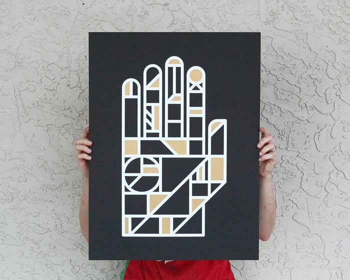
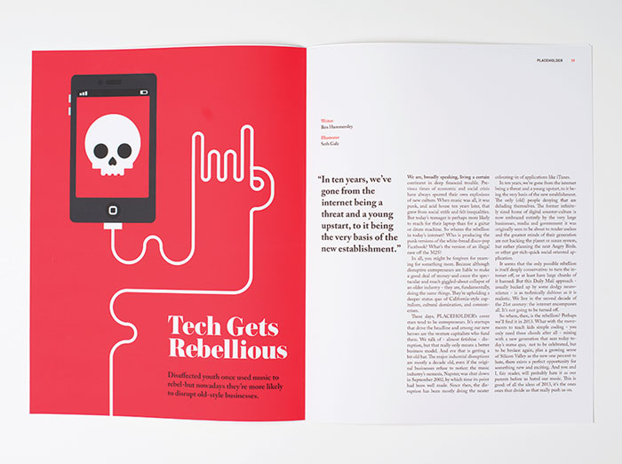
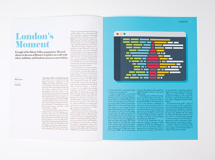
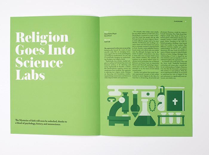
Something great is brewing up in the Pacific Northwest, and it’s not coffee. Okay, there’s tasty coffee brewing up there too, but the really good stuff is brewing in Seth Gale‘s noggin as he throws down some serious design smarts at Portland State University.
Check out a selection of work below, then explore more on Seth’s website and grab a poster or pennant from his online shop.
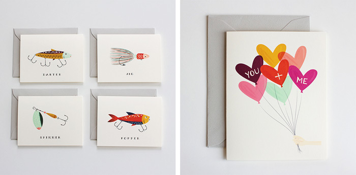
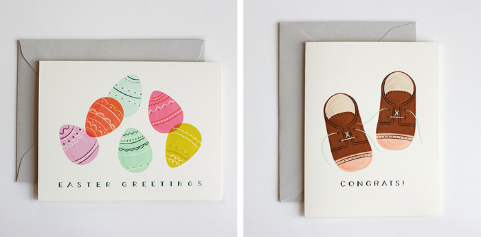
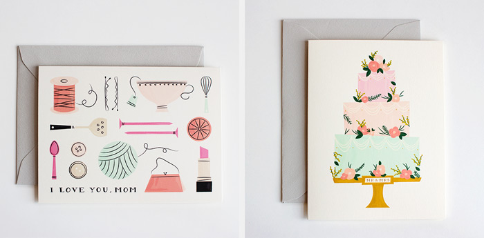
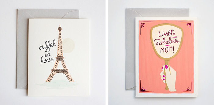
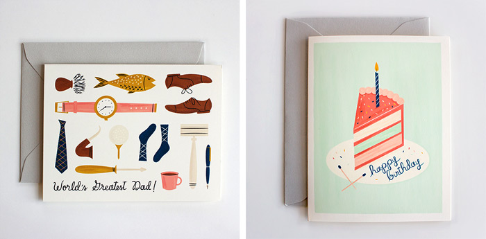
Check out the charming illustration work of My Dear Fellow Co., a husband-and-wife paper goods studio based in Dallas, Texas. Their shop features a selection of prints, as well as greeting cards for every occasion, including a few really fun options for upcoming holidays, like Easter and Mother’s Day.
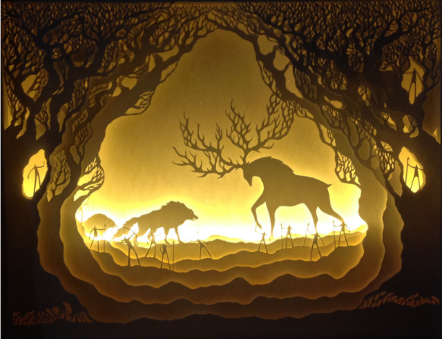
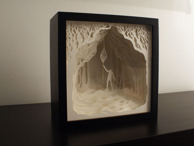
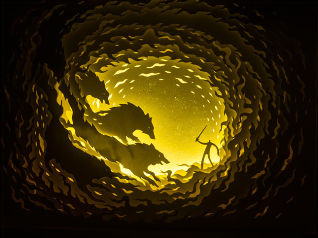
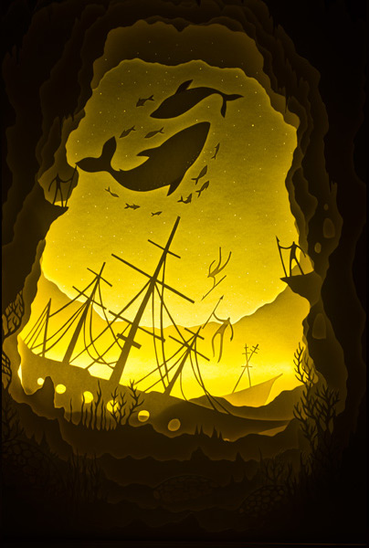
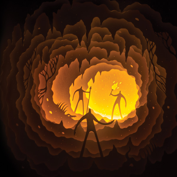
Art duo Hari & Deepti (Harikrishnan Panicker and Deepti Nair) create dramatically back-lit cut paper dioramas in LED light boxes. The light boxes allow the duo to create a sense of depth and atmosphere in the dioramas—they look totally different when the light is switched off.
What amazes us about the paper cut light boxes is the dichotomy of the piece in its lit and unlit state, the contrast is so stark that it has this mystical effect on the viewers.
Hilary Faye Sloane is a Melbourne based designer. She works in a range of mediums such as illustration, collage, animation & photography. After completing her bachelor of design she has spent time travelling or working as a freelance designer.


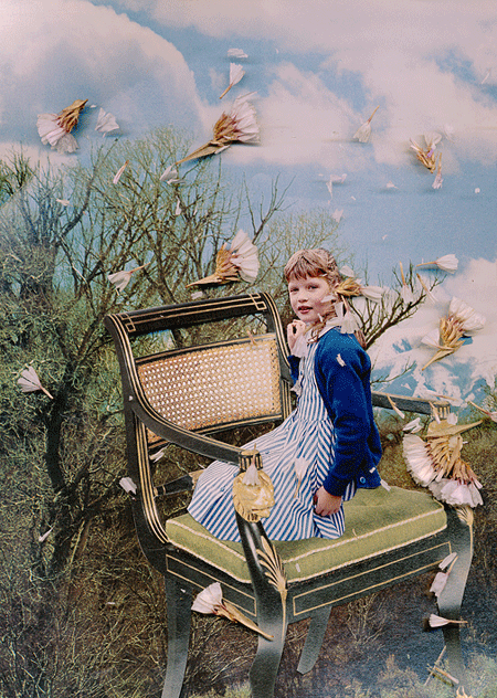
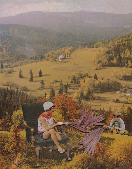
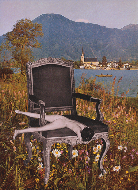
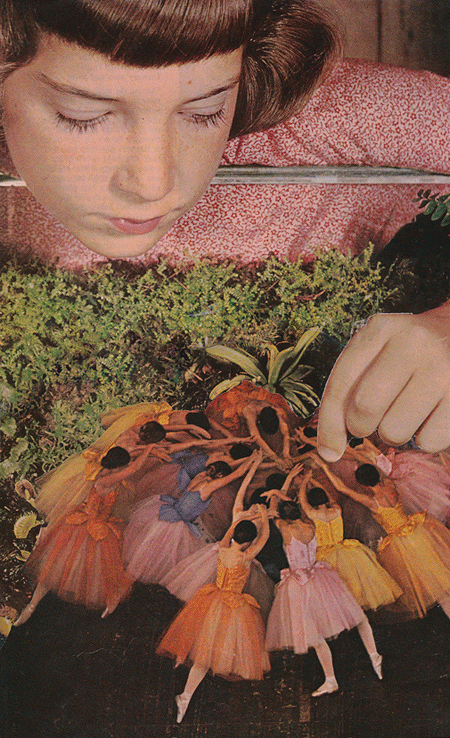
 Folkert


