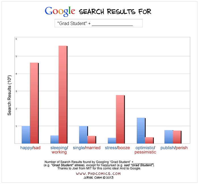
This will either creep you out, fascinate you, or frighten you. The mechanical gear that propelled the Industrial Revolution and, indirectly, our very profession of industrial design, is one of mankind's more profoundly impactful inventions. But two biologists from the University of Cambridge have just discovered that the mechanical gear exists in nature.
Scientists Malcolm Burrows and Gregory Sutton discovered tiny, toothed, interlocking gears atop the hind legs of a three-millimeter-long bug known as Issus coleoptratus. Colloquially known as a "planthopper," the jumping, flea-like bug cocks its hind legs into a "loaded" position; as it "unloads," the legs swiftly rotate backwards, enabling the bug to get some NBA-like air. The gears connecting the top of the legs—which even have filleted teeth—ensure perfect synchronicity of the leg extensions, enabling accurate and predictable jumping.
[Image: The west coast of North America as it appeared roughly 215 million years ago; map by Ron Blakey].
The paleo-tectonic maps of retired geologist Ronald Blakey are mesmerizing and impossible to forget once you've seen them. Catalogued on his website Colorado Plateau Geosystems, these maps show the world adrift, its landscapes breaking apart and reconnecting again in entirely new forms, where continents are as temporary as the island chains that regularly smash together to create them, on a timescale where even oceans that exist for tens of millions of years can disappear leaving only the subtlest of geological traces.
With a particular emphasis on North America and the U.S. Southwest—where Blakey still lives, in Flagstaff, Arizona—these visually engaging reconstructions of the Earth's distant past show how dynamic a planet we live on, and imply yet more, unrecognizable changes ahead.
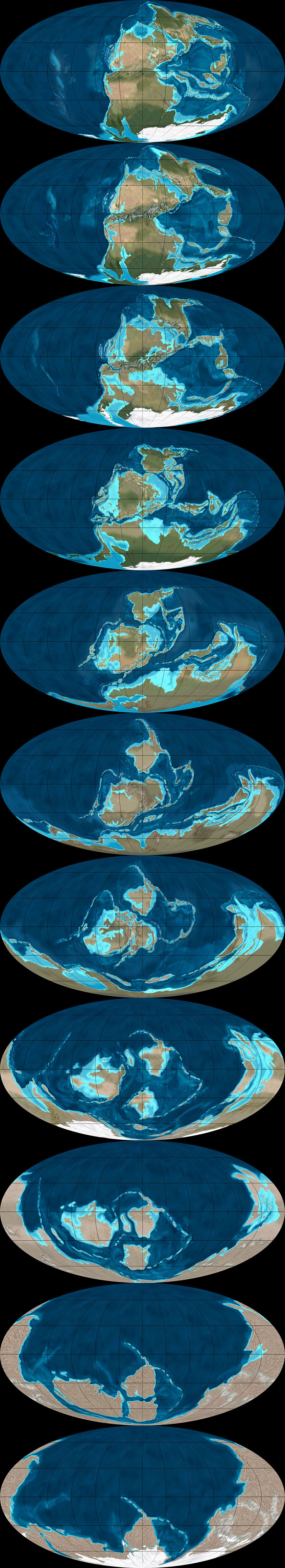
The following images come from Ron Blakey's maps of the paleotectonic evolution of North America. The first map shows the land 510 million years ago, progressing from there—reading left to right, top to bottom—through the accretion and dissolution of Pangaea into the most recent Ice Age and, in the final image, North America in its present-day configuration.
As part of BLDGBLOG's collaborative side-project, Venue, Nicola Twilley and I met with Blakey in his Flagstaff home to talk about the tectonic processes that make and remake the surface of the Earth, the difficulty in representing these changes with both scientific accuracy and visual panache, and the specific satellite images and software tools he uses to create his unique brand of deep-time cartography.
Like film stills from a 600-million year-old blockbuster, Blakey's maps take us back to the Precambrian—but there are much older eras still, stretching unmapped into far earlier continents and seas, and there are many more billions of years of continental evolution to come. Blakey talked us through some of the most complex changes in recent geological history, including the opening of the North Atlantic Ocean, and he allowed himself to speculate, albeit briefly, about where Earth's continental crust might yet be headed (including a possible supercontinent in the Antarctic).
Many of Blakey's maps are collected in the book Ancient Landscapes of the Colorado Plateau, written with Wayne Ranney, where Blakey also describes some of the research and methods that went into producing them. Blakey also contributed to the recent, new edition of a textbook by Wolfgang Frisch and Martin Meschede, Plate Tectonics: Continental Drift and Mountain Building, a thorough exploration of landscapes disassembling and colliding over vast spans of time.
• • • [Image: The west coast of North America, depicted as it would have been 130 million years ago; the coast is a labyrinth of islands, lagoons, and peninsulas slowly colliding with the mainland to form the mountains and valleys we know today. Map by Ron Blakey].
Geoff Manaugh: When I first discovered your maps showing the gradual tectonic re-location of the continents over hundreds of millions of years, I thought this was exactly what geologists should be doing: offering clear, step-by-step visual narratives of the evolution of the earth’s surface so that people can better understand the planet we live on. What inspired you to make the maps, and how did you first got started with them?
Ronald Blakey: Well, the very first maps I made were in conjunction with my doctoral thesis, back in the early 1970s. Those were made with pen and ink. I made sketches to show what the paleogeography would have looked like for the specific formation I was studying with my doctorate. Three or four of those maps went into the thesis, which was then published by the Utah Geologic Survey. I’ve also done a number of papers over the years where I’ve made sketches.
But I was late getting into the computer. Basically, during my graduate work I never used a computer for anything. I kind of resisted it, because, for the kind of work I was doing, I just didn’t see a need for it—I didn’t do quantifiable kinds of things. Then, of course, along comes email and the Internet. I actually forget when I first started with Photoshop—probably in the mid-1990s. When I found that, I just thought, wow: the power of this is incredible. I quickly learned how to use the cloning tool, so that I could clone modern topography onto ancient maps, and that made things even simpler yet.
Another thing I started doing was putting these maps into presentations. There were something like five different programs back there, in the late 90s, but the only one that survived was PowerPoint—which is too bad, because it was far from the best of the programs. I was using a program called Astound, which was far superior, particularly in the transitions between screens. I could do simple animations. I could make the tectonic plates move, create mountain belts, and so forth.
I retired in May of 2009, but all of my early maps are now online. With each generation of maps that I’ve done, there has been a noted improvement over earlier maps. I find new techniques and, when you work with Photoshop as much as I do, you learn new ideas and you find ways to make things that were a little clumsy look more smooth.
Manaugh: Where does the data come from?
Blakey: It comes from various publications. You can get a publication and have that PDF open, showing what something looked like in the past, and work from that. Usually, what I’m working from are fairly simple sketches published in the literature. They’ll show a subduction zone and a series of violent arcs, or a collision zone. What I do is take this information and make it more pictorial.
If you create a series of maps in sequence, you can create them in such a way that certain geologic events, from one time slice to the next, to the next, to the next, will blend. It depends a lot on the scale of what you’re trying to show—the whole world versus just four or five states in the West.
Now, throughout the years from, let’s say, 2004 until I retired in 2009, I kept improving the website. I envisioned most of this as educational material, and I didn’t pay much attention to who used it, how they used it, and so forth. But, then, shortly before I retired, various book companies and museums—and, most recently, oil companies—have approached me. So I started selling these and I tried very diligently not to allow this to overlap with what I was doing for my teaching and my research at the University.
In the following long sequence of images, we see the evolution of the west coast of North America, its state boundaries ghosted in for reference. Sea levels rise and fall; island chains emerge and collide; mountains form; inland seas proliferate and drain; and, eventually, modern day California, Vancouver Island, and the Baja peninsula take shape, among other recognizable features. The time frame represented by these images is approximately 500 million years. All maps by Ron Blakey.
Nicola Twilley: What do the oil companies want them for?
Blakey: They’re my biggest customers now. Usually, the geologists at oil companies are working with people who know either much less geology than they do or, in some cases, almost no geology at all, yet they’re trying to convince these people that this is where they need to explore, or this is what they need to do next.
They find these maps very useful to show what the Devonian of North Dakota looked like, for example, which is a hot spot right now with all the shales that they’re developing in the Williston Basin. What they like is that I show what the area might have really looked like. This helps, particularly with people who have only a modest understanding of geology, particularly the geologic past.
Manaugh: What have been some of the most difficult regions or geological eras to map?
Blakey: The most difficult thing to depict is back in the Paleozoic and the Mesozoic. Large areas of the continent were flooded, deep into the interior.
During certain periods, like the Ordovician, the Devonian, and parts of the Jurassic—especially the Cretaceous—as much as two-thirds of the continents were underwater. But they’re still continents; they’re still continental crusts. They’re not oceans. The sea level was just high enough, with respect to where the landscape was at the time, that the area was flooded. Of course, this is a concept that non-geologists really have problems with, because they don’t understand the processes of how continents get uplifted and subside and erode and so forth, but this is one of the concepts that my maps show quite nicely: the seas coming in and retreating.
But it’s very difficult—I mean, there is no modern analog for a seaway that stretched from the Mackenzie River Delta in Canada to the Gulf of Mexico and that was 400 miles wide. There’s nothing like that on Earth today. But the styles of mountains have not dramatically changed over the last probably two billion years—maybe even longer than that. I don’t go back that far—I tend to stick with the last 600 million years or so—but the styles of mountains haven’t changed. The nature of island arcs hasn’t changed, as far as we know.
What has changed is the amount of vegetation on the landscape. My maps that are in the early part of the Paleozoic—the Cambrian and the Ordovician early part of the Silurian—tend to be drab-colored. Then, in the late Silurian and in the Devonian, when the land plants developed, I start bringing vegetation colors in. I try to show the broad patterns of climate. Not in detail, of course—there’s a lot of controversy about certain paleoclimates. But, basically, paleoclimates follow the same kinds of regimens that the modern climates are following: where the oceans are, where the equator is, where the mountain ranges are, and so forth.
That means you can make broad predictions about what a paleoclimate would have been based on its relationship to the equator or based on the presence or absence of nearby mountains. I use these kinds of principles to show more arid areas versus more humid areas.
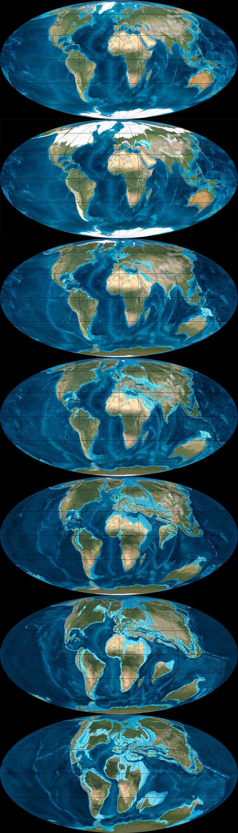
The next three sequences show the evolution of the Earth's surface in reverse, from the present day to, at the very bottom, 600 million years ago, when nearly all of the planet's landmasses were joined together in the Antarctic. The first sequence shows roughly 90 million years of backward evolution, the continents pulling apart from one another and beginning a slow drift south. They were mapped using the Mollweide projection, and, in all cases, are by Ron Blakey.
Twilley: And you paint the arid area based on a contemporary analog?
Blakey: Right. I know the modern world reasonably well and I’ll choose something today that might have matched the texture and aridity of that older landscape.
I use a program called GeoMapApp that gives me digital elevation maps for anywhere in the world. Most recently, they have coupled it with what they call the “Blue Marble.” NASA has stitched together a bunch of satellite photos of the world in such a way that you can’t tell where one series of photos come in or another. It’s a fairly true-color representation of what Earth would look like from space. So this Blue Marble is coupled with the GeoMapApp’s digital elevation topography; you put the Blue Marble over it, and you use a little slider to let the topography show through, and it gives you a fairly realistic looking picture of what you’re looking for.
For example, if I’m working with a mountain range in the southern Appalachians for a Devonian map—well, the southern Appalachians, during the Devonian, were probably far enough away from the equator that it was in the arid belt. There are some indications of that, as well—salt deposits in the Michigan Basin and in parts of New York and so forth. Plus, there are red-colored sediments, which don’t prove but tend to indicate arid environments. This combination tells me that this part of the world was fairly arid. So I’m going to places like modern Afghanistan, extreme western China, northern Turkey, or other places where there are somewhat arid climates with mountain belts today. Then I clone the mountains from there and put them in the map.
But you have to know the geologic background. You have to know how the mountains were formed, what the grain of the mountains was. That’s not always easy, although there are ways of doing it. To know the grain of the mountains, you need to know where the hinterland and the center of the mountains were. You need to know where the foreland area is, so that you can show the different styles of mountains. You have to move from foreland areas—which tends to be a series of parallel ridges, usually much lower than the hinterlands—to the center and beyond.
I use this kind of information to pick the right kind of modern mountain to put back in the Devonian, based on what that Devonian landscape probably had a good chance of looking like. Do we know for certain? Of course not. We weren’t around in the Devonian. But we have a good rock record and we have a lot of information; so we use that information and, then, voilà.
To give another example, let’s look at the Devonian period of the east coast. The big European continent that we call Baltica collided with Greenland and a series of micro-continents collided further south, all the way down at least as far as New Jersey, if not down as far the Carolinas. We know that there are places on Earth today where these same kinds of collisions are taking place—in the Alps and Mediterranean region, and the Caucasus region, and so forth.
We can use the concept that, if two plates are colliding today to produce the Caucasus mountains, and if we look at the style of mountains that the Caucasus are, then it’s reasonable to think that, where Greenland and Baltica collided in the Silurian and the Devonian, the mountains would have had a similar style. So we can map that.
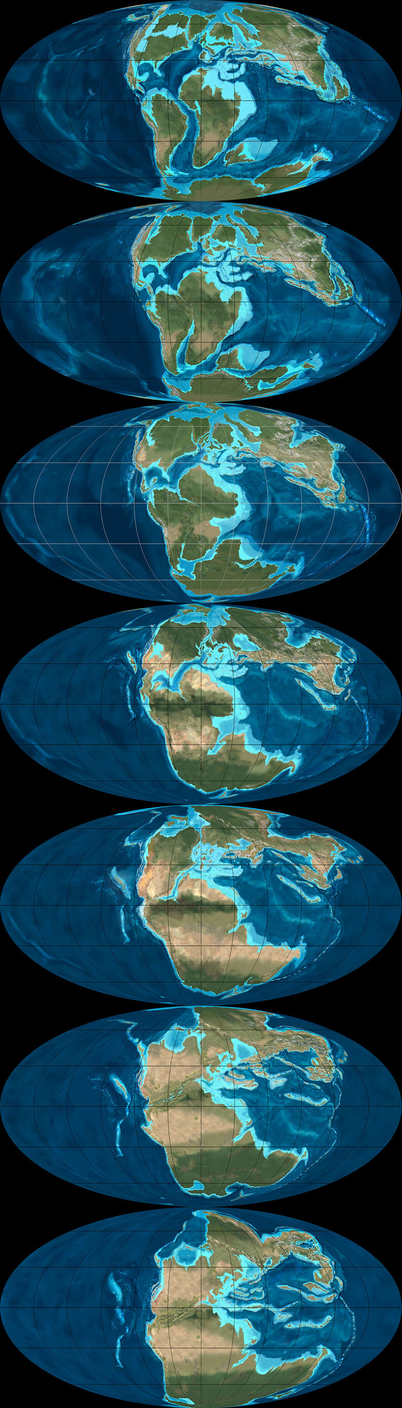
This second sequence shows the continents drifting apart, in reverse, from 105 million years ago to 240 million years ago. They were mapped using the Mollweide projection, and, in all cases, are by Ron Blakey.
Manaugh: That collision alone—Baltica and Greenland—sounds like something that would be extremely difficult to map.
Blakey: Absolutely. And it’s not a one-to-one relationship. You have to look at the whole pattern of how the plates collided, how big the plates were, and so forth.
Then there’s the question of the different histories of particular plates. So, for example, most of Scotland started out as North America. Then, when all the continents collided to form Pangaea, the first collisions took place in the Silurian-Devonian and the final collisions took place in the Pennsylvanian-Permian. By, say, 250 million years ago, most of the continents were together. Then, when they started to split apart in the Triassic and Jurassic—especially in the Triassic and Cretaceous—the split occurred in such a way that what had been part of North America was actually captured, if you will, by Europe and taken over to become the British Isles.
Scotland and at least the northern half of Ireland were captured and began to drift with Europe. On the other hand, North America picked up Florida—which used to be part of Gondwana—and so forth.
One of the things that is interesting is the way that, when mountains come together and then finally break up, they usually don’t break up the same way that they came together. Sometimes they do, but it has to do with weaknesses, stress patterns, and things like this. Obviously, all time is extremely relative, but mountains don’t last that long. A given mountain range that’s been formed by a simple collision—not that there’s any such thing as a simple collision—once that collision is over with, 40 or 50 million years after that event, there is only low-lying landscape. It may have even have split apart already into a new ocean basin.
But here’s the important part: the structure that was created by that collision is still there, even though the mountains have been worn down. It’s like when you cut a piece of wood: the grain is still inherited from when that tree grew. The pattern of the grain still shows where the branches were, and the direction of the tree’s growth in response to wind and sun and its neighbors. You can’t reconstruct the tree exactly from its grain, but, if you’re an expert with wood, you should be able to look and say: here are the tree rings, and here’s a year where the tree grew fast, here’s a year where the tree grew slow, here’s where the tree grew branches, etc.
In a sense, as geologists, we’re doing the same things with rock structure. We can tell by the pattern of how the rocks are deformed which direction the forces came from. With mountains, you can tell the angle at which the plates collided. It’s usually very oblique. What that tends to do is complicate the geologic structure, because you not only get things moving one way, but you get things dragging the other way, as well. But we can usually tell the angle at which the plates hit.
Then, in many cases, based upon the nature of how the crust has been deformed and stacked up, we can tell the severity of the mountain range. It doesn’t necessarily mean that we can say: oh, this structure would have been a twenty-thousand-foot high mountain range. It’s not that simple at all, not least of which because rocks can deform pretty severely without making towering mountains.
This final of the three global sequences shows the continents drifting apart, in reverse, from 260 million years ago to 600 million years ago. There was still nearly 4 billion years of tectonic evolution prior to where these maps begin. They were mapped using the Mollweide projection, and, in all cases, are by Ron Blakey.
Manaugh: Are you able to project these same tectonic movements and geological processes into the future and show what the earth might look like in, say, 250 million years?
Blakey: I’ve had a number of people ask me about that, so I did make some global maps. I think I made six of them at about 50-million-year intervals. For the fifteen to 100-million-year range, I think you can say they are fairly realistic. But, once you get much past 75 to 100 million years, it starts to get really, really speculative. The plates do strange things. I’ll give you just a couple of quick examples.
The Atlantic Ocean opened in the beginning of the Jurassic. The actual opening probably started off the coasts of roughly what is now Connecticut down to the Carolinas. That’s where the first opening started. So the central part of the Atlantic was the first part to open up. It opened up reasonably simply—but, again, I’m using the word simple with caution here.
The north Atlantic, meanwhile, didn’t open up until about 60 to 50 million years ago. When it opened up, it did a bunch of strange things. The first opening took place between Britain and an offshore bank that’s mostly submerged, called Rockall. Rockall is out in the Atlantic Ocean, northwest of Ireland—near Iceland—but it’s continental crust. That splitting process went on for, let’s say, ten million years or so—I’m just going to talk in broad terms—as the ocean started opening up.
Then the whole thing jumped. A second opening began over between Greenland and North America, as Greenland and North America began to separate off. That lasted for a good 40 or 50 million years. That’s where you now get the Labrador Sea; that is actual ocean crust. So that was the Atlantic Ocean for thirty or forty million years—but then it jumped again, this time over between Greenland and what is now the west coast of Europe. It started opening up over there, before it jumped yet again. There’s an island in the middle of the North Atlantic, way the heck up there, called Jan Mayen. At one time, it was actually part of Greenland. The Atlantic opened between it and Greenland and then shifted to the other side and made its final opening.
The following two sequences show the evolution of Europe from an Antarctic archipelago to a tropical island chain to the present day Europe we know and recognize. The first sequence starts roughly 450 million years ago and continues to the Jurassic, 200 million years ago. All maps by Ron Blakey.
So it’s very complicated. And that’s just the Atlantic Ocean.
The Northern Atlantic took at least five different paths before the final path was established, and it’s all still changing. In fact, the south Atlantic is actually even worse; it’s an even bigger mess. You’ve got multiple openings between southwest Africa and Argentina, plus Antarctica was up in there before it pulled away to the south.
These complications are what makes this stuff so interesting. If we look at events that we can understand pretty well over the last, let’s say, 150 or 200 million years of time—where we have a good indication of where the oceans were because we still have ocean crusts of that age—then we can extrapolate from that back to past times when oceans were created and destroyed. We can follow the rules that are going on today to see all of the oddities and the exceptions and so forth.
These are the kinds of things I try to keep track of when I’m making these maps. I’m always asking: what do we know? Was it a simple pull-apart process? There are examples where continents started to split across from one another, then came back together, then re-split in a different spot later on. That’s not just speculation—there is geologic evidence for this in the rock record.
So, when it comes to extrapolating future geologies, things become very complicated very quickly. If you start thinking about the behavior of the north Atlantic, creating a projection based on what’s going on today seems, at first, like a fairly simple chore. North America is going on a northwesterly path at only one or two centimeters a year. Europe is moving away, at almost a right angle, at about another centimeter a year. So the Atlantic is only opening at three centimeters a year; it’s one of the slowest-opening oceans right now.
OK, fine—but what else is happening? The Caribbean is pushing up into the Atlantic and, off South America, there is the Scotia Arc. Both of those are growing. They’ve also identified what looks like a new island arc off the western Mediterranean region; that eventually would start to close the Atlantic in that area. Now you start to speculate: well, these arcs will start to grow, and they’ll start to eat into the oceans, and subduct the crusts, and so forth.
Again, for the first 50, 75, or even 100 million years, you can say that these particular movements are fairly likely. But, once you get past that, you can still use geologic principles, but you’re just speculating as to which way the continents are going to go.
For instance, the one continent that does not seem to be moving at all right now, relative to anything else, is Antarctica. It seems to be really fixed on the South Pole. That’s why some people think that everything will actually coagulate back towards the South Pole. However, there are also a bunch of subduction zones today along southern Asia, and those are pretty strong subduction zones. Those are the ones that created the big tsunami, and all the earthquakes off of Indonesia and so forth. Eventually, those could pull either parts of Antarctica or all of Antarctica up toward them.
But I’m more interested in reconstructing the past than I am the future, so I’ve only played around with those five or six maps.
This second sequence, showing the next phase in the evolution of Europe, begins approximately 150 million years ago and extends to the present day. All maps by Ron Blakey.
Manaugh: To ground things a bit, we’re having this conversation in Flagstaff, on the Colorado Plateau, which seems like a great place to teach geology. I wonder whether there might be another Colorado Plateau, so to speak, elsewhere in the world—something geologically similar to the extraordinary landscapes we see here that just hasn’t had the chance to emerge. Maybe the tectonics aren’t right, and it’s still just a crack, rather than a canyon, or maybe it’s covered in vegetation or ice so we can’t see it yet. Conversely, I’m curious if you might have found evidence of other great geological districts in the earth’s past—lost Grand Canyons, other Arches National Parks—that have been lost to time. How could we detect those, and where are they?
Blakey: This is indeed a great place to teach geology. It’s a great place to live.
As for Colorado Plateau analogs—it’s an interesting question. There’s an area in South America that I’d say is fairly similar. It’s got a couple of famous national parks that I can't remember the name of. It’s a smaller version, but it’s very similar to the Colorado Plateau. It’s between the Andes and the Amazon basin, part of the general pampas region there of South America. It even has similarly aged rocks. Parts of northern Africa would also be similar.
But you have to look at all the characteristics of the Plateau. Number one: the rocks are flat. Number two: the rocks have been uplifted. Number three: the rocks are dissected by a major river system. Number four: it’s a semi-arid climate. There are probably five or six defining characteristics in total, and I’ve heard many people say that there is no other place else on Earth that has all those characteristics in exactly the same way. But I went to an area in eastern Mauritania many years ago, where, for all the world, it looked like the Grand Canyon. It wasn’t as colorful, but it was a big, deep canyon.
In fact, the Appalachian Plateau would be somewhat similar, except it’s in a humid climate, which means the land has been shaped and formed differently. But the Appalachian plateau has flat-lying rocks; it’s dissected by some major rivers; it’s experienced uplift; and so forth.
The next two sequences of images, followed from left to right, top to bottom, illustrate the gradual evolution of the Colorado Plateau, where, in its modern day incarnation, this interview with Ron Blakey took place (specifically, in Flagstaff, Arizona. The earliest map included here depicts the Proterozoic; the first sequence ends in the Triassic. All maps by Ron Blakey.
Twilley: I’m interested in the representational challenges you face when you decide to make a map, and, specifically, when you’re in Photoshop, what your most-used tools might be. I thought it was fascinating when you said that the cloning tool really changed how you make geological maps. What other techniques are important to you, in order to represent geological histories?
Blakey: Oh, the cloning tool is the most important, by far—at least when I’m actually painting. Of course, I use the outline tool to select areas, but, when I’m actually painting, it would be impossible to paint these different maps pixel by pixel. I couldn’t do it. Occasionally, I will actually hand-draw some things in the flatlands, where I want to put a river system, for example, but, at least for mountains and rugged terrain, I clone everything.
Some times, I’ll cut and paste. I’ll select an area in the GeoMapApp, I save it as a JPEG, and then I can select it and copy it and paste it in, and I can rotate and deform it a little bit. Are you familiar with the warp tool in Photoshop? I use that a lot, because you can change the shape of mountains a little. If you do it too dramatically, it really looks flaky. But, if you do it right, it still looks pretty realistic.
This second sequence, also showing the evolution of the Colorado Plateau, begins with the Triassic and ends roughly 5 million years ago—basically the present day, in geological terms. All maps by Ron Blakey.
Twilley: And do you have certain filters you rely on for particular geological effects?
Blakey: A little bit. I like to use the craquelure filter. It actually gives you little bumps and valleys and so forth. I use that especially for continental margins. Continental margins are anything but regular slopes, going down to the abyssal depths. They’re very irregular. There are landslides and all kinds of things going on there at the margins, so I add a little texture with craquelure.
It can be difficult to use, though, and it doesn’t work at really high resolutions—so, what I actually have to do some times, is that I will actually copy a part of my map, take it out, make it smaller, do the craquelure on it, and then blow it back up and paste it in again.
[Image: A painting by Ron Blakey depicts a geological landscape near Sedona, Arizona].
Dee Blakey, Ron's Wife: I think the other reason that he can do what he does is that he paints. That’s one of his paintings over there. [gestures above fireplace]
Blakey: Well, I guess I should have said that right away, when you asked me why I got interested in this, because I am interested in the artistic aspect of geology. The artistic aspect of science, in general, but especially geology. Astronomy, for example, would be another field where artistic visualizations are useful—any time you’re trying to show things that can’t easily be visualized with something comparable here on present-day planet Earth, you have to use an artistic interpretation.
Anyway, I can’t explain it, but I understand color pretty well. I use the hue saturation tool a lot. I’ll select an area and then I’ll feather it, let’s say, because you don’t want the edges to be sharp. I’ll feather it by thirty, forty, fifty pixels. Then I'll take the slider for hue saturation, where, if you go to the left, you make things redder and, if you go to the right, you make things greener. If I’ve got a landscape that looks a little too humid, I’ll just slide it slightly to the left to make it a bit redder. You can also change the lightness and darkness when you do that. There’s also regular saturation. By killing the saturation, you can really kill the nature of a landscape quite a bit.
And I use hue saturation a lot. That took me a long time to master, because it’s really easy to screw things up with that tool. You start sliding things a little too far and, whoa—wait a minute! All of a sudden, you’ve got purple mountains.
• • • For more Venue interviews, be sure to stop by the Venue website.
Sarah A. Downey is an attorney, privacy analyst, and writer at Abine, an online privacy startup in Boston. Find her on Twitter @SarahADowney.
If you’re like me, the idea of knowing what’s in your genetic profile is both fascinating and scary. Want to learn about your ancestry? How about how likely you are to get Alzheimers or how fast your body processes caffeine? All of these clues are in your genes, and the company 23andMe can help you discover them.
It’s the stuff of science fiction, but it’s already here. That’s why I wanted to try out 23andMe as soon as I heard about it…but waited until I had the privacy tools to pull it off pseudonymously.
Let me explain why I didn’t want 23andMe to know who I was. First, there’s the obvious. I admit I care deeply about privacy, but even if you don’t, you have to admit there’s something unsettling about a massive company–and potentially the government–knowing your entire genetic code, especially if you don’t yet know what it contains.
You’ve probably caught at least some of the NSA news this summer. One big takeaway from the surveillance revelations is that private companies have to turn over customer information when the government asks. Customer information is whatever the company collects about you: emails, phone calls, and, yes, even your genetic code.
That’s why today’s prevailing big data business model (“let’s collect every byte of consumer data we can and figure out how to sell it later”) is fundamentally incompatible with privacy. And let’s not forget that Google, one of the biggest suppliers of data to the NSA and a PRISM company, is a lead investor in 23andMe. Note that some companies, like Wickr, DuckDuckGo, and Abine, (where I work) minimize that problem by either not collecting data at all, or encrypting data so it looks like nonsense to anyone looking at it without the password.
23andMe collects a whole lot of deeply personal information, the kind of stuff that not just marketers, but also insurers, doctors, potential dates, employers, and arch-nemeses would love to get their hands on. They have your entire genome (the sequence of nucleotides that make up your DNA), your browsing activity on their site, the information you provide when registering (like email and name), sex, date of birth, credit card number, the results of any health or behavior-related quizzes on their site (which can include disease conditions, ethnicity, and other health info), and more.
Not only do they collect a lot of personal information, but they share it in five broad situations, including with law enforcement (“Personal Information may be subject to disclosure pursuant to judicial or other government subpoenas, warrants, or orders, or in coordination with regulatory authorities.”)
That’s right: if the NSA comes knocking at 23andMe and wants your genetic code, they’re getting it. There’s a privacy exception–an NIH Confidentiality Certificate–if you’ve opted to participate in 23andMe’s IRB-approved research, but it’s sort of a catch-22: either share your info with the private sector (23andMe and their affiliates) and get more privacy protection from the government, or don’t share your info with the private sector but get less protection from the government.
Even though they offer you during the signup process the chance let them destroy your saliva sample, the company still has the digital record of your genome.
Likewise, the company isn’t clear about whether you can ever delete your data from their servers. They say you can delete your account by emailing customer support, but also say that they’ll “preserve and disclose any and all Personal Information to law enforcement agencies or others if required to do so by law or in the good faith belief that such preservation or disclosure is reasonably necessary.”
They also say they’ll tell you if law enforcement asked for your sample — that is, unless they’re under a gag order, which we now know is pretty common for the NSA.
Let’s summarize: 23andMe has a ton of data about you and they share it in various cases.
Learn about you…without letting them learn about you
Now here’s my strategy for getting my results pseudonymously. Note that the company still gets my genetic code, but they don’t know it’s mine. It’s not tied to my name or other data that could be used to link it to me.
First, any time I went to 23andMe’s site, I used a few privacy tools, including a Virtual Private Network (VPN) service. I used Private Wifi, but there are lots of good options out there. This VPN service lets you choose the secure server through which to run your web traffic; I chose Virginia. That also makes my IP address appear as though I’m in Virginia, although I’m actually in Boston.
Then I opened a new Firefox window in Private Browsing mode while running DoNotTrackMe, a tracker-blocker, and MaskMe, an add-on that creates aliases of your contact and payment information, and went to 23andMe’s website (Full disclosure: My company Abine makes both of these tools).
I put a kit in my shopping cart and was asked to provide a name for it, so I gave a fake one. When filling out shipping information, I re-entered the same fake name and gave Abine’s address. I was able to do this because A), I actually work there and would get the package; and B), any virtual cards created in MaskMe automatically have Abine’s address as the card’s billing address.
I used MaskMe to create a new alias email address and auto-fill with my masked phone number. Both of these aliases forward to my real information, so I knew I’d still get email confirmations and phone calls.
For billing, I again gave my fake name and Abine’s address, then generated a “Masked Card” in the amount of the testing kit. Masked Cards are like virtual prepaid credit cards, so the merchant doesn’t get your real credit card number and your bank doesn’t see where you spent it. Also, most online merchants don’t check for a match on your name when you use a credit card; they only check for billing address, credit card number, CVV, and expiration date, so you can use pseudonyms when online shopping more often than you may have realized.
Using the alias email I’d just created and MaskMe’s password generator, I made a new 23andMe account. MaskMe stored and encrypted this automatically. Because I had a unique email address and password, no person or system can identify me by cross-referencing anywhere else I’d re-used the same information, which is what happens after hacks and data breaches and in big data marketing.
Once I checked out, I went to my real, personal inbox to complete the 23andMe registration by clicking the confirmation email, which was forwarded to me from the alias email address.
The 23andMe process
A few days later, I got my testing kit, essentially a box with a spit tube in it. I had to register it, so I fired up my privacy tools again, logged into my 23andme account, and registered the kit’s bar code. They asked whether I wanted my sample to be used anonymously for their research; I said no. They asked whether I wanted my sample destroyed after testing; I said yes. However, I know the digital record of my genome is different from my saliva sample, and they’ll still have that potentially forever.
After awkwardly filling up the tube with spit in the middle of the office, I sealed it back in the box and dropped the pre-paid shipping box into a mailbox. And then…I waited.
It took three weeks or so for my first batch of results to come in, which I was notified about through my alias email address. With my VPN + private browsing window + DNTMe + MaskMe combo, I went back to 23andMe and logged in.
Before I could actually see my results, however, the site pestered me to fill in a lot more personal information. Again, their privacy policy says they make a profile of you that includes your answers to these voluntary questions. I had to hit “skip” probably 6 times to finally reach my results. They really push this aspect of the service, even putting a “to do” list on your home page that you see every time you log in that begs you to “complete your health profile.”
You get two broad categories of results: health and ancestry. Health results include health risks, drug responses, traits, and inherited conditions. For example, you could find out that you carry the BMCA mutation that causes significantly higher rates of breast cancer (when Angelina Jolie found out, she opted for a double mastectomy), that you’re likelier than most to have Bipolar Disorder, or that you’re a carrier for Cystic Fibrosis. Here are some of my decreased risks:
More sensitive risks, like Alzheimer’s and Parkinson’s, require you to explicitly give your consent to view them by opting in and confirming. Some health providers and insurers have policies that require you to disclose what you know about your genetic health, so staying willfully ignorant is actually a tactic to avoid disclosing things to them. Plus you never know if future laws will be enacted that affect disclosure duties.
23andMe’s “traits” section is less serious than health conditions but still interesting. I learned that I’m built for sprinting (true–I was captain of my college track team) and that I have a “tendency to overeat” (Also true; if it’s in front of me, I will eat it, so don’t put it in front of me).
A week or so later, I got my second, and final, set of results, which dealt with my ancestry. Without providing your father’s sample, they can only analyze your mother’s side, on which I’m 100% Eastern European. They gave me a rundown of which countries they think I’m from. Apparently, I’m also 2.7% Neanderthal, which is average.
The end result of my experiment? I got to find out a lot of interesting things about myself in exchange for giving 23andMe my genome. Because they don’t know it belongs to me personally, it’s of little use to them or any secret agents who come looking for it — although nothing is guaranteed, of course.
Privacy has become something we have to work for rather than something we expect by default, but I’m willing to put in the effort like I did with 23andMe for the peace of mind.
If you have a food processor at home, you can easily make delicious homemade peanut butter with nothing more than peanuts. But if you really want something delicious, albiet slightly less nutritious, try throwing some Oreos into the mix to make Oreo peanut butter.
We’ve posted these twisted takes on the classic porcelain figurine by Jessica Harrison before on Street Anatomy and have been waiting patiently to see if she’d create more in the creeptastic series. Well to our morbid delight she has!
Jessica just announced a new exhibition of her work opening this month called Body & Soul: contemporary international ceramics at the Museum of Arts & Design in New York. The exhibition will feature 10 of her new figurines alongside the work of 25 international artists exploring the human body through the medium of clay.
Body & Soul: contemporary international ceramics 24th September – 2nd March 2013 Museum of Arts & Design 2 Columbus Circle New York
Having begun studies in sculpture in Scotland in 2000, Jessica recently completed a practice-led PhD from the Edinburgh College of Art funded by the Arts and Humanities Research Council. She “unravels imaginative touch” in creating her sculptures, something clearly seen here as she shows these beautiful female porcelain figures so gruesomely tearing out their innards.
In Kentucky, a revolution is brewing—literally. "Craft beer is encroaching on bourbon territory," says Louisville local news station WDRB, "and a two-week festival in Louisville is out to prove it." This week Craft Beer Week kicks off in Kentucky's largest city, which produces one third of the world's bourbon supply. But until the festival runs its course, the American whiskey variant will be taking a back seat to beer, as 70 different events are attended by dozens of local craft breweries—and at least one talented glassware designer.
Louisville-based Matthew Cummings runs The Pretentious Beer Glass Company, and his handcrafted creations are as different from steins, tumblers and growlers as it gets. Cummings' Dual Beer Glass is the one that most caught our eye, designed for you Half and Half or Black and Tan drinkers.
It is a cylindrical beer glass with two separate chambers inside that combine into one towards the lip. I first began working on this design after having a bartender incorrectly pour a Half and Half, blending the two beers together. This glass is not just the solution to the problem of using a jig to properly pour those types of beers, but it allows you to mix any two beers, even ones that have similar viscosities. A wonderful secondary benefit to this glass is that you can smell the bouquet of both beers simultaneously, where normally you only smell the beer that settles on top. Dimensions vary more on this glass than the others due to production techniques, and are approximately 5-6" tall and 3" wide, holding 10-12 oz.
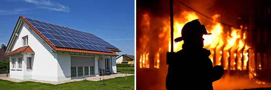
In "How Furniture Design Affects Firefighting, we looked at how the spec'ing out of particular materials can cause headaches for firefighters. Now comes news of another unforeseen troublemaker in the battle to extinguish blazes: Solar panels.
Solar panels of course generate electricity, and are located on roofs. The problem is that roofs are where firefighters will typically "vent" a burning building, to release some air pressure on the fire. But smashing or cutting the holes required for venting presents an issue as firefighters can suddenly be exposed to live electricity, even at nighttime or in the absence of sunlight, from a cut solar panel. If the roof in question is metal, you've now got a live roof covered in human beings now exposed to double jeopardy.
Last week, firefighters in New Jersey arrived at the scene of a burning warehouse. Stymied by the solar panels on the roof, the building continued to burn for 29 hours while firefighters were forced to improvise. According to an article on that blaze in Reuters,
Even when systems are equipped with shutoffs, any light can keep panels and their wires energized, [Consumer Safety Director for Underwriters Laboratories, John] Drengenberg said.
...Experiments, funded by the Department of Homeland Security, have shown that the light emitted by fire equipment can generate enough electricity in the panels that a firefighter who inadvertently touches an energized wire might not be able to let go, a phenomenon known as "lock on."
What is the solution? Solar panels are only increasing in popularity and are arguably a very important key to sustainable living. And if we could figure out how to universally prevent fires, it would already be on the table. In the meantime, designers and engineers are going to have to work out some safety factors, and more importantly, begin a comprehensive education program with emergency personnel for how to safely destroy their product.
Let me start with a bit of semantics that it isn't really a question of whether the shades you see are the same or different. It's a question of the actual colors. Shades are just the color with a percentage of black added to it, just as tints are just the color with a percentage of white added to it.
There is actually active discussion over whether or not everyone's color wheel is in sync. The order of the colors has to be the same, otherwise things like complementary palettes wouldn't work. But, the wheels themselves might actually be rotated.
That would potentially mean that what I perceive as:
You might perceive as:
Recent studies have shown that our evolved perceptions of color do not directly correlate to how our cones sense color - perceptions are not predetermined by wavelength.
So, it's possible your blue is not someone else's blue. The jury is still out.
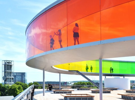
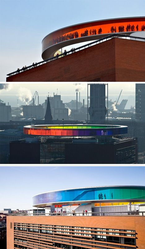
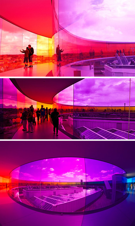
Rainbows on the horizon are impossible to approach, let alone pass through – they flicker and fade like phantoms, except in the case of this iconic space.
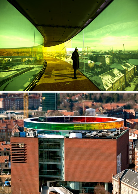
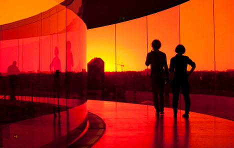
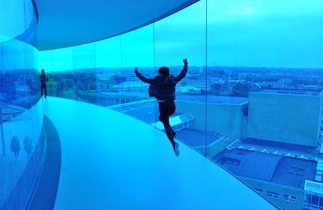
Your Rainbow Panorama by Olafur Eliasson is an enclosed circular walkway that sits atop the ARoS Aarhus Kunstmuseum in Denmark. Its colored glass spans from floor to ceiling and rotates visitors through five hundred feet of color, looping them through a rainbow of panoramic city views.
The experience of walking along this 500-foot path is at once reductive and complex. At each step, the city outside becomes a monochromatic landscape, filtered through the lens of single slices of color that rotate as you move.
From outside, the raised structure forms a bright beacon within the city, a recognizable icon thanks to its combination of round shape and vibrant color. As this project illustrates, powerful architecture can be about more than structure, building and void – it is also about shaping experience through color and light.
According to its Danish-Icelandic designer, it is “a space which virtually erases the boundaries between inside and outside – where people become a little uncertain as to whether they have stepped into a work or into part of the museum. This uncertainty is important to me, as it encourages people to think and sense beyond the limits within which they are accustomed to moving.” In the end, is it an gallery space, a viewing platform, a permanent art installation … or does it perhaps span a spectrum of spatial definitions as well as colors?
The Blue Carpet is an intricately designed illustration by Paris-based art director Jonathan Bréchignac that is made entirely out of blue Bic pens and ultraviolet ink on paper. The labor-intensive piece features a detailed, fairly symmetrical pattern filled with a variety of complex geometric shapes, forcing Bréchignac to map out every minute area of the 115 x 73 cm illustration.
The ambitious endeavor is a spectacular display of discipline and determination. From the mandala-like center to the finely detailed border, the artist reflects a sense of concentration, diligence, and persistence. Bréchignac's past carpet drawings exude a similar degree of the aforementioned attributes. There is an overwhelming presence of repetition in each piece that adds to his impressive artistic feat.
The Blue Carpet can be seen in person as part of a group exhibition titled The Blue Route, which will be on display at the Villa Empain in Brussels from September 27th through February 4, 2014.
Australian photographer Lincoln Harrison is now well-known for his magnificent long exposure photography of radiant, swirling stars illuminating the night sky. Each remarkable shot after the next is a breathtaking document of the luminous, starry Australian nights Harrison diligently stayed up, from sunset to sunrise. The images utilize the natural rotation of the earth to present a spectacular spiraling pattern in the sky, like a magical backdrop to an otherwise serene landscape.
We're pleased to announce that all of the images featured in this post are now available as prints and canvases through our art store, My Modern Shop.
Hugo Oliveira: Architects like Alison and Peter Smithson believed that they could transform people’s lives for the better through architecture. Is this sort of innocence important?
Alain de Botton: The Smithson’s ambition is terrific. The problem is that architects can’t change the world until they become developers. At the moment, the best of our architects are merely hired jesters designed to enliven the egos and bank balances of large property developers.
The current crisis has exposed the existence of a myriad of buildings which are now empty. Promoters, contractors and architects played a part in this. Do you think that in architecture schools a sort of primum non nocere should be taught to students?
Architects are very badly trained in economics. They need to learn to understand finance, how property development is financed – and therefore, they will be better prepared to interpret and in some ways help to prevent crises.
Can an architect’s character and moral be reflected in her/his work just as much as any other virtuous attributes or technical skills?
Yes, humanity is present in buildings, just as it is in music, cooking, fashion and conversation. Part of being a really great architect is being – at some level – a kind person. This is very rare…
Why do you think that architects have been – for a long time – uncomfortable when talking about beauty?
Architects are generally very worried about having to justify to clients that they designed a building in a certain way, “Because it looks beautiful.” That makes them very prone to be attacked and value engineered. So they talk about anything other than beauty. They need to recover their confidence. It is better to be frank about one’s interest in this field.
Do you agree with Dennis Dutton when he said that beauty is not in the eyes of the beholder, rather “it’s deep in our minds. It’s a gift handed down from the intelligent and rich emotional lives of our most ancient ancestors”?
Yes, beauty is objective, not subjective. Everyone agrees that Venice is attractive, no one thinks that Frankfurt is. Enough of relativism – which merely gives property developers an excuse to say that “anything goes” – and then we end up with Dubai…
Artist Bill Domonkos creates delightfully surreal animated GIFs that combine archival photos, film footage and digital art. He has much more art and experimental film on his Tumblr.
Osteoarthritis (OA) is the most common form of arthritis, and is caused by wear and tear of protective joint cartilage over time. While there is no currently known cure for OA, there are several treatment options available to patients. Among them is Moximed‘s newly developed implant designed to relieve excess load on the afflicted joint. While the California-based company’s KineSpring Knee Implant System is currently only designed as a knee implant, the technology could be adapted for other commonly afflicted joints in the future. The procedure is designed to be the first step in invasive OA treatment, as it does not alter the anatomy of a patient. On the contrary, the KineSpring system can prolong the usefulness of an afflicted joint and delaying the need for knee replacement surgery.
At the core of the technology is a spring loaded system designed to function alongside the existing knee anatomy. According to Moximed’s website, “As the knee extends, the spring compresses and absorbs joint overload. As the knee flexes, the spring relaxes and becomes passive.” The procedure is fully reversible, and largely noninvasive, making it a particularly attractive option for physically active OA patients. Although this technology is designed to be an option for OA patients, it is not designed to be a permanent solution. It is intended to put off invasive surgery for as long as possible, however eventually it is intended to be removed.
I have to write a lot of emails. A lot of emails. And each and every one is like a vacation to hell. If you're anything like me, you know exactly how that feels, but this video from Domics sums it up so perfectly it makes want to die and never write another email again.
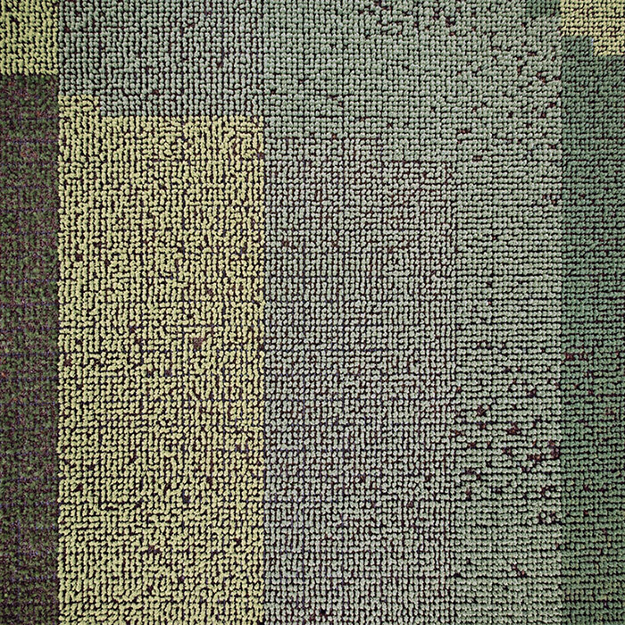
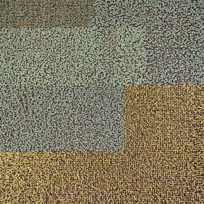
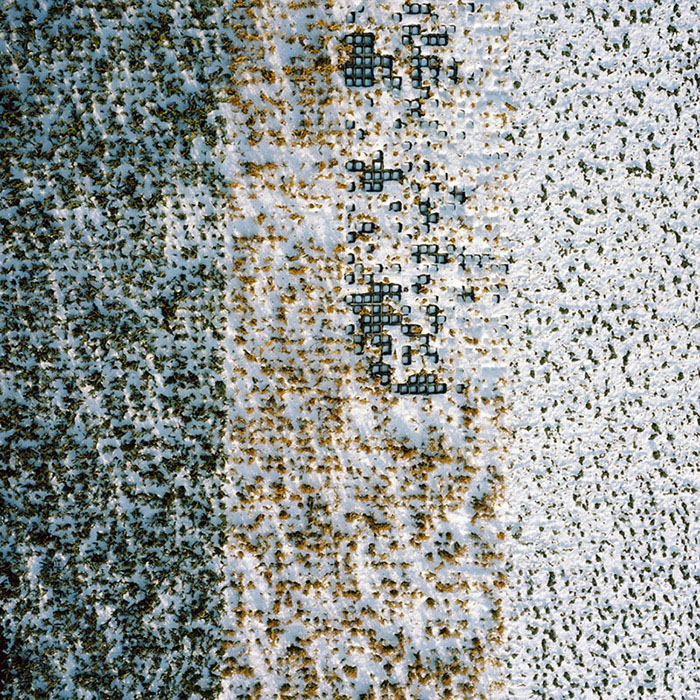
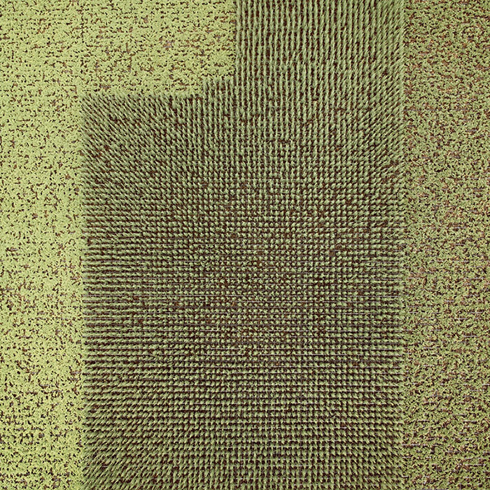
The previous post reminded me of the work of Dutch photographer Gerco de Ruijter, whose fantastic images of gridded, altered, and semi-artificial landscapes have been featured here on the blog before, first with a stunning series of low-altitude aerial shots of tree farms, taken with cameras mounted on kites and fishing rods, then with a video of circular crop-irrigation landscapes in the western U.S., and, last but not least, with a disorienting urban video shot by a flying pigeon.
For the current project seen here, called "Almost Nature," de Ruijter took aerial photos of a tree nursery in Boskoop, "the nursery center of Holland," where nearly 2,200 acres' worth of controlled tree growth is underway at any given time.
Construction must either be anchored into the ancient sea bed, which is about 60 feet deep in this area, or "float" in place on the bog on a special kind of raft. Until fairly recently, heavy structures were built on the top of alternating layers of logs (which float) and cow hides (which seal out the water). Even some old cathedrals were built in this manner. Gouda Cathedral is an example.
The Gouda cathedral is thus a kind of earth-ship, a vessel floating unanchored on a "special kind of raft" easy to mistake for architectural foundations.
In any case, the short text de Ruijter wrote for the series points out, in fact, that "all these little plants are clones" and that "each color descends from the same source. Standing in a square tray they resemble the photographic pixel."
With this in mind, you could presumably undertake a project to plant these trees in a way that would produce an eventual, albeit very low-resolution, JPG—or, given the lifetime growth and seasonal changes of the trees, an animated GIF, combining digital representation with forestry and turning the aerial view into a new kind of living cinema.
You can see Boskoop on Google Maps, where the pixellation de Ruijter describes is obvious—if not as immediately captivating as it appears in his own photos—in the carefully managed greenhouses, nurseries, and local agriculture of the area.
The landscape from above is almost more like a series of polychromatic test-swatches, like something you might use to check the sensors of satellites with.
Meanwhile, de Ruijter's CROPS video is currently on display at the Hirschhorn Museum in Washington D.C., where he will also be speaking about his work on Tuesday, October 8th, at 8pm, at an event that is free and open to the public, and there will also be a short presentation in the gallery space itself on Friday, October 11th, at 12:30pm.
A team of 20 researchers from University of Alberta proudly announced a commendable achievement on Thursday. Using no fewer than five different experimental methods, they've discovered over 3,000 different chemical compounds in human urine. And it only took them seven years.
The waiting room. A window looked over the parking lot, toward the dawn. Perfunctory furnishings did little to warm its medical architecture, a shelf with a single empty vase and a single childrens' book and a stack of religious magazines. They don't want you to get too comfortable. The boy stopped wandering off to get a cup of tea or go to the toilet. He knew it was nearly time.
"He's conscious now," the nurse said at the door, then led them inside. Harry's heartbeat on a monitor. Harry.
His blue eyes were open. He looked up and saw something in her.
"I forgive you," she said again and again. He lay pale as a cracked egg, lashed down with tubes and her sudden awareness of loss. Instants of pain came and went. He closed his eyes.
The boy shouted into the lowering fog, settling upon his father. "Don't die, Dad, don't!" he cried, his dark wet eyes shining.
"Well, son," Harry said. "All I can tell you is ..."
His voice trailed off. But only for a moment.
"Actually, could you pop to McDonald's? This baked tater's gonna kill me."
The boy knew that he could have said more. Too much. Maybe. Too much.
It's incredible, really. It features a central spire and an encircling picket-fence that's been reinforced by horizontal rails, and is strung together by a series of radially oriented guy wires. An impressive edifice at any scale, the structure measures less than 2 cm across. And here's the real kicker: nobody knows what made it.
If you're absolutely fanatical about keeping the lines of your beard or goatee clean and symmetrical, you probably tossed your old razor after seeing that Philips is introducing a trimmer with a built-in laser-projected guide. The StyleXpert Beardtrimmer 9000 takes your obsessive grooming routine to the next level; you'll just want to be careful trimming your eyebrows.


 [Image: The west coast of North America as it appeared roughly 215 million years ago; map by Ron Blakey].
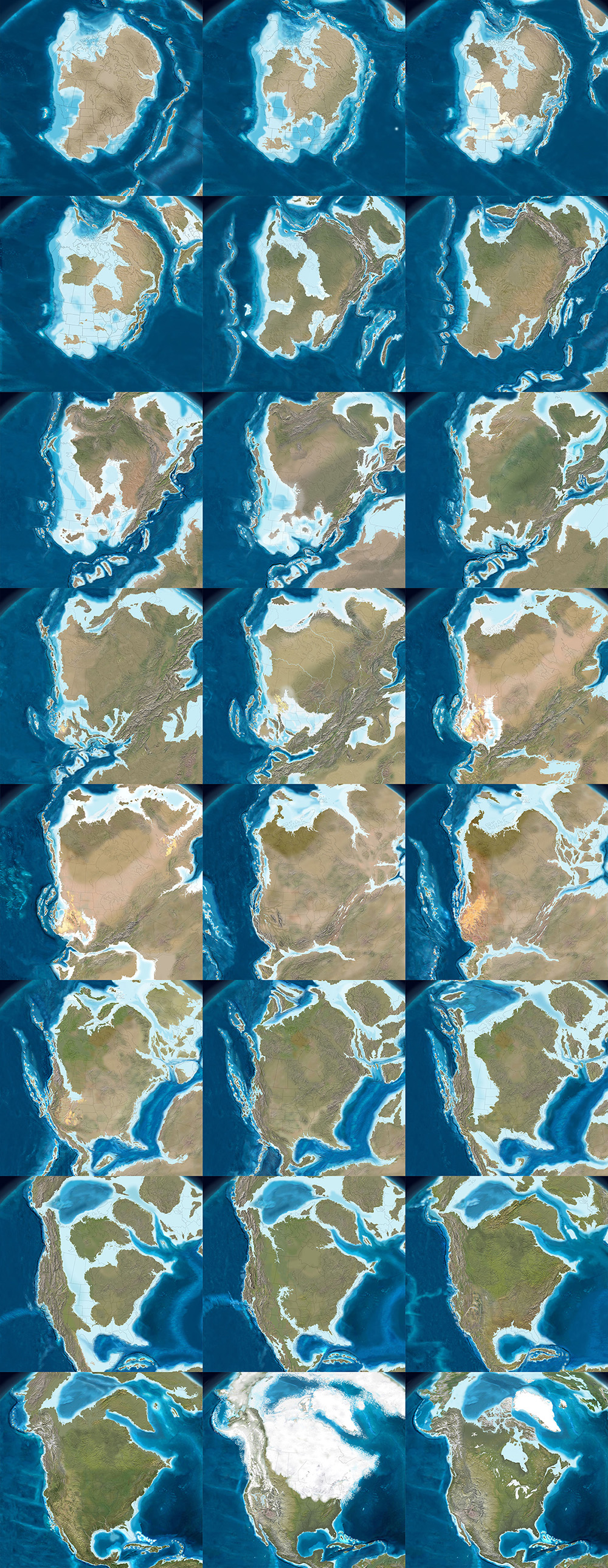
 [Image: The west coast of North America, depicted as it would have been 130 million years ago; the coast is a labyrinth of islands, lagoons, and peninsulas slowly colliding with the mainland to form the mountains and valleys we know today. Map by Ron Blakey].


 [Image: A painting by Ron Blakey depicts a geological landscape near Sedona, Arizona].


 You might perceive as:


") Osteoarthritis (OA) is the most common form of arthritis, and is caused by wear and tear of protective joint cartilage over time. While there is no currently known cure for OA, there are several treatment options available to patients. Among them is Moximed‘s newly developed implant designed to relieve excess load on the afflicted joint. While the California-based company’s KineSpring Knee Implant System is currently only designed as a knee implant, the technology could be adapted for other commonly afflicted joints in the future. The procedure is designed to be the first step in invasive OA treatment, as it does not alter the anatomy of a patient. On the contrary, the KineSpring system can prolong the usefulness of an afflicted joint and delaying the need for knee replacement surgery.
Osteoarthritis (OA) is the most common form of arthritis, and is caused by wear and tear of protective joint cartilage over time. While there is no currently known cure for OA, there are several treatment options available to patients. Among them is Moximed‘s newly developed implant designed to relieve excess load on the afflicted joint. While the California-based company’s KineSpring Knee Implant System is currently only designed as a knee implant, the technology could be adapted for other commonly afflicted joints in the future. The procedure is designed to be the first step in invasive OA treatment, as it does not alter the anatomy of a patient. On the contrary, the KineSpring system can prolong the usefulness of an afflicted joint and delaying the need for knee replacement surgery.


 [Image: From "Almost Nature" by Gerco de Ruijter].
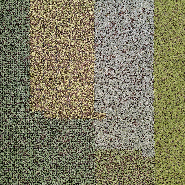
 [Images: From "Almost Nature" by Gerco de Ruijter].
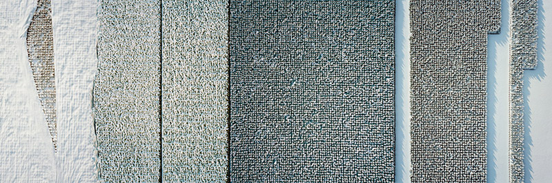 [Image: From "Almost Nature" by Gerco de Ruijter].
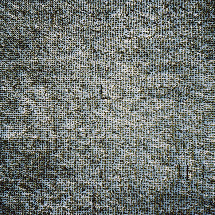
 [Images: From "Almost Nature" by Gerco de Ruijter].
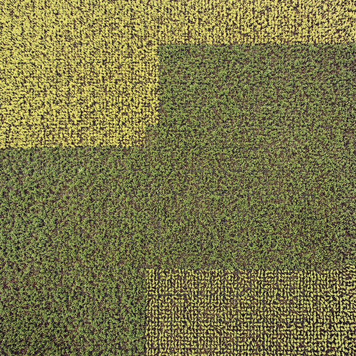
 [Images: From "Almost Nature" by Gerco de Ruijter].
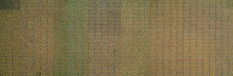 [Image: From "Almost Nature" by Gerco de Ruijter].
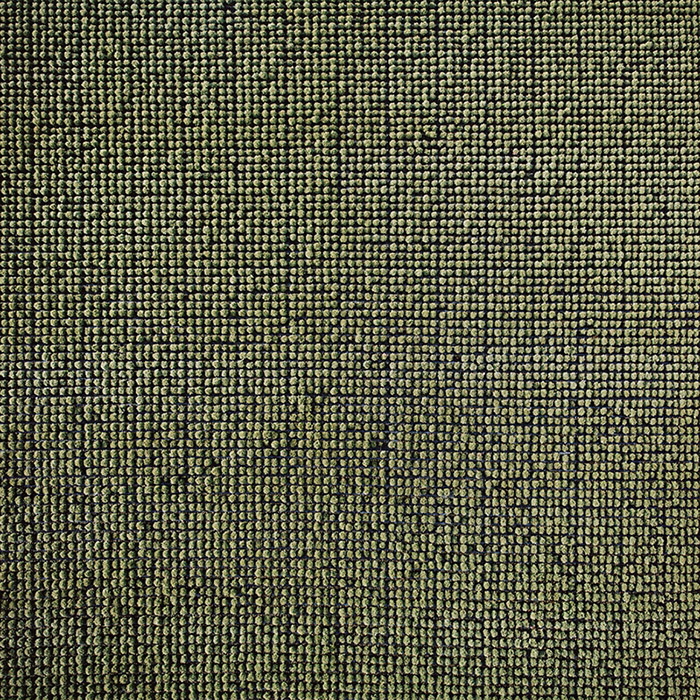 [Image: From "Almost Nature" by Gerco de Ruijter].