By Richard Cobbett on October 15th, 2014 at 2:00 pm.

Well, 21st Anniversary really, but who’s counting? Gabriel Knight 20th Anniversary Edition is a chance to return to 1993 to re-experience the Schattenjager’s first case, but has it stood the test of time? Note to anyone who hasn’t played it, this is mostly going to be looking at the game as a remake rather than as a brand new adventure. Some spoilers inevitably lurk within.
To my mind, there are two good reasons to do a remake. The first, which pretty much never happens, is when a game had an idea that it just wasn’t able to pull off at the time, like, say, the original Space Quest. The second is when the world has moved on to the point that all you can see are cobwebs, such as happened with the original Quest for Glory. There are other reasons of course, not least making a quick buck some old IP from a dark vault, but they’re the ones I can get behind.
Gabriel Knight simply isn’t a game that needed a do-over. It’s one that easily fits in the category of ‘classic’ rather than simply ‘old’, with artistry that still absolutely stands up. The interface is a bit clumsy. The graphics are a touch blocky. The narrator single-handedly stretches the playtime from a few hours to something approaching the half-life of Bismuch-209 unless you switch her off, which you should absolutely do. Get past that though, which takes a few minutes max, and what you’re left with isn’t simply a great adventure in terms of the story and writing that it always gets very justifiable praise for, but one that I’d argue shows Sierra as a whole at its creative peak.
Really, go back. Look at the original. The choice of colour palettes; cold but comfortable blues against bright and chaotic orange. The incidental animations. The rich texture of the backgrounds. The claustrophobia. I won’t say it’s perfect, but it’s an adventure I feel comfortable pointing to and saying that everyone involved brought their A-Game. Well, maybe whoever originally tried ripping off the Forever Knight titles phoned it in just a tad. But the rest? Golden.

20th Anniversary doesn’t come close to living up to that. It’s a passionless, jobbing remake that shoots for adequacy and generally hits it, celebrating the original primarily by highlighting just how good we had it back in 1993. Now, don’t get me wrong. It’s fine. Fine. It’s the same basic game, and that game holds up incredibly well, considering – certainly more than, say, the first Leisure Suit Larry. Really, if what puts you off Gabriel Knight is its graphical resolution, then consider this one your Schattenjager in shining armour. The new voices are basically decent, most of the graphics are okay, it’s nice to have a better quality version of the soundtrack to replace the old MIDI one, and the new interface certainly makes it a much easier game to get into than the original, with its million verbs, pixel hunting, and deaths that actually kill you dead whether you saved lately or not.
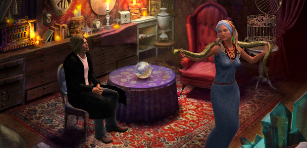
That jump has its price though, including a move from sprites that actually feel like they’re part of the backgrounds to 3D ones that sit on top of them, and an odd lack of atmosphere despite the artists having far more tools at their disposal. The original Gabriel Knight shot for a graphic novel type world of cold and dark, which went a long way toward hiding the fact that honestly not that much actually happens in it for about a week of game time, and even then, the villains are the most laid-back voodoo cult in the history of fiction. This one goes for higher fidelity, which makes for some genuinely lovely areas, like Gabriel’s bookshop and the voodoo museum, but also a lot of flat ones and a general lack of emotion where it should be pushing a sense of style and quiet menace.
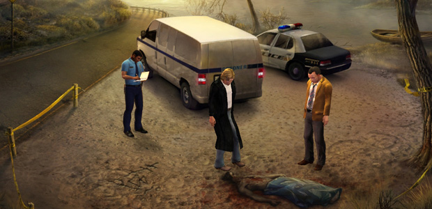
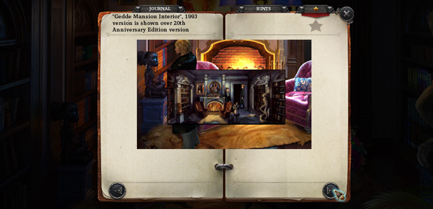
While none of them are a big deal individually, it also doesn’t take long to notice that most of the incidental details have simply been thrown out. Grace, for instance, no longer has her conservative brown skirt, but has switched to easier to animate jeans. Gabriel can no longer climb the ladder in his bookshop. When the police leave the first crime scene, it’s off-camera. There’s no longer the repairman fiddling with the thermostat in the police station, just a Post-It note saying not to fiddle with it. Gabriel no longer hugs his grandmother when he visits her. Now, sure, there are good reasons not to bother with these things, especially as a lot of it would be tricky for the 3D models or require a lot of work creating one-time assets. Going back to the original after playing this though just reinforces how much more soul it squeezed out of pixels than its remake ever manages with polygons.

On a wider level though, the art is mixed. The characters aren’t great, and nor is their animation. A bigger issue though is the number of clunky backgrounds where scenes designed to be tight and confined letterbox locations have simply been blown up to iPad friendly 4:3, without enough consideration always given to whether or not they actually work in that context. You can’t turn a TV show into a movie simply by blowing up the film, but that’s what 20th Anniversary tries, as well as liberating itself from the limited VGA palette without seemingly appreciating what it contributed to in terms of mood and consistency and character. Limitations are not always a bad thing.
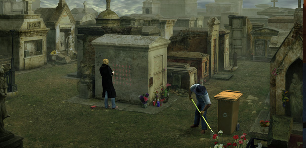
This isn’t necessarily something that comes across in a single screenshot or two, but the global art direction is definitely something of an issue here. In particular, while individually most scenes look fine, there’s little consistency. Most backgrounds feel like they were made in isolation and to order, with little care given to the overall atmosphere, or ways that modern technology could take these designs from 1993 and reimagine them rather than simply recreating them. It’s not like we don’t have modern technologies like particles and lighting to push the mood in ways that were unimaginable in an era of blocky sprites and scanned backgrounds. There’s some of that on offer here, yes, such as light beams and particles, but not enough. Everything that felt gritty and moody in 1993 now feels static and sterile, and most problematically, harmless. 20th Anniversary takes Gabriel Knight from being an Angel Heart inspired supernatural horror to a nice quiet amble around New Orleans.
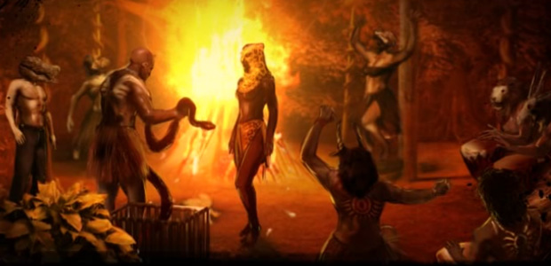
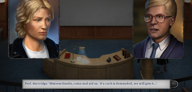
One big, big, big exception to this criticism is the new graphical novel cutscene style. This is fantastic, going from the simple panels and very limited animation designed for the original floppy-disk game to a new, dynamic, gorgeously done motion comic style. I confess, I didn’t have high hopes for them. The first one, at the lake, is bloody awful and totally misses the intended emotion. That turned out to be the only dud though. The rest offer some of the best individual changes and improvements the remake has to offer, with a sense of life and expression and style that greatly improves on the originals. In particular, in a game that all too often lacks it, they explode in moments of genuine passion, making full use of fire and splatter and cinematography in well-directed sequences that both work well as direct replacements for the original panels, and as perfectly effective alternatives to other scenes. The ceremony on St. John’s Eve is an example of the latter – portraying it in the graphical novel style avoids a lot of custom animation and modelling, and allows for the characters to be powerful and expressive in ways the 3D figures never even get close to elsewhere.
In short, much applause deserved there. If only the whole remake had so much fire in its belly.

Again, Gabriel Knight 20th Anniversary is basically Gabriel Knight, and Gabriel Knight is a worthy adventure. Phoenix has however done some fiddling around and reworking and even adding bits, and some of those changes are definitely for the better. Schloss Ritter for instance is no longer a Disney cartoon version of a German castle, but something far closer to the modern European style of Gabriel Knight 2, with its caretaker Gerde now sitting behind a table and doing the books instead of sitting in a maid uniform peeling potatoes. Excellent. Worthy change, well implemented.
And that’s not the only one either. It’s now much easier to find the snake scale on the lake. There’s a brand new ‘horror’ sequence thrown in that’s a little out of the game’s normal style, but I thought worked quite well at making the villains a little scarier. Being able to hit the spacebar to see all hotspots pop up makes the research section of the game much more fluid. If you don’t already know the game backwards, the hint system is also going to be welcome, doling out each clue on a timer to encourage you to take the next step, and with Gabriel’s journal both hinting at objectives and providing a recap of what’s happened so far. These additions unquestionably make the game much more fluid and less frustrating, without at all dumbing it down or diminishing its charm.
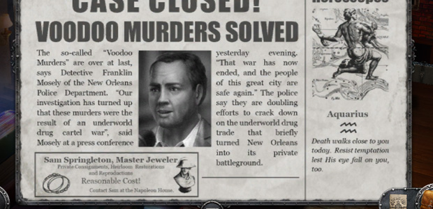
Unfortunately many of the other changes are sloppy at best. Mistaking Gabriel’s detective character, Blake Backlash, for his pen-name and then spelling it wrong. Jokes about Gabriel’s hair that don’t work now he’s gone from short and spiky to long and leonine. Streamlining the flow so that locations only appear when they’re needed (which I can accept, even if I find it makes the world feel a lot more like puzzle locations than a place that Gabriel actually lives in), but then giving no thought to how to actually introduce them. Cue silliness like the Napoleon House bar having to be unlocked by the guy you meet there, Sam, having conveniently taken out a front page advert in the newspaper to announce that anyone who needs jewellery work done should come see him. There. In a bar.

Ngggh. That’s just so lazy, and bizarrely unnecessary given that Gabriel is a regular there… the bartender says so… and so having him just drop in earlier would be totally justified.
Again, like most of the problems with 20th Anniversary, these things don’t matter all that much in themselves. They’re nit-picks. After a point though, little things start to smack of a lack of care and attention that runs depressingly deep throughout, which is all the more obvious in a remake of a game noted for having so much blood and sweat poured into it that its boxes shipped damp.

It’s the added content that’s the real disappointment though. As good as Gabriel Knight’s story is, in many ways it very much shows its age and there’s a lot of stuff that could have done with a little touching up. The whole thing hinges on a love story, for instance, between Gabriel and rich socialite Malia Gedde, but the execution of it is fairly weak. (Really, it more or less boils down to him lying his way into her house, then shaking her while shouting “ADMIT YOU LOVE ME! YOU LOVE ME!” until she agrees – helped along more by destiny dictating they get together than any smooth moves on his part). That could have been built on or reworked a little maybe, especially as Jensen has spent the last few years writing romance novels. Or alternatively, there’s plenty of scope for things like interactive flashbacks, new avenues of exploration, more villain presence, or a reworking of bits that many people would probably be happy to see changed, like the interminable snake mound.
20th Anniversary changes… none of that. Well, one cutscene for the voodoo cult. Nor does it make any effort to smooth out some of the problematic bits that were there before, like how easy it is to miss what annoys the snake in the voodoo museum. All the rough edges are treated as sacrosanct, with the exception of anything that might interfere with the iPad version the “streamlining”.

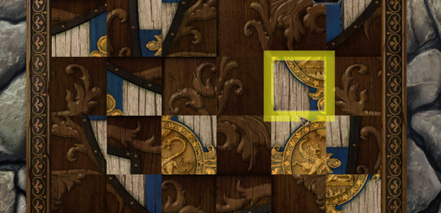
What does it add? Ghastly new puzzles. They’re described in the bonus features as being intended as “surprises” for returning players, and yes, they are, in much the same way as a rattlesnake in your toilet or half a worm in your apple. You know what no adventurer has ever said? “Gee, this game is a classic, but it’s missing something! I know! Sliding blocks!” And you know why? Because the target market for adventures is not brainless shit-whippets! Nevertheless, to play Gabriel Knight 20th Anniversary is to walk into the Schattenjager library – yes, still locked, until a fucking dream dragon gives you the key – and find that their real secrets are now hidden behind a jigsaw puzzle.

…
Phoenix Online Studios, go stand in the corner. That corner. Right now.
Actually, no, wait. Hold on a moment, because I’m not done. While that’s absolutely the most banal of the additions, it’s not actually the worst. As tempted as I am to go through them one by one and explain in great detail why everyone involved should be beaten around the face with a wet halibut, every single new puzzle added is both amateur hour garbage and tonally inappropriate.
I mean, seriously, come on. This is Gabriel Knight, a series that’s never exactly been hailed for its puzzles. Its charm is its character, its texture, its research, and other things that should be bread and butter with jam on top for an adventure game. There could have been deeper dives into the voodoo side, code breaking using slightly more advanced means than buying a book that completely blows open the conspiracy. There could have been interactive flashbacks to Gabriel’s ancestor, letting us meet Tetelo and explore a new area with a different ambience. There could have been a section following the lineage of the Gedde family, a la Le Serpent Rouge. There could have been so many things that might have added to the story and filled in the gaps and embraced more of the historical richness that The Beast Within would later do so well, maybe with a character like Marie Laveau or some other voodoo figure that must have come up while researching the story…
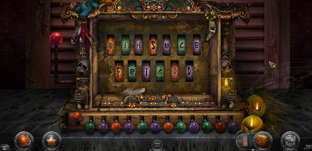
…but you know what we got instead? We get puzzles like persuading a character to translate voodoo symbols, not by demonstrating your knowledge to win her over, not by doing her a favour, but by making what can only be described as Baby’s First Lights-Out Puzzle display the words “TRUSTED FRIEND”. That is the only message it can display. That is this machine’s sole purpose. Maybe it would have been fine in another adventure, but this one? Gabriel Knight? Don’t be ridiculous.

By far the biggest disappointment of the remake though is what should have been its best feature – the behind the scenes content. 20th Anniversary has gathered together a ton of it, including original storyboards, concept art, comments from the original team, snippets of what could have been… and then pissed it all away with poor execution. Everything is displayed in a tiny Journal window in the middle of the screen, with nowhere near enough space to put things. You can’t zoom in on/fullscreen the pictures to see them properly, only squint at tiny resized versions. I just don’t get this. Why take so much time to gather all this stuff and then degrade it all for the sake of the interface?
Ordinarily, I’d have finished the game then settled back for some browsing. You can’t do that though, because rather than doing the sensible thing and unlocking more and more behind-the-scenes material as you play, every bit of it is assigned to a specific screen and only pops up when you click the star in that location. That means that you get one shot at checking out what it might have to say about, say, Malia Gedde’s house, there’s little scope to discuss evolving themes or continue past thoughts, and the choice of what to display often feels totally random. An interview with composer Robert Holmes… outside the snake mound in Africa? A picture of the Bayou maze… in Schloss Ritter? Probably the most head-scratching example is the concept art for the wonderful cutscene where Gabriel meets his uncle, described in the note by Jensen herself as “the dramatic highlight of the story”. It’s sandwiched between – and I swear I am not making this up, I just double-checked – the pencil art of a corridor and art comparison images of a janitor’s closet.
Worst of all, even when the archives have something of interest, there just isn’t space for it. The result is that the game’s idea of a worthy trivia nugget is the likes of “Original bookshop vs. the new. I wanted more New Orleans flavour in the remake.” Or discussing a storyboard with Sierra’s former Vice President of the Bleeding Obvious, “These ideas were later used to inspire drawings, paintings, video capture and 3D animation.” I confess that I haven’t looked at every screen and there may well be a few gems, but this is not exactly the loving nostalgia I was hoping for. I wanted to know more about the background, of alternate stories, of what could have been, of what plans were in mind for the next game, of the stories behind the research – the good stuff straight from the horse’s mouth that we don’t generally get to find out about, and certainly not 20 years down the road. Instead, I quickly got bored of seeing these scraps, craving something meatier than the average tweet.

This kind of thing is what I find most frustrating about 20th Anniversary. It’s not the pixels on screen that ultimately made the impression, but the absence of what was behind them – the hundreds of indefinable somethings that separate a good game from a great one and a great one from a classic. They’re not seen so much as felt, both when done well, like sinking into a warm bath, and when they’re absent. If Gabriel Knight was the product of care, this is the bastard child of compromise – to expectations, to budget and, in fairness, likely a million publisher notes.
Where it succeeds is in modernising Gabriel Knight for an audience that will never, ever play the original. And that’s worth something, to be sure. It fails though at recapturing most of why the original is so beloved, and at channelling it for its changes. When it can’t simply rehash, it flounders, and even when it does, it largely proves why great artists remain great even when those that follow have better tools at their disposal. If what you want are the Sins of the Fathers in HD, 20th Anniversary has you covered. For revisiting the triumphs of the past though, stick with the original.


 CSPANAll of the candidates who appeared in the 2014 Vermont gubernatorial debate.
 CSPANCris Ericson at the 2014 Vermont gubernatorial debate.
  CSPANBernie Peters on the debate stage.



 via Zeloot
Will 50 Watts


