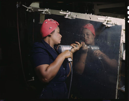
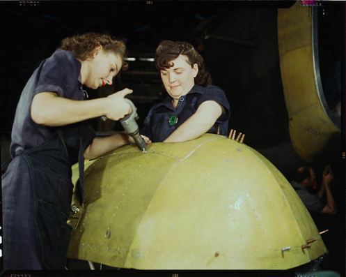

The Library of Congress has made a ton of images available of women working during WWII — actual real-life riveting Rosies. You can see a bunch more at Stuff Mom Never Told You.
The Library of Congress has made a ton of images available of women working during WWII — actual real-life riveting Rosies. You can see a bunch more at Stuff Mom Never Told You.
Bunker.jordanSO. PRETTY.


“Warren Gamaliel Harding (November 2, 1865 – August 2, 1923) was the 29th President of the United States (1921–1923), a Republican from Ohio who served in the Ohio Senate and then in the United States Senate, where he protected alcohol interests and moderately supported women’s suffrage. He was the first incumbent U.S. senator and the first newspaper publisher to be elected U.S. president.”

Few sounds are as recognizable as the THX Deep Note. [Batuhan] did some research, and set about recreating the sound. The original Deep Note (mp3 link) was created in 1982 by [Dr. James A. Moorer]. [Dr. Moorer] used the Audio Signal Processor (ASP) (AKA SoundDroid) to create the sound. The ASP was a complex machine to program. The Deep Note took about 20,000 lines of C code to program. The C code was compiled to about 250,000 discrete statements to command the ASP.
Only one ASP was ever built, and LucasFilm owned it. Instead of recreating the hardware, [Batuhan] used SuperCollider to recreate the sound. Just like the ASP, SuperCollider is a tool for real-time audio synthesis. The difference is that SuperCollider is open source and runs on modern computers. [Batuhan] used his research and ears to perform an analysis of the Deep Note. He created two re-creations. The first is carefully constructed to replicate the sound. The second is a Twitter worthy 140 character version. Both versions are reasonable facsimiles of the original Deep Note, though they’re not quite perfect to our ears.
[Batuhan] isn’t the only person working on recreations. Deep Note in 1KB of JavaScript can be heard at http://thx.onekb.net/. We’d love to hear other versions created by Hackaday readers!
[Via Reddit]

Bunker.jordanLet's all build a bunch of these and lash them together, then float out into the sea.


The art of destruction
These three images represent a realization I had the other day: a damaged or destroyed object may be visually more appealing than the same object in its original state. The top image shows the pulpy remains of the National Library of Iraq, which was destroyed in 2003. At present the library, which included thousands of ancient books, looks more like the surface of a rock than a collection of thoughts and ideas. The charcoaled objects in the middle are three papyrus scrolls from Herculanaeum, a Roman city that was covered by volcanic ash in 79 AD. Its famous library was reduced to cigaret buds like these. The lower book, made in the fifteenth century, is damaged by beetle larvae - “bookworms” - who ate through its pages. As much as I would love to see these objects restored to their full glory, there is something oddly appealing about them in their present state. Sometimes destruction creates beauty.
Pics: the three rolls are Oxford, Bodleian Library, Gr. Class. f. 25-27 (more here); I blogged about them here. The story of the destroyed Iraq National Library is presented here (the image above is from that story). The “bookworm” image is from Emir O Filipovic (@EmirOFilipovic) and I used it in a blog some time ago (here).
Bunker.jordanWANT

If you don’t look at the scale of the things around it you might think this drive was ripped out of some vintage gear. It is actually a fully functional USB SD card reader that looks just like an Apple II Floppy Drive.
“A typical USB SD card reader is boring. Why not show your retro affiliation with a Disk II styled reader? Modeled after the iconic Apple II floppy drive from 1978, the shell is 3D printed SLA, painted beige to match the original.”


NASA's intrepid Curiosity rover has arrived at a scientifically enticing destination called "The Kimberley Waypoint," where researchers hope to carry out the next drilling operation into alien Martian terrain in search of further clues about ancient Red Planet environments that may have been favorable for life.

Arduino Vocal Effects Box by amandaghassaei
This Arduino-powered vocal effects box pitch shifts and distorts incoming audio signals to produce a wide variety of vocal effects. This project is my first experiment with real-time digital signal processing using Arduino. It samples an incoming microphone signal at a rate of about 40kHz, manipulates the audio digitally, and then outputs 8 bit audio at 40kHz. To minimize the amount of computation required by the Arduino, I used a technique called granular synthesis to manipulate the incoming audio signal. Essentially, as audio comes into the Arduino it gets cut up and stored as small (millisecond or microsecond sized) samples called “grains.” These grains are then individually manipulated and played back; they may be lengthened or shortened, stretched or compressed, played back in reverse, copied several times, or mixed with other grains. You can hear a (somewhat creepy) audio sample from the effects box below:
Granular synthesis creates a unique type of distortion caused by discontinuities between individual grains in the outgoing signal. Sometimes this distortion creates an effect I can only describe as a “ripping” sound, other times it introduces new frequencies into the audio that were not present before. Here is an example by Aphex Twin, the granular synthesis is especially prominent in the bridge at around 3min in. Another example of granular synthesis, this time applied to vocals for pitch shifting and textural effects, is from Paul Lansky. My favorite thing to do with this effects box is to use subtle pitch shifting to achieve an androgynous vocal sound, I got the idea for the project after listening to copious amounts of Fever Ray this past winter, you can hear how she pitch shifts her voice to sound somewhat masculine at times.
Bunker.jordanHOCKEY SCIENCE
Laughing Squid has posted this super cool video explaining the physics behind a slapshot.
Smarter Every Day shot some super slow motion video on a Phantom high speed camera to get to the bottom of what makes the ice hockey slapshot so powerful. Filmed at 3,271 frames-per-second, the video highlights how the University of Alabama in Hunstville hockey player’s stick strikes the ice before coming into contact with the puck. This allows the flexible hockey stick to build up energy, which is finally released when it comes up from the ice and strikes the puck, launching the projectile at a speed faster than the player is capable of swinging the stick.

Bunker.jordanShared for last comment.

Shit just got real.
My mind is blown
huh.
screw up a fitted sheet with grit that will get all up in your laundry machine in a futile and sisyphean attempt to not be at the beach while at the beach, why did you even come to the beach, what is your deal

Who needs fancy special effects when you've got real life? Arianespace just released an exhilarating onboard camera view of the recent Soyuz ST-A rocket launch carrying the the Sentinel-1A satellite into orbit. Watch the whole thing from start to finish.

This syringe is capable of staunching a gunshot-wound within 20 seconds — practically on contact. And it was just approved by the FDA to be used out on the battlefield.
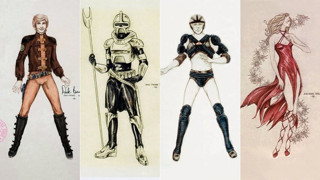
The 1978 Battlestar Galactica had some great Earth-toned costumes and a nice Star Wars-inspired look. But judging from some of these early costume concept art pieces by Jean-Pierre Dorléac, the show could have looked way more discofied and blinged-up. Plus there's a good deal more romantic-fantasy outfits, too.

Long before CGI brought 3D talking animals to life on the silver screen, animators were achieving remarkable—and strange—special effects with stop-motion. This segment from the short film It's a Bird! dates back to the year 1930.
Bunker.jordanThis is fucking awesome. (Warning: Feels)

A young boy feels powerful when he pretends to play the wicked sorceress in his backyard games, but the laughing of his next-door neighbor leaves him feeling powerless. Can he convince her to join in on the gender-bending fun?
This suit is designed to simulate the physical limitations that come with age. Although it might not be completely accurate, it is an interesting concept. Via Trendhunter.
An aging population means it’s more important than ever to be mindful of the needs of senior citizens, including their physical limitations. The South Bank University in London acquired a suit that when worn simulates the types of limitations senior citizens might have.
The suit was designed by Wolfgang Moll and it uses a few different techniques to simulate physical limitations. Weights wrap around the body, which reduce strength and dexterity, earmuffs limit hearing and goggles simulate different visual impairments.
To really understand how age related physical limitations feel, The Guardians Josh Halliday wore the suit and tried doing simple tasks. You can watch this young man struggle going up and down stairs, walking along the streets and getting money out to pay for coffee.
Bunker.jordanAwesome animation
We’re all big fans of chiptune here at Adafruit so this new documentary “Europe in 8 Bits” is definitely on our watch list!
EUROPE IN 8 BITS is a documentary directed by Javier Polo that explores the world of chip music, a new musical trend that is growing exponentially throughout Europe. The stars of this musical movement reveal to us how to reuse old videogames hardware like Nintendo’s GameBoy, NES, Atari ST, Amiga and the Commodore 64 to turn them into a tool capable of creating a new sound, a modern tempo and an innovative musical style. This is a new way of interpreting music performed by a great many artists who show their skills in turning these “limited” machines designed for leisure in the 80’s into surprising musical instruments and graphical tools. It will leave nobody indifferent.
Watch the full documentary on vimeo on demand here.
Tell policymakers that you care about protecting American innovation from poor patents and bad actors.
The House has already passed an important bill, and the White House is ready to sign it. Tell the Senate to pass much-needed patent reform now.
Bunker.jordanWould print. Gotta build a printer #NoMoneySomeProblems

This week’s selection is the very simple, yet powerful 4-way, 3/4” PVC Connector by Thingiverse contributor Jason Powell.
Some of the selections for Design of the Week are intricately designed with highly complex models. This one isn’t. The 4-Way PVC connector is perhaps the simplest item yet awarded Design of the Week. Why do so?
It’s not that the Connector has a complex design; rather that it’s design has such utility. Anyone can 3D print this very simple item, but by combining them with lengths of PVC pipe (as it is intended to be used) you can very easily build moderately sized structures with little or no fuss.
Further, the Connector design might be emulated in variations that could include:
A simple design such as the 4-Way Connector just inspires one to create connectors of all types. There should be a collection of connectors.
Via Thingiverse
Bunker.jordanThis is SO cool. It talks about the original lightsaber designs, and how the sounds were created. Wish I had been born in this era... would have absolutely loved to be a prop-designer.
Fast Co. Design has the story on this mini documentary that explores the creation of the iconic lightsaber from Star Wars.
In all of the annals of film and science fiction, you’d be hard pressed to find an object as singularly identifiable as the Star Wars lightsaber. Even if you don’t like science fiction, you can probably tell a lightsaber sight unseen, just by the distinctive whooshing sound it makes. That’s an impressive feat for a prop that, originally, was nothing more than a rotoscoped stick. It’s a journey that has been documented in this great 15-minute film that details the secret design history of the lightsaber.
According to George Lucas, he came up with the idea of a lightsaber for Star Wars because the film was meant to be a space-age Arthurian epic. It needed its own legendary weapon that the Jedi could use to set them apart, but it also needed to seem futuristic. Most importantly, since Jedis were supposed to be peacekeepers, Lucas wanted the weapon to be purely defensive. He finally settled on the idea of a laser sword to be his franchise’s Excalibur.
Bringing the lightsaber to life in the Star Wars films was an organic process. Originally, Lucas’s vision was that a lightsaber should be an extremely heavy weapon, at least 40 or 50 pounds, that required two-hands to lift. This is why all of the lightsaber duels in Star Wars are two-handed affairs. Over time, though, Lucas realized that he needed a way to show that Luke Skywalker was getting to be more proficient as a sword fighter, so the lightsabers became conceptually lighter, capable of being wielded with one hand.

Bunker.jordanA photograph of a photographer! Meta.
Photography On The Common
John Thomson (Scotland, 1837-1921)
England, 1870s, printed 1870s


Bunker.jordanOh no... GIFlanguage. I think I know how I'm going to spend my lunch hour today.

Two MIT Media Lab Grad students, Travis Rich and Kevin Hu, started GIFGIF, an interactive site that aims to measure and understand the potential of GIFs as web language. Click through to participate! via The Atlantic.
“We were talking about GIFs one day,” Hu told Quartz, “and we realized that they’re becoming more and more serious of a medium. They’re more popular, they’re used for more things.” Buzzfeed, for example, recently used GIFs to explain what was going on in Ukraine—reaching an audience that otherwise might have ignored the news. “And we realized,” Hu said, “that we could quantify this usage.”
The site, where visitors pick which of two GIFs relates better to a particular emotion, is powered by another MIT Media Lab project’s platform. Place Pulse used the multiple-choice A/B voting system to assign emotions to pictures of different cities, allowing researchers to quantify, for example, how “sad” or “unsafe” people felt when looking at pictures of Rio de Janeiro.
But Rich and Hu, who worked on separate teams but sat near each other (and the Place Pulse group) in the lab, decided to harness the system for their own purposes, to create a visual database of emotion. “It’s the same idea,” Rich said. “Taking something that’s very easy for humans to read—emotion—and translating it for computers.” While humans have no trouble deciphering what a GIF “means,” the same task is impossible for a computer.
Since launching on March 3, the site has drawn an average of 15,000 users a day who vote around 10 times per visit. “The average time is increasing already,” Hu said, “so we’re pretty optimistic for the future.” Their first goal is to build a text-to-GIF translator. “I want people to be able to put in a Shakespearian sonnet and get out a GIF set,” Hu said. But once they’ve gotten qualitative metrics for a large number of GIFs, they think the possibilities are pretty endless. “You could reverse-engineer it and use a GIF to find a movie that fits a certain mood,” Rich said.

In last week’s segment, Roman Mars’ podcast 99% Invisible gave us the story behind the mid-twentieth century invention of the bar code. We here at Adafruit print thousands of barcodes daily so it was especially fun for us to take this bit of manufacturing history, from Slate.
When George Laurer goes to the grocery store, he doesn’t tell the checkout people that he invented the bar code, but his wife used to point it out. “My husband here’s the one who invented that bar code,” she’d occasionally say. And the checkout people would look at him like, “you mean there was a time when we didn’t have bar codes?”
A time without bar codes is hard to imagine now. But it wasn’t that long ago, and the story doesn’t start with George Laurer. It starts with an engineer named Joseph Woodland. In 1948 Woodland was trying to come up with simple symbol that, when scanned, would translate to a number that a computer could use to identify a product.
Legend has it that he came up with his design while sitting on the beach in Miami. He was puzzling over the whole thing, thinking about Morse code and tracing circles in the sand. When finally, bull’s-eye!
The very first bar codes were in the shape of a bull’s-eye, though they weren’t called “bar codes” yet. Woodland’s invention was patented in 1952 as a “Classifying Apparatus and Method.” But Woodland’s “apparatus” would gather dust for 20 years—the scanners and other equipment needed to put the system in place were too expensive.
Finally, in 1973, a group of supermarket executives led by Alan Haberman decided they needed to get some kind of scannable symbol in place to move people through checkout lines faster. They laid out a list of specifications that their ideal symbol would have and asked 14 companies, including IBM, to come up with a solution.
That’s where George Laurer comes into the story.
Laurer was working at IBM at the time and was tasked with making Woodland’s circular “Classifying Apparatus and Method” work. But Laurer didn’t think the bull’s-eye would fulfill the specifications set forth by the grocery industry. So he set out to make something that would. Eventually, Laurer came up with a rectangular design that fit more code into less space and didn’t smear on the presses (like Woodland’s bull’s-eye symbol did). The “Symbol Selection Committee” voted unanimously for Laurer’s rectangular symbol and code, which they named the Universal Product Code, or UPC. A year later, in 1974, a pack of Wrigley’s chewing gum became the first item to be scanned with a UPC bar code.
According to GS1 (Global Standards One), the agency which issues bar code numbers, there are now about 5 billion bar codes scanned every day around the world.

Bunker.jordanThis is cool stuff! Listen to the sample at the end of the article!


Toronto-based artist Jess Riva Cooper created this haunting collection of ceramic busts called her Viral Series as part of an artist residency last fall at The Kohler Factory in Sheboygan, Wisconsin. The pieces seem to lie at the peculiar intersection of life and death, as it should be given her inspiration behind the sculptures. Cooper shares about the Viral Series via email:
In my art practice I integrate colour, drawing, and clay to create installation-based artwork. I investigate fallen economic and environmental climates in regions such as Detroit, Michigan, where houses have become feral, disappearing behind ivy, trees and Kudzu vines that were planted generations ago. In my sculptures, the world sprouts plant matter. Colour and form burst forth from quiet gardens and bring chaos to ordered spaces. Nature reclaims its place by creeping over structures. Wild floral growth subverts past states, creating the preternatural from this transformation.
Several of the pieces will be on view at The Wassaic Project opening in June, and you can see much more here. If you liked this also check out the ceramic work of Mary O’Malley. (via NOTCOT)
Bunker.jordangood

Chili's had planned to donate 10% of its customers' checks on April 7th to the National Autism Association , an organization that claims vaccines "trigger or exacerbate autism in some, if not many, children." This evening, Chili's announced it will be canceling the event based on feedback received from its guests.


