
Hovertext: Twist ending: The kid's eyes are pure white because he's a monster too! Spooooooky!
New comic!
Today's News:
Hovertext: Twist ending: The kid's eyes are pure white because he's a monster too! Spooooooky!
KrankotaOMFG
“Remember win you fell Bad the first thing you do is POOP!”

"Dont send this to enybody. This is yours".
i.imgur.com / Via reddit.com


"remember win you fell Bad the first thing you do is POOP!"
KrankotaHaha! These are super neat!
There are a number of ways to get through the painful time of year that is the NFL offseason. Apparently one of those ways is making sick Marvel-inspired NFL helmets.
As I picked through them individually, there are some seriously awesome ones. My personal favorite is the remake of the Pittsburgh Steelers’ helmet, which in a Marvel world would be the Pittsburgh Hydra.
I love how the tentacles incorporate some red and blue into the logo, for some weird reason, and the Hydra having a skull-like head is really cool. The New York Giants remake, the New York Dr. Strange, is clean.
There are also pretty some bad ones — no offense to the creator of these. For starters, the Cleveland Browns are converted to the Cleveland Things, which is kind of perfect because if you’re quarterback who goes to Cleveland, your career is smashed into a million tiny pieces, the same way a Thing pulverizes his enemies.
The Washington Redskins are recreated as the Washington Groots which is also hilarious because in Marvel’s Guardians of the Galaxy released in 2014, he could only communicate by saying “I am Groot!” over and over, which causes some serious confusion. Given the dysfunction within the Redskins, something about this just works.
We salute you, creator of these Marvel NFL helmets, for making these sweet lids.
You can check out Justin Kozisek’s full collection of helmets here or here.
(Source: Imgur via JD Campbell)
KrankotaThis is excellent.

This isn’t about sustainability or going off-grid or striking back at The Man. This is about wanting a goddamn BLT and knowing, just knowing, that every tomato at the grocery store, no matter how shiny and heavy and beautifully red, is going to be a mealy, watery, flavorless piece of crap.
KrankotaThis is neat! I want to get Wes and Rick to drink this beer so I can see the branding often.

(Est. 2014) "Seeing how finding the right craft beer has become an overly complicated endeavor, the brewers at Port Brewing Co. and The Lost Abbey decided to launch a new brand wholly dedicated to hop-forward beers. Dubbed The Hop Concept, they planned to launch with the Hop Freshener Series, a limited-run of IPAs focused on aroma and flavor, so you know exactly what you're getting."
Design by: Experiences for Mankind (San Diego, CA)
Opinion/Notes: If you enjoy drawings of hops this project is for you. The logo has a minimal hop drawing with a superhero-ish "H" inside and is paired with a chunky sans serif inside an oval. Nothing too special but nice enough and it works better with the type in a circle than cutting across the hop. The fun part of the project is the weird idea of pairing beer with the popular tree-shaped car fresheners for the overall brand name, the specific names of the beers — Dank & Sticky, Citrus & Piney, Lemon & Grassy, and Tropical & Juicy — and the label graphics. It makes for an odd yet memorable combination that looks surprisingly cool on the bottles and cartons.
Related Links: N/A


KrankotaDude. Like it's obviously not the story when it comes to what's going on in Baltimore, but holy shit that's weird.

Getty Image
There will be baseball in Baltimore tomorrow, but in an effort to negate the risk to public safety due to ongoing unrest in the city, MASN’s Roch Kubatko reports that Camden Yards will be closed to the general public, and Oriole Park’s 45,000 seats will be vacant at 2:05 p.m. as the White Sox take on the Orioles in the only one of the three scheduled games in this series that will be played at this time. To make up for last night and tonight’s cancellations, a single admission double-header has been scheduled for Thursday, May 28.
The Orioles were scheduled to welcome the Tampa Bay Rays to Baltimore for a weekend series on Friday, but in light of the circumstances, that series has been moved to Tampa, where the Orioles will serve as the technical home team and recieve the gate.
As of right now, there is no word on if and how the Orioles will be compensated by the league for tomorrow’s lost revenue or the difference between what they will make in Tampa on short notice vs. what they could have expected to make in Baltimore, but baseball matters obviously aren’t foremost on the minds of the Orioles right now.
Source: MASN
Krankotahttp://www.movingbrands.com/work/reframing-the-hillary-brand-debate is the whole article.
Man. THis is SO much better.
Krankotaa) Hahaha! So fat!
b) Second comment: American Hero Cat Defies the Greatest Generation -- that is seriously high quality.
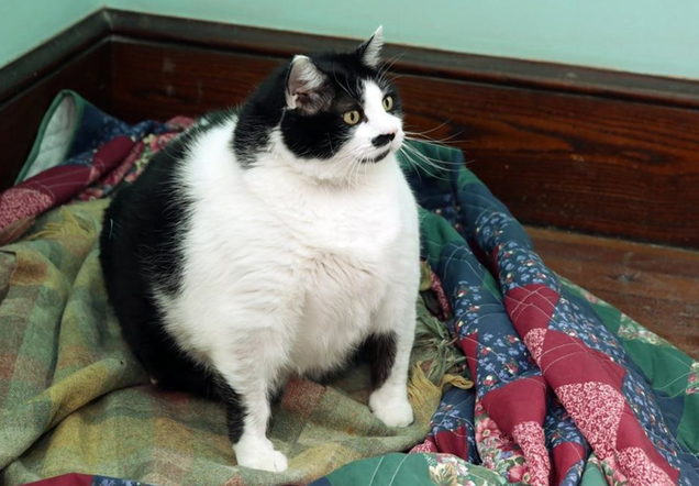
This is a 33-pound cat named Sprinkles. She’s fat as hell. Do you think you could pick her up? Doubt it.
KrankotaVillainy!
KrankotaI usually try to only share the things I DO like, but man...this is really poorly considered, executed and applied. Boo all around.

Orange entered the telecommunications market in Switzerland in 1999 as the third mobile operator and has to grown to 1.6 million customers. In 2011, Apax partners bought Orange Switzerland from its owner, France Télécom, and kept the well-recognized brand name by licensing it, which is a very costly endeavor. Earlier this year, French billionaire Xavier Niel, purchased Orange Switzerland for a smooth $2.9 billion and last week changed the name to Salt with a new identity and campaign by Publicis Switzerland.
Update: Publicis did the ad campaign but it was the London office of Prophet that did the strategy, naming and identity, plus the website and app design.
(A couple of good reads, with Google translate on, are this one on some of the numbers and financial background, and this one on some of the campaign approaches.)
The new logo and the chosen font clearly differentiate Salt from other corporate design within the industry. It underlines the differentiated brand identity, is very flexible and, through animation, is given a dynamic component. For all of the national languages in Switzerland a direct, uncomplicated and simultaneously striking tone was developed.
Despite all the press releases and news stories there is no clear explanation of why they chose the name Salt (or perhaps my German is not good enough to find the answer) but I think it's quite literally called Salt to give the market some flavor. Going from Orange to Salt is a lateral move in choosing another daily-life item that sounds irreverent as a company name. Orange, of course, has become one of the most well-known brands in Europe and Salt is probably betting (hoping) it can achieve the same kind of ubiquity using the same branding tactic.
The new logo is the word Salt, period, typeset in Jeremy Mickel's Superior. It's a beautiful typeface that makes for a very forgettable logo. Again, not very different from the minimalist Orange logo, but at least orange had the orange square behind. To Salt's and Publicis' credit, at least it's not another chunky sans serif wordmark.


The identity starts strong with some of these more corporate applications, with no supporting graphics and just straight-up type. Not much to get excited about but a nice enough, hipster attitude. With the more consumer-driven materials, however, things get a little wonky.

The only other defining identity element is the stroked-dot pattern which feels very 1990s, early web, and has little to no sophistication or even a sense of representing a twenty-first-century telecommunications carrier. A stronger identity system would have been needed to take the rather dry logo into more interesting territory.

The stores look somewhere between a lingerie shop and a bookstore. Not bad, I guess?

One interesting approach is the photography, that captures actual people using their phones in a day-to-day manner, as opposed to models texting while making breakfast for their smiling kids in a perfectly-lit kitchen. It's Salt trying to be edgy and to a degree it works, but it also feels like it lacks context or even a strong point to make along with the new name. The TV spots and ads all say "Orange is now called Salt" but they never bother to provide a pay-off. Overall, it's great that they took a chance with something different but it falls short on impact and meaning.
KrankotaJohn Legend wins at Twitter

Getty Image
Chrissy Teigen brought the leg show to the White House Correspondents’ Dinner on Saturday night. Like many in attendance, Patriots coach Bill Belichick liked what he saw. He took a peek and someone took a photo.
And boom.
BELICHICK YOU DOG! http://t.co/vRMrc0eRQY pic.twitter.com/wBjYlgKJrO
— Feitelberg (@FeitsBarstool) April 26, 2015
The picture spread like wildfire because that’s what happens on the internet. Sometime later, Teigen’s hubby John Legend got a whiff of what was going on. Then he dropped this tweet.

We use the phrase “perfect tweet” far too often here. I’m as guilty as anyone else. But damn John Legend, that’s just tremendous sir.

Hovertext: In fact, I'm pretty sure he's trying to break you for life.
A few friends of mine are fundraising for a gorgeous book on kickstarter. Please give it a look!
KrankotaI feel like Jenny needs to know about this.
Red bottoms everywhere.
The hashtag #LouboutainNails shows women who have taken the red-soled shoe trend to the salon.
Except a manicure doesn't cost $700.
Classy.
Beautiful.
KrankotaHaha! That's a pretty solid argument.

Killing a half-day fishing is one of life’s greatest joys. Measuring yourself against Earth’s dumbest creatures and being found wanting is terrible. For this reason, fishing is the most frustrating of our relaxing pastimes.

To begin, the briefest of rants. A few years ago, I got one of these Crock-Pot Little Dipper dealies as a gift. The idea, the gift-giver told me, was that I could use it to keep queso or artichoke dip warm when I had friends over. This was going to be so great! No longer would once-hot queso congeal sadly on my coffee table! The days of artichoke dip going cold when only half the baking dish had been consumed were over! IT WAS A HOT-DIP MIRACLE.
KrankotaThis is a good and correct list.
NERD ALERT.

i.imgur.com / Via reddit.com


KrankotaHa!
These are all the ones I could remember. I did NOT look these up. This is ALL from memory.
- Sugar
- Honey
- Fantasy
- Butterfly
- Dreamlover
- Heartbreaker
- Sweetheart
- Loverboy
- Rainbow
- Daydream
- Fairy Tale
- Bubblegum
- Sunflower
- Lollipop
- Shooting Star
- Dandelion
- Peach Fuzz
- Toymaker
- Cakebaker
- Ladybug
- Sex Slug
- Soy Bean
- Felicity
- Jean Shorts
- Pegasus
- Pretty
- Princess
- Pork Chop
- Stove Top
- Steve Jorp
- Fog Hat
- Bubble Bath
- Baby Bottom
- Tire Swing
- Button Nose
- Calliope
- Bazinga!
- Hot Goo
- Grub Hub
- Love Lumps
- Play Pen
- Muffin Stuffin’
- Cutie Pie
- Fig Newton
- Fat Nancy
- Hogwild
- Jar O’ Jam
- Sticky Rooney
- Jazzercycle
- Cuddle Matrix
- Rusty Richard
- Higgs Boson
- The Old Poky Porky
- Juicy Rubdown
- Hugbucket
- Sour Gushers
- Boob
KrankotaThis is a good read!

Everyone knows someone who’s run the marathon. Today’s big-city races—in places like Boston, New York, Berlin, and London—draw Olympic hopefuls competing for hundreds of thousands of dollars and hordes of weekend warriors raising money for their favorite charities or just hoping to check off “complete a marathon” on their bucket lists. Marathoning has birthed an industry of energy supplements and performance gear, training manuals and glossy magazines, corporate sponsorships and fitness expos. And nearly half of marathon entrants are women.

Catching a baseball with your can of beer is a very bad idea . Catching it with your cup and then pounding your beer, however, is a great idea!
It’s the only way they make sense.


KrankotaOverdone typeface combo, sure, but I really like the execution
Founded in 1981 in the community of Bethpage, New York, (as Pudgie's Famous Chicken), George Sanders developed his secret chicken recipe and skinning process. The concept quickly spread throughout Long Island and by 1989 had become a franchise company. In 2007, TRUFOODS LLC, acquired the Pudgie's brand. After exhaustive research, TRUFOODS, LLC. created the most unique, relevant & quality driven chicken brand in the quick service restaurant industry, Pudgie's Naked Chicken Co."
Design by: The Watsons (New York, NY)
Opinion/Notes: The previous logo and chicken had all the trimmings of a small, naive restaurant chain and could have probably stuck with that look for decades to come but a little update doesn't hurt. The new logo has a little too much faux texture but the basic structure is quite decent. The new chicken is good-looking (although maybe it has one too many off-register layers). The type is Lost Type Co-op all the way — with Highlands being the main one and Deming in the supporting role — which gives it a slight been-there-done-that feel. Still, it's an improvement that feels like a more modern franchise and the polo alone would be worth the effort to get a franchise going.
Related Links: The Watsons blog post


KrankotaI have seen the future, and it is good.

Chicago Business
Levy Restaurants, the Chicago-based company responsible for selling concessions to Bulls and Blackhawks fans throughout the United Center, is setting up self-service beer stands on the stadium’s concourse for both teams’ respective playoff runs. The goal is to allow fans to pour their own beer, purchasing the exact amount they wish to consume at a set rate per ounce.
Two DraftServ units, each with four taps, will be installed at the United Center, stationed outside the Goose Island Brew Pub near Section 110 of the arena. They will be in use for Game 1 of the Bulls-Bucks series on April 18 and through the postseason for both Chicago teams.
Essentially, fans will buy a prepaid card from a cashier who will be standing nearby. The cards are then used to tap a sensor on the unit. After the customer pours their desired amount of beer, the final price is then deducted from their card.
Similar units were installed in Minnesota last summer for the MLB All-Star game and the results were positive, so Levy is hopeful of similar success at the United Center. “I am a big believer in the potential of it,” said Sean Parisi, director of beverage at Levy. “I could see the future of self-service beer in club environments where you walk in and have a preloaded card, or have areas for season-ticket holders.”
Beer choices will include Bud products at 42.5 cents per ounce and Stella Artois or Goose Island at 47.5 cents per ounce.
KrankotaIt's interesting, for sure. I like the main mark, but agree that all the supporting bits are not the best.
Joining the league in the 1968 – 69 season as an expansion team, the Milwakuee Bucks are the professional NBA team of Milwaukee, Wisconsin, playing in the Central Division of the Eastern Conference. They have only won one championship, in their third season, with the help of a young player by the name of Lew Alcindor (later Kareem Abdul-Jabbar). The Bucks have never been a great team but somehow have had really great players like Kareem, Oscar Robertson, and Ray Allen, among others. Currently at a 50% win record for the season (with only one game left), the Bucks are looking to generate some excitement for the 2015 – 16 season as they introduced a new logo and identity designed by Brooklyn, NY-based Doubleday & Cartwright. (The Bucks have tried to appease the locals by stating that the firm's Managing Creative Director is a Milwaukee native).
The centerpiece of the new brand is the new Buck emblem. The new Buck is only looking ahead, an imposing figure determined and focused on the path in front of him. Several features chronicle the transformation of the team into an undeniable force:
1. An expanded rack (from 8 to 12 points) showing the maturation of the Buck, and underlining the point that he has become an even greater force.
2. The basketball feature in the negative space between the antlers.
3. The M Shape within the chest chevron as an homage to Milwaukee
4. With hard edges that appear almost cut from metal, and industrial but classic proprietary font juxtaposed against the curvature of the logo represents a symbolic union of urban and rural Wisconsin.
The previous logo was neither great nor terrible. It was a fairly literal drawing of a buck and some extra chiseled, extra stroked typography. Could be mistaken for a dozen other sports logos. The new logo is a more abstract interpretation of the buck and comes with plenty of rhetoric about its change from an 8-point to a 12-point antler. "We made it more badass" would have been an acceptable rationalization. The antler part is nicely done and I like the subtle basketball in the smaller horns. The face of the buck is much improved and more interesting. The "M" that makes up the chest or neck part of the buck is the one thing that drives me crazy — as it does in the secondary logo — but then the typography — I'll talk more about it below — saves it in this primary logo. The new logo has a good vintage feel without going full-blast to the past.

Serving as a badge of honor, the secondary mark portrays a strong reminder of the rich heritage of Bucks basketball in Milwaukee:
1. Established in 1968, the Bucks are proud to be one of the five longest tenured NBA franchises remaining in their founding city.
2. The basketball that is alluded to in the primary logo begins to take concrete shape behind the antlers in this logo.
3. A stylized version of the subtle "M" from the New Buck's chest in the primary logo is now called out. This brings additional focus to our home city within our new identity.
Other than the typography, this feels like a completely different project. The super streamlined curves on the basketball look like they belong more on the Houston Rockets' logo library than here. The "M" is very unappealing to me and has nothing to do visually with anything else (not even the swooshy basketball) in the system. It has a James-Bond-villain vibe to it that doesn't go very well with the much more earthy typography and color palette.
The outline of Wisconsin solidifies the importance of the entire state to the underlying fabric of the new Bucks brand. The basketball/antler element once again appears, representing a geographical anchor over the city of Milwaukee. This is the symbolic expression of the team as a statewide unifying force. This is the only element in which each of the three colors in the new Bucks palette appears together, introducing blue while retaining a strong green identity and use of cream as the foundational color.
This is another example of the swooshy basketball being completely mismatched. You have the shape of the state of Wisconsin and the typography with all their blunt angles and corners and then this ball from space. Also, this logo could have done without the inner blue stroke and outer cream stroke. (And without the ball). Then it could have looked like something you would see on a roadside diner in the 1970s.
Unifying all the elements is a custom typeface, MKE Block Varsity, inspired both by traditional varsity lettering and Milwaukee's industrial heritage.

Apart from indeed being the unifying element, the font is what gives some personality to the identity. It has no chiseling (for now), it has no spikes (for now), and it has no multi-stroking (for now), serving as a great respite from the usual sports typography. It's almost dumb in how basic and unpolished it is but that's what makes it work really well and give the identity some visual, industrial strength.

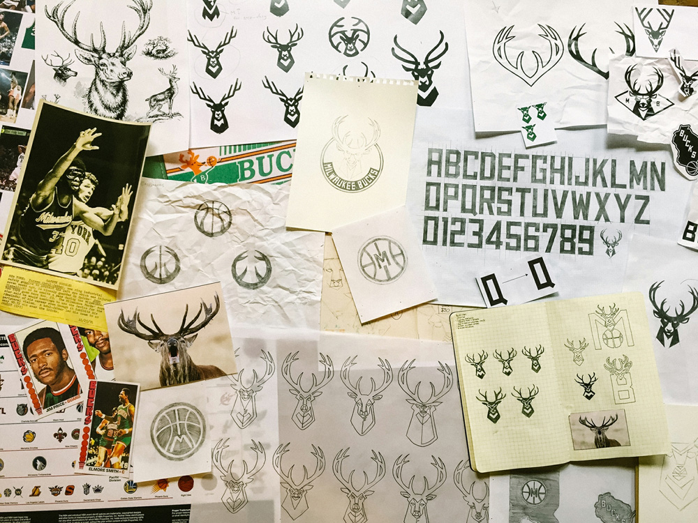
New uniforms have not been released yet and there isn't anything to see in application but, overall, this is a positive change — despite my grievances with the ball and "M" — that should give the team a bold look to work with next season.


