It’s rare that my reaction to a movie is to want to hug it. But with Spy, that was the sensation that washed over me both times I’ve seen it. It’s not just that it’s really funny and consistently entertaining—it’s that, for the first time since becoming a star, Melissa McCarthy finally is in a movie that knows what to do with her. The terrific, charming comedian who pops up on Saturday Night Live and in interviews—the one fans always suspected was there buried beneath obnoxious roles in the likes of Identity Thief—has finally arrived. I wasn’t just happy watching the movie, I was happy for her and for everybody who will get to see this movie. It’s just such fun.
In the past week, the Duggar family scandal has fully rocked the nation. Who could have thought that an extremely religious family with 19 children that believes women should obey men’s orders might have some gross secrets? Anyway, you can’t fully understand the Duggar scandal until you’ve had your name Duggar-fied. What’s your Duggar name? Find out with our handy tool below, created by our in-house tool jenius Adam Pash!
by Samuel Wadhams on Adequate Man, shared by Rob Harvilla to The Concourse
Guns make for poor conversation. Generally speaking, there are two entrenched ideological camps—aficionados and abolitionists—and any attempt to hold a middle ground is likely to enflame both sides. You, by now, probably know how you feel about guns, and this is, by no means, an attempt to change that. What it is, however, is a safety lesson for everyone, a primer on shotguns, and a neutral civilian’s guide to shooting clay pigeons.
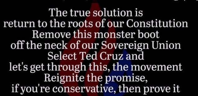
A Christian, uh, hip-hop group called We Are Watchmen has made a song for Ted Cruz. It involves metaphors about “the Reds” and the chorus “Set it on fire,” which, fittingly, sounds a lot like “Kill it with fire.” Let’s just... dive right into this listening experience.
by Pete Keeley on Adequate Man, shared by Rob Harvilla to The Concourse
When my wife and I moved from a 600-square-foot apartment into our 1,000-square-foot house (with garage!), I was particularly excited about a few things: 1) having my very own washer and dryer, and being able to leave shit in them as long as I damn well pleased; 2) being able to more easily justify power-tool purchases; and 3) Costco.
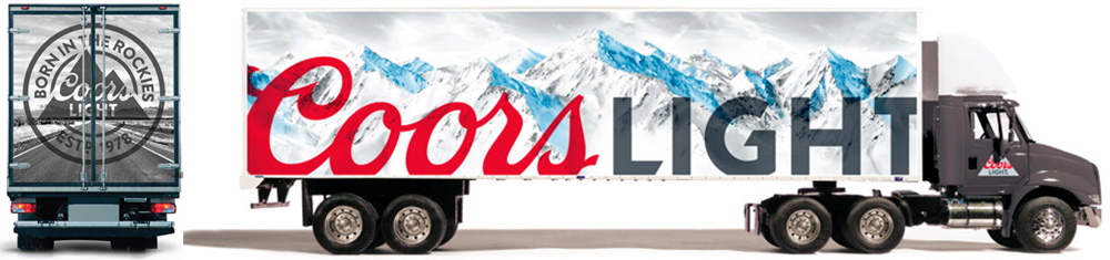
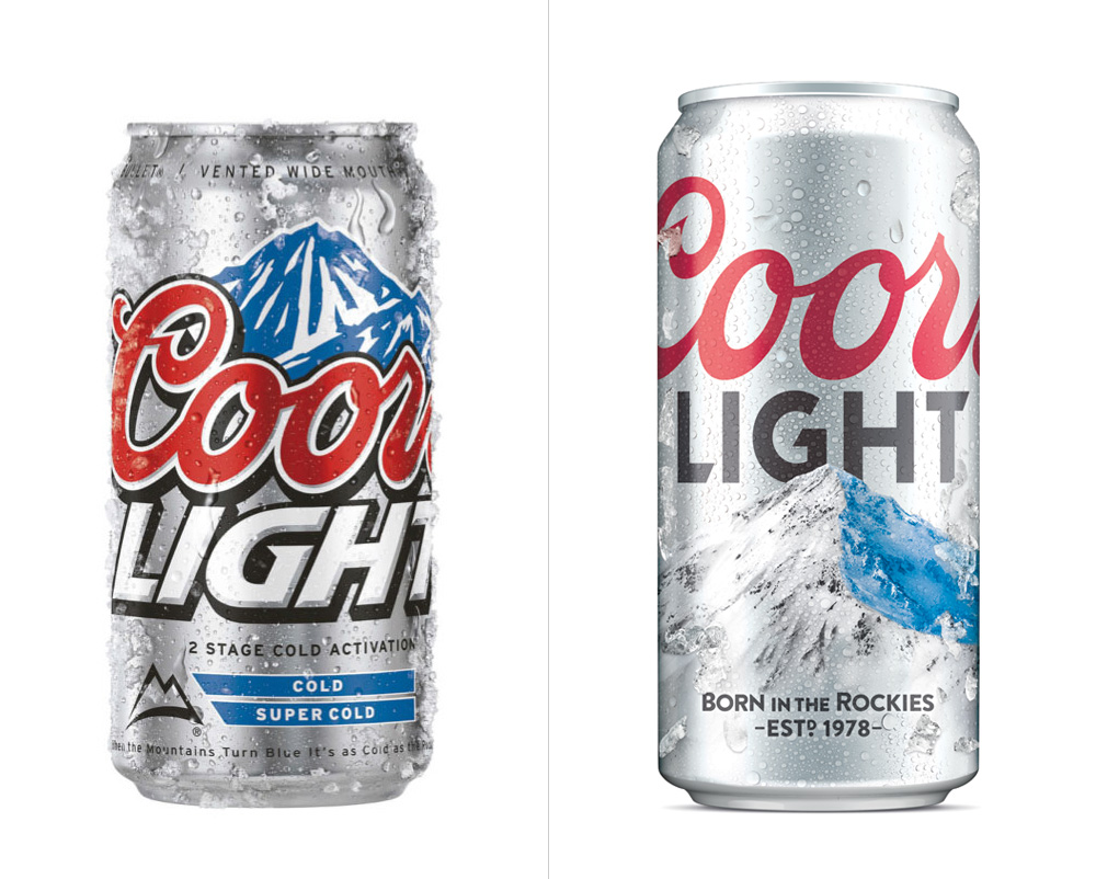
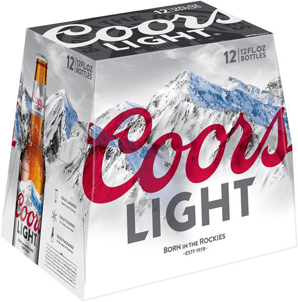
Introduced in 1978, Coors Light is a light beer produced by the Coors Brewing Company in Golden, CO, and owned by the vast beer consortium of MillerCoors. Despite a recent dip in sales, it's the second best-selling beer in the U.S. behind Bud Light. One of Coors Light's biggest claims to fame are its cold-activated cans and bottles where the iconic Rocky Mountains depicted turn blue. Earlier this month Coors Light introduced a revised logo and packaging designed by San Francisco, CA-based Turner Duckworth.
Evolution of the brand.Logo detail.
Like most mainstream consumer packaging logos, Coors Light has evolved from a cool, minimalist vintage look (because it was vintage at some point) to a mash-up of NFL and cartoon typography in its most recent version, featuring a spiked "LIGHT" lettering that would look quite comfortable on a college uniform and a script wordmark buried in strokes and drop shadows. Just as Turner Duckworth did with Coca-Cola, they have stripped as much crap as possible from the logo to reveal a very nice, thin script Coors and a still-spike-ish yet more dignified "LIGHT" descriptor. The logo looks best when kept outside the mountain graphic (as shown in the packaging below) but using the mountain to crop Coors makes for a slightly playful approach.
"Born in the Rockies" logo."The Silver Bullet" logo.
A couple of supporting logos have been added, neither of which seems to have gotten the same attention to detail as the main logo. The "S" in silver is beautiful but the lettering deteriorates as it reaches the "r" and the rest of the typography on that one is very awkward. The roundel logo with the Rocky Mountain is fine but not terribly inspiring.
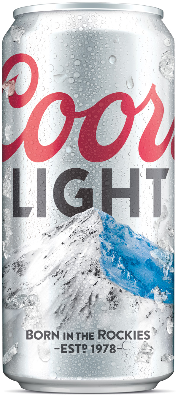
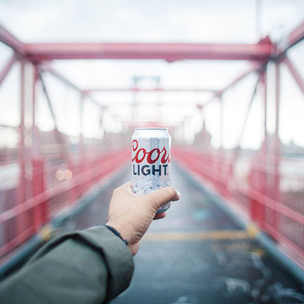
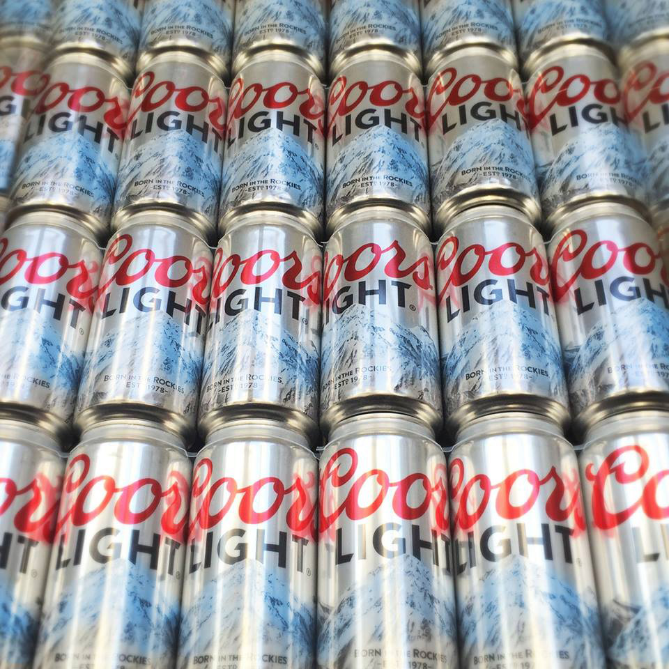
Truck.One of many TV/Web spots. More here and a breakdown of the advertising end of things by AdAge here.Can, before and after.New can, sexy shot.New can, also sexy shot.New cans, non-sexy shot
Also like with Coca-Cola, the new cans have a matte finish that right away make the beer look cooler (literally and metaphorically) and a little more sophisticated. The logo looks great on the can and the new, more realistic mountain… I'm still trying to figure out if it's completely off the mark or a perfect complement to the minimalist look. I guess somewhere in between. With the cleaner approach it makes me think of Evian. (Which has a stronger beer taste than Coors Light. Zing!).
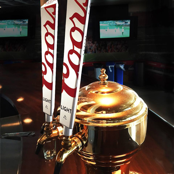
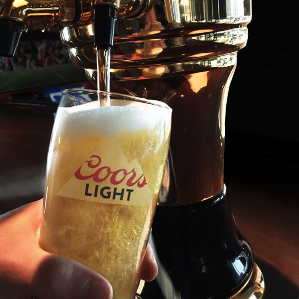
12-pack.Tap handles.Pint.
Overall, while not completely surprising or necessarily innovative, as the pendulum swing in consumer packaging is currently on this minimalist spectrum, Coors Light's evolution is a vast improvement. Elements like the taps and pint above showcase how nice this identity can look and both Turner Duckworth and client alike have done a great job in steering this brand away from almost looking like a parody of its category.
Adam Sandler, believe it or not, used to be funny. Maybe that’s because we were thirteen when we first heard They’re All Gonna Laugh At You and it seemed much funnier at the time than it probably would today, but Sandler’s work on SNL and in his first few movies still holds up decently. But consider us surprised when the song he performed as tribute to a retiring David Letterman was clever enough to go alongside “Red Hooded Sweatshirt” and “The Thanksgiving Song.”
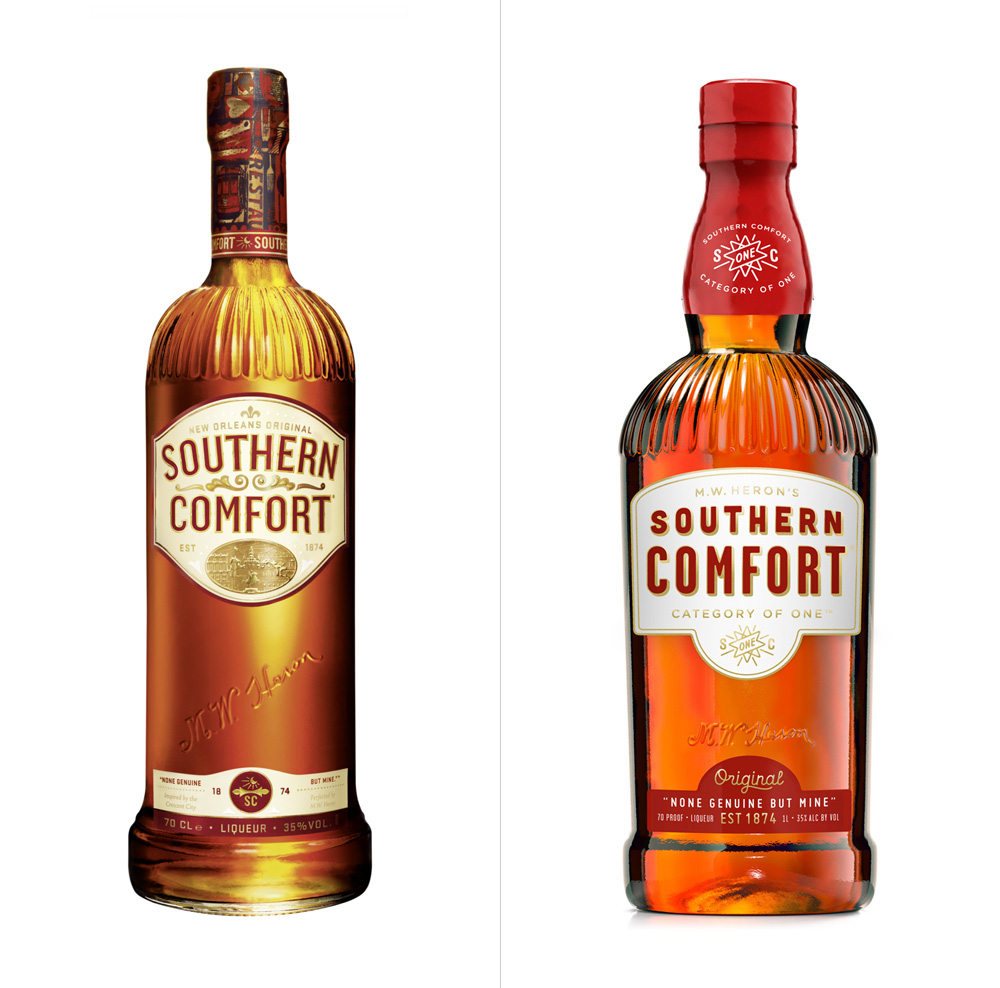
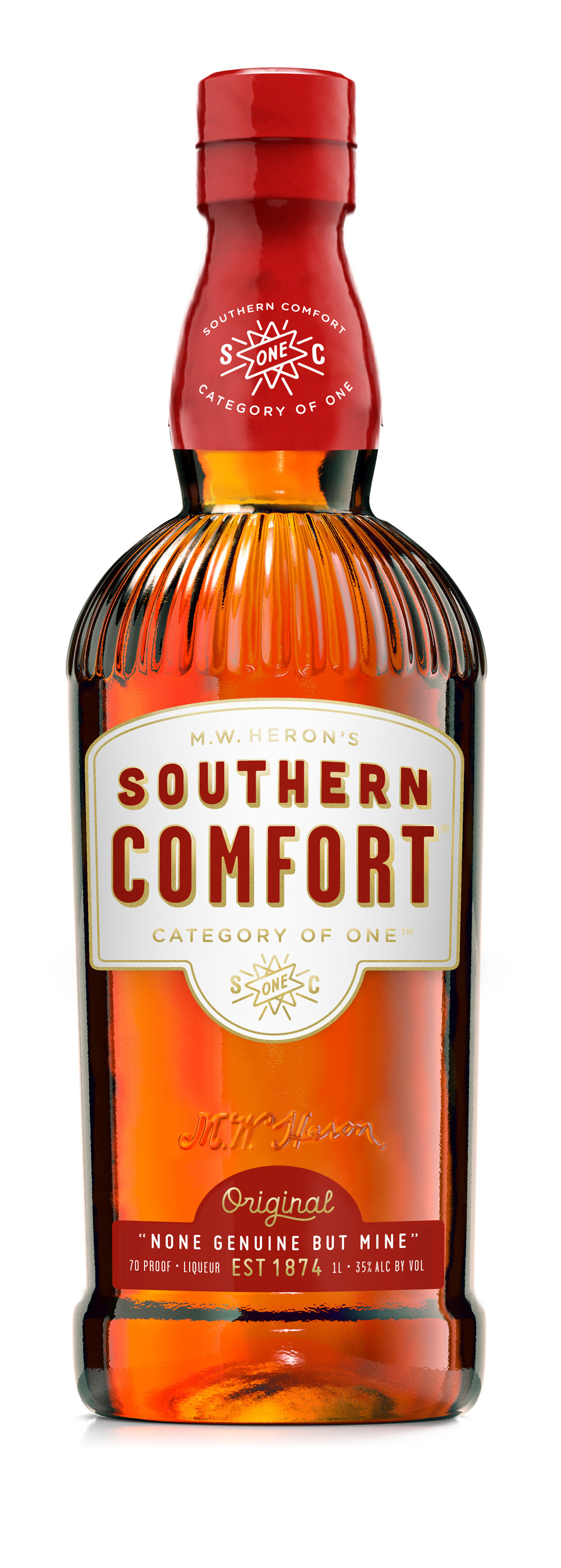
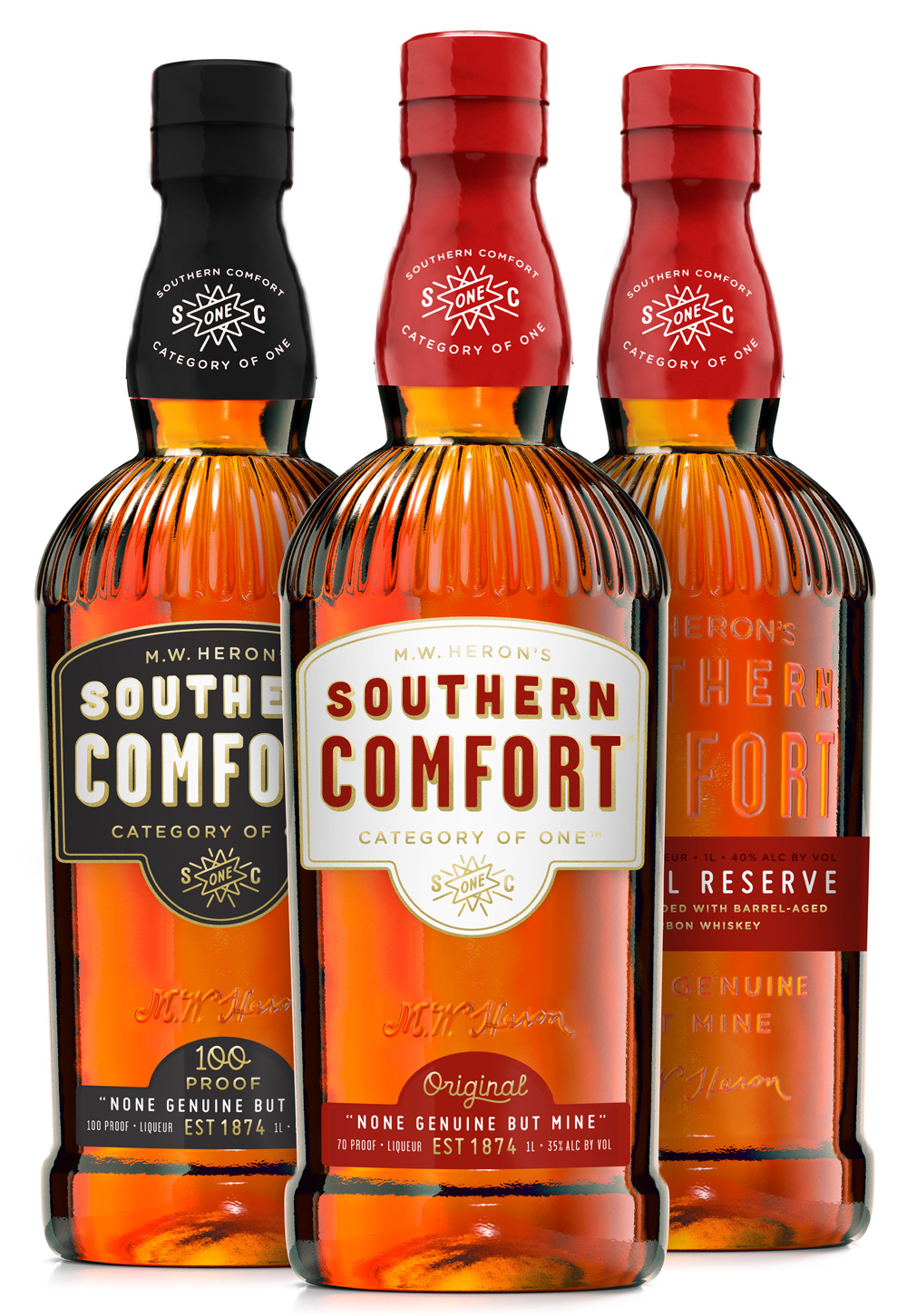
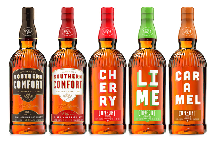
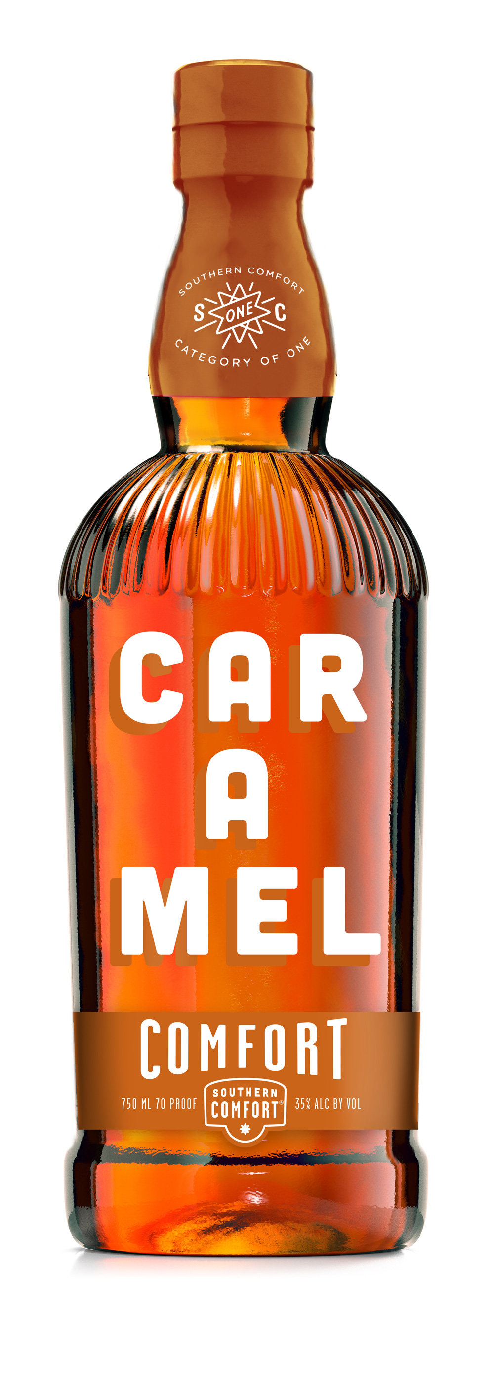
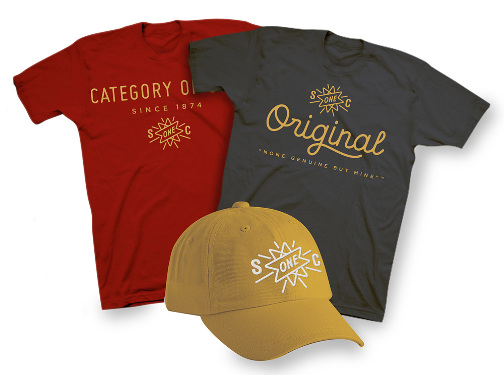
First concocted as a mix of bourbon with fruits and spices in 1874 in New Orleans by bartender M.W. Heron, Southern Comfort is a fruit, spice, and whiskey flavored liqueur owned by Brown-Forman and is available in 100 countries. Southern Comfort has a rich history and I wouldn't normally encourage reading through a product's history page but this one is rather entertaining. Although on the sweet, syrupy side and popular in cocktails, Southern Comfort packs an alcohol punch that can be deceiving. Earlier this year, Southern Comfort introduced a new Caramel version to complement its other mixes like Lime and Black Cherry and introduced a new logo and packaging designed by Austin, TX-based Helms Workshop.
"We dug in and internalized the history and personality of the brand,in order to craft something authentic and meaningful for modern-day drinkers", said designer and owner of Helms Workshop, Christian Helms. "From sifting through the vaults at Brown-Forman and breathing life back into heritage elements, to crafting a new bottle and brand language, the goal was to highlight what makes Southern Comfort unique. The result is a new package that feels confident and comfortable in its own skin, and looks great on the shelf."
Not being familiar with Southern Comfort, my first impression was that the redesign was too friendly, as I thought — just from looking at the previous design — that it was straight-up whiskey or bourbon. After going through the site, reading the press release (a sample quoted below), and some extra Google-ing it's clear that Southern Comfort has a good sense of humor and is trying to make whiskey-drinking a more relaxed, happy, peppy experience.
Alternate, single-line logo.
With that in mind, moving away from the more Memphis-esque and Southern-esque typography and dingbat styling of the previous logo and into a simpler sans serif with more streamlined supporting elements makes the whole personality come together in a more cohesive way. The typography is great and the subtle curve on "SOUTHERN" provides a nice visual bridge between old and new logos/labels, although I do like the single line application better (in general, not as a lock-up that should go on a bottle). The star-slash-banner doodad is quite great.
Did you notice that the bottle looks different? Well it is. In fact, ALL of the Southern Comfort bottles are different! Check out the new bottle and packaging design. The awesomeness inside the bottle hasn't changed, but we thought it could use an upgraded wardrobe on the outside. You may notice our new look as you stroll down the grocery and liquor store aisle. Go ahead — pick one up. Pretty cool, huh? It's the perfect combination of sweet, smooth and delicious. Swoolicious? Probably not a real word but we honestly don't care; we just know it's a darn good beverage to enjoy with friends.
One of the most significant new features to the new package is a unique icon on the neck and label proudly owning Southern Comfort's position as a category of one. The new bottle shape draws from the brand's heritage and wears the same fluted shoulders that drinkers recognize from years past.
The new bottle design has a lot more personality, it's like it hit the gym and got broad shoulders. Along with the bulbous neck it makes for a more interesting silhouette. The labeling on the bottle is the same approach with two separate labels and although I like the new typography better there is something that made the previous version work better. The curved top of the new (top) label feels like it clashes with the bottle but, still, the overall vibe achieved is much more on point. The new neck label is probably the best new trait of the bottle.
Extended family.Caramel detail.
The new Caramel bottle is extra fun, with the lovely and chunky typography printed directly on the bottle and the word all broken up. It's unexpected and irreverent — just like the thought of a caramel-flavored liqueur. The bottom label with another alternate Southern Comfort logo is quite nice as well. The Lime and Cherry versions are equally cool. They definitely feel like something you bring to a party.
Shipping box.T-shirts.Bandanas.Bronco.
There are bonus prototypes of extra fun things like t-shirts and bandanas that all extend the visual language of the brand and play up the different tag lines of the product — "Category of One" and "None Genuine but Mine" — and introduce a small range of supporting typefaces that add to the good vibes. Overall, a strong evolution that separates Southern Comfort from all the whiskey-looking whiskey brands and mixes a bunch of new visual ingredients that set it in its own category indeed.
by Pete Reynolds on Adequate Man, shared by Rob Harvilla to The Concourse
One of the best parts of being a dad in public is the generalized expectation that you are basically a greased-up Kevin James playing banana-cream-pie Jenga with the Queen Mum. Remember those early solo outings with your baby and the generously low bar that you were held to? Doors held open, the fawning looks from the delighted people in your fancy grocery store as you—a MAN, for Chrissakes, nobly taking time out of his busy man-schedule to “give Mom a break”—strode through the produce aisle, your baby slung from your torso in an Ergo made of gilded copies of the Equal Rights Amendment? The rest of society loved you for the simple act of showing up, and the experience validated everything you’ve ever wanted to believe about yourself as a father, which is that you are a shining beacon of gender-role progressivism for not abandoning your child in the beer fridge.
by Albert Burneko on Foodspin, shared by Rob Harvilla to The Concourse
There are many good reasons for grilling whole fish. The skin and bones keep the flesh moist and flavorful; the skin itself, when cooked well, is life-changingly delicious; whole fish stands up better to grilling heat than a fillet or fish steak will; whole fish usually costs less by weight than the portioned stuff; it’s fresh and fun and makes for a spectacular presentation; it’s profoundly satisfying both as a thing to eat and as a thing to do. And so on.
Dude. I still really want to see this. I understand this will be a solo venture.
1. I quit smoking more than four years ago, but nothing—not a night full of drinks, not a table full of smokers, not a gasoline IV—has made me want a cigarette more than Mad Max: Fury Road did. You leave the theater still shaking, everything still pumping and throbbing, a treadmill stopping on a dime and sending you careening through the back wall. The movie roars to life, commences a dead sprint into hell, and never stops. Some reviews claim it’s almost too unrelenting, that it’s too exhausting, that it’s somehow overwhelming. I suppose, for some delicate souls, this may be true, but I’m not sure why those people go to the movies at all. We’re all chasing an experience, zombies in search of escapist narcotics, and I don’t remember the last time a movie so fully delivered An Experience. What it does, it does absolutely perfectly. To complain that it does it too much is churlish and spoiled. This sort of thing doesn’t happen often. Inhale it in massive gulps while you can.
Shared for the funny thing at the end and the SUPER KICK ASS Ben Franklin
Ben There Done That
(Est. 1946) "The Philadelphia 76ers (also commonly known as the Sixers) are an American professional basketball team based in Philadelphia, Pennsylvania. They play in the Atlantic Division of the Eastern Conference of the National Basketball Association (NBA). Founded in 1946 and originally known as the Syracuse Nationals, they are one of the oldest franchises in the NBA, and one of only eight (out of 23) to survive the league's first decade." (Wikipedia)
Design by: N/A
Opinion/Notes: Yay… I guess? The "76ers" wordmark is one of the best in the NBA and it was a pleasure to see it make a comeback in 2009. Double the pleasure this time around simply for the fact that the typography didn't change or got swapped by some crappy spiked type. The biggest change is the rotation of the ball, where the middle seam of the ball used to land in the middle and now it's off to the top right. It's a good move as it frees up the wordmark but — BUT — if they went through the trouble of rotating the basketball why would they not take care of a small detail like the end of the middle seam of the ball right under the "s". It creates a very distracting ink blob in that area. Wait until they have to embroider that. The Philadelphia type and stars around it are passable (although that "ILA" kerning…) and much better than the old lock-up. Perhaps the biggest story here is that the Dribbling Ben/Running Ben/Ballin' Ben logo leaked (and denied) last year is now official! It's the perfect example of "It's so bad, it's good".
Select Quote: The team's new primary logo is a modern interpretation of the classic Sixers insignia, stylistically redeveloped to include a patriotic blue border with six white stars and "PHILADELPHIA" adorned across the heading. The familiar white basketball has been visually updated with a positional rotation of the seams. The emblematic ring of 13 stars present in the primary, partial and secondary logos continues to represent the original American Colonies.
Primary logo detail.Logo family.Secondary Ben Franklin logo.SportsLogos explains the evolution of the 76ers logo over the years.
Cheesy-ass company name but I adore the hand-painted type and applications.
So, Who are You?
Established in 2005 in the founder's bedroom, Awesome Merchandise — now just Awesome — makes all kinds of custom merchandise, from t-shirts to custom-die stickers to banners to mugs to drumsticks and more. Basically, they make swag, all in-house at a 3,300-square-foot facility in Leeds, UK, with a staff of nearly 30 people. Recently they introduced a new identity designed by neighboring Robot Food.
Robot Food was tasked with reinventing the brand. It had to have exceptional standout, position them as masters of merch, and encapsulate the people and ethos that make Awesome, awesome. Robot Food's approach combined new school graphics with hand-made typography. Junior designer, Chris Shuttleworth, painted the typeface in ink, and the creative team created a suite of logos in CMYK in a nod to the print trade colour model. The aesthetic is rooted in alternative music culture, like Awesome themselves, and articulates the company's strong craft credentials.
Robot Food provided text
Logo detail.
The previous logo had an interesting type choice and the exclamation point in the "O" could be considered clever but, overall, it was forgettable. The new logo has a punk-hipster vibe that looks rather cool. The pointy "A" stands out and in the minimal application with the stroke looks almost sophisticated. In contrast to yesterday's Philadelphia 76ers post here you can see the proper way to set and letter-space type on a circle. Insert golf clap here.
Edgy yet professional, the striking identity translates seamlessly across all brand touch-points, including their fully responsive website, branded clothing range and custom mailer boxes. Robot Food also consulted on the design of the factory showroom. This distinctly comprehensive brand identity expresses the sheer passion, ambition and craft that makes Awesome Merchandise so uniquely exciting and progressive.
Robot Food provided text
Alternate logo.Mulitple examples of "We are awesome" in action.
There is a second element to the identity with which things start to get rad. The "We are awesome" lettering functions as a bolder logo and statement that, repeated often enough, leaves no doubt about whether Awesome is awesome or not. (Hint: it is). This is not groundbreaking branding, it's just fun as heck. When the two logos combine, they make for a great couple.
Custom type.Process behind the type.Delivery boxes.Tote.Brand guidelines. Notice the "Not Awesome" uses of the logo.Sticker and pin swag.Business stationery and tags.Factory showroom.
A client that makes swag is the ultimate client to create applications for an identity and all the pictures above are clear evidence of such excellent synergy. There is no deep-level strategy or highly conceptual approach to the applications other than making things that makes other people want to make things like those things and that's not a bad thing. It's an awesome thing.
by Jesse Farrar on Adequate Man, shared by Rob Harvilla to Foodspin
I like to eat. Most of you do, too, I’m fairly sure, because I’ve seen you all doing it out at restaurants and in front of, behind, or under food trucks, and I daresay you looked quite pleased with yourselves. But due to the finite geometry of intestines and other guts, as well as the unwelcome but omnipresent consideration of “not running out of money,” it is unwise for most of us to spend an inordinate amount of time dining out or ordering in.
According to KilledByPolice.net, Freddie Gray was the 348th person killed by police in the U.S. since the start of 2015, an average of more than three people per day. Between the ubiquity of camera phones and the nation’s propensity to whip them out and record anything of note, a lot more of those deaths are being caught on tape.
It’s not just shootings, either. An entire movement has sprung up around citizens recording the police during stops. Until the slow spread of body cameras for officers is complete, this seems like the best way to make sure there’s an unbiased video account of confrontations involving the law. Even though it’s completely legal to record the police, you may be surprised to know that some cops may not respect your right to film them. Tons of people have had their phones confiscated or smashed, or their footage deleted.
In what may become the next flashpoint example of police brutality, New Jersey cops did nothing while their K9 dog mauled 32-year-old Phillip White, who died in police custody shortly after. The incident was caught on film, along with one of the officers telling the witness, “I need your information, and I’m going to need to take your phone.”
Who knows what would’ve happened to this footage if the bystander complied with the cop’s request? Because incidents like this are common, the ACLU of California has created an app called Mobile Justice CA that automatically uploads the footage you take to a local ACLU affiliate. Not only does that make sure the video you take doesn’t get deleted or destroyed, it also notifies others using the app nearby that a police stoppage is underway.
Other slick bells and whistles, like the ability to keep filming while the phone’s lock screen is activated, shows that the ACLU put some time into this. It’s available for iPhone and Android, and it’s free. Who knows? It could end up saving you or someone you film from ending up in jail on trumped charges.
Oh man. The three-minute tangent about the dog. Worth watching.
The Tonight Show handed out a second round of NHL Playoff superlatives on Wednesday night, and they certainly didn’t disappoint. There were, per usual, some perfect and hilarious ones — like this one given to Anaheim Ducks’ left wing Max Friberg.
I have no idea what “whoopsy poopsy” means, but I could absolutely see Friberg saying this.
My next favorite went to Chicago Blackhawks center Brad Richards, whose roster picture does have a creeper-like feel to it, as the superlative accurately suggests.
And finally, the Washington Capitals’ John Erskine was given “Most Likely To Be Woken Up Every Morning By His Dog And Say, ‘Really, Carl?'”
Jimmy Fallon and his sidekick Steve Higgins go on a hilarious, three-minute tangent describing Erskine sleeping on a circular water bed with a four-inch Italian duvet cover and doggie steps for his three legged terrier. Keep these coming, Jimmy Fallon.
Maggie’s two biggest selling points are things I wasn’t sure I ever needed to see again in a movie: a post-apocalyptic setting and Arnold Schwarzenegger. I like the idea of both of them, but after repeated exposure over the years, I confess to feeling fatigued at the notion of sitting through either anymore. But what makes this idiosyncratic zombie movie so surprisingly good is how it tweaks both cinematic staples, letting us see them in a different light. It may be the first Schwarzenegger movie to make you cry.