Shared posts

10 May 19:54

12 Homes Made From Shipping Containers

by Marni Katz

12 Homes Made From Shipping Containers

Shipping containers meet a variety of requirements: Modern. Check. Low-cost. Check. Environmentally-friendly. Check. See twelve homes that make them work.

Above: Two shipping containers flank a taller common space in this residence designed by Studio H:T. The bedrooms are in the containers while the entry, dining, living, and a loft is in the center area. The project is planned to be off-the-grid using solar orientation, passive cooling, green roofs, pellet stove heating, and photovoltaics to create electricity.

12 Homes Made From Shipping Containers in interior design architecture Category

Photo by Andres Garcia Lachner

Benjamin Garcia Saxe Architecture designed this orange container home for clients in San Jose, Costa Rica. The goal was to provide them with the the spectacular views of the natural landscape. The roof between the two containers is made from the scrap metal.

12 Homes Made From Shipping Containers in interior design architecture Category

Copenhagen-based architecture firm arcgency created the “WFH House” in Wuxi, China, out of three stacked shipping containers. Upcycled steel shipping containers were used for a steel frame, which was then clad with a sustainable bamboo facade. The home includes a rainwater collection system, solar cell-clad green roof, skylights, and permeable paving.

12 Homes Made From Shipping Containers in interior design architecture Category

Photo courtesy of the Walker Art Center

This structure, which was exhibited at the Whitney Museum of American Art in New York City and the Walker Art Center in Minneapolis is called the MDU, or Mobile Dwelling Unit, and was designed by Lot-EK. It is meant to travel with its dweller to long term destinations. When traveling, its sub-volumes are pushed in to fill the entire container, and then interlock so the container is left flush and can be shipped worldwide. When in use, the sub-volumes are pushed out, and its 500-square-foot interior is suitable for living and working.

12 Homes Made From Shipping Containers in interior design architecture Category

Photo by Paul Warchol

Lot-EK also designed this 1,500-square-foot penthouse apartment in New York City. The project involved transforming a mechanical room and adding a bedroom with a patio on the roof. Pictured above is a yellow aluminum container that has been partially deconstructed to become an open outdoor space.

12 Homes Made From Shipping Containers in interior design architecture Category

Photo by Jack Thompson

Note the white corrugated wall; that should tip you off that this is the interior of a shipping container home. In fact, this Houston residence is composed of three containers, to make a total of 1,538-square feet of living space. Architect Christopher Robertson of local firm Robertston Design says one of the goals was to make it feel like a typical home.

12 Homes Made From Shipping Containers in interior design architecture Category

Poteet Architects, a firm known for its adaptive reuse of existing buildings, designed this 32-square-foot guest house in San Antonio, Texas using a shipping container. The interior is lined with bamboo plywood for the floor and the walls and the deck is made out of recycled soda bottles. It has a planted roof too.

12 Homes Made From Shipping Containers in interior design architecture Category

The emerald green-accented Crossbox house in Brittany, France was designed by CG Architects. Two shipping containers are cantilevered above two more, and there’s a planted roof too. Like traditional setups, the bedrooms are on top and the living/dining spaces below.

12 Homes Made From Shipping Containers in interior design architecture Category

Cove Park, located on 50-acres of Scotland’s west coast, is a community of established artists. In 2002, Container City created three cubes made of shipping containers to act as artist retreats, and another six were added in 2006.

12 Homes Made From Shipping Containers in interior design architecture Category

This Adam Kalkin Container House in Califon, New Jersey, is three shipping containers wide by two shipping containers tall. Glass on two sides allows ample light to shine in, and the industrial materials continue throughout, with a concrete floor and steel beams and columns. Rustic fir flooring and mahogany closing doors ensures it works in its wooded surroundings.

12 Homes Made From Shipping Containers in interior design architecture Category

This perfectly simple, wood clad, absolutely horizontal 40-foot cargo container house sits on a flat site in the Galician countryside of Spain. Its porch and removable awning allow for outdoor enjoyment, which is ideal since it’s a summer house. It was designed by architects Severo Fernández and Basilio Rodríguez of Estudio Base.

12 Homes Made From Shipping Containers in interior design architecture Category

Maziar Behrooz Architecture designed this 840-square-foot art studio next to the client’s house in the summer enclave of the Hamptons on Long Island, New York. They used two shipping containers which were painted dark charcoal to match the main house; both blend into the surrounding woods.


10 May 19:52

Bookshelf Staircase with Slide: Panorama House by Moon Hoon

by Caroline Williamson
Simple Simon

Bookshelf. Staircase. With. Slide.

Bookshelf Staircase with Slide: Panorama House by Moon Hoon

Korean architecture firm Moon Hoon was hired by a large family to create a modern space that their four kids could play, read, and study, and well, be kids in. Situated on a sloped and irregular lot, the Panorama House gives the parents the upper part of the home and the children can rule the lower part.

Bookshelf Staircase with Slide: Panorama House by Moon Hoon in architecture Category

Located in a relatively new suburb of Chungbuk, Korea, the architect became inspired by the picturesque views and banked on creating a fluctuating facade that would make way for varying directional views throughout.

Bookshelf Staircase with Slide: Panorama House by Moon Hoon in architecture Category

Due to the shape of the lot, the design of the house had to be long and thin.

Bookshelf Staircase with Slide: Panorama House by Moon Hoon in architecture Category

Bookshelf Staircase with Slide: Panorama House by Moon Hoon in architecture Category

The exterior, with the zig-zag facade, is accentuated with the lines of the two materials used. It creates an accordion effect as if the house is being stretched out.

Bookshelf Staircase with Slide: Panorama House by Moon Hoon in architecture Category

In the central part of the house sits a multifunctional staircase that is the hub of activity. There are stairs for the adults, a slide for the kids, and book storage underneath every stair, making access easy for the little ones.

Bookshelf Staircase with Slide: Panorama House by Moon Hoon in architecture Category

Bookshelf Staircase with Slide: Panorama House by Moon Hoon in architecture Category

Bookshelf Staircase with Slide: Panorama House by Moon Hoon in architecture Category

Walk around underneath the stairs and you have workspaces and more access to the books.

Bookshelf Staircase with Slide: Panorama House by Moon Hoon in architecture Category

Bookshelf Staircase with Slide: Panorama House by Moon Hoon in architecture Category

Bookshelf Staircase with Slide: Panorama House by Moon Hoon in architecture Category

The space also acts as a movie theater for the family.

Bookshelf Staircase with Slide: Panorama House by Moon Hoon in architecture Category

The windows vary in size creating different scenes as you look out.

Bookshelf Staircase with Slide: Panorama House by Moon Hoon in architecture Category

Bookshelf Staircase with Slide: Panorama House by Moon Hoon in architecture Category

Bookshelf Staircase with Slide: Panorama House by Moon Hoon in architecture Category

Bookshelf Staircase with Slide: Panorama House by Moon Hoon in architecture Category

Bookshelf Staircase with Slide: Panorama House by Moon Hoon in architecture Category

Bookshelf Staircase with Slide: Panorama House by Moon Hoon in architecture Category

Bookshelf Staircase with Slide: Panorama House by Moon Hoon in architecture Category

Photos by Namgoong Sun.


10 May 07:06

trxfreely: lickypickystickyme: lickypickystickyme The other...


trxfreely:

lickypickystickyme:

lickypickystickyme

The other Kama Sutra….

(or sex positions of other species as reenacted by humans.)

09 May 14:55

Cost of Pennies

Cost of Pennies

“If you carry a penny in your coin tray, how long would it take for that penny to cost you more than a cent in extra gas?”  

—Leto Atreides

At current prices, 140,000 miles, close to the average car’s lifetime mileage:

\[1\text{ cent}\times\left ( \frac{30\frac{\text{miles}}{\text{gallon}}} {\frac{2.73\text{ grams}}{50\text{ pounds}}\times0.5\%\times\frac{\$3.50}{\text{gallon}}} \right )\approx140,000\text{ miles}\]

That means that as long as you go through pennies faster than you go through cars, you’re coming out ahead. (The equation assumes, for a 30 mpg car, 50 lbs of cargo means a 0.5% hit in fuel economy.)

But gas money isn’t the only cost attached to a penny. Let’s consider some of the others.

Suppose you found it on the ground on the way to your car. How much did it cost you to pick it up in the first place?

How much is your time worth? This obviously depends on a lot of things and varies from time to time and person to person. But for a broad estimate, I sometimes use a ballpark value of $10/hour—which is somewhere between the US minimum wage and the average wage—but you can adjust up or down to fit your preference.

If your time is worth $10 an hour, a penny is worth 3.6 seconds. If spotting and picking up a penny takes you more than 3.6 seconds, it’s a loss.

actually, wait, is that a wheat penny?

Of course, picking it up isn’t the only time cost. Having a penny in your pocket makes it harder to find other things there, so you might spend more time looking for stuff in the future.

And then there’s the future time spent dealing with the penny. You may spend time figuring out if it helps you make change, putting it in a roll, donating them, or doing countless other hard-to-predict things. (You may argue that dropping them in a donation jar is noble enough that it makes picking them up worthwhile. That may be true; it’s what I do with pennies. But this isn’t an argument against donating money—it’s just an argument that picking up pennies may not be an efficient way to use your time to acquire money to donate.)

There’s another cost (and benefit) to picking up a penny—the calories burned. When you crouch to pick up a penny, you expend energy. A 70-kilogram person who lowers their center of mass by half a meter will burn about half a calorie of energy standing back up:

\[\frac{70\text{ kg}\times\text{Earth Gravity}\times50\text{ centimeters}}{20\%}=1.72\text{ kJ}=0.41\text{ food calories}\]

(The “20%” represents the overall energy efficiency of the squatting process, which I based on the efficiency of stair climbing.)

All else being equal, to replenish those 0.41 extra calories, you’ll need to eat 0.41 calories worth of extra food. And food costs money.

a chart which can replace two semesters of economics and three of agronomy

Donuts provide 836 calories per dollar, or 8.3 calories per penny—plenty to supply the 0.41 needed to pick one up. On the other hand, if you get your energy from expensive fresh strawberries, you might only get 20 calories per dollar—meaning that picking up that penny costs you 2 cents in extra strawberry. (In dollars per calorie, the cheapest energy sources in the supermarket are refined sugar, oil, and shortening).

But on the other hand, burning calories is exercise, which is good for you. Crouching to pick up that penny is equivalent to two or three seconds on an exercise machine. What’s that worth?

picking up a penny is a potentially exhausting activity

Well, one study suggests that 15 minutes of moderate exercise per day adds three years to your life expectancy (with smaller improvements in mortality rate for progressively more daily exercise). It’s a tremendous oversimplification, but a crude back-of-the-envelope estimate suggests each calorie burned adds something like 30 seconds to your life—or 12 seconds per penny.

But wait—if it only takes a couple seconds to pick up a penny, but it pays back 12 seconds, then you could game the system by repeatedly dropping a penny and picking it back up ...

a lifespan is boosted by repeatedly picking up a penny

… which is just another way of saying that exercise is a good idea.

a realization occurs in the brain

One final thought:

This article is about 770 words long. If you read at 250 words per minute, then add in another couple minutes for the drawings and equations, then reading this article has eaten up 300 seconds of your time. At $10/hour, that’s 83 cents.

Which means that by reading this article, you’ve quite possibly erased the gains from all the pennies you’ll pick up in your entire life and any gains in fuel economy due to keeping a clean change cup.

a chart shows how the text around it has ruined everything for you

You’re welcome.

09 May 14:19

High Throw

Simple Simon

Loving this giraffe height metric

High Throw

How high can a human throw something?

—Irish Dave on the Isle of Man

Humans are good at throwing things. In fact, we’re great at it; no other animal can throw stuff like we can.

It's true that chimpanzees hurl feces (and, on rare occasions, stones), but they’re not nearly as accurate or precise as humans.[1][2]Antlions throw sand, but they don’t aim it. Archerfish hunt insects by throwing water droplets, but they use specialized mouths instead of arms. Horned lizards shoot jets of blood from their eyes for distances of up to five feet. I don’t know why they do this because whenever I reach the phrase “shoot jets of blood from their eyes” in an article I just stop there and stare at it until I need to lie down.

So while there are other animals that use projectiles, we’re just about the only animal that can grab a random object and reliably nail a target. In fact, we’re so good at it that some researchers have suggested rock-throwing played a central role in the evolution of the modern human brain.[3][4]

Throwing is hard. In order to deliver a baseball to a batter, a pitcher has to release the ball at exactly the right point in the throw. A timing error of half a millisecond in either direction is enough to cause the ball to miss the strike zone.[5]

To put that in perspective, it takes about five milliseconds for the fastest nerve impulse to travel the length of the arm.[6] That means that when your arm is still rotating toward the correct position, the signal to release the ball is already at your wrist. In terms of timing, this is like a drummer dropping a drumstick from the 10th story and hitting a drum on the ground on the correct beat.

We seem to be much better at throwing things forward than throwing them upward. Since we’re going for maximum height, we could use projectiles that curve upward when you throw them forward; the Aerobie Orbiters I had when I was a kid often got stuck in the highest treetops. But we could also sidestep the whole problem by using a device like this one:

It could be a springboard, a greased chute, or even a dangling sling—anything that redirects the object upward without adding to—or subtracting from—its speed. Of course, we could also try this:

But the deflector box seems easier.

I ran through the basic aerodynamic calculations for a baseball thrown at various speeds. I will give these in units of giraffes:

The average person can probably throw a baseball at least three giraffes high:

Someone with a reasonably good arm could manage five:

A pitcher with an 80 mph fastball could manage ten giraffes:

Aroldis Chapman, the holder of the world record for fastest recorded pitch (105 mph), could in theory launch a baseball 14 giraffes high:

But what about projectiles other than a baseball? Obviously, with the aid of tools like slings, crossbows, or the curved xistera scoops in jai alai, we can launch projectiles much faster than that. But for this question, let’s assume we stick to bare-handed throwing.

A baseball is probably not the ideal projectile, but it’s hard to find speed data on other kinds of thrown objects. Fortunately, a British javelin thrower named Roald Bradstock held a random object throwing competition, in which he threw everything from dead fish to an actual kitchen sink. Bradstock’s experience gives us a lot of useful data (and a lot of other data, too). In particular, it suggests a potentially superior projectile: A golf ball.

Few professional athletes have been recorded throwing golf balls. Fortunately, Bradstock has, and he claims a record throw (to first contact with the ground) of 170 yards.[7] This involved a running start, but even so, it’s reason to think that a golf ball might work better than a baseball. It makes sense; the limiting factor in baseball pitches is the torque on the elbow, and the lighter golf ball might allow the pitching arm to move slightly faster.

The speed improvement from using a golf ball instead of a baseball would probably not be very large, but it seems plausible that a professional pitcher with some time to practice could throw a golf ball faster than a baseball.

If so, based on aerodynamic calculations, Aroldis Chapman could probably throw a golf ball about sixteen giraffes high:

This is probably about the maximum possible altitude for a thrown object.

… unless you count the technique by which any five-year-old can beat all these records easily:

09 May 14:15

Minimalist Iota Playing Cards by Joe Doucet

by Jaime Derringer

Minimalist Iota Playing Cards by Joe Doucet

IOTA is a deck of regulation playing cards by Joe Doucet that dallies with the idea: how much you can take away while still maintaining a playable deck?

Minimalist Iota Playing Cards by Joe Doucet in style fashion Category

Simple geometric symbols are reductive versions of hearts, clubs, diamonds and spades. While it’s necessary to mark the back of regulation playing cards, Joe’s done so with a minimal diagonal line instead of the overly ornamental versions used at your granny’s bridge club. LOVE. So. Much.

Minimalist Iota Playing Cards by Joe Doucet in style fashion Category

Joe Doucet will be debuting IOTA among other projects during his Play exhibition at Wanted Design in New York, May 17-20, 2013.

Photos by Kendall Mills.


09 May 14:14

Ro: An Easy Chair by Jaime Hayon for Fritz Hansen

by Caroline Williamson

Ro: An Easy Chair by Jaime Hayon for Fritz Hansen

Prolific Spanish designer Jaime Hayon teamed up with Republic of Fritz Hansen to redefine the classic easy chair. Ro is a curvy and elegant chair for reflection, relaxing, and taking a break from the hustle and bustle of your busy day.

Ro: An Easy Chair by Jaime Hayon for Fritz Hansen in home furnishings Category

The only design requirements were to “create a comfortable seat for one person” but Hayon took it a step further and designed Ro as a 1-1/2 seater, giving you room to change positions, have your bag next to you, or even sit with your child or loved one.

Ro: An Easy Chair by Jaime Hayon for Fritz Hansen in home furnishings Category

The word “Ro” translates to “tranquility” in Danish and the two-letter word fits the chair and its Nordic design sensibilities perfectly. The sculptural design gently hugs the body as you sit, creating a private space for that much needed relaxation.

Ro: An Easy Chair by Jaime Hayon for Fritz Hansen in home furnishings Category

Ro will be available in nine colors: three traditional (black, grey, and taupe), three bright (violet, blue, and yellow), and three soft (light pink, sage-green, and sand). It was launched at Milan’s Salone del Mobile and will be available in September 2013.

Ro: An Easy Chair by Jaime Hayon for Fritz Hansen in home furnishings Category

Ro: An Easy Chair by Jaime Hayon for Fritz Hansen in home furnishings Category

Ro: An Easy Chair by Jaime Hayon for Fritz Hansen in home furnishings Category

Ro: An Easy Chair by Jaime Hayon for Fritz Hansen in home furnishings Category

Ro: An Easy Chair by Jaime Hayon for Fritz Hansen in home furnishings Category

Ro: An Easy Chair by Jaime Hayon for Fritz Hansen in home furnishings Category

Ro: An Easy Chair by Jaime Hayon for Fritz Hansen in home furnishings Category


09 May 14:11

By rail

Simple Simon

If I lived closer to the train station in BJ, it'd be quicker for me to get to Shanghai by train than by plane I reckon. In rush-hour, could take me 2 hours to get to the train station though.

Simple and efficient, rail travel nonetheless inspires a sense of romance. By train, subway, and a seemingly endless variety of trams, trolleys, and coal shaft cars, we've moved on rails for hundreds of years. Industry too relies on the billions of tons of freight moved annually by rolling stock. Gathered here are images of rails in our lives, the third post in an occasional series on transport, following Automobiles and Pedal power. -- Lane Turner (47 photos total)

An employee adjusts a CRH380B high-speed Harmony bullet train as it stops for an examination during a test run at a bullet train exam and repair center in Shenyang, China on October 23, 2012. (Stringer/Reuters)


09 May 13:38

Abandoned Asylums in Focus: Photos by Jeremy Harris

by Steph
[ By Steph in Abandoned Places & Architecture. ]

Abandoned Asylum Photos 1

It’s not just the morbid and macabre horror movie ambiance of abandoned psychiatric facilities that makes them so haunting and fascinating; it’s the shadows of the people who often lived their entire lives there. Toothbrushes hanging on hooks, bedding still wadded on cots, wheelchairs and patient records are stark reminders of the humanity that once existed between these walls. Photographer Jeremy Harris has documented many of the structures still standing in a series called ‘Abandoned American Asylums: The Moral Architecture of the Nineteenth Century.’

Abandoned Asylum Photos 2

Abandoned Asylum Photos 4

Harris has been sneaking into abandoned asylums since 2005 to take his photos. The series includes just about everything you’d expect: peeling paint, foreboding hallways and a whole lot of rusting metal. But there are also faded murals, grand theaters and bowling alleys.

Abandoned Asylum Photos 3

In the 19th century, a large number of people – whether seriously mentally ill or not – were institutionalized against their will, often left in hospitals their entire lives without visits from family. At the time, mental illness was often thought of as a moral or spiritual failing. Circumstances improved by the 20th century, in most facilities.

Abandoned Asylum Photos 5

Mother Jones produced a video about the photo project. You can also read more about early psychiatric hospitals and asylums at the U.S. National Library of Medicine, and see the rest of the photos at Jeremy Harris’ website.

Share on Facebook

[ By Steph in Abandoned Places & Architecture. ]

[ WebUrbanist | Archives | Galleries | Privacy | TOS ]


09 May 13:36

Vertical Horizon: Urban Photographs Turn City Upside Down

by Urbanist
[ By WebUrbanist in Art & Photography & Video. ]

vertical horizon hong kong

Hong Kong has to be one of the most-photographed cities on Earth, but these shots present a rarely-seen perspective by documentarians or pedestrians … unless they look straight up.

vertical urban photo shoot

From Vertical Art Space: “Romain Jacquet-Lagreze is a French graphic artist with a Masters in multimedia and art from East Paris University. His interest in photography began during his period of working in Los Angeles and Tokyo, and subsequently blossomed into a passion after his arrival in Hong Kong.”

vertical urban built environment

His Vertical Horizon series emphasizes the vast scale of tall structures, but also the “heterogeneous character” of the built environment – traditional alongside modern, scrappy versus refined, small set against large.

vertical city landscape photos

While some of his images are taken from the top down, or at an angle, many of the most powerful ones are straight-up vertical captures. Somehow, these more predictable approaches lack the striking gravitas of their deceptively-flat  cousins.

Share on Facebook

[ By WebUrbanist in Art & Photography & Video. ]

[ WebUrbanist | Archives | Galleries | Privacy | TOS ]


08 May 14:57

Tangible Alarm by Victor Johansson

by Caroline Williamson

Tangible Alarm by Victor Johansson

I don’t know about your but I hate alarm clocks. I hate setting them to get up at ungodly hours. I hate the blaring alarm sounds that won’t stop as you struggle to find your clock on your bedside table and proceed to knock every single thing off it. I hate that super bright light staring at me all night long reminding me how little sleep I’m going to get. Mostly, I just hate how alarm clocks look. Years ago, I switched to using the alarm on my cell phone so when I spotted Victor Johansson’s Tangible Alarm, I woke right up (heh).

The alarm is a simple panel of wood with three notched out sections that serve specific purposes. When you’re ready to go to sleep, plug your phone in with the attached cord, and using Near Field Communication (NFC) technology, the design becomes your new alarm clock.

Tangible Alarm by Victor Johansson in technology home furnishings Category

Place your phone in the middle slot to set the alarm.

Tangible Alarm by Victor Johansson in technology home furnishings Category

Alarm goes off but not ready to get up yet? Slide your phone to the snooze slot.

Tangible Alarm by Victor Johansson in technology home furnishings Category

When you’re finally ready to face the day, place your phone in the off slot.


08 May 09:05

Tomii Cycles: Bobby’s Fat Road

by prolly

Tomii_Bobbys

This is Tomii number 12 if I’m not mistaken and in the short time Nao has been building, I have to say that I’ve thoroughly enjoyed watching him progress. This latest customer project is best described as a “fat road bike”. Bigger tires, disc and Dura Ace downtube shifters. Pretty interesting component choices, wouldn’t you say? Check out more at the Tomii Flickr.

05 May 09:17

Gantoli Cycling Gloves

by prolly

CyclingGloves

Vintage aesthetics at an affordable rate? Unheard of these days. Or if you can find it, it’s usually shit. Gantoli Cycling Gloves harken back to the era where all pros needed were friction downtube shifting, a cigarette and a bottle of wine. Ok, and a lot of drugs.

Check out their full glove line here.

05 May 09:12

Things Come Apart Exhibition in Chicago

by prolly

things-come-apart

If you’re in Chicago this weekend and you’re looking for something to do. You might wanna check this out. Toronto-based photographer Todd Mclelland has a knack for disassembling everyday items and cataloging them through his lens. Right now, he has an exhibition up at the Museum of Science and Industry until May 19th.

The Museum of Science and Industry
5700 S. Lake Shore Drive
Chicago, IL 60637
United States

Via Hypebeast

05 May 08:00

(via (3) Atheism: What are some profound atheist jokes? - Quora)

01 May 14:05

Einstein

Einstein was WRONG when he said that provisional patent #39561 represented a novel gravel-sorting technique and should be approved by the Patent Office.
29 Apr 21:51

Arm Party, Finger Party, and Phone Party! by bon_et_copieux

Simple Simon

Do either of you know who any of these people are? Also, why they seem to have no taste...


Arm Party, Finger Party, and Phone Party! by bon_et_copieux

29 Apr 21:48

Whenever I try to tell a work story to my friends/family

image
29 Apr 21:46

Whenever you pass a QUEST test via guess and check

image
29 Apr 21:45

Quand un sourd raconte à un autre comment il s’est fait traiter par les entendants (Anne-Laure Bouton)

by Deafmania
Simple Simon

This is one of my favourite actors (Bill Hader) and favourite characters on Saturday Night Live.

When a deaf person tells to another deaf person how the hearing persons treated him
what


28 Apr 16:55

Working in the office and have to submit 2 RIRs per quarter

28 Apr 16:53

The one that started it all

image
28 Apr 16:50

Semen Bartending

by drew
Simple Simon

hmmm...spunky

semenology

I thought that mixing drinks with semen would be a niche market at best, but this book is the #21-best-selling title in the Bartending category. Don’t read the reviews unless you like people trying really hard to be funny, though.

28 Apr 16:44

(via i can read)


(via i can read)

28 Apr 16:42

Graphic Art: Animal Alphabet by Mat Mabe

by Jaime Derringer

Graphic Art: Animal Alphabet by Mat Mabe

A nice collection of graphic animal prints from A-Z by Mat Mabe that includes a 27th print of the letter D for Dragon.

Graphic Art: Animal Alphabet by Mat Mabe in art Category

Inspired to keep going when he started designing prints for his children’s rooms, he ended up going the 26-letter distance to create a set, which is being exhibited at The Gallery@Pedestrian in Leicester’s Cultural Quarter. The first 50 prints bought from the gallery will receive a gratis postcard pack of the entire alphabet. Twenty-five percent of profit from all print sales goes to Leicester Charity Pedestrian.

Graphic Art: Animal Alphabet by Mat Mabe in art Category

Graphic Art: Animal Alphabet by Mat Mabe in art Category

Graphic Art: Animal Alphabet by Mat Mabe in art Category

Graphic Art: Animal Alphabet by Mat Mabe in art Category

Graphic Art: Animal Alphabet by Mat Mabe in art Category

The prints are designed to fit perfectly in super-affordable IKEA RIBBA Frames, keeping the price for a nice, framed print fairly low overall.

Graphic Art: Animal Alphabet by Mat Mabe in art Category


28 Apr 16:04

ronbabcock: pubhealth: Look How Quickly the U.S. Got Fat...

28 Apr 16:02

"But the 8-hour workday is too profitable for big business, not because of the amount of work people..."

But the 8-hour workday is too profitable for big business, not because of the amount of work people get done in eight hours (the average office worker gets less than three hours of actual work done in 8 hours) but because it makes for such a purchase-happy public. Keeping free time scarce means people pay a lot more for convenience, gratification, and any other relief they can buy. It keeps them watching television, and its commercials. It keeps them unambitious outside of work.

We’ve been led into a culture that has been engineered to leave us tired, hungry for indulgence, willing to pay a lot for convenience and entertainment, and most importantly, vaguely dissatisfied with our lives so that we continue wanting things we don’t have. We buy so much because it always seems like something is still missing.


- Your Lifestyle Has Already Been Designed  (via limb-of-satan)
28 Apr 15:59

Neither one of us  was happy about having to wash off the shit...

Simple Simon

I've been here with little dogs that shit too much.


Neither one of us  was happy about having to wash off the shit that was stuck to his butthole.

(Jersey City, NJ)

28 Apr 13:54

Longest Sunset

Longest Sunset

What is the longest possible sunset you can experience while driving, assuming we are obeying the speed limit and driving on paved roads?

—Michael Berg

To answer this, we have to be sure what we mean by “sunset".

This is a sunset:

This is not a sunset:

For the purposes of our question, this is not a sunset:

This is also not a sunset:

This is definitely not a sunset:

And no matter what happens here, this will not be a sunset:

Sunset starts the instant the Sun touches the horizon, and ends when it disappears completely. If the Sun touches the horizon and then lifts back up, the sunset is disqualified.

For a sunset to count, the Sun has to set behind the idealized horizon, not just behind a nearby hill. This is not a sunset, even though it seems like one:

The reason that can’t count as a sunset is that if you could use arbitrary obstacles, you could cause a sunset whenever you wanted by hiding behind a rock.

Note: We also have to consider refraction. The Earth’s atmosphere bends light, so when the Sun is at the horizon it appears about one Sun-width higher than it would otherwise. The standard practice seems to be to include the average effect of this in all calculations, which I’ve done here.

At the Equator in March and September, sunset is a hair over two minutes long. Closer to the poles, in places like the London, it can take between 200 and 300 seconds. It’s shortest in spring and fall (when the Sun is over the equator) and longest in the summer and winter.

If you stand still at the South Pole in early March, the Sun stays in the sky all day, making a full circle just above the horizon. Sometime around March 21st, it touches the horizon for the only sunset of the year. This sunset takes 38-40 hours, which means it makes more than a full circuit around the horizon while setting.

But Michael’s question was very clever. He asked about the longest sunset you can experience on a paved road. There’s a road to the research station at the South Pole, but it’s not paved—it’s made of packed snow. There are no paved roads anywhere near either pole.

The closest road that really qualifies is probably the main road in Longyearbyen, on the island of Svalbard, Norway. (The end of the airport runway in Longyearbyen gets you slightly further, although driving there might get you in trouble.)

Longyearbyen is actually closer to the North Pole than McMurdo Station in Antarctica is to the South Pole. There are a handful of military, research, and fishing stations further north, but none of them have much in the way of roads; just airstrips, which are usually gravel and snow.

If you putter around downtown Longyearbyen (get a picture with the “polar bear crossing” sign), the longest sunset you could experience would be a few minutes short of an hour. It doesn’t actually matter if you drive or not; the town is too small for your movement to make a difference.

But if you head a little ways south, you can do even better.

If you start driving from the tropics and stay on paved roads, the furthest north you can get is the tip of European Route 69 in Norway. There are a number of roads crisscrossing northern Scandinavia, so that seems like a good place to start. But which road should we use?

Intuitively, it seems like we want to be as far north as possible. The closer we are to the pole, the easier it is to keep up with the Sun.

Unfortunately, it turns out keeping up with the Sun isn’t a good strategy. Even in those high Norwegian latitudes, the Sun is just too fast. At the tip of European Route 69—the farthest you can get from the Equator while driving on paved roads—you’d still have to drive at about half the speed of sound to keep up with the Sun. (And E69 runs north-south, not east-west, so you’d drive into the Barents Sea anyway.)

Luckily, there’s a better approach.

If you're in northern Norway on a day when the Sun just barely sets and then rises again, the terminator (day-night line) moves across the land in this pattern:

(Not to be confused with the Terminator, which moves across the land in this pattern:)

To get a long sunset, the strategy is simple: Wait for the date when the terminator will just barely reach your position. Sit in your car until the terminator reaches you, drive north to stay a little ahead of it for as long as you can (depending on the local road layout), then u-turn and drive back south fast enough that you can get past it to the safety of darkness. (These instructions also work for the other kind of Terminator.)

Surprisingly, this strategy works about equally well anywhere inside the Arctic Circle, so you can get this lengthy sunset on many roads across Finland and Norway. I ran a search for long-sunset driving paths using PyEphem and some GPS traces of Norwegian highways. I found that over a wide range of routes and driving speeds, the longest sunset was consistently about 95 minutes—an improvement of about 40 minutes over the Svalbard sit-in-one-place strategy.

But if you are stuck in Svalbard and want to make the sunset—or sunrise—last a little longer, you can always try spinning counterclockwise. It’s true that it will only add an immeasurably small fraction of a nanosecond. But depending on who you’re with ...

... it might be worth it.

28 Apr 05:22

Detail

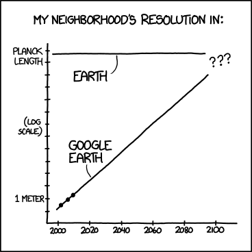
2031: Google defends the swiveling roof-mounted scanning electron microscopes on its Street View cars, saying they 'don't reveal anything that couldn't be seen by any pedestrian scanning your house with an electron microscope.'