Tony Matelli creates art in various media but his hyper-realistic sculptures depicting people and animals in moments of panic, despair, and horror are unsettling in the best possible way. I would love to see a joint art exhibition pairing Tony Matelli with Ron Mueck, who I've posted about many times before. "The bizarre, incredible sculpture works of Tony Matelli" (Juxtapoz)
Nothing is more exciting in summer than cold chocolate on a stick, but store-bought fudgesicles are usually so full of nasty ingredients that shouldn’t pass anybody’s lips. Luckily, there is hardly anything easier than making homemade alternatives with organic chocolate milk and nutella. Check out our recipe for this delicious creamy treat. We can almost guarantee that you will be the most popular person in the house.
Approaching 3 & 1/2 weeks, Tiger’s litter of kittens are starting to explore the world outside of their nest with their waddling gait.
They curiously survey their surroundings nose and tongue first as those are their most developed senses. At the end of their short exploration, they enjoy a comfortable respite on a cushion of piglets, whom they interestingly resemble with their pink paddings, nose, and round, smooshed facies.
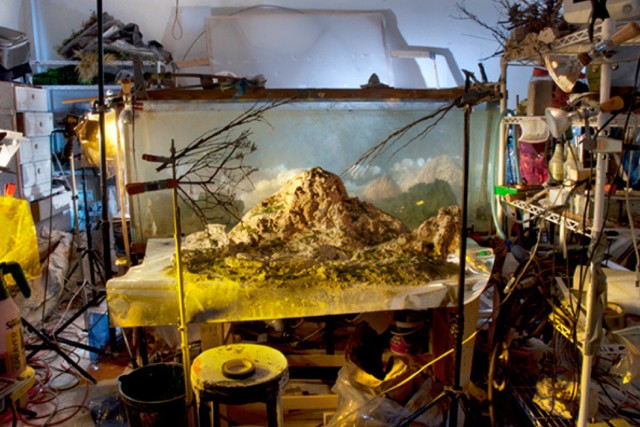
Les paysages de Kim Keever paraissent réels tant les couleurs et les prises de vue sont cristallines. En utilisant des réservoirs d’eau dans lesquels il construit ses panoramas, le photographe leur donne un aspect aussi bien intemporel que fantasmagoriques. Un travail à découvrir en images dans la suite.
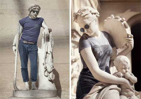
We’ve all seen hipsters in the wild, and even if we can’t perfectly define what a hipster is, we know one when we see one. Parisian artist Léo Caillard does too, and he wondered what this modern trend would look like if it were transported back in time…back to when ancient Greeks paid homage to the perfect human form by immortalizing it in stone.
Caillard got the idea while walking through the Louvre and looking at the masterful statues. He wondered what a juxtaposition of modern fashion and ancient art would look like together. And because a question like that simply can’t go unanswered, he set out to make that unlikely combination happen.
While visiting an estate in Ontario's Niagara Falls two years ago, a film enthusiast stumbled upon a rare World War I Richard Verascope stereo camera previously owned by the French Army. Here's what he found inside.
Artist Philippe Handford turned trees that had been illegally cut down in a forest in Northwest England into a pair of beautiful sculpture installations for the 2012 Pendle Sculpture Trail. In the sculpture “Reconnected 1,” Handford connected a tree back to its stump with a spine-like armature of cross-sectioned logs. In “Reconnected 2,” Handford connected a cluster of four tree stumps with two cross-sectioned log arches. The Pendle Sculpture Trail marked the 400th anniversary of the trials and executions of the Pendle witches.
The Crystal Palace was a glass and cast iron structure built in London, England, for the Great Exhibition of 1851. The building was designed by Sir Joseph Paxton, an architect and gardener, and revealed breakthroughs in architecture, construction and design. More on the Crystal Palace after the break…
In January 1850 a committee was formed to choose the design for a temporary exhibition building that would showcase the latest technologies and innovations from around the world: The “Great Exhibition of the Works of Industry of all Nations.” The structure had to be as economical as possible, and be built before the exhibition was scheduled to open on May 1st, 1851. Within 3 weeks the committee received 245 entires, all of which were rejected. It was only after this that Paxton showed his first interest in the project.
Already a famous gardener at the time, Paxton experimented extensively with glasshouse construction. Using combinations of prefabricated cast iron, laminated wood, and standard sized glass sheets, Paxton created the “ridge-and-furrow” roof design. In 1836 this system was used for the first time in the “Great Stove” – the largest glass building at the time.
Paxton proceeded to visit Hyde Park, where he quickly doodled his famous concept drawing of the Palace (the sketch is now held in the Victoria and Albert Museum). The drawing included all the basic elements of the building, and within two weeks all calculations and detailed plans were submitted.
Paxton’ design was based on a 10in x 49in module, the size of the largest glass sheet available at the time. The modular system consisted of right-angled triangles, mirrored and multiplied, supported by a grid of cast iron beams and pillars. These basic units were extremely light and strong and were extended to an incredible length of 564 meters. The design was also influenced by Paxton’s passion for biomimicry; he drew inspiration from the giant leaves of the Victoria Amazonica waterlily.
Impressed by the low cost proposal, the committee accepted Paxton’s innovative plan, leaving only 8 months for construction, which commenced immediately in Hyde Park. 5000 workers handled more than 1000 iron columns and 84,000 square meters of glass. All parts were prefabricated and easy to erect, and every modular unit was self supporting, allowing the workers freedom in assembling the pieces. Thanks to Paxton’s simple and brilliant design, over 18,000 panes of glass sheets were installed per week, and the structure was completed within 5 months.
Queen Victoria wrote in her journal on May 1st 1851 :
“This day is one of the greatest and most glorious of our lives… It is a day which makes my heart swell with thankfulness… The Park presented a wonderful spectacle, crowds streaming through it, – carriages and troops passing… The Green Park and Hyde Park were one mass of densely crowded human beings, in the highest good humour… before we neared the Crystal Palace, the sun shone and gleamed upon the gigantic edifice, upon which the flags of every nation were flying… The sight as we came to the centre where the steps and chair (on which I did not sit) was placed, facing the beautiful crystal fountain was magic and impressive. The tremendous cheering, the joy expressed in every face, the vastness of the building, with all its decoration and exhibits, the sound of the organ… all this was indeed moving”
When the exhibition was closed 6 months later, the structure was disassembled and then reassembled in the south London suburb of Sydenham Hill. Tragically, the building was destroyed in a fire in 1936.
Paxton’s ingenious design created an unprecedented exhibition space. The construction, acting as a self supporting shell, maximized interior space, and the glass cover enabled daylight. The method of construction was a breakthrough in technology and design, and paved the way for more sophisticated pre-fabricated design.
The colors of art change not just with trends, but availability as well. For reasons of being incredibly poisonous, expensive, or just involving way too many snails, here are five pigments that have disappeared from art.
Maya Blue
Mayan Mural, involving the Maya Blue pigment (via Wikispaces)
On murals, pottery, even possibly painted on the hapless bodies offered as human sacrifices, a sky-blue color has been found in artifacts of the Maya and Aztec. It disappeared around colonial times in Central America, just like the pre-Columbian civilizations themselves. Known as Maya Blue, it’s long been recognized as a mix of a natural clay and a dye from the indigo plant, but how it was so durable in not being subject to fading or even the deterioration of solvents and acids has been a mystery. Earlier this year, however, some chemists announced they may have found the secret in careful variations in the preparation temperatures.
Tyrian Purple
Burial Shroud of Charlemagne (early 9th century), made of Byzantine silk colored with Tyrian Purple (via Wikimedia)
The most prized, prestigious pigment of the ancient world was actually made from a rather slimy source: a predatory snail. Tyrian Purple got its name from the best of the marine shellfish used to make the pigment being found off the shore of Phoenicia’s Tyre, according to Pigment Compendium. Not only was it a properly royal color of rich, slightly red purple, it was said to get even more beautiful and brighter when exposed to the sun and the elements. Yet since you needed a whole pile of snails to have enough mucous secretions to make it, it was very expensive, and eventually disappeared.
White Lead
White Lead in Johannes Vermeer’s “The Glass of Wine” (1658), oil on canvas (via WikiPaintings)
The luminosity of classical European oil paintings was due in large part to White Lead, a pigment of lead carbonate and sulfate. Artists like Vermeer used it to create a special kind of light that radiated from the canvas, the traces of which we can see in its grainy texture. Unfortunately, its striking brightness was rather poisonous. Yet as Applied Polymer Science explains about the lead paint: “Toxicity was recognized, but accepted.” It’s since been largely replaced by Titanium White, a less hazardous, although not as structurally strong, pigment, yet some artists still seek out the White Lead for its believed superior color and permanence, even if it is more difficult to find and still toxic.
Lapis Lazuli
Lapis Lazuli used in a detail of “The Ascension,” attributed to Jacopo di Cione (1371) (via The National Gallery, London)
Widely believed to be the most expensive pigment ever created, more pricey than even its weight in gold, the Lapis Lazuli pigment was made from grinding up Lapis Lazuli precious stones. Its use goes back to the 6th century in Afghanistan, but its popularity really took off with wealthy Renaissance patrons who wanted the stunning blue on the robes of Mary and Jesus in religious paintings. The “ultra marine” color, as it was also known, largely disappeared as it was so incredibly expensive and required quarries to collect the stones. However, you can actually buy it at at the Kremer Pigmente store in Manhattan for $360 for five grams.
Dragon’s Blood
Mural in the Villa of Mysteries in Pompeii, said to incorporate the Dragon’s Blood pigment. (via Wikimedia)
The pigment known as Dragon’s Blood had the most epic and ridiculous of origin stories, a supposed mix of actual dragon’s blood and elephant’s blood. Andrew Dalby’s Dangerous Tastes chronicles this incredible story from the 16th century navigator Richard Eden:
“[Elephants] have continual warre against Dragons, which desire their blood, because it is very cold: and therefore the Dragon lying awaite as the Elephant passeth by, windeth his taile, being of exceeding length, about the hinder legs of the Elephant, and when the Elephant waxeth faint, he falleth down on the serpent, being now full of blood, and with the poise of his body breaketh him: so that his owne blood with the blood of the Elephant runneth out of him mingled together, which being colde, is congealed into that substance which the Apothecaries call Sanguis Draconis, that is Dragons blood, otherwise called Cinnabaris.”
As freaking exciting as a battle between an elephant and dragon would be, the pigment was in actuality made from a Southeast Asian tree — though the story certainly helped hype it to outside buyers, and its blood red color was popular in the ancient world. It faded out of mainstream popularity around the 19th century, probably alongside the very much waning fascination with elephant vs. dragon battles.
UPDATES:
Mummy Brown
Martin Drölling, “L’intérieur d’une cuisine” (1815), believed to have been painted with Mummy Brown (via the Louvre)
A fantastic Twitter tip from Art vs Artifact informed us of another vanished pigment with an incredible story: Mummy Brown. The pigment, a favored shade of the Pre-Raphaelites, was first made with Egyptian mummies, both cat and human, that were ground up and mixed with white pitch and myrrh. It had a great fleshy color, but due to the actual fleshy components it would crack over time. Martin Drölling, who painted the work shown above, reportedly used the mummies of French kings dug up from Saint-Denis in Paris. According to a 1964 Time story, the Mummy Brown pigment didn’t last due to a shortage of its name defining ingredient. Managing director of the London based C. Roberson color maker told the magazine: “We might have a few odd limbs lying around somewhere, but not enough to make any more paint.”
Indian Yellow
Here’s another curious, and unsettling, pigment tip from Twitter on Indian Yellow. According to Philip Ball’s Bright Earth: Art and the Invention of Color, the vivid color of Indian Yellow was a source of mystery until the late 19th century. It turned out that the yellow color came from the urine of cattle in the Bihar province of India that were fed only mango leaves and water. The mistreatment of the animals led to the color being illegal and it vanished by 1908.
Scheele’s Green
From the comments, we got a tip on Scheele’s Green. The yellow-green pigment was a cupric hydrogen arsenite, which was very toxic, yet made it into not just paintings, but candles, wallpaper, and children’s toys. In one incident at a Christmas party, a candle dyed with the color poisoned children, and other 19th century incidents include women in green dresses passing out and those using it to print newspapers suffering from its effects. The arsenic vapors also are believed by some to have played a role in the death of Napoleon, who lived in a room paintly brightly green, his favorite color, as traces of arsenic were found in his hair.
With urban environments becoming more and more congested, there has been an increase in more eco-friendly and space saving alternatives. German-based company Scrooser hopes to revolutionize the way we travel around our cities with their now successfully funded Kickstarter project. The Scrooser is an electric scooter that is similar to a push scooter rather than a motored one. This is because it uses an amazingly engineered impulse drive that quadruples the power of your kicks to a top speed of 15mph. The power source is a standard lithium ion battery found beneath the floorboards. It takes three hours to fully charge and can go for up to 35 miles in distance.
A noticeable detail of this design are the fat wheels which adds to its manageable but cumbersome 60 pound weight. The smooth ride has been compared to the feeling of snowboarding. Other features of this unique mode of transportation are its full aluminum frame, LED running lights, ignition lock, and a cable lock built into the frame so you won't have to worry about anyone stealing your new ride. For just shy of $5,300, you can own your own Scrooser by donating to their Kickstarter campaign, which has already destroyed their set production goal of $120,000. Check out their promotional video below to learn more.
Something surprising has happened with many so-called “sustainable” buildings. When actually measured in post-occupancy assessments, they’ve proven far less sustainable than their proponents have claimed. In some cases they’ve actually performed worse than much older buildings, with no such claims. A 2009 New York Times article, “Some buildings not living up to green label,” documented the extensive problems with many sustainability icons. Among other reasons for this failing, the Times pointed to the widespread use of expansive curtain-wall glass assemblies and large, “deep-plan” designs that put most usable space far from exterior walls, forcing greater reliance on artificial light and ventilation systems.
Partly in response to the bad press, the City of New York instituted a new law requiring disclosure of actual performance for many buildings. That led to reports of even more poor-performing sustainability icons. Another Times article, “City’s Law Tracking Energy Use Yields Some Surprises,” noted that the gleaming new 7 World Trade Center, LEED Gold-certified, scored just 74 on the Energy Star rating — one point below the minimum 75 for “high-efficiency buildings” under the national rating system. That modest rating doesn’t even factor in the significant embodied energy in the new materials of 7 World Trade Center.
What’s going on with these supposedly “sustainable” buildings? Read on, after the break…
Things got even worse in 2010 with a lawsuit [“$100 Million Class Action Filed Against LEED and USGBC”] against the US Green Building Council, developers of the LEED certification system (Leadership in Energy and Environmental Design). The plaintiffs in the lawsuit alleged that the USGBC engaged in “deceptive trade practices, false advertising and anti-trust” by promoting the LEED system, and argued that because the LEED system does not live up to predicted and advertised energy savings, the USGBC actually defrauded municipalities and private entities. The suit was ultimately dismissed, but in its wake the website Treehugger and others predicted, based on the evidence uncovered, that “there will be more of this kind of litigation.”
What’s going on? How can the desire to increase sustainability actually result in its opposite?
One problem with many sustainability approaches is that they don’t question the underlying building type. Instead they only add new “greener” components, such as more efficient mechanical systems and better wall insulation. But this “bolt-on” conception of sustainability, even when partially successful, has the drawback of leaving underlying forms, and the structural system that generates them, intact. The result is too often the familiar “law of unintended consequences.” What’s gained in one area is lost elsewhere as the result of other unanticipated interactions.
For example, adding more efficient active energy systems tends to reduce the amount of energy used, and therefore lowers its overall cost. But, in turn, that lower cost tends to make tenants less careful with their energy use — a phenomenon known as “Jevons’ Paradox.” Increasing efficiency lowers cost, and increases demand — in turn increasing the rate of consumption, and wiping out the initial savings. The lesson is that we can’t deal with energy consumption in isolation. We have to look at the concept of energy more broadly, including embodied energy and other factors.
There are often other unintended consequences. A notable case is London’s sustainability-hyped “Gherkin” (Foster & Partners, 2003), where the building’s open-floor ventilation system was compromised when security-conscious tenants created glass separations. Operable windows whose required specifications had been lowered because of the natural ventilation feature actually began to fall from the building, and had to be permanently closed. The ambitious goal of a more sophisticated natural ventilation system paradoxically resulted in even worse ventilation.
No building is an island
Another major problem with green building programs happens when they treat buildings in isolation from their urban contexts. In one infamous example (“Driving to Green Buildings”), the Chesapeake Bay Foundation moved its headquarters to the world’s first certified LEED-Platinum building — but the move took them from an older building in the city of Annapolis, Maryland to a new building in the suburbs, requiring new embodied energy and resources. The added employee travel alone — what’s known as “transportation energy intensity” — more than erased the energy gains of the new building.
The theory of resilience discussed in our article, “Toward Resilient Architectures 1: Biology Lessons,” points to the nature of the problem. Systems may appear to be well engineered within their original defined parameters — but they will inevitably interact with many other systems, often in an unpredictable and non-linear way. We look towards a more “robust” design methodology, combining redundant (“network”) and diverse approaches, working across many scales, and ensuring fine-grained adaptivity of design elements.
Though these criteria may sound abstract, they’re exactly the sorts of characteristics achieved with so-called “passive” design approaches. Passive buildings allow the users to adjust and adapt to climactic conditions — say, by opening or closing windows or blinds, and getting natural light and air. These designs can be far more accurate in adjusting to circumstances at a much finer grain of structure. They feature diverse systems that do more than one thing — like the walls that hold up the building and also accumulate heat through thermal mass. They have networks of spaces that can be reconfigured easily, even converted to entirely new uses, with relatively inexpensive modifications (unlike the “open-plan” typology, which has never delivered on expectations). They are all-around, multi-purpose buildings that aren’t narrowly designed to one fashionable look or specialized user. And perhaps most crucially, they don’t stand apart from context and urban fabric, but work together with other scales of the city, to achieve benefits at both larger and smaller scales.
Older buildings perform better… sometimes
Many older buildings took exactly this “passive” approach, simply because they had to. In an era when energy was expensive (or simply not available) and transportation was difficult, buildings were naturally more clustered together in urban centers. Their shape and orientation exploited natural daylight, and typically featured smaller, well-positioned windows and load-bearing walls with higher thermal mass.
The simple, robust shapes of these buildings allowed almost endless configurations. In fact many of the most in-demand urban buildings today are actually adaptive reuse projects of much older buildings. The results of this passive approach are reflected in good energy performance. While New York’s 7 World Trade Center actually scored below the city’s minimum rating of 75 out of 100, older buildings in the city that had been retrofitted with the same efficient heating, cooling, and lighting technologies fared much better: the Empire State Building scored a rating of 80, the Chrysler Building scored 84.
But just being old is clearly not a criterion of success. The 1963 MetLife/PanAm building (Walter Gropius & Pietro Belluschi), now a half-century old, scored a dismal 39. Another mid-century icon, the Lever House (Skidmore, Owings & Merrill, 1952), scored 20. The worst performer of all was Ludwig Mies Van der Rohe’s iconic Seagram building, built in 1958. Its score was an astonishingly low 3. What’s the problem with these buildings?
As the earlier New York Times article noted, they have extensive curtain-wall assemblies, large window areas, large-scale “deep-plan” forms, and other limitations. On a fundamental level, as we can now begin to see from resilience theory, they lack many crucial resilient advantages of older building types. There may be something inherent in the building type itself that is non-resilient. The form language itself could be an innate problem — something that, according to systems thinking, no mere bolt-on “green” additions can fix.
“Oil-interval” architecture
Architectural critic Peter Buchanan, writing recently in the UK magazine, The Architectural Review, placed the blame for these failures squarely at the feet of the Modernist design model itself, and called for a “big rethink” about many of its unquestioned assumptions [“The Big Rethink: Farewell To Modernism — And Modernity Too”]. Modernism is inherently unsustainable, he argued, because it evolved in the beginning of the era of abundant and cheap fossil fuels. This cheap energy powered the weekend commute to the early Modernist villas, and kept their large open spaces warm, in spite of large expanses of glass and thin wall sections. Petrochemicals created their complex sealants and fueled the production of their exotic extrusions. “Modern architecture is thus an energy-profligate, petrochemical architecture, only possible when fossil fuels are abundant and affordable”, he said. “Like the sprawling cities it spawned, it belongs to that waning era historians are already calling ‘the oil interval’.”
Buchanan is not alone in calling for a “big rethink” about the assumptions of Modernist design. It is fashionable among many architects today to attack Modernism, and argue instead for various kinds of avant-garde and “Post-Modernist” styles. Buchanan lumps these styles together under a category he calls “Deconstructionist Post-Modernism.” But he insists that the Deconstructionists have not actually transcended the Modernist paradigm they attack: they still operate almost entirely within the industrial assumptions and engineering methodologies of the “oil interval.”
Once again, resilience theory provides insight into the serious flaws carried by this family of related form languages — and indeed, flaws in their very conception of design. (Those will need to be examined in great detail.) Ironically, this “modern” model is now almost a century old, belonging to an era of “engineered resilience” — that is, resilience within only one designed system, but unable to cope with the unintended consequences of interactions with other systems (like urban transportation, say, or true ecological systems).
Because the Modernist form language and its successors are tied to the old linear engineering paradigm, they cannot in practice combine redundant (“network”) and diverse approaches, nor work across many scales, nor ensure a fine-grained adaptivity for design elements — though they can certainly create the symbolic appearance of doing so. Contrary to such dubious claims (in what sometimes takes on aspects of a massive marketing effort), they cannot actually achieve what C. H. Holling called “ecological resilience.” This seems to suggest an important explanation of the alarmingly poor performance of these buildings and places, when actually evaluated in post-occupancy research.
Seen in this light, the various avant-garde attempts to transcend Modernism appear more as exotic new wrappings for the same underlying (and non-resilient) structural types and industrial methods. But as Albert Einstein famously pointed out: “A new type of thinking is essential if mankind is to survive and move toward higher levels.” Just as it is not possible to achieve resilience by merely adding new devices like solar collectors to these old industrial-Modernist building types, it is not possible to get meaningful benefits with dazzling new designer permutations and tokenistic ecological thinking within the same essentially industrial design process. We do need a “big rethink” about the most basic methods and systems of design for the future.
A wave of neo-modernism
Yet if anything, in recent years there has been a remarkable resurgence of an even more unapologetic form of Modernism. In light of the evidence, this is a decidedly reactionary trend: we seem to be witnessing a “back to roots” movement — one that, like other such movements, is based more on doctrinal belief than on evidence. This fashionable Neo-Modernism ranges from outright “retro” boxy white buildings, interiors, and furnishings, to swoopy futuristic-looking buildings and landscapes. Stylistically, the shapes are eye-catching and often edgy, and some people (especially many architects) clearly like them.
Not everyone seems to care for this new/old aesthetic, however. Some see the new structures as sterile, ugly, and disruptive to their neighborhoods and cities. Defenders of the designs often attack these critics for being presumably unsophisticated, nostalgic, or unwilling to accept the inevitable progress of a dynamic culture. This “battle of stylistic preferences” rages on, with the Neo-Modernists claiming the avant-garde high ground, where they tend to dominate the media, critics, and schools.
Of course, fashions come and go, and architecture is no different: in a sense this is just another phase in the more or less continuous waxing and waning of architectural Modernism for almost a century now, along with raging debates about its aesthetic merits. Those debates have never really died down. Critics like Buchanan are not new: in the 1960s and 1970s equally vociferous critics like Christopher Alexander, Peter Blake, Jane Jacobs, David Watkin, and Tom Wolfe made withering critiques, but little has changed.
What has now changed, however, is that we are asking newly urgent questions about the resilience of this kind of structure, at a time when we need to rigorously assess and improve that resilience. As this discussion suggests, it is not only the particular and practical issues of expansive glazed curtain walls, bulky and transparent buildings, and exotic assemblies overly reliant on petrochemical products that are the root of the problem. It is perhaps the very idea of buildings as fashionable icons celebrating their own newness, a quintessentially Modernist idea, which is fundamentally at odds with the notion of sustainability.
As they age, these buildings are destined to be less new and therefore less useful, not more so. The pristine Modernist (and now Post-Modernist and Deconstructivist) industrial surfaces are destined to mar, weather, and otherwise degrade. The eye-catching novelties of one era will become the abandoned eyesores of the next, an inevitability lost on a self-absorbed elite fixated on today’s fashions. Meanwhile the humble, humane criteria of resilient design are being pushed aside, in the rush to embrace the most attention-getting new technological approaches — which then produce a disastrous wave of unintended failures. This is clearly no way to prepare for a “sustainable” future in any sense.
Modernism is more than just a style
In this light, why have the form language and design methodologies of Modernism proven so stubbornly persistent? The answer is that Modernism is not merely a style that one may care for or not. It is part and parcel of a remarkably comprehensive — even totalizing — project of aesthetics, tectonics, urbanism, technology, culture, and ultimately, civilization. That project has had a profound effect upon the development of modern settlements, for better or worse, and (especially visible in the light of resilience theory) made a huge contribution to the current state in which we find our cities, and our civilization.
The origins of architectural Modernism are closely affiliated with the progressive goals of the early Twentieth Century, and the humanitarian ideals — even the utopian zeal — of well-meaning visionaries of that day. Those individuals saw a promising capacity, in the dawning industrial technology of the age, to deliver a new era of prosperity and quality of life for humanity. At their most credulous, its leaders were clearly enraptured by the seemingly infinite possibilities for a technological utopia. From that they developed an elaborate — and in surprising ways, still poorly-evaluated — theory about the necessary new tectonics and form languages of the civilization of the future. Their followers today still argue that it is, unquestionably, Modernism that is best positioned to don the mantle of sustainability.
Many things did improve under this technological regime, of course, and today we can cure diseases, reduce backbreaking toil, eat exotic foods, travel fast in comfortable motoring and flying craft, and do many other things that would astonish our ancestors. But along with that new regime has come a calamitous ecological depletion and destruction of resources, and an erosion of the foundation on which all economics and indeed all life depends. So today, in an age of converging crises, it is well worth our asking hard questions about the assumptions of that industrial regime — and the complicity of architectural Modernism as a kind of alluring “product packaging” within it.
The story goes back to a remarkably small group of writers, theorists, and practitioners in the early 20th Century, and notably the Austrian architect Adolf Loos. We will need to look more closely at this history — and what its ongoing legacy means for us, and our very daunting design challenges today.
Michael Mehaffy is an urbanist and critical thinker in complexity and the built environment. He is a practicing planner and builder, and is known for his many projects as well as his writings. He has been a close associate of the architect and software pioneer Christopher Alexander. He is a Research Associate with the Center for Environmental Structure, Alexander’s research center founded in 1967, and Executive Director of the Sustasis Foundation, a Portland, OR-based NGO dedicated to developing and applying neighborhood-scale tools for resilient and sustainable development.
Nikos A. Salingaros is a mathematician and polymath known for his work on urban theory, architectural theory, complexity theory, and design philosophy. He has been a close collaborator of the architect and computer software pioneer Christopher Alexander. Salingaros published substantive research on Algebras, Mathematical Physics, Electromagnetic Fields, and Thermonuclear Fusion before turning his attention to Architecture and Urbanism. He still is Professor of Mathematics at the University of Texas at San Antonioand is also on the Architecture faculties of universities in Italy, Mexico, and The Netherlands.
Aardman Animations directors Karni & Saul recently directed a new Random Acts film titled "Skinmeal," and we wanted to share with you the trailer, here, prior to its broadcast on Channel 4 in the UK on Wednesday, July 3rd. "Skinmeal" is a miniature predator story in the world of tattoos. In a Lynchian-style beach scenario, a girl lies sunbathing in electric light and is suddenly infested by her own tattoos.
"In 'Skinmeal,' we tried to make a piece that was visually tempting and at the same time had a sharp edge to it," said Karni & Saul, directors at Aardman Animations.
The film is loosely inspired by the work of David Lynch. Karni shot the live action footage on a Digital SLR camera in the studio at Aardman. Saul drew inspiration from tribal art to design the tattoo bugs. The insect tattoos were then animated in Maya by the CG team at Aardman and composited in After Effects. Saul also created the mood music. The result was a moody piece based on the food chain or as we call it skin meal.
Karni & Saul were commissioned by Lupus Films to create a 3 minute short for Channel 4's Random Acts, a short-form daily arts strand screened on the channel late at night. Random Acts launched in 2011 and in its first year showcased 260 specially-commissioned three-minute films chosen for their bold and creative expressions of creativity.
Check out the "Skinmeal" trailer on Vimeo
Images from the film are below.
ABOUT AARDMAN ANIMATIONS
Aardman, based in Bristol (UK) co-founded and run by Peter Lord and David Sproxton, is a world leader in animation. It produces feature films, television series and television commercials for both the domestic and international market. Their multi-award winning productions are novel, entertaining, brilliantly characterised and full of charm that reflects the unique talent, energy and personal commitment of the very special people who make up the Aardman team. The studio’s work is often imitated and yet the company continues to lead the field producing a rare brand of visually stunning and amusing independent and commercials productions. More information can be found at: http://www.aardman.com
In case you're behind on the hype, a Cronut is a croissant-doughnut hybrid created by Dominique Ansel of Dominique Ansel Bakery in New York. It looks and is fried like a doughnut, but it has the delicate layers of a croissant. Since the Cronut's debut in May, people have been lining up before dawn for a chance to try one of these beauties. Because I mean, just look at the thing.
One of the greatest things to do when you visit a different place is to try the local dishes. By eating ethnical food you'll go a little further in the experience of that city or country, which is the whole idea of traveling.
Gabriele Galimberti is an experienced Italian photographer who travels all over the world to capture the soul of different cultures in the little things. You might know his project called Toy Stories, and following the same idea, he captured the essence of each country's traditional foods, cooked mainly by old ladies, which is totally cute. The project called Delicatessen with Love is a explosion of colors and tastes [in my head] that will bring you new light about other countries' cultures. These are only a handful of dishes: for more, and even to get the actual recipes, visit the project page at Gabriele's personal portfolio. It's a delight. Cheers. ;)
Riga, Latvia
Abolu Pirags (sweet pizza with apples and chocolate) by Natàlija Kaze, 65 years old
Saint-Jean du Sud, Haiti
Lambi in creole sauce by Serette Charles, 63 years old
Beirut, Lebanon
Mjadara (rice and lentils cream) by Wadad Achi, 66 years old
Mchinji, Malawi
Finkubala (Caterpillar in tomato sauce) by Regina Lifumbo, 53 years old
Chongqing, China
Hui Guo Rou (twice-cooked pork with vegetables) by Pan Guang Mei, 62 years old
Kuala Lumpur, Malaysia
Nasi Lemak (coconut rice with vegetables and fried dried anchovies) by Thilaga Vadhi, 55 years old
Rio de Janeiro, Brazil
Fejoada light by Ana Lucia Souza Pascoal, 53 years old
Stockholm, Sweden
Inkokt Lax â (poached cold salmon and vegetables) by Brigitta Fransson, 70 years old
Istanbul, Turkey
Karniyarik (stuffed aubergines with meat and vegetables) by Ayten Okgu , 76 years old
La Paz, Bolivia
Queso Humacha (vegetables and fresh cheese soup) by Julia Enaigua, 71 years old
Oltepessi (masaai mara) Kenya
Mboga and orgali (white corn polenta with vegetables and goat) by Normita Sambu Arap, 65 years old
Buenos Aires, Argentina
Empanada Criolla (that is, meat stuffed pastry) by Susana Vezzetti, 62 years old
Cairo, Egypt
Kuoshry (pasta, rice and legumes pie) by Fifi Makhmer, 62 years old
Reykjavìk, Iceland
Kjotsùpa (lamb and vegetables soup) by Valagerdur Olafsdòttir, 63 years old
Lima, Peru
Corvina fish ceviche by Itala Revello Rosas, 77 years old
Addis Ababa, Ethiopia
Enjera with churry and vegetables by Bisrat Melake, 60 years old
Madrid
Asadura de cordero lecca con arroz (milk-fed lamb offal with rice) by Carmina Fernandez, 73 years old
Contrary to urban legend, medieval cathedral windows don't flow like fluids, but the super-tough glass in smartphones and tablet computers shrinks over a period of days
"The elegantly balanced flavors of the Australian Collection are inspired by some of Australia’s finest ingredients with some of Australia’s most creative chefs." We love the mouth watering composite images of the ingredients. It is the clever use of food styling doubling as a brand element that made Connoisseur standout amongst those in the category.
"Bold and sophisticated, let the Australian Collection take you on a mouth-watering journey from the sun-drenched splendor of Kangaroo Island to the silver-crowned majesty of the Snowy Mountains."
Anne Frank (1929-1945) was a young German Holocaust victim who wrote the most famous diary in history. Frank and her Jewish family (including her older sister Margot, who is pictured with Anne in the comic) were forced to go into hiding from the Nazis in Amsterdam in 1942. They stayed in a secret section of an office building for nearly three years before they were captured. Anne and Margot eventually perished at Bergen-Belsen concentration camp, just weeks before it was liberated by Allied troops.
While in hiding Anne kept a diary which described in great detail her family relationships, living conditions and life under occupation. The diary became a refuge for Anne as she discovered her talent for writing and even started to dream of a career as a journalist:
“When I write I can shake off all my cares. My sorrow disappears, my spirits are revived! But, and that’s a big question, will I ever be able to write something great, will I ever become a journalist or a writer?”
Little did she know that her diary would become one of the most famous books in the world.
Whether we are pinching the cheeks of an adorable toddler or enveloping a beloved pet in a bear hug, most of us have experienced the strange drive to give something cute a gigantic squeeze. New research by two Yale University psychologists details how the sight of something cute brings out our aggressive side. Rebecca Dyer and Oriana Aragon investigated “cute aggression” by showing study participants slide shows of either cute, funny or normal animal photographs. As they watched, the participants held bubble wrap. The researchers, attempting to mimic the common desire to squeeze cute things, told subjects to pop as many or as few bubbles as they wished. People watching the cute slide show popped significantly more bubbles than those viewing the funny or control pictures, according to results presented at the Society for Personality and Social Psychology annual meeting in New Orleans. “Some things are so cute that we just can't stand it,” Dyer concludes.

 Tony Matelli creates art in various media but his hyper-realistic sculptures depicting people and animals in moments of panic, despair, and horror are unsettling in the best possible way. I would love to see a joint art exhibition pairing Tony Matelli with Ron Mueck, who I've posted about many times before. "The bizarre, incredible sculpture works of Tony Matelli" (Juxtapoz)


 and part rear (right) view and floor plan of London's Crystal Palace. © Wikimedia Commons")


, oil on canvas (via WikiPaintings)")


 Scrooser's website
via [
Scrooser's website
via [


