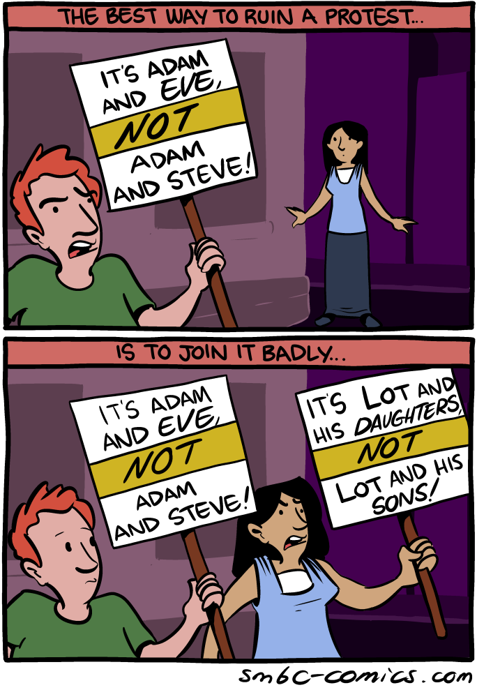
Just a reminder, the Pluto shirt is available a little while longer.

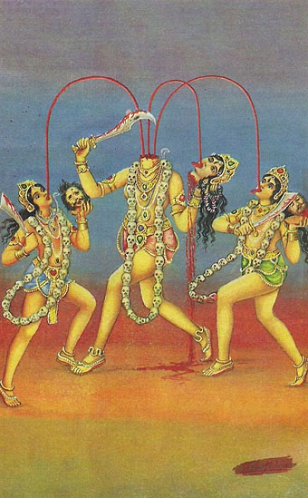
The saintly cephalophores may be reconciled to their martyrdoms but none of them decapitated themselves, unlike Chinnamasta, the self-decapitating Tantric goddess. The most common representations show her sitting or standing on a copulating couple while blood from her neck spouts into the mouth of her severed head and the mouths of her attendants, Dakini and Varnini. In other depictions she should probably be classed among the cephalophores when she goes for a walk or a ride on a lion. The fourth picture here is of Chinnamunda, a related, wrathful form of Vajrayogini from Tibetan Buddhism.


Previously on { feuilleton }
• Cephalophores
• Decapitations
Today I learned that iconic designer Milton Glaser co-wrote a column for New York magazine (which he co-founded) about where to find cheap-but-good food in NYC. It was called The Underground Gourmet. Here's a typical column from the October 27, 1975 issue, reviewing a ramen joint in Midtown called Sapporo that is miraculously still around:
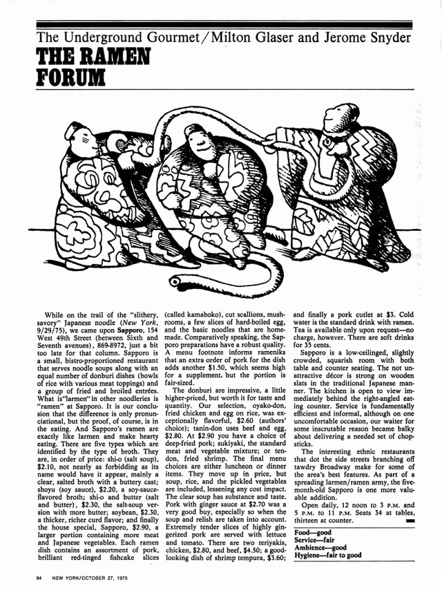
Glaser and his co-authior Jerome Snyder eventually packaged the column into a series of books, some of which you can find on Amazon...I bought a copy this morning.
I found out about Glaser's food enthusiasm from this interview in Eye magazine about The Underground Gourmet and his long collaboration with restaurateur Joe Baum of the Rainbow Room and Windows on the World.
We just walked the streets ... When friends of ours knew we were doing it we got recommendations.
There were parts of the city where we knew we could find good places ... particularly in the ethnic parts. We knew if we went to Chinatown we would find something if we looked long enough, or Korea Town, or sections of Little Italy.
More then than now, the city was more locally ethnic before the millionaires came in and bought up every inch of space. So you could find local ethnic places all over the city. And people were dying to discover that. And it was terrific to be able to find a place where you could have lunch for four dollars.
In 2010, Josh Perilo wrote an appreciation of The Underground Gourmet in which he noted only six of the restaurants reviewed in the 1967 edition had survived:
Being obsessed with the food and history of New York (particularly Manhattan), this was like finding a culinary time capsule. I immediately dove in. What I found was shocking, both in the similarities between then and now, and in the differences.
The most obvious change was the immense amount of restaurants that no longer existed. These were not landmarked establishments, by and large. Most of them were hole-in-the wall luncheonettes, inexpensive Chinese restaurants and greasy spoons. But the sheer number of losses was stunning. Of the 101 restaurants profiled, only six survive today: Katz's Delicatessen, Manganaro's, Yonah Schimmel's Knishes Bakery, The Puglia and La Taza de Oro. About half of the establishments were housed in buildings that no longer exist, especially in the Midtown area. The proliferation of "lunch counters" also illustrated the evolution of this city's eating habits. For every kosher "dairy lunch" joint that went down, it seems as though a Jamba Juice or Pink Berry has taken its place.
Man, it's hard not get sucked into reading about all these old places...looking forward to getting my copy of the book in a week or two.
Update: Glaser's co-author Jerome Snyder was also a designer...and no slouch either.
Tags: books design food Josh Perilo Milton Glaser New York magazine NYC restaurants The Underground Gourmet
Martyrdom of Saint Denis, Saint Eleutherius and Saint Rusticus by Pierre II Mignard.
Consider this an addendum to an earlier post about decapitations in art history. What I didn’t know then was that decapitated saints have their own “cephalophore” category if they’ve been recorded as going for a post-decapitation stroll; a case of “take up thy head and walk”. Saint Denis of Paris receives more attention than most on account of his being a patron saint of France. This also explains why his martyrdom is depicted in gory detail on the wall of the Pantheon in Paris.
St. Denis bearing his head and halo (1896).
Nine-year-old Saint Justus of Beauvais differs from the strolling cephalophores—who manage to walk some distance before finally expiring—in having picked up his head severed head and carried on speaking. Rubens is one of the few artists to depict this event, although his habitual all-shall-have-muscles technique makes the boy look a lot older. Wikimedia Commons has a few more examples of Saint Denis, with and without head.
The Miracle of Saint Justus (c. 1635) by Peter Paul Rubens.
Previously on { feuilleton }
• Decapitations
 [Image: Trevor Paglen, "PAN (Unknown; USA-207)," from The Other Night Sky].
Over the last fifty years, hundreds of satellites have been launched into geosynchronous orbits, forming a ring of machines 36,000 kilometers from earth. Thousands of times further away than most other satellites, geostationary spacecraft remain locked as man-made moons in perpetual orbit long after their operational lifetimes. Geosynchronous spacecraft will be among civilization's most enduring remnants, quietly circling earth until the earth is no more.Paglen ended his lecture with an amazing anecdote worth repeating here. Expanding on this notion—that humanity's longest-lasting ruins will not be cities, cathedrals, or even mines, but rather geostationary satellites orbiting the Earth, surviving for literally billions of years beyond anything we might build on the planet's surface—Paglen tried to conjure up what this could look like for other species in the far future.
 [Image: Star trails, seen from space, via Wikimedia].
 [Image: More star trails from space, via Wikipedia].
 [Image: Cropping in to highlight the geostationary satellites—the unblurred dots between the star trails—in "PAN (Unknown; USA-207)" by Trevor Paglen, from The Other Night Sky].
 [Image: Cropping further into "PAN (Unknown; USA-207)" by Trevor Paglen, from The Other Night Sky].
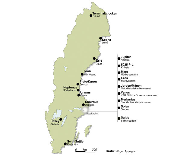
Spanning from comets in the south to the termination shock zone in the northern part of the country, The Sweden Solar System is a scale model of the solar system that spans the entire country of Sweden, the largest such model in the world.
Tags: astronomy science solar system space SwedenThe Sun is represented by the Ericsson Globe in Stockholm, the largest hemispherical building in the world. The inner planets can also be found in Stockholm but the outer planets are situated northward in other cities along the Baltic Sea.
 [Image: From a newscast about Istanbul's recent tornadoes].
 [Image: Photographer uncredited; via the Hürriyet Daily News].
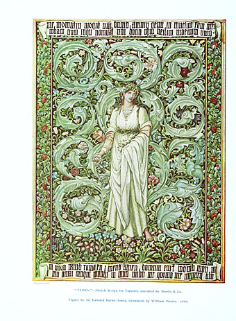
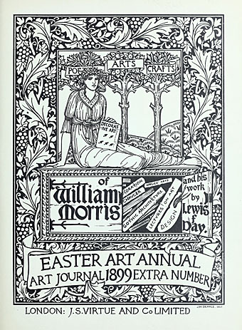
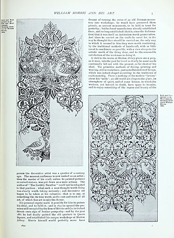
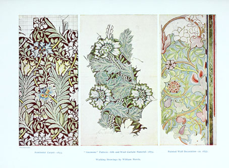
The world isn’t exactly starved of books about William Morris but William Morris and His Work (1899) is the first I’ve seen that gives an opportunity to study the creation of some of the Morris company’s florid textile designs. Those that follow obvious repeating patterns (like the bird designs below) don’t appear technically challenging but I’ve wondered a few times about the difficulties of creating some of the very elaborate interlacings of foliage that became the Morris hallmark. Lewis Foreman Day wrote a number of books on the history of ornament and design so he’s an ideal guide. Browse his book here or download it here.
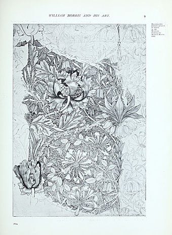

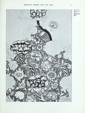
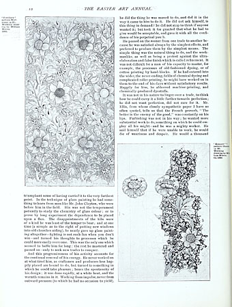
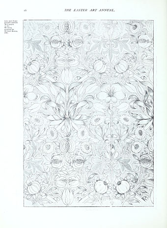
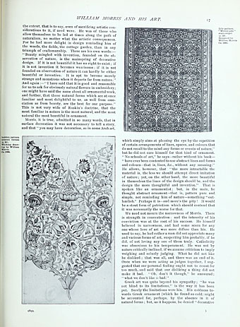
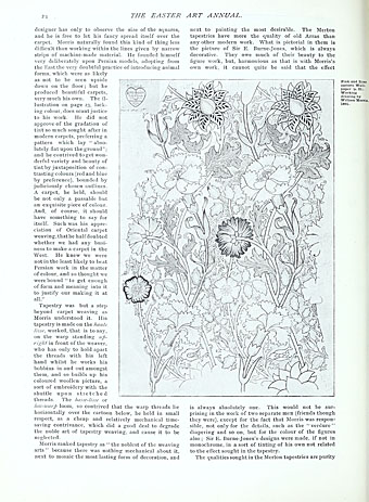

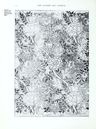
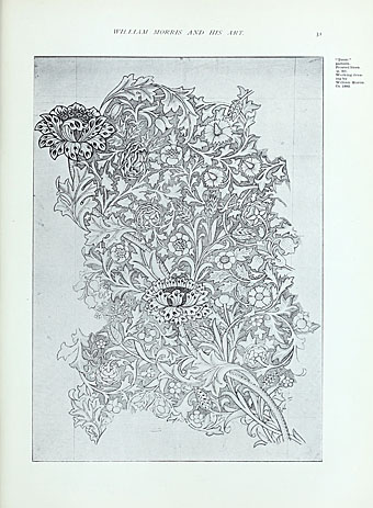
Previously on { feuilleton }
• Walter Crane’s Household Stories
American illustrator Everett Henry (1893–1961) created several maps based on classic American novels but The Virginian and The Adventures of Huckleberry Finn lack the epic, globe-trotting qualities of Moby-Dick, one of the few novels where almost every scene takes place in a different part of the world. The linear nature of the voyage also aids Henry’s design with its graded colours and suitably bloody culmination. The use of vignettes in literary maps reminds me most of the charts drawn by Pauline Baynes for Tolkien’s books but there are plenty of other examples, some of which may be seen at VTS.
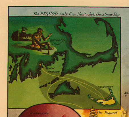
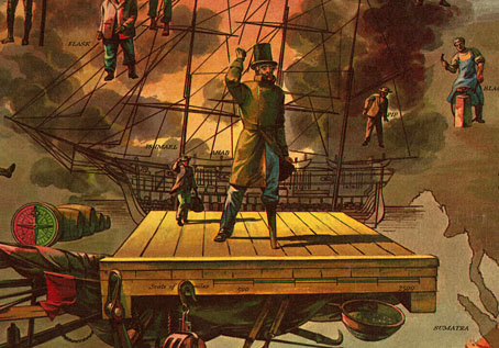
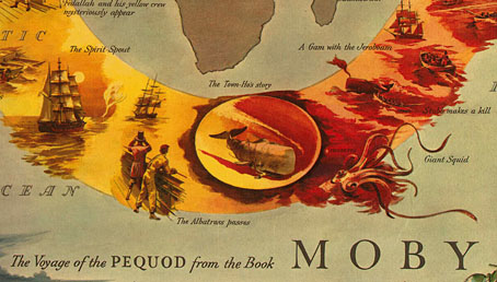
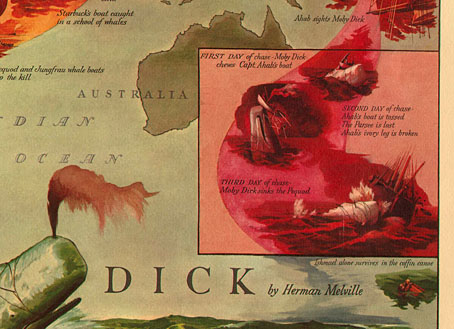
Elsewhere on { feuilleton }
• The illustrators archive
Previously on { feuilleton }
• Of the Monstrous Pictures of Whales
• Jan Saenredam’s whale
• The Whale again
• Rockwell Kent’s Moby Dick
• Pauline Baynes, 1922–2008

Reflecting upon several decades of company logos, I have decided that this one, for the moving company Yamato, is my all-time favorite. It has everything: Moment of mystification, followed by pleasing shock of recognition; implication of a high level of service and literally loving care (as if it were their own!); and, finally, cats.
In light of the ongoing policing situation in Ferguson, Missouri in the wake of the shooting of an unarmed man by a police officer and how the response to the community protests is highlighting the militarization of US police departments since 9/11, it's instructive to look at one of the first and most successful attempts at the formation of a professional police force.
The UK Parliament passed the first Metropolitan Police Act in 1829. The act was introduced by Home Secretary Sir Robert Peel, who undertook a study of crime and policing, which resulted in his belief that the keys to building an effective police force were to 1) make it professional (most prior policing had been volunteer in nature); 2) organize as a civilian force, not as a paramilitary force; and 3) make the police accountable to the public. The Metropolitan Police, whose officers were referred to as "bobbies" after Peel, was extremely successful and became the model for the modern urban police force, both in the UK and around the world, including in the United States.
At the heart of the Metropolitan Police's charter were a set of rules either written by Peel or drawn up at some later date by the two founding Commissioners: The Nine Principles of Policing. They are as follows:
1. To prevent crime and disorder, as an alternative to their repression by military force and severity of legal punishment.
2. To recognise always that the power of the police to fulfil their functions and duties is dependent on public approval of their existence, actions and behaviour, and on their ability to secure and maintain public respect.
3. To recognise always that to secure and maintain the respect and approval of the public means also the securing of the willing co-operation of the public in the task of securing observance of laws.
4. To recognise always that the extent to which the co-operation of the public can be secured diminishes proportionately the necessity of the use of physical force and compulsion for achieving police objectives.
5. To seek and preserve public favour, not by pandering to public opinion, but by constantly demonstrating absolutely impartial service to law, in complete independence of policy, and without regard to the justice or injustice of the substance of individual laws, by ready offering of individual service and friendship to all members of the public without regard to their wealth or social standing, by ready exercise of courtesy and friendly good humour, and by ready offering of individual sacrifice in protecting and preserving life.
6. To use physical force only when the exercise of persuasion, advice and warning is found to be insufficient to obtain public co-operation to an extent necessary to secure observance of law or to restore order, and to use only the minimum degree of physical force which is necessary on any particular occasion for achieving a police objective.
7. To maintain at all times a relationship with the public that gives reality to the historic tradition that the police are the public and that the public are the police, the police being only members of the public who are paid to give full-time attention to duties which are incumbent on every citizen in the interests of community welfare and existence.
8. To recognise always the need for strict adherence to police-executive functions, and to refrain from even seeming to usurp the powers of the judiciary of avenging individuals or the State, and of authoritatively judging guilt and punishing the guilty.
9. To recognise always that the test of police efficiency is the absence of crime and disorder, and not the visible evidence of police action in dealing with them.
As police historian Charles Reith noted in 1956, this philosophy was radical when implemented in London in the 1830s and "unique in history and throughout the world because it derived not from fear but almost exclusively from public co-operation with the police, induced by them designedly by behaviour which secures and maintains for them the approval, respect and affection of the public". Apparently, it remains radical in the United States in 2014. (thx, peter)
Tags: crime Ferguson legal lists London Robert Peel UK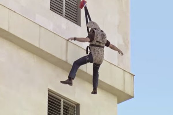 [Image: The SkySaver backpack in action via Kit Up!].
Reading glosses of polysynthetic languages is a trip cause you’ll find stuff like this:
(first example is in Amuesha, second in Tariana, both Arawak languages)
So you’re just there like
This is probably a cue to bring back SpecGram’s adorable morphological typology comics.
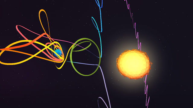
Oh man, this is great. A Spacecraft For All is an interactive video about the ISEE-3 Reboot Project, in which a group of scientists working out of an old McDonald's crowdfunded an effort to communicate with a nearly forgotten satellite launched by NASA in 1978 to observe the Sun and chase a comet. After the intro, click on "See the Journey"...it's well worth your time if you're at all interested in space or science.
For instance, did you know there exists several points between the Earth and the Sun at which a satellite can orbit around, enabling spacecraft to stay more or less in the same spot for observation purposes? So cool!
Tags: NASA science space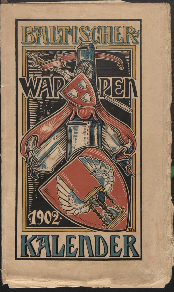
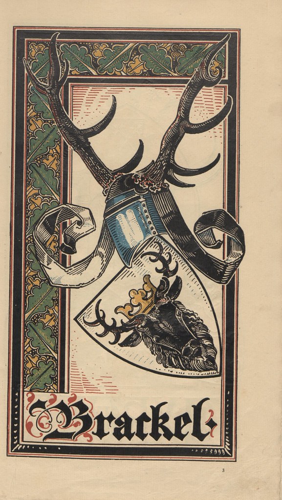
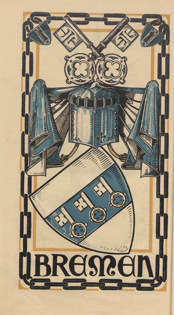

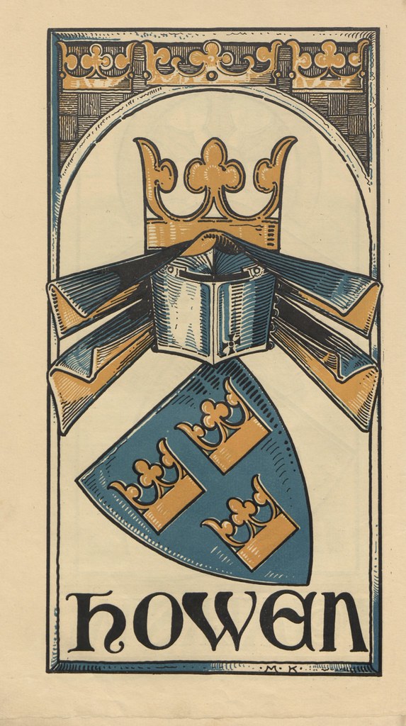
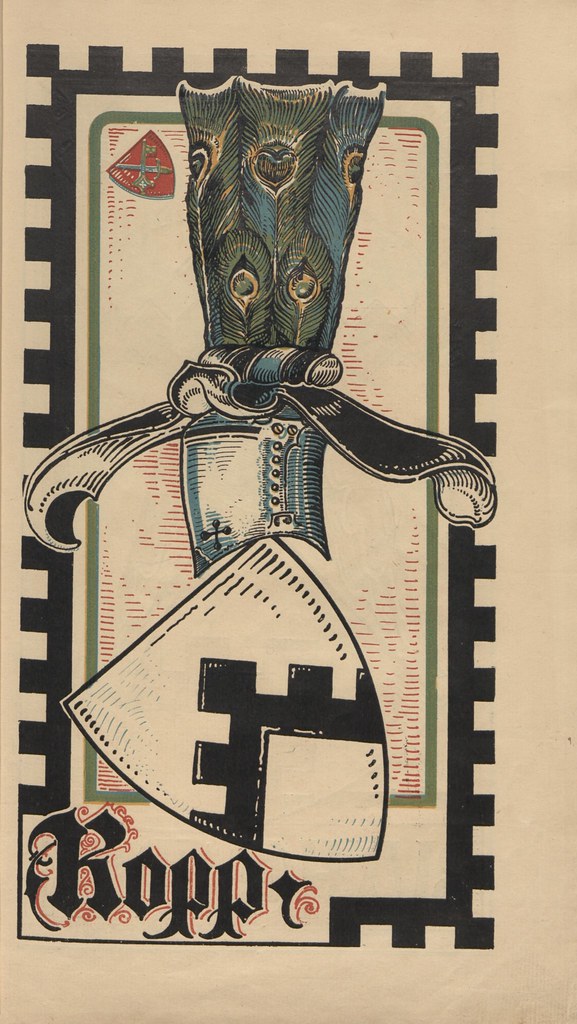
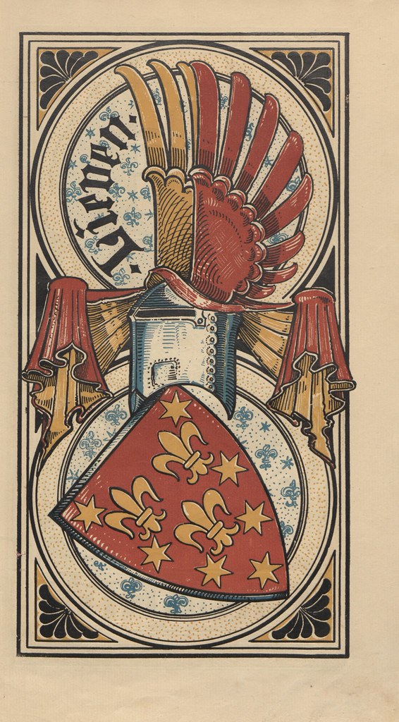
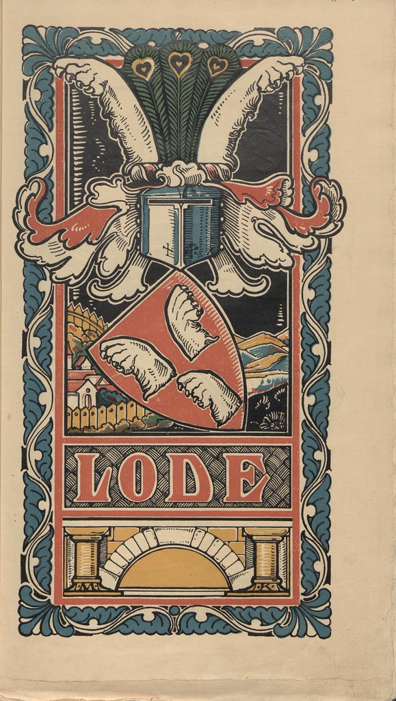
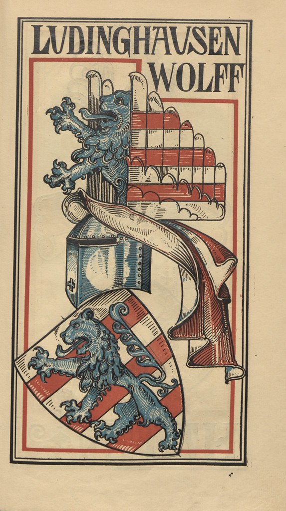
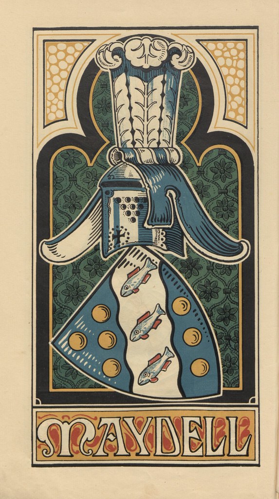
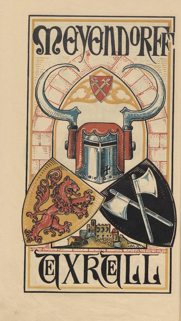
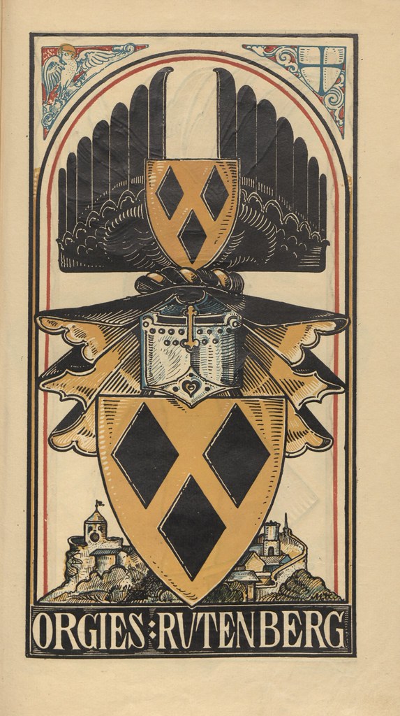
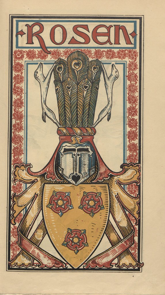
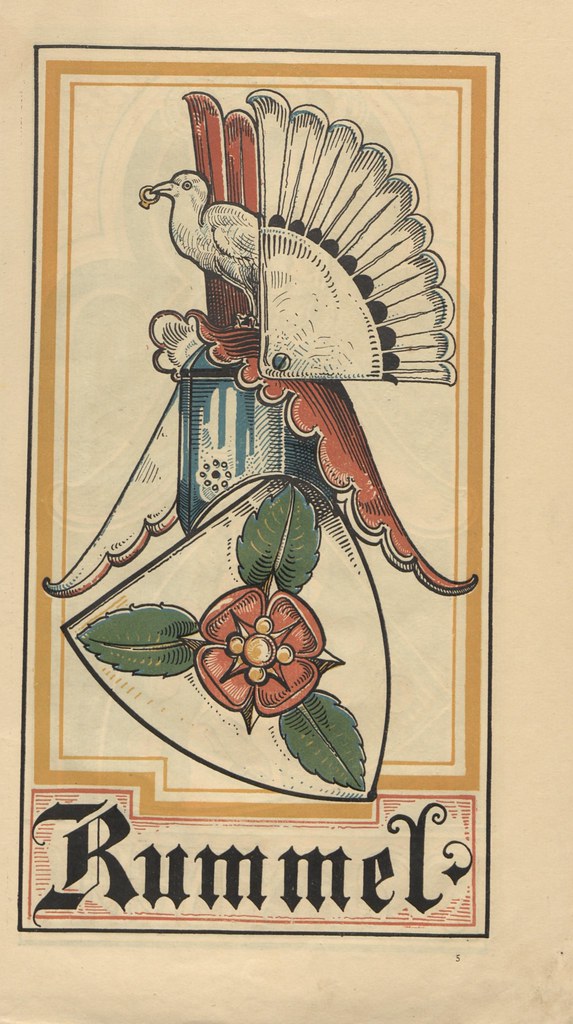
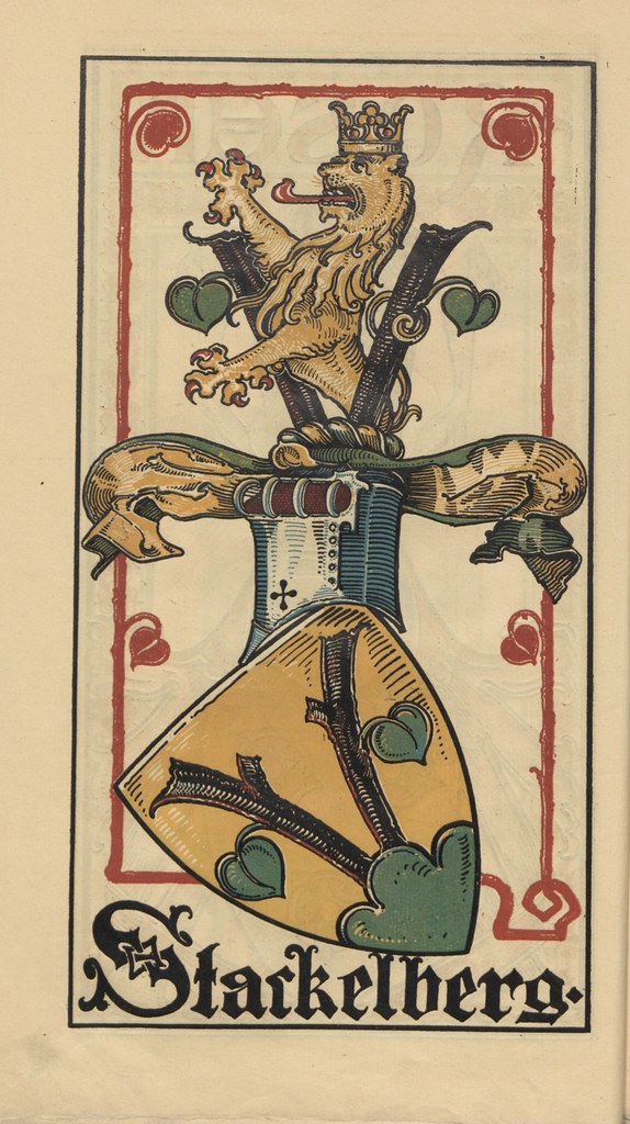
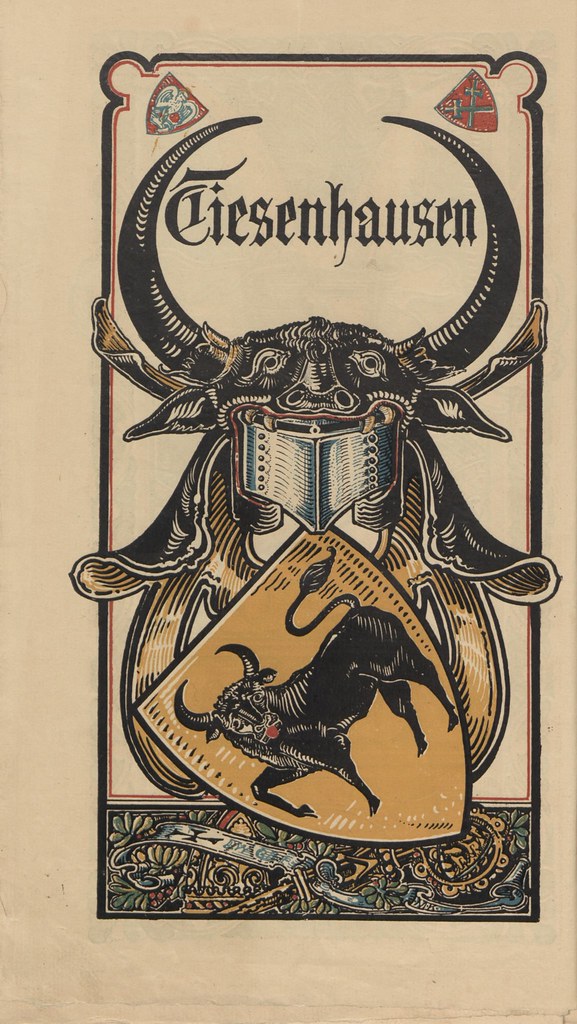
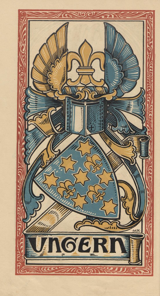
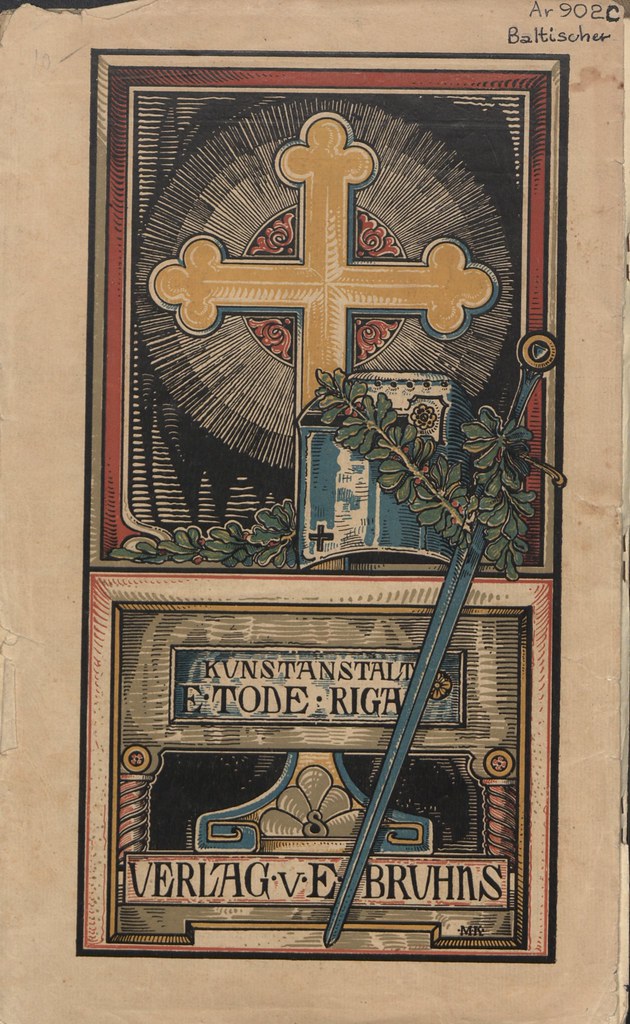
"This publication [..] contains some two dozen coats and crests in colour of nobility of the Russian Baltic provinces, with short genealogical notices. The selection appears a representative one, and includes, among others less famous, such illustrious names as Rosen, Pahlen, Lieven, Wrangel, and Uexkhuell. The Pahlen-Koskull crest, Drie Schilkolben, is uncommon, and we do not remember another example of bulrushes as helm insignia.
The style of design is, of course, German ; but even for German work the drawing is extremely vigorous, and in some cases the directness of effect obtained is quite excellent, though here and there the detail has a tendency to woodenness (i.e., the fish in the Maydell coat), and the mantling is occasionally stiff. As chromo-xylography [w], too, the work is of great merit."
[source: The Genealogical Magazine 1902]
"The Baltic Coat of Arms Calendar, published by the book and art dealer E. Bruhns in Riga and the Riga Art Institute [..] was only published for one year: 1902. Further issues were well planned initially, [but] were never realised. The signature on some leaves [with MK artist] was Martin Kortmann who worked temporarily after 1900 in Riga for the art institute. After 1905 he returned to Berlin.
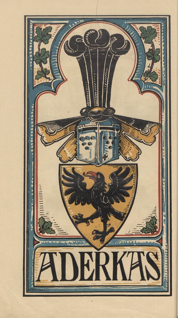
The vertical format calendar contains 24 Baltic Crests for families, namely: Lode, Tiesenhausens, von der Ropp, Buxhoewden, Brackelsberg, Meyendorff-Uexkuell, Pahlen-Koskull, Bremen, Lieven, Ungern-Sternberg, Wrangel, Aderkas, Rosen, Stackelberg, Luedinghausen called Wolff, Hahn, Orgies, gene. Rutenberg, Poll, Fircks, Manteuffel called. Zoege (Szöge), Foelkersam, Maydell, Rummel and Howen. Artistic representations of the act, who probably set a clear target for simplicity, although heraldic correct, but awkward and wooden, far removed from the artistic design of a sovereign Otto Hupp."
[source (slightly paraphrased translation; last garbled bit left as is)]
| The life restoration of a 17th-c. word. |
I’m a joker
I’m a smoker
I’m a midnight toker...
Microsoft has developed software to transform shaky time lapse videos into impressively smooth hyperlapse movies. Take a look at a couple of examples.
Read more about the project on the Microsoft Research site.
Tags: Microsoft time lapse video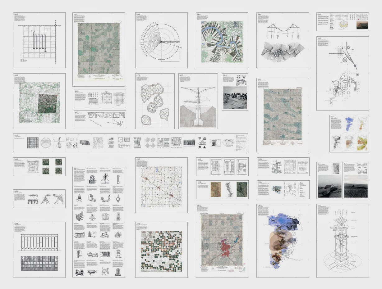 [Image: "Cultivating the Map" by Danny Wills].
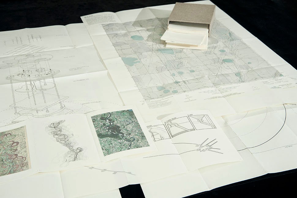
 [Images: "Cultivating the Map" by Danny Wills].


 [Images: "Cultivating the Map" by Danny Wills].
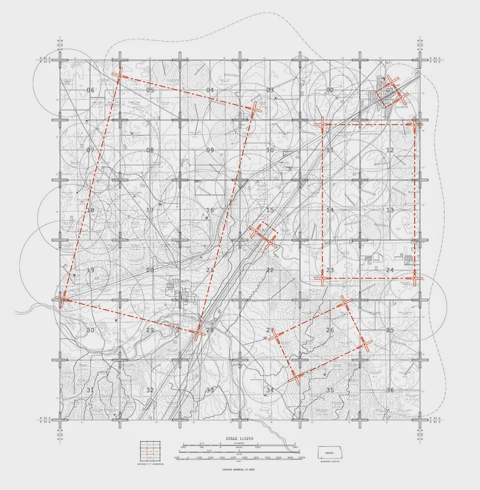
 [Images: "Cultivating the Map" by Danny Wills].


 [Images: "Cultivating the Map" by Danny Wills].
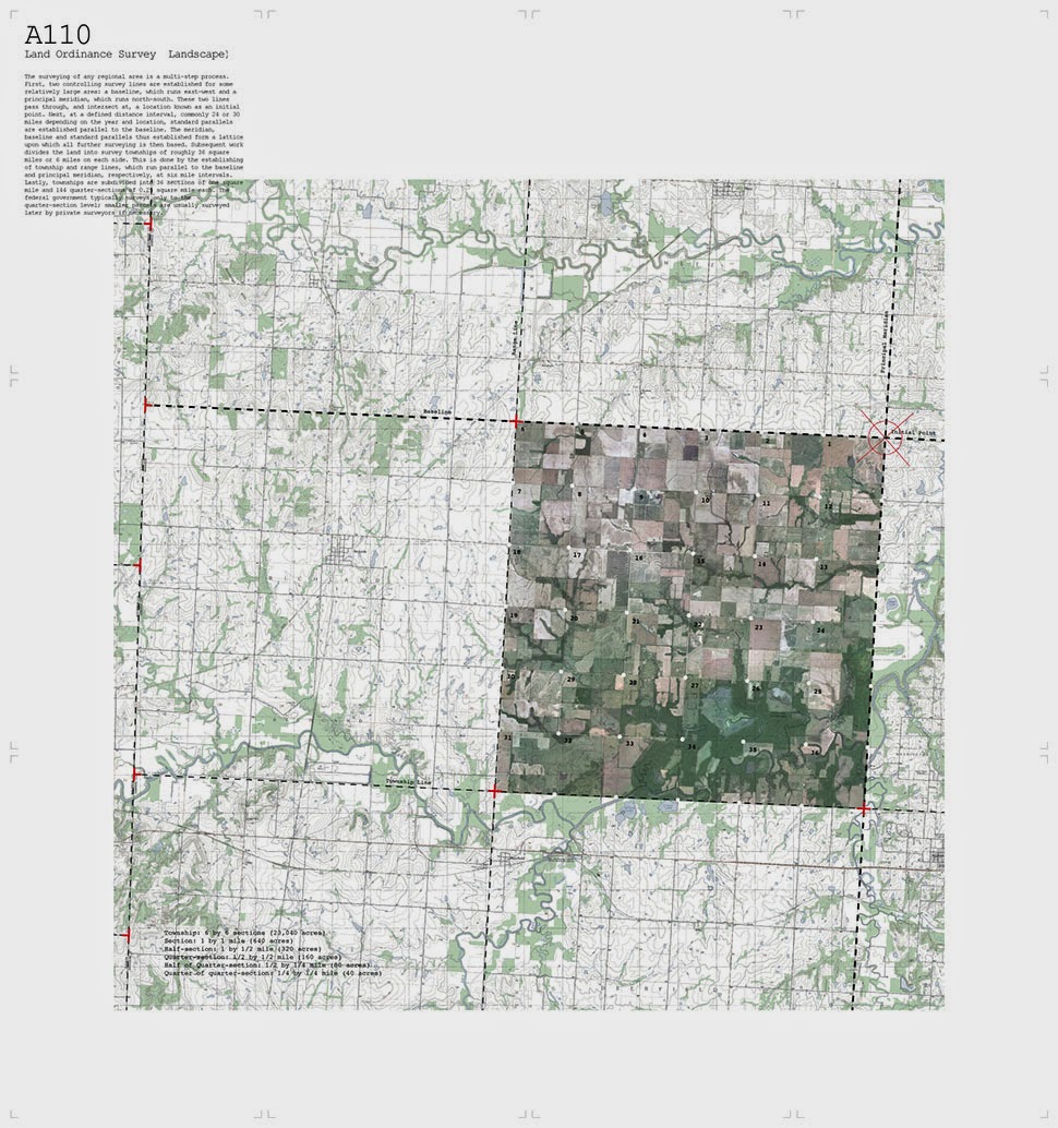

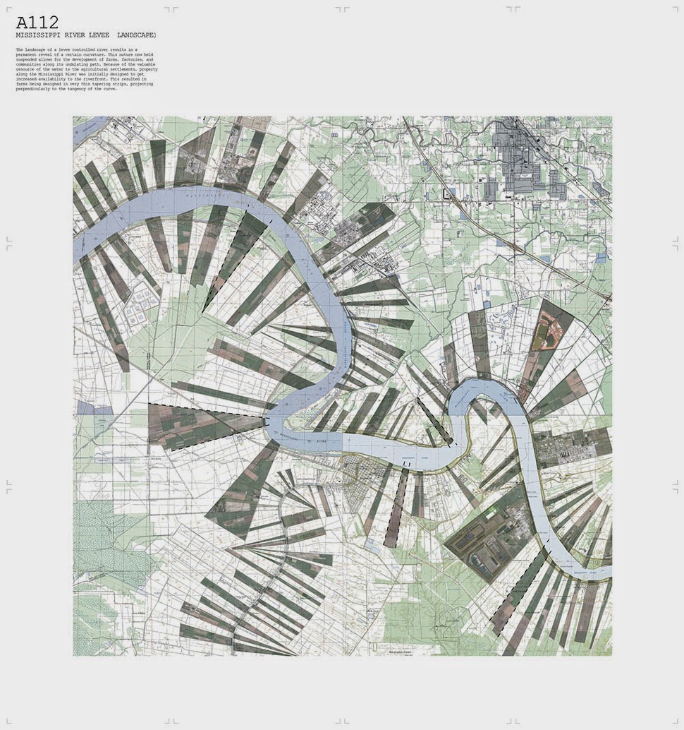
 [Images: "Cultivating the Map" by Danny Wills].
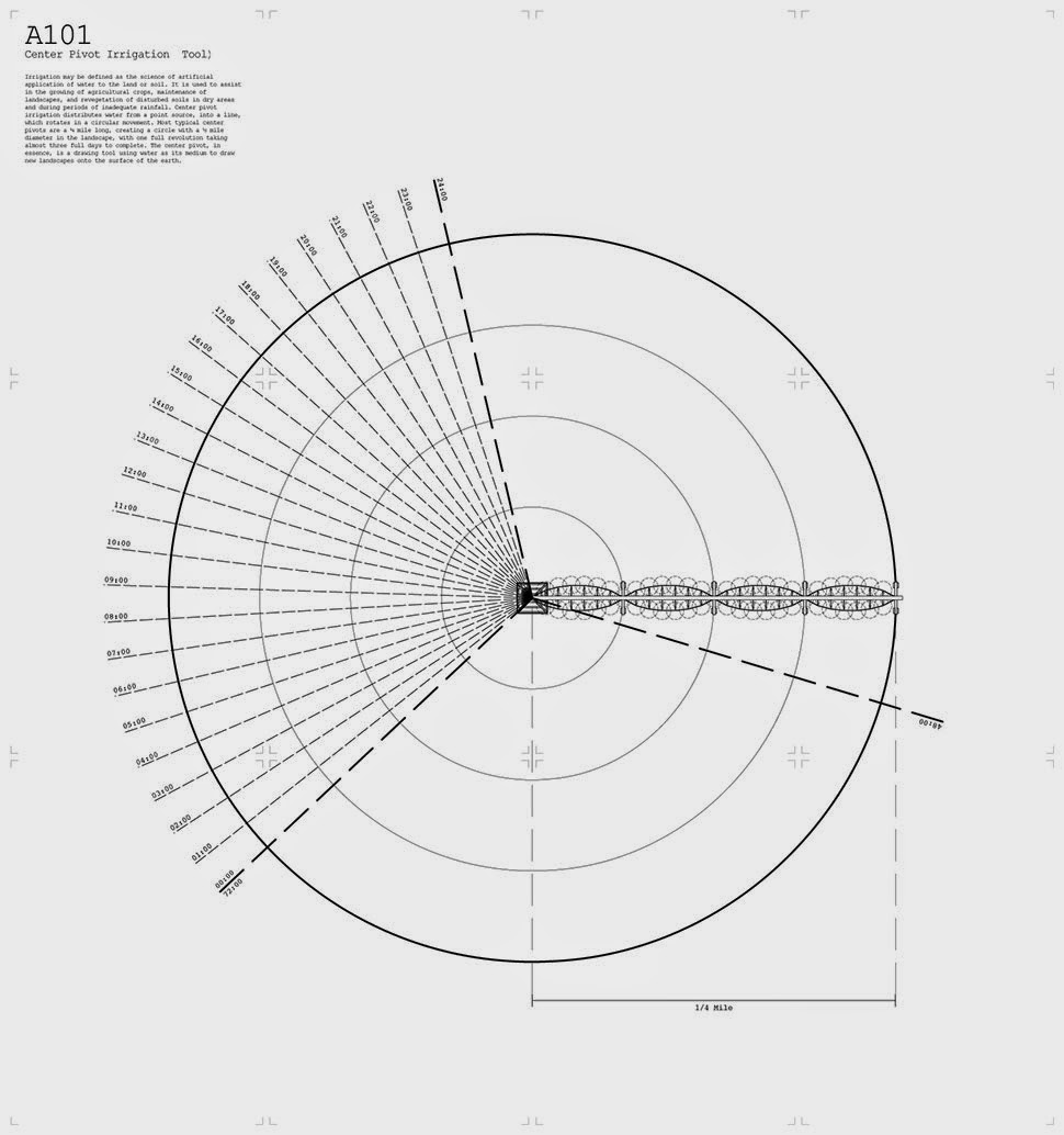

 [Images: "Cultivating the Map" by Danny Wills].
 [Images: "Cultivating the Map" by Danny Wills].
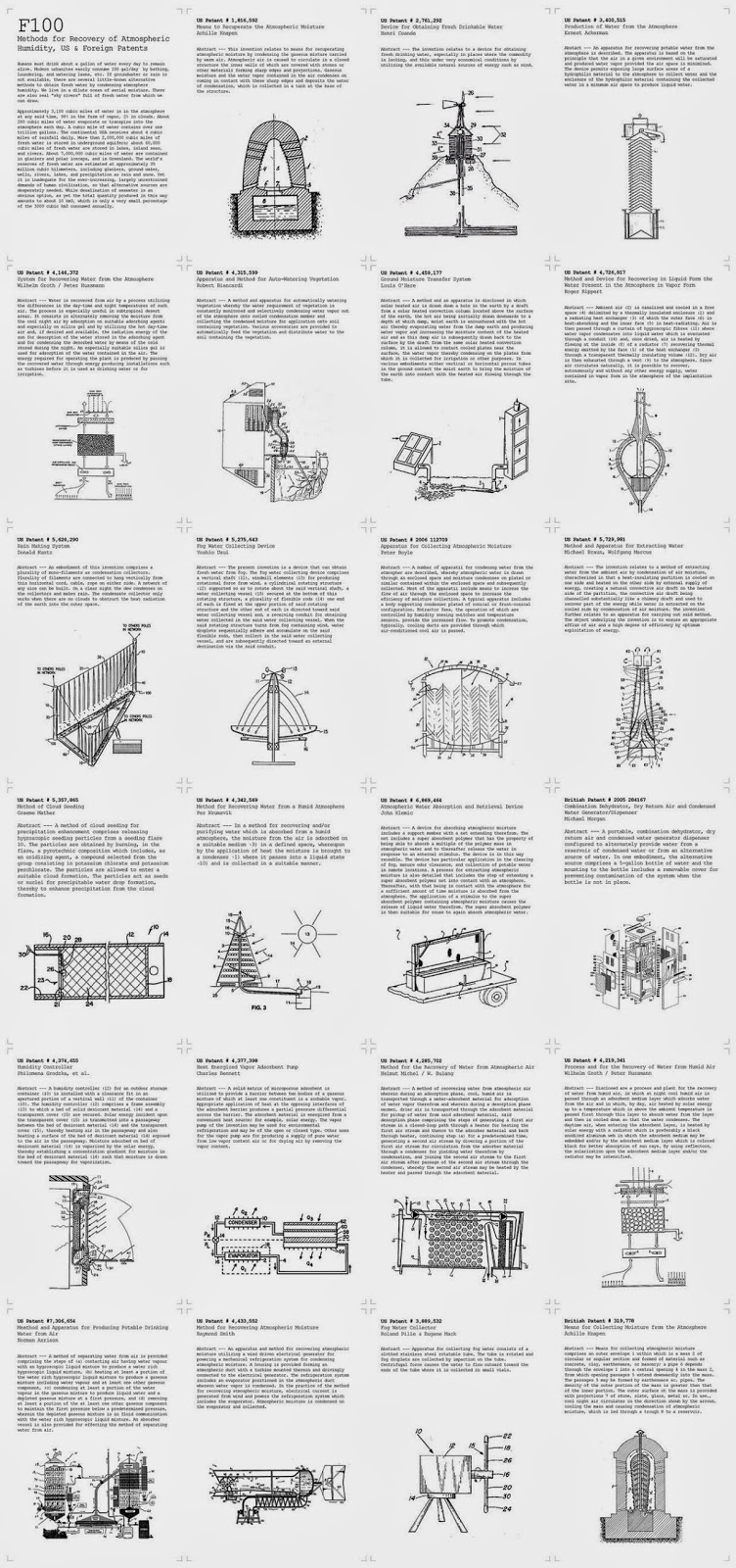


 [Images: "Cultivating the Map" by Danny Wills].
Tool 1 attaches itself to the groundwater streams, both proposing tools to redirect and slow down the flow, as well as tools to collect atmospheric water through technological systems like air wells and fog fences, forming new bodies and streams of water. The new air wells collect atmospheric water through a system of cooling and heating a substrate core inside of a ventilated exterior shell. The air wells also become spaces to observe the re-directing flow of water, as overflow quantities are appropriately managed.Tool 2: Aquifer Irrigation Ponds
Tool 2 uses the center pivot irrigation rigs to reconstruct the ground, making bowls in the landscape that act as dew ponds. At the same time, the wells become tools and markers to survey the levels of the aquifer below, signifying changes in the depth through elevational changes above. New forms of settlement begin to appear around each ring as a balance is reached between extraction and recharge of the aquifer.Tool 3: Sand Dunes, Grazing Fields
Tool 3 uses gas wells as new geo-positioning points, redrawing boundaries and introducing controlled grazing and fallowing zones into the region. Walls are also built as markers of the drilling wells below, creating a dune topography to retain more ground water. Each repurposed oil rig becomes an architectural element that both provides protection and feed for grazing animals as well as a core sample viewing station. The abandoned rigs suspend cross sections of the earth to educate visitors of the geological history of the ground they stand on.Tool 4: Water Recycling Station
Tool 4 converts the grain elevator into a water recycling station, filling the silos with different densities of sand and stone to filter collected types of water- rain, ground run-off, grey, brackish, etc. Large pavilion like structures are built between houses, collecting water and providing shade underneath. Some housing is converted into family-run markets; the new social space under the pavilions provide for market space. The repurposed grain elevator becomes the storage center for the region’s new water bank. Economic control is brought back to the local scale.

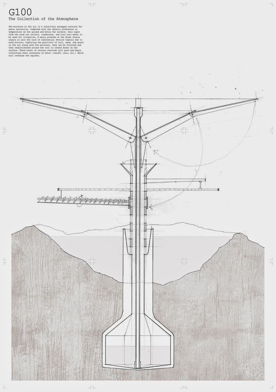

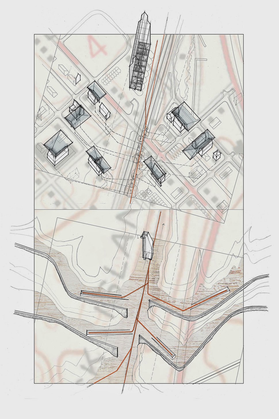


 [Images: "Cultivating the Map" by Danny Wills].
Many videos and photo projects promise a glimpse of life inside North Korea "as you've never seen it", but I believe this video by JT Singh and Rob Whitworth actually delivers the goods. It's one of those 3-minute time lapse portraits of a city that are in vogue, with the North Korean capital Pyongyang as its subject.
Time lapse videos are interesting because they show movement over long periods of time. The Western conception of North Korea is of a place frozen in time, so the time lapse view is highly instructive. (thx, jeff)
Update: Sam Potts, who travelled to Pyongyang and North Korea in 2012 and took these photos, finds this "deeply fake as filmmaking". From his Twitter acct:
Re the time lapse of Pyongyang video, it feels deeply fake as filmmaking, to me. Thus I mistrust it as a document of what real PY is like. You don't see any of the details to that reveal, even in PY, how very poor a country it is. Some of those buses didn't have tail lights. They had blocks of wood painted red to look like tail lights. And the library computers are incredibly poor quality.
Gizmodo's Alissa Walker also noted the propaganda-ish nature of the video. At the very least, the video is a dual reminder of the limitations of time lapse video in showing the whole story and of how manipulative attractively packaged media can be.
Tags: JT Singh North Korea Rob Whitworth time lapse video
The Call of Cthulhu (1988): in the upper half there’s the big sun from Bob Peak’s poster for Apocalypse Now, in the lower half a radical reworking of Arnold Böcklin’s The Isle of the Dead.
In 1990, shortly after the first season of Twin Peaks had finished showing in the US, Video Watchdog magazine ran a feature by Tim Lucas which attempted to trace all the various cultural allusions in the character names and dialogue: references to old TV shows, song lyrics and the like. This was done in a spirit of celebration with Lucas and other contributors welcoming the opportunity to dig deeper into something they’d already enjoyed. This week we’ve had a similar unravelling of textual borrowings in a TV series, only now we have the internet which, with its boundless appetite for accusing and shaming, can often seem like something from the grand old days of the Cultural Revolution.
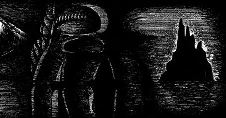
The Call of Cthulhu (1988): a more subtle allusion to Apocalypse Now.
The latest culprit ushered to the front of the assembly for the Great Internet Struggle Session is Nic Pizzolatto whose script for True Detective has indeed been celebrated for its nods to Robert Chambers and The King in Yellow. It’s also in the process of being condemned for having borrowed phrases or aphorisms from Thomas Ligotti’s The Conspiracy Against the Human Race (2011). See this post for chapter and verse.
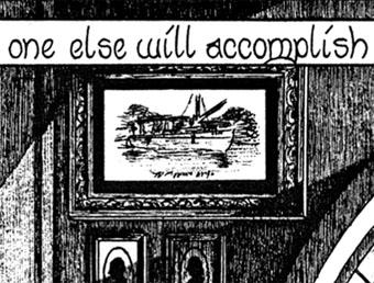
The Call of Cthulhu (1988): It’s not very clear but that’s a boat from The Creature from the Black Lagoon.
If I find it difficult to get worked up over all this pearl-clutching it’s because a) it shows a misunderstanding of art and the way many artists work, b) True Detective was an outstanding series, and I’d love to see more from Pizzolatto and co, and c) I’ve done more than enough borrowing of my own in a variety of media, as these samples from my adaptation of The Call of Cthulhu demonstrate, a 33-page comic strip where there’s a reference to a painting, artist or film on almost all the pages, sometimes several on the same page.
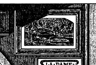
The Call of Cthulhu (1988): Ophelia by Millais.
Cthulhu is a good choice here since Pizzolatto’s story edged towards Lovecraft via the repeated “Carcosa” references. You’d think a Lovecraft zine of all things would know better than to haul someone over the coals for borrowing from another writer when Lovecraft himself borrowed from Robert Chambers (and Arthur Machen and others), while “Carcosa” isn’t even original to Chambers’ The King in Yellow but a borrowing from an Ambrose Bierce story, An Inhabitant of Carcosa (1886). Furthermore, Lovecraft famously complained about his own tendencies to pastiche other writers in a 1929 letter to Elizabeth Toldridge: “There are my ‘Poe’ pieces and my ‘Dunsany pieces’—but alas—where are any Lovecraft pieces?”
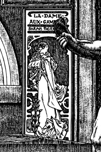
The Call of Cthulhu (1988): A poster by Alphonse Mucha.
I’ve not read the Ligotti book that’s at issue here, but I did spot a paraphrase of William Burroughs in one of Pizzolatto’s Rust Cohle monologues. “Oh, cool, he’s read Burroughs!” was my immediate thought, not “Where’s me pitchfork?” Burroughs, of course, borrowed lines and phrases from other writers throughout his career: in The Ticket that Exploded rather than explain the actions of an alien organism he simply inserts two suitable paragraphs from a Henry Kuttner story; the opening Invocation from The Cities of the Red Night borrows some of the demon descriptions from the Simon Necronomicon. Burroughs’s attitude to other people’s work may be an extreme example (see also Kathy Acker who was always open about her textual thefts) but artists are continually borrowing themes and ideas, riffing on other works, quoting and appropriating. If you make art of any kind this shouldn’t need to be explained, the only people who are shocked when discovering this are those who want “true” art to be the product of a stainless originality.
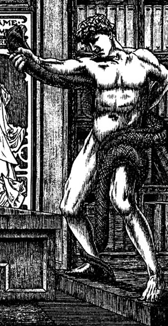
The Call of Cthulhu (1988): An Athlete Wrestling with a Python by Frederic Leighton.
For my part, The Call of Cthulhu was heavily referential because I enjoyed making these allusions, and it was also a way of making the adaptation thematically richer. The references to Joseph Conrad and Apocalypse Now were a nod to Heart of Darkness, another story about a journey by boat to “one of the dark places of the Earth”. So too with King Kong, a story about a lost island that’s a home to monsters. Art is often a conversation, between artists and between different artworks, past and present. The borrowing doesn’t always have to serve as an homage or a reference that everyone ought to understand, sometimes you merely want some intangible quality of otherness from the borrowed thing in your own work, something to throw you off the familiar paths you might otherwise tread.
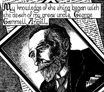
The Call of Cthulhu (1988): Joseph Conrad.
Now this Ligotti connection has come to light it’s increased my appreciation of True Detective. The series now seems even more of an unlikely smuggling of the True Weird into the mainstream, a rare and difficult feat when so much popular entertainment is increasingly inane, unambitious and juvenile. I’m looking forward to the second series.
More of my own outrageous thefts follow.
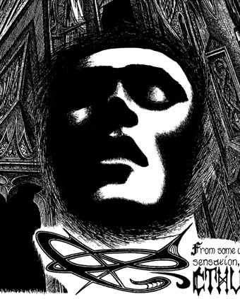
The Call of Cthulhu (1988): The face from Parsifal by Jean Delville.
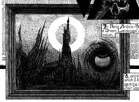
The Call of Cthulhu (1988): Max Ernst and Odilon Redon, together at last.

The Call of Cthulhu (1988): Joseph Conrad again (and not a very good portrait).

The Call of Cthulhu (1988): The Isle of the Dead by Arnold Böcklin.

The Call of Cthulhu (1988): A frame from King Kong reimagined as a Louisiana swamp.
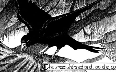
The Call of Cthulhu (1988): Bird borrowed from an alchemical illustration.
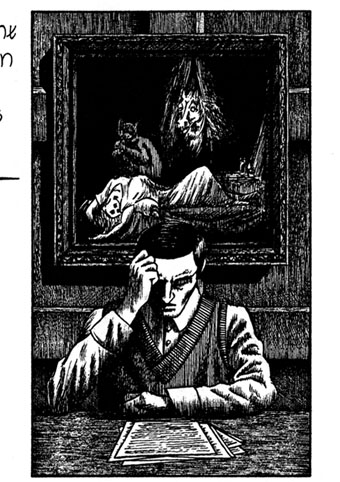
The Call of Cthulhu (1988): The Nightmare by Henry Fuseli, one of Lovecraft’s favourite artists.
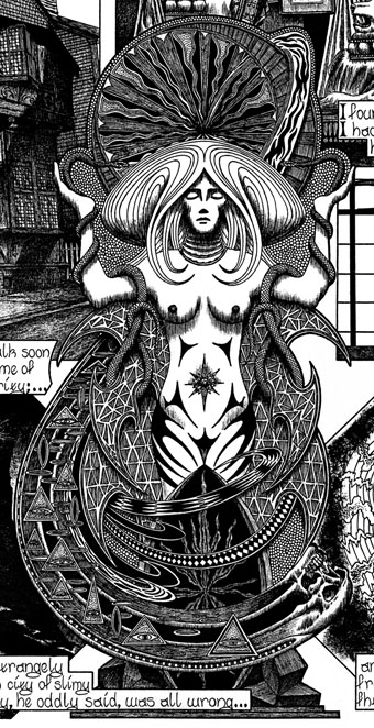
The Call of Cthulhu (1988): Shades of Gustav Klimt.
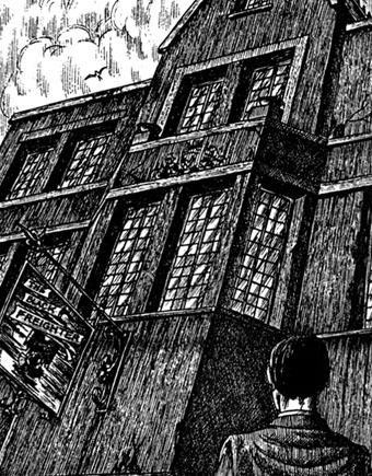
The Call of Cthulhu (1988): The inn sign is a copy of one of the Tales of the Black Freighter panels in Watchmen.
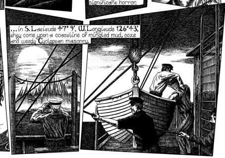
The Call of Cthulhu (1988): Two more frames from King Kong.

The Call of Cthulhu (1988): Intertextuality overload: on the left, the edition of Weird Tales in which The Call of Cthulhu first appeared; on the right, two of the books seen on Kurtz’s desk in Apocalypse Now. Those books are there because they’re two of the volumes mentioned by TS Eliot in his notes to The Waste Land. Why Eliot in Apocalypse Now? Because he has a quote from Heart of Darkness at the opening of The Hollow Men, a poem Marlon Brando reads in the film. The Waste Land is, of course, very famous indeed for being a poem-collage of quotes and allusions to other poets, dramatists, etc.

The Call of Cthulhu (1988): This was an RKO picture. Mind how you go.
Interzone #253 is now a thing in the world. I would have recognised this fact a trifle sooner but for the presence of Men with Tools and Serrated Gadgets giving the innards of my woodland habitat a damn good seeing to. I know that this is the 21st Century and we’re all supposed to interact with the internet via smart watches and digital nipple clamps but I still find it difficult to do anything of substance without a proper screen and a decent keyboard.
The July-August of IZ boasts, as ever, a plurality of wonders including short fiction by James Van Pelt, E. Catherine Tobler, Andrew Hook, Neil Williamson and Caren Gussoff as well as the James White Award-winning story by D.J. Cockburn entitled “Beside The Damned River”. Non-fiction includes an interview with the editor John Joseph Adams, film columns by Nick Lowe and Tony Lee as well as reviews by Maureen Kincaid Speller, Jack Deighton, Stephen Theaker, Ian Sales, Paul Graham Raven, Ian Hunter, Andrew J. Wilson, Duncan Lunan, Simon Marshall-Jones and Jim Steel.
There’s a lot of nice stuff in this magazine but I was particularly charmed by Nick Lowe’s opening homage to the much-overlooked medium that is science fiction theatre:
There’s an old misperception that theatre is a medium in competition with film, and doomed to try to mimic its art of illusion. But theatre is above all a space of suggestion and implication, where embodied physicality can conjure worlds with a gesture or line. In that respect, it’s far closer to what sf does with the written word, only kissed with the spell of live mimesis and response. The moment that wrote the grammar of western theatre was the young Aeschylus’ staging of the Iliad with two actors, no set, and a single location. It’s a moment that theatre re-enacts nightly.
Last and almost certainly least is my column about Robert A. Heinlein, or rather the (to my mind deeply problematic) campaign to see him restored to his one-time position of prominence thanks to a sudden and unexpected flurry of biographies and (overwhelmingly positive) critical re-appraisals. Personally, I think there are far more attractive and deserving bodies to uncover. I will be republishing that column here in a few months but if you need to get your Heinlein Hatin’ fix right this minute, you can either visit the TTA Press shop or Amazon, which seems to sell electronic copies.
*****
Now, on with this month’s reprint! My Fifth Future Interrupted Column is entitled ‘Profound and Beautiful Lies’, it considers science fiction’s often quite confusing relationship with truth and goes on to reclaim Reza Negarestani’s Cyclonopedia as a work of science fiction. Those of you who are interested in a slightly different take I had on Cyclonopedia, might want to take a look at my original review.
*****
There’s a wonderful scene in the Coen Brothers’ film A Serious Man where a student confronts his physics professor about what he feels is an unjust failing grade. The student argues that while he may not have coped particularly well with the mathematical stuff, he did understand the stories about the dead cat and didn’t this suggest that he understood the physics? The professor replies that the mathematical stuff is the whole point of physics, the stories are nothing more than fables designed to help us visualise what the mathematical models reveal about the nature of the universe. The stories, though useful, are not true.
Back in the early 1980s, the philosopher of science Nancy Cartwright produced a book entitled How the Laws of Physics Lie. One of the many lines of argument pursued by Cartwright is the idea that while the Coens’ professor may have been right to distinguish between truth and useful falsehood, most of the laws of physics are themselves nothing more than mathematical abstractions dreamed up to help physicists isolate and study different parts of a single phenomenon. For example, people involved in sending robots to other planets often use Newtonian physics to calculate orbital trajectories because, while everyone knows that Newton’s vision of the cosmos is incomplete, his system for flinging stuff from one planet to the other works pretty damn smoothly. The laws of physics, though useful, are not true.
Despite the fact that science itself is littered with useful lies and non-existent theoretical objects, many devotees of science fiction remain convinced that science fiction must adhere to scientific fact. For example, when seeking to describe the unique challenges of writing science fiction, fans of hard SF are prone to reaching for a tennis metaphor: Fantasy writers may create entire universes but these universes are only ever accountable to the whims of the author and the needs of their stories. By contrast, the worlds of science fiction must be accountable to the laws of physics and so the difference between writing fantasy and writing science fiction is like the difference between hitting a ball around and playing tennis with the net up. Aside from being a superannuated cliché, this metaphor is a grotesque and fundamental misunderstanding of what makes science fiction so unique.
Contrary to what some would have us believe, science fiction is not about being correct. It isn’t about doing your research, checking your equations and ensuring that none of your ideas are contradicted by the latest scientific journals. Science fiction is born of the same mistake made by the student in A Serious Man, it is about trying to understand the world by creating lies so beautiful and so profound that the light they cast helps us to visualise the truth. This is a column about a tissue of lies so grotesque and transparent that it tells us more about the world than the collected works of Isaac Asimov, Arthur C. Clarke and Greg Egan. This is a column about Reza Negarestani’s Cyclonopedia.
Cyclonopedia presents itself as a series of nested documents. The outermost layer tells of an editor who is lured to Turkey by a mysterious online correspondent. Once in Turkey, the editor comes across a manuscript purporting to be the reactions of a group of radical academics something written by a dissident Iranian thinker prior to his disappearance. This type of set up will be instantly familiar to horror readers as similar techniques feature in both Mark Z. Danielewski’s House of Leaves and Caitlin R. Kiernan’s The Red Tree. The reason these techniques are popular with horror writers is that they allow the author to play with the boundaries between truth and fiction and make their stories far more unsettling. For example, films like Wolf Creek and Texas Chainsaw Massacre claimed to be based upon real events because suggesting that our world contains deranged killers is far more unsettling than even the best-written stories about fictional monsters. Similarly, works like Philip K. Dick’s A Scanner Darkly often feature nested stories and lies because allowing those stories to bleed into one another is a really effective way of recreating what it feels like to confuse reality with psychotic delusion. What distinguishes Cyclonopedia from works like House of Leaves and The Red Tree is that rather than blurring the lines between madness and sanity, Negarestani blurs the lines between outright fiction and useful theory.
The theory contained within the nested texts of the Cyclonopedia is that the region historically known as Mesopotamia has acquired a form of alien consciousness and plans to expand its boundaries to the point where they encompass the entire planet; an event referred to by Negarestani as the “dry-singularity”. Cyclonopedia then goes on to explain how seemingly unconnected phenomena such as ancient cults, rogue Special Forces units, peak oil and the War on Terror are all secretly part of the same process of desertification.
Though Negarestani certainly acknowledges the influence of genre writing on his ideas (the book is littered with oblique genre references including a wonderfully unhelpful definition of the term “Cthuloid ethics”), the true genius of Cyclonopedia lies in the way that it encourages us to take these ideas entirely at face value. Indeed, the most striking thing about this book is that it looks and reads exactly like the kind of stuff churned out by academic presses the whole world over: Written in almost impenetrable jargon punctuated only by fragments of dead languages and illustrative diagrams that make absolutely no sense, Cyclonopedia radiates precisely the kind of self-satisfied inaccessibility that we are conditioned to associate with intellectual substance. Like Pavlov’s dogs, the university-educated see the run-on sentences and the verbs used as nouns and try to extract meaning from what is essentially little more than page after page of paranoid gibberish.
All of Cyclonopedia’s structural devices and stylistic quirks help to set up an ambiguity over whether the found document at the centre of the book deserves to be taken seriously as an attempt to make sense of the West’s continued involvement in the Middle-East. What makes this ambiguity so difficult to resolve – aside from Nagerestani’s flawless pastiche of academic writing – is that while the book may posit the existence of an ancient god in order to explain the War on Terror, this kind of paranoid worldbuilding is really not all that different to the kind of thought underpinning most political theories. For example, when Marxists attempt to explain how society keeps re-shaping itself to ensure that the rich get richer and the poor get poorer, they often invoke the interests of ‘Capital’ even though the term ‘Capital’ does not apply to any single group of individuals or institutions. The same is true for the way in which feminists talk about the ‘Patriarchy’ and Mrs Thatcher refused to talk about ‘Society’: None of these terms refer to real-world objects like tables or chairs, they are instead intended as short-hand for patterns of thought and behaviour that exist (to a greater or lesser extent) in all of us. None of these theoretical objects exist, they are little more than ghosts in our intellectual machinery… profound and beautiful lies that help us to understand the world and visualise the impossibly complex truth. Negarestani’s Mesopotamian desert god is really no different to Capital or the Patriarchy… it is useful fiction.
While Negarestani’s methods may be new, his use of divinity as a political metaphor actually has a number of recent fictional precursors. For example, Vernor Vinge’s stodgy Hugo-winning space opera A Fire Upon The Deep opens on an entire civilisation being taken over by a rogue artificial intelligence. To the casual observer this act of cultural possession is indistinguishable from a society tumbling into totalitarianism. Similarly insightful is Adam Roberts’ much under-rated New Model Army in which a mercenary company that crowd-sources all of its decision-making in real time slowly transforms into a new form of life, an emergent collective consciousness whose values are as inhuman as its perspective. If Roberts and Vinge can compare political entities to supernatural ones, why not Negarestani?
The tragedy of Cyclonopedia is that while it may create big, beautiful genre-friendly lies and use them to generate surprising insights into the world around us, the book seems to exist in a class entirely of its own. Released by a tiny academic press and written by an obscure Iranian philosopher (who may not actually exist except as a pseudonym), Cyclonopedia slipped through the cracks of a literary culture and publishing industry that have become hopelessly addicted to their own narrow and reductive labeling systems. Neither entirely fictional nor entirely theoretical, Cyclonopedia occupies a niche equidistant between Olaf Stapledon’s character-free future history Last and First Men and works of gonzo scholarship like Robert Graves’ White Goddess and Julian Jaynes’ book about ancient Greeks hearing gods thanks to their differently-shaped brains. Some critics have taken to calling Cyclonopedia ‘theory fiction’ but I call it science-fictional as fuck.
Arthur Chu has a very interesting essay at NPR’s Code Switch site that begins by describing how he speaks English in a “Chinese accent” for a video and goes on to unpick the complexities of such an accent:
Nearly every Chinese immigrant I’ve met does, in fact, “talk like that,” because it’s almost impossible not to have a thick accent when your first language is as fundamentally phonetically different from English as Mandarin or Cantonese is.
But it’s equally true that every single Chinese-American kid born here I’ve met emphatically does not “talk like that.” In fact, there isn’t a Chinese-American accent the way there’s a distinct cadence to how black Americans or Latino Americans talk. Most Chinese-Americans have a pitch-perfect “invisible” accent for wherever they live.
If anything, the thing that made me weird as a kid was that my English was too perfect. My grammar was too meticulously correct, my words too carefully enunciated — I was the kid who sounded like “Professor Robot.” In order to avoid being a social pariah in high school I had to learn to use a carefully calibrated proportion of slurred syllables and street slang in my speech — just enough to sound “normal,” not enough to sound like I was “trying too hard.” [...]
The “Asian accent” tells the story of Chinese-American assimilation in a nutshell. Our parents have the accent that white Americans perceive as the most foreign out of all the possible alternatives, so our choice is to have no accent at all. The accent of our parents is the accent of the grimy streets of Chinatown with its mahjong parlors and fried food stalls and counterfeit jewelry, so we work to wipe away all traces of that world from our speech so we can settle comfortably into our roles as respectable middle-class doctors, lawyers, engineers, hundreds of miles from Chinatown.
No wonder we react so viscerally to the “ching-chong, ching-chong” schoolyard taunt. To attack our language, our ability to sound “normal,” is to attack our ability to be normal. It’s to attack everything we’ve worked for.
I liked this anecdote about interpreting between English and English:
Most vividly I remember being on vacation at the Waterton-Glacier International Peace Park that straddles the U.S.-Canadian border, bemusedly translating between my dad and a park ranger, both of whom were speaking English. One of them would say something. The other would blink in confusion. Only when I repeated it did they understand. And suddenly I realized my dad’s Chinese accent and the ranger’s Canadian accent were too far apart from each other to be mutually intelligible.
And if you’re interested in the history of the “ching-chong” thing, by all means click on the link within the quote. (Via MetaFilter.)
Hi, everybody! Tim Carmody here, guest-hosting for Jason this week.
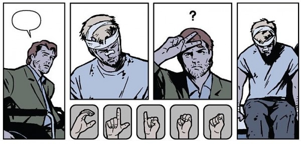
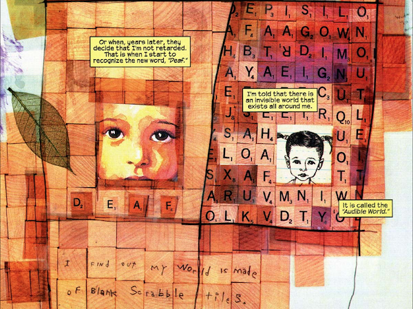
In the Marvel comic Hawkeye #15, published in February, the title character was brutally attacked and deafened by a supervillain real estate developer trying to push the hero's neighbors out of their apartment building in Brooklyn's Bed-Stuy. (It's a very special comic book.) This week's issue, #19, took months to finish but finally picks up that story line. It's mostly told in a combination of silent panels, American Sign Language, and half-intelligible lip reading. It's already being talked about as a shoo-in for this year's Eisner award for best single issue.
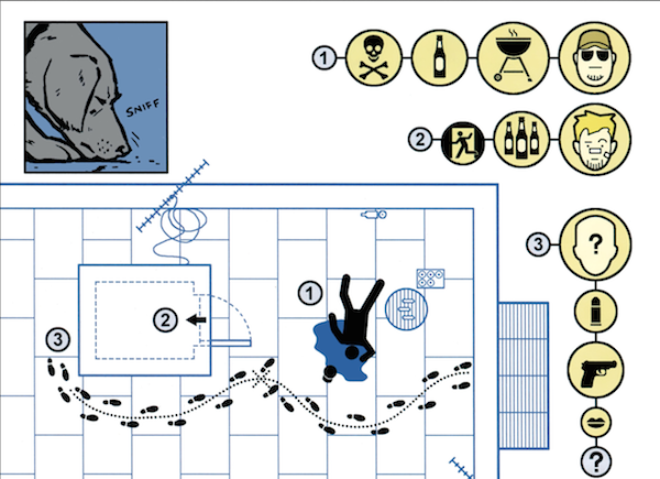
There are precedents here. Last year's mostly-silent Hawkeye #11 was told from the point of view of a dog (named Pizza Dog), using symbols and maps to tell a kind of detective story. (That issue also won writer Matt Fraction and artist David Aja the Eisner.)
There's also a silent issue of Daredevil by Brian Michael Bendis and Alex Maleev where the blind superhero is temporarily deafened by an explosion. And there's two gorgeous mini-arcs of Daredevil by writer/artist David Mack, featuring Maya Lopez as Echo, Daredevil's deaf, super-powered love interest and counterpart.
Hawkeye's also been temporarily deaf twice before: once in the limited series Hawkeye, back in the 1980s (his use of a hearing aid made him a minor hero to hearing-impaired readers) and (it's revealed in this new issue) also as a child, as a result of an injury implied to be caused by his abusive father. This is how Clint and his brother Barney are shown to know American Sign Language.
I've been interested in ASL for a long time for personal reasons, but also as a kind of "writing," in the family-resemblance sense of visible language, that functions like speech.
Comic books, at least in print, are a silent medium by necessity. But it's still harder to render ASL in comics than ordinary oral/aural speech, because it's a language of movement, and we don't have the conventions of speech bubbles and the alphabet.
What we do have is a graphic tradition of maps, signs, atlases, manuals, and other forms of everyday iconography to draw on. And those are largely what Mack used in Daredevil, and what Aja uses in Hawkeye.
It's a sign that we, all of us, read signs everywhere, and every kind of reading can be used and incorporated in every other kind. The best way to stay true to what's essential in a medium is to do your best to explode your way out of it.
Tags: ASL comic books Hawkeye Hawkguy language sign language writingI love The Verge.
Look at the photos in that review: every photo of the Illum, taken by a normal camera, is better than any photo taken by the Illum itself.
I can’t find one technically good photo in their entire Illum-taken gallery. All I see is the same major optical problems as the first Lytro camera two years ago: drab color, obvious chromatic aberration, and a severe lack of sharpness. The refocusing ability isn’t very useful if no part of the photo is actually sharp at any setting.
Compared to The Verge’s previous Lytro review (“You’ve never seen a camera like this before”), it sounds like they haven’t made much progress at all. It’s still an expensive, mediocre, limited, unreliable camera that does nothing better than our existing smartphone cameras except one rarely useful, poorly executed gimmick, which requires bad proprietary processing software and clunky web embeds.
Nothing about this is “the future” of photography.