[This is an essay in the old sense of the word. I'm not here to pick fights or bludgeon anyone with my point of view on SF1. I want to explore, to wander a little. I've used footnotes not as a scholarly buttress but in an attempt to keep this exploration from becoming a hopeless tangle.]
I’m English. I've lived in the US a long time (in fact last year I got my US citizenship) but I’m still English. You can tell: all I have to do is speak. There's no hiding that accent. In England, I belong. I visit often; I feel at home; I just don't live there anymore.
A few years ago, when William Gibson was inducted into the Science Fiction and Fantasy Hall of Fame, he said: I am a native of science fiction but no longer a resident.2 I understood exactly what he meant.
My most recent novel, Hild, has no fantastical elements whatsoever. It's not set in a secondary world, there are no dragons, no wizards casting spells, no special swords or magic rings. Yet the book has been nominated for three SF awards3. Why?
Perhaps it's because I'm a native of SF and it shows: Hild might be a literary novel but it speaks with a fantasy accent and uses the grammar of science fiction. It relies on world-building, the grand "What if...?" learnt reading and writing SF. More than that, it relies on readers being willing to take that leap of faith into the unknown—the ability to take odd spellings, strange names, unfamiliar concepts in stride, to risk just going with the flow and trust it'll make sense eventually—that is one of the mainstays of our genre.
Perhaps it's because of the setting. Hild begins fourteen hundred years ago, in the north of Britain. A time that used to be called the Dark Ages, lit in our imagination by flickering flame, with menhirs looming from the mist and men on horseback waving swords. It was a time when kings were petty warlords, might was right, and some thought there was a god on every hill.4 The tropes of this milieu are often appropriated by fantasy writers, so much so that it's become a cliché. But here's the thing: the setting of Hild is real. Hild was a real person. Everything in that book could actually have happened.5
Perhaps, then, it's because I deliberately worked to give the book the feel of myth and epic. It might be a novel of character—Hild is in every single scene; there's no "Meanwhile, several hundred leagues away in the head of a character you've forgotten about"—but it's painted on a heroic canvas. There's gold and glory, plots and politics, sweeping change and a focus on systems (economic, climatic, and behavioural). There's also very human joy and misery, fear and hope, lust and boredom, and a few simple contentments.
I admit, I wanted Hild to be the Platonic ideal of a novel: to feel like myth, yet to make sense not only on an epic but a personal scale; for its magic to be the wild magic of the landscape and that of the human heart.
Margaret Atwood (in)famously defined speculative fiction as being about what could happen. If we focus only on that and ignore her other idiotic pronouncements6 , then Hild is separated from the genre only by a matter of tense; if I've done my research properly, it's what could have happened.
In this sense, then, I'm comfortable defining Hild as speculative fiction. It relies on a tradition practised by fantasy and science fiction writers and readers. It could not exist without the particular reading stance honed by and required by genre, the willingness to reach understanding as one proceeds. But I was surprised when it (along with Karen Joy Fowlers's We Are All Completely Beside Ourselves) was nominated for a Nebula.
Clearly some voting members believed a fantasy accent or science fiction grammar enough for a book to belong to the genre. But maybe it's not the books that are considered to belong but the authors.
I can't speak for Karen but, yes, I am part of the SF community and have been for decades. And it is a community (or, rather, many interlocking communities). I went to the Nebula Awards Weekend in San Jose not because I thought I'd win—I knew I wouldn't7—but to hang out in the bar. To spend time with my people. Because the readers and writers of SF are my people. I feel at home here; I belong.
In May, before I went to the Nebulas, I read a review of Troubling the Line: Trans and Genderqueer Poetry, edited by TC Tolbert and Tim Trace Peterson.8 Frances Power, the reviewer, suggests (I'm paraphrasing) that speculative writing helps us to live because the definitions by which we live are products of culture. They are imaginary; we made them up.
She's referring to the work of Judith Butler on the gender binary but I think her opinion applies equally to the artificial division between SF and so-called mainstream fiction: both are cultural constructs, invented categories; we can uninvent them.
The tricky part, of course, is who are We—whose definitions are we using?
The world is changing. It no longer belongs to angry white boys sitting around in their white-wall buzz cuts eating white bread and watching Leave It To Beaver. (I'm not sure it ever did, but they certainly thought so.) The world is changing and the SF community is changing with it. I understand that this upsets some people; change is hard. But change also lies at the heart of the genre. It's who we are, what we do. We ask "What if...?" and follow the answer relentlessly.
The big "What if..." in Hild is: What if women had always been real human beings, human in, of, and by themselves rather than in relation to men? What if, despite the stories we've been told—and ask yourself who told those stories—women have always found a way around their constraints, just as we do today? What would history have really looked like? I wrote this book to find out.
What we read, what we experience in the privacy of our heads, changes us one at a time. For me the best books put us right there, right then with a character, make her experiences our own, his lessons our lessons, their lives ours lives. We become them, just for a little while, and come back increased.
In this way, books can change the world: they change us, one at a time. With Hild I've come back to the question that lay at the heart of Ammonite: What if all people are just people? What if that has been, is, and will be true in every time and place?
And so, for me—though of course every writer is different—the past is where I turn the key that unlocks the answers. If someone like Hild, someone with her agency, her will, her determination was possible fourteen hundred years ago, then she is possible now. If she's possible now then the odds are good that we're making very sure she will be possible in the future. And suddenly the world looks different: if the lights go out, women don't have to be chattels.9
This is why I made the world of seventh-century Britain as real as I could, why I decided against an alternate history or secondary world fantasy, though that would have been far easier: I wanted to change this one.
At SF gatherings built around books and stories—functionally I see no difference between conferences, conventions, and award weekends—the sense of community is palpable. It can be hard to tell the difference between writers and fans. First and foremost, SF writers are fans; we are readers. In this genre there's an assumption of equality between those two sides10 that I had no idea was not true for others. The gathering is structured for mutual support of readers and writers. We exchange reading recommendations, information on publishing, direct experience of life, the universe, and everything. The weekends (they are usually weekends) are administered and run by the community itself.
In my experience, then, the SF community is something special. Yes, there's always been in-fighting, some of it vicious. We have always fought, as all communities do, over who owns the clubhouse: who makes sets the standards and makes the rules? Who is Us and who is Other?11
Our community is in the process of experimenting, of unmaking and remaking. Expect the pendulum, the definition of what is and what is not genre, to swing wildly meanwhile. I have no doubt that many find this unsettling, but meanwhile there are some astonishing moments.
It was amazing to sit at the Nebula Awards and watch women win, cheer women of colour as they climbed the stage, listen to a woman who loves women tell her Toastmaster jokes. It was fabulous to see men applaud heartily and laugh at the jokes about gender. To me and many people in that room, it felt like a vast hand pushing aside old boundaries, making room for even more experimentation.
And isn't that the point of SF, to experiment, to ask "What if...?"
Perhaps my insistence on realism is what disqualifies Hild as SF. I'm okay with that. For now. But it'll be interesting to see if this holds true in the future, to see who We become, who owns SF.
1 I'm going to use SF as an umbrella term to cover fantasy, science fiction, speculative fiction, horror, etc. It's just easier.
2 I'm paraphrasing. This was relayed to me secondhand at a dinner party by someone who attended the ceremony. That was six years ago. But I think the essentials are accurate.
3 Shortlisted for the Nebula and John W Campbell Memorial Awards and named a Tiptree Honor book.
4 Not everyone, of course. Perhaps not even most. Then, as now, culture was not monolithic; there were many layers, levels of status, belief systems. Then, as now, individuals in the same family could have radically different worldviews. (Just like the SF community. Or communities. I'll come back to this.)
5 Though I did, apparently, make one idiotic error regarding hay: they kept it loose and didn't bale it. (Mea culpa.) What people of early seventh-century Britain did or did not do with hay, though, is not (in my opinion) enough to classify a novel as fantasy.
6 See, for example, the Guardian.
7 Though I admit I was disappointed when I didn't win. Yes, intellectually I knew I wouldn't. Yes, I've won it before. No, Hild's not fantasy. Yes, it was an honour and delight to be shortlisted. But it turns out hope springs eternal and I want all the prizes!
8 May 2014 issue of Poetry magazine, beginning p 105.
9 Or the world all white, or straight.
10 Samuel R. Delany has talked about the egalitarian foundations of the genre as we know it today. I can't find the reference but he mentions Wagner and his demand that audiences listen to his music as though it were more important than they were. And how SF's refusal to privilege creator over audience antipates postmodernism. Or something like that...
11 Men and Women. White people and People of colour. Straights and Queers (whether we're talking sexual orientation or gender identification). Able and Differently Abled (whether we're talking physically or neurologically). The list is almost endless—and not particular to SF. Religion and class and political ideology are the stuff of war and revolution.
[Many thanks to Gary Wolfe, Jonathan Strahan, and Kelley Eskridge for the conversations that helped shape some of these ideas. See, for example, this Coode Street podcast.]
 [Image: Photo by Heiko Prumers, courtesy of
  [Image: Photo by Heiko Prumers, courtesy of
  [Image: Photo by Heiko Prumers, courtesy of


 [Image: The "
 [Image: Midland, California, via
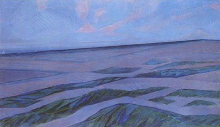
  [Image: Midland, California, via
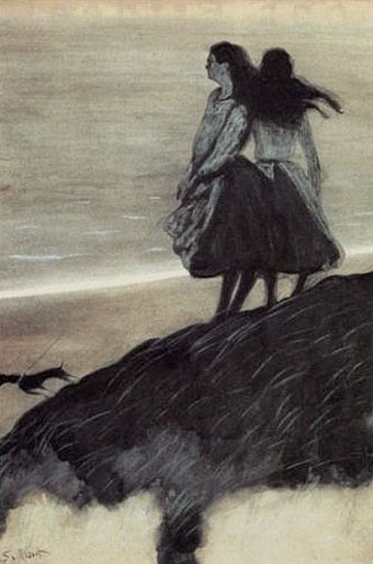
  [Image: The abandoned streets of
  [Image: Midland, California, via