Shared posts
13 Oct 22:06


The Extraordinary Details of Tiny Creatures Captured with a Laser-Scanning Microscope by Igor Siwanowicz
by Christopher Jobson
Chris CothrunThis is amazing
Acilius diving beetle male front tarsus (foot) 100x
If you’ve ever wondered how a diving beetle swims through the water or manages to rest just on the surface, the answer is in part because its foot is infinitely more complicated than your own. As seen above, this microscopic image of a male Acilius sulcatus (diving beetle) by photographer Igor Siwanowicz reveals the extraordinary complexity of this aquatic insect’s tiny appendage. This is just one of many examples of Siwanowicz’s work as a neurobiologist at the Howard Hughes Medical Institute’s Janelia Farm Research Campus. His brilliantly colored images show the tree-like structures of moth antennas, the wild details of barnacle legs, and the otherworldly shapes of plant spores. The photos are made with a confocal laser-scanning microscope capable of “seeing” vast amounts of detail beyond what you might capture with a traditional lens-based microscope. You can see much more of his nature photography here. (via Synaptic Stimuli, Wired)
Barnacle
Midge Pupa
Paraphyses & Sporangia
Isopod appendage
Front leg of whirligig beetle
Moth antennae
Moth antennae, detail
13 Jul 05:34
61 Glimpses of the Future
by Jason Kottke
Jan Chipchase is the founder of Studio D Radiodurans, which is sort of a modern day A-Team, except with more field research and fewer guns. For example, Chipchase is the sort of person who, for vacation, does not sip pina coladas in Bali but heads for "Kyrgyzstan, Tajikistan's GBAO region and China's western provinces". At the conclusion of the trip, which was actually only partially a vacation, Chipchase jotted down 61 Glimpses of the Future. A few of my favorite observations:
7. A white male travelling alone in interesting places, will always need to disprove they are a spy. Thanks Hollywood.
24. There is only one rule for driving in the GBAO: give a lift to every local that wants one, until the car is full. It's common to travel main thoroughfares for a day and only see a couple of vehicles.
33. People wearing fake Supreme are way more interesting than those that wear the real deal.
34. An iPhone box full of fungus caterpillar in Kham Tibet sold wholesale, is worth more than a fully specced iPhone. It's worth 10x at retail in 1st/2nd Tier China. It is a better aphrodisiac too.
38. Tibetan monks prefer iOS over Android.
53. Visitors to Tibet proper are supposed to go in a tour group and hire a local guide. With the right agent you can become a tour group of one and on arrival tell the guide you don't need their services. It helps to look like you're going to behave.
This is, as Tyler Cowen might say, interesting throughout. (via @themexican)
Tags: China Jan Chipchase Kyrgyzstan lists Tajikistan travel
Serafin.shane likes this
04 Oct 19:26


Building a race simulator
by f1metrics

One of the most fascinating aspects of modern Formula 1 is the use of computer simulations to predict car performances and race strategies. By the early 1990s, teams like Benetton had begun to develop simple race simulators to estimate optimal strategies. Today, teams develop highly sophisticated models based on massive amounts of telemetry data.
Constructing mathematical models is one of the most satisfying aspects of my job as a scientist. Selecting the form of the model and the ingredients that should be added often involves a good deal of creativity and intuition. It is challenging to build a successful model, but a successful model is extremely valuable in making predictions and gaining understanding of the modeled system. I’m going to walk you through my own process of building a simple race simulator model.
Inputs and outputs
The first question for any modeler to consider is: which data are we feeding into the model and which outputs would we like to get back from the model?
For this model, I could potentially go all the way down to modeling the lines of each driver through each corner of the track, predicting their position as a continuous function of time throughout the race. However, that’s an extremely difficult problem, and it would be hard to generalize the model to different tracks. So instead, I’ll settle for simulating the lap times of each driver discretely on each lap of the race. This is similar to the model that was developed on intelligentF1, one of my favorite blogs. However, that model predicts times in clean air. I want to run full race simulations, so I’ll need to somehow include the effects of interactions with other drivers and variability in driver performance. For example, a driver might become stuck behind another for many laps until the driver ahead makes a slight mistake, or they might breeze past with the help of DRS. How do we model that?
Driver parameters
For each driver, I decided to include 8 parameters. I could have included many more, but I think these best capture the dynamics:
1. Qualifying position
Drivers who qualify further down the grid start the race at a time disadvantage. By timing how long it takes the whole pack to cross the starting line at the beginning of the race (~5 seconds from 1st to 22nd), I estimated that the difference between two adjacent grid positions is worth about 0.25 seconds on average (in reality, the time differences will be nonlinear, but let’s keep this simple for now).
2. Start bonus/penalty
Some cars and drivers consistently gain positions at the start of the race (e.g., Williams this year). I used the average number of position gained/lost on the first lap in 2014 to estimate the time gain/penalty on lap 1 for each driver, with one position corresponding to a relative gain of 0.25 seconds.
3. Maximum speed
Straight-line speed is important for determining how easily one car can pass another. I used speed-trap recordings from qualifying for each driver.
4. Pace on long runs
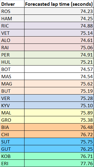
The most important parameter for determining race results is the driver’s lap time in clean air under race conditions. An initial forecast can be obtained by studying lap times in the 1.5-hour FP2 session, when teams usually run a long stint on the tyre they intend to use for most of the race. The teams have not always finalized race set-ups at this stage, but this is the closest they come to a full race simulation. FP1 tends to involve shorter runs, while FP3 tends to have a greater focus on preparing for qualifying.
To estimate race pace from FP2 times, I used the following method:
- Take all lap times in the longest run on prime tyres from FP2.
- Ignore any laps that are much slower than the surrounding laps. The specific criterion used was any lap >1 second slower than the lap before or after, since these were probably cool-down laps or laps affected by traffic.
- Average the times of the remaining laps (or better yet, fit them using the tyre model, once it is defined below).
The results of this analysis for Austria 2014 are shown in the table below.

Note that it’s possible that long runs are performed with different fuel loads. Unfortunately, this is something we can’t easily detect as outside observers.
Qualifying provides a good chance to update the race forecast, with equal fuel loads just before the cars enter parc fermé. The average times from FP2 give expected delta times in qualifying — Hamilton was the quickest in FP2 so has a delta of 0.00 seconds, while Rosberg was 2nd with a delta of 0.09 seconds. Qualifying gives us a different set of delta times.
To update the forecast, I used the following formula, which averages the FP2 and qualifying performances:
ForecastedPrimeTime = FP2time + 0.5(QualifyingDelta – FP2Delta).
If the driver performed relatively better in qualifying than FP2 then QualifyingDelta < FP2Delta, so the new estimate is less than the old estimate. If the driver performed relatively worse in qualifying than FP2 then QualifyingDelta > FP2Delta, so the new estimate is greater than the old estimate. Using this formula for Austria gives the following forecasted lap times.
5. Lap-time variability
All drivers have some variation in their lap-times from one lap to the next, due to small inconsistencies, errors, and improvements. This natural variation is important for overtaking, as small mistakes can allow drivers through. To illustrate the level of variability, I have plotted the lap-times for Chilton and Alonso in the 2014 Austrian Grand Prix below.
 The first thing you should see is see that Alonso was systematically faster than Chilton and that he had two pit-stops while Chilton had one. But there’s another more subtle feature I want you to notice: Alonso’s times are less variable than Chilton’s. Alonso’s times are practically metronomic, while Chilton’s times frequently wax and wane.
Within each stint, there is also a shifting baseline due to a combination of decreasing fuel mass and increasing tyre wear. If we take away pit-stops and in-laps, we can fit the baseline trend in each stint (here I used a quadratic function) and then see how much variation remains about the baseline.

Below, I’ve plotted the time differences relative to the fitted baseline on each lap (i.e., the residuals of the fit).
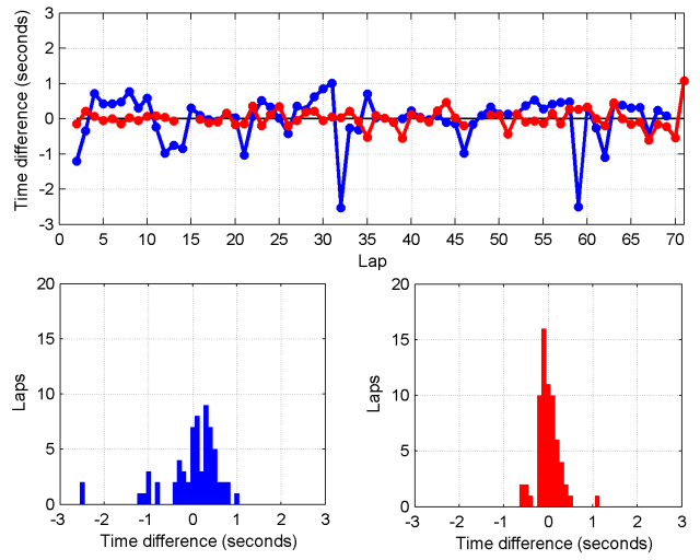
You can see how much more stable Alonso’s times are than Chilton’s. The standard deviation of the time difference is 0.26 seconds for Alonso, whereas it is 0.65 seconds for Chilton. I estimated lap-time standard deviations for each driver, ranging from 0.2 seconds to 0.7 seconds.
6. Pit strategy
If simulating a race after the fact, we can simply input each driver’s pit strategy. If we want to predict race results, we need to guess the strategy each driver will use, based on which strategies are optimal. This is discussed below.
7. DNF probability
There is always some chance that a driver will fail to finish the race, due to a crash or a mechanical failure. The probability of a driver finishing a race without crashing can be computed from their prior race history, as I did in my previous post. From this, the probability of crashing on each lap can be estimated. The probability of a mechanical DNF can also be crudely estimated using the percentage of race starts for the driver’s team that have ended in mechanical DNFs in 2014.
8. Tyre degradation
Some drivers and cars are relatively kinder on their tyres than others, but how do we quantify this? One way is to look at the average number of laps per stint on each type of tyre across all the races in 2014 to date. I did that analysis for all completed stints (i.e., not interrupted by any problems) on prime (harder) and option (softer) tyres up to Austria, with the tabulated results below. Ratios are relative to the overall average.
Average length of prime (harder compound) and option (softer compound) stints for each driver up to Austria 2014. Also shown are the ratios of each drivers’ stints to the overall average.
The data confirm some qualitative observations, such as Force India generally running longer than other cars, and Ricciardo getting more life out of his tyres than Vettel. For each driver, I included a tyre degradation multiplier based on this table. For example, Perez has run 1.08 times longer than the average driver overall. I therefore divided his degradation rate by a factor of 1.08.
Elements of the race simulator
Now that I have decided on the inputs to the model, I need to figure out how to simulate the race!
Tyre and fuel model
Lap times aren’t static across a race, even for drivers who spend the whole race in clean air. They vary due to reductions in the car’s weight as fuel is burned and due to degradation of tyres. I’m not privy to all of the data the teams and Pirelli collect, so I have to use some educated guesswork to determine the effects of these factors.
The effect of fuel on lap times can be estimated by comparing lap times on the same tyre at different stages in the race. In the Austrian Grand Prix this year, Alonso, Raikkonen, and Magnussen all spent most of the race in clean air and ran two similar length stints on the soft (prime) tyre. I compared these two stints with a time penalty for the number of laps remaining in the race. I found the minimum distance (sum of square time differences) between the two stints occurred when I included a time penalty of 0.037 seconds per lap of extra fuel.
This comparison assumes that drivers are burning fuel at the same rate, pushing equally hard, and running on equally fresh tyres in both stints, which may not be true. In any case, it gives us a ballpark figure. The fuel factor affects all cars equally in the model (for now), so it doesn’t affect the predicted finishing order of the drivers, but it does change the absolute lap times.
The degradation profile of the 2014 Pirelli tyres is also something that we can estimate from data. If we average the 6 prime stints from Alonso, Raikkonen, and Magnussen after correcting for fuel burn, we get the following profile.
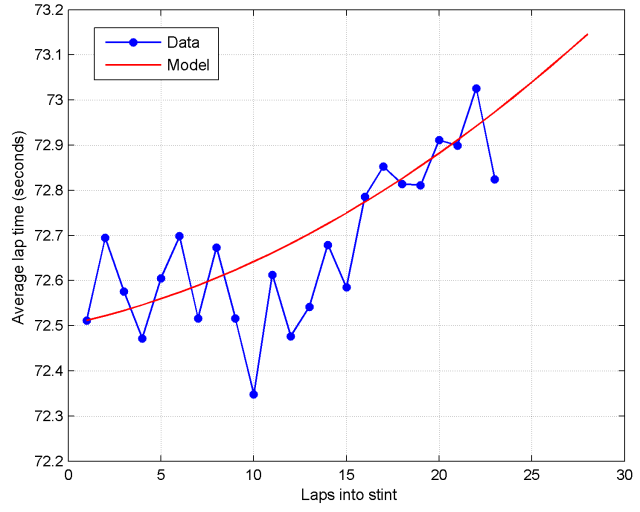
It seems reasonable to assume that degradation is monotonically increasing (because the tyres get increasingly worn) and that the rate of degradation in lap times is increasing (because times get drastically worse when the tyres are very worn). I chose a quadratic function to approximate the degradation profile as a function of the tyre’s age.
For the softer option tyres, I assumed that the wear rate was higher (by a factor of 2, since super-soft stints were about half as long as soft stints) and that fresh option tyres were about 0.7 seconds per lap quicker than fresh prime tyres, based on data obtained from pre-season testing. This means that option tyres are quicker than primes for a short period of time, but then rapidly degrade.
 A crossover point occurs for the option tyre around 14 laps, where it becomes slower than a fresh prime tyre. This is a critical point from a strategic standpoint, because it means a driver who switches to fresh prime tyres at this point may be able to undercut a competitor who stays out longer on options. The crossover point is around the same time most drivers chose to take their first pit-stop in the Austrian Grand Prix.
Lap time calculations
We now have the basis for a simple model of lap times. I haven’t yet introduced interactions between drivers, so at this point cars are able to ghost straight through one another! We’ll get to interactions next.
On each lap of the race, I use the following formula to calculate a driver’s lap time:
LapTime = ForecastedPrimeTime + Random + TyreDeg + FuelAdj.
- ForecastedPrimeTime is the lap time computed for each driver above, based on their pace on fresh prime tyres.
- Random is a normally-distributed random variable with zero mean and a driver-specific standard deviation chosen as described above.
- TyreDeg is the lap-time difference for the current tyres as a function of laps into the stint, the type of tyre, and the driver’s tyre degradation multiplier.
- FuelAdj is the change in lap time per lap of fuel burn.
On the first lap of the race, I add a lap time penalty (6 seconds) to represent the time required to get away from a standing start, plus a normally-distributed random variable with driver-specific mean (as described above) and a standard deviation of 0.25 seconds to represent variation in starting speed.
When a driver makes a pit-stop, their tyre compound and tyre age is updated. I also add a time penalty on the in-lap (4 seconds for Austria) and a time penalty at the beginning of the out-lap (22.5 seconds for Austria).
This basic model can be used to simulate race lap times, as shown below for Alonso and Chilton.
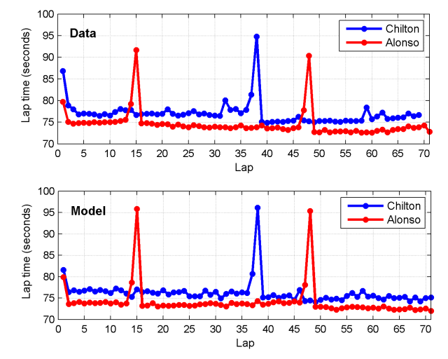
The effects of traffic and DRS are completely ignored at this stage, so the agreement is not perfect, but nevertheless decent. Notably, the lap time profile for Alonso is a little off on his middle stint, suggesting the tyre or fuel model is not perfect, and the pit-times are slightly overestimated for Alonso (Ferrari have one of the quickest pit-crews), but we have to start somewhere and this looks quite respectable!
Pit Strategies
Having formulated a model of lap times, tyre degradation, and time spent on pit-stops, we have the basis for finding optimal pit strategies. We can ask the model whether it is theoretically quicker to take an extra pit-stop for fresh tyres. Obviously there are many factors still missing from the model, such as interactions with other drivers (which can lead to favoring undercuts) and the age of each set of tyres (not all will necessarily be fresh). However, we can still begin to probe how tyre properties affect strategies.
Two factors that play an important role in dictating optimal race strategy are the relative durability of the option (softer) vs. prime (harder) tyres and the lap time advantage of fresh option vs. prime tyres. Below are theoretically optimal strategies as a function of these two variables generated using the model.
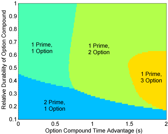
In the top left corner we have the scenario where prime and option tyres are both durable and there is little time difference between the two. In this case, it is optimal to run the race on a one-stop strategy due to the low rate of degradation. Things begin to change if either tyre offers a large advantage. If the durability of the option tyre is very low (bottom of graph), then only a short stint can be run on options, necessitating a two-stop strategy with two prime stints. If instead the option tyre is durable and offers a significant time advantage (middle and top of graph), it becomes preferable to run a two-stop strategy with two option stints and a single short stint on the slower prime tyre. Low durability with a large option time advantage (far right of graph) can even make a three-stop strategy viable.
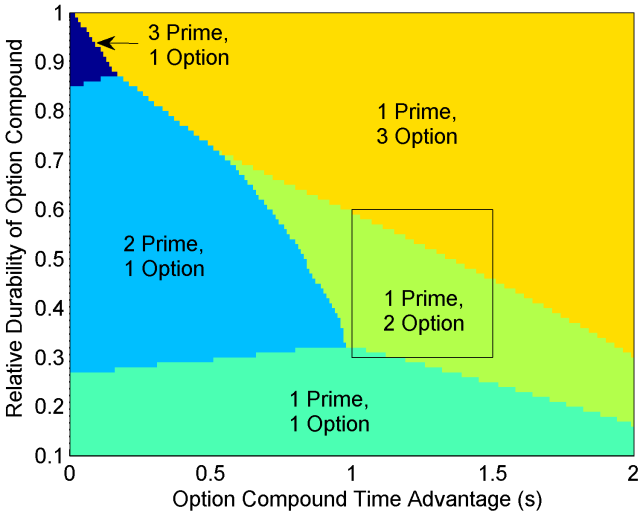
If the option time advantage is very large, it is optimal to get off the prime tyre as soon as possible — after just a single lap! — as shown in the graph below.

This analysis gives some insight into the thinking that tyre manufacturers like Pirelli must do to ensure interesting races. Nobody wants to see a race where one tyre compound is so much worse than the other that it is shed as soon as possible. The most entertaining races usually emerge when there are multiple viable strategies; in other words, near the boundaries between the different optimal strategy zones. For example, at the ‘triple point’ between 1-prime-1-option, 2-prime-1-option, and 1-prime-2-option strategies.
I had finished this model just before the Belgian Grand Prix, so I decided to examine its predictions for that race, where soft and medium compounds were used. The performance difference between soft and medium tyres is in the range of 1.0-1.5 seconds. Based on the strategies used in the Chinese Grand Prix, I was able to estimate that the relative durability of these compounds is 0.3-0.6. I was also able to estimate the wear rate for the soft tyres on the Spa circuit from FP2 long runs.
Using these, plus the time taken to execute a pit-stop from last year’s Belgian Grand Prix, I predicted the most likely strategies in Belgium.
 The overlayed box is my best estimate of the tyre properties. This suggested that two-stop strategies would predominate, with some drivers perhaps finding a three-stop strategy more viable, depending on individual car/driver characteristics. Using each driver’s degradation rate modifier, I used the model to estimate optimal race strategies. In some cases, the model predicted split strategies for teammates, such as Ricciardo on a two-stopper vs. Vettel on a three-stopper, due to Vettel’s slightly higher degradation rate modifier. In the actual race, we indeed saw most drivers using a 1-prime-2-option strategy, and with Vettel running an extra stint on options.
DNFs and safety cars
When teams decide strategies, the safety car is an extremely important factor. Teams need to be able to react, pitting early if the safety car is issued shortly before a scheduled stop (within the “pit window”). On each lap, there is a chance of each driver retiring, as described above. When a driver retires, I modeled a chance of the safety car being issued, with the chance based on the historical likelihood of a safety car at that track.
When the safety car is deployed, I simulate a 6-lap safety car period. During the safety car period, cars run no quicker than a safety car delta time, which is about 120% of the normal lap time (for Austria, I used 90 seconds). When running to delta times, I simulate half a lap of tyre wear per lap. Once a driver closes to within 0.4 seconds of the car in front, they must travel at safety car pace, which is about 140% of the normal lap time (for Austria, I used 105 seconds). When running to safety car pace, I simulate no tyre wear.
At the beginning of the safety car period, drivers will pit if they are within the pit window of their next scheduled stop. For Austria, I used a pit window of up to 12 laps before the scheduled stop. Below, you can see the simulated lap times for Alonso and Hamilton for two simulated races with slightly different timings on the safety car deployment: lap 26 and lap 28.

Alonso’s scheduled pit-stops were on laps 15 and 48. In both cases, the safety car fell outside his pit window, so he pitted as scheduled both times.
Hamilton’s scheduled pit-stops were on laps 14 and 40. The lap 26 deployment fell just outside his pit window, causing him to pit as scheduled, whereas the lap 28 deployment fell just inside his pit window, triggering an earlier pit-stop. His time on lap 28 is slowed by the pit-stop. He is then able to run quicker on lap 29 as he catches up to the cars in front (almost running at the 90-second delta time).
Overtaking model
The final key ingredient is interactions between drivers, including DRS and overtaking. The model I used is illustrated below.
From lap 3 onwards, drivers receive a DRS bonus if they are within 1 second of any cars at the beginning of the lap, just after drivers finish their pit-stops. I guesstimated a net gain of 0.4 seconds per lap due to DRS. I also included an increase in tyre degradation due to running in dirty air close behind another car — on any lap where a driver receives a DRS bonus, their tyre wear rate is increased by a factor of 1.1.
The closest a driver is allowed to run behind another driver at the end of a lap is modeled as 0.2 seconds. To ‘stick’ an overtaking move, the attacking driver must be quicker than the defending driver by a certain amount on that lap. The precise overtaking threshold will vary based on the track, because it’s easier to overtake at certain tracks than others. For two drivers in identical cars, I guesstimated a threshold of 1.2 seconds (i.e., the driver must be a net 0.8 seconds quicker in clean air without DRS). Below is a graph of the model’s predicted average number of overtakes per race (excluding the first lap and pit-stops) as a function of the overtaking threshold.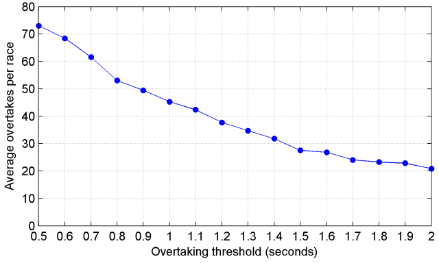
My initial guess of 1.2 seconds turned out to be quite a good one, since the number of overtakes in dry races is averaging ~45 this year, down from a peak of ~60 in 2011, and up from ~15 or less from 1995-2009. This suggests that the overtaking threshold was around 2+ seconds per lap from 1995-2009 due to the aerodynamics of the day making it very difficult to follow another car through corners. Changes to the technical regulations have reduced the threshold and DRS has helped drivers to reach the threshold more easily.
Note that a driver need not exceed the overtaking threshold on every lap to get past another driver; they just need to do it once. Due to variability in lap times, it is possible for a driver to remain within DRS range of another for several laps before exceeding the overtaking threshold and passing.
Differences in straight-line speed between cars should also affect the overtaking threshold. A car with a higher top speed generally finds it easier to overtake and easier to defend against other drivers. I modeled a change in the overtaking threshold of 0.2 seconds for every 10 km/h of difference in straight-line speed between the two cars.
When a driver is successfully overtaken, they typically lose time taking an inferior line. This often allows another driver behind a chance to overtake. I modeled a time loss of 0.4 seconds whenever a driver is overtaken.
Including the overtaking model leads to much more realistic race simulations.
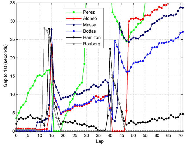
In this time chart from one simulation of the Austrian Grand Prix, you can see several cases of drivers interacting with one another. [All 22 drivers were simulated, but only the top 6 are shown.]
- In the opening laps of the race, there are three drivers (Bottas, Rosberg, and Alonso) running very close behind the leader (Massa), but unable to pass.
- On lap 9, Massa has a very poor lap, allowing Bottas to overtake. The time Massa loses being overtaken also allows Rosberg and Alonso through, causing him to drop back from the leading three.
- Rosberg pits first at the end of lap 11, while the Williams drivers pit slightly later. This allows Rosberg to undercut them.
- Rosberg catches and then passes Perez, who is pitting much later.
- After his first pit-stop, Bottas is stuck behind Alonso. Although he is quicker, it takes Bottas until lap 34 to pass Alonso.
- Hamilton gets within DRS range of Rosberg on lap 35 but is not quite able to pass him before the second pit-stops.
Race simulations
With the model up and running, I used it to simulate the Austrian Grand Prix 1000 times — because the model is simple, this takes only a few minutes. The number of times each driver finished in each position (from 1st to 22nd) across the 1000 races is shown below, with the position in the real race highlighted in red.

Most of the distributions are bimodal (have two peaks). This is because a DNF results in a low position.
The model accurately predicts the total race time. Shown below are the winning race times for each of the 1000 simulations. The distribution is multimodal, due to the varying number of possible safety car deployments.

For races with no safety car deployments, the model predicts a winning race time of 87m 25s ± 6s (mean ± std), which is pretty close to the actual 2014 race time of 87m 55s.
Improvements to the model
Simulating the Austrian Grand Prix highlighted three areas in which the model could be improved.
1. Variability in pit-stop times.
Most pit-stops tend to be close to the minimum possible time, but there are occasionally much slower pit-stops, such as when there is a problem attaching a wheel. This is an important source of variability, as poor pit-stops often change races. Around 50% of pit-stops are within 1 second of the best time (measuring the time from pit-entry to pit-exit), 80% are within 2 seconds of the best time, and 90% are within 4 seconds of the best time.
This suggests a heavy-tailed distrbution for pit-stop durations. Without a good physical model to describe pit-stop durations, I experimented with a variety of heavy-tailed distributions to fit pit-stop duration data. I achieved the best fit using a log-logistic distribution. The cumulative distribution functions are shown below for the data and the fit. For the data, I used the total time spent in the pits, relative to the shortest pit-stop time, for all race pit-stops in 2014 up to Austria.

2. Variability in time gained/lost at the start
Looking at the model’s predictions for the first lap, large position changes are very rare. This suggests that the amount of simulated variability in starts (standard deviation of 0.25 seconds) is too conservative. The model predicts an average of 10.6 position changes on the first lap (7th to 5th counts as 2 position changes in this count). In reality, there are usually about 30. I therefore tried increasing the standard deviation of start times from 0.25 seconds to 1.00 seconds. This increased the average number of first-lap position changes to 33.4.
3. Missing Data
Naturally, in making race forecasts, we are always limited by the imperfect and incomplete information we have available. But how do we treat cases where a driver sets no representative times at all in FP2 or qualifying? I decided on the following method:
- If a driver’s time is at least 2 seconds slower than their teammate’s in either FP2 or qualifying, or they have no times, only the other session is used for the race pace forecast.
- If a driver’s time is at least 2 seconds slower than their teammates’s in BOTH FP2 and qualifying, or they have no times, I conservatively estimate a race pace lap-time 1.0 seconds slower than their teammate.
Race analysis
One of the neat things about a model is that it can be used to understand race strategies. Following the 2014 Italian Grand Prix, where the model again performed well, I used it to analyze how the top positions were decided. This time, I gave the model the state of the race at the end of lap 1 to see how it expected the race to pan out from there.
After poor starts, Hamilton and Bottas had dropped down to 4th and 11th, respectively. However, based on their FP2 and qualifying pace, the model was confident that they would rapidly recover. Before the race, the model predicted a 75% chance of Hamilton winning and a 12% chance of Rosberg winning. After lap 1, this changed to a 70% chance for Hamilton and a 25% chance for Rosberg. In most cases, Hamilton was predicted to catch and pass Rosberg around the time of the only pit-stop. One typical model simulation is shown below for the top four finishes.

The model accurately predicted that Hamilton should pass Massa within the first phase of the race and then chase down Rosberg. It also very accurately predicted the timing of the one pit-stop. However, it was overly optimistic about Bottas’s chances of cutting through the traffic and catching his teammate, and slightly too pessimistic about Massa’s pace; in reality, Bottas spent a long time battling his way past Magnussen, by which time any chance at 3rd was long gone.
After the race, Vettel’s interesting strategy attracted questions. He pitted after just 18 laps, forcing him to run long on his second stint. This left him vulnerable to Ricciardo in the later stages and seemed a peculiar decision given Vettel has been struggling with tyre life this year. However, the goal was to ensure an undercut of Magnussen for 5th. The model suggests that had Vettel stopped later instead, he himself would have been undercut by other drivers and might have been unable to pass Magnussen. Ricciardo didn’t need to worry about undercuts, as he had a 5-second buffer over the cars behind and was free to run his own race.
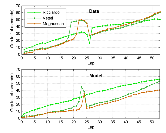
Ricciardo’s extremely rapid progress in overtaking other cars — Raikkonen after 3 laps of DRS, Button after 2 laps, Perez after 1 lap, Magnussen after 2 laps, and Vettel after 1 lap — far exceeded the simulator’s predictions. I suspect the Red Bull team were also surprised by this. On paper, Ricciardo shouldn’t have taken 5th so easily from Vettel.
Conclusion
My goal here was to show that even a fairly simple model can be useful in simulating and understanding races. In that respect, I think the model is very successful. There are of course many aspects of real racing that are grossly oversimplified by the model. The drivers in the model run their own predetermined strategies — they don’t react to race events in real time, besides safety cars. This is an interesting problem to solve in itself, which could involve using game theory to outwit opponents. Currently, the model is only applicable to dry weather conditions. It could potentially be extended to different weather conditions, including changes in driver performances and crash rates in wet weather that I previously computed, changes in lap times, and changes in overtaking.

17 Aug 15:46

Breathtaking Aerial Landscapes of Iceland by Sarah Martinet
by Christopher Jobson


While on a recent trip to Iceland, photographer Sarah Martinet had the opportunity to shoot these amazing landscapes from a plane with open windows. You can see much more of her work (as well as more from this trip) on 500px and Facebook.
07 Aug 15:58
How Long Is the Coast of Britain?
by but does it float
Fractal scapes by batjorge
Title: Wikipedia


 More fractals on BDiF
Folkert
More fractals on BDiF
Folkert
More fractals on BDiF
Folkert
Damien.ldp likes this
07 Aug 15:57
You can roll out steel — any length. You can blow up a balloon — any size. You can mould plastic — any shape
by but does it float
Video sculpture (8 minutes) “Walking City” by Universal Everything
Title: David Greene, Archigram
Folkert
07 Aug 15:57

New Stained Glass Windows Made from Stacked Laser-Cut Paper by Eric Standley
by Christopher Jobson

Either/Or Newmarch. Cut paper, 20″x20″, 2014.

Either/Or Newmarch, detail. Cut paper, 20″x20″, 2014.

Either/Or Newmarch, detail. Cut paper, 20″x20″, 2014.

Zeno of Elea. Cut paper, 20″x20″, 2013.
 Zeno of Elea, detail. Cut paper, 20″x20″, 2013.

Zeno of Elea II. Cut paper, 20″x20″, 2013.

Zeno of Elea II, detail. Cut paper, 20″x20″, 2013.

Either/Or Tetragon 6.7.1. Cut paper, 8″x10″, 2014.

Either/Or Tetragon 6.7.1, detail. Cut paper, 8″x10″, 2014.
Virginia-based artist Eric Standley (previously) brings a whole new meaning to the term “cutting edge” with his methodical stained glass windows created entirely from laser-cut paper. Standley stacks well over 100 sheets for many of his pieces which involve months of planning, drawing, and assembly. The artist says his inspiration comes from the geometry found in Gothic and Islamic architectural ornamentation which he somewhat jokingly calls “folk math.”
Standley currently has work as part of “Fold, Paper, Scissors” at the Mesa Arts Center in Arizona, and is an included artist in the upcoming book Mandala Masterworks by Paul Heussenstamm. You can see many new pieces from the last several years on his website.
Tomas.jung, Benjaminsavage and 4 others like this
07 Aug 05:22
Flying car sculptures
by Jason Kottke

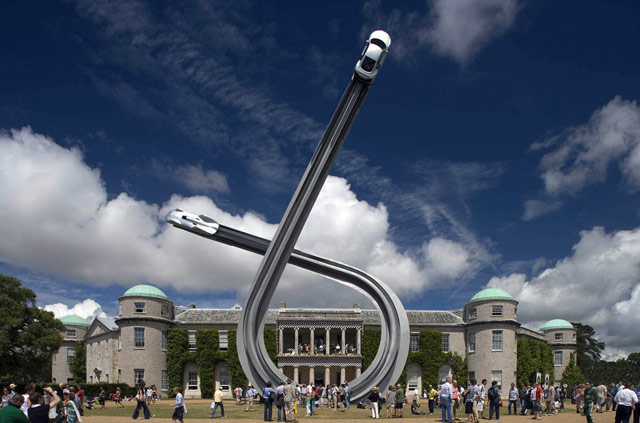
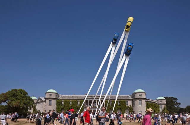
These sculptures by Gerry Judah for the Goodwood Festival of Speed are amazing. Here's how they made the Mercedes arch for this year's festival. (via ministry of type)
Tags: art cars Gerry Judah video
Kevin Erb likes this
07 Aug 05:07
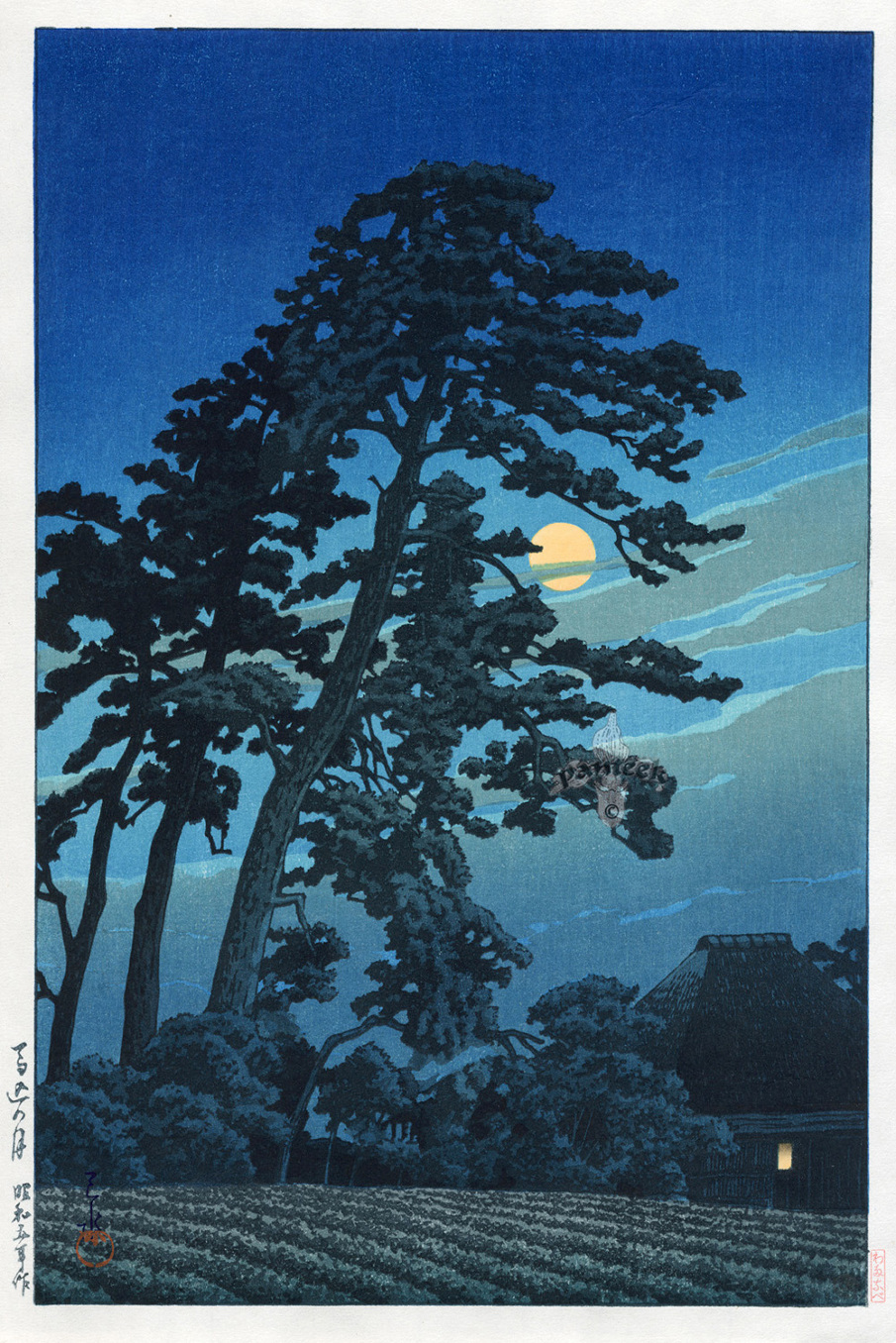
He strove long to learn what can be learned, in silence, from the eyes of animals, the flight of birds, the great slow gestures of trees
by but does it float
Chris CothrunGorgeous illustrations.
.shrink3 img { width: 600px; height: auto; }Woodblock prints by Hasui Kawase
Title: Ursula K. Le Guin, A Wizard of Earthsea


 Folkert
Folkert
Alexander Voronkov, Noreawahlbeck and 3 others like this
07 Aug 05:07


Japanese Artist Creates a Diorama a Day for the Past Four Years in ‘Miniature Calendar’ Project
by EDW Lynch

For the past four years, Japanese artist Tanaka Tatsuya has been creating charming dioramas every day of the year for his “Miniature Calendar” project. He creates the often humorous dioramas out of miniature figurines and everyday objects. The series is available as a photo book and on his Facebook page and Instagram account.


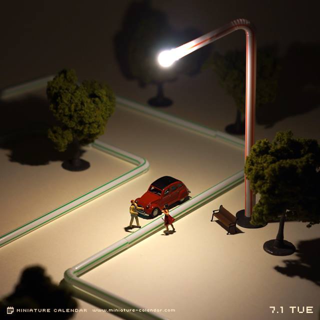
photos by Tanaka Tatsuya
via Spoon & Tamago

07 Aug 05:06
Wonderful Dance Photos That Use Silhouette to Capture the Form and Movement of Dancers
by EDW Lynch

Photographer Erik Saulitis captures the form and movement of dancers through the use of silhouette in his wonderful dance photos. Prints are available through his website.


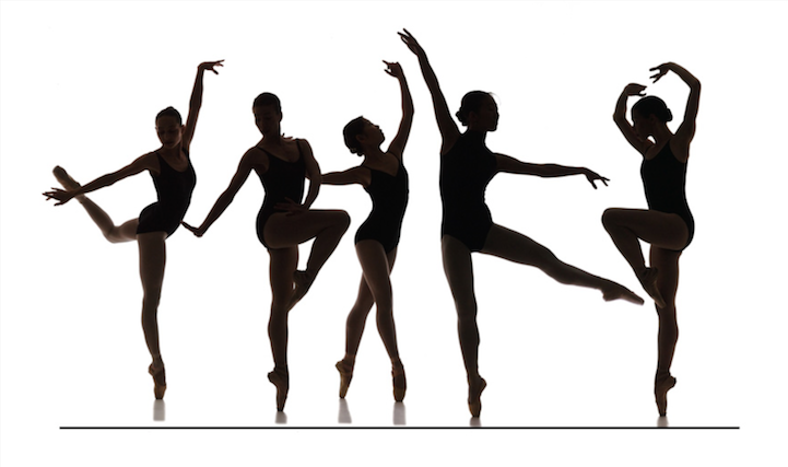

photos by Erik Saulitis
06 Aug 19:10

A Brain-Like Building Turned into a Twisting Video Mapping Light Show
by Christopher Jobson


Nikola Lenivets

Nikola Lenivets
As part of the New Media Night Festival last month at Moscow’s Nikola-Lenivets Art Park, one of the most unusual video-mapping projects we’ve seen took place against the backdrop of Nikolay Polissky’s (previously) brain-like Universe Mind structure. The twisting, serpentine building has been used for years as a centerpiece to many events at the art park which now boasts a collection of almost 30 architecturally-influenced artworks, including a 170-foot trampoline installed in the middle of a forest.
For this year’s New Media Night Festival, media design studio Radugadesign was comissioned to set ‘Universe Mind’ in motion with this 8-minute video projection. If you’d like to get a feel for what it’s like to step inside the building under normal circumstances, check out this interactive 360° panorama. (via The Creator’s Project)
Nuno Cruz, Cooper Griggs likes this
06 Aug 19:09

Artist Erdal Enci Clones Himself to Create Elaborate Choreographed GIFs
by Christopher Jobson


It’s been over a year since we last checked in with video artist Erdal Inci (previously) who clones multiple recordings of himself moving through public spaces resulting in these bizarre looping performances. Inci often carries lights or other objects which lend a sense of choreography to each video, and at times the exposure eliminates him from the scene or makes him appear shadowlike in the background. Here are a few of our favorites over the last few months but you can see more on his website and at a higher resolution on Vimeo. (via iGNANT)
05 Aug 23:08
The science of Star Wars
by Jason Kottke

Physicist Andy Howell recently gave a talk about the science of Star Wars and wrote up a summary of it for Ain't It Cool News. Topics covered include binary star systems, droids, the Death Star, and lightsabers:
Of course, we still don't know how to make a lightsaber. One big problem is confining plasma (if that is even what it is), into some tube. But a bigger problem is the amount of energy required. We can actually calculate this from clues in the movies!
In Episode I, Qui-Gon jabs his lightsaber into a door, and melts part of it. That's just basic physics! To melt something, you have to raise its temperature to the melting point, and you can calculate how much energy that takes using the specific heat capacity of a material.
(thx, greg)
Tags: Andy Howell movies science Star Wars
05 Aug 23:08
Digital Atlas of the Roman Empire
by Jason Kottke
Chris CothrunPaul's journey, anyone? Also, there's that site that has travel times between locations of the Roman Empire.
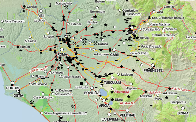
The Digital Atlas of the Roman Empire lets you explore ancient Rome in a Google Maps interface. (via @pbump)
Tags: maps Rome
Pcline98 likes this
No more posts. Check out what's trending.