Shared posts

27 Sep 13:14

Make your own tiled cartograms

by Nathan Yau

tilegram

A challenge of using geographic maps to show data is that larger regions inevitably get more visual real estate. Cartograms try to solve this problem by sizing regions by the data instead of land mass. Tilegrams by Pitch Interactive makes it easy to construct tiled versions at the US state level.

Upload your data, adjust the resolution to your liking, and export for your own purposes. Nice.

Tags: cartogram, Pitch Interactive

25 Jun 08:49

state of the map 2015

Two weeks ago I was in New York for State Of The Map 2015, the annual OpenStreetMap conference.

2014’s event was in DC, and I had kind of a hard time with it. Good event, but dispiriting to come back to the community after a year away and encountering all the same arguments and buillshit as 2013 and before.

This year in New York was awesome, though. It felt as though some kind of logjam had been cleared in the collective consciousness of OpenStreetMap. Kathleen Danielson, new international board member, delivered a mic-drop talk on diversity. New York designers and urbanists were in attendance. A wider variety of companies than ever before sponsored and presented.

I was a last-minute addition to the program, invited by Brett Camper to take over moderation of his panel on vector rendering. There is video now on the website (here is a direct Youtube link for when the permalink-haters who do the site each year break all the current URLs).

We had four participnts on the panel.

Matt Blair from Mapzen works on the Tangram rendering engine, a WebGL rendering layer for in-browser delivery of responsive, dynamic, and funny maps like this sketchy style:

Mapzen has been doing a bunch of interesting things with 3D, and when I visited the office Peter Richardson had a bunch of printed Manhattan tiles on his desk, including this one of 16/19300/24630 with Grand Central and the NYPL viewed from the north:

Konstantin Käfer from Mapbox works on the new GL rendering product, and he’s been producing a regular stream of new rendering work and data format output throughout the three years I’ve known him. Konstantin shared this gorgeous animated view of a map zooming from Boston to Melbourne, showing off dynamic text rendering and frame-by-frame adjustments:

(Click for video)

Hannes Janetzek of OpenScienceMap produces a rendering product intended for scientific use. His work is used to support academic research, and he was unique on the panel for not having a commercial product on offer: “OpenScienceMap is a platform to enable researchers to implement their ideas, to cooperate with others, and to share their results.”

Steve Gifford of WhirlyGlobe-Maply is primarily in the consulting business, and his open source 3D globe rendering platform is used by the current number two app in the Apple app store, Dark Sky. The rendering output of Steve’s work is typically different from the other three, in that he’s mostly delivering zoomed-out views of entire regions rather than the street-level focus of OpenScienceMap, Mapzen, and Mapbox. It was telling that everyone except Steve identified text rendering and labeling as their primary difficulty in delivering vector-driven client-side renders.

Steve’s rendering pipelines commonly cover more raster rendering than the others, such as this screen from Dark Sky showing stormy weather over Ohio and Kentucky:

I produced a bunch of vector rendering work two years after I left Stamen, and I enjoyed moderating a panel on a topic I’m familiar with without having any skin in the game. It’s super exciting to see all of this happening now, and it feels a bit like OSM raster rendering in 2006/07, when Mapnik was still impossible to install but a growing group of people like Dane were nudging it forward into general accessibility. I give vector tiles and vector rendering another 1-2 years before it tips from weird research and supervised, commercial deployment into wide use and hacking. Comments

25 Jun 08:43

Refugee migration mapped globally

by Nathan Yau

Regugees

According to estimates recently released by the United Nations, about 14 million left their home countries because of conflict or persecution. Sergio Pecanha and Tim Wallace for the New York Times mapped the migrations.

After the data, there are two things that make this series of maps. The first is the projection, azimuthal equidistant, centered on areas where there is the most activity.

The second is the use of line thickness to indicate the direction that people migrated, from one country to another. Usually these migration maps use single-width lines accompanied by symbols or colors. This subtle growth from thin to thick provide clarity to one could easily be a mess of lines.

Tags: migration, New York Times, refugees

11 Feb 08:08

Tinderbox via prostheticknowledgeCoding project by Justin Long...


Tinderbox via prostheticknowledge

Coding project by Justin Long automates the process of selection for dating app Tinder using facial recognition, customized Eigenfaces (which are algorithmically generated face-like images) and Natural Language Processing (NLP) for conversations.

…I eventually got fed up and designed a piece of software that automates everything on Tinder.

… It wasn’t my intention to “one-up” the competition, but using the facial recognition algorithm Eigenfaces I built a bot that learns when to swipe right (like a person) AND swipe left (dislike a person) AND start your conversations.
… The bot that runs in the background also has a messaging system that starts conversations. Using StanfordNLP, the bot analyzes the sentiment of each chat response and classifies it as positive or negative. Using a “message tree” (see diagram below), the bot selects from pre-programmed chat messages as a response based on the sender’s sentiment. This continues up to 3 replies until the user is notified that a chat is ready to enter. The advantage of this? It removes the time involved in filtering new Tinder matches since a lot of people tend to drop off and “go dark” early in the process. Extended conversation is a strong indicator of interest.

07 May 08:38

Best-of Typography on Fubiz

by Camille

Pour ce premier article best-of Fubiz du mois de Mai, nous vous avons sélectionné les typographies les plus belles, graphiques et originales. Au programme, des typographies dans tous leurs états : sculptures, dessins, peintures, impressions, créations qui sont à découvrir en images et avec différents liens.

Awesome Typography by Xavier Casalta.

Galaxy Type Posters by Romain Roger.

ABC Black Pen Typography by Florian Meacci.

La Fabrique 125 by Humà Design.

Typography vs Logotypes by Jabier Rodriguez.

Nike Typography with Wooden Slats by Txaber.

Rooms Illustrated with Words by Thomas Broomé.

Flourish Typographic Project by Dana Tanamachi.

Letters at Large by Audra Hubbell by Audra Hubbell.

Tables You Need to Hear by Ogilvy London.

Handcrafted Typography by Marion Luttenberger.

Boxing Illiteracy by Wladimir Klitschko.

History of Type by Johnson Banks.

The Sculpted 3D Alphabet by Foreal.

Typodarium Calendar by Boris Kahl.

BCN Typography by Simon Prades.

Europe in Typography by Gokhun Guneyhan.

Paper Alphabet by Dan Hoopert.

Typography Game by Cosmografik.

Shanghai Numerals Type by Sawdust.

Shadow Type by Steve Heller and Louise Fili.

History of Type Awesome Typography by Xavier Casalta La Fabrique 125 Wladimir Klitschko Boxing Illiteracy Galaxy Type Posters Typodarium Calendar BCN Typography Flourish Typographic Project Shadow Type Typography Game Typography vs Logotypes Shanghai Numerals Type Tables You Need to Hear Handcrafted Typography Rooms Illustrated with Words Nike Typography with Wooden Slats Europe in Typography The Sculpted 3D Alphabet Letters at Large by Audra Hubbell Paper Alphabet by Dan Hoopert ABC Black Pen Typography Best-of Typography on Fubiz
05 May 12:00

Journalism Warning Labels « Tom Scott

by gabrielfigueiredo
05 May 07:01

Photo


17 Mar 12:48

Elements

by Dustin

Periodic table distorted by how abundant each element is on earth.

image

The above is from 1970, so we’ve gotten a little more precise since then. Here are a few other versions:

image

ew:

image showing Abundance in Earth's crust: cylinders logs periodic periodicity in a 3d cylinder style for the chemical elements

12 Mar 13:55

Tedious Map of the Solar System

by Dustin

Josh Worth created a horizontal map of the solar system using a scale of 1 pixel = diameter of moon.  There’s a lot of nothing out there (but Josh does add some amusing commentary to help pass the time scrolling between planets).

image

26 Dec 09:39

Iron Maiden uses piracy data for tour locations

by Nathan Yau

When you hear "piracy data" and "music" in the same sentence, it usually ends with exorbitant fines. Iron Maiden took a different route.

In the case of Iron Maiden, still a top-drawing band in the U.S. and Europe after thirty years, it noted a surge in traffic in South America. Also, it saw that Brazil, Venezuela, Mexico, Columbia, and Chile were among the top 10 countries with the most Iron Maiden Twitter followers. There was also a huge amount of BitTorrent traffic in South America, particularly in Brazil.

Rather than send in the lawyers, Maiden sent itself in. The band has focused extensively on South American tours in recent years, one of which was filmed for the documentary "Flight 666." After all, fans can't download a concert or t-shirts. The result was massive sellouts. The São Paolo show alone grossed £1.58 million (US$2.58 million) alone.

22 Dec 11:13

Anteprima Punto Informatico

by massimo mantellini

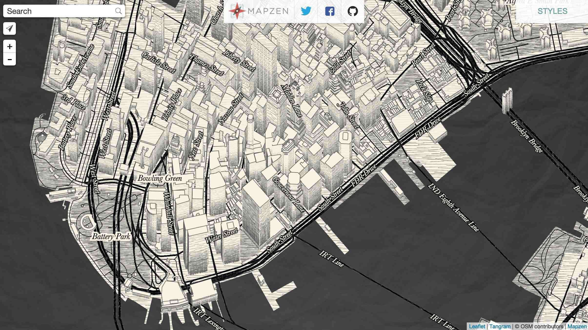
Contrappunti su Punto Informatico di domani.

***


Schermata 2013-12-22 alle 09.54.26


Così questa settimana abbiamo imparato che si può scrivere un tweet idiota prima di imbarcarsi a Londra per un lungo volo, diventare il bersaglio di una rapidissima conversazione in rete nelle ore successive mentre quell’aereo sta sorvolando l’Europa e l’Africa e trovarsi infine licenziati per quel tweet al momento dell’atterraggio.

Fra le tutele dell’Articolo 18 dello statuto dei lavoratori italiano e le prassi sbrigative sul licenziamento che vigono nei paesi anglosassoni, c’è una distanza maggiore di quella coperta da un volo intercontinentale da Londra a Johannesburg ma il caso di Justine Sacco, PR di IAC una grande compagnia americana proprietaria di marchi come Vimeo, Match.com, The Daily Beast e altri, non riguarda solo questo. Perché per quanto tu possa essere rappresentata in rete dalle tue parole esse diventano importanti ed assumono valore solo nel momento in cui vengono date in pasto ad una numero abbastanza grande di moralisti da scrivania. Che è quello che siamo un po’ tutti diventati in questi anni.

I 140 caratteri razzisti o presunti tali che sono costati il licenziamento supersonico della Sacco, ben prima di essere ascoltata dai vertici dell’azienda per cui lavorava, non valgono per quello che dicono ma per le reazioni che sono stati in grado di suscitare in tempi di comunicazioni accelerate. Un tipico caso di licenziamento per sentito dire, dove il sentito dire non è la somma di molti punti di vista ma il copia-incolla liberatorio del medesimo argomento mille volte riproposto. Non c’è nessuna intelligenza della folle dietro questa sentenza della rete, solo un’idonea spiegazione della sua stupida ed occasionale pericolosità.

Episodi del genere introducono nelle nostre conversazioni in rete un grado di casualità molto forte. La Sacco twittava da un profilo personale, con un numero modesto di follower: un account (che nel frattempo è stato cancellato ma che è possibile vedere parzialmente nella cache di Google) pieno di cose irrilevanti, come ad esempio il tweet scritto poco prima di quello che le costerà il licenziamento, dedicato al suo vicino di posto in aereo, un tedesco al quale la Sacco via Twitter consigliava con toni sarcastici l’uso del deodorante (ehi amico tedesco, sei in prima classe!). Qualche esegeta dei tweet della PR forse potrebbe trarne una indicazione contro i tedeschi? O una deduzione sul fatto che i clienti dei voli aerei in classe economica siano gente che puzza? Così sembra andare il mondo: quando si attribuisce propri valori alle parole degli altri il pasticcio è sempre in agguato.

Accade già oggi: l’analisi dei nostri segnali di rete irrilevanti, le battute scritte al volo e senza pensarci, le foto che non avremmo dovuto pubblicare, il commento rancoroso che non siamo riusciti a dominare, domani potranno essere agevolmente rivolti contro di noi per una casualità del destino o per un progetto ben orchestrato. E se una simile attenzione riceverà l’imprimatur della folla, se il numero di retweet si impennerà, se molti dei nostri lettori casuali (mediamente gente che di noi non sa nulla e che fra dieci secondi si sarà dimenticata tutto) decideranno di partecipare alla celebrazione della PR razzista allora, a quel punto, ogni nostra reputazione diversamente guadagnata, la stima per il nostro lavoro da parte dei nostri capi, la vicinanza dei nostri colleghi, non conterà più niente e noi diventeremo, come diceva il poeta, “solo una X nel ciclo dell’azoto”.

Licenziare qualcuno per un tweet senza attendere nemmeno di capire meglio cosa sia successo, senza sapere se il telefono della Sacco è stato rubato o preso in prestito, magari dal tedesco allergico al sapone seduto lì accanto, ma solo per rispondere abbastanza in fretta ad una emergenza comunicativa aziendale che vive solo nei feedback di rete è una sorta di dichiarazione di resa della nostra intelligenza nei confronti di un sistema che ci ha intossicato. Il sentiment della rete dicono, l’engagement dei clienti, il mood delle conversazioni on line. Tutta roba tossica, immaginata da tossici per altri tossici, numeri su numeri che quando non sono truccati trasmettono valanghe di informazioni che nella maggioranza dei casi raccontano con vasta approssimazione il mondo in cui viviamo.

Frugate abbastanza a fondo nel bidone della Internet planetaria e se ne troveranno di cose indecenti, stupide e razziste scritte da qualcuno che ci è vicino o perfino da noi stessi. Frugate abbastanza a fondo nei grandi frammenti di vita quotidiana che ognuno di noi mette ogni giorno on line e troverete infine la maniera affinché tutti licenzino tutti. Con solidi argomenti impossibili da ribaltare, meglio se vidimati dal tribunale assoluto dei retweet.

17 Dec 20:15

635 - Sex and Drugs and Border Changes

by Frank Jacobs
A combination of sex and drugs (and possibly rock 'n roll) is forcing two governments to change the border that divides them. The Presqu'ile de l'Islal, a small Belgian peninsula stranded on the Dutch bank of the river Meuse, is to change hands to eliminate a zone that is, to all practical effects ...

Read More
17 Dec 10:10

FITC Amsterdam – The latest and greatest digital creators from around the world

by CreativeApplications.Net Staff
FITC Amsterdam - The latest and greatest digital creators from around the world

Now in its 7th year, FITC Amsterdam 2014 is host to design, technology and cool shit from digital creators and world renowned speakers at the Felix Meritis this February. Learn about installations, web frameworks, experiential media, HTML5, creative coding, JavaScript, projection mapping, design and so much more.
17 Dec 09:42

The Flutenizer – Iregular for Baillat Cardell and fils’ 5th Birthday

by Filip Visnjic
The Flutenizer - Iregular for Baillat Cardell and fils' 5th Birthday

To celebrate the fifth birthday of Baillat Cardell and fils, Iregular decided to give their long term friends and collaborators a special present...
17 Dec 09:29

Multilevel Agglomerative Edge Bundling in JS

This is a JavaScript implementation of the paper Multilevel Agglomerative Edge Bundling for Visualizing Large Graphs (Emden R. Gansner, Yifan Hu, Stephen North, Carlos Scheidegger).

The edge bundling algorithm groups edges together to minimize the amount of ink used to render a graph. This particular paper introduces a fast technique to perform edge bundling.

Take for example this map connecting locations between the east coast in the US and western Europe:

easteurope image 1

The algorithm creates a proximity graph for the edges where each of the edges is represented by a node. Then the algorithm bundles edges as long as we’re saving some ink in the final rendering. Here’s an intermediate step on the bundling animation:

easteurope image 1

And here’s the final result:

easteurope image 1

This implementation is solely based on the paper. The license for the code is MIT.

Examples

This simple example shows links connecting locations in the Bay Area. The rendering uses 2D Canvas but could use any other rendering API.

You can see an example here.

Image of Edge bundling example

03 Dec 12:15

http://www.internazionale.it/immagini/thailandia/2013/12/03/foto-294212/

Un monaco buddista partecipa alle proteste antigovernative a Bangkok, in Thailandia. (Dylan Martinez, Reuters/Contrasto)

18 Nov 09:02

About to check out of a hotel? Before you do, here’s a...


About to check out of a hotel? Before you do, here’s a handy guide for the kleptomaniacs among us…

21 Oct 19:57

Preserving.exe Report: Toward a National Strategy for Preserving Software

by Trevor Owens

Shelved Software at the Library of Congress National Audio-Visual Conservation Center

Our world increasingly runs on software. From operating streetlights and financial markets, to producing music and film, to conducting research and scholarship in the sciences and the humanities, software shapes and structures our lives.

Software is simultaneously a baseline infrastructure and a mode of creative expression. It is both the key to accessing and making sense of digital objects and an increasingly important historical artifact in its own right. When historians write the social, political, economic and cultural history of the 21st century they will need to consult the software of the times.

I am thrilled to announce the release of a new National Digital Information Infrastructure and Preservation Program report, Preserving.exe: Toward a National Strategy for Preserving Software, including perspectives from individuals working to ensure long term access to software.

Software Preservation Summit

On May 20-21 2013, NDIIPP hosted “Preserving.exe: Toward a National Strategy for Preserving software,” a summit focused on meeting the challenge of collecting and preserving software. The event brought together software creators, representatives from source code repositories, curators and archivists working on collecting and preserving software and scholars studying software and source code as cultural, historical and scientific artifacts.

Curatorial, Scholarly, and Scientific Perspectives

This report is intended to highlight the issues and concerns raised at the summit and identify key next steps for ensuring long-term access to software. To best represent the distinct perspectives involved in the summit this report is not an aggregate overview. Instead, the report includes three perspective pieces; a curatorial perspective, a perspective from a humanities scholar and the perspective of two scientists working to ensure access to scientific source code.

  • Henry Lowood, Curator for History of Science & Technology Collections at Stanford University Libraries, describes three lures of software preservation in exploring issues around description, metadata creation, access and delivery mechanisms for software collections.
  • Matthew Kirschenbaum, Associate Professor in the Department of English at the University of Maryland and Associate Director of the Maryland Institute for Technology in the Humanities, articulates the value of the record of software to a range of constituencies and offers a call to action to develop a national software registry modeled on the national film registry.
  • Alice Allen, primary editor of the Astrophysics Source Code Library and Peter Teuben, University of Maryland Astronomy Department, offer a commentary on how the summit has helped them think in a longer time frame about the value of astrophysics source codes.

For further context, the report includes two interviews that were shared as pre-reading with participants in the summit. The interview with Doug White explains the process and design of the National Institute for Standards and Technology’s National Software Reference Library. The NSRL is both a path-breaking model for other software preservation projects and already a key player in the kinds of partnerships that are making software preservation happen. The interview with Michael Mansfield, an associate curator of film and media arts at the Smithsonian American Art Museum, explores how issues in software preservation manifest in the curation of artwork.

The term “toward” in the title is important

This report is not a national strategy. It is an attempt to advance the national conversation about collecting and preserving software. Far from providing a final word, the goal of this collection of perspectives is to broaden and deepen the dialog on software preservation with the wider community of cultural heritage organizations. As preserving and providing access to software becomes an increasingly larger part of the work of libraries, archives and museums, it is critical that organizations recognize and meet the distinct needs of their local users.

In bringing together, hosting, and reporting-out on events like this it is our hope that we can promote a collaborative approach to building a distributed national software collection.

So go ahead and read the report today!

18 Oct 14:31

It’s worse when there are multiple people involved.

by Jessica Hagy

Good artists are good secretaries

Share and Enjoy:DiggStumbleUpondel.icio.usFacebookTwitterGoogle Bookmarks

17 Oct 17:38

Speculative cartography & programmed landscapes – a chat with Benedikt Groß

by Greg J. Smith
Speculative cartography & programmed landscapes – a chat with Benedikt Groß

Benedikt Groß is a speculative and computational designer whose work is often featured on here on CAN. We recently interviewed him in order to glean a little insight about Benedikt's thoughts his recent work, 'outsider' cartography, and generative strategies.
17 Oct 17:31

Raw: a Vector Visualization Tool

by Dustin

Raw is a pretty cool (and free!) online tool for creating vector outputs of uncommon visualizations. You copy and paste your data, select a few options, and it cranks out the visualization. What’s so nice is that it doesn’t stop there – you can then save it in svg output, and then take that into Illustrator or other vector editing software for finishing touches. It’s nice to see free tools that understand that some users need professional quality outputs. Of course, you can also just download a PNG version and throw it up on the web if you want. 

The speed at which it generates the charts is also pretty impressive considering the complexities.

Treemaps with adjustable colors, size, etc:

image

Alluvial charts:

image

Dendrograms:

image

Circular dendrograms:

image

Scatter, bubble, and packed circle charts:

image image

and Binned hexagons:

image

11 Oct 15:03

D3.js 3-Hour Crash Course : UPLOAD.gif Series

by Melissa

muni_route22

Logistics

Date: Saturday, October 12, 2013
Time: 1:00 PM to 4:00 PM
Location: This is a 21+ event New Hive, 1975 Bryant Street, San Francisco, CA, 94110

Learn how to quickly generate visualizations with D3.js and walk away with an animated GIF!

Requirements:
Bring a laptop and register here. With your registration you will also receive entry to the Upload.gif Exhibit Party

About d3:
d3.js is a JavaScript library for manipulating documents based on data. d3 helps you bring data to life using HTML, SVG and CSS. D3’s emphasis on web standards gives you the full capabilities of modern browsers without tying yourself to a proprietary framework, combining powerful visualization components and a data-driven approach to DOM manipulation.

Ian Johnson

Instructor

Ian Johnson is a data visualization programmer and designer. His passion is building tools that make the creation of audio, visual, and data-driven media more intuitive and engaging for both programmers and non-programmers. As an active user in the d3.js community, he co-organizes the SF Bay Area d3 Meetup and hones his skills by helping startups visualize their data with his colleagues at the Mainstem Collective.

This crash course is part of the Upload Series: a partnership between grayarea.org and newhive.com.

Get in touch with upload@gaffta.org with any questions!!

11 Oct 14:42

Planet and moon resizer

by Nathan Yau

Moon resizing

It can be difficult to imagine the scale of planets and moons, because (1) they're really big and (2) they're far away. From where we are, the stars look pretty small, but in reality, they shiny objects might be several times larger than our own planet. In this straightforward interactive, Brian Lukis shows how planet and moon sizes compare. Simply select between the apparent view and the absolute to see how perspective seemingly changes size.

11 Oct 14:38

An infographic about infographics. How meta.

07 Oct 08:16

[Nehalenia] (Image)

05 Sep 14:27

Anni e anni che lo dico

by massimo mantellini

On Tuesday, the company plans to announce a new program, Kindle MatchBook, that lets its customers buy the electronic versions of books they have already purchased in print form for either $2.99, $1.99, $0.99 or free. That’s far less than the $11 or more that Amazon typically charges for standalone purchases of the latest Kindle titles. One benefit of MatchBook is that Amazon will let its customers buy Kindle editions of books that they purchased in print as far back as 1995, the year Amazon opened for business. The discounted Kindle edition prices apply to book purchases made in the future on Amazon too.


Amazon presenta Kindle MatchBook: chi acquista il libro di carta avrà la versione elettronica a prezzo di favore.


(via NYT)

28 Aug 10:11

Google search suggestions by country

by Nathan Yau

Search suggestions by country

Google search suggestions have transformed into a never-ending source of entertainment and a candid peek into what people look for in the world. We've seen insecurities change with age and stereotypes of states in the US. Noah Veltman banked on the locality of suggestions for a country-specific view of the world. He shows suggestions for the same query for the United States, Canada, the United Kingdom, Australia, and New Zealand.

For example, a search for "why is America" in each country depicts stereotypes and national curiosities about why America is so fat, rich, and better than Canada. Scroll down and you see suggestions for "how to", "why is there", and "why does everyone" which interestingly shows many of the same wonderings.

Now if you'll excuse me, I have to go eat bacon and swim in my pool of gold coins while I browse through my vastly superior Netflix selection.

06 Aug 12:56

Socialmente utile

by admin

socially-useful-work

02 Jul 08:08

Mapping all the rivers in the United States

by Nathan Yau

All Rivers - California

Inspired by Ben Fry's All Streets map, which showed every road in the United States, Nelson Minar mapped every river to similar effect. As you'd expect, the geography of the United States emerges without actually mapping locations.

We saw a similar map from National Geographic, which showed the rivers of the world and took home an award for best map of 2010 at Malofiej. So Minar's map isn't especially new, but the good bit is that Minar posted a tutorial and his code on github, so that you can see how such a map is made.

Most of the actual cartography is being done in Javascript, in the Leaflet and Polymaps drawing scripts. This tutorial code does very little, mostly just drawing blue lines in varying thicknesses. In addition the Leaflet version has a simple popup when rivers are clicked. With the actual vector geometry and metadata available in Javascript a lot more could be done in the presentation; highlighting rivers, interactive filtering by Strahler number, combination with other vector data sources, etc.

02 Jul 07:58

What’s the best way to *teach* visualization?

by Enrico
Yes teach, not learn. I have been writing about ways to learn visualizations multiple time (here, here, here, here, here, and, here) and others have done it multiple times too, but I am more interested in questions about how to best teach visualization now. I have been teaching a whole new Information Visualization course last […]