Russian Sledges
Shared posts
High-Concept Enchantments

Games for the Cold Hours: Gloom by Keith Baker
Russian Sledges<3 gloom

While the weather ping-pongs from sixty degrees and sunny to freezing rain and negative wind-chill over the course of a single day, or while blizzards bury cars, sometimes staying in is preferable to going out. And, if you’re going to stay in, fending off cabin fever is a necessity—winter, to me, is the time for games. One recent acquisition that’s captured my interest is a card game designed by Keith Baker and published by Atlas Games: Gloom, the game where you “make your characters suffer the greatest tragedies possible before helping them pass on to the well-deserved respite of death.” In 2005, it was given an Origins Award for Best Traditional Card Game of the Year—but I hadn’t heard of it until a few months ago.
The game is designed for two to four players, and revolves around creating the most crushing, bizarre, appalling series of grotesqueries and accidents possible for your characters—while your opponents try to play cards like “Was Delighted by Ducklings” to remove some of your negative points. (Which are actually good, in this context.)
[If you like card games, story-telling, and puns…]
At St Clement’s Hospital
Russian Sledgesnon-detroit ruin porn
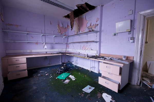
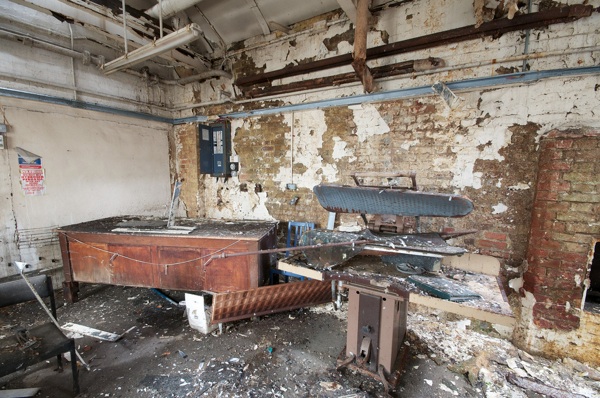
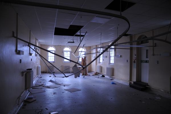
Members of City of London & Cripplegate Photographic Society were invited to record the interior of the disused St Clement’s Hospital in Mile End last year. Originally opened as the City of London Union Workhouse in 1849, it was converted to an Infirmary in 1874 and renamed St Clement’s Hospital in 1936, being used as a psychiatric unit in recent years, before closing finally in 2005.
An initiative is being launched by East London Community Land Trust to convert the building to affordable housing, but in the meantime it lies in magnificent dereliction and an exhibition of these other-wordly photographs opens tomorrow, Thursday 28th February, at the Genesis Cinema.
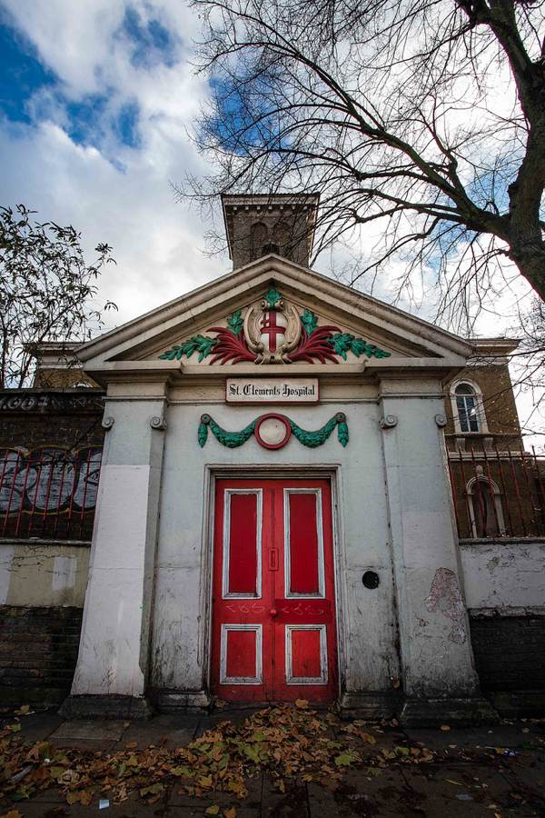
© Hilary Barton

© Hilary Barton

© Pat Mooring
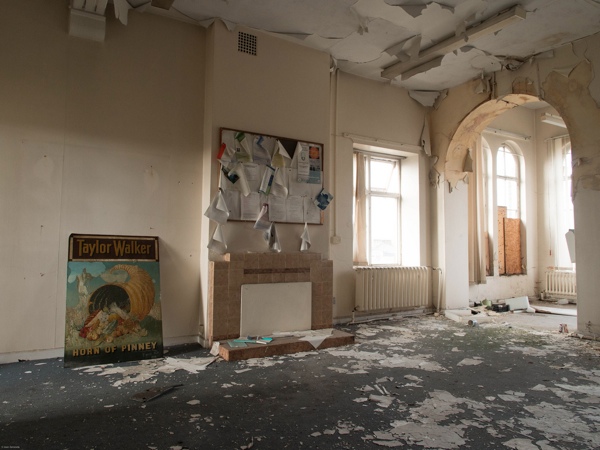
© Jean Jameson

© Bill Gilliam

© Jean Jameson

© Pat Mooring

© Pat Mooring

© Pat Mooring

© Pat Mooring

© Pat Mooring

© Pat Mooring
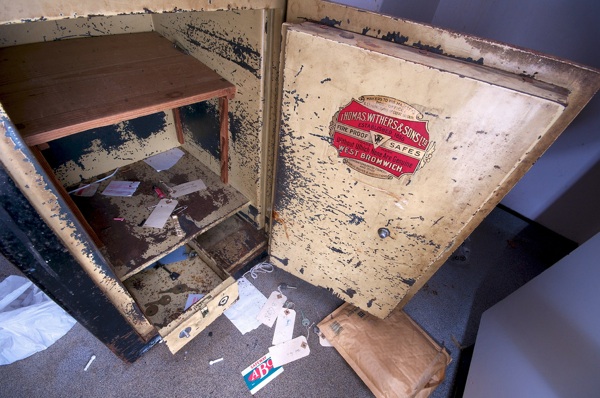
© Jean Jameson
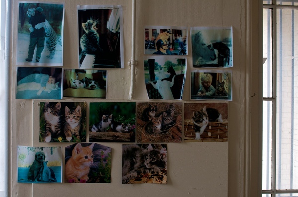
© Pat Mooring

© Pat Mooring

© Jean Jameson

© Pat Mooring
© Pat Mooring
© Pat Mooring

© Pat Mooring
© Bill Gilliam

© Pat Mooring

© Jean Jameson
bumsquash: versatilequeen: this is important for people who...



this is important for people who like to appropriate MLK as the posterboy for gentle, nonviolent, “nice,” “universally accessible” activism in order to silence angry POC.
The Stars (Are Out Tonight) by David Bowie, With Tilda Swinton
Russian Sledgesautoautoautoshare
“The stars are never far away, Stars are out tonight”
David Bowie has released the music video for his new single “The Stars (Are Out Tonight)” which is from his first album in ten years, “The Next Day” (pre-order). The video stars Bowie, of course, and his female doppelganger Tilda Swinton (who plays his wife). It was directed by Floria Sigismondi and filmed by Jeff Cronenweth.

'Pope Emeritus' Benedict XVI Will Wear White, But Trade In Red Shoes
'Pope Emeritus' Benedict XVI Will Wear White, But Trade In Red Shoes
by Scott Neuman
 Enlarge image i
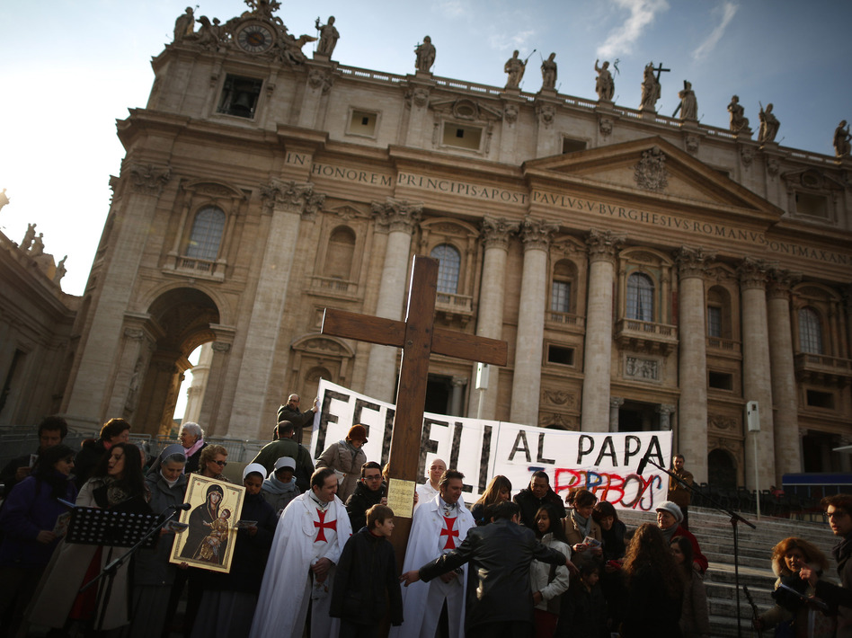
A church group prepares to pray for Pope Benedict XVI on the steps of St. Peter's Basilica on Tuesday.
Peter Macdiarmid/Getty ImagesIt's settled. When the pontiff steps down Thursday, he'll still be known as Benedict XVI and have the title of "pope emeritus." In public, he'll wear an understated white cassock and stylish brown shoes from Mexico.
The Vatican announcement on Tuesday ends speculation over some of the thorny issues that have been the subject of speculation in the days since the world learned that the 85-year-old Benedict would voluntarily step down, the first pope to do so in more than 700 years.
Vatican spokesman Jesuit Father Federico Lombardi says instead of reverting to his birth name, Joseph Ratzinger, the 265th pope will be known as "His Holiness Benedict XVI, Roman pontiff emeritus."
According to Lombardi, Benedict will continue to wear a white cassock (sans the pontifical ornaments), but forgo his trademark red shoes. Instead, he will wear a pair of handmade brown shoes given to him during a papal visit to Mexico in 2012.
According to The National Catholic Reporter, the pope's "fisherman's ring," which contains the formal seal, will be destroyed, as is custom at the end of a papacy.
" 'It will be broken at a particular moment; when that will happen is up to the college of cardinals,' said Basilian Father Thomas Rosica, who provided English translation of the press conference.
"Rosica also said the decisions regarding the retired pope's title and clothing were made by Benedict, 'but obviously he would have discussed those with other people around him.' "
Before Benedict, the last (and only) pope to resign voluntarily was Celestine V, an erstwhile hermit who served for just five months in 1294 before deciding that the job wasn't for him. Gregory XII was deposed in 1415.
George Ferzoco, a researcher in the Department of Theology at Bristol University in England, tells NPR's Philip Reeves that Celestine set the precedent for Benedict.
"The law passed by Celestine the day before he actually resigned served as the legal bedrock for the decision that Benedict XVI made to resign the papacy," Ferzoco says.
While Celestine's edict may have laid the groundwork for a papal resignation, it didn't offer much in the way of how exactly to carry that out, says Thomas F.X. Noble, a history professor at the University of Notre Dame in Indiana.
"The code of canon law doesn't spell out in detail what you have to do," he says.
"I say, with all due respect, that [Vatican officials] are making it up as they go along, because they don't have any experience to guide them," Noble says.
Benedict is expected to reside in a former nunnery inside the Vatican walls just a few hundred yards from where his successor will reside, in the Vatican Palace. But first he'll reside temporarily at Castel Gandolfo outside the Vatican until renovations at the three-story nunnery are complete.
The Christian Science Monitor reports that the new residence is:
"Set on a hill within the Vatican City State, it commands wonderful views of the terracotta rooftops of Rome, the Spanish Steps and the distant Apennine mountains, which at this time of year are coated in glistening snow.
"Gardeners were busy weeding and trimming the surrounding gardens, and a cement mixer churned away in the driveway that leads to the entrance of the residence.
"Mature palm trees and umbrella pines provide shade, and the roof of the Sistine Chapel looms so close it almost seems to be within touching distance."
Benedict's elder brother, Monsignor Georg Ratzinger, says the pope emeritus would be happy to advise his successor, if required. However, Notre Dame's Noble thinks he'll be very careful not to upstage his successor.
"I wouldn't be surprised if we don't see Benedict in public at all," Noble says. "If we do, I suspect that it won't be for quite a while."
In any case, inside a cloistered residence inside the Vatican's inner sanctum, "No one, no paparazzi or anyone else, is going to have access to him," he says.
Copyright 2013 NPR. To see more, visit http://www.npr.org/.9()) Copyright 2013 NPR. To see more, visit http://www.npr.org/.
Copyright 2013 NPR. To see more, visit http://www.npr.org/.
emoji dick and mo tweets
The news about Emoji Dick (the version of Moby Dick translated into Emoji) being acquired by the Library of Congress prompted me to capriciously go to Twitter Search to see who was talking about it. As I drilled backwards I was surprised to see the search results went back to Fred Benenson’s original Tweet about the project.
I am paying 50 cents a sentence to convert from Herman Melville's Moby Dick into Emoji on Amazon's Mechanical Turk: http://ping.fm/1cVXy
— Fred Benenson (@fredbenenson) February 10, 2009
That Tweet is from 4 years ago!
Up until recently you could only search back a couple of weeks, tops. The only sad thing is that the Twitter Search API still seems to have the two week window. I used my little twarc utility to drill back in the search results via the API and the earliest it was able to find for the same query was from 2013-02-18.
Hopefully the search window for the API will be opened up at some point, since it is at least theoretically possible now. If you happen to know any of the details about how the search functionality works I would be most grateful to hear from you.
Oh, and of course, I had to request Emoji Dick from the stacks:
PLEASE DO NOT REPLY TO THIS MESSAGE.

STATUS: Your request has been received.
REQUEST ID: 243106235
SEND TO: Adams Charge Station (LA 5244) - Staff
REQUEST RECEIVED: Mon Feb 25 12:56:19 EST 2013
TITLE: Emoji Dick ; or The Whale / by Herman Melville ; Edited and Compiled by Fred Benenson ; Translation by Amazon Mechanical Turk.
AUTHOR: Melville, Herman, 1819-1891.
CALL#: PS2384 .M6 2012
The one-time-cataloger in me thinks that there was a missed opportunity to add a uniform title to the LC catalog record…. But the title statement of responsibility mentioning that it is a translation made by Amazon Turk more than makes up for that!
Thanks Jay for letting me know what is going on at my own place of work.
Oscar winner, Jennifer Lawrence


Oscar winner, Jennifer Lawrence
The Doctor Who-James Bond Connection
Photographer Bill Gekas Shoots Portraits of his Daughter in the Style of Classic Paintings

Australian photographer Bill Gekas creates elaborate portraits of his five-year old daughter that are inspired by classic paintings. Gekas talks about his photography process in this interview with Digital Photography School.


The Wu of Maker's Mark
Russian Sledgeswhiskey/philip k dick autoshare
Never mind whiskey aficionados; tongues on even vodka lovers were wagging earlier this month over a rare public relations stumble in Kentucky. Rob Samuels, COO of Maker's Mark, announced that the alcoholic strength of the company's signature bourbon was to be lowered from 90 proof to 84 proof.
The company had announced, quite literally, that it was watering down the product.

I was struck immediately by the resonance of Samuels' announcement with Philip K. Dick's 1962 novel The Man in the High Castle. The book depicts a world in which Germany and Japan emerge victorious in World War II. Between them, they conquer and divide a disgraced former United States. I must have been ten when I read it first, but Dick's depiction of wu — a slippery concept applied to handcrafted jewelry in the book, but applicable to whiskey here — has stayed with me for more than thirty years.
 It wasn’t indignation over the decision to dilute the whiskey or even anger, really, I felt. Rather, it was sadness. Another layer on our ever-thickening patina of loss. True, Americans have experienced great gains in recent decades in fields such as medicine, technology, and publishing. But we have suffered a concomitant erosion of our greatness. Heroes once idolized have been exposed as flawed — sometimes deeply flawed — humans; OJ Simpson, Lance Armstrong, Joe Paterno, John F. Kennedy, Michael Vick. Endless obstructionist caviling among our politicians have led many to despair that we will ever be better off than our parents.
Our entertainment has grown recursive; witness the remakes of The Texas Chainsaw Massacre, Arthur, The Karate Kid, or Gus Van Sant's scene-by-scene reshoot of Pyscho, movies that did not need to be remade, that arguably should not have been remade, that do not leave the world a better place in their passing. Our homes, by and large, are not built as well as those of a hundred years ago. On it goes. NASA's space program: gutted. New Orleans: flooded and nearly lost to us. The lunacy of creationism taught as fact to defenseless children who will be unable to compete for jobs as adults because they simply will not understand how the natural world works as well as their grandparents did.
Into this morass steps Maker's Mark with another assault on our faith in the goodness of humanity. And why? Why reduce the proof of this iconic whiskey? Profit. Global thirst for American whiskey has grown steadily in recent years and supply has not consistently kept pace with demand. Maker's in particular has experienced shortages, despite a 2012 expansion that increased production capacity by some 45%. Watering the whiskey was seen as a way to increase almost instantaneously the available inventory by 6%.
Deplorable things happen. Every day. Drove my Chevy to the levee and all that. But it's not all odious Kardashians, pedophile priests, and watered down whiskey. Not even close. There are good things as well. Whether it's the residuum of my midwest upbringing or a Catholic education that drives me to be what the Jesuits dubbed a man for others, I choose to spend time making and pursuing things that make the world better. As the California designer Mike Monteiro writes in Design in a Job, "[Y]ou are responsible for what you put into the world...and you can only stand as proud of the work as its benefit to society entitles you to." Amen, brother. Whether it's websites or whiskey, we shoulder a moral responsibility for what we bring into the world.

Until the day it wasn't, the day we were told it was to be cheapened for the masses. And that brings us back to Dick's novel. In The Man in the High Castle, Robert Childan, a dealer in historic Americana — Colt revolvers, Buffalo Bill's head in a jar, Civil War recruitment posters and the like — has presented a piece of modern American jewelry to Paul Kasoura, a wealthy young Japanese civilian newly stationed in occupied San Francisco. Kasoura secretly laughs at Childan for presuming to present such a piece, but soon develops an unexpected attraction to it.
"Here is a piece of metal which has been melted until it has become shapeless. It represents nothing. Nor does it have design, of any intentional sort. It is merely amorphous. One might say, it is mere content, deprived of form.”He goes on.
“Yet,” Paul said, “I have for several days now inspected it, and for no logical reason I feel a certain emotional fondness. Why is that? I may ask. I do not even now project into this blob, as in psychological German tests, my own psyche. I still see no shapes or forms. But it somehow partakes of Tao. You see?” He motioned Childan over. “It is balanced. The forces within this piece are stabilized. At rest. So to speak, this object has made its peace with the universe. It has separated from it and hence has managed to come to homeostasis.”
“It does not have wabi,” Paul said, “nor could it ever. But—” He touched the pin with his nail. “Robert, this object has wu.”Wu, Dick tells us though Kasoura, is a quality that allows us to experience a tranquility associated with holy things. It is not necessarily apparent, even to its maker who may recognize only that the object satisfies, that it is complete. By contemplating such things, we gain wu ourselves. Kasoura is profoundly moved by it. With subtle discomfort, he informs Childan that an associate wishes to replicate the piece in plastic or base metal — tens of thousands of units — for sale to the poor and superstitious in Latin America and Asia. The deal, he confirms, would be worth a great deal of money. “What about wu?” Childan asks. “Will that remain in the pieces?”
Kasoura is silent, but we know the answer. It will not.
Childan could take one of two paths. One could make him immensely wealthy. The other is less clear. He seizes the decision to meet the exporter. Then, in a moment of clarity, he realizes the trap.
Whole affair a cruel dismissal of American efforts, taking place before his eyes. Cynicism, but God forbid, he had swallowed hook, line and sinker. Got me to agree, step by step, led me along the garden path to this conclusion: products of American hands good for nothing but to be models for junky good-luck charms.Which path does Childan take? Read the book.
Maker's Mark, however, made the honorable choice. Chairman emeritus Bill Samuels, Jr. joined Rob Samuels in a conference call to confirm that fans' protestations were heard loud and clear. Geoffrey Kleinman relates their conversation here at DrinkSpirits.com and confirms that, after just a few days of online furore, the whisky will return at 90 proof.
Well, I'll be damned. Turns out there's room on my shelf for Maker's after all. And if, from time to time, it's not available, that's ok.
Goes well with:
- Mike Monteiro's 2012 Design is a Job is ostensibly selling design for web designers, but it's a practical little manual for creative types of all stripes — and those of us who work with them.
- We also disdain watered down bacon. Maynard Davies aims to show how bacon was done the old way.
- Don't know Dick? You may know more than you think. His stories have been made into movies such as Minority Report, Blade Runner, Total Recall, and A Scanner Darkly. Pick up a copy of The Man in the High Castle at your neighborhood bookstore or online here.
- Got a thing for Dick? You may also enjoy these Charles Bukowski postal stamps.
- David Toczko's 2012 book, The Ambassador of Bourbon: Maker's Mark and the Rebirth of America's Native Spirit, presents over 250 photos of the Maker's Mark distillery, including fermenting mash, barrels in the rickhouse, hand-dipping of the those red wax seals, and some archival material. Introduction by Bill Samuels, Jr. and foreword by Rob Samuels. Pick up a copy here.
Watch K-Pop Tasty Road online | Free | Hulu
Russian Sledgeswatch episode 2 for my Asian tourist doppelgänger
pretzelbasket: Extra batteries? Badass denim? Cyberpunk as...
Russian SledgesSHADOWRUN

So You Think You Can Pope
How to get to the top of the Catholic Church:

Complex regexp worked exactly as expected

Submitted by Leprosy
French Artist Gives Caddisfly Larvae Gold & Jewels to Build Their Protective Cases
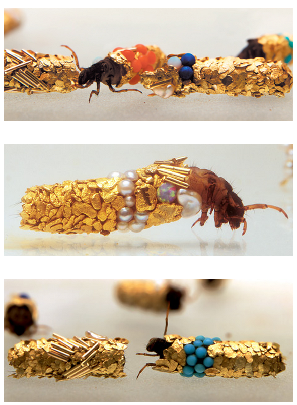
Generally, the protective silk cases the caddisfly larvae build are decorated with gravel, sand, snail shells, twigs or other common debris but French artist Hubert Duprat gave them shinier materials. He introduced beads, pearls, turquoise, and 18-karat gold pieces into their environment and let them construct tiny gilded sculptures. Duprat has been collaborating with the larvae since the 1980s. Learn more about his work at Cabinet Magazine.
photos by Jean-Luc Fournier via Cabinet
Supercut of the Phrase “This Isn’t TV, This is Real Life!” in TV Shows
New York comedian Bryan Menegus created the Slacktory Supercut video titled This isn’t TV, this is real life!, which highlights the phrase being spoken in popular television shows. The original concept for this supercut was suggested by Emily Nussbaum, a TV Critic for The New Yorker.
No wait, actually this is TV.
submitted via Laughing Squid Tips
Dragon Quest x Animal Crossing It’s Saturday afternoon, so...
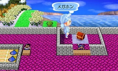


Dragon Quest x Animal Crossing
It’s Saturday afternoon, so you know what that means: shots of fun stuff you can do in Animal Crossing: New Leaf!
Here we have a player dream walking through a Dragon Quest-themed town someone’s created. This village has it all — monsters, shops, inns, Slimes, and even Torneko!
You can see more shots of the Dragon Quest town here.
PREORDER Animal Crossing: New Leaf (June 9), upcoming games
"In short, the record shows that there is only one Evil Empire in baseball and it is the New York..."
- Judge rules that Yankees are baseball’s only ‘Evil Empire’ | Big League Stew - Yahoo! Sports
Nick Sherman on Typography: Font Hinting and the Future of Responsive Typography
Font hinting has been the source of countless headaches for type designers and users. Meanwhile, some of the most fundamental and important elements of typography still can’t be addressed with the web of today. Rather than being seen as a tedious chore whose demise will be celebrated, hinting might actually provide the essentials for truly responsive design, and vastly expand the possibilities of digital typography for designers, publishers, and readers.
The fundamentals of hinting
Type and web designers usually think of “hinting” as instructions built into digital fonts to improve their rendering on a grid of pixels. Hinting pushes the points of a font’s Bézier curves around according to contextual conditions, such as the font’s rendering size. Though it’s now associated with type on screens, hinting was first used in the 1980s to improve rendering on low-resolution printers.
Thinking about it in these terms, hinting is responsive type that existed before the web: The font performs a media query of sorts to learn its size, then responds by repositioning points in each glyph according to built-in instructions, or “hints.”

In other words, hinting is to fonts what responsive layout is to websites. It allows a single font file to adapt to a variety of contexts, the same way CSS allows a single HTML file to adapt to a variety of contexts. In fact, Håkon W. Lie used the term “presentation hints” in 1994 to summarize his original proposal for CSS.
Hating hinting
Developing hinting instructions can be extremely difficult, expensive, and time-consuming. Automated hinting tools have begun to ease some of this pain, but for smaller body type—often the most important type on any page—there’s still no substitute for the quality that can be achieved through tedious manual hinting. That’s why most people who deal with hinting today eagerly anticipate a future when they’ll no longer need to worry about it. They optimistically cite advances in display resolutions and rendering software as sure signs that hinting will be obsolete within a few years. (Such claims have been made for the past twenty years, and will probably continue to be made for some time to come.) But this ardent desire to see the end of hinting is based on a narrow understanding of what hinting can be.
I used to be among the impatient hinting haters, cursing Apple (yes, Apple—whose rendering engines now all but ignore hinting data) for popularizing the concept of hinted screen fonts with their TrueType spec in 1991. And I would be lying if I claimed that the issues currently related to hinting don’t still cause me trouble. However, I’m very reluctant to dismiss the general concept of hinting just because current implementations of the idea are limited and hard to deal with.
Pushing toward macro-hinting
The hinting that people know and use today only represents a small sliver of the possibilities for contextual typeface modification. Considering that it’s impossible to query a font’s absolute size—never mind things like font smoothing conditions or physical pixel density—many of the most basic fundamentals of typography, typeface design, and readability are still lost on the web.
With better media query features in place, typefaces could be endowed with what I call macro-hinting: intelligence to modify a typeface according to variables beyond the nominal size. Such modifications could happen automatically according to the instructions of the type designer, or they could be adjusted by the specifications of the typographer.
A few contextual typeface modifications that could be possible with macro-hinting include:
- Ascenders and descenders that dynamically shrink when the line height is reduced.
- Glyphs that condense as column width is reduced.
- Hairlines that are always exactly one pixel, gradually increasing the overall contrast between thick and thin strokes as the size increases. (This would be a hit with fashion magazines.)
- Subtle weight adjustments to give a consistent feeling across different rendering environments, without needing separate font files.
Other context-specific typeface modifications
The idea of modifying a typeface’s letterforms for different situations is nothing new. As far back as Gutenberg, each size of a letterpress typeface has traditionally featured “optical size” variations that altered the spacing, proportions, weight, and other details for optimal results. This concept has been applied to some digital typefaces that are offered as “Text” and “Display” versions, for example.

In addition to optical size variations, some typefaces are offered in a range of “grades”—subtly different versions that allow for a high level of consistency across printing processes, paper stocks, and even humidity levels that affect ink spread.

Adobe’s Multiple Master (MM) technology allows users to change a typeface along multiple axes such as weight, width, and optical size. Though MM technology is now mostly obsolete in typesetting software, it’s still used by type designers to generate font families, and—interestingly—in Adobe Acrobat for scaling generic fallback fonts to match the proportions of missing fonts.
For another example of contextual typeface modifications, applications like InDesign can tweak spacing or glyph widths for better copyfit. These automated modifications to a typeface have a very limited range of acceptable use, but they afford typographers that much more flexibility when needed.

As with hinting, these methods of varying a typeface’s design exist to improve performance in context. The interesting twist is that, like hinting, they all come from the relatively static world of print typography, but are still largely absent from the otherwise dynamic world of web typography, which seems like their natural niche.
Static fonts floating in the seas of dynamic layout
In Tim Brown’s Universal Typography presentation (go to 15:50), he describes contemporary web typography as a practice in abstraction, determining limits, and defining ranges of acceptable solutions:
We used to think about typography as a set of fixed decisions, but now we understand it as a continuum of conditional logic.
I completely agree with him, but I wish the continuum didn’t end when it reached the base level of the typeface. In the current world of web typography, defining a typeface is still very much about fixed decisions. Web browsers can automatically interpolate the position, shape, and size of any element on the page, yet when it comes to the most basic typographic forms, there’s no instrument for adaptation.
We are beginning to see cases where designers will detect the users’ conditions and serve different font files accordingly. This method, which I call “detect and serve,” shows that there is still a need for context-specific typeface modifications on the web.
Indeed, until there is universal support for WOFF, even a single static type style requires an array of fonts in different formats just to match the requirements of different browsers. Providing real-world solutions for larger type families, or even the lowest level of contextual optimization, can require dozens or even hundreds of mostly redundant files.
As you can imagine, generating and serving individual font files for every possible situation quickly gets out of hand. The same way that web designers shouldn’t have to maintain multiple HTML files for every conceivable viewing condition, a broader implementation of the concepts behind hinting would allow a single responsive typeface to dynamically provide optimal results across a multitude of contexts.
Evolution, not extinction
In a series of follow-up columns, I’ll address the relationships between typefaces and media queries in more depth. For now, let it suffice to say that many pieces are still missing from the puzzle of responsive typography on the web.
Solving this puzzle will take time. Inventing new standards is not easy, never mind getting them widely supported. Bringing these ideas into practical reality will require new tools, coding languages, working groups, and public education. It won’t happen overnight.
In the short to medium term, we’ll see increasingly complex hacks to achieve similar results. The “detect and serve” method will likely become more popular in the near future, with font vendors generating arrays of distinct variations on each typeface. Some may even develop systems to spit out font files on demand to match each user’s situation. People will still complain about hinting, and hinting will continue to be a struggle.
However, at the end of the day, I don’t expect to see the extinction of hinting anytime soon. Instead, I foresee it evolving toward more advanced methods of describing digital letterforms. It may sound like science fiction, but typefaces will eventually gain more awareness of their internal structures and external surroundings. The concepts that underly hinting will only become more relevant as the scope of responsive design continues to expand.
Have you ever wondered what a car would look like covered in 5 1/4-inch floppy discs?
Russian SledgesWhen I first spotted this car on Oxford St last year, it had Washington plates that said DSKDRV, and an additional CueCat as a hood ornament.
Wonder no more (and note the CueCat on the dash). Spotted around Camberville.
Via Boston Reddit.
imlittlemisssunshine: #SMACK THAT UP ON THE FLOOR #SMACK THAT...

#SMACK THAT UP ON THE FLOOR #SMACK THAT GIMME SOME MORE #SMACK THAT TIL YOU GET SORE #now turn to page 394
oh my GOD the tag
CRYING
Laughing at this for about 10 minutes now.


realboats4sale: “A picture by seventeenth-century microscopist...

“A picture by seventeenth-century microscopist Nicolaas Hartsoeker of the human sperm, showing it as containing a microscopic infant folded in a fetal position. This already-formed infant supposedly grew larger during fetal development, with the mother’s egg providing only the nutrition for its growth.”
R.I.P. Ray Cusick, the designer who helped make the Daleks terrifying
 Doctor Who writer Terry Nation conceived of the Doctor's perennial foe, the extermination-happy Daleks, but it was BBC designer Ray Cusick who created their pepperpot look. Now another bright light has fallen from the Doctor's sky as the BBC reports that Cusick passed away Thursday due to heart failure. More »