The Librarian, Giuseppe Arcimboldo
Three Maps of the Proposed Panama Canal (1895)
 Map of the proposed route of a Panama Canal, from 1895, Part I. Map of proposed Panama Canal I Date: 1895 Author: unkwn Dwnld: 01, 02, 03 Print Availability: See our Prints Page for more details pff This map isn't part of any series, but we have other engineering maps that you might want to check out. Three maps illustrating the French plan for a proposed Panama Canal between Nueva...
the BIG Map Blog - Interesting maps, historical maps, BIG maps.

When in The Fifth Element the Mangalore Aknot calls Zorg to report that the “mission is accomplished,” we get a few seconds of screen time with Zorg’s secretary who receives the call. During this moment, she’s a bit bored, and idly shoves a finger into a small, lipstick-case sized device. When she removes it, the device has colored her fingernail a lovely shade of #81002c.

The small device is finger-sized, the industrial design feels very much like cosmetics, and its simple design clearly affords inserting a finger. There’s also a little icon on the side that indicates its color. This one device speaks well of what the entire line of products might look like. All told, a simple and lovely interaction in a domain, i.e. cosmetics, that typically doesn’t get a lot of attention in sci-fi.
But what is even more remarkable is that this isn’t the only fingernail interface in the Make It So survey. There is one other, 7 years earlier, and it happens to be used by someone with the exact same job. This other interface comes from the 1990 movie Total Recall.

As you can see, this receptionist has an interface for coloring her nails as well, but the interaction is entirely different. This device has something like a a tablet with a connected stylus. It displays 16 color options in a full screen grid. She selects a particular color with the tap of the stylus. Then when she taps the stylus to a nail, the nail wipe-transitions to the new color from the tip to the cuticle.

This device is cumbersome. It’s not something that could fit into a purse. Does she just leave it on her desk? Doesn’t her supervisor have opinions about that? My sense is that this is something better suited to a salon than an office space.


As a selection and application mechanism, the stylus is a bad choice. It requires quite a bit of precision to tap the tip of the nail. Our old friend Paul Fitts certainly would use something different for his nails. Since the secretary has to have to have some kind of high-tech coating, perhaps similar to electrophoretic ink, why is the stylus necessary at all? Can’t she just tap her fingernails to the color square of her choice? That would disintermediate the interaction and save her the hassle of targeting her nails with that stylus, especially when she has to switch to her off-hand.
The color display poses some other interesting problems as well. It needs to show colors, but why just 16? We don’t see any means of selecting others. Are these just this season’s most popular? Why not offer her any color she likes? Or some means of capturing her current outfit and suggesting colors based on that? Even the layout is problematic. Because of the effect of simultaneous contrast, the perception of a color alters when seen directly adjacent to other colors. These squares should have some sort of neutral border around them to make perception of them more “true.” But why should we burden her with having to imagine what the color will look like? Show her an image of her hand and let her see in advance what the new color will look like on her fingers. Any sort of low-level augmented reality would help her feel less like she’s picking paint for her living room wall.
Comparing the two, I’d say that The Fifth Element fingernail-o-matic wins out. It’s more personal, more ergonomic, fits into the user’s lifestyle more, feels more fashionable than techy (which that receptionist clearly cares about). Yes, it’s more restricted in choices, but I’d much rather figure out how to augment that little device with a color selector than try to make a stylus and tablet fingernail-o-matic actually work.

Russian Sledges'Is “pretentious” some asshole’s weird way of saying “correct”? Because these are all _correct_.'--RRO

By Michael McWhertor on Apr 17, 2013 at 8:17p
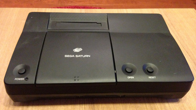
One of two alleged prototypes of a Sega console codenamed "Pluto" has been photographed and detailed on the Assembler Games forums by a poster who says he's a former employee of the company. Pluto, he says, is a variation on the Sega Saturn, with a built-in NetLink modem, that never made it to production.
The hardware, said to be about 14 years old, is reportedly in working condition, but region-locked. The poster in possession of the hardware, who goes by the handle Super Magnetic, describes the hardware in a series of posts.
"The front features two controller ports, and on top you have a flip-top drive bay, a cart slot, a Power button, and the venerable Reset button," the poster wrote. "Note that the logo still says Saturn, so I'm guessing the Pluto codename was simply that, and they were thinking of branding it with the Saturn name. (The logo is printed on production-style though, so I'm guessing they were fairly serious about this one.) The left and right sides feature beautiful-and-exotic vents, while the back is standard Saturn, save for the Netlink ports. The bottom has nothing of note except for the "PLUTO-02" sticker (which is, of course, of note)."
Sega's NetLink modem was compatible with a handful of Sega Saturn games, including Virtual-On, Sega Rally, Saturn Bomberman and a special version of Daytona USA.
Pluto was one of many reported planet-themed codenames for Sega hardware. Sega's 32X add-on was originally codenamed Mars and a scrapped 32X/Genesis combo unit was codenamed Neptune.
Dave Winer introduces Fargo.io, a web-based, ad-supported outliner that stores to Dropbox. It looks nice and it sounds like just the beginning to a bigger project and importantly, it uses OPML for import and export.
By way of Taking Note

Good news everyone! Hive is now my legit job.
Special thanks to my current employer Tivix, who is sponsoring me and this project. For the next month I will be working on Hive with Tivix and all it’s resources are at my disposal.
What does this mean for Hivemined?
I can now focus on this 100% and get it out the door asap. (get yourself ready)
I will be bringing in at least one other person who is 100% focused on Hive as well.
I also will be getting help from some of the most talented people I know and already work with.
With their help, along with my full attention, you can get it in your hands way faster and hopefully with fewer bugs.
This is super exciting news. I couldn’t ask for anything better. HUGE thanks to Tivix for giving me this opportunity and resources to see Hive come to life. (I think they got tired of me always talking about it and spending all my free time on it, lol)
To you, the community: thanks for sticking with me! This is now happening without a doubt and should arrive way faster. Expect more updates, we want to be very open about what’s happening and keep you in the loop.
Lastly, the answer to Beta keys is soon. I’ll have a more concrete answer hopefully late next week.
I can’t wait, it’s gonna be awesome.
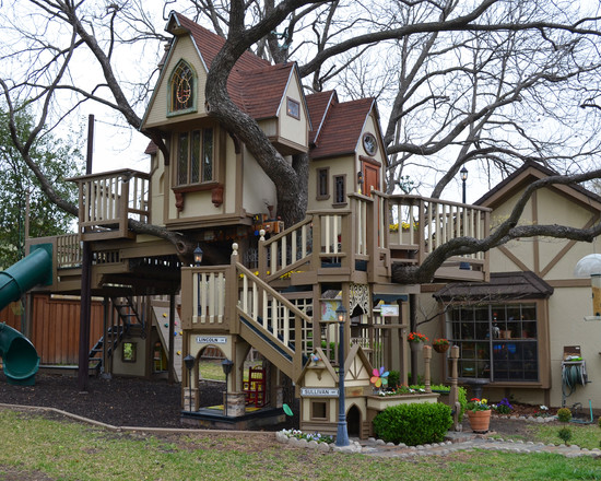
Nine years ago Steve and Jeri Wakefield of Dallas began work on an incredibly elaborate tree house for their two grandsons. They commissioned an architect friend, James Curvan, to design and build the house in a pecan tree in the couple’s backyard. The 100 square foot tree house took three months to build, and over the years it was upgraded to keep pace with the growing grandchildren. The finished tree house features two decks, two sleeping lofts, a zipline, suspension footbridge, and crow’s nest. It is also air-conditioned—a necessity in Texas. The interior is laid out like a miniature family home and features vintage furniture and decor. The Wakefield’s grandchildren are now grown up, but the couple keeps the house lively by opening it up to neighborhood kids.


photos by Sarah Greenman
Russian SledgesI know where this is!
Russian SledgesIn an email sent April, Rep. Peter Hansen of Amherst referred to a speech given by another lawmaker, who described how he had been able to retreat without using deadly force in public.
‘‘There were two critical ingredients missing in the illustrious stories purporting to demonstrate the practical side of retreat. Not that retreat may not be possible mind you. What could possibly be missing from those factual tales of successful retreat in VT, Germany, and the bowels of Amsterdam? Why children and vagina’s of course. While the tales relate the actions of a solitary male the outcome cannot relate to similar situations where children and women and mothers are the potential victims."
    
|

Though a lot of ruins leave us with the shivers, there's a good reason to fear these abandoned power stations. They're full of dangerous substances and deadly gadgets. Plus, how can you really be sure they've been entirely shut down? You could be in for the shock of your life.
|
|

Having put records on vintage X-rays and liquid-filled vinyl, Jack White is taking his love for the LP into a whole new—or, rather, old—direction. White’s Nashville-based Third Man Records store is adding a refurbished 1947 Voice-O-Graph machine to its Novelties Lounge, giving fans the ability to immediately press their own voice and/or music to vinyl.
The machine can put up to two minutes of audio on a 6-inch record, meaning any rube off the street can be a published musician now. According to Third Man, the machines were an arcade staple during the middle of the 20th century (you may remember their cameo the movie Badlands) before disappearing in the ‘60s and ‘70s. Like their vintage compatriots, patrons of the Third Man Recording Booth will be encouraged to mail their LP messages to friends and family, with the store providing special mailers and stamps for that ...
Read moreRussian SledgesM.I.L.F.
On the other hand, Levi-Strauss, the inventor of denim jeans is an example of structuralist opposition. He made the denim jeans fashionable and popular.
One day my boss comes up to me and out of the blue says
My boss: “”[last name] , hey [last name] is that your husband’s name?
Me: No I didn’t take my husband’s last name.
Boss: …
Me: I’m a feminist, that’s why
Boss: I could not stand it if my wife thought she could keep her own name. She has my name. We are going to have to work on this, you will take your husband’s name by the end of the year.
Russian Sledgesfriend-of-a-friend-of-a-friend
|
|
Russian Sledgesattn overbey

CONNECTICUTIANS: I will be conversing on stage with Carrie Brownstein and Baratunde Thurston on Saturday, May 4.
They call it FUNNY SMART PEOPLE, but I am pretty sure that I am a robot implanted with human memories, so caveat emptor.
I promise to wear or change into a Hartford Whalers shirt.
Details are HERE.
That is all.


Salt Lake City UTA TRAX and FrontRunner: now officially the most embarrassing transit maps in the U.S.
Seriously. Do they even care at all any more?
With the opening of the new TRAX light rail Green Line extension to the airport, the UTA has updated their website with new maps. Well, only partially, which is bad enough in itself. If you go to the System Maps page, you still get a combined pre-extension TRAX/FrontRunner map (reviewed here, Dec 2012, half a star). However, if you click on the TRAX or FrontRunner icons, you can get to the updated individual maps for each service as shown here.
These maps are… beyond appalling.
It’s painfully obvious to me that a low-quality JPG has been exported for each map, and the service that is not meant to be shown has been deleted in Photoshop using the eraser tool. And they’ve done a really bad job of it, too, sloppily deleting parts of route lines, station markers and labels all over the place. On the TRAX map, the Red and Blue lines inexplicably change to shades of grey through the city center, and a completely undeleted part of the FrontRunner route remains visible (also in grey!). Stations on the FrontRunner map that would interchange with TRAX still have their wider interchange markers, even though there’s no TRAX routes shown to interchange with.
Even the legend at the bottom of the maps have had the same treatment: there’s room for the three TRAX lines to slot neatly into place on the FrontRunner map and vice versa. I’ve overlaid these two maps on top of each other in Photoshop: they fit almost perfectly.
I recently said that designers shouldn’t work for free, but in this case, I take it all back. Please: can someone – anyone! – design a decent rail map for the UTA and make them use it, because this is is just pathetic.
ZERO STARS.
![]()