vuild studio's structure uses traditional japanese joining techniques by ways of wooden driving plugs, in order to create their temporary, transportable bridge.
Located in the inner-city suburb of Surry Hills, New South Wales, Australia, this renovated apartment can be found in the historic Edwards & Co. building, one of the area’s most recognized structures. Originally a tea factory in the 1920s, it had most recently been used by an advertising agency before architect Josephine Hurley was hired to transform the 300-square-meter (approx. 3229-square-foot) space into a private, two-story residence on the top two floors.
The main level features large arched windows that give the space a distinct look while providing plenty of natural light to the interior. The understated design was thoughtfully executed to respect the building’s history, while modernizing it for everyday life.
A fairly neutral palette of warm grey, rich wood, and crisp white surfaces were used throughout for practicality.
The original brick was left untouched giving the open space character while also providing contrast to the white elements.
Hidden behind what looks like a closet door is a bathroom.
The top floor used to be the caretaker’s office, which they demolished to create a guest retreat. It’s basically its own apartment.
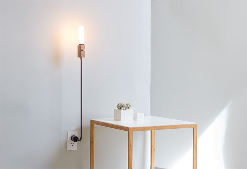
Behind the grey doors is a hidden kitchen letting you slide them shut when you want to keep it under wraps. Copper piping was used in a random design to create light fixtures in the main living space.
We’ve been following the evolution of Martin Lesjak and Anastasia Su’s 13&9 brand since its launch in 2013. Since its introduction, they’ve partnered with many international companies, like Artifort, Buzzispace, Mohawk Group, Viteo Outdoors, and more, along with designing and producing their own products including jewelry. One such partnership is with Belgian lighting firm Wever & Ducré, which led to the Rock Collection, a series of lamps and tables made from materials that were intended for other purposes. The results are lamp shades made from razor-thin stone veneers and tables that reflect the shape of the lamps’ frame. For this Deconstruction, 13&9 gives us insight into how this collection is made.
1. Programming the CNC cutter
2. Preparing the CNC machine
3. Quality control of the sheets before the cutting process
A trip to the Louvre Museum inspired Ákos Huber to design the Wing Sofa, a bent wood sofa with flexible ropes for the seat. Studying Nike of Samothrace, a massive marble sculpture with wings, Huber was taken with the lightness of the piece, which are translated into the design of the sofa.
The sofa’s shape is made from a beech plywood frame that appears to be slit horizontally down the center. To form the seat, 6mm climbing rope is woven across the opening and connected on either side. While the rope remains flexible, it helps brace the overall structure.
San Francisco-based Volata Cycles have engineered a bicycle worthy of a “2.0” designation, one designed to work in unison with 2.4″ app-based embedded computer integrated into the handlebar.
Volata Cycles is the creation of automotive engineer Marco Salvioli and Mattia De Santis, who was designing and manufacturing high-concept bicycle designs in Milan.
Like existing bike add-on computers the unit can track speed and performance; the Volata adds weather forecasting, turn-by-turn directions, heart rate monitoring, and smartphone notification about performance and security (a GPS-based anti-theft system works with a motion detection unit, monitoring the bike status, sending notifications about the bicycle’s location in case of theft).
Volata Cycle founders Marco Salvioli and Mattia De Santis designed Volata to merge their passion for cycling with more refined integration of technology, collaborating between a San Francisco headquarters and their R&D and Design office in Milan, Italy.
The bicycle isn’t just connected in terms of rider info/data, but also mechanically modified: a belt drive transmission replaces the conventional chain, eliminating traditional gear system maintenance; paired with an internal-gear hub Shimano Alfine 11 di2 with electronic shifting, riding around town on this bike should be comfortable for all fitness levels. Automated front and tail lights with a 96 dB electronic horn also add an extra layer of safety for bicyclists navigating city traffic.
Heart rate monitoring can be used in connection with an Apple Watch.
A front-hub dynamo charges the internal battery while peddling, providing enough recharge power to operate the bicycle’s onboard computer.
The Volata is currently available for online reservation at $299 at www.volatacycles.com. Note, that’s just the reservation price…you’ll owe another $3,200 upon delivery, beginning next year in July 2017, the price of being a first adopter!
For ping pong players who also are design enthusiasts, the Woolsey Ping Pong Table is the perfect table for you. Designed by Sean Woolsey, it is a sleek, multifunctional table that fits the International Table Tennis Federation specs, and features a solid black walnut top. Of course, the paddles are not to be outshone. Made from walnut and maple, the paddles have a matte black exterior, and are perfect for batting around five 3 star Japanese balls. The table sits on solid walnut legs, and has a powder-coated steel net that can be easily removed. Need a dining table? The Woolsey Ping Pong Table can be converted to a dining or conference table as well.
Since the earliest days of her artistic career, Michigan artist Anne Mondro has been captivated by human anatomy, creating her own interpretations of internal organs and body forms through crocheted sculptures. Working with thin steel and copper wire, she spends hundreds of hours on a single artwork, manifesting her own interpretations of hearts, lungs, limbs, and even entire bodies. “Crocheting wire enables me to create interwoven forms that are structurally strong, yet visually and physically light,” Mondro shares. “The forms allude to ethereal silhouettes associated with shadows, ghosts or decay.”
Though anatomy is an ongoing focus for Mondo, she’s also lent her crocheting abilities to the construction of more mechanical objects, namely the recreation of a Model T engine for the 2011 Love Lace exhibition at the Powerhouse Museum.
Late this year Mondo has an exhibition at Ceres Gallery in New York titled Intertwine, and you can explore more of her work here. (via Bored Panda)
MeetThePugs – Funny images of a pug’s everyday life.
Loulou the little pug could be the next star that follows the footsteps of Grumpy Cat and all the other animal internet celebrities. But only this fact is no reason to get featured on WE AND THE COLOR. This is actually not a page for cute animal photos. No but I’m rather intrigued by the funny and well composed concept of the photos as well as the human traits of this little dog. Loulou is the official face of MeetThePugs, a community dedicated to connect pug lovers from all over the world. Everybody is welcome to post and share his passion for pugs with funny pictures, videos, etc.
You can find MeetThePugs on all major social media communities such as Facebook, Twitter, Instagram, and Tumblr.
Loulou the pug in lazy mood.
A little scared?
Happy Birthday! The little dog turns one.
In anticipation.
Very fancy!
MeetThePugs – promo photo of a community for pug lovers from all over the world.
Cooking is quite the art these days and having a place to share that creativity is becoming more and more prominent. People want open kitchens so they can interact with their guests and the Cooking Table from Moritz Putzier is a great alternative to that. While the idea for the table was to bring it back to the basics without all of the fancy tools and equipment, it would be such a cool piece to use when having a party.
Putzier wanted to focus on the experience rather than the food itself with a new way of both cooking and dining. With a flexible station that lets you interact while cooking and dining, it becomes about the connection. The dining table is often the social center of the household so this design brings it all into one so you can prepare food, cook, and dine, all while spending time with your family and/or friends.
The table itself adapts to whatever task you need it for. It splits down the center to accommodate movable gas burners for cooking. There’s a hidden track that the burners click into.
Add more than one for additional cooking needs. How cool would it be to have fondue pots warmed on these for a party?
When you’re not using it for kitchen purposes, you can use it as a workstation.
A stoolbench was designed as a cross between a slightly elevated stool and a slender bench and offers the cook a place to sit.
Ceramic bowls in three sizes let you prep and serve the food. The lids also act as cutting boards.
Product designer Marcel Dunger conceived of this fascinating and elegent way of creating small rings, pendants, and earrings by “repairing” broken pieces of maple wood with colored bio-resins. The resin is first poured onto a larger piece of broken wood and after the hardening process the piece is then machined into pieces of jewelry.
We’ve seen so many different projects using resin lately from sculptures of aquatic life to hair ornaments, but what’s probably more interesting, as pointed out by The Fox is Black’s Bobby Solomon, is the trend of visibly incorporating repairs into new or improved objects. We’ve seen it with Japanese Kintsugi pieces, furniture created by fusing tree trunks with cast aluminum, and even another wood/resin combo resulting in glowing kitchen shelves. As far as turning waste products into functional objects, or extending the life of something broken, it’s a visually striking idea that will hopefully be incorporated by more artists and designers. You can see more of Dunger’s work in his online portfolio. (via The Fox is Black, Behance)
Update: Jewelry designer Britta Boeckmann creates a similar form of jewelry and has quite a few pieces available in her shop.
The following is a guest post by Pankaj Parashar. Pankaj has written here before, last time about the progress element. I'm happy to have Pankaj back, this time to tackle the idea of showing reading progress (or really, a scroll position indicator) on websites, which has been a mini-trend lately.
Lately I've seen quite a few websites that have some kind of an indicator to display the current reading position (how much you have "read", depending on how far you have scrolled down an article). Generally, such indicators are used on blog posts or long form articles and help readers understand how far they are from finishing the article.
Interestingly, all three techniques represent the same information but with a different approach. I don't know if there is a name for this feature - so throughout the article, I call it a Reading Position Indicator.
In this article, we'll focus on the first technique that uses a horizontal progress bar as the indicator. But instead of using traditional div/span(s) and some non-linear math to build the indicator, we will use the HTML5 progress element. In my opinion <progress> is much more semantically accurate and suitable to represent this information, and that too with no complex calculations involved.
If you have never used the HTML5 progress element before, then I would strongly recommend you to read my article on CSS-Tricks that gives you an introduction on how to use this element in your markup and style them via CSS as cross-browser as possible with decent fallback techniques.
The Problem
To build a reading position indicator, we need to answer two important questions:
What is the length of the webpage? The length of the webpage is same as the length of the document, which can be calculated via JavaScript.
What is the current reading position of the user? Determining the current reading position of the user would entail hacking into the user's mind to extract the portion of the document currently being read by the user. This appears more like a candidate for Artificial Intelligence and seems impossible; given the scope of technologies that we are dealing with.
This leaves us with no choice but to tackle this problem statement with a completely different approach.
Principle
The principle behind this technique is based on a simple fact that the user needs to scroll to reach the end of the web page. Once the user reaches the end of the web page we can conclude that he/she has finished reading the article. Our technique revolves around the scroll event which is likely to be the key to determine an approximate position of the user while reading.
Assuming the user starts reading from the top and will only scroll once he/she reaches the end of the viewport, we'll attempt to answer the following questions:
How much the user needs to scroll to reach the end of the web page? The portion of page that is hidden from the viewport is exactly the amount of scroll the user needs to perform to reach the end of the page. This will become our max attribute.
How much portion of the page, user has already scrolled? This can be determined by calculating the vertical offset of the top of the document from the top of the window which will become our value attribute.
A demo simulating the scrolling behaviour of the user. As soon as the user starts scrolling in the downward direction to access the hidden part of the web page, the vertical offset increases. Demo on CodePen
In the context of the browser, document and window are two different objects. window is the viewable area of the browser (thick blue box in the above example) and document is actually the page that loads inside the window (thin grey box currently scrolling).
Markup
Let's start with a basic markup:
<progress value="0"></progress>
It's important to explicitly specify the value attribute. Otherwise, our progress bar will be in the indeterminate state. We don't want to add unnecessary styles in CSS for the indeterminate state. Thus we choose to ignore this state by specifying the value attribute. Initially, the user starts reading from the top, hence, the starting value set in the markup is 0. The default value of the max attribute (if unspecified) is 1.
To determine the correct value for the max attribute, we need to subtract the window's height from the height of the document. This can only be done via JavaScript, so we will worry about it at a later stage.
The placement of the markup in the HTML document would heavily depend on the how rest of the elements are placed. Typically, if you have no fixed position containers in your document, then you can place the progress element right on top of all the elements inside the <body> tag.
<body>
  <progress value="0"></progress>

  <!--------------------------------
  Place the rest of your markup here
  --------------------------------->
</body>
Styling the indicator
Since, we want our indicator to always sit on top of the web page, even when the user scrolls, we'll position the progress element as fixed. Additionally, we would want the background of our indicator to be transparent so that an empty progress bar doesn't create a visual hinderance while scrolling through the web page. At the same time this will also help us tackle browsers with JavaScript disabled that we'll cover later.
progress {
  /* Positioning */
  position: fixed;
  left: 0;
  top: 0;

  /* Dimensions */
  width: 100%;
  height: 5px;

  /* Reset the appearance */
  -webkit-appearance: none;
     -moz-appearance: none;
          appearance: none;

  /* Get rid of the default border in Firefox/Opera. */
  border: none;

  /* Progress bar container for Firefox/IE10+ */
  background-color: transparent;

  /* Progress bar value for IE10+ */
  color: red;
}
For Blink/Webkit/Firefox, we need to use vendor specific pseudo elements to style the value inside the progress bar. This will be used to add color to our indicator.
Calculating the width/height of window and document in JavaScript is messy and varies horribly across different breed of browsers. Thankfully, jQuery manages to abstract all the complexities offered by these browsers and provides a much cleaner mechanism to calculate the dimensions of window and document. Hence, for the rest of the article we'll rely on jQuery to handle all our interactions with the user.
Before, we begin, do not forget to add jQuery library to your document.
We need jQuery to determine the max and the value attribute of our progress element.
max - The max value is the portion of the document that lies outside the viewport which can be calculated by subtracting the window's height from the height of the document.
var winHeight = $(window).height(),
  docHeight = $(document).height();
  max = docHeight - winHeight;

$(progress).attr('max', max);
value - Initially, value will be zero (already defined in the markup). However, as soon as the user starts scrolling, the vertical offset of the top of the document from the top of the window will increase. If the scrollbar is at the very top, or if the element is not scrollable, the offset will be 0.
var value = $(window).scrollTop();
$(progress).attr('value', value);
Instead of using document in $(document).height(), we can use other elements like section, article or div that holds the content of the article to calculate the height and present the user with a much more accurate representation of the reading position indicator. This becomes quite useful, when you have a blog post that is filled with comments and constitutes more than 50% of the actual article.
Now, everytime the user scrolls, we need to re-calculate the y-offset from the top of the window and then set it to the value attribute of the progress element. Note that the max attribute remains the same and doesn't change when the user scrolls.
$(document).on('scroll', function() {
  value = $(window).scrollTop();
  progressBar.attr('value', value);
});
The direction in which the user is scrolling is not important, because we always calculate the y-offset from the top of the window.
It's important that our code executes only then the DOM is loaded, otherwise, premature calculation of window/document's height could lead to weird and unpredictable results.
$(document).on('ready', function() {
  var winHeight = $(window).height(),
      docHeight = $(document).height(),
      progressBar = $('progress'),
      max, value;

  /* Set the max scrollable area */
  max = docHeight - winHeight;
  progressBar.attr('max', max);

  $(document).on('scroll', function(){
     value = $(window).scrollTop();
     progressBar.attr('value', value);
  });
});
(Or ensure this code is loaded at the bottom of the page instead of the top, and skip the document ready call.)
Browser compatibility
This is all what we need to build a functional reading position indicator that works equally well in all the browsers that support the HTML5 progress element. However, the support is limited to Firefox 16+, Opera 11+, Chrome, Safari 6+. IE10+ partially supports them. Opera 11 and 12 doesn't permit changing the progress bar color. Hence, our indicator reflects the default green color.
Variants
There are quite a few variations possible in which we can style the indicator. Especially, the semantic color scheme (fourth variation) is a useful experiment, wherein the indicator changes color based on the proximity of the reading position from the end of the article.
There are few scenarios, where our code can potentially break or present the user with an incorrect indicator. Let's look at those edge cases:
Document height <= Window height
So far, our code assumes that the height of the document is greater than the window's height, which may not be the case always. Fortunately, browsers handle this situation very well by returning the height of the window, when the document is visibly shorter than the window. Hence, docHeight and winHeight are the same.
max = docHeight - winHeight; // equal to zero.
This is as good as a progress element with both max and value attribute as zero.
<progress max="0" value="0"></progress>
Hence, our progress bar would remain empty and since our background is transparent, there will be no indicator on the page. This makes sense because, when the entire page can fit within the viewport there is really no need for an indicator.
Moreover, the scroll event won't fire at all because the height of the document doesn't exceed the window height. Hence, without making any modification, our code is robust enough to handle this edge case.
User resizes the window
When the user resizes the window, the height of the window and the document will change. This means that we will have to recalculate the max and the value attribute to reflect the correct position of the indicator. We'll bind the code that calculates the correct position to the resize event handler.
When JavaScript is disabled our progress bar would have the default value as 0 and max as 1.
<progress max="1" value="0"></progress>
This would mean that the progress bar would remain empty and wouldn't affect any part the page. This is as good, as a page with no indicator isn't a big loss to the reader.
Fallback for older browsers
Older browsers that do not support the HTML5 progress element will simply ignore the progress tag. However, for some devs providing a consistent experience is important. Hence, in the following section, we'll employ the same fallback technique that was used in my previous article to implement the reading position indicator for oler browsers.
Markup - The idea is to simulate the look and feel of the progress element with div/span(s). Modern browsers will render the progress element and ignore the markup inside it, whereas older browsers that cannot understand the progress element will ignore it and instead render the markup inside it.
Interaction - First we need to separate browsers that do not support the progress element from the browsers that support them. This can be achieved either with native JavaScript or you can use Modernizr to test the feature.
if ('max' in document.createElement('progress')) {
  // Progress element is supported
} else {
  // Doesn't support the progress element. Put your fallback code here.
}
The inputs still remain the same. But, in addition to determining the value, we need to calculate the width of the .progress-bar in percentage.
After exploring all the edge cases, we can refactor the code to remove any duplicate statements and make it more DRY-er.
$(document).ready(function() {

  var getMax = function(){
    return $(document).height() - $(window).height();
  }

  var getValue = function(){
    return $(window).scrollTop();
  }

  if ('max' in document.createElement('progress')) {
    // Browser supports progress element
    var progressBar = $('progress');

    // Set the Max attr for the first time
    progressBar.attr({ max: getMax() });

    $(document).on('scroll', function(){
      // On scroll only Value attr needs to be calculated
      progressBar.attr({ value: getValue() });
    });

    $(window).resize(function(){
      // On resize, both Max/Value attr needs to be calculated
      progressBar.attr({ max: getMax(), value: getValue() });
    });

  } else {

    var progressBar = $('.progress-bar'),
        max = getMax(),
        value, width;

    var getWidth = function() {
      // Calculate width in percentage
      value = getValue();
      width = (value/max) * 100;
      width = width + '%';
      return width;
    }

    var setWidth = function(){
      progressBar.css({ width: getWidth() });
    }

    $(document).on('scroll', setWidth);
    $(window).on('resize', function(){
      // Need to reset the Max attr
      max = getMax();
      setWidth();
    });
  }
});
Performance
Generally, it is considered a bad practice to attach handlers to the scroll event because the browser attempts to repaint the content that appears every time you scroll. In our case, the DOM structure and the styles applied to them are simple, hence, we wouldn't observe any lag or noticeable delay while scrolling. However, when we magnify the scale at which this feature can be implemented on websites that employs complex DOM structure with intricate styles, the scroll experience can become janky and the performance may go for a toss.
If scrolling performance is really becoming a big overhead for you to overcome, then you can either choose to get rid of this feature completely or attempt to optimize your code to avoid unnecessary repaints. Couple of useful articles to get you started:
I am no UX expert, but in some cases, the position and appearance of our indicator can be ambiguous and potentially confuse the user. Ajax-driven websites like Medium, Youtube etc., use similar kind of a progress bar to indicate the load status of the next page. Chrome for mobile natively uses a blue color progress bar for the webpage loader. Now, if you add the reading position indicator to this frame, I am sure that an average user will have a hard time understanding what the progress bar at the top of the page really means.
Credits to Usability Post for screenshots from Medium/Youtube.
You'll have to make the call for yourself if this is of benefit to use your users or not.
Pros
Semantically accurate.
No math or complex computation involved.
Minimum markup required.
Seamless fallback for browsers with no support for HTML5 progress element.
Seamless fallback for browsers with JavaScript disabled.
Cons
Cross browser styling is complex.
Fallback for older browsers relies on traditional div/span(s) technique making the entire code bloat.
Scroll hijacking can potentially reduce FPS on webpages with complex DOM structure and intricate styles.
It conflicts with the progress bar used to indicate web page loading and might confuse users.
The Gentona font family was created in 2013 by German type designer René Bieder for a wide range of possibilities. The modern sans serif typeface supports contemporary design and professional typography. The entire Gentona type family consists of 18 fonts (nine weights + italics) ranging from subtle thin shapes to strong and heavy weights. Gentona supports 72 languages in total. Its large x-hight ensures well legibility especially in long texts and small sizes. Gentona’s typeface has clean open shapes and a wide range of typographic features provide endless possibilities of use. Gentona is a purebred neo-grotesque font family, which is available as Webfont and Desktop font.
Paper artist Nguyễn Hùng Cường lives and works in Hanoi and folds many of his original, distinctly expressive origami works using a Vietnamese handmade paper called Dó. Cường tells All Things Paper that he began folding around the age of five or six and although his work has been featured in numerous popular books on origami, he has not yet made it his full-time career. See much more of his work on Flickr. All photos courtesy the artist. (via all things paper)


