When using postgres locally for development, sometimes, if the production dataset is too large, I'll take a sample to work with locally.
More recently I've run into the problem that when I load new production data into tables with auto increment primary key columns, I'll get a conflict, i.e. I load some production data in locally, and then when the auto increment runs it'll hit a conflict - because my local sequences are completely out of sync with production.
The solution is to update my local sequence value. This is a two part process.
1. Capture current values from production:
SELECT last_value FROM public.<table>_<col>_seq;
So for something like user ids, this would be:
SELECT last_value FROM public.user_id_seq;
>>> 304
If this doesn't yield a result, then the sequence name is wrong, and it can be checked with the following query:
SELECT pg_get_serial_sequence('user', 'id');
Now armed with this value, in my example 304, the next part is to upload locally:
2. Update sequences locally:
ALTER SEQUENCE <table>_<col>_seq RESTART WITH <next_value>;
It's important that I update to the next value, not the current value:
ALTER SEQUENCE user_id_seq RESTART WITH 305;
Now when the next id for the user is loaded through an insert, the sequences are in sync.
As a rather unusual pastime for the Saturday night I attended the third Domain-Driven Design Africa online meetup. Thomas Pierrain a.k.a. use case driven spoke about his adaptation of Hexagonal architecture. "It's not by the book," as he said, but it solves a lot of the issues he encountered over the years. I'll try to summarize his approach here, but I recommend watching the full talk as well.
Hexagonal architecture
Hexagonal architecture makes a distinction between the use cases of an application, and how they are connected to their surrounding infrastructure. Domain logic is represented by pure code (in the FP sense of the word), surrounded by a set of adapters that expose the use cases of the application to actual users and connect the application to databases, messages queues, and so on.
The strict separation guarantees that the domain logic can be tested with isolated tests ("unit tests", or "acceptance tests", which run without needing any IO). The adapter code will be tested separately from the domain logic, with adapter tests ("integration tests"). Finally, when connecting domain logic and adapters, the complete running application can be tested with end-to-end tests or exploratory tests.
Pragmatic hexagonal architecture
Thomas notes that in practice, developers like to write unit tests and acceptance tests, because they are fast, and domain-oriented. Adapter tests are boring (or hard) to write, and so they are often neglected. Thomas noticed that the adapters are where most of the bugs reside. So he stretches acceptance tests to also include part of the left-side adapters and part of the right-side adapters. Only the actual IO gets skipped, because the penalty is too high: it would make the test slow, and unpredictable.
I think it's somewhat liberating to consider this an option. I've also experimented with tests that leave out the left-side adapter but include several right-side adapters. I always felt somewhat bad about it; it wasn't ideal. Indeed, it may still not be ideal in some situations, but at least it gives you some options when you're working on a feature.
I find I often don't test left-side adapters on their own, so they are a nice place for mistakes to hide until deployment. Being able to make them part of an acceptance test is certainly a way to get rid of those mistakes. However, the standard arguments against doing this still hold up. Your acceptance tests become tied to the delivery mechanism. By invoking your web controller in an acceptance test, you're coupling it to framework-specific and web-specific classes. This is going to be a long-term maintenance issue.
The same goes for the right-side adapters. If we are going to test part of those adapters in an acceptance test, the test will in fact end up being coupled to implementation logic, or a specific database technology. Thomas mentions that only the "last mile", the actual IO, will be skipped. I took this to mean that your test may, for instance, use the real repository, but not provide the real database connection to it. This, again, seems like a very valuable technique. It saves some time creating a separate adapter test for the repository. However, this also comes at the price of increased coupling. The acceptance test verifies that a certain query will be sent to the database, but this will only be useful as long as we're using this particular database.
Thomas explains that we can reduce the coupling issue by making assertions at a higher abstraction level, but even then, the acceptance tests being tied to specific technologies like that greatly reduces the power that came with hexagonal architecture: the ability to swap adapters, or experiment with alternative adapters, while leaving the tests intact. On the other hand, it is cool to have the option to write fewer types of tests and cover more or less the same ground.
Concerns
Although the concept of an acceptance test gets stretched a bit, it still doesn't invoke any IO, which means it's still mostly follows the hexagonal architecture approach, where we should be able to replace left-side adapters with our test runner, and replace right-side adapters with some fake adapters. However, when an ac
Truncated by Planet PHP, read more at the original (another 1759 bytes)
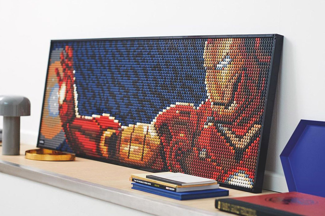
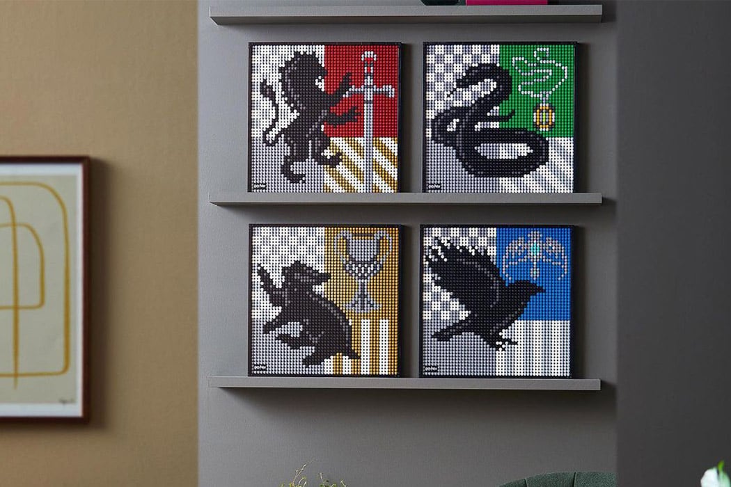
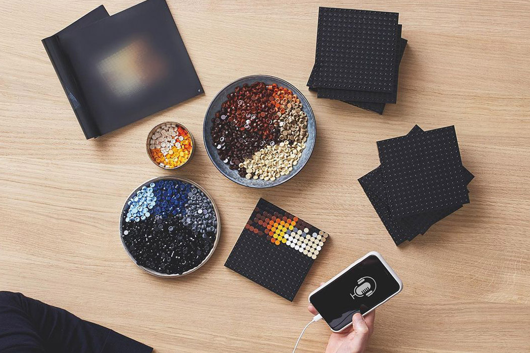
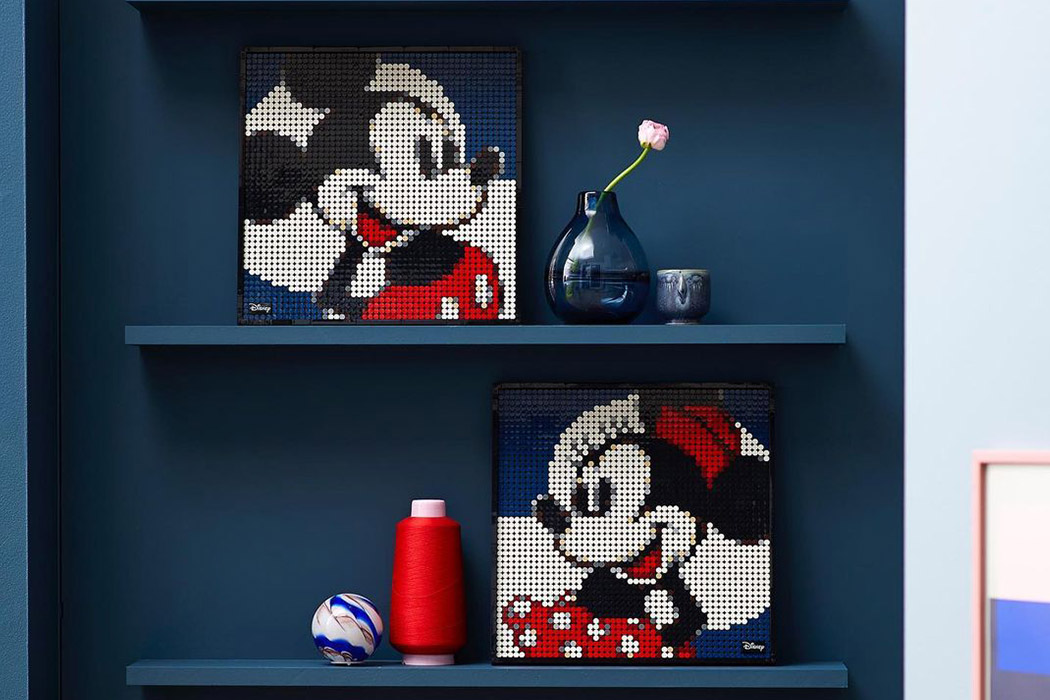
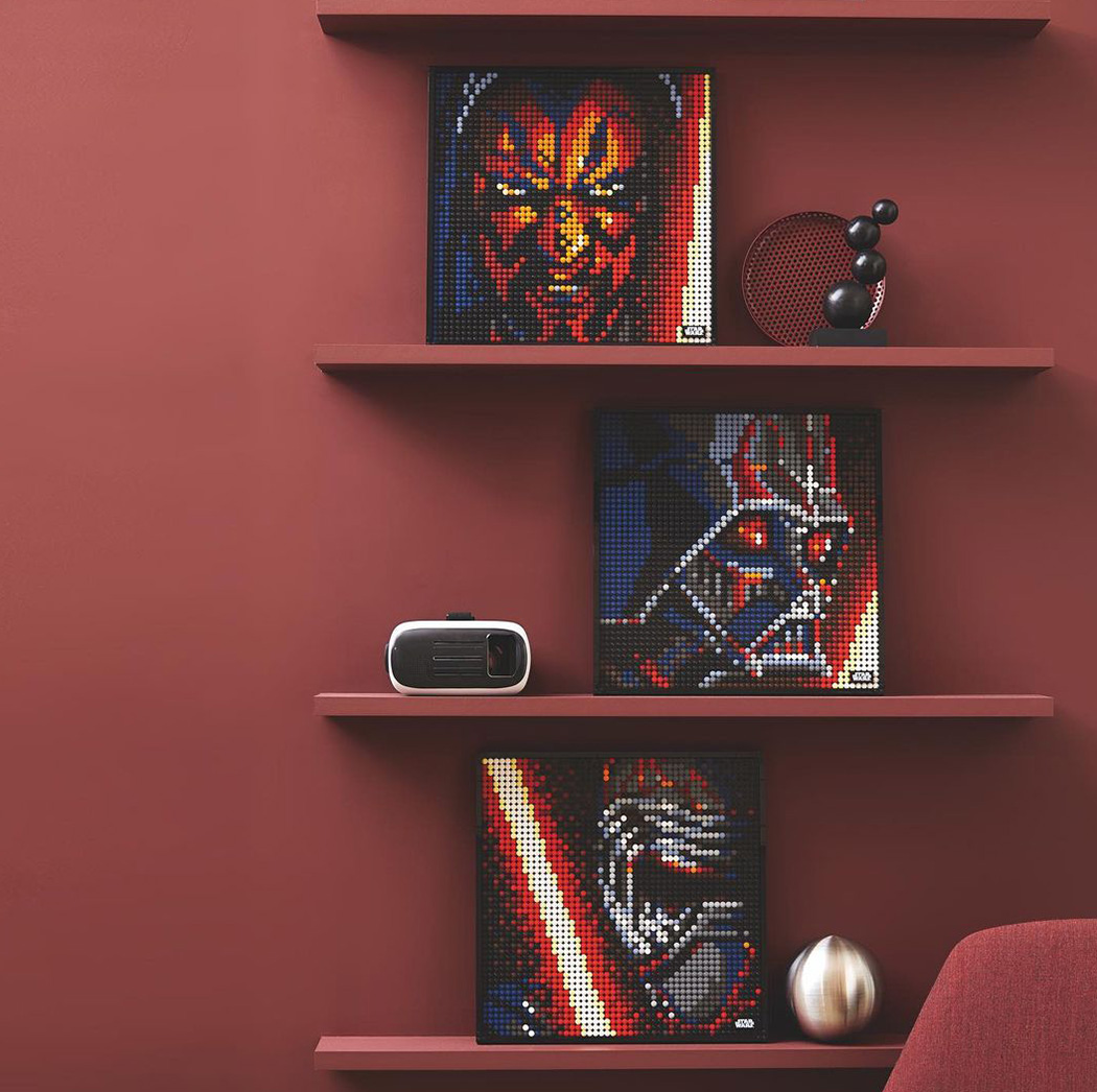
Every weekend brings forth a new dilemma – what is the most entertaining way to spend this weekend without stepping out in this quickly escalating COVID situation? Well, we now have LEGO to thank to make our weekend castle-making activity (consider this writer guilty of spending hours playing with LEGO creating her personal billionaire homes) a little more adult. What I mean is, the LEGO Art is here to make playing with LEGO more intricate and also creating an artwork that definitely deserves that coveted shelf space!
Designed to help adults relax and recharge as they transform a blank canvas (or in this case, small interlinking base plates) using LEGO tiles. Each set can be reimagined in a number of different ways to express the personality of each different builder and to make it easy and simple for pop culture lovers to refresh the LEGO Art piece on display in their house.
Being a hardcore IronMan fan (genius, philanthropist, playboy, billionaire – what more can we ask for!), that’s one of the first sets I would be working on. However, the Game of Thrones setup is a close second of mine!
Designer: Samuel Liltorp Johnson, Creative Design Lead for LEGO Art
The very first sequence of this video is of the camera — presumably perched on a drone — dropping out of the sky, flying through the door of beloved Minneapolis institution Bryant Lake Bowl, and following a bowling ball down the lane…and it just keeps going from there. Great drone piloting, choreography, sound design, and execution of concept. (via @brianmcc)
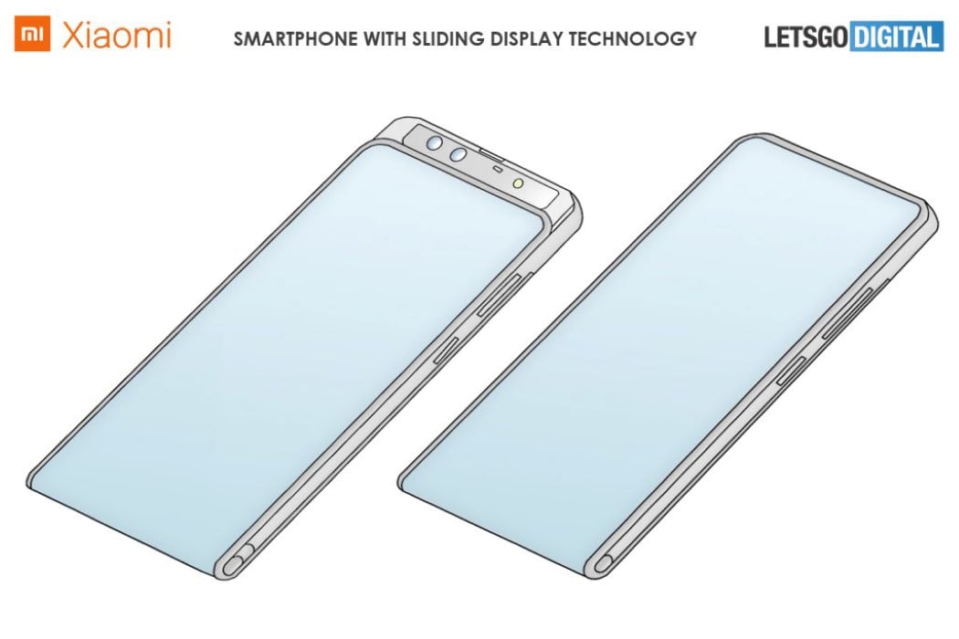
It seems like flexible displays have finally found their place in the smartphone world. Folding phones haven’t been their best application (because folding screens leave a crease behind, and result in thicker phones), but sliding/rolling displays seem to be an interesting approach that allows phones to have larger screens in smaller, thinner bodies. LG, Oppo, and TCL have all indicated they’re working on smartphones with rollable scroll-inspired displays, and according to a new patent discovered by LetsGoDigital, Xiaomi seems to be working on a rollable display smartphone too.
The conceptual Xiaomi phone uses the sliding mechanism and flexible display to its advantage. The design comes with virtually no bezel on the front, and the display cascades off the base (like a waterfall), transitioning to the back and turning into a secondary display that works with the main camera. Upon command (either through a voice command or a tap on the screen), the front of the phone slides downwards and reveals the front-facing camera setup on the top. It includes the selfie camera, as well as an ambient light sensor, a distance sensor, and a dot projector. The receiver is also hidden behind the slider display.
This dual-screen dual-camera opens the Xiaomi slider concept up to quite a few use-cases. The larger screen on the front can be used for selfies, facial-unlock, and even video conferencing, while the smaller screen on the back can act as a viewfinder for more elaborate group photos, videos, etc. For visualization purposes, the sliding concept contains the quad-camera module from the Mi10 Pro.
Progressive web applications (PWA) are still gathering popularity in 2020. It doesn’t come as a surprise, considering the benefits of higher conversion rates, customer engagement, decreased page loading speed, and lower costs on development and overhead.
We can see respected companies also enjoying success with their PWAs, such as Twitter, Uber, Tinder, Pinterest, and Forbes. And they all boast about massive benefits from implementing the progressive apps.
The good news is that developing a PWA isn’t something that only big-budget companies can afford. These applications serve small and average businesses equally and are not that complicated to create.
However, let’s take a step further and learn how to deploy modern qualities to PWAs, such as offline functionality, network-based optimizing, cross-device user experience, SEO capabilities, and non-intrusive notifications and requests. You’ll also find example code or references to more specific guides so you can implement these tips to your PWA.
A Quick Overview Of Progressive Web Applications (PWA)
Let’s not skip the basics and quickly go over the heart of PWAs.
What Is A PWA?
“Progressive Web Apps (PWA) are built and enhanced with modern APIs to deliver enhanced capabilities, reliability, and installability while reaching anyone, anywhere, on any device with a single codebase.”
In other words, PWAs are websites that users can use as stand-alone applications. They are different from native apps mainly because PWAs don’t require installation and can be used with various devices — native apps are primarily built for mobile devices.
How Do PWAs Work?
The core of a PWA consists of three components: a web app manifest, service workers, and an application shell. You can find detailed instructions for building those in the beginner’s guide mentioned above.
Here’s what these components do.
Web App Manifest
The web app manifest is the core for making a website run as a stand-alone application in full-screen mode. You can define how the PWA looks, optimize it for different devices, and assign an icon that’s displayed after the application’s installation.
Service Workers
The service workers enable the offline usage of the PWA by fetching cached data or informing the user about the absence of an Internet connection. The service workers also retrieve the latest data once the server connection is restored.
Application shell architecture
The application shell is what the users see when they access a PWA. It’s the minimum HTML, CSS, and JavaScript that’s required to power the user interface. When developing a PWA, you can cache the application shell’s resources and assets in the browser.
Deploying Modern Characteristics To Your PWA
On top of the core features, modern PWAs embrace additional traits that further drive their users towards a more extraordinary user experience.
Let’s look at some specific modern characteristics of a PWA and learn about adding these to your PWA. The following qualities are considered great additions to the basic PWA by Google developers.
The Application Works Offline As It Does Online
When building your PWA, you can also develop a custom offline page as part of the core. However, it’s much more user-friendly if your PWA continues to function even without an Internet connection — up to a certain point where the connection becomes necessary. Otherwise, the user experience could be as frustrating as Ankita Masand’s ordeal with ordering a cake as she describes in her article about the pain points of PWAs.
You can achieve a more significant user experience by using cached content, background syncing, and skeleton screens. Let’s look at each one.
Cached content with IndexedDB
IndexedDB is an in-browser NoSQL storage system that you can use to cache and retrieve the required data to make your PWA work offline.
However, not all browsers support IndexedDB, so the first thing you want to do is check if the user’s browser supports it.
if (!('indexedDB' in window)) {
  console.log('This browser doesn\'t support IndexedDB');
  return;
}
After this, you can create cached content with the IndexedDB API. Here’s an example from Google developers of opening a database, adding an object store, and adding an item to this store.
var db;

var openRequest = indexedDB.open('test_db', 1);

openRequest.onupgradeneeded = function(e) {
  var db = e.target.result;
  console.log('running onupgradeneeded');
  if (!db.objectStoreNames.contains('store')) {
    var storeOS = db.createObjectStore('store',
      {keyPath: 'name'});
  }
};
openRequest.onsuccess = function(e) {
  console.log('running onsuccess');
  db = e.target.result;
  addItem();
};
openRequest.onerror = function(e) {
  console.log('onerror!');
  console.dir(e);
};

function addItem() {
  var transaction = db.transaction(['store'], 'readwrite');
  var store = transaction.objectStore('store');
  var item = {
    name: 'banana',
    price: '$2.99',
    description: 'It is a purple banana!',
    created: new Date().getTime()
  };

 var request = store.add(item);

 request.onerror = function(e) {
    console.log('Error', e.target.error.name);
  };
  request.onsuccess = function(e) {
    console.log('Woot! Did it');
  };
}
Background sync
If your PWA syncs data in the background, the user can take actions while offline, which are then executed when the Internet connection restores. A simple example is a messaging app. A user can send a message when offline without the need to wait until it is sent — the background sync automatically sends the message when the connection restores.
Here’s an example of how to develop a background sync feature by Jake Archibald.
// Register your service worker:
navigator.serviceWorker.register('/sw.js');

// Then later, request a one-off sync:
navigator.serviceWorker.ready.then(function(swRegistration) {
  return swRegistration.sync.register('myFirstSync');
});
One of the main perks of using skeleton screens is that users perceive the application working rather than sitting idle. While the user doesn’t have a connection, the skeleton screen draws the interface out without content — which then fills once the connection restores.
Code My UI has some excellent code snippets available that you can use to create a skeleton screen for your PWA.
Optimizing Based On Network Usage
A central benefit of a PWA is that it provides a faster experience for users. You can further optimize the loading speed by having the PWA use cache-first networking, prioritizing resources, and use adaptive loading based on network quality.
Let’s look at how you can develop these to your PWA.
Cache first, then network
Using the cached content first further enables your PWA to function offline and paves the way for users to access the content even on low network coverage areas. You can do so by creating a service worker to cache the content and then fetching it.
Here’s an example from Jeff Posnick on caching static HTML using service workers.
self.addEventListener('fetch', event => {
  if (event.request.mode === 'navigate') {
    // See /web/fundamentals/getting-started/primers/async-functions
    // for an async/await primer.
    event.respondWith(async function() {
      // Optional: Normalize the incoming URL by removing query parameters.
      // Instead of https://example.com/page?key=value,
      // use https://example.com/page when reading and writing to the cache.
      // For static HTML documents, it's unlikely your query parameters will
      // affect the HTML returned. But if you do use query parameters that
      // uniquely determine your HTML, modify this code to retain them.
      const normalizedUrl = new URL(event.request.url);
      normalizedUrl.search = '';

      // Create promises for both the network response,
      // and a copy of the response that can be used in the cache.
      const fetchResponseP = fetch(normalizedUrl);
      const fetchResponseCloneP = fetchResponseP.then(r => r.clone());

      // event.waitUntil() ensures that the service worker is kept alive
      // long enough to complete the cache update.
      event.waitUntil(async function() {
        const cache = await caches.open('my-cache-name');
        await cache.put(normalizedUrl, await fetchResponseCloneP);
      }());

      // Prefer the cached response, falling back to the fetch response.
      return (await caches.match(normalizedUrl)) || fetchResponseP;
    }());
  }
});
Prioritizing resources
By default, PWAs have greater performance over similar native apps due to their lite nature. Furthermore, since PWAs use the browser’s cache, it’s possible to indicate which resources take priority and need to be rendered even before they are used. This mainly works with static elements as dynamic content needs updating before it’s fetched.
You can specify the priority of elements by using the <link> string in the HTML. You can also specify third-party server files by using rel=”preconnect” and rel=”dns-prefetch.”
Maximiliano Firtman gives a simple example of this by prioritizing Web Fonts within the browser’s engine:
The Internet speeds of WiFi and 4G aren’t accessible everywhere, and users still get on the Internet with 2G and 3G connections. Since you want your PWA to be accessible by as many people as possible, you might want to optimize it to perform at lower Internet speeds as well.
You can achieve this by implementing adaptive loading, which loads the PWAs elements based on the connection type that the user has.
The most straightforward way is to use Google’s Workbox tool, which includes numerous ready-made plugins for caching strategies.
Suppose you want to define a custom caching strategy. Here’s how you can do it as an example from Demian Renzulli and Jeff Posnick:
An excellent PWA works seamlessly on browsers, mobile, and tablet. While using an Android device is the most popular way (with a 38.9% market share) of accessing the Internet, optimizing your application for all platforms is part of developing the PWAs core functions.
You can take further steps to increase usability and offer a great user experience, such as reducing jumpiness when your PWA loads and making sure your PWA works with any input method.
Here’s how you can approach each of those aspects.
Reducing “jumpy” content loading
Even with high-speed Internet, the site’s content can shift while loading because the site’s elements load in order. This effect is even worse with slower connection speeds and badly hurts the user’s experience.
The most common elements causing the content to shift while loading are images since these are generally larger and not a priority when loading content. You can tackle this issue with “lazy loading” by using smaller placeholder images that you can prioritize after the HTML structure is rendered.
Here’s an example by Mozilla’s developers on how you can add a lightweight image that’s loaded first before the actual image in JavaScript:
You can also check out a thorough guide on Smashing Magazine about reducing content jumping with other elements.
PWA works with any input method
We’ve covered how PWAs should work with a variety of different devices. To take a step further, you also need to account for other input methods the users can use on these devices, such as touch, mouse, and stylus.
Adding the Pointer Events API to your PWA mainly solves this question. Here’s how you can approach it according to Google’s developers.
First, check if the browser supports the Pointer Events:
if (window.PointerEvent) {
  // Yay, we can use pointer events!
} else {
  // Back to mouse and touch events, I guess.
}
Next, you can define the actions various input methods can take:
switch(ev.pointerType) {
  case 'mouse':
    // Do nothing.
    break;
  case 'touch':
    // Allow drag gesture.
    break;
  case 'pen':
    // Also allow drag gesture.
    break;
  default:
    // Getting an empty string means the browser doesn't know
    // what device type it is. Let's assume mouse and do nothing.
    break;
}
Since most browsers already have touch-enabled features, you won’t need to add anything else.
Discoverable Through Search
One of PWAs key benefits over a native application is that the PWA is a website by nature and search engines can index them. This allows you to deploy SEO strategies to make your PWA content more discoverable.
You can start by ensuring that each URL in your PWA has a unique, descriptive title and meta description, which is the baseline of any SEO optimization activity.
Let’s look at some other steps you can take to make your PWA searchable.
Analyze the findability of your PWA
Google has an excellent tool in its Search Console that analyses your site (PWA) and reports the results. You can use it to run a basic scan of your site and uncover any weak spots that you can then start fixing.
Alternatively, you can use Lighthouse in the Chrome browser to run an SEO audit.
First, navigate to the target URL. Then Press Control+Shift+J (or Command+Option+J on Mac) that opens the developer’s tools menu. Choose the Lighthouse tab, tick the SEO category box, and generate the report.
Use structured data
Google’s search engine uses structured data to understand the content’s purpose on your webpage.
Structured data is a standardized format for providing information about a page and classifying the page content; for example, on a recipe page, what are the ingredients, the cooking time and temperature, the calories, and so on. — Google
Before you start coding, Google has also put together a useful list of common structured data errors and relevant guidelines to fix them. Studying this material should give you a good baseline of what to avoid.
User-friendly Notifications And Permission Requests
Last but not least, you can increase the user experience by optimizing the notifications and permission requests, so they serve your users — as opposed to just being confusing and annoying.
While you can generally rely on common sense, there are practical tips that you can implement as well, such as creating non-intrusive push notifications and giving the user an option to unsubscribe from messages.
Subtle permission requests for communication
There are two modern ways to automate the communication between a website and a user — chatbots and notifications.
In a PWAs context, the main perk of a chatbot is that it doesn’t require the user’s permission to interact with the user. However, depending on which chatbot application you use, the user might miss the subtle message. Notifications, on the other hand, require the user’s permission but are much more visible.
Since you can add a chatbot as a separate third-party application, let’s focus on creating a user-friendly push notification. In case you need a guide on how to create a push notification in the first place, here’s a great one by Indrek Lasn.
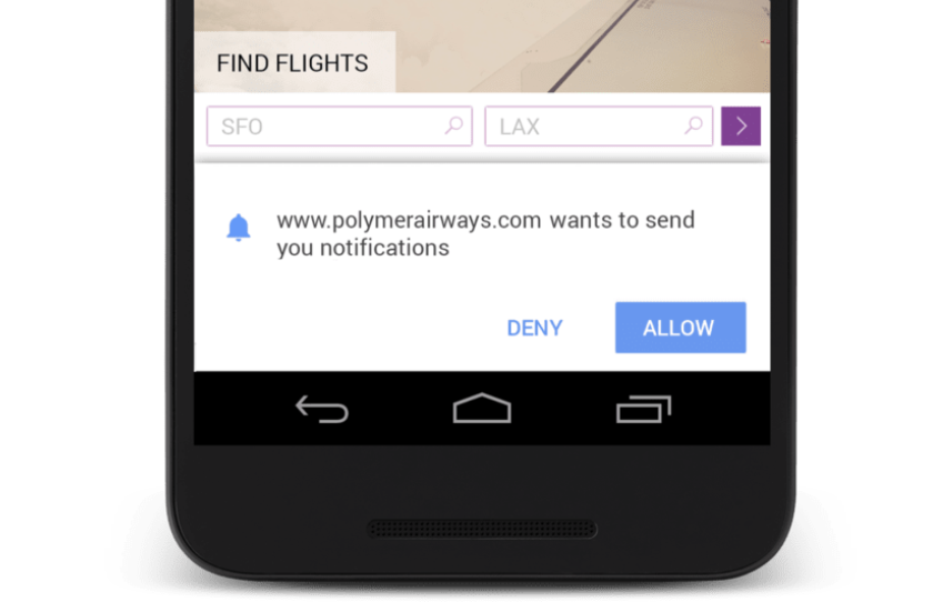
The most straightforward way to create a non-intrusive permission request is by using a double request. This means that you include a custom interaction to your site on top of the default one from the user’s OS.
Here’s the default notification permission request that provides no context:
And here’s the custom interaction added before the default notification permission described above:
By adding a custom alert before the OS’s default one, you can describe the purpose of the notification more clearly to the user. This increases the chance of the user opting in for your site’s notifications.
Enable the user to opt-out from notifications
For a user, disabling the push notifications of a site is quite annoying regardless of the device they’re using. Therefore, giving the user an option to opt-out from the messages goes a long way in terms of user experience.
Here’s an example from Matt Gaunt on how to implement an unsubscribing function into your code and UI:
function unsubscribeUser() {
  swRegistration.pushManager.getSubscription()
  .then(function(subscription) {
    if (subscription) {
    // TODO: Tell application server to delete subscription
      return subscription.unsubscribe();
    }
  })
  .catch(function(error) {
    console.log('Error unsubscribing', error);
  })
  .then(function() {
    updateSubscriptionOnServer(null);

    console.log('User is unsubscribed.');
    isSubscribed = false;

    updateBtn();
  });
}
Here’s how it looks in the console after successfully implementing the subscribe button to disable the notifications if the user chooses.
Conclusion
PWAs can be mighty powerful for increasing your site’s traffic and expanding on user experience. To further optimize your PWA, you can use these modern solutions described in this article to enhance performance and functionality.
You also don’t need to implement everything at once. Feel free to cherry-pick the most relevant options since each of these suggestions helps you further your PWA.
Okay, I am just going to say it, I have never met a kitchen exhaust or vent that has helped prevent the ringing of the smoke alarm when I cook. Some that are good certainly delay it, but if you have a small New York City apartment then your house is going to smell like your dish for at least a day. I am glad someone out there thought we needed a more innovative solution and designed the world’s first downdraft with a central cooking plate and underhung drawer! A top-notch setting that controls ventilation, making cleaning easier, and elevates the aesthetics of your kitchen.
Gutmann is a global leader in manufacturing high-quality exhaust hoods for households and is trusted by the best of specialized kitchen dealers. The design team combined their superior engineering with their own creative vision to give the users a cleaner experience. To come up with the solution, the team had to understand that performance, cleaning, and changing the filters are the core pillars of creating an efficient product. “With downdraft becoming the new norm, power was questionable. We said it had to step above the current noise. Emphasizing airflow, and creating clarity in the UI were our central points,” said the design team about their goal to create a downdraft hood that had the same (if not better) impact as the ceiling hood.
Each kitchen is different, there is a large variation in depths and heights of cabinets and drawers; so the design of this cooktop was kept lightweight without compromising on the advanced technology and materials. It was important to highlight the drawer during use and assembling all components in a central zone for intuitive user experience – optimizing storage and making cooking a stress-free process. Cooktops are used every day and they have to be durable to endure the constant cleaning and cooking. It can wear down even the most enthusiastic chef and homeowner to maintain appliances. To make this easier all the components were made with precise dimensions so they would fit directly into the dishwasher. This cooktop set up should go straight on top of your kitchen wishlist!
Designers: Oliver Hatton and Nicolas Schmitt for VanBerlo Agency
Driving customer loyalty is one of the most value-driven marketing campaigns for a business to employ. That’s because a 2% increase in customer retention can lower business costs by 10%, according to Fundera.
The challenge, then, is how to curate loyalty with existing customers.
Begin from the start of the customer journey, and determine the monetary value of the MQL in question. If you see the customer as potential repeat business, you’ll want to tailor your pitch to create more value. Do some extra homework on this prospect’s potential pain points, and determine how your product or service can solve this.
Next, and perhaps most important, is to follow-through with your promises. If your product or service does not drive the promised KPI’s, it’s likely the customer in question will not be back for a repeat purchase. This plays a part in the final invoice as well. Hidden fees may turn a prospect off if not discussed upfront. Consider detailing the service and all additional fees for your client before signing the final contract.
Additionally, consider the values of your business. Find clients who share the same beliefs. 87% of consumers will make their purchase decisions solely based on what a company advocates for. This is especially true if your prospect market consists of millennials and gen Zers. Learn more about how to make your clients love you with this roadmap, courtesy of Fundera:
Are you a cat person? Well, I am, and if you are a cat person or a cat owner like me, you know the amount of attention and care that goes into looking after them. They’re fussy and prissy, worthy of all the luxuries the world has to offer! But what about the pet-owners? While our cats hold the center of our attention, we don’t want to compromise the aesthetic value of our homes as well. To please our feline friends and their owners, product designer Yoh Komiyama collaborated with Tokyo-based Rinn to create the NEKO Cat Tree, and to be honest, it’s pretty modern and fancy!
The column-like structure features a marble base, with the marble being sourced from Greece. The cool marble helps your cat regulate and monitor its body temperature. Wood sourced from the forests in the Hida region of Japan was used to craft the series of dowels that make up the majority of the column.
The dowels encircle a pillar shrouded with hemp cord, which supports three circular levels, acting as comfy platforms for your cat to relax on!
The wooden dowels provide your cat with its own personal area, however the even spaces in between allow it to catch glimpses of its surrounding and you, so it always feels connected!
While the hemp wrapped pillar acts as a scratching post for your furry friend.
Each level has been coated with a soft layer of grey Kvadrat, only the best for you pet! One side of the tree opens up like a door, giving you swift access to the interior.
The craftsmanship that went into creating the tree is centuries old and utilizes the Japanese broad-leaved trees. The wooden dowels are combined via an intricate method known as “Dabo”. Dabo abandones nails, and uses only small wooden rods to join the larger bars. Each wooden bar is then coated with urethane, to make them resistant to the sharp claws of our cats!
Not only is the NEKO Cat Tree a fun and exciting design for our pets, but the care and precision with which it was created, and its minimal warm aesthetics make it a decorative piece worthy of being placed in our homes! You’re going to receive a lot of appreciation for this intriguing piece.
Believe it or not, I used to be a mathematician. And stupidly, I didn’t apply myself to applied math, stuff that uses computers and makes money. I was interested in 1) formal logic 2) the history of mathematics 3) the foundations of geometry, all of which quickly routed me into philosophy, i.e., obscurity.
But it does mean that I remain stupidly interested in things like ruler-and-compass constructions, axioms for foldable geometries, and the difference between Euclidean and non-Euclidean spaces. Folding is especially interesting because it’s tactile, it doesn’t require tools, and it sort of requires you to mentally balance the idea of the paper as representative of the geometric plane AND paper as the tool you use to inscribe that plane… oh, forget it. Let me just show you this cool GIF:
Here's a cool way to paper-fold an ellipse:
1) Cut a circle and fold it so that the circumference falls on a fixed point inside 2) Repeat this procedure using random folds pic.twitter.com/TAU50pvgll
I’m not sure how this fits into foldable geometries exactly since it imagines an infinite procedure, and geometric constructions are typically constrained to be finite. But still. It’s really cool to look at, play with, and think about.
A perfect fit amidst Poland’s green terrain is this house, commissioned for a single family, designed by Kartik Reddy. Paying tribute and respect to the greenery, the house has a number of vertical gardens near the side passage and back entrance. It even primarily makes use of wood, to give it a natural aura, and the front facade is made entirely of glass, almost making the house look a little like an idyllic greenhouse among the trees!
The house’s exterior has a simple yet striking silhouette that echoes homeliness through its symbolic house shape. Plus, who wouldn’t feel at home amidst such stunning greenery?!
There a bit of a CSS trick is Scott Jehl's latest article. Perhaps you've used an "accessible hiding" technique? That's where you are deliberately avoiding display: none; because you want the element to be focusable, but not seen visually.
But... that can be awkward for anyone who uses the keyboard to navigate the site and also looks at the screen.
To avoid this, we try to remember that any accessibly-hidden content should be visible when it gains focus. For example, this CSS would place a focused element at the top of the viewport
Ben shows us how easy it is to use a CodeBug to participate in the global movement Hour of Code this week. Now join Ben in exploring coding concepts using a drag and drop development environment with this kid-friendly project! Visit The Ben Heck Show...
If you try to book a hotel room in San Diego in September, you can probably get one for around $200-300 a night. If you try to do the same in mid-July during Comic-Con? You'll likely have to cough up close to $1,000 a night, and that's if you can get...
Marie Mosley just finished up a revamping of the text-decoration property (and friends) in the Almanac. You're probably aware of this property. For instance, most default browser styles include underlined links by way of text-decoration: underline; - which you can remove with text-decoration: none;.
But you may not be aware that there is more you can do with this property, as well as various sub-properties offering more fine-grained control.
Note that Gecko renders the underline behind descenders while WebKit/Blink render on top:
Left is Chrome, right is Firefox.
A common way of handling colored underlines has generally been to use a border instead of text-decoration. Borders can have individually controlled colors, thicknesses, and position a bit better than text-decoration can pull off.
But there are some things borders can't do, like...
There has been some clear desire for better underlined text. For instance, skipping the descenders for better readability, as noted in that post:
That's going to be controlled by text-decoration-skip, although not yet implemented anywhere. In the meantime, setting an underline to a more relaxed, less contrast-y color might help. Here's rgba() in use:
And skipping descenders is just one ability it's likely to have. You'll be able to skip certain inline elements, whitespace, and control the edges.
Note that Safari/iOS seems to skip descenders by default.
If you want to turn this off, -webkit-text-decoration-skip: none; works.
Playground
Due to varied levels of browser support, some (or all) of this demo may not work in your browser.
Composer is one of the core tooling we use at EasyBib when we work on the various products for the company. The following deck of slides is from a talk I gave at the Berlin PHP Usergroup meetup in November.
In addition, there were a few questions how dependencies are handle in a project when installed through composer’s global command:
Do you have to require the autoloader from $COMPOSER_HOME in order to use code which is installed through ./composer global require?
How does composer handle different versions of dependencies with global vs. local?
Loading global vendors
This is a tricky question! Composer will not require regular vendors automatically for you.
The global command should be used to install and maintain cli-tools (like phpunit) or composer plugins. And not to install libraries globally.
When plugins are installed globally, they get loaded automatically from the $COMPOSER_HOME. You don’t need to put them into every project’s composer.json file.
Different versions of a dependency
When you install a plugin through global and require another version locally in a project, the locally installed version wins once it’s installed.
Ok so a couple of weeks now, on it’s very own two year anniversary Mark Otto and the rest of the guys responsible for the develop and maintenance of Bootstrap announced the official release of the framework’s third version, and it came on steroids, let’s see what we’re getting.
What’s New?
First off, the most important changes you’re going to find in the new Bootstrap release is the support for responsive websites, as a matter of fact the responsive module has been removed. Now, from its core, Bootstrap is responsive, more than that, this new version comes with the approach of “Mobile First”, meaning that almost everything has been redesigned to start from a lower screen size and scale up (more on that in a bit).
Nearly everything has been redesigned and rebuilt to start from your handheld devices and scale up.
In the look and feel you’ll see a lot of changes too, prominently the fact that the whole style has gone flat, and there’s an optional theme for a 2.0-er look. Additionally, the icons have gone from images to a font, which is really handy to use when needing different sizes and colors.
Grid System
Let’s start talking about the Grid System, oh the Grid, as a matter of fact, there are four Grid Systems in this new version of Bootstrap, each works exactly the same, being differentiated by the screen size width at which they operate.
Enabling the Grid
In order for the Grid System to work properly and also to ensure proper rendering and touch zooming, add the viewport meta tag to your document:
There are four Grid Systems in this new version of the framework, with the width of the viewport being the parameter that differentiates them. The widths that set the frontiers between one and another are as follows:
Extra small devices ~ Phones (
Small devices ~ Tablets (>= 768px)
Medium devices ~ Desktops (>= 992px)
Large devices ~ Desktops (>= 1200px)
And each of the different supported viewports have a particular class to address it, as follows:
col-xs- ~ Extra small devices
col-sm- ~ Small devices
col-md- ~ Medium devices
col-lg- ~ Large devices
To make use of the Grid System you’d need a container element, with a class "container", and inside a second container with a class "row". Notice how in both cases the “fluid” suffix has disappeared, this in contrast with Bootstrap 2. And inside the second container you’d place your columns.
As I mentioned earlier, this new version of Bootstrap comes with a Mobile First approach, what this means is that the columns with a class suffixed with an "xs" are always going to be floated horizontally, no matter the viewport size. If you were to say, use columns prefixed by an "md" and the viewport happened to be less than 992px wide (even 991px), those columns will stack one below the other with a 100% width, as in the next example.
When this page is viewed at a viewport of 992px or more, it will look like this:
If you would happen to see that document in a viewport of 991px or less, it would look as follows:
You can also combine classes to address your elements at a given viewport size. For instance, if in the following example you’d need the first two columns floated side by side in small devices (sm) and stacked on phones, you could add the col-sm-6 in addition to the col-md-4 class.
In this case, opening the page in a viewport larger than 991px you’d see three equal columns, one next to the other, just like in the last example. However, if you’d see it in a viewport with a width between 768px and 991px, you’d get the following result:
As in the example above, you can combine and nest columns in a lot of different combinations to create very complex layouts. There’s a lot more to the Grid System in Bootstrap, but going into detail about every aspect of it would take a while to cover, so for a deeper look into it I’d strongly suggest that you go ahead and take a look at the documentation.
Bootstrap CSS
Most of the classes for the Base CSS part of Bootstrap have remained the same, however there are some changes that we must keep in mind when using this new version.
The code as a whole, has being re-written and variable names have changed. If you look at the .less files, you’ll find that all the variables in the framework have switched from camelCase to use hyphens for word separation, and also every variable name has been standardized in a “element-state-pseudo state” approach. What this means is that element-specific styles like:
<ul class="unstyled">...</ul>
Now are prefixed with the element that they are applied to, so in this new version of Bootstrap the previous list would become.
<ul class="list-unstyled">...</ul>
The same applies for lists with an “inline” style applied to them. Some other changes in the variables names reflecting in the classes that we’ve known from the earlier days are those related with size, for instance with buttons, in version 2.* you’d have:
This size suffixes have changed to match the overall naming convention and this is the same as for the Grid System, so the previous buttons declaration for version three becomes:
The same applies for input sizes and visibility declarations as well.
Responsive Tables
The overall syntax and layout for the tables remain the same in this version of the framework, but, loyal to the whole “Mobile First” paradigm, now we have responsive tables in this iteration of Bootstrap. To take advantage of it, simply wrap the whole table in a container with a class of “responsive-table“, what this will do is make the tables scroll horizontally in small devices (
In the CSS department, it’s in the Forms where you’d see the major differences. For starters, every input in a form in Bootstrap three is now displayed as a “block” element with a 100% width. The “size” attributes you can modify with a class in form controls relate to the padding and font-size of the element and not the width, to control that you’d need to put it in a container of the desired width.
The markup for the forms has also changed, in it’s most basic form, in version 2.* a form would look something like this.
Bootstrap has been created with Accessibility in mind, that’s the reason for the “role” attribute addition, note also that the label/input combo is wrapped inside a wrapper with a class of “form-group“, and like everything else, this has to do with the responsive nature of the framework.
The search form is gone in this version, and since all inputs and textareas are 100% width by default, special consideration has to be taken with inline forms, however the markup for these is almost identical to that of the previous form.
Note the addition of the class “form-inline” to the form element, and that of “sr-only” to the label, this last class has to do with the Accessibility part of the framework. The use of a label is optional with inline forms, however it’s highly encouraged and doesn’t hurt anyone. And by the way, the “sr-only” stands for Screen Reader only. So screen readers will find the label and “say it” to the user.
Lastly, to create a horizontal form you simply set the width of the label by setting it’s “col-md-” or “_sm” or whatever and the corresponding “control-label” class, just as with version two., and then wrap the input in a container with its own column width specified.
There are some other changes that have been made in regard to forms, like the removal of “input-prepend” and “input-append” classes, in favor of “input-group” and “input-group-addon“. However, there’s a lot more to cover yet, so for details on that, please refer to the documentation.
Glyphicons
Another area where you’re going to find major changes is in the framework’s icons. The icon library includes 40 new glyphs, and not only that, they switched from using images to fonts, so now instead of adding the two “glyphicons-*” images to your “img” folder, you’ll have to add the four “glyphicons” fonts to your “fonts” directory, and yes, four of them. This has to do with the browser’s compatibility.
For performance reasons, every icon requires a base class and a icon specific class. So now, to add a user icon you’d use:
<span class="glyphicon glyphicon-user"></span>
The switch from images to fonts, gives control to icon coloring and sizing, and also allows you to replace the default icons with some custom ones you may like. If you happen to wonder where you might find such font icons, Fontello is a great resource.
JavaScript Components
Although redesigned and recreated, the JavaScript Components in Bootstrap 3.0 keep the same names and usage. With a couple of slightly and not that gentle differences.
Modals
Perhaps one of the most used plugins in Bootstrap is Modals. You’ll find it is quite similar, with the differences being that the containers “modal-header”, “modal-body” and “modal-footer” are not wrapped inside a “modal-content” inside a “modal-dialog” container. So what used to be:
Yes, it’s a little more markup, but it improves the responsiveness of the component and also allows it to scroll the whole viewport instead of having a “max-height” parameter.
To trigger them via JavaScript, you’d use the same method as before.
$( '#my-modal' ).modal('show');
The rest of the plugins remain mostly the same. On a special note, the accordion is gone in favor of collapsible panels, they work pretty much the same and have a very similar syntax. With some classes changing a bit, they still require the transitions plugin and don’t require any extra containers.
JavaScript events are now namespaced, but what does mean to you? Well, in Bootstrap two, to listen for the moment when some alert in your site was “close“, you’d add:
$( '#my-alert' ).bind( 'close', function() {});
Now in this third version, the event name has changed, it is namespaced to the framework, so the previous snippet would be:
You can add the “active” class to any item in the list to highlight it, also if you happen to place a badge inside it, it will be centered vertically and align it to the right, inside the item. Go ahead and try it.
Panels
Panels are a way to box in some content in your site or application, highlight it and give it a sense of unity. The panel markup is fairly simple, and its contents can be combined with different elements to achieve a unique look and feel.
Panels can have headers and footers and get a special meaning with the well known “sucess“, “error“, “warning“, etc. classes. For instance.
As you can see, panels work well with list groups, and also with non-bordered tables.
Customizer
Also new in this version is the Customizer in which, not only the look has changed, is far better organized and gives you control on things like the viewport width at which a certain Grid System takes control.
As always, you can set all your fonts styles and colors. It’s a huge topic on its own so I’d encourage you to go on your own and mess with it.
Browser Support
Long has been the suffering brought to all of us by Internet Explorer, it’s version six was a total nightmare and its predecessors still have a lot of catching up to do. In version 2.* Bootstrap’s team still supported the version seven of Microsoft’s browser. In this new iteration of the framework, support for IE seven is gone, as well as for Mozilla Firefox 3.6 and below.
Specifically, Bootstrap supports the latest version of all the major browsers (Safari, Opera, Chrome, Firefox and IE), in both Windows and Mac when there are both.
For IE, it supports version eight and forward, and although there are some properties that the browser doesn’t render, such as “border-radius“, the framework is fully functional only with some minor look and feel differences. Also IE eight requires respond.js for media query support.
To get a detailed list of workarounds and gotchas for the different browsers (cough Internet Explorer cough) look at the official docs.
Conclusion
Since its beginning, Bootstrap has been a great tool for rapid prototyping and creation of great sites and web applications and this third version is no different. If you need just one reason to use it, I would definitely go for the Grid System, with the growth of mobile browsing and the always increasing viewport sizes out there, responsiveness is a must now, more than ever. And in this latest version, that’s the area where Bootstrap shines the most.
The ONDA marble bench is born from the desire to minimize material waste by using modular sections that aren’t instantly recognizable as similar. Cut from the same block, each “wave” is just alike with the same dimensions. Reversing the pattern with every other one being turned the opposite direction creates a visual illusion of woven complexity when it’s rather simple!
- Yanko Design Timeless Designs - Explore wonderful concepts from around the world! Shop CKIE - We are more than just concepts. See what's hot at the CKIE store by Yanko Design! (Mesmerizing Marble was originally posted on Yanko Design)
Diabetics might appreciate high-techglucose sensors when they're available, but the option for other advanced treatments is certainly intriguing. Take, for example, this new method developed by North Carolina State University researchers that uses injectable sponge to control blood sugar levels. No, it's not the same sponge you use to clean at home -- the material is made out of a substance taken from crab and shrimp shells called chitosan. This spongy material forms a matrix that's approximately 250 micrometers in diameter, where a rise in blood sugar causes a reaction in the pores that leads to the drug's release.
Fighting diabetes is but one of the things this miraculous sponge can be used for; developed further, it could even "intelligently" release anticancer drugs whenever the chitosan reacts to tumors or cancer cells in close proximity. Seems like medical technology is getting smarter with each passing day.
While wheel-dozers and loaders most often function on flat ground, there are times when more rugged terrain must be tackled to get the job done. To ease working on uneven land, the Arm Loader features a driver’s cabin positioned on a moving arm that keeps the operator elevated and balanced even when the machine is not. This provides workers a safer, less tiresome position with a better view of obstructions that would otherwise not be visible depending on the machine’s angle. Check out the vid for the 360!
- Yanko Design Timeless Designs - Explore wonderful concepts from around the world! Shop CKIE - We are more than just concepts. See what's hot at the CKIE store by Yanko Design! (Loader Facelift! was originally posted on Yanko Design)
We've become so dependent on GPS that a three-minute drive often means frequent glances at an in-car navigation companion. But taking your eyes off the road can be very dangerous, even if it's only for a moment. If you're fortunate enough to have one, a head-up display will let you get to your destination efficiently and safely, and Garmin's got a new aftermarket solution to keep you cruising on the cheap. The company's new HUD projects bright directions onto a transparent film mounted on your windshield, serving up guidance within your regular line of sight. The simple interface displays your current speed and the speed limit, turn arrows, the distance until your next turn and an ETA. The Garmin HUD is compatible with Bluetooth-equipped smartphones running Garmin StreetPilot and Navigon apps. It's expected in stores this summer with a MSRP of $129.99.
Square is now in a partnership with Apple to bring its new Square Stands to Apple retail stores.
The Square Stand will convert an iPad into a full point-of-sale system that pairs with cash drawers, receipt printers, barcode scanners and credit card readers.
The US$299 device begins shipping this week and will be available at the same time at Apple retail stores, Best Buy and other select retailers.
The Square Stand only works with 2nd and 3rd generation iPads because of the 30-pin dock connector. A Lightning-connector model will be available later this year.
Anna Filina has a quick new post to her site today with some helpful tips on how to motivate your developers (and coworkers) to make for the best end result.
When developers are not motivated, progress is slow and quality is low. This ultimately affects company revenues and can lead to reduced opportunities for all employees. Motivation leads in the opposite direction: wealth and happiness. The first thing to understand about motivation is that it's internal. We can't force someone to become motivated, but we can still have a strong influence. Here are my top three picks to increase motivation from my presentation at IPC 2013 in Berlin.
Her top three are:
Setting goals for the group and a purpose for making it good
Focus on the "small wins" sometimes to keep motivation high
Let developers use their full range of talents, don't force them into one niche
The Opus stool finds inspiration in traditional Chinese medicine where the balance between mind and body is key in keeping physically and mentally agile. The ball-based structure encourages the user to take control of their balance by placing them in a new position between traditional seat and upright standing. In this posture the center mass of the individual is located under the spine, positioning them in a stance where mind/body harmony will keep them comfortable.
Designer: Dor Ohrenstein
- Yanko Design Timeless Designs - Explore wonderful concepts from around the world! Shop CKIE - We are more than just concepts. See what's hot at the CKIE store by Yanko Design! (Zen-Inducing Stool was originally posted on Yanko Design)
Stem cell research has resulted in several important breakthroughs in medicine, such as rebuilding the larynx and regenerating spinal cord connectors. Now the liver, one of the most highly sought after organs on the donor transplant list, could get some serious stem cell assistance as well. A team of scientists led by Takanori Takebe of Yokohama City University has successfully created a miniature version of the human liver with the help of induced pluripotent stem cells (iPSC), which are derived from adult somatic cells. They developed the iPSC into generalized liver cells called hepatocytes, at which point the researchers mixed in endothelial cells and mesenchymal stem cells, left the petri dishes alone for a couple days, and voila -- an extremely tiny version of a human liver, said to be the first-ever functional human organ grown from stem cells, was born.
The liver "buds," as they're known, measure five millimeters long and are the sort you would find in human embryos shortly after fertilization. When implanted in mice, the baby livers managed to perform all the functions of their adult equivalents. The researchers' next step would be to generate liver buds that are a touch closer to normal liver tissue -- like the addition of bile ducts -- and to see if they can mass produce them by the tens of thousands. Don't go wasting your liver just yet though, as it'll likely be years before the likes of you and me will be able to have a lab-grown liver in our bodies. In the meantime, check out the time-lapse video after the break to see a young liver bud take shape in a petri dish.
C-Thru is a helmet that is designed to help firefighter walk through dense smoke during smoke diving search and rescue missions. Time constrains of six minutes per mission, makes it imperative that the gear is optimal. C-thru gives them the edge thanks to the wire-frame vision of the interior geometry, surrounding the smoke diver. Using technological enhancements, the helmet provides a visual map of the interiors so that it becomes easy for the firefighter to locate the victims.
This is how it works:
C-Thru’s vision system integrates many technologies to aid firefighters, such as a head-mounted projection display, optical thermal camera, cloud computing, selective active noise cancellation and target acquisition.
The optical thermal camera captures the imaging of the surrounding area and sends the data to the smoke diver leader’s handheld device.
The data is calculated there and sent back to the helmet.
Newly generated 3D wire-frame data is projected by the head-mounted projectors through the retro-reflective front visor of the helmet.
This wire-frame outline of their surroundings helps firefighters find a path through the building and locate victims.
- Yanko Design Timeless Designs - Explore wonderful concepts from around the world! Shop CKIE - We are more than just concepts. See what's hot at the CKIE store by Yanko Design! (Holy Smoke! was originally posted on Yanko Design)
It's a common need in web apps: you click something and the text of the thing you just clicked changes. Perhaps something simple like a "Show" button that swaps to "Hide", or "Expand Description" to "Collapse Description." This is a fairly simple thing to do, but there are various considerations to make. Let's cover a bunch of ways.
jQuery Way (Less Markup / More JavaScript)
You need to store the "swap" text somewhere. I'd say in most cases it is a design/view concern so storing it in the markup is a good idea. We'll use the example of a button who's text swaps between "Hide" and "Show". A data-* attribute is a perfectly good place to store the swap text. So that becomes:
<button data-text-swap="Show">Hide</button>
It's easy to swap out the text, like:
var button = $("button");
button.text(button.data("text-swap");
But, if we did that we'd lose the orignal text forever. We need to store the original text first. Another data-* attribute will do.
var button = $("button");
button.data("text-original", button.text());
button.text(button.data("text-swap"));
But that only goes one direction. To complete the "swap", we'll need to compare the current text value of the button to see if it matches the swap text or not. If it does, change it back to the original. If not, to the swap text. This is what it looks like all done:
$("button").on("click", function() {
  var el = $(this);
  if (el.text() == el.data("text-swap")) {
    el.text(el.data("text-original"));
  } else {
    el.data("text-original", el.text());
    el.text(el.data("text-swap"));
  }
});
jQuery Way (More Markup / Less JavaScript)
If we're willing to set that data-text-original value in the original markup, we can simplify the JavaScript a bit. We can use a single ternary operator to check if the swap matches the orignal and perform the right action based on the truthiness.
$("button").on("click", function() {
  var el = $(this);
  el.text() == el.data("text-swap")
    ? el.text(el.data("text-original"))
    : el.text(el.data("text-swap"));
});
Vanilla JavaScript Way
I'm guilty of using too much jQuery around here for things that can be done without it. This is what the first "less markup" version would look like in "raw" JavaScript:
Since this is a view concern and could be considered a "state," a popular idea is to use JavaScript only to change classes which represent states and let CSS define what the visual change actually is.
We could use the class "on" to represent the swap state. Then that class would apply a pseudo element covering the old word and replacing it with the swap word. I don't think actual button elements with default browser styling take well to pseudo element so let's use an anchor here.
This is a bit funky, to be fair. I think this is almost worse that putting the swap word in the JavaScript. CSS isn't really meant for this kind of thing and likely has some accessibility concerns.
This also happens to work because the word "Hide" is smaller than "Show" a little bit. If the swap word was bigger, the original would stick out underneath the white cover. You might be able to get around that by inline-blocking the original, hiding the overflow, and kicking the original out of the box with text-indent. But the fact that the replacement word is absolutely positioned removes it from the flow, which could be an issue, not to mention real world design isn't always a simple as flat-color-on-flat-color.
CSS-Only Way
But hey as long as we're getting funky, we could use The Checkbox Hack here to make the text swap entirely CSS. The replacement happens the exact same way, it just happens when an invisible checkbox right before the word is either :checked or not. This means the word needs to be in a label as well, which is able to toggle that checkbox's state through the for attribute.
Steam-O is a modern cruiser that takes inspiration from the iconic steam locomotives of the past, applying the signature aerodynamic shape to its stark frame. In classic 1930s style, the bike sports a leather seat with spring suspension, an oversized headlight with chrome and bronze polish, and choo-choo style rims. The main feature, however, is a pushrod drivetrain like that of locomotives from the time. This unique power system and distinct attention to detail set it apart from other cruisers new and old.
Pedaling torque is transmitted by bearing on shaft and coupling rods. Coupling rods move in a vertical motion as well as horizontally as the crank-arm rotates. The same shaft at the rear wheel receives the torque ration 1:1. To gain a useful travel speed it needs a small gearbox (about 1:6 ratio depending on the crank arm length and rear wheel size).


 Ben shows us how easy it is to use a CodeBug to participate in the global movement Hour of Code this week. Now join Ben in exploring coding concepts using a drag and drop development environment with this kid-friendly project! Visit The Ben Heck Show...
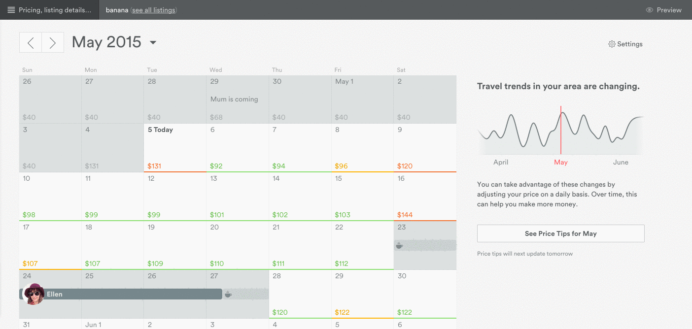 If you try to book a hotel room in San Diego in September, you can probably get one for around $200-300 a night. If you try to do the same in mid-July during Comic-Con? You'll likely have to cough up close to $1,000 a night, and that's if you can get...


 If you want to turn this off,


