Shared posts

30 Apr 05:21

How to Book Travel Online for Less

by Andrew Tarantola

How to Book Travel Online for LessWith clear skies and rising temperatures around the country, the summer travel season is nearly upon us. And unless you've got money to burn or a first-born to offer, now's the time to book your travel plans. Here's how to get away without breaking the bank.

How to Book Travel Online for Less

Timing Is Everything

Airline ticket pricing is a fickle mistress. While prices overall have steadily risen over the last two years—and showing no signs of stopping any time soon—the cost of an individual ticket depends on a myriad of factors, the largest of which being when you buy it and when you want to leave.

By and large, prices are lowest when book your flight at least 21 days in advance and rapidly increase as the departure date draws near. Seat pricing often fluctuates depending on the departing day, with weekend flights costing more than mid-week ones. If you can be flexible on what days you fly, say on a Tuesday rather than a Friday, many additional seating options will be available for less. Obviously, there are exceptions to that pattern: booking for major travel days like the night before Christmas, Thanksgiving, and Superbowl Weekend are going to be uber-pricey no matter what, and flying during the North American travel season (June to August) will see many of the less expensive seats purchased months in advance.

Sometimes it also pays to be patient. Airlines will often post "weekend deals" for flights and routes they're trying to fill. Prices for these seats likely won't be as 21-day advance purchases but if you're travelling last-minute, they'll get your butt in a seat for less than what you'd pay at the ticket counter.

How to Book Travel Online for Less

Get a Price Check

Used to be, if you didn't buy your tickets directly from the airlines, you'd have to go through a intermediary, a travel agent. These people would put together vacation packages for travelers, including flights, car rentals, and hotel accommodations. The rise of the Internet, of course, put a stop to all that silliness. Now, a plethora of travel sites (including the airlines themselves) perform the same function, you've just got to know how to use them effectively.

Every major American carrier will gladly sell you a seat directly from its website. United, Delta, Virgin, American, Southwest, Jet Blue, and Alaska all do, as well as a number of smaller, regional carriers. If you tend to fly primarily on one carrier than the others, sign up for the company's newsletter or mobile app—which often contain deep discount offers—and follow them on Twitter—Virgin and JetBlue both regularly drop great deals through the social media service. If you can afford the debt, sign up for an airline-branded credit card that delivers miles or other flight perks.

If you're airline agnostic and want to compare the fares for a given time and trip across multiple airlines, there's no need to check each website individually. Instead, use a cost comparison site like Fare Compare, KAYAK, or Skyscanner. These services not only list the flights available for your specific departure time—sourced from both the airlines themselves and other booking sites like Hotwire and Priceline—it also allows you to see all the flights for that date from up to three other travel sites. So say you're flying SFO to JFK, leaving May 23 at 6pm. The service will show both the flights available for 6pm, but also all JFK-bound flights out of SFO for the 23rd. You might find something cheaper if you fly two hours earlier. Hipmunk might be your best option of all; it sorts by price just as effectively as other providers, but also by how much of a pain in the ass your connections will be.

How to Book Travel Online for Less

You Want Lodging with That?

Chances are, you're probably going to need transportation and accommodations once you get to wherever you're going so you might as well bundle those in with the price of the flight and save a few bucks, right? Sites like Orbitz, Expedia, and Priceline all provide this service and operate much like the flight comparison sites above. Each service has different limits to the discounts it can provide for any given package, so you'll do well to give all three a quick look before pulling out your credit card.

For the more adventurous traveler, apps like HotelTonight (iOS) and AirBnB (iOS, Android) offer great rates on last-minute hotel/apartment/couch deals.

How to Book Travel Online for Less

Who Says You Have to Pay Cash?

There's no reason to fork over your hard earned cash when you've got hard-earned miles that can cover the cost but you'll have to book early. Airlines only designate a couple of seats per flight to reward passengers (those paying with miles). Only about 10 percent of a carrier's total number of seats are reserved for rewards and those go quickly—even on otherwise empty flights. You can thank the airlines' yield management software, which determines the price of a particular route or flight, for these blackout dates.

Mile Rewards are also governed according to their status as either Saver or Standard. Saver rewards are usually capacity-controlled but require half as many miles as Standard rewards, which are available regarless of how full the flight. In general, you should expect to pay somewhere in this ballpark when using saver miles, though for off-peak travel, these figures may be as much as 5,000 miles less:

  • 120k - Free round-trip first-class ticket US to Asia
  • 100k - Free round-trip first-class ticket US to EU
  • 60k - Round-trip one-class upgrade US to Asia
  • 50k - Free round-trip coach ticket US to Asia
  • 50k - Round-trip one-class upgrade US to EU
  • 50k - Free round-trip coach ticket US to EU
  • 45k - Free round-trip first-class ticket in the continental US
  • 30k - Round-trip one-class upgrade in the continental US
  • 25k - Free round-trip coach ticket in the continental US

Well, what are you waiting for? Book your flight and go see the world—or at least visit your parents. Hey, it's still better than the In-Laws.

[Smarter Travel - Budget Travel - Independent Traveler - Cheap Flights - Wild Junket - Mashable - Image: doomu / Shutterstock, tratong / Shutterstock, FuzzBones / Shutterstock, michaeljung / Shutterstock]

25 Apr 12:24

Conference or Not, We'll Cherish These E3 Nintendo Memes Forever

by Brian Ashcraft

Nintendo is not holding a big time E3 press conference this year. Bummer! Know why? The memes and the memories, that's why.

In the past, Nintendo's E3 press conferences have given birth to some of the best gaming memes the internet has seen. Thus, this summer could see a huge hole in internet fun, which is truly unfortunate.

Let's take a look back at some of the most delightful (and delightfully embarrassing) Nintendo's E3 press conference moments from over the years.

Thanks for the meme-mories, Nintendo!

"That's the Worst Japanese I've Ever Heard"

This was apparently the first question Shigeru Miyamoto was asked at the 2001 E3 press conference.

Reaction Guys

The meme is called "Gaijin Yonkoma" ("4-frame foreigners") in Japan, where it still pops up online from time to time. The meme uses two photos of IGN reporters (disinterested in one and excited in the other) to show, as KnowYourMeme explains, something akin to "At first I was like X, but then I was like Y."

The now famous photos were taken at Nintendo's 2003 and 2004 press conferences and uploaded to IGN's boards. From there, the photos went viral in Japan.

"Kicking Ass, Taking Names, and Making Games"

This is from Nintendo's 2004 E3 press conference, which showcased the Nintendo DS and hinted at the then codenamed Revolution. That console would become the Nintendo Wii.

Link Miyamoto

This was a high point for E3, for Nintendo, and for everyone. Even to this day, goosebumps.

Miyamoto, The Orchestra Conductor

I wanted this game. Wii Music was not this game. But for a few minutes on stage at the 2006 E3, Nintendo created magic.

"My Body is Ready"

Said by Nintendo of America's Reggie Fils-Aime at the 2008 E3 and never forgotten by the internet. The press conference itself, however, was not good. At all.

Ravi

...

Non-Specific Action Figure

This happened. No, really. It did. But, you know what, it's aged pretty well.

Reggie Is a Zombie

At last year's E3, Reggie turned into a zombie—or a zombi. He likes French food, but who doesn't?

There are many more Nintendo E3 memes and moments from over the years, whether it's Miyamoto pretending to throw a Pikmin into the crowd or the company unveiling new hardware like the Nintendo 64. What made those moments was that they were big. There was a crowd. There was energy.

Sometimes, Nintendo pulled off feats of wonder and amazement. Sometimes, Nintendo fell flat on its face. But one thing was constant: Nintendo gave E3 everything it had. And this year, Nintendo isn't, which is a shame. A real shame.

25 Apr 12:19

Oculus Rift, as tested by a 90-year-old grandma

by Megan Farokhmanesh

YouTube user Paul Rivot equipped his 90-year-old grandma with the Oculus Rift Tuscany demo and turned on a camera to record the results.

"Oh man, it's so real," Rivot's grandma says. After she asks if the images are actual photos from Tuscany, one of the video's other occupants explains they're 3D images made with a computer. Oculus Rift's Tuscany demo takes users through a virtual villa. You can watch the video above for almost four minutes of adorable and cliché grandma exclamations.

Earlier today, Polygon reported on a Mirror's Edge mod featuring Rift support. We had the chance to go hands-on with the Oculus Rift at GDC. You can read our impressions here, albeit with significantly less "holy mackerel."

25 Apr 12:16

http://juliasegal.tumblr.com/post/47794043262


25 Apr 12:16

Order Pizza Hut from Xbox 360

by Alexander Sliwinski
Xbox, order pizza Xbox 360 owners now have the option to download the Pizza Hut app for their console and place an order directly from the comfort of their couch, cozy recliner or beanbag chair. As Polygon reports, there's no need to search for a phone anymore, as the chain's full menu (pizza, pasta, breadsticks, agita) is available from the app. Shame or pride after ordering can be shared across Facebook.

"We're always looking at ways to give our audience more of what they're interested in," Xbox's Larry Hryb told Polygon. "If you look at our audience, they love pizza. I mean, who doesn't? It has international appeal, and Pizza Hut is a recognized brand that matches up well with the Xbox brand."

Don't go thinking Microsoft is some pioneer in this space. In 2005, World of Warcraft let you order chinese food from Pandaren Xpress... no, wait, that was a joke. However, EverQuest 2 players could order a pie by simply typing /pizza.

JoystiqOrder Pizza Hut from Xbox 360 originally appeared on Joystiq on Tue, 23 Apr 2013 09:00:00 EST. Please see our terms for use of feeds.

Permalink | Email this | Comments
25 Apr 12:15

Samsung Galaxy S4 review

by David Pierce
Gs4_1-hero_large

Years ago, people either bought an iPhone or “a Droid." Verizon’s marketing power, those insane robot ads, and maybe that just-close-enough naming convention made the carrier's Android phones virtually synonymous with their operating system.

But now I hear people every day saying "oh, is that the new Galaxy?" or "I don't really want an iPhone. I think I'm going to get a Galaxy." Thanks to its high quality and wide availability, not to mention Samsung's sheer brute-forcing marketing effort, the Galaxy S III became the face of the Android universe. It has sold tens of millions of units, and helped Android take huge marketshare away from the iPhone. Now Samsung's back with that device’s successor, the Galaxy S4. The new handset changes little from the GS III, but it adds a lot — a bigger screen, and a laundry list of software tweaks and features. It's a variation on a theme, a safe tweak to a strategy that’s worked impossibly well for Samsung.

But the landscape has changed since the Galaxy S III came out, and good cameras, big and beautiful screens, and fast performance now come virtually standard. The Galaxy S4 comes into a fiercely competitive market, with great phones on all sides and a particularly strong showing from the HTC One — is it enough of an improvement to keep Samsung atop the Android heap? I've had one for a week or so, and I have a few thoughts on the subject.

Hardware

Some things never change

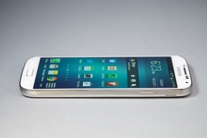
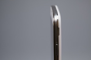
The GS4's primary competitors are the iPhone 5 and the HTC One, and from a pure design perspective that should make Samsung very, very nervous. Where Apple and HTC have both made beautiful, well-made, high-quality phones, the GS4 has Samsung back in the land of cheap, plasticky handsets. It looks for all the world like the Galaxy S III — despite having a bigger screen and more horsepower, at 7.9mm and 4.6 ounces it's actually imperceptibly thinner and lighter than the S III. But copying the S III wasn’t a good idea.

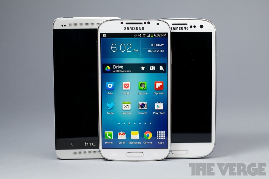
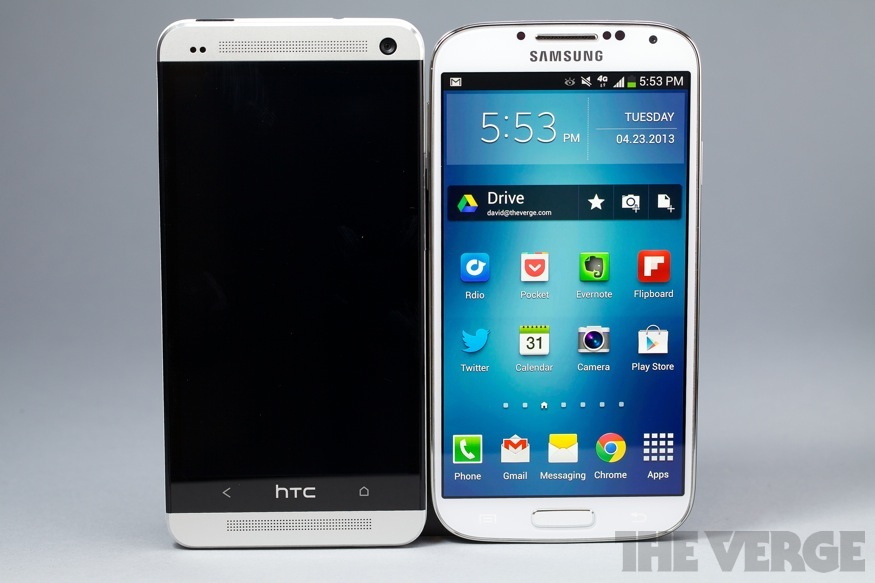
I don't like holding this phone, and I can't overstate how much that informs the experience of using it. It makes an awful first impression, slippery and slimy and simply unpleasant in your hand. My white review unit is completely smooth and glossy, with a subtle checkered pattern that looks textured but is neither grippy nor textured anywhere on its body. Even the silver band around the sides, which is obviously supposed to look like metal, is plastic. Everyone I showed the GS4 to frowned and wrinkled their nose as if it smelled bad, before rubbing their fingers on the back of the phone and then handing it back to me — that's the opposite of the standard reaction to HTC’s One, which everyone wants to ogle and hold. That's going to be a huge problem for Samsung, because the GS4 and One are likely to be next to each other on store shelves, and at least on first impression there's absolutely no contest between the two.

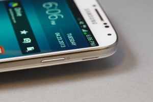
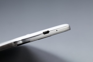
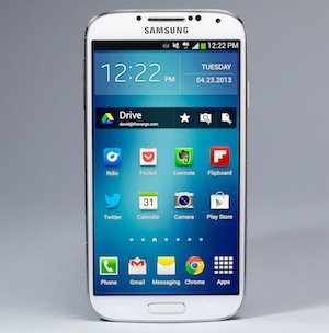
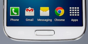
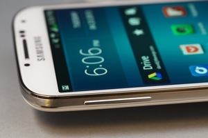
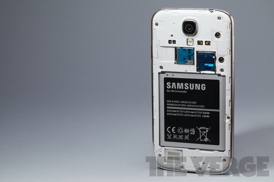
It's a shame, too, because Samsung didn’t have to do it this way. The company made tradeoffs for a removable battery and a slightly thinner body, but I’m not sure those are features worth sacrificing so much for in 2013. It's not all bad: the GS4 is thin and light, and feels durable despite its cheap materials. It's also an improvement over the S III, thanks to slightly flatter edges and shrunken bezels. The port layout is smart: power button on the right, volume on the left, headphone jack up top and Micro USB on the bottom, with the SIM card, microSD slot, and battery accessible when you peel off the removable back. I’m thrilled the GS4 has a physical home button, with capacitive Back and Menu keys on either side. It's very comfortable for such a large phone, but I can't get over the gross feeling I get holding it.

Samsung's proven repeatedly that people don't care about build quality, or at least will overlook it in favor of features and performance, but the landscape's different now. The HTC One is a powerful, feature-rich device that is also beautiful and classy, while Samsung's handset feels like an overpowered children’s toy. Samsung's feature list has to be awfully long to overcome that — and it is, but I'll get there.

Can we finally decide design matters? Gs4_14-300px Gs4_6-300px Gs4_15-300px Gs4_8-300px Gs4_7-300px Gs4_13-875 Display
In living color

It may not be perfectly accurate, but it looks good Gs4_4 Gs4_27-300px Gs4_2 Gs4_9
Gs4_28-555px

Through my entire time with the GS4, I kept imagining walking through a store and trying to pick a phone. Before even considering how Samsung can beat HTC, I wondered how such an apparently evolutionary change would convince users to upgrade from the S III, or to spring for the newer and more expensive model when the GSIII is still a solid choice.

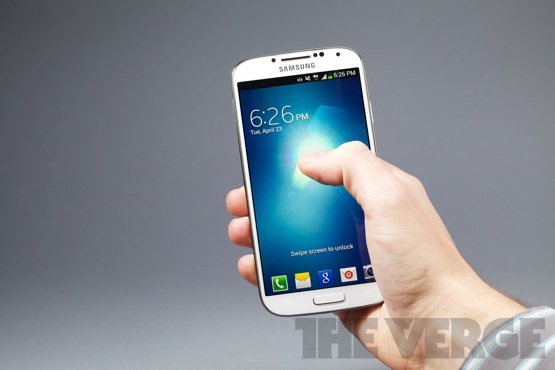
The answer's simple, and luckily for Samsung it's also immediately obvious. It's the screen. The GS4's 5-inch, 1920 x 1080 display is big, beautiful, and seriously eye-catching. The latter is partially a bad thing: the S4 uses a Super AMOLED panel like many of Samsung's phones, and like many of Samsung’s phones it displays overly contrasted and vibrant colors. Those colors may not be accurate — reds and oranges absolutely explode off the screen, whether they should or not — but they certainly catch your eye. And with a ridiculous 441 pixels per inch, even the PenTile display matrix I usually loathe causes no problems. The glass is rigid and responsive to touch, and works even if you have gloves on — which I shouldn’t have needed to test in April in New York City, and yet here we are.

For some reason, Samsung has always had trouble with screen brightness settings — the GS4 can never seem to decide how bright its screen should be, changing suddenly and drastically often and without warning. I turned automatic brightness off very quickly.

I tried to pick my favorite between the One's display and the GS4's, and wound up going back and forth a dozen times before giving up. Both are incredibly high-res, bright, and crystal clear; the One is slightly more accurate, but I still periodically forget my nitpicking and get lost in the GS4's vibrant colors. You really can't lose, and that's pretty great.

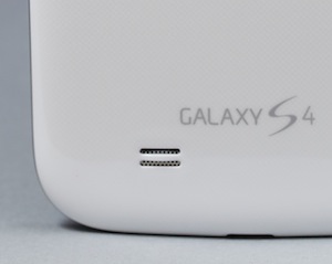
The lone speaker on the Galaxy S4 resides on its backside, in that wonderfully unconsidered spot where audio is both muffled by your hand and blasting directly away from your ears. Once again, HTC broke the curve by offering two big, powerful speakers pointed straight at your face — but the One aside, the GS4 offers surprisingly loud sound from rear-facing grille. It's not very rich and is very compressed, but it's loud. Loud is good.

2013-04-22_12 Camera

The camera Instagram deserves

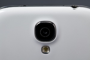
While HTC is trying to convince buyers that megapixels don't matter, and that its so-called Ultrapixels are better anyway, Samsung went the opposite direction. I don't know if all the pixels the Galaxy S4's 13-megapixel sensor are the reason, or if I should credit Samsung's fast processor or the clear attention paid to its software, but the upshot is that the GS4's camera is the best Android camera I've ever used by a considerable margin, and in most cases it's every bit as good as the iPhone 5's camera.

However, the One and the Nokia Lumia 920 do considerably better than the GS4 in poor lighting. When it’s dark, the GS4 takes the same soft, noisy pictures as any other smartphone camera, but without the incredible brightness capabilities of the One — there are pictures you'll get with the One or the 920 that the GS4 just can't capture. The GS4's autofocus stumbles in low light, too; I learned quickly to take three shots at night, in order to get one that was properly focused.

It's actually Samsung's experience with dedicated cameras that make shooting photos with the GS4 so nice. The company borrowed a lot of the GS4's camera software from the Galaxy Camera, a concept car of sorts that clearly informed its ability to build a great cameraphone. The interface is much improved over the S III, from the scrolling mode dial to the one-press capture of either stills or video. It's also simple and fast, two things many cellphone cameras are not.
2013-04-22_19 2013-04-19_10
2013-04-22_12 2013-04-19_09


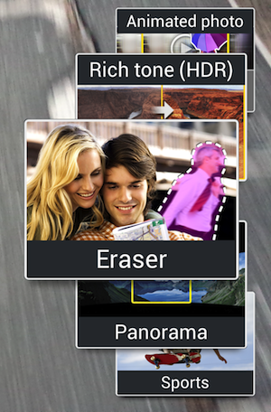
The GS4's greatest photographic achievement, though, is that it manages to be simple and fast while simultaneously offering the largest, most impressive feature set of any smartphone camera I've ever used. If you're just turning the phone to Auto and firing pictures, you're missing out. Instead, you should try turning it to Eraser Mode, which detects moving objects in your photo — like the stranger that always walks by right as you take the shot — and automatically removes them. Or scroll up to Drama Shot, which takes a series of pictures as a subject moves and then shows a whole leap, or the soccer ball's whole flight path, in one automatically-overlaid photo. Animated Photo lets you take a few seconds of video, then choose with your finger whether a part of the frame is still or in motion — you can actually create and share animated GIFs without ever leaving the camera app. Some of the more advanced features require some staging — and Drama Shot sometimes takes a couple of tries — but they're all pretty cool.

All except for Dual Camera, which despite Samsung's heavy promotion remains a mystery to me. The pitch is simple enough: you take a picture with both front and rear cameras simultaneously and overlay one on the other, so the person taking the picture appears in the picture as well. It's a neat idea in theory, but in practice left me just superimposing giant versions of my head onto random buildings, inside weird postage-stamp borders or within a heart. It's a fun, silly way to take an "I'm in New York!" selfie without turning the camera on yourself, and maybe that's enough, but it's still a little odd that Samsung is putting so much marketing muscle behind such a niche feature.

There are a lot of trees in this forest, some of them less than perfect, but taken as a whole the Galaxy S4's camera is a triumph. If it supplants the many terrible Android cameras posting to my Instagram feed, we'll all be better off.
Gs4_16-875 Software

What comes after the kitchen sink?
Gs4_19-555px

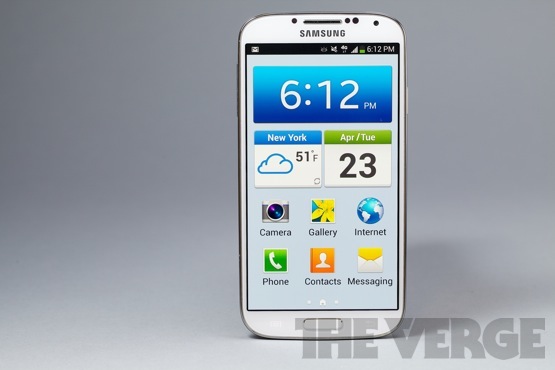
Speaking of forests with lots of trees: the GS4 may run Android 4.2, but Samsung has heaped so many features on top of Google's operating system that it almost feels like something entirely different. Normally I'm conditioned to believe stock Android is better than any manufacturer skin, but Samsung overhauls the software so completely that I'm less annoyed than I would be with a company like Motorola or LG, where the changes are typically a combination of aesthetic, problematic, and pointless. Some of Samsung's added features are all three, but many are downright useful.

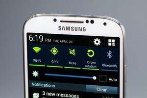
To start, the GS4 keeps all the features Samsung has debuted on various Note models and the Galaxy S III. Samsung pioneered the radio and connectivity toggles in the notification windowshade, and the GS4 offers access more and more settings there, including a brightness slider. Samsung's big clock-and-weather widget comes on the home screen by default, and the general Touchwiz look and feel remains intact. The green-on-blue-on-gray scheme is growing on me, but Samsung's hideous Calendar app never will; likewise many of the Phone menus and screens look cartoonishly terrible, with huge icons and ugly images.

What Touchwiz mostly offers is options: with a bit of effort, the GS4 can look and feel almost any way you choose. You can hide or rearrange apps in the app drawer, pick and choose quick-launch apps for the lock screen, change the order of settings and toggles, and much, much more. There's even an Easy Mode on the GS4, which turns your phone into something like John's Phone: it presents a simple dialer, shortcuts to a few common apps, huge icons for everything, and hides almost everything else. Samsung probably should’ve taken this as a sign, because if your phone needs Easy Mode you’re probably doing something wrong, but it does at least do a nice job simplifying everything the GS4 has going on.

The Galaxy S4 has a lot going on – maybe too much Gs4_24 Gs4_25-300px Gs4_22-300px 2013-04-23_21 2013-04-23_21
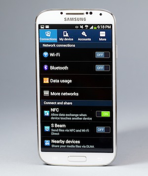
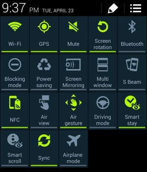
And boy, is there a lot going on. There are now 18 (yes, eighteen) toggles in the notification pulldown, which you can see by pressing a new button at the top right — it opens up a command center of sorts, which lets you turn off everything from Wi-Fi and Bluetooth to some of the wilder eye-tracking features. I kind of wish there were a Medium mode that would take away all the Minority Report stuff, and just leave a more normal Android phone.

I'll never forget Samsung's launch event for the GS4, a bizarre spectacle at Radio City Music Hall where actors went through feature after feature, explaining how they work together to make the GS4 your "Life Companion." Some of Samsung’s additions fit this bill a little more closely than others. S Health is the best example of an actual Life Companion – it's a Fitbit- or FuelBand-style app that tracks your steps, calories, sleep, and diet, offering you a way to get fit (or in my case just provide more data about my pathetically sedentary lifestyle). It's handy to have built right into your phone, and the app's pretty powerful thanks to the S4's temperature and humidity sensors — you can actually tell it how you feel, and it'll figure out how you should adjust your surroundings to feel better. S Health is a great tool, though it won't be as good as it could be until its companion accessories come out in a few months' time.

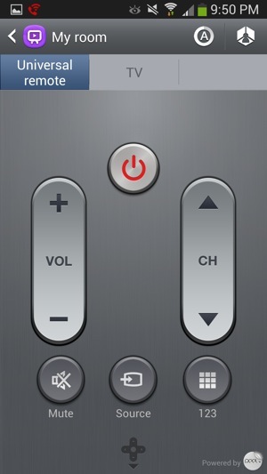
My aforementioned sedentary lifestyle is also probably to blame for why I used WatchOn, Samsung's handy universal remote and search-based TV guide app, far more than S Health. It’s a great app, offering quick and easy control over your whole home theater setup via the IR blaster on top of the GS4, plus the really clever Peel-made search and recommendations interface across your cable box, Netflix, Blockbuster, and other services. More than anything, it's just convenient — I tend to have my phone in my hands while I watch TV anyway, so switching to WatchOn to change the channel is light work.

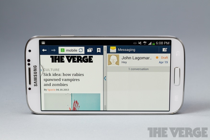
There's a full-fledged suite of Office products via the Polaris suite, though I can't say there's any way to make editing a PowerPoint on your phone a pleasant experience. There’s also a built-in translator app — I bet you can guess it’s name — plus a handy tool for scanning business cards and QR codes. Carriers (in my case T-Mobile) also add some bloatware, though Samsung lets you hide most of the apps you don’t want from the drawer — yet again, the GS4 is an incredibly malleable phone. It just takes some work to get it the way you want. You can even run two apps at once, side-by-side with a system just like the Note 8.0’s, which works surprisingly well on a smaller screen because there are just so many pixels to play with.

I like the apps and services Samsung adds to the Android experience here, but I'm less enamored with all the ways Samsung has reimagined how you'll want to actually interact with your cellphone. These features were touted heavily on the GS III despite the fact that I never once saw a regular person using S Beam or AllShare, and the trend continues unabated with the S4.

The hand waving software is more useful — sometimes. There's Air View, which approximates the Galaxy Note's ability to recognize when you're hovering over the screen with the S Pen and unearth content without making you tap, but requires only your finger. It's handy for previewing an email without opening it, or seeing stories in Flipboard, but not much else, and it requires precision hovering a centimeter away from your target — I wound up accidentally tapping on the screen half the time anyway.

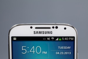
Air Gestures has me completely torn. It's really impressive, letting you wave your hand over the phone to scroll up and down a webpage or flip through a gallery, and it works reliably once you figure out your hand has to pass over the top of the phone, where the IR sensor sits next to the earpiece. I started using it while my hands were wet, or if I had something in my hand. (Sadly it doesn't work with Pocket, so I can't wave my coffee-filled hand over the phone to flip pages while riding the subway.) It's overly sensitive, though, and will often scroll back when you’re just moving your hands around. It also tended to jump as I was pointing something out or showing someone a photo, which became a pain. I wound up leaving both Air View and Air Gestures on, mostly just to show people how cool they are — and because I love that I can wave at my phone to change songs.

The list goes on and on, really, with Samsung offering features galore that you'll probably never use. The Story Album app lets you create scrapbooks from your photos, though there are plenty of third-party apps that do it better. Group Play is like AllShare on steroids – you can have everyone listen to the same song at the same time, play a game together, or all look at a slideshow, except everyone has to have a GS4 and jump through a bunch of hoops to get it all working. Of course there's also S Beam and NFC, plus a new security feature called Knox that separates your personal information from your work data — handy if you're bringing your GS4 to work, mostly superfluous otherwise.

Much of what Samsung offers seems to be just for show, designed to give sales clerks something to demo that makes the GS4 unique. The best features get out of your way, but too many are simply obtrusive — I wound up using the GS4 like I would any other phone, with most of the additional features off, and as much as I'd be thrilled to watch people waving at their phones on the subway, I'm not betting it catches on.
2013-04-23_21
Eye tracking and hand waving Gs4fixed-875
Performance

Still on the bleeding edge
Gs4_5-555px

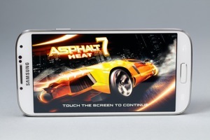
Samsung’s Galaxy S lineup has never wanted for power, and neither does the Galaxy S4 — it’s an impressively fast and powerful phone, capable of handling anything I threw at it. I could get it to drop frames in Asphalt 7 or stutter ever so slightly when closing some apps, but only by turning on and turning up every conceivable feature on the phone — and even then its stumbles are rare. Used more normally, once you've disabled some of the more obnoxious software features, it's virtually flawless.

I say "virtually" because the phone does trip up occasionally, and only in surprising places like the Gallery, which sometimes freezes and crashes for no obvious reason. Samsung's software design is clearly to blame here, and it's the most lasting reason I still dislike software skins — they just create problems Android doesn't otherwise have. But otherwise the 1.9GHz Qualcomm Snapdragon 600 processor and 2GB of RAM inside the S4 do every bit as well as you'd expect bleeding-edge specs to do. Some international markets are getting Galaxy S4s powered by Samsung’s own Exynos processor, which should be even more powerful.

The phone's going to be available on every carrier on the planet, or at least Samsung makes it feel that way — it's coming to all four major US carriers, plus a handful of smaller regional companies. I tested a device with T-Mobile, and while this device supports the company's brand-new LTE network (and its new, contract-free service plans) I didn't have a chance to test it because, well, T-Mobile’s LTE network only works in Las Vegas. Reception and data speeds were normal for T-Mobile in New York City, and I'm looking forward to the bump when LTE comes on in Manhattan. Call quality was solid if unspectacular, though I very much appreciated the "Extra Volume" button that makes the other person just astonishingly loud in your earpiece — construction zones and sirens be damned, you'll hear just fine.

My biggest frustration with the HTC One has always been its battery. It’ll last a day, but only with a bit of hand-holding. If that’s lower-middle class, I’d say the Galaxy S4 is upper-middle class: it lasts a full day almost no matter how I use it (unless I stream HD Netflix videos constantly, in which case it dies in about five hours), and will even get me to the morning if I forget to plug it in. I rarely forget to plug my phone in every night, and I don’t mind needing to charge every night, but I’m so used to babysitting my iPhone 5 all day or watching the One’s meter hit red that not having to worry about the GS4 all day was pretty wonderful.

There's never a shortage of power from Samsung Gs4_10-300px Gs4_29 Gs4_26-300px Gs4_12-875
25 Apr 12:09

Inside Video Games, A Retro Collection of 3D Pixel Art by Metin Seven

by Justin Page

Inside Donkey Kong Stage 2 by Metin Seven

Inside Donkey Kong – Stage 2

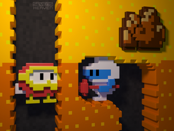
Netherlands-based artist Metin Seven (aka “Sevensheaven“) has created a retro collection of 3D pixel art that takes a look Inside Video Games. Prints are available to purchase online at Imagekind.

Pac Mans Dilemma by Metin Seven

Pac-Man’s Dilemma

Inside Space Invaders by Metin Seven

Inside Space Invaders

Inside Dig Dug by Metin Seven

Inside Dig Dug

Inside Galaga by Metin Seven

Inside Galaga

Inside Donkey Kong Junior by Metin Seven

Inside Donkey Kong Junior

Inside Defender by Metin Seven

Inside Defender

Game Over by Metin Seven

Game Over

via it8Bit

25 Apr 02:46

Say goodbye to power cords with USB 3.0 update

by Tim Schiesser
Slimfady

nice

Intel has revealed that USB 3.0 SuperSpeed will soon receive a specifications boost, allowing for power output of up to 100 watts through a single port, which could remove the need for custom chargers Read more...
23 Apr 05:06

Namco's Idolm@ster games released on iOS in English (for $55 each)

by JC Fletcher
Slimfady

$55 for a mobile game? WTF?

Namco's Idolmster games released on iOS in English for $55 eachNamco Bandai's Idolm@ster games have been exclusive to Japan since the series started, and for good reason: they're all about being a producer who recruits, trains, and promotes a girl group of "idol" performers. It's a huge sensation in Japan, and would meet mostly blank stares over here.

And now, Namco is helping generate those blank stares, releasing three Idolm@ster games, in English, on the iOS App Store. The catch: they're rhythm game spinoffs, without any of the simulation aspects. The real catch: they're $54.99 each. They're the same, except each stars a different team of erstwhile idols and includes a different animated sequence.

Square Enix just breathed a massive sigh of relief, as the pressure is off of its insane iOS pricing tendencies for a while.

JoystiqNamco's Idolm@ster games released on iOS in English (for $55 each) originally appeared on Joystiq on Mon, 22 Apr 2013 21:50:00 EST. Please see our terms for use of feeds.

Permalink | Email this | Comments
22 Apr 16:00

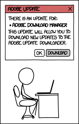
All Adobe Updates

ALERT: Some pending mandatory software updates require version 21.1.2 of the Oracle/Sun Java(tm) JDK(tm) Update Manager Runtime Environment Meta-Updater, which is not available for your platform.
20 Apr 18:23

Authorization

Before you say anything, no, I know not to leave my computer sitting out logged in to all my accounts. I have it set up so after a few minutes of inactivity it automatically switches to my brother's.
20 Apr 18:20

Chinese site exploits Apple's own tools to distribute pirated apps without jailbreaking

by Aaron Souppouris
Screen-shot-2013-04-18-at-2-00-14-pm_large

Chinese pirate site 7659 is exploiting Apple's bulk enterprise licensing tools to distribute free versions of paid App Store applications. Bulk enterprise licensing is supposed to let businesses send in-house apps to employees without dealing with Apple's App Store. It works via a developer provisioning profile, which facilitates "sideloading" of sorts without jailbreaking.

The site is only open to users in China, but that restriction can be circumvented via proxy server. According to VentureBeat, 7659 is full of apps that would otherwise cost money. Those include our best new app last week, Badland, which is usually $3.99, and Final Fantasy V, priced at $15.99 in the App Store. In a statement on its site, Kuaiyong, the company that appears to run 7659, explains its reasoning behind offering the apps:

"First of all, we would like to thank all Apple users around the world and your support for Kuaiyong.

Statistics have shown that a significant amount of Apple users are Chinese based. However, the fact is that in China, a large number of Apple users are not very familiar with the iTunes system and how to effectively manage it.

In order for Chinese Apple fans to download applications securely, Kuaiyong developed its own method of giving users access to thousands of free apps without having to jailbreak their devices. Kuaiyong offers detailed descriptions of apps, free app download trial, IOS device management and visual and audio file backup system. IOS system backup and recovery features will also be released in the very near future.

Our goal has always been about bringing Chinese Apple users with quick, convenient and pleasant IOS experience. Since the introduce of Kuaiyong, the proportion of jailbreak in China has declined dramatically from 60% to around 30%. Kuaiyong will hold on to this goal in the future and we would like to see more support for Apple as well as Kuaiyong."

Kuaiyong's justification for providing pirate apps — that navigating the App Store is difficult for Chinese users — is laughable at best. It would appear that Apple won't have a particularly tough time putting a stop to this, though, as all of the apps are provisioned with the same developer profile. Apple just needs to find a way to cut 7659's profile off. Of course, there's always the chance that the same organization could use another developing profile to achieve the same thing, and it's not clear if Apple is able to remove apps remotely from users' phones. VentureBeat says it asked Apple for comment on the matter "multiple times" without response, but we've also reached out to ask how it plans to deal with 7659.

20 Apr 18:19

Photo


19 Apr 07:54

Watch 10,000 iPhones Fall Like Dominoes

by Samantha Murphy
Iphonedominoes Feed-twFeed-fb

Be prepared to be blown away as you watch 10,000 iPhones beautifully fall like dominoes in this epic visual masterpiece.

Aatma Studio — the makers behind the viral iPhone concepts that envisioned the device with a stunning laser and a 3D multiplayer hologram for gaming — created a virtual office environment with 10,000 iPhone 5s standing on end. (Yes, these iPhones are computer-generated, so the company didn't actually buy 10,000 iPhones for the project.)

As the first one tips over, rows of phones fall like dominoes over the other, revealing new patterns as the phones fall from room to room — and even take a ride in an elevator. Read more...

More about Iphone, Iphone 5, Tech, Gadgets, and Mobile
19 Apr 07:53

'World 1-2' album brings chiptune artists and legendary composers together

by JC Fletcher
'World 12' album brings chiptune artists and legendary composers together World 1-2, a new album produced by Mohammed Taher for the record label GameChops, is a collection of new material by relatively new voices like Super Hexagon composer Chipzel, and established artists like Mega Man's Manami Matsumae (who Taher's Koopa Soundworks connected to Yacht Club Games for Shovel Knight). Other artists on the eclectic mix include Danimal Cannon, Austin Wintory, Tecmo's Keiji Yamagishi, halc, and Akira Yamaoka.

The album will be released on May 2 for $10. Five sample tracks can be streamed here, in case the collected talent on the album isn't convincing enough.

Joystiq'World 1-2' album brings chiptune artists and legendary composers together originally appeared on Joystiq on Tue, 16 Apr 2013 19:00:00 EST. Please see our terms for use of feeds.

Permalink | Email this | Comments
18 Apr 01:38

Xbox Live outage knocks gamers offline, renders Netflix and other apps useless (update)

by Chris Welch
Xboxstock1_640_large

Xbox Live is currently experiencing a significant service disruption, with many users reporting problems when trying to sign in to Microsoft's online gaming platform. The outage — which inconveniently comes during peak weekend gaming hours — has subsequently rendered a large part of the console's functionality useless for the time being. Many of the most popular apps on Xbox 360 (including Netflix, HBO Go, Hulu, and YouTube) are tied to Xbox Live Gold subscriptions; if you're unable to sign in, you won't be able to access any content. Microsoft has confirmed the ongoing issue on its Xbox support website, pledging that "every available resource" is currently working to get players back online. In the meantime, the company is...

Continue reading…

14 Apr 07:37

Hilarious Photos of Commuters with Their Heads Replaced by Newspaper Photos

by EDW Lynch

Hilarious commuter newspaper photos

Ordinary commuters are transformed into celebrities, cartoon characters, and animals with the help of a strategically positioned newspaper in these hilarious photos by an anonymous London commuter. According to the Daily Mail, the mystery photographer takes the photos to entertain coworkers. For more photos, see this gallery at Shortlist Magazine.

Hilarious commuter newspaper photos

Hilarious commuter newspaper photos

Hilarious commuter newspaper photos

Hilarious commuter newspaper photos

via gallery at Shortlist Magazine, New York Daily News, Phoblographer, PetaPixel

photos via Rex USA

12 Apr 09:42

Alive Without Breath: Three Dimensional Animals Painted in Layers of Resin by Keng Lye

by Christopher Jobson

Alive Without Breath: Three Dimensional Animals Painted in Layers of Resin by Keng Lye  sculpture resin paint fish animals

Alive Without Breath: Three Dimensional Animals Painted in Layers of Resin by Keng Lye  sculpture resin paint fish animals

Alive Without Breath: Three Dimensional Animals Painted in Layers of Resin by Keng Lye  sculpture resin paint fish animals

Alive Without Breath: Three Dimensional Animals Painted in Layers of Resin by Keng Lye  sculpture resin paint fish animals

Alive Without Breath: Three Dimensional Animals Painted in Layers of Resin by Keng Lye  sculpture resin paint fish animals

Alive Without Breath: Three Dimensional Animals Painted in Layers of Resin by Keng Lye  sculpture resin paint fish animals

Alive Without Breath: Three Dimensional Animals Painted in Layers of Resin by Keng Lye  sculpture resin paint fish animals

Alive Without Breath: Three Dimensional Animals Painted in Layers of Resin by Keng Lye  sculpture resin paint fish animals

Alive Without Breath: Three Dimensional Animals Painted in Layers of Resin by Keng Lye  sculpture resin paint fish animals

Singapore-based artist Keng Lye creates near life-like sculptures of animals relying on little but paint, resin and a phenomenal sense of perspective. Lye slowly fills bowls, buckets, and boxes with alternating layers of acrylic paint and resin, creating aquatic animal life that looks so real it could almost pass for a photograph. The artist is using a technique very similar to Japanese painter Riusuke Fukahori who was featured on this blog a little over a year ago, though Lye seems to take things a step further by making his paint creations protrude from the surface, adding another level of dimension to a remarkable medium. See much more of this series titled Alive Without Breath over on deviantART. (via ian brooks)

Update: I have some additional details from the artist that I’d like to add here, as this post seems to be getting a lot of attention. Via email Lye shares with me:

I started my first series in 2012 where all the illustrations were “flat” and depth was created using the layering of resin and acrylic over the different parts of the illustration. This year, I started on the octopus and it was purely an experiment; I just wanted to see whether I could push this technique to a higher level. After applying acrylic paint straight onto the resin, I incorporated a 3-D element in this instance, it was a small pebble for the ranchu and octopus. For the turtle, I used an egg shell for the turtle shell and acrylic paint for the rest of the finishing. The whole idea here was to give the art work an even more 3D effect therefore you can have a better view from any angle. I think there are still many other techniques to explore.

So to be clear the elements that extrude from the top of the resin are actually physical pieces that have been painted to match the layers of acrylic and resin below.

11 Apr 14:32

A fresh new look for Google Play

by Unknown
Whether you’re in the mood to listen to Justin Timberlake’s new album, read Harlan Coben’s latest bestseller or discover a new game to play, you want the experience of finding and making your purchase to be quick and easy. Today we’ve started rolling out a redesigned Google Play store on Android phones and tablets that is simple, clean and — most importantly — helps you find great entertainment, fast.


The new design focuses on bigger images that jump off the page. Similarly themed content is grouped together so you can hone in on a magazine to read or an app to try. As you move down the page, new recommendations continue to appear so there is always more to see and explore. We’ve also simplified purchasing so you can breeze through checkout and get to enjoying your movie rental or other content.


The redesigned Google Play store app starts rolling out today for Android phones and tablets running Android 2.2 (Froyo) and above. People around the world should see it over the next few weeks. Get ready for a simpler Google Play.

Posted by Michael Siliski, group product manager for Google Play
11 Apr 14:12

Facebook Home review: are people more important than apps?

by Dieter Bohn
2013-04-09_at_19-56-06-hero_large

On April 12th, the much-vaunted Facebook Phone will arrive — but it's not a phone at all. Facebook Home, as it's called, is a couple of pieces of software that transform any Android smartphone’s homescreen into a Facebook feed, and put Facebook Messenger chats on top of any app. Instead of making a sucker's bet that it can take on Apple and Samsung directly, Facebook is doing what Facebook does best: making software.

It's a clever strategy, but it will only work if the software is actually compelling enough for people to want to install and use it. Facebook needs to convince a wide swath of users who never gave their homescreens a second thought that it has a better way. Even if it can't, Facebook is hedging its bets with another feature that makes texting much easier. Will either be enough to draw users away from Twitter and into Zuckerberg's world? Read on for our full review.

Video Review Getting Home

Getting Home

How to give your phone over to Facebook 2013-04-09_at_19-54-15-555px

Facebook Home essentially consists of two parts. The first is Facebook Home proper (henceforth "Home"), which replaces your homescreen and your lockscreen with Facebook's News Feed and app launcher. The second is a major update to Facebook Messenger which lets you receive and reply to texts no matter which app you're using.

To start, Facebook is only making Home available on a select few Android devices: the HTC One and One X, and the Samsung Galaxy S III, S4, and Note II. Actually, there's one more phone that it's available on, the HTC First. You can read our full review of the HTC First here, but for now the main thing to know is that the First offers a few more Home features than what's possible on those other devices. Facebook has promised to expand which devices it will support, but the depth of integration necessary for Home to operate means that it likely won't be able to just release it for every single Android device that's out there.

A custom Android launcher for the masses

To install Home, you simply need to download it from Google Play and run the app. When you do, you'll see a dialog box or two asking if you'd like to set Facebook Home as your default launcher when you hit the home button — it's a fairly easy setup process, and if you decide you don't want to use it later, there are settings within Home that let you turn it off. In my testing on the HTC First I found that you can disable Home but still keep using the Messenger "Chat Head" feature on top of your current Android setup — more on that in a bit.

Getting started should be a familiar process for anybody who's installed a custom launcher, but I imagine that some users may be a little confused by the sudden disappearance of their homescreen. Any of the work you've put into customizing your homescreens will be hidden underneath the new Home skin. Facebook is probably targeting the kind of user who never bothers do to much of that in the first place, offering them a much simpler and cleaner Android experience than what anybody else does right now.

2013-04-09_13
2013-04-06_11
Cover Feed

Cover Feed

The simple interface works on both a functional and conceptual level 2013-04-09_10 2013-04-09_10

2013-04-09_at_20-04-31-555px

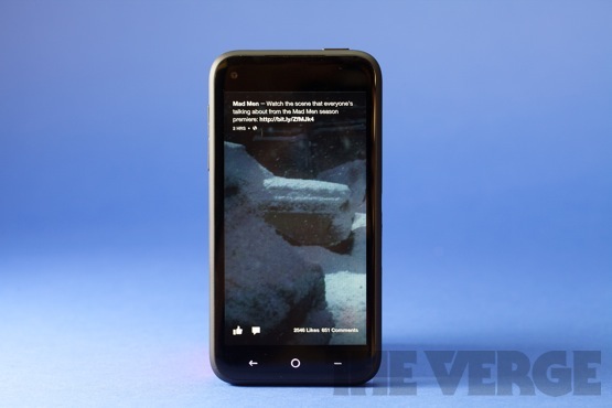
Home takes status updates out of the Facebook app and slaps them right on your homescreen. Instead of little boxes scrolling vertically, however, each update from your News Feed becomes a full-screen photo with small bits of text at the top. You can let them flow by until your screen goes dark or swipe through them one by one.

The moment you power up your phone, you're greeted with the time up top, and your own profile picture at bottom in a little circle that Facebook calls a "bobble." These both quickly fade away to reveal your stream of News Feed updates, including images, text updates, links, and a couple others. Also, "Yup!", eventually Facebook will put ads in Cover Feed, though probably not on the first screen.

The overall design is quite good, with clean white fonts that are bolded for links and names, and each person's name and profile photo up top as well. The design is almost entirely "chromeless" in that there are none of the traditional buttons, sliders, and switches you usually see on a smartphone interface. Facebook also hides the traditional Android status bar, which shows your notifications, signal strength, and time. You can still get to it with a swipe down from the top (a second swipe brings down your notification drawer), and if you really want it back there's a setting for that.

As you play around, you quickly discover that you can tap once to toggle the "bobble" control at bottom on and off, double tap to like something, and swipe to move to the next update. There actually are a few buttons at bottom, but they're simple and clean icons: thumbs up for liking, a chat bubble for commenting, and a like/comment count. You can tap on the chat bubble to bring up the comments for that particular post and comment yourself. For posts without images (simple text updates or links), the image you see in the background is your friend's main cover image. All of the images pan slowly with a "Ken Burns" effect, and there's one more gesture — a long tap — that zooms the photo out so you can see the whole thing.

That's basically the entirety of what you can do in Cover Feed, but the simple interface works on both a functional and conceptual level. I found myself casually swiping through images when I turned on my phone instead of, well, doing whatever it was I intended to do when I turned the darn thing on. Facebook's basic addictive quality — seeing what your friends are doing — translates very well to this more immersive interface.

Of course, not every status update is a beautiful image or amusing bon mot. We all have friends who post garbage we don't really care about on Facebook and having that garbage on your lockscreen can be a jarring experience. For every baby photo and landscape scene, there was a fleeting image of my ex wife or an ill-informed political rant. Unfortunately, getting these images off of your homescreen is a trial, because you can't directly hide something in Cover Feed. Instead, you need to go to the Facebook app itself and hunt down the offending post, then hide it there. Cover Feed definitely got me using Facebook more, but part of my increased usage included unfollowing a bunch of people's updates. Sorry, but there are really only so many pictures of omelets I need to see on a Sunday morning, and most of them I don't really want on my homescreen.

All too simple

All too simple

2013-04-09_at_19-51-09-555px

Smartphones, especially Android smartphones, can be daunting to a new user. They introduce multiple usage metaphors that aren't immediately obvious: Lock screen, homescreen, app drawer, multitasking, back, and menu all play key parts in getting around your phone. Most of us who have used smartphones for any appreciable amount of time take these UI elements for granted, they quickly become second nature.

Facebook deserves some credit for trying to rethink these basic concepts in its quest to remove as much complexity as possible. To wit: Facebook Home does a funny little thing to your homescreen and your lock screen, it combines them into a single entity. Instead of "unlocking" your phone, you can interact with Cover Feed straight-away. Instead of having a separate widget-based homescreen and app drawer, it collapses them both into the same interface.

Here's where the little "bobble" comes in. Inside Cover Feed, a single tap brings up your own profile picture in a little circle at the bottom, the so-called "bobble." When you press your thumb on it, three shortcut icons appear. To the left is Messenger, up top is Apps, and to the right is a shortcut to whatever you most-recently-used app was. You drag the bobble to the shortcut you want and release to activate it.

It's incredibly strange that these are the only three options — you'd expect that Facebook would have a top-level shortcut to launching the camera, but you'd be wrong. If you were wondering whether Facebook was serious about Messenger, wonder no more: right now it's apparently more important to the company than any other app it makes.

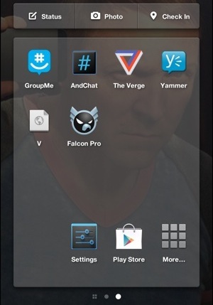
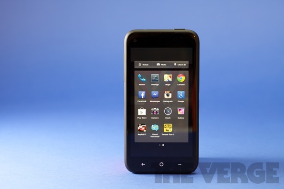
If you choose Apps, you're taken to Home's radically simplified app launcher. It consists of two parts. On the far left is an alphabetical listing of all your apps. To the right is a four-by-four grid of icons that Facebook calls "Bookmarks." The grid sits beneath a set of icons for posting a status update, uploading photos, or checking into a location.

You can drag apps over to the bookmarks section, arranging them as you please, and you can have multiple screens of these grids. Actually, you can have as many screens as you like (I stopped counting when I hit 15), but what you can't have are folders or widgets.

Although I'm all for making smartphones more accessible, I hesitate to think that folders would set anybody adrift in a sea of confusion. When we asked about this lack, Facebook says only that this is just the first version of Home and that updates will come on a monthly basis. The loss of widgets is less vexing to me. Although I use them myself on Android, I have to admit that I don't use them heavily and I am sure that a large swath of Android owners don't use them at all. Facebook has included a button labeled "More" which will drop you temporarily into your default launcher, so you could theoretically keep your widgets there for when you need them and use Home for when you don't.

You can have as many screens as you like, but you can't have folders or widgets 2013-04-07_16 2013-04-09_10
2013-04-08_16

2013-04-06_12

Things get even weirder if you have a PIN enabled on your phone. By default, Facebook puts Home "above" the PIN entry screen, which means that even if your phone is locked you can still see your Cover Feed, like and comment posts, and even see all of your installed apps. That's a pretty crazy level of access, but luckily you can put the PIN entry back up top if you like. Otherwise, the default behavior leads to aggravating moments like not being able to pull down your notification drawer and not knowing why.

One thing I really do like with Home is how it handles notifications. Instead of scurrying them away in the Notification drawer, they're presented front and center in a set of stacked cards in the center of your homescreen a la iOS.

Each card presents a small preview of the notification and you can tap on it to open the relevant app or swipe it away to the left or right. You can also long-press to stack all of them up and then dismiss them as a group. Finally, you can swipe them down to temporarily hide them if you want to get a better look at your Cover Feed.

Unfortunately, the downloadable version of Home only has access to SMS, Facebook Messenger, and Facebook notifications — the rest show up in the traditional way. On the HTC First, you get all of your notifications on Home, and Facebook says it's working with manufacturers to extend that feature to more phones in the future.

I should point out that I noticed a bug here and there in Home. Specifically, the text from a different app would show up in the Google Now notification and when you install a new app it doesn't go straight to where it belongs in the alphabetical app drawer — instead it gets put down at the bottom for a brief period.

Facebook says (much to Microsoft's chagrin) that its primary innovation on Home is putting the focus on "people, not apps." That is obvious on Cover Feed, but it also applies to notifications. Especially with Facebook alerts, the thing you see in a notification is the person from whom it came, not the app. It's a nice touch that I'd like to see more of on smartphones, but for now it's just a small step in that direction.

With Home, Facebook has moved well beyond simplicity and into primitiveness. Until and unless one of those monthly updates contains some better tools for managing your apps, only the most diehard Facebook junkies should install Home.

Chat Heads

Chat Heads

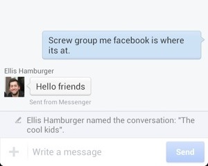
As a home screen, Facebook Home is definitely a mixed bag. However, the second part of Home is a big update to Facebook Messenger that changed the way I talk to people on my smartphone. It's called "Chat Heads," which is a stupid name for a great idea. Instead of having to constantly switch into your texting app, your ongoing conversations are immediately available no matter what you're doing on your phone. Messenger works with both Facebook messaging and your SMS messages, so even if you're not a fan of Facebook you can still take advantage of this useful feature.

A Chat Head is a tiny little circle that sits on edges of your screen on top of whatever app you happen to be using. The Chat Head has your friend's Facebook profile picture on it, and when you tap on it it pops up an overlay with your text conversation.

The difference in immediacy and convenience is huge. What Facebook has figured out is that people usually have messaging conversations with somebody for a little while, but are doing other things on their phone while they do it. Being able to reply without losing your sense of place is incredibly convenient.

As far as implementation goes, Facebook has applied the same deep level of coding to Chat Heads that it did on Facebook Home. That means that these little bubbles can streak around your phone fairly quickly and the Chat Head conversation view pops up and disappears relatively snappily — though I did detect a hint of lag from time to time. If the bubble is in the way of something you need on the screen, you can move it to another spot. Actually, you can just flick it wildly across the screen and it'll shoot over to where you've flung it as though on a bungee cord — it bounds over with invisible Cut-the-Rope physics and speed.

You can have up to four Chat heads active at any time, including group Facebook conversations, but only the most recent one appears on the edge of your screen. When you tap it, the rest of your conversations are arrayed at the top. When you drag it, you can see the other Chat Heads trailing behind it and, if you like, you can simply fling the whole set down to the "X" button at the bottom of your screen to dismiss them.

2013-04-05_07
2013-04-05_07
2013-04-09_09

That's not to say that Chat Heads are perfect. They have a tendency to disappear sometimes, either because Android is managing memory or because you've opened Facebook's Messenger app. You can bring them up manually with a long press in the Messenger app, but most often you can just wait for a message to roll in and they'll pop up.

I also wish that Facebook Messenger did a slightly better job of integrating SMS. Your SMS conversations aren't threaded into your Facebook Conversations, but instead kept separate. Windows Phone, iOS, and even webOS have all already figured out that keeping your entire text conversation in a single thread — no matter which service you're using — is the best way to do it. I wish Facebook would do the same. Actually, I wish that I had something like Chat Heads that was completely service-agnostic and worked with GChat, WhatsApp, and so on — but given the current state of messaging right now that's unlikely.

Technically, Facebook isn't the first company to overlay its own software on other apps, but it's probably the biggest. Moreso than with Home proper, Chat Heads has real potential to extend Facebook's reach into mobile even further. I don't know if I'm really ready to move all my texting activity into Facebook Messenger just so that I can use Chat Heads, but I'm close. I'm sure that many people with fewer compunctions about Facebook won't be so hesitant, and that means that Chat Heads give Facebook a real chance at finally gaining some serious traction in the messaging space.

09 Apr 15:02

Homemade Mosquito Trap

by Jonco

Mosquito trapWorks on Gnats too!

Items needed:

1 cup of water
1/4 cup of brown sugar
1 gram of yeast
2-liter plastic bottle

1. Cut the plastic bottle in half.
2. Mix brown sugar with hot water. Let cool. When cold, pour in the bottom half of the bottle.
3. Add the yeast. No need to mix. It creates carbon dioxide, which attracts mosquitoes.
4. Place the funnel part, upside down, into the other half of the bottle, taping them together if desired.
5. Wrap the bottle with something black, leaving the top uncovered, and place it outside in an area away from your normal gathering area. (Mosquitoes are drawn to the color black or white.)

Change the solution every 2 weeks for continuous control.

via

Thanks Cari


09 Apr 06:02

Intel’s next Thunderbolt version doubles speeds, can multitask

by Andrew Cunningham
Thunderbolt adoption still hasn't reached critical mass, but Intel will continue to iterate on the technology. Chris Foresman

We're not far off from the introduction of Intel's next-generation Haswell processors, but this isn't the only new technology that Intel has in the hopper. In a presentation at this year's National Association of Broadcasters (NAB) Show, the company also took some time to detail upcoming enhancements to its high-speed Thunderbolt interface.

Engadget reports that the next-generation version of the interface, called "Falcon Ridge," is due out in 2014, and it will double the speed of current Thunderbolt controllers—we'd heard rumors about this controller before, but this is our first official confirmation from Intel. The second-generation "Cactus Ridge" controllers were capable of 10Gbps transfer speeds, but Falcon Ridge increases this to 20Gbps. Falcon Ridge also apparently has enough bandwidth to display a 4K image and transfer files at the same time, and it will be backward-compatible with existing cables and devices.

In the meantime, this year's Haswell processors will be paired with another slightly less exciting Thunderbolt update, codenamed "Redwood Ridge." This controller keeps the same 10Gbps speed as Cactus Ridge but consumes a bit less power, supports DisplayPort 1.2, and will reportedly be integrated into some of Haswell's chipsets, obviating the need for a separate controller chip. Intel won't say specifically which Haswell chipsets will and won't feature the integrated controller, but it may be a feature confined to higher-end chipsets, at least initially.

Read 2 remaining paragraphs | Comments

09 Apr 05:07

Awww, This Mario Wedding Is So Sweet I Want To Get Married All Over Again

by Luke Plunkett

Where 96% of video game weddings are tacky, horrid affairs, potentially awkward for many guests and with a high chance of regret decades down the line, this one gets the balance between "video game wedding" and "normal wedding" just right.

The key is in the style and design, with every reference obvious enough to fans that its from Mario, but classy enough that if you don't get it, it just looks cool.

It may have taken place back in 2011, but this Mario-themed wedding was so damn good it's taken the internet that long to get its breath back and say something about it.

SUPER MARIO BROS. WEDDING INSPIRATION [Green Wedding Shoes, via pxlbyte]

08 Apr 07:05

Artist Hong Yi Plays with her Food for 30 Days

by Christopher Jobson

Artist Hong Yi Plays with her Food for 30 Days food

Artist Hong Yi Plays with her Food for 30 Days food

Artist Hong Yi Plays with her Food for 30 Days food

Artist Hong Yi Plays with her Food for 30 Days food

Artist Hong Yi Plays with her Food for 30 Days food

Artist Hong Yi Plays with her Food for 30 Days food

Artist Hong Yi Plays with her Food for 30 Days food

Artist Hong Yi Plays with her Food for 30 Days food

Artist Hong Yi Plays with her Food for 30 Days food

Artist Hong Yi Plays with her Food for 30 Days food

For almost every day last month Malaysian artist/architect Hong Yi (who often goes by the nickname Red) created a fun illustration made with common (and occasionally not so common) food. Her parameters were simple: the image had to be comprised entirely of food and the only backdrop could be a white plate. With that in mind Yi set out to create landscapes, animals, homages to pop culture, and even a multi-frame telling of the three little pigs. The project, which still appears to be ongoing, has been documented heavily around the web, but if you haven’t seen it all head over to her Facebook and read an interview on designboom. Photos will also be appearing on her Instagram at @redhongyi.

08 Apr 07:01

Mario Balotelli to be fined after getting caught smoking in train bathroom

by Brooks Peck

Mario Balotelli has displayed an increase in production on the pitch and more maturity off it since his move from Man City to Milan at the end of January. This improvement is made clear by the latest story about him. You see, instead of letting his friends burn down the bathroom of his rented mansion by setting off fireworks inside it, he was simply caught smoking a cigarette inside the bathroom of a train car on the way to Milan's match against Fiorentina. Progress!

From Reuters:

Balotelli was told off by the train guard, who told Galliani: "You need to pull his ears. He was smoking in the bathroom," Gazzetta dello Sport reported.

Smoking is banned on Italian trains. "I want to say that we're going to fine him," Galliani said.

Perhaps Mario should just stick to sleeping on the luggage racks during train rides.

Fiorentina and Milan ended up playing to a 2-2 draw. Balotelli was booked in the 70th minute for not getting back on a free kick, which means he will miss next week's match against second-place Napoli due to yellow card accumulation.

Memorable Moments from Yahoo! Sports:

Other popular content on Yahoo! Sports:
Irish fighter hopes $60K UFC payday starts path away from welfare
FBI reportedly investigating Rutgers whistle-blower Eric Murdock
Jason Cole: Let gay players come out on their terms

07 Apr 06:53

Mega Man 1 OST now available digitally through Capcom

by Jordan Mallory
Mega Man 1 OST now available digitally through Capcom As the first step in an ongoing effort to make all of the original NES Mega Man soundtracks "legitimately available in the West," the fly jams built into 1987's Mega Man are now available directly through the Capcom Store. The digital pack costs $8.95 and includes 28 different tracks from the game, including such unforgettable hits as "Staff Roll (PS)" and "Capcom Logo."

In case you missed it yesterday, Mega Man composer Manami Matsumae is still in the video game composing business after 26 years, and will be contributing her extensive talents to Shovel Knight's soundtrack, in the form of two original songs.

JoystiqMega Man 1 OST now available digitally through Capcom originally appeared on Joystiq on Sat, 06 Apr 2013 21:00:00 EST. Please see our terms for use of feeds.

Permalink | Email this | Comments
06 Apr 19:18

You Busy?

03 Apr 17:26

34 Hyperrealistic Paintings You'll Swear Are Photographs

by Attila Nagy

34 Hyperrealistic Paintings You'll Swear Are PhotographsAs you scroll through these 34 exquisite hyperrealistic paintings, something strange will happen. You'll start doubting your eyes, then your brain, then these images. You'll become convinced that at least a few of them are photographs and not acrylic paint. They have to be.

But you know what? You'll be wrong.

Click on the images in order to take a closer look at the full paintings!


34 Hyperrealistic Paintings You'll Swear Are Photographs

Denis Peterson: Off the Track. Urethanes on wood panel.

34 Hyperrealistic Paintings You'll Swear Are Photographs

Robert Bechtle: Berkeley Pinto (John De Andrea and his Family next to Bechtles Car). 1976, oil on canvas.


34 Hyperrealistic Paintings You'll Swear Are Photographs

Gérard Gasiorowski: The approach. That's me, who needs to make enormous efforts to keep himself on the surface of things. 1970, oil on canvas.


34 Hyperrealistic Paintings You'll Swear Are Photographs

Don Eddy: Untitled (Volkswagen). 1971, acryl on canvas.


34 Hyperrealistic Paintings You'll Swear Are Photographs

Malcolm Morley: Portrait of Esses in Central Park. 1969-1970, liquitex on canvas.


34 Hyperrealistic Paintings You'll Swear Are Photographs

Tom Blackwell: Gap Outlet, Waterside Shops, Naples, FL. 2004, oil on canvas.


34 Hyperrealistic Paintings You'll Swear Are Photographs

Tjalf Sparnaay: Supersandwich!! 2013, oil on linen


34 Hyperrealistic Paintings You'll Swear Are Photographs

Anthony Brunelli: Monument Square (Troy). 1997, oil on linen.


34 Hyperrealistic Paintings You'll Swear Are Photographs

Peter Maier: 1908 Indian Racer. 2005.


34 Hyperrealistic Paintings You'll Swear Are Photographs

Allan Gorman: Macho Dream. 2013, oil on canvas.


34 Hyperrealistic Paintings You'll Swear Are Photographs

Richard Heisler: Shinjuku Sunset II (100 Views of Tokyo). 2010, oil on linen.


34 Hyperrealistic Paintings You'll Swear Are Photographs

Charles Hartley: Bahama Surf. 2012, oil on Polyester.


34 Hyperrealistic Paintings You'll Swear Are Photographs

Chris Jenkinson: Good Morning America. 2008, oil on board.


34 Hyperrealistic Paintings You'll Swear Are Photographs

Matteo Mezzetta: Dj #2. 2010, oil on canvas.


34 Hyperrealistic Paintings You'll Swear Are Photographs

Jerry Ott: Pretty Picture #1. 2011, acrylic on panel.


34 Hyperrealistic Paintings You'll Swear Are Photographs

Hilo Chen: Beach 125. 1996.


34 Hyperrealistic Paintings You'll Swear Are Photographs

Clive Head: 42nd Street, Sunday Morning. 2001, oil on linen.


34 Hyperrealistic Paintings You'll Swear Are Photographs

Ron Kleemann: Red Bull Sitting. 2011, oil on canvas.


34 Hyperrealistic Paintings You'll Swear Are Photographs

Richard McLean: Lynne's Brymar Shantytown. 1991, oil on linen.


34 Hyperrealistic Paintings You'll Swear Are Photographs

Bertrand Meniel: Breakfast at the Fairmont. 2009, acrylic on linen.


34 Hyperrealistic Paintings You'll Swear Are Photographs

David Parrish: Midway. 2007, oil on canvas.


34 Hyperrealistic Paintings You'll Swear Are Photographs

Richard Estes: The Plaza. 1991, oil on canvas.


34 Hyperrealistic Paintings You'll Swear Are Photographs

Méhes László: Lukewarm water I. 1970, Acrylic on canvas.


34 Hyperrealistic Paintings You'll Swear Are Photographs

John Salt: Blue Mobile Home. 1992-93, oil on linen.


34 Hyperrealistic Paintings You'll Swear Are Photographs

Audrey Flack: Shiva Blue. 1973, oil over acrylic on canvas.


34 Hyperrealistic Paintings You'll Swear Are Photographs

Ben Schonzeit: Hot Peppers. 2011, acrylic on polyester.


34 Hyperrealistic Paintings You'll Swear Are Photographs

Raphaella Spence: Empire State. 2012, oil on canvas.


34 Hyperrealistic Paintings You'll Swear Are Photographs

Robert Gniewek: Rosie's Diner #10. 2011, oil on canvas.


34 Hyperrealistic Paintings You'll Swear Are Photographs

Ralph Goings: Miss Albany Diner. 1993, oil on linen.


34 Hyperrealistic Paintings You'll Swear Are Photographs

Luigi Benedicenti: Autunno 2. 2011 , oil on panel.


34 Hyperrealistic Paintings You'll Swear Are Photographs

Sharon Moody: The Amazon Tricks Me. 2012 , oil on panel.


34 Hyperrealistic Paintings You'll Swear Are Photographs

Hubert De Lartigue: Sushi. 2010 , acrylic on canvas.


34 Hyperrealistic Paintings You'll Swear Are Photographs

Juan Cossio: Fortune's Wheel. 2012, acrylic on panel.

Top image: Marilyn Minter: Bazooka. 2009, enamel on metal.


Do you have your favourite hyperrealistic artwork? Show us in the comments!

03 Apr 15:07

This is the goal-line technology system selected by FIFA for the World Cup

by Brooks Peck

FIFA finally settled on a goal-line technology system that will be used at this summer's Confederations Cup, and if all goes well, next summer's World Cup. The German GoalControl system (demonstrated in the video above with an overly dramatic soundtrack) does not require any modifications to goals, nets or balls and uses high-speed cameras. When a goal is scored, the referee's watch vibrates. So even if he's not paying attention at all, we shouldn't have a repeat of the Frank Lampard disallowed goal against Germany in 2010.

Here's a more detailed explanation of how it works from the company's website:

The GoalControl-4D system works with 14 high-speed cameras (7 per goal) around the pitch at the stadium roof/catwalk. The cameras are connected to a powerful image processing computer system which tracks the movement of all objects on the pitch and filters out the players, referees and all disturbing objects. The remaining object is the ball and the system knows its three dimensional x-, y- and z-position with a precision of a few millimeters in the coordinate system of the pitch. When the ball passes the goal line, the system sends a vibration- and optical signal to the officals´watches. Of course, all camera images of such goal event, and also of all near-goal events, are stored and can be replayed anytime.
According to the AP, GoalControl owner Dirk Broichhausen says the system will cost $260,000 per stadium to install, and $3,900 per match to operate -- considerable sums that could determine just how widespread the use of goal-line tech becomes in the near future. Perhaps some of those costs could be offset by renting out vibrating watches like the one the referees will wear to fans in attendance. That could be fun.

More news from the Yahoo! Sports Minute:

Other popular content on Yahoo! Sports:
Cardinals acquire QB Carson Palmer from Raiders
NBA Power Rankings: Heat in control
Band of castoffs leads Wichita State to Final Four
Ex-Ohio State star Maurice Clarett attempts comeback, but not in football

03 Apr 15:06

Windows 8.1 to be final name for Blue upgrade

by Tom Warren
Windows8-stock-765_large

Microsoft is preparing to name its "Windows Blue" upgrade as Windows 8.1. ZDNet's Mary Jo Foley first unveiled the name, but The Verge has confirmed with its own sources that Microsoft will name Windows 8.1 as the upgrade to Windows 8. The upgrade will include a number of improvements to the operating system that are not usually distributed in Service Packs. Windows 8.1 will mark a new approach to Windows upgrades and updates, bringing future version changes on a yearly basis.

Microsoft will release its first Windows 8.1 public preview at its Build developer conference in late June. The software maker opened up registration for the conference today, and tickets are expected to sell out fast. Windows 8.1 will be part of the agenda, but Microsoft is also expected to detail further changes across its software and services at Build. Xbox, Windows Phone, and Windows Server are also slated to be part of Build 2013.