Shared posts

27 Feb 20:07

Newswire: How To Get Away With Murder gets away with a second season

by Alex McCown

Just in time for everyone on the show to freak out about a brand-new murder, ABC has already begun airing a promo teasing a second season of How To Get Away With Murder this fall. Given that no official announcement has been made, ABC is apparently adopting the old middle school tactic wherein two kids stop acting like a couple, letting everyone else spread the news that they’ve obviously broken up without having to say anything themselves. The show ended the season as one of the most-watched new shows, and the top-rated 10 p.m. drama, so renewal seems like a given.

Unless, of course, that’s exactly what ABC wants you to think. Of course—a classic misdirect! It’s so subtle, you won’t even notice when ABC begins choking the life out of the show. Although the choking is more likely to be from the deluge ...

27 Feb 20:07

Newswire: And now the president of Sony Pictures Digital is fired as well

by Alex McCown

The Sony hacking scandal continues to churn out new “shakeups” at the company, which is industry slang for “moving people around to pretend that a deeply entrenched culture of awfulness is changing.” Following on the heels of the company hiring noted unpleasant Fox exec Tom Rothman to replace outgoing president and fan of being fired Amy Pascal, Sony has now also fired Sony Pictures Digital president Bob Osher, thereby putting a real dent in the studio’s summer kickball league lineup.

The move is in conjunction with an overall restructuring of Sony’s digital operations. Variety reports that Imageworks, the character animation and visual effects arm of the company, will now be placed under the motion picture wing of the company. Additionally, post-production services and other ancillary aspects of the digital operations will be divided between the motion picture group and Sony Pictures Television. The company has not yet decided ...

27 Feb 20:06

‘The Katering Show’, A Gut-Bustingly Hilarious Parody Cooking Show

by Rebecca Escamilla

The Katering Show is a hilarious cooking show starring an Australian duo of Kates: Kate McCartney and Kate McLennan. McLennan serves as a foodie chef preparing meals for McCartney, who has a tragically large amount of food intolerances (note the large intestine in their logo). This results in bizarre, disgusting substitutions in recipes—calcium tablets for cheese in a quesadilla, for example—and constant mockery and references to the dangers of McCartney defecating her pants. McLennan and McCartney brilliantly parody the cutesy smugness of foodie culture in each gut-busting episode.


Episode 1: “Mexicana Festiana

In this episode The Kates explore the cultural phenomenon/plague of food trucks and eating in gutters by creating a food intolerant-friendly Mexican quesadilla, then eating it in a gutter!


Episode 2: “Ethical Eating

As an ex-vegetarian, McCartney wants to be thoughtful about the meat that she eats. And as a wanker, Mclennan wants to use her new pressure cooker. In this episode The Kates prepare a ragu that is food intolerant-friendly AND made from a non-cute animal.


Episode 3: “We Quit Sugar

In an attempt to live forever, and become just like their Instagram idol, Sarah Wilson, McCartney and McLennan give up the sweet stuff; sugar. Please Note: This episode is booze, sugar, gluten, fructose, lactose and personality-free.

Australian media personality, journalist, and blogger Sarah Wilson even wrote a blog post in response to “We Quit Sugar,” taking it all in good fun.

Behind-the-scenes photos and pre-orders for Katering Show aprons are available on the show’s website.

via Boing Boing

27 Feb 20:06

Ikea CEO Wants New Desk On His Desk By End Of Day

Ikea CEO Wants New Desk On His Desk By End Of Day


27 Feb 20:06

Yankees Rookie Nervously Tells A-Rod How Much He Used To Hate Him As A Kid

TAMPA, FL—Tentatively approaching the All-Star third baseman during a spring training workout Friday, New York Yankees rookie outfielder Tyler Austin reportedly worked up the courage to tell Alex Rodriguez how much he used to hate him as a kid.


27 Feb 20:04

Jameis Winston Rape Accuser Speaks Out in Film - Yahoo

by gguillotte
Kinsman told filmmakers Amy Ziering and Kirby Dick that when she identified her alleged rapist, she was told by the lead detective, “This is a huge football town. You really should think long and hard about whether you want to press charges or not.” While the Tallahassee Police’s handling of the case has been criticized, no charges were filed in the case, with Florida State Attorney Willie Meggs citing insufficient evidence. Winston -- who has maintained that the encounter was consensual -- was also cleared in a university code of conduct hearing. Winston is slated to be one of the top picks in this year’s NFL Draft.
27 Feb 20:04

Leonard Nimoy on Twitter: "Don't smoke. I did. Wish I never had. LLAP"

by gguillotte
firehose

RIP

Jan. 10: Don't smoke. I did. Wish I never had. LLAP
27 Feb 20:03

Photo

firehose

sext


27 Feb 20:02

Reviewed: New Logo and Identity for YouTube Kids by Hello Monday

by Armin
firehose

I love, love, love that the animation clips are on Vimeo

Not Stranger Not Danger

New Logo and Identity for YouTube Kids by Hello Monday

Launched this week, YouTube Kids is a new mobile app for iOS and Android that filters YouTube's content into a selection of age-appropriate videos, channels, and playlists in a super simple user interface targeted to 4-year-olds and up. If you've ever had your kid go from an innocent Dora the Explorer clip to this explicit dubbed clip (as I have) then you will most definitely appreciate and see the need for this app. "Built from the ground up with little ones in mind", as this blog post notes, YouTube Kids comes with its own family-friendly identity designed by Copenhagen- and New York-based Hello Monday.

We designed the entire brand identity, including the product interface. The kid-friendly UI uses icons and tips that any young mind can easily understand. Inspired by our own childhood best friends, invisible pals, and favorite toys, we created an animated character sidekick that guides each child through the app, and grows along with them. The visual identity draws from the original aesthetics of YouTube, the mother brand. It's fun, quirky and embodies the YouTube Kids brand.

Hello Monday project page

New Logo and Identity for YouTube Kids by Hello Monday
Logo detail.
New Logo and Identity for YouTube Kids by Hello Monday
Logo grid.
Logo animation shown when app launches.

The problem most logos targeted at kids have is that they fall into the trap of making it look as if a kid designed it, with scribbles and bad drawings. They usually forget there is an adult that acts as a buffer between kid and product/service/company and that they are part of the audience that a logo needs to appeal to. This logo does that perfectly. It includes the YouTube logo, looking spiffy and minimal — don't forget it's gradient-y origins — with the word "KIDS" in playful but grown-up typography all jumbled up, not much different from what any parent's floor looks like on any given day. The composition is energetic and has better kerning than some straight-up logos we sometimes see. It's a logo that makes you smile.

New Logo and Identity for YouTube Kids by Hello Monday
App icon.
New Logo and Identity for YouTube Kids by Hello Monday
Icon moods.

In addition to the logo there is an app icon that feels like its own separate project, almost competing with the logo for attention. What ties them together is YouTube's play-button-TV shape. The app icon is cute and ambiguously gendered and works perfectly small and in the rounded-corner shape of app icons, making it highly recognizable among the sea of kid apps now stored in most adults' phones and tablets.

Introduction to the new app.
New Logo and Identity for YouTube Kids by Hello Monday
T-shirt. Dig the tag on the bottom.
New Logo and Identity for YouTube Kids by Hello Monday
Tote.
Animation to set the mood for the new app.

Not much in application (pun!) as there is only so many mock-ups you can make of things related to apps, but what little there is to see clearly establishes a mature yet kid-friendly vibe that isn't cloying or annoying for parents yet very appealing to kiddos. It's almost like a tame version of Cartoon Network, showing careful consideration not to go too far but also willing to make it feel less pandering than most kids' stuff.

Many thanks to our ADVx3 Partners
27 Feb 20:01

Linked: National Video Game Museum Contest

by Armin
firehose

"This is not mere moaning about another contest, this is moaning about a giant, sad missed opportunity for the National Video Game Museum, who have an amazing subject matter that would lend itself to a great identity system if they properly engaged a design firm. In lieu of that, please enjoy the 200-plus submissions to this open contest."

National Video Game Museum Contest
Link
This is not mere moaning about another contest, this is moaning about a giant, sad missed opportunity for the National Video Game Museum, who have an amazing subject matter that would lend itself to a great identity system if they properly engaged a design firm. In lieu of that, please enjoy the 200-plus submissions to this open contest. Many thanks to our ADVx3 Partners
27 Feb 19:32

O Librărie

27 Feb 19:30

This isn’t fucking Paris

firehose

Teenie Harris autoshare


Greg Schmigel


Jules Aarons


Greg Schmigel


Charles “Teenie” Harris


Larry Fink


Jules Aarons


Greg Schmigel

This isn’t fucking Paris

27 Feb 19:29

Reviewed: New Logos for the Cleveland Browns

by Armin
firehose

'For those of you who have little to no interest in the NFL — I include myself in that camp — the before and after logos you see are correct: The Cleveland Browns logo IS a helmet. Basically, it's a graphic representation of the thing they wear on their heads. While every other team has a logo (that is not a helmet) and that logo is placed on their helmet, the Browns don't put their logo on their helmet, because a helmet drawing on a helmet is lame. But, to start with, a helmet as a logo is not the most Stephen Hawking move in the history of athletic logos. It's as if, say, the Philadelphia 76ers logo was a basketball jersey. So we have to roll with the fact that their logo is a helmet and that, to some, it's one of the most classic and great NFL logos.'

'considering that this was a 2-year process'

Helmet Law

New Logos for the Cleveland Browns

Introduced to the NFL in 1950 — after playing and dominating the All-America Football Conference league from 1946 to 1949 — the Cleveland Browns are the professional football team of Cleveland, Ohio, and are members of the North Division of the American Football Conference (AFC). After early success, winning four league championships in their first 15 years including that of their inaugural season, the Browns have yet to make the big game again since 1965 and have only had two winning-record seasons since 1999 — after being "deactivated" by the NFL for three years. (Long story). For the past month or so, anticipation and hype had been building up for the introduction of a new team logo and identity that was finally revealed this past Wednesday and was received with a sad trombone attitude by most fans and media. Although no credit is given I think it can be gathered that the Nike Identity Group designed it. The logos have been designed by Michael Irwin, Senior Designer at the NFL. Uniforms will be designed by Nike.

The orange is brighter and richer and matches the passion of our fans and city.

Cleveland Browns announcement

New Logos for the Cleveland Browns
Color, before and after.

One of the most poking-fun-at elements of the identity was the change in saturation of the orange. It's a significant change, as any designer would know, but for most fans this was a barely-there change. While I don't think the new orange "matches the passion of our fans and city" in such a hyperbolic way I do agree it's much more aggressive and visible.

Our updated helmet logo is reflective of today's modern Cleveland — the design honors the past while evolving into the future. The iconic brown and white stripes stand tall over the orange helmet — a new orange color that matches the passion of the Dawg Pound. The new brown facemask represents the strength and toughness of Cleveland.

Cleveland Browns announcement

New Logos for the Cleveland Browns
Logo detail.

For those of you who have little to no interest in the NFL — I include myself in that camp — the before and after logos you see are correct: The Cleveland Browns logo IS a helmet. Basically, it's a graphic representation of the thing they wear on their heads. While every other team has a logo (that is not a helmet) and that logo is placed on their helmet, the Browns don't put their logo on their helmet, because a helmet drawing on a helmet is lame. But, to start with, a helmet as a logo is not the most Stephen Hawking move in the history of athletic logos. It's as if, say, the Philadelphia 76ers logo was a basketball jersey. So we have to roll with the fact that their logo is a helmet and that, to some, it's one of the most classic and great NFL logos.

Even with that in mind, the redesign is vehemently underwhelming. The helmet remains the same. Its coloring has been tweaked; not just the orange but the dark stroke around the metal-y part of the helmet has been shifted from black to white, improving the helmet in no way. The biggest change is the wordmark, moving away from the more collegiate slab serif approach to a bold, industrial condensed sans serif. It's alright and it has no spikes.

2015 marks the 30th anniversary of the Dawg Pound — bestowing a unique opportunity to modernize the symbolism of the Dawg Pound through an evolved logo. The Dawg Pound represents one of the most iconic fan bases in all of sports. The Dawg Pound is a unifying identity of all Cleveland Browns faithful. It's tough and exemplifies the "Play Like A Brown" attitude. With one passionate voice — the DAWG POUND BARKS TOGETHER.

Cleveland Browns announcement

New Logos for the Cleveland Browns
Dawg Pound logo, before and after.
New Logos for the Cleveland Browns
Dawg Pound detail.

Perhaps the biggest story here is the redesigned Dawg Pound logo, moving away from a more literal representation of a dog to a more abstract drawing of one. As a standalone drawing of a dog, it's pretty cool. I really like how they have used the minimal facial features possible, letting your brain complete the full picture. The white eyes and teeth add a great spark. The problem is that it feels very un-NFL-like. Too playful and more akin to a minor league baseball team — which is not a diss at all to minor league baseball logos, since they have a great batting average of being awesome. But for a team with such a bland main logo, this Dawg is almost out of place.

Perhaps all will be neatly resolved when the Browns introduce their new uniforms on April 14 and all the elements gel together in some cohesive way. In the meantime — and considering that this was a 2-year process — the Brown's PR bark was louder than the bite it eventually delivered.

Many thanks to our ADVx3 Partners
27 Feb 19:26

Photo

firehose

mcnutty


27 Feb 19:26

Photo

firehose

anti-sext


27 Feb 19:25

The History of the New York Subway as a GIFA fun little GIF from...


The History of the New York Subway as a GIF

A fun little GIF from Appealing Industries that shows the construction of the modern New York Subway in sequence. I’d really like it to be just a little slower, and have a year clock somewhere. Bonus points would have been awarded for showing the construction and eventual demolition of the elevated lines as well. Still nicely done, and almost mesmeric after a while.

Compare with this GIF of the Boston “T”.

Source: Appealing Industries website via quite a few readers this morning

27 Feb 19:20

Google unveils plans for a glass utopia in Mountain View

by Nathan Ingraham
firehose

'basic building components like floors, ceilings, and walls will be reconfigurable in a matter of hours, thanks to small cranes and robots'

Earlier this week, The New York Times reported that Google was set to submit a proposal for a new campus in Mountain View next week — and now we're getting our first look at that proposal, thanks to a report from Silicon Valley Business Journal. Unsurprisingly, Google isn't just settling for a more modern update to the vast, sprawling series of buildings that already make up its Mountain View offices. Instead, the company worked with Danish architect Bjarke Ingels from the Bjarke Ingels Group and Thomas Heatherwick of Heatherwick Studio to build a series of city block-sized "canopies" — glass greenhouse-style buildings. Heatherwick told the SVBJ that the canopies were akin to "a piece of glass fabric, and draping it across some tent poles."

What's even more wild about these canopy buildings is that the basic building components like floors, ceilings, and walls will be reconfigurable in a matter of hours, thanks to small cranes and robots. Rather than build in entirely new parts of Mountain View, Google is instead going to redevelop four existing sites where it already has buildings, but significantly increase the square footage — making up a total of 3.4 million square feet. It'll be a while before these buildings are ready, however — the first of four areas being redesigned isn't expected to be finished until the first quarter of 2020.

You can see more pictures of Google's wild new proposed campus here.

Developing...

27 Feb 19:18

Never give up on love ⊟True love, the kind that goes the...

by ericisawesome


Never give up on love ⊟

True love, the kind that goes the distance, is worth fighting for. It’s not too late — you can still get Shulk on Amazon or eBay if you don’t mind paying $20-30 extra. The screenshots are from Secret Video Game Secret and Jalisciense.

PREORDER Xenoblade Chronicles 3D, Xenoblade Chronicles X
27 Feb 19:18

A Fascinating Look at the Inside of the Official Nintendo Character Manual From 1993

by Rollin Bishop

Nintendo Character Manual

Author Blake J. Harris has offered up a fascinating look at the inside of the official Nintendo Character Manual from 1993 that features details for “any public performance of the Mario character” and more. The manual served as a way for those licensing any Nintendo video game properties to maintain the exact image that the Japanese company wanted. Harris is the author of Console Wars: Sega, Nintendo, and the Battle that Defined a Generation.

Nintendo Character Manual

Nintendo Character Manual

Nintendo Character Manual

Nintendo Character Manual

Nintendo Character Manual

images via Press The Buttons

via Press The Buttons, MetaFilter

27 Feb 19:17

Newswire: Synergy projects a synopsis and clearer image of Jem And The Holograms

by B.G. Henne

Less than a day after a low-res photo of Jem And The Holograms surfaced on the web, an elusive entity known only as “Synergy” has responded to the collective demands of the Internet, projecting a higher-resolution version of the image over the previous grainy scan, and issuing a synopsis:

As a small-town girl catapults from underground video sensation to global superstar, she and her three sisters begin a one-in-a-million journey of discovering that some talents are too special to keep hidden. In Universal Pictures’ Jem And The Holograms, four aspiring musicians will take the world by storm when they see that the key to creating your own destiny lies in finding your own voice.

The summary reveals a departure from Jem’s original backstory to fit the times. Gone is the empowered heroine who pulled double-duty as head of her own record label and moonlighting as a pop star. Also ...

27 Feb 19:15

VLC Gets First Major Cross-Platform Release

by Soulskill
An anonymous reader writes VideoLAN today launched what is arguably the biggest release of VLC to date: an update for the desktop coordinated with new versions across all major mobile platforms. The world's most-used media player just got a massive cross-platform push. The organization says the releases are the result of more than a year of volunteer work on the VLC engine and the libVLC library. As a result, VLC has gained numerous new features, has seen more than 1,000 bugs fixed, and has significantly increased its scope of supported formats.

Share on Google+

Read more of this story at Slashdot.


27 Feb 19:14

Freeware Garden: Ode To Cactus

by Konstantinos Dimopoulos
firehose

Cactus autoshare

'a collection of three mini-games all wrapped up in a weird little thing that loves both Cactus and David Lynch'

By Konstantinos Dimopoulos on February 25th, 2015 at 11:00 am.

I really do love the idea behind the series of ongoing Clone Jams indie developers are holding in order to do something between paying homage and parodying other devs. It’s all very honest, very cute and quite frankly heart-warming. It feels a bit like making an awkward joke to a friend that suggests intimacy and care. Love, even. Love definitely shows in the six interesting games that comprise the Cactus Clone Jam and, possibly, more so in Tahla Kaya’s very honest Ode to Cactus [official site].

It’s an ode and, handily, also a collection of three mini-games all wrapped up in a weird little thing that loves both Cactus and David Lynch and includes a lovely first person reference to contemporary classic Mondo Medicals –one of the first indie freeware games I truly loved– a stylized platformer of sorts and a highly Cactus-esque shmup. Everything is very simple, properly polished and feels cohesive. It won’t take you too long to play through the whole thing and remember just how incredibly odd such games felt less than a decade ago.

Then, you’ll have all the time in the world to check the rest of the jam’s games out.

cactus, clone jam, free, Freeware Garden, Ode to Cactus, Talha Kaya.

27 Feb 19:12

Wot I Think: Homeworld Remastered Collection

by Alec Meer
firehose

'This comes from a development mindset which made far less concessions than today’s, and that presumes patience and dedication from its audience. By God I don’t want every game to do that, but it is wonderful to see it happen here, because it weaves so completely into the sci-fi nautical fantasy Homeworld seeks to create.'

'From a UI point of view it’s remarkably elegant and cohesive, and from a strategy point of view it makes every moving part absolutely count, taking it to a place where it feels like the fantasy it’s evoking, not just a strategy game set in space. In a time where so much real-time strategy has adopted this manic, hyperactive mindset (even though it requires more precision and practice than Homeworld ever did), these games feel like epics.'

By Alec Meer on February 25th, 2015 at 5:00 pm.

Disclaimer: I played Relic’s space strategy game Homeworld [official site] when it first released (because of course I did), but unlike many of its fans I didn’t continue to live and breathe it, so I am simply not your guy to get into the fine detail of how the new version does or doesn’t differ from the original. I’m sure other places and even our own comments section will provide that stuff, but this piece is essentially looking at whether the Homeworld games, newly remastered by Gearbox, still hold up today. I should also note that I’m discussing this as an overall package rather than comparing the two games within it to each other.

Two questions:
1) Is it pretty enough?
2) Is it still any good?

These are questions I ask about my reflection in the mirror every day, but turns out they’re also the biggies to pose at this semi-remade version of cult classic space strategy series Homeworld.

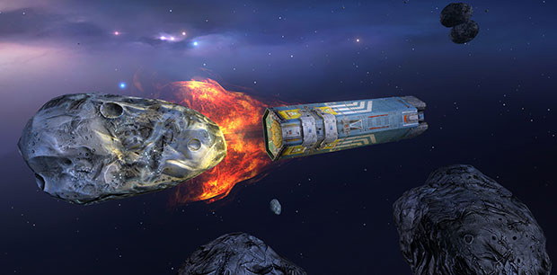
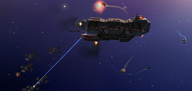
Homeworld was always pretty, to the point that (with some help from mods and tweaks) it’s staved off the ravages of technological age far more naturally than many other games of that era have. Hard angles, painted metal, no faces – these were things even aged graphics cards could handle well. In terms of strategy games which ‘need’ remastering, Homeworld was probably somewhere at the bottom of the list. But in terms of strategy games which really, truly benefit from remastering – well, this is a chart-topper.

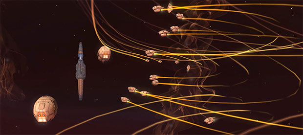
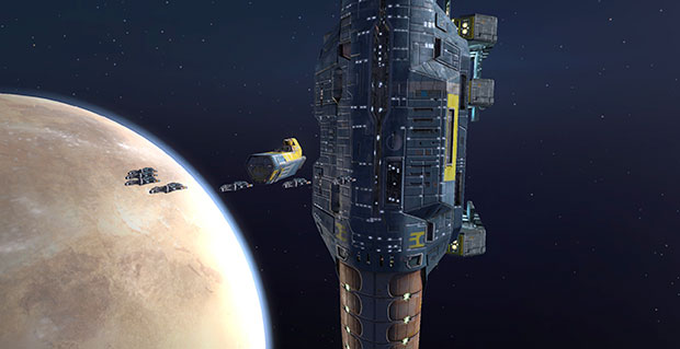
Light, shadow, texture and high resolutions are part of it, of course, but they wouldn’t mean much without scale. Small fighters are insects, the mothership is this enormous obelisk, the stellar backdrop is palpably infinite-feeling, and the camera zooms all the way in and out to show how all these things compare to each other.

Combine this with a celestial score (plus, of course, the rightfully iconic, still-powerful usage of Adagio for Strings at the start of Homeworld 1) )and starkly industrial sound effects and you’ve got space. It’s a universe away from the squat, constrained worlds of almost any other real-time strategy game. I know it can be ugly to bust out hyperbole in a game review, but I’m extremely tempted to say that Homeworld was and is a masterpiece of visual design.

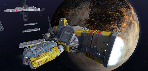
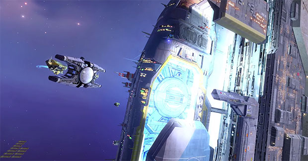
The new textures help, though even then some still look blown up and blocky when you get in close, but it’s the crispness that the Remastering most benefits from. Resolution and anti-aliasing (plus assorted less obvious shader tricks) mean these looming industrial shapes, these man-made visitors to a vast and empty space, look that much more 3D and tangible, that much less like simple game models.

They’re colourful too, borrowing respectfully from Chris Foss rather than Star Wars, and this with their unusual shapes (broadly avoiding any jet or shuttle inspiration) take on true character. That’s needed, because while Homeworld’s a game about saving people, it usually avoids showing people. That it lets its spaceships take centre stage is a huge part of why it’s stood the test of time. A 1999 face is much trickier to scrub up than 1999 metal is.

Far from the only reason, though. There’s much that Homeworld does which subsequent and contemporary strategy games do not, and it remains an expert lesson in how to make an RTS feel so much bigger than its individual levels. Each one connects directly to the last, feels like the next stopping point on this dramatic journey into the unknown, while whatever units and resources you’ve made (and kept intact) carry over between levels. The carry-over ships probably won’t last too long, but when a new level begins and you see them come out of the (gorgeous, cuboid) lightspeed warp along with your mothership, they feel like old friends.

This is a journey, rather than a series of conquests. It’s difficult to overstate how different that feels from the norm; now that I’ve come out of the game to write about it, I feel this slight, gnawing guilt that I’ve left my ships and my people out there, waiting for me to come back and help them travel onwards. I close my eyes and picture the mothership hanging there, so massive yet so vulnerable without me.

The minimalist interface, while spit’n’polished here, still feels ahead of its time too. Homeworld wants us to concentrate on the game-space, not the menus. They live on the edges of the screen, designed to be brought up and hidden with logical hot keys, and able to disappear entirely when you want to take in the vastness of it all (and the pace of the game entirely allows this).

There is, perhaps, an over-reliance on memorising hotkeys or abstract icons, which can make truly getting to grips with the game a slow affair, but I’d certainly rather it this way than have half the screen occupied by gerbil-sized icons and some goon’s disembodied head gawking at me. There are definitely some duff icons, and some oversights such as not being able to click on your population list to select all ships of that type, but in the main the UI feels modern and design-led rather than functional. That’s unusual enough for today’s strategy games (Endless Legend being a particular exception), let alone in 1999.

Likewise, making the map something you switch to (with spacebar) rather than a persistent screen element both keeps space free and means you look at the game rather than condensed replication of it. It’s on the fiddly side, at least if you’re coming to this from a traditional, ground-based RTS, but this isn’t so much to do with Homeworld being old or unrefined as it is trying to achieve so much more. Space is 3D, after all, and while I couldn’t say this was the most elegant method imaginable of representing and controlling movement across all planes, not obfuscating it with too many elements and icons goes a long way to making it feel natural.

Pacing, too, feels rare. Nothing happens quickly in a Homeworld game – construction is drawn out, even the quick-to-build smallest ships performing a casual undocking manoeuvre before they’re ready to use. Nothing can be destroyed instantly; a fight is never over until it’s over. Slowly sending parts of your fleet across space to meet your enemy or set up a mining outpost can sail very close to patience-testing, but the game gets away with it because it’s selling a slow-burn mechanical war set in a limitlessly vast environment, not a few burly blokes duking it out in the hills.

I keep wanting the use the word ‘celestial’ again – Homeworld really does feel like galvanised galactic gods waging war across the aeons.

While all this means it gives space and time to breathe and plan, that too a rare thing for the genre, mastering Homeworld is not at all easy. At times I struggled to select the right ship, or spent too long referring back to the controls menu, or sent craft to a completely different place than my angle on the map had suggested. I don’t think I can say that’s a criticism, but it is a warning.

This comes from a development mindset which made far less concessions than today’s, and that presumes patience and dedication from its audience. By God I don’t want every game to do that, but it is wonderful to see it happen here, because it weaves so completely into the sci-fi nautical fantasy Homeworld seeks to create.

So, to answer those starting questions:

1) Yes, and then some. A few textures and some noticeably absent shadowing is all that gives the 16-year-old truth away. Part of this is down to careful replacement of textures and shader effects, but a lot of it is down to the less is more ethos of the original. It’s also well-optimised enough that I was able to max out everything and run it at 4K (via dynamic super resolution stuff in drivers; I don’t have that posh a monitor) and get around 80 frames per second. The sole exception was depth of field, which dropped me to 25 frames if left on. I should also mention there’s a much-appreciated UI scaling option, which keeps the game playable if you’re running at high res on comparatively small screens. All tech witter aside, this is as beautiful an electronic sight as I’ve seen any time in the last few years. Almost every wrinkle is gone.

2) Yes, far more so than I’d expected (based on distant memories of how fiddly Homeworld had seemed to me when I first played it). From a UI point of view it’s remarkably elegant and cohesive, and from a strategy point of view it makes every moving part absolutely count, taking it to a place where it feels like the fantasy it’s evoking, not just a strategy game set in space. In a time where so much real-time strategy has adopted this manic, hyperactive mindset (even though it requires more precision and practice than Homeworld ever did), these games feel like epics.

I’m not sure the Homeworld games were first built with the expectation that they’d stand the test of time like this, but because there was so much care, because there’s been nothing quite like them since, and because the remastering has been sensitive, this package comes across as beautifully timeless, and as essential as real-time strategy gets. Welcome home.

27 Feb 19:11

Is the sexed-up Power Rangers short making a statement? Why the answer is important

by Ben Kuchera
firehose

"The copyright owner could make a really decent argument as well that no, what you're really doing is creating a new story with our copyrighted characters, and we are the ones who have the sole right to make derivative works." While judges may decide issues of fair use if it's clear cut, this is not one of those cases. It would likely go ahead to a jury.

"This is a law school exam-type question," Newberg said.

Director Joseph Kahn released a gritty, 14-minute look at an alternate version of the popular Power Rangers characters.

The short quickly blew up, and video-sharing site Vimeo briefly featured the video on its front page before suddenly removing the video entirely.

So what happened, and what does the future hold for this particular fan film? And are these sorts of projects copyright infringement, or covered under fair use?

Well, those aren't easy questions to answer.

Profit may not matter

Brad Newberg is an intellectual property partner at the law firm of McGuireWoods LLP, whose practice is almost entirely copyright and trademark law. He found the case fascinating, as the video rests in an uncomfortably gray area of the law.

"In terms of it not being for profit, it's only one factor to be looked at," Newberg explained.

First, it's important to note that when a site like Vimeo receives a take-down notice from a copyright holder, they have to take the content down, no questions asked. "They can't make a determination on their own in terms of whether or not they think it's copyright infringement. If they want to operate under the safe harbor of the DMCA, they have to take it down," Newberg explained. This is how the process begins, and after the content is removed a few things may happen.

The creator of the allegedly-infringing content has a few weeks to send a response saying they believe their content does not infringe on anyone else's copyright, and if that happens the copyright owner must bring suit against the creator of the content. If no suit comes, the content goes back up.

I reached out to Vimeo, which confirmed that this is exactly what happened.

"Joseph Kahn’s Power Rangers reboot has been removed from Vimeo due to a takedown notice filed under the Digital Millennium Copyright Act ("DMCA") by Saban subsidiary, SCG Power Rangers LLC, the copyright holder of the original Power Rangers series," a Vimeo spokesperson told Polygon.

"By removing the video, Vimeo is not siding with Saban in this dispute. Rather, we are only acting in accordance with the DMCA, which contains a process that allows users like Mr. Kahn to challenge takedown notices by copyright holders. Mr. Kahn has submitted a notice challenging Saban’s takedown notice. If Saban does not file a lawsuit against Mr. Kahn within 10 business days, Vimeo will restore his video in accordance with the DMCA," the statement continued.

So what happens next? It depends on Saban. The situation could move to the courts, or Saban could fail to bring suit and allow the video to be reposted.

If the case does end in a lawsuit, what then?

It's gotta be commentary

The question of who would win this particular, hypothetical lawsuit doesn't have a clear answer.

"Characters are copyrightable. The way that characters are expressed are copyrightable. When you go and put a video out without the copyright holder's permission, then the question is going to come down to: Is the work you're putting forward some sort of parody or commentary on the original work or the characters themselves?" Newberg said.

"That is really, nine times out of time, what the issue will come down to."

He listed some examples. There was a case where someone created a sequel to Catcher in the Rye, with Holden Caulfield as an old man. The work merely continued the story, which was found to be infringing.

"This is a law school exam-type question"

If, on the other hand, you released a version of Gone with the Wind told through the point of view of a slave on the story's plantation? That's fair use, as it provides commentary and in many ways parodies the original work. You can buy that particularly book yourself and check it out.

So the question is whether the Power Rangers short is providing any commentary or parody. The interesting wrinkle is that people online can't seem to decide whether the director was poking fun at hyper-dark takes on kiddie subject matter, or being serious. Is this a story in the world of the Power Rangers, or is it making fun of the idea of an ultra-dark Power Rangers story?

"That is as much in the gray area as I could give as an example. One could view this as commentary, taking a broad view of this, you're taking a kid's cartoon and making it a much darker short, and you could say well, that's commentary on the copyrighted work and the characters," Newberg explained.

"The copyright owner could make a really decent argument as well that no, what you're really doing is creating a new story with our copyrighted characters, and we are the ones who have the sole right to make derivative works." While judges may decide issues of fair use if it's clear cut, this is not one of those cases. It would likely go ahead to a jury.

"This is a law school exam-type question," Newberg said.

What does the director think?

The director, Joseph Kahn, may have helped put it to rest when he gave an interview the day the short came out.

"What I really want to accomplish when you watch, is you should really take it seriously. There's nothing playful except for maybe the Hip-Hop-Kido thing. Maybe a few little like motivational character [things], interactions and stuff. Overall, it's a very serious thing," Kahn said in an interview with HitFix.

"The joke isn't that you're laughing at each particular scene; the joke is that we did this 'fuck you' thing in the first place. You're going to look at it and you go wow I can't believe they fucking did that."

We reached out to Kahn for comment, but have yet to hear back. For now, maybe take the advice of his Twitter feed.

27 Feb 19:10

Freeware Garden: Death Ray Manta

by Konstantinos Dimopoulos

By Konstantinos Dimopoulos on February 26th, 2015 at 11:00 am.

Death Ray Manta [official site], an outrageously glowy shmup designed to make you happy, the very same Rob Fearon game that received appropriately glowy reviews by the likes of Eurogamer and Edge, has now gone freeware. Along with all of Rob’s frantic and occasionally hilarious games.

After the essential disclaimer through which I tell you that I was the one to originally ask Rob to make this game for a bundle I was helping run, let me just go on and promise that if you’ve ever enjoyed an arena shooter, you’ll simply adore DRM. It’s unlike all other DRMs. It’s brilliant and DRM-free.

Its arenas are populated by a surreal, psychedelic mix of aliens, bunnies, alien bunnies, robots, turrets, space invaders and all sorts of other obstacles and enemies you have to shoot in order to progress to the next stage and earn a single point. Manage to grab each stage’s tiffin and you’ll have both added a little firepower to the Space Manta you are playing as and scored another point.

Yes, it’s as simple a scoring system as that and you’ll soon discover just how brilliantly high-scores and finding out what lies ahead are so closely linked. It’s a small thing, sure, yet it ties in perfectly with the simplicity of the whole game and is wisely elegant.

Instead of having you master rules and mechanics, DRM forces you to constantly move and shoot and watch the light displays. The beautiful pyrotechnics and the shifting backgrounds. The exploding greens, oranges and reds as you obliterate carefully designed waves of enemies.

arena shooter, Death Ray Manta, free, Freeware Garden, Rob Fearon, shmup.

27 Feb 19:09

Teenage Mutant Ninja Turtles writer is Tomb Raider's new movie scribe

by Dave Tach
firehose

no. fuck no. fuck off. pratchett and/or simone or gtfo forever

Evan Daugherty will write the upcoming Tomb Raider movie, Deadline reports.

Daugherty's screenwriting credits include Divergent, Snow White and the Huntsman and last year's Teenage Mutant Ninja Turtles. He's also writing G.I. Joe 3.

Nearly two years ago, Variety reported that the movie will take the same route as developer Crystal Dynamics' 2013 Tomb Raider and reboot the franchise. The report also said that Iron Man screenwriters Mark Fergus and Hawk Ostby had been tapped for the film.

"[It] is really the story before she became Lara Croft, so it is a character piece," producer Graham King said at the time. "It does have a lot of really great characters, but it's a lot of action and a lot of fun, and for me, it's something very different.

"I've not really done a movie like that before, but I really gravitated to rebooting this franchise and we're going to give it a shot."

According to Deadline, King, MGM and Warner Bros. are partnering to reboot the film franchise, which once starred Angelina Jolie as Lara Croft.

The globetrotting archeologist's latest video game adventure, Lara Croft and the Temple of Osiris, was released last December, and you can learn more about it in Polygon's review.

27 Feb 19:09

death note - Nanashi no Game (Epics/Square Enix - DS - 2008)


death note - Nanashi no Game (Epics/Square Enix - DS - 2008)

27 Feb 18:57

What the Hell is Going On On the Esplanade?!

by Dirk VanderHart

Portland police have found two bodies on or near the Eastbank Esplanade since 10:30 am, and it's insane.

The police bureau sent out a release just after 11 am, announcing a man was spotted this morning below a drainpipe just north of the Burnside Bridge. Cops think the man was a 48-year-old who may have been inside the drainpipe—you've got to assume for shelter, though no one's saying that—"prior to being pushed out by rainwater and being discovered this morning. "

An autopsy is scheduled tomorrow.

A rare enough occurrence, but then the cops just announced a second body—this of a woman who was found on the esplanade just south of the Steel Bridge around 3:30 pm. Police aren't sure who she is or how she died.

"There does not appear to be any connection to the earlier death investigation of a 48-year-old male along the banks of the Willamette River," the latest release says.

Update, Friday 9:15 am: Police sent out an updated release last night explaining they believe the woman "suffered a medical event which resulted in her death." There's an autopsy planned today.

Update, Friday 12:45 pm: Cops now say the woman found dead yesterday on the esplanade was only 26, and homeless. The police bureau hasn't released her name, but says she wasn't attacked.

Cops also have confirmed the man discovered near a drainage pipe Thursday morning also was homeless.

[ Subscribe to the comments on this story ]

27 Feb 18:24

giphy.gif (GIF Image, 360 × 240 pixels)

by djempirical
firehose

autoreshare

27 Feb 18:22

Oaklands Answer to Hipster Fixies: Scraper Bikes

by Jamilah King
Oakland's Answer to Hipster Fixies: Scraper Bikes

Meet Tyrone "Baybe Champ" Stevenson Jr., an Oakland native who for years has been changing the way youth of color ride in the city. In this video from Grit Media, Stevenson explains his passion for "scraper bikes" -- tricked out bicycles named after the infamous cars of the Hyphy era of Bay Area music and culture.