Shared posts

26 Feb 23:03

Avanaut, the Flickr member who inspired the LEGO Movie

by Kay Kremerskothen

A Pilot's Dream Bossk's Cool Day Out

Samwise the Brave

Dr. Jones Saves the Day

Indiana Jones in the Map Room Breaking In the Tauntaun (Revisited)

Vesa Lehtimäki, also known as Avanaut on Flickr, has been designing LEGO scenes for many years, recreating worlds like Hoth and Tattooine from Star Wars, The Lord of the Rings’ Middle Earth, and the 1930s earth from Indiana Jones.

A recent article on fxguide.com revealed that Vesa’s work was one of the big inspirations for the creators of the LEGO Movie, and we invite you to see what it takes in Avanaut’s LEGO set. We also highly recommend you check out some of his other work with action figures as well as his Star Wars Scale Model Project.

Photos from Avanaut.


22 Feb 00:04

The Society of Mutual Autopsy

by vaughanbell

The Society of Mutual Autopsy was an organisation formed in the late 1800s to advance neuroscience by examining dead members’ brains and to promote atheism by breaking sacred taboos.

It included some of the great French intellectuals and radicals of the time and became remarkably fashionable – publishing the results in journals and showing plaster-casts of deceased members brains in world fairs.

In October 1876, twenty Parisian men joined together as the Society of Mutual Autopsy and pledged to dissect one another’s brains in the hopes of advancing science. The society acquired over a hundred members in its first few years, including many notable political figures of the left and far left. While its heyday was unquestionably the last two decades of the century, the society continued to attract members until the First World War. It continued its operations until just before World War II, effectuating many detailed encephalic autopsies, the results of which were periodically published in scientific journals.

The quote is from a fascinating but locked academic article by historian Jennifer Michael Hecht and notes that The Society was partly motivated by self-nominated ‘great minds’ who wanted to better understand how brain structure related to personal characteristics.

It was no backwater project and attracted significant thinkers and scientists. Most notably, Paul Broca dissected brains for the society and had his brain dissected by them, despite apparently never joining officially.

Part of the motivation for the society was that, at the time, most autopsies were carried out on poor people (often grave robbed) and criminals (often executed). The intellectual elite – not without a touch of snobbery – didn’t think this was a good basis on which to understand human nature.

Also, these bodies usually turned up at the dead of night, no questions asked, and no one knew much about the person or their personality.

In response to this, the Society of Mutual Autopsy functioned as a respectable source of body parts and also requested that members write an essay describing their life, character and preferences, so that it could all be related to the shape and size of their brain when autopsied by the other members.

There was also another motive: they were atheists in early secular France and they wanted to demonstrate that they could use their remains for science without consideration of religious dogma.

As with most revolutionary societies, it seems to have fallen apart for the usual reasons: petty disagreements.

One person took exception to a slightly less than flattering analysis of his father’s brain and character traits. Another starting flirting with religion, causing a leading member to storm off in a huff.

In a sense though, the society lives on. You can donate your body to science in many ways after death:

To medical schools to teach students. To forensic science labs to help improve body identification. To brain banks to help cure neurological disorders.

But it’s no longer a revolutionary act. Your dead body will no longer reshape society or fight religion like it did in 1870′s France. The politics are dead. But neither will you gradually fade away into dust and memories.

Jennifer Michael Hecht finishes her article with some insightful words about The Society of Mutual Autopsy which could still apply to modern body donation.

It’s “both mundane – offering eternity in the guise of a brief report and a collection of specimens – and wildly exotic – allowing the individual to climb up onto the altar of science and suggesting that this act might change the world”.
 

Link to locked and buried article on The Society of Mutual Autopsy.


21 Feb 23:57

Paint the Earth

by xkcd

Paint the Earth

Has humanity produced enough paint to cover the entire land area of the Earth?

—Josh (Bolton, MA)

This answer is pretty straightforward. We can look up the size of the world's paint industry, extrapolate backward to figure out the total amount of paint produced. We'd also need to make some assumptions about how we're painting the ground. Note: When we get to the Sahara desert, I recommend not using a brush.

But first, let's think about different ways we might come up with a guess for what the answer will be. In this kind of thinking—often called Fermi estimation—all that matters is getting in the right ballpark; that is, the answer should have about the right number of digits. In Fermi estimation, you can round[1]Using the formula \(\text{Fermi}(x) = 10^{\text{round}(log_{10}x)}\), meaning that 3 rounds to 1 and 4 rounds to 10. all your answers to the nearest order of magnitude:

Let's suppose that, on average, everyone in the world is responsible for the existence of two rooms, and they're both painted. My living room has about 50 square meters of paintable area, and two of those would be 100 square meters. 7.15 billion people times 100 square meters per person is a little under a trillion square meters—an area smaller than Egypt.

Let's make a wild guess that, on average, one person out of every thousand spends their working life painting things. If I assume it would take me three hours to paint the room I'm in,[2]This is probably optimistic, especially if there's an internet connection in the room. and 100 billion people have ever lived, and each of them spent 30 years painting things for 8 hours a day, we come up with 150 trillion square meters ... just about exactly the land area of the Earth.

How much paint does it take to paint a house? I'm not enough of an adult to have any idea, so let's take another Fermi guess.

Based on my impressions from walking down the aisles, home improvement stores stock about as many light bulbs as cans of paint. A normal house might have about 20 light bulbs, so let's assume a house needs about 20 gallons of paint.[3]These are very rough estimates. Sure, that sounds about right.

The average US home costs about \$200,000. Assuming each gallon of paint covers about 300 square feet, that's a square meter of paint per \$300 of real estate. I vaguely remember that the world's real estate has a combined value of something like \$100 trillion,[4]Citation: This really boring dream I had once. which suggests there's about 300 billion square meters of paint on the world's real estate. That's about one New Mexico.

Of course, both of the building-related guesses could be overestimates (lots of buildings are not painted) or underestimates (lots of things that are not buildings[5]EXAMPLES OF THINGS THAT ARE NOT BUILDINGS: Ducks, M&Ms, cars, the Sun, cuttlefish, microchips, Macklemore, lightning, goat blood, zeppelins, tapeworms, pickle jars, those sticks you use to toast marshmallows, alligators, tuning forks, minotaurs, Perseid meteors, ballots, crude oil, sponsored tweets, and catapults that throw handfuls of engagement rings. are painted) But from these wild Fermi estimates, my guess would be that there probably isn't enough paint to cover all the land.

So, how did Fermi do?

According to the report The State of the Global Coatings Industry, the world produced 34 billion liters of paints and coatings in 2012.

There's a neat trick that can help us here. If some quantity—say, the world economy—has been growing for a while at an annual rate of n—say, 3% (0.03)—then the most recent year's share of the whole total so far is \(1-\tfrac{1}{1+n}\), and the whole total so far is the most recent year's amount times \(1+\tfrac{1}{n}\).

If we assume paint production has, in recent decades, followed the economy and grown at about 3% per year, that means the total amount of paint produced equals the current yearly production times 34.[6]\((1+\tfrac{1}{0.03})\) That comes out to a little over a trillion liters of paint. At 30 square meters per gallon,[7]"Square meters per gallon" is a pretty obnoxious unit, but I think it's not quite as bad as acre-foot (a foot by a chain by a furlong), which is an actual unit used in technical papers I was trying to read this week. that's enough to cover 9 trillion square meters—about the area of the United States.

So the answer is no; there's not enough paint to cover the Earth's land, and—at this rate—probably won't be enough until the year 2100.

Score one for Fermi estimation.

12 Feb 12:41

Star Sand

by xkcd

Star Sand

If you made a beach using grains the proportionate size of the stars in the Milky Way, what would that beach look like?

Jeff Wartes

Sand is interesting.[Citation needed]

"Are there more grains of sand than stars in the sky?" is a popular question which has been tackled by many people. The upshot is that there are probably more stars in the visible universe than grains of sand on all of Earth's beaches.

When people do those calculations, they often dig up some good data on the number of stars, then do some hand-waving about sand grain size to come up with a number for the sand grains on Earth.[1]From a practical point of view, geology and soil science are more complicated than astrophysics. We're not going to tackle that issue today, but to answer Jeff's question, we do need to figure out what the deal with sand is.[2]"i like sand because i don't really know what it is and there's so many of it"

@darth__mouth Specifically, we need to have some idea of what grain sizes correspond to clay, silt, fine sand, coarse sand, and gravel, so we can understand how our galaxy would look and feel if it were a beach.[3]Instead of just containing a bunch of them.

Fortunately, there's a wonderful chart by the US Geologic Survey that answers all these questions and more. For some reason, I find this chart very satisfying—it's like the erosion geology edition of the electromagnetic spectrum chart.

According to surveys of sand,[4]There are apparently lots of them. the grains found on beaches tend to run from 0.2mm to 0.5mm (with the finest layers on top). This corresponds to medium-to-coarse sand in the chart. The individual grains are about this big:

If we assume the Sun corresponds to a typical sand grain, then multiply by the number of stars in the galaxy, we come up with a large sandbox worth of sand.[5]I mean, you come up with a bunch of numbers, but imagination turns them into a sandbox.

However, this is wrong. The reason: Stars aren't all the same size.

There are a number of widely-circulated YouTube videos comparing star sizes. They do a good job of getting across just how staggeringly large some stars are. Although it's easy to get lost in the videos and lose track of scale, it's clear that some of the grains in our sandbox universe would be more like boulders.

Here's how the main-sequence[6]The stars in the main part of their fuel-burning lifecycle. star-sand grains look:

They mostly fall into the "sand" category, though the larger Daft Punk stars cross the line into "granules" or "small pebbles".

However, that's just the main sequence stars. Dying stars get much, much bigger.

When a star runs out of fuel, it expands into a red giant. Even ordinary stars can produce huge red giants, but when a star that's already massive enters this phase, it can become a true monster. These red supergiants are the largest stars in the universe.

These beachball-sized sand stars would be rare, but the grape-sized and baseball-sized red giants are relatively common. While they're not nearly as abundant as Sun-like stars or red dwarfs, their huge volume means that they'd constitute the bulk of our sand. We would have a large sandbox worth of grains ... along with a field of gravel that went on for miles.

The little sand patch would contain 99% of the pile's individual grains, but less than 1% of its total volume. Our Sun isn't a grain of sand on a soft galactic beach; instead, the Milky Way is a field of boulders with some sand in between.

But, as with the real Earth seashore, it's the rare little stretches of sand between the rocks where all the fun seems to happen.

09 Feb 03:49

Hamster

by Reza

hamster

09 Feb 03:49

Suspicion

by Reza

suspicion

06 Feb 12:51

The Baby Name Wizard

by xkcd

The OKCupid statistics blog, by Christian Rudder, is amazing. Sadly, it hasn’t updated since 2011, around when OKCupid was bought by Match.com. (Rudder says the timing was a coincidence—he took time off for another project, and the blog may return soon!)

In the meantime, I’d like to recommend another unexpectedly engrossing blog: The Baby Name Wizard blog, by Laura Wattenberg (creator of the amazing Name Voyager graphing tool).

I find the Baby Name Wizard blog fascinating because, like the OK Cupid Blog, it combines two key ingredients:

  • Access to rich data about something that comes up all the time in our lives
  • The ability to find and tell the stories in that data

The reason I like the blog has nothing to do with naming babies. (I’m not allowed to name babies, anyway.)

I like it because we all encounter names every day, all the time, in every part of our life. We all have feelings and opinions about what names mean, but if you’re like me, they were mostly unconscious, unquestioned, and never subject to any statistical rigor. (Freakonomics has a well-known chapter about naming trends, which Wattenberg takes issue with).

Nevaeh (“Heaven” backward) is currently a more popular baby name than Sarah.  Brooklyn is more popular than either, and Sophia is more popular than all three combined. In 20 years, those names will conjure up images of college kids, and Brandon and Sarah will sound as much like Mom and Dad names as Gary and Debby do to my generation.

If you’re like most people, you probably had some opinions when you read the names in the last paragraph. But maybe the biggest thing I’ve learned from reading this blog is that the reactions and stereotypes that names provoke often reveal more interesting stories than the names themselves.

For example, you may have heard the urban legend about a mother who named her daughter Le-a, pronounced “Ledasha”. Wattenberg dissects this urban legend in an insightful essay (Part 1, Part 2, Part 3), which explains how apocryphal names like Le-a serve, across a wide variety of communities, as proxies for talking about race.

Here are a few of the other things I’ve learned from the blog:

That’s just a tiny sampling; if you think any of it sounds interesting, I recommend browsing through the blog’s extensive archives.

06 Feb 12:43

Why Your Kit Lens Isn't as Bad as You Think It Is

by jeffguyer

One of the things that I try getting across to my students is that despite all of its amazing capabilities, the camera is just a box. Yes, it is programmed with a seemingly limitless number of exposure combinations, but when all is said and done it's just a box. It has no artistic intent. We have to speak its language, telling it what we see, in hopes that the image in our head matches the image in the box. It is a box with a cylindrical window on the world. It's the quality of that window that is often the subject of raging debate. Nikon or Canon? OEM or third party? Everyone has an opinion. Interestingly enough, the one thing that many-- if not most-- agree upon is that kit lenses should be avoided like the plague.

I completely disagree. I say go dig that kit lens out of wherever you've hidden it and put it to work. For those of you who've somehow been convinced that your photography can't possibly be of adequate quality until you drop money you don't have on a lens you can't afford, I say that nothing could be farther from the truth.

kit-lenses-diyphotography-000

Home Studio Photography

read more

28 Jan 03:43

Wrong

by Justin Boyd

Wrong

Hopefully one day Green will get over the passiveness, just like I did!  Or not.  Or maybe, like, sometimes?  I guess it all depends on the food.


bonus panel
12 Jan 19:49

A labor of love: New York in the 1970s

by Kay Kremerskothen

A somewhat nerdy 14 year old me on top of dad’s 1965 Pontiac with our L.A. cousins who just arrived to spend the whole summer with us in Milford, Connecticut. JFK airport. Queens New York. July 1973.

Jersey City. Industrial wasteland with the World Trade Center and Lower Manhattan in the distance. The old chromium plant on Henderson Street at left middle. 1975

Hey, is that Theo Kojak sitting in the brown 1970s Cadillac, staking out a suspect in a battered and forlorn old industrial neighborhood in Brooklyn by the East River?  Could be!  New York. 1974

Yet more 1970s New York Subway fun as captured by my trusty Kodak Pocket Instamatic in April 1976. Burned out, graffiti covered MTA train in Midtown Manhattan. (and this was the Express train!)

1960s and 1970s car heaven. I spy a 1960s Chevy Impala, a 1971 Camaro, a Chevy Nova, a Datsun (?), Cadillac, a GMC Flxible bus, a 1960s Dodge Van and lots of VW Beetles.  What do U see? Brooklyn Battery Tunnel traffic. New York. May 1973

Prints and negatives of the New York metropolitan area, stored over decades in several shoeboxes in a closet.
About 5 years ago, Andy Blair, also known as wavz13 on Flickr, decided to send off batches of these hidden gems for digitizing. Once in the digital domain, he spent months enhancing the images taken so long ago. "Talk about a labor of love!", he says. A friend mentioned Flickr to Andy and after checking it out, he tentatively decided to start uploading.

But let’s go back to where it all began: Andy grew up in Milford, Connecticut, and his dad commuted by train down to Manhattan every day, where he worked in the brand new World Trade Center. On days off from high school Andy would often join him, always carrying his Kodak Pocket 40 Instamatic to capture some of the sights of a Lower Manhattan significantly different than the one which exists now. "As a teen, I relished those adventures where I could walk around and take in the sights of what was then a very dirty and gritty – and potentially dangerous – Manhattan. It was so exciting to be there!"

"Although the term ‘urban exploration’ didn’t exist yet, that’s precisely what I was doing. Even as a teen, I avoided the tourist shots and went for the forgotten, obscure and abandoned (which there was plenty of back then!)"

His time on Flickr over the past 4 years has been quite an experience, Andy tells us. "One of the things I found absolutely amazing is how interested people are in these old photographs which until recently spent decades in complete obscurity."

Check out all of wavz13′s photos in his photostream, and also take a look at the sets he created, including vintage New York City, Jersey City, and Milford and Woodmont scenes to get a glimpse of not just urban sights of the New York area, but also everyday life in the USA during the 1970s.


10 Jan 00:52

Photos

Scott Akerman

Gah, this alt-text.

I hate when people take photos of their meal instead of eating it, because there's nothing I love more than the sound of other people chewing.
03 Jan 03:28

Sigil Cycle

The cycle seems to be 'we need these symbols to clarify what types of things we're referring to!' followed by 'wait, it turns out words already do that.'
03 Jan 03:13

Like Denying Candy From a Baby

by Adam

2013-12-24-Like-Denying-Candy-From-a-Baby

25 Nov 12:58

New Study

When the results are published, no one will be sure whether to report on them again.
22 Oct 12:40

Trash

by Justin Boyd

Trash

Yay, a comic about me and my problem with taking out the trash!  I’m pretty sure I’m not the only one though.  Right?

–ME NEWS–

Remember that thing I couldn’t tell you about last week?  Well, now I can tell you!

I interviewed for a new job and I got it!  I’m super excited to get started =)  I won’t be working from home anymore, but I’m cool with that.

Comics will still be happening as usual, so you don’t even need to worry about that!

30 Sep 13:21

HIS-WAY

Achewood strip for Friday, September 27, 2013
27 Sep 18:04

Mantis popularity

by Arnold Chao

IMG_0306

Dead leaf mantis.

Empusa pennata (Empuse)

254/365_092013

 Phyllocrania paradoxa

Orchid Mantis

the Mantis

Mantis with Lady bug prey.

Idolomantis Takes Chewbacca's Portrait

Mantis palo (Empusa pennata)

Green and green

Mantis_2_100812

Cõng Sên...

Morning toilet

Pseudocreobotra wahlbergii

Explore popular pictures of insects, and you’re bound to find the mantis. Easily recognized by their distinctive forelegs and triangular face, these bugs eat pests with such aggression that they inspired two Chinese martial art styles. Mantises are even pampered as exotic pets by their devoted fans, unlike their closest relatives, cockroaches and termites. More than 2,400 species comprise their Mantodea insect order, including the uniquely camouflaged ones that mimic vegetation.

See, and share, more animal photos in the Magnificent Mantises gallery and Praying Mantis group.

Photos from thienbs, Andy @ Pang Ket Vui, melch2B, Gregg Kiesewetter, Celimaniac, ReaganPufall, Spice ♥, davidgerardball, scott cromwell, rio en medio – Jose, myu-myu, marakawalv, xuanthanh_arc, Fab. B, and Celimaniac.


26 Sep 22:27

A Softer World

21 Sep 23:45

This complex and tragic event supports my own view

by vaughanbell

As shots rang out across the courtyard, I ducked behind my desk, my adrenaline pumping. Enraged by the inexplicable violence of this complex and multi-faceted attack, I promised the public I would use this opportunity to push my own pet theory of mass shootings.

Only a few days have passed since this terrible tragedy and I want to start by paying lip service to the need for respectful remembrance and careful evidence-gathering before launching into my half-cocked ideas.

The cause was simple. It was whatever my prejudices suggested would cause a mass shooting and this is being widely ignored by the people who have the power to implement my prejudices as public policy.

I want to give you some examples of how ignoring my prejudices directly led to the mass shooting.

The gunman grew up in an American town and had a series of experiences, some common to millions of American people, some unique to him. But it wasn’t until he started to involve himself in the one thing that I particularly object to, that he started on the path to mass murder.

The signs were clear to everyone but they were ignored because other people haven’t listened to the same point-of-view I expressed on the previous occasion the opportunity arose.

Research on the risk factors for mass shootings has suggested that there are a number of characteristics that have an uncertain statistical link to these tragic events but none that allow us to definitively predict a future mass shooting.

But I want to use the benefit of hindsight to underline one factor I most agree with and describe it as if it can be clearly used to prevent future incidents.

I am going to try and convince you of this in two ways. I am going to selectively discuss research which supports my position and I’m going to quote an expert to demonstrate that someone with a respected public position agrees with me.

Several scientific papers in a complex and unsettled debate about this topic could be taken to support my position. A government report also has a particular statistic which I like to quote.

Highlighting these findings may make it seem like my position is the most probable explanation despite no clear overall conclusion but a single quote from one of the experts will seal the issue in my favour.

“Mass shootings” writes forensic psychiatrist Anand Pandya, an Associate Clinical Professor in the Department of Psychiatry and Behavioral Neurosciences at the UCLA School of Medicine, Los Angeles, “have repeatedly led to political discourse”. But I take from his work that my own ideas, to quote Professor Pandya, “may be useful after future gun violence”.

Be warned. People who don’t share my biases are pushing their own evidence-free theories in the media, but without hesitation, I can definitely say they are wrong and, moreover, biased.

It is clear that the main cause of this shooting was the thing I disliked before the mass shooting happened. I want to disingenuously imply that if my ideas were more widely accepted, this tragedy could have been averted.

Do we want more young people to die because other people don’t agree with me?

UPDATE: Due to the huge negative reaction this article has received, I would like to make some minor concession to my critics while accusing them of dishonesty and implying that they are to blame for innocent deaths. Clearly, we should be united by in the face of such terrible events and I am going to appeal to your emotions to emphasise that not standing behind my ideas suggests that you are against us as a country and a community.


21 Sep 03:16

To Protect and Unnerve

by Adam

2013-09-20-To-Protect-and-Unnerve

11 Sep 02:56

The Ghosts of Creativity

by Grant

11 Sep 02:31

Brain vs Drain

by Adam

2013-09-10-Brain-vs-Drain

11 Sep 02:29

RIP Cal Worthington

by Jason Weisberger

Iconic southern California car salesman Cal Worthington has passed away at the age of 92.

Both you and your dog Spot will be missed. Thanks, Ca!.


28 Aug 21:42

Peer review, or it didn't happen

by Maggie Koerth-Baker

An amusing science meme, courtesy my friend Andrew Balfour.


28 Aug 01:25

Buttercup Festival by David Troupes


26 August 2013
All being well, I plan to launch a Kickstarter for Renaming of the Birds two weeks from now. Yippy woo!

24 Aug 04:06

American dialects mapped

by Rob Beschizza

Joshua Katz, at NC State University's Department of Statistics, compiled a series of simple, striking maps that visualize the words Americans use—and where they use them. The data was compiled from a survey conducted by Bert Vaux at the University of Cambridge. Below are just a few to whet your appetite for the full set of 122.


24 Aug 03:57

Remembering Futurism

by Grant


Filippo Tommaso Marinetti was a man of inherited wealth, artistic vision, controversial political views, and a well-curled mustache. His “Futurist Manifesto” is an outlandish and entertaining document that would be difficult to parody. I’ve paraphrased parts of the manifesto in this comic while trying to stay true to the spirit of the original.

This comic appeared as the first in my series "Who Needs Art?" for Medium.com.


16 Aug 22:33

Whatever Forever

16 Aug 00:38

Buttercup Festival by David Troupes


14 August 2013
A late Wednesday update! The whale drawing is here now.

11 Aug 12:35

Why is the F-stop scale so weird?

by Haje Jan Kamps

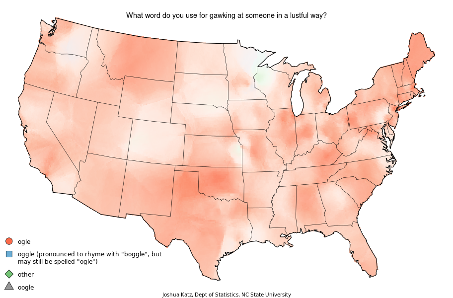
Shutter speeds are pretty easy to understand – but why do apertures increase so weirdly? How come bigger numbers are smaller apertures? And how the hell are you meant to remember all of this?

Don’t worry – it’s less of a mystery than you’d think. Here’s how it works.

Why does it matter?

It’s sort of important to know what ‘half the aperture’ is of any given aperture, because if you’re shooting in Manual mode (you’re not still shooting in automatic modes, are you?!), you can use something called ‘synonymous exposures’. That is; you can use two different sets of exposure settings, that let the same amount of light onto your light sensor.

In other words: if you shoot a photo at 1/100 second, f/4 and ISO 200, you would get exactly the same brightness in your photo if you halved the ISO and doubled the shutter speed (so 1/50 second and ISO 100) or the other way around (1/200 second shutter speed and ISO 400).

ISO and Shutter speeds

Before we dive into aperture-land, let’s take a look at shutter speeds. As I hinted at before, they are both pretty intuitive: A 2 second shutter speed means that the shutter is open twice as long as a 1 second shutter speed. The same goes for 1/100 and 1/200 – the former is half as fast as the latter.

ISO deals with light sensitivity; in the old days, we’d talk about film speeds of a certain ISO. These days, it refers to the sensitivity of your light sensor (or rather, a multiplication factor done by your camera’s processing chips). When you’re shooting at ISO 100, your camera will use the light capture data as-is. At ISO 200, it’ll take your light measurements and multiply them by 2 (because it used half the shutter speed in its exposure calculation). At ISO 400, it multiplies everything by 4 – and so on.

F-stops and aperture

prime.jpg

Lovely picture of a Ricoh f/2.2 prime lens by Nayu Kim, with five aperture blades clearly visible.

Aperture is the one that always trips up my students, because it appears as if the F-stop scale doesn’t make any sense. For one thing, f/2.8 is a pretty weird number, but how can f/2.8 be a larger aperture opening than f/4?

The aperture opening is measured in f-stops, which are, in fact, a fraction. Specifically, an aperture opening is a fraction of the focal length of your lens. So, if you have a 100mm lens set to f/4, what you are really saying is that the aperture opening in the lens is 1/4th of 100mm. Let’s do the math: 1/4th of 100mm is 25mm – or about an inch.

This fraction is obviously the reason why f/4 is a larger aperture than f/8 – if you get a 1/4 (25%) of a cake, you’re getting more cake than if you’re getting 1/8 (12.5%) of a cake.

You may have seen some very posh f/1.0 lenses (Canon’s version of the 50mm f/1.0 costs around US$4,500), and if you’ve been around in the photography world for long enough, you may even have come across a couple of 50mm f/.95. If you’re immediately wondering how this is possible, simply go back to the math: The 50mm f/1.0 lens has a 50mm aperture opening. As such, the 50mm f/.95 isn’t a physics-defying freak of nature – it simply has an aperture opening that’s larger than its focal length; 52.6 mm, to be exact.

The F-stop scale

fractions.jpgThe scale of F-stops is a geometric sequence of numbers: the sequence of the powers of the square root of 2. Which sounds pretty mystical, but have a look at the table that’s hovering to the right of this text; the actual square roots on the left-hand side of the table might look arcane, but you’ll no doubt recognise the aperture f-stops as ones that your camera comes up with when you’re taking photos.

So why did they choose this scale? Well, F-stops increase and decrease go up and down (inverse-) geometrically in powers of the square root of two because when the aperture diameter increases by the square root of two, the size of the area of the aperture (in other words: the amount of light that hits the film/CCD) is doubled. The reason for choosing to use the ‘square root of two’ scale, then, is that it it keeps the intervals equivalent to the doubling and halving of exposures. Nifty, eh?

Of course, the f-stop scale doesn’t operate exclusively with whole numbers; look at the second table to see what happens when I take a selection of fractions and plug them into the square root formula. Your camera will operate either with thirds- or halves of a stop, so when we look at different fractions of five (5-and-a half, 5-and-a-third and 5-and-two-thirds), we’ll get more f-stops you’ll probably recognise (f/6.7, f/6.3 and f/7.1, respectively).

fractions_of_fractions.jpgThis way of calculating apertures is the reason why you very rarely see f/3.0 or f/7.0, for example – although I have seen them on some cameras from time to time, bizarrely, especially camera phone cameras, who seem to relish throwing photographic convention to the wind.

Where do variable aperture lenses fit in?

You may have seen some lenses that have something like “18-35mm f/3.5-4.5″ stamped on the side of them. That means that when the lens is zoomed out fully, you can shoot with a f/3.5 aperture. However, when you zoom in, you can only use f/4.5.

In a way, that makes sense, let’s do the math. At 18mm, f/3.5 is a 5.1mm opening. At 35mm, f/4.5 is a 7.7mm opening. Those are pretty similar; due to the way the lens is designed, it is able to have a bigger aperture opening when it is fully zoomed out; but because it has a longer focal length, the aperture is a smaller fraction of the lens length at full zoom than at full wide-angle.

This article was originally posted at Why is the F-stop scale so weird? , on Photocritic.

PLEASE NOTE -- The contents of the Photocritic blog is strictly copyrighted, and this feed is for personal, non-commercial use only. The use of this feed on other websites is a copyright infringement, so you should only ever be able to read this text in a feed reader. Digital Fingerprint: d07805f964d211dfdfe227d609f7448f