It’s time to move beyond the misguided war between bikes and cars. Doing so requires all parties on urban streets to acknowledge that city mobility is a collective problem without an either-or answer. In the spirit of a healthier such discussion, we’ve culled from this excellent list of anti-bike arguments that should be put to rest, compiled by Lindsey Wallace at streets.mn, as well as a recent longer list from Adam Mann in Wired.
1. Cyclists break the rules
If breaking the law is a knock against cyclists, then it’s a knock against everyone who uses city streets. Some bike riders do run red lights (though it’s often because the signal doesn’t recognize them) or pop onto the sidewalk (though it’s often because they don’t have bike lanes). Then again, drivers are no strangers to blowing lights—one in 10 run reds in New York City—and doing so is the most common cause of crashes in U.S. cities.
So sure, some cyclists are just jerks. That’s true of any group of humans. What must be recognized with regard to bike riders is that much of what’s mistaken for jerky behavior is better attributed to the frustrations of city travelers long denied space on urban streets.
From a strict design sense, that’s largely true in U.S. cities today. Engineering manuals and guidelines have emphasized the creation of car-friendly streets at the expense of other modes for decades. But that reality is also a choice—not a fate. As cities recognize the increasing social costs of car reliance, they’ve started to adjust car-first street-design standards to incorporate alternative modes and to see urban streets as spaces that can be safely shared by all.
3. Cyclists don’t pay for roads
The idea that cyclists don’t have the right to city streets because they don’t pay vehicle taxes doesn’t hold up to much scrutiny. Some cycling advocates aren’t opposed to a small road usage fee as a bargaining chip, but the truth is bikes just don’t cause much street damage; might as well charge a usage tax to platform shoes or wheeled luggage while we’re at it. Most cyclists are drivers, too, so they do pay to use the road at times. And at the city level it’s often property taxes, not fuel taxes, that pay for street maintenance anyway.
More broadly, everyone pays for roads in the U.S.—or, to be more precise, everyone pays too little for them.
4. Bike lanes are bad for business
On the contrary, as we showed in this complete economic case for converting street parking into bike lanes, they can be very, very good for business. We’ll let this chart of spending by travel mode in one New York City neighborhood do the talking:
5. Well, then bike lanes at least slow down traffic
That’s not always the case, either. Sure, at some point, if you remove enough general car lanes you’re going to create congestion. But cities can reduce that outcome with smart design, and in some cases they can even help traffic flow more smoothly.
Let’s stick with New York and the case of bike lanes installed recently on Eighth Avenue. In fact, daytime travel times on the street decreased an average of 14 percent, largely because left-turn pockets were also installed, which meant through-traffic didn’t have to slow down for turning cars—and had the safety benefit of making it easier for drivers to see bikes coming.
We’ll cut the list here for now and let the commenters add their own anti-bike arguments worth putting to rest. The encouraging thing is that, bike-versus-car rhetoric notwithstanding, city streets are evolving to reflect balanced usage. It’s time for our discussion of urban mobility to evolve beyond wars of words, too.
At the end of last month, Trade Promotion Authority (TPA), better known as "fast track" for various trade agreements, was approved after a series of back and forth procedural moves by Congress. This means that Congress no longer has the (Constitutionally-provided) power to have a say in the trade deals the administration is creating, other than a single up-or-down vote when everything is set in stone. There was, however, one tiny poison pill that Senator Bob Menendez supposedly hid in the TPA concerning the Trans Pacific Partnership (TPP) agreement. And that was that it could not be used if the trade agreement included countries that were listed as a "tier 3 nation" by the State Department when it comes to human rights violations. Malaysia, one of the countries that is a part of the TPP, has been designated a "tier 3 nation" by the State Department for a while now, due to serious human trafficking problems.
Some trade deal supporters in Congress tried to quietly remove this provision, but failed. And that left a big Malaysia-shaped problem in front of the TPP. But, the Obama administration is nothing if not resourceful in trying to make sure the TPP gets approved and big corporations get their expanded power over national governments around the globe.
There is essentially zero evidence Malaysia has done anything to earn this reclassification. Just two months ago, police found 139 mass graves along the Malaysian border that contained migrant workers that had been trafficked or held for ransom.
Since the 2014 TIP report, Malaysia has actually convicted fewer smugglers. As recently as mid-April, the US ambassador to Malaysia publicly criticized the government there for not doing more to combat trafficking.
Also sketchy: the State Department's report was actually due out last month, but was mysteriously delayed until after the whole mess with fast track was concluded. It's almost like the State Department chose to wait until it saw whether or not this provision was included to determine what Malaysia's status would be.
And if you want further evidence that this late decision to magically upgrade Malaysia to tier 2 wasn't in the cards originally, how about this:
Menendez’s office said Friday that an interim report was delivered to the Senate Foreign Relations Committee in March on Tier 2 countries only, and Malaysia was not included.
In short, the State Department does not really think that Malaysia has improved its terrible record on human trafficking. It did not think so in March when it released an interim report. And then it made the political decision to hold off on releasing its June report until the middle of July to see how the fast track path proceeded.
Finally, rather than take this tool and use it force Malaysia to actually improve things, it gave the country a total free pass, just for the sake of finalizing TPP. I don't care where you stand on the various other provisions of the TPP, but this sort of cynical move -- where real lives are at stake -- is horrifying. And it shows the "who gives a fuck, get it done" attitude of our government right now. This isn't a theoretical issue. This is one where it's clear that people right now are being harmed, and rather than do anything about it, the government has deliberately chosen to turn a blind eye to the problem just so it can get this questionable trade deal passed.
This, of course, also is likely to confirm the fears of many who were opposed to the TPP all along. The Obama administration and US Trade Rep Michael Froman keep insisting that the TPP has a number of features to help raise labor standards in various countries. Yet, if they're happily willing to not just look the other way over Malaysia's human trafficking, but to actively whitewash it, what does that say for the seriousness with which it will enforce any labor practice rules?
Last week, the Washington City Paper made a stand against what it considered an unfair concert photography contract presented by the Foo Fighters with an article entitled “Why We’re Not Photographing The Foo Fighters.” Concert photographers everywhere stood up and slow clapped for the headline, the main idea of the article, and the stand it took on photographers rights.
In the last paragraph of the article however, the City Paper did something even worse to photographers than the Foo Fighters ever could have: they called on the fans to submit photos of the show, and they offered to pay for them.
Instead of simply not covering the event and saying “Screw you, Foo Fighters” as the article’s title might make you believe, they’re saying “Screw you, concert photographers” and created a new class of concert photographer; the front row, amateur, on spec, freelance iPhoneographer. The ramifications are going to be far reaching to the concert photographer, the concert attendee, the artist, and the publications themselves.
For the concert photographer, we’ve learned how to use our (typically very expensive) equipment, what shots work and which don’t, how to behave in a photo pit. We’ve fostered relationships with PR firms, management companies, artists, venues and publications over hundreds or thousands of events and we deliver substantial amounts of content for a relatively low price.
By crowdsourcing their content, City Paper has effectively removed this position as a viable income source. We simply cannot compete with 3,000 people all hoping to make a quick buck off their photos. The law of large numbers means that thousands of people shooting hundreds of pictures each will come up with a small amount of publishable photos, probably as many as a handful of seasoned photographers and that as supply rises, demand falls and prices go down.
If no one is occupying the photo pit, the front rows of your local concert hall will become a wall of iPhones, with everyone hoping to recoup the a portion of the cost of their ticket by selling a shot. At the more raucous events (the ones I love to cover), the photo pit provides a slight barrier from crowd surfing, moshing or stage diving revelers, a benefit our new iPhoneographer won’t have.
In addition to concentrating on getting a sellable shot, Johnny iPhone has to contend with Drunky McMoshenstein crashing into him. If you don’t spend enough to be one of the few that splurge for front row seats, or don’t get their early enough to hug the barrier at a general admission event, prepare for even more cell phones in front of you than you already see.
There are a set of rules in place for concert photographers that make us less intrusive on the artist’s performance while still allowing us to get the photos we need to cover the event: we shoot 3 songs, we don’t use flash, we don’t do video, and we cull through our coverage. In fact I had just tweeted this recently before reading this article.
Will the new amateur, on spec, freelance iPhoneographer follow these same rules? Judging by what I see at concerts every week, no, not at all. The artist will contend with even more smartphones in the air, popping off flashes and bootlegging blurry grainy images and video with blown out sound straight to Instagram. For some artists, the response will just be “no photography.”
I’m not naive enough to think that we make or break artists as photographers, but we’re part of the machine, and we’re part of the only profitable portion left for them. In the long run, not having access to the high quality content created by concert photographers at your show will eventually hurt an artist that has already taken so many shots from the crowdsource distribution of their music.
The logistics of crowdsourcing photos will create a new burden for the publications. Rather than reviewing 25-100 images to select a few for print or publication, the publications will have to sort through thousands to tens of thousands of blurry, grainy, poorly composed shots for a few publishable gems. Concert photographers are not expensive as photographers go, typically making from less than a hundred to just a couple hundred dollars an assignment.
By the time you cull through all the bad photos find the good ones and post process them, what has the publication really gained in the process? Not much. What you’ve lost however, is a relationship with a professional who values and invests in his work, shows up when he says he will and consistently creates good content.
Put yourself in my shoes, and those of my fellow concert photographers; imagine you work for a company, you purchase thousands of dollars in equipment to work for said company and a third party comes along that has a contract that makes it incredibly difficult for you to do your job, through no fault of your own. Rather than simply not attending the event or requesting amendments to the contract, your employer decides to pay people who aren’t experienced and haven’t spent a dime on specialized equipment to do your job because they don’t have to play by the same rules you do, negating that pesky contract.
The end product is not as good as yours, but could be considered passable on occasion. You get a “super sorry, maybe next time that third party won’t be so mean,” and someone else gets paid. Does that leave you with the same warm, fuzzy feeling about the stand the Washington City Paper made for photographer’s rights? If they were a catering company and instead of sending chefs and cooks they sent people who really enjoy cooking at home, would that be standing up for culinary rights?
The problem is the artists’ contracts, not the concert photographer, so why are the concert photographers the only ones paying the price?
About the author: Kevin Bergin is a Boston, Massachusetts-based photographer who specializes in low-light, action portraiture. Be it local bands or festival concerts, hockey or surfing, nightlife events or casual journalistic photography of your family reunion, Kevin is up to the challenge. You can find his work on his website. This article was also published here.
Mary Ybarra on the porch of her land-trust home in East Austin. (Alana Semuels / The Atlantic)
AUSTIN, Tex.—Not long ago, inner cities were riddled with crime and blight and affluent white residents high-tailed it to the suburbs, seeking better schools, safer streets, and, in some cases, fewer minority neighbors.
But today, as affluent white residents return to center cities, people who have lived there for years are finding they can’t afford to stay.
Take the case of the capital city of Texas, where parts of East Austin, right next to downtown, are in the process of becoming whiter, and hip restaurants, coffee shops, and even a bar catering to bicyclists are opening. Much of Austin’s minority population, meanwhile, is priced out, and so they’re moving to far-out suburbs such as Pflugerville and Round Rock, where rents are affordable and commutes are long.
“It’s a very bitter pill to swallow for families to be priced out as it becomes a desirable neighborhood,” Mark Rogers, the executive director of the Guadalupe Neighborhood Development Corporation (GNDC), told me.
Rogers and other groups have a bold plan to try and reverse this course: Make homes in the area to affordable—forever.
How, exactly? Rogers is developing community land trusts, through which a local nonprofit acquires a parcel of land and pledges to use it for purposes that benefit the neighborhood, whether that be food production or affordable housing. In the housing model, the nonprofit builds a home on the land and sells it to someone in need. But the nonprofit retains ownership of the land that the house sits on, leasing it to the homeowner for a designated time period, typically 99 years. Dividing the structure from the land has two important benefits: It ensures that the land won’t be sold to developers by keeping it in the community’s possession, but still allows people to buy a home and earn equity on the structure.
As part of the deal, the home will always be affordable. The lease between the homeowner and the nonprofit sets a fixed rate for the house’s appreciation, so that the homeowner builds equity while still keeping the price down for the next buyer.
The first community-land-trust home in the state of Texas is a one-story, mint green house with a wraparound porch in a quiet East Austin neighborhood where prices have skyrocketed in recent years. (A home across the street is currently listed for $859,000; it sold for $349,000 in 2010.)
Mary Ybarra bought the home for $150,000 in 2012, and pays $815 a month on her interest-free mortgage. (GNDC loaned her the money, since it was difficult to get a loan for a land-trust home.) At the time, nearby homes were going for $350,000, which would have been out of reach for Ybarra, a single mother who works as an administrator in an office.
“I would not have been able to get in that league—ever,” she told me, sitting on the porch. “But once the land trust came in, I knew I was on my way somewhere.”
GNDC bought the land where the house sits for less than $20,000 in 1989. When it sold the house to Ybarra in 2012, the land was valued at $120,000 and the house valued at $150,000. But rather than take the profit of the rising land prices, the nonprofit holds onto the land, keeping it affordable for future residents.
Austin is the only large, fast-growing city in America to see its population of African American residents decline between 2000 to 2010.
The idea of community land trusts isn’t a new one. The idea was first popularized in America as part of the Civil Rights movement, when a community activist named Robert Swann decided to try and obtain a large piece of land for black sharecroppers to settle and develop. The backers of that land trust took inspiration from the Jewish National Fund, which at the time was buying up land and setting up settlements in Israel, and the Bhoodan Movement in India, which tried to persuade wealthy landowners to give some of their land to the poor.
Despite Swann’s success, the idea didn’t really take off in urban areas in America until the 1980s, when rapidly increasing real-estate prices began shutting many out of homeownership, according to Reinventing Real Estate: The Community Land Trust as A Social Invention in Affordable Housing, by James Meehan. Cities in states such as Massachusetts, California, and New York embraced the idea. The city of Boston even used eminent domain to clear a portion of land for a local land trust. There are currently 243 community land trusts in the country, the largest of which is in Burlington, Vermont, and leases land to about 500 owner-occupied homes.
But, elsewhere, the idea was slow to catch on. There are few areas more speculative than real estate, and the idea of setting a fixed value for a home’s appreciation made some advocates uneasy. Banks, unaccustomed to loans just for structures and not the properties they sit on, refused to give loans for land-trust homes. Tax assessors charged taxes for the properties based on similar properties in the area, not on the value of the homes as designated in the leases.
That’s all a partial explanation for why the first home to be built on a community land trust in Texas wasn’t completed until 2012. In 2011, a state law made land-trust properties tax-free, and thus more affordable, Rogers said. It was also around that time that Guadalupe was able to find a bank that was willing to give a home loan on a land-trust property. (No community-land-trust loans had been done in Texas before.)
A bar in East Austin (Alana Semuels)
It couldn’t have come at a more crucial time for East Austin. Though the area was designated for residents of color in the city’s 1928 Master Plan, by the mid-2000s, white residents began to move in to be close to the city’s bustling downtown. By 2010, homes were double the price they’d been in 2005. Poor, long-term residents—mostly minorities—began to move out. Between 2000 and 2010, the black population living within city limits fell 4 percent, as the black population in the Austin metro area grew 27 percent. The white population living within Austin’s city limits grew 11 percent, increasing 24 percent in the metro area. Austin is the only large, fast-growing city in America to see its population of African American residents decline between 2000 to 2010.
Mary Ybarra grew up in East Austin, and has seen the neighborhood change dramatically in the past few years. She remembers walking to school with her three sisters and buying piñatas for birthday parties down the street. That piñata shop became the center of the city’s gentrification debate earlier this year when it was torn down—with everything still inside—after the new owners told the piñata-shop owners to vacate the premises and they refused.
“I hardly ever see old friends anymore, because they can’t afford to live here,” she said. Then she gestured to a small home across the street. “That home is renting for $1500 a month.”
Rogers wants to build more land-trust homes to guarantee that more people like Ybarra can stay in the neighborhood. If they can own their own homes, even better, he said. Building equity when owning a house is a good way for low-income families to try and join the middle class.
His group currently has three land-trust properties, as well as 25 vacant lots that will soon be land trusts, he said. GNDC bought real estate in East Austin before prices started climbing, which makes it easier to continue to survive as a non-profit and still keep land cheap. Rogers built one of the land trust properties in 2009 for $100,000—the land and house on that property are now appraised for $575,000. (GNDC supports itself through rental properties it owns, it uses a combination of city funding and donations to make some of its deals.)
Rogers is planning a row of community land trust homes on this East Austin property. (Alana Semuels)
It’s possible to create a land trust without deep pockets. After Austin passed a bond to raise money for affordable housing, Guadalupe used some of that money to buy land. Some private developers are also looking at creating land trusts as part of new developments, said Melora Hiller, the executive director of the Community Land Trust Network. The city of Austin created land trusts on some of its properties, and is looking to do more. In Baltimore a community group is looking at creating a land trust to turn vacant homes into residences for the homeless.
There may be more of these trusts created as communities look for ways to keep housing affordable, Hiller said.
“Certainly since the recession, there’s been a huge increase and interest,” she said. “We are constantly getting phone calls from resident groups who are interested in seeing if a community land trust would work for them.”
This has happened in city neighborhoods like Mueller in East Austin, as well as in resort towns where residents realize they need to keep housing affordable for local workers to keep the economies going, Hiller said.
But even neighborhoods that aren’t under threat from gentrification are creating land trusts, knowing that in a culture where cities are “in,” no one is safe from being driven out of a neighborhood. That includes areas of distressed cities such as Detroit and Baltimore.
“The residents are seeing the writing on the wall,” she said. “They see that the prices will go up and they want to make sure they can protect affordability.”
Starting Wednesday, the city of Chicago’s new "cloud tax" went into effect: it imposes a 9-percent tax on "patrons of amusement," including those services that are "delivered electronically."
In short: Netflix users in Chicago will be paying a little extra for their subscriptions pretty soon.
"We will be adding it to the cost we charge subscribers," Anne Marie Squeo, a Netflix spokeswoman, told Ars in a statement. "Jurisdictions around the world, including the US, are trying to figure out ways to tax online services. This is one approach."
Oregon’s much-anticipatedper-miledriving fee, called OReGO, launches today. Instead of paying the normal gas tax embedded in the price of fuel, OReGO drivers will pay 1.5 cents for every mile on the road. The initial public rollout is limited to 5,000 vehicles, but the implications of the program are vast: if all goes well, state and federal leaders might have an answer to the transportation funding crisis that’s hampered American infrastructure for years.
Here’s 18 reasons the whole country should give per-mile fees a chance.
1. The Highway Trust Fund keeps running out of money
The federal Highway Trust Fund that pays for America’s roads (and to a lesser extent rails) is expected to run out of money at the end of July. We’ve seen this movie before, so we know that Congress will find a way to keep the fund afloat—even if that involves the legally dubious maneuver of transferring money from the general taxpayer treasury. But the past trends and future projections of the Highway Trust Fund make clear that it’s a badly bent spending model that’s routinely on the cusp of badly breaking.
2. Yet Congress and some states refuse to raise the gas tax
The federal gas tax hasn’t been raised since 1993. (And the last President to truly achieve that task was Ronald Reagan.) Some states have raised it recently out of desperation, though others remain desperately opposed; New Jersey’s gas tax is about half what it was in 1927. Elected officials on both sides of the aisle generally refuse to touch the issue for fear of political damage, despite polls showing that many voters would accept a hike.
3. The truth is the gas tax is totally busted anyway
Preach.
4. For one thing, cars are much more fuel-efficient
The gas tax is a decent proxy for car travel: for the most part, the more you spend at the pump, the more you drive on the road. But that relationship has become weaker and weaker as American vehicles have gotten more fuel-efficient. That means on the average tank of gas, a car does a lot more damage to roads today than it’s done in the past.
Transportation funding aside, better fuel-efficiency is a great thing, and should be encouraged. So an arguably bigger problem with the gas tax is soaring construction costs. The Institute on Taxation and Economic Policy has estimated that these costs have increased 335 percent since 1972, contributing to much more of the decline in the purchasing power of the gas tax than new fuel-efficiency standards.
ITEP
6. Plus, people aren’t driving as much as they used to
MPG and construction costs aside, Americans just aren’t driving as much as they once did. Per-capita vehicle mileage is well off its peak in the mid-2000s—a new normal of driving that suggests we can’t think about funding (or building) highways the same way we did in the past.
SSTI
7. A per-mile fee is a true “user” fee
Ideally every driver would cover their own individual costs of using the road—a true “user” fee that seems only fair. Practically that’s never been the case. Driver fees like the gas tax once accounted for about 70 percent of road costs, but that link declined over the decades for many of the reasons mentioned above. The result is that not only are road costs distributed unequally among drivers, they’re distributed among non-drivers, too. A per-mile driving fee would be a return to this “user pay” ideal.
Unlike the gas tax, a per-mile fee isn’t hidden away in the larger cost of fuel. Right now many drivers think they pay much more in gas taxes than they truly do—a disconnect that contributes to their frustration over rising fuel prices, despite the fact that Americans pay relatively little at the pump. With a per-mile fee, drivers could see exactly what they spend on the road each month, just as they do on their cable or phone bill, and change their behavior accordingly.
9. It would raise a gargantuan amount of money
The American Association of State Highway and Transportation Officials has estimated that a mileage-based road fee would produce an astonishing $246.31 billion by 2020. That’s enough to cover the Highway Trust Fund shortfall many times over, and that’s assuming just a penny per mile—below the per-mile OReGO rate of 1.5 cents. The windfall stands to get weaker over time as people drive less, but if and when that’s the case local government won’t have as much road maintenance or expansion to do, either.
10. It can be adjusted to reduce traffic and promote transit
A per-mile fee is also remarkably flexible. Heavily congested metro areas can add a surcharge during rush-hour (which would incentivize transit use, telecommuting, or new work patterns) or within a certain boundary (similar to the congestion pricing zones in London, Singapore, and Stockholm). They can also shift some of that money toward transit improvements in particularly crowded corridors—giving the per-mile fee an equity basis as well.
A per-mile fee is flexible enough to slap gas-guzzling clunkers with a surcharge and squeaky clean EVs with a discount.
11. And adjusted to cover truck damage
One of the big arguments against any flat transportation tax is that not all vehicles rough up the road the same way. Fair enough. A per-mile fee is far easier than the gas tax to adjust for the size of a vehicle, from 18-wheelers to Smart cars.
12. And adjusted to discourage pollution
Electric vehicle owners often oppose a per-mile fee because they say it offers a disincentive to go green. That’s a fair if tenuous argument: EVs still save money at the pump, they still damage the road, and if they draw from a coal-based energy grid they can even create more pollution than gas cars. Still a per-mile fee is flexible enough to slap gas-guzzling clunkers with a surcharge and squeaky clean EVs with a discount as local governments see fit.
13. Look, it’s just really adjustable, okay?
Touché. In theory, a per-mile fee is elegant and nimble enough to capture more or less every social cost of driving. It’s the Baryshnikov of transportation funding.
REUTERS/Sergio Perez
14. Millennials dig it
In a new public opinion poll for the Mineta Transportation Institute, Asha Weinstein Agrawal and Hilary Nixon report that 59 percent of respondents age 18 to 24 “strongly” or “somewhat” supported a mileage tax (provided it was adjusted for vehicle pollution). So Millennials seem more on board with the idea than older age groups. And we should listen, because according to them, they’ve never been wrong.
The single biggest concern voiced about a per-mile driving fee is privacy. But there’s no need to worry. Oregon has developed several tiers of mileage tracking, from low-tech options (such as an annual fee or odometer reading) to higher-tech ones (e.g. cell tower dings or full GPS). In other words, there’s a tracking program to suit everyone’s comfort level. Even libertarians aren’t concerned about per-mile privacy. In recent Congressional testimony supporting a mileage fee, Bob Poole of the Reason Foundation said “privacy need not be a serious obstacle” to its adoption.
16. It’s been tested—with success
Oregon has been developing and testing and improving the concept for years now. And it’s not alone. Other pilots around the country have been a success. An Iowa trial found that vehicle trackers can capture the vast majority of actual miles traveled (92 percent). Simulations in Sacramento and Washington, D.C., as well as real-world trials in Atlanta and Seattle, have shown that per-mile taxes can lead to reduced car travel. A Portland study showed it works best when it includes a rush-hour surcharge.
Best of all, people like it more as they try it. In the Iowa trial, for instance, about 41 percent of participants had “very” or “somewhat” positive feelings toward the trial beforehand, rising to 70 percent afterward.
Transportation Research Record: Journal of the Transportation Research Board
17. Lots of states have shown an interest
Though Oregon is the only state to launch a per-mile program so far, many others are keeping a close eye on the concept. California recently authorized a pilot program of its own; in late 2013, Florida’s transportation secretary predicted the state could shift to a mileage-based fee within 10 to 15 years; and several Western states have joined a consortium to monitor road-usage charges. A recent report from the Council of State Governments lists 26 states that have dipped their toe in the waters of per-mile pricing in some form or another.
18. Oregon has been been down this Trail before
Yes, we just did that. (It’s been a long list, all right?) But it’s also the truth. Back in 1919, Oregon became the first state to implement a gas tax. The state’s funding vision has served American roads well for this long. Why not follow it in a new direction?
For a few years now, we've been covering the proliferation of the FBI's own plots, in which they basically set up a fake terrorist plot, and use their own undercover agents or (preferably) informants (generally former criminals who get paid and/or favors such as reduced sentences) to go out seeking young and gullible individuals to convince to "join" the plot (a plot that has no connection to reality). Then they stage a big arrest and an even bigger press conference about how they "stopped" a terrorist threat. We've written about examples of this over and over and over and over and over and over and over and over and over and over and over and over and over and over again. Apparently, a huge chunk of the FBI's resources goes toward manufacturing these kinds of fake plots, which help generate scary headlines, but rarely seem to do much other than putting young, gullible folks in jail.
The Intercept has now published a story of one of these cases that is so extreme and so ridiculous that it should make you angry. It is the story of the "Fort Dix Five" -- a case that Chris Christie led the prosecution of while he was a US Attorney before becoming governor. This case was part of his fame and his "tough on terror" bona fides. Now, as Christie prepares his presidential campaign announcement, the case against the Fort Dix Five is a big part of his biography:
In a 2012 speech to the American-Israel Public Affairs Committee (AIPAC), Christie recalled his success in the “uncovering of a plot to kill American servicemen and women,” telling a packed audience at the New York Hilton Hotel that he helped send to prison a group of “Muslim men practicing with semi-automatic weapons and screaming about jihad against the infidels.” Today, both the Republican Governors Association and the New Jersey Republican Party list the Fort Dix case as “one of Christie’s finest moments” under his biography.
Except, as the Intercept writeup details, despite putting three brothers away for life, there was no evidence against them. There was one friend of theirs, who liked to make up stories and brag a lot, who talked about an idea to shoot people at Fort Dix, but no indication at all that the other participants (mainly the three Duka brothers) knew about this plot at all. And then the fifth member of the "Fort Dix Five", upon hearing about the "plot", immediately went to the police to tell them about it. The Intercept has also published a short film about the Duka brothers (narrated by their younger brother) that is worth watching: The video shows clips of the footage the FBI got on the brothers, none of which ever has them discussing a plot against Fort Dix -- and actually tends to just show them messing around or even pushing back while the two FBI informants pushed them to get more involved in plots, which the brothers mostly ignored. Even the story of how the brothers came to the attention of the FBI is somewhat ridiculous. After a ski vacation in the Poconos, in which the brothers also did some horseback riding and went to a shooting range, they tried to make a DVD of some of the video they shot to give to everyone who went on the trip as a memento. In the video, while at the shooting range, some of the brothers say "allahu akbar" leading the guy making the DVDs at Circuit City to alert the feds.
Despite the two FBI informants pushing to try to get the brothers engaged in a plot for a year -- mainly by pressuring the one show off guy who kept saying he had talked to them about it -- there is no evidence of any actual plot whatsoever. One of the informants and the one show off guy both admit that the brothers had no role in the plot. Eventually, the FBI set up a fake gun buy -- as the brothers were fans of guns, but as non-US citizens couldn't buy guns legally. It's pretty clear in going through with the plan to buy some guns, they broke the law, but it had nothing to do with a terrorist plot at all, and so the charges left them baffled. But in the end it didn't matter:
Delivering Shain’s sentence, the culmination of a terrorism case that had lasted over two years, Judge Kugler said, “It’s not my place or desire at this time to review all the evidence … Suffice to say this defendant was in the middle of this plot. I’m realistic, I remember that they weren’t being taped 24 hours a day seven days a week.”
Brushing off the lack of direct evidence, Kugler added: “That there isn’t more explicit evidence does not concern me and obviously didn’t concern the jury either … I cannot deter this defendant, because of his belief system, from further crimes.”
Equally as disturbing is the way they included the fifth member of the "Fort Dix Five," Serdar Tatar, a friend of the Dukas who the braggart guy, Mohamad Shnewer, dragged into the "plot" to prove to the FBI informant that he could pull together people to pull off an attack. Except Tatar -- who wanted to become a police officer -- went to the police instead. And still got included in the charges.
Omar apparently felt more comfortable approaching Tatar than the Duka brothers and began courting the 23-year-old. He told him of the plot to attack Fort Dix and openly asked for his help: he needed the pizza delivery map.
Tatar, who had since left his father’s pizza shop and moved to Philadelphia, was working at a 7-Eleven when Sgt. Dean Dandridge of the Philadelphia Police Department came by for his daily coffee. On November 15, 2006, Tatar told Dandridge that he believed Omar might be planning a terrorist attack. Neither Tatar, nor Dandridge, had any way of knowing that Omar was an informant.
Dandridge left Tatar’s information with the FBI, expecting the bureau’s agents would be in touch soon. For three weeks, Tatar waited for the FBI to contact him. In the meantime, he recorded at least one conversation with Omar, so that when the authorities did reach out, he would have information to give them.
The full story and the video are infuriating. Yes, the FBI should be looking out for people looking to perform acts of terrorism and such, but in case after case after case we don't see them doing that. We see them setting up elaborate theater productions. In many of those cases, after lots of pressure, at the very least, the gullible and troubled individuals make some sort of statement to agree to participate in the "plot." This case -- as high profile as it is -- is even more exceptional in that 4 of the 5 participants never agreed to take part in any plot at all, with three of them not even knowing there was a plot.
The story is a complete travesty and raises serious questions about what the FBI and Chris Christie were doing, other than padding their resumes.
Maps are big these days. Blogs and news sites (including this one) frequently post maps and those maps often go viral—40 maps that explain the world, the favorite TV shows of each U.S. state, and so on. They’re all over Facebook, Twitter, and Tumblr, and news organizations are understandably capitalizing on the power that maps clearly have in digital space: they can visualize a lot of data quickly and effectively. But they can also visualize a lot of data inaccurately and misleadingly.
A map is not just a picture—it’s also the data behind the map, the methodology used to collect and parse that data, the people doing that work, the choices made in terms of visualization and the software used to make them. A map is also a representation of the world, which in some ways must always be a little inaccurate—most maps, after all, show the roughly spherical world on a flat surface. Certain things are always left off or highlighted while others are altered, as no map can show everything at once. All of those choices and biases, conscious or not, can have important effects on the map itself. We may be looking at something inaccurate, misleading, or incorrect without realizing it.
Americans are taught from an early age to analyze and understand the meaning and manipulation of words, but they are rarely taught the same skills about maps.
As Mark Monmonier writes in the fantastic book How to Lie With Maps, Americans are taught from an early age to analyze and understand the meaning and manipulation of words, such as advertising, political campaigns, news and the like (to be “cautious consumers of words” as he puts it) but they are rarely taught the same skills about maps.
Education about using maps (and geography as a whole) is not thorough or common in U.S. schools. The high school Advanced Placement exams for human geography only started being offered in 2001*, for example, and many top private universities do not offer geography as a subject. Harvard dropped it in 1948, which some academics blame for kicking off a decrease in the learning of geography across the country.
Numerous studies report that the vast majority of Americans lack geographic literacy and are unable to find places like Afghanistan or Iraq on a map, let alone understand more complex spatial relationships about them—where are things, why are they there, how does that influence other things? (Harvard, to its credit, formed a Center for Geographic Analysis in 2006.) If they think of it at all, many Americans think geography is just memorizing a list of state capitals or looking at pictures of cool animals in National Geographic.
It’s no surprise then that people often assume maps are accurate, because it’s so often unclear how they are made—maps are “arcane images afforded undue respect and credibility” that are “entrusted to a priesthood of technically competent designers and drafters,” as Monmonier puts it. Almost everybody can write, but not everyone can make a map.
At the same time, the use of geographic information systems (GIS) has exploded as computers and software get more powerful and less expensive. New web mapping tools and the availability of data are democratizing cartography, allowing almost anyone to attempt mapmaking—something that was formerly possible only for experts or users of specialized software. That means many more people are creating their own maps, which is surely a good thing, but it also means that there are many more inaccurate, incorrect maps out there—either by design (to push viral or push a viewpoint) or because the creators don’t fully understand what they’re doing.
Maps are still fun, even the inaccurate ones. But there are a few steps you can take and concepts you can keep in mind to avoid being fooled by a map.
Don’t trust a title
A good mapmaker should correctly and succinctly explain what their map actually shows, rather than making grand claims. One recent example is a New York Times article and interactive map is called “The Best and Worst Places to Grow Up.” That might seem self-explanatory, but the data behind this particular map really only shows that people make more or less money depending on where they grow up. That’s still a very interesting finding, but earning more or less money does not necessarily mean that one place is better or worse to grow up in than another, something that is hard to define and would surely include many variables: maybe a place has a lower cost of living, or better schools, better health care, more recreation options, and so on—and an accompanying article actually makes that argument.
(The New York Times)
The data is very attractively presented, and impressively the map actually changes based on where you are reading from, but the title does not really show what it purports to show. If you just look at the map and think a place is good or bad, you are missing the whole story. Are Atlanta or Denver bad places to grow up? Are the best places Wyoming, Utah, the Dakotas, and rural Minnesota and Iowa? That depends on what you consider best and worst.
A red flag with map titles should also be Upworthy-esque words like amazing, incredible, gorgeous, and so on, or ones that claim to explain everything—“this incredible map shows half of U.S. output is generated by a few cities,” for example. Looking more into the data and the way the maps are made, those amazing statements often turn out to be pretty boring.
That particular map, which shows gross domestic product (GDP), seems like it suggests that people in cities are more productive than people in rural areas, but really it shows that 50 percent of the GDP of the country is generated by 50 percent of the population, since far more people live in cities than in rural areas: hardly an amazing story. A more interesting map would be GDP by population—are certain places more productive than others? Why? (I like to tell my students that a good map may raise a question rather than answer one.) A similar example is a map that shows that 92 percent of U.S. AIDS cases happen in 25 counties—but another article notes most of the U.S. population lives in those 25 counties, so that’s probably to be expected. What would be more interesting is to map out the variation in counties.
A related issue with titles is how they interpret maps, and speaks to why a good map should include the source of the data on the map itself (more on that shortly). This map, for example, the Corporate States of America, claims to show the “most recognizable” company in each state. But what does most recognizable mean? The author of the map explains, to his credit, that it’s just ones he thought best represented the state rather than something with actual data behind it, like percentage of people who are familiar with a company, its market value, or something else. Florida doesn’t need to be ashamed that Hooters is its representative on this map, for example. Another popular map of the most distinctive band in a state (i.e., bands that are more popular than in other states), which had actual data behind it, came to be shared as “your state’s favorite band”—two different things.
Often these “amazing” maps are just something that someone made up. Of course, that doesn’t mean they can’t also be nice-looking and fun. (In fact, they should be nice-looking. Don’t share ugly maps.)
The source is important
The source of the data on a map is one of the first things you should look for—where did this information come from? Is that a trustworthy source? Is it recent? Can you look at it yourself?
If the source is not listed, be suspicious—but be suspicious even if it is. For example, in a recent viral map of the most hated college basketball teams, the cartographer includes a bit of metadata listing himself as the creator, which is helpful. However, the data itself is from a two-question Google Docs survey that was posted on Reddit’s college basketball board, hardly a representative group of Americans. The survey did require respondents to enter where they are from, but people could just say the wrong thing on purpose—someone who doesn’t like Duke could say they were from North Carolina to skew the data.
In this case, a more accurate description would be “Most hated college basketball teams among self-selecting Reddit college basketball board users”—and those kind of explanations should really be on the map, rather than making the reader find them. Then again, that might not have helped it get picked up by newspapers published where the supposedly hated teams are.
Can you trust the data in this map? Look closer. (via Playboy)
This is a silly, innocuous example (who cares if a college basketball hate map is inaccurate?) but the same thing can happen with any kind of data—politics, health, religion and so on.
Source data that’s readily available can also let you see if something is biased or even just flat made up. An amusing example of this is “Most Common Cause of Death That THEY Keep Covering Up” by state, including things like trolls, a Russian invasion, lake monsters, and lactose intolerance. This is clearly a parody of viral maps that show things like most popular film or job or food in a state—or weightier subjects like cause of death—which can all be misleading or misinterpreted and can easily hide variations between states.
Viral maps like “signature food from each state” and “most popular television show set in each state” (or is it the most significant show? Again, title is important) also come from Reddit users, which is probably why things like “meth cookies” appear as Arkansas’s signature food. Maps like these are fun, to be sure, but drawing conclusions based on them wouldn’t be the best idea. Presumably there aren’t many restaurants in Little Rock with meth on the menu.
Heat and density maps can confuse
The webcomic XKCD skewers this type amusingly, with maps showing the density of three unrelated things: people who visit a website, people who subscribe to Martha Stewart Living, and people who consume furry pornography; and the density of all three is the same.
(XKCD)
The joke is that each map is just a population map, and that more people tend to do more things. The GDP map mentioned above is also really just a population map—there is more GDP in places where there are more people.
Another map that says it shows every tweet ever falls into this same category: while a truly beautiful map, it is basically showing that people tweet more where there are more people, as the geographers at the great site Floating Sheep point out. Maybe just showing there is a lot of something in a place is enough, but if you’re trying to map something other than just population, or draw useful conclusions, a heat map needs to do something else, like generalize the data by population or some other useful factor.
A map of more or less tweets per capita would be interesting, for example: that way you can see if the thing you are looking at is actually more or less common. (Eric Fischer, who made that tweet map, has some other interesting examples of that, such as looking at where tourists versus locals take geo-tagged pictures, and some that show more tweets in areas that don’t necessarily have more people, like east of the Anacostia River in Washington, D.C.)
What is the cartographer trying to show? What are they trying to hide?
Maps are representations of the world where certain things are highlighted and certain things removed. This often is a good thing: if there’s a map for a specific purpose, it should only include things that are helpful (road types, names and cities on a road atlas, for example) or maybe for clarity’s sake you reduce how jagged or complicated something is, like the lines on a subway map. But it can be hard to tell when something has been manipulated or removed, so it’s important to think about the choices the cartographer could have made.
A simple example of this are maps that advertise or try to convince you of something: does that real estate map accurately show distance? Does it leave off the coal power plant or stinky poultry farm nearby? (Think of The Simpsons and the monorail—it put Brockway, Ogdenville and North Haverbrook on the map!)
Color and size can also be used to highlight or hide something. If a mapmaker wants to show something is bad, they’ll make it red; if a they want to highlight something, they might make it big and brightly colored and make the things they don’t want people to notice small and gray (or take them off altogether.)
If they want to show that there is a lot of something (potholes in New Jersey, for example) they might make the symbols big and bold. Those big symbols can hide a lot of variation within the data—are these potholes a foot wide, or only an inch? Are there more potholes in New Jersey than other places? It’s impossible to tell much other than “wow, there are a lot of potholes.” (And the map doesn’t list the source of the data, either.)
This can also be inadvertent: people might assume something is bad if it’s colored red or differently, even if that’s not the case—and red also tends to draw the eye away from more subtle colors. One confusing example of this is an Associated Press map showing population growth by state:
Michigan is red, so that means bad, right? But the legend is confusing for many reasons. There are three different kinds of ranges here: two “less than” signs, three numerical ranges like 5-10, and then one “plus” sign. That variety of how the numbers are displayed can make it hard to understand. And there's overlap, too: is 10 percent in the 5-10 range or 10-15? More useful ranges would be something like 0-4.9, 5-9.9, and so on. Less than 5 percent would technically include less than 0 percent, too. And finally, the note says the data is in thousands, but then lists percent. The population of Texas went up a lot, but it didn’t increase by 20,000 percent. All of these make a good argument why legends and colors should not be overlooked. If red is going to be bad, make it clear why.*
A related feature to look out for is how the data is structured—is it the values of data itself, such as total unemployment or unemployment rate, or something else derived from that data? The farther away you get from the actual values, the more suspicious you should be. Are you looking at the rate of change, or even the decrease in the rate of change? If someone is highlighting the second derivate, they might be obscuring the fact that things are bad overall. (There is an important corollary to that, however: normalizing data by population, which we’ll get to shortly.)
The way the data is distributed is important
If a map is showing the variation of something using different colors, say population by state, where lighter means fewer and darker means more (what’s called a choropleth map) take special note of the arrangement of the values into different classes. This distribution can be misleading or obscure reality.
It’s often normal to make a map that divides data into equal intervals—population by county from 1-10,000, 10,0001-20,000, 20,001-30,000, and so on. However, sometimes that logical organization isn’t the best way to present the information. If the mapmaker wants to highlight or hide something, it’s easy to manipulate the class breaks (those dividing lines between groupings) to put all the high or low values into one large class while making all the other values into their own classes. In this way, you are emphasizing part of the data while hiding another part of it. A good example of this are these maps of the Hispanic population in Florida:
While they all use the exact same data, the different choices for classes in each map make the number of Hispanic people appear vastly different.
And be very suspicious if the map doesn’t actually say what those divisions are, such as if it just includes the colors with “high” and “low,” or leaves off the legend altogether. This is another warning that the source might be not trustworthy or just something somebody made up.
The groupings of the data can also be arbitrary: if a mapmaker wants to highlight something they think is positive, such as a decline in unemployment, they might make a map showing counties where unemployment went down and by how much, with a progression of darker colors showing how much it dropped, while counties where unemployment went up were all the same, unobtrusive color (like a light gray.) Maybe the increases in unemployment in those places were actually much greater than those highlighted drops, you wouldn’t know that from looking at the map. A map showing the same data with a scale including both increases and decreases would give the reader a much different understanding of the data. (Yet another reason why the source of the data is important.)
Choropleth maps can be tricky
Choropleth maps, which I mentioned earlier, can show data very effectively, but they can cause a lot of problems if used improperly. One of those is what’s called the “modifiable areal unit problem,” which arises because states, counties, census tracts and so on are not uniform in size or population, and population is not evenly distributed within them. This means that clusters or patterns in the real world can be obscured by the boundaries used to divide the data. You may need to dig into the data to understand those patterns.
This series of choropleth maps of the 2012 U.S. presidential election shows this problem very well. The first map makes it appears that the presidential race was pretty close or that the country is very divided (red states versus blue states.) However, coloring a state red or blue based on who won obscures the margin of victory, the total number of votes, and any variation within that state.
If the cartographer chose to be more granular and show the same data by county, a logical choice, it appears that there was much more support for Romney than Obama, despite the fact that Obama received 5 million more votes and won the Electoral College vote handily. We know this because each county is not the same population—Obama overwhelmingly won the small urban counties with very large populations while Romney won many more sparsely populated rural counties. Even if you show the data by degree of support, from blue to purple to red (the “purple state” maps that were popular after the election) you are still missing that urban counties are often quite small in area but large in population.
The modifiable areal unit problem is also why it can be helpful to map something like density (say, population density) rather than raw numbers, since small counties or census tracts might be very dense.
One solution to this is a cartogram, a graphic where the areal units (in this case, counties) are sized based on their population, so counties with more people appear much bigger.
Examples of cartograms of 2012 U.S. presidential elections results, courtesy Mark Newman at the University of Michigan.
That’s somewhat helpful, but can be quite confusing or disorienting, even if we already know what those states or counties are. Adding in a gradation in color showing the margin of victory in each county helps even more:
That cartogram shows that most counties with big populations went overwhelmingly for Obama, while the rest of the counties were mostly purple.
This all may seem obvious, but that’s because we are generally familiar with the U.S. election results. Information we are not as familiar with can seem to show patterns than don’t exist or are incorrect based on how it is displayed or organized. That’s why it’s important that the cartographer understands their data and what they are mapping, and why the data should be available so others can look into it.
A bad example of that understanding was a now-updated article from FiveThirtyEight on kidnappings in Nigeria. Originally, the author mapped data on reports of kidnappings without fully understanding how it was collected and organized and drew a lot of incorrect conclusions from it, resulting in a lengthy retraction. For example, data that hadn’t been mapped to a specific town in Nigeria was placed in the exact center of the country, so a choropleth map made it appear that there was a massive wave of kidnapping in the district that contained that center point. In addition, the article stated it was a map of kidnappings, when in fact it was a map of reports of kidnapping, a subtle but important difference and another example of why an accurate title and description is important.
Base data is important, too
Even the base data used for a map can have important consequences—boundaries, locations and so on. For example, Google Maps changes boundaries based on where you are: the boundaries of China, India and Pakistan are quite different in each country because of each country’s conflicting land claims. The company does the same thing for Crimea in Ukraine, Russia and the rest of the world, subtly adapting to (or even changing) perceptions for people in those countries. You might not realize something is off because you’ve always seen it the same way, while someone somewhere else may have seen different maps their whole life.
Even the way a map is shown can be important. The infamous Mercator projection being a notable example of exaggerating the size of Europe and North America while making Africa and South America appear much smaller than they really are. A funny example of this comes from the West Wing.
Base data can have systematic flaws too: the viral map of “every river in the United States” is pretty to look at, but if you look a littler closer, the data has some problems.
A map of every river in the U.S.? Not quite.
For one, there are some straight lines and rectangles in Texas and Oklahoma where the density of rivers changes—surely not a natural feature, but an artifact in the data where for whatever reason, more rivers were mapped in some areas than others. Base data used on a map might have other flaws like this that aren’t apparent at first glance.
But maps are still good
None of this means that all maps are bad, or that we should always be suspicious of them, or that only experts should make maps. Maps are inherently interesting and fun (so is geography!), but a little bit of thought and increased awareness of how they can manipulate or obscure is a good thing, too. Just like advertisements and political campaigns, we shouldn’t trust maps (or the data behind them) inherently, but they can still be powerful, interesting and amusing.
*CORRECTION: This story originally misstated the year that the high school Advanced Placement exams for human geography began. The exams were first offered in 2001, not 2010. Also, a paragraph that describes issues with the legend in an Associated Press population change map has been updated for clarity.
Today we’re launching our first-ever vertical Street View collection, giving you the opportunity to climb 3,000 feet up the world’s most famous rock wall: Yosemite’s El Capitan. To bring you this new imagery, we partnered with legendary climbers Lynn Hill, Alex Honnold and Tommy Caldwell. Read more about the project from Tommy Caldwell, who completed the world’s hardest climb in Yosemite in January of 2015. -Ed.
“That is awesome. I definitely have to be a part of that.”
Maybe it was the sheer exhaustion from being in the middle of a 19-day climb of the Dawn Wall, but when the guys at Google Maps and Yosemite National Park asked if I wanted to help them with their first-ever vertical Street View collection of El Capitan in Yosemite, I didn’t hesitate. Yosemite has been such an important part of my life that telling the story of El Capitan through Street View was right up my alley—especially when it meant working with the Google engineers to figure out some absurd challenges.
Climbing is all about flirting with the impossible and pushing the boundaries of what you think you can be done. Capturing Street View imagery 3,000 feet up El Capitan proved to be an extension of that, especially when you take a camera meant for the inside of a restaurant and mount it thousands of feet up the world’s most iconic rock wall.
Doing anything thousands of feet high on a sheer granite face is complicated, but everyone up there had spent years of their lives on a rope and knew exactly what they were doing. After some testing, we used our tried-and-true climbing gear like cams and ropes to make sure the camera wouldn’t fall to the ground in the middle of our Street View collection.
Once we figured out how to keep the camera on El Cap, we created two sets of vertical Street View. First, we collected Street View of legendary Yosemite climbers—and my good friends—Lynn Hill and Alex Honnold in iconic spots up the sheer vertical face.
Lynn Hill’s ascent of El Capitan changed the paradigm of climbing, and she had an extraordinary effect on my climbing career. I’ll never forget when she became the first person, man or woman, to free-climb (using only her hands and feet) “The Nose” back in 1993. Now, you can see her navigate these epic moves— like climbing sideways on tiny holds of the Jardine Traverse, inventing a “Houdini” maneuver on the Changing Corners and traversing under the Great Roof.
Any story of El Capitan had to include my good friend Alex Honnold. He holds the speed record for climbing the Nose at 2 hours and 23 minutes - most people take 3-5 days. His unwavering confidence in himself is contagious; when I’m with him, I feel like the mountain has shrunk to half its size. As you make your way around Yosemite in Street View, you’ll see Alex doing what he does best: chimneying up the “Texas Flake,” racing up the bolt ladder, or getting dinner ready in the solar-powered van he calls home.
You’ll also see a glimpse of yours truly on the Dawn Wall. I spent some of my rest days during my January climb of the Dawn Wall testing out the Street View technology the Google team had sent me that month. El Cap is an intimidating environment for experimentation, but years of setting ropes proved pretty helpful in figuring out how to get the equipment rigged and ready to collect Street View.
Then, we really put Alex to work to collect the second set of Street View: the entire vertical route of “The Nose” on El Capitan. One of the few people that could do this efficiently and quickly, Alex took the camera and pretty much ran 3,000 feet up with photographer partner Brett Lowell. Now, anyone can get the beta (climbing speak for insider advice) before they climb the entire route.
Lynn, Alex and I also helped create a new Yosemite Treks page, where you can take a tour up El Cap and learn more about climbing, from what a “hand jam” is to why we wear such tiny shoes. And as a father, I’m excited kids will learn more about Yosemite when Google brings students to the park through NatureBridge later this year as a part of this project. Plus, its pretty awesome that students who can’t make it to Yosemite yet will be able to go on a virtual reality field trip to the Park with Google Expeditions.
Yosemite’s driven so much of my life that I’m excited to be able to share it with the world through my eyes. These 360-degree panoramic images are the closest thing I’ve ever witnessed to actually being thousands of feet up a vertical rock face—better than any video or photo. But my hope is that this new imagery will inspire you to get out there and see Yosemite for yourself… whether you travel up a rock wall or just down the trail.
From Portland, Oregon, to Portland, Maine. From Jacksonville to Juneau. No matter where you look, there isn’t enough affordable housing.
Without exception, there is no county in the U.S. that has enough affordable housing. The crisis is national and it is growing. Since 2000, rents across the nation have increased. So has the number of of families who desperately need affordable housing.
Without exception, there’s no county in the U.S. that has enough affordable housing.
New research from the Urban Institute shows that the supply of housing for extremely low-income families, which was already in short supply, is only declining. In 2013, just 28 of every 100 extremely low-income families could afford their rental homes. Than figure is down from 37 of 100 in 2000—a 25 percent decline over a little more than a decade.
Using data from the Census Bureau and the U.S. Department of Housing and Urban Development, researchers built an interactive map to illustrate the nationwide reach of the problem. In no county in the U.S. does the supply of affordable housing meet the demand among extremely low-income households. (Families who made no more than 30 percent of an area’s median household income were considered “extremely low income.”)
A closer look at affordable-housing access for the extremely poor in Travis County. (Urban Institute)
In Travis County, Texas, for example, the extremely low-income cutoff for a family of four is $21,950. There are about 7,000 safe, affordable rental units to meet the needs of these poor Austin families. But there are more than 48,000 extremely low-income families living there.
The Urban Institute’s research shows how the number of extremely low-income households around the nation has grown since 2000. At the same time, federal housing-assistance programs have grown, but not nearly enough to keep up with need. The difference in the availability of affordable housing between 2000 and 2013 is immediately apparent from the maps, especially in states in the South (namely Alabama, Kentucky, and South Carolina), the Midwest (Ohio and Illinois), and the West (Nevada).
Side-by-side heat maps that show the availability of affordable housing in 2000 (left) and in 2013 (right). (Urban Institute)
Strike federal support from the map—as many members of Congress might like to do—and the picture grows considerably bleaker. Extremely low-income households increasingly rely on assistance from HUD: More than 80 percent of affordable rental homes for extremely low-income families are provided through assistance from HUD. (This figure is surging: It was 57 percent of households in 2000.)
The Urban Institute’s interactive map shows just what a dire situation the nation would face without federal housing assistance. In Pulaski County, Arkansas, for example, some 15,000 families met the criteria for extremely low income in 2013 (earning no more than $18,650 for a family of four). Without federal assistance, none of these poor families in Little Rock would have access to affordable housing: zero. As it stands, only 24 extremely low-income families out of every 100 can find safe, affordable rental housing in Little Rock.
Heat map for the availability of affordable housing in 2013 minus federal assistance. (Urban Institute)
Suffolk County in Massachusetts does the best at meeting the housing needs of its poorest residents, according to the complete report from the Urban Institute; it leads the 100 U.S. counties with the largest populations in its affordable-housing supply. But the situation in Boston isn’t exactly cheery: Only 51 extremely low-income families out of every 100 are able to access safe and affordable rental housing.
At the other end of the spectrum, the situation is bleak. Denton County (in the Dallas-Fort Worth metro area) can only muster 8 affordable rental units for every 100 extremely low-income families.
The number of renters receiving federal assistance (in particular through the Housing Choice Voucher program) is rising. Yet it’s just not rising as fast as demand. For the nation’s poorest and vulnerable households, the alternatives are unsafe housing, exploitation, overcrowding, and homelessness. The crisis is most dramatic in cities in the South and West, but there is no place in the nation that it does not touch. It’s not just an economic crisis, but a moral one as well.
The area in downtown Charleston, South Carolina, where 21-year-old Dylann Storm Roof allegedly killed nine people has been a target of racial upheaval for a long while. The Emanuel African Methodist Episcopal Church where the killings occurred is one of the oldest black churches in America, formed in 1816 by African Americans who left the segregated white Methodist church over a dispute about burial grounds.
The alleged shooter reportedly said, “I have to do it, … you’re taking over our country. And you have to go,” moments before the shooting, which claimed the life of Emanuel AME pastor Rev. Clementa Pinckney, who was also a state senator. The tragic irony is that African Americans in that area could make the case that a takeover is happening to them in Charleston. And it’s unfortunately not the first time that they’ve heard this message.
”The fact that this tragic incident happened at one of the the remaining vestiges of black history, a place that signifies black liberation and agency, makes it even more heartbreaking...”
Charleston has been spotlighted as the number one“Top U.S. City” destination by Conde Nast Traveler for four years straight. The city has been working to maintain such designations, particularly through consistent improvement of its housing and tourism industries, taking advantage of historical celebrations such as the 150th anniversary of the Civil War this year and the 100th anniversary of the National Park Service, approaching next year.
Meanwhile, says Lessane, “African Americans are getting pushed off [Charleston’s downtown] peninsula due to gentrification and rising taxes that have made it prohibitive to keep properties here.
”The fact that this tragic incident happened at one of the the remaining vestiges of black history, a place that signifies black liberation and agency, makes it even more heartbreaking and plays into the larger narrative that black lives aren’t valued,” Lessane continues.
As Citylab reported on June 1, downtown residents—black and white—have been struggling with theNational Park Service (NPS), the state, the city, and with private developers who plan to build luxury homes in a park area that has been central to civil rights history. These residents are concerned that the conversion of DeReef Park, a 10-minute walk from Emanuel AME, into a housing development would not only deplete their green spaces but would also diminish the historical significance of African-American churches and landmarks throughout the area.
A letter from the residents’ association Friends of DeReef Park to the NPS just two days ago lays bare what this means:
NPS has established African-American ethnic heritage as a significant historic theme that would compromise an Area of Significance eligible for National Register listing. NPS in fact has recognized the importance of the area surrounding DeReef Park as a “historically significant, Civil Rights era, African-American neighborhood” and has noted the environmental justice implications that the undertaking might have. The South Carolina Historic Preservation Office has also recognized the importance of African American related historic contexts. There are currently a number of African-American-related historic contexts acknowledged by the South Carolina Historic Preservation Office through NPS Multiple Property Documentation Forms; however a survey of post-Civil War to mid-20th century Civil-Rights-era historic and architectural resources in Charleston is not one of them. Therefore NPS must complete an intensive survey of those properties surrounding DeReef Park that have not been thoroughly evaluated for National Register eligibility and assess impacts of the undertaking on those properties in regards to their associative value to the Old and Historic District and their importance within a “local historic context.”
The letter is the latest exhibit in a years-long legal battle that, at its root, is about the reckless way in which government officials at all levels have failed to recognize the value of what African Americans have brought to this area historically. That history includes enslaved Africans revolting against their enslavers, as heard in the story of Denmark Vesey, one of Emanuel AME’s founders. For the audacity of fighting to free black families from slavery, Vesey has been accused of exacting racial terror and was branded a “terrorist” by Charleston’s “Southern Avenger” commentator Jack Hunter in 2010.
But the history of racial terror against African Americans in this area extends back far longer than Vesey’s failed rebellion in 1822. And much of that terror involved violence against black churches. Emanuel AME itself was burned down in the early 19th century, as were many other black churches throughout the 20th century. As recently as 1996 there were a string of black church arsons by the Ku Klux Klan across the South, including in Charleston.
So while South Carolina Governor Nikki Haley said in a press conference today that explaining to “kids how they can go to church and feel safe” is “not something we’d ever thought we’d have to deal with,” this is a conversation African Americans have had with their children for decades. In fact, African-American South Carolina congressman James Clyburn told a local news reporter right before that press conference that African Americans there, sadly, “expect things like this to happen.”
Clyburn said this while on his way to a prayer service held at noon today at Morris Brown AME church, which also holds a special place in history for Charleston’s African Americans. Morris Street AME was cited as one of a few places of worship in the Friends of DeReef Park’s letter to NPS that would be affected if private development plans moved forward. Here is some of that history, as detailed in the letter:
The Morris Brown AME Church, named after the pastor of the first AME congregation established in Charleston in 1818, is one of the first established and most prestigious AME churches in its district. The Church was one of the first African American churches in South Carolina to operate a Senior Citizen’s home, and in 1969 was the headquarters for the Revered Ralph D. Abernathy and the Southern Christian Leadership Conference during a strike by the service workers of Charleston’s hospitals. The physical building was purchased from a Lutheran congregation in 1867 in order to provide services for a congregation of 2,000 members at the time.
Another church mentioned in the letter is Morris Street Baptist Church, not far from Morris AME, Emanuel AME, and DeReef Park:
On May 9, 1865, seventy-three African Americans organized the Morris Street Baptist Church, one of the first African American churches created in South Carolina following the Civil War. The original building, in use starting in the mid-19th century, was tragically destroyed by a fire in 1964. Five years later, the Church moved into their new building, making the current Morris Street Baptist Church building almost 50 years old. In 1990, the Church celebrated its 125th anniversary by publishing a complete history of the Church that serves as a permanent record of its Civil Rights era history. The South Carolina Senate recently commended the congregation for 150 years of service to the community.
Beyond worship centers, there’s also the nearby Francis P. Seignious House, home of The United Order of Tents, which is “the oldest and only Christian fraternal organization comprised of and operated solely by African-American women,” and also a site active in the Underground Railroad. The Cannon Street YMCA in the community is the “oldest continuously operating YMCA developed for African Americans,” built after the Civil War. In 1953, the Y provided space for the only African-American Little League baseball program in South Carolina.
Said historian Agustus Holt of one of the baseball teams in that league, “To understand the struggle of African Americans to gain their equality in the twentieth century, you have to understand the story of the Cannon Street Y All Stars. It’s not just a Charleston story, but it has national significance as well.”
Some historians have stated that the first public school for African Americans and an important black cemetery were in this area as well, though these remain unconfirmed because government agencies have poorly preserved and archived black landmarks here. Developers have been moving forward with housing plans in these areas based, in part, on a 2003 cultural-resource assessment that either didn’t acknowledge most of these landmarks or said there was no historical significance for the ones they did. NPS and state officials have all but rubber-stamped developers’ plans based on that finding, according to court documents.
But an independent review of that 2003 assessment, by archaeologist Michael Trinkley of the Chicora Foundation, found it inadequate. In his own letter to the NPS, dated April 15, Trinkley wrote that the assessment “fails to provide much in the way of land-use history,” and that “Had some additional work been done we might have more information on what went on at this location over the past 50-80 years.”
The reported words of Roof in ways reflect the sentiments of government officials to black Charleston residents: “You have to go.”
Trinkley says in an interview with CityLab thatgovernment officials insufficiently investigated the possible cemetery location, and that African-American burial grounds in general “tend to disappear more easily—some for cultural reasons, due to how African Americans marked their grave sites, and then also certainly some for racial issues, where black cemeteries are simply not thought to be as important.”
This echoes the moment in history that contextualizes last night’s shooting: It happened in a church, Emanuel AME, that was created by African Americans who split from the white Methodist church over burial-ground disputes. Today, such disputes are at the center of the battle between residents and people looking to quickly build scenic housing and attractions, all to stay at the top of tourism lists.
“I’m always distressed by rushed decision-making processes,” Trinkley says. “Most of the things we deal with as archaeologists have been around for several hundred years... It’s OK to postpone something for a sufficiently long enough period to make sure for certain that you aren’t doing something that won’t irreversibly damage a resource.”
Which leads us back to the reported words of Roof—which in many ways reflect the sentiments of neglectful government officials to black downtown Charleston residents: “You have to go.”
BEAUMONT, Tex.—There are termites everywhere in this first-floor apartment near the railroad tracks. They’re on the windowsill and in an elongated nest on the ceiling. They’re flying into water glasses and expiring there, landing on food and beds and clothing, playing a Mother-May-I game every time you turn your back.
The apartment shakes when trains go by, blowing their horns through the night, and a cement-crushing plant a block away spews up clouds of dust and residue that coat windows and front porches. The tenant, who didn’t want to give his name because he said the Housing Authority has a reputation for evicting people for petty reasons, said he tries to keep things neat, but he’s no match for the bugs, dust, and mold.
The public-housing property, called Concord Homes, is not a good place to live, and in many cities, a similar disaster would have been torn down decades ago. But the funds to do so have gotten caught up in a battle about whether federal and state government have the right to tell Beaumont to integrate its neighborhoods, a fight that seems pulled from an earlier era.
Just about every resident of Concord Homes is black and poor—the average annual income there is $6,716 per household. But when the Beaumont Housing Authority received $12.5 million of federal money to build new homes for the people who live there, the city refused to build anywhere but this particular footprint, which is located in a census tract where 87 percent of the population is black and half live in poverty. Housing advocates said that rebuilding this public-housing property in an area of high poverty, where almost all other public-housing residents live, did not “affirmatively further” fair housing, a goal that the federal government has been required to promote since the Fair Housing Act in 1968. There are also environmental hazards nearby, including the rail lines, a shuttered steel plant, and the concrete-crushing plant.
After a multi-year battle among the Beaumont Housing Authority, housing advocates, the Department of Housing and Development (HUD), and the Texas General Land Office, the city of Beaumont said it would rather give up the funding than build homes for these people in a richer and whiter part of town. HUD is now assigning the money to other communities and Beaumont has to find its own money to renovate Concord Homes, if it chooses to do so.
Concord Homes sits next to train tracks and an area zoned for industrial use. (Alana Semuels)
The Fair Housing Act became law in 1968, a week after the assassination of Martin Luther King Jr. Its goal was to prevent landlords and lenders from turning away tenants and homebuyers because of their color, but Senator Edward Brooke, one of the sponsors of the bill (and the first black man elected to the U.S. Senate), had bigger ideas. He wanted to use the law to integrate cities and suburbs, reversing the effects of decades of housing discrimination, discrimination that had often been perpetuated by the federal government.
“American cities suffer from galloping segregation, a malady so widespread and so deeply embedded in the national psyche that many Americans, Negroes as well as whites, have to come to regard it as a national condition,” Brooke said in 1968. “The prime carrier of galloping segregation has been the Federal Government. First it built the ghettos, then it locked the gates, now it appears to be fumbling for the key.”
But America could do better, Brooke believed. Federal laws could make it possible for black residents living in inner cities to move to areas with better schools, decent homes and good jobs, simply by making it illegal to refuse qualified tenants on the basis of race. HUD could give money to cities and states to build public housing in areas outside of “Watts, Hough, Hunter’s Point and ten-thousand other ghettos across the land.” The federal government could withhold funding from cities dead-set against integration, and make sure its money went to help build a country where blacks and whites live together, side by side.
“This measure, as we have said so often before, will not tear down the ghetto,” he said. “It will merely unlock the door for those who are able and choose to leave.”
“This town is caught in the 1950s.”
In many places, America seems to have given up on that vision. Affluent neighborhoods throughout the country resist the construction of affordable housing in their backyards. White residents self-segregate, and though poverty might not be limited to urban areas, it is often the most concentrated where minorities live. In places such as Beaumont, federal funding to build homes for black residents in white areas is lost because neither white nor black residents want that to happen.
“This town is caught in the 1950s,” Janice Brassard, a former school-board member, told me.
Laws to promote integration have been rolled back as the memories of the Civil Rights era fade. The Roberts Court struck down parts of the Voting Rights Act and ruled that the country no longer needs race-conscious policies to remedy past wrongs. And sometime this month, it will rule on a part of the Fair Housing Act, in a case referred to as Inclusive Communities, in which Texas is challenging the rulings of lower courts that it acted illegally inlocating affordable-housing complexes in low-income, minority areas.
“The way to stop discrimination on the basis of race is to stop discriminating on the basis of race,” Roberts wrote in a 2007 opinion that struck down a voluntary public-school desegregation program.
And yet, in the absence of the legal muscle to overcome it lives on here in east Texas. This is an area where, in nearby Vidor, a 1993 attempt to integrate public housing was met with Ku Klux Klan marches; where, in the nearby town of Orange, a group is building a Confederate Memorial off of Martin Luther King Jr. Drive, which will feature dozens of Confederate flags visible from I-10; where 12 members of a white-supremacist gang called Solid Wood Soldiers were arrested and indicted as recently as 2013.
In 2010, white residents made up about 40 percent of Beaumont’s population, while black residents made up about 47 percent. Black and white residents go about their lives separately, unless the state or federal government intervenes. The city seems to have resigned itself to the idea that “integration will never work in Beaumont,” said Maddie Sloan, an attorney for Texas Appleseed, a nonprofit that litigates on behalf of low-income families.
A mostly-empty section of Concord Homes (Alana Semuels)
“It is apartheid, the type of stuff that goes on in the real world out there in mid-sized cities today,” said John Henneberger, a fair-housing advocate in Austin who sued the state of Texas over its planned use of disaster-recovery funds.(Henneberger recently won a MacArthur Genius Grant.)
“At some point,” he said, “HUD and the Department of Justice and some other folks have to blow the whistle, but they don't unless somebody's out there raising hell about it.”
* * *
Highways divide Beaumont (population: 118,000) into three sections — the North End, the West End, and the more amorphous south, where downtown is located. The north and south are poor and predominantly black and Latino, the west is wealthy and predominantly white. According to census data, the most populous tract in the West End is 76 percent white, has a median family income of $82,153. The area on the north side where Concord Homes is located has median family income of $19,861 and is 79 percent black.
Segregation in Beaumont
A racial dot map of Beaumont. A blue dot is a white person, a green dot is a black person, a yellow dot is a Latino person, a red dot is an Asian person. (Credit: Dustin Cable/Weldon Cooper Center for Public Service)
Deshawn Smith learned firsthand the differences between the north and west sides of town when she moved to Concord Homes two years ago from the west side. Her eldest daughter had loved school at Amelia Elementary, on the far west side. When the girl started second grade at her new school on the north side, the teacher called Smith and expressed surprise that her daughter could read—no other second-graders could read at all. (Smith moved because her boyfriend went to jail and she could no longer afford a West End apartment on her own.)
“My 8-year-old says she learns nothing at this school and she doesn’t like it,” Smith told me, standing outside her Concord Homes apartment as the same daughter quietly listened. “The teacher got mad at her in class and said she only comes for a paycheck anyway.”
Housing integration has always been a controversial topic. An increasing amount of data indicates that children of low-income families who are moved to so-called “high-opportunity” areas achieve higher levels of education and have better jobs than their counterparts who stay in poor areas. But low-income neighborhoods need investment too, and some housing advocates argue that taking federal housing dollars from poor neighborhoods to build affordable housing in nicer neighborhoods causes the poor areas to struggle even more.
The culture of Beaumont seems to encourage local leaders to merely shrug when racial tensions emerge.
Still, HUD is required to “affirmatively further fair housing,” and it is difficult to argue that keeping Concord Homes in the North End does so. Much of the North End is zoned for industrial use, and there’s an asphalt plant under construction on one side of Concord Homes and a citywide school-bus parking lot on the other. Railroad tracks run through many streets on the north side, and trains constantly stop traffic on their way to the port, their cars labeled “liquefied petroleum gas.” Many of the area’s one-story houses are peeling, and many streets lack sidewalks or underground drainage. There are pawn shops but the last central grocery store closed last month, part of a plan by the chain H.E.B. to open a new store much farther to the south. The Housing Authority began moving families out of Concord Homes when it thought it was getting federal money to renovate the complex, now that it has lost the money, the complex is half-abandoned and barely maintained.
The West End, by contrast, has mega-grocery stores and fancy restaurants, wide roads with traffic lights, sidewalks, and drainage.
All of the public elementary schools in Beaumont’s north side were rated “F” by a state group called Children At Risk; the only two elementary schools in the Beaumont Independent School District that received grades of “A” or “A-“ are located in the West End (one school in the very north part of the city did receive a “D”).
DeShawn Smith outside Concord Homes (Alana Semuels)
Even low-to-moderate income families have trouble achieving upward mobility in Beaumont. Community Bank of Texas, a Beaumont bank, made just one loan to low-to-moderate income families in 2012, according to a letter sent to the Federal Reserve Bank of Dallas from the National Community Reinvestment Coalition. By contrast, all lenders in the Beaumont market collectively issued 17.1 percent of their loans to low-to-moderate income families that year. The same bank issued just one prime loan to African American borrowers in Beaumont in 2012, while all lenders in the city issued 8.2 percent of their loans to African-American borrowers.
When different races don’t interact, racism tends to be exacerbated, and Beaumont is no exception. The culture of Beaumont, and indeed, much of east Texas, seems to encourage local leaders to merely shrug when racial tensions emerge.
In 2011, for instance, a black worker at a Goodyear tire plant in Beaumont allegedly returned to his locker to find a figure of a black man eating a watermelon and a noose. He filed a racial-discrimination suit, and his attorney Peter Costea told me that when he talked with witnesses in the case, he was shocked at what he learned: Black and white employees worked on separate sides of the plant, and the black side was hotter because, employees were told, “they are used to the heat.” The complaint details other alleged incidents at the plant, including when another noose was hung in the open, when graffiti depicting swastikas appeared in the plant’s bathroom and cafeteria, when a letter was found in a desk drawer stating “niggers are lazy,” when a supervisor said he disliked “nigger President Obama and also that all niggers thought that they were running the country now,” and when a comment was written on a safety card that slavery should still be legal. The plaintiff also alleged that he had not been hired as a full-time Goodyear employee, but was instead kept a contract employee for seven years because of his race. He eventually asked Costea to drop the lawsuit because he was struggling with depression after the incident, Costea said.
But when I asked Michael Getz, a Beaumont city-council member, about racism in Beaumont and the incident at the Goodyear tire plant, he played it down.
“Someone played a practical joke, and it was in poor taste and stupid,” he told me. “Do things like happen from time to time here? Sure. It happens across the country. How many times can you pick up a newspaper and read that somebody found a noose in the workplace?”
Getz and the Beaumont Housing Authority have argued that moving families to a wealthier neighborhood is a strategy dreamed up by outsiders who don’t know what the people of Beaumont want. The North End is in need of development, they say, and the city is spending money there to make it a better place to live—rebuilding Concord Homes would further that mission. They say the area has seen $282 million in recent investment, including new schools, new parks and recreation facilities, and newly renovated public housing properties. Plus, the Housing Authority argues, residents want to stay on the north side, near their churches and their families.
Had Beaumont been able to build on the existing footprint with HUD funding, the Housing Authority would have been able to avoid debt, said Robert Reyna, the head of the Housing Authority. They conducted testing on the ground soil near the asphalt plant and said it didn’t show any signs of health hazards. In addition Reyna said that new restaurants and businesses are opening in the North End, though all I could find was a new Dollar General and a few fast food restaurants.
As a last-minute attempt to compromise, the Housing Authority proposed a plan to build 100 units in a high-opportunity area, but only 50 would be public housing. It planned to still rebuild Concord Homes. The state rejected this plan because it did not promote fair housing, and because it eliminated 50 units of public housing.
The head of the local NAACP sent a letter to the state in support of the Housing Authority’s plan. The NAACP also supported rebuilding Concord Homes on its current footprint, Sloan said.
Half-abandoned mailboxes outside Concord Homes (Alana Semuels)
“Forced integration is never going to work anywhere,” Reyna told me. “I think that as people choose where they want to live, whether it’s in an impacted neighborhood or not, you have to respect people’s choices.”
Getz puts it differently.
“You should be willing to help people who can't help themselves,” he told me. “But they’re not necessarily entitled to live in the West End.”
* * *
The Beaumont Housing Authority’s history of resisting integration efforts casts doubt on whether Beaumont ever really stopped believing in the doctrine of “separate but equal.”
In 1982, HUD sued 36 counties in East Texas, including Jefferson County where Beaumont is located, over their failure to integrate public housing. The suit was resolved by a consent decree in 1987, but Beaumont still resisted taking actions to integrate its housing, despite HUD money provided to the city in 1992 to develop a few units of affordable housing in desegregated areas. By 2000, little of that housing had been built and HUD took over the Beaumont Housing Authority.
“Civil rights deferred are civil rights denied,” HUD secretary Andrew Cuomo said at the time, in a press call recommending that a nearby city take over Beaumont’s Housing Authority.
Many residents of Concord Homes said they just wanted the city to rebuild the units. They didn’t care where they were located.
Little had changed by the time Hurricane Ike swept through Beaumont in 2008. Texas received $1.7 billion in funds for hurricane recovery, but was not awarding the grants in a way that “affirmatively furthered fair housing,” according to a complaint filed by Henneberger’s organization, Texas Low Income Housing Information Service, and Texas Appleseed. A 2010 settlement between the housing advocates and the state required these funds to be distributed in ways that led to more integration, and allowed the groups to review applications for disaster funding to make sure the state complied. Beaumont’s plan to rebuild Concord Homes in a high-poverty area using those funds violated the agreement.
The state did its own review, and agreed that Beaumont could not rebuild on the site, and HUD agreed. The state offered Beaumont an additional $1 million to rebuild elsewhere, bringing the total figure of external money for rebuilding Concord Homes to $13.5 million, a huge sum for a housing authority to receive. (A senior housing property with 126 units was recently proposed for the city’s more expensive west side for $14 million.)
The Beaumont Housing Authority also proposed to sell off the individual units of affordable housing it had built, which were some of the only places that low-income residents could live in public housing that was not located in the North End.
Reyna is right that many in Beaumont—including Concord Homes residents—say they don’t want to move. Local African-American pastors urged Henneberger and HUD to allow Beaumont to rebuild Concord Homes on its current location.
“The African-American pastors said, ‘Look, just let them do this, because this is Beaumont—we tried integration back in the ‘70s and ‘80s, it didn't work,’” Henneberger told me.
I spent some time at Concord Homes, and many residents said they just wanted the city to rebuild the units. They didn’t care where they were located, they said, though many complained about the trains and the dust and the disrepair.
“If they’re coming to take the hospitality to rebuild for us and our kids, and they're building us a new apartment, how are we going to complain about where they build it?” said one woman, who didn’t want her name used because she said people get kicked out of public housing for lesser causes.
I asked a group of women in a north-side park about moving Concord Homes and they agreed that residents should stay put.
“Why does everything got to go to the West End?” one woman, who identified herself as Miss Y, told me. “Why would they take from the North End and put it way across town?”
It’s true that the North End could use a whole lot more investment. But this has been true for a long time, and little has changed. The city repaved 7th Street, which runs through downtown and up into the North End, but stopped the work where the street enters the North End, said Tai Ho, the managing attorney at Lone Star Legal Aid in Beaumont. An effort to repave Concord Road, which runs through the North End, has been delayed multiple times. And there’s no way to stop trains from idling in the North End for hours at a time, blocking roads (I saw one train sit still, blocking an intersection for an hour, which residents told me was typical).
When I asked Michael Getz about whether the West End could ever see similar industrial developments, he said no, because it wasn’t zoned for light industrial use.
“That area has been zoned light industrial forever, and homes sprung up around there historically because at the time, that's all they were allowed to buy,” he said, about the North End. “That’s how neighborhoods were created in the pre-Civil Rights era. And now we're going to move everyone out of there? I don't see that as a practical situation.”
Ho, the Legal Aid attorney, said he was surprised by the degree to which North End residents seem to accept that they are relegated to a more toxic and blighted area of town than white residents. He likens it to “battered-spouse syndrome.” Residents in Beaumont put up with things that people in other parts of Texas would push back against, he told me. They regularly cede their security deposits because landlords say they’ve been living in the apartments for more than five years, which the landlords say means they must have created a lot of damage, he said. Residents of public housing get written up for stacking dishes on the counter rather than in cupboards or taking too long to fold their laundry. One low-income resident was allegedly nearly kicked out of her apartment for disobeying a posted sign and saying negative things about the Housing Authority in a public area, Ho said. North End residents feel that they couldn’t possibly move to the west side, because they don’t belong there, he told me.
“The community as a whole is hoping for separate but equal—but I don’t see it as equal at all,” he told me. “I see it as what they are resigned to—it permeates throughout the community: You’re getting assistance, be happy about it and shut up.”
* * *
In January, a black Beaumont man who was in a relationship with a white woman found the letters “KKK” written on the back of his car in white shoe polish, according to a local news station. It was the second such incident that week. A surveillance video showed a white man running out of a white pick-up truck and writing the letters.
In March, when a developer made a presentation about putting an affordable housing complex for seniors on the city’s West End, community members asked, at a public meeting, “Why do you want to come to an area where nobody wants you?” which drew applause from the audience. Another resident called him a “carpetbagger.”
And last week, an African-American councilman said publicly that he was a victim of racism when residents objected to his application for a permit to open his law office in an area near downtown. Residents had circulated an email about the councilman’s plan to open his office, complaining that they didn’t want “pimps and thugs” in their neighborhood. Another African-American councilman said he had heard disparaging remarks made about areas of town where black residents lived three times since January.
As the school district has struggled, many white families have moved to Lumberton, a town to the north. Changes to the racial composition of the West End are met with suspicion. Janice Brassard, who lives on the west side, told me that after a black family moved in on one side of her house and a Latino one moved into another, she was asked “multiple times” when she was selling her house “because the West End is being invaded.”
But residents of the North End are still stuck there for the time being. After losing $12.5 million of HUD funding, the Beaumont Housing Authority vowed to renovate Concord Homes with its own money. Residents were told renovations could begin in the next 18 months. For now, they’ll put up with noisy trains and termite nests, rattling trucks and a half-empty housing development.
The city of Beaumont has other things to worry about. Last month, the Department of Justice sued the city for violating another part of the Fair Housing Act in the way it built group homes for people with intellectual and developmental disabilities. The city says it has done nothing that is against the law.
The Black Hole is a water slide at the Bad 1 waterpark in Bremerhaven, Germany. It's an older slide that's been retrofitted with a ton of different LEDs to make riders feel like they're traveling through star fields and a black hole. I've got the feeling traveling through an actual black hole probably wouldn't be so pleasant. I imagine that would be more like hell. Which means there would almost certainly still be little kids shitting in the wave pool.
Keep going for a POV ride so you can pretend like you're there.
Pet owners know that domestic animals have many uses around the home. Thousands of years ago, that’s why we welcomed them into our dwellings in the first place, and we’ve come to appreciate them for their other skills as well. Cats were originally welcomed inside to catch vermin, and now they are also alarm clocks and are fur-covered laptop cozies. Dogs now guard our houses and clean up crumbs on the floor.
These ads, produced for the Animal Foundation in Nevada, use the familiar tropes of infomercial spots by showing exaggerated everyday frustrations in black and white that are solved with some kind of gadget, like a Snuggie or an egg tube boiler. In this case, however, the gadget that solves all of your problems is a cat or a dog.
Unlike many of my friends, I enjoy assembling IKEA furniture — to a point. I have been known to utter a few Scandinavian profanities after a few days of shredding my fingers with an allen wrench. Now a video game will apparently allow me to enjoy that unique thrill of putting together a nonsense-named end table without enduring any physical or spiritual injuries.
Höme Improvisåtion is a free game for both Windows and Mac that puts you in a living room with some decidedly IKEA-like furniture that is missing one key component — IKEA’s all-but-wordless assembly guides.
And you’re not only stuck having to sort out the pieces sans instructions. Once you’ve put a peg into what you hope is its associated hole, it’s stuck. At least with real IKEA furniture, you can usually work your way backward when you make an assembly error.
All the pegs fit into all the holes, which means you can create whatever furniture Frankenstein you want from the pieces available.
The game also offers a multiplayer experience that is supposed to aid in your faux-IKEA constructions, but which we predict will only end in dissolved friendships.
“Or labor alone and descend into madness,” the above preview video suggests.
Want a camera that can automatically encrypt photos after taking them? A hacker named Doug did. After having this idea for years without seeing camera companies offer it, he decided to take matters into his own hands and make it happen himself.
Doug writes that his idea was set into motion after Samsung released the NX300, a Linux-powered, semi-open-sourced, mirrorless camera that can easily be rooted. “I knew this was my opportunity to implement my idea,” he says.
Here’s how Doug’s custom firmware works: every photograph captured with the camera is saved using public-key cryptography. When the camera is “locked,” only someone with the “private key” to the camera can unlock the camera and decrypt the photos. As long as the camera is locked, the photos are encrypted and hidden from the world.
What someone sees if they try to view photos on the locked camera.
Why would you ever need this type of system, you may ask? Doug offers some possible scenarios. One might be for photographers in dangerous locations. The system would allow them to snap encrypted photos out in the field that can only be unlocked by someone with the private key back home.
Another scenario might be any situation in which someone would want to make sure photos aren’t leaked into the world and onto the Web. Having the key means being able to control the only copies of the photos in existence.
If you’d like to try this firmware out on your own phone (at your own risk), you can download it here and read Doug’s instructions on how to install and use it.
This firmware is only available for NX300 cameras for now, but Doug says it can probably be used on other NX cameras since they have similar firmware (he just doesn’t have units to develop on at the moment).
I remember seeing the photo above on Flickr once, and having my brain melt slightly from trying to figure out what went wrong.
The issue was the propeller was rotating as the camera detector ‘read out’, i.e. there was some motion during the exposure of the camera. This is an interesting thing to think about, lets have a look.
Many modern digital cameras use as their ‘sensing’ device a CMOS detector, also known as an active-pixel sensor, which works by accumulating electronic charge as light falls upon it. After a given amount of time, the exposure time, the charge is shifted row-by-row back to the camera for further processing. There is then a finite time where the camera scans down the image, saving rows of pixels at a time. If there is any motion over this timescale the image will be distorted.
To illustrate, consider photographing a spinning propeller. In the animations below the red line corresponds to the current readout position, and the propeller continues to spin as the readout proceeds. The portion below the red line is saved as the captured image.
First, a propeller which completes 1/10th of a rotation during the exposure:
Some distortion, but nothing crazy. Now a propeller moving 10 times quicker, which completes a full rotation during the exposure:
This is starting to look like the Flickr image at the beginning. 5 times per exposure:
This is a little too far, things have clearly gone mental. Just for fun, let’s see what some different objects look like at different rotation speeds, from 0 to 1 rotation per exposure.
The same propeller as above:
A fatter propeller:
A car tire:
We can think of the rolling shutter effect being some coordinate transformation from the ‘object space’ of the real-world object, to the ‘image space’ of the warped image. The animation below shows what happens to the Cartesian coordinate grid as the number of rotations is increased. For small rotations the deformation is slight, as the number increases to 1 each side of the grid is moved successively towards the right-hand side of the image. This is a fairly complicated transformation to look at, but simple to understand.
Let the image be denoted by , and the real object (which is rotating) be denoted by where are 2D polar coordinates. Polar coordinates are a natural choice for this problem due to the rotational motion of the objects.
The object is rotating at angular frequency , and the shutter progresses across the image at speed in the vertical direction. At position in the image, the distance the shutter has moved since the start of exposure is , and so the time elapsed is . In this time the object has rotated a number of radians . Putting this together,
which is the required transformation. The factor is proportional to the number of rotations during the exposure, and parameterises the transformation.
To get some insight into the apparent shapes of the propellers, we can consider an object consisting of propellers where is non-zero only for for . The image is then non-zero for
or
In Cartesian coordinates this becomes
which helps to explain why the propellers get that S-shaped look – it’s just an inverse tangent function in the image space. Cool. I’ve plotted this function below for a set of 5 propeller blades at slightly different initial offsets, as might be observed during a video recording. They look pretty much like the shapes in the animations above.
Now we understand a little more about the process, can we do anything about these ruined photos? Taking one of the warped images above, I can take a line through it, rotate backwards the appropriate amount, then stick those pixels onto a new image. In the animation below I scan through the image on the left, marked by the red line, then rotate the pixels along that line onto a new image. This way we can build a picture of what the real object looks like even if a pesky rolling shutter ruined our original image.
Now if only my photoshop skills were better I could extract the propellers from the original Flickr image, un-warp them, and slap them back on the photo. Sounds like a plan for the future.
To figure out the real number of blades in the photo at the top of the post and the rotation velocity we can look to this excellent post at Daniel Walsh’s Tumblr blog, where he definitely has the edge on mathematical explanation.
He works out that we can calculate the number of blades by subtracting the ‘lower’ blades from the ‘upper’ blades, so in this picture we know there should be 3. We also know the propeller is rotating approximately 2 times during the exposure, so if we try ‘undoing’ the rotation with a few different speeds around that we get something like this:
I’ve had to guess where the centre of the propeller is, and I’ve drawn a circle to guide the eye. Looking at that, the centre shouldn’t be too far off. There is unfortunately a missing blade, but there’s still enough information to make an image.
There is a sweet spot where everything overlaps the most, so picking this rotation speed (2.39 rotations per exposure), the original image and blades look like this:
It’s still a bit of a mess unfortunately, but at least looks something like the real object.
About the author: Jason Cole is a PhD student from London with a passion for math, physics, and data visualization. Visit his website here. This article originally appeared here.
Tryba has created what he says is the world’s first “layer-lapse” video, or a time-lapse video that shows different times of the day in different parts of each frame. The video is called “Boston Layer-Lapse“.
Traditional time-lapses are constrained by the idea that there is a single universal clock. In the spirit of Einstein’s relativity theory, layer-lapses assign distinct clocks to any number of objects or regions in a scene. Each of these clocks may start at any point in time, and tick at any rate. The result is a visual time dilation effect known as layer-lapse.
The project took 100 hours to shoot 150,000 photos weighing 6 terabytes and 350 hours to edit through 800 drafts and iterations. Each of the clips has an average of 35 different layers toggling in and out.
Equipment used include a Canon 6D, 7D, 16-35mm, 24-205mm, and Tokina 11-16mm.
Tryba works full time as an engineer at GE Aviation and shoots time-lapses in his spare time. He came up with the idea for this layer-lapse project after learning coming across Fong Qi Wei’s “Time in Motion” project here on PetaPixel, which uses a similar layering idea in animated GIFs.
You can find a behind-the-scenes look at how this project was shot over on Kessler, which sponsored Tryba after coming across this video.
The Terms of sale on the KlearGear website included this Non-Disparagement Clause that tried to put customers on the hook for $3,500 if they dared to complain about bad transactions.
In the wake of lawsuits over online retailers that try to charge customers huge fees for allegedly violating “non-disparagement” clauses that prohibit customers from complaining about their transactions, lawmakers in California have approved a bill outlawing the ridiculous practice.
This issue has been spotlighted in recent months thanks to legal disputes with a pair of online business.
And so California Governor Jerry Brown recently signed off on a piece of legislation that will make it illegal to try to enforce one of these silly clauses against a California consumer starting in 2015.
Violating the California law will result in penalties of up to $2,500 for the first instance, and up to $5,000 for each subsequent violation. If a customer can prove that it is willful, intentional, or reckless violation” they can be awarded a civil penalty not to exceed $10,000.
BBC Worldwide, the commercial arm of the UK public broadcaster, has told an Australian government proceeding that people who use VPNs a lot should be assumed to be engaged in piracy, that ISPs should surveil their users, that websites should be censored by Chinese-style national firewalls, and that the families of people accused of watching TV the wrong way should be disconnected from the Internet.
Read the rest
There’s been another big development in the ongoingGamergate discussion on Twitter, and it’s a doozy. On Saturday night, Zoe Quinn tweeted a long string of images collected while sitting in a “raid” forum where 4chan users discussed tactics against her and her supporters. All of the images depict members of the forum saying things that suggest the movement specifically sought to discredit “SJWs” under the guise of caring about journalistic integrity; a few even depict Quinn’s ex-boyfriend, who appears to be coaching chatroom members on how best not to “lose” against Quinn.
Members of 4Chan, of course, have denied that this new information proves anything one way or the other. “Most of it is taken out of context to make us look bad and half the images, what she is describing isn’t even taking place,” a 4chan member told The Escapist yesterday. “Seriously, just read the logs she posted and the conclusions she comes to. Some very strange connections.” Other members of the chatroom have published the chatlogs in their entirety as an attempt to discredit her, which might have backfired on them as far as public opinion goes:
One of the biggest allegations against 4Chan is that members of the forum deliberately manufactured the #NotyourShield hashtag, which consisted of self-identified women and people of color in support of Gamergate, as a way to combat the notion that they are against diversity in gaming.
If proven true, this would not be the first time 4Chan has engaged in such behavior. Back in June they created a fake campaign to “End Father’s Day” as a way of painting feminists in an extremely negative light, and specifically targeted black feminists on Twitter for harassment in the process. Previous anti-feminist hoaxes also include “Operation Bikini Bridge,” in which 4chan members invented and proliferated a new thigh gap-style body classification for women to feel self conscious about, and “Operation Freebleeding,” which attempted to convince women that feminine hygiene products like pads and tampons were oppressive tools of the patriarchy. So for many people, it’s entirely too believable that 4chan engaged in similar astroturfing (a term for fraudulent grassroots organizing) here, despite claims to the contrary.
Some members of Gamergate have not given up yet, however: over the weekend members of the movement also circulated a list of demands, which, among other things, call for opinion pieces to be marked as such and that comment sections more or less remain un-moderated. I don’t think we need to tell anyone who reads The Mary Sue regularly why that last one might not be a good idea.
Meanwhile, those who want to discuss legitimate causes for concern in the industry without getting mired in the harassment and trolling that many now expect from #GamerGate have migrated to the hashtag #GameEthics instead. While not as popular as #GamerGate, the tag contains a lot of very interesting information about working conditions for developers and journalists, some of which explores the larger business of mainstream gaming as a whole.
#gameethics working conditions for AAA: bust yr chops to make christmas, which kills quality, then award bonuses based on metacritic — Zach A (@IcePotato) September 6, 2014
Seen reviews time and again where it’s clearly rushed to meet embargo, playing what seems as little as an hour before writing. #gameethics — Conrad Zimmerman (@ConradZimmerman) September 6, 2014
Sexism is a problem in every medium and should be documented and held accountable. The games industry is no different. #gameethics — Asher Vollmer (@AsherVo) September 7, 2014
Things like graphics can’t be graded on a rubric because not every game *needs* to have good graphics, or graphics at all. #gameethics — Carli Velocci (@revierypone) September 7, 2014
I’d love to see a publication financed by it’s viewers instead of ads about the games they cover, but who would pay for that? #gameethics — Dr. Hackenstein (@jhackenstein) September 7, 2014
Some #Gamergate devotees claim that this new hashtag is a tactic devised to “divide and conquer” the original movement, but considering that this isn’t actually a war despite the militaristic rhetoric, and that the major part of the movement being “divided” is the one full of harassers and 4chan users looking to upset people, I’m more than okay with that. No one within the hashtag is claiming that the games industry is perfect or that it’s even devoid of corruption, after all; and for those of us who aren’t insiders, it’s a fascinating look into how the industry operates.
But while many want to believe that the worst of Gamergate is over with this new development, it’s important to note that the deeper prejudices and injustices — specifically the online harassment of women involved in the gaming industry — are not going to go away overnight because some 4Chan users got caught with their pants down. In order to make any kind of lasting change, we need to continue to advocate for inclusivity and acceptance in gaming. Hopefully #GameEthics will serve as a small step in the right direction.
Genius investor Warren Buffett (right) is worth $62.7 billion. But his children will see only a small fraction of it when he dies. He's leaving them some money, but only what he describes as "enough money so that they would feel they could do anything, but not so much that they could do nothing."
He's one of many self-made millionaries and billionaries who is intentionally leaving only small portions of their fortunes to their children. They're not doing it out of spite, but out of love. The famous and wealthy chef Nigella Lawson put it like this:
I am determined that my children should have no financial security. It ruins people not having to earn money.
Roxanne Roberts investigated this trend for the Washington Post. She describes how one multi-millionaire arranged his estate:
‘We probably struggled over this more than any other issue,” says a local self-made multimillionaire. The businessman and his wife, worth hundreds of millions, grew up modestly in middle-class families and wanted to create a financial plan that would take care of their children — but not spoil them — if the couple died suddenly.
“We were horrified by what might happen if they had control of a large amount of money at a young age,” he says. “The more we stared at that, the more we became uncomfortable.”
Inspired by Buffett’s example, they created trusts for each of their now college-age children. Each kid has $2.5 million controlled by trustees, who can release money only for education, health care, a home purchase or a business start-up. Any unspent money in the trust will continue to be invested and grow.
Those restrictions remain in place until each child reaches age 40; after that, the money is all theirs to do as they please. In their 20s and 30s, the funds are there to get them launched; by 40, their parents assume they will be mature enough to use the money wisely or save it as a safety net.
Starting this month Verizon FiOS customers can get upload speeds every bit as fast as their download speeds. Since that means faster, easier sharing of high-res illustrations, designs, and photos, FiOS is sponsoring a series of posts on Colossal to help us commission and share these super hi-res animated GIFs from some of the most amazing artists we could find.
Digital artist Dave Whyte (previously) continues to amaze us with his impressive mathematical gifs that bounce, swirl, and twist around the web as quickly as he posts them online. The Dublin-based PhD student is currently studying the physics of foam and tells us his first geometric gifs riffed on computational modules he was exploring while in undergrad. As interest in the work grows Whyte is focusing more on his artistic side, pushing the boundaries of these small animations created with the Processing programming language. He’s now able to fully envision each animation before coding it, making tweaks to color, timing, and measurements along the way. The artist publishes new images almost daily on his Tumblr, Bees & Bombs.
If you've been watching what's going on in Ferguson, Missouri, lately, you're quite well aware that the police have been basically spraying tear gas almost everywhere they can. Suddenly, articles are springing up all over the internet about the use of tear gas -- which, it turns out is technically banned for use in warfare as a chemical weapon. The history of how that came about, however, is a bit complicated, as this State Department notice on tear gas discusses. Basically, there was a dispute over whether or not tear gas violated the Geneva Conventions. Here's a snippet:
In 1966 the Communist countries strongly criticized the United States for using tear gas and chemical herbicides in Vietnam. In the General Assembly, Hungary charged that the use in war of these agents was prohibited by the Geneva Protocol and other provisions of international law. The United States denied that the protocol applied to nontoxic gases or chemical herbicides. Joined by Canada, Italy, and the United Kingdom, the United States introduced amendments to a Hungarian resolution that would have made the use of any chemical and bacteriological weapons an international crime. In its final form the resolution called for "strict observance by all states of the principles and objectives" of the protocol, condemned "all actions contrary to those objectives," and invited all states to accede to the protocol. During the debate the U.S. Representa-tive stated that it would be up to each country to decide whether or how to adhere to the protocol, "in the light of constitutional and other consider-ations."
Interpretation of the protocol remained a thorny problem. In his foreword to a U.N. report on chemical and biological weapons (July 1, 1969), Secretary General Thant recommended a renewed appeal for accession to the protocol and a "clear affirmation" that it covered the use in war of all chemical and biological weapons, including tear gas and other harassing agents. Discussion in the Conference of the Committee on Disarmament (CCD) showed that most members agreed with the Thant recommendations. Swedish Ambassador Myrdal, a strong advocate of the broad interpretation, stressed the danger of escalation if nonlethal chemical agents were permitted. She also pointed out that the military use of tear gases should be distinguished from their use for riot control and that there was a similar difference between using herbicides in war and employing them for peaceful purposes. On the other hand, U.K. Disarmament Minister Mulley held that only the parties to the protocol were entitled to say what it meant.
Years later, there was a push to officially renounce the use of chemical weapons in war, which became the chemical weapons treaty... but it included exceptions for domestic use. Those exceptions were mainly pushed by the US:
The 1993 Chemical Weapons Convention doesn't apply to domestic law enforcement. (The United States was a major proponent of the exemption, fearing that the convention might be interpreted to prohibit lethal injection.)
Ferguson police chief Tom Jackson has defended the use of tear gas. “There are complaints about the response from some people,” he said, “but to me, nobody got hurt seriously, and I’m happy about that.”
But another report highlights that the negative health effects of tear gas are severely underestimated by law enforcement groups who use it. In an interview with Vox.com, Sven-Eric Jordt, a scientist who studies tear gas, warns that law enforcement has become too complacent with this narrative that tear gas is a harmless way of dispersing crowds:
I frankly think that we don't know much about the long-term effects, especially in civilian exposure with kids or elderly or people in the street who might have some kind of lung disease already. There's very few follow-up studies. These are very active chemicals that can cause quite significant injury, so I'm concerned about the increased use of these agents.
[....]
I'm very concerned that, as use has increased, tear gas has been normalized. The attitude now is like, this is safe and we can use it as much as we want.
Even as it's been banned for use in war. Something seems... very, very wrong with this situation.
TorrentFreak has the exceptionally troubling story of a federal district court in Oregon issuing an incredibly broad and questionable order, effectively wiping a bunch of websites out, without ever letting the websites in question know that they were being "tried" in court. The request came from ABS-CBN, a giant Filipino entertainment company arguing infringement, of course. But the argument against these sites is somewhat questionable already, made worse by the demand that the whole thing be done under seal (without alerting the site operators). Then Judge Anna Brown granted the temporary restraining order, basically deleting these sites from the internet, without even a sniff of an adversarial hearing.
You may recall that the entertainment industry insisted that SOPA was needed for exactly these cases -- overseas sites they claimed were "rogue" sites dealing in infringement. They claimed there was no way to take them down. And, even SOPA had more limitations than what Judge Brown allowed here. If you have rogue judges like Brown issuing orders like this, who needs SOPA. It's already in place in her view of the world.
The complaint itself is raising some questions, as it makes long-debunked claims such as saying that the sites use of "meta tags" boost how the sites show up in search engines. That may have been true in the 90s, but it hasn't been true for over a decade, at least. Further, the complaint argues that the site operators have some sort of proactive requirement to "implement means to prevent infringement," but the law requires no such tools or filters -- only that the sites properly respond to takedown notices for copyright infringement (trademark is a bit different, but the trademark claims here are also quite weak).
The filing was done under seal based on the bogus excuse that if the sites operators were alerted they might be "tipped off" that something was happening and make an effort to prevent the sites from being shut down. We'll get into why that goes against Supreme Court precedent and the First Amendment in a moment, but first let's look at how broad and ridiculous the actual restraining order is. The judge grants the restraining order against the defendants ordering them to stop making use of ABS-CBN trademarks and copyrights, which isn't too surprising. But then stretches the order to include tons of non-parties to the lawsuit:
Upon Plaintiffs' request, those with actual notice of the injunction, including any Internet search engines, Web hosts, domain-name registrars, and domain name registreies or their administrators, shall cease facilitating access to any or all domain names and websites through which Defendants engage in the (i) copying, distribution, performance, and promotion of Plaintiffs' copyrighted works and\or broadcast content or (ii) use of the ABS-CBN Marks
It also orders domain registrars to hand over the domains to ABS-CBN and to block further transfers. Again, all of this is done without ever notifying the defendants, who are named as Jeffrey Ashby, Lenie Ashby and a bunch of Does operating a variety of domain names.
The ruling is extremely questionable. The whole reason why the entertainment industry pushed so hard for SOPA was because they knew you couldn't pull a stunt like this. It seems that Judge Brown doesn't know about this or doesn't care. That's what happens when you only hear one side of an argument in a case. However, as we've discussed in the past, such one sided rulings that shut down entire websites with no notice to the operators of those websites, are illegal under the Supreme Court's ruling in Fort Wayne Books v. Indiana. When it comes to any sort of expressive content, the court held that seizing the content prior to an adversarial hearing violates the First Amendment:
In a line of cases dating back to Marcus v. Search Warrant, 367 U. S. 717 (1961), this Court has repeatedly held that rigorous procedural safeguards must be employed before expressive materials can be seized as "obscene." In Marcus, and again in A Quantity of Copies of Books v. Kansas, 378 U. S. 205 (1964), the Court invalidated large-scale confiscations of books and films, where numerous copies of selected books were seized without a prior adversarial hearing on their obscenity. In those cases, and the ones that immediately came after them, the Court established that pretrial seizures of expressive materials could only be undertaken pursuant to a "procedure `designed to focus searchingly on the question of obscenity.' " Id., at 210 (quoting Marcus, supra, at 732). See also, e. g., Lee Art Theatre, Inc. v. Virginia, 392 U. S. 636 (1968).
We refined that approach further in our subsequent decisions. Most importantly, in Heller v. New York, 413 U. S. 483, 492 (1973), the Court noted that "seizing films to destroy them or to block their distribution or exhibition is a very different matter from seizing a single copy of a film for the bona fide purpose of preserving it as evidence in a criminal proceeding." As a result, we concluded that until there was a "judicial determination of the obscenity issue in an adversary proceeding," exhibition of a film could not be restrained by seizing all the available copies of it. Id., at 492-493. The same is obviously true for books or any other expressive materials. While a single copy of a book or film may be seized and retained for evidentiary purposes based on a finding of probable cause, the publication may not be taken out of circulation completely until there has been a determination of obscenity after an adversary hearing. Ibid.; see New York v. P. J. Video, Inc., 475 U. S. 868, 874-876 (1986).
Thus, while the general rule under the Fourth Amendment is that any and all contraband, instrumentalities, and evidence of crimes may be seized on probable cause (and even without a warrant in various circumstances), it is otherwise when materials presumptively protected by the First Amendment are involved. Lo-Ji Sales, Inc. v. New York, 442 U. S. 319, 326, n. 5 (1979). It is "[t]he risk of prior restraint, which is the underlying basis for the special Fourth Amendment protections accorded searches for and seizure of First Amendment materials" that motivates this rule. Maryland v. Macon, supra, at 470. These same concerns render invalid the pretrial seizure at issue here.
And yet... the judge appears to ignore that entirely. That's incredibly troubling for the precedent it sets. It may very well be true that the sites in question were engaged in infringing activity and deserve to lose any lawsuit filed against them. But it's also possible that they were not engaged in such activities -- and yet their sites are preemptively shut down and destroyed, without them even knowing there was a legal proceeding under way. That's prior restraint.
I actually spoke to Rob Holmes, an "intellectual property cybercrime consultant" who is working with ABS-CBN in this case. Holmes is a Techdirt reader and someone whom I've had good discussions with on related subjects in the past -- but he's obviously defending this ruling. As he told me:
The subjects will have plenty of opportunity in the near future to defend their actions. We proved beyond a shadow of a doubt that they were bad actors and, rightfully, the judge made us work hard to prove it.
The reason a case is filed under seal is so that the criminals do not have time to put a contingency plan into action. Otherwise our efforts would not be effective. It's no different than conducting a raid on a crackhouse. This operation is not only making financial profit from their piracy, but their ads contained malware that infected the computers of all of their users. They are also employing other black-hat techniques in attempts to make money.
You know my case history. The whack-a-mole game is a scam for all involved. From an IP enforcement standpoint, when someone messes with your company's livelihood, you stop them. And you make sure that all watching are discouraged. Period.
I have to take issue with nearly everything that Rob says here. The fact that they'll have plenty of opportunity after the fact to dispute the charges against them is besides the point. Who knows if this is a legitimate operation or not, but if it is, and this action totally destroys it, then it's a bit late to go and complain to the courts after it happened. The whole point of the Supreme Court ruling discussed above is that you have to have an adversarial hearing first. The whole "contingency plan" argument is bogus as well. Any action required in the restraining order could easily be issued at a later date against any other sites that these individuals happen to set up as well.
Rob's comparison of this to a "crackhouse" and calling them criminals is also dangerously misleading. First, this a civil, not criminal case. Second, as the Supreme Court noted, when you're dealing with things like drugs, it's reasonable to seize it. When it's expressive material, you can take or copy a single example for the purpose of evidence, but you cannot shut the speech down. But that's what the judge did here. The claim that the case "proved beyond a shadow of a doubt" that they were bad actors is simply laughable as well. Again, only one side of the story has been told here, and already in the complaint itself there are highly questionable arguments (such as arguing that the sites had a requirement to take proactive action against possible infringement).
Whether or not you have to "play whack-a-mole" (and as a trademark expert, Rob should know that it's actually whac-a-mole) to stop scammers that does not remove the rights of those who operate the sites. And those rights include the First Amendment and the right to an adversarial hearing before expressive content -- websites -- are taken out of commission.
Who knows if the site operators will really fight back here. They may not. They may, in fact, be engaged in infringement and not wish to challenge any of this in court. But, even so, that doesn't change the massively problematic nature of this move by ABS-CBN, and the denial of basic due process and the First Amendment to the operators of those sites. People have rights for a reason. We don't just stomp them out without due process just because one party has told a court that they're "bad actors."


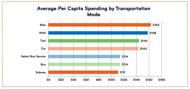
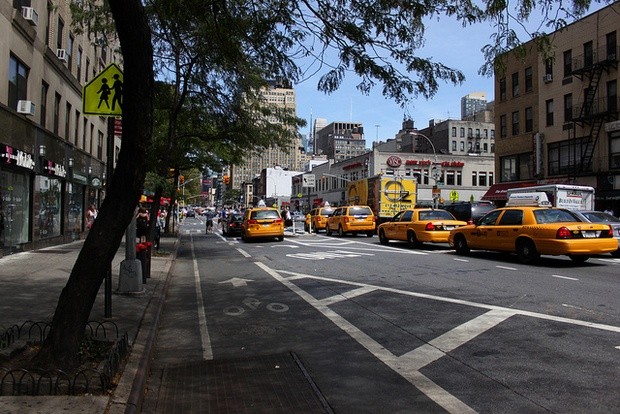


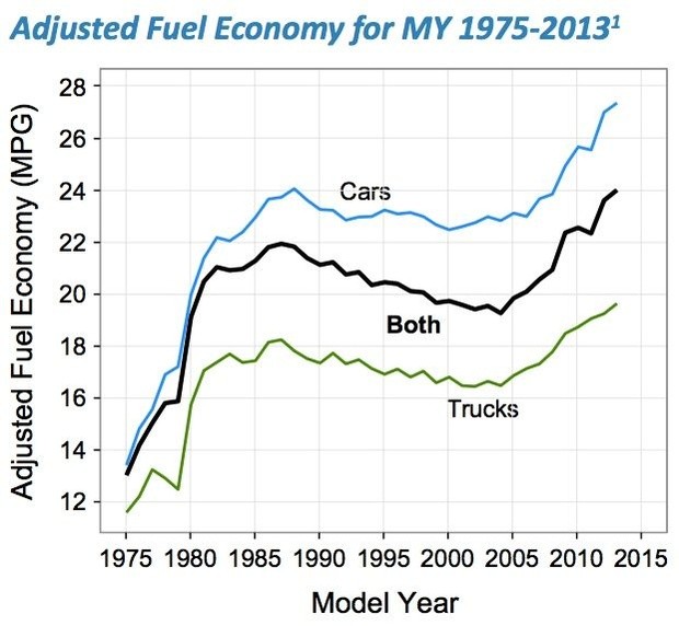
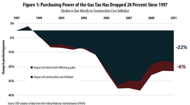
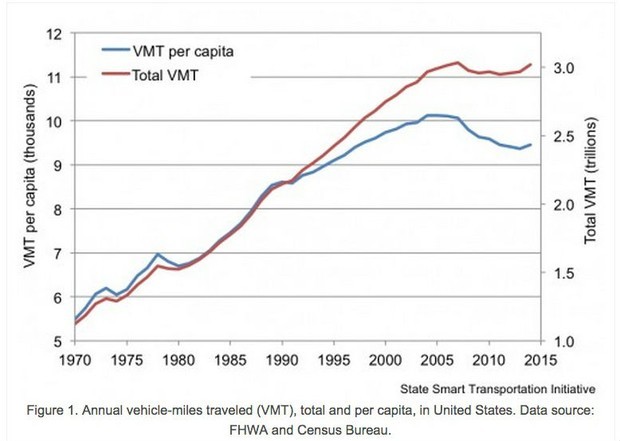
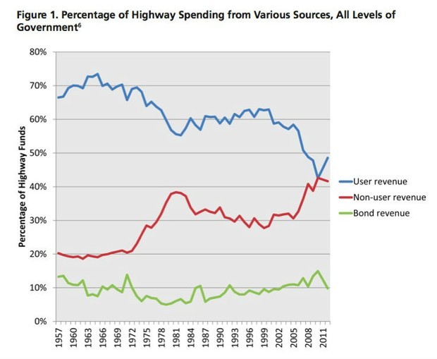

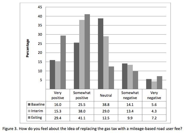

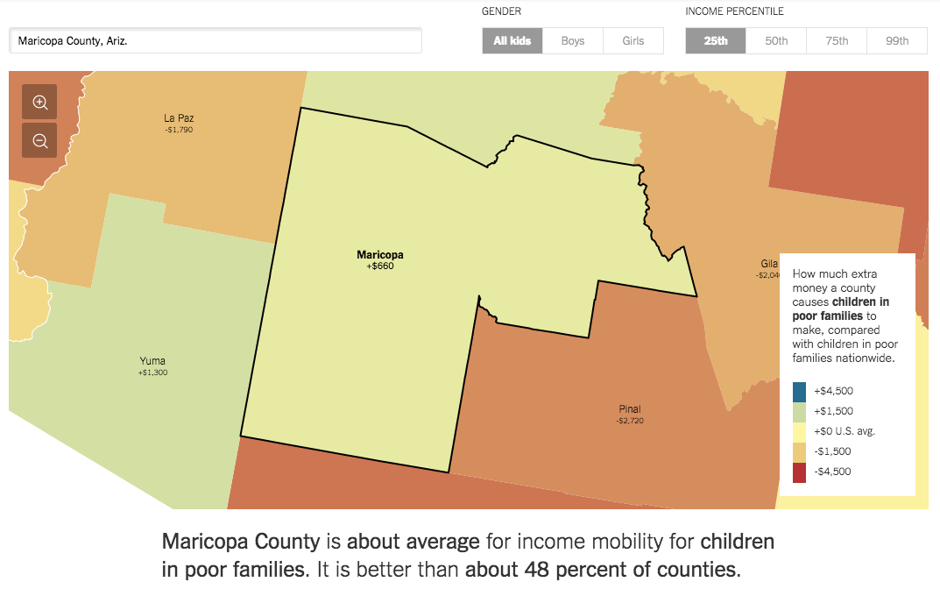

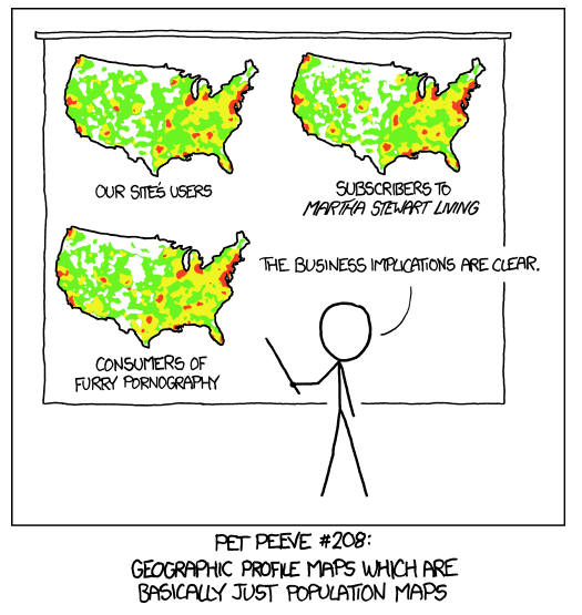
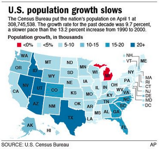
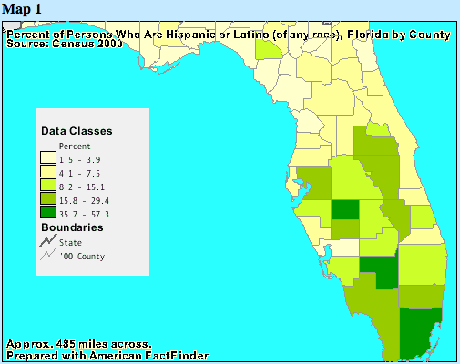

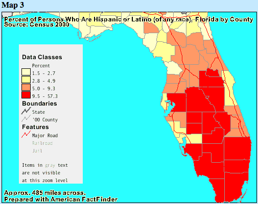
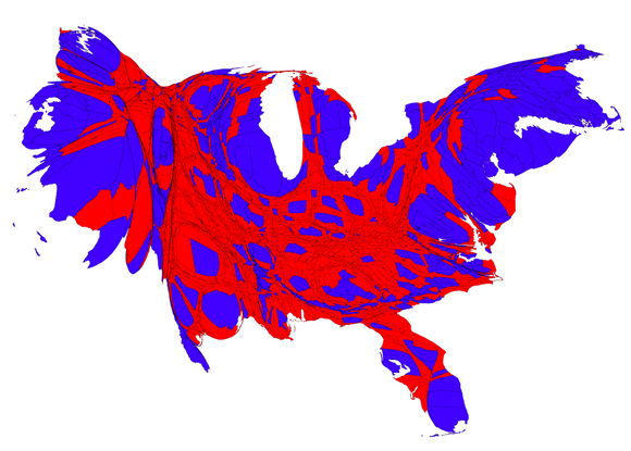
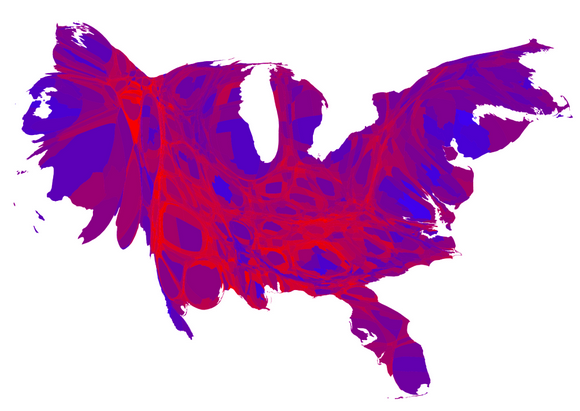
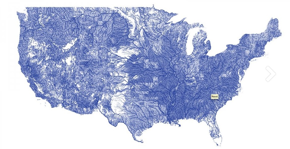
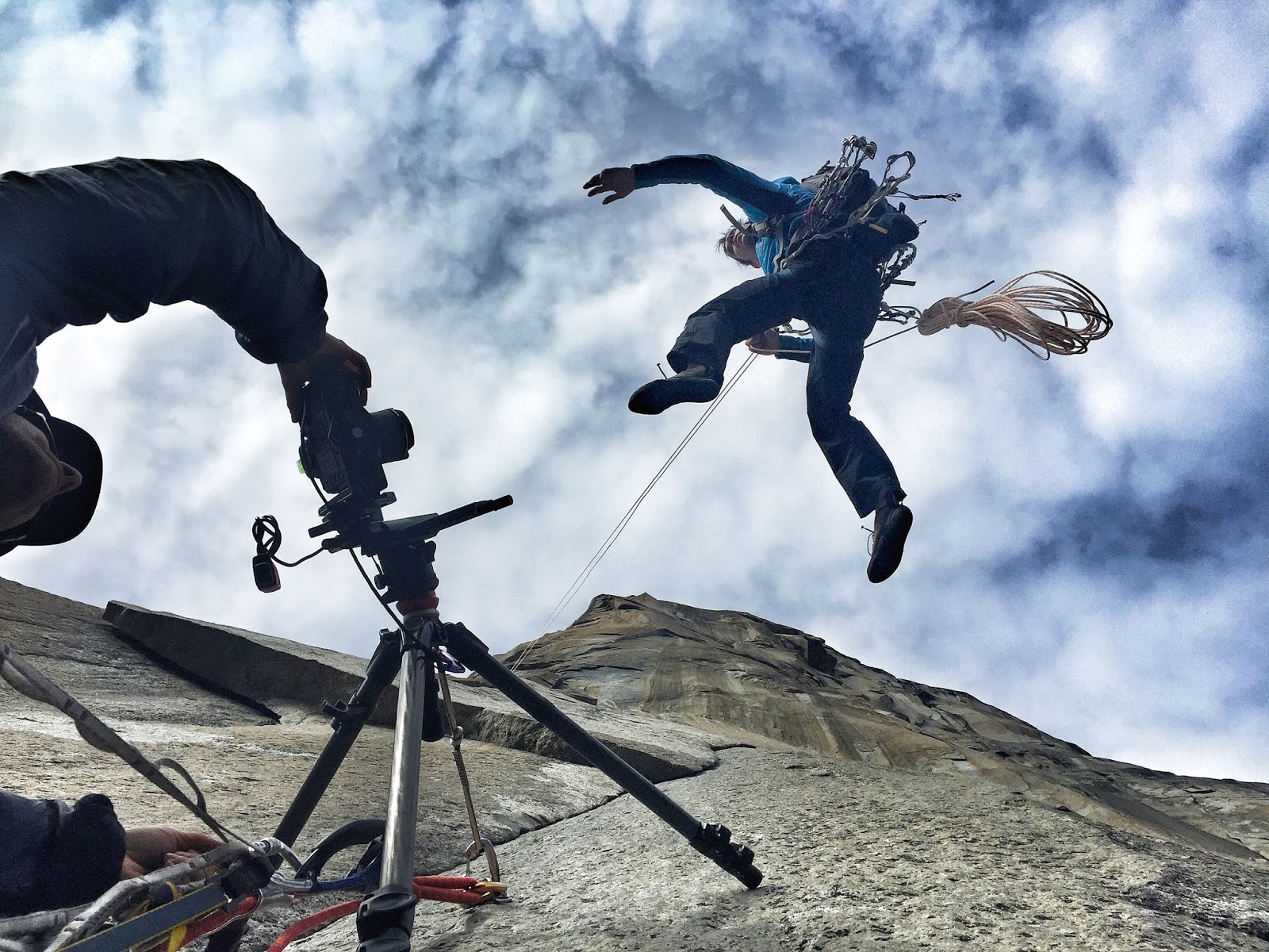
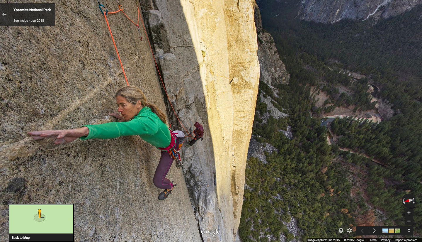

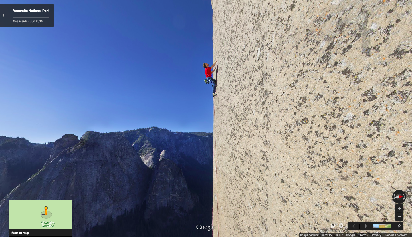
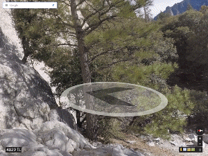

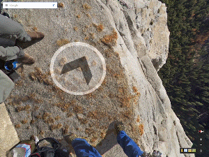

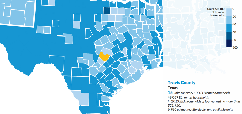
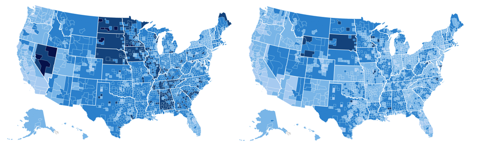
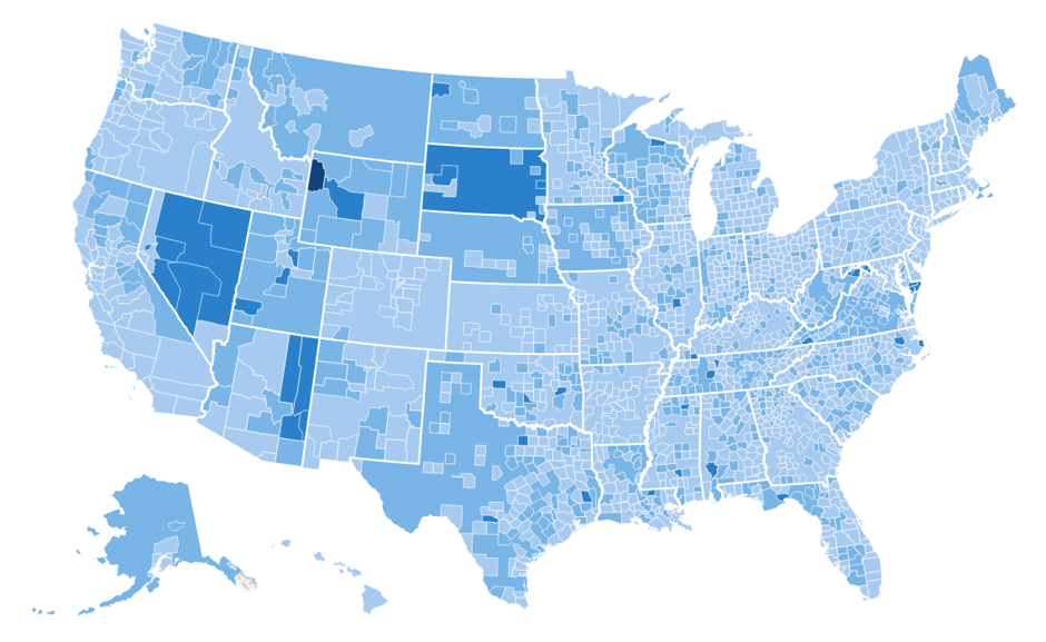


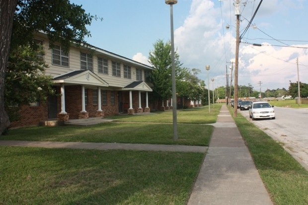

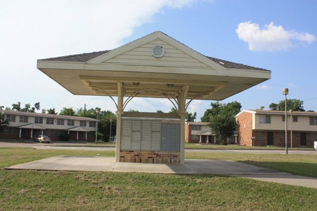
 The Black Hole is a water slide at the Bad 1 waterpark in Bremerhaven, Germany. It's an older slide that's been retrofitted with a ton of different LEDs to make riders feel like they're traveling through star fields and a black hole. I've got the feeling traveling through an actual black hole probably wouldn't be so pleasant. I imagine that would be more like hell. Which means there would almost certainly still be little kids shitting in the wave pool.
Keep going for a POV ride so you can pretend like you're there.
The Black Hole is a water slide at the Bad 1 waterpark in Bremerhaven, Germany. It's an older slide that's been retrofitted with a ton of different LEDs to make riders feel like they're traveling through star fields and a black hole. I've got the feeling traveling through an actual black hole probably wouldn't be so pleasant. I imagine that would be more like hell. Which means there would almost certainly still be little kids shitting in the wave pool.
Keep going for a POV ride so you can pretend like you're there.

 facebook
 reddit
 Pet owners know that domestic animals have many uses around the home. Thousands of years ago, that’s why we welcomed them into our dwellings in the first place, and we’ve come to appreciate them for their other skills as well. Cats were originally welcomed inside to catch vermin, and now they are also alarm clocks and are fur-covered laptop cozies. Dogs now guard our houses and clean up crumbs on the floor.


") , and the real object (which is rotating) be denoted by
, and the real object (which is rotating) be denoted by ") where
where ") are 2D polar coordinates. Polar coordinates are a natural choice for this problem due to the rotational motion of the objects.
are 2D polar coordinates. Polar coordinates are a natural choice for this problem due to the rotational motion of the objects. , and the shutter progresses across the image at speed
  in the vertical direction. At position
  , and so the time elapsed is
  /v") . In this time the object has rotated a number of radians
. In this time the object has rotated a number of radians  r\sin\theta)") . Putting this together,
. Putting this together, = f(r,\theta + (\omega/v)r\sin\theta)")
 is proportional to the number of rotations during the exposure, and parameterises the transformation.
 propellers where
  is non-zero only for
  for
for  . The image
  is then non-zero for
r\sin\theta = 2p\pi/P")

 + \frac{\omega}{v}y = 2p\pi")