Shared posts

03 Mar 12:01

The Left Justifies New Taxes Based on Reducing (Presumed) Negative Externalities, But Actually Just Wants The Money

by admin

Here is the Wikipedia definition of  a Pigovian tax:

A Pigovian tax (also spelled Pigouvian tax) is a tax levied on any market activity that generates negative externalities (costs not internalized in the market price). The tax is intended to correct an inefficient market outcome, and does so by being set equal to the social cost of the negative externalities. In the presence of negative externalities, the social cost of a market activity is not covered by the private cost of the activity. In such a case, the market outcome is not efficient and may lead to over-consumption of the product.[1] An often-cited example of such an externality is environmental pollution.

The Left often tries to justify new taxes based on their being Pigovian taxes.  The classic example is a carbon tax -- it is claimed there is a social cost to carbon-based fuel combustion (e.g. CO2 production and resulting global warming) that is not taken into account by market prices.  By adding the tax, these other costs can be taken into account, likely raising the price of these fuels and thus both reducing their use and providing a higher price umbrella for alternatives.

For years, I accepted these arguments at face value.  I might argue with them (for example, I think that the Left has tended to spot 10 of the last 2 true negative externalities), but I accepted that they really believed in the logic of the Pigovian tax.  I am now becoming convinced that I was wrong, that the Left's support of Pigovian taxes is frequently a front, a way of putting a more palatable face on what is really a naked grab for more taxpayer money by public officials.  To support this emerging hypothesis, I cite two examples.

 1.  Proposed Carbon Tax in Washington State

This last November, a carbon tax was placed on the ballot in Washington State.  In many ways, it partially mirrored my own proposal (here) by making the tax revenue neutral, ie the new carbon tax was offset by a reduction in other regressive taxes, particularly other consumption taxes.  If the Left and environmental groups truly embraced the Pigovian logic of a carbon tax, they should have jumped at supporting this initiative.  I discuss what happened in depth here but Vox has a good summary:

The measure, called Initiative 732, isn’t just any carbon tax, either. It’s a big one. It would be the first carbon tax in the US, the biggest in North America, and one of the most ambitious in the world.

And yet the left opposes it. The Democratic Party, community-of-color groups, organized labor, big liberal donors, and even most big environmental groups have come out against it.

Why on Earth would the left oppose the first and biggest carbon tax in the country? How has the climate community in Washington ended up in what one participant calls a "train wreck"? (Others have described it in more, er, colorful terms.)....

the alliance’s core objection to I-732 is that it is revenue-neutral — it surrenders all that precious revenue, which is so hard to come by in Washington. That, more than anything else, explains why alliance groups are not supporting it.

Opponents say they wanted to use the revenue for climate-related investments, but even if true there are two things wrong with this.  First, it shows ignorance of the economic theory of the Pigovian tax -- the whole point is that by raising the price of carbon-based fuels, markets will find the most efficient way to reduce this fuel use.  The whole point is that it is way more efficient to reduce CO2 production through this simple pricing mechanism than it is through government cronyist winner-picking "investments".  The second problem is that such promises of funds dedication never last.  Supposedly the tobacco settlement was all supposed to go to health care and tobacco-related education, but there is not a single state where even a double digit percentage went to these things (the American Lung Association estimates just 2% of the funds go to the original purpose).  In New York, the entire tobacco settlement stream was securitized and used to plug a single year's general budget hole.  You can be assured the same thing would happen with carbon tax revenue.

2.  Soda Tax in Philadelphia

Last year, Philadelphia passed a large soda tax.  The justification for such a tax is that such drinks cause obesity and other health issues.  Either for people's own good or to reduce the future burden on government health care programs, the whole point of such a tax is to reduce soda consumption.  Or so it was justified.

But now, once the tax took effect, the city government that passed the tax seems to be shocked and surprised that soda consumption is way down.  You would think that they would be declaring victory, ... that is, if the point was ever to reduce soda consumption and not just to raise some extra revenue.  Via Reason:

For now, Kenney and other city officials seem unfazed—dismissive, even—of the problems caused by the new tax. A city spokesman told Philly.com that no one knows whether low sales figures and predicted job losses are anything more than "fear-mongering to prevent this from happening in other cities."

Kenney put an even finer point on it.

"I didn't think it was possible for the soda industry to be any greedier," Kenney said in an emailed statement to Philly.com reporter Julia Terruso. "They are so committed to stopping this tax from spreading to other cities, that they are not only passing the tax they should be paying onto their customer, they are actually willing to threaten working men and women's jobs rather than marginally reduce their seven figure bonuses."

It's not the first time Kenney has tried to ignore basic economics when it comes to the soda tax. A few weeks ago, he blamed grocery stores and restaurants for "price gouging" when they increased prices for sugary drinks to make consumers pay for the cost of the tax (the tax is technically applied on the transaction between distributors and retailers, but, like all other taxes, it gets passed along).

Its clear that this tax justified as a pigovian tax is really no such thing.   City officials seem to be honestly surprised that consumption is down as the result of a Pigovian tax whose purpose is to... reduce consumption.  And if they really did not expect the tax to get passed on to consumers, then how does it work?   In fact, city officials are actually worried that reductions in soda consumption is going to cause the tax to yield less money than they expected, creating a hole in their budgets.

*    *    *

Going forward, I plan to apply an order of magnitude more skepticism to any future calls for Pigovian taxes.  I think the first thing I will ask of each new suggestion is "do you still support this tax if I were to make it revenue neutral, say by offsetting it with reductions in another regressive taxes?"

01 Mar 13:14

The BigLaw Massacre Approaches

by Jason Willick

Bad news for the tens of thousands of newly minted lawyers who pass the bar every year and hope to get associate positions at big law firms sorting through documents for corporate clients: Robots are taking your jobs. Bloomberg reports:

At JPMorgan Chase & Co., a learning machine is parsing financial deals that once kept legal teams busy for thousands of hours.

The program, called COIN, for Contract Intelligence, does the mind-numbing job of interpreting commercial-loan agreements that, until the project went online in June, consumed 360,000 hours of work each year by lawyers and loan officers. The software reviews documents in seconds, is less error-prone and never asks for vacation.

For the past few years, most of the commentary about technological innovation has focused on the way it has eliminated working and middle-class jobs like manufacturing. But the next round of the information revolution may put pressure on “symbolic analyst” jobs that are mostly coded as upper-middle or professional class. Lawyers are one example, but new medical technologies could make some tasks that doctors do obsolete and trading algorithms could shake up the financial industry in unpredictable ways.

The new technologies aimed at automating the discovery process don’t mean that high-flying lawyers will be put out of business. In fact, it’s possible that the firms that own these technologies could get more wealthy than ever before. But they do probably mean that the huge flow of cash into the legal sector every year will be somewhat reduced, and middling firms and lawyers will be in trouble.

In the long run, however, this will be good for everyone. Firms can redirect funds that would otherwise be spent on legal fees into research and development, leading to better products. And a loosening of the legal labor market will mean lower rates, and more access to legal services for people who need them but haven’t been able to afford them in the past.

01 Mar 12:59

Review: The New Philistines

by Matthew Stewart

A review of The New Philistines: How Identity Politics Disfigure the Arts by Sohrab Ahmari. Biteback Publishing (2016), 144 pages.


“Today’s art world isn’t even contemptuous of old standards — it is wholly indifferent to them,” writes Sohrab Ahmari in this timely polemic, in which he writes passionately in defence of humane art and the critical standards once thought to be of supreme importance and permanence: “sincerity, formal rigour and cohesion, the quest for truth, the sacred and the transcendent.”

Editorialist for the Wall Street Journal, contributor to Commentary magazine, author and editor of works analyzing the Arab Spring and its aftermath, and a recent convert to Catholicism, Ahmari makes his own position clear. His book is aimed at readers who want to engage with art but find too little of it that speaks to them. He is not concerned with winning over the art world insider or academic expert, but rather wishes to aid the confused and disgruntled arts lover.

Ahmari was raised in Iran while the “cultural revolution” busied itself purging the academy and cultural institutions of anyone who might “create the wrong kind of art, or hold the wrong opinion about [it].” The revolutionary vanguard spent its time in libraries blacking out images of nudes. “That a theocratic police state could be this afraid of Renaissance nudes in books taught me early on about the power of great art and its connection to human freedom,” writes Ahmari.

But what has that to do with the art of the West, where artists are free to create as they please, and critics to write what they want? For well over a hundred years the smashing of traditional forms has become business as usual in the world of high art and, as for subject matter, anything goes. Only of late has a retraction of freedoms been promulgated, and – setting aside reactionary religious forces such as Islamism – this urge to censor and restrict has come from inside the art community itself, which consistently seeks to impose a worldview that aligns with prevailing theories of social justice.

It is this kind of self-imposed limitation that Ahmari’s book explores. For despite the contemporary art scene’s superficial freedoms, experimentation, and efforts to shock, the author finds a deeply conventional world governed by trendy doctrinaire politics. The art scene exhibits a narrowly circumscribed world view that restricts itself to predictable subject matter and seems more interested in what has become known as ‘virtue signaling’ than in aesthetics. Artists who deviate from this narrow set of values and practices won’t find themselves in jail, of course, but they are apt to find themselves without institutional patronage, media attention, or the support of their contemporaries. It is a state of affairs that recalls Orwell’s complaint about “smelly little orthodoxies.”

To see what is going on for himself, Ahmari surveys the art scene in London, sampling a variety of artistic media. He also makes a sincere effort to understand this world in its own terms, generously quoting from the in-crowd’s own explanations of their goals. While the examples mostly come from London, readers even modestly acquainted with the arts will recognize a scene familiar to many Western cities in which identity politics holds sway among the bien pensant and creative classes.

He calls the adherents of this postmodern dogma “identitarians,” and these self-styled moral entrepreneurs are evidently not noted for their humility in the face of the large human questions once explored by art. Instead, they “think they already have the answers: a set of all-purpose formulas about race, gender, class and sexuality, on the one hand, and power and privilege, on the other.” The art world, it seems, has passed into the hands of hectoring sociologists.

The author’s field trips include attendance at a five-day film festival held at the London Institute of Contemporary Art (ICA). The festival’s written program confirms his thesis, forthrightly setting down that, “Themes of social and political identity permeate the content and subjects explored. These themes underpin moving image’s relevance in 2016.” The exhibited films, the festival talks, and the accompanying special presentations are all monomaniacally identitarian. Ahmari concludes that “It is almost inconceivable that so many filmmakers could think of nothing – be inspired by nothing – nothing, nothing, nothing – but the politics of representation, ‘performativity,’ gender, race, queer theory etc. There must be other subjects, in the world outside or in their inner lives, which belong on the screen.”

American readers who have listened to National Public Radio on one of the ever-more-frequent days when story after story is devoted to these same topics will identify with Ahmari’s exasperation. How much more depressing, then, when the identitarians’ obsessively narrowed weltanschauung permeates not just the news room, but the arts, once conceived to be the cathedral of heart, soul and mind, devoted to humanity’s capacity to explore.

Ahmari is also in tune with the mangling of language that accompanies – nay, propels – the contemporary art world. It is motivated by careerism, one gathers, and produced from heads and hearts unburdened with deeper cultural content. He captures the artists’ own musings in several long passages of verbatim quotation taken from various venues, including post-screening discussions at the ICA. Here pretension combines with inarticulacy in a ‘Pseuds Corner’ version of artspeak gobbledygook.

Inarticulate artists wouldn’t matter much, of course, if the art works they produced were profound or moving. But Ahmari astutely makes the proper connection: “If their English grammar sounds broken, it is because their creative grammar is too, and the source of the brokenness is the same.”

A slightly different sort of verbal/artistic abuse is of even greater significance. This comes from the jargon-cluttered pages of the postmodern publication, Art Forum. Reading this material is like chewing tinfoil, but Ahmari has soldiered through the journal’s abstruse pages extolling “radical feminism, racial grievance, anti-capitalism and queer theory” to extract several key identitarian concepts that he elucidates in order “to expose [their] illiberalism.” Readers unfamiliar with the identitarian use of the words intersectionality, visibility, individualism, and legibility will be served with a lucid primer to these au courant terms. Those already familiar with the deformations that these terms represent may take note of the supercilious attitude that permeates the turgid passages in which they appear.

I took particular interest in Ahmari’s notations on “legibility,” a term which essentially means that a work of art “appeals to a broad audience, or that the mainstream culture can appreciate . . . it.” For the new philistines this is not a desirable quality in a work of art. The concept takes me back to a visit to the Tate Modern when it was still fairly new. Not all the art then on display was driven by identity politics, but a significant amount of it was, and some of it would have qualified for the “grievance Olympics” that the author finds so often displayed in today’s galleries. Almost all of the items at the Tate would have registered low enough on the legibility scale to pass even the most exacting standards of obscurantism.

Unsurprisingly the works themselves seemed to hold the interest of very few of those who thronged the halls (and let us note that the people who chose to come to the Tate were surely a self-selecting group motivated by a desire to see art). But for all the self-proclaimed daring of low-legibility works of art, they were usually accompanied by lengthy explanations of what the viewer was supposed to take away from the “provocative” installations. Here, then, was an apparent betrayal of the very principle of illegibility and what amounted to an obvious vote of no confidence in the work itself.

Hundreds of people appeared unmoved by what they beheld, and barely glancing at the art itself, could be seen gazing (if they stopped at all) at the same sort of pleasureless verbiage to be found in the pages of Art Forum: an admixture of promotional hype, art-crit obfuscation, and self-congratulation for the supposed achievement of the right mix of “transgression” and social-justice bona fides.

That was some fifteen years ago. In this lucid, heartfelt and intelligent work of criticism, Sohrab Ahmari demonstrates that the art world is still playing the same games, only higher and harder, with an increasingly narrow range of interests and an ever-more vehement insistence on its own moral rectitude.


Matthew Stewart is an Associate Professor of Humanities and Rhetoric at Boston University.

27 Feb 06:23

The impact of weight loss on the drive to eat

by Stephan Guyenet

Weight loss engages a “starvation response” that acts to regain the lost weight, and this is a key reason why weight loss is difficult and often temporary.  This starvation response includes an increase in the drive to eat and a decrease in calorie expenditure.  Using a clever study design, Kevin Hall and colleagues recently quantified the contribution of eating drive to this starvation response.  The results suggest that increased eating drive is the primary way in which the starvation response opposes weight loss.

Countless controlled trials have shown that weight loss is difficult, regardless of the approach.  Not only is it unlikely that a person with obesity will lose all of his excess fat, but in most cases even moderate losses are regained over time.  A key reason for this is that weight loss decreases the circulating concentration of the hormone leptin, activating a negative feedback process that I call the “starvation response”, which I explain in greater detail in my book.  This response attempts to bring more calories into the body, and curtail the flow of calories out of the body, thereby refilling fat stores.  The starvation response includes an increase in the drive to eat (hunger, food seductiveness) and a decrease in calorie expenditure (slowed metabolic rate and physical activity calorie expenditure).

The “calories out” side of this equation has been fairly well characterized, yet we don’t know nearly as much about the “calories in” side due to the challenges inherent in measuring it.  A new paper from Kevin Hall’s research group asks the important question, how strongly does the increased drive to eat counter weight loss?  To do this, they used a clever study design in which weight loss was covertly induced.

The study

Hall’s team used data from a one year randomized, placebo-controlled trial of a drug called canagliflozin in 242 people with type 2 diabetes and obesity.  Canagliflozin causes substantial loss of glucose via the urine and is used to improve blood glucose control in diabetes.  This loss of glucose is roughly 90g per day, amounting to about 360 Calories.

Importantly, since this was a double-blind trial, neither the investigators nor the subjects had direct knowledge of who was receiving the drug.  The study involved a long-term, covert perturbation of energy balance that “largely bypasses the volition of the subjects”, which makes it an unusually pure test of the brain’s response to changes in body weight.

Using previously validated mathematical models, and measured body weight changes, Hall’s team estimated the calorie intake of the canagliflozin and placebo groups over the course of the one-year trial.  They then used the resulting output to estimate how calorie intake, calorie expenditure, and the drive to eat change with typical weight loss, using two years of data from a commercial weight loss program (Weight Watchers).

The results

The canagliflozin group gradually lost weight over the course of the trial, eventually plateauing about 8 pounds (3.5 kg) lighter than at the beginning.  In contrast, the placebo group lost about two pounds (just under 1 kg).

Hall’s model estimates that as the canagliflozin group lost weight and the starvation response kicked in, their calorie intake gradually increased by about 350 Calories per day, eventually halting their weight loss.  The model estimates that for each 2.2 pounds (1 kg) of body weight lost, the brain ramps up the drive to eat by about 100 Calories per day in an attempt to regain the weight!

With this information in hand, the researchers were able to gain insight into what happens during typical weight loss due to diet and lifestyle change.  Data from a two-year commercial weight loss trial showed that participants experienced their maximum weight loss at 6 months, then gradually regained over the following year and a half.

Plugging these numbers into Hall’s model, they estimate that the initial calorie deficit was about 700 Calories per day, but that this rapidly rebounded, and had almost returned to baseline by 9 months.  This might suggest that the participants just stopped trying, but in fact this is unlikely to be the case, because they were still weight reduced at that point and therefore their brains were still experiencing a heightened drive to eat (see the line below labeled “homeostatic drive to eat”).

The researchers were actually able to quantify the effort the participants were putting into their diets by calculating the difference between actual calorie intake and the estimated drive to eat.  The results suggest that even though people were already almost back to their baseline calorie intake by 9 months, and already beginning to regain weight, they were nevertheless expending considerable effort to stop themselves from eating substantially more than their baseline intake (to the tune of about 600 Calories per day).

Gradually, as their body weights rebounded over the last year and a half of the trial, their effort level declined toward baseline.

Discussion

This study has a notable strength, which is that energy balance and body weight were perturbed without the participants’ knowledge.  We can be confident that the effects the researchers observed had nothing to do with the participants’ conscious feelings or behaviors around dieting and weight loss.  They were the result of nonconscious biological processes.

The study also had at least two notable weaknesses.  The first is that the participants in the first trial had type 2 diabetes, which means that we can’t know how well the results would apply to people without diabetes.  I’m not aware of any reason why they wouldn’t apply, and the results are consistent with what we know about weight regulation in people without diabetes, but we still have to be cautious.  The second weakness is that the trial perturbed calorie balance via a specific mechanism– the excretion of blood glucose in the urine.  It’s theoretically possible that the results would have been different if the drug had caused the participants to excrete fat.  I don’t think this is very likely, but this question might be tractable by studying randomized trials of Olestra, the fat substitute that gets excreted in feces.  Or perhaps by studying liposuction patients.

There are several interesting implications of this study.  The first is that the data support our current understanding of how body weight is regulated.  Even when energy balance was perturbed without the participants’ knowledge, a powerful starvation response occurred that favored the regain of lost weight.  The data support the concept that a sort of body weight “set point” is defended against changes, particularly changes in the downward direction.

A second implication is that between the two arms of the starvation response– the increased drive to eat and the decreased calorie expenditure– the former is by far the most influential.  In other words, the primary way in which the brain opposes weight loss is by increasing the biological drive to eat.  The data also give us a quantitative estimate of this drive: for each 2.2 lbs (1 kg) of weight lost, the drive to eat increases by about 100 Calories per day*.  This is even stronger than I would have predicted.

A third implication– which I think is the most novel of the study– relates to the dynamics of the heightened drive to eat that people experience when they diet, and how this undermines weight loss efforts.  After a person loses weight, the biological drive to eat can be so high that they have to exert considerable effort just to prevent themselves from overeating substantially.  Even though it seems like they’re no longer adhering to their reduced calorie regimen, they may still be trying hard to eat fewer calories– and succeeding, relative to the amount their brain “wants” them to eat.

The amount of effort that people put into a diet does slowly decline over time however, and as this effort recedes, the biological drive to eat takes over and weight comes back.  It’s hard to fight the starvation response forever.

This study strengthens my conviction that the brain’s starvation response has to be managed for long-term weight loss success– and particularly its impact on the drive to eat.  Rather than pretending like the starvation response doesn’t exist, as most weight loss approaches do, a better method may be to try to dampen appetite and/or passive calorie intake sufficiently to counterbalance the heightened drive to eat.  In other words, find ways to keep the brain happy at a lower calorie intake rather than using willpower to continually struggle against the biological drive to eat.


* I don’t think these results can tell us whether or not the relationship is linear, e.g. if 1 kg of weight loss causes an increase in the drive to eat by 100 Calories, would a 5 kg loss cause an increase of 500 Calories, 10 kg, 1000 Calories, etc.?  It’s possible that there is a plateau at some point where the response reaches its maximum strength.  Another way of saying this is that this simple rule of thumb may not necessarily apply over the entire range of weight changes.  We would need more research to explore this possibility.


25 Feb 00:32

Iran confirms: US paid ransom

by Michael Rubin

Back in September, I testified before the House Financial Services Committee on the allegation that the Obama administration had paid Iran a ransom—at the time it was believed to be $400 million but it was later revealed that the figure was more than three times that amount—in cash for the release of American hostages held by Iran.

Jason Rezaian (2R) was one of four American prisoners released by Iran ahead of the lifting of international sanctions on Iran January 16, 2016 as part of a deal between major powers and Iran to curb Tehran’s nuclear program. REUTERS/Kai Pfaffenbach.

At the hearing, it is now clear that State Department officials lied outright to the committee. But, lest there be any question about how the Iranian government perceived the payment received from the United States, Hossein Nejat, deputy Intelligence Director of the Islamic Revolutionary Guard Corps yesterday bragged that Iran forced the United States to pay $1.4 billion ransom to win the release of imprisoned Washington Post correspondent Jason Rezaian.

What does this mean for the United States? Unfortunately, the damage is already done. The cash the Islamic Revolutionary Guard Corps received (for they were the entity which took possession of the ransom) will fuel greater terror as well as Iran’s campaigns in Syria, Yemen, and perhaps Bahrain as well. In 2010, the United States busted the Iranian plot to kill the Saudi ambassador in Washington because the US intelligence community was monitoring bank accounts known to be operated by the Qods Force. Cash makes it far easier for Iran to move money without risk of detection.

Ironically, President Donald Trump kept on the official whom President Obama and Secretary of State Kerry placed in charge of the hostage negotiation. At the very least, however, it is time to publish the hostage agreement. Obama promised he would preside over the most transparent administration in history. Five weeks after Obama left office, Trump has the power to hold his predecessor to it and expose the true mendacity of Obama’s ransom deal.

16 Feb 04:37

Trump fails two tests of judgement and competence

by Danielle Lafleur

Michael Flynn’s resignation as national security adviser has rightly received more attention, but it wasn’t even the first personnel snafu in the administration that week. It wasn’t even the first national-security personnel snafu that week. A few days earlier, President Donald Trump had denied Secretary of State Rex Tillerson’s request that Elliott Abrams be nominated to be his deputy.

These two stories tell us a few things about how the Trump administration operates.

Trump wants loyalists. Flynn was selected in large part because he was an early and vociferous Trump backer, and Trump said no to Abrams after learning that the longtime Republican foreign-policy hand had criticized him during the campaign.

Trump was accused of being “thin-skinned” when the Abrams story went public, but it is entirely normal and reasonable for a president to favor people who backed him. Trump has actually been more willing than most presidents to appoint people who said extremely harsh things about him. Rick Perry called Trump a “cancer on conservatism” and “a barking carnival act,” and now he is Trump’s nominee for energy secretary.

There aren’t enough qualified loyalists to staff Trump’s administration. That’s why Trump has had to appoint people who have in the past severely criticized him. It’s also part of the reason he is so short-staffed, especially when it comes to national security. A very high proportion of the Republican foreign-policy intelligentsia opposed him in the primaries and even in the general election, both because he sometimes argued for a more restrained foreign policy than Republicans usually favor and because he seemed like an erratic leader.

The Trump White House uses different criteria for positions that require Senate confirmation and those that don’t. In general, the people Trump is nominating are less controversial and more widely respected than the people he is appointing. Flynn and Stephen Bannon got jobs that don’t require Senate confirmations. Tillerson and Nikki Haley got jobs that do.

Trump’s critics have complained that the Republican Congress is not acting as a check on him, but to some extent it is. The administration seems to know that it can go only so far without losing too many Senate Republicans.

There’s a management problem. Either Trump is being arbitrary about his desire for loyalists, or his underlings are not keeping him adequately informed about the people he is considering. A meeting among Trump, Tillerson and Abrams reportedly went well, and Trump learned only afterward about Abrams’s criticisms of him.

A well-running process would not have allowed this to happen. Even in a factionalized White House, Trump’s aides should have either made it clear to Tillerson that Abrams’s history ruled him out, or informed Trump about that history. Instead the president wasted some valuable time, and Tillerson lost some valuable credibility.

The fact that Flynn had to leave the administration after the shortest tenure as national security adviser in history has far greater repercussions than the fact that Abrams wasn’t allowed to enter it in the first place. Neither story speaks well of the judgment and competence of the people working in this administration, or of the man at its top.


The American Enterprise Institute for Public Policy Research (AEI) is a nonpartisan, nonprofit, 501(c)(3) educational organization and does not take institutional positions on any issues. The views expressed here are those of the author.

14 Feb 12:36

Economies in reverse

by John H. Cochrane
How can economies forget? How is it that once we have learned to do something better, that knowledge can be lost and economies move backward? How can productivity decline? Viewing productivity as knowledge, it would seem almost impossible for it to do so -- and real business cycle theory was often derided on that point. Yet middle ages eurpoeans lost the recipe for concrete, and time after time we have seen economies get worse. How can our own productivity be growing so slowly overall when so much we see around us is progressing so fast?

Scott Alexander at Slate Star Codex has an intriguing blog post that illuminates these questions (HT marginal revolution). I'll offer my thoughts on the answers at the end.

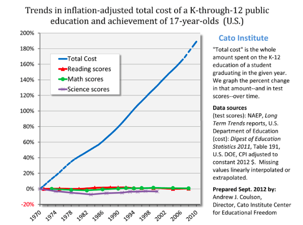
Scott starts with education:

Inputs triple, output unchanged. Productivity dropped to a third of its previous level.


Scott offers remarkable economic clarity on the issue:
"Which would you prefer? Sending your child to a 2016 school? Or sending your child to a 1975 school, and getting a check for $5,000 every year?

I’m proposing that choice because as far as I can tell that is the stakes here. 2016 schools have whatever tiny test score advantage they have over 1975 schools, and cost $5000/year more, inflation adjusted. That $5000 comes out of the pocket of somebody – either taxpayers, or other people who could be helped by government programs.
...College is even worse. Inflation-adjusted cost of a university education was something like $2000/year in 1980. Now it’s closer to $20,000/year.... Do you think that modern colleges provide $18,000/year greater value than colleges did in your parents’ day? Would you rather graduate from a modern college, or graduate from a college more like the one your parents went to, plus get a check for $72,000?  (or, more realistically, have $72,000 less in student loans to pay off)"
Health care is similarly bloated, though a more complex case.
The cost of health care has about quintupled since 1970. ... The average 1960 worker spent ten days’ worth of their yearly paycheck on health insurance; the average modern worker spends sixty days’ worth of it, a sixth of their entire earnings. 
Unlike schooling, health care is unquestionably better now. Scott notices that lifespan doesn't go up as much as we might have hoped, and other countries get the same lifespan with much less cost. Tell that to someone with an advanced cancer, curable with modern drugs and not with 1970 drugs. Still, it's a good example to keep in mind, as it's pretty clear health care is delivering a technologically more advanced product with a huge decrease in organizational efficiency.

Infrastructure, today's cause célèbre is more telling,
"The first New York City subway opened around 1900. ...That looks like it’s about the inflation-adjusted equivalent of $100 million/kilometer today... In contrast, Vox notes [JC: This is an excellent article worth a blog post on its own] that a new New York subway line being opened this year costs about $2.2 billion per kilometer, suggesting a cost increase of twenty times – although I’m very uncertain about this estimate.
...The same Vox article notes that Paris, Berlin, and Copenhagen subways cost about $250 million per kilometer, almost 90% less. Yet even those European subways are overpriced compared to Korea, where a kilometer of subway in Seoul costs $40 million/km (another Korean subway project cost $80 million/km). This is a difference of 50x between Seoul and New York for apparently comparable services. It suggests that the 1900s New York estimate above may have been roughly accurate if their efficiency was roughly in line with that of modern Europe and Korea."
I have seen similar numbers for high speed trains -- ours cost multiples of France's, let alone China's.

I find this one particularly telling, because we're building 19th century technology, with 21st century tools -- huge boring machines that dramatically cut costs. And other countries still know how to do it for costs orders of magnitude lower than ours.

Similarly, housing. bottom line
"Or, once again, just ask yourself: do you think most poor and middle class people would rather:

1. Rent a modern house/apartment

2. Rent the sort of house/apartment their parents had, for half the cost"
Housing is a little different I think, because much of the cost rise is the value of land, so supply restrictions are clearly at work.

More useful anectdotes, on whether this is real or just a figment of statistics.
The last time I talked about this problem, someone mentioned they’re running a private school which does just as well as public schools but costs only $3000/student/year, a fourth of the usual rate. Marginal Revolution notes that India has a private health system that delivers the same quality of care as its public system for a quarter of the cost. Whenever the same drug is provided by the official US health system and some kind of grey market supplement sort of thing, the grey market supplement costs between a fifth and a tenth as much; for example, Google’s first hit for Deplin®, official prescription L-methylfolate, costs $175 for a month’s supply; unregulated L-methylfolate supplement delivers the same dose for about $30. And this isn’t even mentioning things like the $1 bag of saline that costs $700 at hospitals. 
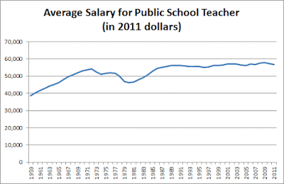
Where is the money going? It's not, despite what you may think, going to higher salaries:


Scott has similar evidence for college professors, doctors, nurses and so on. What about fancy salaries you hear about?
...colleges are doing everything they can to switch from tenured professors to adjuncts, who complain of being overworked and abused while making about the same amount as a Starbucks barista.
It's also not going to profits, or CEO salaries. Those have not risen by the orders of magnitude necessary to explain the cost disease.
This can’t be pure price-gouging, since corporate profits haven’t increased nearly enough to be where all the money is going.
My thoughts below.

Scott's elegant summary:
So, to summarize: in the past fifty years, education costs have doubled, college costs have dectupled, health insurance costs have dectupled, subway costs have at least dectupled, and housing costs have increased by about fifty percent. US health care costs about four times as much as equivalent health care in other First World countries; US subways cost about eight times as much as equivalent subways in other First World countries.

And this is especially strange because we expect that improving technology and globalization ought to cut costs. In 1983, the first mobile phone cost $4,000 – about $10,000 in today’s dollars. It was also a gigantic piece of crap. Today you can get a much better phone for $100. This is the right and proper way of the universe. It’s why we fund scientists, and pay businesspeople the big bucks.

But things like college and health care have still had their prices dectuple. Patients can now schedule their appointments online; doctors can send prescriptions through the fax, pharmacies can keep track of medication histories on centralized computer systems that interface with the cloud, nurses get automatic reminders when they’re giving two drugs with a potential interaction, insurance companies accept payment through credit cards – and all of this costs ten times as much as it did in the days of punch cards and secretaries who did calculations by hand.

It’s actually even worse than this, because we take so many opportunities to save money that were unavailable in past generations. Underpaid foreign nurses immigrate to America and work for a song. Doctors’ notes are sent to India overnight where they’re transcribed by sweatshop-style labor for pennies an hour. Medical equipment gets manufactured in goodness-only-knows which obscure Third World country. And it still costs ten times as much as when this was all made in the USA – and that back when minimum wages were proportionally higher than today.

And it’s actually even worse than this. A lot of these services have decreased in quality, presumably as an attempt to cut costs even further. Doctors used to make house calls; even when I was young in the ’80s my father would still go to the houses of difficult patients who were too sick to come to his office. This study notes that for women who give birth in the hospital, “the standard length of stay was 8 to 14 days in the 1950s but declined to less than 2 days in the mid-1990s”. The doctors I talk to say this isn’t because modern women are healthier, it’s because they kick them out as soon as it’s safe to free up beds for the next person. Historic records of hospital care generally describe leisurely convalescence periods and making sure somebody felt absolutely well before letting them go; this seems bizarre to anyone who has participated in a modern hospital, where the mantra is to kick people out as soon as they’re “stable” ie not in acute crisis.

If we had to provide the same quality of service as we did in 1960, and without the gains from modern technology and globalization, who even knows how many times more health care would cost? Fifty times more? A hundred times more?
And the same is true for colleges and houses and subways and so on.
Scott points out that many of our intractable political debates -- paying for college, health care, housing, and transportation, are made intractable by this bloat:
 I don’t know why more people don’t just come out and say “LOOK, REALLY OUR MAIN PROBLEM IS THAT ALL THE MOST IMPORTANT THINGS COST TEN TIMES AS MUCH AS THEY USED TO FOR NO REASON, PLUS THEY SEEM TO BE GOING DOWN IN QUALITY, AND NOBODY KNOWS WHY, AND WE’RE MOSTLY JUST DESPERATELY FLAILING AROUND LOOKING FOR SOLUTIONS HERE.” State that clearly, and a lot of political debates take on a different light.
What's happening?

I think Scott's post is exceptionally good because it points out the enormous size of the problem. It's just not salient to point to productivity numbers that grow a few percentage points higher or lower. When you add it up over decades to see that while some things have gotten ten times better, other things are ten times more expensive than they should be really strikes home.

Scott tries on a list of candidate explanations and doesn't really find any. He comes closest with regulation, but correctly points out that formal regulatory requirements, though getting a lot worse, don't add up to the huge size of this cost disease.

So, what is really happening? I think Scott nearly gets there. Things cost 10 times as much, 10 times more than they used to and 10 times more than in other countries. It's not going to wages. It's not going to profits. So where is it going?

The unavoidable answer: The number of people it takes to produce these goods is skyrocketing. Labor productivity -- quality adjusted output per number of people involved in the entire process -- declined by a factor of 10 in these areas. It pretty much has to be that: if the money is not going to profits, to to each employee, it must be going to the number of employees.

How can that happen? Our machines are better than ever, as Scott points out. Well, we (and especially we economists) pay too much attention to snazzy gadgets. Productivity depends on organizations not just on gadgets. Southwest figured out how to turn an airplane around in 20 minutes, and it still takes United an hour.

Contrariwise, I think we know where the extra people are. The ratio of teachers to students hasn't gone down a lot -- but the ratio of administrators to students has shot up. Most large public school systems spend more than half their budget on administrators. Similarly, class sizes at most colleges and universities haven't changed that much -- but administrative staff have exploded. There are 2.5 people handling insurance claims for every doctor. Construction sites have always had a lot of people standing around for every one actually working the machine. But now for every person operating the machine there is an army of planners, regulators, lawyers, administrative staff, consultants and so on. (I welcome pointers to good graphs and numbers on this sort of thing.)

So, my bottom line: administrative bloat.

Well, how does bloat come about? Regulations and law are, as Scott mentions, part of the problem. These are all areas either run by the government or with large government involvement. But the real key is, I think lack of competition. These are above all areas with not much competition. In turn, however, they are not by a long shot "natural monopolies" or failure of some free market. The main effect of our regulatory and legal system is not so much to directly raise costs, as it is to lessen competition (that is often its purpose). The lack of competition leads to the cost disease.

Though textbooks teach that monopoly leads to profits, it doesn't "The best of all monopoly profits is a quiet life" said Hicks.  Everywhere we see businesses protected from competition, especially highly regulated businesses, we see the cost disease spreading. And it spreads largely by forcing companies to hire loads of useless people.

Yes, technical regress can happen. Productivity depends as much on the functioning of large organizations, and the overall legal and regulatory system in which they operate, as it does on gadgets. We can indeed "forget" how those work. Like our ancestors peer at the buildings, aqueducts, dams, roads, and bridges put up by our ancestors, whether Roman or American, and wonder just how they did it.


12 Feb 22:13

New paper out: Immigrant crime in Germany 2012-2015

by Emil O. W. Kirkegaard
  • Kirkegaard, E. O. W., & Becker, D. (2017). Immigrant crime in Germany 2012-2015. Open Quantitative Sociology & Political Science. Retrieved from openpsych.net/paper/50

So the German paper is finally out. As far as I know, this is the most extensive analysis of immigrant crime in Germany. Still, it is a quite simple analysis in some ways. Aside from the usual business of adding yet another replication of country of origin predictive validity, it showed the important fact that while age and sex differences matter for crime rates, the country of origin differences are so large that this does not matter much for the purpose of doing correlations or regressions. It does matter for the absolute differences between countries. See the figure below.

de_rr_compare

The two outliers may be due to some data error. I checked the source files, the numbers are real enough. The problem is perhaps related to incorrect matching between the crime and population counts.

Whatever the case may be, the correlation before and after adjustment is so large that it doesn’t matter much whether one does them or not. This has an important implication: we can use unadjusted data. Studying immigrant performance is often somewhat of a scavenging game because they don’t regularly publish the numbers by country of origin. So one has to rely on various obscure documents to find the data, usually reports in the native language. In this case, I came across the data on Anatoly Karlin’s blog which was from some image floating around on the internet (LARGE).

original infograph

The crime data is quite extensive covering just about every possible crime one can be convicted of in Germany, which is about 1000. This makes it possible to examine the crime profiles of countries too, which was not done. E.g. it has been noticed that violent crime rates seem to be easier to predict, and are more strongly related to IQ at the individual level too. I am too busy to conduct this research, but I’d help out anyone else who would want to do it. I think it is more important to cover more countries and have more outcomes. When one has e.g. 10 host countries x 50 origin countries x 3 outcomes, one can do one huge analysis to check the importance of each. We have already compiled some UK data (only a few outcomes), and we are currently trying to buy some detailed Swedish data. If the Swedish data also validates the adjustment method, then we can speed up things by merely using this method for all other countries instead of having to find crime rates by age x sex subgroups, which is hard or expensive to come by.

12 Feb 11:18

Swedish immigrant crime data from the 1980s

by Emil O. W. Kirkegaard

I was skimming a Wikipedia article related to immigrant crime and came across an obscure Swedish language report from the 1990s:

  • Ahlberg, J. (1996). Invandrares och invandrares barns brottslighet: En statistisk analys [Immigrants’ and immigrants’ children’s crime: a statistical analysis]. Brottsförebyggande rådet (BRÅ).

(file available on OSF)

This report is a goldmine. Briefly:

  • Data from 1985-1989.
  • Country of origin crime rates for 1st gen. Raw and adjusted for age and sex. n=38.
  • Country of origin crime rates for 2nd gen. Raw and adjusted for age and sex.
  • Stereotypes about immigrant crime levels. n=10 ethnicities.
  • Data for different crime types: violent, property, sex, etc.
  • Various other interesting things.

In this case, the old data are particularly useful because they allow us to examine whether recent wars etc. are responsible for poor performance of some groups. E.g. Iraqis usually do not perform well, but people will say it’s because their country got invaded by the US. Twice. And so they suffer from transgenerational epigenetic stress or whatever. And also had prolonged civil war. Similar things apply to Afghanistan and Yugoslavia.

The old data also allow for longitudinal analyses, which are very important to immigrant policy. I.e. if we can expect immigrants to acquire similar performance to natives after 20 years, then taking in poorly performing immigrants is only a temporary burden, not a permanent one.

Of the 38 cases, 34 are countries and 4 are unspecified remainder categories (e.g. “other European countries”). Of the country cases, some are combined, presumably due to small numbers. E.g. Argentina and Uruguay are combined. They are mostly combined sensibly by combining neighboring countries with similar cultures and genetics. E.g. there is a North African case with Algeria, Libya, Morocco and Tunisia. Perhaps the most problematic is the combination of Bangladesh and Pakistan. These are on different sides of India, which is included by itself. Both are mostly Muslim, but Bangladesh is mostly grouped with the other South Asian countries (Burma, Bhutan, Nepal) not with MENAP. In general, a sensible approach to these combined groups is to split them and use both countries as datapoints. This inflates the sample size a bit. One could weigh them accordingly when doing this to avoid this problem somewhat (i.e. weigh datapoints for Bangladesh and Pakistan by 0.5 vs. usual 1). After expanding the combined countries, we get a more respectable n=48. This still has a few former countries that are problematic: USSR, Yugoslavia, Czech Slovakia.

The stereotypes come from a large survey (n=1,362) and simple concern whether one thinks the 10 groups have more, same or fewer immigrants (5 options + don’t know). Similar to the data in this recent paper about the UK. Unfortunately, they don’t all match up with the immigrant groups, e.g. one group is gypsies. Gypsies have no country, so it is hard to get reliable data on them about any trait. However, if we match up 8 or 9 of the groups depending on our liberal we are. Depending on which, we get accuracy scores of r = .36 or .52. Not too bad. The groups are not random: all were above average, so there is variance reduction which reduces the observed correlation. But this is the best we can do.

[There is a meta-analysis of Roma IQ which found a mean of 74! Seems to be not published yet, but there’s an abstract from the talk.]

So, what are the basic findings? A scatterplot says a thousand words.

se_dk_rrse_de_rr

se_rape_robbery_rr

(all values adjusted for age and sex)

These subgroup rates should be taken very lightly because the samples must be very small indeed. Italians not known to be particularly crime prone.

More to come! We’re buying a large dataset for Sweden with immigrant performance data on 4 metrics: crime, education, income and social benefits. Then we will essentially replicate the Denmark and Norway analyses.

09 Feb 13:25

On school choice, wise words from the advocate you would never expect

by Elizabeth English

Following last week’s celebration of Catholic Schools Week (January 26 through February 4, 2017) the debate over “school choice” really got heated when every Democratic senator (and two Republicans) voted against confirming school choice advocate Betsy DeVos for Secretary of Education in yesterday’s Senate floor vote (disclosure: DeVos formerly served as a trustee on the AEI board). Vice President Mike Pence broke the 50-50 tie, making DeVos the nation’s eleventh individual to hold the office.

During the heated battle over DeVos’ confirmation, Senator Elizabeth Warren of Massachusetts wrote a public letter to DeVos that was highly critical of her support for charter schools and voucher programs.

On January 9, 2017, Warren wrote:

For decades, you have been one of the nation’s strongest advocates for radically transforming the public education system through the use of taxpayer-funded vouchers that steer public dollars away from traditional public schools to private and religious schools…But the actual evidence on how private voucher programs affect educational outcomes is mixed at best, in many cases reveals these programs to be expensive and dangerous failures that cost taxpayers billions of dollars while destroying public education systems.

But Warren would be wise to re-read the words of a committed advocate for school reform and choice from back in 2003.

who-said-it

That thoughtful policy leader wrote:

An all-voucher or all-school choice system would be a shock to the educational system, but the shake out might be just what the system needs…But over time, the whole concept of “the Beverly Hills schools” or “Newton schools” would die out, replaced in the hierarchy by schools that offer a variety of programs that parents want for their children, regardless of the geographic boundaries. By selecting where to send their children (and where to spend their vouchers), parents would take control over schools’ tax dollars, making them the de facto owners of those schools.

No, those aren’t the words of economist Milton Friedman, who invented the concept of school vouchers. Nor are they the words of now-Education Secretary Betsy DeVos.

That was Elizabeth Warren in her book, “The Two-Income Trap”.

09 Feb 12:10

Explaining Trump

by David Friedman
There are two possible approaches to explaining odd things Trump does. One is to assume that he is stupid, crazy, erratic. Early in the campaign that looked like a plausible explanation. After he won twice contests everyone expected him to lose, first the nomination and then the election, it was still possible–he could have been lucky–but less plausible.

The alternative is that he is crazy like a fox, doing odd things for reasonable, perhaps tactically correct, reasons. I am not sure that is what is going on but I think it quite likely and have been trying to make sense of his moves on that basis.

The most recent example, not done directly by Trump, was preventing Elizabeth Warren from speaking against Sessions on the grounds that one senator was not supposed to say hostile things about another. That got a lot of negative publicity and was widely viewed as a blunder.

There is another possibility. The incident raised Warren's visibility and status within the Democratic party. That will tend to pull the party left. Trump may well believe that pulling the Democrats left will make it harder for them to win future elections. He may well be right.

Apply the same approach to making sense of the apparently bungled executive order on immigration. Including green card holders in the initial order made no sense in terms of the stated objective and was a considerable, and highly public, nuisance for those affected. The result was a lot of hostile criticism, greatly increasing the amount of publicity the executive order got. 

Seen from the standpoint of Trump's base, he was doing something about immigration and terrorism, as he had promised and it must be a substantial something if his enemies in the media were so upset about it. As Jack Goldsmith, a former head of the Justice Department’s Office of Legal Counsel and a Harvard Law School professor, put it:
“The president would get a huge symbolic boost with his base while not violating the law and while changing nothing of substance. He would get maximum symbolic value while doing nothing. Trump’s a genius at this.”
09 Feb 06:59

Minimum Wage and Discrimination

by Walter Williams

There is little question in most academic research that increases in the minimum wage lead to increases in unemployment. The debatable issue is the magnitude of the increase. An issue not often included in minimum wage debates is the substitution effects of minimum wage increases. The substitution effect might explain why Business for a Fair Minimum Wage, a national network of business owners and executives, argues for higher minimum wages. Let's look at substitution effects in general.

When the price of anything rises, people seek substitutes and measures to economize. When gasoline prices rise, people seek to economize on the usage of gas by buying smaller cars. If the price of sugar rises, people seek cheaper sugar substitutes. If prices of goods in one store rise, people search for other stores. This last example helps explain why some businessmen support higher minimum wages. If they could impose higher labor costs on their less efficient competition, it might help drive them out of business. That would enable firms that survive to charge higher prices and earn greater profits.

There's a more insidious substitution effect of higher minimum wages. You see it by putting yourself in the place of a businessman who has to pay at least the minimum wage to anyone he hires. Say that you are hiring typists. There are some who can type 40 words per minute and others, equal in every other respect, who can type 80 words per minute. Whom would you hire? I'm guessing you'd hire the more highly skilled. Thus, one effect of the minimum wage is discrimination against the employment of lower-skilled workers. In some places, the minimum wage is $15 an hour. But if a lower-skilled worker could offer to work for, say, $8 an hour, you might hire him. In addition to discrimination against lower-skilled workers, the minimum wage denies them the chance of sharpening their skills and ultimately earning higher wages. The most effective form of training for most of us is on-the-job training.

An even more insidious substitution effect of minimum wages can be seen from a few quotations. During South Africa's apartheid era, racist unions, which would never accept a black member, were the major supporters of minimum wages for blacks. In 1925, the South African Economic and Wage Commission said, "The method would be to fix a minimum rate for an occupation or craft so high that no Native would be likely to be employed." Gert Beetge, secretary of the racist Building Workers' Union, complained, "There is no job reservation left in the building industry, and in the circumstances, I support the rate for the job (minimum wage) as the second-best way of protecting our white artisans." "Equal pay for equal work" became the rallying slogan of the South African white labor movement. These laborers knew that if employers were forced to pay black workers the same wages as white workers, there'd be reduced incentive to hire blacks.

South Africans were not alone in their minimum wage conspiracy against blacks. After a bitter 1909 strike by the Brotherhood of Locomotive Firemen and Enginemen in the U.S., an arbitration board decreed that blacks and whites were to be paid equal wages. Union members expressed their delight, saying, "If this course of action is followed by the company and the incentive for employing the Negro thus removed, the strike will not have been in vain."

Our nation's first minimum wage law, the Davis-Bacon Act of 1931, had racist motivation. During its legislative debate, its congressional supporters made such statements as, "That contractor has cheap colored labor that he transports, and he puts them in cabins, and it is labor of that sort that is in competition with white labor throughout the country." During hearings, American Federation of Labor President William Green complained, "Colored labor is being sought to demoralize wage rates."

Today's stated intentions behind the support of minimum wages are nothing like yesteryear's. However, intentions are irrelevant. In the name of decency, we must examine the effects.

08 Feb 13:02

Wed Open Thread: 770,000 genomes and the American Nations

by evolutiontheorist

Wow, is it Wednesday already? Time definitely flies when you’re busy.

In interesting news, Politico ran an article with a long (and somewhat misleading) section about Moldbug, and further alleging (based on unnamed “sources” who are probably GodfreyElfwick again*,) that Moldbug is in communication with the Trump Administration:

In one January 2008 post, titled “How I stopped believing in democracy,” he decries the “Georgetownist worldview” of elites like the late diplomat George Kennan. Moldbug’s writings, coming amid the failure of the U.S. state-building project in Iraq, are hard to parse clearly and are open to multiple interpretations, but the author seems aware that his views are provocative. “It’s been a while since I posted anything really controversial and offensive here,” he begins in a July 25, 2007, post explaining why he associates democracy with “war, tyranny, destruction and poverty.”

Moldbug, who does not do interviews and could not be reached for this story, has reportedly opened up a line to the White House, communicating with Bannon and his aides through an intermediary, according to a source. Yarvin said he has never spoken with Bannon.

Vox does a much longer hit piece on Moldbug, just to make sure you understand that they really, truly don’t approve of him, then provides more detail on Moldbug’s denial:

The idea that I’m “communicating” with Steve Bannon through an “intermediary” is preposterous. I have never met Steve Bannon or communicated with him, directly or indirectly. You might as well accuse the Obama administration of being run by a schizophrenic homeless person in Dupont Circle, because he tapes his mimeographed screeds to light poles where Valerie Jarrett can read them.

*In all fairness, there was a comment over on Jim’s Blog to the effect that there is some orthosphere-aligned person in contact with the Trump administration, which may have set off a chain of speculation that ended with someone claiming they had totally legit sources saying Moldbug was in contact with Bannon.

In other news, Han et al have released Clustering of 770,000 genomes reveals post-colonial population structure of North America:

Here we identify very recent fine-scale population structure in North America from a network of over 500 million genetic (identity-by-descent, IBD) connections among 770,000 genotyped individuals of US origin. We detect densely connected clusters within the network and annotate these clusters using a database of over 20 million genealogical records. Recent population patterns captured by IBD clustering include immigrants such as Scandinavians and French Canadians; groups with continental admixture such as Puerto Ricans; settlers such as the Amish and Appalachians who experienced geographic or cultural isolation; and broad historical trends, including reduced north-south gene flow. Our results yield a detailed historical portrait of North America after European settlement and support substantial genetic heterogeneity in the United States beyond that uncovered by previous studies.

Wow! (I am tempted to add “just wow.”) They have created a couple of amazing maps:

ncomms14238-f3

Comment of the Week goes to Tim Smithers for his contributions on IQ in Are the Pygmies Retarded:

IQ generally measures the ability to learn, retain information, and make logical decisions and conclusions. It is not about mathematics nor reading, at least in modern testing (since about 1980).
Modern IQ tests typically do not have any math or even reading. Many have no verbiage at all, and there is no knowledge of math required in the least.
For example, a non-verbal, non-math IQ test may have a question that shows arrows pointing in different directions. The test taker must identify which direction would make the most sense for the next arrow to go.
I’m very sorry to disappoint, but I’ve done considerable research into IQ testing over the past decade. The tests have had cultural biases removed (including the assumption that one can read) in order to assess a persons ability to learn, to retain information, and to use common logic. …

You may, of course, RTWT there.

So, how’s it going out there?


08 Feb 13:02

Le Grand Remplacement

by Steve Sailer
by Steve Sailer
Nobody seems to know exactly how fast France, the cultural heartland of the West over the past millennium, is being demographically transformed. But I have found a way to estimate the percentage of babies being born in France who are of non-European ancestry. And the results are...

Read the rest at Taki's Magazine

07 Feb 13:30

China's Wind Power: Some Cautionary Facts

by Timothy Taylor
China has 75% more capacity for generating wind power than does the United States, but it actuall produces 14% less wind power. Long Lam, Lee Branstetter, and Inês M. L. Azevedo explain the situation in "Against the Wind: China’s Struggle to Integrate Wind Energy into Its National Grid," written as a "Policy Brief" for the Peterson Institute for International Economics (PB 17-5, January 2017). Here's a figure from their paper, showing China's capacity for wind generation outstripping the US, while the actual electricity generated falls short:

The authors write:
"But close examination of China’s aggressive top-down approach to the promotion of renewable energy reveals that it has fallen far short of its ambitious goals. Turbines were quickly installed—but many of them were not connected to the power grid. After some turbines were connected, the state-owned enterprises (SOEs) that operate the national grid often refused to accept energy from them. These problems led to inefficiencies that are without precedent in the Western world. They help explain the shocking fact that although its installed wind energy capacity is 75 percent larger than that of the United States, China produces 14 percent less wind energy than the United States. Even in a political system with a strong centralized government, China’s push for renewable power faltered in the face of entrenched interests, weak incentives, and conflicting policy priorities. 
"After accounting for the cost of building wind capacity that was not effectively utilized by the national grid, the cost of wind energy in China in the mid-2000s was twice as high as projected. A decade later costs had declined, but they were still 50 percent above projections. Consequently, the cost of carbon mitigation by replacing coal-generated electricity with wind energy has been four to six times higher than official estimates."
Apparently, up through about 2010, as much as 35% of China's wind capacity wasn't connected to the electrical grid at all. Since then, the electrical grid operators often "curtail" the electricity produced by wind power--which means they simply refuse to purchase it. The authors explain why:
"Data from the first half of 2016 show a national curtailment rate of 21 percent—significantly higher than in any year between 2011 and 2015—and the highest curtailment rates typically lie in the second half of the year ...  Curtailment rates are high and rising because keeping them high serves the financial interests of the grid companies. Since 2014 the growth of China’s energy-intensive industries has sharply decelerated, limiting electricity demand. At the same time, global coal prices have fallen sharply, lowering the cost of coal-powered electricity. Overestimating energy demand, the authorities permitted the construction of too many coal plants, forcing many of them to operate well below capacity. The intermittency of wind, and the need for the grid operators to purchase and dispatch the right amount of fossil energy–generated electricity to offset that intermittency, make wind power significantly more expensive for grid companies to use than coal power. Seeking to maximize their margins, the grid companies buy increasingly cheap coal energy and increase curtailment of wind energy."
China's wind power seems to be an example of how powerful government control can push in one direction, but even in this setting, economic realities will push back. I've read a lot about China's efforts to expand renewable energy sources in the last 10-15 years, but  Lam, Branstetter, and Azevedo put the results to date in perspective when they write:
"The still-large gap between installed capacity and renewable energy usage helps explain one of the painful realities of China’s green energy push: After a decade of unprecedented expansion, renewables have risen from 6 percent to only 10 percent of China’s total primary energy consumption—and hydropower generates 8 percentage points of that total ..." 
07 Feb 12:19

Race: The social construction of biological reality, pt 3

by evolutiontheorist

Oh man! We are finally at part three! The part in which I attempt incorporating two-D space into our diagram:

race3

Right, so as we turn our car around and head back up the road, we notice an intriguing turnoff in the Congolese rainforest: a tribe of the shortest people in the world, the Pygmies. According to Wikipedia:

A pygmy is a member of an ethnic group whose average height is unusually short; anthropologists define pygmy as a member of any group where adult men are on average less than 150 cm (4 feet 11 inches) tall.[1] A member of a slightly taller group is termed “pygmoid“.[2]

The term is most associated with peoples of Central Africa, such as the Aka, Efé and Mbuti.[3] If the term pygmy is defined as a group’s men having an average height below 1.55 meters (5 feet 1 inch), then there are also pygmies in Australia, Thailand, Malaysia, the Andaman Islands,[4] Indonesia, the Philippines, Papua New Guinea, Bolivia, and Brazil,[5] including some Negritos of Southeast Asia.

Women of the Batwa Pygmies

Basically, whenever humans live in tropical rainforests, there’s a good chance they’ll get shorter. (Rainforests also produce pygmy elephants.) Maybe it’s because short people can move more easily through the dense forest, or an adaptation to low levels of iodine, sunlight, or other nutrients–I don’t really know.

Wikipedia estimates that there are between 250,000 and 600,000 pygmies living in the Congo rainforest:

Genetically, the pygmies are extremely divergent from all other human populations, suggesting they have an ancient indigenous lineage. Their uniparental markers represent the most ancient divergent ones right after those typically found in Khoisan peoples. African pygmy populations possess high levels of genetic diversity,[10] recent advances in genetics shed some light on the origins of the various pygmy groups. …

“We studied the branching history of Pygmy hunter–gatherers and agricultural populations from Africa and estimated separation times and gene flow between these populations. The model identified included the early divergence of the ancestors of Pygmy hunter–gatherers and farming populations ~60,000 years ago, followed by a split of the Pygmies’ ancestors into the Western and Eastern Pygmy groups ~20,000 years ago.”

But I recall–was it WestHunt?–objecting that the authors of this paper used a too-fast estimation of genetic mutation rates. Oh here it is:

There are a couple of recent papers on introgression from some quite divergent archaic population into Pygmies ( this also looks to be the case with Bushmen). Among other things, one of those papers discussed the time of the split between African farmers (Bantu) and Pygmies, as determined from whole-genome analysis and the mutation rate. They preferred to use the once-fashionable rate of 2.5 x 10⁻⁸ per-site per-generation (based on nothing), instead of the new pedigree-based estimate of about 1.2 x 10⁻⁸ (based on sequencing parents and child: new stuff in the kid is mutation). The old fast rate indicates that the split between Neanderthals and modern humans is much more recent than the age of early Neanderthal-looking skeletons, while the new slow rate fits the fossil record – so what’s to like about the fast rate? Thing is, using the slow rate, the split time between Pygmies and Bantu is ~300k years ago – long before any archaeological sign of behavioral modernity (however you define it) and well before the first known fossils of AMH (although that shouldn’t bother anyone, considering the raggedness of the fossil record).

See my review of Isaac Bacirongo and Nest's Still a Pygmy
See my review of Isaac Bacirongo and Michael Nest’s Still a Pygmy

Let’s split the difference and say that one way or another, Pygmies split off from their hunter-gatherer neighbors and became isolated in the rainforest quite a while ago.

Before we drive on, I’d like to pause and note that I’m not entirely comfortable with using the way Pygmies are sometimes used in racial discussions. Yes, they are short, but they otherwise look a lot like everyone else in the area. Pygmies go to school, often speak multiple languages, live in cities, work at real jobs, read books, operate businesses, drive cars, fall in love, get married, build houses, etc. For more on Pygmies see my review of Isaac Bacirongo’s memoir Still a Pygmy (Isaac is a Pygmy man who speaks, IIRC, 5 languagues, attended highschool, and owned/ran successful pharmacies in two different cities in the DRC before the army burned them down during a civil war.)

Now I admit that Isaac is just one guy and I don’t know what the rest of the Pygmies are like.

People over-thought ancestry long before 23 and Me
Different classes of Mexican mestizos: people over-thought ancestry long before 23 and Me

But let’s hop back in our car, for at the other end of this road we have not a small town of isolated forest-dwellers, but a large group we have so far neglected: the Native Americans.

The indigenous peoples of North and South America today number about 60 million people, plus some quantity of mixed-race people (mestizos.) In some areas these mestizos are majority European by ancestry; in others they are majority Indian; studies in Mexico, for example, estimate that 80-93% of the population is Mestizo, with Indian ancestry averaging between 31% and 66% in different regions. The people of El Salvador are about 86% mestizo; Chileans are about 40% Indian and 60% Europeans; Columbia is about 49% mestizo; etc.

Unfortunately, Wikipedia doesn’t list the total number of mestizos, and I don’t have time to calculate it, but I will note that the total population of both continents, including Canada and the USA, is about 1 billion people.

map of gene-flow in and out of Beringia, from 25,000 years ago to present

We’re not sure exactly when (or how) the Indians got here, but it looks like they arrived around 10-20,000 years ago across the then-Bering Landbridge. (I think we should also keep in mind the possibility that they could have built boats.) According to Wikipedia:

Scientific evidence links indigenous Americans to Asian peoples, specifically Siberian populations, such as the Ket, Selkup, Chukchi and Koryak peoples. Indigenous peoples of the Americas have been linked to North Asian populations by the distribution of blood types, and in genetic composition as reflected by molecular data, such as DNA.[192] There is general agreement among anthropologists that the source populations for the migration into the Americas originated from an area somewhere east of the Yenisei River. The common occurrence of the mtDNA Haplogroups A, B, C, and D among eastern Asian and Native American populations has long been recognized.[193] As a whole, the greatest frequency of the four Native American associated haplogroups occurs in the AltaiBaikal region of southern Siberia.[194] Some subclades of C and D closer to the Native American subclades occur among Mongolian, Amur, Japanese, Korean, and Ainu populations.[193][195]

Genetic studies of mitochondrial DNA (mtDNA) of Amerindians and some Siberian and Central Asian peoples also revealed that the gene pool of the Turkic-speaking peoples of Siberia such as Altaians, Khakas, Shors and Soyots, living between the Altai and Lake Baikal along the Sayan mountains, are genetically close to Amerindians.[citation needed] This view is shared by other researchers who argue that “the ancestors of the American Indians were the first to separate from the great Asian population in the Middle Paleolithic.”[196][197] 2012 research found evidence for a recent common ancestry between Native Americans and indigenous Altaians based on mitochondrial DNA and Y-Chromosome analysis.[198] The paternal lineages of Altaians mostly belong to the subclades of haplogroup P-M45 (xR1a 38-93%;[199][200][201] xQ1a 4-32%[199][200]).

Hilaria Supa, Indigenous Peruvian Congresswoman https://en.wikipedia.org/wiki/Hilaria_Supa
Hilaria Supa, Indigenous Peruvian Congresswoman

These ancient Siberians also had some “European” DNA, as do modern Siberians, but they are most closely related to their neighbors to the south, throughout the rest of Asia. Native American DNA is super fascinating, but we don’t have time to get into it all. On the grand scale, Native Americans are genetically Asians, separated from the rest of the clade by (probably) a mere 13-20,000 years. (Somewhat coincidentally, the Dire wolf, Smilodon, giant beaver, ground sloth, giant Columbian mammoth (Mammuthus columbi), woolly mammoth, mastodons, giant short-faced bear, American cheetah, scimitar cats (Homotherium), American camels, American horses, and American lions all went extinct in North America around 12,000 years ago.)

On the grand scale of human history, (200,000 years, more or less,) 13-20,000 years is not very long, and the Native Americans have not diverged too much, physically, from their cousins in Asia. The G-allele mutation of the EDAR gene arose about 30,000 years ago somewhere in east Asia and gives both modern Asians and Native Americans (but not Europeans and Africans) their characteristic hair and skin tone. While Native Americans are clearly physically, culturally, and geographically distinct from other Asians, (just as Europeans and south-Asian Indians are distinct from each other,) they are genetically close enough that they unquestionably clade together in the greater racial schema.

Also credit Robert Lindsay

As I’ve said before, my diagram is just one way to represent one aspect of the genetic (and physical) distances between people.

Here is another diagram, not mine, which tells the same story in a different way (though it estimates a much lower genetic distance between Bushmen and Bantus than I’d expect. Oh well. different studies get different results; that’s why replication and meta-analysis are super important):

The Melanesians of Papua New Guinea and Australia are in pink (there are some mixed Melanesian / Polynesian populations in the world, but our road trip skipped them.) Their nearest relatives are other south Asians and Polynesians, but those same south Asians are themselves more closely related to Europeans than Australians. Diagrammed like this, it’d be understandable to break off south Asians into one race and put Caucasians, Native Americans, and East Asians into a single race. And I suppose you could, if you wanted to and could get everyone else to start using your categories. Race is biologically real and quite obvious at the macro scale, but a few small groups like Aborigines and Bushmen introduce existential uncertainty that intellectuals can quibble over.I don’t think it would be terribly useful rearrangement, though, for all of the reasons discussed over the past three posts in this series.

Well, that’s the end of our big road trip! I hope you’ve enjoyed it, and that it’s cleared up that nagging question people seem to have: How can Nigerians be more closely related to Europeans than some other Africans? Have a great day, and enjoy the drive home.


05 Feb 13:19

Global Temperature Update

by admin

I just updated my climate presentation with data through December of 2016, so given "hottest year evah" claims, I thought I would give a brief update with the data that the media seldom ever provides.  This is only a small part of my presentation, which I will reproduce for Youtube soon (though you can see it here at Claremont-McKenna).  In this post I will address four questions:

  • Is the world still warming?
  • Is global warming accelerating?
  • Is global warming "worse than expected"?
  • Coyote, How Is Your Temperature Prediction Model Doing?

Is the world still warming:  Yes

We will use two data sets.  The first is the land surface data set from the Hadley Center in England, the primary data set used by the IPCC.  Rather than average world absolute temperature, all these charts show the variation or "anomaly" of that absolute temperature from some historical average (the zero point of which is arbitrary).  The theory is that it is easier and more accurate to aggregate anomalies across the globe than it is to average the absolute temperature.  In all my temperature charts, unless otherwise noted, the dark blue is the monthly data and the orange is a centered 5-year moving average.

You can see the El Nino / PDO-driven spike last year.  Ocean cycles like El Nino are complicated, but in short, oceans hold an order of magnitude or two more heat than the atmosphere.  There are decadal cycles where oceans will liberate heat from their depths into the atmosphere, creating surface warming, and cycles where oceans bury more heat, cooling the surface.

The other major method for aggregating global temperatures is using satellites.  I use the data from University of Alabama, Huntsville.

On this scale, the el nino peaks in 1999 and 2017 are quite obvious.  Which method, surface or satellites, gets a better result is a matter of debate.  Satellites are able to measure a larger area, but are not actually measuring the surface, they are measuring temperatures in the lower tropospehere (the troposphere's depth varies but ranges from the surface to 5-12 miles above the surface).  However, since most climate models and the IPCC show man-made warming being greatest in the lower troposphere, it seems a good place to measure.  Surface temperature records, on the other hand, are measuring exactly where we live, but can be widely spaced and are subject to a variety of biases, such as the urban heat island effect.  The station below in Tucson, located in a parking lot and surrounded by buildings, was an official part of the global warming record until my picture became widely circulated and embarrassed them in to closing it.

This argument about dueling data sets goes on constantly, and I have not even mentioned the issues of manual adjustments in the surface data set that are nearly the size of the entire global warming signal.  But we will leave these all aside with the observation that all data sources show a global warming trend.

Is Global Warming Accelerating?  No

Go into google and search "global warming accelerating".  Or just click that link.  There are a half-million results about global warming accelerating.  Heck, Google even has one of those "fact" boxes at the top that say it is:

It is interesting by the way that Google is using political advocacy groups for its "facts" nowadays.

Anyway, if global warming is so obviously accelerating that Google can list it as a fact at the top of its search page, it should be obvious from the data, right?  Well let's look.  First, here is the satellite data since I honestly believe it to be of higher quality than the surface records:

This is what I call the cherry-picking chart.  Everyone can find a peak for one end of their time scale and a valley for the other and create whatever story they want.  In economic analysis, to deal with the noise and cyclicality, one will sometimes see economic growth measured peak-to-peak, meaning from cyclical peak to the next cyclical peak, as a simple way to filter out some of the cyclicality.  I have done the same here, taking my time period as about 18 years from the peak of the 1999 El Nino to 2017 and the peak of the recent El Nino.  The exact data used for the trend is show in darker blue.  You can decide if I have been fair.

The result for this time period is a Nino to Nino warming trend of 0.11C.  Now let's look at the years before this

So the trend for 36 years is 1.2C per century but the trend for the last half of this is just 0.11C.  That does not look like acceleration to me.  One might argue that it may again accelerate in the future, but I cannot see how so many people blithely treat it as a fact that global warming has been accelerating when it clearly has not.  But maybe its just because I picked those darn satellites.  Maybe the surface temperatures show acceleration?

Nope.  Though the slow down is less dramatic, the surface temperature data never-the-less shows the same total lack of acceleration.

Is Global Warming "Worse Than Expected"?  No

The other meme one hears a lot is that global warming is "worse than expected".  Again, try the google search I linked.  Even more results, over a million this time.

To tackle this one, we have to figure out what was "expected".  Al Gore had his crazy forecasts in his movie.  One sees all kinds of apocalyptic forecasts in the media.  The IPCC has forecasts, but it tends to change them every five years and seldom goes back and revisits them, so those are hard to use.  But we have one from James Hansen, often called the father of global warming and Al Gore's mentor, from way back in 1988.  His seminal testimony in that year in front of Congress really put man-made global warming on the political map.  Here is the forecast he presented:

Unfortunately, in his scenarios, he was moving two different variables (CO2 levels and volcanoes) so it is hard to tell which one applies best to the actual history since then, but we are almost certainly between his A and B forecasts.  A lot of folks have spent time trying to compare actual temperatures to these lines, but it is very hard.  The historical temperature record Hansen was using has been manually adjusted several times since, so the historical data does not match, and it is hard to get the right zero point.  But we can eliminate the centering issues altogether if we just look at slopes -- that is all we really care about anyway.  So I have reproduced Hanson's data in the chart on the left and calculated the warming slopes in his forecast:

As it turns out, it really does not matter whether we choose the A or B scenario from Hansen, because both have about the same slope -- between 2.8C and 3.1C per century of warming from 1986 (which appears to be the actual zero date of Hansen's forecast) and today.  Compare this to 1.8C of actual warming in the surface temperature record for this same period, and 1.2C in the satellite record.  While we have seen warming, it is well under the rates predicted by Hansen.

This is a consistent result to what the IPCC found in their last assessment when they evaluated past forecasts.  The colored areas are the IPCC forecast ranges from past forecasts, the grey area was the error bar (the IPCC is a bit inconsistent when it shows error bars, including error bands seemingly only when it helps their case).  The IPCC came to the same result as I did above:   that warming had continued but was well under the pace that was "expected" form past forecasts.

By the way, the reason that many people may think that global warming is accelerating is because media mentions of global warming and severe weather events has been accelerating, leaving the impression that things are changing faster than they truly are.  I wrote an article about this effect here at Forbes.  In that I began:

The media has two bad habits that make it virtually impossible for consumers of, say, television news to get a good understanding of trends

  1. They highlight events in the tail ends of the normal distribution and authoritatively declare that these data points represent some sort of trend or shift in the mean
  2. They mistake increases in their own coverage of certain phenomenon for an increase in the frequency of the phenomenon itself.

Coyote, How Is Your Temperature Prediction Model Doing?  Great, thanks for asking

Ten years ago, purely for fun, I attempted to model past temperatures using only three inputs:  A decadal cyclical sin wave, a long-term natural warming trend out of the little ice age (of 0.36 C per century), and a man-made warming trend really kicking in around 1950 (of 0.5C per century).  I used this regression as an attribution model, to see how much of past warming might be due to man (I concluded about half of 20th century warming may be due to manmade effects).  But I keep running it to test its accuracy, again just for fun, as a predictive tool.  Here is where we are as of December of 2016 (in this case the orange line is my forecast line):

Still hanging in there:  Despite the "hottest year evah" news, temperatures in December were exactly on my prediction line.  Here is the same forecast with the 5-year centered moving average added in light blue:

05 Feb 10:16

California: Easy to Love, Impossible to Do Business In

by admin

California is beautiful.  Many parts have great weather.  There are a lot of smart people there and some good schools.  Both my kids live there right now, though it is really expensive given the state and local governments' propensity to take many steps to limit the supply of housing.

But it is simply impossible to do business in.  Every single legislative session brings a series of new time-consuming and expensive regulatory requirements.  Despite California having some of the best recreation spots in the world, we have systematically reduced our business in California by 50%, and I have a moratorium in place on accepting new business (I won't even look at RFP's and proposals to avoid being tempted.)  I wrote about this process a number of times, including here.

This week, Hans Bader covers this ground and more in his article about businesses fleeing California to places like Texas.

It does not surprise me that service industries, particularly those that provide high-margin services to the wealthy, stay in California -- service businesses have to be close to their customers.  But it always blows me away when I see anyone manufacturing in California.  Why?  Move over the border into Nevada or Arizona or Mexico and costs go down a lot without any real increase in logistics costs.  California does not even want you there -- I am convinced they achieve most of their environmental goals merely by chasing folks over the border, exporting these issues rather than solving them.

05 Feb 09:00

Are Americans kinder than Europeans?

by CapX Contributor

When I’m in Europe giving speeches and participating in conferences, it’s quite common that folks on the Left will attempt to discredit my views by asserting that Americans are selfish and greedy.

Since I’m generally sympathetic to Ayn Rand’s writings, I don’t see anything wrong with people striving to make themselves better off. Moreover, Adam Smith noted back in 1776 that the desire to earn more money leads other people to make our lives better.

One of his most famous observations is that, “It is not from the benevolence of the butcher, the brewer, or the baker, that we can expect our dinner, but from their regard to their own interest.”

But, for the sake of argument, let’s accept the premise of my statist friends in Europe and simply look at whether their assertion is correct. Are Americans more selfish and greedy that their counterparts across the ocean?

The most obvious way of testing this proposition is to compare rates and levels of voluntary charity. Selfish and greedy people presumably will cling to their money while compassionate and socially conscious people will share their blessings with others.

Get more from CapX

So how does the United State compare to other nations? Well, I’m not a big fan of the Organisation for Economic Cooperation and Development, but the bureaucrats in Paris are quite good at collecting statistics from member nations and producing apples-to-apples comparisons.

And if you look at rates of “voluntary private social expenditure” among nations, it turns out that Americans are easily the most generous people in the developed world.

Wow, people in the United States are so generous that their voluntary giving amounts to 10.2 per cent of gross domestic product. The only other nations that even crack 5 per cent of GDP are the Netherlands, Canada, and the United Kingdom.

Most of the supposedly compassionate welfare states have dismal levels of charitable giving. Voluntary social expenditure in major European nations such as France, Germany, Italy, and Spain averages less than 2 per cent of GDP.

It’s also worth noting that these numbers actually understate the charity gap between Americans and folks from other nations. Economic output in the United States is about 30 per cent higher than it is in the rest of the developed world, so charitable giving by Americans actually represents a much bigger slice of a much bigger pie.

Statists might respond by asserting that Europeans express their generosity through the public sector. I reject that comparison since – as I explained when criticising a Michael Gerson column – it’s wrong to equate government coercion with private charity.

But even if you have the European mindset that government should be a vehicle for redistribution, the OECD numbers show that there’s not much difference between the United States and other developed nations.

Elsewhere on CapX

According to the OECD data, government redistributes 20 per cent of GDP in America compared to an average of 21.9 per cent of GDP for all OECD nations. And since there’s strong evidence that government redistribution undermines progress in the fight against poverty, I actually wish there was a big gap between America and other nations!

And don’t forget, by the way, that 20 per cent of U.S. GDP is a lot more money than 21.9 per cent of GDP in other nations, so government in the United States spends more on redistribution, on average, than other OECD governments. Indeed, I’ve already shared healthcare numbers making that same point.

P.S. It’s also worth sharing the data showing that proponents of small government in the United States are far more generous than those who favour a big welfare state.

This article was originally published on FEE.org. Read the original article.

The post Are Americans kinder than Europeans? appeared first on CapX.

05 Feb 06:50

Friday afternoon links

by Mark Perry
schools

1. Table of the Day I (above) shows a comparison of some key statistics in 1980 and 2014 for public elementary and secondary schools in the US based on data from the National Center for Educational Statistics here. During the 34-year period between 1980-2014, the number of public school students increased by 22.6% (and by 9.25 million). Over the same period, total staff headcount increased by 50.1% (and by 2.1 million), led by an 88.1% increase in school district administrative staff and followed by a 54.1% increase in instructional staff which included a 63.1% increase in school principals and assistant principals. The total expenditures for America’s public schools more than doubled between 1980 and 2014, from less than $300 billion 1980 to more than $600 billion in 2014 (both in 2015 dollars). On a per-student basis, the cost to educate a student in US public schools increased by more than 75.5%, from $7,204 in 1980 to $12,642 in 2014. Meanwhile, reading and math test scores for 17-year old public school students have been basically flat since the 1970s.

As my AEI colleague Andrew Biggs commented on Facebook about the table above: “If you think more resources will solve our educational problems…”

==========================================

cpi

2. Chart of the Day I (above) displays CPI price increases since 1978 for: a) educational books (mostly college textbooks), b) medical care services, c) new home prices and d) the overall CPI for all items. Except for college tuition, there’s no other consumer good, product or service that has increased more in price over the last 38 years than college textbooks, which have increased more than 1,000% since 1978. As I wrote in 2015, those ongoing price increases have led to the “new era of the $400 college textbook.” Exhibit A: The chemistry textbook Principles of Instrumental Analysis (7th edition), with a list price of $448, but available at a sale price on Amazon.com for $425 (gift-wrap available).

=========================================

3. Markets in Everything: Superbowl 51 “prop bets” are available on almost everything related to Sunday’s game including: the opening coin toss (heads or tail, and which team wins the toss), time for Luke Bryan to sing the national anthem (over/under 2:15 minutes), Lady Gaga’s first song at halftime, Lady Gaga’s hair color, first score of the game by team and type (touchdown, field goal, safety), team to score last, first touchdown scorer, MVP, total points, color of Gatorade poured on  the winning coach, etc. and of course the outcome of the game (New England Patriots are 3-point favorites).

4. Quotation of the Day I, from Northwestern University professor Laura Kipnis:

Among the problems with treating students like children is that they become increasingly childlike in response.

mex

5. One Tiny Widget’s Dizzying Journey Shows Just How Critical NAFTA Has Become (above) — is the title of a Bloomberg article (alternatively titled “What Donald Trump Doesn’t, But Should, Understand About NAFTA, Global Supply Chains and the Benefits of International Trade”), here’s the opening:

Global trade involves a complex web of cross-border journeys, seamless and often invisible to American consumers. As President Trump seeks to rewrite Nafta and other trade accords in an effort to bring jobs back to America, he would do well to follow the meandering path of a single lowly capacitor, a pinkie tip-sized component that stores electrical energy. Its journey illustrates how U.S. manufacturers rely on numerous border crossings and thousands of miles of travel to produce goods at the low cost and high quality that customers demand. Nafta, in particular, allows goods to travel back and forth to Mexico with minimal delay and at no cost.

In this case, we begin with a small Michigan company called Firstronic, which makes printed circuit boards for autoparts, such as automotive seat controls. Firstronic, based in Grand Rapids, Michigan, buys the capacitor itself from a Centennial, Colorado, supplier called Arrow Electronics Inc., which imports the components from multiple suppliers in Asia.

And here’s the final step for the circuit board, after going back-and-forth across the US-Mexican border four times (or three times and once across the Canadian border) before ending up in a GM or Ford vehicle (see graphic above):

Now traveling inside the finished seat, the capacitor is shipped a short distance to an auto assembly plant. It is installed in the Ford Flex SUV at its factory in the Toronto suburb of Oakville and GM’s Escalades, Suburbans, Tahoes and Yukons in Arlington, Texas.

Conclusion:

Countless other component parts weave their way through border-crossing supply chains each day. So as Trump pledges to scrap, or at least overhaul, Nafta, the story of the little capacitor shows how intricately interconnected North American manufacturing operations have become. Backing out of the trade accord — while a move that could eventually help U.S. workers in some industries — would immediately wreak havoc on this supply chain and, in the process, drive up consumer prices and put jobs at companies like Firstronics at risk.

Amen.

=============================================

mexicoimports

6. Table of the Day II (above) shows the top 25 imported items from Mexico in 2015, based on Census Bureau data here and was inspired by J.W. Mason’s post “What Exactly Does Mexico Export to the US?” The combined value of the top 25 imports in the table above – $240 billion – represents more than 80% of all imports of goods from Mexico of $296.4 billion in 2015. Note that four of the top nine imports from Mexico in 2015 were auto-related (parts, accessories, engines, engine parts, truck, buses and passenger cars), reflecting the extensive, intricate and inter-connected automotive supply chain in North America (illustrated above in the previous item) that makes US automakers globally competitive, supports thousands of US jobs, and bestows great benefits on American consumers. It’s also important to note that only about 27% of the value of the imports above represent consumer goods (vegetables, fruits, passenger cars, TVs, appliances, alcohol, clothing, etc.) and the large majority (nearly 73%) represent inputs and intermediate goods purchased by American firms for production in the US including car parts, crude oil, industrial supplies, medical equipment, machines, instruments, computer parts, etc.).

Economic Lesson: Making Mexican imports more expensive with tariffs, duties, or border taxes would increase input costs for US firms, making them less competitive globally and less likely to increase production and jobs here. US consumers would also suffer from higher prices for consumer goods coming from Mexico including fruits, vegetables and clothing, and those higher prices would disproportionately burden low-income and poor Americans.

HT: Warren Smith

===========================================

7. Advocating for US Consumers – Nearly 150 US companies and trade groups, including Nike, Best Buy, Target, Walmart, Sears, Saks, Macy’s, Rite Aid, JCPenney, Michigan Retailers Association, Texas Retailers Association have banded together to form Americans for Affordable Products, a new group designed to fight the proposed import tax (Border Adjustment Tax) according to this source. From the Americans for Affordable Products website:

The Border Adjustment Tax (BAT), under consideration in Congress today, slaps outrageous taxes on imported goods—like clothing, food, medicine, and gasoline—products Americans rely on every day.

Under the BAT, a U.S. large company may virtually pay no corporate taxes simply because it exports products, while another American company delivering affordable essentials to their consumers will be faced with crushing taxes simply because many of these essentials must be imported. This means higher prices for everyday goods that Americans purchase, and taxpayer subsidies for products sold abroad. The Border Adjustment Tax is a trillion-dollar tax break for a few corporations and a $1,700 bill for ordinary household expenses delivered to the address of every hardworking American family.

vennc

8. Venn Diagram of the Day (above). When/if “currency manipulation” strengthens the US dollar, it makes imports less expensive and makes Americans richer. Why object to low prices? If foreigners sent us goods for free, that would be the best outcome possible. Lower prices through currency manipulation move us in that direction of the best of all outcomes, and the greater the manipulation, the better off we are.

Q: Isn’t the Federal Reserve an habitual “interest rate manipulator”? If you have any doubts, check this out.

===============================================

capture

9. Best Tweet I’ve Seen All Week (above), link here.

Update: Mike points out in the comments that Superbowl halftime performers don’t get actually any cash payments because the publicity and exposure to 100 million viewers is so valuable. Lady Gaga will reportedly announce dates for her upcoming world tour the day after the Super Bowl on Monday, and her Superbowl exposure will serve as a very timely and massive commercial. So let’s hope that Lady Gaga’s commitment to “inclusion and equality” will inspire her to share her tour profits equally with her dancers, stage people, caterers and roadies.

10. Chart of the Day II (below). Adding to the evidence of America’s emergence as a world energy superpower in recent years, exports of US natural gas reached a new all-time record high in November of 226 billion cubic feet, according to new EIA data here. Exports of natural gas by pipeline to Canada and Mexico reached a new record high in November of 193 billion cubic feet, a 26% increase from a year earlier. LNG exports surged to 33 billion cubic feet in November, more than ten times greater than LNG exports in November 2015, reflecting the new developing American industry of exporting some of our abundance of natural gas in the form of LNG. Interestingly, Mexico has emerged as America’s No. 1 customer of LNG, buying more than 40% of the US LNG exports in November, followed by China, which was the second-largest buyer of LNG with a 22% share of November exports.

As Jeff Jacoby wrote recently (featured on CD here), “Not even Donald Trump claims there is anything unpatriotic about selling American-made products to Mexico or China [like LNG for example]. So how can it be unpatriotic to buy products from Mexico or China? Trade is by definition a two-way proposition: Stifle imports and you stifle exports. The only way foreigners can acquire the dollars they need to purchase American goods and services [like LNG] is for Americans to buy their goods and services. The more we trade, the more we gain.”

natgas
04 Feb 23:57

Will Liberals Learn to Love the 10th Amendment?

by Damon Root

In the 1997 case Printz v. United States, the U.S. Supreme Court ruled it unconstitutional for the federal government to direct state and local law enforcement officers to enforce certain provisions of the 1993 Brady Handgun Violence Prevention Act.

"The Federal Government may neither issue directives requiring the States to address particular problems," the late Justice Antonin Scalia wrote in his majority opinion, "nor command the States' officers, or those of their political subdivisions, to administer or enforce a federal regulatory program." In short, Printz held, the feds may not commandeer the states for federal purposes.

At the time it was decided, Printz was criticized by many liberals for being a "conservative" decision that promoted states' rights at the expense of duly enacted national reforms. In other words, they saw it as a case of the 10th Amendment run amok.

Liberals today are more likely to view Scalia's handiwork in a far more favorable light. That's because Printz now serves as perhaps the single best legal precedent in support of the constitutionality of so-called sanctuary cities—municipalities that either won't help the federal government round up and deport undocumented immigrants or otherwise refuse to participate in the enforcement of federal immigration laws.

Sanctuary cities have become a hot topic since the election of Donald Trump. Less than a week after Trump won, New York Gov. Andrew Cuomo took to Facebook with a defiant message for the incoming administration. "We won't allow a federal government that attacks immigrants to do so in our state," he declared. Chicago Mayor Rahm Emanuel was equally blunt: The Windy City, he said, "will always be a sanctuary city." Los Angeles Police Chief Charlie Beck announced that his department was "not going to work in conjunction with Homeland Security on deportation efforts. That is not our job, nor will I make it our job."

Federal authorities retain their own power to enforce national laws in those places. But the lack of meaningful local cooperation is no small hindrance. In effect, these cities are a bulwark against the far-reaching national agenda of border hawks in Washington.

If you like the sound of that, take a moment to thank Justice Scalia. As he made clear in Printz, "federal commandeering of state governments" goes against the text, structure, and history of the Constitution. Trump may not want to hear it, but "such commands are fundamentally incompatible with our system of dual sovereignty."

04 Feb 23:31

The Sound of Settled Science

by Charlie

Fukushima residents exposed to far less radiation than thought:

Citizen science usually isn't this personal. In 2011, roughly 65,000 Japanese citizens living near the crippled Fukushima Daiichi Nuclear Power Plant started measuring their own radiation exposure in the wake of the Tōhoku earthquake and tsunami. That's because no one, not even experts, knew how accurate the traditional method of estimating dosage--taking readings from aircraft hundreds of meters above the ground--really was...
The scientists concluded that actual radiation doses were roughly 15% of what the helicopters were measuring, scaled to ground level, they reported last month in the Journal of Radiological Protection. That's four times less radiation than what the Japanese government was previously assuming.
Anti-nuclear activists are reportedly devastated at the results.
02 Feb 05:20

Iran Tests Ballistic Missile (And Trump)

by Sean Keeley

The United Nations Security Council is convening an urgent meeting today following an Iranian ballistic missile test.  The Financial Times:

The US mission to the UN said it had requested urgent consultations on the missile test at the security council. Mark Toner, US state department spokesman, said the US was looking into whether the test violated the Security Council resolution that endorses the nuclear deal.

“When actions are taken that violate or are inconsistent with the resolution, we will act to hold Iran accountable and urge other countries to do so as well,” he said. […]Benjamin Netanyahu, Israel’s prime minister, who is to meet Mr Trump this month, claimed that Iran’s latest missile test was a “flagrant violation” of the UN Security Council resolution. In a message on Facebook, he said that “Iranian aggression must not go unanswered”.“In my coming meeting in Washington with President Trump, I plan to raise the issue of renewing sanctions against Iran in relation to this and other things,” he added.

We have noted before that Iran’s missile program was likely to provide an early test of Trump’s credibility on Iran. That moment has now arrived. The Obama administration repeatedly argued that such tests were not violations of the nuclear deal or the UN resolution that upheld it, often employing tortuous logic to make the case. But Trump has already staked out a more maximalist position, promising to stop Iran’s missile tests.

Does this spell the end of the Iran nuclear deal as we know it? Perhaps not immediately, since Trump’s closest advisers, and even Israel, have warned against killing the deal unilaterally. But that does not mean that the deal is safe in the long term. The foundations of the deal began to unravel long before Trump took office, as Tehran pushed the envelope by launching missile tests and threatening to develop nuclear-powered marine vessels. Iran’s latest test suggests that it has every intention of continuing such provocative moves, and the course now being urged by Netanyahu in response could chip away at the deal’s long-term prospects.If Trump adheres to strict enforcement of the deal (including treating ballistic missile tests as a violation), imposes new sanctions on Iran (as Netanyahu is urging him to do), and pushes back more aggressively against Iranian proxies on other fronts, the shallow foundations of the deal could erode, sending it into a death spiral.  The Trump Administration’s response could be the first step down that road.
31 Jan 12:16

Border adjustment tax: $260 billion more than you thought

by Sarah Gustafson

The hottest topic in tax reform is the proposal by House Speaker Paul Ryan and Ways and Means Committee Chairman Kevin Brady to adopt a border adjustable cash flow tax. Catching all the attention is the fact that imports would be subject to a 20% tax and exports would enjoy a 20% tax subsidy. But a key piece of this policy is missing, and this will have important economic and budgetary consequences.

Twenty20.

Twenty20.

Basic economic theory tells us that a border adjustable cash flow tax would drive an appreciation in the value of the US dollar. As my colleague Stan Veuger explains:

The conventional deep logic of international economics suggests… nominal exchange rates would adjust to the increased demand for subsidized US exports and the decreased demand for foreign products in the US. A 25% strengthening of the dollar would perfectly offset the border adjustment tax, leaving the effective terms of trade unchanged. Retailers would enjoy lower- cost imports, offsetting their tax increases, and the trade deficit would not change.

In addition, because the United States runs a sizeable trade deficit, the tax on imports raises more revenue than is foregone by the subsidy for exports. Simply put, a properly constructed border adjustment tax is a tax on the trade deficit. As Caroline Freund from the Peterson Institute for International Economics notes in a recent Bloomberg column, “The U.S. annual trade deficit is running at $500 billion. All else equal, a 20 percent border adjustment would yield $100 billion of revenue a year or $1 trillion in 10 years.” Similar estimates have been made by the Tax Policy Center and Tax Foundation. This revenue gain could serve lawmakers well in their effort to offset the budget cost of reducing the corporate income tax rate from 35% to 20%.

But, if the House Republican plan were adopted, many large US multinationals and others net exporters would receive more tax subsidy on their exports than tax owed on their other business activities. Without refundable credits (or the like), the elegant neutrality of the border adjustment policy is compromised. As my colleague Alan Viard writes, US exporters with a negative tax liability should be provided a cash tax refund from the Treasury. Notably, the Ryan-Brady blueprint offers only carryforward of these losses, not refundability. For firms that would perpetually face a negative tax liability, these carryforwards are worthless.

This observation has more than just economic consequences. It has important budget consequences as well. If the border adjustment is not refundable, the revenue cost of the export subsidy is significantly diminished. A recent Treasury Department working paper by Elena Patel and John McCelland shed some light on the magnitude of the nonrefundability of tax losses under a border adjustable cash flow tax.

Patel and McCelland’s paper is not a “score” or revenue analysis of the Ryan-Brady plan per se, but in examining a large panel of recent corporate tax returns they investigate how the tax base during this period would change if losses were refunded, allowed to be carried forward and back, or disallowed entirely. Based on evidence from their paper (Table 6), the difference in the tax base attributable to border adjustment of a cash flow tax base with losses that are refundable versus losses that can be carried forward and back is $1.3 trillion over the 2004–2013 period. Assuming a tax rate of 20%, the revenue difference is $260 billion.

As Patel and McCelland observe:

The change in the magnitude of losses relative to the taxable base may be an indicator that allowing loss carry forwards and carry backs is insufficient to make border adjustments netted against taxes equivalent to an explicit border adjustment of imports and exports.

It is possible that tax-motivated mergers and acquisitions could combine firms with unusable tax losses with importers with lots of tax liability, a “self-help” fix to this tax policy distortion. Moreover, differences between the historic dataset employed by Treasury and the baseline appropriate for revenue estimating mean that the actual revenue impact could be modestly higher or lower than $260 billion.

But, the effect is certainly not trivial. These additional revenues could offset the cost of an additional 2 point reduction in the corporate rate with money left over to…  pay for a wall. Congress, proceed with caution.

30 Jan 11:24

No, Most Restaurants Don’t Fail In The First Year

by Adam Ozimek

A woman walks past a sign advertising a restaurant on the boardwalk in Atlantic City, New Jersey, on May 8, 2016. (JEWEL SAMAD/AFP/Getty Images)

A piece of conventional wisdom about restaurants is that most of them close in the first year. An American Express commercial even warned that 90% failed in the first year. This is, to put it simply, false.

For a long time this question has been handled with anecdote or small spotty datasets. But two economists decided to settle this decisively in 2014 using BLS data that covers 98% of U.S. businesses, the QCEW dataset. They tracked single-establishment restaurants from 1992 to 2011, and the study overall is very careful and well-done.

What they find is that only 17% of restaurants close in the first year, not 90%. This is in fact a lower failure rate than other service providing businesses, where 19% fail in the first year. For comparison, they find that 21% of offices of real estate agents and brokers fail in the first year, and the number is 19% for both landscapers and automotive repair. The failure rate for full-service restaurants is the same as the failure rate for insurance agencies and brokerages.

Part of restaurants reputation may be due to smaller startups, which fail more often. Restaurants with 20 or fewer employees fail more often than other service business, but those with 21 or more employees have a median lifespan that is 9 months longer than other businesses of the same size.

The data also show that, as with many industries, the death rates of restaurants has fallen over time. This means a less dynamic economy and may not be a healthy sign overall, but it does mean that the high failure rate myth is less true than ever before.

Finally, it’s important to note that while I use “failure” and “closure” interchangeably here, a closing restaurant is not necessarily an unsuccessful one. It could be the case that the restaurant was doing well, but family or health problems forced a closure. Or maybe the location was successful but the building was sold for another use. Or perhaps the owners were making money but decided they wanted to do something else. In fact, a 2003 study found that 29% of businesses who closed reported they were successful at the time of closure.

Overall, the two economists using BLS data rightly conclude with the following:

“Perhaps due to the visibility and volume of restaurant startups, the public perception is that restaurants often fail. However, as shown in this paper, restaurant turnover rates are not very different from startups of many other different industries.”

This result is not that surprising. Given that leisure and hospitality has consistently been a growing part of the economy for literally the last half century, it would be surprising if it was the disastrous investment implied in the fake 90% statistic.

30 Jan 04:03

Exposing The First Birther

by tonyheller

Vicious rumors about Barack Obama’s birthplace were started by racists wanting to impugn Mr. Obama’s integrity. The first one of these evil people was this man in 1991, who curiously has the same name and face as Barack Obama. I have nothing good to say about the people behind the vicious “Born in Kenya” rumors.

Born in Kenya and raised in Indonesia and Hawaii’

Seven years later, Mr. Barack Obama continued his efforts to undermine Mr. Barack Obama.

Client List

Kenya’s largest newspaper joined in these efforts to smear our first congenitally lying future president.

Kenyan-born Obama all set for US Senate

This evil birther who shared Barack Obama’s name and face, continued to spread the birther lie right up until three weeks before he announced his candidacy for president.

Dystel & Goderich Literary Management :: Client List

But just in the nick of time he stopped spreading these rumors which would have kept our first communist president out of office.

Dystel & Goderich Literary Management :: Client List

Obama declares he’s running for president – CNN.com

Sadly though, African newspapers continued to try to smear our first anti-American president right up until election day.

Nigerian Observer Online Edition

As Gavin Schmidt would say, if you don’t like the facts in Africa – simply change them.

28 Jan 13:13

Turok of the North

by gcochran9

Recently a paper by Justin Sandefur came up with a way of calibrating the results of a math test taken by a number of African countries that don’t participate in PISA and other international assessments – from overlapping questions, and from a few countries that took both. So now we have fairly good estimates of the math proficiency of those poorly-reported African countries [Mauritius, Kenya, Seychelles, Mozambique, Swaziland, Tanzania, Botswana, Uganda, South Africa, Zanzibar, Lesotho, Malawi,Zambia, and Namibia]

Average pupils score below the fifth percentile for most developed countries.

Neil Turok is a theoretical physicist from South Africa, currently at (and running) the Perimeter Institute for Theoretical Physics in Canada. He’s a smart cookie, well thought of: he won the Maxwell Medal in 1992, and took the chair of mathematical physics in Cambridge in 1997.

He gives TED talks (ominous already!) about the search for an African Einstein. from Wired: “Turok, 54, sees conditions in Africa today as comparative to those of eastern Europe 100 years ago: then, ambitious young Jews were suddenly granted access to education, and went on to make significant discoveries and advances in science.

Now it is the turn of Africans. “Einstein came from a very disadvantaged community, which had been completely excluded from university until the second half of the 19th century,” he says in his office in Ontario, Canada, where he runs the Perimeter Institute for Theoretical Physics. “But once they got into university, that first generation, you start having Jacobi, Einstein, Bohr, Pauli.

This group completely revolutionised physics.”

He founded, and convinced Bill Gates to fund, AIMS – the African Institute for Mathematical Sciences. How’s that search for African Einsteins going?

I mentioned that he was a smart guy. He’s also crazy. He thinks that sub-Saharan Africans today are analogous to Ashkenazi Jews in 1850 or so – ready to explode into the intellectual world and tear it a new asshole.

Wanna bet? With African math scores at the 5th percentile? With their IQ scores two standard deviations below those of Europeans, three below the Askenazim? That low average tremendously suppresses the fraction above a high threshold. With every event in life its own self consistent with those statistics – not just in Africa, but everywhere in the African diaspora?

And he has no excuse [other than his commie family history]. He grew up in South Africa: there are plenty of things he would have seen if this picture of the world were true, and he’s never seen any of them. Did black kids out-argue him, beat him at chess, win the math competitions even though their parents were poor as synagogue mice? No sirree.

Of course Bill Gates is also a smart guy, but he’s crazy too. His craziness has had negative impact on the success of the Gates Foundation, which is too bad. If you compare Gates Foundation achievements with those of the Rockefeller Foundation in its youth [defeat of hookworm, elucidation of the composition of DNA, many other things] it’s downright embarrassing. Sometimes they’ve been crazy ( everything they’ve touched in educational reform), sometimes perhaps too ambitious [ malaria vaccine – technically hard. Maybe too hard?]. Probably Warren Buffet should have put his charitable money elsewhere.

That craziness is not rare among people smart enough to do theoretical physics, or even write a Basic interpreter. Dumb people don’t originate much, smart people are susceptible to all kinds of ideological craziness. Oh, what a world.


25 Jan 22:46

The Beginning of the End of EPA

by Guest Blogger
Guest essay by Jay Lehr At the Republican National Convention last summer, the GOP approved a platform that stated: “We propose to shift responsibility for environmental regulation from the federal bureaucracy to the states and to transform the EPA [Environmental Protection Agency] into an independent bipartisan commission, similar to the Nuclear Regulatory Commission, with structural…
24 Jan 03:01

Yes, protectionism can save some US jobs, but at what cost? Empirical evidence suggests it’s very, very expensive

by Mark Perry
mfg

According to Team Trump’s website, we’re told that “blue-collar towns and cities have watched their factories close and good-paying jobs move overseas, while Americans face a mounting trade deficit and a devastated manufacturing base. By fighting for fair but tough trade deals, we can bring jobs back to America’s shores, increase wages, and support U.S. manufacturing.”

Actually, it’s been capital investments in labor-saving technologies like robotics and increasing worker productivity that have led to the large majority of US factory job losses, not trade or outsourcing, as I documented recently here. And there’s been no devastation of America’s manufacturing base; to the contrary, real US manufacturing output has reached all-time high levels in recent quarters.

What’s Trump’s solution to the loss of US manufacturing jobs?  America’s “first authentic protectionist to win the White House since the 1920s” has outlined a series of protectionist trade measures including tariffs (30-40-50%), “tougher trade deals” (likely trade deals to protect US manufacturers from foreign competition), “Buy American” policies, and border adjustment taxes, among other strategies to “save American jobs.”

Here’s a relevant question to ask: How have protectionist trade policies in the past worked out for the US economy and how expensive is it to save American jobs with the protectionist trade policies Trump is proposing? We can find some answers to those questions in a Federal Reserve Bank of St. Louis research article published in 1988 by three economists “Protectionist Trade Policies: A Survey of Theory, Evidence and Rationale,” which presented a summary of the empirical evidence on trade protectionism from the 1986 book published by the Institute for International Economics Trade Protection in the United States: 31 Case Studies. Even though the research and empirical results are from the 1980s, this article and book provide useful empirical evidence on the costs of protectionism to bring some much-needed sanity to the debate on trade policy to counterbalance the favorable treatment being given to protectionism these days.

Here’s the introductory paragraph of the research article, which certainly sounds like it could have been written today, even though it was written to describe the rising protectionist tide in the 1980s (emphasis added):

Protectionist pressures have been mounting worldwide during the 1980s. These pressures are due to various economic problems including the large and persistent balance of trade deficits in the United States; the hard times experienced by several industries; and the slow growth of many foreign counties. Proponents of protectionist trade policies argue that international trade has contributed substantially to these problems and that protectionist trade policies will head to improved results. Professional economists in the United States, however, generally agree that trade restrictions such as tariffs and quotas substantially reduce a nation’s economic well-being.

Here’s a discussion of the summary of the empirical evidence on trade protection from the article, based on the results in the Hufbauer et al. book (and summarized in the table above):

Hufbauer et al. (1986) examined 31 cases in which trade volumes exceeded $100 million and the United States imposed protectionist trade restrictions. They generated estimates of the welfare consequences for each major group affected (see table above). The figures in the table indicate that annual consumer losses exceed $100 million in all but six of the cases. The largest losses, $27 billion per year, come from protecting the textiles and apparel industry. There also are large consumer losses associated with protection in carbon steel ($6.8 billion), automobiles ($5.8 billion) and dairy products ($5.5 billion). The table above also reveals that domestic producers were the primary beneficiaries of protectionist policies…..

The purpose of protectionism is to protect jobs in specific industries. A useful approach to gain some perspective on consumer losses is to express these losses on a per-job-saved basis. In 18 of the 31 cases, the cost per-job-saved is $100,000 or more per year; the consumer losses per-job-saved in benzenoid chemicals, carbon steel, specialty steel, and bolts, nuts and screws exceeded $500,000 per year [in 1986 dollars, see the last column for annual consumer losses per-job-saved re-stated in 2016 dollars].

Here’s from the paper’s conclusion (emphasis added):

The empirical evidence is clear-cut. The costs of protectionist trade policies far exceed the benefits. The losses suffered by consumers exceed the gains reaped by domestic producers and government. Low income consumers are relatively more adversely affected than high-income consumers. Not only are there inefficiencies associated with excessive domestic production and restricted consumption, but there are costs associated with the enforcement of the protectionist legislation and attempts to influence trade policy.

MP: In other words, an increase in protectionist trade policies would “Make America Poorer” — not “great again” — and would especially impoverish the most vulnerable Americans – the poor and low-income families. Further, the wasteful costs to enforce protectionist trade policies create a further drag on the economy. And here below the authors use public choice theory to explain the popularity of protectionism, which applies today just as it did in the 1980s:

The primary reason for these costly protectionist policies relies on a public choice argument. The desire to influence trade policy arises from the fact that trade policy changes benefit some groups, while harming others. Consumers are harmed by protectionist legislation; however, ignorance, small individual costs, and the high costs of organizing consumers prevent the consumers from being an effective force. On the other hand, workers and other resource owners in an industry are more likely to be effective politically because of their relative ease of organizing and their individually large and easy-to-identify benefits. Politicians interested in re-election will most likely respond to the demands for protectionist legislation of such an interest group.

MP: As H.L. Mencken explained it, protectionism results for political, and not economic reasons, because the legislative process is like having two foxes (producers and politicians) and a chicken (consumers) taking a vote on what to eat for dinner. Finally, the long-run effects of protectionism on economic growth are discussed, as well as the inevitable tendency for protectionism to breed more protectionism:

The empirical evidence also suggests that the adverse consumer effects of protectionist trade policies are not short-lived. These policies generate lower economic growth rates than the rates associated with free trade policies. In turn, slow growth contributes to additional protectionist pressures.

Interest group pressures from industries experiencing difficulty and the general appeal of a “level playing field’’ combine to make the reduction of trade barriers especially difficult at the present time in the United States. Nonetheless, national interests will be served best by such an admittedly difficult political course.

Bottom Line: Let me re-phrase that last paragraph as follows:

Interest group pressures from industries like manufacturing experiencing difficulty producing products, the general now popular appeal of a “level playing field,’’ and the election of the first authentic protectionist president in nearly a century combine to make the reduction introduction of trade barriers especially difficult likely at the present time in the United States. Nonetheless, national interests will not be served best by such an admittedly difficult politically popular course.

The popularity of protectionist trade policy is growing and is being actively promoted by President Trump. The appeal is clear and understandable: protectionism does save and protect some American jobs in protected industries, and those jobs are easily visible, identifiable, and measurable; in fact, they provide wonderful photo opportunities and hand-shaking opportunities for protectionist presidents and politicians. And that’s all we hear about from President Trump are the factory jobs that he’ll save by protecting American manufacturers and their workers from foreign competition. But the one group of Americans we never hear about from Trump when he discusses international trade are the most important group of Americans – the American consumers (including especially the poor and low-income households) — who are the group that have the most to gain from international trade and the group that has the most to lose from trade barriers. But by not considering the most important group — consumers — we get a biased and distorted viewpoint of protectionism because we only hear about the benefits of protectionism to some producers and workers whose jobs are saved, while ignoring the huge and burdensome costs of protectionism imposed on consumers.

The empirical evidence above helps us to understand a very important economic lesson about international trade, call it “protectionist math” — and that mathematical reality is that the costs of protectionism imposed on American consumers in the form of higher prices and a reduction in trade will always be greater than the benefits generated for the protected industries and the workers in those industries. And here’s another part of that “protectionist math” that helps us answer the question: Sure, we can save US jobs with protectionist trade policies, but how much does it cost consumers for every job saved with protectionist trade policy, and is that cost worth it? Economic analysis and the empirical evidence presented above suggest that it’s very, very expensive to save US jobs with protectionism — more than half-a-million dollars on average per year per job in 2016 dollars (see chart above). If Trump enacts protectionist policies that save $50,000 per year US factory jobs but at a cost to consumer of $500,000 annually for each job saved, that’s a surefire formula to “Make America Expensive and Poor Again,” not “great again.”


23 Jan 21:55

Reality check: US factory jobs lost are due overwhelmingly to increases in productivity and they’re not coming back

by Mark Perry
mfgjobs1

According to President Trump’s White House website:

For too long, Americans have been forced to accept trade deals that put the interests of insiders and the Washington elite over the hard-working men and women of this country. As a result, blue-collar towns and cities have watched their factories close and good-paying jobs move overseas, while Americans face a mounting trade deficit and a devastated manufacturing base.
…………
By fighting for fair but tough trade deals, we can bring jobs back to America’s shores, increase wages, and support U.S. manufacturing.

Here’s a reality check (and fact check) for Team Trump, based on the conclusions summarized below from the research article “The Myth and Reality of Manufacturing in America” by Michael J. Hicks and Srikant Devaraj at Ball State University (emphasis added):

Manufacturing has continued to grow, and the sector itself remains a large, important, and growing sector of the U.S. economy. Employment in manufacturing has stagnated for some time, primarily due to growth in productivity of manufacturing production processes. Three factors have contributed to changes in manufacturing employment in recent years: a) Productivity, b) Trade, and c) Domestic demand. Overwhelmingly, the largest impact is productivity. Almost 88% of job losses in manufacturing in recent years can be attributable to productivity growth (see chart above), and the long-term changes to manufacturing employment are mostly linked to the productivity of American factories. Growing demand for manufacturing goods in the U.S. has offset some of those job losses, but the effect is modest, accounting for a 1.2% increase in jobs beyond what we would expect if consumer demand for domestically manufactured goods was flat (see chart).

Exports lead to higher levels of domestic production and employment, while imports reduce domestic production and employment. The difference between these, or net exports, has been negative since 1980, and has contributed to roughly 13.4% of job losses in the U.S. in the last decade (see chart). Our estimate is almost exactly that reported by the more respected research centers in the nation. Manufacturing production remains robust. Productivity growth is the largest contributor to job displacement over the past several decades.

Bottom Line: The great majority of US manufacturing job losses (88% according to this study) are a direct result of increased productivity of America’s factory workers, not because our jobs have moved overseas. And those factory jobs lost to increased productivity are never, ever coming back to America, unless of course Team Trump can somehow negotiate deals with the powerful forces of technological progress to slow the steady march of advances in labor-saving manufacturing technologies and “Make America Less Productive Again.”

The post Reality check: US factory jobs lost are due overwhelmingly to increases in productivity and they’re not coming back appeared first on AEI.