Olivercgrant
Shared posts
Bath House: Abandoned Public Restroom Turned Private Home
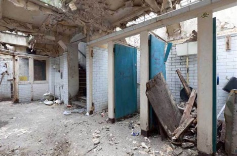
The ultimate fixer-upper, real estate rarely looks so unpromising as this London dump did – thankfully, one architect saw potential beyond these potties, despite the place truly looking like shi… well, er, bad. In the end, the before-and-after shots speak for themselves – few buildings can boast such total turnarounds, converting crappy ruins into shining tur…, er, digs.
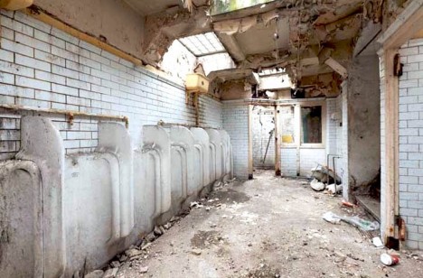
Located under the Crystal Palace Parade, these lavatories constitute just 600 square feet of space – not much by the standards of some cities but relative huge for England’s densely-packed capital.
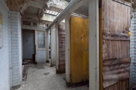

Located by architect Laura Clark after just finishing up at the Glasgow School of Art, the strange site seemed a perfect challenge for an aspiring architectural designer wanting to take up residence in London.
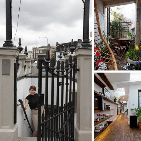
At the intersection of various municipalities and built nearly a century ago, getting approvals turned out to be painfully difficult – even establishing who owned the property proved problematic. Eventually, though, it went up for sale and she was able to secure and start working to convert it.
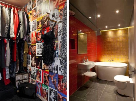
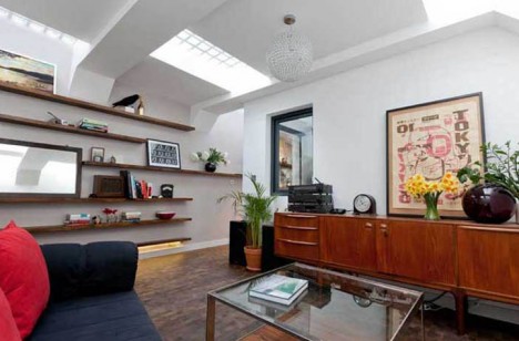
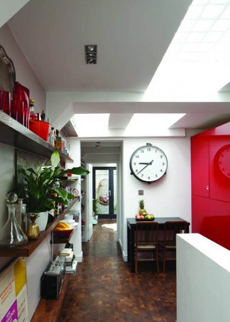
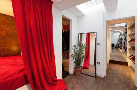
The results of her efforts: a compelling home constructed for under 65,000 Pounds (around $100,000 USD), surprisingly open, spacious and light-filled compared to its cavernous original state. Along the way, the architect was able to reuse some old materials in the new construction and save some existing walls as well.
Want More? Click for Great Related Content on WebUrbanist:
Rad Restroom Designs: 15 Actually-Awesome Public Potties
Little architectural effort is typically spent on public restrooms – they’re perfunctory, with looks reflecting embarrassment about the functions ... Click Here to Read More »»
House Turned Inside Out: All Walls Cut, Flipped & Reattached
An ambitious art project, the House Turned Inside Out peals away facades, those outer layers of mystery physically surrounding abandoned buildings, and reveals ... Click Here to Read More »»
Rebuilding Infrastructure: Viaduct turned Holiday Home
An abandoned viaduct in southern Italy with stunning vistas of the mountains and sea will become a vertical village of stacked, cantilevered vacation homes. Click Here to Read More »»


[ By WebUrbanist in Architecture & Houses & Residential. ]
[ WebUrbanist | Archives | Galleries | Privacy | TOS ]
Guerrilla Lace: Prettied-Up Urban Surfaces in Poland
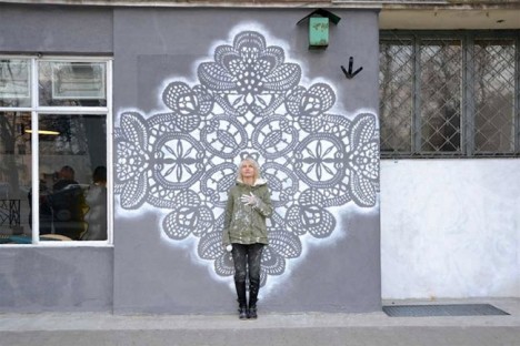
Urban sidewalks, sewer grates and dingy underpasses aren’t exactly the most likely places to find beautiful large-scale ornamental lace, but for artist NeSpoon Polska, that’s exactly where it belongs. The Polish artist creates both spray-painted street art and crocheted installations for interactive displays in all sorts of public spaces, from street lamps to abandoned houses.
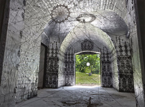
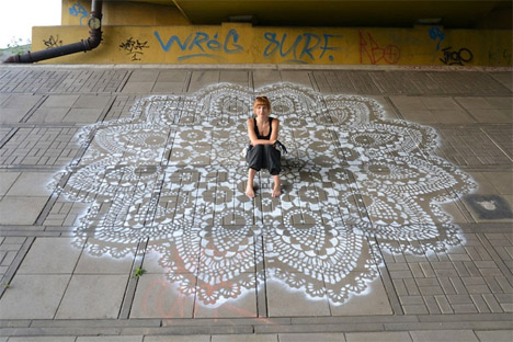
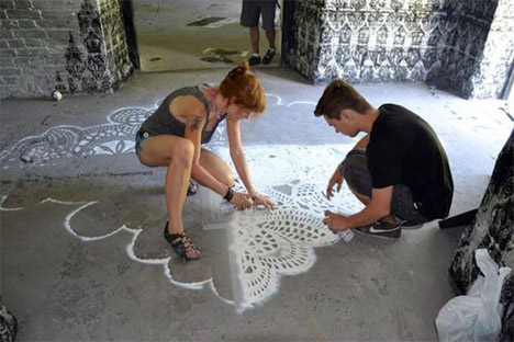
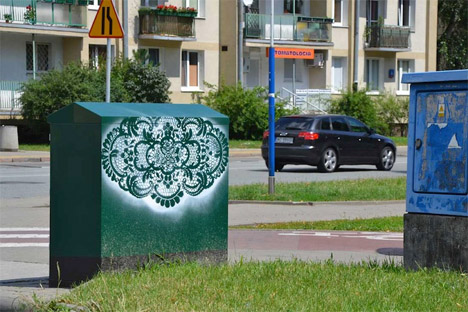
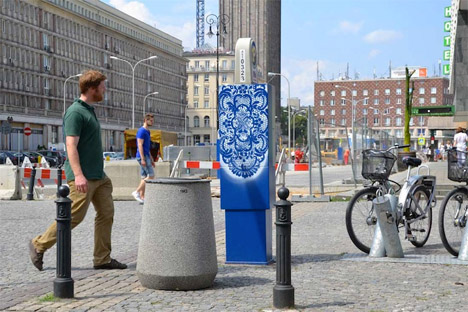
Calling it ‘illegal city decor’ and ‘public jewelry,’ Polska wanders around Warsaw, swiftly painting parking meters, utility boxes, blank signs and other blank (and often ugly) urban surfaces. Some, like a giant mural taking up almost the entire side of a three-story building, are created with permission.
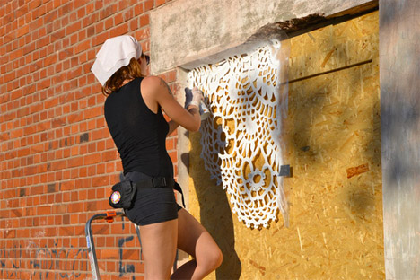
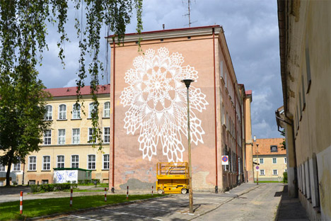
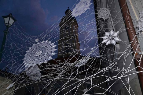
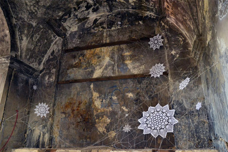
“Jewelry makes people look pretty, my public jewelry has the same goal, make public places look better. I would like people who discover, here and there, my small applications, to smile and just simply feel better,” says the artist.
Want More? Click for Great Related Content on WebUrbanist:
Surprise! 20 Subversive Works of Urban Guerrilla Street Art
Whether using the streets as a blank canvas or masterminding 'interventions', these street artists help change the public perception of everyday urban life. Click Here to Read More »»
Wild Creatures in Urban Mexico: New Street Art by ROA
10-foot-tall wild animals spring to life in the streets of Mexico from the spray paint can of Belgian artist ROA, champion of the underdogs of nature. Click Here to Read More »»
Semi-Subversive: 3 Unusually Legal Urban Street Art Projects
Here are some engaging types and works of visual and performance art that have prompted critical thought or stirred up controversy, all without getting the ... Click Here to Read More »»


[ By Steph in Art & Street Art & Graffiti. ]
[ WebUrbanist | Archives | Galleries | Privacy | TOS ]
Retro-Modern Radio Ball Rolls its Way to the Next Station
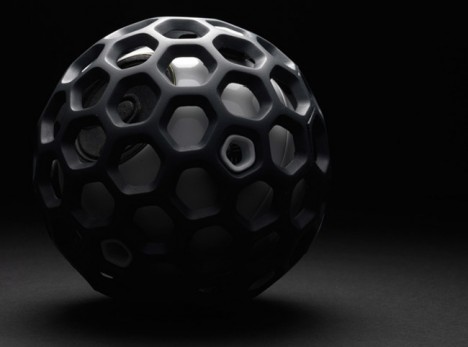
Remember when searching for a good radio station was a process of discovery, slowly turning a knob to hear snippets of music or talk making its way through the static? The anticipation was part of the experience, not knowing just what you might hear as you made your way around the dial. A fun concept called the Radioball brings back that feeling with an interactive three-dimensional design marrying retro and modern technologies. You simply roll the ball to change the station.
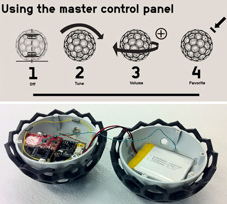
“Thinking back to the days of old analog radios, the magic of finding unexpected stations in the midst of fuzz was both enchanting and evocative,” says designer Ben Collette. “Compare that with today’s digital-based interactions of screens and tact switches; they give us exactly what we want when we want it, but leave no room to stumble onto alternative choices. The radioball prototype was built as a starting point for conversation about the need for richer, more spatial interactions.”
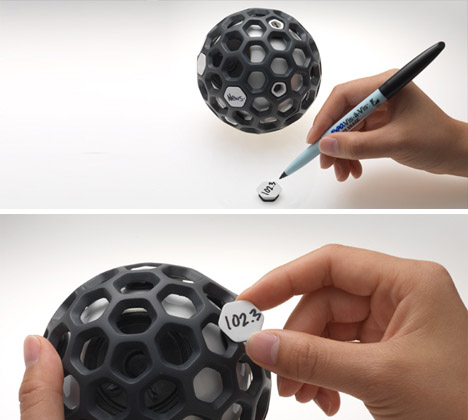
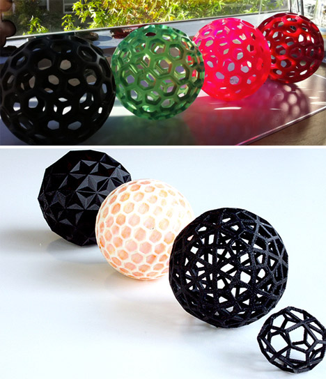
A lightweight, 3D-printed urethane mesh forms a honeycombed ball shape, which is then fitted with electronic components like speakers. The sections of the ball and the components are held together using magnets, and the design team is playing with various colors and levels of transparency for the outer mesh.
For version 2.0, Collette added a digital gyroscope to the control board so that a slow twist on any facet turns the volume up or down. It’s also got a larger battery and an easily accessible mini-USB slot for recharging the device.
Want More? Click for Great Related Content on WebUrbanist:
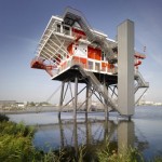
Pirate Island Radio Station Invaded, Dismantled & Rebuilt
Few works of architecture can boast half so strange a history as this remarkable rebuilt structure now serving as a restaurant in the waters of Amsterdam. Click Here to Read More »»
Dialed In: 15 Cool & Quirky Radio Design Concepts
DO touch that dial! These 12 cool & quirky radio design concepts provide a glimpse of this classic medium's future while giving a nod to its historic past. Click Here to Read More »»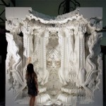
Digital Grotesque: Intricate Full-Scale 3D Printed Room
Stacked sections of intricate 3D-printed columns of the most baroque nature imaginable make up a cube-shaped, full-scale room. Designers Michael Hansmeyer and ... Click Here to Read More »»


[ By Steph in Gadgets & Geekery & Technology. ]
[ WebUrbanist | Archives | Galleries | Privacy | TOS ]
Time-Traveling Trams: 30,000 LED Lights Vanish Street Trains
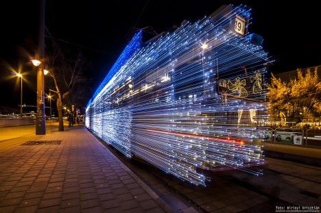
Extended exposure photography combined with a unique art installation project creates an incredible time lapse illusion on the streets of Budapest, making train cars appear to disappear in a burst of light.
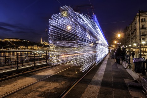

Started for Christmas 2009, this is a project of a regional transport company since captures by a number of intrepid photographers, each showing different speeds and resulting effects.


Via Colossal, this seasonal lighting is meant to attract tourists and additional riders, a decorative nod to the holidays as well as a moving work of photogenic art.

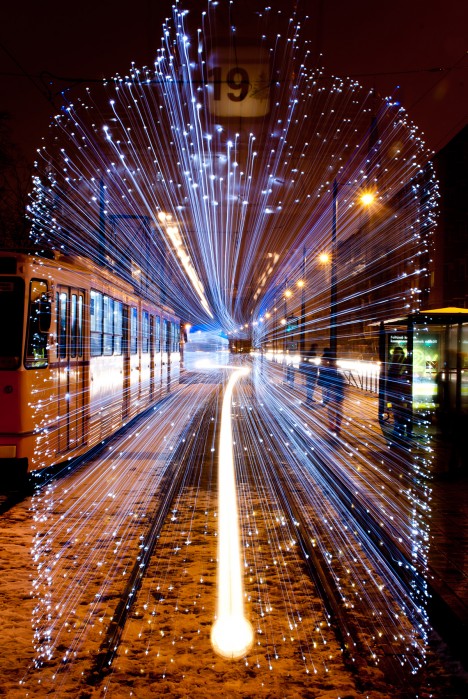
Images here were taken by Andras Csore, Victor Varga, Krisztian Birinyi, Krisztian Birinyi, Zsolt Andrasi English Hungary and the Centre for Budapest Transport.
Want More? Click for Great Related Content on WebUrbanist:

Infrastructural Art: Colorful LEDs Lights Up Shipyard Cranes
The imagination readily fastens onto the anthropomorphic figures like those found in shipyards, turning looming metal giants into huge toy beasts, origami ... Click Here to Read More »»
Subway Parasite: Stealth Projector Lights Up Train Tunnels
Here to lighten the mood a bit during the duller parts of your nighttime or subterranean transit is a quirky little projector that suctions to vehicular shells. Click Here to Read More »»
Illuminating Inventions: 10 Twists to Simple Street Lights
Functional street lights tend to fade into the background for most of us, but these designers have creatively re-imagined the humble piece of urban furniture. Click Here to Read More »»


[ By WebUrbanist in Art & Installation & Sound. ]
[ WebUrbanist | Archives | Galleries | Privacy | TOS ]
I Need A Hero

He or she would also strike fear into the hearts of developers who make those ads that jump in front of your cursor right before you click.
"The point is that these people either didn’t care about those details until the case became a..."
The point is that these people either didn’t care about those details until the case became a partisan issue, or weren’t actually following the Bergdahl issue. They just latched onto an ideologically convenient way to bash Obama. You think the president hates the troops — why hasn’t he brought our captured man home? You think Obama is secretly anti-American — why did he release Taliban leaders to free a traitor?
Now, you can find people saying just about anything if you search long enough on Twitter. But these tweets perfectly demonstrate the larger principle that politics makes you stupid. A raft of social science research finds that people seek out facts that prove their political worldview correct, and ignore or reject the ones that challenge it. It’s so bad that, in experiments, people reject the right answers to math problems when their conclusion is ideologically threatening.
”-
this is not just a conservative issue; liberals have the same kind of blind spots for exactly the same reasons.
archiemcphee: The Department of Awesome Natural Wonders just...


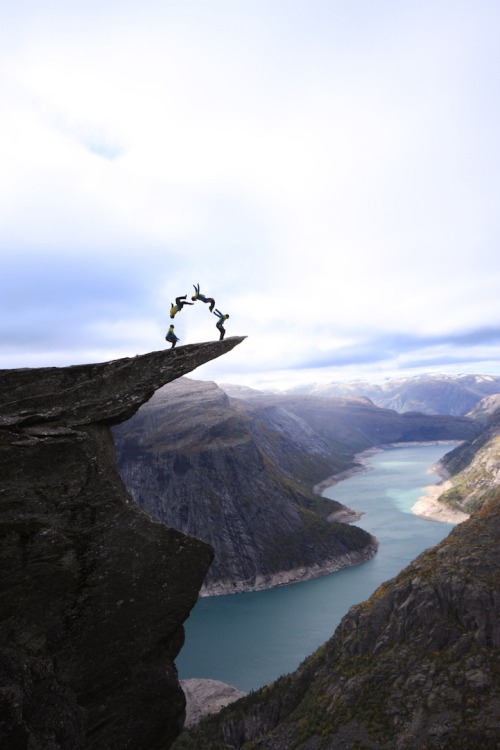




The Department of Awesome Natural Wonders just learned about an amazing field trip opportunity in Norway. That is, assuming you aren’t afraid of heights. This spectacular mountain vista is called Trolltunga, which translates to mean exactly what we hoped: “The Troll’s Tongue.” One of Norway’s most scenic cliffs, it’s an enormous piece of rock that juts out of a mountain over half a mile above the ground.
"The cliff was formed during the ice age, approximately 10,000 years ago, when glacial water froze huge chunks of the mountain and then broke off. This left an incredibly strange-looking rock outcropping. Thousands of visitors come each year to sit "on top of the world," and with no safety rails to block their view, or their fall, Trolltunga is one of those "bucket list" experiences that’s not for the faint of heart."
Reaching Trolltunga requires an 8-10 hour roundtrip hike, but if you’re looking for an awesome view, it’s well worth the effort. And then you could tell people that you’d stood on the tongue of a troll.
Photos by Digernes, WNDR.BE — G. DE SELYS, Opplev Odda Hardanger, Robin Ševčík, Sylvie Monharoul, Opplev Odda Hardanger and OpplevOdda respectively.
[via My Modern Metropolis]
Street Smart: Solar Roadway Lights Up & Feeds Power Grid

Currently in crowdfunding, these hexagonal pavers can provide energy, melt accumulated snow and ice, light up with LEDs, all while being tough enough to support trucks weighing 250,000 pounds.
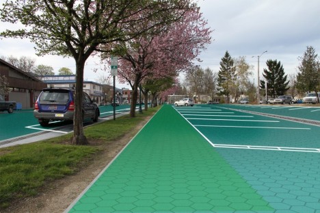
Designed by American electrical engineer Scott Brusaw to work everywhere from roads, parking lots and driveways to sidewalks, bike paths and playgrounds, you can walk, drive or park on these hexagrams with ease. They have been extensively tested for load-bearing capacity as well as traction and impact resistance.
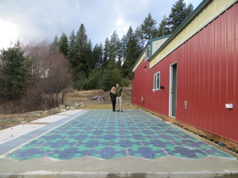
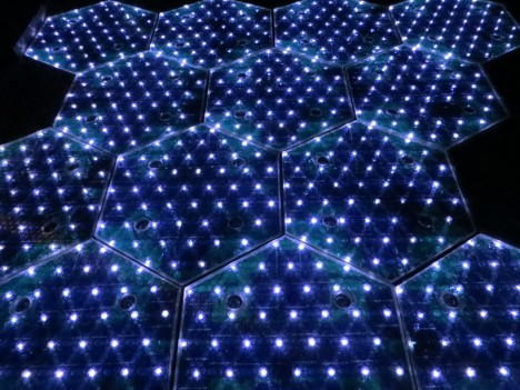
More about the project from IndieGoGo (graphics by Sam Cornett): “Solar Roadways is a modular paving system of solar panels that can … pay for themselves primarily through the generation of electricity, which [in turn] can power homes and businesses connected via driveways and parking lots.”


Current working prototypes are already powerful, as demonstrated above. Beyond existing capabilities there are many possibilities for further development, including mutual induction technologies that would allow charging while driving and more complex LED systems to create changing road displays on demand.
Want More? Click for Great Related Content on WebUrbanist:
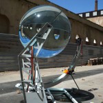
Lunar Power: Solar Spheres Energized by Both Sun & Moon
This sphere is so powerful in its ability to turn light into heat that it can not only harvest the rays of the sun, but even draw on energy reflected from the ... Click Here to Read More »»
Illuminating Inventions: 10 Twists to Simple Street Lights
Functional street lights tend to fade into the background for most of us, but these designers have creatively re-imagined the humble piece of urban furniture. Click Here to Read More »»
Powerhouse Ideas: 10 Futuristic Clean Power Concepts
Fossil fuels won't be around forever. Is the world prepared for alternative energy? Judging from these 10 amazing concepts, we'll be just fine. Click Here to Read More »»


[ By WebUrbanist in Conceptual & Futuristic & Technology. ]
[ WebUrbanist | Archives | Galleries | Privacy | TOS ]
Rooms on Wheels: Mobile Kitchen, Bedroom & Office Spaces

A step beyond flip-down beds and foldaway furniture, this series of modular rooms packs whole kitchens, bedrooms and offices into a highly portable form, so much so that they be bought online at stores like Amazon Japan and shipped right to your door.

Consider the possibilities, too, for on-demand residential conversions: with these you can make anything, from a cargo container to an old warehouse, into an instant apartment.

Set on wheels and made narrow when closed, each room-in-a-box can be rolled easily through opening and navigate narrow corridors to arrive at its destination.


The bedroom unit is the largest – it uses central breakpoints to allow overhead lighting as well as the bed and its supports below to collapse in half then fold up or down into empty spaces in the shell.

The mid-sized office features interlocking solids and voids to maximize shelving and storage when open. Meanwhile, the wheeled chair below detaches from the primary structure on demand.

The small kitchen flips up and out to reveal a sink, work surface and hot plate at hip height with space for storage and refrigeration below.

Square footage is a serious commodity in cities like Tokyo and Kyoto, making the four-figure price tag for these units from Atelier OPA (dubbed Kenchikukagu) also a lot more palatable in the right urban context.
Want More? Click for Great Related Content on WebUrbanist:
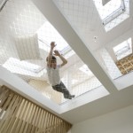
Sibling Spaces: Modular Rooms Made for Brother & Sister
For getting things done: a static, serious and refined work space is shared by the siblings. For everything else: there is a playful flexibility to be found in ... Click Here to Read More »»
Borrowed from Libraries: Mobile Shelving for Modular Rooms
To save space, libraries employ a rolling stack system that allows access to only one or a few aisles needed at one time. How about the same in homes or ... Click Here to Read More »»
Resource Furniture: Convertible Designs for Small Spaces
Multifunctional and convertible furniture solutions from Resource Furniture unfold and expand in unexpected ways, fitting lots of function into tiny rooms. Click Here to Read More »»


[ By WebUrbanist in Design & Furniture & Decor. ]
[ WebUrbanist | Archives | Galleries | Privacy | TOS ]
The Power of Paint: Mini Spruce-Ups Act as Advertisements
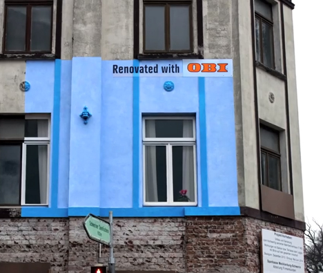
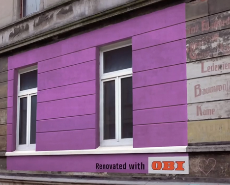
Billboard-sized paint jobs on buildings that have seen better days give passersby a glimpse of how much fresher and brighter the structure could look with a little care – the ideal advertisement for paint company OBI. They may be promoting a product, but these miniature renovations get their message across by proving what the product can do rather than just plastering photos of it on ugly billboards.
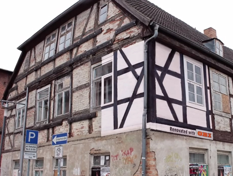
The campaign by Hamburg-based agency Jung Von Matt came about as a result of price wars between independent stores in Germany, causing a sudden increase in unsightly billboards all over the country. OBI, the largest DIY store in Germany, asked “Why do people advertise products that are supposed to make our homes look nicer using adverts that make everything look uglier?”
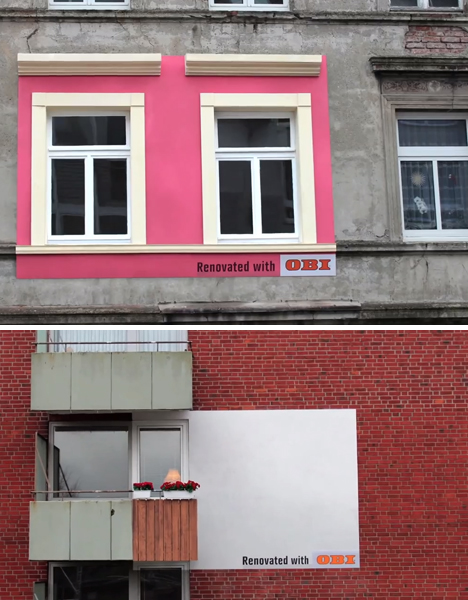
It’s a refreshing twist on the usual public advertisement, using the old show-don’t-tell method. In some cases, just half a window is included in the re-paint, making it glaringly obvious how much newer and more cheerful the building would look if the whole thing received the same treatment.
These days, as we collectively develop blinders that make conventional ads in public spaces virtually invisible, marketers have to get a lot more creative to be noticed. Check out 300+ shocking, brilliant and unmissable ad campaigns that force us to sit up and pay attention.
Want More? Click for Great Related Content on WebUrbanist:

Useful Billboards? Advertisements Extend Into Urban Space
Most billboards simply show words and pictures, but this series of urban advertisements offers passers-by a helping hand with some of life's little moments. Click Here to Read More »»
Mad Marketing: 15 Crazy & Controversial Advertisements
Some ads grab our attention because they're clever and unusual. Others do it with bizarre, stomach-turning imagery. Which ones are actually effective? Click Here to Read More »»
15 Clever & Creative Billboard Advertising Campaigns
Some advertisers think outside the box - literally - with billboards that step outside their own boundaries and interact with the world at large. Click Here to Read More »»


[ By Steph in Design & Guerilla Ads & Marketing. ]
[ WebUrbanist | Archives | Galleries | Privacy | TOS ]
Surreal Snippets: Gifs Elevated to Mind-Bending Art Form

Gifs are taking over the internet, and that’s not always a good thing. Entire conversations are carried out in the form of animated images, replacing words with snippets of out-of-context pop culture. But it’s hard to deny that they can be totally mesmerizing – especially when they’re as surreal as this. Science student Hugo Germain, known as Graphonaute, has truly elevated the gif to an art form of its own.

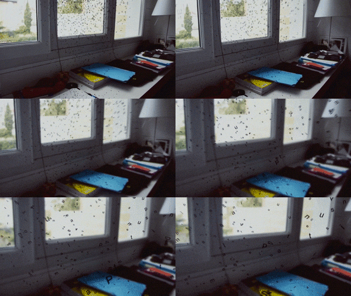
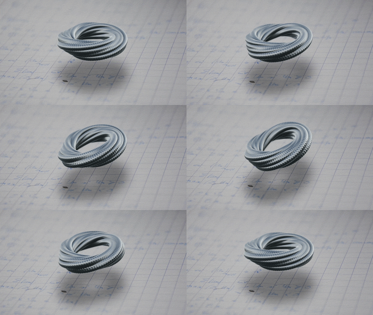
Objects spin in mid-air, liquid ink turns to gas, letters raise themselves off a page and float. The images defy all laws of physics, warping reality in totally unexpected ways.
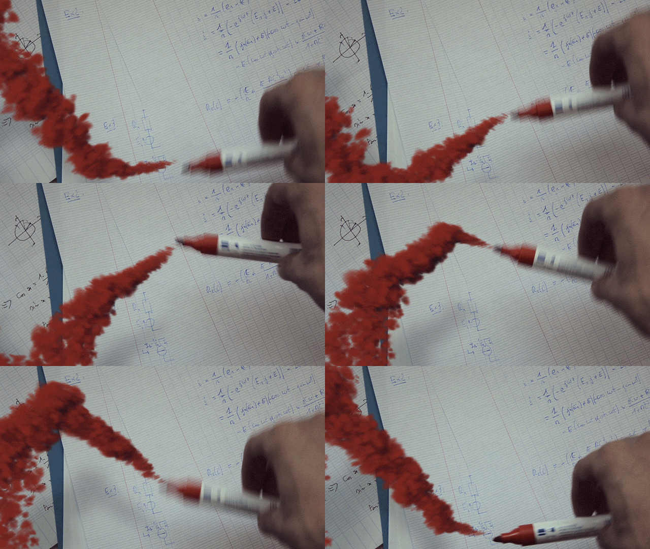


Germain creates the images using a combination of live-action footage and 3D tools. Most of the images are unexplained, but occasionally the designer offers a glimpse at what he was thinking during the creative process. “That awkward moment when a dementor bumps into you,” he clarifies in regards to the image above.
Want More? Click for Great Related Content on WebUrbanist:
Mind-Bending Digital Photo Manipulation by Erik Johansson
Roads unfurl like fabric and human faces are frighteningly elastic in the digitally manipulated photographs of artist Erik Johansson. Click Here to Read More »»
20 Mind-Bending & Floor-Ripping Architectural Sculptures
Australian artist Robbie Rowlands masterfully blends architecture and art with his unique style. His art shakes our notions of stability and familiarity. Click Here to Read More »»
On Space Time Foam: Surreal Billowing Art Installation
PVC membranes provide a playground for visitors, requiring coordination between the people navigating its surface to keep them all from sliding to the center. Click Here to Read More »»


[ By Steph in Art & Drawing & Digital. ]
[ WebUrbanist | Archives | Galleries | Privacy | TOS ]
Window Sketches: Minimalist Landscapes of Steam & Glass
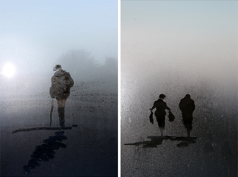
No smoke-and-mirrors or post-production here, just fleeting vignettes swiftly staged on steamed windows and set against natural outdoor backgrounds.
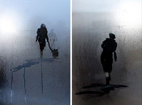
Jim Osborne is a self-taught landscape artist who typically works in watercolor, acrylic and oils. He describes himself as being inspired by his surroundings, light and the weather. Recently, however, he has begun working in a new direction with water condensation on glass window surfaces.

His Steamy Windows Collection represents a bit of a departure for him in terms of tools and approach – the work is necessarily fast, drawing on organic backdrops, lighting conditions and perceptual cues. Each piece is shot quickly as well, and prints can be found for sale on his website.
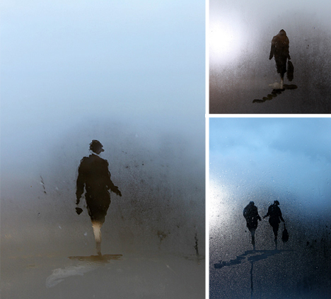
With the need for speed, every little gesture counts – the results are simultaneously planned but ultimately uncontrolled, a mixture of simple figures and hasty grounds that somehow manages to look like more than the sum of its parts. The approach seems like a a great way to train oneself to think in an agile fashion and be nimble in execution.
Want More? Click for Great Related Content on WebUrbanist:
House of Glass: Cabin Facade from Antique Window Frames
On an unusual kind of cross-country road trip, this couple visited garage sales, antique dealers and added these to other roadside finds, all toward the quest ... Click Here to Read More »»
Real 3D Sketches: 3 Furniture Sets that Draw on 2D Doodles
Like photo-realistic art in reverse, these three-dimensional objects are carefully crafted to look like rough-edged, hand-sketched representations. If the ... Click Here to Read More »»
Extreme Exposures: Light Landscapes Take Hours to Shoot
Most light photographers focus on making a shape in the foreground in a matter of seconds, then setting it against a dark static backdrop – this artist ... Click Here to Read More »»


[ By WebUrbanist in Art & Drawing & Digital. ]
[ WebUrbanist | Archives | Galleries | Privacy | TOS ]
Kinetic Facade: Awesome Adaptive Window Shading System
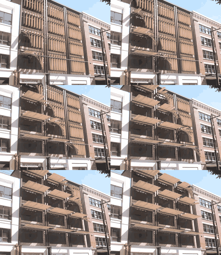
Buildings are forever in tension, being static objects in a dynamic world – light conditions in particular shift predictably yet variably throughout the day, week, season and year, in turn demanding an adaptive response.
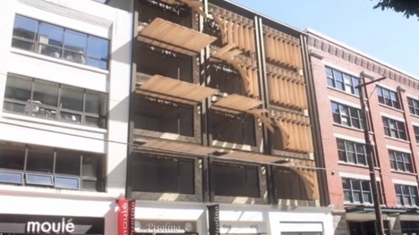
Thus the Penumbra system by Tyler Short, “designed to offer a kinetic and mechanical solution to a problem that would otherwise be nearly impossible to solve with static architectural components: providing shading across a building facade for both low evening sun and high afternoon sun conditions.”
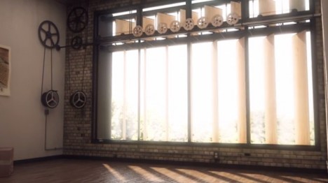
The constituent parts can shift side to side while in their vertical orientation, then turn on a proverbial dime to form a horizontal shading solution, all creating a way to deflect (and let in) light while maintaining control over views.
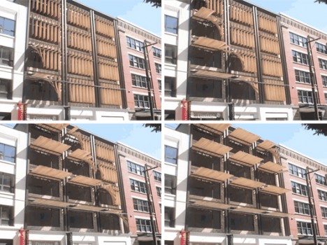
More from the designer: “Our solution was a series of vertical shading louvers, that can independently pivot to maximize solar protection, and when the sun reaches an altitude in which vertical louvers would be ineffective, completely rotate upwards to act as a horizontal shading element and light shelf. All of the mechanical components and gear ratios were fully resolved, and the result is a hand or computer-operated system that creates a beautiful undulating form across the facade.”
Want More? Click for Great Related Content on WebUrbanist:
Algae-Fueled Building: World’s First Bio-Adaptive Facade
Bio-reactors and micro-algae sound like the stuff of science fiction, but this is the real deal: biomass built into panel glass on an actual working structure. Click Here to Read More »»
House of Glass: Cabin Facade from Antique Window Frames
On an unusual kind of cross-country road trip, this couple visited garage sales, antique dealers and added these to other roadside finds, all toward the quest ... Click Here to Read More »»
Adaptive Reuse: 7 Brilliant Building Conversion Projects
So many recycled projects out there, but few can boast they live in a boat, or a plane, or a church, for that matter - here are a few that do. Click Here to Read More »»


[ By WebUrbanist in Gadgets & Geekery & Technology. ]
[ WebUrbanist | Archives | Galleries | Privacy | TOS ]
Animated Still Lifes: 7 Relaxing Cinemagraphic Illustrations
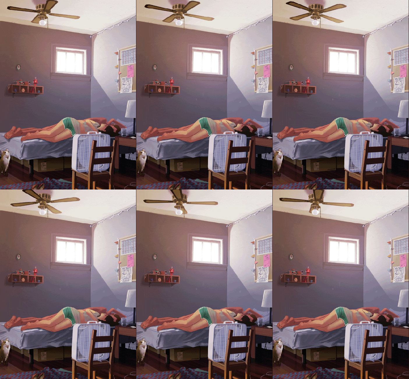
Reclining in the space between the extremes of sped-up, movie-style GIF files and traditional, immobile paintings, this artist brings lazy scenes of everyday reality to life.

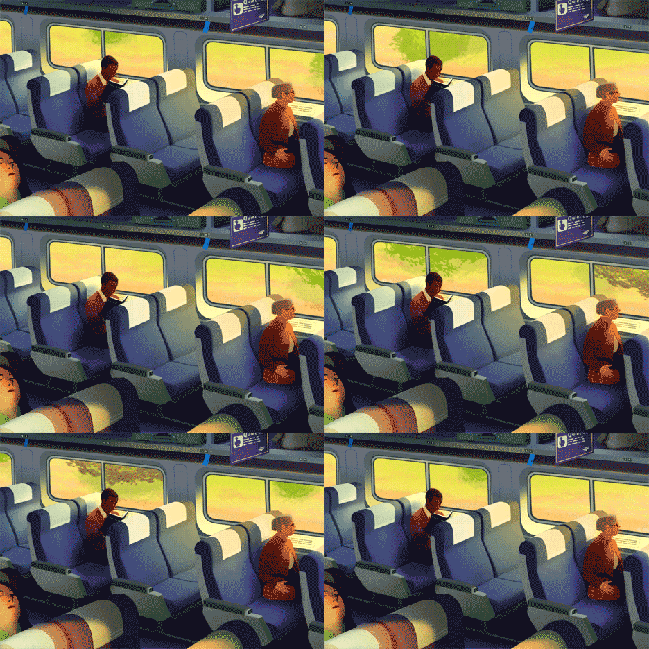
Rebecca Mockam is a Brooklyn-based illustrator and comic artist whose cinemagraphs move only as much as needed, a different kind of visual artist’s takes on medium most often associated with photography.
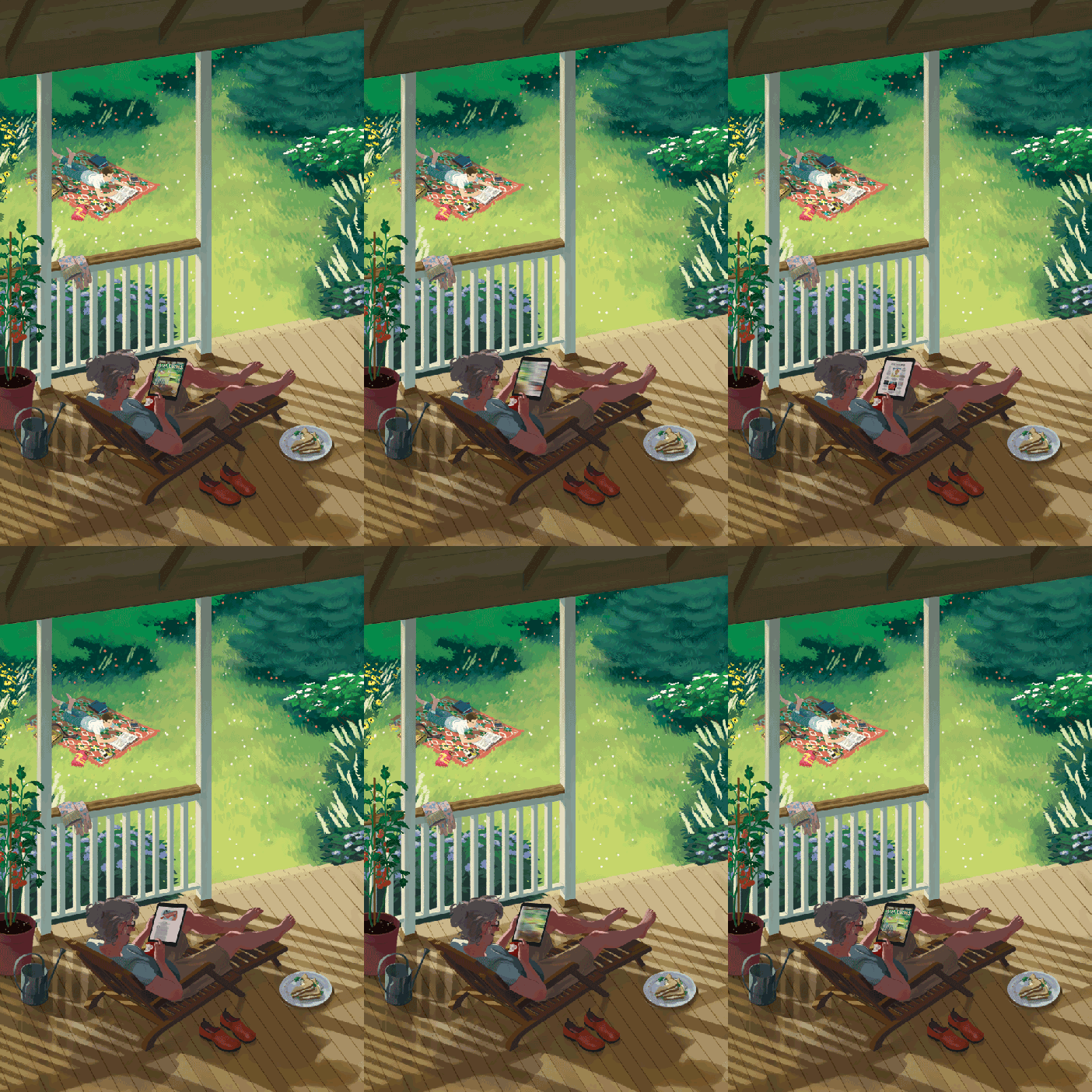
Note that these reduced-sized examples don’t do justice to the detail and seamlessness of her originals, so it is worth looking more closely at her portfolio for these and more.

Her work is peaceful and contemplative, lending itself to a lot of potential comparisons, including Edward Hopper and Norman Rockwell. At the same time, much of the subject matters is definitively contemporary, including all-too-familiar ringing phones and tablet swipes. Still-life Americana revisited, this approach (in the age of portable computers, tablets and phones) uses a medium that makes sense with its era.

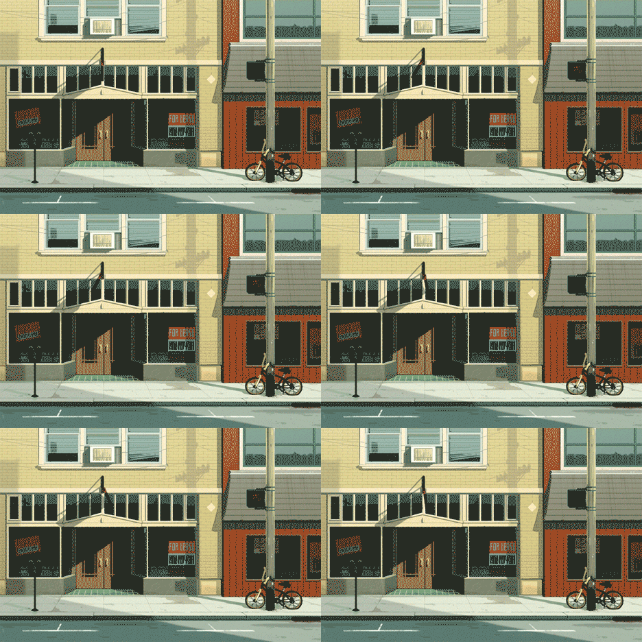
Mockam has worked on everything from art exhibits and comic covers and is currently drawing a graphic novel titled Four Points, set to be released in 2015. She uses a Wacom tablet for most of her illustration work, sketches with a pencil and ink with various brush pens, and a nib & ink when it comes to drawing comics.
Want More? Click for Great Related Content on WebUrbanist:
Stunning Black and White Street Art Illustrations by Phlegm
Comic book artist and muralist Phlegm makes the streets of England look like pages from an illustrated book, telling a story with giant black-and-white images. Click Here to Read More »»
NeoLucida: Optical Drawing Tool Lets You Trace Real Life
An update on a 19th century optical drawing tool lets artists trace the real world around them. The NeoLucida will soon be available for just $40. Click Here to Read More »»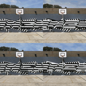
GIF-fiti: Trippy Animated Street Art Photos by INSA
This graffiti isn't made to be seen in person - artist INSA paints and repaints each mural to create animated GIFs that can only be viewed on computers. Click Here to Read More »»


[ By WebUrbanist in Art & Drawing & Digital. ]
[ WebUrbanist | Archives | Galleries | Privacy | TOS ]
Cutting Edges: Layered Back-Lit Paper Art Gets Deep & Dark

Together, Hari & Deepti (Deepti Nair and Harikrishnan Panicker) turn sets of two-dimensional cutouts into vivid and haunting three-dimensional dioramas, often set in shadowy fantasy spaces.


Despite the darkness of their subject matter, in ordinary lighting conditions there is almost nothing to be seen of these pieces. The work waits in the shadows, so to speak, popping out when you turn out the lights and turn on the LEDs inside each individual light box.
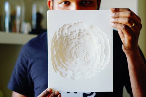
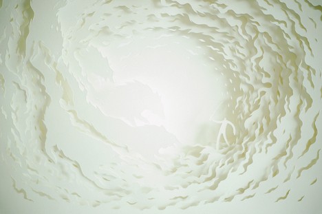

Loosely analogous to a book, perhaps, the story plays out in the space between the pages, each one individually flat but, together with illumination, adding up to something more than the sum of its parts.

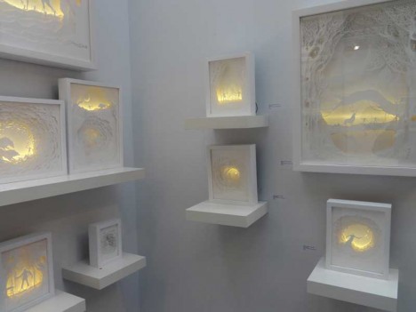
While most of their works are relatively small, a recent project challenged them to build at a much bigger scale, creating an entirely monstrous (pun intended) New York cityscape (shown below).
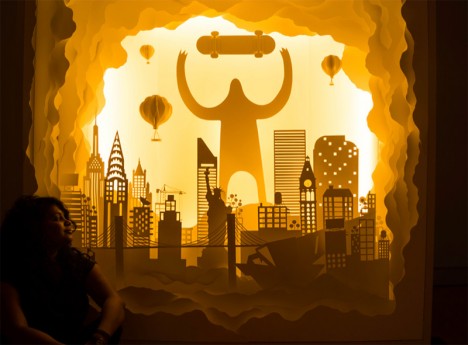
From the artists: “Paper is brutal in its simplicity as a medium. It demands the attention of the artist while it provides the softness they need to mold it in to something beautiful. It is playful, light, colorless and colorful. It is minimal and intricate. It reflects light, creates depth and illusions in a way that it takes the artist through a journey with limitless possibilities.”
Want More? Click for Great Related Content on WebUrbanist:
Spectral Studio: 20 Sq M Space Uses Light & Dark as Decor
In an Paris apartment with just over 200 square feet, it is almost impossible to imagine anything but the more bare essentials resulting a boring space. Click Here to Read More »»
Static Flip Books: 360-Degree Scenes in Panoramic Pages
Like a flip book, there is no text, and each page of these volumes contains a slightly different scene. But that is where the similarities end and the fun ... Click Here to Read More »»
14 (More!) Masters of Incredibly Intricate Cut Paper Art
Cutting, scoring, folding and gluing, these 14 masters of paper art transform their delicate medium into collages, sculptures, illustrations and installations. Click Here to Read More »»


[ By WebUrbanist in Art & Sculpture & Craft. ]
[ WebUrbanist | Archives | Galleries | Privacy | TOS ]
landscapelifescape: Japanese Garden, Portland, Oregon, USA by...
Moss Graffiti: A How-To Guide (via many reblogs)


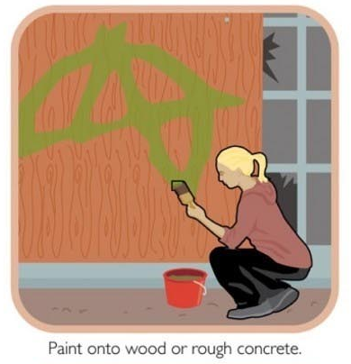

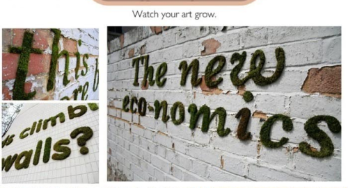
Moss Graffiti: A How-To Guide (via many reblogs)
kqedscience: ER doctors use Google Glass and QR codes to...

ER doctors use Google Glass and QR codes to identify patients
"A tech-savvy hospital in Boston developed a custom information-retrieval system for Google Glass, which lets ER doctors scan a QR code on the wall of each room to call up information about patients.
Dr. John Halamka, CIO of Beth Israel Deaconess Medical Center, described the system today in his blog:
In the Emergency Department, we’ve developed a prototype of a new information system using Google Glass, a high tech pair of glasses that includes a video camera, video screen, speaker, microphone, touch pad, and motion sensor.
Here’s how it works.
When a clinician walks into an emergency department room, he or she looks at [a] bar code (a QR or Quick Response code) placed on the wall. Google Glass immediately recognizes the room and then the ED Dashboard sends information about the patient in that room to the glasses, appearing in the clinician’s field of vision. The clinician can speak with the patient, examine the patient, and perform procedures while seeing problems, vital signs, lab results and other data.
Read more from arstechnica: http://goo.gl/ghRRT5
Smear Campaign: Guerrilla Artist Remixes Adverts with Acid

Mutating works of public advertising with corrosive acid, this cunning urban interventionist hijacks posters from bus stops and subway stations, then adds his own message into the mix.
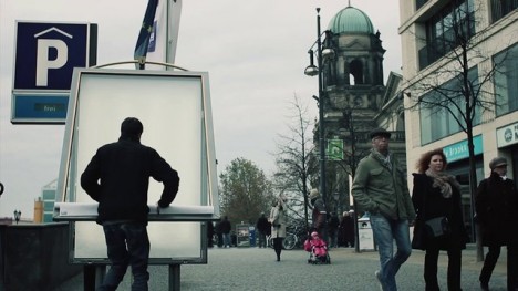

Vermibus takes posters then employs solvents to remake each surface in his studio, dissolving inks and colors already there and reusing materials from each de facto ‘canvass’ to make something new.
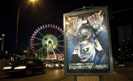
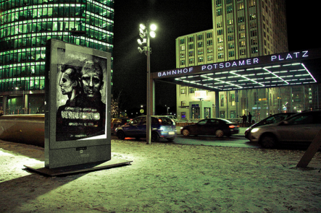
He then puts his transformed works back where he found the original or, in many cases, an entirely different site, city or even country, blending them back into the urban environment.
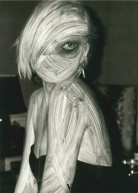
Having taken them off the streets, Vermibus brushes the idealized figures, slowly morphing them into surrealist versions of their former selves. He has repeated this unusual artistic process in various major cities, including and beyond his home town of Berlin.
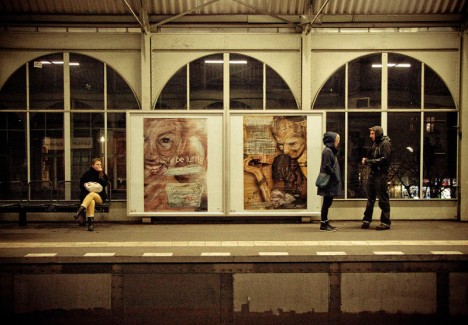
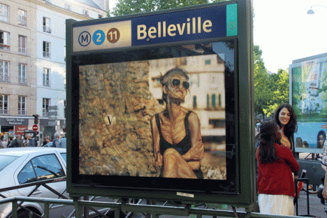
Sometimes the commentary is clear – a model made intentionally skeletal, for instance – while others evolve (or devolve) into abstractions and parodies that seem almost inhuman.

The three fascinating short films embedded throughout this article (above and below) show his process, various examples of his work around Europe and his organization of and participation in the No-Ad Project. “Using a dubious inter-rail ticket, Vermibus set out with a set of 90 keys and his pallet of solvents to physically and temporally hijack the Western Worlds of advertisements in the name of fine art.”
Next Page - Click Below to Read More:
Smear Campaign Guerrilla Artist Remixes Adverts With Acid
Want More? Click for Great Related Content on WebUrbanist:

Public Camouflage: Make-Up Artist Makes Models Invisible
Illusion relies on expectation - we glance but only glimpse what is familiar and the rest blends neatly into the background of urban settings. Click Here to Read More »»
Double Agent JR: Undercover Photographer & Guerilla Artist
Photographers are the subject of a medium-old question: does their work represent reality, or create new realities? This one undoubtedly does both in fantastic ... Click Here to Read More »»
Clean Streets: Guerilla Marketing Meets Reverse Graffiti
This group has managed to turn a street art hobby into a guerilla marketing campaign strategy. Click Here to Read More »»


[ By WebUrbanist in Design & Guerilla Ads & Marketing. ]
[ WebUrbanist | Archives | Galleries | Privacy | TOS ]
Touch to Open: Kinetic Doors Unfold Like Life-Sized Origami
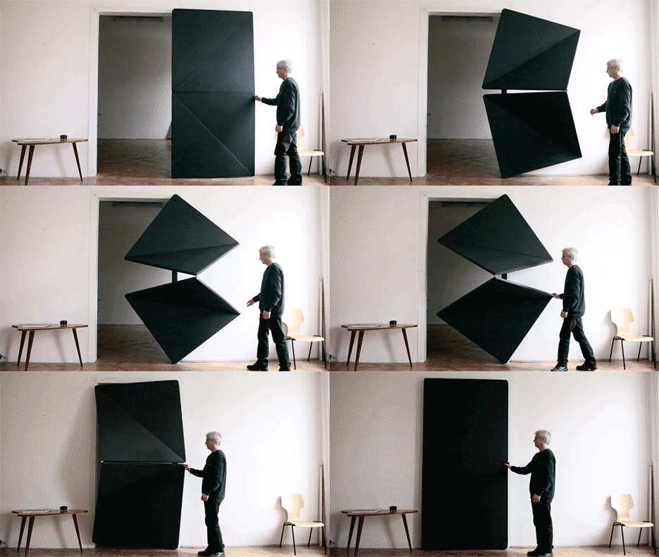
Made of rubber, metal, glass and wood, these dynamic flip panel doors tackle perhaps the world’s original architectural invention in a series in a fresh, new and interactive fashion.
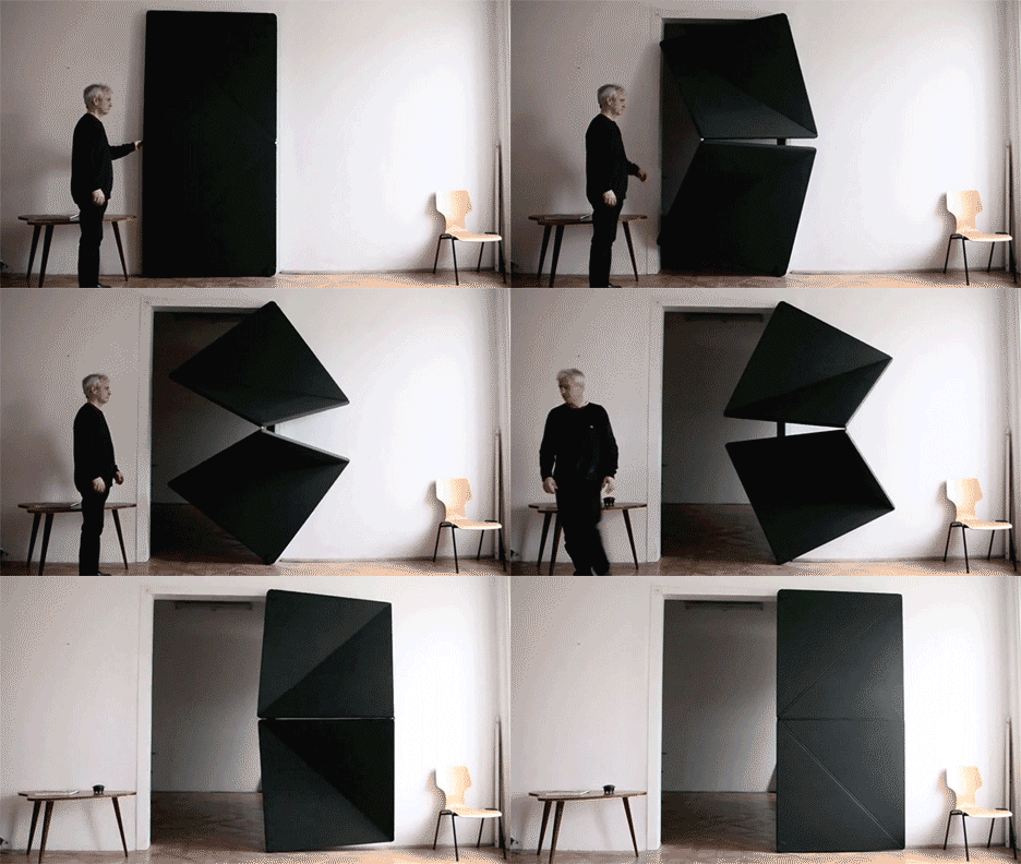
Each member of the Evolution Door set by Austrian artist, designer and builder Klemens Torggler involves a multi-panel contraption the flips open and re-closes in a fantastic feat of kinetic motion.
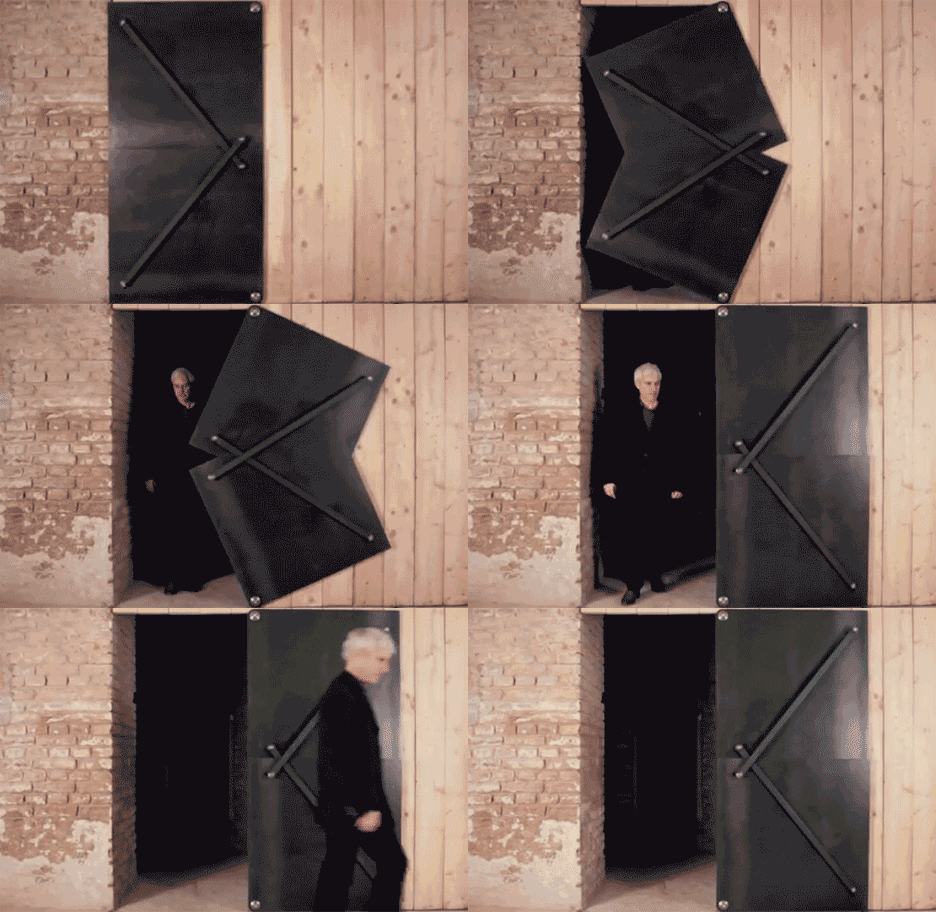
The steel version of the door is particularly ingenious as its space-saving method of action. Like its sliding cousins, it avoids the in-and-out motions of a typical doorway to minimize the space you need to set aside in front of or behind it.
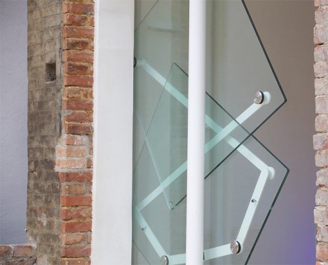
The glass design uses a minimalist framework of structural supports, all of which then disappears entirely into a secret wall space hidden alongside it.
With steel and glass variants in particular, though, viewers are sure to wonder how one avoids getting a finger pinched if they are not paying full attention, hence this short video regarding benefits of the softest member of the Evolution family.
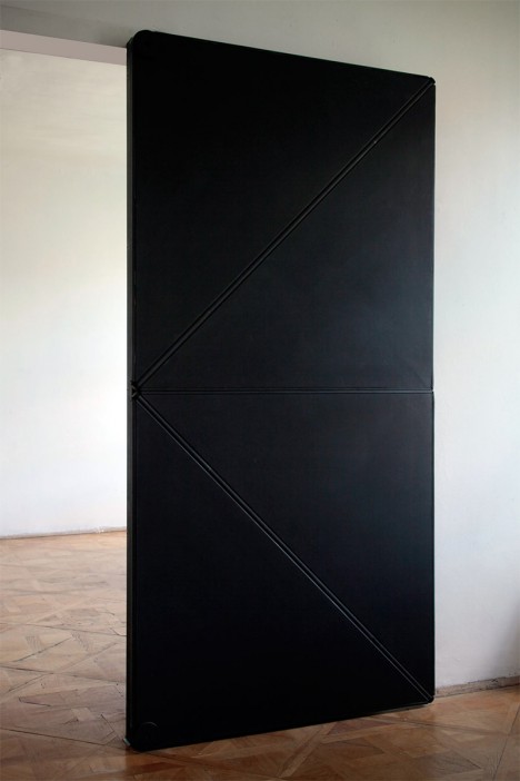
Aside from the finger-friendly end result, there is something brilliant in the common approach of these works: each bypasses all positions outside of the binary ones – these doors are either opened or closed between uses, never resting anywhere in between.
Want More? Click for Great Related Content on WebUrbanist:

5 Stunning Modern Secret Rooms, Hidden Doors & Passages
In some cases the discovery of a secret room is a wonderful find but it can also be a twisted nightmare. Click Here to Read More »»
Open House(s): 10 Wonderful Open-Plan Home Designs
Open floor plans allow even the smallest cottage to seem spacious and luxurious. These 10 homes with open plans are the pinnacle of modern architectural design. Click Here to Read More »»
Wall Art Gone Wild: Fantastic Life-Sized Room Sketches
With some of her works it is hard to tell where the two-dimensional art ends and 3D objects begin, blending as they do into one semi-continuous surface. Click Here to Read More »»


[ By WebUrbanist in Design & Furniture & Decor. ]
[ WebUrbanist | Archives | Galleries | Privacy | TOS ]
Long-Exposure Faces: Moody Light Art Painted with Sparks
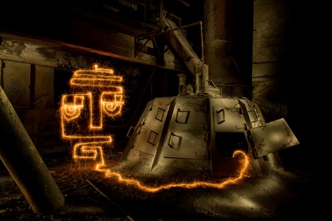
Light painter Diliz has worked for three years to twist, turn and perfect his single-line sparkler sketches in urban settings around the world. Each successive shot is related to a new time and place but also reflects a fresh attempt at capturing a mood and creating a sense of site-specific interaction.
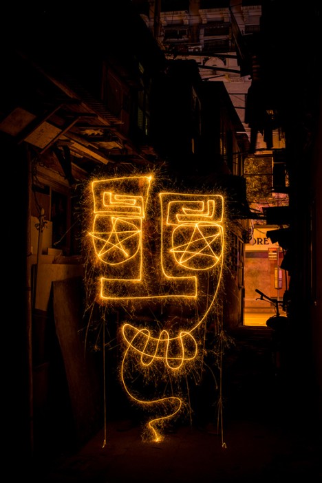
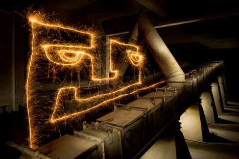
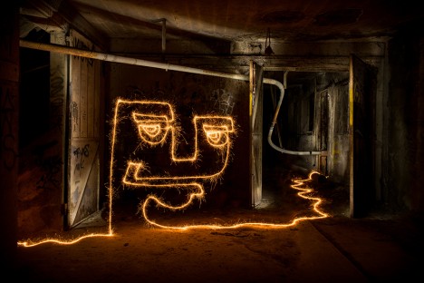

Diliz (aka Vincent Delesvaux) has experimented with all kinds of photographic light art. In this particular series, dubbed 60 Seconds to Find an Exit, he set up shop at night in out-of-the-way streets and alleys, abandoned buildings and deserted basements.

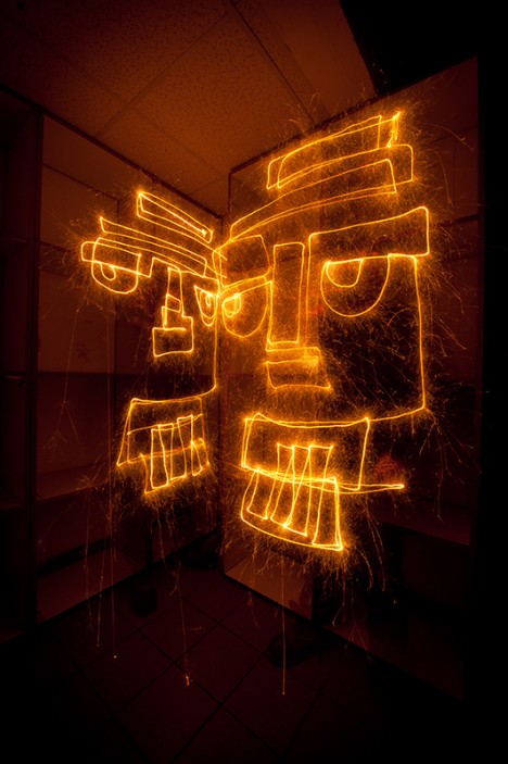

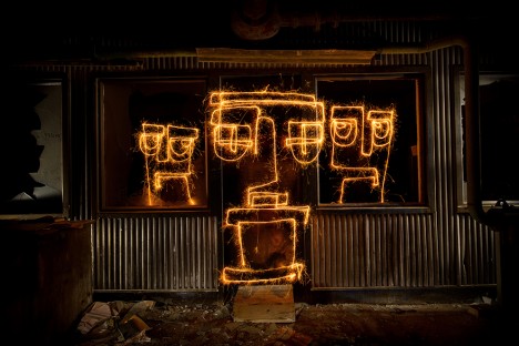
His travels took him everywhere from European locations (including Verbier, Switzerland and Grenoble, France) all the way to cities in China, such as Lijiang, Yangshuo Fenghuang and Shanghai.
Next Page - Click Below to Read More:
Long Exposure Faces Moody Light Art Painted With Sparks
Want More? Click for Great Related Content on WebUrbanist:
Painting with Light: 15 Long-Exposure Light Art Photos
Luminous graffiti, eerie drawings, streaks of light, raining sparks - all of these effects and more are possible by moving a light source around in a scene. Click Here to Read More »»
Geometric Projections: Light Art Radically Reshapes Nature
Everyone knows there are mathematical patterns to be found everywhere in nature - though few such geometries are as explicit and dazzling as these. Click Here to Read More »»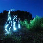
Exposure: 10 Amazing Light Graffiti Artists & Photographers
Light graffiti, also known as light painting, is a kind of leave-no-trace, sustainable and incredibly awesome temporary graffiti if captured right by clever ... Click Here to Read More »»


[ By WebUrbanist in Art & Street Art & Graffiti. ]
[ WebUrbanist | Archives | Galleries | Privacy | TOS ]
Rapid Packing Container: Students Reinvent Cardboard Box
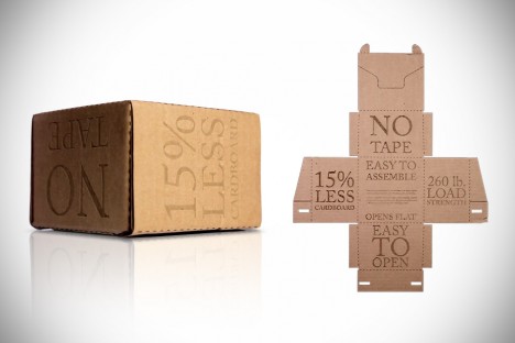
Faster, leaner and just plain better, this ingenious resign reduces wasted cardboard, eliminates excess tape and is also more convenient to build, open and store than traditional shipping boxes.

Fully reversible for easy reuse, this patent-pending creation is the product of two Cooper Union student collaborators, Henry Wang and Chris Curro, undergraduates in the Albert Nerken School of Engineering.

The Rapid Packing Container deftly address a long series of shortcomings, showing that even something so taken for granted as the cardboard box can benefit from serious improvement.
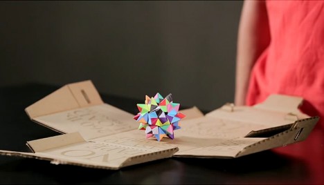
Instead of pulling the unfolded box from a shelf then manually taping together various sides and flaps, shippers can simply press the flattened version of the RPC into a box that folds it for them. After removing a single strip of paper, a minimal amount of exposed adhesive does the rest. Instead of unnecessarily overlapping layers of cardboard, or using tape to support weight, the built-in corrugation and interlocking folds provide for essential structural needs all while using less material.
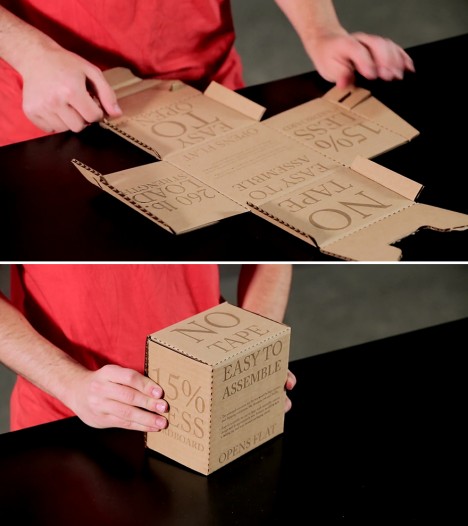
The end-user experience is also refreshingly clean and simple – instead of cutting through copious amounts of tape, recipients can push a tab to open the box and watch it unfold in front of them. If there is branding or shipping data on the exterior, that set of exposed sides can be flipped, folded and bent back into the hidden interior. Of course, only time and rigorous testing will tell whether this radical reinvention can disrupt entrenched industrial design standards.
Want More? Click for Great Related Content on WebUrbanist:
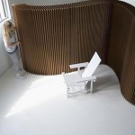
7 Creative Cardboard Building & Paper Furniture Projects
What would it take to get you to see a well-known non-building material in a new light? Perhaps a paper house, or a cardboard chair would be the place to start. Click Here to Read More »»
20 Shipping Container Cities, Apartments & Emergency Shelters
Not all steel shipping container architecture is about building a dream home. These clever designs use cargo containers for community and emergency housing. Click Here to Read More »»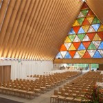
Cardboard Cathedral: Temporary Structure Acts as Placeholder
In 2011, Christchurch, New Zealand was hit with a massive 6.3 magnitude earthquake. Among the city’s most heartbreaking losses was the destruction of the ... Click Here to Read More »»


[ By WebUrbanist in Design & Products & Packaging. ]
[ WebUrbanist | Archives | Galleries | Privacy | TOS ]
Crochet Playscapes: 13 Interactive String Art Installations
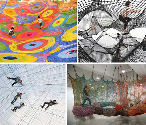
Miles of yarn and string stretch across inflatable structures, galleries and outdoor environments in these crocheted and knotted art installations, offering massive interactive playgrounds that invite people to climb, bounce and lounge. String is used as both an art medium and a functional, supportive structure in projects ranging from vast playscapes for children to a public NYC installation made of 1.4 million feet of hand-knotted rope.
Colorful Crochet Playgrounds by Toshiko Horiuchi MacAdam
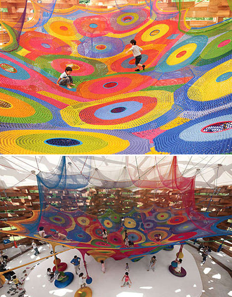
Perhaps the most vast and complex crocheted works ever created, Toshiko Horiuchi MacAdam’s colorful installations are literal playgrounds for kids and adults, installed in parks and playgrounds. The artist starts her design process by creating a wooden scale model of the space where the net will be installed, and thence rockets the piece in fine cotton thread. That design is then adapted to full scale with yarn. ‘Rainbow Net,’ her most famous piece, took three years to complete and is located at the children’s area of the Takino Suzuran Hillside National Park in Sapporo, Japan.
Crocheted Alligator Playground by Olek
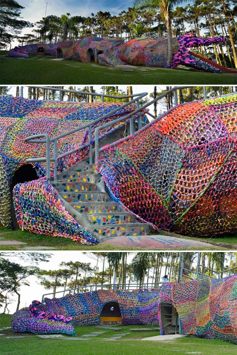
An alligator the size of a particularly massive dinosaur is covered in colorful crocheted yarn in ‘Crocheted Jacaré,’ a piece in Brazil by Brooklyn-based artist Olek. The alligator was already a part of the playground, Olek simply created some temporary clothes for it that made it stand out even more.
In Orbit: Transparent Suspended Net Playground
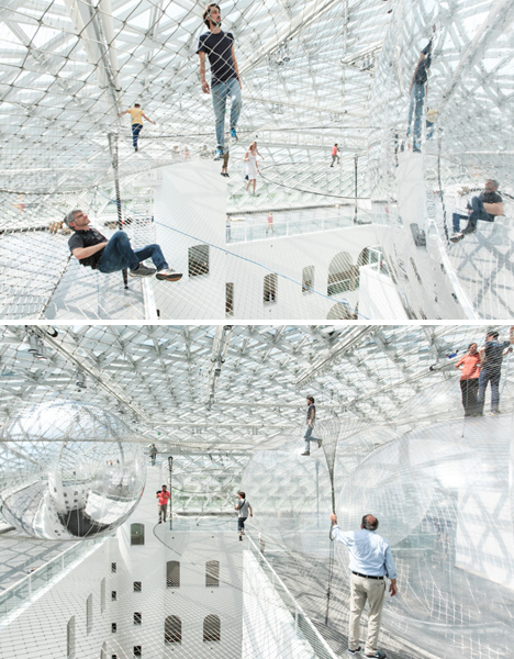
Transparent net hung over a four-story drop offers a rather frightening play experience for anyone with the slightest fear of heights. Artist Tomás Saraceno created the 2500-square-meter installation at the Kunstammlung Nordrhein-Westfalen museum in Dusseldorf, Germany, inviting visitors to walk out onto the cloud-like nets amidst mirrored spheres.
Inhabitable String Structure by Numen/For Use
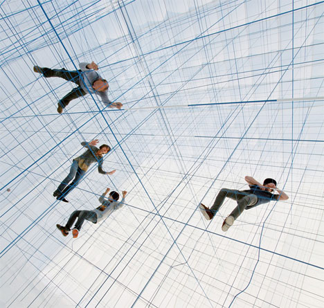
Climbers make their way through a grid made of string in this ‘social sculpture’ installation by design collective Numen/For Use. The ropes are contained within an inflatable structure, secured to all sides of the interior. When the bubble is deflated, they fall to the ground, and when it’s inflated, they become a taut interactive playground. The designers describe it as “bodies entrapped in a 3D grid, flying in unnatural positions throughout superficial white space, resemble dadaist collages. Impossibility of perception of scale and direction results in the simultaneous feeling of immenseness and absence of space.”
Crocheted Net Nests by Ernesto Neto
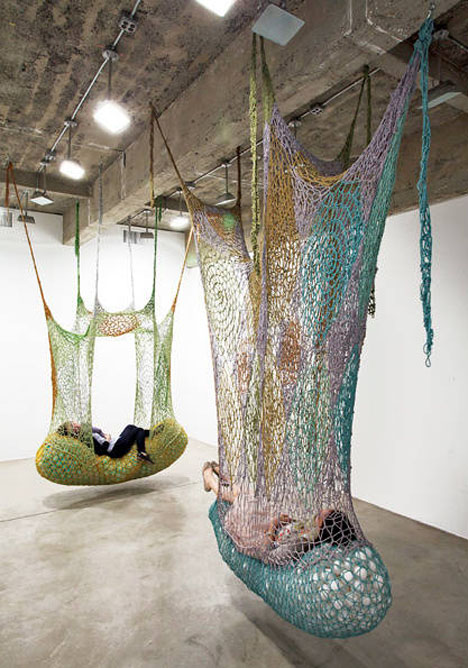
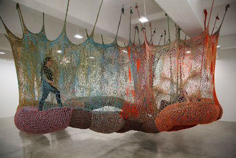
Brazilian artist Ernesto Neto creates massive crochet installations reminiscent of the playgrounds by Horiuchi MacAdam, but in more muted tones. Strung from gallery ceilings, these strange little ‘nests’ offer an inhabitable space that can be either playful or quiet and comforting. Larger pieces encourage running and jumping, while the smaller ones are cocoon-like relaxation spaces.
Next Page - Click Below to Read More:
Crochet Playscapes 13 Interactive String Installations
Want More? Click for Great Related Content on WebUrbanist:
The City is a Playground: 15 Interactive Installations
Art installations that invite or even dare passersby to join in on a fun activity transform even the most stiff and boring urban environments into public ... Click Here to Read More »»
Tying Us Together: Portraits on Hanging Elastic String
Korean artist Hong Sung Chul prints images of human body parts onto individual strings so that they come together into ghostly three-dimensional sculptures. Click Here to Read More »»
Spicy Fleshy Wonderland: Installation by Ernesto Neto
It smells like citrus and cloves, looks like parts of human anatomy and invites you in like a womb: Ernesto Neto's 'Anthropodino' is a feast for the senses. Click Here to Read More »»


[ By Steph in Art & Installation & Sound. ]
[ WebUrbanist | Archives | Galleries | Privacy | TOS ]







 facebook
  reddit