U.S. Coast Guard Barracks, Alameda, California, 1971
(Marquis & Stoller)
Russian Sledgesmy father very likely was here
U.S. Coast Guard Barracks, Alameda, California, 1971
(Marquis & Stoller)
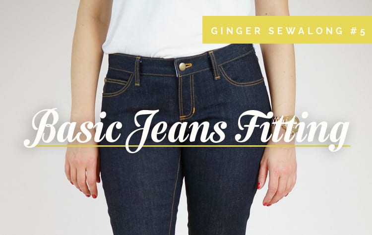
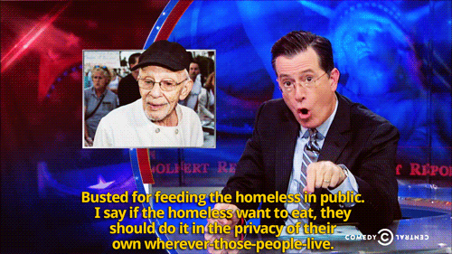
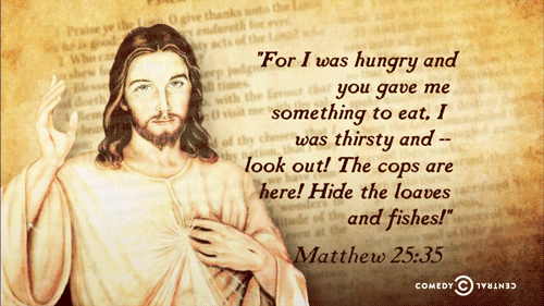
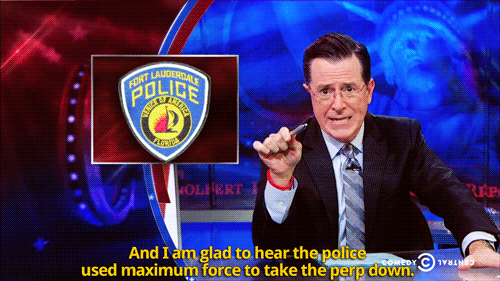
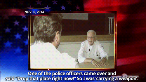
O ne more post before we get into actual construction folks! We’ve already discussed sourcing denim, gathering supplies, personalizing our pattern, and the best seam finishes for sewing jeans. Today we are going to break down fitting.
Pants fitting gets a bad rap. We’ve all read the horror stories. However, I think the Ginger jeans are pretty forgiving to fit and a great introduction to making pants. Because they are designed to sit close to the body, and because stretch denim is so forgiving, you can avoid dealing with some of the fitting issues you’ll encounter working with traditional non-stretch woven fabrics where every minor issue is a little more evident.
I think far too many of us are intimidated to make pants because we are focused on achieving “perfection”. Perfection is a dangerous goal. This is a lesson I am learning personally as well as in my sewing practice, since I am one of those type-A control-freaks who struggles with letting go. When you are only satisfied by perfection, you are bound to be disappointed again and again; perfection is so rarely achieved. Life, sewing, all of it, is a process. We learn something new along each step of the journey, and I truly believe that getting tripped up by the flaws, rather than celebrating the victories, takes the fun out of making. Too many of us beat ourselves up over minor issues that only we really see; a beautiful handmade garment that was made with love and care gets reduced to the sum of it’s flaws. Where is the joy in that? I think it is worthwhile to point out that we are much harder on the garments we make than those we buy. If you are really struggling with fitting something, take a clearer look at a RTW garment you already own and love, and see if you can’t find some of the same “problems” there. Chances are you will; we just don’t tend to view our store-bought garments with the same overly-critical eyes we use to see ourselves and the things we make. So, all of this to say: let us be kind to ourselves, and enjoy the fitting process for everything it teaches us about our bodies and about making. It’s not something to be scared of; it’s part of the journey. (Sorry if I’m getting a little philosophical in a fitting post, but I believe going into a new project with the right attitude is key.)
Moving on, I hemmed and hawed about where to place this post; before or after we’ve cut and basted our pants together? In the end, I thought we’d discuss it now so you have all the tools you need to analyze any potential issues at the basting stage. If you don’t have any crappy denim to muslin with, you may want to make your seam allowances 1″ at the front and back crotch and inseam just in case you want a little room to play with, but it’s not mandatory.
I will get started with some basic pattern modifications, and move on to addressing more specific fitting issues. This is not an exhaustive list of pants fitting adjustments; if you’d like more help I highly suggest picking up a copy of Pants for Real People and/or Fitting and Pattern Alteration
(the first editions of this book is much cheaper!)
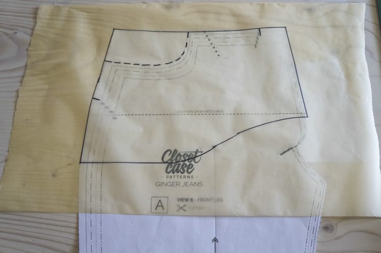
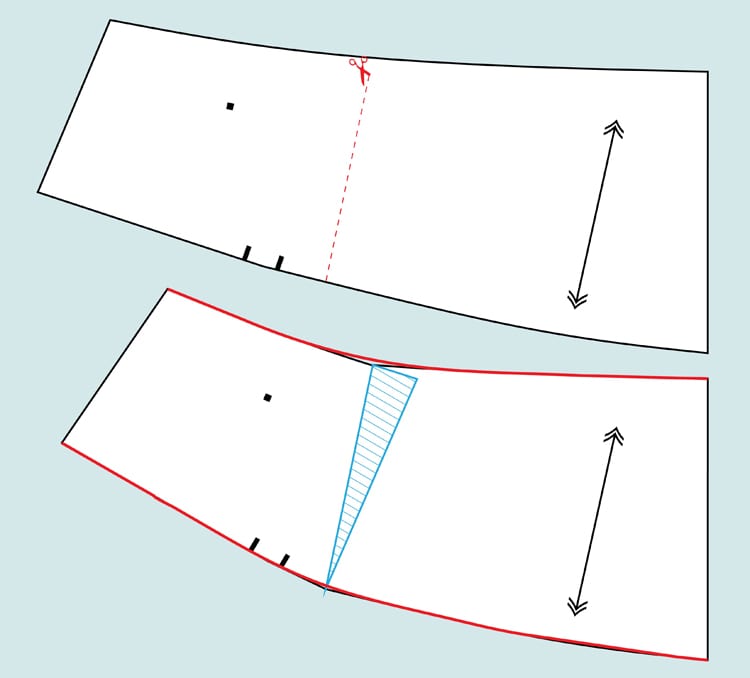
If you are high or low waisted, you may need to adjust the length of the rise. It’s a simple mod. At the “Lengthen & Shorten here” line, cut your pattern and spread or overlap the pieces the required amount. Smooth the curve to blend at the hip. Repeat for the back leg. You’ll also need to lengthen your fly shield and fly interfacing pieces the same length, but your pocket lining will stay the same.
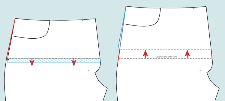
Left: Shorten rise, Right: Lengthen rise
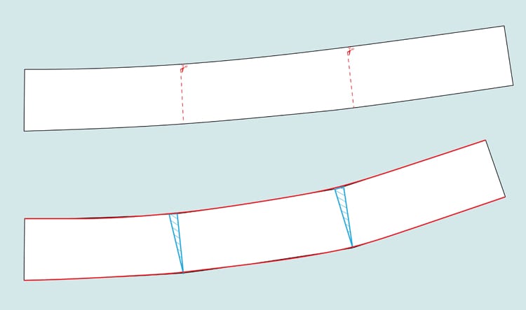
It’s important to lengthen your legs at the knee and not at the ankle unless you want the ankle to be wider. It’s the same process as above – cut your pattern on the indicated line at the knee and spread or overlap the desired amount. True your lines after you’ve taped the pieces together.
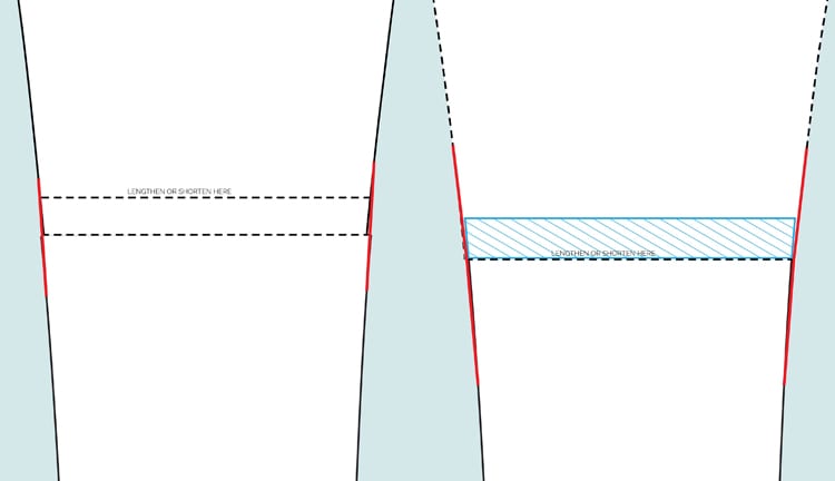
Left: Lengthen leg, Right: shorten leg
I drafted a pocket stay for my last pair of high-waisted Gingers and the effect was pretty astonishing, to the point where I berated myself for not having included it in the final pattern. Thankfully it’s quite simple to do yourself. Basically, a pocket stay is a pocket lining that has been sewn into the fly front. When cut from a stable lining like quilting cotton, it sucks your tummy in so no one can tell that you ate a whole Toblerone for breakfast. I had my doubts that it would make much of a difference, but it really does! It makes your jeans more snug in front, but you get a nice smooth line. If you’re making version 2 and don’t have a 6-pack, I highly suggest you give it a try! All you have to do is fold your pocket piece in half and line it up with the front leg so the pocket shapes align and the notches meet. Then trace the shape of the pocket lining, but continue the bottom edge of the lining into a smooth upward curve so it dies into the fly extension.Trace the fly extension and top of the jeans, as well as the curved pocket shape.
Since this is now a two piece lining, you also need a mirrored piece with the pocket shape cut out. Your two lining pieces will now look something like this:
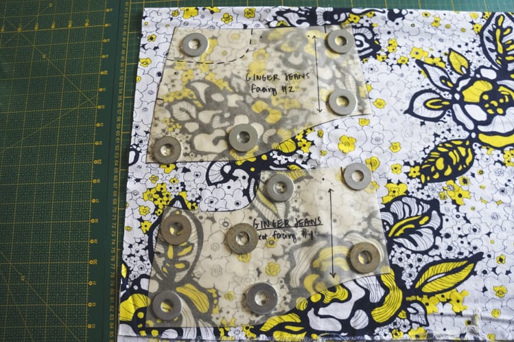
If you choose to make a pocket stay, I’ll be showing you how to sew it into your jeans when we get to that point next week.
This is typically where people get all sweaty and nervous when making pants. Making slight changes to the crotch curve is a common adjustment, since all of our crotches are unique snowflakes (without a doubt the weirdest sentence I’ve ever written). The key is small, incremental steps. Try not to make changes greater than 1/4″ – you’d be surprised what happens with tiny adjustments.
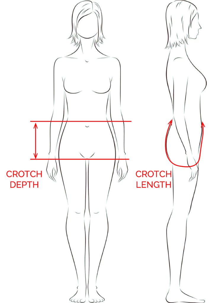
The biggest thing to understand is depth versus length. Think of crotch depth as height or rise – it is the distance from the bottom of your crotch to the top of the pants. Crotch length is how long the total crotch is if you were to measure from the top of the center-front down to the bottom and back up to the top of the center-back. These two factors work together to determine the fit of the crotch, and if you’re having any issues with crotch fitting, the trick is to find a balance between the two. Adding to the length can effect the depth and vice versa. This is why we make small incremental changes; much easier to assess progress!
I think the Ginger crotch curve is a pretty good starting point, but here is what to do if you’re seeing some crotch weirdness.
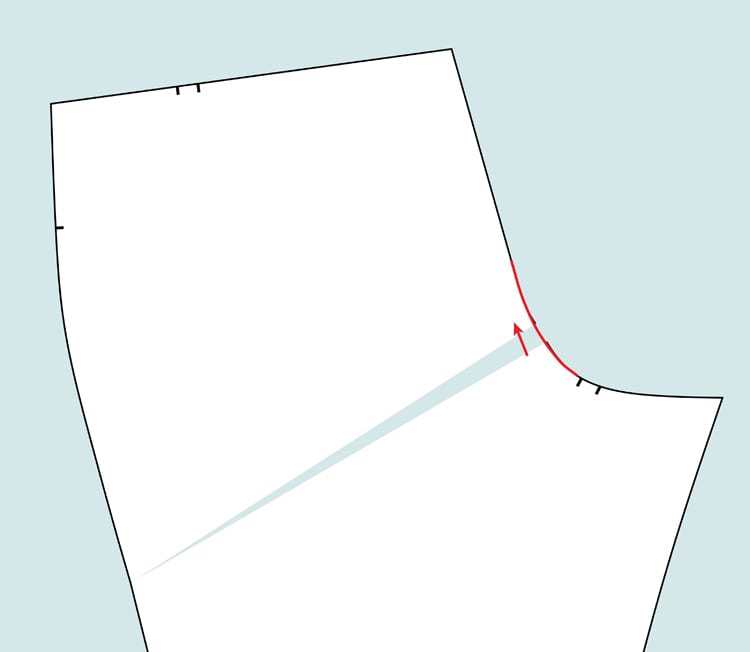
If you have lines at your crotch pointing up like a smile, your crotch may be too short. Try tweaking the angle and length of that crotch curve (again, not making adjustments bigger than 1/4″) and see if those smile lines start to take a hike.
If you see frown lines at the crotch pointing down, your crotch is probably a little too long. Try taking a little off the length and check to see if it corrects the problem. Below I am showing it with a slightly more curved angle, but you can also simply carve a little off the end. The goal is to find the balance between crotch length and depth that works for you.
EDITED: I realized I forgot to talk about the actual shape of the crotch curve here. To shorten the crotch, you can remove length as I stated above, but you can also shorten it by flattening out the crotch curve. Depending on the shape of your body, you may want a slightly flatter line below the crotch pivot point. If simply shortening it doesn’t work, try taking out 1/8″-1/4″ in the shape of the curve to see if that makes a difference!
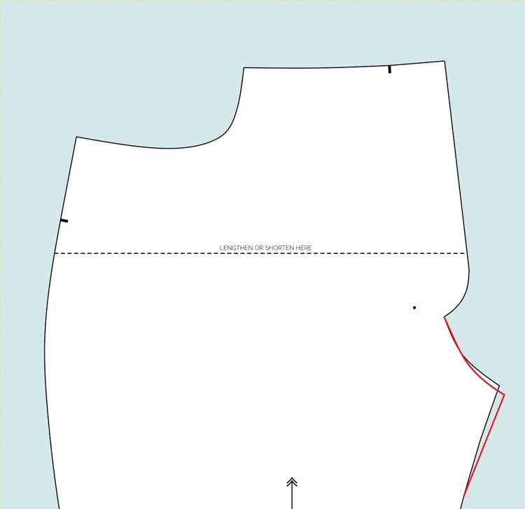
If you are seeing pulling at the inner thigh, or if there seems to be excess fabric there, you will need to adjust the inseam. Depending on the adjustment, you will either be taking in or letting out the inseam, tapering to above the knee. For this adjustment, you want to take in from the front and back leg. Keep in mind that the back crotch curve at the thigh is a little longer, so experiment with taking a smidge more from the back than from the front.
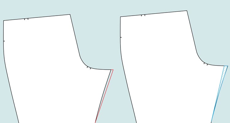
Left: adding to inseam for full thigh, Right: subtracting from inseam for thin thigh
If your pants feel tight at the calf or you are seeing a lot of horizontal lines above the calf, you have full or hyper-extended calves. If letting out the seams doesn’t help, you can do a full calf adjustment. Cut your pattern piece up the middle of the leg and then angle on either side to just above the knee. Spread your pieces and tape paper below to secure. Straighten the bottom seam line.
There are a few ways to make a full seat adjustment, some more complicated than others. A simple fix is to cut a hinge from the crotch curve to below the hip. Rotate up the desired amount to add to the curve and give you a little more booty room. This effects the angle or pitch of the back crotch seam – a more angled seam is better for fuller bums.
A flat seat adjustment is done just like a full seat adjustment, except this time your hinge should rotate down so you can remove length from the back seat curve and subtract some of the excess fabric over the bum. Like in the adjustment above, you are essentially changing the pitch or angle of the back crotch curve. Flatter bums need a straighter seam here.
If you have a sway back, or a more pronounced difference between waist and hip, you may notice some gaping at the back. The quick fix is to dart out the excess. Once you know what to remove, cut a hinge into your yoke pattern piece and rotate in to remove the excess along the top edge. It is also possible to remove a wedge at the center back, but be careful as this changes the back pitch of the seat.
If you are noticing gaping at the waistband, you may need to add a little more curve to the contour waistband. During the muslin phase, pinch out darts where necessary and transfer to your pattern piece by cutting a few hinges and rotating in the desired amount.
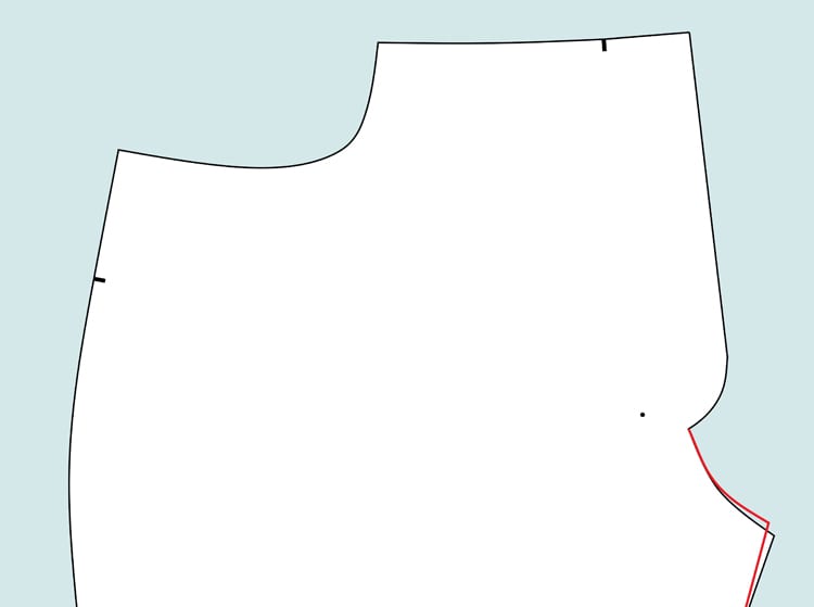
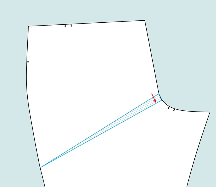
This is a fairly common problem that results from too much of a difference between the curve of the seat and the size of the upper thigh. Please note that there is an important difference between sitting ease and actual pooling fabric. You need some leeway back there so you can sit and move comfortably. You will rarely if ever see skinny jeans without some horizontal lines under the bum; it’s just the way it is.
If you’re seeing egregious folds of fabric you have two options. Kenneth King recommends pinning out the access in a horizontal line, transferring the amount to the pattern, smoothing out the curve at the thigh, and adding the length you took out from the thigh to the ankle. I’ve heard mixed reviews about this method. Betsy at Skinny Bitch Curvy Chick recommended a fitting trick that she says works wonders at removing fabric and helping with thigh pull lines, so if the excess under your butt is driving you mad, try this!
Drop the crotch curve of the back leg about a half inch, and draw a diagonal line from the new height of the center back seat to the side seam, like so:

The back inseam is now a 1/2″ shorter than the front inseam. If you ease the shorter back inseam into the front inseam between the crotch and the knee, you will force the fabric to cling to your thigh. This is apparently an old pro fitting trick, and I’ll be trying it for my next pair to see how it works.
Whew. These are some basic tips to get you started. Feel free to post progress pics to the Flickr pool and we can try and diagnose what’s going on over the next few weeks.
Tomorrow: WE FINALLY START CUTTING!
Happy Movember, DPLA friends! The month of November brings about a great many things—Thanksgiving, brisk breezes, falling leaves—including ditching the razor for a good cause. Movember encourages participants to grow out mustaches and beards to raise awareness for men’s health issues.
In celebration, we’re providing some historic grooming inspiration. Check back once a week for a selection of some of the best beards and mustaches from the DPLA collection, and up your “Movember” game!
This week, we’re featuring the one thing the North and South could unite around: excellent facial hair.
Death is different now. In a time of networks and social media, it’s not just having a song remind you of your deceased loved one anymore, it’s Spotify suggesting you listen to their playlists. It’s scrolling just a bit too far too soon and seeing their last shares on Twitter or Facebook. It’s not just figuring out funerals and atom-based belongings granted through wills (or figuring things out there wasn’t any pre-planning), it’s a faceless mass of internet informing you that your friend has died. It’s not just compiling half-finished scrawled songs and old love notes, it’s debating cracking the password for a laptop full of memories. Because the internet and technology haven’t just changed how we live – it’s changed what happens in death. And we can simply be awash in tragedy in these new ways, or we can use those new connections to show our care and values, even through death.
Today the spontaneity of planning, which makes it possible to search for a place to eat with your incoming friend while already out the door, forms habits making the avoidance of planning for death even easier. But after working through the unexpected deaths of a number of networked friends, I have started explicitly planning for the eventuality of my own death, to ease the burden on others. I’ve set up a living will (detailing things like whether I want to be kept on life support — I don’t), a will (what to do with my corpus and my corpse — open them up and share the contents), and mechanisms for notifying the many communities I inhabit, helping them find each other for support. The compartmentalization of online selves otherwise makes discrete and care-full notifications difficult, and sadly the current viable option is mass broadcast.
Because I’m also from the parts of the internet that care about open access and free software, friends and I have taken my death preparations and formed a guide for the bits of postmortem planning other guides may have missed. Based on ideas from open access and information security, it includes topics like how to deal with passwords, contact lists, plans for account deletion while archiving information, and donating one’s body to science in ways that support open research.
This living documentation is called NetworkedMortality, and I hope it helps others to start thinking about and planning for the inevitable, either privately or in this wiki-based and public place. Just as the internet is about creating, storing, and transmitting knowledge, this guide is about contributing to something larger than the individual. It’s about continuing to build the commons, establishing protocols for death in the digital. The sorrow of death need not also be accompanied by confusion over what intentions would have been or who should know what. Funeral home directors and lawyers have helped guide us through the protocols of death in the better-known world. In this new space those steps are considered by Twitter, Facebook, and Google, but I at least would prefer to trust people I know to deal with my wishes more accurately and with more love. We’ll be hosting a “death drill” to test out these new protocols on December 13th from 2p-5p at the Berkman Center.
Too often, we think only about the short term – this quarter, this school year, this laughably short short life span – when considering how we plan as well as what we build. We must instead intentionally look to the public future, and our responsibility as members of that shared story. We must contribute to freely available knowledge which lasts beyond our brief moments. An unavoidable part of life is death. Let’s care for each other, and hold true to our values, through the entirety. Let’s network our mortality, together.
P.S.
It is possible to speak about death without fear – I hope you can act from this place. If you are in danger of harming yourself, please get help, rather than indirectly indicating through things like estate planning.

West Point photographs by Kristine Potter in her Greenpoint studio, 2010 (photo by the author for Hyperallergic)
I first encountered Kristine Potter‘s work in her studio in Greenpoint in 2010. I remember her West Point series, known as The Grey Line, which consisted of large black and white images of cadets at the military academy. She came across as protective of the images and allowed me to photograph them only obliquely, and from a slight distance. The above photo conveys a great deal about the work and its scale. These stark images are not your typical über-masculine meditations on future soldiers, but they blur subject and background, often feeling like the men — they are all male — disappear into the landscape.

Kristine Potter (photo courtesy the artist)
Potter, who still lives and works in Brooklyn, comes from a family of military men, so the project was very personal. The way she guarded the images from my camera in 2010, a few months before she was planning to exhibit them at Daniel Cooney Fine Art, suggested to me the body of work was emotionally complicated and unresolved for her.
Then, last week, Buzzfeed writer Gabriel H. Sanchez posted “An Intimate Look At The Cadets Of West Point,” which included (with Potter’s permission) many of the photographs from The Grey Line, interspersing the images with quotes from the artist. It wasn’t the first time Potter had been the subject of internet attention, but Buzzfeed coverage can invite a tidal wave of digs, snark, and ridicule on any given subject.
The comments on the Buzzfeed article don’t come across as particularly offensive compared to the usual banter and taunts found online, but they were enough for Potter to request that the images be removed. Potter explains that many of the subjects themselves were uncomfortable with the comments, some of which accused the photographer and subject of disrespecting West Point, which was never anyone’s intention. Potter felt that the negativity and mindless criticality on the post was snowballing. (The twitterverse also had a field day.) Since this is the internet, even though Buzzfeed honored the photographer’s request, the post survives in archival form.

One of Kristine Potter’s image from her The Grey Line series (image courtesy the artist) (click to enlarge)
Nevertheless, people react when an article gets “censored.” Media types are particularly sensitive to requests to remove critical items, afraid that exceptions like this one will lead to a deluge of requests that court-shy publishers may comply with. When Buzzfeed removed the post, Gawker responded with a provocative headline, “Buzzfeed Deletes Homoerotic Photos of West Point Cadets,” ending the story with: “Gawker readers are invited to share homoerotic military photos of themselves or others below. No judgment.” The website didn’t have permission to post Potter’s images, but they bypassed that by embedding tweets, which are difficult to police for copyright.
“Jeeze. [sic] I’ll try and be careful not to look homoerotic next time someone takes a picture of me,” one Gawker commenter jabbed. “Battle of the Bulge,” another joked. “The real crime is the low-contrast black-and-white. Too much ‘T-Max’, not enough ‘Tri-X’. … Also the homoeroticism. Say nay to gay,” a blatant homophobe offered.
This isn’t the first time I’ve seen an artist unsure of how to cope with online pressure. I’ve known many incidents where performance artists were harassed as the result of nude performances on YouTube or ridiculed by commenters who have an ax to grind. Artist Jason Hanasik, who works in a similar vein to Potter, was disappointed in the Buzzfeed and Gawker responses. Reacting in Four Two Nine Magazine, Hanasik writes:
If we follow the logic which has been presented in light of the Buzzfeed and Gawker articles and comments, if one wrestles in the woods, lies in repose in a meadow, sits for a portrait in one’s uniform and stares into a camera, and walks through the forest with a friend — amongst other pedestrian activities — we too have trespassed across an unspoken line, perhaps that is ‘The Grey Line’ Kristine Potter wants us to expand?
I decided to talk to Potter about the fallout from the Buzzfeed post and its redaction. She requested that the story not be illustrated with any photographs containing multiple soldiers (except for one), as those have been most targeted by negative commenters, or photographs of officers who have asked her that their image not be used. This is our email conversation.
* * *

One of Kristine Potter’s image from her The Grey Line series (image courtesy the artist)
Hrag Vartanian: What was your original intention with the photo series?
Kristine Potter: I grew up around the military with a long, long line of military men in my family tree. I was very aware of the image and presence of that kind of man. I was particularly aware of the parameters of that image; what seemed to be allowed, and what wasn’t. The original intention of the work was to look at the transition from civilian to officer. For me, that is a perfect place to look at the construction of that image and to consider the fact that it is only one facet of the human experience. I wanted to remind myself as much as anyone, that our soldiers are human, with complex emotions and experiences in this world. I wanted to broaden the way they could be seen.
My choice to only look at men was the more deeply personal decision. I needed to separate this work from the purely documentary notion of the expose of West Point. My experience with the military had always been with men and so it seemed like the right way to keep this work close to my own biography. In retrospect, I think I just had more ideas about what I envisioned was a kind of learned masculinity.
HV: Did people’s responses surprise you?
KP: The work has been around for years. It’s been through exhibitions and a modest amount of critical review. For the most part, the reception has been very positive. People have been able to parse out a tone of sensitivity that the military rarely affords its enlisted troops. Occasionally the topic would veer to the sexual, but that certainly wasn’t the dominant overtone. The truth is, the work always lived in a space (the art world) where people are prepared to look more deeply into images and their signifiers.
When the work got displayed on Buzzfeed, the audience grew exponentially, and it did not benefit from my thorough contextualization. Suddenly, a quarter-of-a-million people saw it in one day and saw it in the same way you might see “21 Cute Kittens For Your Monday Morning.” The comment section filled up with puzzling remarks from mostly current and former cadets. It was all terribly negative and shocking to me. The comments went immediately to homophobic slurs — not even thinly veiled. Out of courtesy to the cadets (now officers) who posed for me, I pulled the article. My impulse was to protect them from any further mischaracterizations. While I’m well aware of the razzing that goes on between cadets, and particularly between the Army and the Navy (a rivalry that played out in the comments section), I did not anticipate the kind of vitriol that emerged. I have to say, “Don’t Ask, “Don’t Tell” being repealed seems to have changed very little about that culture.
Among the multitude of questions I asked myself during this episode, one of the larger ones was “Is this what happens when you take ‘Art’ out of the ‘Art World’?”

One of Kristine Potter’s image from her The Grey Line series (image courtesy the artist)
HV: I find it interesting you felt the need to protect the men from reactions. It seems antithetical to the way we often think of the military and soldiers. Why not dismiss the comments and allow the project to take on its own life on the internet? Are you afraid it might overwhelm the project?
KP: I cannot control people’s responses to my work and I don’t want to give the impression that I can’t take the heat. If it were all about me and my camerawork, I’d have let it play out. I was actually amused by the few comments that went there. But I feel sensitive about the fact that most of those ridiculous comments were slurs about the cadets by other cadets.
Here’s the thing: when you photograph another individual there is a line of trust (however brief) that must be established. I work with a view camera, it takes a while to set up, the subject has to hold still, take direction, etc. We have to work together to make the picture. I’m not in the business of manipulating people, so I talk a lot about my ideas and my desire to tell stories with my images. When the context of these photographs got overrun with the flippant, immature, and malicious opinions of others on Buzzfeed and Gawker, my instinct was to protect. There was no evidence that letting it continue would encourage more thoughtful responses.
I’ve considered the critique of me “backing down,” but I don’t see it that way. I defend the work. It just wasn’t a constructive conversation for anyone and out of courtesy to the cadets who posed, I opted to remove the images from a forum that seemed challenged to consider the photographs with any depth.
HV: You talk about taking “art” out of the “art world” but what is the essence of that three-letter world? Is it a sense of a safe space? I’m curious what your soul-searching on the matter has revealed.
KP: I’ve suffered the slings and arrows of some incredibly intelligent minds in the art world. I’ve even had it happen in a public forum. It doesn’t feel great, but I’m not afraid of an intelligent conversation about ideas and images. Art is interesting when it challenges. I suppose the three-letter word presupposes that those engaged are willing to consider what they’re seeing with some depth.
I’m not trying to be an elitist. I actually like the idea that this work, in a larger forum, could start some engaging conversations about masculinity and the very narrow spectrum in which we allow men to be viewed. And also about beauty, which is a word I’m not afraid of attaching to the work. I’d even be happy if someone actually acknowledged that it was a woman who made this work. But so far, one thing that is very well established after this incident, is that images of men that are not hyper-masculine make certain people very uncomfortable.
HV: That’s an interesting point around masculinity. In some ways it feels like an attempt at shaming them for being vulnerable in front of a photographer. I keep wondering how some of these men would be feeling right now if any of them happen to be queer and had to read the homophobia in the comments of the posts. Do you think people assume a “male gaze” when they look at these photos, even though they are taken by a woman?
KP: I think about that too, about how using homophobic slurs hurts people in dynamically different ways. How is it still so pervasive an insult after the repeal of “Don’t Ask, Don’t Tell?” Why should “vulnerable” be translated as anything other than one of our myriad of human experiences? If my day-to-day job hazard included possibly being killed in battle, I’m certain I would travel through a lot of human emotions, even if I was just training for eventual deployment. Why can’t we talk about that?
And yes, I do think that many people assume a male gaze, in almost everything. Our culture teaches us to see this way and unless you fortify your awareness against it, it is somewhat of a natural disposition. I think that is particularly true with images of the human form. If it is covetable or affectionate in any way, it must be for a man’s desires. With photography, I think in many cases it is relevant to consider who is behind the camera. In this case, it is a heterosexual woman. So why characterize the images as homoerotic? It’s just a knee-jerk reaction based on anxiety with a perceived lack of male dominance. That’s how I interpret it, anyways.

One of Kristine Potter’s image from her The Grey Line series (image courtesy the artist)
HV: Do you see anything political in your photo series? I wonder how you think people read politics into this body of work.
KP: I always see the political in the personal. But more specifically, I made this work during the height of the Iraq and Afghanistan wars. In some way, I was trying to disrupt the binary language that gets publicly heightened in conflict. Right/Wrong, Good/Evil, With Us or Against Us. My impulse to find psychological nuance felt like it complicated those hardened narratives. And it’s not because I blurred the lines between say, “Good” and “Evil.” It was more about expanding our vision of what the military experience could encompass psychologically, that was my protest.
I would argue that acknowledging the humanity in people is a critical and important way to support them. But I never intended for this work to be socially active in that way. It is all very complicated: War, the necessity of having a strong army, the battle of peace keeping — all of it. I don’t think there is any one statement that can encompass its complexity. I look to other photographers who work around the military industrial complex (An-My Le, Jason Hanasik, and others) and I think … none of us are saying definitively “Yes, War!” or “No Bad!” Because it would be shortsighted to do so. My voice has always centered around the human drama. These are people and they get used in the political sphere. But in the end, they’re human and I find that really compelling.
HV: If you had to do it all again, would you have asked to remove the photos from Buzzfeed or let them stay?
KP: I don’t know if I have enough space between me and the event to have clarity about that yet. Right now, I would still say yes. I think it was the right thing to do considering the circumstances. We all have to weigh the pros and cons of any situation and the pros were so small to me. “Trending” is not really something I care about. I can say with some humor, that going viral feels worse than getting a very bad virus.
But who knows, maybe in time I will see that this had some ripple in the real world that would not have happened without the hysteria. And if Art can still affect ideas and thoughts outside of our small, academic circles, then I think that is kind of amazing. I’ll probably never know.
A mother who purchased an "Evil Stick" for her 3-year-old was unhappy when she found it contained a disturbing image. She wants the store to remove the item from its shelves.
It looks like a magic fairy princess wand but when you push the button it laughs manically and a light flashes behind the foil star top, revealing a picture of a demonic woman cutting herself with a knife.
Russian Sledgesvia willowfire
Russian Sledgesthe most metal unique identifiers for the most metal researchers
Russian Sledgesvia rosalind
Russian Sledgesvia willowbl00
#neverevergo


daaaaaaaaaaaaaaaaaaaaaaaaaaaaaaaaaammmmmmmmmmmmmmmmmmmmmnnnnnnnnnnnnnnnnnnnnnnnnnnnnnnnnnn
Russian Sledgesmy feelings
Russian Sledgesvia overbey ("North Korean public performances of emotion are just so eerily similar to Pentecostal church.")

Kim Jong-un with Korean People’s Army troops.
Russian Sledgesvia hosalind


A graphic guide to Cemetery Symbolism, created by Michelle Enemark, text by Allison C. Meier. Click on the above pictures to enlargen.
Russian Sledgesamherst!
Russian Sledgesthey sell these at porter square books now and I ogle them constantly
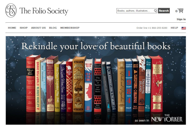
They have been in business for 65 years and have almost 2,000 titles under their belt.
They produce some of the most beautiful and well-made books on the planet.
They work with the leading illustrators in the world.
Yet the Folio Society remains far from a household name.
Why?
Their business model stinks.
They operated exclusively as a membership book club and didn’t spend any energy actively promoting their titles until two years ago!
Focusing on high-quality production values centered on packaging, typography, and illustration should not automatically negate attention to distribution, marketing and building brand awareness. It is the age old quandary faced by so many publishers of the well-made book.
During my years at Wessel & Lieberman we tried numerous times to carry their books in our shop but to no avail. One of the illustrators we represented, Charles van Sandwyk, illustrated Andrew Lang’s Blue Fairy Book for them and we were eager to both carry it and promote it. No such luck, Mark Wessel ended up becoming a member so we could acquire copies to provide to our clients who collected van Sandwyk’s books.
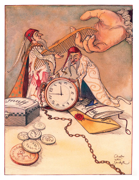 illustration by Charles van Sandwyk for the Blue Fairy Book
Hopefully this is about to change. Their website has finally opened its offerings to anyone, member or not and they have entered the world of social media. They have an advertising campaign underway in The New Yorker and are showing up at and sponsoring various book festivals. I am not sure they have included booksellers into their new mix yet but clearly they are making a concerted effort to emerge from the marketing darkness.
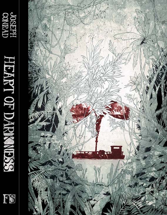
Ironically, the PR push coincides with the release of their latest book, a new edition of Joseph Conrad’s Heart of Darkness beautifully illustrated by Sean McSorley.
Folio Society Tries To Raise Its Profile | Publisher’s Weekly
Illustrating a Heart of Darkness | Creative Review
Russian Sledges5.b. then why do I keep sewing bow ties for dudes
via multitask suicide
“First of all,” Charlie said, “when people ask me if I’m married, I always say, ‘Yes, but I’m not a fanatic about it.’
“So here’s Number One: Do not wear bows all the time. Keep the viewer off balance. Wear them once in a while, the way you might eat liver.

“Number Two: Never wear a bow tie to an interview or a pitch for new business. People will concentrate on the tie rather than on what you are saying.
“Number Three: In the men’s-clothing business ten percent of tie sales were in bows … forever. Today it’s fifteen percent or twenty percent, which is unprecedented. This tells me that there is such ambiguity of roles today that men are desperate to assert something.
“Number Four: You would be amazed at the practical reasons people wear bows. Doctors have always worn them, because patients can’t reach up and yank on them the way they could with the four-in-hands. Certain men wear them in the summer because they eat more salads. Dressing can splash on long ties.
“And Number Five: Men who wear bow ties care more about themselves than they do about you.”
— as told to John D. Spooner
Russian Sledges#yitb
5.00 USD
Japan!
100% cotton dobby
Lightweight and sturdy
1/2 metre (50cm x 110cm , 19" x 43")
If you would like continuous yardage please change the quantity at the checkout.
Parcels are shipped via small packet international airmail from Japan.
Japan Post does not provide tracking numbers for small packet airmail.
A shipping upgrade with a tracking number and insurance can be purchased
for an additional $5. If you would like to upgrade to registered small packet airmail
please let me know.
Thank you.
All images © Miss Matatabi
Russian Sledgesdoughnuts
8.00 USD
Yoshiko Jinzenji for Yuwa
100% cotton oxford
Medium weight
1/2 metre (50cm x 110cm, 19" x 43")
If you would like continuous yardage please change the quantity at the checkout.
Parcels are shipped via small packet international airmail from Japan.
Japan Post does not provide tracking numbers for small packet airmail.
A shipping upgrade with a tracking number and insurance can be purchased
for an additional $5. If you would like to upgrade to registered small packet airmail
please let me know.
Thank you.
All images © Miss Matatabi
Russian Sledgesvia rosalind

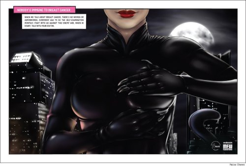
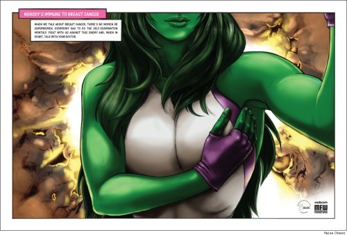

Nobody’s immune to breast cancer.
Best. Ever.
Get that on your blogs. NOW.putting this on my blog for reasons.
Reblogging for similar reasons.
[This is fucking awesome.]
OOC: Very good idea!!
still my fav
OKAY LISTEN UP BECAUSE THERE IS SOMETHING SUPER IMPORTANT ABOUT THIS CAMPAIGN AND MOST OF YOU PROBABLY DON’T KNOW
It’s the inclusion of Storm. (Storm? Pretty sure that’s Storm.) And in a way where, yes, representation saves lives.
See, here’s a weird medical fact: black women are more likely to get breast cancer and nobody knows why. It’s a medical mystery. Now, I want you to do a fun exercise: tell me the last time you saw a breast cancer awareness campaign that included black women. Go on, I’ll wait. Speaking as someone active with the cause whose aunt is even more active with the cause, here’s my answer: In eight years of working for awareness across four states, I have never seen a single black woman in any breast cancer campaign. Ever.
Black women are also more likely to die of breast cancer because they’re less likely to catch it early. That’s not genetics, that’s math. The sooner you begin treatment, the better your prognosis. Black women are less likely to know how to do self-exams and because of the socioeconomic divide, less likely to see an OB/GYN annually. And they’re ignored by awareness campaigns.
Tell your black friends. And spread this like wildfire. Because they are more at risk than you are.
Russian Sledgesvia multitask suicide

Old LL Bean catalogs can be really fun to flip through this time of year. To be sure, they print and mail out catalogs year-round, but it’s their rubber duck boots, handsewn moccasins, and heavy field coats that feel so representative of the company – and so quintessentially fall.
I’ve collected some of their catalogs throughout the years. Here’s one from 1959, which was printed just a short while after they first introduced their women’s wear collection. Like with most mail order catalogs (at those dealing with clothing), the women’s stuff is put at the front of the book, while menswear is placed at the back. Included in this one is also LL Bean’s outdoor gear spread throughout. I’ve skipped the women’s wear and outdoor supplies for the sake of brevity, but there are still plenty of menswear things to keep one amused. And impressively, fifty-five years later, also plenty of things I’d happily buy.
The whole Americana trend seems to have passed, as fewer and fewer menswear blogs talk about brands such as LL Bean. However, as the writer behind Heavy Tweed Jacket once wrote about this stuff (when he was still writing), they feel forever appealing because they have a sense of “genuineness” to them. Perhaps a little hokey, but also hard to deny.


Russian Sledgesvia firehose via Matthew Connor

John Carpenter’s synth-driven film scores have experienced a cultural resurgence of late, referenced by modern composers in movies like The Guest, Cold In July, and Drive, and inspiring such electronic acts as Steve Moore, Com Truise, Umberto, Power Glove, Pye Corner Audio, and many others. Building on this momentum, Sacred Bones Records will release an album of new Carpenter music on February 3, 2015.
Titled Lost Themes, the album was originally rumored to be unreleased material that Carpenter had discarded for his previous films. But it turns out the songs are all new creations—although listeners are encouraged to envision Kurt Russell screaming in the foreground as they play. In the press release, Carpenter calls them “little moments of score from movies made in our imaginations.”
The track listing reads like discarded band names for a Tampa goth outfit:
1. Vortex
2. Obsidian
3. Fallen
4. Domain
5. Mystery ...
Russian Sledges#selfshare
larger/better: https://www.flickr.com/photos/sushiesque/15327360762/
Russian Sledges#selfshare
the least terrible welt pocket I've sewn so far
sushiesque posted a photo:

pattern (modified for straight leg): www.sewaholicpatterns.com/thurlow-trousers/
fabric ("kale"): www.robertkaufman.com/fabrics/shetland_flannel/SRKF-14770...
Russian Sledges#selfshare
sushiesque posted a photo:

pattern (modified for straight leg): www.sewaholicpatterns.com/thurlow-trousers/
fabric ("kale"): www.robertkaufman.com/fabrics/shetland_flannel/SRKF-14770...
Russian Sledges#selfshare
sushiesque posted a photo:

pattern (modified for straight leg): www.sewaholicpatterns.com/thurlow-trousers/
fabric ("kale"): www.robertkaufman.com/fabrics/shetland_flannel/SRKF-14770...
Russian Sledgesvia overbey
Jason Snell:
Amazon’s been headed in this direction for a while now. The original Kindle screen was 167 ppi; the Paperwhite upped that all the way to 212 ppi. The Paperwhite’s screen is actually quite good, but the Voyage’s is still noticeably better. To put it in Apple terms, this is really the first Kindle with a Retina display.
Unfortunately, Amazon has invested all of this effort in improved reading technology only to find itself completely at sea when it comes to typography. The Voyage still only offers six typefaces — many of them poor choices for this context — and still force-justifies every line (with no hyphenation!), creating variable-length gaps between words just so the right margin is straight rather than ragged. A device that’s dedicated to words on a page, one with a screen this beautiful, deserves better type options.
It’s depressing that all my typographic complaints from two years ago still stand. Amazon hasn’t improved the typography of Kindles in any way since then, other than by increasing the resolution of the display. I’ll repeat now what I wrote then:
Amazon’s goal should be for Kindle typography to equal print typography. They’re not even close. They get a pass on this only because all their competitors are just as bad or worse. Amazon should hire a world-class book designer to serve as product manager for the Kindle.
They should either devise or license (from Adobe?) a world-class hyphenation-justification algorithm while they’re at it. I’ll never buy another Kindle device until they fix this.
Update: Numerous readers have pointed out that they could just use the excellent open-source hyphenation algorithm from TeX.
Russian Sledgesdidn't make it past this paragraph
Russian Sledgeshey, multitask, bread & salt linked to our interview in their newsletter

A line of people waiting to order Palestinian takeout from the Conflict Kitchen (all photos courtesy Conflict Kitchen)
Conflict Kitchen, the social practice eatery in Pittsburgh, has come under fire from the Israel advocacy organization B’nai B’rith International over its current programming on Palestine. The restaurant’s menu and programming focus on the food and culture of countries where the US is engaged in a conflict, an effort to foster understanding between populations whose governments are at odds — but not everyone is eating up their culinary diplomacy. After a deluge of right-wing media coverage, the organization temporarily closed the restaurant on Friday after receiving a letter containing death threats.
In response to the letter from B’nai B’rith, the Heinz Endowments, which is chaired by Teresa Heinz Kerry (the wife of US Secretary of State John Kerry) and provided a $50,000 grant to Conflict Kitchen last year to help it relocate and develop new programming, appeared to disavow its support for the organization. “I want to be especially clear that its current program on Palestine was not funded by the endowments and we would not fund such a program, precisely because it appears to be terribly at odds with the mission of promoting understanding,” Heinz Endowments president Grant Oliphant wrote in a letter quoted in a B’nai B’rith release from October 31. But a follow-up statement from Oliphant, posted on the Heinz Endowments website, tempered the message: “Just to be clear, the Endowments has a long and proud history of supporting arts organizations whose work can be challenging or controversial, and I stand firmly with our staff in carrying that tradition forward.”

A tasting with members of the local Palestinian community
“The real story on our Palestinian version is that it is the most popular iteration to date, with 300–400 people a day coming to the restaurant,” Conflict Kitchen co-founders Jon Rubin and Dawn Weleski wrote in a blog post responding to the recent press. “Our public is approaching us with trust, support, and open minds.”
Media coverage of the affair has been sensationalist in tone, with headlines like “Anti-Israel restaurant receives funding from John Kerry’s wife’s foundation” (Fox News), “Report: John Kerry’s Wife Funds Radical Anti-US, Anti-Israel Eatery” (Breitbart), “Kitchen Nightmares” (Washington Free Beacon), and “Kerry’s Wife Funds Anti-Israel Pop Up Restaurant” (Breaking Israel News).
Attacks on Conflict Kitchen have revolved around two issues. Its Palestine-themed programming launched with a September 30 talk that featured West Bank-raised, Pittsburgh-based doctor Nael Aldweib and Ken Boas, a University of Pittsburgh professor who is also the chair of the board of the Israeli Committee Against House Demolitions-USA. That event drew criticism from Pittsburgh’s Jewish Chronicle for not including an Israeli perspective.

An order being handed over during the Iranian edition of Conflict Kitchen
“Promoting understanding is at the core of Conflict Kitchen’s mission,” Rubin and Weleski wrote. “We have demonstrated this in the past by presenting the food, culture, and viewpoints of Iranians, Afghans, Cubans, North Koreans, and Venezuelans. We believe that presenting the viewpoints of Palestinians promotes understanding of Palestinians.”
Subsequent attacks on the organization have centered on the text printed on their food wrappers, which include excerpts from interviews conducted in Palestine. One passage, quoted very selectively in the Washington Free Beacon, reads:
How can you compare Israeli F-16s, which are some of the best military planes in the world, to a few hundred homemade rockets? You’re punishing the Gazans who have been under your siege for eight years already. You’re attacking, arresting and killing guilty and innocent people alike. You have 1.8 million people in an area half the size of New York City, but without proper housing, water or infrastructure, and no way to make a living. They are banned from dealing with anyone outside Gaza. You’ re pushing them to the absolute extreme. So what do you expect? Palestinians are not going to just let you in and drop their arms. No, they’re going to kill and they are going to die.
“Conflict Kitchen’s goal is to increase the curiosity and understanding about the people who live in countries our government is in conflict with by directly exposing our customers to these cultures and viewpoints,” Rubin and Weleski wrote. “Another goal is to raise the public profile of the minority Afghan, Iranian, Cuban, Venezuelan, and Palestinian communities who live and work in our region, thereby creating a more accurate depiction of Pittsburgh’s cultural diversity. These new accusations will not alter Conflict Kitchen’s goals with our current Palestinian version. Rather, they strengthen why our mission to increase curiosity and understanding is more important than ever before.”

The Conflict Kitchen stand and an adjacent tent set up to host events
Conflict Kitchen was launched by Rubin, a Carnegie Mellon University art professor, and Weleski, a multidisciplinary artist, in 2010. Past programs have been devoted to Afghanistan, North Korea, Cuba, Iran, and Venezuela. In spite of the current media hysteria, the restaurant’s customers remain enthusiastic.
“Absolutely love the concept and the food here,” Yelp reviewer Elizabeth H. of Belle Mead, New Jersey, wrote on October 19. “Recently went to try their Palestinian food — the fattoush was excellent. Always have plenty of vegetarian options. People who work here are knowledgeable and love to talk when it’s less crowded. Favorite place to eat in Oakland.”