Shared posts

11 Feb 20:16

Twitter Feed for “Florida Man” Posts Real Headlines About the World’s Worst Superhero

by Rusty Blazenhoff

Florida Man

Florida Man” is a parody Twitter account that humorously posts real headlines about the “world’s worst superhero.”

Florida Man Attacks Three Women With Sword And Peanut Butter Sandwich | bit.ly/OZOguG

— Florida Man (@_FloridaMan) February 10, 2013

Florida Man Arrested For Giving Wedgies | kens5.com/news/Fla-man-a…

— Florida Man (@_FloridaMan) February 8, 2013

Florida Man Busted In Dinosaur-Smuggling Caper | miamiherald.com/2012/10/17/305…

— Florida Man (@_FloridaMan) February 9, 2013

11 Feb 20:15

Where USB Memory Sticks are Born

by bunnie

In January, I had the fortune of being a keynote speaker at LCA2013. One of the tchotchkes I received from the conference organizers was a little USB memory stick.
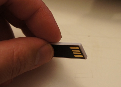
I thought it was a neat coincidence that I was in a factory that manufactured exactly such memory sticks about a week before the conference. In fact, I managed to score a rare treat: the factory owner gave me a sheet of raw chip-on-flex, prior to bonding and encapsulation, to take home.

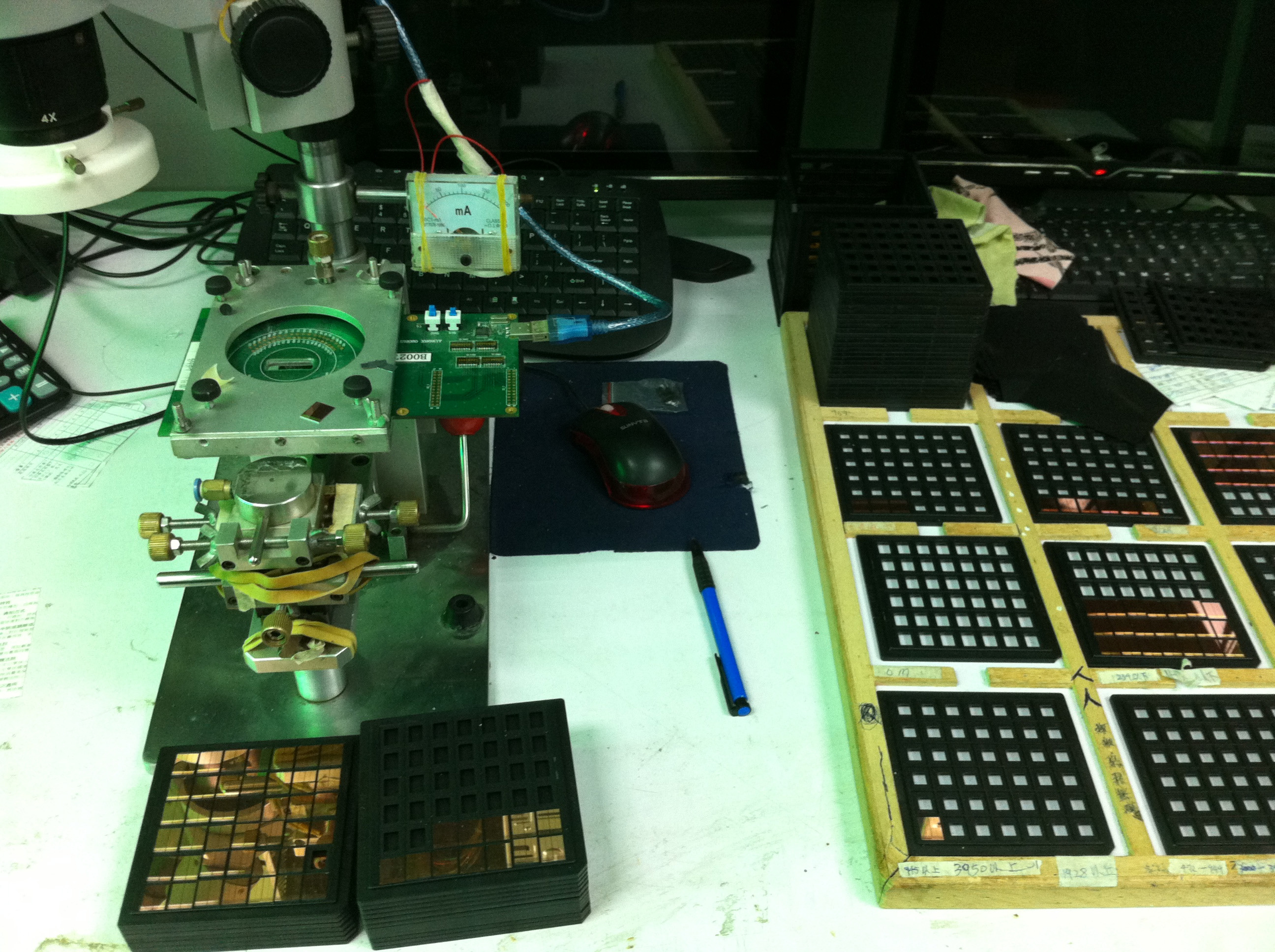
The USB sticks start life as bare FLASH memory chips. Prior to mounting on PCBs, the chips are screened for capacity and functionality. Below is a photo of the workstation where this happens:
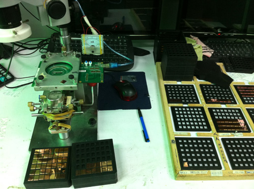
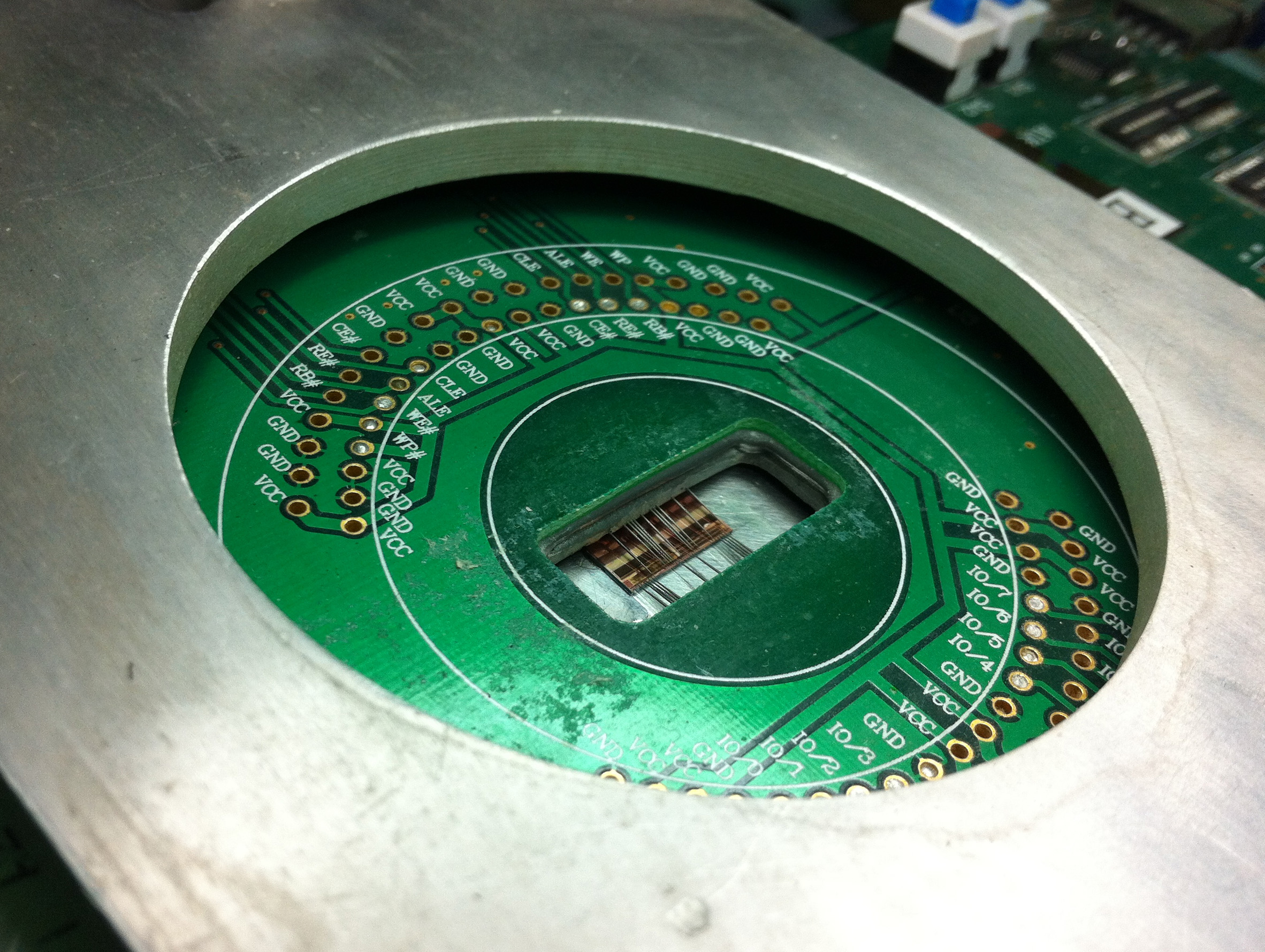
In the image, you can see stacks of bare-die FLASH chips, awaiting screening with a probe card. I love the analog current meter and the use of rubber bands to hold it all together. The probe card has tiny needles on it that touch down on microscopic (less than 100-micron square) contacts on the chip surfaces. Below is what a probe card looks like.
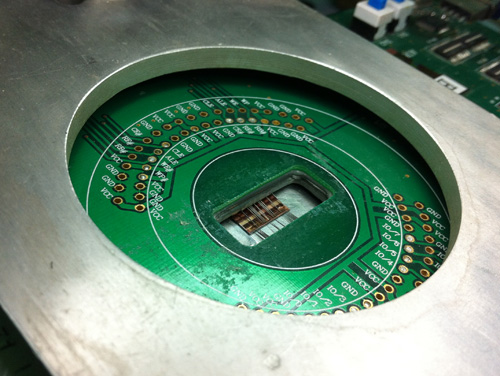
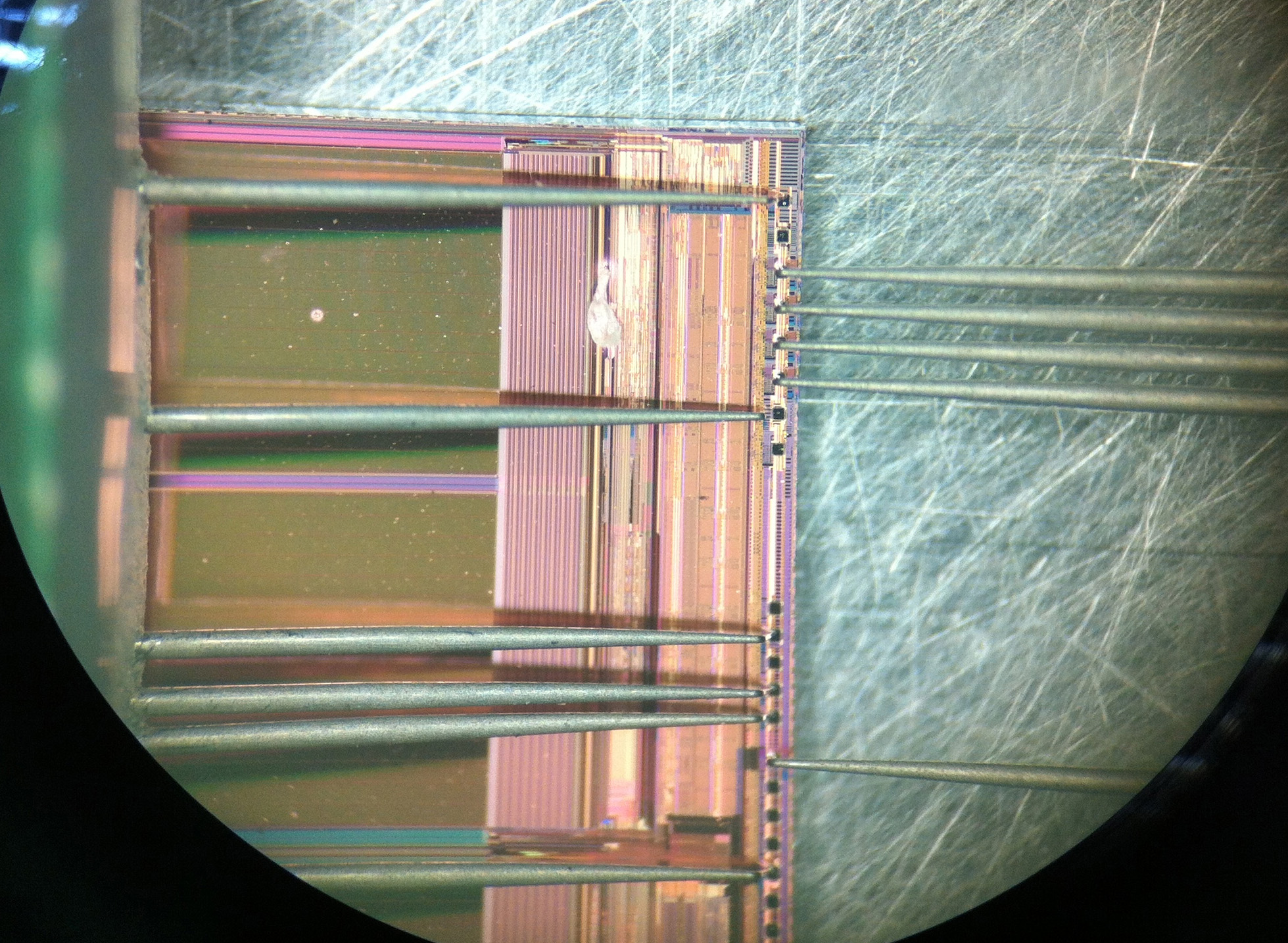
Below is an image through the microscope on the micro-probing station, showing the needles touching down on the square pads at the edge of the FLASH chip’s surface.
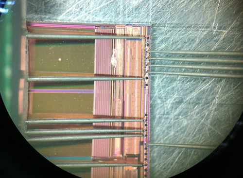
Interestingly, this all happens in an absolutely non-clean-room environment. Workers are pretty much handling chips with tweezers and hand suction vises, and mounting the devices into these jigs by hand.

Once the chips are screened for functionality, they are placed by hand onto a PCB. This is not an unusual practice, pretty much every value-oriented wirebonding facility I’ve visited relies on the manual placement of bare die. The photo below shows a controller IC being placed on a panel of PCBs. The bare die are in the right hand side of the photo, sitting in the beige colored waffle pack.

The lady is using some sort of tool made out of hand-cut bamboo. I still haven’t figured out exactly how they work, but every time I’ve seen this process they are using what looks like a modified chopstick to place the chips on the board. My best guess is that the bamboo sticks have just the right surface energy to adhere to the silicon die, such that silicon will stick to the tip of the bamboo rod. A dot of glue is pre-applied to the bare boards, so when the operator touches the die down onto the glue, the surface tension of the glue pulls the die off of the bamboo stick.

It’s trippy to think that the chips inside my USB stick were handled using modified chopsticks.

The chips are then wirebonded to the board using an automated bonding machine which uses image recognition to find the location of the bond pads (this is part of the reason they can get away with manual die placement).


(view in HD)

The first half of the video above starts out with the operator pulling off and replacing a mis-bonded wire by hand, and re-feeding the wire into the machine. Given that these wires are thinner than a strand of hair, and that the bonding pads are microscopic, this is no mean feat of manual dexterity.

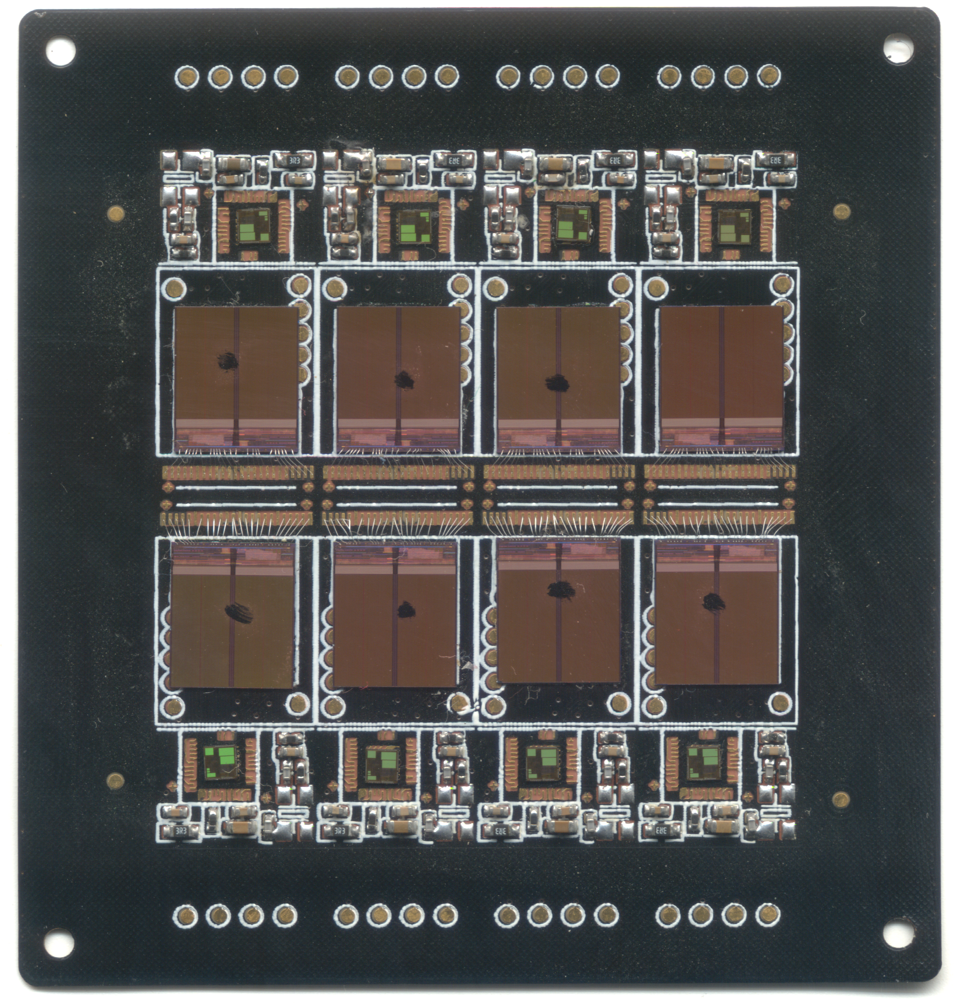
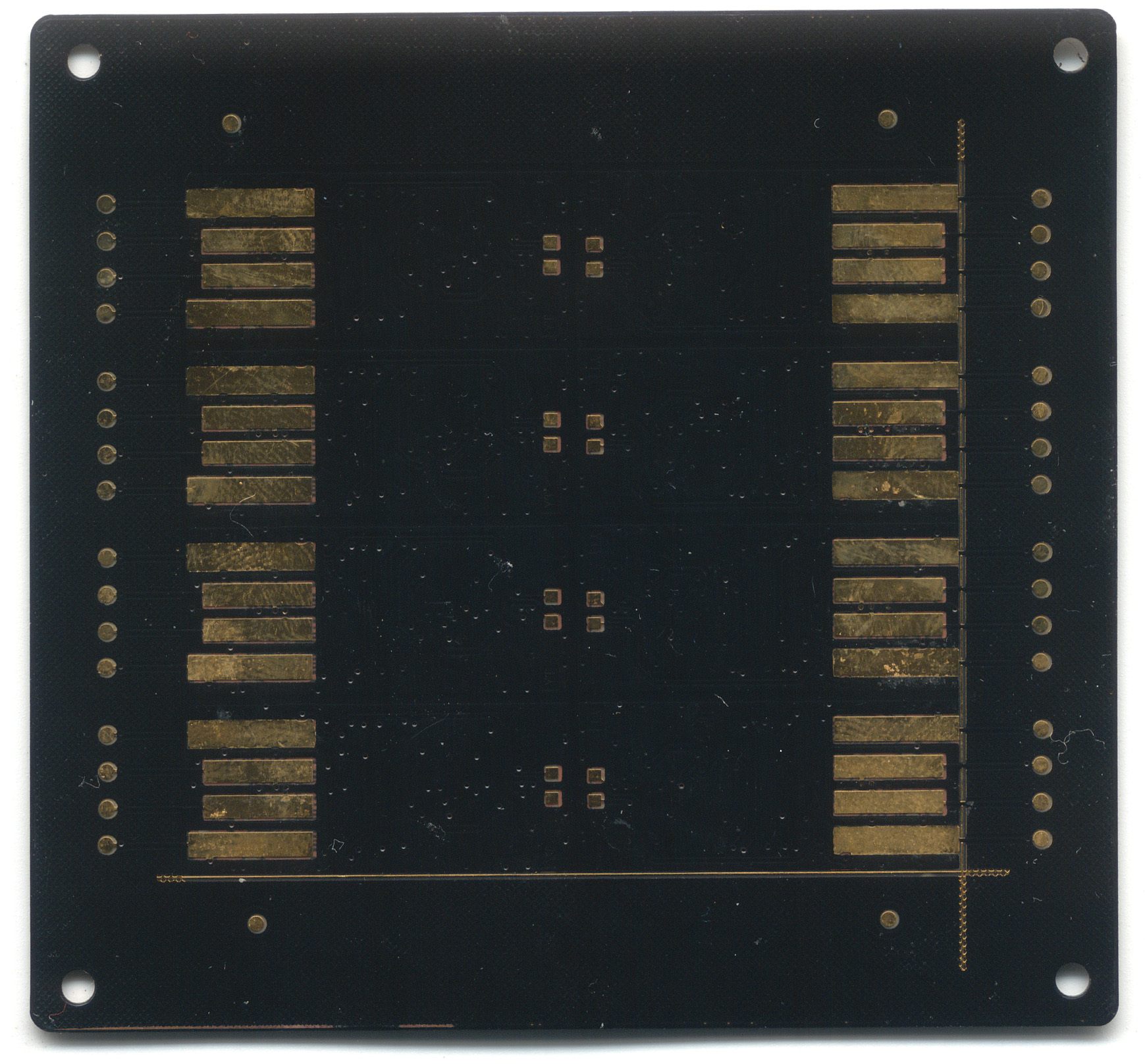
Here’s a scan of the partially-bonded but fully die-mounted PCB that I was given as a memoir from my visit (I had since crushed some of the wire bonds). The panel contains eight USB sticks, each consisting of a FLASH memory chip and a controller IC that handles the bridging between USB and raw FLASH, a non-trivial task that includes managing bad block maps and error-correction, among other things. The controller is probably an 8051-class CPU running at a few dozen MHz.
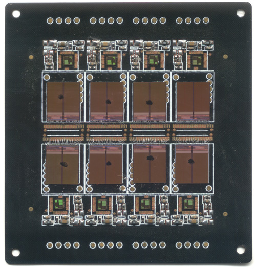
Once the panels are bonded and tested, they are overmolded with epoxy, and then cut into individual pieces, ready for sale.

Interestingly, the entire assembly prior to encapsulation is flexible. The silicon chips have been thinned down by grinding off their back sides to the point where they can tolerate a small amount of flexing, and the PCB is also so thin, it is flexible.

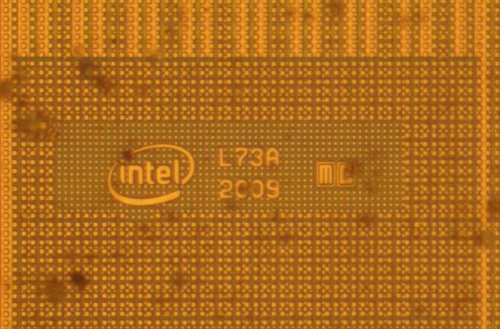
For those of you interested in this kind of thing, here’s the die marking from the FLASH chip; apparently it is made by Intel:
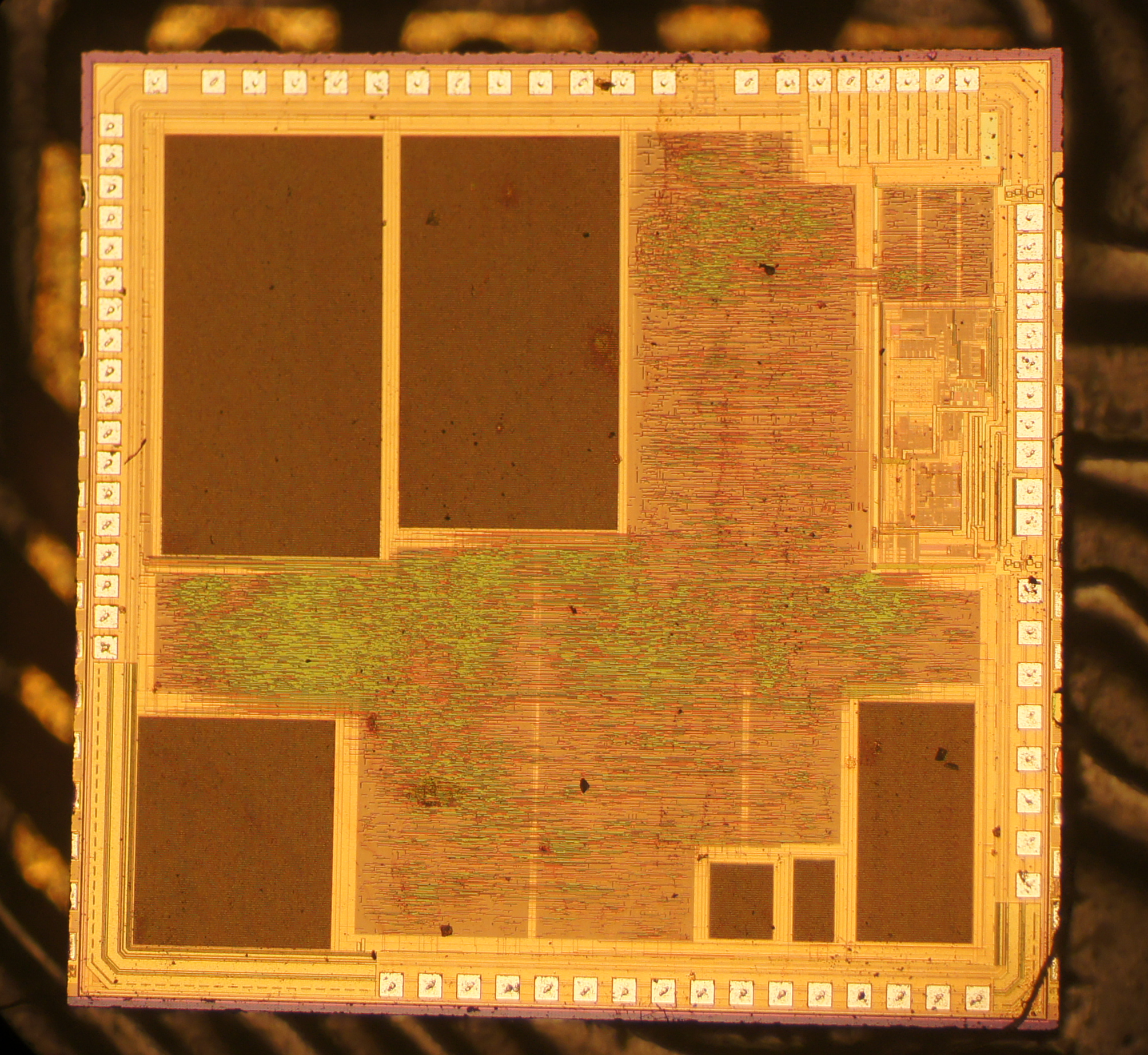
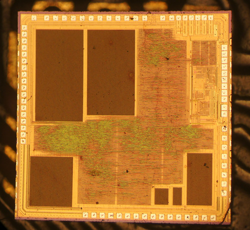
Here is also a die shot of the controller chip:
And now you know where those tiny USB thumb drives are born.

Thanks to David Cranor for contributing images. Images used with permission.

PS: chopsticks

11 Feb 19:57

Frail Pope Benedict to step down

Russian Sledges

totally distracted by this today

Pope Benedict XVI becomes the first pontiff to resign in nearly 600 years, saying his health is deteriorating.
11 Feb 19:09

Amazon.com: Vatican: The Board Game - Unlock the Secrets of How Men Become Pope: Toys & Games

by russiansledges
Russian Sledges

out of print

help me get one of these

Currently unavailable. We don't know when or if this item will be back in stock. Learn How Men Become Pope The mysterious process comes to light! A powerful educational game for teachers, youth groups, and families Board game, cards and playing pieces Fun and exciting each time you play it!
11 Feb 16:08

Workflow

There are probably children out there holding down spacebar to stay warm in the winter! YOUR UPDATE MURDERS CHILDREN.
11 Feb 14:14

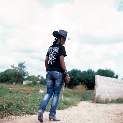
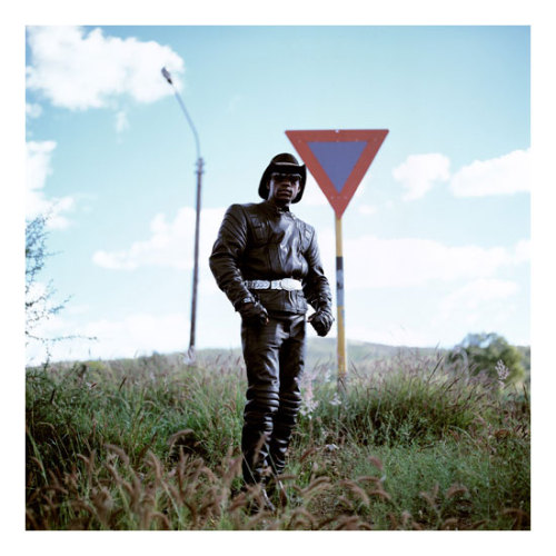
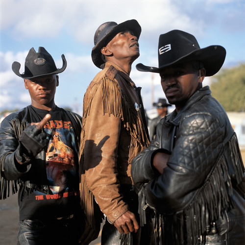
sirmitchell: Cowboy Metalheads of Botswana are my new favorite...

by 3liza


sirmitchell:

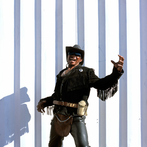
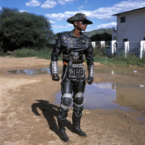
Cowboy Metalheads of Botswana are my new favorite thing. 

11 Feb 04:10

Fun with sexism

11 Feb 04:09

Photo


11 Feb 04:09

Tomas Kral's Homework Desk: Drawerless, with Drainage

tomas-kral-homework-01.jpg

Switzerland-based designer Tomas Kral's Homework Desk is unusual: Made from cast aluminum sandwiched between two sheets of ash, it contains a sort of gutter that runs around three edges. Rather than being for drainage, it's meant to store desktop items, well, off of the desktop. For his part, he describes the wraparound as "A toolbox to store documents, objects, photos that you need or simply desire to work." No drawers necessary.

tomas-kral-homework-02.jpg

Here's a shot of an early mockup made with cardboard and particle board:

(more...)
11 Feb 04:07

Aaron Mickelson's Proposals for Disappearing Packaging

AaronMickelson-TheDisappearingPackage.jpg

For his Masters Thesis in Packaging Design at Pratt Institute, Aaron Mickelson created a series of eco-friendly packages that are designed to be consumed with the products they hold such that no waste remains. Per his description of the Disappearing Package:

Every year, we throw away a ton of packaging waste (actually, over 70 million tons). It makes up the single largest percentage of trash in our landfills (beating out industrial waste, electronics, food... everything). Figures released by the EPA indicate this problem is getting worse every year.

As a package designer (and grad student—meaning I know everything and can solve every problem, naturally), I was concerned about where this trend is going. Of course, many talented designers working in the field have made great efforts over the past few years to reduce the amount of packaging that goes onto a product. However, for my Masters Thesis, I asked the question: Can we eliminate that waste entirely?

AaronMickelson-TheDisappearingPackage-OxoGroup.jpg

To that end, Mickelson has come up with five potential solutions that either incorporate water-soluble materials and/or printing directly on products as hypothetical but largely feasible alternatives to superfluous paper and plastic packaging. "I realize each presents its own manufacturing or distribution challenge; however, each also presents opportunities available to package designers right now."

AaronMickelson-TheDisappearingPackage-Oxo.jpg

As in Diane Leclair Bisson's Edible Containers, the packaging is generally designed to be consumed with its contents, leaving nary a trace of excess.

AaronMickelson-TheDisappearingPackage-TidePods.jpg

Hit the jump to see his solutions for GLAD garbage bags, Twinings teabags and Nivea soap...

(more...)
11 Feb 00:06

http://www.sewingandembroiderywarehouse.com/embtrb.htm

http://www.sewingandembroiderywarehouse.com/embtrb.htm:

pizzaforpresident:

yepperoni:

aka “don’t forget to close your html tags”

I CAN’T BREATHE

HOLY SHIT

10 Feb 23:45

This Robotic Fur Patch is Cooler Than Your Cat | MIT Technology Review

by russiansledges
Think of how much you love your smartphone. Now think of how much you love your pet. What if the two were the same?
10 Feb 23:13

Amazon.com: Customer Reviews: Youth Without Youth

by russiansledges
I decided to crochet through the rest of the movie, and was glad that we only paid $3.00 at Big Lots for it.
10 Feb 22:43

Caramelized Shallots in Port Wine

by russiansledges
Russian Sledges

awesome forever

2tablespoons bacon fat or olive oil 1½cups finely minced shallots 1teaspoon kosher salt Freshly ground black pepper 1bottle (750 ml) Port wine
10 Feb 20:21

would-you-like-a-jelly-baby: The Three Doctors


would-you-like-a-jelly-baby:

The Three Doctors

10 Feb 20:21

(via Police Box Refrigerator Kit Custom made to by...

by ilovebender
10 Feb 20:19

Doctor Who star Matt Smith set to dematerialise in How to Catch a Monster

by Ben Child

BBC Time Lord set to dematerialise in Hollywood for lead role in Ryan Gosling fantasy adventure starring Christina Hendricks

Doctor Who star Matt Smith looks set to be the latest BBC big-hitter to embark on a Hollywood career after signing up to make his US acting debut on Ryan Gosling's first directing effort, How to Catch a Monster.

The film stars Christina Hendricks as Billy, a mother of two who is swept into a macabre underworld. Her teenage son, Bones, discovers a secret road leading to an underwater town, leading to an adventure that will apparently weave elements of fantasy noir and suspense into a modern-day fairytale. "Both Billy and Bones must dive deep into the mystery, if their family is to survive," reads the film's synopsis.

Gosling is writing How to Catch a Monster, in which Eva Mendes has also been cast in an unspecified role. It is not yet clear what part will be played by Smith, who recently finished filming his third series as Doctor Who, but Variety reports he will be the male lead. Filming is due to start in the spring.

BBC Brits are hot property in Hollywood following the rapid ascent to the A-list made by Benedict Cumberbatch. The Sherlock star is due to star in Peter Jackson's Hobbit trilogy as the dragon Smaug, and is the main villain in sci-fi sequel Star Trek Into Darkness. Cumberbatch has also been cast as WikiLeaks founder Julian Assange in Bill Condon's The Fifth Estate, and will appear in fellow Brit Steve McQueen's hotly anticipated true-life tale Twelve Years a Slave.

Ben Child
guardian.co.uk © 2013 Guardian News and Media Limited or its affiliated companies. All rights reserved. | Use of this content is subject to our Terms & Conditions | More Feeds

10 Feb 20:00

So happy to have missed this…


So happy to have missed this…

10 Feb 19:45

Photo


10 Feb 19:44

A High Quality Collection of Animated GIFs From Nature Documentaries

by Justin Page

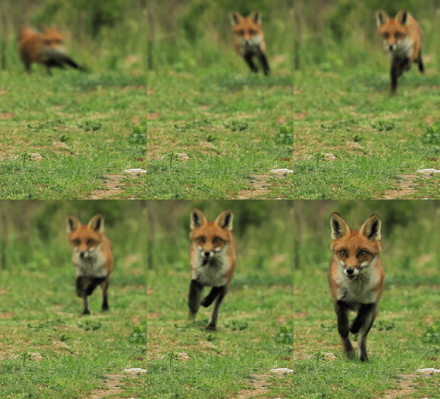
fox gif

Head Like an Orange is an interesting blog on Tumblr that features a high quality collection of animated GIFs. Most of the posted GIFs derive from various nature documentaries. You can view more images on the official blog.

tiiiger

ladybuggers

Monkey Wood

jellyjelly

images via Head Like an Orange

via Brian Malow

10 Feb 18:22

Matching up volunteers with people who really need shoveling

by adamg
10 Feb 18:21

2 in Boston die of carbon monoxide after blizzard

BOSTON (AP) — Officials are warning of carbon monoxide dangers after two people, including a child, died in Boston while sitting in running cars after the blizzard.

Add to Facebook Add to Twitter Add to digg Add to StumbleUpon Add to Reddit Add to del.icio.us Email this Article
10 Feb 17:36

Preserved: Cara Cara Orange Marmalade and Marmalade Blondies

by Lucy Baker
Russian Sledges

<3 cara caras

From Sweets

My local produce market sells Cara Cara oranges for $1.50 each. Highway robbery, right? And yet I can't stop buying them. There is just something absolutely irresistible about their bright pink flesh and juicy sweet flavor. I crave them especially in January and February, when I need a burst of citrus and a big dose of vitamin C.

This Cara Cara orange marmalade is all about comfort. (Can marmalade be a comfort food? I sure think so!) Tangy chunks of peel, a whiff of honey, and a hint of spice from my secret ingredient, herbal tea, offset the sweet flesh of the oranges. I used Twinnings Hebal Unwind, but feel free to substitute whatever you have on hand.

The marmalade is slow to set up, so don't be alarmed if it looks loose at first. It took my batch a full 24 hours to set completely. If the peel floats to the top of the jars, gently turn and tilt them as they cool to redistribute it.

This marmalade is delicious on a proper English muffin or crumpet. But it was so good I was inspired to take it one step further, swirling it into a blondie batter studded with chocolate chips. They make a bright winter upgrade to traditional blondies.

Get the Recipe

Cara Cara Orange Marmelade »

Cara Cara Orange Marmalade Blondies With Chocolate Chips »

About the Author: Lucy Baker is a food writer and the author of The Boozy Baker: 75 Recipes for Spirited Sweets and Edible DIY: Simple, Giftable Recipes to Savor and Share. She lives in Brooklyn with her husband, son, and dachshund.

Recipes!

10 Feb 16:04

heaveninawildflower: Citrus fruit by Johann Sigismund...

by ushishir


heaveninawildflower:

Citrus fruit by Johann Sigismund Elsholtz.

  Diaeteticon Oder Neues Tischbuch, 1682. Wikimedia.

10 Feb 16:01

Cardinal Mahony used cemetery money to pay sex abuse settlement

by By Harriet Ryan, Los Angeles Times
The Archdiocese of L.A. took $115 million from its cemeteries' maintenance fund in 2007, nearly depleting it. The move seems legal, but it was not announced, and relatives of the dead were not told.

Pressed to come up with hundreds of millions of dollars to settle clergy sex abuse lawsuits, Cardinal Roger M. Mahony turned to one group of Catholics whose faith could not be shaken: the dead.
10 Feb 14:56

milstil: When the girls dress like the boys x white tie and...


milstil:

When the girls dress like the boys x white tie and tails VIII. Marlene Dietrich understood men’s clothes better than most men. And style wise she was far ahead of her time. In a time in which women were more or less stuck to skirts and dresses, she started raiding the male wardrobe to add to her collection of dresses and gowns. She had her men’s tailors, shirtmakers and cobblers (she frequented quite a few) make her suits, blazers, sports coats, shirts and custom made trousers. But only Knize in Vienna and Eddie Schmidt in Hollywood made her many tails. Fun trivia: Dietrich’s starched shirt cuffs were directly attached with a hidden buttoned fastening in the sleeve of her dress suits. So she wore sleeveless shirts with her tailcoat, that allowed for quick costume changes and slimmer, more feminely cut jacket sleeves. And while costume jewelry was always worn with stage costumes, for Marlene’s favorite white tie and tails, the cuff links were always her own- from Cartier, Van Cleef & Arpels or Trabert & Hoeffer.

10 Feb 14:52

Podčetrtek Traffic Circle / Enota

by Alison Furuto

Designed by Enota, their just completed Traffic Circle in  Podčetrtek marks the entrance to the dark monolithic volume of the municipal sports hall on one and the thermal spa complex on the other side of the regional road. With a primary intent to slow down the traffic in this consequently very busy area, the main accesses to both complexes also connect to the traffic circle. Its design also suggests a tectonic shift that has caused the road surface to bloat and belched out the massive blocks. More images and architects’ description after the break.

The design of the roundabout’s central island thus references the appearance of both facilities and marks the entrance points to the destinations of the visitors to either of the program centers.  In combination with the water, which sporadically rises to the surface between the clefts, it is somewhat reminiscent of geyser-strewn basalt strata, its appearance thus evoking the presence of both nearby facilities.

The large, dark concrete blocks allude to the design the monolithic volume of the sports hall. The play of light on the irregular arrangement of the elements forms a composition of surfaces, which corresponds to the expression of the hall’s folded volume.

Architects: Enota
Location: Podčetrtek, Slovenia
Project Team: Dean Lah, Milan Tomac, Alja Černe, Tjaž Bauer
Client: Terme Olimia
Type: Commission
Size: 380 m2
Budget: 33.000 EUR
Project Year: Completed 2012

Podčetrtek Traffic Circle (1) © Miran Kambič Podčetrtek Traffic Circle (2) © Miran Kambič Podčetrtek Traffic Circle (3) © Miran Kambič Podčetrtek Traffic Circle (4) © Miran Kambič Podčetrtek Traffic Circle (5) © Miran Kambič Podčetrtek Traffic Circle (6) © Miran Kambič Podčetrtek Traffic Circle (7) © Miran Kambič Podčetrtek Traffic Circle (8) © Miran Kambič Podčetrtek Traffic Circle (9) © Miran Kambič Podčetrtek Traffic Circle (11) concept elevations Podčetrtek Traffic Circle (10) concept 01

Podčetrtek Traffic Circle / Enota originally appeared on ArchDaily, the most visited architecture website on 08 Feb 2013.

send to Twitter | Share on Facebook | What do you think about this?

10 Feb 14:49

Photo


10 Feb 14:49

A hand-painted rose, as a bookplate

by Caleb Crain

A bookplate of a rose, hand-painted by Helen Costello Chase, 1953

This hand-drawn and hand-painted bookplate is in a copy of Virginia Woolf's To the Lighthouse that I bought last year. Note the preliminary pencilling, still visible beneath the ink, of both the signature and the flower. Extrapolating from an obituary that I found online, it seems that in 1953, when Helen Costello Chase was nineteen, she was dancing with the Sadler's Wells Theatre Ballet in London. Later she became a florist and a painter. "Her mode of transportation was not automobile but ballet slipper," her eulogist declares.

10 Feb 05:12

Anatomy

by acejet170

DSCF4030

Towards the end of last year a friend of mine, who was working on a web-based typography tool, asked me for tips on how to pair typefaces. I know how I approach the task but I started to wondering if there were well defined techniques to share. Digging through typography books (old and new) I couldn't find much on the subject. One or two writers basically say, "Just don't do it!", advising you to stick to one font family. After all, that's why it's been designed as a family (well, one of the reasons). Interesting, good advice, but the urge to contrast typefaces is still there. Are there any more encouraging answers?

And, perhaps, now more than ever an encouraging answer would be helpful. Not least because of the whole new generation of graphic designers (whether they call themselves that or not) whose work manifests itself in some digitally-based form but whose journey has not taken the "conventional" route. They haven't got to where they are via a lengthy stay at the university of typographical hard knocks. But the desire to learn is great.

What would/do I do? The first and most obvious approach, I think, is to look to type designers who have produced a range of typefaces and see if sympathetic pairs can be identified from within their body of work.

It's not uncommon for type designers to use similar letter structures across different typefaces. Some are plainly obvious, Spiekermann's Meta goes with his Meta Serif; Sumner Stone's self-titled Sans sits nicely with it's Serif sister and Informal brother.

More recently we've seen the term "Super Families" become more visible, describing sets of typefaces, some with incredibly extensive variations. Super Families hand us sympathetic font pairs on a plate and that's very helpful; not least for the fledgling typographic designer.

But what if you want to freestyle? Go off-typedesigner or off-superfamily in search of a pairing with greater contrast or all of your own making. How do you start?

I can think of two ways (there's probably more):

The easiest way is to cheat. You go looking for examples that work and you copy the same pairing. It's not stealing; it's not a terrible way to approach it really. Except that you're not going to learn much. It's a bit like the old, clichéd "Give a man a fish…" cliché.

A better way to approach the challenge is to get closer to the type; intimate in fact. Get under the skin of type design, analyse the characteristics of typefaces to discern what one (say, serif) face has in common with a different (say, sans) face. Learn about its historical and, even, its geographical contexts.

Enter, stage left, Stephen Coles' new book The Geometry of Type (or if you're Stateside, The Anatomy of Type). A timely publication, given the still fairly new but ferocious interest in typography from the designers and builders of the digital realm; Stephen's book, I think, couldn't have come at a better time. It presents just what those new to designing with type need to know.

The Geometry of Type leads you through the classification of typefaces, their historical background and reveals their distinguishing characteristics. Armed with a detailed grasp of this knowledge, the designer can see that, for example, a particular typeface that falls into the Humanist Serif category may well work well with another face that could be described as a Humanist Sans. Or how a Geometric Sans might work well with a Rational Serif (more traditionally known as a Modern). Of course, with any one single volume only a limited collection of typefaces can be included. Perhaps the most important lesson that the book teaches is to look closer at whatever typeface we're using. It teaches what to look for; where the critical details can be gleamed.

I think this is a book that could, and probably should, become a staple for a generation of typographic designers. From talking to a few people who are coming to typographic design with a digital background, our time feels not unlike that period when design studios were just installing Macs for the first time. When graphic designers were getting their hands on type which they'd previously relied on others to control (typesetters).

It's a little different but it's similar because there are designers using type with very little proper understanding of its intricacies. I was like that way back then and what I had to do was learn lots of stuff. I can wholeheartedly relate to the plight of these designers; that's just what I was like. And what I needed back then was a nudge here and there to set me on the right track. Stephen's book is one of those very helpful nudges.

DSCF4021DSCF4025

DSCF4019DSCF4024

Related: Ellen Lupton's article on Thinking With Type.

Super Families: At fontshop.com and fonts.com