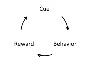
The devil has put a penalty on all things we enjoy in life.
Sixty-two percent of the weight of the web is images, and we’re serving more image bytes every day. That would be peachy if all of those bytes were being put to good use. But on small or low-resolution screens, most of that data is waste.
Why? Even though the web was designed to be accessed by everyone, via anything, it was only recently that the device landscape diversified enough to force an industry-wide movement toward responsive design. When we design responsively our content elegantly and efficiently flows into any device. All of our content, that is, except for bitmaps. Bitmap images are resolution-fixed. And their vessel—the venerable img with its sadly single src—affords no adaptation.
Faced with a Sophie’s choice—whether to make their pages fuzzy for some or slow for all—most designers choose the latter, sending images meant to fill the largest, highest-resolution screens to everybody. Thus, waste.
But! After three years of debate, a few new pieces of markup have emerged to solve the responsive images problem:
srcsetsizespicture- and our old friend
source(borrowed fromaudioandvideo)
These new elements and attributes allow us to mark up multiple, alternate sources, and serve each client the source that suits it best. They’ve made their way into the official specs and their first full implementation—in Chrome 38—shipped in September. With elegant fallbacks and a polyfill to bridge the gap, we can and should implement responsive images now. So, let’s!
Let’s take an existing web page and make its images responsive. We’ll do so in three passes, applying each piece of the new markup in turn:
- We’ll ensure that our images scale efficiently with
srcsetandsizes. - We’ll art direct our images with
pictureandsource media. - We’ll supply an alternate image format using
pictureandsource type.
In the process we’ll see firsthand the dramatic performance gains that the new features enable.
The status quo
I guess I don’t so much mind being old, as I mind being fat and old.
We take as our subject a little web page about crazy quilts. It’s a simple, responsive page. There isn’t much to get in the way of its primary content: giant images (of quilts!). We want to show both the overall design of each quilt and as much intricate detail as possible. So, for each, we present two images:
- the whole quilt, fit to the paragraph width
- a detail that fills 100 percent of the viewport width
How would we size and mark up our images without the new markup?
First up: the whole quilts. To ensure that they’ll always look sharp, we need to figure out their largest-possible layout size. Here’s the relevant CSS:
* {
	box-sizing: border-box;
}
body {
	font-size: 1.25em;
}
figure {
	padding: 0 1em;
	max-width: 33em;
}
img {
	display: block;
	width: 100%;
}
We can calculate the img’s largest-possible display width by taking the figure’s max-width, subtracting its padding, and converting ems to pixels:
  100% <img> width
x ( 33em <figure> max-width
   - 2em <figure> padding )
x 1.25em <body> font-size
x 16px default font-size
= 620px
Or, we can cheat by making the window really big and peeking at the dev tools:

(I prefer the second method.)
Either way we arrive at a maximum, full-quilt img display width of 620px. We’ll render our source images at twice that to accommodate 2x screens: 1,240 pixels wide.
But what to do about our detail images? They expand to fill the whole viewport, whose size has no fixed upper limit. So let’s pick something big-ish with a standard-y feel to it and render them at oh, say, up to 1,920 pixels wide.
When we render our images at those sizes our status-quo page weighs in at a hefty 3.5MB. All but 5.7kB of that is images. We can intuit that many of those image bytes constitute invisible overhead when delivered to small, low-resolution screens—but how many? Let’s get to work.
First pass: scaling with scrset and sizes
Teatherball with a tennis ball for his shoelaces
Naturally adapt to have more than two faces
The first problem we’ll tackle: getting our images to scale efficiently across varying viewport widths and screen resolutions. We’ll offer up multiple resolutions of our image, so that we can selectively send giant sources to giant and/or high-resolution screens and smaller versions to everyone else. How? With srcset.
Here’s one of our full-viewport-width detail images:
<img
	src="quilt_2-detail.jpg"
	alt="Detail of the above quilt, highlighting the embroidery and exotic stitchwork." />
quilt_2-detail.jpg measures 1,920 pixels wide. Let’s render two smaller versions to go along with it and mark them up like so:
<img
	srcset="quilt_2/detail/large.jpg  1920w,
	        quilt_2/detail/medium.jpg  960w,
	        quilt_2/detail/small.jpg   480w"
	src="quilt_2/detail/medium.jpg"
	alt="Detail of the above quilt, highlighting the embroidery and exotic stitchwork.">
The first thing to note about this img is that it still has a src, which will load in browsers that don’t support the new syntax.
For more capable clients, we’ve added something new: a srcset attribute, which contains a comma-separated list of resource URLs. After each URL we include a “width descriptor,” which specifies each image’s pixel width. Is your image 1024 x 768? Stick a 1024w after its URL in srcset. srcset-aware browsers use these pixel widths and everything else that they know about the current browsing environment to pick a source to load out of the set.
How do they choose? Here’s my favorite thing about srcset: we don’t know! We can’t know. The picking logic has been left intentionally unspecified.
The first proposed solutions to the responsive image problem attempted to give authors more control. We would be in charge, constructing exhaustive sets of media queries—contingency plans listing every combination of screen size and resolution, with a source custom-tailored for each.
srcset saves us from ourselves. Fine-grained control is still available when we need it (more on that later), but most of the time we’re better off handing over the keys and letting the browser decide. Browsers have a wealth of knowledge about a person’s screen, viewport, connection, and preferences. By ceding control—by describing our images rather than prescribing specific sources for myriad destinations—we allow the browser to bring that knowledge to bear. We get better (future-friendly!) functionality from far less code.
There is, however, a catch: picking a sensible source requires knowing the image’s layout size. But we can’t ask browsers to delay choosing until the page’s HTML, CSS, and JavaScript have all been loaded and parsed. So we need to give browsers an estimate of the image’s display width using another new attribute: sizes.
How have I managed to hide this inconvenient truth from you until now? The detail images on our example page are a special case. They occupy the full width of the viewport—100vw—which just so happens to be the default sizes value. Our full-quilt images, however, are fit to the paragraph width and often occupy significantly less real estate. It behooves us to tell the browser exactly how wide they’ll be with sizes.
sizes takes CSS lengths. So:
sizes="100px"...says to the browser: this image will display at a fixed width of 100px. Easy!
Our example is more complex. While the quilt imgs are styled with a simple width: 100% rule, the figures that house them have a max-width of 33em.
Luckily, sizes lets us do two things:
- It lets us supply multiple lengths in a comma-separated list.
- It lets us attach media conditions to lengths.
Like this:
sizes="(min-width: 33em) 33em, 100vw"That says: is the viewport wider than 33em? This image will be 33em wide. Otherwise, it’ll be 100vw.
That’s close to what we need, but won’t quite cut it. The relative nature of ems makes our example tricky. Our page’s body has a font-size of 1.25em, so “1em” in the context of our figure’s CSS will be 1.25 x the browser’s default font size. But within media conditions (and therefore, within sizes), an em is always equal to the default font size. Some multiplication by 1.25 is in order: 1.25 x 33 = 41.25.
sizes="(min-width: 41.25em) 41.25em,
       100vw"
That captures the width of our quilts pretty well, and frankly, it’s probably good enough. It’s 100 percent acceptable for sizes to provide the browser with a rough estimate of the img’s layout width; often, trading a tiny amount of precision for big gains in readability and maintainability is the right choice. That said, let’s go ahead and make our example exact by factoring in the em of padding on either side of the figure: 2 sides x 1.25 media-condition-ems each = 2.5ems of padding to account for.
<img
	srcset="quilt_3/large.jpg  1240w,
	        quilt_3/medium.jpg  620w,
	        quilt_3/small.jpg   310w"
	sizes="(min-width: 41.25em) 38.75em,
	       calc(100vw - 2.5em)"
	src="quilt_3/medium.jpg"
	alt="A crazy quilt whose irregular fabric scraps are fit into a lattice of diamonds." />
Let’s review what we’ve done here. We’ve supplied the browser with large, medium, and small versions of our image using srcset and given their pixel widths using w descriptors. And we’ve told the browser how much layout real estate the images will occupy via sizes.
If this were a simple example, we could have given the browser a single CSS length like sizes="100px" or sizes="50vw". But we haven’t been so lucky. We had to give the browser two CSS lengths and state that the first length only applies when a certain media condition is true.
Thankfully, all of that work wasn’t in vain. Using srcset and sizes, we’ve given the browser everything that it needs to pick a source. Once it knows the pixel widths of the sources and the layout width of the img, the browser calculates the ratio of source-to-layout width for each source. So, say sizes returns 620px. A 620w source would have 1x the img’s px. A 1240w source would have 2x. 310w? 0.5x. The browser figures out those ratios and then picks whichever source it pleases.
It’s worth noting that the spec allows you to supply ratios directly and that sources without a descriptor get assigned a default ratio of 1x, allowing you to write markup like this:
<img src="standard.jpg" srcset="retina.jpg 2x, super-retina.jpg 3x" />That’s a nice, compact way to supply hi-DPI imagery. But! It only works for fixed-width images. All of the images on our crazy-quilts page are fluid, so this is the last we’ll hear about x descriptors.
Measuring up
Now that we’ve rewritten our crazy-quilts page using srcset and sizes, what have we gained, in terms of performance?
Our page’s weight is now (gloriously!) responsive to browsing conditions. It varies, so we can’t represent it with a single number. I reloaded the page a bunch in Chrome and charted its weight across a range of viewport widths:

The flat, gray line up top represents the status-quo weight of 3.5MB. The thick (1x screen) and thin (2x) green lines represent the weight of our upgraded srcset’d and size’d page at every viewport width between 320px and 1280px.
On 2x, 320px-wide screens, we’ve cut our page’s weight by two-thirds—before, the page totaled 3.5MB; now we’re only sending 1.1MB over the wire. On 320px, 1x screens, our page is less than a tenth the weight it once was: 306kB.
From there, the byte sizes stair-step their way up as we load larger sources to fill larger viewports. On 2x devices we take a significant jump at viewport widths of ~350px and are back to the status-quo weight after 480px. On 1x screens, the savings are dramatic; we’re saving 70 to 80 percent of the original page’s weight until we pass 960px. There, we top out with a page that’s still ~40 percent smaller than what we started with.
These sorts of reductions—40 percent, 70 percent, 90 percent—should stop you in your tracks. We’re trimming nearly two and a half megabytes off of every Retina iPhone load. Measure that in milliseconds or multiply it by thousands of pageviews, and you’ll see what all of the fuss is about.
Second pass: picture and art direction
srcsetif you’re lazy,pictureif you’re crazy™
So, for images that simply need to scale, we list our sources and their pixel widths in srcset, let the browser know how wide the img will display with sizes, and let go of our foolish desire for control. But! There will be times when we want to adapt our images in ways that go beyond scaling. When we do, we need to snatch some of that source-picking control right back. Enter picture.
Our detail images have a wide aspect ratio: 16:9. On large screens they look great, but on a phone they’re tiny. The stitching and embroidery that the details should show off are too small to make out.
It would be nice if we could “zoom in” on small screens, presenting a tighter, taller crop.

This kind of thing—tailoring image content to fit specific environments—is called “art direction.” Any time we crop or otherwise alter an image to fit a breakpoint (rather than simply resizing the whole thing), we’re art directing.
If we included zoomed-in crops in a srcset, there’s no telling when they’d get picked and when they wouldn’t. Using picture and source media, we can make our wishes explicit: only load the wide, rectangular crops when the viewport is wider than 36em. On smaller viewports, always load the squares.
<picture>
	<!-- 16:9 crop -->
	<source
		media="(min-width: 36em)"
		srcset="quilt_2/detail/large.jpg  1920w,
		        quilt_2/detail/medium.jpg  960w,
		        quilt_2/detail/small.jpg   480w" />
	<!-- square crop -->
	<source
		srcset="quilt_2/square/large.jpg  822w,
		        quilt_2/square/medium.jpg 640w,
		        quilt_2/square/small.jpg  320w" />
	<img
		src="quilt_2/detail/medium.jpg"
		alt="Detail of the above quilt, highlighting the embroidery and exotic stitchwork." />
</picture>
A picture element contains any number of source elements and one img. The browser goes over the picture’s sources until it finds one whose media attribute matches the current environment. It sends that matching source’s srcset to the img, which is still the element that we “see” on the page.
Here’s a simpler case:
<picture>
	<source media="(orientation: landscape)" srcset="landscape.jpg" />
	<img src="portrait.jpg" alt="A rad wolf." />
</picture>
On landscape-oriented viewports, landscape.jpg is fed to the img. When we’re in portrait (or if the browser doesn’t support picture) the img is left untouched, and portrait.jpg loads.
This behavior can be a little surprising if you’re used to audio and video. Unlike those elements, picture is an invisible wrapper: a magical span that’s simply feeding its img a srcset.
Another way to frame it: the img isn’t a fallback. We’re progressively enhancing the img by wrapping it in a picture.
In practice, this means that any styles that we want to apply to our rendered image need to be set on the img, not on the picture. picture { width: 100% } does nothing. picture > img { width: 100% } does what you want.
Here’s our crazy-quilts page with that pattern applied throughout. Keeping in mind that our aim in employing picture was to supply small-screened users with more (and more useful) pixels, let’s see how the performance stacks up:

Not bad! We’re sending a few more bytes to small 1x screens. But for somewhat complicated reasons having to do with the sizes of our source images, we’ve actually extended the range of screen sizes that see savings at 2x. The savings on our first-pass page stopped at 480px on 2x screens, but after our second pass, they continue until we hit 700px.
Our page now loads faster and looks better on smaller devices. And we’re not done with it yet.
Third pass: multiple formats with source type
The 25-year history of the web has been dominated by two bitmap formats: JPEG and GIF. It took PNGs a painful decade to join that exclusive club. New formats like WebP and JPEG XR are knocking at the door, promising developers superior compression and offering useful features like alpha channels and lossless modes. But due to img’s sadly single src, adoption has been slow—developers need near-universal support for a format before they can deploy it. No longer. picture makes offering multiple formats easy by following the same source type pattern established by audio and video:
<picture>
	<source type="image/svg+xml" srcset="logo.svg" />
	<img src="logo.png" alt="RadWolf, Inc." />
</picture>
If the browser supports a source’s type, it will send that source’s srcset to the img.
That’s a straightforward example, but when we layer source type-switching on top of our existing crazy-quilts page, say, to add WebP support, things get hairy (and repetitive):
<picture>
	<!-- 16:9 crop -->
	<source
		type="image/webp"
		media="(min-width: 36em)"
		srcset="quilt_2/detail/large.webp  1920w,
		        quilt_2/detail/medium.webp  960w,
		        quilt_2/detail/small.webp   480w" />
	<source
		media="(min-width: 36em)"
		srcset="quilt_2/detail/large.jpg  1920w,
		        quilt_2/detail/medium.jpg  960w,
		        quilt_2/detail/small.jpg   480w" />
	<!-- square crop -->
	<source
		type="image/webp"
		srcset="quilt_2/square/large.webp   822w,
		        quilt_2/square/medium.webp  640w,
		        quilt_2/square/small.webp   320w" />
	<source
		srcset="quilt_2/square/large.jpg   822w,
		        quilt_2/square/medium.jpg  640w,
		        quilt_2/square/small.jpg   320w" />
	<img
		src="quilt_2/detail/medium.jpg"
		alt="Detail of the above quilt, highlighting the embroidery and exotic stitchwork." />
</picture>
That’s a lot of code for one image. And we’re dealing with a large number of files now too: 12! Three resolutions, two formats, and two crops per image really add up. Everything we’ve gained in performance and functionality has come at a price paid in complexity upfront and maintainability down the road.
Automation is your friend; if your page is going to include massive code blocks referencing numerous alternate versions of an image, you’d do well to avoid authoring everything by hand.
So is knowing when enough is enough. I’ve thrown every tool in the spec at our example. That will almost never be prudent. Huge gains can be had by employing any one of the new features in isolation, and you should take a long, hard look the complexities of layering them before whipping out your claw and committing to the kitchen sink.
That said, let’s take a look at what WebP can do for our quilts.

An additional 25 to 30 percent savings on top of everything we’ve already achieved—not just at the low end, but across the board—certainly isn’t anything to sneeze at! My methodology here is in no way rigorous; your WebP performance may vary. The point is: new formats that provide significant benefits versus the JPEG/GIF/PNG status quo are already here, and will continue to arrive. picture and source type lower the barrier to entry, paving the way for image-format innovation forevermore.
size the day
This is the secret of perfection:
When raw wood is carved, it becomes a tool;
[...]
The perfect carpenter leaves no wood to be carved.
For years, we’ve known what’s been weighing down our responsive pages: images. Huge ones, specially catered to huge screens, which we’ve been sending to everyone. We’ve known how to fix this problem for a while too: let us send different sources to different clients. New markup allows us to do exactly that. srcset lets us offer multiple versions of an image to browsers, which, with a little help from sizes, pick the most appropriate source to load out of the bunch. picture and source let us step in and exert a bit more control, ensuring that certain sources will be picked based on either media queries or file type support.
Together, these features let us mark up adaptable, flexible, responsive images. They let us send each of our users a source tailored to his or her device, enabling huge performance gains. Armed with a superb polyfill and an eye toward the future, developers should start using this markup now!
 Try as they might, Microsoft's effort to get its Surface tablets out and in front of as many people as possible keeps backfiring in hilarious ways. Most recently, a CNN anchor during Tuesday night's election coverage was spotted using his Microsoft...


