Super-cool video from i-D of dance styles for each letter of the alphabet.
(via @Han)
Tags: alphabet dance videohttp://research.swtch.com/alphaAlphabetization!
Before I clicked on this, I thought that the link was going to point out that the order of the alphabet is entirely arbitrary in English and many other languages, which is also true (a few alphabets, like Arabic, use less arbitrary factors, such as the shapes of the letters, to determine ordering, although the shapes themselves are arbitrary).
Instead, it’s about writing lists in alphabetical order, which is also non-obvious even once you grant the order of the alphabet itself:
The use of alphabetic order for entire words seems to be a much later invention; it is something we might think is obvious, yet it has to be taught to children, and at some point in history it was necessary to teach to adults.
Several lists from about 300 B.C. have been found on the Aegean Islands, giving the names of people in certain religious cults; these lists have been alphabetized, but only by first letter, thus representing only the first pass of a left-to-right radix sort. Some Greek papyri from the years A.D. 134-135 contain fragments of ledgers that show the names of taxpayers alphabetized by the first two letters.
Apollonius Sophista used alphabetical order on the first two letters, and often on subsequent letters, in his lengthy concordance of Homer’s poetry (first century A.D.). A few examples of more perfect alphabetization are known, notably Galen’s Hippocratic Glosses (c. 200), but they are very rare.
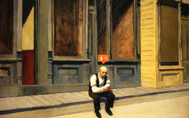
In a five part series called "emoji-nation", Ukrainian Nastya Ptichek mixes the work of well-known painters with graphical elements of new media. In the second part of the series, the works of Edward Hopper are augmented with social media interface icons:
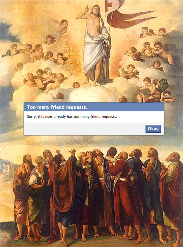
The first part finds emoji doppelgangers for works of fine art while the third part uses paintings as movie poster imagery for the likes of Kill Bill and Home Alone (paired with Munch's The Scream). For part four, Ptichek places modal dialogs over art works:
And part five plays around with several Google interface elements:
Love this kind of thing. Feels like I've seen something like it before though. Anyone recall?
Tags: art Nastya Ptichek remixSlow television is the uninterrupted broadcast of an ordinary event from start to finish. Early efforts included burning Yule logs on TV around Christmas and driver's views of complete British rail journeys (not to mention Andy Warhol and the pitch drop experiment), but Norwegian public television has revived the format in recent years. The first broadcast was of a 7-hour train trip from Bergen to Oslo, which was watched at some point by ~20% of Norway's population. You can watch the entire thing on YouTube:
Not content with that, in 2011 an entire ship voyage was broadcast for 134 continuous hours. The entire voyage is available for viewing, but you can watch a 37-minute time lapse of the whole thing if you can't spare the 5½ days:
As the show progressed and the ratings climbed (half of the Norwegian population tuned in at some point), the show became an interactive event, with people meeting the ship along to coast in order to appear as extras in the cast. Some even followed in smaller boats, filming as they went along in the ship's wake.
Other shows included 12 hours about firewood (including 8 uninterrupted hours of a burning fireplace), 18 hours of salmon swimming upstream (which some felt was too short), 100 hours of Magnus Carlsen playing chess, a 30-hour interview with a noted author, and several continuous hours of sweater production, from shearing to knitting.
Shows currently in the planning stages include A Day in the Life of a Snail and "a 24-hour-long program following construction workers building a digital-style clock out of wood, shuffling planks to match each passing minute". The slow TV concept might soon be coming to American TV as well.
P.S. Does this 10-hour video of Tyrion Lannister slapping Joffrey count as slow TV? Either way, it's great.
Tags: Norway television video
LSD: The Consciousness-Expanding Drug (1964).
From serious scientific study, to tabloid concern, to psychedelic exploitation…a brief evolution of acid-related cover art in books and magazines. These are mostly American titles so who knows what else has yet to be rediscovered.

LSD (1966) by Richard Alpert & Sidney Cohen.

LIFE, March 25th, 1966.
See inner pages here.

Newsweek, May 9th, 1966.
See inner pages here.

LIFE, September 9th, 1966.
See inner pages here.

LSD : Trip or Trap? (1966) by Lindsay R. Curtis.
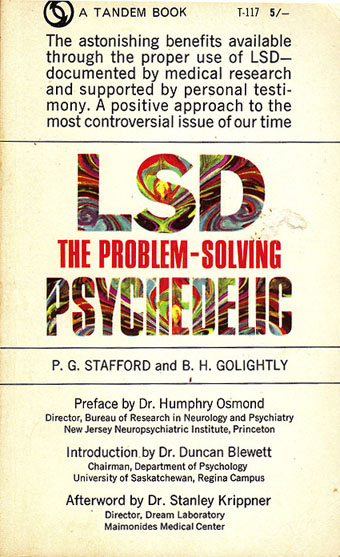
LSD: The Problem-Solving Psychedelic (1967) by PG Stafford & BH Golightly.
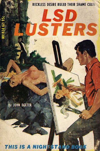
LSD Lusters (1967) by John Dexter. Art by Darrel Millsap.
Reckless desire ruled their shame cult!

LSD Orgy (1967) by Marcus Miller. Art by Ed Smith.
Their psychedelic sin-trip passed the point of no return!

The Sexual Paradise of LSD (1967) by Marsha Alexander.

Front Page Detective, July 1967.

LSD: Some Questions and Answers (1969).
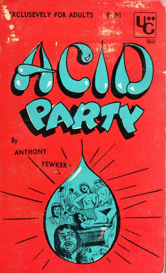
Acid Party (1969) by Anthony Yewker.
“Exclusevely”

Drug Awareness (1970) by Richard E. Horman & Allan M. Fox.

Lieutenant LSD (1971) by Lan Creston.
A self-published memoir.

LSD: Visions or Nightmares? (1988).
Elsewhere on { feuilleton }
• The book covers archive
Previously on { feuilleton }
• Lyrical Substance Deliberated
• The Art of Tripping, a documentary by Storm Thorgerson
• Enter the Void
• In the Land of Retinal Delights
• The art of LSD
• Hep cats
Ben Sack makes these amazingly detailed maps of cities, all drawn by hand.

And just so you can get a sense of how large these drawings are:
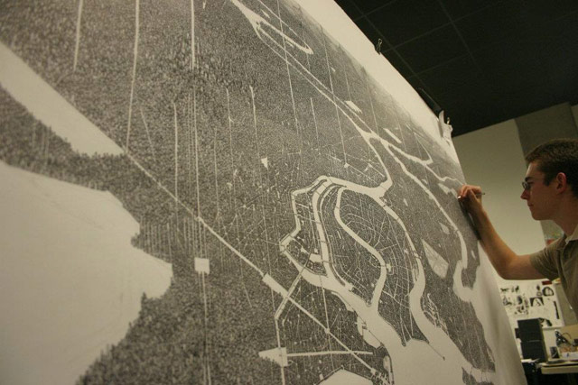
Here's a peek at his process:
Reminiscent of Stephen Wiltshire's work. And every time I see something like this, I think about when I went to the Met a few years ago and noticed the sketchbook of this guy working the membership desk. It was filled with beautifully intricate drawings of NYC-style city streets. I chatted with him about them briefly, but I wish I'd asked if he had put any of it online. Would have been neat to share his drawings with you. (via waxy)
Tags: art Ben Sack cities maps Stephen Wiltshire


Philip the evangelist is one of my favorite “minor” characters in the New Testament.
Philip was an affirmative-action hire by the early church in Jerusalem — before that word “church” had even begun to be used. The early Christians shared all their possessions — “everything they owned was held in common” and “there was not a needy person among them.” Part of what that meant was a kind of Meals on Wheels program that took care of widows. But the community was growing fast and, “the Hellenists complained against the Hebrews because their widows were being neglected in the daily distribution of food.”

A dangerous man.
This is just a few chapters after Pentecost — the miraculous declaration that this community was going to include everybody from everywhere as equals. But the community was growing fast and there was a bit of a rift between the original insiders and the newcomers. So the disciples told the Greek-speaking newcomers to pick “from among yourselves seven men of good standing, full of the Spirit and of wisdom, whom we may appoint to this task.” Smart solution — correcting for the imbalance of power in the community by empowering those who were being neglected.
One of the seven men elected by the “Hellenists” was Philip. So he’s a community organizer in charge of feeding neglected widows. I like him already.
The next time we meet Philip is two chapters later. He’s in Samaria, healing the sick and preaching the gospel to the Samaritans. You remember all those Sunday school lessons about how the Samaritans were religious and ethnic outcasts? Those Samaritans. Samaritans were the first people Philip chose to reach out to, and we’re told that he brought them “great joy.”
One of Philip’s most enthusiastic converts in Samaria was Simon the magician, who was baptized and “stayed constantly with Philip.” Magic and sorcery always make for good stories, so tradition and legend have run wild with the character of Simon Magus — giving him a flying chariot drawn by demons and a host of other unlikely attributes never mentioned in the book of Acts. Those stories are loopy, but they confirm something that was certainly true of Simon — before he met Philip he was a wicked man, feared by many and despised by the righteous.* But Philip didn’t fear him or despise him. Philip didn’t fear or despise anybody — that’s what “evangelist” means.
The next story with Philip has him heading south, sent by “an angel of the Lord” to the wilderness road leading to Gaza. There he comes across: “An Ethiopian eunuch, a court official of the Candace, queen of the Ethiopians, in charge of her entire treasury.” This man, Acts says, was returning to Ethiopia from Jerusalem, where he had gone “to worship.” That’s interesting, because we’ve just been told several reasons why this man wouldn’t be allowed to worship in Jerusalem. He’s an Ethiopian — a Gentile, so most of the Temple would have been off-limits to him. He’s a eunuch, and the inerrant, authoritative Bible clearly teaches that “He that is wounded in the stones, or hath his privy member cut off, shall not enter into the congregation of the Lord” (Deuteronomy 23:1). And he’s also a member of the wrong political party — a devotee of some foreign, heathen feminist.
This man, in other words, is existentially against the rules. A host of clobber texts from the holy Bible say that this man is unacceptable and unclean.
So Philip, being Philip, hops up into the man’s chariot and rides along with him, telling him “the good news about Jesus”:
They came to some water; and the eunuch said, “Look, here is water! What is to prevent me from being baptized?” He commanded the chariot to stop, and both of them, Philip and the eunuch, went down into the water, and Philip baptized him.
Philip knew his Bible. He knew that there were dozens of clobber texts that would have authoritatively answered the eunuch’s question. “What is to prevent me from being baptized?” But Philip did not recite those clobber texts. He hopped down and got in the water with his new friend.
The last time we come across Philip is much later. The story has shifted to the journeys of the Apostle Paul who winds up one day, on the way from Point A to Point B, at “the house of Philip the evangelist, one of the seven.”
That’s a reference back to that original story about the seven “Hellenist” Christians elected to make sure all the widows were being fed. They were: “Stephen, a man full of faith and the Holy Spirit, together with Philip, Prochorus, Nicanor, Timon, Parmenas, and Nicolaus.” We don’t hear much more about the last five, but we do learn what happened to Stephen. Stephen was arrested for questioning the laws of the Bible and for threatening to “change the customs that Moses handed on to us.”
The religious officials ask Stephen if the charges are legit, and he launches into a 52-verse sermon, which we can summarize as “Guilty as charged — way guiltier than you can even imagine.”
Then they dragged him out of the city and began to stone him; and the witnesses laid their coats at the feet of a young man named Saul.
So Stephen — Philip’s friend and co-worker — was stoned to death for his disrespect of the clobber texts (hence that term). And of course that “young man named Saul” who participated in killing Stephen would later become the Apostle Paul. Oh, and that story about Philip preaching in Samaria? That starts like this:
Saul was ravaging the church by entering house after house; dragging off both men and women, he committed them to prison.
Now those who were scattered went from place to place, proclaiming the word. Philip went down to the city of Samaria …
So that’s a bit of backstory we should keep in mind as we re-read that final mention of Philip from Acts 21: “The next day we left and came to Caesarea; and we went into the house of Philip the evangelist, one of the seven, and stayed with him.” There’s no mention there of Paul’s personal history with “the seven,” or of the fact that really at this point, thanks to him, it’s only “the six.” Philip certainly doesn’t seem to mention it himself. Paul was just as welcome in Philip’s house as any Samaritan sorceror or warrior-queen’s eunuch would have been. He would probably have been just as welcome if he’d still been Saul.
Paul and his friends stay with Philip for several days, and this is the last we’re told of anything regarding Philip the evangelist: “He had four unmarried daughters who had the gift of prophecy.”
Four daughters. All preachers.
Somehow, though, the Apostle Paul didn’t rebuke Philip and his daughters for violating all those clobber texts that insist that women must keep silent in the church. Instead, while enjoying his time there in Philip’s house, Paul himself seems to have cheerfully and enthusiastically ignored all those clobber texts. That’s kind of interesting, considering that Paul himself supposedly wrote them.
I guess that just goes to show what a bad influence Philip could be, and why it’s dangerous to allow people like him to remain in the church.
- – - – - – - – - – - -
* Peter and John show up later and rebuke Simon for the sin of simony — for thinking he could “obtain God’s gift with money.” He pleads for their forgiveness and Luke, annoyingly, never tells us what happened next. The tradition and legends say that Peter and John rejected Simon’s repentance, but there’s nothing in Acts to suggest that. In the actual story, Peter says, “Repent … and pray to the Lord” and then Simon repents and prays to the Lord. There’s no reason to think that Peter and John did not take yes for an answer:
Now when Simon saw that the Spirit was given through the laying on of the apostles’ hands, he offered them money, saying, “Give me also this power so that anyone on whom I lay my hands may receive the Holy Spirit.”
But Peter said to him, “May your silver perish with you, because you thought you could obtain God’s gift with money! You have no part or share in this, for your heart is not right before God. Repent therefore of this wickedness of yours, and pray to the Lord that, if possible, the intent of your heart may be forgiven you. For I see that you are in the gall of bitterness and the chains of wickedness.”
Simon answered, “Pray for me to the Lord, that nothing of what you have said may happen to me.”
This is why the corrupt practice of buying and selling influence in the church used to be called the sin of “simony.” Nowadays, of course, it’s referred to as the “annual stewardship campaign” or, even more recently, as “punishing World Vision’s apostasy by withdrawing support.”
I picture Peter and John heading out of Samaria, later, discussing their encounter with Philip’s sidekick the ex-sorceror. “Where does he find these people?”

This is a few months old but I just discovered my bookmark of the page. The view is a panorama of Seattle but with a difference since this one encourages you to play hunt the artist. The streets are scattered with many of Seattle’s artists and performers, some of them easier to find than others. Michael Cohen, the director of the project explains:
We first sought out the perfect rooftop location from which to shoot such a panorama. We were lucky enough to find the Bay Vista condominium building, and thanks to the gracious owners, get access to amazing 360-degree views that include the Seattle Center, the Olympic Sculpture Park, and Seattle’s stadiums, as well Mount Rainier, Puget Sound, and Lake Union. We also discussed the project with John Boylan, who has deep roots in the Seattle art scene. He helped us attract great interest from the arts community to come out and help create this celebration of the arts in Seattle. John introduced us to Elise Ballard, who coordinated the efforts of everyone involved in producing the entire piece. And finally, videographer Kris Crews helped us assemble a team to shoot video footage of the artists and performers from the ground.
Art aside, the panorama is detailed enough to be able explore many of the otherwise hidden details of city life such as rooftop gardens and the mechanical paraphernalia that accumulate on the tops of buildings. Nice view of the Space Needle as well.
Elsewhere on { feuilleton }
• The panoramas archive
The press is continuing to speculate as to causes and criminals, but I think we’re all clear now that until we find the aircraft itself, we won’t know what happened. Of course what everyone is hoping for is that we find the “black box” and that it has useful information on it.
A black box is actually a bright-orange container designed for high visibility, which houses the cockpit voice recorder and the flight data recorder. The black box is housed at the rear of the aircraft, on the presumption that following the initial impact, the rear of the aircraft will be moving at a slower speed. The black box is engineered to survive a catastrophe, including crashing down to the bottom of the South Indian Ocean. It is extremely likely that if we find the black box, the contents will be safe and we will get at least some data on the final flight of Malaysia Airlines Flight 370.

However, finding the black box is proving difficult because we simply don’t know where the aircrash was.
Aircraft are fitted with distress radio beacons, often referred to in aviation as ELTs (Emergency Locator Transmitter) or more colloquially as pingers. These beacons send out a distress signal every second in order to help search and rescue determine the location of a downed aircraft. Traditionally, a distress beacon would interface with the International Cospas-Sarsat Programme, a search and rescue satellite system established in 1979 by Canada, France, the United States and the former Soviet Union. However, it isn’t possible for a distress radio beacon to broadcast to a satellite from underwater. The point of the distress beacon was to find survivors as quickly as possible. It was not intended to discover sunken wreckage at the bottom of the ocean.
In 1961, the UK Ministry of Aviation focused on how to locate and recovery aircraft lost in deep water, with the result that commercial aircraft since 1988 carry mounted acoustic beacons for underwater use. All modern commercial jets now carry an Underwater Locator Beacon (ULB). In the photograph above, the Underwater Locator Beacon is the small cylinder on the far right.
A ULB is powered by a lithium-ion battery. Once the beacon is immersed in water, the water closes an electric circuit and the beacon begins to transmit. The ULB will transmit a “ping” at an acoustic frequency of 37.5kHz every second at full power for 30 days. The detection range is 1-2 kilometres in normal conditions and 4-5 kilometers in good conditions. After the 30 days, the ULB will continue to transmit but the range will reduce day by day until it stops altogether. How long it will continue to transmit is based on various factors, including the environment it is in and the age of the beacon and the battery itself which is generally replaced every few years.
After the Air France Flight 447, the Bureau d’Enquêtes et d’Analyses (the French Bureau of Enquiry and Analysis for Civil Aviation Safety) recommended that the ULBs’ transmission period be increased to 90 days.
Honeywell Aerospace, the producers of the black box on Malaysian Airlines Flight 370, have confirmed that the cockpit voice recorder will only have the final two hours of the flight on it. However, the flight data recorder will allow us to recreate the flight itself and the wreckage itself may help to unravel the mystery. The ULB will be attached to the black box and we’re hoping it will lead us to the wreckage of the aircraft in the South Indian Ocean.
Hydro International describes deep-water black box retrieval as “A game of hunt-the-pinger against the clock.”
Deep-water Black Box Retrieval – November 2009, Volume 13, Number 09 – Archive – Hydro International
Localising a pinger from the surface in shallow water is relatively easy, as described above. This task becomes increasingly difficult as water depth increases, however, because the direction is affected by both the horizontal bearing and the depression angle to the beacon (Figure 2). When trying to locate a pinger beacon in deep water, the detection equipment should be installed on a self-propelled underwater vehicle (either an ROV/AUV or a manned submersible). However, this presupposes that the position is already known to within the maximum 2-3km detection range. When aircraft debris is scattered over a large area, as with the recent Air France 447 accident off the Brazilian coast in depths up to 3.5km, a grid search must be conducted using underwater acoustic listening equipment. This equipment must be deployed as deep as possible to overcome the bearing/depression angle conflict (such as on the nuclear submarine described in a news feature in the July 2009 issue of Hydro International). The additional time required to mobilise and carry out this search highlights the second major limitation of fitting CAT aircraft with pinger beacons: that of their limited operational life.
Last week, two different search mechanisms were moved into place in the South Indian Ocean: a Towed Ping Locator 25 and a Bluefin-21, an Autonomous Underwater Vehicle.
The Towed Pinger Locator 25 will be operated by a team on the Royal Australian Navy supply ship Seahorse Standard. The ray-shaped sensor searches for emergency relocation pingers on downed aircraft up to a maximum depth of 20,000 feet.
The US Navy Fact File: Towed Pinger Locator 25
The system consists of the tow fish, tow cable, winch, hydraulic power unit, generator, and topside control console, although not all of these components are required on every mission. Navigation is accomplished by using algorithms incorporating the amount of cable in the water, the depth indication from the pressure sensor and other parameters. The generator provides electrical power for the system or power from the support platform can be used if it is compatible. The tow fish carries a passive listening device for detecting pingers that automatically transmit an acoustic pulse.
The Pinger Locator is towed behind a vessel at slow speeds, generally from 1 – 5 knots depending on the depth. The received acoustic signal of the pinger is transmitted up the cable and is presented audibly, and can be output to either a Oscilloscope, or Signal Processing Computer. The operator monitors the greatest signal strength and records the navigation coordinates. This procedure is repeated on multiple track lines until the final position is triangulated.
")
The Bluefin-21 automous underwater vehicle is a sonar-equipped robot used to search for transmissions from the Underwater Locator Beacon as well as detect debris on the ocean floor in an attempt to find the wreckage of MH370. The torpedo-shaped vehicle can operate almost up to three miles underneath sea-level and uses an acoustic camera to provide very high resolution sonar still imagery and video.
| Diameter | 53 cm / 21 in |
| Length | 493 cm / 16.2 ft |
| Weight (Dry) | 750 kg / 1,650 lb |
| Depth Rating | 4,500 m / 14,763 ft |
| Endurance | 25 hours at 3 knots |
| Communications | RF, Iridium and acoustic; Ethernet via shore power cable |
| Data Management | 4 GB flash drive for vehicle data Plus additional payload storage |
Last week, I was a guest on a radio show where I explained that trying to find the aircraft wreckage underwater with these locators was looking for a needle in a haystack. “It’s worse than that,” interrupted an ex-NTSB investigator. “We don’t even know where the haystack is yet.” That’s a pretty perfect summary of the situation.
The limited range and speed of the Towed Pinger Locator 25 and the Bluefin-21 mean that they are of little use in a large area. A vessel towing a pinger can search about 15 square nautical miles per hour in depths less than 2 km. As the water gets deeper, the grid-search becomes slower.
The current search area, moved today to a zone about 1,850 km west of Perth, is approximately 319,000 km². Even with two ships searching to a depth of less than 2 km, we’d be talking about over a year of non-stop, uninterrupted searching in perfect weather. Unfortunately, the South Indian Ocean is quite a bit deeper with an average depth of 3.9 km, and the Underwater Locator Beacon will start getting weaker in ten days.
The reason that the TPL-25 and the Bluefin-21 are in place is so that if we do find debris, they are ready for action rather than losing more precious time transporting them to the scene.
Right now, though, all our hopes are pinned on the ocean surface search for debris. The photographic imagery captured today is being assessed overnight and weather conditions for Saturday are expected to be “reasonable”.
Adam Smyth has a very enjoyable LRB review of The Atheist’s Bible: The Most Dangerous Book That Never Existed, by Georges Minois, translated by Lys Ann Weiss (Chicago, 2012). The book doesn’t sound great (“There are ways to articulate complexity, and Minois’s isn’t generally one of them”), but the review is a delight, full of lists of names:
Many accounts of imaginary books originate in Rabelais’s Pantagruel (1532), where, between the giants and the scatology, Rabelais describes the Library of St Victor in Paris – perhaps Europe’s earliest imaginary library. Among the volumes Pantagruel finds are The Codpiece of the Law; The Testes of Theology; On the Art of Discreetly Farting in Company; Three Books on How to Chew Bacon; Martingale Breeches with Back-flaps for Turd-droppers; and The Spur of Cheese. Imaginary books get funnier when they collide with enumerative bibliography – bodiless texts meticulously pinned to a board – and Rabelais’s catalogue lists 140 titles, some of which, he tells us, ‘are even now in the presses of this noble city of Tübingen’.
The iterative wit of the phantom bibliography is at work in the best-known early English example: John Donne’s Catalogus librorum aulicorum incomparabilium et non vendibilium, or The Courtier’s Library of Rare Books Not for Sale. Unpublished until 1650, Donne wrote the text between about 1603 and 1611, and it proved popular in manuscript with his coterie readers. It is a parody of guides to courtly behaviour – a turning on its head of Castiglione’s Il Cortegiano (1528) – and lists 34 titles including Edward Hoby’s Afternoon Belchings; Martin Luther’s On Shortening the Lord’s Prayer; and The Art of copying out within the compass of a Penny all the truthful statements made to that end by John Foxe. ‘With these books at your elbow,’ Donne suggests, ‘you may in almost every branch of knowledge suddenly emerge as an authority.’
But the review gets really riveting when it comes to the focus of Minois’s book, De tribus impostoribus, or the Treatise of the Three Imposters: “‘an aggressive work, a frontal attack upon religion’, according to Minois’s always exuberant prose, which labelled as imposters the heads of the three great monotheistic religions, Moses, Jesus and Muhammad, and thus reduced the Old Testament, the New Testament and the Quran to beguiling tricks. [...] Between the 13th and the 17th centuries, De tribus circulated as a rumour and (in Minois’s words) ‘a sulphurous reputation’. Minois calls it a ‘virtual work’, but in the early centuries it was essentially an accusation” (of having been the author). The accusation was first directed by Pope Gregory IX against Holy Roman Emperor Frederick II, but was eventually “levelled at a who’s who of Renaissance Europe,” including “Bernardino Ochino, author of Disputa intorno (Basel, 1561), and ‘that villain and secretary of hell’ (according to Thomas Browne) who converted to all three religions in turn.”
The condemnations were accompanied by an even more frenzied hunt for the missing manuscript: rumours spread of texts circulating in Europe and De tribus was (in Minois’s phrase) ‘in the process of becoming a reality’. ‘People claimed to see the book everywhere,’ he writes. ‘They confused it with other books; they fabricated fakes, which others bought at the price of gold; and they did this while cursing the work.’ (In his Anatomy of Melancholy of 1621, Robert Burton condemned ‘that pestilent booke’, ‘not to be read without shuddering’.) Minois delights in strange, Eco-esque vignettes of doomed book-hunting obsessives, like Christina, the daughter of King Gustavus Adolphus of Sweden, who criss-crossed Europe in the 1650s looking for De tribus, flinging out rewards for information. Her diplomat Salvius was rumoured to have tracked down a manuscript after a lifetime of searching but, according to his confessor, guilt overtook him and he burned his copy shortly before he died of ‘excessive sexual activity’.
De tribus had been a rumour since the 13th century, but in the early 18th century it became a reality, several times over: multiple versions were written, in print and in manuscript, in different languages. [...] A Latin manuscript, De tribus impostoribus, seems to have been in circulation in late 17th-century Germany. A Protestant minister called Johan Friedrich Mayer had a copy in his library, which brought agitated requests from readers, a few of whom were permitted to make copies. After Mayer died, and after much petitioning, Leibniz was granted permission to read the text, watched over by Mayer’s son. ‘The work consisted of 14 leaves and 28 pages in a small folio,’ Leibniz wrote in 1716. ‘One could read nothing more execrable, more impious, or even dangerous … The style is full … of affected gallicisms. The fourth page of the work has been almost entirely effaced with a pen, apparently because of the blasphemies it contains.’ This manuscript, purchased in 1716 by Prince Eugen of Savoy and now in the National Library of Vienna, appeared in print in 1753 in Vienna with the false date of 1598. [...] Some claimed there was a copy in Italian. Responses and refutations of De tribus began to appear too, as did denials on the part of those accused of writing them, including Peter Arpe, who nevertheless admitted to having ‘held … in his hand’ De tribus. At some point between 1712 and 1716, a forged letter from Frederick II to Otto of Bavaria began to circulate, purporting to confirm the 13th-century origins of the (in fact newly composed) text. Publishers began to use the title De tribus to stimulate sales in any vaguely heterodox book. ‘Where do all the copies come from of this book,’ the librarian Mathurin Veyssière de La Croze fretted in 1718, ‘until now unknown to the learned world?’
What a story! The Necronomicon is a piker by comparison.
Franklin Hophni Phineas Graham continues his personal crusade to destroy every decent remnant of his father’s legacy:
Click here to view the embedded video.
“Gays and lesbians cannot have children,” Graham says, “biologically it’s impossible.”
Let that slide. Franklin Graham is the product of an evangelical education, so it would be unfair to expect him to understand reproductive biology. But he follows that misstatement with a nasty lie that he knows is a nasty lie, and he visibly delights in the nastiness of it.
“They can adopt …” the interviewer says, and Graham cuts him off.
“Yeah, they can recruit.”
The interviewer hesitates. He apparently wasn’t expecting Graham to publicly admit to promoting long discredited anti-gay propaganda from the 1970s. “Recruit?” the interviewer asks. That’s short for, “Did you really just say that out loud? Are you really that much of a lying sack of …?”
And here Graham reveals everything you need to know about his character and his utter lack thereof. He grins — more of a smirk really, but his whole face lights up with the joy of this game he’s playing. This is not the face of a man who believes any of this — who genuinely believes that he is “protecting children” from the insidious threat of Gay Recruitment. This is not the face of a man who is in any sincere way worried about the well-being of children — fearful that something bad is or might be happening to children. This is the face of a politician — the face of a man who is saying something he knows is untrue, but which he believes will score points and scare the credulous into writing checks in response to direct mail fundraising.
“Yeah, sure,” Graham says, smirk-grinning. His response isn’t an attempt to convince the interviewer that this “recruitment” slur is true, or even to convince the interviewer that he really believes what he is saying. It is, rather, an appeal to the interviewers’ sophistication. The sense is, Yeah, I went there — I’ll go as far as I need to go to win. He’s proud of that.
Unfortunately for him, the interviewer isn’t wowed by this sophisticated display of political cynicism. The interviewer, instead, follows up with a clarifying question — either to give Graham a lifeline back to the shore, or to give him more rope with which to hang himself.
“What’s the difference between recruit and adopt?” the interviewer asks. That’s short for “People are going to see this interview, you know. Do you really want to go all-in with this Fred Phelps garbage?”
Graham is caught off-guard by this. He’s not sure what to do or to say when interacting with someone who doesn’t share his joy in anti-gay slurs, or with someone who isn’t impressed by the “political hard-ball” skills he’s so evidently proud of. Graham gets flustered and starts stammering, badly. The interviewer hasn’t actually said anything more probing than, “What do you mean by that?” but Graham was still completely unprepared to respond.
Some intern is gonna get fired for arranging this interview.
“Well … you can adopt a child into your marriage, but you can also recruit children into your cause,” he finally says, his eyes unable to meet the interviewer’s until he regains his footing with a bit of boilerplate from his standard talking points. “I believe in protecting children, OK? From exploitation — all exploitations. So that’s, that’s, that’s all that is about.”
“Exploitation” is a category, apparently, that does not include the crass recruitment of those same children as political pawns to be used as rhetorical human shields whenever someone tries to make you justify your ugly slurs. That’s apparently not a form of “exploitation,” that concerns Franklin H.P. Graham.

Vladdie and Frank-lin sittin’ in a tree …
But Graham can’t help himself — he can’t leave it there. He keeps talking and keeps digging: “I agreed with Putin. I think protecting his nation’s children I think was probably a pretty smart thing to do.”
If I were directing the biopic on Franklin Graham, I’d want to explore this further with the actor playing the lead. Billy Graham was a staunch Cold Warrior, what do you think Franklin Graham’s fascination with a former KGB-head might reveal about his relationship with his father? What does Franklin’s enthusiasm for Putin as a kind of surrogate father-figure tell us about his disappointments or resentments in his own father?
Graham is a bit defensive about his man-crush on Putin, getting a bit agitated and animated on the subject: “I was very clear I supported Putin in his decision to protect his nation’s children, and I think our Congress needs to do more in protecting our nation’s children.”
He doesn’t say what it is that these children need “protecting” from. But he’s clearly not talking about Ukrainian nationalists or all-female punk bands. He means from gays and their “cause.” And he means that he thinks America should, like Putin’s Russia, outlaw the public display, acknowledgment and existence of anyone or anything that scores above a zero on the Kinsey Scale.
Graham goes on to discuss the “gay agenda.” This is, he says, an agenda to push this agenda. And then he says “agenda” a bunch more times. If you had the word “agenda” in the Franklin Graham Interview Drinking Game, you’d be unconscious by the 2-minute mark in this video.
“That’s enough on this issue,” Graham says, segueing into a discussion of the constant religious persecution that he — the eldest son of Billy Graham — experiences here in America.
“I’m attacked all the time because of my religious beliefs,” Graham says. “For what I believe and what I say.”
Graham makes no distinction, you see, between being criticized for saying nasty things and being persecuted for his religious beliefs.
And then he says the following. Bear in mind that this starts two minutes into an interview. Graham spent the entire first two minutes of that interview explaining that gays are a menace, a threat to America’s children. America needs a strongman like Vladimir Putin, Graham says, to “protect” children from the threat of these diabolical gays and their evil recruitment. Gays, he has just said, for two whole minutes, are a threat to children, a menace to children, a danger to children. He has just called on Congress to pass laws to limit the freedom and the civil rights and the public presence of LGBT people because, he says, such laws are necessary to protect children from the danger that such people pose just by existing.
And now, after all that, Franklin Graham says this:
There are people who are very quick to demonize you if you disagree with them. The Left. The gay lesbian movement. If I disagree with a gay person, then I’m a homophobic. It’s not that I’m a homophobe, I’m not afraid of ‘em. I’m not intolerant — I just have a different opinion.
Right. It’s just a simple difference of opinion. Gay people are of the opinion that they’re equal citizens who deserve equal rights, while Franklin Graham is of the opinion that they are a menace to our children whose visible presence in society must be outlawed by Congress. Can’t we just agree to disagree?
The best one can say about Franklin Graham in this interview is that he is utterly lacking in self-awareness and perspective. But I don’t think he’s as dumb as he would need to be for this just to be ignorance. I saw that mischievous gleam in his eye when he dropped that word “recruitment” and I saw how flummoxed he got when he was politely challenged to defend such slurs.
This is the man that white evangelicals have been cheering this week. This interview will do nothing to detract from Franklin Graham’s standing as a pillar of white evangelicalism. Brian McLaren is “controversial.” Rachel Held Evans is “controversial.” Rob Bell is beyond “controversial” — he’s a lost cause. But Franklin Graham, defender of children from the gay-agenda agenda of recruiting children for the gay agenda, is not at all controversial. He’s celebrated. White evangelicalism thinks of him as a good person. Sure, he can’t talk to a newspaper interviewer for more than five minutes without repeating several vicious lies about our LGBT neighbors, but he’s only telling those lies to defend the authority of the Bible and the proper biblical “stance,” so it’s all good.
Franklin Graham did not hesitate for even a second to jump in to condemn World Vision for the possibility that it might allow LGBT Christians to serve openly. Graham was, instead, “quick to demonize” World Vision — racing to urge white evangelicals to cut off their support for World Vision and redirect it to Samaritan’s Purse, the charitable agency his father put him in charge of years ago in the hopes that involvement with such work might, somehow, help his son to become the decent human being he has never managed to be.
Franklin Graham is free to exercise his religion however he sees fit. It’s sad that his religion is an unrecognizable caricature of his father’s faith, but that doesn’t change the fact that Franklin is free to practice it, free to preach it — and even free to embody it as a warning sign to anyone else who may have once found it attractive.
Franklin Graham is free to have and to express whatever opinions and views he likes. This is America — Fred Phelps lived and died a free man, and Franklin Graham is free to follow in his footsteps. He is free to be a hateful, lying, opportunistic jackwagon, and white evangelicals are free to celebrate him for being a hateful, lying, opportunistic jackwagon. (That’s why it was a banner week for Samaritan’s Purse. (You say despicable opportunism, he says cha-ching!)
But the rest of the world is also free to acknowledge the undeniable fact that Franklin Graham is a hateful, lying, opportunistic jackwagon. And we are free to say so, too.
That ain’t “persecution.” That’s just honesty.
Looking forward to this one: a cocktail recipe book from Death & Co, an East Village cocktail joint.
Tags: books cocktails Death and Co NYC restaurantsFeaturing hundreds of recipes for signature Death & Co creations as well as classic drink formulas,Death & Co is not only a comprehensive collection of the bar's best, but also a complete cocktail education. With chapters on the theory and philosophy of drink-making; a complete guide to the spirits, tools, and other ingredients needed to make a great bar; and specs for nearly 500 iconic drinks, Death & Co is destined to become the go-to reference on craft cocktails.
For her Uncomfortable Project, Katerina Kamprani redesigned useful objects; they're still technically functional but are a pain in the ass to use. Like this key:

Or this awkward broom:

People collect everything. Even old nail polish.
The objects of their desire -- what they track on eBay, rhapsodize about on their blogs and search for in faraway lands -- are bottles of old nail polish. More specifically, discontinued varieties that come in colors no longer available but that are still out there, sitting forgotten on the shelves of manicurists and out-of-the-way stores, just waiting to be found by some lucky lemming who will add them to her collection, cherish them and post them on Instagram for other members of this unlikely subculture.
One white whale for those in the know is Starry Starry Night by Essie, often abbreviated SSN. The navy blue pigment, spangled with silver glitter, is beloved for its "buildability," meaning that in just a few coats one can achieve an alluring depth.
The vocabulary around nail polish collecting is as colorful as the polishes themselves: "lemmings", "unicorn pee", "frankensteining", "lacquerhead", "dusty hunting".
Tags: fashionGeoffrey K. Pullum (via almostnonmetaphorically)
From Language Log, showing that novel sentences are possible even without colourless green ideas or friendly milk countermanding one’s trousers.
Neil Young’s Pono music store and triangular music player are coming soon: the Kickstarter campaign has reached nearly $3 million already, as I write this, with no limit in sight.
Pono’s main attraction is higher-than-CD-quality downloads, up to 24-bit/192 kHz, losslessly encoded as DRM-free FLAC files, and an awkwardly triangular iPod-like player, designed to fit in nobody’s pockets, capable of playing back those high sample rates.
As usual for the high-end audio world, there’s a lot of placebo and misinformation. Fortunately, smarter people than us have already written about it extensively.
First, for the straight scientific data and healthy perspective on whether 24/96 or 24/192 even can be audibly better than the 16/44 CD-quality audio we’ve had for decades, read Dan Rutter’s Righteous Bits:
The big deal about Pono is, of course, that 24/192 audio is meant to sound better even than CD, let alone lossily-compressed MP3s or AACs. According to Neil Young, digital-music listeners today, who are almost all listening to music data-reduced via MP3 or some other lossy codec, are as a result enduring sound worse than that from a 78-RPM shellac record. …
And actually, I think that from his own point of view he may be right, in a way. But the only way for him to be right is a terrible one, that leaves me wondering if everybody else is just humouring this old guy with a large wallet.
Problem one, which is a bit of a biggie, is that 24/192 doesn’t actually sound better than CD audio.
Then read Dan’s follow-up in response to the angry letters he got (if you didn’t read these when I first linked to them in November).
Going a bit deeper into exactly why 24/192 doesn’t sound better, Christopher Montgomery’s 24/192 Music Downloads are Very Silly Indeed uses actual science, math, and reasoning to prove that higher-than-CD-quality music is not only not better, but can actually be slightly worse. I learned a lot from this one:
Sampling theory is often unintuitive without a signal processing background. It’s not surprising most people, even brilliant PhDs in other fields, routinely misunderstand it. It’s also not surprising many people don’t even realize they have it wrong.
The most common misconception is that sampling is fundamentally rough and lossy. A sampled signal is often depicted as a jagged, hard-cornered stair-step facsimile of the original perfectly smooth waveform. If this is how you envision sampling working, you may believe that the faster the sampling rate (and more bits per sample), the finer the stair-step and the closer the approximation will be. The digital signal would sound closer and closer to the original analog signal as sampling rate approaches infinity. …
All signals with content entirely below the Nyquist frequency (half the sampling rate) are captured perfectly and completely by sampling; an infinite sampling rate is not required. Sampling doesn’t affect frequency response or phase. The analog signal can be reconstructed losslessly, smoothly, and with the exact timing of the original analog signal. …
Why push back against 24/192? Because it’s a solution to a problem that doesn’t exist, a business model based on willful ignorance and scamming people. The more that pseudoscience goes unchecked in the world at large, the harder it is for truth to overcome truthiness… even if this is a small and relatively insignificant example.
Finally, don’t miss Justin Colletti’s excellent Neil Young and High-Definition Sound, after polling his audience of audio professionals to see if they could blindly pick which of a pair of files was the uncompressed WAV and which was the 256 kbps AAC: (spoiler: they couldn’t)
Because of their ability to help us overcome the placebo effect and confirmation bias, blind AB tests have the power to help us make important decisions – and to keep us from making bad ones. …
In the meantime, let’s face it: If you’re a trained listener and you find yourself rapidly flipping back and forth between two sources, desperate to identify some kind of difference, maybe it’s because that difference isn’t very meaningful at all.
While any passionate listener is wise to push the limits of her listening through non-blind practice and blind testing, when she comes up against a difference that seems inconsequential, isn’t it best to focus on the big wins instead? …
Buy yourself some great headphones or speakers instead and you’ll have a tangible connection to your music that will smoke the competition in any A/B test.
I came to a similar conclusion in last month’s Headphones and Coffee.1 There’s a lot we can do in speakers, headphones, and mastering to improve music quality, but modern compression formats and the CD Audio sample rates simply aren’t real problems, and people’s money is better spent on improvements that actually bring detectable improvements.
Pono might bring us music that’s better mastered for high-end speakers and headphones, rather than awful butchery to sound better on FM radio and earbuds, but we already have that with Mastered for iTunes. We even already have remastered 24/192 FLAC downloads for purchase at HDtracks.
If Pono succeeds, it could expand the availability of well-mastered audio releases. That outcome would be great for everyone, but it would have nothing to do with most of the technical claims they’re making and selling to people in triangular metal enclosures.
That’s now slightly out of date. After everyone in the world told me to try the infamous Sennheiser HD-800 headphones, a better amp, and a more sophisticated audiophile DAC, I finally did. Review coming soon. ↩
When Owen Suskind was three, a switch flipped within him and he went from a typical chatty rambunctious three-year-old to autistic.
I had just started a job as The Wall Street Journal's national affairs reporter. My wife, Cornelia, a former journalist, was home with him -- a new story every day, a new horror. He could barely use a sippy cup, though he'd long ago graduated to a big-boy cup. He wove about like someone walking with his eyes shut. "It doesn't make sense," I'd say at night. "You don't grow backward." Had he been injured somehow when he was out of our sight, banged his head, swallowed something poisonous? It was like searching for clues to a kidnapping.
After visits to several doctors, we first heard the word "autism." Later, it would be fine-tuned to "regressive autism," now affecting roughly a third of children with the disorder. Unlike the kids born with it, this group seems typical until somewhere between 18 and 36 months -- then they vanish. Some never get their speech back. Families stop watching those early videos, their child waving to the camera. Too painful. That child's gone.
But a tenuous connection remained between Owen and his pre-autistic self: Disney movies. And through them, Owen slowly learns how to communicate with the outside world again.
So we join him upstairs, all of us, on a cold and rainy Saturday afternoon in November 1994. Owen is already on the bed, oblivious to our arrival, murmuring gibberish.... "Juicervose, juicervose." It is something we've been hearing for the past few weeks. Cornelia thinks maybe he wants more juice; but no, he refuses the sippy cup. "The Little Mermaid" is playing as we settle in, propping up pillows. We've all seen it at least a dozen times, but it's at one of the best parts: where Ursula the sea witch, an acerbic diva, sings her song of villainy, "Poor Unfortunate Souls," to the selfish mermaid, Ariel, setting up the part in which Ursula will turn Ariel into a human, allowing her to seek out the handsome prince, in exchange for her voice.
When the song is over, Owen lifts the remote. Hits rewind.
"Come on, Owen, just let it play!" Walt moans. But Owen goes back just 20 seconds or so, to the song's next-to-last stanza, with Ursula shouting:
Go ahead -- make your choice!
I'm a very busy woman, and I haven't got all day.
It won't cost much, just your voice!
He does it again. Stop. Rewind. Play. And one more time. On the fourth pass, Cornelia whispers, "It's not 'juice.' " I barely hear her. "What?" "It's not 'juice.' It's 'just' ... 'just your voice'!"
I grab Owen by the shoulders. "Just your voice! Is that what you're saying?!"
He looks right at me, our first real eye contact in a year. "Juicervose! Juicervose! Juicervose!"
Walt starts to shout, "Owen's talking again!" A mermaid lost her voice in a moment of transformation. So did this silent boy. "Juicervose! Juicervose! Juicervose!" Owen keeps saying it, watching us shout and cheer. And then we're up, all of us, bouncing on the bed. Owen, too, singing it over and over -- "Juicervose!" -- as Cornelia, tears beginning to fall, whispers softly, "Thank God, he's in there."
This is the best thing I've read in a month, so so heartbreaking and amazing. Just pre-ordered the book...can't wait to read the full version.
Tags: books crying at work Disney Life Animated movies Owen Suskind Ron Suskind
Arriving in the post this week was a catalogue for a Maison & Objet exposition of design and decoration which includes one of my paintings among the listed “Inspirations“. The event was held in Paris at the end of January but I’ve been so busy for the past few of months I forgot to see when it was on. Not that I could have said much about it since this is a showcase event you have to attend rather than experience remotely.
Catalogues for big art and design events often tend to the lavish and expensive but the Elsewhere book is the most lavish I’ve ever encountered. The production runs the gamut of the many expensive options which modern printing can provide: metallic inks, varnish effects, iridescent and translucent sheets, embossing, die-cutting, tipped-in inserts, and variable page sizes. The inflexible icing on the cake comes in the shape of a small square of polished marble glued to one of the pages. Excess aside, the print quality is excellent, and I’m very pleased with the way my Elvis painting appears.

Sun King (1996).
Sun King was commissioned by Creation Books in 1996 as cover art for a Jeremy Reed novel which ended up being dropped by the company. The concept was the author’s, and while I’m pleased with the way it turned out I always felt it should have had more of a Gustave Moreau quality. This is the first time the picture been used anywhere although I did reuse the Elvis-in-a-Cadillac idea recently for one of the Alas Vegas Tarot cards.

My painting is included in the Heliotropic section of the book which shows some of François Bernard’s inspirations. I’m pleased they placed one of the die-cut overlays before my piece. The photos below show some of the pages from the other sections which concern the inspirations of Elizabeth Leriche—her section includes the chunk of marble—and Vincent Grégoire whose section features futurism, space scenes, metallic effects, and Daft Punk.


This wonderful quiz, originally from Walter Penney in the August 1969 issue of Word Ways: The Journal of Recreational Linguistics and now presented online by Futility Closet, is as simple as can be: “Below are five groups of English words. Each group appears also in a foreign language. What are the languages?” I got 3 and 5 instantly, 1 and 4 after some thought, and was stumped by 2. I suspect there will be spoilers in the comments [Update: there are definitely spoilers], so if you want to try, you should do so before clicking through to the thread. Thanks, John and Breffni!
Clarification (since some people misunderstood the way it worked): the words are not etymologically connected, they are words that happen to be spelled the same way in English and another language; e.g. (to take a language that isn’t in the quiz), more and my are Russian words (for ‘sea’ and ‘we’ respectively) as well as English ones.

Andrew Salgado | Ultramarine | 2014 | oil on canvas with spray, 140x130cm
 [Image: Photo courtesy of the Rijksmuseum Amsterdam and the Metropolitan Museum of Art].
 [Image: Photo courtesy of the Rijksmuseum Amsterdam and the Metropolitan Museum of Art].
 [Images: Photos courtesy of the Rijksmuseum Amsterdam and the Metropolitan Museum of Art].
 [Image: Photo courtesy of the Rijksmuseum Amsterdam and the Metropolitan Museum of Art].
 [Image: Photo courtesy of the Rijksmuseum Amsterdam and the Metropolitan Museum of Art].
 [Images: Photos courtesy of the Rijksmuseum Amsterdam and the Metropolitan Museum of Art].
Six different kinds of chile in this aisle alone. Pro’s Ranch Market, Albuquerque, February 2014, by John Fleck
Related posts:


Every typeface taken seriously enough by its designer will teach valuable lessons. From Signo I learned that in designing a reverse contrast typeface, the challenge isn’t so much in the contrast, or in the black part of the letter for that matter. The conventions for that part are being disregarded, played with, reversed, so the white part of the letter has to assume greater control. And it leads one to rethink what ‘reversed’ really means.

Signo started as an attempt at designing a sans serif with reverse contrast. However, I didn’t really want an eccentric type suitable only for headlines; rather I wanted to design a usable and versatile typeface and try to use the reverse contrast in service of readability and functionality. I had in mind some advantages of the reverse contrast: the concentrated weight at the top and bottom of the letter would favor the horizontal continuity in lines of text, and the thinner stems meant that the letters could be narrower — a good thing for a versatile and functional typeface. The x-height could also naturally be taller, since the black of the letters would be “expanded” vertically.

Reversing the contrast
In the first sketches I tried some letters with reverse contrast, in witch the contrast wasn’t merely reversed, but had a deeper relation to a calligraphic modulation of the strokes. These shapes were fun but I also wanted to design a usable typeface both for headlines and text, so after the first outlines in FontLab I soon went astray from these sketches towards more conventional shapes. That begun a long process of going back and forth, between an experimental and fun, but less usable approach, and a conventional but functional one.


At this point I was thinking too much in terms of ‘reverse contrast.’ I was going for a logical, mathematical approach, so my objectives were being reduced to the mere reversal of the conventional ratio between thicks and thins. And sure enough, the results were quite simply ugly letters (not shown here). Reversing the contrast, felt more and more like an arbitrary act, an imposed mathematical inversion of a basic optical principle of letter forms. In Signo, I was trying to find a way to make this feel natural. How could a reverse contrast typeface be designed in a way that felt natural?
I knew I didn’t want anything to feel artificially reversed or strange in Signo, even if the horizontal strokes were heavier than the vertical strokes. I slowly left the notions of contrast aside and approached the shapes more freely. That meant coming to terms with the first sketches and realizing that If the stress axis is rotated far enough, the weight would shift towards to top and bottom parts of the letters, without anything having to be artificially inverted. Most importantly, I didn’t have to insist so much on notions of contrast, which is just the rate between the thick and thin parts of the strokes, which in turn are only the black part of the letter. This return to the sketches also made the designing of Signo really fun again.

The counters
Since I stopped concentrating so much on the strokes, I began playing more with the angle of stress as the commanding principle for rotating the different concentrations of black around fixed counters. The shapes grew increasingly more organic and playful, a bit freer from the traditional conventions (or reversed conventions) in sans serif typefaces, and the counters began to rule the design. In a way the black felt like soft, pliable matter, easy to mold around hard and solid white shapes. The black in Signo, is ‘blobby’ with an asymmetric distribution of weight, but it is shaped around solid, open counters, which provide the order and rationality I was looking for.

Floating effect
Drawing from Roger Excofon’s idea of shifting the weight to the top half of the letters in the beautiful Olive Antique, In Signo too, the black is distributed asymmetrically around the counters. The letters are heavier at the top, with more concentration to the right. This way, especially when set big, the letters seem to be lifted up slightly. The stems are also shaped to accentuate this effect, with some stems curving outwards at the top, while others shrink slightly in width towards the baseline.
Metrics
The constant element of the design process, even with all the experimenting across an entire year, were the vertical metrics. That probably had to do with the use I had in mind for Signo, from the outset. I imagined a charismatic yet versatile typeface used in magazines for both headlines and text. The ascenders and descenders are short and the x-height is relatively tall, facilitating open counters. Good proportions for smaller text sizes, but also for punchy headlines.

The family
Signo comes with 6 weights from thin to bold. The matching italics have a cursive flavor and will add warmth and variety to the page. The weights include two variations for text, regular, and book. The Regular provides stronger headlines and darker captions to match the main text, while the book is a lighter option for text.

By Rui Abreu.

Sponsored by Hoefler & Co.
and
Making Signo

happy valentine’s day
I can't stop watching this...watch Imperial AT-AT's attack Olympic mogul skiers on Hoth:
Those skiers are not going to make it past the first marker. (via devour)
Tags: 2014 Winter Olympics Olympic Games remix Star Wars videoFor his Classic Movies in Miniature Style series, Murat Palta illustrated scenes from movies using traditional Ottoman motifs. Here's A Clockwork Orange and Kill Bill:
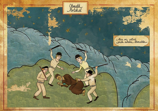

Great stuff. (via @pieratt)
Tags: A Clockwork Orange art Kill Bill movies Murat Palta remixHassan Hajjaj's photos of female motorbike enthusiasts from Morocco are fun.

On display at the Taymour Grahne Gallery in NYC through March 7.
Tags: art Hassan Hajjaj NYC photography