Shared posts

08 Sep 04:37

Arriving 9/7/15

by graeme@savagecritic.com (Savage Critics)

Big things this week. BITCH PLANET returns with what must be a bang, Andrew MacLean’s HEAD LOPPER becomes a thing you can pick up at the local sequential art emporium, the first collection of Jeff Lemire and Dustin Nguyen’s DESCENDER lands alongside the book everyone has been yelling about for the last seven months, SAGA VOL. 5.

Plus new WALKING DEAD, DARTH VADER, GOTHAM ACADEMY and A-FORCE is those are your jam.

The rest of the sweltering almost-end-of-summer comics under the cut!

1602 WITCH HUNTER ANGELA #3 SWA
ABE SAPIEN #26
ACTION COMICS #44
A-FORCE #4 SWA
ALL STAR SECTION 8 #4 (OF 6)
AMAZING SPIDER-MAN RENEW YOUR VOWS #5 SWA
AMERICATOWN #2
ATOMIC ROBO & THE RING OF FIRE #1 (OF 5)
BATMAN #44
BATMAN SUPERMAN #24
BITCH PLANET #5
BOY-1 #2 (OF 4)
BRAVEST WARRIORS #36
BUNKER #14
CATWOMAN #44
CIVIL WAR #4 SWA
CROSSED BADLANDS #85
CROSSED PLUS 100 #8
DARTH VADER #9
DEADLY CLASS #16
DOCTOR WHO 12TH #11
EARTH 2 SOCIETY #4
FABLES THE WOLF AMONG US #9
FASTER THAN LIGHT #1
FUSE #14
GEARS AND BONES #2
GIANT SIZE LITTLE MARVEL AVX #4 SWA
GOD IS DEAD #42
GOTHAM ACADEMY #10
GRIEVOUS JOURNEY OF ICHABOD AZRAEL #6 (OF 6)
HARLEY QUINN ROAD TRIP SPECIAL #1
HARROW COUNTY #5
HAUNTED HORROR #18
HEAD LOPPER #1
INJECTION #5
INSUFFERABLE #5
JOURNEY STAR WARS FASE #1 (OF 4)
JUSTICE LEAGUE UNITED #13
KING TIGER #2
KNIGHTS OF THE DINNER TABLE #223
KORVAC SAGA #4 SWA
LANTERN CITY #5 (OF 12)
LEGACY OF LUTHER STRODE #3
LETTER 44 #20
MAXX MAXXIMIZED #23
MERCURY HEAT #3
MICE TEMPLAR V NIGHTS END #5 (OF 5)
MIRRORS EDGE EXORDIUM #1
MRS DEADPOOL AND HOWLING COMMANDOS #4 SWA
MS MARVEL #18 SWA
MY LITTLE PONY FRIENDS FOREVER #20
NEW SUICIDE SQUAD #12
ONYX #2 (OF 4)
OUTCAST BY KIRKMAN & AZACETA #12 (MR)
PHONOGRAM THE IMMATERIAL GIRL #2 (OF 6)
PLANET HULK #5 SWA
QUAKE SHIELD 50TH ANNIV #1
REBELS #6
RED HOOD ARSENAL #4
RED SKULL #3 (OF 3) SWA
RED SONJA CONAN #2 (OF 4)
SADHU BIRTH OF THE WARRIOR #3 (OF 6)
SAVIOR #6
SCOOBY DOO WHERE ARE YOU #61
SECRET WARS 2099 #5 (OF 5) SWA
SIEGE #3 SWA
SPONGEBOB COMICS #48
STAR TREK GREEN LANTERN #3 (OF 6)
STAR TREK NEW VISIONS SURVIVAL EQUATION
STARFIRE #4
STARVE #4
SUICIDERS #6
SWORDS OF SORROW #5 (OF 6)
TET #1 (OF 4)
TYSON HESSE DIESEL #1 (OF 4)
UNITY #22
WALKING DEAD #146
WALT DISNEY COMICS & STORIES #723
WICKED & DIVINE #14
X-FILES SEASON 11 #2

Books/Mags/Things
ATOMIC ROBO GN EVERYTHING EXPLODES COLLECTION
AVENGERS TIME RUNS OUT TP VOL 01
BTVS SEASON 10 TP VOL 03 LOVE DARES YOU
CHRONONAUTS TP VOL 01
CROSSED PLUS 100 TP VOL 01
D4VE TP VOL 01
DARK TOWER DRAWING OF THREE HOUSE OF CARDS TP
DESCENDER TP VOL 01 TIN STARS
JUDGE DREDD CLASSICS DARK JUDGES HC
JUDGE DREDD COMP CASE FILES ANNIV ED HC VOL 01
JUDGE DREDD COMP CASE FILES TP VOL 25
JUDGE DREDD MEGAZINE #363
MY LITTLE PONY OMNIBUS TP VOL 02
NEW LONE WOLF AND CUB TP VOL 06
PIXU MARK OF EVIL TP
RANMA 1/2 2IN1 TP VOL 10
SAGA TP VOL 05
STAR TREK ONGOING TP VOL 10
UNCLE SCROOGE TP VOL 01 PURE VIEWING SATISFACTION
VIRGIL TP
ZOMBIES VS ROBOTS TP VOL 01


As always, what do YOU think?

No related posts.

08 Sep 04:37

SF ZineFest – Tomorrow!

by Jesse Russell
I had my comic event radar in the off position for a few months, so I’ve lost the habit of turning it on each morning. When I saw the Alternative Press Expo announcement it reminded me that San Francisco Zine Fest must be coming up soon. Indeed it is! Tomorrow in fact. SF Zine Fest returns […]
04 Aug 00:16

Losing a Pet Part 1: Berkeley Humane's Pet Loss Support Group

by Maddie Greene
Once upon a time I had the best cat ever. His name was Beeper.

His death from kidney failure at age 17 was devastating. It doesn’t matter that he died four years ago; I can still cry as freely today as I did then.

Registered Nurse, Clinical Social Worker and Grief Recovery Specialist Jill Goodfriend had her own best cat ever.

In her June 2012 piece To Honor Aja Katrina:The Creation of Pet Loss Support Groups, Goodfriend describes the way her cat Aja’s death inspired the creation of her long-running pet loss support group:
“The apartment felt hollow, empty. Her toys were still scattered around, food and water bowls untouched, wisps of her hair everywhere. I needed to talk and cry. I needed a compassionate someone, who understood our unique bond, to listen. Gratefully I found Betty Carmack’s support group in San Francisco, and another in Marin, but surprisingly none in the East Bay. I vowed that when my grief healed sufficiently I would create a pet loss support group to honor Aja Katrina. And I did.”
Jill has offered groups at various Bay Area locations and finally found a home at Berkeley Humane ten years ago. Each month on the third Tuesday, the group welcomes anyone to drop in and share their loss, no matter how recent or distant. It's also an excellent resource for those preparing for a pet's imminent death. 

“Berkeley Humane has been so supportive,” says Jill. “Another location started at the same time put us in a windowless, hot room without a fan after the air conditioning had been turned off for the night, and failed to advertise the group, so no one came. But Berkeley Humane welcomed us from the beginning, rent-free, and has included our group on their website. They’ve been great to work with.”

Candles to honor the pets we miss
One evening in June I headed to Berkeley Humane. As a volunteer I’m familiar with the shelter’s front room, but Jill and her co-facilitator Sylvia Wenninger transformed it into a welcoming place to grieve. Jill organized a centerpiece of softly glowing electric candles. No matter which seat I chose in the circle, a box of tissues was close at hand to absorb tears. Stuffed animals offered comfort and a bittersweet reminder of the pets we’d lost.

Attendance varies: over the last year the group welcomed an average of seven mourners each month. The evening I attended was an intimate affair that gave us all a chance to share our stories, ask each other questions, and receive counseling on healing actions that might help us.

Stuffed animals and tissues.
Each month Jill or Sylvia select a new piece dealing with pets and loss. This reading, followed by a moment of silence, opens each meeting. Soon I was passing around my pictures of Beeper and sharing stories about my best cat ever. My audience listened intently (in fact, one of the rules is no interrupting while someone speaks) and passed me tissues when I dissolved into inarticulate tears.

Two things struck me that evening. The first is how comforting it is to speak of the loss of a pet openly and without judgment, which is precisely why Jill created the group.

“Although our society is uncomfortable with the whole topic of death, and certainly doesn’t know how to deal with people who are mourning their pets, at least there are some socially accepted cultural or religious rituals to acknowledge and honor a person’s passing and to offer support to the bereaved family,” she says. The pet loss support group lets us mourn our beloved companions in a supportive environment.

“The mourning pet owner finds that his grief may not be recognized or accepted by society, that it is disenfranchised grief. From well-meaning friends and co-workers he might hear ‘It was just a dog,’ ‘Aren’t you over him yet?’ or ‘Why don’t you just adopt another one from a shelter?’ as if pets are simply interchangeable. Many group attendees admit to experiencing more difficulty recovering from the loss of a pet than from the death of a parent.” - Jill Goodfriend

Monk, a very good cat. He is missed.
The second thing that struck me was how helpful perspective is in the healing process. Another attendee lost his cat Monk earlier this year. Learning about friendly, unflappable Monk reminded me that I’m not alone in missing my pet. Grief doesn’t have to be a solo journey.

Jill brings resources to suit all needs: handouts on self care after loss, help lines, regional pet loss groups, even copies of a book written for bereaved cat owners: Soul Comfort for Cat Lovers by Liz Eastwood. No one leaves without useful information on positive next steps. For instance, Jill felt I might benefit from writing letters to Beeper. (That the prospect unnerves me is probably a clue to its therapeutic, if tearful, value.)

The pet loss support group left me in tears, I admit. After the discussion I missed Beeper more than I’d allowed myself to in years.

Yet I felt unquestionably better: by revisiting my grief I’d reassessed it, an emotional check-in that made it easier to move forward.

Beeper, my very best cat.
If you’re mourning an animal, consider sharing your story at the pet loss support group each third Tuesday of the month from 7-8:30pm. Sharing is not required but the confidentiality rules make it a safe place to do so. The group is run by Jill Goodfriend and Sylvia Wenninger, Licensed Marriage and Family Therapist and RYT. The group meets at Berkeley Humane, 2700 9th Street. Find out more about the group here.

 
Part two of this series shares recommendations and resources for those who have lost a pet or are readying themselves for the loss.
21 May 22:17

Creative Cocktail Menus From Around the World

by Camper English

I love the trends of:

1. Bars producing elaborate, creative cocktail menus.

2. Especially when they are offered as purchasable souvenirs. 

3. And extra-specially when bartenders mail them to me for keeping!

Here are a few that have come into my hands lately. Sorry about my lousy photography skills. I guess you'll have to fly around the world and see these in person...


Beaufort Bar at the Savoy Hotel, London

Chris Moore of Beaufort Bar mailed me their incredible pop-up menu, which was made in a limited edition of 1000 copies. 

IMG_8835
IMG_8835
IMG_8835


Black Pearl, Melbourne, Australia

While at the Bacardi Legacy Global Cocktail Competition in Sydney, Australia, bartenders from Melbourne's Black Pearl gave an amazing presentation and drink tasting to our group. 

Their drink menu is a baseball card album, and I believe they said you get to keep the card for the drink you order. Here are some of the cards.

IMG_8664
IMG_8664
IMG_8664

And if that's not a good enough souvenir for you, Black Pearl also offers a naked bartender calendar. 

IMG_8831


Nightjar, London

Last week in New York for the (cancelled) Manhattan Cocktail Classic I ran into one of the owners of Nightjar, who handed me their latest card deck. They are several editions into doing this. 

IMG_8825
IMG_8825


Balderdash, Copenhagen

My pal Geoffrey Canilao handed me the menu for his new bar Balderdash when we were together at the Reykjavik Bar Summit a couple of months ago. The menu is on a fold-out subway map with cocktails on either side.

IMG_8830
IMG_8830


Bitter & Twisted Cocktail Parlour, Phoenix, Arizona, USA

Ross Simon of Bitter & Twisted Cocktail Parlour sent me their latest menu, which is a comic book comprising of a lot of parts. There is a chart with how exotic/safe/refreshing/boozy the drinks are (similar to what Pouring Ribbons has done with their menu), some fun illustrations, and cocktails listed with upsell prices (economy, business, and first classes) depending on the base spirit used. 

IMG_8821
IMG_8821
IMG_8821


Dead Rabbit Grocery & Grog, New York, New York, USA

The Dead Rabbit fellas recently released the third edition of their cocktail menu; this one with some fold-out illustrated pages to make it even more impressive than the last two. The menu costs $50 at the bar to take home, but if you have the patience they're also releasing a full cocktail book (including the recipes not just the menu) this fall. 

IMG_8818
IMG_8818


Related articles
28 Apr 20:18

Volunteer Appreciation Series: Romy

by Madolan


Today’s Volunteer Appreciation post features a very special volunteer, Romy Harness, who serves Berkeley Humane in two distinct but complementary roles: Canine Volunteer and Board Member. Romy started volunteering three years ago as a Canine Volunteer. Her expertise with a range of dog behavior earned her an “upgrade” to Dog Training Assistant, where she is able to help with pooches that might prove a little more challenging to a new volunteer. Her talents and dedication led to an invitation to join Berkeley Humane’s Board of Directors, where she has served as a Director since August 2014.

Romy enjoys contributing to the varied talents that board members bring to their monthly meetings. “Everyone brings a lot of good personal insight and expertise from the different realms they come from,” she says. “When we get together to share ideas and brainstorm, it’s a really good and positive experience. We work together really well.”

The talents Romy brings to the Board of Directors are highly informed by her experiences volunteering at Berkeley Humane. “Because I’ve been a volunteer for three years now, my chosen focus is staff culture, volunteer culture, and morale,” she says. “I’m the only board member who volunteers at Berkeley Humane so I think it gives me a particularly good insight into the other side” apart from administration. I don’t have a particular educational background in animals, but [all Board Directors] have something to bring. In my other life, I’m an Executive Assistant at a software company. What I can share from that is an ability for organization, and knowing how to run a professional organization.”

She got started working with Berkeley Humane when she realized how much she wanted to spend time with dogs, even though she recognized that her loft apartment — while a wonderful place for her three cats, Pepe, Rocky, and Bucci — wasn’t ideal for a dog. She realized that volunteering was a great way to spend rewarding time with dogs who would greatly benefit from her efforts. “I started volunteering at Berkeley Humane because I wanted to be around dogs more but wasn’t really set up to have a dog. I started to volunteer and it has grown from there.”

Romy also points out that volunteering wasn’t just about satisfying her need for quality doggy time. The animals and shelter benefit just as much.

“I know that organizations like Berkeley Humane and other shelters really depend a lot on volunteers. I know how valuable foster help and people helping on-site can be.”

Romy’s dual positions as a board member and dog training assistant complement each other. “[Holding both volunteer positions] is extremely beneficial! They benefit each other, especially by giving me a lot more breadth of knowledge about the day-to-day running of the shelter. It really helps me because I get to know the staff and other volunteers well and see how things are going.”

“I think my future vision is twofold. One is to get a new shelter built. Along with that [my vision is to] continue to examine as a board how to best serve the animals and people of our community.”


Thank you for your dedication, Romy! We appreciate your years of service and the variety of ways you help Berkeley Humane grow.

If you’d like to help make Romy’s vision of community service come true, please consider volunteering at Berkeley Humane. No matter what talent you have to share, we probably have a volunteer opportunity you’ll excel at.
22 Apr 22:37

An Analysis of the Shift in Color Palettes Used in More Than 50 Years of ‘Avengers’ Comic Book Covers

by Justin Page

50 Years of  Avengers Comic Book

The Wall Street Journal has published an in-depth article and interactive graphic that analyzes the shift in color palettes used in more than 50 years of Avengers comic book covers. All of the color palettes they generated and more information about the shift in colors is available to view online.

When Marvel’s “Avengers: Age of Ultron” opens in theaters next month, a familiar set of iconic colors will be splashed across movie screens world-wide: The gamma ray-induced green of the Hulk, Iron Man’s red and gold armor, and Captain America’s red, white and blue uniform.

How the Avengers look today differs significantly from their appearance in classic comic-book versions, thanks to advancements in technology and a shift to a more cinematic aesthetic. As Marvel’s characters started to appear in big-budget superhero films such as “X-Men” in 2000, the darker, muted colors of the movies began to creep into the look of the comics. (read more)

50 Years of  Avengers Comic Book

50 Years of  Avengers Comic Book

50 Years of  Avengers Comic Book

50 Years of  Avengers Comic Book

50 Years of  Avengers Comic Book

images via The Wall Street Journal

submitted via Laughing Squid Tips

01 Apr 22:52

The US Forest Service's Cocktail Construction Chart

by Jason Kottke

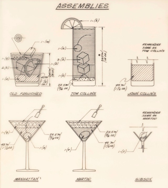
Cocktail Construction Chart

This is...weird. The National Archives contains a Cocktail Construction Chart made in an architectural style, for some reason, by the US Forest Service in 1974.

Cocktail Construction Chart

Update: Kenny Herzog at Esquire did some digging and found out some of the chart's backstory.

If it does, royalties might be due to the family of late Forest Service Region 8 Engineer Cleve "Red" Ketcham, who passed away in 2005 but has since been commemorated in the National Museum of Forest Service History. It's Ketcham's signature scribbled in the center of the chart, and according to Sharon Phillips, a longtime Program Management Analyst for Region 8 (which covers Virginia, Georgia, Florida, Oklahoma and Puerto Rico, though Ketcham worked out of its Atlanta office), who conferred with her engineering department, there's little doubt Ketcham concocted the chart in question. "They're assuming he's the one, because the drawing has a date of 1974, and he was working our office from 1974-1980," she said. And in case there'd be any curiosity as to whether someone else composed the chart and Ketcham merely signed off on it for disbursement, Phillips clarified that, "He's the author of the chart. I wouldn't say he passed it along to the staff, because at that time, he probably did that as maybe a joke, something he did for fun. It probably got mixed up with some legitimate stuff and ended up in the Archives."

I contacted the librarian at the Forest History Society and found similar information. An archivist pulled a staff directory from the Atlanta office (aka "Region 8") from 1975 and found three names that correlate with those on the document: David E. Ketcham & Cleve C. Ketcham (but not Ketchum, as on the document) and Robert B. Johns (presumably aka the Bob Johns in the lower right hand corner). Not sure if the two Ketchams were related or why the spellings of Cleve's actual last name and the last name of the signature on the chart are different.

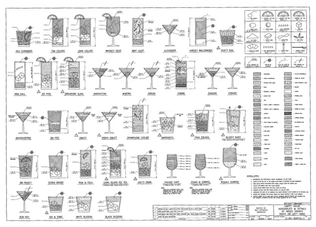
However, in the past few days, I've run across several similar charts, most notably The Engineer's Guide to Drinks.1 Information on this chart is difficult to come by, but various commenters at Flowing Data and elsewhere remember the chart being used in the 1970s by a company called Calcomp to demonstrate their pen plotter.

Engineers Guide to Cocktails

As you can see, the Forest Service document and this one share a very similar visual language -- for instance, the five drops for Angostura bitters, the three-leaf mint sprig, and the lemon peel. And I haven't checked every single one, but the shading employed for the liquids appear to match exactly.

So which chart came first? The Forest Service chart has a date of 1974 and The Engineer's Guide to Drinks is dated 1978. But in this post, Autodesk Technologist Shaan Hurley says the Engineer's Guide dates to 1972. I emailed Hurley to ask about the date, but he couldn't point to a definite source, which is not uncommon when you're dealing with this sort of thing. It's like finding some initials next to "85" scratched into the cement on a sidewalk: you're pretty sure that someone did that in 1985 but you'd have a tough time proving it.

FWIW, if I had to guess where this chart originated, I'd say that the Calcomp plotter demo got out there somehow (maybe at a trade show or published in an industry magazine) and every engineer took a crack at their own version, like an early internet meme. Cleve Ketcham drew his by hand while others probably used the CAD software running on their workplace mainframes or minicomputers.

Anyway, if anyone has any further information about where these CAD-style cocktail instructions originated, let me know. (thx, @john_overholt & tre)

  1. Other instances include these reprints of drawings from 1978 on eBay and an advertisement for a Cocktail Construction drawing in the Dec 1982 issue of Texas Monthly.

Tags: alcohol   architecture   cocktails   food   infoviz
10 Feb 21:39

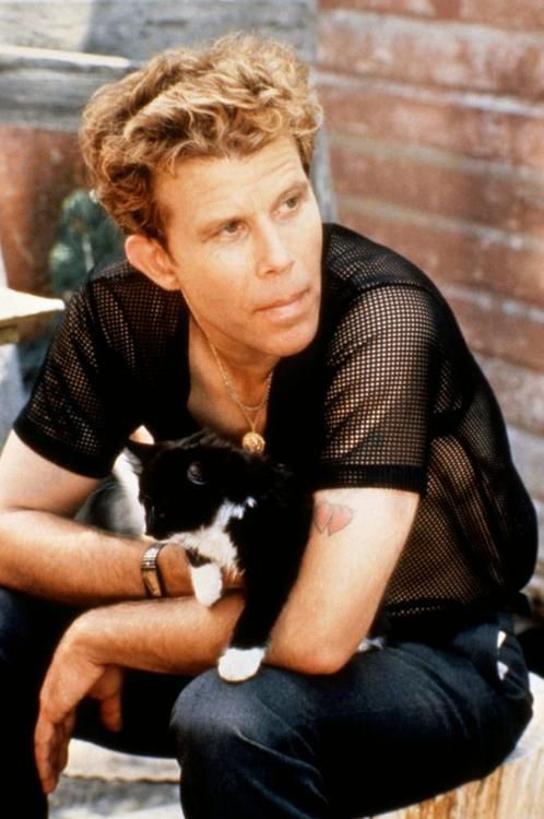
Even Tom waits wears mesh t-shirts some times you guys


Even Tom waits wears mesh t-shirts some times you guys

11 Nov 22:22

Classic Works of Literature Turned Into Beautiful Book Sculptures

by EDW Lynch

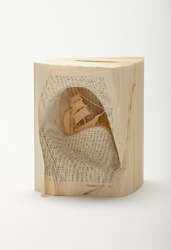
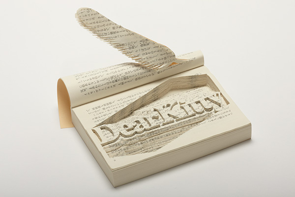
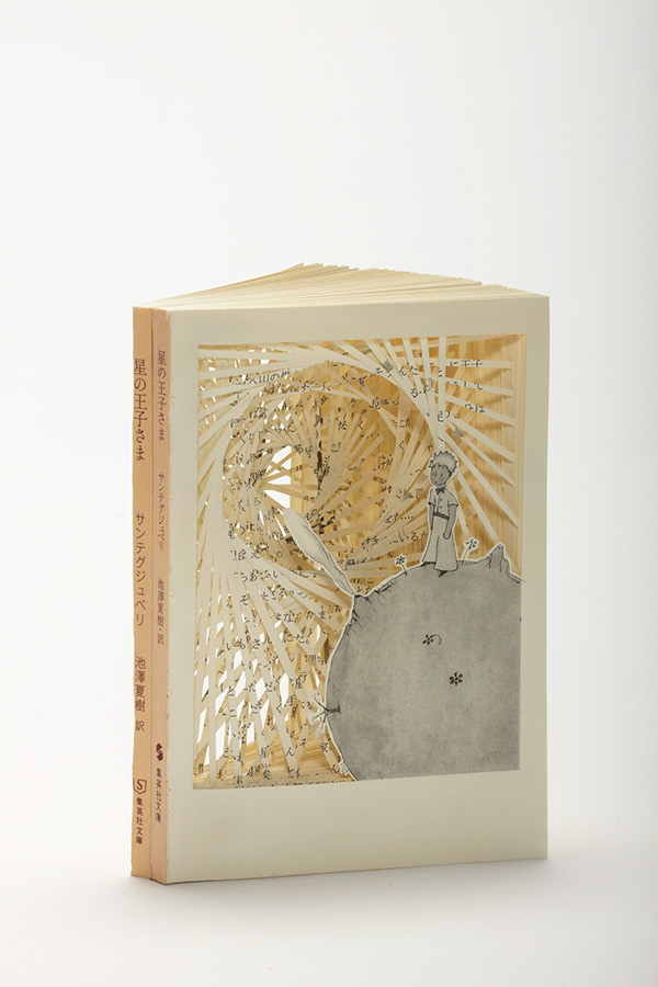
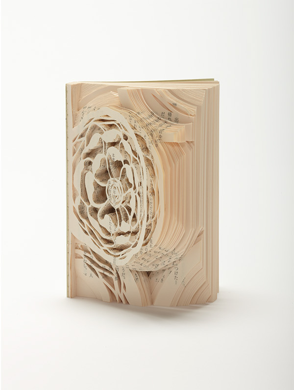
Book Sculptures of Classic Literature by Tomoko Takeda
Alice’s Adventures in Wonderland by Lewis Carroll

In her series Fragments of Story, Tokyo-based art director Tomoko Takeda creates sculptures inspired by classic works of literature using the actual books as her medium. She has created book sculptures for Alice’s Adventures in Wonderland, Flowers for Algernon, and The Little Prince, among others.

Book Sculptures of Classic Literature by Tomoko Takeda
Two Years’ Vacation by Jules Verne

Book Sculptures of Classic Literature by Tomoko Takeda
The Diary of a Young Girl by Anne Frank

Book Sculptures of Classic Literature by Tomoko Takeda
The Little Prince by Antoine de Saint-Exupéry

Book Sculptures of Classic Literature by Tomoko Takeda
Flowers for Algernon by Daniel Keyes

photos via Tomoko Takeda

via Visual News

15 Aug 22:40

Hyperphotos: Architectural Hybrids Remix Built Environments

by Urbanist
[ By WebUrbanist in Art & Photography & Video. ]

hyperphoto endless staircase image

There is something almost mystical (or mythical) about these photographic collages, at once apparently realistic in content and seemingly impossible in composition.

hyperphoto urban city montage

hyperphoto babylon

The Hyperphotos portfolio of Jean-Francois Rauzier, a French artist and photographer, represents years of captured images overlaid to create incredibly detailed composites. “In his monumental works he mixes the infinitely big and the infinitesimal, in a profusion of details so unusual as fascinating. The image thus recomposed numerically gives way to the dreamlike world of the artist.”

hyperphoto reflected mythical interior

Some seem to reflect the nature of their places of origin, from New York City and Paris to Istanbul and Barcelona, or the time period from which the architecture originates, from ancient cathedrals to modern brownstones.

hyperphoto stacked bridges

hyperphoto infinite future city

Others are works of almost pure fantasy, casting the viewer into imaginary futures or impossible pasts. While people, plants and animals are sometimes included, the focus of his fascination is almost always a built environment.

hyperphoto inside religious structure

About the artist: “Fascinated by photography from an early age, Jean-François Rauzier graduated from the School Louis Lumière in 1976. He has since been working as a professional photographer, while developing a personal creative work. In 2002, his artistic work takes an innovative and radical turn.” Now “he creates virtual images consisting of several hundreds of shots, taken with a telephoto lens and assembled by computer.”


Want More? Click for Great Related Content on WebUrbanist:

Works of Impossible Architecture Built from Found Photos

Like the architecture of dreams, these images are seamlessly integrated, yet structurally surreal ... and, like waking up: they hard to recall when you look ... Click Here to Read More »»


Bones of War: Haunting Skeleton Weapon Photography

When a photographer unexpectedly acquired a human skeleton, the only question he had was what to do with it. The result was these powerful anti-war sculptures. Click Here to Read More »»


Art Remix: 26 Modern Takes on Famous Historical Paintings

Modern artists recreate famous paintings like the Mona Lisa and The Birth of Venus using photography, Photoshop, digital technology... even vegetables. Click Here to Read More »»


Share on Facebook

[ By WebUrbanist in Art & Photography & Video. ]

[ WebUrbanist | Archives | Galleries | Privacy | TOS ]


14 Aug 17:36

Kate Bush's Hounds of Love/The Ninth Wave

Kate Bush's Hounds of Love/The Ninth Wave:

madolan:

Wave after wave, each mightier than the last,
Till last, a ninth one, gathering half the deep
And full of voices, slowly rose and plunged
Roaring, and all the wave was in a flame

—Tennyson, The Coming of Arthur

At seven songs long, The Ninth Wave surely stands among the shortest concept…

04 Aug 17:22

Potential Dangers of Homemade Tonic Water

by Camper English

UntitledA few weeks ago, Avery and Janet Glasser drank some homemade tonic syrup in a Gin and Tonic at a bar and came down with the symptons of cinchonism, a condition caused by a buildup of quinine.

Tonic water contains quinine as its active, bittering ingredient. Quinine comes from cinchona tree bark. Homemade tonic waters begin with this tree bark either in chunk or powdered form. The powdered form is particularly hard to strain out of the final beverage, and this could lead to an accidental overdose.

The symptons of cinchonism (from wikipedia):

Symptoms of mild cinchonism (which may occur from standard therapeutic doses of quinine) include flushed and sweaty skin, ringing of the ears (tinnitus), blurred vision, impaired hearing, confusion, reversible high-frequency hearing loss, headache, abdominal pain, rashes, drug-induced lichenoid reaction (lichenoid photosensitivity),[1] vertigo, dizziness, dysphoria, nausea, vomiting and diarrhea.

A scientific paper published in 2007 reported a case of a patient self-medicating for leg cramps with quinine and it turns out he gave himself cinchonism. His systems were intermittent fevers, chills, and tremors for approximately 12 days; general malaise that would begin with a bitter taste in his mouth that wouldn't go away. (On PubMed the article is at  PMID: 18004031)

BS1-300x150Glasser wrote about his incident on his Facebook page, and I asked if I could reprint it. The Glassers are the founders of Bittermens, makers of bitters, spirits, liqueurs, and other products. Thus they are very familiar with quinine. He wrote:

How did it happen? Well, we work with cinchona all of the time, which means that our bodies already have a small buildup of quinine. During Tales of the Cocktail, we had a gin and tonic at a restaurant where they made their own tonic syrup. By the amount of the suspended cinchona dust floating in the drink and the distinctive earthy tannins that mark incomplete filtration, we should have stopped drinking it at the first sip. But we didn't, and spent the next two days dealing with the very uncomfortable symptoms of cinchonism. 

Safe Amounts of Quinine in Tonic Water

The below information all comes from Avery Glasser. 

There's a federal standard for the use of quinine in carbonated beverages, specifically that it cannot exceed 83 parts per million in the final tonic water (21 CFR 172.575). Now, if you're working with commercial quinine sulphate or quinine hydrochloride, it's easy to calculate. Basically, that ends up being 2.48 mg of commercial quinine per ounce of tonic water.

So, let's expand this out: a typical gin and tonic is 1.5 oz of gin and 4.5 oz of tonic, 6 ounces total. That means we can expect 11.16mg of quinine in that beverage.

However, most producers of tonic syrups don't use quinine hydrochloride/quinine sulphate... and there's the rub.

Cinchona bark is approximately 5% quinine.

The Most Popular Tonic Water Syrup Recipe Has Too Much Quinine

Let's take one of the most popular tonic syrup recipes, published by Jeffrey Morgenthaler: Basically, it's 6 cups of liquid to 1/4 cup of powdered cinchona bark, which is about 35 grams of cinchona. Extrapolate from that and we're talking about 35 grams of cinchona per 1.4 liters of end syrup, which is 25 grams per liter, and if it extracts fully, contributes 1.25 grams of quinine per liter, which equates to 1251 parts per million. That's 15 times the CFR standard.

If you use 3/4 of an ounce of that syrup in a Gin and Tonic, you're adding in 27.5 mg of quinine - more than double the amount of quinine in a commercial gin and tonic. 

Note: Does a syrup extract quinine fully from the cinchona? No - but it extracts faster from powdered cinchona versus cinchona chips or quills.

Note: Does a syrup that is sieved through a french press or a coffee filter have a high percentage of solids still in suspension? Yes - and any of the solids you swallow contribute the full amount of the quinine as your body digests the powder. 

Quinine in Bittermens Bitters and Liqueurs

Glaslser says, "We work with small amounts of cinchona in many of our bitters. At our concentration, there's only about 1.1 grams of cinchona per liter in the maceration, and all of the solids are removed down to 5 microns, which means there's barely any cinchona left in the mix. If we say that we get a full extraction of quinine from the cinchona before we filter it out, then we're talking about contributing about 57 mg of quinine per liter of bitters, or assuming a half ml of bitters per cocktail, we add no more than 0.0283 mg of quinine to a cocktail, or raise the total amount of quinine by 0.19 parts per million. Again, that's assuming that we left all of the cinchona bark in the final product, which we do not as we don't use powdered cinchona (we use larger pieces of bark). Most likely, we're contributing less than a tenth of that amount.

"Just for full disclosure, our liqueur division (Bittermens Spirits) makes a tonic liqueur - but we had that tested before releasing it to ensure that our liqueur was below 83 ppm, meaning that any beverage use would still be well below the federal limits."
 

Avery Glasser's Conclusion

All I'm saying this this: be careful. Bitters and tonic syrups can be fun to make, but they can be dangerous if you don't know what you're doing. I'm not saying that you need to be a food scientist or a compounding pharmacist to do things safely, but you have to understand that you're working with potentially harmful substances! Indian Calamus root, Virginia Snakeroot or tobacco - even in small amounts can have horrible and irreversible effects. Just last week, I was told about a bar that was soaking stone fruit pits in neutral grain and had no idea about cyanide toxicity.

For us, it's now five days later and the symptoms are basically gone, but it also means we have to be careful about having cinchona for another week or so.  

That's it. No rant. Just a plea for my health and the health of all of our friends and customers: think carefully before making your own tinctures, extracts, bitters and syrups.

General Cautions:

Based on the above information, the following recommendations seem prudent. These are from me. 

  • If you're using powdered cinchona tree bark, try extra hard to strain it thoroughly. I've strained it through 2-3 coffee filters (I run vodka through the coffee machine to do my extractions with quinine powder in the basket) and there is still a quantity of the bark solids that pass through the filters. In the future I might strain it more.
  • Filter your bark before you add sugar or you'll gum up your filters.
  • If you are testing recipes with homemade tonic, keep your samples small.
  • As Glasser experienced, quinine/cinchona can build up in your system. So go easy on the intensive homemade tonic syrup drinking, and beware of other tonic syrups with lots of barky bits. 

 Thanks to Avery Glasser for sharing his story - and the math - with us. 


Related articles
30 Jul 15:47

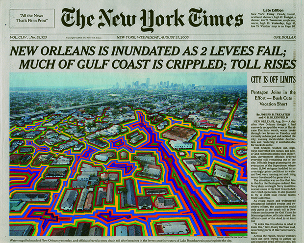
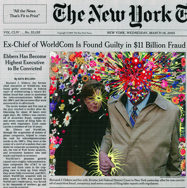
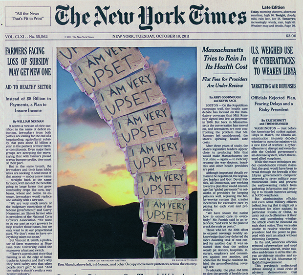
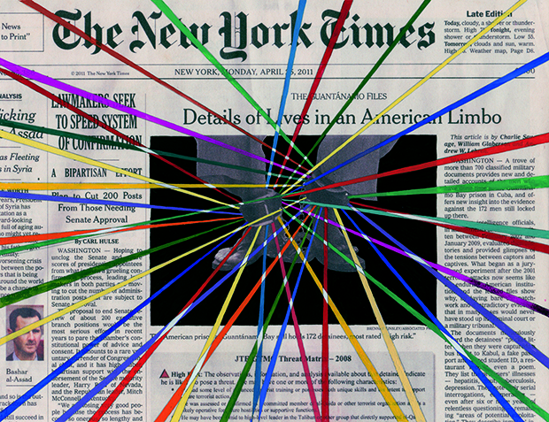
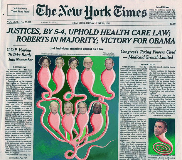
Art Created With ‘New York Times’ Cover Pages by Fred Tomaselli

by EDW Lynch

New York Times Cover Page Art by Fred Tomaselli

New York City-based artist Fred Tomaselli has been adding colorful art to cover pages of The New York Times since 2005. His additions — mainly centered around the newspaper’s photos, but sometimes incorporating the entire front page — vary between abstraction and commentary. The series has been turned into an art book, Fred Tomaselli: The Times, which is available on Amazon.

New York Times Cover Page Art by Fred Tomaselli

New York Times Cover Page Art by Fred Tomaselli

New York Times Cover Page Art by Fred Tomaselli

New York Times Cover Page Art by Fred Tomaselli

images via Feature Shoot

via Feature Shoot

30 Jul 15:40

Book of Shadows: 2D Shape Cutouts Cast Silhouettes on Pages

by Urbanist
[ By WebUrbanist in Design & Products & Packaging. ]

motion train animated example

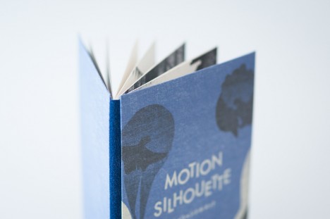
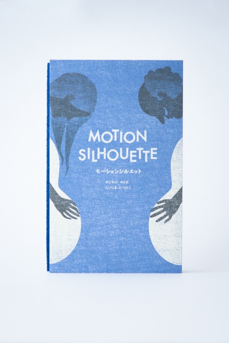
A children’s book with an interactive twist, Motion Silhouette engages readers through pop-up pieces that require lighting to animate shadow pictures on each page.

motion train moving page

motion train other page

motion womans face page

motion butterfly shape page

The idea is to add elements of manual animation that are necessarily subjective – each person will hold, turn and highlight the cutouts in different ways.

motion animated book shadow

motion silhouete tree city

motion silhouette

Secondary readers or viewers (young kids watching over parents’ shoulders) will also have their own unique experience each time.

silhoutte book one

silhouette spider web

silhouette plant shapes

silhouette cross page

silhouette bird page

Motion Silhouette is actually a sequel to another book, simply titled Silhouette (excerpts shown above), a work which similarly uses slightly less-developed pop-up pages to create a more basic multi-dimensional experience.

motion silhouette book

From its Japanese creators, Megumi Kajiwara and Tathuhiko Nijima: “I will begin to talk about the story and illustrations shadow falls on top of the page overlap. In this work, you can enjoy the animation of shadow phantasmagoric by you move the light. Trees and become bigger and bigger, which aims to train a distant star. Story that changes depending on the page falling shadows, shadows move around the top of the page.”


Want More? Click for Great Related Content on WebUrbanist:

Drinkable Book: Tear-Out Pages Filter, Clean & Purify Water

Each sheet from this life-saving tome can provide 30 days of drinkable water - all together, the entire volume is able make a total of 5,000 liters fit for ... Click Here to Read More »»


Static Flip Books: 360-Degree Scenes in Panoramic Pages

Like a flip book, there is no text, and each page of these volumes contains a slightly different scene. But that is where the similarities end and the fun ... Click Here to Read More »»


Art in the Shadows: Documenting Temporary Urban Sights

Shadows are the most fleeting parts of the urban landscape, but some artists use various methods to make the shadows last just a little longer. Click Here to Read More »»


Share on Facebook

[ By WebUrbanist in Design & Products & Packaging. ]

[ WebUrbanist | Archives | Galleries | Privacy | TOS ]


28 Jul 21:10

‘Fear on Film’, A 1982 Roundtable Discussion About Horror With David Cronenberg, John Landis, and John Carpenter

by Brian Heater

“Fear on Film” is a 1982 roundtable discussion, hosted by filmmaker Mick Garris, featuring legendary directors David Cronenberg, John Landis, and John Carpenter. The group talks about the nature and history of horror films.

The genre of monster films and horror films has been consistent throughout the history of the business. If you look at the decades, there’s always cycles of westerns, war movies and comedies, but there have been horror films straight through. The only difference is budgets — whether they’re A pictures or B pictures.

via Rian Johnson

25 Jul 17:53

by john kenn

23 Jul 03:23

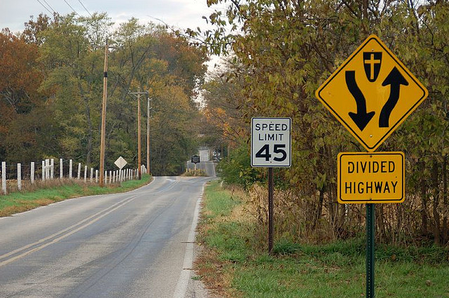
The Grave in the Middle of a Rural Indiana Road

by EDW Lynch

The Grave in the Middle of a Rural Indiana Road
photo via Roadtrippers

On a rural stretch of County Road 400 in Amity, Indiana, the road splits around a small mound of earth located in the center of the roadway. That mound is the grave of Nancy Kerlin Barnett (1793-1831) and it is in the middle of the road for a most unusual reason. As the 1912 historical marker at the site explains, when the county planned to run a road through the cemetery in which Barnett was laid to rest, her grandson Daniel Doty guarded the plot with a gun until the county relented and built the road around the grave.

The Grave in the Middle of a Rural Indiana Road
photo via GraveyardGirl.net

The Grave in the Middle of a Rural Indiana Road
photo via GraveyardGirl.net

The Grave in the Middle of a Rural Indiana Road
photo by nuekerk

via GraveyardGirl.net, Neatorama

21 Jul 21:46

Character Art Painted on Stacks of Books by Mike Stilkey

by EDW Lynch

Character Art Painted on Stacks of Books by Mike Stilkey

Artist Mike Stilkey has created a series of book sculptures in which he paints fantastical animal and human characters directly on stacks of books. Stilkey uses a combination of ink, colored pencil, paint, and lacquer on the sculptures. They range in size from a few books to wall-sized installations. He talks about his process in this 3-part interview with Fully Booked (part 1, part 2, and part 3). His book sculptures are available at Gilman Contemporary gallery in Ketchum, Idaho.

Character Art Painted on Stacks of Books by Mike Stilkey

Character Art Painted on Stacks of Books by Mike Stilkey

Character Art Painted on Stacks of Books by Mike Stilkey

Character Art Painted on Stacks of Books by Mike Stilkey

photos via Mike Stilkey

via Art Is A Way, Lustik, Colossal

01 Jul 23:39

Lars and the Voodoo Cocktail

By Lars Theriot

“What’s that sound?”
“It’s dead people… SCREAMIN’!!!!”

I was probably 16 when I heard that line for the first time, and I think I surprised myself by laughing out loud.  I wouldn’t have thought it was possible to laugh like that when you were already scared out of your mind.

There are a lot of theories about why we love zombie movies… I believe we love them for the same reason we love Westerns.  Here at the beginning of the 21st century we are a pampered and sheltered people.  Like caged lions desperate to roam and hunt free of fences and zookeepers, we are at odds with the endless layers of protection that exist between us and our problems (or our prey).  Got a fire? Call the fire dept.  Someone breaking into your house?  Call the cops.  Someone bullying you at school?  Talk to the Principal.  Next door neighbor building a fence over the property line?  Call a lawyer.  In zombie movies, as in Westerns, all those layers of “officials” whom we call to deal with our issues have been stripped away.  We stand naked – just us and our wits against a deadly existential threat.  As a fantasy, it’s both exhilarating and terrifying.

After the seminal zombie flick Night of the Living Dead, director George Romero and his writing partner John Russo parted ways.  Russo walked away with the rights to the title “Living Dead” and eventually a sequel was born – Return of the Living Dead.  For a brief period, the production was planned as a 3D movie with Texas Chainsaw Massacre’s Tobe Hooper set to direct.  Eventually Hooper left the project and writer Dan O’Bannon (Alien, Heavy Metal, Dead & Buried) signed on to not only pen but direct the film.  Not wanting to retread the same territory so brilliantly pioneered by Romero’s original film, O’Bannon stipulated that he must be able to craft the project into something very different than Night of the Living Dead. The result of O’Bannon’s re-imagining is a nearly perfect zombie movie.  It’s as scary as Danny Boyle’s 28 Days Later and Zack Snyder’s Dawn of the Dead remake, while also being funnier than any other zombie movie made before or since.

“How do you kill something that’s already dead?”
“It’s not a bad question, Bert.”


It’s got fantastic actors like James Karen, only two years away from Wall Street and absolutely refusing to mail it in.  Watch the scene where he calls his boss to let him know they’ve accidentally released zombies on the city. He takes the time to smooth his hair, wipe the sweat from his brow, and take a sip of water before sing-songing “Oh, Bert – we’ve got a little problem here.”

No other zombie movie has ever worked so hard to come up with a plausible reason why zombies eat people.  The scene where Ernie the mortician interviews a captured zombie is mesmerizing and horrifying all at the same time.  It somehow manages to make you sympathize with the zombies even as you are disgusted by their callous disregard for the lives they take and the ruthlessness with which they take them.

“Why do you eat people?”
“Not people, BRAINS!”
“Brains only?”
“Yessssssssss”
“Why?”
“The pain of being dead – I can feel myself rot!”
“Eating brains… how does that make you feel?”
“It makes the pain… go away!”


Perhaps O’Bannon meant for his zombies to serve as an allegory for drug addiction, which was just starting to dominate the news in the mid-80’s (Return certainly contains a strong element borrowed from the juvenile delinquent films of the late 1960s).  Just as an addict, strung out on heroin and desperate to head off the pain of withdrawal, will lie, cheat, and steal to get that next fix, these zombies seem capable of any atrocity, as long as “it makes the pain go away”.


“Send. More. Cops!”

Did I mention that Dan O’Bannon’s zombies can talk?  They can also use machinery and tools.  And strategize.  But most importantly, they can’t be killed.  You can destroy their brains, remove their heads, cut them to pieces, and the pieces will still come after you.  The only way to permanently dispose of one of these zombies is to burn them to ashes in an industrial crematorium.  You don’t have a crematorium handy, do you?


In the pantheon of the zombie mythos, just about every movie made gives its terrified audiences a thin ray of hope:  if you’re fast, you can outrun the zombies (Romero); if you can shoot well, you can kill the zombies (Snyder, Romero); if you can hole up somewhere with supplies, you can outlast the zombies (Boyle).  But this is where Return of the Living Dead is different.  It’s downright merciless.

Return removes any hope of salvation.  Every single one of the characters in the film is doomed from the minute James Karen unwittingly releases the plague – it’s only a matter of how and when.  I think that’s what terrified me most as a boy, and that’s why the film has stuck with me all these years.  Most horror films have the good sense to let the audience off the hook.  Return of the Living Dead, on the other hand, is fiendishly ruthless.  At the risk of spoiling things, that’s all I’ll say.

For today’s companion drink, we turn to the heart of zombie lore – the voodoo of the West Indian nation of Haiti. Haiti has long been associated with voodoo and the walking dead.  From William Seabrook’s The Magic Island (1929) to anthropologist Zora Huston’s photographs in the late 1930s of Felicia Felix-Mentor, a purported zombie who had originally died in 1907, to the more recent work of ethnobotanist Wade Davis, who journeyed to Haiti to investigate similar claims of reanimation being performed by local voodoo practitioners as well as by Tonton Macoutes, members of President “Papa Doc” Duvalier’s death squads.  The stories Davis had heard were horrible.  It was said that the Macoutes were using plant and animal extracts to create a potent drug – a cocktail, if you will – which would simulate death in anyone who came into contact with it.  With all of this in mind, we chose the Voodoo Cocktail.


Voodoo Cocktail

4 oz Apple Juice
2 oz Gold Rum
1 oz Fresh Lime Juice
1 oz Basic (1:1) Simple Syrup
1 oz Spiced Sweet Vermouth

Add all ingredients to a mixing glass
Shake with ice and double strain into a highball glass over large ice
Pre-Zombiepocalypse, garnish with a lime wedge or voodoo charm
Post-Zombiepocalypse, you shouldn’t be worried about garnishes

Featured Glassware: Boston Double Old-Fashioned by Villeroy & Boch


We found the Voodoo Cocktail on absolutdrinks.com, and, unfortunately, the provenance isn’t given.  The same drink (one of many called “Voodoo”) appears elsewhere with Appleton rum specifically called for, a choice which makes thematic sense, if nothing else.  We checked the Appleton site to see if they claimed it, but it was not among their recipes.  From wherever it originally hails, the drink is outstanding, especially if made with the Spiced Sweet Vermouth from the Bloodbath (you’ll want the spices to be more cinnamon than cardamom).  While on paper it may look a little thin, the Voodoo reveals itself to be a very balanced autumnal cooler (I’d call it a cooler rather than a cocktail), which can be successfully scaled into a bowl of punch (finish with a grating of nutmeg and cinnamon).  Of course, if you’re looking for something even more Living Dead like, please click on over to our recent Laughing Zombie.

While the Voodoo Cocktail won’t bring any long lost relatives back to life, do heed a word of warning:  it’s a deceptive drink, and more than two may have you slipping into a walking dead state yourself.  Of course, if your Halloween plans include a bowl of dip shaped like a brain – well, then you’ll be ready to rock n’ roll.


Esoterica: There is a right way and a wrong way to clean a dusty voodoo chicken foot.


01 Jul 23:38

David and the Ward Eight

Since we’re talking horror films, I think it’s only appropriate that we talk Scooby-Doo.  Like most adults my age, the misadventures of the Mystery Machine were my first exposure to ghosts, ghouls, and things that go bump in the night (at abandoned amusement parks).  It’s safe to say that, as a kid, Scooby-Doo was by far my favorite cartoon (until that punk Scrappy came along, that is), but when the live action movies arrived, I was at a loss.  Despite a nostalgia-fueled desire to want to want to see the Scooby-Doo Movie, I had an even greater urge to avoid it.  At the time, Lars summarized this succinctly by observing that the film “wasn’t made for me” – that I simply wasn’t its target audience.  I had grown up; Scooby hadn’t.  Point conceded.

Over the years, there have been plenty of movies “made for me” that I still had no desire to see or, if I did, that I failed to appreciate.  Since our focus right now is on horror, I’ll specifically limit that list to films like The Blair Witch Project, Saw, Paranormal Activity, and, most recently, Insidious – films that all have their ardent supporters and that all were marketed to “me” but which will never make my short list.  My first thought was maybe that I was getting too old or too fickle for my own good, but then films like Let the Right One In and The Human Centipede come along and I enjoy them both, each on its own very different terms.    Perhaps I’ve just seen so many horror films that it takes more and more to get my blood moving;  yet, every repeated viewing of The Exorcist or The Shining is as good and chilling as the first.

What I came to realize is that – much as with sex, food, and vacation spots – I’ve developed certain horror predilections over the years.  Fortunately, I’ve narrowed them down to a short list.  Haunted houses and/or spooky environments are key.  Whether it’s the Overlook Hotel or the demonic coal town of Silent Hill, surround me with terror that can come from any angle.  Next, give me smart and proactive protagonists, not screaming, twitchy idiots.  One of my favorite horror films is The Changeling because I’ve always held that if George C. Scott is scared, I should be scared too.  Also, the less CGI, the better.  (If you need proof that “state of the art” doesn’t necessarily mean scarier, see Jan de Bont’s modern remake of The Haunting.)  Finally, know how to dish out both surprise and suspense.  Here’s the difference between the two:  surprise is when the hero backs into an unseen killer and leaps into the air, suspense is when audience knows that the killer is in the room but the hero doesn’t.  Suspense builds tension; surprise releases it.

Given that most of our esteemed Halloween guests have picked older films, I decided to go with something more contemporary.  Something which not only met all of my requirements — and then some — but which was somewhat obscure.  And so, I give you Session 9.


Unfortunately, there’s not much that I can say about the plot of the film without treading into spoiler territory, but I think that a simple logline (cribbed from IMDb) will be enough to grab you (or not):   Tensions rise within an asbestos cleaning crew as they work in an abandoned mental hospital with a horrific past that seems to be coming back.  That the team is composed of not-easily-scared actors the likes of Peter Mullan, David Caruso, and Josh Lucas makes the proceedings all the more unsettling, but the real star of the movie is Danvers State Insane Asylum itself.


Founded in 1878, the State Hospital for the Insane at Danvers was built on Hathorne Hill in the rural outskirts of Boston.  In the 19th century, there was an explosion in state-funded mental health programs, with each asylum seemingly trying to outdo the last.  One of the most popular styles of institutional architecture was the Kirkbride building, with its “bat wing” design of two wings (one for the men, the other for the ladies) extending in opposite directions from a central administration building.  Pioneered by Dr. Thomas Story Kirkbride, superintendent of the Philadelphia Hospital for the Insane, the concept was intended to promote a more comfortable, natural, and productive environment for the patients.  At the time of its construction, some believed that the sprawling Danvers hospital would never be filled, but as government-run facilities have a tendency of doing, the hospital eventually became overcrowded multiple times over.  During the second half of the 20th century, psychiatric policies and methodologies changed while budgets were repeatedly cut.  In 1992, after more than 100 years, Danvers closed its doors forever.

Just looking at the photo above, it’s not hard to imagine that Danvers, in all its raw, decrepit beauty, would make an amazing setting for a horror film.  Of course, if you’re a Boston-based, rising independent filmmaker who just happens to drive by the hospital each day, you make the natural leap and actually start working on said film.   Up until that point, director Brad Anderson (who would next go on to make The Machinist) was mostly known for the indie romantic comedies Next Stop Wonderland and Happy Accidents, so a horror film would certainly buck the direction in which his career was naturally heading (although Anderson’s first film credit is Frankenstein’s Planet of Monsters!).  The first step for Anderson was to call friend and Happy Accidents star Stephen Gevedon and piggy back on a group of “urban spelunking” teens for a look inside the cordoned off Danvers.  From there, all it took was a unique but reasonable reason to introduce characters into the situation – a hazmat team cleaning up the building prior to its demolition – some history of misbegotten psychiatric practices, and inspiration from a famous Boston murder case, and Anderson and Gevendon had themselves a story worth telling.

What makes Session 9 work so well, outside of the magnificent setting, is the extremely grounded and adult nature of the proceedings.  There are no shrieking teens, wise-talking sidekicks explaining “the rules”, or lumbering superhuman killers.  No, these are characters weary of parenthood, worried about paying the mortgage, and contemplating the wrong turns they’ve taken in life.  Moreover, they are characters made real by some of the finest actors alive, in particular Peter Mullan and David Caruso.  It’s a sparse movie that not only lets the tension and the suspense build, but also leaves much of the mystery open to the viewer’s interpretation.  The result is a true masterpiece of adult horror – a creepy, unnerving film that, among haunted house movies, ranks up with The Shining for me.


Session 9 was released in 2001.  Unfortunately, in 2005, the Danvers hospital property was sold to a developer and the vast majority of the buildings were torn down.  A portion of the main brick shell was kept and turned into apartments.  Interestingly, some claim that the hospital’s vast network of underground tunnels still exists.

As for the drink, not only is the Ward Eight remarkably tasty, it makes for a very fitting companion to the film.  At its core, we have a classic whiskey sour that adds a nice splash of grenadine in place of the sugar and orange juice in place of half of the lemon juice.  Our recipe comes from the Robert Vermiere version courtesy of Erik Ellestad over at Savoy Stomp, which scales the whiskey down a bit from David Wondrich’s version at Esquire.com (Wondrich offers a quite different recipe in his book Imbibe! ).   Variations on the Ward Eight are so plentiful, Wondrich tells us, that when the drinks reporter for the New York Sun called for recipes many a year ago, he received 400 replies.


Ward Eight

1.5 oz Rye Whiskey
0.75 oz Lemon Juice
0.75 oz Orange Juice
1 tsp Grenadine

Add all ingredients to a mixing glass
Shake with ice and strain into a cocktail glass


Despite the multitude of conflicting recipes, there are a few points about the drink on which most everyone seems to agree.  It comes from Boston and originated just before the dawn of the 20th century.  As luck would have it – just like Danvers Asylum.  Unfortunately, the drink doesn’t take its name from the hospital’s eight wards but from Boston’s eight political districts, also called wards.  But, really, is there any difference between a political ward and one in an asylum?

So, when the kids are out trick-or-treating or safely tucked away for the night, having surrendered to sugar comas, turn down the lights, whip up a few Ward Eights (actually, make the drinks, then turn down the lights), and check into one of the creepiest places that ever existed.  They have a room waiting for you.


Esoterica:  Speaking of misbegotten psychiatric practices, here’s some PBS footage on the origins of the lobotomy:


16 Jun 22:26

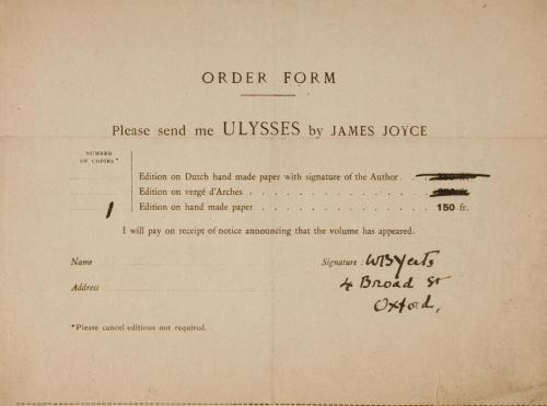
W.B. Yeats’s order form for Ulysses (he wanted the least...


W.B. Yeats’s order form for Ulysses (he wanted the least expensive edition). via The National Library of Ireland

19 Apr 00:04

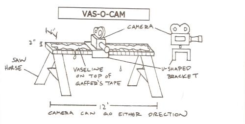
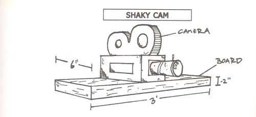
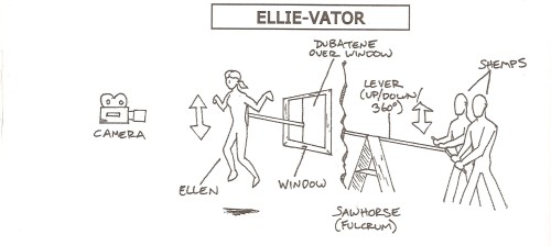
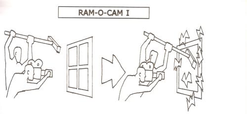
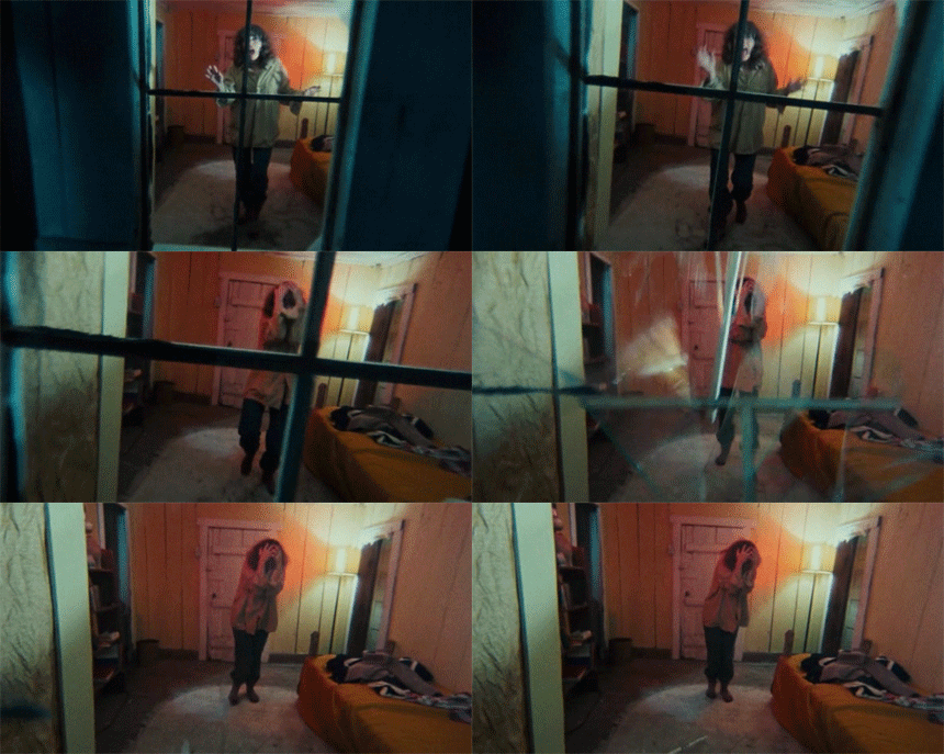
The Evil Dead - Sam Raimi’s low budget camera rigs


The Evil Dead - Sam Raimi’s low budget camera rigs

24 Mar 17:50

Requiem for an Engine: A comic board’s legacy

by Maddie Greene
Madolan

I wrote this!

It was a strange and fruitful blip in the online comic community. Writer Warren Ellis’s comic book message board The Engine ran from early September 2005 to Aug. 31, 2007, birthing in its short life new comic books, ongoing collaborative superteams, Eisner and Harvey Award-winning projects, and at least one marriage. My affectionate memories are […]

The post Requiem for an Engine: A comic board’s legacy appeared first on The Shared Universe.

19 Mar 05:21

Brooches Made from Pages Salvaged from Old Classic Books

by EDW Lynch

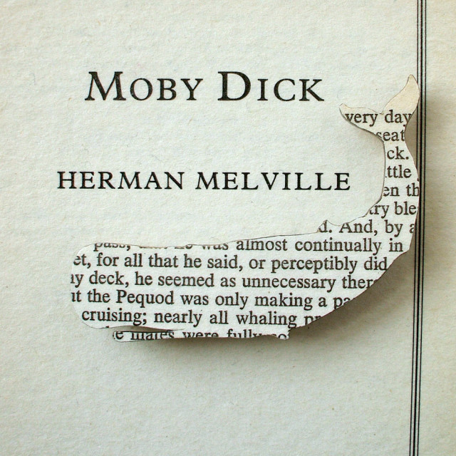
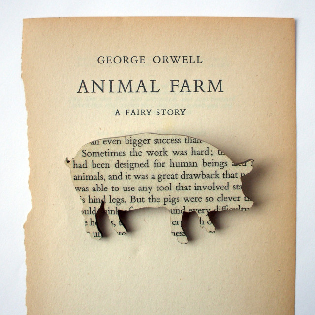
Classic Book Brooches by House of Ismay

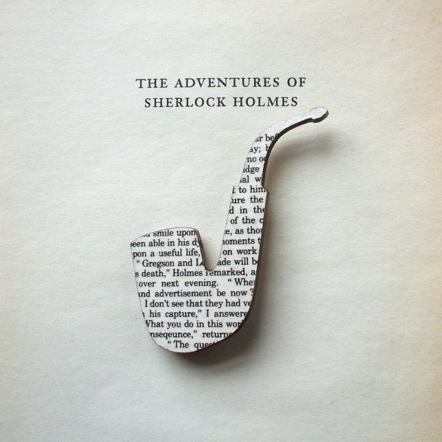
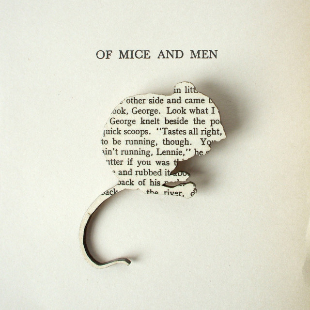
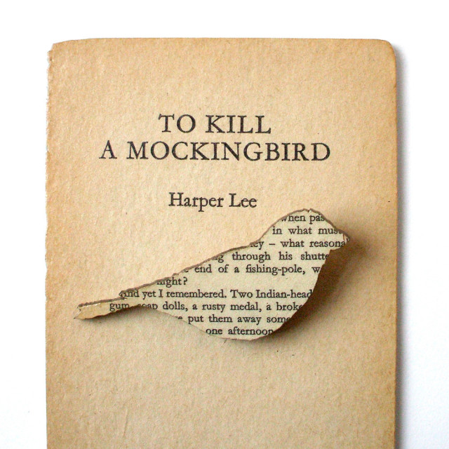
Sarah of House of Ismay hand crafts brooches out of pages from worn out classic books and salvaged wood scraps. Her brooches and other upcycled products are available for purchase.

Classic Book Brooches by House of Ismay

Classic Book Brooches by House of Ismay

Classic Book Brooches by House of Ismay

Classic Book Brooches by House of Ismay

photos via House of Ismay

via My Modern Metropolis

05 Mar 00:47

Wonderfully Bizarre Embroidered Found Photos by Mana Morimoto

by EDW Lynch

Embroidered Photos by Mana Morimoto

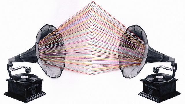
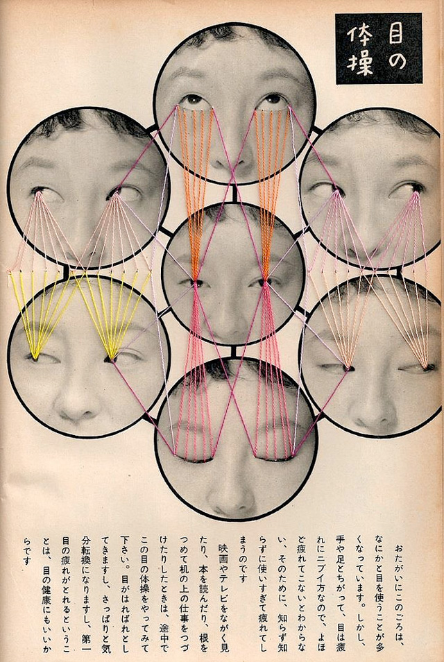
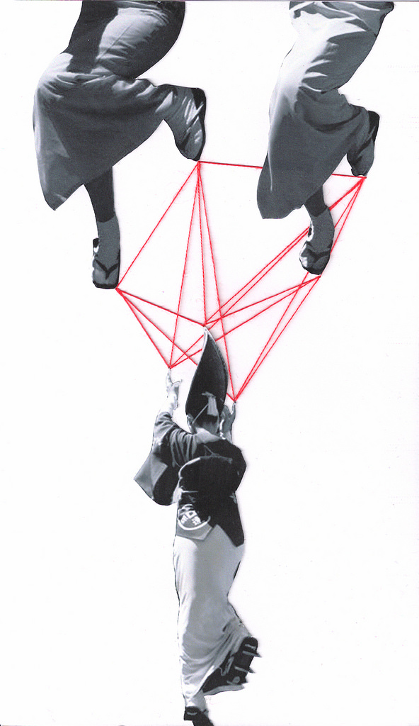
Artist Mana Morimoto uses embroidery to add colorful, often wonderfully bizarre flourishes to found photographs. She has more embroidery art on her website.

Embroidered Photos by Mana Morimoto

Embroidered Photos by Mana Morimoto

Embroidered Photos by Mana Morimoto

Embroidered Photos by Mana Morimoto

via Hi-Fructose

07 Feb 18:13

Style Sheet: A Conversation with My Copyeditor

by Edan Lepucki

style

I’ve fallen in love with my copyeditor Susan Bradanini Betz.  Not only did she find all the mantle/mantel homonym errors in my novel manuscript, she also helped me with my commas and discovered a couple of embarrassing inconsistencies.  (“First she had a briefcase,” one of her notes reads.  “Now it’s a suitcase.”)  She is both respectful of style and sharp as knives about grammar.  Also, she said she’d read a sequel to my book — if not a whole series! — so of course I love her.

I’ve always been curious about a copyeditor’s process and Susan was kind enough to answer a few questions of mine.  Susan has been in the publishing business for, as she puts it, a zillion years.  She’s worked in-house as both a copyeditor and an acquisitions editor, and currently freelances, mostly for Knopf and Soho Press.  She recently started working with Little, Brown again, which was one of her main clients in the 1980s and 1990s.  She lives in Chicago.

The Millions: You have worked in book publishing for years, not only as a copyeditor but as an in-house editor doing acquisitions and all that.  You told me copyediting is your favorite of these jobs. Why? 

Susan Bradanini Betz: When I copyedit, I get closer to the manuscript than I was ever able to as an acquisitions editor. I read every single word, looking at each word and tracking the syntax, not skimming over sentences. It’s not my job as a copyeditor to suggest big-picture changes or comment on quality, so I am focused on the story and the language at the word and sentence level. I keep the reader in mind and try to anticipate what might be confusing or problematic; I check facts and dates, track characters and events for consistency; and I do the most thorough read I possibly can, coming away with an in-depth understanding of the work that wasn’t possible for me in acquisitions.

As a freelance copyeditor, I work for publishers who expect me to do a thorough job. And when I find an error in a novel’s chronology or an incorrect date in a nonfiction book, I feel that is as important to the integrity of the book as when I used to suggest switching chapters around.

TM: What are the copyeditor’s particular pleasures and challenges?

SBB: I love being able to read a manuscript closely, word by word or even, when something is particularly dense, syllable by syllable. (Yes, I have done that.) The main challenge, other than the usual one of balancing deadlines with quality, is making a sustainable living as a freelance copyeditor. With Obamacare, I’ll have health insurance for the first time in quite a while.

TM: Can you describe how you go about copyediting a manuscript?  That is, what’s your reading process like?  How in the hell do you manage to catch the smallest of errors?

SBB: Ideally, I’d have time to read through every manuscript twice: once to mark everything and once just to read and find whatever I missed the first time through. But the schedules don’t allow for that. Plus, I usually end up reading each sentence multiple times anyway.

So, when I get a manuscript, I just start right in on page one. I don’t page through or skim the manuscript first because I want be aware of the evolution of the story and the order in which information is presented. That way, if some detail important to the reader’s understanding was inadvertently dropped in the author’s revision process, I’m more likely to catch it.

I usually read the first 60 to 100 pages without marking anything but the most cut-and-dried items — serial commas, typos, backward quotation marks, those sorts of things. I start my style sheets right away on page one, keeping track of the author’s existing style for thoughts, words, dialogue, and so on, and noting what seems intentional and what seems unintentional.

Once I’m familiar with the author’s style and voice, which usually happens around page 60, I begin making copyediting changes that I hope are consistent with the author’s intent and the publisher’s expectations. I query a lot rather than changing a lot. When I reach the end of the manuscript, I go back and copyedit those first sixty pages.

Creating style sheets is the secret to catching small errors. I am obsessed with my style sheets. I keep a word list, a character list, a list of places (fictional and real), a chronology, a general style sheet, a list of hyphenated modifiers, and any other list that helps me keep track of everything. I usually fact check as I go, although when I’m pressed for time I make a list of items to look up later, sometimes after I’ve returned the manuscript to the publisher. In those cases, I send a list of corrections that can be added by the production editor to the first pass. (Ha-ha, if someone else wrote this paragraph, I’d query the repeat of “list” — I used it seven times in five sentences.)

Because I read slowly, I also remember odd little details that provide a strong visual image, and so as I read along, if my visual image is jarred by a description, I’ll backtrack to figure out if there’s some inconsistency. I remember more details about characters in novels I’ve copyedited than I remember from my own life.

TM: Can you turn off your copyediting mind when you’re reading for pleasure? 

SBB: No, I can’t turn it off, but believe it or not, that mind-set makes pleasure reading more pleasurable for me. When reading for pleasure I don’t read as slowly as when I copyedit, but I am not a fast reader. Often I will read a sentence more than once, then flip back and forth comparing it with other sentences, just like I do when copyediting. I think I’ve always read like a copyeditor, even way back before I knew what a copyeditor was. One of my favorite authors is Proust, and when I was young I would read some of his sentences over and over trying to make sure I understood how every word related to the other words and just to make sure I understood what he was saying.

TM: So I guess it’s possible to have fun reading while you’re copyediting…

SBB: Yes! I have fun reading nearly all the manuscripts that come to me — maybe all. I think of my job as publishers setting up an amazing reading list for me.

I try not to read ahead of my editing, but sometimes it’s impossible not to because I’m so caught up in the story. Many things can only be noticed when you are reading slowly and reading something for the first time. If I read ahead, I have to go back and reread everything at a copyediting pace. But because I already know what’s going to happen, I might make assumptions that don’t take into account the reader’s limited information at that point in the story

TM: In a conversation between Michael Pietsch and Donna Tartt that ran in Slate, Pietsch quoted from the letter Tartt sent to her copyeditor for The Goldfinch:

I am terribly troubled by the ever-growing tendency to standardized and prescriptive usage, and I think that the Twentieth century, American-invented conventions of House Rules and House Style, to say nothing of automatic computer functions like Spellcheck and AutoCorrect, have exacted an abrasive, narrowing, and destructive effect on the way writers use language and ultimately on the language itself. Journalism and newspaper writing are one thing; House Style indubitably very valuable there; but as a literary novelist who writes by hand, in a notebook, I want to be able to use language for texture and I’ve intentionally employed a looser, pre-twentieth century model rather than running my work through any one House Style mill.

What are your thoughts on Tartt’s argument? (And were you the copyeditor to receive this note?!)

SBB: Yikes — no, fortunately, I wasn’t the copyeditor to receive that note. But often, when an author has that kind of reaction, it’s a result of misunderstanding. Most copyeditors don’t want to alter anything in a manuscript that the author has done on purpose.

The house style is set by the publisher, and copyeditors generally receive a manuscript without any guidelines other than to follow the house style for that publisher. And “house style” doesn’t refer to writing style but to mechanics such as capitalization, hyphenation, spelling (most often the house dictionary is Webster’s 11th), and so on. In addition, copyeditors watch for dangling modifiers, subject-verb and antecedent-pronoun agreement, repeating words, chronology, consistent names and dates, among other things. And they are expected minimally to verify dates, proper nouns (personal names, place-names, streets and highways, institutions, etc.), foreign words, brand names, slogans or advertisements — really, to verify as much as possible within the allotted time. Add to that that freelancers have no benefits and work for an hourly rate, so getting continual work from a publisher is important. What all that means is that the copyeditor is pressed for time and is unlikely to go against house style unless instructed to do so, for fear that the publisher will think she just doesn’t know how to copyedit.

Copyeditors are always guessing at the author’s intentionality, and a copyeditor who assumes everything the author has done is inadvertent does come off as a harsh schoolmarm. For example, in the note the author writes “Twentieth century, American-invented conventions.” A copyeditor would revise that as “twentieth-century, American-invented conventions,” assuming that the cap T in “Twentieth” was a typo, and the inconsistent hyphenation of compound modifiers was an oversight. However, “House Style,” which is not a proper noun, is capped three times in one paragraph. For me, that would be a signal that the author might have a personal cap style that I shouldn’t mess with. So I’d probably query the author about her intentionality regarding caps, calling out the occurrences so she can double-check that everything is as she wants it. If the copyeditor doesn’t at least call out the nonstandard style with a query, someone will do it later — either the production editor or the proofreader or even someone in publicity. And if the issue is raised after typesetting, the publisher is perfectly justified in asking why the copyeditor hadn’t settled that question earlier.

But that said, as an acquisitions editor, I saw copyeditors make all sorts of unjustified changes. And when I was acquiring poetry and fiction, I would sometimes lose it myself when I saw what copyeditors would do. I once had a copyeditor rewrite the last paragraph in a novel, which made the author (and me) go ballistic. The final paragraph! As if the author hadn’t given it considerable thought.

And sometimes a copyeditor is just mismatched to a project. Last year a publisher asked me to do a second copyedit on a memoir that had been thoroughly (way too thoroughly) copyedited already. The first copyeditor had changed so much that the author became paralyzed about a third of the way through his review of her changes. According to what the publisher told me, and from what I could tell from the author’s comments on her comments, he not only felt the copyeditor didn’t understand his work, but he started doubting his own choices. When I looked at the first copyedit, I understood the reasons behind nearly all of her changes, but I also saw that she clearly did not get this author’s humor or his unique voice, which often involved nonstandard syntax. She had done a ton of work recasting passive sentences and paring down “awkward” (and by “awkward” I mean “hilarious”) sentences. And in many places he had agreed to a change that honestly purged all the humor and personality from a passage. So then I would query if it was OK to reinstate his original as it was better than the copyedited version. That was a case of a complete mismatch.

TM: Is there a tension between what you know to be “correct” and the artistic license of the writer?  How do you handle that tension?

SBB: I see my job as a copyeditor less about enforcing rules than about making sure the author is aware of anything in the manuscript that is nonstandard and confirming that any variations from standard grammar and punctuation are intentional. In my queries, I try to get across the idea that just because I’m asking a question doesn’t mean that something needs to be changed. As you know, I often qualify my questions by saying something like “just checking” or “it might be just me” or “not really necessary to change.”  Especially with poetry, I love when an author responds with “yes, that is intentional,” because it means he or she truly thought through the style, so I don’t have to be so OCD about it.

TM: Have you noticed any new style and grammar trends in the last five years? 

coverSBB: New copyediting trends generally pop up after a new edition of The Chicago Manual of Style is published, and the 16th edition came out in 2010. New guidelines in CMOS cause publishers to reevaluate their current house style, because they have to decide what changes they will incorporate from the new edition. These are changes like what to do about capping a generic geographic noun when it follows more than one proper noun — so is it “Illinois and Chicago rivers” or “Illinois and Chicago Rivers”? The style has changed back and forth over the last editions of CMOS, but it’s something really only copyeditors get excited about.

For informative and entertaining updates on the state of copyediting, I keep up with Washington Post copyeditor Bill Walsh’s Twitter feed.

Just anecdotally, in the manuscripts I receive, I’ve noticed a lot of two-word proper nouns closed up (like “SpongeBob”), a result of tech product names, I guess. So when an author creates a fictional product or company now, it’s often one word made up of two.

I’ve noticed, too, that a lot of authors are omitting the word “that” and putting a comma in its place in dialogue or first-person narratives in fiction. I think that’s because many throwaway phrases currently used in conversation omit “that,” and the speaker pauses — for example, “I mean, I had a really good time at the party.” Almost every novel I’ve worked on in the past few years had at least one “I mean, . . .” in dialogue. And in just about every conversation I have in real life someone uses the phrase. But the comma for an omitted “that” happens with other constructions, too, as in “She was so late, she missed the show” rather than “She was so late she missed the show” or “She was so late that she missed the show.”

TM: What are your favorite errors to fix?

SBB: I love to find errors that are important to the accuracy or quality of the manuscript, because then I feel as if my copyediting is contributing something more than tiny details. So, for example, things like a character being described as not having visitation with his kids later taking them somewhere on “his” weekend, or someone beginning a scene sitting on a couch, then rising from a chair, or a character drinking a shot of whiskey but getting a refill on her red wine. Those are errors that usually result from the author’s revisions and multiple drafts, and they can slip past easily. I also like to catch dangling modifiers, because we all miss those, so it means I’m paying attention. I never change any of these, though, without querying, and most often I will just call them out to the author with a query. And, yes, I have had authors who say that dangling modifiers are part of their style and don’t want to change them.

TM: I am proud that you said my manuscript was “clean,” but I was also appalled by my misuse of the comma!  Can you provide three rules for comma use to put in my back pocket for the next book?

SBB: It isn’t so much that commas are misused as that authors often don’t realize their phrasing is effective enough to make the addition of nonstandard commas unnecessary. A comma isn’t always needed to make the reader catch the pause in dialogue or narrative; often the syntax does that just fine, and an unnecessary comma slows the reader down too much.

So, in addition to the serial comma (“I adopted a lab mix, a poodle, and a Lhasa mix”), here are the three commas that I think work best when handled per standard punctuation style:

1. Avoid a comma between elements of a series connected by conjunctions.

I adopted a lab mix and a poodle and a Lhasa mix.

2. Add a comma between independent clauses connected by a conjunction unless each clause is short, especially if the conjunction is “but.”

I used to foster dogs, but I had to stop after I adopted Frank.

3. Avoid using a comma between compound predicates or objects.

I brought Frank home as a foster dog and just couldn’t return him to the shelter.

I’ve had many dogs but never bought a puppy from a pet store.

I feed my dogs kibble and homemade treats.

4. And a bonus tip: Always add a comma after a phrase or clause ending in a preposition to avoid “reading on.”

After I put my coat on, the dogs knew it was time to go out. (Even “After I put on my coat, the dogs knew it was time to go out” reads better with the comma, though there’s no chance of reading on.)

Image Credit: LPW

06 Feb 23:11

Reverse Listening Device Swaps the Sound Coming to a Person’s Right and Left Sides

by EDW Lynch

Reverse Listening Device
photo by Piotr Gaska

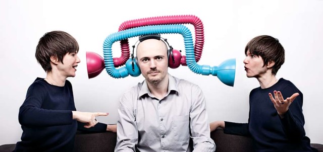
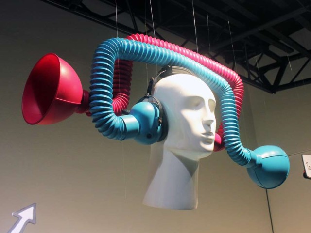
The Reverse Listening Device is a wearable device that reroutes sound from a person’s left side to their right ear and vice versa. The device is a conceptual object by British artist and designer Dominic Wilcox. He reports that it does indeed work and it’s “a very strange experience wearing it.” The device is on display at the Selfridges store in London for the next four weeks.


video via Dominic Wilcox

Reverse Listening Device
photo via Dominic Wilcox

via Boing Boing

30 Jan 00:59

Spice Tile

by Nicola

Laurent_Mareschal_Beiti

IMAGE: “Beiti” (detail from a 2011 installation at CAPC in Bordeaux, France), Laurent Mareschal. Courtesy of the artist and Galerie Marie Cini. Photo by Tami Notsani.

2013GV2410

IMAGE: “Beiti,” Laurent Mareschal, installation shot at the Victoria & Albert Museum, London.

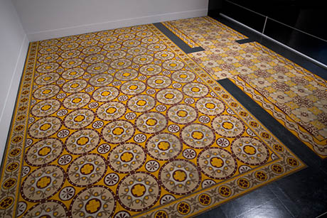
Laurent Mareschal’s “Beiti” is a carpet made of spice, carefully sieved through stencils into tiled patterns inspired by Arabic geometry. I saw it last month at London’s Victoria & Albert Museum, on display as part of the Jameel Prize shortlist of Islamic-influenced contemporary art, craft, and design.

In the exhibit’s low light, the carpet seems to float above the black floor, warming up its corner with a slightly fuzzy glow and a faint gingery, spicy scent. In an accompanying video, Mareschal, whose work typically deals impermanence and, in particular, the Palestinian condition, explains that the spice tiles are a deliberate play between ephemerality and the almost subliminal longevity of olfactory memory.

“I want people to look and think [...] wow, this guy is completely nuts, he has been working for a week and it will just vanish in a second,” Mareschal said, before adding that:

There is something about the smell that you can’t really refuse. It gets inside of you and makes you remember something. You can play with the colour and the smell and what it makes you remember and I am playing with that.

Laurent_Mareschal_Beiti_Detail

IMAGE: “Beiti” (detail from a 2011 installation at CAPC in Bordeaux, France), Laurent Mareschal. Courtesy of the artist and Galerie Marie Cini. Photo by Tami Notsani.

With its Proustian olfactory powers, capable of transporting exhibition viewers to a remembered or imagined romantic Orient—a Moroccan souk or Egyptian spice bazaar—Mareschal’s spice carpet is perhaps also something of a magic carpet, that standard device of Eastern storytelling.

But the installation also reminded me of Paul Freedman’s fascinating book, Out of the East: Spices and the Medieval Imagination, which examines the incredible popularity of nutmeg, clove, pepper, cinnamon, and ginger in Europe during the Middle Ages—and their sudden fall from fashion in the seventeenth and eighteenth centuries.

Curiously, while their mysterious Oriental origins formed part of the allure of spice for European consumers, Freedman notes that, “alone among the great world religions, Islam has consistently resisted the use of incense in both public and private worship.” Meanwhile, for their Christian consumers, the uses of aromatic spices went beyond food flavouring and medicinal tonic to become a sort of medieval air freshener:

It was customary that the rooms of a comfortable house should be not merely airy and unscented but redolent of actual healthy scents from spices that might be scattered about or resins that were burned as incense.

Rooms were perfumed with spices to promote health (“Avicenna, the authoritative Arab physician whose work was known in Christian Europe by the late twelfth century, recommended that ambergris, frankincense, cloves, and even theriac be employed to dry out the air and make it smell sweet,” writes Freedman), but also for spiritual and aesthetic reasons.

As Freedman explains, the theological consensus at the time was that the Garden of Eden was located in eastern Asia, most likely in India. For medieval Europeans, exotic aromatics thus literally represented the scent of earthly paradise—a prelapsarian idyll of intoxicating beauty and freedom from decay.

Terre Promesse 460

IMAGE: “Terre Promesse 2″ (detail from a 2008 installation using za’atar and cumin), Laurent Mareschal.

Of course, Freedman points out, it was this passion for spices that launched Europe on its path to overseas conquest and colonialism. The great expeditions of Vasco de Gama and Christopher Columbus were motivated by the desire to control the lucrative spice trade by finding and conquering its Asian source. The irony is that, by the time Europe’s colonial expansion truly hit its stride in the nineteenth century, spices had long since fallen out of fashion, all but disappearing from the continent’s cuisines.

Mounir_Fatmi_Modern_Times_-_A_History_of_the_Machine_Detail

IMAGE: “Modern Times: A History of the Machine” (detail), Mounir Fatmi, 2010–12, (video). Courtesy of the artist and Shoshana Wayne Gallery, photo by Mounir Fatmi.

In any case, the Jameel Prize exhibition is on display at the V&A until April 21, and is well worth a visit if you’re in London. Florie Salnot’s plastic bottle jewellery, the mesmerising calligraphic gears and cogs of Mounir Fatmi’s video projection, and Faig Ahmed’s pixellated rugs are some of its other, non-edible, delights.

06 Jan 18:49

Hedi Xandt’s Dark Emotions

by Vanessa Ruiz
Hedi Xandt God of the Grove
The God Of The Grove, 2013. gold-plated brass, polymer, distressed black finish, marble.

I admire the range of work by Hamburg-based communication designer and conceptual artist Hedi Xandt. His combination of design, concept, and execution is extremely impressive and gives his work a level of sophistication that I haven’t come across in a while. Here I’ve showcased a few of his dark, slightly morbid pieces for you.

Hedi Xandt God of the Grove

“I could stare into the face of a skull for hours, for example, and always see new things.”

– Hedi Xandt
Hedi Xandt My Die-Cast Soul
“My Die-Cast Soul” is part one in a series of filigree skull-ptures that combine the aesthetics of naturally shaped bone with state-of-the-art and experimental production techniques.
Hedi Xandt Longer You Last
The Longer You Last, 2013 gold-plated cast of an 18th century skull with inserted nails, custom-made black-red perspex fixture
Hedi Xandt Longer You Last

Hedi explains his dark aesthetic in an interview with Trendland,

“Darkness is rich of emotions. I love the blur, the mist in our heads when we experience things we cannot explain. Have you ever held a skull in your hands? It’s magical. So light, but strong. Intricate and almost fragile in appearance, yet it serves us a lifetime as support, a case for our mind. I will never understand how someone can not find it beautiful. Things like that fascinate me, the layers of our existance, but also the almost godly alienation from nature that comes with knowledge and technology.

I think that you have to infuse something known, something from the “real world” with a new, abstract “spark” in order to create a work that people can – emotionally and intellectually – relate to.”

To me, that “abstract spark” that Hedi talks about is precisely why I and so many others like yourselves love anatomical art. It’s the human body, the common thread we all share enhanced by art that manipulates and abstracts it making anatomy even more fascinating.

Not willing to label himself as solely a graphic designer nor an artist he simply sees himself as a creative person experimenting and creating. Hedi’s portfolio includes work for companies like Lancôme, Chanel, and Apple and ranges across a variety of media and subjects. I encourage you to view all of Hedi’s incredible work at hedixandt.com!

17 Dec 23:38

Reading Food: 2013

by Nicola

Don’t let its name fool you: in between shiny “phablets” and robot armies, Gizmodo still makes time for the ultimate old-school entertainment and educational device, the book. When Gizmodo‘s new editor-in-chief (and my Venue collaborator), Geoff Manaugh, asked me to contribute my top ten books of 2013 to their end-of-year “Best Books” list, I agonised for a very long time, and came up with the following.

Edible Geography’s Best Books of 2013

Forget quick-and-easy dinner suggestions: the Edible Geography top ten books of 2013 all sit firmly within the growing genre of writing about food as a way of writing about ideas, though you will find the odd recipe for bioluminescent durian sauce and a sauerkraut-kimchi hybrid. But what you lose in kitchen instructions, you gain in an awe-inspiring mix of gene-hacking, container shipping, fecal humor, and food porn wizardry.

From The New York Times best-seller that even your mum has heard of (Michael Pollan’s Cooked) to the artist-published manifesto for a new, open-source food-tech movement (the Center for Genomic Gastronomy’s Food Phreaking), this list compiles the most exciting ways of thinking about, and with, food that crossed my plate in 2013.

FP0_G9_800

IMAGE: A spread from Food Phreaking. Photograph via the Center for Genomic Gastronomy.

Food Phreaking: Issue #00
This short but bold manifesto, published by the Center for Genomic Gastronomy, is available both as a free PDF and also as a rather gorgeous neon-pink-and-gold booklet. In it, artists Cat Kramer and Zack Denfield provide 38 examples of “what Food Phreaking might be, and what it most definitely is not.” From DIY suggestions such as Colony Collapse Cuisine (“Why not limit yourself to a diet of non-bee-pollinated ingredients? Taste the future, today. And be prepared for bio-adversity.”) to examples of culinary civil disobedience and outlaw ingredients (grey market raw milk vending machines, seed saving clubs, and beans tattooed with DNA-laced ink), the result is a mini-encyclopedia of stories at the fertile intersection of food, technology, and open culture.

Pandora’s Lunchbox: How Processed Food Took Over the American Meal
Although it inexplicably received much less attention that Michael Moss’s simultaneously released Salt, Sugar, Fat, Melanie Warner’s Pandora’s Lunchbox is the behind-the-scenes look at the food processing industry that will truly blow your mind. Who knew that the world’s largest manufacturer of Vitamin D, which is added into nearly all the milk that Americans consume (including organic varieties), is a factory in Dongyang, China, whose raw material is grease derived from Australian sheep’s wool? Or that genetically engineered enzymes are routinely used to boost apple juice yield, stop cookie batters from clogging factory nozzles, and make soybean oil transfat-free — and they don’t have to be declared on the end product label? Warner makes a convincing case that these industrially engineered food-like substances (which make up an estimated 70 percent of the American diet) are an entirely alien form of nutrition, and “if we really are what we eat, then Americans are a different dietary species from what we were at the turn of the twentieth century.”

Laudan Warner covers

IMAGE: Cover art for Pandora’s Lunchbox and Cuisine & Empire.

Cuisine and Empire: Cooking in World History
This is a weighty book, spanning three thousand years of human culinary history from the steamed millet mush of 1000 BCE to the foams, spheres, and encapsulations of the present day, and it starts very slowly indeed. The patient reader, however, is rewarded: Laudan’s broad scope allows her to draw out previously obscure linkages and patterns (for example, she identifies the last lonely traces of Islamic culinary techniques in European cookery: Italian salsa verde, English mint sauce, and Catalonian picada), as well as convey the enormous (and, now, often overlooked) benefits of industrial food processing, as a release from the inadequate diets and hours spent grinding wheat or corn that characterized life for 99 percent of the world before the nineteenth century.

In the end, Cuisine and Empire reveals that the way we cook is a kind of a code — a set of repeated, shared, evolving actions through which we embody and enact our shifting relationship with natural world, our ideas of personal health and social hierarchy, and our religious or ethical values. Show me how you cook, says Laudan, and I’ll tell you who you are.

Cooked: A Natural History of Transformation
Like Laudan, Pollan thinks that cooking has everything to do with who we were, are, and could yet be. In Cooked, however, Pollan’s scope is simultaneously smaller than Laudan’s (personally, geographically, technically, and historically) and wider — his adventures in braising, hog-barbecuing, and bread-baking are opportunities to explore elemental themes: air, water, fire, earth, and the human relationship with each, and each other. With the exception of the microbial adventures in the fermentation chapter, this book won’t necessarily surprise you, but although Pollan may be telling you things you already know, when they’re as well written as this, they have a freshness and force you won’t forget.

Ninety Percent of Everything: Inside Shipping, The Invisible Industry That Puts Clothes on Your Back, Gas in Your Car, and Food on Your Plate
Journalist Rose George’s new book on the overlooked world of freight shipping is about much more than food — there are Somali pirates, Filipino crew (a third of all seafarers are from the Philippines), and Liberian flags of convenience. But the 90 percent of everything that is transported by container ship includes food, and, while she spends thirty-nine days and nights aboard the Maersk Kendal, traveling from Felixstowe to Singapore, George notes that “shipping is so cheap that it makes more financial sense for Scottish cod to be sent ten thousand miles to be filleted, then sent back to Scottish shops and restaurants, than to pay Scottish filleters.” While shipping has remade the contents of our plates and farms, a modern container crew has no idea what they’re carrying (only flammable, toxic, or refrigerated goods are listed), and modern consumers have even less idea of the shadowy, floating world that George reveals, lying behind our endless retail abundance.

Trading Pit hand signals

IMAGE: A photographic guide to open-outcry trading pit hand signals, from a book to look forward to in 2014. Images via the Trading Pit Blog.

The Secret Financial Life of Food: From Commodities Markets to Supermarkets
Sadly, The Secret Financial Life of Food is not a terrifically well-written book. Still, it made my list because its subject matter is unique and completely fascinating: in it, author Kara Newman examines the role that the commodities market has played in shaping culinary history, unpacking such arcane curiosities as the corn derivatives market, cheddar cheese futures (cheddar is the only cheese variety traded on the Chicago Mercantile Exchange), and the Great Salad Oil Swindle of November 1963, which caused hundreds of millions of dollars in losses, but was overlooked in the drama surrounding JFK’s assassination later the same month. Arcane, indeed, but increasingly relevant: as Newman points out, the amount of money invested in food commodities increased from $13 billion in 2003 to $260 billion in 2008, spurred by the profits to be made in a world of increasing food demand and, as climate change kicks in, decreasing supply.

Food: An Atlas
What do you see when you map the world through food? According to Food: An Atlas, a crowd-sourced, crowd-funded, “guerrilla cartography” project led by UC Berkeley professor Darin Jensen, you see the distribution patterns of the global almond trade but also the lost agrarian landscapes of Los Angeles, the geography of taco trucks of East Oakland and the United States beershed, as well as the rise of foodbanks in the UK, and much more besides. Available as a free PDF as well as in print form, this compilation of more than seventy food maps is less of a definitive atlas and more of an inspiring guidebook to the kinds of cartographic questions you can ask about food: it’s hard to read it without coming up with ten more foodscape maps you can’t wait to create.

Gulp: Adventures on the Alimentary Canal
The prolific Mary Roach, fresh from tackling the science of corpses, sex, and space travel, takes the reader along on the journey our food makes every day, from nose to tail (or, to be precise, to Elvis Presley’s constipated mega-colon). Gulp is stuffed full of enjoyably peculiar details, from a section on how dogs and cats taste food, to the fact that human hair is (a) Kosher, and (b) as much as 14 percent L-cysteine, an amino acid used to make meat flavorings and ersatz soy sauce. Although Roach’s endless, schoolboy-humor footnotes (making fun of EneMan, the world’s only enema mascot, for instance, or academic papers on “fecal odorgrams”) can get a tiny bit tiring after a while, it’s hard not to enjoy her infectious curiosity.

Tutti Frutti with Bompas & Parr and Friends
Full disclosure, I contributed a short essay (about spaces of banana control) to this exuberant collection of fruit eclectica. Still, at the risk of self-promotion, I couldn’t leave out a book that contains a recipe for bioluminescent durian sauce, a guide to the pineapple as architectural ornament, and, perhaps most thrillingly, a sustained meditation on the reason artificial raspberry-flavored sweets and soda are blue. You will never look at your fruit bowl the same way again.

barbeque_hamburger-cutaway_460

IMAGE: Photograph courtesy The Cooking Lab/Modernist Cuisine.

Blueberries Modernist Cuisine

IMAGE: Photograph courtesy The Cooking Lab/Modernist Cuisine.

The Photography of Modernist Cuisine
Nathan Myrhvold may be a patent troll, but he certainly knows how to take an amazing food photograph.When Modernist Cuisine, his six volume, $450 encyclopedia unpacking the mysteries of sous-vide cuisine and the relationship between ultrasonic cavitation and crispy French fries, came out in 2011, reviewers spent more time marveling at the incredible images of a Weber grill sliced in half to reveal glowing coals and the browning base of the burgers, or a planet-sized blueberry, so close-up you could see its normally invisible orange seeds, than discussing its contents. Released this autumn, The Photography of Modernist Cuisine reproduces some of the best images at an even larger scale, and, best of all, reveals exactly how they were made. That Weber grill? Thirty separate photos, cropped and combined. Pins, toothpicks, Plexiglass, and a band saw all play an important role, but there are also lighting and backdrop techniques you can copy at home. No more Martha Stewart-style #fails for your food snaps!

• • •

This list only includes books that were published in 2013, but, even so, I’m sure I’ve missed a few gems (let me know in the comments). Gizmodo’s full list is well worth a read: it includes Venue favourites The End of Night and Wild Ones, as well as some fantastic-sounding recommendations for books about secret plutonium-manufacturing cities, hot-air ballooning, New York City’s Sanitation Department, and much more. Time to get reading!