firehose
Shared posts
Corporate HQ Superdesigns, Part 2: Apple "Spaceship" to Give New Meaning to the Term "High Tolerance"

Hard to believe it's been nearly two years since we saw that video of Steve Jobs pitching Apple's Norman-Foster-designed "spaceship" HQ to the Cupertino City Council. Jobs, sadly, passed away just months later. But Jobs' influence is still very much ingrained in the ongoing design process of the building. That is why the building will likely be magnificent. It is also why the timetable has been pushed back to 2016, and why the cost estimate has now risen to nearly $5 billion. (For scale, the new World Trade Center in NYC rings in at $3.9 billion.)
We know Apple's got curved glass down, though it isn't cheap to produce. We know the building's plans call for it to sustainably generate its own electricity, as many of their facilities now do, and that that isn't cheap either. But as Businessweek reports,
The true expense of the campus lies not in green tech, though, as much as the materials--as well as what product designers call "fit and finish." As with Apple's products, Jobs wanted no seam, gap, or paintbrush stroke showing; every wall, floor, and even ceiling is to be polished to a supernatural smoothness. All of the interior wood was to be harvested from a specific species of maple, and only the finer-quality "heartwood" at the center of the trees would be used, says one person briefed on the plan last year.
That's not the crazy part, though. This is: "Jobs insisted that the tiny gaps where walls and other surfaces come together be no more than 1/32 of an inch across, vs. the typical 1/8 inch in most U.S. construction." Anyone who's ever built anything or installed anything using conventional power tools knows that's insanely difficult. It's easy for even an inexperienced craftsperson to take 1/8-inch off of something, as that's the width of a sawblade. The skilled among you can get things down to 1/16, even by eyeballing. But I don't know anyone who can consistently hit 1/32. It's not just twice as hard as getting something down to 1/16, it is an order of magnitude more difficult, and essentially demands less humans and more CNC.
If that didn't get your attention, maybe this will:
Jobs even wanted the ceilings to be polished concrete. Contractors would typically erect molds with crude scaffolds to pour the cement in place, but that leaves unsightly ruts where the scaffolding puts extra pressure on the surfaces. According to two people who've seen the plans, Apple will instead cast the ceilings in molds on the floor and lift them into place, a far more expensive approach that left one person involved in the project speechless.
I should point out that I don't think these demands are crazy in a pejorative way; if anyone can pull this off, it's Apple. Shareholders are complaining about the price of construction, but you don't build something like this purely to increase the bottom line. Jobs said it best during his pitch to the Council: "We have a shot at building the best office building in the world. I really do think that architecture students will come here to see it."
(more...)
    
|
Comics A.M. | Direct market sales climb more than 22% in March
firehoseMiddle East Comic Con: "In Dubai, the majority of the local youths’ costumes adhered to Islamic standards of modesty. Many local girls cleverly modified their abayat and incorporated their cultural dress into their costumes."

Guardians of the Galaxy #1
Comics sales | The direct market continued its rise last month, with comics and graphic novel sales up 22.59 percent compared to March 2012, according to Diamond Comic Distributors. Marvel routed DC Comic in this month’s sales, claiming 40 percent of the market to DC’s 27 percent. [ICv2]
Conventions | The fire marshal had to turn away hundreds of people Sunday from the DoubleTree Hotel in Tampa, Florida, where the two-day Tampa Bay Comic Con was being held. An estimated crowd of 4,000 were crammed into the lobby and the ballroom (which is designed to hold a maximum of 1,200 people), with many hoping to see The Walking Dead star Lauren Cohan. Organizers conceded they need a larger venue for the twice-yearly event. [Tampa Bay Times]

Fluke 2013
Conventions | The Fluke Mini-Comics and Zine Festival in Athens, Georgia, has grown so much since its inception in 2002 that they actually had to have pre-registration this year. Artist Patrick Dean explains that the appeal of the show is that it focuses on individual creators rather than big-name guests: “The person paying $15 to sell minicomics gets exactly the same treatment as someone who’s got a book out from a bigger publisher.” [The Red & Black]
Conventions | Middle East Comic Con, held in Dubai this past weekend, sounds like quite an event; James O’Barr, creator of The Crow, was there, as was Archie Comics co-ceo Nancy Silberkleit (clad entirely in “Archie orange,” which has to be a hard color to pull off). And there was cosplay, which the reporter duly noted sometimes involves skimpy costumes—but not here: “In Dubai, the majority of the local youths’ costumes adhered to Islamic standards of modesty. Many local girls cleverly modified their abayat and incorporated their cultural dress into their costumes.” [Saudi Gazette]

Comic Con South Africa
Conventions | The saga of Comic Con South Africa continues with a radio interview with the organizer, Tlou Ramatlhodi, who explains why the event is being held in a venue with a maximum capacity of 150 people: “It’s a launch — we’re not catering to the masses that would come to a comic con.” And he winds up by telling the interviewer not to bother heading to Cape Town for the show. [Lazygamer.net]
Creators | Bill Baker talks to newcomer Nimue Brown, co-creator of Hopeless, Maine. [The Morton Report]
Digital comics | Arch Enemy Entertainment launches a line of digital comics today on the USA Today website. There will be seven comics in different genres, each of which will update once a week, so there will be new content every day. [USA Today]
Graphic novels | I joined teen librarian Robin Brenner and middle-school librarian Esther Keller for a discussion about the removal of Marjane Satrapi’s Persepolis from seventh-grade classrooms in Chicago Public Schools. [Good Comics for Kids]
Digital comics | I discussed Vertical’s digital strategy – publishing their manga on e-book platforms such as Kindle and Nook and pricing them much lower than print — with marketing director Ed Chavez. [Good E-Reader]
Webcomics | David Herbert, creator of Living With Insanity, takes down five pieces of bad advice that are common currency among webcomickers. [The Webcomics Overlook]
Collecting | Jay Bardyla, owner of Happy Harbor Comics in Edmonton, Alberta, has some quick tips for anyone looking at comics as an investment. [Global News]
Shiba Inu Puppy Maximizes the Adorable Head Tilt
Scout the Shiba Inu puppy looks backwards at her owners with her head completely upside down in this video uploaded by rnehiebert. Scout has also gotten her head stuck in a peanut butter jar and played with door stoppers.
This Is Vladimir Putin’s ‘I See Boobs’ Face
firehosethis fucking guy
Stuff You Can Buy Today With Bitcoin On Portland's Craigslist
firehosemeanwhile, in Portland
A topless demonstrator with written messages on her back walks...
firehosethis fucking guy

A topless demonstrator with written messages on her back walks towards Russian President Vladimir Putin , left and German Chancellor Angela Merkel, right, during the opening tour at the Hannover Fair in Hannover, Germany, Monday April 8, 2013. Several activists stormed the booth of Volkswagen to demonstrate in presence of the politicians. (AP Photo/dpa,Jochen Lurbke)

It’s just been announced that Blizzard—makers of Diablo III and Starcraft 2—just bought the technolo
firehosehrm
It’s just been announced that Blizzard—makers of Diablo III and Starcraft 2—just bought the technology and assets for the IGN Pro League eSports promotion.
Now, Google to acquire WhatsApp for $1 bn? - Hindustan Times
firehosechrist
 CBS News |
Hindustan Times The online world is abuzz with speculation that Internet giant Google is in talks to buy the messaging application 'WhatsApp' for $1 billion (Rs 5,500 crore). “While the deal started four or five weeks ago, we've been told that WhatsApp is 'playing hardball' and ... Report: Google Could Grab Messaging App WhatsApp for $1BFox Business Google to acquire WhatsApp for $1billion?Firstpost Google In Talks To Buy WhatsApp For $1bn - ReportTechWeekEurope UK Dazeinfo -Mobile & Apps -Wireless Week all 99 news articles » |

The Scariest Search Engine On The Internet
firehoseof COURSE they named it Shodan
of COURSE they did
you FUCKS
https://www.youtube.com/watch?v=5iZMD_eCpEo
Margaret Thatcher May Have Helped Invent Soft-Serve Ice Cream
firehose"Thatcher, you see, before she was a politician, was a research chemist. The future prime minister, then Margaret Roberts, received a degree in chemistry from Oxford in 1947. And she put it to use first in work at a glue factory, and then with a research job at food manufacturer J. Lyons and Company, a "foodstuff conglomerate" in Hammersmith. Thatcher's task in that role? To help figure out a way to whip extra air into ice cream using emulsifiers -- so that the ice cream could be manufactured with fewer ingredients, thereby reducing production costs. (And so that, additionally, the dairy-y result could flow from a machine rather than being scooped by hand.) While Thatcher's exact contribution to the effort remains, in a way that would foreshadow her future political career, a matter of controversy, her team ultimately succeeded. And the work resulted, ultimately, in the swirly stuff we know today as soft serve."
RIP you beautiful angel~


Shut Up and Take My Money!
Submitted by: Unknown
Tagged: Cats , puns , sweatshirts , poorly dressed , g rated Share on FacebookMahabat Maqbara, India
Submitted by: Unknown
Tagged: tower , architecture , india , destination WIN! , g rated Share on FacebookMozilla pulls tracking trigger for Firefox 22, ignores ad industry attacks - Computerworld
Catching Up With Kai, The Hatchet-Wielding Hitchhiker
The Windows 7 Upgrade
The latest fad among free-wheeling startups may be BYOD, but government offices tend to be far more conservative. Government offices handling confidential data even more so. When Miguel started his contract with a state office, they issued him a laptop. For security reasons, he was forbidden from using any other machine, nor should anyone else use his. Also for security reasons, the laptop was not allowed to leave his desk. It was locked in place with a security chain too short to move the laptop more than a few inches.
The computer had a great deal of… character. It was so old that archaeologists kept stopping by, asking to place it in a museum. Over its lifetime, it had received a few upgrades. The HDD was 500GB, and its RAM was maxed out- at 2GB. This created special challenges for Miguel, since their software required VS2003, VS2005, VS2008 and VS2010, installed alongside their third-party SaaS reporting tools. The machine limped along on Windows XP.
Miguel and his venerable computer toiled away on closing software bugs in the application suite. Meanwhile, the IT bureaucracy was busy with its own tasks. Someone noticed that Windows XP’s support ended in 2014 . Recognizing the epic challenge to move all of their users over, this someone decided that the best time to start was now, and the best place to start was with the IT sub-contractors.
One Monday, Miguel arrived to find the laptop which was never allowed to leave his desk had left. In its place sat a memo detailing the upgrade process. Miguel couldn’t use a different computer, so he warmed a chair and played games on his phone for all of Monday and most of Tuesday. Late Tuesday afternoon, his computer returned to its place, equipped with Windows 7, Office 2003, and nothing else.
Miguel started the reinstall of his development tools. He navigated to the network share where the Visual Studio images lived, launched the first installer, and discovered the Win7 upgrade had revoked his admin access, preventing him from installing anything. He submitted a help desk ticket via email, requesting the appropriate permissions.
The same security reasons which kept Miguel from using any other computers also kept the help desk from simply granting him those permissions, even though he had them only a few days prior. They needed a manager’s sign-off. They needed three separate sign-offs, in fact. This week, one of the three was on vacation. By the time he got back, the second one of the three would be on his own vacation.
Miguel spent two weeks waiting for all the bureaucratic pieces to reach a cosmic alignment possible only once a century. Angry Birds flew across the screen; deadlines flew past Miguel. Miguel did nothing, because there was nothing to do.
Eventually, Miguel’s account was blessed. He started installing the tools he needed. The hours ticked by as he moved through each IDE and reporting system. The reporting system alone took six hours to install, and prompted him for UAC permissions roughly every thirty minutes. After that, he needed to uninstall everything and start over- he had installed the components in the wrong order, and now the application couldn’t build.
Twenty days after the upgrade began, Miguel finally had everything configured to work. He “eagerly” opened IE and pointed the browser at their bug tracker. He expected a huge pile of work backed up over the past few weeks. Instead, he saw an error: the ActiveX control their bug-tracker used was incompatible with Windows 7. Frustrated beyond reason, he called the help desk.
“That’s a known issue,” the help desk drone said. “If you need to access the bug tracker, you’ll need a Windows XP virtual machine.”
 [Advertisement] Make your team a DevOps team with BuildMaster. Pairing an easy-to-use web UI with a free base platform, BuildMaster gets you started in minutes. See how Allrecipes.com and others use BuildMaster to automate their software delivery.
Cello Cover of ‘Game of Thrones’ Theme Song by Break of Reality
firehosestill have not seen this show; still enjoy watching the fandom enough to not need or want to
We’ve seen HBO’s Game of Thrones theme song performed by dogs and violinists alike, and now cello rock band Break of Reality has created their own energetic cover of the show’s iconic theme.
via Cinema Blend, Jezebel
Ferrets Have Fun Playing in a Kiddie Pool Full of Packing Peanuts
A group of ferrets have fun while playing in a kiddie pool full of packing peanuts.
video via AtChannelTv
Running running running
firehoseWojit: "(Oh hey Joey Alison Sayers got a tumblr (she wrote Thingpart (which was great)). (the tumblr is about book covers)"

These poor kids and their dog, just running and running from genre to genre. Where will they end up next?
"My goal will be to direct as much sunlight as possible on the issues so that the absolute truth can..."
firehosesomehow I don't believe Mike Arrington's life has fallen apart
- Mike Arrington Responds to Abuse Claims: ‘All of The Allegations Are Completely Untrue’
FeedsAPI
FeedsAPI is a full text RSS feed generator and web content extraction service that allows you to: turn any shortened RSS feeds into a full text RSS feed content, generate an RSS feed from any static webpage, turn xml and html to JSON and send RSS to emails in real time.
Socialist TV Typeface Videtur Finally Freed
firehoseATTN: RUSSIAN SLEDGES
In the 1980s, the German Democratic Republic’s state television broadcasting service commissioned Axel Bertram to develop a custom typeface. The result was “Videtur,” a remarkably independent serif design that was intended to define the on-screen graphics of East German television for years to come. But by the beginning of the 1990s, the GDR no longer existed. With it went its state broadcasting service – and Videtur, too. Another 20 years in the now reunified Germany would have to pass by before Andreas Frohloff could finally help bring a modernized FF Videtur to market.

Whenever a particularly unique type design challenge arose in the eastern half of divided Germany, it wasn’t long before eyes began to fall on Axel Bertram. Already when it had come to the design of magazines and book covers, he had refused to be satisfied with the limited range of typefaces available in the socialist state. Unlike many of his colleagues, who simply copied western models, he drew new type and lettering commissions according to his own ideas:
“The typefaces that came from the west were often photographed; then their letters would be rearranged. I always drew everything myself, however. The results looked more original that way. All that practice made my letter-drawing skills better.”
The requirements for Videtur were very specific. In order to meet the medium’s needs, Axel Bertram initiated a broad series of experiments with the 625-line television screen’s display conditions. He summarizes his findings into three points:
1. Serif letterforms are easier to recognize than those in monolinear sans serif typefaces.
2. Compact serifs stabilize letterforms and improve the reading movement along a line of text.
3.An alternating stroke contrast leads to easier differentiation between letters.
During Videtur’s design phase, all three findings were kept in mind and refined with the most advanced technology available at the time. After the typeface had been precisely drawn in four different sizes, it was photographed with an electronic camera and projected onto the screen.
“The letters’ height was adapted to the number of lines on the television screen and were justified pixel by pixel with the Chyron font generator. The point size was practically determined by the number of lines available. I experimented with the serif-forms a lot; the result was something that I named the ‘balled knot’ at the time.”

Aside from electronic display technology, text for television graphics in the 1980s was often set with rub-down letters. In East Germany, these sheets were produced a by company named Typofix. Both of these typesetting methods (electronic on-screen typesetting and rub-down letters) were technologies that – at least in his GDR days – Axel Bertram only had access to during his work on the Videtur project.
Oldstyle-inspired letterforms, short ascenders and descenders, low stroke contrast and the “balled knots” form the basis of this extraordinary typeface’s design. In order to transfer these characteristics into the new millennium in a contemporary way, it was necessary for Axel Bertram to find a competent helping hand; someone with a particular attention to detail. He found the man he was looking for in Andreas Frohloff, a former student and now Head of the Type Department at FontFont. Or rather, Frohloff found him. Frohloff proved to be the impetus for redesigning Videtur in the first place, as Bertram had long considered a Videtur-revival to be out of the question. Frohloff managed to change Bertram’s mind through something of a “pirate” method:
“I told him that I’d really like to have an image of the old Videtur typeface. After he found one for me, I scanned it in and made a pretty raw digital version of my own. I changed the proportions a little bit, too. My results managed to convince him, and our collaboration really took off.”

It was clear to both of them that, in the age of HD-TV and retina displays, Videtur couldn’t be re-digitized as is. Even the old serif-form would appear quaint in a high-resolution environment. The “balled knots” were gently and prudently modeled into a triangular form – more pointy, but still rounded. Adjustments were also made to the vertical proportions; shorter ascenders and descenders were adequate for old television graphics, but needed to be extended a bit for optimal comfort in today’s reading conditions. Of course, the two designers also revised the basic shapes of the letters – when returning to a typeface after such a long time, it is only natural to take advantage of the opportunity to incorporate lessons learned. More subtleties are possible today, as Andreas Frohloff explains with the example of one detail:
“We tempered the rather oblique diagonal stroke on the lowercase ‘e.’ In the original Videtur, the diagonal was so extreme because its angle could minimize flickering on the screens of the time – the so-called ‘St. Elmo’s fire’ on corners and edges appeared less frequently this way. Now the bar appears softer, and it fits into a contemporary text typeface better.”

Although the letters were revised, particular attention was paid to keep the stroke contrast moderate but still noticeable – less than is usual in humanist typefaces – in order to retain the design’s original vigor.
Because of its television screen background, FF Videtur remains a technical typeface, but it does have recognizable humanist features in its blood. This isn’t surprising, as both of the typeface’s creators are calligraphers. Already in the design for an earlier custom typeface for the high-circulation weekly magazine NBI-Wochenzeitschrift (Neue Berliner Illustrierte, 1963), the influence of Eric Gill and Edward Johnston on Axel Bertram is quite recognizable. After so many years, his opinion on the humanist letterform remains unchanged:
“The highest development for typefaces, in terms of legibility, was reached during the Renaissance. It doesn’t get any better than that!”


In comparison with the typefaces from the last decade, FF Videtur stands out. Similarities are more likely to be found in printing types from the 1980s, such as Karl-Heinz Lange’s Minima, or ITC Weidemann, whose similarity stunned Axel Bertram’s former student Andreas Frohloff:
“We were talking about Videtur one day while I was in design school, and I happened to have an issue of Graphics magazine with me. ITC Weidemann was presented in that issue; although at the time, the typeface was still called ‘Biblica.’ I couldn’t believe the resemblance at first, but a closer inspection allowed us to breathe easy again. This was one of those famous coincidences: a similar task – good legibility, little space available – and at that time, one apparently had similar conceptions of design.”
At the same time, Videtur’s humanist approach also managed to help distinguish GDR-TV from competing West German television channels. During the 1980s, on-screen graphics from ‘that other side of the Wall’ were more often set with neoclassical-style typefaces.
Thanks to its 21st century revision, FF Videtur isn’t limited to the television screen or to just four point sizes. Numerous tests prove that it easily fits into any media. Today, FontFont typefaces are used in more environments than ever before – in print, on websites, with mobile devices, etc. – and Axel Bertram is thrilled to see how designers will use his modernized typeface:
“I work with the fonts myself. I love writing with them, and I’ve tried the typeface out in my own correspondence. The design is objective and has an attitude.”
Andreas Frohloff especially appreciates FF Videtur’s warmth: “Its objectivity, combined with its rather warm humanist forms, gives the typeface an impressive range of possibilities. I’m not surprised that it works well on-screen. It has a static quality that combines well with the dynamic of the moving image, even under adverse conditions.”

FF Videtur is already the second collaboration between these two type designers. Rabenau, their neoclassical serif family, also had a long development process before it was finally published by Linotype in 2011. Axel Bertram and Andreas Frohloff each work with precision and share a common attention to detail, as Frohloff emphasizes:
“It’s nice when two designers can work on the same wavelength. I studied under Axel Bertram, but I don’t feel occupied by his opinions. In between our frequent meetings, we often came to similar conclusions in our work. Afterwards, we could constructively continue down the same path.”
With the release of FF Videtur, their cooperation hasn’t reached its end. Each of them has ideas as to how the never-before-designed italic for FF Videtur could look. While Axel Bertram isn’t even sure if an italic is necessary, Andreas Frohloff already has a vague concept for the extension:
“If it comes to that, the italic should have a dynamic form that would combine with the very objective-natured upright members of the family. I think that the contrast between these two styles would be charming.”
We’re sure he’ll find the right way to convince Axel Bertram this time, too!
Authors: Dan Reynolds and Christoph Koeberlin.

Sponsored by H&FJ.
Socialist TV Typeface Videtur Finally Freed

Wrist-straps for pocket-watches
firehose#shredding
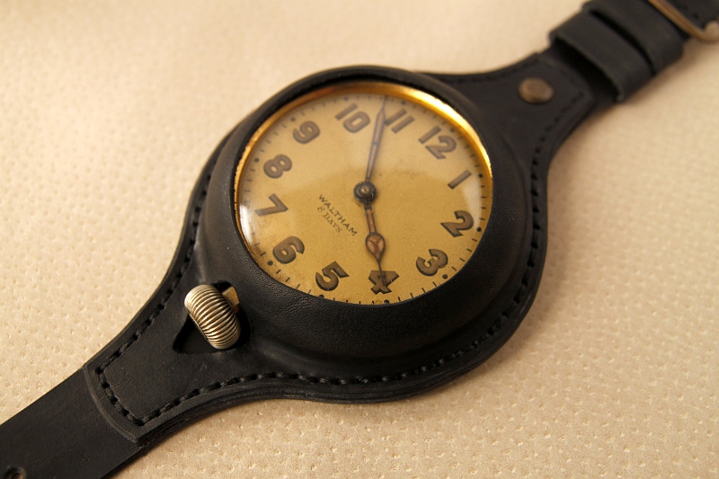
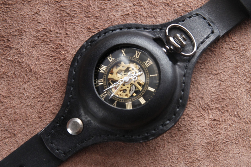 Polish leatherworker MK makes some very nice wrist-straps for pocket-watches and car-watches. He's not the only one making these, but I find them particularly handsome, and rather nice retro-modern take on the massive wristwatch phenomenon.
Wristbands for pocket watches. (Thanks, Nic!) 
|
|
