One of my SDCC exclusives which will be available at booth 1334 on Thursday and Sunday starting at 1pm. I’ll also be signing, sketching and selling some pins so drop by and say hello! #sdcc2016 (at San Diego Convention Center)
From Mark Forsyth’s The Elements of Eloquence, a reminder of the rules of adjective order that fluent English speakers follow without quite knowing why.
…adjectives in English absolutely have to be in this order: opinion-size-age-shape-colour-origin-material-purpose Noun. So you can have a lovely little old rectangular green French silver whittling knife. But if you mess with that word order in the slightest you’ll sound like a maniac. It’s an odd thing that every English speaker uses that list, but almost none of us could write it out.
That summer, she had a student who was obsessed
with the order of adjectives. A soldier in the South
Vietnamese army, he had been taken prisoner when
Saigon fell. He wanted to know why the order
could not be altered. The sweltering city streets shook
with rockets and helicopters. The city sweltering
streets.
Did anyone learn this in school? I sure didn’t. How do we all know then? My daughter’s kindergarten teacher had a great phrase she used when things got a bit tricky as her students learned to read: “the English language is a rascal”. (via @MattAndersonBBC)
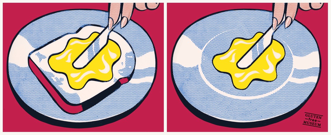
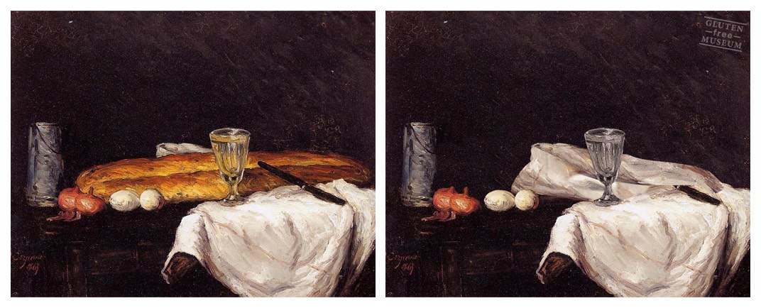
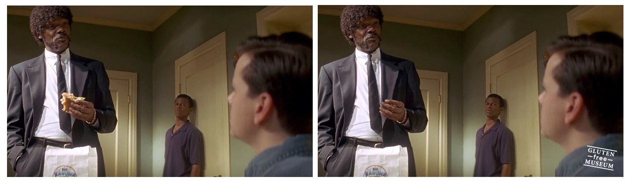
Gluten Free Museum takes works of art (high and low) and removes all of the gluten from them. A one-trick pony, but a particularly entertaining one. (via tmn)
Hold up! There’s an amusement park in NJ right outside of Philly called Diggerland USA where you can operate construction equipment, dig holes with backhoes, and drive asphalt rollers?!? How is this not the most popular amusement park in the entire world?
I rarely post about LEGO Ideas projects as I get so many request to feature a particular one but this Pop-Up Book by Jason Allemann and Grant Davis has really caught my eye. It is a very original idea that I haven’t seen much before of on LEGO Ideas. The book has a simple mechanism that uses Technic beams to make the scene to rise up from the book just like the pop-up books you may have read before as a child. As you can see from the video below, the scenes can be easily changed to your liking and they have shown off a couple of scenes with the cottage, western building, and a castle.
If you see what you like and would think this project would make a great official LEGO set, head over to LEGO Ideas to show your support.
New psychology research explores "word aversion," or why "as many as 20% of the population equates hearing the word 'moist' to the sound fingernails scratching a chalkboard." In a scientific paper about their study, psychologists from Oberlin College and Trinity University report that for some people the word "moist" is associated with bodily functions that trigger a visceral feeling of disgust. No surprise there. But interestingly, those "semantic features" of the word may not be the only issue at play. From their paper:
A separate possible explanation not tested in the current studies, but which the author acknowledges, is rooted in the facial feedback hypothesis. This hypothesis suggests that facial movement can influence emotional experience. In other words, if facial muscles are forced to configure in ways that match particular emotional expressions, then that may be enough to actually elicit the experience of the emotion. On this explanation, saying the word “moist” might require the activation of facial muscles involved in the prototypical disgust expression, and therefore trigger the experience of the emotion. This could explain the visceral response of “yuck” people get when they think of the word. Separate research has identified the particular facial muscles involved in the experience and expression of disgust, but no research as of yet has tested whether the same muscles are required when saying “moist.”
Slime moulds (Physarum polycephalum for example) are quite dexterous when it comes to solving complex 2-D puzzles – their skills having been documented in research which led to the double Ig Nobel prizes (2008 & 2010) awarded to Toshiyuki Nakagaki [full details via here]. Now a new study performed by Alice Dimonte and Victor Erokhin (IMEM-National Research Council, Parma, Italy), Andrew Adamatzky (Unconventional Computing, UWE, Bristol, UK) and Michael Levin (Tufts University, Medford, MA, USA) have made a discovery that could, if replicated, have large scale implications for those involved in such fields. Slime moulds strongly prefer right turns.
In a series of 120 experiments in which moulds made their way up a T-shaped junction, the team found that they turned right in no less than 74% of trials. As yet, the team don’t have a firm explanation for the phenomenon, and call for further research to clarify :
“[…] the role of gravity and other geophysical parameters (such as geomagnetic field, hemisphere location, etc.) in this phenomenon remains to be explicitly tested in Physarum asymmetry.”
Update: Two corrections. The spreadsheet program is actually OpenOffice, not Excel. (Excel is almost a genericized trademark at this point.) And the in-spreadsheet game isn't actually playable...this is a stop motion video of still frames.
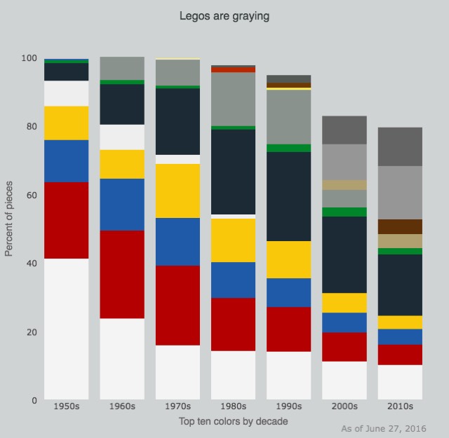
Life-long Lego fan Joel Carron recently analyzed a data set containing the types, colors, and number of pieces in every Lego set from the past 67 years and graphed the results. The shift in colors is the most striking thing to me: Legos are graying.
Legos have gotten darker, with white giving way to black and gray. The transition from the old grays to the current bluish grays (or "bley") is a hot-button topic for many Lego fans.
If you look at the dominant color palettes for all of the tie-in sets they're doing now, it's not difficult to see where those darker colors are coming from.
A black title band, shaded relief, and uniform text help give National Park visitor maps a consistent look.
National Park Service
I’ve always loved the visitor maps you get when you visit a national park. I’ve got little stashes of them tucked into the seat back pockets of my car and hidden away in closets. I can never bring myself to toss the maps when I get home from a trip. With their combination of photos, maps and text they bring back memories of where I’ve been and inspire me to think of adventures still waiting to be had.
Tom Patterson is one of the people who makes those maps. He’s visited more than 100 national parks, including some of the most far-flung and least visited. As a senior cartographer for the National Park Service, it’s Patterson’s job to make sure the maps visitors see at U.S. national parks, monuments, battlefields, and other sites are up to date and easy to use, even for people who aren’t cartographically inclined.
The judicious use of shadow makes the Washington Monument stand out on this map of the National Mall.
National Park Service
“We design our maps for a broad cross section of humanity,” Patterson says. “We believe very strongly that to get park visitors to look at a map, the first thing it has to be is pretty.” He and his colleagues try to design maps that draw people in with their good looks and keep them looking long enough to absorb some of the information they need to need to make the most of their visit—the location of trails, viewpoints, lodging, and so on.
National Park visitor maps have a certain look that makes them easy to recognize. That’s very much by design (and we’ll get to how it’s done), but it wasn’t always so.
Before World War II, most visitors arrived by train, Patterson says. Most of the maps in those days were made not by the park service but by railroad companies hoping to inspire people to take the trip. The latter half of the 20th century saw the rise of the automobile, and road maps became increasingly common. But it wasn’t until the 1970s that the Park Service began to standardize park visitor maps and give them a more uniform appearance. “Up to that point, there was a whole hodgepodge of different styles,” Patterson says.
Natural colors on this map of Kenai Fjords National Park in Alaska help orient visitors to what they see around them.
National Park Service
You can see a pictorial history of National Park visitor maps in the gallery at the bottom of this post—it’s a compilation of vintage park maps photographed by Nancy Haack, a (now retired) Park Service cartographer.
In 1977, the park service hired Massimo Vignelli, the graphic designer who created the iconic map and signage for the New York City subway system, and charged him with creating a more consistent style for the park system’s maps and other publications.
One design element Vignelli introduced is the bold black title band you can see on nearly all park service publications. “It’s become more or less part of the identity of the entire National Park Service,” Patterson says.
The usually unseen unigrid (blue lines) organizes the layout of all National Park maps.
National Park Service
The band is part of the “unigrid,” another of Vignelli’s innovations, still in use today. This grid guides the layout of every map, but it’s invisible in the final product (you can see it overlaid on the map of Theodore Roosevelt National Park above). “The maps look very organic butthere is this hidden grid dictating the placement of photographs, text and maps,” Patterson says.
Another feature that distinguishes park service maps is their use of shaded relief to give the maps a 3-dimensional look. This method—using shading to simulate the shadows cast by hills and other features of the terrain—is Patterson’s specialty. He’s invented several techniques for doing shaded relief and even writes a blog about it.
The Park Service prefers shaded relief to contour lines, another way to portray 3D features of the terrain on a flat map. Each line follows a certain elevation—200 feet above sea level, for example. But the lines add “graphical noise” to a map, Patterson says, and many people don’t know how to use them. “Frankly, they look technical and not inviting.” (That said, if you’re hiking off into the backcountry, you will definitely want a topographic map—the visitor maps are just for basic planning).
Shaded relief makes this map of Canyonlands National Park look surprisingly three-dimensional.
National Park Service
Many other features of the visitor maps have been standardized as well, from the text (the house font of the National Park Service, and the only one to appear on its maps, is the clean-looking and highly legible Frutiger), to the symbols. There are currently 229 symbols used on Park Service maps to indicate everything from parking lots and campgrounds to various hazards that visitors might encounter.
Easily recognizable symbols help park visitors find their way around.
National Park Service
Most of the symbols are easily recognizable, even if some are a bit anachronistic. Like the boombox. And the tent. “I haven’t seen a tent that looks like that in quite some time,” Patterson says. “It looks like something from World War I.”
Sometimes a park will request a new symbol that tests the cartographers’ creativity, such as a symbol to indicate a zebra mussel decontamination station. Parks have these checkpoints to stop the spread of this invasive species. But Patterson says he couldn’t think of a good symbol for it, especially given the 3.5-millimeter size at which it would appear on a brochure. “Finally I just gave up and put a big Z in there,” he says.
Patterson is always experimenting with ways to make the maps more usable for people who aren’t very experienced at using maps. For some parks, he’s used natural colors from satellite photos so that the colors people see on the map match up with the terrain they see in front of them.
He and colleagues also use aerial photos to make detailed maps of historical sites. For the map of Fort Stanwix National Monument in upstate New York (see below) they hired a helicopter to photograph the site. It cost about $1,200 to hire the helicopter, Patterson says, but it probably saved $20,000 to $30,000 compared to the cost of drawing everything from scratch.
Photographs shot from a helicopter became the basis for this visitor map of Fort Stanwix National Monument.
National Park Service
More detail isn’t always better, though. Certain things don’t appear on parks’ visitor maps, including employee housing and parking areas, sensitive habitats, and some archaeological sites. The act of Congress that created the National Park Service 100 years ago specified that the service conserve the natural and historical resources of the parks as well as provide for the enjoyment of them.
Making maps that help fulfill that mission is a never-ending process, especially given the diversity of the parks’ visitors—more than 300 million of them each year—and the diversity of the parks themselves. The Park Service administers 411 units from Gates of the Arctic National Park and Preserve in Alaska to the National Park of American Samoa, south of the equator. Every map is custom made, Patterson says. “One-size-fits-all design doesn’t apply.”
In a recent high-stakes basketball match between the Golden State Warriors and the Oklahoma City Thunder, Golden State Warrior player Draymond Green kicked Thunder player Steven Adams directly in the penis and testicles.
(more…)
In the early 20th century, the Official Automobile Blue Book reassured drivers that road trips were safe and gave them turn-by-turn directions.
Photograph by NatPar Collection, Alamy
A cross-country road trip is a quintessentially American experience. From Jack Kerouac to the Griswold family, millions have loaded up the car and hit the open road. It’s always an adventure, but in modern times it’s a relatively tame one: The roads are paved, signs point the way, and Siri always has your back.
But a hundred years ago, traveling cross-country by automobile was intimidating, if not a little bit dangerous. Cars were unreliable. Roads were rough, and with the Interstate Highway System still decades away, a bewildering array of potential routes connected any pair of distant points.
A crucial aid in those days was a series of guides called the Official Automobile Blue Book. Each thick volume covered hundreds of routes, giving detailed turn-by-turn directions that put Google to shame, pointing out landmarks like cemeteries, factories, and places where the road crossed trolley tracks.
The Blue Book guides and others like them were the predecessors to road maps and atlases, says John Bauer, a geographer at the University of Nebraska at Kearney, who published what may be the only academic study of the series. Bauer suspects the guides may have even influenced some of the routes chosen for the state and federal highway networks built in the subsequent decades.
The leather cover and gilt lettering were designed to give the Blue Book guides an authoritative look.
Prelinger Library / Photo by Greg Miller
I recently spent some time flipping through a 1916 volume at the Prelinger Library in San Francisco. It covered a huge swath of the country, from the Mississippi River to the Pacific Coast. With a leather cover and gilt lettering, the guide had the look and heft of a Bible. It included 1,286 individual routes—actually more, because some routes had lettered side routes. Route 528, for example, takes you from Fort Morgan, Colorado to Denver, via Greely, while route 528A takes you from Greely up to Estes Park.
What struck me, in addition to the sheer number of routes and their complexity (the 115-mile route from Fort Morgan to Denver had 40 steps), was the volume’s boosterish tone. The ads, with photos of well-dressed, apparently well-heeled people, make driving look très sophisticated. If cars had cupholders back then, these folks would be rolling with crystal goblets, not Big Gulps.
A section on Transcontinental Touring extolls the “wonders of the western country,” and urges readers not to be daunted by the journey, reminding them that at least 5,000 cars had made the trip from the Mississippi to the Pacific in the last two years. Five whole thousand! “True, the unexpected happens in those less developed and more sparsely settled sections of the country—but those unforeseen occurrences, seldom dangerous or serious, are the very thing that give romance and variety to a Western trip.”
Ads like this one in the 1916 Blue Book reflected the aspirations of the middle class, for whom automobile ownership had only recently come within reach.
Prelinger Library / Photo by Greg Miller
The Blue Book guides (which aren’t related to the Kelly Blue Book guides to car values still published today) were intended to look authoritative and to drum up enthusiasm for automobile touring, Bauer writes in his paper, published in Cartographic Perspectives in 2009. The guides also met a pressing need for navigational aids at the time. “They were uniquely suited for navigating the primitive network of local roads that existed prior to the 1920s,” he writes.
In the early 20th century, a trip from, say, Chicago to Denver, would involve hundreds of turns on small local roads that wound their way through the countryside and zig-zagged through towns. Road signs were virtually nonexistent, Bauer says, because until cars came along there was no need for them. Long trips were made by train, and virtually all short trips were made by local people who already had a mental map of the roads in their area.
Cars changed everything. By 1916, they were well on their way to becoming more than just a toy for the wealthy (all the same, those fancy people in the Blue Book ads reflected the aspirations of the newly automobiled middle class). The number of cars registered in the U.S. had doubled in the last two years, reaching 3.4 million (compared to 188 million in 2014). Lots more people were driving. And lots of them were getting lost.
The instructions for using the Blue Book guides (see below) seem complicated now, but they made sense in the context of the times. “You don’t drive but one or two or three miles before you have to turn,” Bauer told me. “It’s impossible to show all those turns at the scale of a typical map.”
This diagram explains how to use the reference maps to look up detailed driving directions between two places.
Prelinger Library / Photo by Greg Miller
The guides do contain maps, but most of them aren’t meant to be used directly in navigation. Rather, they serve as a visual index to the written turn-by-turn directions. Like railroad maps, these index maps depict straight-line connections between towns, even when the actual routes were far more convoluted.
And convoluted they were. Here are two steps in the directions from Fort Morgan to Denver:
3.4
1.7
End of road, turn right; curving left just beyond. Pass school on left 4.4. Turn right with road 5.0. Cross concrete bridge 5.2.
8.8
5.4
End of road; turn right with travel. Cross bridge over Platte River and RR. 9.2
The numbers refer to mileage. The first number for each step is the total distance traveled so far, the second is the intermediate distance you’d see on your odometer if you re-zeroed it at the beginning of each step. For example, at the start of the second step above, you’d be 8.8 miles into the entire trip, and you’d have just finished the 5.4 mile segment described in the previous step (you’d have passed the school at 4.4 miles, the concrete bridge at 5.2, and hit 5.4 at the end of the road, right where the second step begins). Easy, right?
Well, following all these twists and turns would have been easier back when cars rarely broke 30 miles per hour, Bauer says, and there was time for a driver (or better whoever was riding shotgun) to look back and forth between the book and the road ahead.
This section of the 1916 guide shows driving directions between Greely and Estes Park, Colorado.
Prelinger Library / Photo by Greg Miller
Even so, following these directions would require two things: a good odometer and a degree of diligence. If you got off track all your numbers would be off. You’d have to find your way back to the nearest point of reference.
The Blue Book guides weren’t purely for navigation. They also include introductions to towns and cities and flag points of historical or modern interest. The Fort Morgan-Denver route description, for example, includes this gem: “The intrepid Hollen Godfrey maintained a stage station at a point located near Merino. He was often attacked by Indians, but was never caught napping…”
Not much is known about how the Blue Book guides were made, Bauer says, but the publisher apparently paid professional “pathfinders” to drive the main roads each summer so the guides could be updated to reflect the quickly-changing road conditions. Amateur pathfinders, often members of local automotive clubs, also contributed.
This index map shows the main roads leading in and out of Chicago.
Prelinger Library / Photo by Greg Miller
In a way, the success of the guides may have contributed to their demise. As more people felt emboldened to hit the road, pressure mounted on the government to build better roads. The Federal Aid Road Act of 1916 provided the first federal funding for building and improving roads. In 1926, the first network of numbered interstate highways was established. As signs went up along these routes, it became far easier to navigate without turn-by-turn directions.
Two years earlier, in 1924, Rand McNally had published its “Auto Chum,” the first edition of what would become its bestselling road atlas. Other companies soon jumped on the road-atlas band wagon. After 1927, the Blue Book guides with turn-by-turn directions were no longer published.
It’s ironic that nearly a century later, after decades of relying on road maps and atlases, so many drivers have gone back to turn-by-turn directions as their preferred navigational aid. If only Siri could flag the landmarks and throw out some trivia along the way.
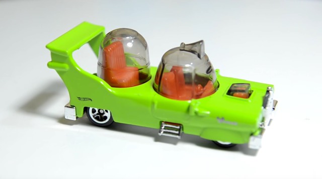
Hot Wheels released a die-cast version of The Homer, the "everyman" car designed by Homer Simpson in season two episode of The Simpsons. Designed for his half-brother's car company, the car was so bad and expensive that it drove (ha!) the company out of business. And now it can be yours!
As the US and Cuba move toward becoming BFFs again (or at least members of the same #squad), it's a good time to review the history between the two countries, which includes slavery, the Spanish-American War, and the Cold War-era series of fiascos.
The PBS Ideas Channel talks to Brooklyn bar owner Ivy Mix about all the different kinds of glassware that cocktails are served in. The most interesting bits are about how factors other than taste influence how people enjoy drinks, as with wine. Men in particular seem to have a difficult time enjoying themselves with certain types of glassware and drink colors.
New York Horizon, the first place winning design of the EVolo 2016 Skyscraper Competition by architects Yitan Sun and Jianshi Wu, uses an incredibly novel horizontal approach in order to provide a maximum of space. The “skyscraper” would surround the perimeter of a newly sunken Central Park and provide an enormous amount of housing while protecting views and accessibility to the park.
The annual award established in 2006 recognizes visionary ideas for building high- projects that through the novel novel use of technology, materials, programs, aesthetics, and spatial organizations, challenge the way we understand vertical architecture and its relationship with the natural and built environments. The FIRST PLACE was awarded to Yitan Sun and Jianshi Wu from the United States for the project New York Horizon. The design proposes a continuous horizontal skyscraper around the full perimeter of a sunken Central Park. The project would create 7 square miles (80 times greater than the Empire State Building) of housing with unobstructed views and connection to the park.
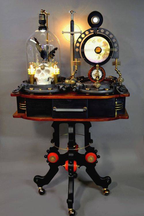
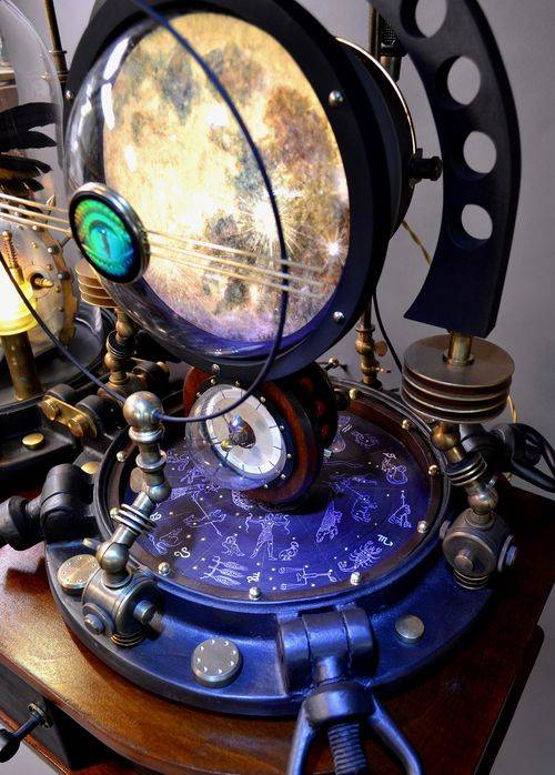
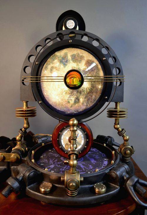
Art Donovan (previously) created this amazing, mixed-media sculpture as a commission, called The Raven's Chamber, resembling some arcane astronomical instrument from a mad alchemist's lab.


