what are we????
WRITERS!!!!!!
what are we gonna do????
WRITE!!!!!!!!!!
when are we gonna do it????????
//distant sobbing
Sophianotloren
Shared posts
07 Jun 08:29
fedoramoron: what are we????WRITERS!!!!!!what are we gonna do????WRITE!!!!!!!!!!when are we gonna...
bernot, Sophianotloren and one other like this
07 Jun 08:29


A perfectly reasonable response.
A perfectly reasonable response.
bernot, Sophianotloren and -1 others like this
07 Jun 08:29
"If you took our two good male characters Max and Nux out of the movie, Furiosa and the girls (and to..."
“If you took our two good male characters Max and Nux out of the movie, Furiosa and the girls (and to a lesser extent the Vuvalini) would still have motivations and character development and narrative arcs. But if you took the women out of the movie, the men aren’t left with a plot of their own. THIS IS INCREDIBLE TO COMPREHEND. I have spent complete minutes lost in wonder at how rare this is to find in any movie, especially a big explosiony one. Without Furiosa, without the women she is freeing and the women she is returning to, who raised her to be the woman she is, this movie just does not exist.”
- A Very Long Post On Fury Road’s Feminism (x)
- A Very Long Post On Fury Road’s Feminism (x)
baron, Sophianotloren and one other like this
07 Jun 08:28
whatwouldelizabethbennetdo: Pride and Prejudice/The Onion...
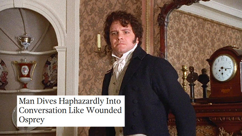
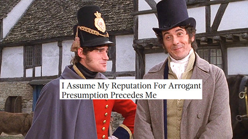

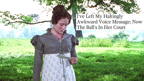

Sophianotloren, Tertiarymatt likes this
07 Jun 08:28
bettybonesco: this might be my favorite gif

Sophianotloren, Balint and 2 others like this
07 Jun 08:27
geekandmisandry: I’ve been laughing at this for 15 minutes.

bernot, Sophianotloren and 2 others like this
07 Jun 08:27
haveitjoeway:*watches porn*me: this intro is taking too long*skips one minute* *they eating ass*me:...
*watches porn*
me: this intro is taking too long
*skips one minute*
*they eating ass*
me: now i gotta rewind because ive obviously missed a key element to the story
bernot, Sophianotloren and one other like this
07 Jun 08:27
joeliebgot: computer unfreezes“oh are you done? you’re done having a hissyfit now? you’re ready to...
computer unfreezes
“oh are you done? you’re done having a hissyfit now? you’re ready to function like a reasonable machine?”
Rosalind, Sophianotloren and one other like this
07 Jun 08:27

youdtearthiscanvasskinapart:tenthousand-rectums: When your dad...
When your dad thinks your bath bomb is a toilet cleaner
This is the only “bathbomb” meme I will except it is the only one it is the ultimate dad thing to do im dead
bernot, Sophianotloren and one other like this




07 Jun 08:25
This is adapted from my GDC 2015 talk "Level Design Histories and Futures" and resembles a similar but much shorter talk I gave at Different Games 2015. By "level" it means "level in a 3D character-based game", which is what the industry means by the word.
The "level designer" is a AAA game industry invention, an artificial separation between "form" (game design) and "content" (level design). The idea is that your game is so big, and has so much stuff, that you need a dedicated person to think about the "content" like that, and pump it all out. This made level designers upset, since they were a chokepoint in the game production process and everyone blamed them if the game was shit. To try to bypass this scapegoating, level design has changed over the past decade or two, from something vague / loosely defined, to something fairly specific / hyperspecialized.
What is the shape of this level design, what did it used to be, and what else could it be in the future?
But first, let's talk about chairs.

What is a chair? What is the most "chairful" chair, the chair that exemplifies the pure essence of chair-ness?
The ancient Greek philosopher Plato argued that the most chairful chair did not exist in real life -- and only philosophers, through disinterested intellectual contemplation, could understand the true essence of a chair.
This is the idea of "Platonic forms", that specific concrete chairs are less relevant than the universal structure and patterns inherent among all chairs. Level design and architecture make similar claims about "universal structures"...

Ancient Greek architecture was fascinated with forms. Buildings were made of clearly articulated walls, floors, pillars -- and each part of a building was to conform to a specific set of proportions in order to be most beautiful. How many different types of buildings are there? (The correct answer is three.)
Early modernist architecture echoes this formalism, where the phrase "form follows function" comes from. Form is considered to be the sum of a building's core structural elements, and so buildings should match this ideal form as much as possible.

Some Western modernist architects even thought they could design a universal form devoid of politics, an "International Style" of building that would transcend the violent nationalism of the 20th century. Sounds like a nice idea, right?
Here, architects were assuming the underlying "Platonic form" of all societies was architecture, which meant architects were philosopher-kings whose duty was to "go back into the cave" and help others. Much of "level design" today inherits these high modernist ideas, both in politics and practice.

To address practice, we must address tools. The first level editors for 3D games like Wolfenstein3D and Doom 1 were actually 2D top-down grid views, inspired mostly by actual architectural industry drafting tools like AutoCAD. The next generation of editors for "true 3D" games like Quake, Unreal, and Half-Life were inspired more by 3D modeling tools and 4-split pane interfaces. Here, level design was largely a matter of construction and opportunity for details.

Today, most 3D games use one large 3D view and modular construction, where a level designer's task is more to assemble pre-fabricated modules already made by environment artists. Some AAA studios maintain strict divides between level design and environment art, and I think this division is on the rise as demands for higher fidelity increase, as more Western studios outsource environment art asset production while keeping design in-house. It makes sense to do it like this when your boss tells you to build a giant city full of thousands of things within a year.

This shift in workflow is about taking the construction out of level design. Level designers used to be artists, sculptors, modelers, and carpenters -- but today, the game industry has decided that a level designer is mostly an architect who draws a blueprint and manages labor.
Most industrial level designers might start with a design document or general concept pitch. Once approved, they would begin sketching a floorplan and paper prototyping some shapes. After another round of approvals, they make a greybox or simple 3D block-out (or hand it off to a "level builder") and do some playtesting in the graybox, then hand it off to the environment art team for an art pass. (see below)
The idea here is that these gray boxes ARE the soul of the level, and art assets and detail are just "ornament" -- and according to the high modernist architects of the early 20th century, ornament is not "real" architecture. This is VERY different from ideas of early level design; check out this 2001 level designer job posting from a little company called Crytek, where they want you to have "art skills" and 3D modeling experience. So in between then and now, the level design field embraced high modernism, and they started pumping stuff out that looked like high modernism. (Note that this is just AAA level design; AAA games as a whole are totally addicted to ornament and excessive detail.)
The problem with embracing this brand of modernism as a central creative driving force is that it essentially died, like, 50 years ago. Today, if you're called a "formalist" in art or architecture, it is probably intended as an insult. We can trace its death back to the idea of Platonic forms -- remember that question, what is the most chairful, chair-iest chair?

Postmodernism was about this realization that, wait, ANYTHING can be a chair, it depends on how you use it? What if you're a farmer who was denied permission to build a horse shelter, so you build some 20 foot tall chairs -- these chairs clearly aren't chairs, and yet they are. Or what about professional wrestlers who "give 'em the chair"? It is important that is a chair because it isn't functioning as a chair.
If a building cannot dictate how it is used or interpreted by its people, then how can architecture know what's best for everyone?

By the way, who was "everyone"?
Take Frank Lloyd Wright's famous "Fallingwater" -- who owns Fallingwater, who can afford to go there, who can get car insurance and a credit card to rent a car to go drive there? Most of the well-preserved architectural landmarks, ancient or modern, were made for governments, religious institutions, large militaries, or maybe just plain ol' rich people. Le Corbusier wanted to bulldoze the middle of Paris and replace it with condos, and Robert Moses wanted to bulldoze Greenwich Village and replace it with a highway.
Who exactly benefits from this supposedly apolitical, ideal universal form of society?

Architecture has politics embedded in the form, as well as politics completely outside of the form.
For instance, the Vietnam Veterans Memorial in Washington DC is one of the most acclaimed pieces of memorial architecture -- and it was designed by Maya Lin, then a young architecture student. Her proposal was two dark metallic marble cuts into the ground, with the name of every US military casualty etched into its surface. It is a scar in the landscape that tries to give every death some space and room for reflection. If you see any memorial architecture with multitudes of names etched into it, it's because Maya Lin changed the field.
Her proposal was part of a blind competition. When US senator and local racist Ross Perot found out the winning architect was a young Asian woman, he called her an "eggroll." He and senator Jim Webb withdrew their approval, and Ronald Reagan's secretary of interior James Watt threatened to revoke the building permit. To review: the building itself was great... until they found out an Asian woman designed it, and then all bets were off because it was "disrespectful to the boys who died in Vietnam"... but even if you follow that terrible logic, Maya Lin is Chinese and she was BORN. IN. OHIO.

This is pretty much a clear-cut example of institutional racism and sexism. That's why orthodox modernism had to die, because even old white male racists have to admit that "what a building is" often has nothing to do with its form.
Postmodern architecture and subsequent movements are about how a home is so much more than just a "machine for living", and emphasizes how decoration is important for people and communities. Lack of decoration is a style of decoration in itself. There is no such thing as "pure form."
Here, the governing mantra is less "form follows function", and more like "form follows worldview." When we build for people instead of market demographics, our work can become part of a community and it can endure -- this is a core tenet of sustainable architecture, to actually study and collaborate with neighborhoods and governments.

Inner City Arts in Los Angeles provides an under-served neighborhood with arts programs and a civic center. It was painted white, to emphasize how they would maintain this infrastructure, and they kept the garage door aesthetic to callback to the location's history as a set of re-purposed industrial garages.
Here, the main formalism was about the different milestones in the art center's construction, and how they "released" this center in "early access" as stages, so they could be useful to the community as soon as possible. Architecture is an on-going dialogue with stakeholders that affects the development process over time.
Because Team Fortress 2 used its achievement system to gate item unlocks, the player community quickly established achievement grinding servers so players could acquire items more quickly. In response, achievement_all_v4 is an "achievement trap" map where everything seems normal for a few minutes, and then a giant cat rises out of the ground and starts killing everyone with laser beams and cannons. At the end, the entire server is nuked as punishment.
Note that the "achievement grinding map" is itself a form of local level design, a genre devised by players -- and so is the achievement trap genre as well. This level design functions as a complex rhetoric, an effective moral commentary on a community response to a developer's game update.

For the Quinta Monroy housing development, the government hired a firm to renovate a neighborhood populated mainly by squatters. This could've been another housing project, but the firm actually did workshops with residents to listen to their needs and imagine what the houses would look like. They turned their limited budget into a design strength: rather than build an entire residence at a low and cheap standard, they chose to collaborate with the residents' ability to adapt housing – instead, they only built half of a house, but it's an entry-level middle class half of a house that would've been difficult for the residents to build themselves.
The residents at Quinta Monroy can then finish the house themselves and make it their own, sharing control over the appearance and structure of their neighborhoods with the architects. What if we left our own games and levels purposely half-finished, as a gesture of outreach and respect for players?
The Gary Hudston Project is a Portal 2 puzzle map that ends with a marriage proposal, intended for one specific player in the entire world, commissioned for a specific time and place. It reminds me of one of my level design students who wants to make a map based on his family's home before they move away -- what if we made small levels or games as gifts, as tokens, as mementos?
Notice that typical game design questions don't really apply here. No one cares if the puzzles were good or if the textures were aligned. What matters is whether the proposer spent months making it or commissioned it, or whether the player said "Yes" at the end; what matters is the process and the response, not necessarily the product nor its specific form.

Industrial level design views every design problem as a problem of production time, dependent on the ability to scope and plan and manage human labor.
In contrast, local level design views every design problem as a problem of dialog and methodology, it is a "compassionate formalism" that tries to collaborate on conceptual frameworks rather than imposing them. I hope these already existing examples of locally-oriented practice across architecture and level design demonstrate that it is something possible, important, and real.

And that is why "chairs can't just be chairs."
Local level design, and a history / future of level design
by Robert Yang
 |
| Right-side modified from “Unscaping the Goat” (Ed Byrne, Level Design in a Day @ GDC 2011) |
The "level designer" is a AAA game industry invention, an artificial separation between "form" (game design) and "content" (level design). The idea is that your game is so big, and has so much stuff, that you need a dedicated person to think about the "content" like that, and pump it all out. This made level designers upset, since they were a chokepoint in the game production process and everyone blamed them if the game was shit. To try to bypass this scapegoating, level design has changed over the past decade or two, from something vague / loosely defined, to something fairly specific / hyperspecialized.
What is the shape of this level design, what did it used to be, and what else could it be in the future?
But first, let's talk about chairs.
What is a chair? What is the most "chairful" chair, the chair that exemplifies the pure essence of chair-ness?
The ancient Greek philosopher Plato argued that the most chairful chair did not exist in real life -- and only philosophers, through disinterested intellectual contemplation, could understand the true essence of a chair.
This is the idea of "Platonic forms", that specific concrete chairs are less relevant than the universal structure and patterns inherent among all chairs. Level design and architecture make similar claims about "universal structures"...
Ancient Greek architecture was fascinated with forms. Buildings were made of clearly articulated walls, floors, pillars -- and each part of a building was to conform to a specific set of proportions in order to be most beautiful. How many different types of buildings are there? (The correct answer is three.)
Early modernist architecture echoes this formalism, where the phrase "form follows function" comes from. Form is considered to be the sum of a building's core structural elements, and so buildings should match this ideal form as much as possible.
Some Western modernist architects even thought they could design a universal form devoid of politics, an "International Style" of building that would transcend the violent nationalism of the 20th century. Sounds like a nice idea, right?
Here, architects were assuming the underlying "Platonic form" of all societies was architecture, which meant architects were philosopher-kings whose duty was to "go back into the cave" and help others. Much of "level design" today inherits these high modernist ideas, both in politics and practice.
To address practice, we must address tools. The first level editors for 3D games like Wolfenstein3D and Doom 1 were actually 2D top-down grid views, inspired mostly by actual architectural industry drafting tools like AutoCAD. The next generation of editors for "true 3D" games like Quake, Unreal, and Half-Life were inspired more by 3D modeling tools and 4-split pane interfaces. Here, level design was largely a matter of construction and opportunity for details.
Today, most 3D games use one large 3D view and modular construction, where a level designer's task is more to assemble pre-fabricated modules already made by environment artists. Some AAA studios maintain strict divides between level design and environment art, and I think this division is on the rise as demands for higher fidelity increase, as more Western studios outsource environment art asset production while keeping design in-house. It makes sense to do it like this when your boss tells you to build a giant city full of thousands of things within a year.
This shift in workflow is about taking the construction out of level design. Level designers used to be artists, sculptors, modelers, and carpenters -- but today, the game industry has decided that a level designer is mostly an architect who draws a blueprint and manages labor.
Most industrial level designers might start with a design document or general concept pitch. Once approved, they would begin sketching a floorplan and paper prototyping some shapes. After another round of approvals, they make a greybox or simple 3D block-out (or hand it off to a "level builder") and do some playtesting in the graybox, then hand it off to the environment art team for an art pass. (see below)
 |
| from "Gallente Research Facility", Dust 514, CCP Games |
The idea here is that these gray boxes ARE the soul of the level, and art assets and detail are just "ornament" -- and according to the high modernist architects of the early 20th century, ornament is not "real" architecture. This is VERY different from ideas of early level design; check out this 2001 level designer job posting from a little company called Crytek, where they want you to have "art skills" and 3D modeling experience. So in between then and now, the level design field embraced high modernism, and they started pumping stuff out that looked like high modernism. (Note that this is just AAA level design; AAA games as a whole are totally addicted to ornament and excessive detail.)
The problem with embracing this brand of modernism as a central creative driving force is that it essentially died, like, 50 years ago. Today, if you're called a "formalist" in art or architecture, it is probably intended as an insult. We can trace its death back to the idea of Platonic forms -- remember that question, what is the most chairful, chair-iest chair?
Postmodernism was about this realization that, wait, ANYTHING can be a chair, it depends on how you use it? What if you're a farmer who was denied permission to build a horse shelter, so you build some 20 foot tall chairs -- these chairs clearly aren't chairs, and yet they are. Or what about professional wrestlers who "give 'em the chair"? It is important that is a chair because it isn't functioning as a chair.
If a building cannot dictate how it is used or interpreted by its people, then how can architecture know what's best for everyone?
By the way, who was "everyone"?
Take Frank Lloyd Wright's famous "Fallingwater" -- who owns Fallingwater, who can afford to go there, who can get car insurance and a credit card to rent a car to go drive there? Most of the well-preserved architectural landmarks, ancient or modern, were made for governments, religious institutions, large militaries, or maybe just plain ol' rich people. Le Corbusier wanted to bulldoze the middle of Paris and replace it with condos, and Robert Moses wanted to bulldoze Greenwich Village and replace it with a highway.
Who exactly benefits from this supposedly apolitical, ideal universal form of society?
Architecture has politics embedded in the form, as well as politics completely outside of the form.
For instance, the Vietnam Veterans Memorial in Washington DC is one of the most acclaimed pieces of memorial architecture -- and it was designed by Maya Lin, then a young architecture student. Her proposal was two dark metallic marble cuts into the ground, with the name of every US military casualty etched into its surface. It is a scar in the landscape that tries to give every death some space and room for reflection. If you see any memorial architecture with multitudes of names etched into it, it's because Maya Lin changed the field.
Her proposal was part of a blind competition. When US senator and local racist Ross Perot found out the winning architect was a young Asian woman, he called her an "eggroll." He and senator Jim Webb withdrew their approval, and Ronald Reagan's secretary of interior James Watt threatened to revoke the building permit. To review: the building itself was great... until they found out an Asian woman designed it, and then all bets were off because it was "disrespectful to the boys who died in Vietnam"... but even if you follow that terrible logic, Maya Lin is Chinese and she was BORN. IN. OHIO.
This is pretty much a clear-cut example of institutional racism and sexism. That's why orthodox modernism had to die, because even old white male racists have to admit that "what a building is" often has nothing to do with its form.
Postmodern architecture and subsequent movements are about how a home is so much more than just a "machine for living", and emphasizes how decoration is important for people and communities. Lack of decoration is a style of decoration in itself. There is no such thing as "pure form."
Here, the governing mantra is less "form follows function", and more like "form follows worldview." When we build for people instead of market demographics, our work can become part of a community and it can endure -- this is a core tenet of sustainable architecture, to actually study and collaborate with neighborhoods and governments.
Inner City Arts in Los Angeles provides an under-served neighborhood with arts programs and a civic center. It was painted white, to emphasize how they would maintain this infrastructure, and they kept the garage door aesthetic to callback to the location's history as a set of re-purposed industrial garages.
Here, the main formalism was about the different milestones in the art center's construction, and how they "released" this center in "early access" as stages, so they could be useful to the community as soon as possible. Architecture is an on-going dialogue with stakeholders that affects the development process over time.
Because Team Fortress 2 used its achievement system to gate item unlocks, the player community quickly established achievement grinding servers so players could acquire items more quickly. In response, achievement_all_v4 is an "achievement trap" map where everything seems normal for a few minutes, and then a giant cat rises out of the ground and starts killing everyone with laser beams and cannons. At the end, the entire server is nuked as punishment.
Note that the "achievement grinding map" is itself a form of local level design, a genre devised by players -- and so is the achievement trap genre as well. This level design functions as a complex rhetoric, an effective moral commentary on a community response to a developer's game update.
For the Quinta Monroy housing development, the government hired a firm to renovate a neighborhood populated mainly by squatters. This could've been another housing project, but the firm actually did workshops with residents to listen to their needs and imagine what the houses would look like. They turned their limited budget into a design strength: rather than build an entire residence at a low and cheap standard, they chose to collaborate with the residents' ability to adapt housing – instead, they only built half of a house, but it's an entry-level middle class half of a house that would've been difficult for the residents to build themselves.
The residents at Quinta Monroy can then finish the house themselves and make it their own, sharing control over the appearance and structure of their neighborhoods with the architects. What if we left our own games and levels purposely half-finished, as a gesture of outreach and respect for players?
The Gary Hudston Project is a Portal 2 puzzle map that ends with a marriage proposal, intended for one specific player in the entire world, commissioned for a specific time and place. It reminds me of one of my level design students who wants to make a map based on his family's home before they move away -- what if we made small levels or games as gifts, as tokens, as mementos?
Notice that typical game design questions don't really apply here. No one cares if the puzzles were good or if the textures were aligned. What matters is whether the proposer spent months making it or commissioned it, or whether the player said "Yes" at the end; what matters is the process and the response, not necessarily the product nor its specific form.
Industrial level design views every design problem as a problem of production time, dependent on the ability to scope and plan and manage human labor.
In contrast, local level design views every design problem as a problem of dialog and methodology, it is a "compassionate formalism" that tries to collaborate on conceptual frameworks rather than imposing them. I hope these already existing examples of locally-oriented practice across architecture and level design demonstrate that it is something possible, important, and real.
And that is why "chairs can't just be chairs."
Sophianotloren likes this
07 Jun 08:18

CVS Managers Allegedly Instructed Security Guards To Racially Profile Shoppers
by Liam Mathews
Four former CVS “market investigators” filed suit against the pharmacy chain in Manhattan Federal Court on Wednesday, alleging that managers at locations in Manhattan and Queens instructed them to racially profile black and Hispanic shoppers, the New York Daily News reports. The anti-shoplifting security guards were “directed to follow utterly despicable and racist directives. Specifically, they were repeatedly instructed to intentionally target and racially profile black and Hispanic shoppers,” by loss prevention managers Anthony Salvatore and Abdul Selene, the suit alleges. The investigators were all fired after complaining about the discrimination.
According to the suit, CVS store management in New York is institutionally racist: “These black people are always the ones that are the thieves,” Salvatore allegedly said, while Abdul Selene said to “watch the black and Hispanic people to catch more cases,” according to the International Business Times. The four investigators, who are all black or Hispanic, were also subjected to racist verbal abuse from managers themselves. One of the defendants, Kerth Pollack, says that Salvatore told him to “get his black ass back to the store and apologize” after arguing with a store manager.
Similar suits at Barneys and Macy’s received payouts of $525,000 and $625,000, respectively.
(Photo: Ed Yourdun)
The post CVS Managers Allegedly Instructed Security Guards To Racially Profile Shoppers appeared first on ANIMAL.
Rosalind, Sophianotloren likes this
07 Jun 08:17
‘Dub Will Tear us Apart’: Jäh Division, the gimmick band that transcendeth all

I give perhaps too much benefit of the doubt to high-concept joke bands, and rarely does it pay off. A great many DM readers are surely familiar with the drill—the cheeky name and description of the band gives you enough of a chuckle that you check them out, only to find so-so...
Sophianotloren, Cary Renquist and one other like this
07 Jun 08:17


Studying Race and Gender in Comic Books with Color Codes
by TBridges
Originally posted at Feminist Reflections.
Lots of time and care consideration goes into the production of new superheroes and the revision of time-honored heroes. Subtle features of outfits aren’t changed by accident and don’t go unnoticed. Skin color also merits careful consideration to ensure that the racial depiction of characters is consistent with their back stories alongside other considerations. A colleague of mine recently shared an interesting analysis of racial depictions by a comic artist, Ronald Wimberly—“Lighten Up.”* “Lighten Up” is a cartoon essay that addresses some of the issues Wimberly struggled with in drawing for a major comic book publisher. NPR ran a story on the essay as well. In short, Wimberly was asked by his editor to “lighten” a characters’ skin tone—a character who is supposed to have a Mexican father and an African American mother. The essay is about Wimberly’s struggle with the request and his attempt to make sense of how the potentially innocuous-seeming request might be connected with racial inequality.  In the panel of the cartoon reproduced here, you can see Wimberly’s original color swatch for the character alongside the swatch he was instructed to use for the character.
Digitally, colors are handled by what computer programmers refer to as hexadecimal IDs. Every color has a hexademical “color code.” It’s an alphanumeric string of 6 letters and/or numbers preceded by the pound symbol (#). For example, computers are able to understand the color white with the color code #FFFFFF and the color black with #000000. Hexadecimal IDs are based on binary digits—they’re basically a way of turning colors into code so that computers can understand them. Artists might tell you that there are an infinite number of possibilities for different colors. But on a computer, color combinations are not infinite: there are exactly 16,777,216 possible color combinations. Hexadecimal IDs are an interesting bit of data and I’m not familiar with many social scientists making use of them.**
There’s probably more than one way of using color codes as data. But one thought I had was that they could be an interesting way of identifying racialized depictions of comic book characters in a reproducible manner—borrowing from Wimberly’s idea in “Lighten Up.” Some questions might be: Are white characters depicted with the same hexadecimal variation as non-white characters? Or, are women depicted with more or less hexadecimal variation than men? Perhaps white characters are more likely to be depicted in more dramatic and dynamic lighting, causing their skin to be depicted with more variation than non-white characters. If that’s true, it might also make an interesting data-based argument to suggest that white characters are featured in more dynamic ways in comic books than are non-white characters. The same could be true of men compared with women.
Just to give this a try, I downloaded a free eye-dropper plug-in that identifies hexadecimal IDs. I used the top 16 images in a Google Image search for Batman (white man), Amazing-man (black man), and Wonder Woman (white woman). Because many images alter skin tone with shadows and light, I tried to use the eye-dropper to select the pixel that appeared most representative of the skin tone of the face of each character depicted.
Here are the images for Batman with a clean swatch of the hexadecimal IDs for the skin tone associated with each image below:


Below are the images for Amazing-man with swatches of the skin tone color codes beneath:

Finally, here are the images for Wonder Woman with pure samples of the color codes associated with her skin tone for each image below:

 Now, perhaps it was unfair to use Batman as a comparison as his character is more often depicted at night than is Wonder Woman—a fact which might mean he is more often depicted in dynamic lighting than she is. But it’s an interesting thought experiment. Based on this sample, two things that seem immediately apparent. Amazing-man is depicted much darker when his character is drawn angry. And Wonder Woman exhibits the least color variation of the three. Whether this is representative is beyond the scope of the post. But, it’s an interesting question. While we know that there are dramatically fewer women in comic books than men, inequality is not only a matter of numbers. Portrayal matters a great deal as well, and color codes might be one way of considering getting at this issue in a new and systematic way.
While the hexadecimal ID of an individual pixel of an image is an objective measure of color, it’s also true that color is in the eye of the beholder and we perceive colors differently when they are situated alongside different colors. So, obviously, color alone tells us little about individual perception, and even less about the social and cultural meaning systems tied to different hexadecimal hues. Yet, as Wimberly writes, “In art, this is very important. Art is where associations are made. Art is where we form the narratives of our identity.” Beyond this, art is a powerful cultural arena in which we form narratives about the identities of others.
At any rate, it’s an interesting idea. And I hope someone smarter than me does something with it (or tells me that it’s already been done and I simply wasn’t aware).
____________________________
*Thanks to Andrea Herrera for posting Ronald Wimberly’s cartoon essay, “Lighten Up.”
**In writing this post, I was reminded that Philip Cohen wrote a short post suggesting that we might do more research on gender and color by using color codes to analyze children’s clothing. The post is here if you’re interested. After re-reading his post, I used the same site to collect pure samples of each hex code and I copied his display of the swatches. Thanks Philip!
Sophianotloren likes this
07 Jun 08:16


An Addictive Experiment in Annotating Footage from a London Street
by Allison Meier
An annotated scene from Kyle McDonald’s “Exhausting a Crowd” (GIF by the author via Vimeo)
In 1974, French writer Georges Perec spent three days on a bench in Saint-Sulpice Square in Paris, writing about 60 pages on the minutiae that usually goes overlooked, from the people walking by to the details of the architecture. His “An Attempt at Exhausting a Place in Paris” is part of the inspiration behind Kyle McDonald’s new online interactive Exhausting a Crowd. Twelve hours of footage from two days at London’s busy Piccadilly Circus is open to annotation, where anyone online can comment on the happenings and people in an accumulating experiment in surveillance and how human intelligence can be enhanced through automation.
Exhausting a Crowd (screenshot by the author for Hyperallergic)
Annotating Exhausting a Crowd (screenshot by the author for Hyperallergic)
Exhausting a Crowd (screenshot by the author for Hyperallergic)
The Brooklyn-based media artist recently launched Exhausting a Crowd as a commission by the Victoria and Albert Museum in London for their current exhibition All of This Belongs to You. The exhibition centers on public space and privacy, showcasing objects like Edward Snowden’s destroyed hard drive along with art like McDonald’s. His previous projects include the pplkpr app created with Lauren McCarthy, which tracks and auto-manages your relationships by monitoring your emotional state when you’re with a person. Similarly, Exhausting a Crowd with its tagline of “click & follow everyone” harnesses the impulse for annotation currently being popularized by sites like Genius, simultaneously showing the potential for automated, hyper-detailed surveillance.
As an experience it’s surprisingly addictive, both in watching the feed progress with new additions from anonymous users, and in how it focuses your eye intently on these strangers. There’s constant near-collision traffic of taxis, buses, bikes, and rickshaws, with pedestrians dodging in between. There are the encounters between friends and lovers, the odd person jogging at 1 am, and the person futilely using a broken umbrella against the rain. There’s also a sense of repetition, and something slightly unnerving in not just watching these moments in people’s lives, but projecting a meaning. One sequence is captured in the video below, where a private kiss in a public square is extracted from the crowd.
Exhausting a Crowd (screenshot by the author for Hyperallergic)
Exhausting a Crowd (screenshot by the author for Hyperallergic)
Kyle McDonald’s Exhausting a Crowd is available to annotate online. All of This Belongs to You continues at the Victoria and Albert Museum (Cromwell Road, London) through July 19.
Rosalind, Sophianotloren likes this
07 Jun 08:15
Intergenerational Cycle of Crap
by Lyz Lenz
Gabriel Roth has some hard truths about The Poky Little Puppy, and he’s not wrong.
Millions of people enjoyed The Poky Little Puppy as children, because it was cheap and because, being children, they had no standards. They grew up to be parents, remembered the book fondly from childhood, and purchased it for their own children. It’s an intergenerational cycle of crap, and it’s the reason The Poky Little Puppy and The Little Engine That Could and God knows how many more terrible books have been in print for three-quarters of a century.
Related Posts:
Sophianotloren likes this
07 Jun 08:15


Sum of the Arts
by Allison Meier
A selection of the 650 official Federal Standard Colors used by the US government (screenshot by the author via federalstandardcolor.com)
Inspired by the Harper’s Index, Sum of the Arts is a periodic tabulation of numbers floating around the art world and beyond.
- Number of official colors used by the US government = 650
- Number of figures cut from Rembrandt’s 12 foot by 14 foot “The Night Watch” to fit in Amsterdam town hall 73 years after its completion = 2
- Weight in pounds of solid gold opium and cannabis paraphernalia discovered in a 2,400-year-old Scythian grave mound = 7
- Number of recycling trucks to be covered with art this summer as part of a “mobile canvas” project in Washington, DC = 10
- Tons of stacked steel cubes by Richard Serra that will surround his former assistant, composer Philip Glass, in a July performance = 40
- Pairs of military drumsticks acquired by the Yale Collection of Musical Instruments = 60 (including those of the “Poet Drummer of Connecticut”)
- Percentage of lots that were guaranteed, meaning they were practically already sold, at the May 13 Christie’s auction = 61
- Millions in US dollars that have been cut from New York City’s three public library systems in the past 8 years = 65
- Number of artworks the Metropolitan Museum of Art declined to accept from Gertrude Vanderbilt Whitney in 1928, which became the foundation of the Whitney Museum of American Art = 600
- Number of households in the world that are worth over $30 million = 211,275
Sophianotloren likes this
07 Jun 08:13

PayPal gave itself the right to robocall you for any damn reason it pleases
by Mark Frauenfelder
PayPal is splitting away from eBay on July 1. When that happens, PayPal users will be pleased to know that they've agreed to allow PayPal to robotext and robocall the bejesus out of them.
Read the rest
Sophianotloren, Luke.stirling likes this




07 Jun 08:11

Today’s Gender of the day is: POW!
Today’s Gender of the day is: POW!
mkvande, Sophianotloren and one other like this
07 Jun 08:11



Does the Golden Ratio Not Measure Up?
by Laura C. Mallonee
Nautilus shells are thought to demonstrate the golden rectangle at work in nature (image via Wikimedia Commons)
Le Corbusier designed glimmering high-rises while Salvador Dali painted implausible landscapes, yet they had one thing in common: both embraced the golden ratio as gospel and used it in their work. But could it be possible that these two 20th century masters had fallen for nothing more than the art world equivalent of an old wive’s tale?
A recent article published in Fast Company claims that’s the case, presenting some convincing evidence from Stanford University mathematician Keith Devlin. But before we take a look, let’s back up to consider what the golden ratio is for those who might be new to the concept.
Merriam-Webster defines the golden ratio as “a proportion … in which the ratio of the whole to the larger part is the same as the ratio of the larger part to the smaller.” That means that if you unevenly split a line in two, the longer line divided by the shorter one equals the whole length divided by the longer one — mathematically expressed with the value of 1.6180. Translating that for the mathematically un-inclined, a rectangle that fits the golden ratio can be cut up into a square and a smaller rectangle with the exact same proportions as the bigger one.
Anyway, mathematicians and philosophers have long claimed this shape — known as the “golden rectangle” — occurs throughout nature in objects like sea shells and pine cones and appears the most harmonious to the human eye. It’s an appealing idea, one that makes beauty neatly definable.
But Devlin told Fast Company that in actuality, you can actually only find approximations of the golden ratio in the real world, because its unending decimal points (1.6180339887…) render it mathematically an irrational number. So there’s that.
The professor has also conducted numerous experiments in Stanford’s psychology department wherein he asks students to pick out which rectangle they like best out of a diverse group. He said the ones they select are always random and frequently change. If the golden rectangle were really the most pleasing, wouldn’t students choose it every time?
“We’re creatures who are genetically programmed to see patterns and to seek meaning,” Devlin told the magazine. “People think they see the golden ratio around them, in the natural world and the objects they love, but they can’t actually substantiate it.”
The article blames the propagation of the golden rectangle idea on an alleged 18th-century misreading of a 16th-century text. It claims that when Franciscan friar Luca Pacioil published his book De Divina Proportione (1509), he misleadingly named it after the Greek mathematician Euclid’s golden ratio even though the text instead embraced the Roman architect Vitruvius’s system of rational proportions. In 1799, mathematicians falsely associated Pacioli with the golden ratio, which helped propagate the rumor that Leonardo da Vinci — who illustrated the book — used the golden ratio to create his masterpieces.
Then came the German mathematician and psychologist Adolf Zeisig, who took things to a whole new level. He claimed to find evidence of the golden ratio everywhere from plant leaves to animal skeletons to the human body. He believed the ratio represented “beauty and completeness in the realms of both nature and art … which permeates, as a paramount spiritual ideal, all structures, forms and proportions, whether cosmic or individual, organic or inorganic, acoustic or optical.” Ever since then, the golden ratio as a principle of design has been cited everywhere from art history textbooks to advertisements for beauty masks.
Obviously, you can’t question such accepted wisdom without pushback. Angry Fast Company commenters have dubbed the article “silly” and “snarky,” and the website Golden Number — which claims its purpose is to “help you appreciate the incredible beauty and design in the world around you” — has even published a full rebuttal. It points to how the Parthenon demonstrates the golden rectangle at work and cites other scientific studies that support the concept, including one published in 2009 that shows its usefulness in understanding facial attractiveness.
While the Fast Company piece might not be enough on its own to completely refute the time-honored design principle, it does poke some worrisome holes through it — not to mention expose its status as unquestionable dogma.
Sophianotloren likes this
07 Jun 08:09
Do We Have Enough Space Bucks?
by Scott Santens
Possibly the most frequently asked question of all by those newly introduced to the idea of a truly universal and unconditional basic income is essentially:
That sounds way too expensive... Can we actually afford such an idea?
Now, others have responded to this question conceptually, and I've even recently replied to this question on Huffington Post economically, but I want to take a moment to explain this from a slightly different angle.
I want to describe it through South Park.

In one of my favorite episodes, "Pinewood Derby", alien cops visit Earth in pursuit of an alien criminal. This criminal has a ship full of "space bucks", which are taken and divided among Earth's nations. Mexico then immediately builds a bunch of hospitals and water parks while China builds 48 soccer stadiums.
This of course is very funny, but what's not so funny is that we actually do think this way. We think that money is real and that money is wealth. But it's neither.
Money does not actually exist.
I like to describe its true nature in the same way Alan Watts did, as a tool of measurement like inches. Money is purely a means of calculating and distributing access to resources. The resources are what's real. All the water, air, wind, land, trees, sunlight, minerals, metals, and all the amazing technology we make out of it, and every human body and mind that imagines it and creates it... that's what's real. Money is not. Money is like inches. Looking at it this way, thinking we don't have enough inches doesn't make any sense at all, does it?
But that's what we continue to do. The Great Depression is such a great example of this weird mental hangup of ours regarding the nature of money, because the money basically disappeared but nothing else did. All the resources were still there entirely unchanged. The companies were there. The machines were there. The people were there. Our capacity for production was absolutely untouched, and yet we stopped producing. Why?
Because we thought money was real. People went to work one day and were told to go home because even though they had all the wood they needed, and all the metal, and all the tools, and all the labor, they were simply out of inches.
This delusion continues to this day because it's the system we all exist inside of. We are born into it and thus is extremely difficult to question. Money is money and of course it's real because we hold it in our hands, and receive it in exchange for work. But is it really real?
I love the space bucks analogy, because it's the exact opposite of what happened during the Great Depression. Instead of the resources being unchanged and people producing less, in the South Park episode, countries cranked up production and produced more than ever. They did this despite no change whatsoever in their ability to produce. Space bucks didn't make them richer. They just simply felt richer. The Earth itself gained no new resources, no new technology, no new people. The Earth was just as wealthy as before space bucks arrived. But because Earth felt it got more inches, it built more.
If all the money in the world disappeared tomorrow, it wouldn't matter at all. Nothing would change. All of our actual wealth would be exactly the same as it was before. All of the resources would still be there. All of the people would still be there. All of the technology would still be there. And if we wanted, we could actually let the technology do most all of the work for the people using the resources.
This needs to be better understood. Money is how we measure access to resources, but it is not in itself resources. And it's also all entirely relative. If one country has 10 space bucks divided among 10 people in a way that everyone gets 1, then they all have the exact same access to their resources. If another country with the exact same resources has 100 space bucks divided among 10 people such that one person has all 100 and the rest have 0, then there's one person with all the access to their resources and the other 9 have no access at all. Which is the wealthier nation? The one with 10 space bucks or the one with 100 space bucks?
Both nations have the exact same resources so the question is irrelevant.
However, the one with fewer space bucks is arguably a better place to live because each person has 10% access to the total amount of resources, whereas the one with 100 space bucks only gives 1 person 100% access. I don't think that person can be considered lucky either, because he's kind of likely to get a pitchfork to the face.
So when it comes to this question of having enough space bucks for basic income, we should look at it as a pretty silly question. Space bucks? Space bucks are imaginary. The question is "Do we have the resources for basic income?" Do we have the technology for basic income? Do we have the people for basic income?
Our GDP (which does not even measure our entire economic output) is measured in our space bucks as being over $17 trillion and the additional cost of a $1,000 per month basic income requires about 8% of that. Is that really too high a percentage of our total capability here in the "greatest country on Earth?" Especially if we also consider the fact that the aggregate burden of crime is also about 8% of GDP and the economic cost of child poverty alone is about 6% of GDP? If we recognize those costs and all the others, we're actually spending more of our resources not having basic income, than we would be if we already had it.
Meanwhile, the current distribution of our total access to resources via space bucks looks like this, with essentially one person actually having all the space bucks, and therefore all the access.

So the answer is quite simple.
Yes, we have enough space bucks.
But do we have the will to feel like we have enough space bucks, as Mexico and China displayed in a silly episode of South Park? Will we provide ourselves universally a minimum amount of unconditional access to our total resources for the purposes of securing equal opportunity and unleashing human creative freedom in a quickly technologically advancing world?
Having read this, if you'd really like to dive into the idea of money itself, and happen to have an extra four hours or so, I recommend watching, "Understanding Money."

Like my blog? Please subscribe and also consider making a monthly pledge of support.
Want a basic income? Crowdfund it. Take the BIG Patreon Creator Pledge.
Subscribe to my blog | Follow me on Twitter | Like me on Facebook | Follow me on Tumblr
Sophianotloren likes this
07 Jun 08:07




Revisiting Postwar American Art in Paris
by Joseph Nechvatal
Roy Lichtenstein, “Live Ammo (‘Tzing’)” (1962) (all images courtesy the Grand Palais unless otherwise noted)
PARIS — During springtime in Paris, one frequently meets beaming American newlyweds on their honeymoon. That identifiable “lovers on cloud 9” scenario pretty well sums up American Icons: Masterworks from SFMOMA and the Fisher Collection at the Grand Palais. No snark intended. Curated by Gary Garrels, it is a tasteful, modestly sized show of postwar painting and sculpture that merely demonstrates what the works will look like in their new home in San Francisco, where its Museum of Modern Art has forged a partnership with the Fisher Collection to house and display its massive collection in a new Snøhetta-designed building in 2016. In 2007 the Fishers announced plans to build a museum of their own in the San Francisco Presidio to house the art collection. However, the plan stirred opposition from historic preservationists and was canceled. American Icons includes a fraction of the 1,100 works by 185 artists from that collection. On view are only a few (14) of these artists, including wonderful well-known paintings and sculptures by Americans.
The Fishers started collecting art in the 1970s with fine art prints from Gemini or Tyler Graphics and hung them in an office building for Gap, the retail company the couple co-founded in 1969. Eventually they added paintings, sculpture, drawings, photographs, and other media by American and European artists that were obtained from the likes of Paula Cooper, Mary Boone, Marian Goodman, André Emmerich, Pace, and Anthony d’Offay. These buying binges brought in key examples of first wave Pop Art, Minimalism, Abstraction, Figurative Art, and Color Field painting.
The Fisher Collection is narrow but deep, with often 40 or more pieces by a single artist, such as Gerhard Richter (47), Ellsworth Kelly (45), Alexander Calder (40), Sol LeWitt (40), and Andy Warhol (20). The artists presented here each get either an entire gallery devoted to their work or share a very large gallery with another artist to mutual benefit. The artists are all blue-chip white males (but one): Calder, Kelly, Roy Lichtenstein, Warhol, LeWitt, Donald Judd, Dan Flavin, Carl Andre, Richard Diebenkorn, Brice Marden, Cy Twombly, Chuck Close, Philip Guston, and Agnes Martin.
Calder, who first moved to Paris for a time in 1926 and settled in France in 1962 at Indre-et-Loire, opens the show with four delightful Joan Miró-influenced works from the 1940s and ‘50s, including “Tower with Painting” (1951). These early abstract experiments with motion and balance show perfectly his engineering skills mixed with his artistic sensibility for machine-like, playful design.
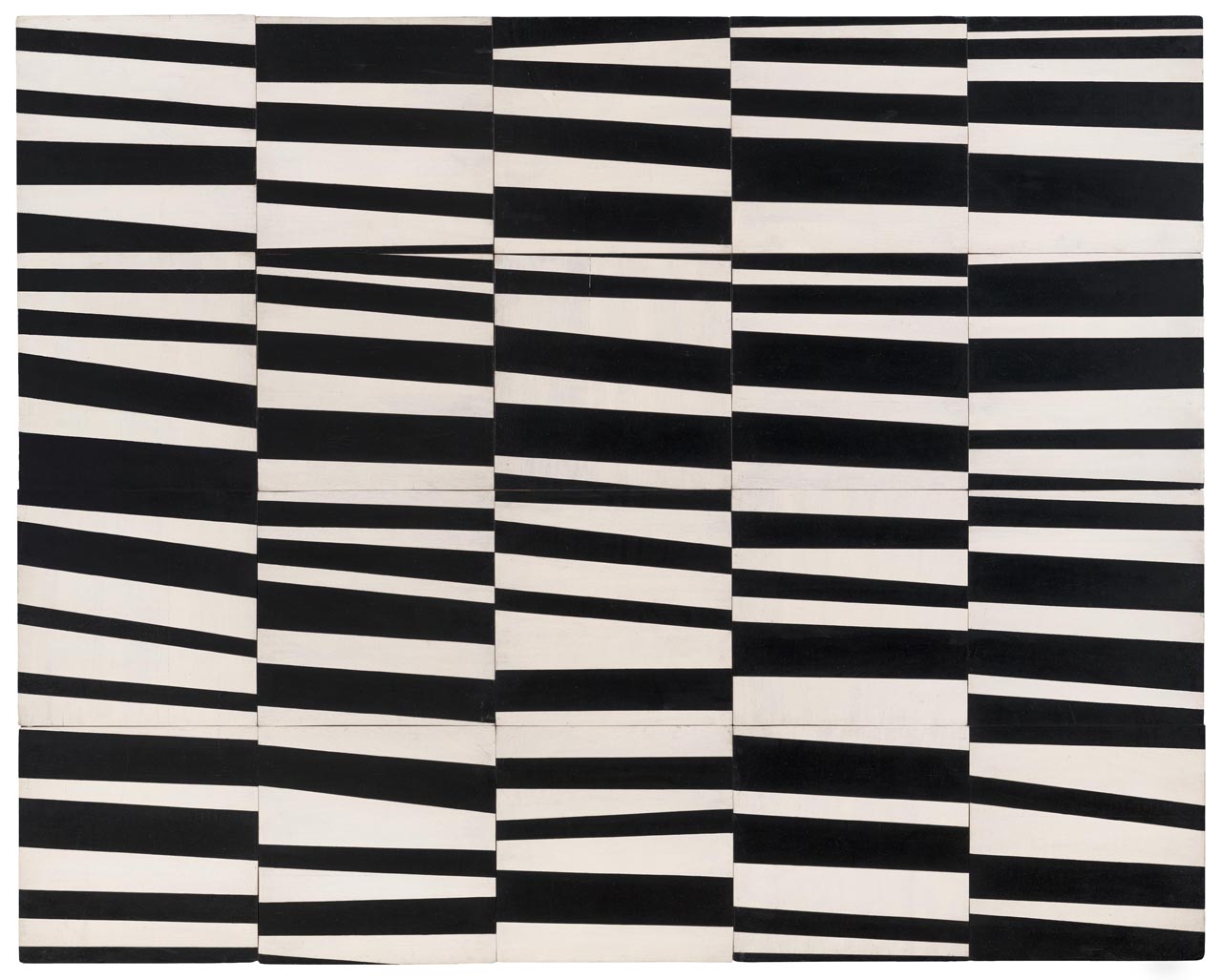
The following gallery is devoted to Kelly, where I was very impressed with his early painting “Cité” (1951). It is a piece made of movable parts, constructed using chance operations, and is very much influenced by his meeting Jean Arp while living in Paris from 1948 to 1954. “Cité” came from a dream Kelly had and is constructed of twenty joined wood panels whose abutting edges amplify the flickering rhythm of the painted stripes. The work reflects Kelly’s belief that his paintings are objects, while his other earlier work on display, “Spectrum I” (1953), explores the retinal aspects of the color spectrum.
Ellsworth Kelly, “Cité” (1951)
Following a group of typically free-form Cy Twombly paintings, there are a number of very beautiful canvases by Richard Diebenkorn and Philip Guston that have been juxtaposed in a room of sensual painting. Besides the Matisse-influenced “Ocean Park #54″ (1972), there are two sensational gushy paintings by Diebenkorn from 1955, “Berkeley #23” and “Berkeley #47,” that took me by surprise. Guston’s distinctive abstract painting for his wife, “For M.” (1955), a fracas of pink brushtrokes, is intelligently positioned next to his much more unrestrained, “Evidence” (1970), a painting that bridges the abstract and representational — conflicting positions that were much in debate during the early ‘70s, thereby bringing decades of theoretical combatants to their knees.
Philip Guston. “Evidence” (1970)
Then the show cools way down with a big gallery containing three Donald Judd stacks, including the terrific horizontal “To Susan Buckwalter” (1964), some Carl Andre floor sculptures, and two delicate wall drawings by Sol LeWitt, “Wall Drawing 1: Drawing Series II 18 (A & B)” (1968) and “January 2002, Wall Drawing 1A: Drawing Series II 18 (A & B)” (2002).
The show climaxes with an enormous Andy Warhol gallery, particularly with Warhol’s two silver chefs-d’oeuvres, “Silver Marlon” (1963) and “National Velvet” (1963). Of course, it is with Warhol where the term “Icon” in the title of the show is appropriate, as he piggybacks on Hollywood movie stars’ promotional material, rendering stud Marlon Brando and cute Liz Taylor as flickering, glamorous, almost devotional images that appear to fade and deteriorate, suggesting the need to be stoic in the face of death. For all those who see art as message, that room attempts to approximate the misty, complex world of media.
Detail Andy Warhol of Andy Warhol’s “National Velvet” (1963), silkscreen ink, graphite, and silver paint on linen (photo by the author for Hyperallergic)
If you follow the path that moves historically through the exhibit, it closes with a hat trick of Brice Marden noodle-like line paintings, a shining pair of classic Dan Flavins, and three large Agnes Martin meditations on tonality. Quality all the way down.
The ‘60s-heavy artwork holdings that span two mega-collections are impeccable and impeccably installed. If there is a fault, it is that the exhibit lacks the punch of doubt. Only Warhol’s work continues to conceptualize doubtful, fragile questions: Is this painting? Is this printmaking? Is this rip-off? Is fame worth it? Everything else in American Icons is a Masterwork that projects one aspect or another of assured American self-confidence. The show has a professional polish, conveying a sense of mastery and assurance that doesn’t quite mesh with dusty, existential Paris. It reminds me of what André Malraux said about culture: that it is not inherited, but won through individual efforts against bureaucratic culture. In that sense, American Icons reminds us that art in context matters.
American Icons: Masterworks from SFMOMA and the Fisher Collection continues at the Grand Palais (3 Avenue du Général Eisenhower, 75008 Paris) through June 22. The exhibit will travel to Musée Granet, Aix-en-Provence from July 11 to October 18, 2015.
Sophianotloren likes this
07 Jun 08:07
Condiment Wars, Revisited
by Erik Loomis
What Cheer Tavern in south Providence already had a legitimate claim to the best bar in the state. And then they gave me this menu tonight:

I like this place even more.
Sophianotloren likes this
07 Jun 07:33


Photo: Cat Hair Pills
I Ordered Cat Hair Pills From A Mysterious Dealer in Bed-Stuy
by Liam Mathews
On Saturday, I saw a flyer taped to one of those green lamp post boxes outside of Scratch Bread in Bed-Stuy advertising “Cat Hair Pills.”
The poster’s body copy read:
“Cat hair pills available. Made from the finest hair of organic, free-range cats with only occasional antibiotic usage. Two cat choices available, please specify which cat you prefer.”
That was all there was by way of explanation. The poster raised a lot of questions for me, such as: Why would anyone want a capsule stuffed with cat hair? What does one do with a cat hair pill? Does it cost money? Is this a joke? Why am I having such a hard time understanding something as simple as “Cat Hair Pills?”
Photo: Cat Hair Pills
I tore off a slip of paper with a phone number and email address for ordering. On Monday morning, I emailed inquiring about the pills. A few hours later, I received a reply informing me that since I’m a member of the press, the cat hair dealer, who declined to identify him or herself, would provide me with a sample from both Cat A and Cat B. “Please reply with your preferred pick-up neighborhood and I will consult our distribution database for an ideal location,” the fuzzy pharmacist wrote.
I wrote back with my location. A little while after that, the fur-slinger wrote back with instructions on how to pick up my pills. I was to go to a cafe in Bed-Stuy and tell the barista I had lost my Teenage Mutant Ninja Turtles cup. The cup would be green with “George W.” written on the lid in permanent marker. My samples would be inside. I was instructed not to discuss Cat Hair Pills with the staff of the cafe due to HIPAA regulations.

The retrieval of the pills went as planned. So I am now the owner of two large pills stuffed with cat hair. I asked the pharmacist what I should do with them, and he or she wrote back, “Tell your friends and family! God bless.” I tried a different angle, asking what’s my prescription. “Entirely up to you, fellow Cat Hair Pil-grim,” my new spiritual guide answered.
I don’t know what to do with them. My friends have suggested swallowing them, using them to assassinate an allergic enemy, feeding them to my own cat, or snorting the hair.

The creator won’t tell me why the pills exist or who he or she is. I asked “why are you doing this?” and he or she responded “I just knew there had to be a better way.” I suppose this is a situation where it’s better to just embrace the mystery. If you want cat hair pills of your own, email cathairpills@gmail.com or call the Cat Hair Hotline at (724) 426-6691.
(Photo: Aymann Ismail/ANIMALNewYork)
The post I Ordered Cat Hair Pills From A Mysterious Dealer in Bed-Stuy appeared first on ANIMAL.
Sophianotloren, Cary Renquist likes this
04 Jun 15:45
Noncompete Clauses
by Erik Loomis

Chris Murphy and Al Franken have introduced a bill to ban one of the most egregiously oppressive practices against low-wage workers: noncompete clauses.
The bill from Sens. Chris Murphy (D-Conn.) and Al Franken (D-Minn.) would ban noncompete clauses for workers making less than $15 an hour or $31,200 annually, or the minimum wage in the employee’s municipality.
The move follows reports the Jimmy John’s sandwich shops requires some of its low-wage workers to sign two-year noncompete agreements prohibiting them from working at retail stores that make at least 10 percent of their sales from sandwiches.
The legislation is dubbed the “Mobility and Opportunity for Vulnerable Employees (MOVE) Act” and is also supported by the National Employment Law Project.
There is no reason at all for noncompete clauses on low-wage workers. If a Jimmy John’s work learns how to make a sandwich and then takes her skills to Subway, Jimmy John’s does not suffer at all. This is why I push back against those who say that the employer assault on workers is about money. It’s not. It’s about power. Money is a big part of power, but there are plenty as aspects to this assault that have nothing to do with money. Noncompete clauses in the fast food industry is one of them. This is all about employers doing this because they can and because it intimidates workers from quitting. It should be illegal and hopefully this bill will make it so.
Rosalind, Sophianotloren likes this


04 Jun 08:36
Filed under: General


It’s all up to you.
by Sophia, NOT Loren!
A few thoughts rattling around that I want to get out before I sleep…
Self-determination. I see it as essential. It is what underpins my support for access to abortion for anyone who chooses to do so. It’s why I see it as important for people who fuck to be able to do so in any way that works for the ones involved, and why I think that the law needs to back out of the bedroom.
It’s also why I feel it absolutely critical that someone who chooses to end their life have that as an option. Whether that’s someone who is at the end of a long and happy life who is ready to leave, whether that’s someone old and miserable and in the final stages of cancer and asking another person to help them die, whether that’s someone young and hurting for any number of reasons — the ability to determine one’s own course is more important than pretty much anything else.
That’s why I’m not comfortable forcibly preventing someone from suicide. I’m not okay with involving law enforcement to negate the right to self-determination, not to mention all the other ways that cops fuck things up.
And yes, I realize that it may sound contradictory when I say that I’m doing everything I can right now to keep someone I care deeply about from suicide… but I’m not going to force anything. I’m hoping to change a mind, but I also fully acknowledge that the choice is not mine to make.
“My body, my choice!” It’s not just about so-called reproductive rights. And I can’t claim to support doing what I want with my own body if I won’t equally support everyone else in doing the same, no matter how much or how little I agree with their choices.
I’m going to sleep now.
Filed under: General
Rosalind, Sophianotloren likes this