
Natalia Pokrovskaya
Shared posts
27 Feb 09:03


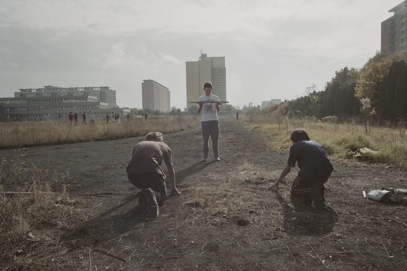
Jason Lazarus, Untitled

Jason Lazarus
Untitled,
Tampa, Florida, 2011
From the 2004-Present series
Website - JasonLazarus.com
Jason Lazarus (born 1975) is a Chicago based artist, curator, writer, and educator who received his MFA in Photography from Columbia College Chicago in 2003. His work has been exhibited internationally and is in major collections including the Museum of Contemporary Art Chicago, the Art Institute of Chicago, the Bank of America LaSalle Photography Collection, and the Milwaukee Museum of Art among others. Major exhibitions include Black is, Black ain’t at the Renaissance Society, On the Scene at the Art Institute of Chicago, Not the Way You Remembered at the Queens Museum of Art, Image Search at PPOW Gallery in NYC, Michael Jackson Doesn’t Quit, Part 3 at the Future Gallery, Berlin, Self Portrait as an Artist at Kaune Sudendorf in Cologne, Germany, and Tiny Vices at Studio Bee in Tokyo, Japan. Jason recently became the Co-Director of Chicago Artist Writers, a new art criticism platform. Upcoming projects include a feature length 16mm film comprised entirely of animated GIFS called twohundredfiftysixcolors.
Stavka likes this
26 Feb 11:14


Long-Exposure Photos of Light Rising Up from Snowy Landscapes
by Michael Zhang

“Lights Edge” is a series of beautiful pictures by photographer Kevin Cooley that show beams of light rising up from various winter landscapes. They’re simple long-exposure photographs that aren’t the result of any digital trickery. Instead, Cooley simply opened up his 4×5 camera and launched military-grade emergency flare into the night sky.


In November of last year, we featured a different project of Cooley’s that also involved flares and snowy landscapes. It was titled Take Refuge, and showed various locations illuminated by the red glow of road flares.
Lights Edge by Kevin Cooley (via Photojojo)
Image credits: Photographs by Kevin Cooley and used with permission
Masha Vorslav, Anton Tolchanov and -1 others like this
26 Feb 11:05

DKNY Atones for Unauthorized Usage by Donating $25K to Photog’s Community YMCA
by Conor Risch
Brandon Stanton’s images were used without permission in a window display at a DKNY store in Bangkok.
When DKNY used several photographs by Brooklyn, New York-based street photographer Brandon Stanton in a display window without permission, Stanton took to social media to get the word out and ask the clothing company to donate to a local YMCA in his community, the Bedford-Stuyvesant neighborhood in Brooklyn. The multinational clothing company responded by giving the YMCA a $25,000 donation in Stanton’s name.
“I didn’t want to take on a powerful company in any sort of litigation,” Stanton told PDN via email. “I don’t have time for that right now. I also didn’t want to try to personally enrich myself by drawing attention to the matter. So I decided on the YMCA.”
He added, “I’ve seen firsthand how much they help the community.”
DKNY had originally approached Stanton months ago and had offered him $15,000 for use of 300 images for store windows. When Stanton asked for more money, the clothing brand balked, and the deal fell apart, the photographer claims.
Then Stanton discovered his images were being used anyway in a DKNY store in Bangkok. He took to Facebook to share his story and demand that the company make a charitable donation rather than
compensate him. Stanton wrote: “I don’t want any money. But please SHARE this post if you think that DKNY should donate $100,000 on my behalf to the YMCA in Bedford-Stuyvesant, Brooklyn. That donation would sure help a lot of deserving kids go to summer camp. I’ll let you guys know if it happens.” The post spread, earning more that 60,000 Facebook shares and likes, and several thousand comments.
This afternoon DKNY responded with a statement on their social media sites, saying their Bangkok store “inadvertently… used an internal mock up containing some of Mr. Stanton’s images that was intended to merely show the direction of the spring visual program.”
“DKNY has always supported the arts and we deeply regret this mistake,” the statement said. “Accordingly, we are making a charitable donation of $25,000 to the YMCA in Bedford-Stuyvesant Brooklyn in Mr. Stanton’s name.”
After DKNY agreed to make the donation, Stanton published their response on Facebook and thanked everyone who supported him. “$25k will help a lot of kids at the YMCA,” he wrote. “I know a lot of you would like to have seen the full $100k, but we are going to take them at their word that it was a mistake.”
DKNY may have another problem, though. Stanton doesn’t have model releases for his images, he told PDN. “Part of DKNY’s original pitch to me was that I would obtain model releases from 300 of my subjects. Seeing as though no agreement was reached, that was never done.”
Whether that could come back to bit the DKNY and its parent company, LVMH, Inc., remains to be seen.
Amy Wolff contributed reporting to this article.
24 Feb 00:08


David Soffa, Untitled
Natalia PokrovskayaТоже клевый, см. сайт.

David Soffa
Untitled,
Malvern, Pennsylvania, 2012
From the Centralia series
Website - DavidSoffa.com
David Soffa (b. 1987) was awarded a fellowship to Yale University Summer School of Art in 2009. He received a BA in Photography from Bard College in 2010. Primarily a landscape photographer, his images investigate the uncanny in everyday situations. Soffa’s photographs have been exhibited nationally in venues such as the Garrison Art Center and the Brooklyn Waterfront Artists Coalition. His work can also be found in the 2013 competition issue of The Photo Review and an upcoming installment of Dwell Magazine. He currently lives and works in Philadelphia, Pennsylvania.
22 Feb 15:36


Karl Baden, Millbury, Massachusetts, August 6, 2010, 5:24 pm

Karl Baden
Millbury, Massachusetts,
, August 6, 2010, 5:24 pm
From the Roadside Attractions series
Website - KBeveryday.blogspot.com
Karl Baden's childhood dream was to be an archaeologist. This dream was shattered upon taking his first college archaeology course. In the Fall of 1972, he took a leave from school, hitchhiked across the U.S., and traveled through Central and South America with his father's old Nikon. He has been taking and making photographs ever since. Though Baden has yet to launch his own website, a variety of his projects may be found at the gallery website of his faithful and tolerant dealer, Howard Yezerski and also at Luminous-lint.com and KBeveryday.blogspot.com.
21 Feb 14:40
Stefan Bladh
by Tim Clark
Natalia PokrovskayaНетленочка, твой коллега )


Elena Bulygina and -1 others like this

21 Feb 00:24
David Barry
by willsoncummer
Natalia PokrovskayaЛежит.

Catskill Mountains began as a seeing exercise. It must happen to everyone at some point, when you cannot see the forest for the trees — in the most literal sense, when you become inured to your surroundings. I’m not sure when it happened, but I have spent the past twenty-five years in the Catskills and I could no longer see the mountains — the very same blue and green landscapes depicted by the Hudson River School. The natural world described by John Burroughs. The mountains and their valleys are still there and I am certain they remain beautiful. I simply wasn’t able to see them in the way I wanted to – or in the way I could remember seeing them.
In an effort to regain my sight, I began with the hills, in the hope that I would see the mountains. Perhaps along the way I would also see a forest and its trees.
– David Barry, Margaretville, New York, USA

![]()
![]()
![]()
![]()
Stavka, Elena Bulygina likes this
20 Feb 21:05


John Mann, Untitled (ocean)
Natalia PokrovskayaПреодолевая.

John Mann
Untitled (ocean),
, 2008/9
From the Folded in Place series
Website - RockPaperCloud.com
John Mann's work examines the landscape through photography and distance. He has an ongoing interest in the ability to make photographs of distant lands to which the mind has traveled, but the body has not yet been. His work has been exhibited in numerous museums and galleries including Phillips de Pury London, the Katonah Museum of Art, The Houston Center for Photography and PDX Contemporary. His work has been seen in Conveyor Magazine, Elephant Magazine, SPOT Magazine and numerous online publications. Mann received an MFA from the University of New Mexico and currently teaches at Florida State University. His work is represented by Daniel Cooney Fine Art, New York City.
Elena Bulygina likes this
19 Feb 21:15
Chang Kyun Kim
by willsoncummer
Natalia PokrovskayaКлёвенько.

When I moved to California, I was surprised by the number of power plants and oil refineries that were adjacent to local communities. However, the more surprising thing was that many of the residents in the areas didn’t even know what the facilities were.
The title Intervened Landscapes first indicates the physical intrusion of the facilities into natural landscapes. They always seem to be eyesores but somehow are accepted and forgotten by people. More importantly, it also means some kind of invisible intervention that obscures our minds toward the whole energy industry, which can be government control and high-level security, or contribution to communities such as local developments that all have friendly-looking slogans.
By putting color palettes in front of the lens and blocking the facilities in the frames, I wanted to imply people’s view intervened by the industry’s secrecy and the forceful friendliness.
– Chang Kyun Kim, Los Angeles, California, USA
![]()
![]()
![]()
![]()

15 Feb 09:39
Twitter


What I Read: 2012 Edition
by Bryan Formhals
Natalia Pokrovskayaпропала кнопка покет, ай!

©Bryan Formhals
The past couple of years I’ve compiled a list of photography websites of note with a short paragraph explaining why I find them interesting. I’ve decided not to do it this year. Well, at least not in that format. The primary reason is because the list hasn’t changed much, if at all, which to me either means I’m missing some of the better new sites out there (which is entirely possible and even likely), or there just haven’t been that many new sites of note (at least none that appeal directly to my sensibility).
So, this year I decided to copy The Atlantic Wire’s ‘Media Diet’ format to give you a better idea of what I read. And as I mentioned in The Digest last week, I have plans to create a section on the site for recommended blogs and magazines, something more than a page with links. I hope to get around to that sooner than later.
Blogs
I follow blogs primarily through Google Reader (and Twitter). The mainstays are Conscientious, Blake Andrews, A Photo Editor, BAGNewsNotes, DLK Collection, Flak Photo, Feature Shoot, Shooting Wide Open, Time LightBox, LENS Blog, aCurator, New Yorker Photo Booth, Raw File, Wayne Ford, David Campbell, dvafoto, Prison Photography, eyecurious, The Online Photographer, boooooom!, fototazo, Shane Lavalette, LensWork, duckrabbit, the Great Leap Sideways, LENSCRATCH, Searching for the Light, oitzarisme, Street Level Japan and Stellazine.
Blake and Jorg are my favorites because they tend to have strong opinions. We need more of that in photoland. Tom Griggs of fototazo also produced several thought provoking pieces this year that I enjoyed. APE provides a nice glimpse into the editorial world and Rob is very good aggregator. Aline at LENSCRATCH is the hardest working blogger and does the best job of providing textual context for the work she publishes.
I enjoy Mike Johnston’s philosophical musings on TOP. That goes for Brooks Jensen too. Both have plenty to offer even though I don’t necessarily share their aesthetic sensibility.
Without question DLK Collection is the go to blog for reviews of gallery shows in New York.
Magazines
This year I subscribed to Aperture, PDN and Dear Dave. Online I follow Fraction, Unless You Will, Ahorn, Deep Sleep, Excerpt, 1000 Words, Seesaw, SuperMassiveBlackHole, and American Photo.
I made the leap to the iPad this year too. I subscribed to the BJP iPad edition and it’s excellent. I tend to view PDN in app as well, but it’s a tad clunky. I’ll probably pull the trigger on Hotshoe sooner than later.
The most notable absence in my list I feel is FOAM. It’s expensive, and I’m too lazy to go hunt it down in a store. I’ll probably pull the trigger on it this year though. Oddly, I feel it might be one of the very few must reads. Maybe that’s why I’ve ignored it!
I know I’m likely forgetting some magazines as well. There are going to be more and more of them arriving on the scene. It’s becoming tougher to figure out why I should really care about them. The same can easily be said about LPV. We all need to do a better job of differentiating our publications from the crowd in order to keep the ecosystem vibrant and not redundant.
I generally keep Twitter open at all times. I’m an addict. It’s my primary source for news. The key accounts I follow for photography are @monroegallery, @theclick , @jmcolberg, @1854 , @brookpete, @rawfileblog and that’s it. What? Can’t be. Well, yes to some extent. Although, I do follow a bunch of other photographers, galleries and publications. I’ve made lists that you can check. I also follow many more outlets that aren’t really related to photography. For that, you’ll have to check out my personal account.
Twitter can be tough to explain to people. The key for me is to follow people that bring me value. I can be ruthless. Even if you’re a friend, I might not pay much attention to you if you’re not really sharing anything interesting. I’m generally only interested in links to interesting content. Although, I don’t mind some random ruminations or casual chit chat. But twitter is not a place for debate or in depth conversations. You have to know when to back away at times.
Tumblr
I’m addicted to Tumblr. This year POTB was added to the ‘photography spotlight’ which resulted in an explosion of followers, 100,000 and counting. The platform and community consistently amaze me and I highly recommend that photographers use it as their blogging platform.
I follow 590 Tumblr’s which may sound like too many but many of them post infrequently.
My two favorite’s are Mark Peter Drolet and Wayne Bremser. You should read this interview Blake did with MPD to gain some insight into his thinking. In the past I couldn’t follow him because he posted too much but this year I tried again and it stuck. The breadth of work that he posts is mind boggling. I have no idea how he can remember all those photographers or where he finds the time to dig into their sites, but day after day he’s sharing work that I’ve never seen before and that would be impossible for me to find on my own.
Wayne is an old standby, mostly sharing black and white work. I keep tabs on urbanautica and Hamburger Eyes through Tumblr. This is a Cult was new to my radar this year.
The posse of Daniel Shea, Emiliano Granado, Ryan Pfluger, Joao Canziani, Alexi Hobbs, and Jake Stangel have introduced me to plenty of great work. They are great examples of how to mix personal work while promoting the work of their pals.
Others I enjoy are fette sans, Art Photo Collector, Panopticon Gallery, internet history, jogging, photolia, Blood of the Young, photoformag, ICP/Bard MFA, epsteinian, remerge, fourteen-nineteen, Little Brown Mushroom, Please Excuse the Mess, Daily Beast Picture Dept, Banana Leaves, Mossless, digital faun, one125, Rocket Science, and Caille.
The Rest
I check Facebook like most people and I do find some articles there but for the most part what I see there I’ve already seen somewhere else. I still peruse Flickr but that’s mostly to check in some groups or see what some of my old contacts are up to.
What I’ve posted above is just the photography portion of my web consumption. I’ll spare you the details of everything else but if you follow my personal Twitter you’ll find that I throw in stuff about physics, astronomy, publishing and other random articles that cover a spectrum of topics.
Thank you!
There’s no way LPV would be where it is today without all of the wonderful inspiration and insight that the above blogs, magazines and individuals provide on a daily basis. Thank you all very much! I may not interact with you too often, but I am following along, and certainly appreciate all the hard work that you put into your respective sites. I’m also always on the look out for new and interesting sites, so if you know of any, drop me a line.
Here’s to a great 2013!
Related Posts:
- Blogging From a Deserted Island
- Social Media & Photography: Observations Part 4 – Blogging & Tumblr
- OpEd: Some New Work From….
14 Feb 09:17


The Moon and Venus Captured in a Single Photograph
by Michael Zhang

Behold, a photograph of the moon. Can you see it? No, it’s not that tiny bright crescent you see… The moon is that faint giant crescent. That tiny one to its left is Venus. Hungarian astrophotographer Iván Éder captured this beautiful photograph back in 2004 from Budapest, Hungary.
The Moon and Venus are both bright enough to be observed during the day from people on the ground. When they’re close to one another in the sky, beautiful shots like this one can be snapped using a telescope.
Here’s a closer look at the two crescents:

You actually don’t need extremely fancy camera gear for a shot like this. Éder was using a Nikon Coolpix 4300, a 4-megapixel compact camera (settings were 1/100s, f/11, and ISO100).
For you astrophotogs out there: Éder was also using a TMB 130/780 apochromat telescope (with a 30mm 2″ Vixen LV eyepiece) and a Synta EQ6 mount.
As an encore, Éder captured a very similar photograph a few years later, in 2007. This one was captured with a Canon 350D DSLR, a Skywatcher 80/600 ED apochromat, a Skywatcher EQ5 GOTO.

…and a closer look:

You can find higher resolution versions of these photographs on Éder’s website here and here.
Image credits: Photographs by Iván Éder and used with permission
Osiasjota, Tertiarymatt likes this
13 Feb 14:27


Emoji Art History [UPDATED]
by Hrag Vartanian
Ah, the simplicity of it all. A simple tumblelog post has evolved into a Twitter meme simply named #emojiarthistory.
Edvard Munch may be the only artist blessed with his own emoji, but it appears the emoji lexicon is quite flexible, particularly when it comes to art.
Here is the original Tumblr post by ladiesupfront.tumblr.com:


Needless to say, after artist ManBartlett got his hands on this post he helped spawn a new hashtag. Here are some of our favorites:


 UPDATED: Some newer contributions to the continuing story of #emojiarthistory!


And one museum gets into the game, creating emoji versions of work in their collection:


And this wouldn’t be art history if certain things weren’t contested:

And one of our readers sent this recent emoji-filled conversation she had with a friend:

Elena Bulygina, Alexander Gagin and -1 others like this
13 Feb 07:43

Cell Phone Disco is a surface that visualizes the...
Cell Phone Disco is a surface that visualizes the electromagnetic field of an active mobile phone. Several thousand lights illuminate when you make or receive a phone call in the vicinity of the installation. Cell Phone Disco makes an invisible property of the environment perceptible to our senses. It reveals the communicating body of the mobile phone.
Cell Phone Disco » ABOUT, via Dan W.
11 Feb 14:58


Online Simulator Shows You What Photos Look Like to People With Color Blindness
by DL Cade

Approximately 1 in 12 men and 1 in 200 women suffer from some form of color blindness. Given those statistics, it might not be a bad idea for photographers to occasionally consider how their work is being viewed by those who can’t see the entire spectrum. And right on cue, a new online simulator from Etre is here to help.
The simulator will take any photo you would like to upload (given the dimensions are less than 1000 x 1000 pixels and the file size is less than 100Kb) and spit out a color blind preview of the image.
You can choose from three types of color blindness: Protanopia and Deuteranopia (both common forms of red-green color blindness) and Tritanopia (blue-yellow color blindness). Once you’ve uploaded the photo and chosen your particular genetic variant, the website will do the rest and show you what your color blind viewers are seeing.
At the top you’ll see an example we ran through the simulator. Top left is the original photo, top right as seen with Protanopia, bottom left as seen with Deuteranopia, and bottom right as seen with Tritanopia. Even if you never put the simulator to practical use, it’s quite interesting to see how your more colorful photos are being perceived by almost 4.5% of your audience.
Colour Blindness Simulator [Etre via BoingBoing]
Image credit: Photo illustration based on Coloured pencil by nojhan
09 Feb 10:47
{photography | fashion editorial : jennifer lawrence by tim walker}
by noreply@blogger.com ({this is glamorous})
by roséline


. . . and even with the all magazine reading & purchasing around here, had somehow missed this beautiful editorial, discovered while searching for white peacocks [more on that later], featuring jennifer lawrence photographed by the one and only tim walker for w magazine; there is such an ethereal quality, with the soft colours and lighting, as if it were something out of a fairytale -- but then again, that is the very essence of tim walker's work . . .
[more below] x
CONTINUE ---------------------------------->
twitter | facebook | tumblr | instagram | pinterest
06 Feb 14:50
Hessian, a brand in a box
by Jason Kottke
Designer Ben Pieratt calls Hessian "an invader, an ode, a brand in waiting, a pitch to the market". It is also a fully developed brand (logos, Twitter handle, web themes, app icons, etc.) for sale.
Tags: Ben Pieratt designAs a newborn idea, Hessian is aggressive and evolving. Its only conduit the working mind of designer Ben Pieratt, it fights for life by building meme-hooks through studies in contrasts, nostalgia, repetition and confusion. The Hessian could be a restaurant, a start-up, a clothing brand or more.
Like any great brand, Hessian is for sale. The current asking price is $18,000.


03 Feb 16:20
Attack the Block
Natalia PokrovskayaЭто я.
Daria Nifontova, Elena Bulygina and 2 others like this

03 Feb 15:17
Filed under: Uncategorized Tagged: Cute or Sad?, Pups

No Poop For You!
by pyrit
Natalia Pokrovskayaпомесь БАССЕТА и ШАРПЕЯ
NEXT!

Michelle M. rescued this Bassett-Shar-pei mix, who loves to eat bunny poop.
Filed under: Uncategorized Tagged: Cute or Sad?, Pups
Elena Bulygina, Stavka likes this
03 Feb 14:57
まるさん、今年も鬼役をお願いします。
Hey Maru, I ask you for the role of ogre this year also.
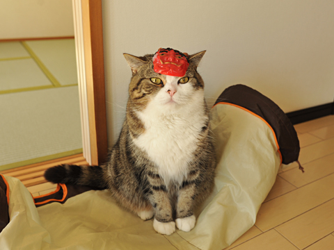
「カリカリ撒きなら大歓迎ですよ。」
Maru:[Please throw dry cat foods instead of beans.]
It is Setsubun today.
まるです。
by mugumogu
まるさん、今年も鬼役をお願いします。
Hey Maru, I ask you for the role of ogre this year also.
「カリカリ撒きなら大歓迎ですよ。」
Maru:[Please throw dry cat foods instead of beans.]
It is Setsubun today.

03 Feb 11:36
Lotus 1-2-3 is 30 years old
by Jason Kottke
Dan Bricklin, the inventor of spreadsheet software in the form of VisiCalc, writes an appreciation of Lotus 1-2-3, which perfected and popularized spreadsheets, on the occasion of its 30th birthday.
While VisiCalc concentrated on just being able to do spreadsheets at all, Lotus 1-2-3 went to the next level and addressed the final printed output much better, with more number formats, variable column widths, long labels, and that very-hard-to-do-by-hand graphing. And it did all of this with greater speed than anything else. Speed and fluid operations matters, as the Palm Pilot later showed (with its instant page turning in response to taps), and then the Apple iOS products showed after that.
The code itself stood the test of time and for years beat out most other products running on the hardware for which it was designed. It wasn't until a platform switch occurred (GUI) that the torch was passed to the next dominant spreadsheet, Excel.
The team Mitch assembled to get the "full" product (including documentation, sales, etc.) out the door had some of the best positioned and most experienced (with personal computing) people in the world. He also worked with one of the most tied-in to the personal computing business venture capitalist, Ben Rosen. A dream team at the time and in hindsight.
Also, wow, this Lotus 1-2-3 promotional video from 1983 is amazing:
My dad had a copy of the first version of 1-2-3...we both used the hell out of it for a long time. (via @joeljohnson)
Tags: Dan Bricklin Lotus 1-2-3
Elena Bulygina, Albener Pessoa and 3 others like this
01 Feb 20:58
 When looking at one of Amanda Browder's colorful installations or plush creations, one can't help but smile. Working from often recycled materials and fabrics, the Brooklyn-based artist creates her patchwork world of sculptures and objects including everything from a stuffed gorilla barfing glittery strings to a monumental, quilted waterfall...
Continue Reading...
Amanda Browder: Plush and stuffed creations from the colorful imagination of a Brooklyn-based artist
by Kat Herriman
When looking at one of Amanda Browder's colorful installations or plush creations, one can't help but smile. Working from often recycled materials and fabrics, the Brooklyn-based artist creates her patchwork world of sculptures and objects including everything from a stuffed gorilla barfing glittery strings to a monumental, quilted waterfall...
Continue Reading...
Elena Bulygina likes this
31 Jan 13:19


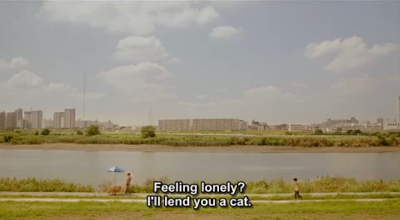

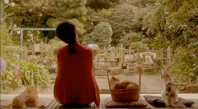

レンタネコ
by Make it Easy


i finally got to watch this movie after waiting so long! Rent-a-cat is a quaint little Japanese film that came out last year. just like my other favourites, its a quiet life-movie with room for breathing and thought. but of course, the love of cats is well played in this one!
it plays on the term "crazy cat lady" but with a more thoughtful outlook on a quirky young woman who uses her cats to mend lonely hearts. as much as this film is a comedy, with very colourful characters, it also came across to me as a very lonely film... it goes through different types of "loneliness-es" and living situations that many people face in reality. so this movie is a nice reminder that no matter who you are in life: young or old & rich and poor, everyone has some sort of hole in their heart that needs filling.
you can watch the film here! and i hope you enjoy it as much as i did! :-3
Elena Bulygina and -1 others like this
31 Jan 11:17


Exhibition Explores Racism in Early Color Photography
by DL Cade

One would hope that the medium of photography was immune to racial prejudice, but an exhibit by London-based artists Adam Broomberg and Oliver Chanarin shows that this was not always the case. The artists’ exhibit, on display at Johannesburg’s Goodman Gallery, explores the marks that racism left on early color photography.
Using film designed to capture white faces and a camera that became infamous for helping further apartheid in South Africa, Broomberg and Chanarin took photos of beautiful South African flora — putting the once-racial implements to better use.
The film was some of Kodak’s old stock with such a narrow light range that, according to Broomberg, “if you exposed film for a white kid, the black kid sitting next to him would be rendered invisible except for the whites of his eyes and teeth.”
This is a ‘Kodak Shirley’ that was once used to calibrate for skin tones in photos
The camera was a vintage Polaroid ID-2, famously protested against in the 1970s until Polaroid finally withdrew from South Africa. It featured a boost button that would boost the flash exactly 42%. Black skin reportedly absorbs about 42% more light. To Broomberg, the connection seems fairly clear-cut.
Using the camera’s boost ability, South African officials were better able to photograph the victims of apartheid for the infamous passbooks used to keep tabs on them.
The exhibition goes into more detail that we have room for here, pointing out other instances of racism in photography, including its title “To Photograph the Details of a Dark Horse in Low Light” — a code phrase used by Kodak to describe their new film that could expose a broader light range.
If you’re interested in learning more or seeing how the photos turned out, check out the exhibit’s page over on the Goodman Gallery website.
To Photograph the Details of a Dark Horse in Low Light [Goodman Gallery via The Guardian]
Image credits: Photographs by Adam Broomberg and Oliver Chanarin/Goodman Gallery
Elena Bulygina and -1 others like this