    
|
 You probably heard that terrorists murdered a British soldier in London Wednesday, and of course it goes without saying that attacking people with machetes and meat cleavers to make a political statement is pretty much the definition of Very Wrong. Unless of course you’re the English Defence League, the gang of super-literate racist goons who responded to the murder by going out and trying to burn down some mosques, throwing bottles at police, and posting the image above on Facebook, saying that it was outrageous that such a monstrosity could be allowed to pollute English soil:
Idiot 1: Would look lovely in Saudi…
Idiot 2: Where is this to? [sic]
Idiot 1: This is one of the main roads down to the front in Brighton
Idiot 2: So that mosque is in Britain jesus christ the size on it!
Idiot 1: And that’s not even half of it
In a tweet, Conservative Party blogger Mark Wallace, calls the conversation
“A quick reminder of the #EDL’s appreciation of our national heritage: they thought Brighton Pavilion was a mosque”
The Royal Pavillion in Brighton was completed in 1811 as a seaside vacation home for notorious radical Muslim mullah King George IV. Ship it to Saudi Arabia where it belongs!
One of Wallace’s readers hoped that the EDL doesn’t find out about this Russian Orthodox church in Chiswick:

For our part, Yr Wonkette is concerned for the safety of any number of mini-golf courses:
Not to mention the possibility that the EDL will start smashing suspiciously Muslimy Lego sets:

Because it makes me laugh so hard.
Johan PalmeSkip the rest, but Denrele Edun is such an amazing style icon! How did I miss this guy? (Also Charly Boy, to a lesser extent. Afro-androgyno--fat-goth-celeb.)
By Onos O
Nothing sells drama, intrigue, romance, suspense, conspiracy and of course a little action better than Big Brother Africa. Its brand new season is just around the corner and has come with just as much excitement and fanfare as its predecessors. We don’t know who the housemates are yet or what twists the team has got planned for this season yet, but we can’t wait for all the action to start.
The launch of Big Brother Africa 8 is on Sunday 26 May at 19:00 CAT. In the mean time, here’s a quick list of Nigerian celebrities we would love to see in the house.
Denrele Edun
This pick was a no-brainer. Denrele has oceans of energy, an adrenaline-fueled personality and a peculiar dress sense that on its own is quite entertaining to look at. How I see it , no matter where you drop him, he’s going to give us something interesting to look at.
Tonto Dikeh
Controversy sells and we all know who one of the queens is, right? Even without being called up, rumors surfaced online that Poko was going to be in the Big Brother Africa house. How we’d really love to see that.
Jim Iyke
Speaking of controversy, who better than Nollywood bad boy, Jim Iyke to go stir things up in the Big Brother Africa house. We’ve been to see some real parts of him in his “Jim Iyke Unscripted” reality series, but who wouldn’t want to see so much more? And, now that he and his ‘BFF’, Nadia Buari have let the cat out of the bag, BBA would be a huge test to see if he left his ‘old ways’.
Beverly Naya
She is slowly becoming a household name for a variety of reasons, her acting prowess included. But, nonetheless, this Nollywood actress has managed to remain mysterious and keep her personal life out of the news. Wouldn’t you like to get a glimpse behind the curtain of this sultry young actress?
O.C Ukeje
Cool, calm and collected, O.C has gotten himself some of the suavest Nollywood movie roles. As much as he’s been portrayed as a playboy, the ladies can’t just help but see him as a sweetheart which would make the O.C paradox such an intrigue to watch.
Omawumi
She’s one of the realest music divas in Nigeria as she sometimes switches from the most eloquent English to pidgin just to get her point across. Don’t you think Omawonder would be such a delight in the house?
Lynxxx
Always looking fresh and dapper, Mr. Fine Lady always looks fresh every time of the day. Wouldn’t you want to see the buff rapper on one of his bad days? Or see how all the ‘ladies’ eye candy’ magic comes to life behind the scenes? I’m sure the ladies would love it and the guys could learn a thing or two.
Share your thoughts!
Photo Credit: BellaNaija | Instagram |JudithAudu


Tags: Beverly Naya, denrele, Denrele Edun, jim iyke, Lynxxx, O.C Ukeje, omawumi, tonto dikeh
Filed under: News & Features

Guru - Alkayida (Al Qaeda)
When the rest of the world starts to get interested in Azonto, Ghanaians come up with something new. Now they have a new dance style they call “Alkayida” or “Al Qaeda”. No, I have no idea why they chose that name… There are some Alkayida dance videos on YouTube, but I have to say I’m still not sure what’s so new and different in this dance compared to Azonto. There are also some new Alkayida dance songs and this is one of them, the slowest one I’ve heard so far.

IMAGE: A street market in the U.S. military’s fake Afghan village of Ertebat Shar. All photographs by Nicola Twilley.
Every unit of the U.S. military, immediately prior to combat deployment, spends three weeks at the National Training Centre at Fort Irwin, California. Scattered across a base the size of Luxembourg, in the middle of the Mojave Desert, the Department of Defence has built fifteen simulated towns populated by 350 civilian role-players, many of Middle Eastern origin.

Post-Cold War, and following the disastrous U.S. “Black Hawk Down” raid in Mogadishu, national security experts, Pentagon top brass, and military contractors alike have agreed that the future of warfare lies, as the U.S. Army War College Quarterly declared, “in the streets, sewers, high-rise buildings, and sprawl of houses that form the broken cities of the world.”
The challenge, as expressed in “Urban Combat: Confronting the Specter,” a 1999 article from the Military Review, is that “the city presents a very special type of problem for strategic and operational commanders and their staffs. [...] Civilian populations frustrate the “war convention”—those rules that guide military conduct.”
In other words, in a city, an army has to deal with an already unusually complex and dangerous spatial situation that is made yet more challenging thanks to its dense concentration of people going about their daily business, against whom the use of force is “constrained, for political, economic, public relations, or humanitarian reasons” (and, one might hopefully add, ethical concerns).
“The crowded bazaar” is, Mr. Grau and Dr. Kipp of the Foreign Military Studies Office conclude, a recipe for “combat in hell.”

And thus it is that the U.S. military hires Afghan-American civilians to pretend to sell plastic bread and meat on the streets of a shipping container village in California, in order to prepare its forces to successfully navigate the urban inferno.

I would love to read a strategy paper that explicitly dissects combat techniques for the urban street market context (if you know of such a thing, send it my way, please!).


In its absence, and while there are many interesting things to be said about both plastic food, and war and food, this post serves instead as a tenuously food-related excuse to encourage you to (re-)visit the Venue website. There, you can read our much longer post describing an afternoon spent observing military training in the fake Afghan village of Ertebat Shar, as well as other new interviews that touch on the difficulty of integrating food systems into the new version of SimCity, water rights in the American West, and much more besides.


I hope he learned a lesson from this.
i don’t care; i’m completely amused and so is she *s
Members of the singing duo Simon & Garfunkel.
Pages in category “Simon & Garfunkel members”
The following 2 pages are in this category, out of 2 total. This list may not reflect recent changes (learn more).
Link (Thanks, Zemyla)
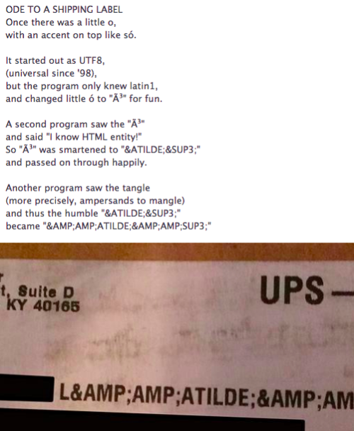
“An ode to the journey of ó on a shipping label” found at http://i.imgur.com/4J7Il0m.jpg, via @shyhoof.
Johan PalmeThis blog is one of my new faves, truly.


U.S. Patent No. 207,559. The first appearance of the QWERTY keyboard. (image: Google patents)
What came first: the typist or the keyboard? The answer depends on the keyboard. A recent article in Smithsonian’s news blog, Smart News, described an innovative new keyboard system that proposes a more efficient alternative to the ubiquitous “universal” keyboard best known as QWERTY – named for the first six letters in the top row of keys. The new keyboard, known as KALQ, is designed specifically for thumb-typing on today’s smart phones and tablets. It’s an interesting and by all accounts commercially viable design that got me thinking about the rationale behind the QWERTY keyboard. Unlike KALQ, it couldn’t have been designed to accommodate a specific typing technique because, well, the idea of typing –touch typing, at least– hadn’t been invented yet. It turns out that there is a lot of myth and misinformation surrounding the development of QWERTY, but these various theories all seem to agree that the QWERTY layout was developed along with, and inextricably linked to, early typewriters.
In the 1860s, a politician, printer, newspaper man, and amateur inventor in Milwaukee by the name of Christopher Latham Sholes spent his free time developing various machines to make his businesses more efficient. One such invention was an early typewriter, which he developed with Samuel W. Soulé, James Densmore, and Carlos Glidden, and first patented in 1868. The earliest typewriter keyboard resembled a piano and was built with an alphabetical arrangement of 28 keys. The team surely assumed it would be the most efficient arrangement. After all, anyone who used the keyboard would know immediately where to find each letter; hunting would be reduced, pecking would be increased. Why change things? This is where the origin of QWERTY gets a little foggy.

Experimental Sholes & Glidden typewriters circa 1873. (original image: The World of Typewriters)
The popular theory states that Sholes had to redesign the keyboard in response to the mechanical failings of early typewriters, which were slightly different from the models most often seen in thrift stores and flea markets. The type bars connecting the key and the letter plate hung in a cycle beneath the paper. If a user quickly typed a succession of letters whose type bars were near each other, the delicate machinery would get jammed. So, it is said, Sholes redesigned the arrangement to separate the most common sequences of letters like “th” or “he”. In theory then, the QWERTY system should maximize the separation of common letter pairings. This theory could be easily debunked for the simple reason that “er” is the fourth most common letter pairing in the English language. However, one of the typewriter prototypes had a slightly different keyboard that was only changed at the last minute. If it had been put into production this article would have been about the QWE.TY keyboard:

The 1873 prototype used to demonstrate the technology to Remington (original image: The World of Typewriters)
By 1873, the typewriter had 43 keys and a decidedly counter-intuitive arrangement of letters that supposedly helped ensure the expensive machines wouldn’t break down. Form follows function and the keyboard trains the typist. That same year, Sholes and his cohorts entered into a manufacturing agreement with gun-maker Remington, a well-equipped company familiar with producing precision machinery and, in the wake of the Cilvil War, no doubt looking to turn their swords into plowshares. However, right before their machine, dubbed the Sholes & Glidden, went into production, Sholes filed another patent, which included a new keyboard arrangement. Issued in 1878, U.S. Patent No. 207,559 (top image) marked the first documented appearance of the QWERTY layout. The deal with Remington proved to be an enormous success. By 1890, there were more than 100,000 QWERTY-based Remington produced typewriters in use across the country. The fate of the keyboard was decided in 1893 when the five largest typewriter manufacturers –Remington, Caligraph, Yost, Densmore, and Smith-Premier– merged to form the Union Typewriter Company and agreed to adopt QWERTY as the de facto standard that we know and love today.
There’s a somewhat related theory that credits Remington’s pre-merger business tactics with the popularization of QWERTY. Remington didn’t just produce typewriters, they also provided training courses – for a small fee, of course. Typists who learned on their proprietary system would have to stay loyal to the brand, so companies that wanted to hire trained typists had to stock their desks with Remington typewriters. It’s a system that’s still works today, as illustrated by the devout following Apple built through the ecosystem created by iTunes, the iTunes store, and the iPod.
While it can’t be argued that deal with Remington helped popularize the QWERTY system, its development as a response to mechanical error, has been questioned by Kyoto University Researchers Koichi Yasuoka and Motoko Yasuoka. In a 2011 paper, the researchers tracked the evolution of the typewriter keyboard alongside a record of its early professional users. They conclude that the mechanics of the typewriter did not influence the keyboard design. Rather, the QWERTY system emerged as a result of how the first typewriters were being used. Early adopters and beta-testers included telegraph operators who needed to quickly transcribe messages. However, the operators found the alphabetical arrangement to be confusing and inefficient for translating morse code. The Kyoto paper suggests that the typewriter keyboard evolved over several years as a direct result of input provided by these telegraph operators. For example;
“The code represents Z as ‘· · · ·’ which is often confused with the digram SE, more frequently-used than Z. Sometimes Morse receivers in United States cannot determine whether Z or SE is applicable, especially in the first letter(s) of a word, before they receive following letters. Thus S ought to be placed near by both Z and E on the keyboard for Morse receivers to type them quickly (by the same reason C ought to be placed near by IE. But, in fact, C was more often confused with S).
In this scenario, the typist came before the keyboard. The Kyoto paper also cites the Morse lineage to further debunk the theory that Sholes wanted to protect his machine from jamming by rearranged the keys with the specific intent to slow down typists:
“The speed of Morse receiver should be equal to the Morse sender, of course. If Sholes really arranged the keyboard to slow down the operator, the operator became unable to catch up the Morse sender. We don’t believe that Sholes had such a nonsense intention during his development of Type-Writer.”
Regardless of how he developed it, Sholes himself wasn’t convinced that QWERTY was the best system. Although he sold his designs to Remington early on, he continued to invent improvements and alternatives to the typewriter for the rest of his life, including several keyboard layouts that he determined to be more efficient, such as the following patent, filed by Sholes in 1889, a year before he died, and issued posthumously:

U.S. Patent No. 568,630, issued to C.L. Sholes after his death (image: google patents)
But the biggest rivals to ever challenge QWERTY is the Dvorak Simplified Keyboard, developed by Dr. August Dvorak in the 1930s.

The Dvorak Simplified Keyboard (image: wikipedia)
Dvorak users reported faster and more accurate typing, in part because the system dramatically increases the number of words that can be typed using the “home” row of keys where your fingers naturally rest – also known as the keys you type when you’re just trying fill space. asjdfkal; sdfjkl; asdfjkl; asdfjkl; dkadsf. asdfjklasdfjk. More recent research has debunked any claims that Dvorak is more efficient, but it hardly matters. Even in 1930 it was already too late for a new system to gain a foothold. While Dvorak certainly has its champions, it never gained enough of a following to overthrow King QWERTY. After all, the world learned to type using Remington’s keyboard.
When the first generation of computer keyboards emerged, there was no longer any technical reason to use the system – computers didn’t get jammed. But of course, there’s the minor fact that millions of people learned to type on the QWERTY keyboards. It had become truly ubiquitous in countries that used the Latin alphabet. Not only that, but way back in 1910, the system had been adopted by Teletype, a company that would go on to produce electronic typewriters and computer terminals widely used around the world, thereby ensuring QWERTY’s place as the new technological standard.

The KALQ keyboard layout (image: Outlasvirta et al.)
When a design depends on a previous innovation too entrenched in the cultural zeitgeist to change, it’s known as a path dependency. And this why the new KALQ proposal is so interesting. It attempts to break from the tyranny of Christopher Latham Sholes, whose QWERTY system makes even less sense on the virtual keyboards of tablets and smartphones than it does on a computer keyboards. Is the new KALQ system any different? In some ways, the answer is obviously yes. It has been designed around a very specific, very modern behavior – typing with thumbs. Like the telegraph operator QWERTY theory, the user is determining the structure of the keyboard. But it could still be argued that the KALQ system, or any similar system that may be developed in the future, is also a product of path dependency. Because no matter how the letters are arranged, they basic notion of individually separated letters distributed across a grid dates back to Sholes and co. tinkering away in their Milwaukee workshops. But it’s just not necessary in a tablet. If you gave an iPad to someone who had never used a keyboard and told them to develop a writing system, chances are they would eventually invent a faster, more intuitive system. Perhaps a gesture based system based on shorthand? Or some sort of swipe-to-type system? This is not to say that such a system would be better, it’s merely an observation that our most bleeding edge communication technology still dates back more than 150 years to some guys tinkering in their garage. Truly, the more things change, the more they stay the same.

Infrastructural graffiti in the streets of New Haven, CT (original photo)
Cities around the world are covered in spray-painted hieroglyphics and cryptic designations scrawled on public surfaces; unintelligible tags and arcane signs intended to communicate messages to a specialized audience with a trained eye. Such markings are so prevalent that they just blend into the urban patina of dirt and disrepair and go largely unnoticed. I’m not talking about illegal graffiti. Rather, the officially sanctioned infrastructural “tagging” employed by public works departments around the country.
You’ve probably seen these markings on streets and sidewalks. Multi-colored lines, arrows and diamonds denoting the presence of some subterranean infrastructure or encode instruction for construction or maintenance workers. A secret language that temporarily manifests the invisible systems that power our world. Recently, Columbia’s Studio-X blog shared the decoder ring that unlocks these secret messages:

The American Public Works Association ULCC Color Codes for Marking Excavations (image: LA One Call 811)
A version of the above code was first implemented in California after construction workers accidentally cut through a petroleum pipeline in 1976, resulting in a fatal explosion that destroyed half a city block. To prevent future incidents, a system of notation known as DigAlert was developed to communicate vital information to anyone who might be doing construction work or excavations in areas near underground cables or pipelines. Since then, the American Public Works Association established a standard color code to identify subterranean infrastructure in American cities. This standard is a recommended by most national agencies, but, like the “fire diamond,” it is not a mandate intended to supersede any local regulations.

left: Munsell Color Wheel (image: Munsell.com); right: excerpt of ANSI Z535 Safety Color Code (image: scribd)
These “safety colors” –expanded to include red, orange, yellow, green, blue, purple, brown, grey, white, and black– have been formalized by the American Standards Institute (ANSI) as Safety Color Code Z535, which provides Munsell notation and Pantone color-matching information to help ensure consistency across mediums.
While the color system warns workers about certain types of hazard, there is a complementary language used to approximately mark the underground location of a conduit, cable, or pipe. According to the Guidelines for Operator Facility Field Delineation established by the Common Ground Alliance, spray-painted lines (in the appropriate color, of course) space between four-feet and fifty-feet apart should be used to mark the center of a single facility or, if multiple conduits are running in a single trench, over their outside edges with arrows pointing in the the direction the services are running with a perpendicular line connecting the edge marks to form an H (as seen in the photo at the top of this post). A diamond is used instead of the perpendicular line to indicate a duct system.
While just as esoteric (though not as artistic) as illegal graffiti, these regulated utility markings encode a different type of turf. And knowing that Krylon code can save lives. Such urban annotation reveals the danger and complexity of American cities and is just one more example of the standardized, secret signs that surround us.
Previously: Decoding the City: The Fire Diamond


samples of a few brand characters (image: we made this)
To the untrained eye, cattle brands, those unique markings seared into animals’ hides with a hot iron, might just seem like idiosyncratic logos or trademarks designed to clearly and simply indicate ownership. However, unlike the graphic logos and trademarked images of popular commercial brands, they must comply with a rigorous set of standards and are developed using a specific language ruled by its own unique syntax and morphology.Livestock branding dates back to 2700 BC, evidenced by Ancient Egyptian hieroglyphics. Ancient Romans are said to have used hot iron brands as an element of magic. But brands are most famously associated with the cowboys and cattle drives of the Old West, when brands were used to identify a cow’s owner, protect cattle from rustlers (cattle thieves), and to separate them when it came time to drive to market (or rail yards or stock yards).
At its most basic, a cattle brand is composed of a few simple letters and numbers, possibly in combination with a basic shape or symbols like a line, circle, heart, arc, or diamond. But these characters can also be embellished with serif-like flourishes to create myriad “pyroglyphics.” For example, such serifs might include extraneous “wings” or “feet” added to a letter or number. Each character can also be rotated or reversed. Every addition and variation results in a unique character that is named accordingly. The letters with “wings” for example, are described as “flying” while those with “feet” are, you guessed it, “walking.” An upside-down characters is “crazy” while a 90-degree rotation makes a character “lazy.” These colorful designations aren’t just cute nicknames used to identify the characters, but are actually a part of the name, a spoken part of the brand language, which like most western languages is read from left to right, top to bottom and, perhaps unique to brands, outside to inside.

A few accepted variations on the letter A. From left to right: Crazy-A, Flying-A, Lazy-A, Walking-A (image: Texas Brand Registration)
The vast array of combinations made possible by these characters and variations ensures that unique and identifiable brands can be created –hopefully without repetition– using only limited formal language. And sometimes they could even be used to make a joke:

The above brand, 2 – lazy 2 – P, is read as “too lazy to pee” (image: Marks of Excellence: History and Taxonomy of Trademarks via We Made This)
Serifs and rotations are just two of the primary ways brand letters can be modified. Multiple symbols may be joined together forming a type of ligature – a term used in typography to describe a single character representing two or more letters, such as æ. Some of these ligature brands are read as “connected” while others are given unique identifiers:

Brand ligatures (image: Texas Brand Registration)
When it comes to getting your brand approved by the authorities, location is as important as design. The reason? The same brand can be registered in the same country as long as its located on a different part of the animal. The following two brands, for example, are considered distinct markings:

These two identical brands are considered to be distinct based on their location (image: Texas Brand Registration)
Brands are registered like trademarks or copyrights and are monitored, taxed and regulated. So if an owner failed to pay the brand tax, the brand could no longer be offered as “valid prima facie evidence of ownership.” Brands were, and continue to be, a critical element of the cattle industry unless –bonus fun fact!– you happen to have been 19th century Texas politician and rancher Samuel A. Maverick, who refused to brand his cattle and consequently saw his own surname immortalized as a brand for those independent few who refuse to follow the precepts of social order.
Today, the most successful trademarks and brand identities are the simplest and easiest to identify. Think of Nike’s swoosh or McDonald’s golden arches. The same is true for cattle brands. Not only is it easier to read a simple brand, but its less painful for the livestock. However, it can’t be too simple because the brand itself also serves as a means to combat theft and fraud, in much the same way that the swoosh is also an indicator of authenticity. Cattle rustlers would sometimes use a hot iron to alter brands into a similar graphic, then claim the cow as their own – its like a failing middle school student changing an “F” on his grade card to a “B” with a few pen marks so his parents don’t get upset. Although the phrase “cattle rustler” conjures romantic images of the Old West, it is still a very real problem for today’s ranchers. In fact, the U.S. is currently experience something of a rustling renaissance. Consequently, there’s also something of a branding revival. Despite the invention of GPS tagging, DNA testing (yes, for cattle), and other preventative measures, branding is still the top preventative measure to combat cattle theft. Carl Bennett, director of the Louisiana Livestock Brand Commission recently told USA Today that ”We have yet to find a system that can replace a hot brand on a cow. There’s nothing in modern society that’s more sure.”


Brand: Vlisco
Hommage A L’Art Collection
The Hommage à l’Art collection honours Vlisco’s art by placing our iconic drawings in the spotlight. This theme evolves from this year’s focus on craftsmanship. Vlisco’s fabrics are known for their expressive drawings and this is just one of the things that make our brand so unique and beloved by our consumers. This collection pays tribute to Vlisco’s drawings in a number of ways. From the feminine florals that draw on our batik heritage to modern hand-drawn abstract designs, the collection features a wide range of icons. For the first time, some of the drawings have been printed using different techniques, so that the same design is repeated in Java and Wax-block fabrics. Various heritage drawings were also reinterpreted to give their stories a podium. These heritage drawings inspired our designers to create new fabric designs, using an amalgam of famous Vlisco icons literally placed on a pedestal.
Alex Law's "little girls R better at designing heroes than you" is a great, occasionally updated Tumblr that features illustrations of superheroes based on the hero costumes little girls have made for themselves.
Kids are more impressionable than you, but kids can also be less restricted by cultural gender norms than you. Kids are more creative than you, and they're better at making superheroes than you.
This is a mini art project where I draw superheroes based on the costumes worn by little girls.
little girls R better at designing heroes than you (via MeFi) ![]()
|
|


Anita Sarkeesian faces backlash for disabling Youtube comments.
In celebration of International Women’s Day, people are taking to the Internet to complain about Anita Sarkeesian. The first installment of her long-awaited video series about sexism in video games was released yesterday, inspiring an inevitable torrent of backlash. Aside from suggestions that she “stole” the Kickstarter funding for the Women vs. Tropes in Video Games series, much of the criticism is because she disabled comments on the YouTube video.
[…]
Leading the charge against Sarkeesian’s decision is Tumblr user amazingatheist, who posted a ten-minute video entitled “Who’s The Damsel Now?“ Arguing that Sarkeesian’s “censorship” of YouTube comments counteracts her message about strong women, and that her TED talk about online harassment amounts to “whining,” amazingatheist says:
“What are you afraid of, Anita? Why can’t people have a discourse about your material? Why can’t people make their opinions towards your content known? I understand that some comments will be abusive in nature — probably most will — but so what?”
Ironically, the existence of this response means by definition that amazingatheist is making his opinion known, as well as participating in a discourse about Sarkeesian’s material. [READ MORE]
The amazingatheist destroyed his own chance at participating in these discussions by being a misogynistic MRA. Just in case, that link needs a trigger/content warning so TW: rape, misogyny, abusive language.
The woman got bombarded with rape and death threats when she talked about the idea of doing this series. And people are up in arms about her not wanting to deal with that during her actual work??
So aside from the misogyny aspect here (and that isn’t to downplay it at all, because holy fucking shit you ASSHOLES,) I would like to point out something that appears to be lost on 95% of the denizens of The Intertubes:
No one is required to let you air your opinion in their space.
This includes the comments section of anything they upload to YouTube.
Seriously, the number of people who think that they are somehow owed the right to comment on things boggles me. You want to bitch about someone’s videos, comment on news articles, disagree with someone’s Facebook post? Go do it in your space. No one owes you shit.
And in particular, no one you are abusive and violent toward owes you shit.I’m still boggling at this bit: “I understand that some comments will be abusive in nature — probably most will — but so what?”
Abusive in nature…but so what?
That comment says everything, doesn’t it?
After all, who fucking cares about what it’s like to receive death threats, rape threats? About what it’s like to have people barge into your space to pour violent, abusive vitriol all over your work? They are owed that opportunity, apparently. They are owed the opportunity to abuse you, and if you deny them that, you’re “censoring” them.
I would like everyone to think about that for a moment. @amazingatheist thinks it’s OK to threaten & abuse women he disagrees with - he’s done it himself, and he’s certainly never had any problem with anyone else doing it.
Abuse is OK. But protecting yourself from abuse? OH NO, CAN’T HAVE THAT.
What a shitstain.

Yesterday, at 7:05pm Eastern Time, Boston Police received a report that suspected terrorist Dzhokhar Tsarnaev was hiding in a boat in Watertown.
At 7:15pm, a drone was heard overheard. Seconds later, an enormous explosion destroyed the boat, as well as 10 nearby homes.
Sources say 46 Watertown residents were casualties of the missile strike, including 7 children.
…
Wouldn’t that be an unconscionable end to this ordeal?
If so, then why are we okay with us doing this in Pakistan?
And if you’re not okay with us doing that, then you don’t get to wave an American flag and chant “USA USA!” when we catch a terrorist.
Why? Because that same flag is painted on the side of the missiles we use to commit our own acts of terror.
- not a fucking thing
Nice things I can list about this fucking white kid
- he’s a scholarship student, 25K worth
- pre-med
- “nice guy who had a lot of friends who everyone loved”
- “smoked pot” which apparently made him normal
- apparently misled down this path of evil by his older brother
- “how much did he REALLY contribute to this because maybe his older brother really did everything and he was just an unwilling patsy”
the whole pot thing REALLY drives me crazy since Trayvon Martin was demonized for getting in trouble for having pot


celebrating The Freak I #queer
Luciano and Lunga are biological boys living in Alex and Tembisa. They identify as both male and female. While the way they express their gender and their sexual orientation could get them beaten and/or raped and/or killed, they choose to be themselves, to “celebrate The Freak”.
 It was 2011 and we were preparing for TEDxDar. Behind schedule as always, we needed to get Bi Kidude, this iconic figure on our stage. We wanted to hear her voice and her story in an intimate way. We wanted to experience her magical presence, her Diva, on the small stage, away from the large international concerts and festivals such as Sauti za Busara where we had become accustomed to seeing her. Was she still alive we asked ourselves, for it seemed every four weeks in the previous four years there was at least one rumor of her passing. How would we even get in touch with such a legend? This authority of culture must surely be hard to find – but find her we did.
We released some fillers and finally managed to get a hold of her manager, one of her nephews at the time. And we managed to book for this icon, set to arrive in Dar es Salaam from Zanzibar. Having organized with her nephew manager, we were skeptical that the iconic Bi Kidude would be so accessible. But we realized this reality as she arrived with more spice than could be filled on an Island. Arriving at the docks of Dar es Salaam by boat, our posse went to welcome the Empress of East Africa to Dar es Salaam.
 Her handshake, firm, hid all other appearances of age. “How was your boat ride to Dar es Salaam?” we asked her. In a charming way, she seemed to have misinterpreted the question. “Ahh mimi bara lizima nimeshalizunguka miguu peku…” (“Ahh I have circled the whole mainland barefoot!”) She went on a diatribe about how this was not her first time on the mainland, she had in fact circled it barefoot three times before we were even born… She was liberating ears before TANU had even brought independence. Perhaps she understood the question exactly, but her discernment was to educate beyond small talk. DIVA.
“Tomorrow we will need you at the National Museum and House of Culture where our event is being held. We will pick you up for rehearsals.” She agreed to come and see the venue, but rehearse she would not: “Do I look like I need rehearsal?” her gaze seemed to say.
She was sitting outside the Museum veranda on event day, burning through her classical pack of Embassy cigarettes, we sat in wait – anxious. When the bell struck, she was on stage, our closing act. And close she did.

Image by Hellen Rosiah Marie
Bi Kidude is beyond a cultural icon, a national figure, an orator, a historian, a legend, her humility, her statuesque authority transcends a legacy like no other. Her loss is a great one to Tanzania and the world over though we shall not mourn but celebrate her excellency. Rest in Power, Great Empress.
***
Here are some videos to remember her by. Below is Bi Kidude in a drum circle beating the drum with her dancers in a ubiquitous dance style of going round in a mduara (circle) and gyrating:
In “Kijiti” Bi Kidude speaks of rape; since there are subtitles you can see her wizardy skills of composing, storytelling. Kijiti returns the defiled girl deceased, this could be spiritually or physically:
Bi Kidude sings one of her classics, “Muhogo Wa Jang’ombe”, where she explores themes of sex and midwifery:
And finally, “Alaminadura” (Ar. “the Universe is Round”). In Swahili there is the similar proverb “Dunia duara” (the world is round): you will come back to the starting point:

Johan PalmeI was completely expecting something loaded, ritualistic and furtive.

“In the wake of the Boston Marathon bombing, people on the internet have taken to groundlessly speculating on the identity of the attacker or attackers based on photos and videos from the scene, a process known as “procrastinating at work,” or “crowdsourcing.” What they have uncovered is that the attacker is possibly one of a dozen or so people in the vicinity of the bombing wearing a black backpack.”
Your Guide To The Boston Marathon Bombing Amateur Internet Crowd-Sleuthing
Johan Palme#selfshare

Kicukiro, Kigali, Rwanda.
Swedish photographer and visual artist Jens Assur has spent ten months producing an exhibition of 40 enormous-size, large-format photographs chronicling structural patterns in the everyday life of twelve of Africa’s rapidly-changing urban centers, currently showing at the Liljevalchs konsthall in Stockholm. And by some coincidence, he’s gone for a title of similar intent as this blog’s: the whole thing is titled “Africa is a Great Country”. We got the opportunity to talk to Jens Assur about the exhibition, the criticism it has received and about broader issues on the representation of Africa and visual clichés in general.
What was your idea with the title of the exhibition?
It plays on us Swedes’ preconceived notions of what Africa is. No-one would think to conflate, say, the economies of China and Afghanistan into one big picture, and yet it happens all the time when talking about Africa, as if it wasn’t incredibly diverse. And yes, of course I’m trying to get people to react, that’s part of the point.
Talking about reactions, what do you think about the opinion piece by two researchers at the Nordic Africa Institute about your exhibition, criticizing your exhibition for conflating Africa into one whole?
I welcome their article. They bring out their knowledge and their experiences, which is important. But of course they’ve misunderstood the intended irony of the title.

Victoria Falls, Zimbabwe.
What generally are you trying to show?
From the beginning, we wanted to tell another side of Africa: taking it seriously, not taking pictures of pretty women in colourful clothing, bustling markets and cute animals. An Africa where 1/4th of the population now is middle class, where in Kenya 55% of all financial transactions are done by mobile phone; an Africa where giant building projects happen all the time, often backed by hugely escalating Chinese investment. There are enormous new residential projects, nearly always closed-in gated communities where first the land is bought, then the walls go up, and then the buildings. Road systems, often built in the 40s and 50s that are unable to cope with an enormous increase in car traffic and congestion. And societies where cars are becoming a necessity, with huge out-of-town shopping centres – Gaborone for instance has practically become like Los Angeles. To an extent, it’s a reflection on our cities here too, what’s happened, is happening and will happen in the future.
Generally, the exhibition has quite a positive view on what’s happening; a narrative of poor people pulling themselves up. But I don’t think my job as an artist is to give answers. Society is neither straight-forward nor simple. Still, we constantly had to ask ourselves questions: do we just want to show the richest and most successful examples? Probably not. And if we mix it up, do we risk saying nothing of any importance whatsoever? At one point we also suddenly realized there were almost no women in the pictures. Is it because we consciously chose masculine places, building sites, harbors? Or is it because women are relatively absent in many African cityscapes?
Why have you chosen to use this enormous photographic format, 18 x 13 centimeter negatives producing 2,5 x 3,5 meter pictures?
To an extent it’s about letting the viewer come into the image. It also allows us to use an incredible level of detail, with longer exposure times giving a huge, sharp depth-of-field, so the viewer can take in the whole structure, all the parts, all the details. This also allows occurrences to be slow and dignified, unhurried. Many photo journalists claim that you have to come right up close to individuals to create a sense of understanding, but instead we’ve taken a step back, further out, and used the large-format camera’s ability to tilt and shift to be capture large wholes, to show complete structures.

Lake Malawi, Lilongwe [sic], Malawi.
Tell us about the idea behind the exhibition, how did it come about?The very beginning of the genesis of the exhibition was way back in 1992, after my first journey to Africa as a photo journalist, to Mogadishu in the middle of the civil war. I took a picture of a nurse cleaning the grenade wound of a young boy at Keysaney hospital, and it was published in Sweden’s biggest newspaper. And it got a lot of attention, it generated a lot of discussion. That picture became proof to me that you can communicate with pictures alone, and I ended up going back to Africa again and again as a newspaper photographer over the next decade: to Angola, Mozambique, South Africa, Congo, Côte d’Ivoire and of course the horror that was Rwanda during its civil war. My reality for so many years was watching death and suffering, and taking pictures of it.
I don’t regret taking those pictures at all. They were important pictures, and I think each one was individually true. But to a large extent it’s only these pictures of death and suffering, and pictures of the picturesque Africa travel magazine, that ever get to represent the continent in media here. Swedes still think of the Ethiopian famine and Live Aid when you mention Africa. So perhaps taken together, these pictures as a whole don’t give a true image of a diverse continent of 54 countries, you know? Anyway, for much of the 2000s I’ve been focusing on our own society, including in my big project Hunger, which is about how our societies have come to treat consumption like a bulimic treats food, stuffing itself and then purging it away. I took pictures of the global flow of goods and the huge, sprawling mega-cities, with an enormously growing global middle class. And Africa has entirely become part of this. So I had the idea to make an exhibition of African cities, from Cairo to Johannesburg, from Monrovia to Dar es Salaam, and the structural changes that happen to them. I’m the first to acknowledge that this only shows one part of Africa, but it’s a different one than usually shown.
The conception of the exhibition was entirely mine and Studio Jens Assur’s. I’ve had external financial backers, but they’ve not been given access to the material in advance at any time. And it’s been produced very fast for a project of this scale, to not lose the zeitgeist of what’s happening right now.

Golden Jubillee Tower, Dar es Salaam, Tanzania.
You stress the different clichés in photographing Africa. Is it difficult to avoid falling into those tired visual ideas?
Not really, I think. And I don’t want to go too far: by always avoiding the stereotypes, I risk missing opportunities to tell possible stories. If I go to an extreme, say only trying to show an Africa without problems, it will also become a stifling generalization. It’s a definite risk. That said, I’m generally uninterested in the clichés. Just this month, I specifically rejected a plan to have African drumming at the exhibition launch…
To an extent you’ve dealt with the problem of visual clichés about Africa before. For instance, in your short film The Last Dog in Rwanda, there’s a particularly drastic scene where the main character, a photographer, moves a corpse in order to try to make it fit better into a particular archetypal image.
There’s a challenge in the world of photography generally, in that a lot of people take pictures to try to affirm their own artistic view. This in turn is connected to previous works, and these works in themselves become a measuring stick whereby the pictures are judged, these previous works are seen as the truth. This is especially true of journalism, where there’s often a finished story already, a prepared mold for the narrative to fit into. In fact, some of the criticism I’ve got has been precisely that the exhibition doesn’t fit precisely into one mold, that it’s too indistinct, that it doesn’t just show the growth but other thing as well. People feel at home in clichés.
Although it’s been generally well received by the audience, I’m surprised about how little debate it has seemed to generate in the media about our image of the world and how we choose to communicate. Perhaps it’s unsurprising considering these are the same people who generally work by telling a straightforward story, and they seem to know very little about Africa and about photography. Instead, the critique seems to be almost like a sporting event: it’s about the size, sharpness and subject matter of the pictures, whether they’re too pretty, too ugly, to city-focused or not city-focused enough. It’s as if I’m on skis, hurtling down a mountain and they expect me not to knock into various hurdles.

Vila Olimpica, Maputo, Mozambique.
Have you received any criticism for being, to put it crudely, a white man going on a photo expedition to Africa? Falling into that sort of form, dating back to the colonial era? Any criticism in general about the potential power issues?
Actually, no. I think that sort of issue is more interesting, and quite reasonable, a healthy line of questioning. All I can say is that I’ve had the opportunity to do this, and I’ve tried my best to communicate to Sweden the things I’ve come to understand. I just can’t let myself be stopped by this type of doubt. I don’t have any claims to be telling a complete truth, and I definitely encourage people to seek out a variety of sources.
Do you think the exhibition would have been different if you’d been a photographer from Africa?
Of course, or anyone else for that matter. Of course my cultural and social background has influenced me. Compare it to interior design: in Sweden everyone obsesses about vintage furniture, but in Los Angeles for instance they’d just look at you questioningly; there the ideal is that everything should be new and forward-looking. And it’d be different between African photographers! Imagine someone from Lilongwe compared to someone from Lagos – that’s like comparing [the small regional town] Visby to São Paolo. Africa is incredibly diverse.
So what’s going to happen to these pictures after the exhibition here in Stockholm?
One copy of the exhibition is going to be touring other Swedish art museums over the next year. Another copy will be shown in three large African cities, although I can’t quite reveal which ones yet, I hope to have it finalized before June. We’ve also had interest from other countries, so that may be happening too.

* Africa is a Great Country will be on at Liljevalchs konsthall until 2 June.

George Takei posted the following thing to Facebook recently:

It got reposted by a bunch of people and provoked a tremendous amount of discussion (for a math topic, anyway), much of which was somewhere in the continuum between merely wrong and psychedelically incoherent. It’s not a new subject – a version of the image got discussed on Stack Exchange last year – but it’s an interesting one and hey, it’s not all that often that the subtle properties of the set of real numbers get press on Facebook. Let’s do a taxonomy of the real numbers and see what we can figure out about pi and whether or not it has the properties stated in the picture.
These are the counting numbers: 0, 1, 2, 3, 4… There’s an infinity of them, but there are gaps. If you have 5 dollars and you give half of them to your friend, you’re stuck. The number you need is not a natural number. If we want to be able to deal with ratios of natural numbers, we need more numbers so we can deal with those gaps between the natural numbers. We can include the set of natural numbers with negative signs in from of them, and we have what’s called the integers: …-3, -2, -1, 0, 1, 2, 3… Later on I won’t worry about explicitly discussing negative numbers, but of course all of the subsequent sets include negative numbers.
These are the ratios of integers, or fractions. Divide 1 by 4 and you get the rational number 1/4. We can write it in decimal notation as 0.25. Divide 1 by 3 and you have the rational number 1/3 = 0.333… All rational numbers have a decimal representation that either terminates or repeats infinitely. In fact, it’s better to say that all rational numbers have a decimal representation that repeats infinitely: 1/4 = 0.25000000… and we just happen to have a notation that suppresses trailing zeros. Sometimes you have to go out quite a ways before the repeat happens, but it always does. 115/151= 0.761589403973509933774834437086092715231788079470198675496688741721854304635761589… All rationals have repeating decimal representations, and all repeating decimals represent rational numbers.
The rational numbers are dense. Between any two rational numbers, there is another rational number. Which immediately implies that between any two rational numbers, there are an infinite number of rational numbers. Pick any point on the number line, and you’re guaranteed that you can find a rational number as close as you want to it. But alas, you’re not guaranteed that every point on the number line is a rational number. Some of them aren’t.
The square root of 2 is the most famous example of an irrational number. It’s the number which, when squared, gives exactly 2. It’s equal to 1.41421356237…, but the decimal representation never repeats. This is because there are no two integers A and B such that (A/B)2 = 2. You can get as close as you want: 7/5 = 1.4 is kind of close, and 3363/2378 is much closer still, but you’ll never find a rational number whose square is exactly 2. This can be rigorously proven and means that the square root of 2 is irrational, and never repeats.
The square root of two is the solution to the equation 

Does all this mean the decimal expansion of the square root of 2 includes any and every combination of digits? Maybe. Maybe not.
Not all irrational numbers can be written in terms of the solutions of polynomials with integer cofficients. The ones that can’t are called transcendental numbers. Pi is one of them. So is Euler’s number e = 2.71828… Transcendental numbers are all irrational.
In a precise but somewhat technical mathematical sense, “almost all” real numbers are irrational. Throw a dart at the real number line and you will hit an irrational number with probability 1. This makes some intuitive sense. If you just start mashing random digits after a decimal point, it seems reasonable that you won’t just happen to make an infinitely repeating sequence. It turns out that the same thing is true of the transcendental numbers. “Almost all” real numbers are transcendental. But at the present time, even with hundreds of years of brilliant mathematicians pouring unfathomable effort into the problem, our toolkit for dealing with transcendental numbers is pretty sparse. It’s very difficult to prove that specific numbers are transcendental, even if they pretty obviously seem to be. Is 
Here’s a number called Liouville’s constant which is proven to be transcendental: 0.110001000000000000000001000000… (It has 1s at positions corresponding to factorials, 0s elsewhere.) It was among the first numbers known to be transcendental and was in fact explicitly constructed as an example of a transcendental number. It’s irrational, of course. It is an “infinite, nonrepeating decimal”, as the Facebook picture puts it. But is my DNA in it? Heck no, my phone number’s not even in it. Infinite and nonrepeating is not synonymous with “contains everything”.
A normal number is one whose decimal representation contains every string of digits on average as often as you’d expect them to occur by chance. So the digit 4 occurs 1/10th of the time, the digit string 39 occurs 1/100th of the time, the digit string 721 occurs 1/1000th of the time, and so on. All normal numbers are irrational. Normal numbers satisfy Takei’s criteria. Any finite string of digits occurs in the decimal representation of a normal number with probability 1.
Is pi a normal number? Nobody knows. If our toolkit is sparse for proving things about transcendental numbers, it’s almost completely empty for proving anything about normal numbers. There are a few contrived examples. The number 0.123456789101112131415… is normal in base 10 at least, and in fact it contains every finite string of digits, because it was constructed so that it would. It also satisfies the properties which Takei’s image ascribes to pi, though it also shows that these criteria aren’t especially profound. A string that contains all numbers turns out to contain all numbers, which is true but not all that impressive.
But is this specific number normal in other bases? Nobody knows. Are there numbers that are normal in every base? Yes – again, “almost all” of them. Can I actually write out the first few digits of one? Nope. As far as I can tell, while examples of absolutely normal numbers have been given at in terms of algorithms, there’s not yet been anyone who’s been able to start generating the digits of a provably absolutely normal number.
Mathematicians love proof. I’m a physicist. I love proof too, but I’m a lot more willing to work with intuition and experiment. Do the billions of digits of pi that we’ve calculated act as though they’re distributed in the “random” way that the digits of an absolutely normal number ought to be distributed? Yes. Just about everyone suspects pi is absolutely normal. Same for e and the square root of 2 and the rest of the famous irrationals of math other than the ones that are obviously not normal. Numerical evidence is not dispositive though, and has misled mathematicians before.
If pi is absolutely normal, than Takei’s image is true. If you can prove this conjecture, you will have boldly gone where no one has gone before.
Johan PalmeHey, Massachusetts sharebros, are you all okay? :/
the New York Post is awful and there is no second source yet
there’s no group claiming credit for it either (white supremacist groups, extreme right wing domestic terrorist groups, non-domestic terrorist groups) at this time
Don’t listen to non local reports. We are calling it an attack and it has not been called terrorism and no ethnic speculation or even knowledge of groups who did it have been made!!!!!
Boston PD denied it TWICE on air in press conference. The Post is a hatemongering lying pile of shit-talking amoral racist scumbags.


Highlights from South Africa Fashion Week 2013
Day 1
Designer: Black Cofee


 (Via
(Via 