Shared posts
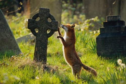
10 Sep 13:41
This Minimalist Children's Book Hides Some Cool Secrets
by Jill Harness
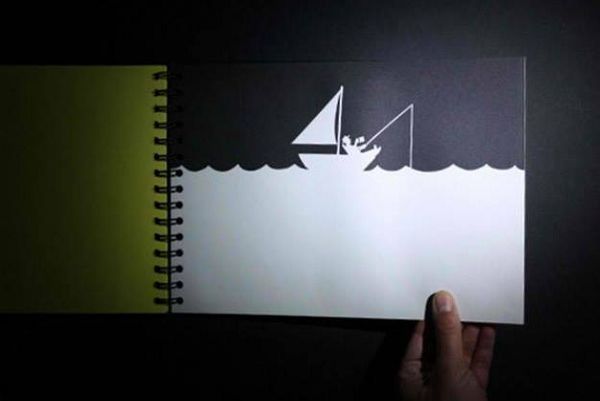
The children's book above looks cute, but pretty boring, right? But shine a flashlight underneath the page and all kinds of new details pop up.
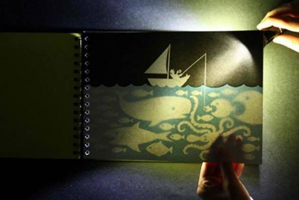
The delightful creation, titled Hide and Eek!, was designed by artist Rebecca Sutherland, design studio Hat Trick and design company Knock Knock.
Link Via Design Taxi
Rob Young likes this


19 Aug 03:00
Are You Making These 5 Small But Vital Mistakes On Your Illustration Portfolio Website?
by Lea
There are a number of obvious, small yet possibly business-limiting mistakes which are prevalent on a number of portfolio websites we review…
#1 No (or Hard to Find) Contact Details
Would you believe that many websites make it impossible to find the contact details on them? They’re either simply not there or the details are buried deep within the website somewhere and unlikely to be easily found.
How will potential clients and art directors get in touch if they like your work, and want to hire you?
While some visitors may like your work enough to be motivated to spend a while searching your site for them, you want to make it as EASY as possible.
ACTION: Open up your website now! Are your contact details easy and obvious to find from every single page? If not, make them so!
#2 Too Small Thumbnails
If the thumbnail photos for your portfolio gallery are too small, it makes it really tricky to see your work, and pick something which might stand out or be of interest to a potential client.
Not only that, it can be visually overwhelming to be faced with an entire screen of tiny thumbnails, which can then lead to visitors clicking away from your site because they just don’t know where to go.
ACTION: Open up your website now! Are your thumbnails large enough for visitors to get a clear idea of what that piece of work actually is? If not, increase the size of your thumbnails.
#3 No Photo
If you are selling yourself as a professional service provider, you MUST have a photo of yourself up there somewhere.
It doesn’t need to be a glossy, staged and professionally-shot photo but it does need to show you as a friendly, approachable, professional human being who can be trusted with someone’s hard-earned pennies.
People work with people, so show yourself and who you are instead of hiding behind an avatar or no image of yourself at all.
ACTION: Open up your website now! Is there a photo of yourself or something that will give prospective clients a visual of exactly who they’ll be hiring and working with?
#4 No Mailing List
It’s the #1 rule of marketing yourself online…build a mailing list.
The reason being is that while it’s great that people come to your website in the first place, you need to give them a way to stay up-to-date with what you’re doing, and stay present in their minds should any suitable potential projects crop up.
It might feel like just one extra thing you don’t have time to do, but smarter creative marketers know that an online mailing list is a relatively quick, easy and cost effective way of keeping in touch with potential clients who are interested in hiring you.
ACTION: Check out mailing list providers such as AWeber or Mailchimp – and plan the sending out of a regular e-newsletter into your marketing strategy soon!
#5 Splash Pages
While they may look pretty, when clicks and getting people to take action on the web are at a premium, why force visitors to make that one, unnecessary extra click just to get to the main part of your website?
ACTION: Open up your website now! Are you forcing visitors to take unnecessary extra steps and actions just to get to the main content of your website (your portfolio)? If so, streamline the experience and remove any barriers.
Rob Young likes this
12 Aug 02:22
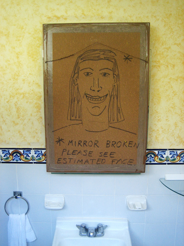
George McCallum Constructing Puns in a Combination of Woodwork and Illustration
by Philip Dennis
Judging by his work, the George McCallum studio must be a lot of fun to hang out in if not a bit cramped with all the wonderful but huge 3D pieces he makes.
In a combination of woodwork and illustration, George saws, hammers and nails his ideas together. He constructs them into large, visual puns that demand your attention and smile. It’s a really interesting way to work, producing some original looking imagery.
As impressive as they must be in real life, George’s work easily transfers into print, like in his book cover submission for the Bristol short story competition. However, given the chance, his work looks like something that is really best experienced. Who wouldn’t want to sit on ‘Chair Man Mao‘ or check themselves out in ‘Ugly Mirror‘?
‘Chest of Draws’

“My work is colourful and tongue in cheek and hopefully fun. I work primarily 3 dimensionally using a wide range of materials depending on the brief, although at the moment M.D.F is my material of choice.”

‘Chair Man Mao’

‘Bristol Short Story’

‘Love to Skate’

‘Ugly Mirror’

‘Ugly Mirror’

‘Pillow Fighter’


© George McCallum, 2013
Rob Young likes this

01 Aug 17:27
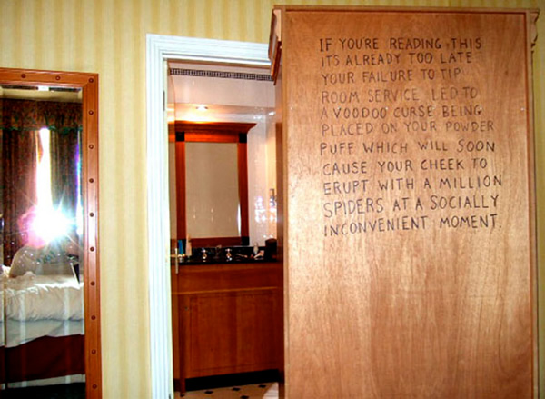
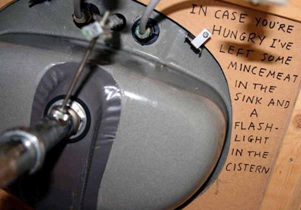
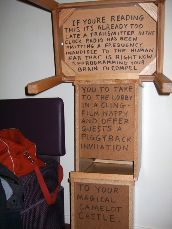
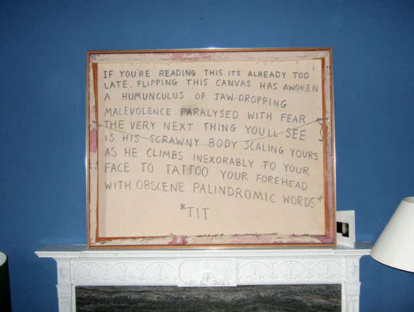
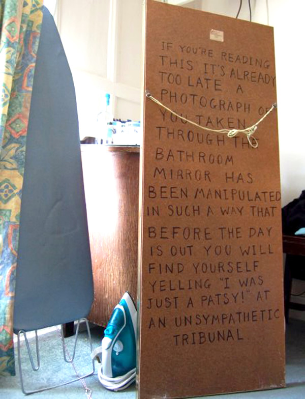
If You're Reading This, It's Already Too Late
by Alex Santoso
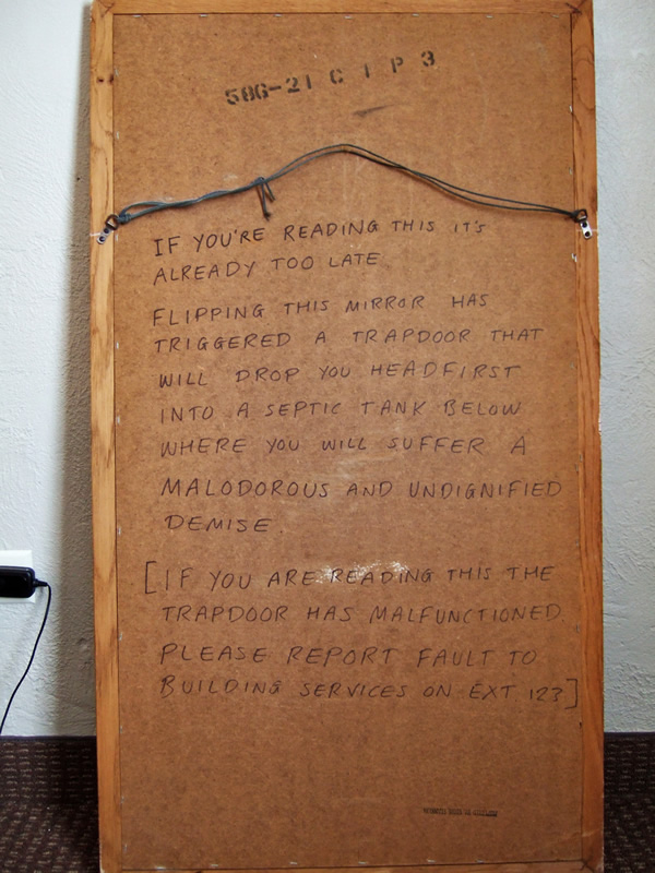
Best Western. Forrest City, Arkansas, USA (2008)
Comedian David Bussell has stayed in a lot of hotels over the years, and decided that he should leave a bit of something ... in form of a hidden message behind mirrors, paintings, and other obscure places in the room. Next time you stay in a hotel, try to see if a fellow traveler has left you something. Behold, Hotel Graffiti - via Metafilter
 Peuto San Jose. Costa Verde, Guatemala (2010)
Royal Bath Hotel. Bournemouth, England, UK (2009)
Model A Inn. Cranbrook, British Columbia, Canada (2009)
Premier Inn. Manchester, England, UK (2010)
Crescent House. Edinburgh, Scotland, UK (2010)
The Cathedral Gate Hotel. Canterbury, England, UK (2008)
Rob Young and -1 others like this
02 Jul 16:12
Tiny Row House Installation Restores Missing Addresses
by Steph
[ By Steph in Art & Street Art & Graffiti. ] 


[ By Steph in Art & Street Art & Graffiti. ]
[ WebUrbanist | Archives | Galleries | Privacy | TOS ]


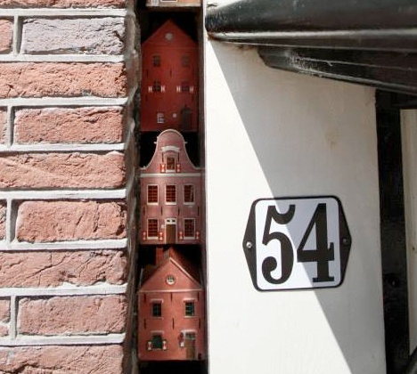
Taking a stroll along Westerstraat in Amsterdam, you might notice that an entire clump of houses seems to have disappeared. The addresses jump from 54 to 70, with nothing but a four-inch crack between them. Where did those houses go? Ad agency Natwerk has its own creative take.
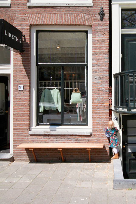
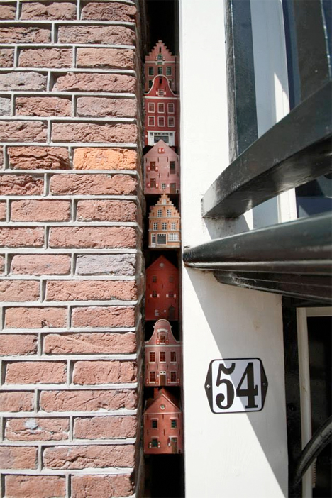
The agency restored the seven ‘missing’ row houses, building tiny models in the same style as the full-scale homes that surround them. Just barely peeking out from the dark void, these cute little sculptural installations invite passersby to stop and look closer.

Urban interventions are a fun way to temporarily alter the environment in public places. Some are fleeting, like chalk tracings of shadows that document a passing moment, or tiny, like Slinkachu’s miniature scenes. Some require no more than a couple plastic eyeballs to make people smile. Others are more disruptive, altering familiar objects like street signs, trash cans and traffic markings.
[ By Steph in Art & Street Art & Graffiti. ]
[ WebUrbanist | Archives | Galleries | Privacy | TOS ]
    
|


27 May 23:37
The Wheel House
by Alex Santoso
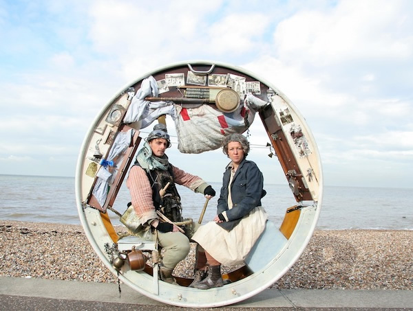
A rolling stone gathers no moss, but a rolling house will definitely gather audience. The Wheel House by UK's Acrojou Circus Theater features a live performance of two acrobats as they live in a unique circular house - complete with bookcase, pots and pans, and other household accoutrements - rolling slowly on a straight path to nowhere.
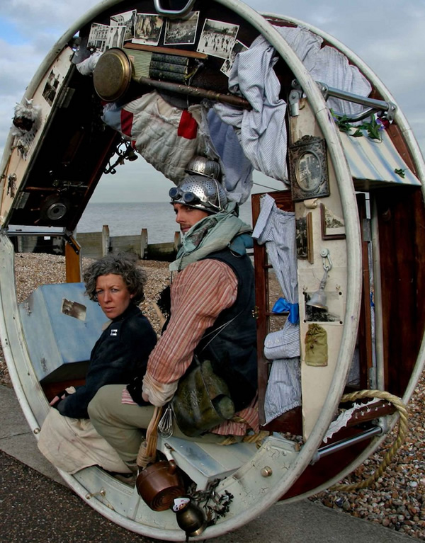
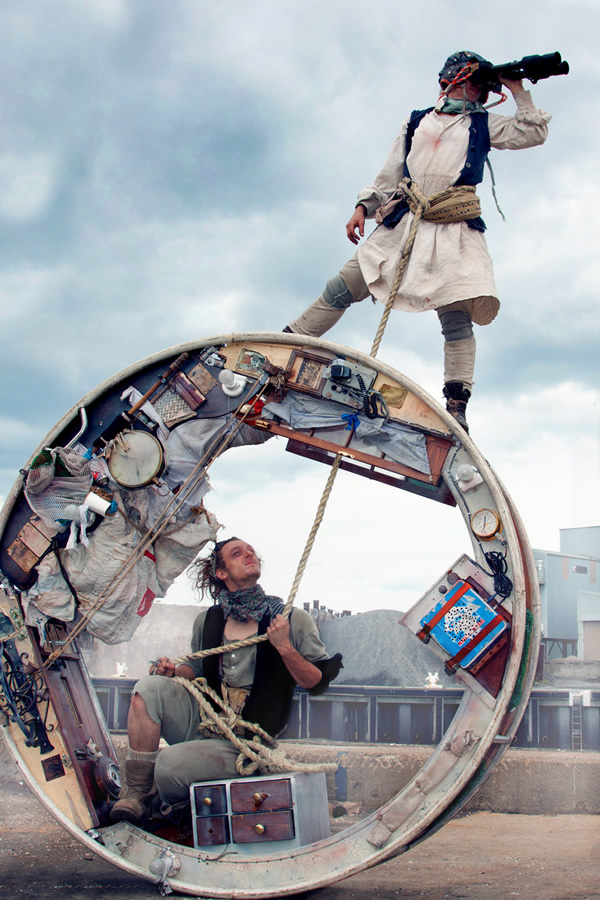
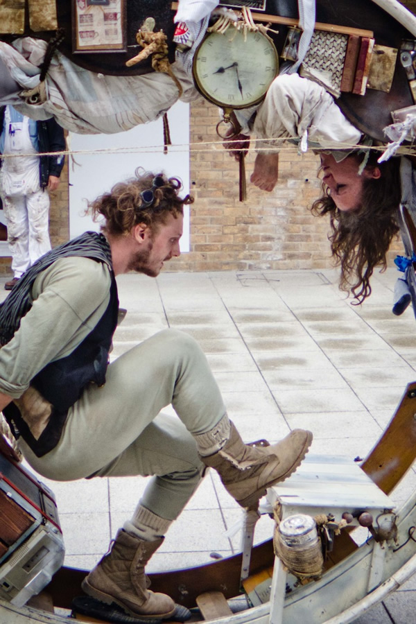
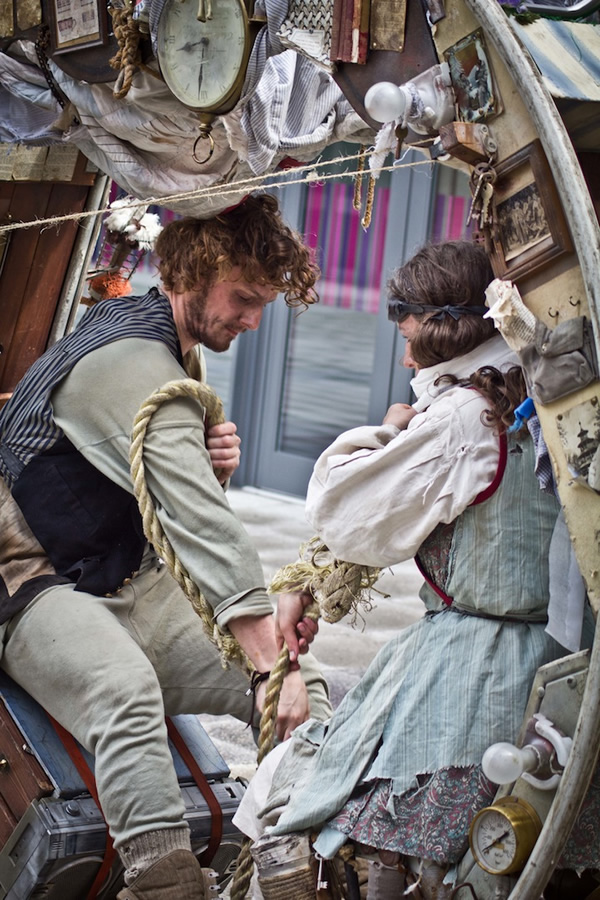
Have wheel house, will travel: Link - via My Modern Met
Rob Young likes this
14 May 00:55
Patrick Arrasmith (update)
by Charley Parker

Since I first wrote about illustrator Patrick Arrasmith back in 2008, he has become best known as the illustrator of the Last Apprentice series by Joseph Delaney.
Arrasmith works in the difficult but rewarding medium of scratchboard, in which line and tone are created by scratching black ink from the surface of clay-coated board on which it has been applied, leaving white areas or lines where the ink has been scratched away (in Arrasmith’s case, with a #16 X-acto blade).
His technique allows him to create appropriately spooky imagery for the series, not only in working from black to white, but also because it produces that wonderfully textural line and tone quality, somewhere between pen and ink and wood engraving, that is unique to scratchboard.
In a number of the chapter headings, Arrasmith has carried forward the older tradition of allowing areas with the illustration for the incorporation of the initial block of text that starts the chapter, sometimes knockout text in white against a block background, sometimes in white areas, often with an inventive take on how the text is blended into the art.
For color work, such as the series covers, Arrasmith scans the scratchboard drawings and applies color digitally in Photoshop.
Since my initial post, Arrasmith has updated his website with a new design and nice large images that allow you to see some of the detail and textural characteristics of his approach. When viewing his online portfolio, be aware that there are several sections, accessed from small text links at the bottom right of the main Portfolio page.
There are a couple of videos on YouTube of Arrasmith discussing his work for the series, in one he talks briefly about his process, in the other he highlights some of his favorites among the illustrations.
There is also a brief interview with Arrasmith from 2008 on Irene Gallo’s The Art Department, and a gallery of his work in Tor.com.
[For more background on scratchboard, a Lines and Colors search for scratchboard will bring up other posts in which the medium is discussed.]
Davidbrawley, Matthias.reiche and one other like this
01 May 17:11
Lots of fun was had making this cover.
As usual, ink on claybord, 11*15". The original is SOLD.


The End of the Road
by Kal D
Here is a new cover for Solaris Books.
The End of the Road is the next anthology edited by Jonathan Olivier, for whom I did the cover of the "Magic" anthology last year.
Each step will lead you closer to your destination, but who, or what, can you expect to meet at journey's end?
Each step will lead you closer to your destination, but who, or what, can you expect to meet at journey's end?
Here are stories of misfits, spectral hitch-hikers, nightmare travel tales and the rogues, freaks and monsters to be found on the road.
Lots of fun was had making this cover.
As usual, ink on claybord, 11*15". The original is SOLD.


Rob Young and -1 others like this

17 Apr 18:25
The Rejection Slip
by John Farrier
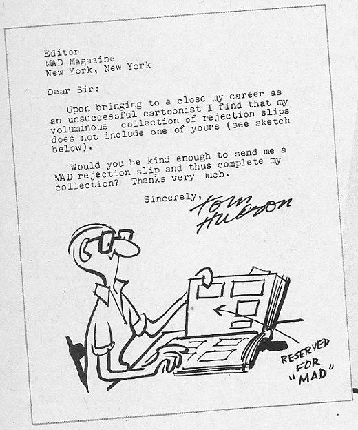
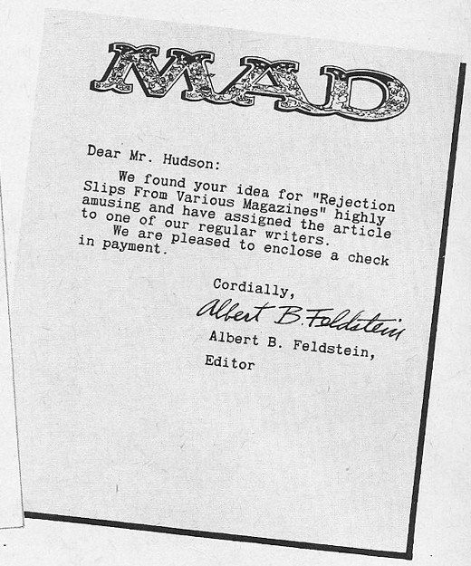
Cartoonist Tom Hudson wasn't looking for new work. He just wanted to brag about having been rejected by Mad. His entire exchange with the editor was published in (and likely created for) the July 1963 issue of that magazine. Read it all at the link.
Electrikmonkrjs likes this
17 Apr 15:39
Tel Aviv 2033
by noreply@blogger.com (the realist)
this is a ten pages story that was originally created for Villa Méditerranée publication, which also includes work by Nicolas de Crécy and François Olislaeger.


it's about Tel Aviv in the future.
--
Tadeu, Tertiarymatt and 3 others like this
No more posts. Check out what's trending.