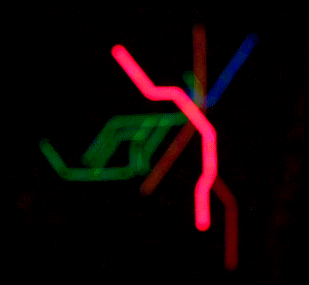
Bostonians who want to know when the next train arrives could check an MBTA schedule app. Or if they’re in the area they could peer into Ian Reynolds’s window, as the guy has made a glowing system wall map updated with real-time location data.
“The MBTA is a big part of life in Boston, and I built this as sort of a love letter to the transit system that we all know and love (to hate),” writes the 21-year-old MIT engineering student on Reddit. It took him three weeks and more than two-dozen feet of Adafruit NeoPixel LED strips to finish. Reynolds has it synced with the transit agency’s API so he can watch the “trains,” shown as bright LEDs, putter through the system from the comfort of his frat room’s loft bed.
Which he definitely does, according to the Boston Globe:
“I do find myself staring at it sometimes,” said Reynolds. “I’ll just turn it on and then zone out.”...
In terms of letting the MIT student know when to dash out the door to catch a train, it’s not very useful, he said. But it does add pizzazz to his living quarters. Plus, it was fun to build and program.
“It’s just something that makes the room look nice,” Reynolds said.
Since he’s a generous guy, Reynolds has penned an explainer on Medium so other transit-heads can create their own city maps. This video gives an idea of what it looks like at night—note the dots update only every 15 seconds or so and there is some blurriness (though if you’re zoning out with the proper substances, that should seem correct).
Recently I’ve seen several interesting conversations about ad blocking, and I wanted to remind people about a great offering called Google Contributor. With Google Contributor, you contribute a certain amount of money each month. That subscription means that you see fewer ads on the web, and you support the sites that you visit with your money.
You get to decide how much to contribute (I do $10/month, but for example you can do $2/month if you prefer). The more you contribute, the fewer ads you see. The handwave-y explanation that when you go to a website, your monthly subscription actually bids on your behalf in ad auctions. So you end up buying the ad yourself rather than someone else. This is cool for several reasons:
1. You support the sites you visit without expending any energy.
2. You see fewer ads.
3. (And this is the cool part) you get to decide what to show in that ad space instead of ads.
That’s right: you can pick a custom URL to show to yourself instead of ads. It’s like buying space on a billboard and showing nature scenes instead of ads. Personally, I like to show a dynamically generated Mondrian-like pattern:
But here’s the part I love: when you sign in, click the gear icon and then “Advanced settings,” and at the bottom of the page you can provide any custom URL you want (it does have to serve over https). You could replace ads with pictures of kittens, or your family. Or make ads your todo list, or a reminder to get back to work. Think outside the box, like Paul Ford. It’s the open web–you can have all kinds of fun with your HTML.
Here are some common misconceptions about Google Contributor:
Q: I thought Google Contributor only worked with ten websites or so?
A: No, it works with millions of websites. Contributor launched with a small set of websites initially, but if a website runs Google ads like AdSense or DoubleClick for Publishers, it’s likely to be compatible with Contributor.
Q: Isn’t there a waitlist to join? Or I need an invite or something?
A: Not anymore! You can sign up immediately and support tons of websites with one monthly payment.
Q: Can I see which websites I’m supporting?
A: Yes! You get a report that looks like this:
(Adding a few more questions)
Q: Why don’t you support Google Apps accounts? I thought it only worked with Gmail accounts?
A: This is very fresh news, but I believe Google Apps accounts are now supported. Try it out!
Q: Why doesn’t Contributor support country X or currency Y?
A: It’s safe to assume that the Contributor team has heard that feedback. I’m happy to pass that feedback on as well. That can be a complicated issue though.
If you like the web and use it as much as I do, why not support some of your favorite websites while reducing the number of ads you see? Give Google Contributor a try now.
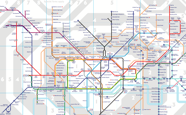
The London transit authority’s rarely-publicized, geographically-correct map (pdf) of the London Underground subway system is making the rounds, and it’s been a little unsettling.
On this map, disclosed by Transport for London in response to a Freedom of Information Act request, all of the Tube’s noodle-like contours are laid bare. It’s accurate, yes—at last, the Northern Line is revealed for the twisted mess it is! But it’s also disorienting, as the clean, bold lines of the iconic Tube map melt away.
When it comes to its transit map, London decided long ago that it was willing to forego accuracy for simplicity and design.
The current Tube map.(Transport for London)
But for the first few decades of its existence, the city’s (much smaller) underground system was mapped out geographically.
A draftsman named Harry Beck came up with the prototype of the current design in 1931. It was all straight lines, with 45- and 90-degree angles only, a modernist masterpiece divorced from the chaotic reality of the streets above. Transit planners initially rejected the map, saying its failure to allow Londoners to gauge real-life distances between stations would be too confusing for riders. A trial run proved them wrong.
Beck’s design principles went on to inform many of the world’s other transit systems. Paris’s current map resembles one Beck designed for fun in the 1940s. Washington, D.C.’s Metro sports decidedly Beckian angles. And the upcoming 24-hour Night Tube in London will have a map that follows on from the daytime version:
But the design-first approach doesn’t work everywhere. In 1976, New York’s Metropolitan Transportation Authority commissioned designer Massimo Vignelli to revamp the subway map. His colorful end result shrank Central Park and distorted Manhattan’s geography in exchange for clean lines and angles like London’s—and New Yorkers hated it.
Why mess with a city whose easily navigable grid system—above 14th Street, anyway—already made perfect sense? Vignelli’s contribution was yanked in 1979, replaced with a version of the messy but geographically accurate version in use today.
A rare interview with Massimo Vignelli on type, his NYC subway map design & what is important in #design: http://t.co/97jhpQU9Oi
But then something interesting happened. When The Weather Channel executives tried to up the rates on cable operators like DirecTV and Verizon FiOS, both companies balked -- and pulled The Weather Channel from their lineups, replacing it with channels, apps and services that actually reported the weather. Apparently, threatening to pull your product from the market if you don't get more money -- only works when people give a damn about your product. Meanwhile, cable companies are having a harder time pushing off programming rate hikes to consumers awash with alternative options.
Initially, The Weather Channel executives responded by trying to claim DirecTV and Verizon were threatening public safety by pulling access to an invaluable public resource (an argument that fell flat on its face since most realize the channel doesn't actually provide that). Then, the company amusingly tried to attack competitors like AccuWeather by actually claiming it offered too much fluff. But with a little time to think about it, The Weather Channel executives appear to have finally learned something.
"The plan calls for a singular focus "on our unique strength -- and that is the weather." With the cable channel bundle coming under increasing pressure, and "skinny bundles" becoming more common, "it's inevitable that channels will be cut," Weather Company CEO David Kenny said in an interview. With this in mind, "we need to be really clear who we are," Kenny said.
That means paring back its original programming investments (shows like "Prospectors" and "Fat Guys in the Woods") and lifestyle coverage. The priority is essential, live weather coverage -- particularly during periods of severe weather -- and local information.
Granted there's only so many ways you can monetize a quick glance at the five-day forecast, and filling twenty-four hours of eyeball-grabbing airtime in the smartphone era without catering to nitwits will likely be a continued challenge. But it's at least a positive sign that the company sees the cable TV landscape changing and needs to either change with it, or be left behind.
Police dogs attack a young civil rights protester in Birmingham, Alabama, in 1963. (AP Images )
With each new story that surfaces about violence against black men, women, and children, the idea of post-racial America is buried a bit deeper. In one recent gut-wrenching video, police officers in San Francisco surround a homeless man with a prosthetic leg. At one point, four of them pin him down despite his cries of protest.
Here’s what Chaédria LaBouvier, a journalist who filmed this incident, wrote on Medium:
These incidents are so quotidian, so mundane, that they do not merit a mention in even passing on the local news. Which is to say, this is everyday harassment. Which is to say, that we’ve normalized and habitualized the kind of policing in San Francisco and the rest of America that brutalizes the most vulnerable people, which strips them of their human dignity, the agency to their bodies — to walk with crutches when physically disabled, to have this body unviolated — when in actuality, they are whom the police are especially supposed to be protecting.
LaBouvier’s point that vulnerable groups are often stripped of their humanity is supported by a new paper published in the Journal of Personality and Social Psychology. The study finds that some groups in America are considered less human than others, and that people who regard these groups as such are not shy to express their sentiments or behave in accordance with them.
"In addition to the more subtle forms of prejudice and dehumanization that are out there, that are also important, some groups are still facing these more blatant forms, and they seem to be pretty insidious," says Nour Sami Kteily, assistant professor of management and organizations at Northwestern University and one of the study authors.
The concept of dehumanization—considering another person less human than you, and therefore, less deserving of humane treatment—is an ancient one. It’s been used to explain and justify aggressive actions of one group towards another throughout history. In Nazi Germany, propaganda posters and movies represented Jews as rats. Many who opposed abolition of slavery compared African Americans to apes.
For the last few decades, researchers have veered towards measuring more subtle, indirect forms of dehumanization—assuming most people would no longer openly reveal that they believe someone else to be less than human. In 2006, psychologist Susan Fiskeexamined how people’s brains reacted to images of addicts and homeless people. She found strong neural signs of disgust, supporting the theory that “extreme out-groups may be perceived as less than human, or dehumanized.”
Arabs and Muslims were perceived as being the least evolved.
For the new study, Kteily and his colleagues wanted to question the assumption that dehumanization only occurs as silent, subtle perceptions. They designed a measure for blatant dehumanization called “ascent dehumanization,” based on the famous depiction of humans evolving from primitive to advanced beings, over time. Although they conducted seven studies on data samples from three countries, we’re going to stick to what they found in America.
Here are the highlights:
Less privileged groups are dehumanized more than others
In one study, the researchers surveyed a mostly white, liberal-leaning sample of Americans to find out which groups of respondents (if any) blatantly dehumanized other U.S. racial groups. The questions were designed in a way that the respondents were likely to be conscious that they were attributing less humanity to certain groups. The respondents were shown the “ascent of man” silhouettes (below) and asked to point to where they saw various ethnic groups on that scale from lower animals to highly evolved humans:
The respondents rated European groups and Japanese as “similarly evolved” as themselves. But Chinese, South Koreans, and Mexican immigrants were rated as being at a lower rung of humanity. Arabs and Muslims were perceived as being the least evolved compared with Americans. (The researchers didn’t measure dehumanization against African Americans in this part of the study series, but other parts confirmed that they were one of the dehumanized groups.)
Here’s how the paper describes its findings:
These results suggest that the Ascent dehumanization measure may be especially useful for assessing blatant dehumanization toward low status or derogated targets, who may be perceived as relatively primitive or unsophisticated.
Dehumanization can help predict attitudes and behaviors
In successive studies, researchers found that dehumanization was strongly associated with social dominance orientation—the belief that that some groups should maintain superiority over others. They also found that dehumanization was a strong predictor of certain behavioral outcomes.
Dehumanization of Arabs, for example, was linked to more tolerance for military violence in Arab nations. For African Americans, dehumanization predicted that respondents would have less sympathy when encountered with incidents of injustice and wrongful incarceration. For Hispanic Americans, it meant less support for immigration.
Here’s how the researchers summarize this section of the study:
The effects of blatant dehumanization on responses to media portrayals in the African American condition, aversive racism in the Hispanic American condition, and outgroup donation in the Chinese condition remained significant even after controlling for prejudice toward these groups.
(The researchers controlled for prejudice to show that it wasn’t just a strong dislike for these racial groups that was responsible for these behavioral outcomes—it was, as far as they can tell, dehumanization.)
Dehumanization increases with increased threat perception
In another study, the researchers examined how dehumanization changes over time. They compared survey data before and after the Boston Marathon bombings in April 2013. Dehumanization of Arabs spiked in the immediate aftermath of the terrorist attack, and then started subsiding in a couple of months.
"When people feel like their group is coming under attack from another group … it may increase the blatant levels of dehumanization," Kteily says.
It’s frightening to think about how fears and perceptions of threat can be manipulated to justify ill-treatment and violence against certain people. Nearly 14 years after 9/11, anti-Muslim violence is still common. And the recent stream of dehumanizing rhetoricagainst immigrants has already also had violent ramifications.
"[Politicians] are playing to an audience,” Kteily says. “They recognize that the perception, or this type of rhetoric, has supporters.” Adding fuel to the fire is likely to exacerbate the existing perceptions o these groups, and worsen the potential ramifications, he says.
In the future, it would be interesting to see how the so-called “lower-status” groups—the ones that the study finds are targets of dehumanization—perceive those that are regarded as being higher up in the social hierarchy, Kteily says. For now, it’s important to acknowledge that dehumanization is more common than previously thought. “[The study] highlights a deep issue here that needs to be addressed from the point of social harmony,” he says.
Can I hear traffic slowing to a stop? Is the curb sloping downwards? Can I feel the rumble of engines on a perpendicular street?
For people with visual impairments, safely crossing the street can be a tricky task, even at designated crosswalks. A 2007 report prepared for the National Cooperative Highway Research Program outlined the sensory cues that visually-impaired people note when locating and navigating an intersection. It requires a lot of maneuvering: How wide is this block? Are there any medians? What will I encounter on the other side?
Without audible cues, it may be difficult to estimate how much time you have to get across the street. And even when there are aural cues, they might be hard to understand. Accessible intersections can vary dramatically from place to place, and even within the same city.
Take Portland. Roughly 250 of the city’s 1,200-plus intersections feature sound cues—but those range from spoken phrases to bird chirps to clicking, ticking, or buzzing sounds, KGW News reported. Such inconsistencies can cause problems, especially when people struggle to differentiate the beacon’s cues from other ambient sounds. The Oregonianchronicled instances of people charging out into the street, thinking that the chirps were indicating that it was safe to cross—in fact, the mechanical coos sounded a lot like the cardinal’s call; plus, birds perched on wires learned to imitate the crosswalk sound and deploy it at their whim.
There’s a lot of information to process, and a dearth of resources to help sort it out. A new app aims to streamline the process by crowdsourcing as much information as possible for crosswalks all over the world.
Users can log on to SeeLight—free in the iTunes store—and add information such as duration of the walk signal or presence of raised bumps indicating the crosswalk’s borders. The app, which uses an open API, adds a GPS tag to the intersection so the location is searchable.
The app’s creators believe it can help mitigate outdated technology and infrastructure that’s constantly in flux. Vlad Sitnikov, creative director of Hungry Boys, the app’s Moscow-based developers, explained to Fast Company:
"Public bodies can be notoriously slow at being proactive and temporary traffic lights are forever popping up when roads are being worked on. SeeLight helps manage this uncertainty."
Retrofitting existing crosswalks with accessible technology can have a hefty price. It would cost about $12,000 to outfit a four-way intersection with an audible signal, Dylan Rivera, the spokesperson for the Portland Bureau of Transportation, told KGW News.
Overhauling and standardizing accessible intersections is a long-term project. In the meantime, SeeLight could help make crossings easier—and safer—to use.
MOUNT OLIVE TWP.- Computers for all students, more robots and a change in the time-worn quarterly grading system are among the changes to come in the grades K-12 district this 2015-16 school year.
The school district continues to invest in instructional technology to make education more hands-on, student-centered, and interactive, a statement said.
“The new technology underscores the goal of the board of education and administration to make the school system a county leader in STEM (science, technology, engineering, and math) education,” said a statement.
At the secondary level, added technology will mean that every student in every core classroom will have a computer to use in class. A total of 400 new ChromeBooks have been added at Mount Olive High School for in-classroom use by juniors and seniors and about 400 laptops will be added at Mount Olive Middle School. The new machines should be configured and up and running by the end of September.
Some computers used at the middle school and high school last year will be moved to the elementary level; by October, every core elementary classroom in grades 2-5 will have one computer available for every two students, the statement said.
More robots have arrived in the district as well. Last year, the district began using NAO humanoid robots in introductory robotics courses at the high school as a way to help students learn programming basics. The two-foot-tall robots are fully articulated and are capable of walking, speaking, and dancing. Several new NAO robots will be added for the program.
Robots of another kind will be seen throughout the district – ones that will actually attend classes and share the hallways with students. Five VGo robots have been purchased that will be allow homebound students to virtually attend classes rather than receive specialized home instruction by a visiting teacher. The four-foot-tall robots have motorized wheels rather than legs, and are integrated with cameras, microphones, and video displays.
Student-controlled from applications available for iPads or computers, the VGo’s allow students to see, hear, and ask questions just as they would if they were actually sitting in the classroom.
The benefit for students, besides emulating the actual school experience, will be many more hours of instruction. Currently the district provides about 10 hours of weekly instruction per week to each of the 50 or so homebound students, the statement said.
The VGo’s also save the district money because teachers will not have to visit the students that virtually attend school.
Other STEM initiatives include the introduction of a new engineering course at the high school, the purchase of additional interactive SMART boards, a 3-D printer for the high school, Google cardboard virtual reality viewers, and flexible cameras for microscopes that will allow full-classroom viewing of magnified samples.
Trimesters Organized
One of the changes being made this year will impact all students in grades K-5.
The 2015-16 school year will be divided into thirds instead of quarters. The move will provide students with more instructional time because it will mean less time spent taking tests and less time reviewing old material in preparation for testing.
Students will also spend less time taking internal assessments to monitor progress because the district is moving to a new testing system that makes measuring student growth and providing actionable data easier and more efficient, the statement said.
The first trimester will run from Sept. 2 to Dec. 4; the second will run from Dec. 5 to March 23; and the last will run from April 3 to June 24, the last day of school.
A number of facilities improvements were completed over the summer and others will be implemented later this fall, including a major renovation of space at the high school.
At the high school, a science laboratory and a new science learning space were added; the school’s photo lab and an art classroom were remodeled; a new track was installed and will be open for play this fall; ceiling tiles were replaced; and student restrooms and team rooms are in the process of being renovated, the statement said.
At Mount Olive Middle School the stage floor is being replaced. Later in the fall at Mountain View Elementary School, a new surface will be installed in the school’s multipurpose room so that the high school’s robotics team can use the site for practices.
Other work completed this summer includes concrete and asphalt repair, a new bus parking lot, new sidewalks and repairs to the driveways at the middle school to keep both pedestrians and motorists safe, new water tanks for Sandshore Elementary School and the high school and new ceiling tiles at Mountain View.
A major renovation project at the high school, expected to begin in November, will result in new educational opportunities for students. The original school auditorium, a 20,000-square-foot space known as the “pit,” is underutilized because of its poor design. In the upper level there are steep bleachers that were installed when the school was originally constructed. The pit is now used as a wrestling room and for storage.
The space will be reconfigured into three separate learning areas. On the first floor, a state-of-the-art recording studio will be created along with an adjacent performing area. A sound engineering course is planned that will use the recording studio to teach students the fundamentals of audio design and production. A dance course is planned for the performance area.
A second floor will also be constructed in the pit space. Here, a maker studio will be created that will provide unique hands-on STEM (science, technology, engineering, and math) opportunities for students.
A maker space is a relatively new concept in education and represents a fusion of creativity, STEM, and fabrication. The space combines high tech manufacturing and computer equipment in one lab, enabling students to design, prototype, and produce products.
“The maker space will engender a spirit of creativity, community, and collaboration – the type of culture that you would find at Google or Apple,” said Schools Superintendent Larrie Reynolds. “Courses will be tailored specifically for the maker space that will bring students to whole new levels of thinking and innovation. When they leave the high school, students involved in the program will have advanced STEM skills that are in high demand in the workplace.”
Three years ago, Boyan Slat was a precocious 18-year-old on a TEDx stage in the Netherlands, eloquently introducing people to his radical idea to clean up the ocean. He would build a network of floating walls that would work with the oceans’ currents to catch the millions—maybe even trillions—of tons of plastic waste. The motion of the ocean would essentially make it self-cleaning.
Coming from a kid not even in his twenties, the idea was impressive and the video of his talk quickly went viral. But his idea was just that: an idea.
Now 20, Slat is the founder and CEO of the organization The Ocean Cleanup, and his “idea” just earned him a $152,700 Index Award, given to entrepreneurs with bold solutions to the world’s toughest problems. Together with his team of researchers and engineers, Slat is planning to build a 62-mile long trash-catching system in the Pacific Ocean, between Hawaii and California. The apparatus will be deployed in 2020, the Huffington Postreports, and will be the world’s longest floating structure in the ocean, with barriers spanning more than 6,500 feet.
“It will be one of the largest environmental operations yet, but we created this mess,” Slat said in his TEDx talk back in 2012.
Shaped like a V to funnel plastic waste toward the center, the barriers would sit along the Great Pacific Garbage Patch—a “vortex” of trash bounded together by circular ocean currents known as gyres. The walls will be attached to the seabed three miles beneath the surface. The current will flow underneath the wall, letting sea life through. Lighter-than-water plastics will get trapped, then collected and recycled.
The organization recently completed a month-long “mega expedition” studying the plastic in the Great Pacific Garbage Patch, and hopes to pilot testing a one-mile barrier off the coast of Japan next year. The 62-mile wall could potentially clean up half of the Great Pacific Garbage Patch in 10 years.
While Slat’s initial talk garnered a lot interest—enough to eventually raise $2 million for his project—it also attracted critics who say the idea isn’t actually feasible. It would be challenging to anchor something that large, wrote oceanographer Kim Martini, adding that she isn’t convinced that the system will avoid anybycatch of sea life. Stiv Wilson, then the policy director of the nonprofit 5 Gyres,called Slat’s idea a “fool’s errand,” saying that gyre cleanup is not a realistic strategy, given the sheer size of the oceans. Plastic, Wilson wrote, isn’t just contained within the gyres’ borders.
In fact, many experts agree that the solution to ocean pollution starts on land. Nonprofits have been trying to prevent more trash from entering the ocean by working with businesses and individuals. The Ocean Conservancy, for example, started a “Trash Free Sea” alliance, where companies including Coca-Cola and Nestle commit to making their products ocean-friendly. The organization has also mobilized the world’s largest volunteer effort to clean up trash along different coasts around the globe.
A digital rendering of The Ocean Cleanup’s apparatus, close up. (Erwin Zwart / The Ocean Cleanup)
Plus, there is already technology in use that has shown promise. Last year, Baltimore City quietly installed a solar powered water wheel in the popular Inner Harbor. The wheel lifts garbage out of the water and into a dumpster barge via a conveyor belt.
The industrial designer James Dyson has suggested his company’s vacuuming technology can also play a role. In 2014, he revealed his concept for the M.V. Recyclone, a vessel that will vacuum up debris from waterways.
None of this deterred Slat from moving his project forward, however. He wrote off the criticism—in a 530-page feasibility study he conducted with a hundred colleagues addressing his critics’ concerns. It took more than a year, and results showed that his plan actually could work (though some, like Martini, remain unconvinced).
“… [W]e haven’t found a single reason it cannot be done,” Slat said in a June 2014 talk detailing the results. “We can only conclude that it could be done; it’s feasible.”
Want to cross the street with authority? Try using the “Walkbump,” a crosswalk button you activate by pounding it with your meaty fist.
Designer Alfredo Adan Roses made silicon molds of his hand and recently epoxied them to crosswalk poles around Los Angeles. To judge from video footage, people were quick to bond with the artificial fists, knocking them righteously as if they’d just downed a Jager bomb. (Whether or not the buttons actually do anything is another question.)
“Crossing the street at the crosswalk has now become a fun thing to do,” writes Roses.
The municipal worker who has to chip the fists out of their cement-hard bonds would probably disagree. But still, credit goes to the designer for giving a rote action some bro-worthy satisfaction—and keeping germy fingertips off the walk button, to boot.
(For those curious about the fists’ construction, see the making-of video.)
We have a lot of interviews and things on the go for Step Aside Pops as it gets near the release date, so expect to see a whole lot of activity! If you're listening to the CBC, I'll be on As It Happens in the next while, and on Q later in the month.
A 2007 photo of 52 Oaktree Lane in Levittown, New York. (Mary Altaffer/AP)
Just two minutes into the first address at the 2015 National Fair Housing Conference on Tuesday, the conversation turned to Show Me a Hero. It was only a matter of time. Housing policy and Winona Ryder just don’t intersect that often.
But the conversation got real just as quickly. Richard Rothstein, a research associate at the Economic Policy Institute, gave a barn-burner of an address at the conference, a program convened by the U.S. Department of Housing and Urban Development.
“We’ve all forgotten how federal, state, and local governments consciously segregated our metropolitan areas by race,” Rothstein said.
His speech is a potent reminder. Rothstein delivered his address on modern residential segregation last year at The Atlantic’s “Reinventing the War on Poverty” conference. It’s worth your time to read the full talk. The rough outline below covers many of the policy levers that leaders at all level of government used to build and safeguard white residential areas.
The Federal Government Built Exclusively White Neighborhoods
Federally funded public housing got its start in the New Deal. From the very beginning, public housing was segregated by race. Harold L. Ickes, the U.S. Secretary of the Interior and the most liberal member of President Franklin D. Roosevelt’s brain trust, proposed the “neighborhood composition rule,” which said that segregated public housing would preserve the segregated character of neighborhoods. (This was the liberal position. Conservatives preferred to build no public housing for black people at all.)
After World War II, the Federal Housing Administration (a precursor to HUD) and the Veterans Administration hired builders to mass-produce American suburbs—from Levittown near New York to Daly City in the Bay Area—in order to ease the post-war housing shortage. Builders received federal loans on the explicit condition that homes would not be sold to black homebuyers.
The Housing Act of 1949, a tentpole of President Harry Truman’s Fair Deal, greatly expanded the reach of the public housing program, which was then producing the most popular form of housing (!) in the country. In an effort to kill the bill, conservatives tried to tack on a “poison pill” to the legislation: an amendment that would have required public housing to be integrated.
Government Policy Guided Segregation at the Neighborhood Level
Way back in 1917, after the U.S. Supreme Court struck down certain segregation rules, Baltimore launched an official Committee on Segregation as a workaround. The committee organized neighborhood associations in order to promote restrictive covenants and otherwise intimidate white homeowners or real-estate agents who were selling to black buyers.
In St. Louis, segregated housing developments replaced neighborhoods that were roughly 55 percent white and 45 percent black.
San Francisco wanted to build integrated public housing near the Hunters Point Shipyard development, but the Navy wouldn’t allow it.
In 1984, The Dallas Morning News surveyed federally funded housing projects in 47 metro areas. All of them and their 10 million residents were segregated by race. The white projects that remained by the 1980s had better facilities, amenities, and maintenance than the others.
Ghettoes Are the Mirror of White Suburbs
Pruitt–Igoe, the notorious and short-lived public housing project in St. Louis, was designed to be segregated. Pruitt was for blacks, Igoe was for whites. But by the time the development was completed in 1955, the housing shortage had grown less pressing for whites (thanks to efforts to repopulate them in the suburbs). The waiting list for Pruitt was long; Igoe experienced vacancies. Before Pruitt–Igoe met its early demise, its towers were entirely opened to black residents, like most formerly whites-only housing projects.
Courts Often Endorse a Myth of ‘De Facto’ Segregation
In 1974, Supreme Court Justice Potter Stewart argued in Milliken v. Bradley—a case about busing—that segregation in Detroit schools was caused by “unknown and unknowable factors.”
As recently as 2007, Supreme Court Justice Stephen Breyer and Chief Justice John Roberts ruled (in Parents Involved in Community Schools v. Seattle School District No. 1 ) that racially segregated neighborhoods were the result of de facto isolation, not de jure segregation. (Meaning that residential segregation was a matter of choice among residents, not consequence decided by law.)
A Federal Project Like Levittown Cannot Be Undone Locally
In 1947, white buyers could purchase homes in Levittown for $8,000 (which is roughly $84,000 in 2015 dollars). Today, the median housing value in Levittown is $365,000, per Census data. The Long Island suburb built more than 17,000 Levitt homes, nearly all of which were leased or purchased by whites, thanks to racial covenants guided originally by the terms of the Federal Housing Administration loans.
While African Americans are allowed to live in Levittown now, they by and large do not: The city’s population is 89 percent white and less than 1 percent black. New York City, meanwhile, is 26 percent black and just 44 percent white.
There’s more to Rothstein’s talk than a laundry-list of dates and figures, so read his essays about the root causes of contemporary segregation. Start here or here or here or here. His challenge is consistent throughout.
“Government thinks things done by accident can only be remedied by accident,” he said. “Things done on purpose can only be remedied on purpose.”
Lo Barnechea is a commune of Chile located in Santiago Province, with a population of about 75,000. Its Mayor, Felipe Guevara, has decided what Lo Barnechea really needs is a massive surveillance system installed in aerostats tethered over the area, as explained by a post on the Derechos Digitales site (original in Spanish.) It's not clear from the article why he chose this unusual approach; perhaps it's because most of his district is mountainous, and that poses problems for conventional surveillance systems. Whatever the reasons, Guevara is smart enough to recognize that powerful mass surveillance systems of the kind he wants to install, which involves cameras able to pick out people from a distance of more than a kilometer away, have a serious problem:
The mayor explains that in a surveillance system implemented in Argentina, the operators started to use the cameras to follow women in the streets.
That might have alerted him to the larger issue here: the fact that there will always be a temptation to abuse such powerful systems. But no, Guevara is undeterred, because he believes he has come up with a way to avoid this issue:
The mayor's unusual solution: to employ women, because "they are less voyeuristic, more discreet" than men."
Or maybe they are so discreet, they just get away with it...
Techdirt has been following for a while the Canadian government's unabashed attempts to muzzle scientists and librarians who work for the state, as it tries to deny them the right to express their views if those happen to disagree with the Prime Minister Stephen Harper's political agenda. That battle over freedom of speech is not only continuing, but escalating according to this story in The Globe and Mail:
An Environment Canada scientist is under investigation for allegedly breaching the public service code of ethics by writing and performing a political song that criticizes the Harper government.
Tony Turner, a physical scientist who most recently was working on a study of migratory birds, has been put on administrative leave with pay over allegations that his participation in his song Harperman puts him in a conflict of interest, the union representing him said.
Turner's song, with its opening lines "Who controls our parliament? Harperman, Harperman. Who squashes all dissent? Harperman, Harperman," and a refrain of "It's time for you to go," is pretty mild stuff. A former head of the Ontario Public Service defended the government's actions as follows:
The public sector's ethics code states that federal public servants are expected to "[carry] out their duties in accordance with legislation, policies and directives in a non-partisan and impartial manner." Mr. Dean said the non-partisan nature of the public service offers protection that goes both ways: It prevents government officials from pressing public servants to act in partisan interests, and public servants make a commitment to do their jobs regardless of the political stand of the government of the day.
For one thing, it's not the case that the ethics code "prevents government officials from pressing public servants to act in partisan interests". As a BBC story on the muzzling of Canadian scientists reported:
The [media] protocol requires that all interview requests for scientists employed by the government must first be cleared by officials. A decision as to whether to allow the interview can take several days, which can prevent government scientists commenting on breaking news stories.
Sources say that requests are often refused and when interviews are granted, government media relations officials can and do ask for written questions to be submitted in advance and elect to sit in on the interview.
That's not allowing scientists to speak in a "non-partisan and impartial manner": the "media protocol" is clearly designed to cow government scientists and to ensure that they toe the official line in everything they say, regardless of what the science may indicate.
But the other point is that Turner was not performing his Harperman song as a government employee, but as a citizen -- he is described on the YouTube page as an "Ottawa folksinger", and there is no reference anywhere to his work as a government scientist.
Of course, the great thing about the Canadian government's absurd overreaction to this gentlest of private protests is that many more people will now learn that Turner is an environmental scientist who is being muzzled by a bunch of desperate control freaks who are frightened that the Canadian people might be told the truth about important scientific issues. Thank goodness for the Streisand Effect….
Google has changed a lot over the past 17 years—from the range of our products to the evolution of their look and feel. And today we’re changing things up once again:
So why are we doing this now? Once upon a time, Google was one destination that you reached from one device: a desktop PC. These days, people interact with Google products across many different platforms, apps and devices—sometimes all in a single day. You expect Google to help you whenever and wherever you need it, whether it’s on your mobile phone, TV, watch, the dashboard in your car, and yes, even a desktop!
Today we’re introducing a new logo and identity family that reflects this reality and shows you when the Google magic is working for you, even on the tiniest screens. As you’ll see, we’ve taken the Google logo and branding, which were originally built for a single desktop browser page, and updated them for a world of seamless computing across an endless number of devices and different kinds of inputs (such as tap, type and talk).
It doesn’t simply tell you that you’re using Google, but also shows you how Google is working for you. For example, new elements like a colorful Google mic help you identify and interact with Google whether you’re talking, tapping or typing. Meanwhile, we’re bidding adieu to the little blue “g” icon and replacing it with a four-color “G” that matches the logo.
This isn’t the first time we’ve changed our look and it probably won’t be the last, but we think today’s update is a great reflection of all the ways Google works for you across Search, Maps, Gmail, Chrome and many others. We think we’ve taken the best of Google (simple, uncluttered, colorful, friendly), and recast it not just for the Google of today, but for the Google of the future.
You’ll see the new design roll out across our products soon. Hope you enjoy it!
Posted by Tamar Yehoshua, VP, Product Management & Bobby Nath, Director of User Experience
Google has changed a lot over the past 17 years—from the range of our products to the evolution of their look and feel. And today we’re changing things up once again.
Among the many reasons that an overwhelming majority of people commute by car is that driving to work literally becomes a habit. Once the routine is established, you wake up and follow a chain of automatic cues that end on the road. In a practical sense, whatever choice you once had about your travel mode no longer exists.
That’s a lot of neuroscience standing between cities and reduced car reliance. But it turns out drivers aren’t the only ones whose brains get beholden to a certain manner of commuting. New evidence claiming to be the first of its kind suggests that people who walk or ride a bike to work also become behaviorally attached to their travel type—and may even form stronger habits than drivers do.
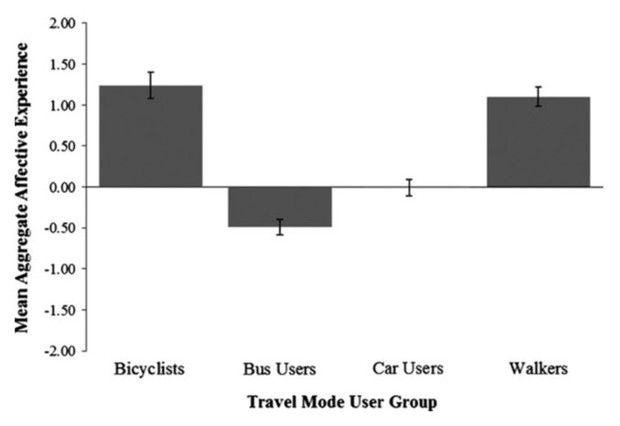
The work comes from psychologists Gregory Owen Thomas and Ian Walker of the University of Bath in the U.K., who have studied the overlap of habits and commuting in the past. For the present study, Thomas and Walker collected data on the travel routines of roughly 1,600 staff and students who made regular trips to campus by driving (37 percent), riding the bus (34 percent), cycling (7 percent), or walking (16 percent). Participants also completed a series of standard self-report assessments, including one on the habit strength of their preferred travel mode.
To the surprise of Thomas and Walker, who suspected that weather might make non-drivers frequently adjust their travel patterns, participants who commuted by bike or on foot showed significantly stronger habits than those who traveled by bus or car. On a scale from 1 to 7, with 7 being the strongest, walkers and cyclists each rated their commuting habit at roughly 5.2. Bus riders reported an average of 4.8—and drivers came in dead last, at an average below 4.7.
The researchers report their findings in an upcoming issue of the journal Transportation Research Part F: Traffic Psychology and Behaviour.
In a separate analysis, based on self-reported ratings of work trip satisfaction, Thomas and Walker found that cyclists and walkers had the highest affective appraisal of their commute mode—significantly above drivers, who were themselves significantly above bus riders. Those findings are in line with previous research showing that active transport modes lead to happier commutes. Cyclists were generally positive and excited about their trips (though not always relaxed); walkers were positive and relaxed (though not always excited); bus riders were, well, bus riders.
Drivers were more or less neutral toward their commute mode—another surprise, considering the common belief that people love their cars. Thomas and Walker suspect that neutrality might reflect the “default” status of driving to work: something “people adopt relatively unthinkingly because it is seen as the ‘proper’ or ‘normal’ thing to do in societies.” In contrast, they write, walking or cycling requires a more deliberate initial level of choice, which in turn might lead to a stronger emotional connection to the mode.
That bond might hold the key to the habit strength findings. Perhaps the initial reward of being able to walk or bike to work strengthens the habit at an emotional level, which then combines with the general behavioral cues that accompany all habits to form a more potent routine. Here’s Thomas and Walker:
If this interpretation is correct, car and public transport users, whose habits are weaker, likely have these habits based around contextual cues alone, without the additional habit-strengthening force of positive affective appraisals.
The study needs to be replicated in other populations. College towns are known for being more conducive to non-car commuters than other places; indeed, the share of car commuters among participants, at 37 percent, is far below most city-wide figures. The mean age among drivers in the sample, at 41, was also much higher than that of bus riders (24), walkers (27), and cyclists (31), which brings an age component into play as well.
Taken at face value, though, the findings offer a great deal of encouragement to cities and employers trying to promote alternative commute habits. Not only does the study suggest that people don’t love their car commute as much as conventional wisdom would hold, it also suggests they can form even stronger attachments to walking or biking. Getting people to try these modes in the first place remains a tall order—timing the shifts to major life events is the most promising strategy—but getting the change to stick is not a hopeless case.
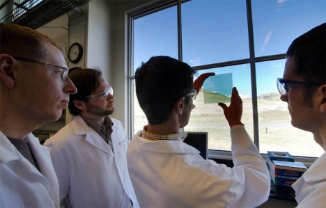
Better, cheaper and easier than solar windows, this newly-patented flexible coating can be applied to existing glass and plastic surfaces, turning any aperture into a source of electricity. With this technology on all of its surfaces, buildings can generate up to 50 times more solar energy per structure.
Developed by SolarWindow Technologies, this inexpensive approach has a payback time of as little as one year (far less than the 5 to 10 years of traditional solar approaches. As the technology evolves and expands, it is only a matter of time until every window draws energy from light.
By adding it to the inside surface of a window, the process protects the tech from exterior sources of damage and simplifies application. The solution is also lightweight and adaptable, making it easier to retrofit existing architecture without cost-intensive shipping or labor-intensive installation processes.
These sensitive photovoltaics can draw power from lunar energy and artificial lights in addition to the sun’s rays. Their relatively low price per unit reinforces the sensibility of simply putting them on all sides of a structure, including those with less natural light.
Effectively invisible wires draw electricity from the exposed surfaces while a uniform and architecturally-neutral color tinting process allows for a variety of of looks and degrees of transparency.
This new substance can be deployed as a sticky film on a surface or potentially even painted on as a liquid. The organic (but secretive) constituent source materials of the core polymer include common elements such as carbon, hydrogen, nitrogen, and oxygen.
Want More? Click for Great Related Content on WebUrbanist:
This sphere is so powerful in its ability to turn light into heat that it can not only harvest the rays of the sun, but even draw on energy reflected from the ...Click Here to Read More »»
Currently in crowdfunding, these hexagonal pavers can provide energy, melt accumulated snow and ice, light up with LEDs, all while being tough enough to ...Click Here to Read More »»
Applied to anything from the surface of your smartphone to the the sides of a skyscraper, the possible uses of this innovation for everyday surfaces are ...Click Here to Read More »»
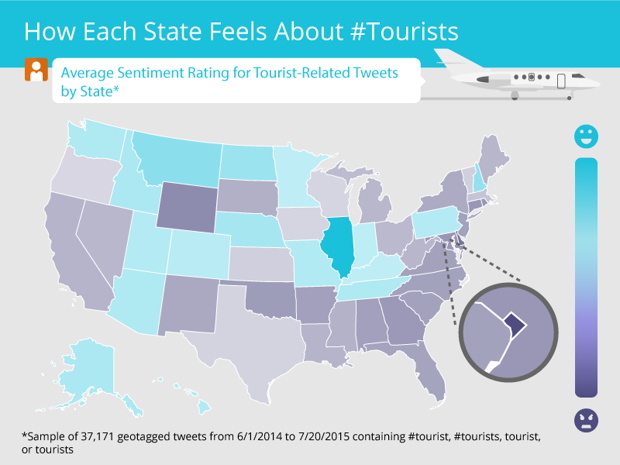
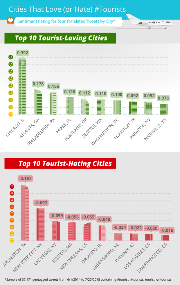
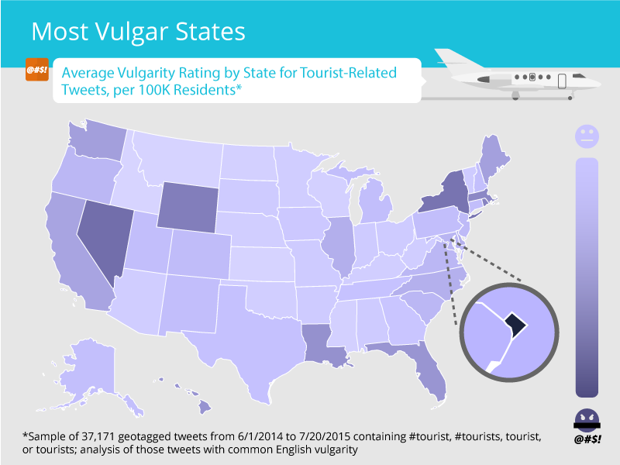
New York is notoriously hostile to tourists, but it’s got nothing on Arlington, Texas. That’s according to a new study conducted by private air charter company Stratos Jets, which analyzed thousands of tourist-related tweets from across the country.
The company used an algorithm to assess the positive or negative sentiment in geotagged tweets featuring the word “tourist,” then used those scores to rank the hospitality of different cities and regions. Below are a few of the sampled tweets:
Why do tourists go to the top of tall buildings and then put money in telescopes so they can see things on the ground in close-up?
The results largely accord with regional stereotypes. The Midwest appears to be the friendliest, the Northeast the nastiest, and the West Coast—where gorp-eating hippies presumably cancel out Beverly Hills snobs—comes off roughly neutral. But the South is surprisingly inhospitable to tourists, with negative sentiment scores comparable to the Northeast’s.
The study also ranked cities on their “love” or “hate” for tourists, with Chicago emerging as the most welcoming by far. On the other hand, fanny-packed visitors should probably prepare for an icy reception in Arlington, New York, Las Vegas, Boston, and New Orleans.
Of course, tweets are an imperfect measure of a city’s openness to tourism. The World Economic Forum, in its Travel and Tourism Competitiveness Report, ranks a nation’s hospitality by the political and economic infrastructure it provides for the tourism industry. The 2013 report asked citizens to rate how “welcoming” their country was to foreign visitors, but this variable didn’t appear in the latest edition.
Still, the raw vitriol spewed by a city’s active social media users might be a good predictor of the number of eye rolls, foot taps, and throat clearings you’re likely to elicit by fumbling for a transit pass or blocking the sidewalk in a new city. Another data set from the Stratos Jets study reveals where you’re likely to encounter the most vulgar tourist haters, based on an analysis of expletive-laden tweets:
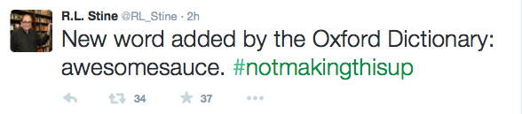
Manspreading—the act of occupying a gratuitous amount of precious subway real estate by sprawling one’s legs—is an etiquette faux pas. But the term has gotten the seal of the approval from the Oxford English Dictionary.
The Guardian reported that the slang would be confined to the OED’s digital edition for the time being. The selection process works like this:
New words, senses, and phrases are added to oxforddictionaries.com once editors have gathered enough independent evidence to be confident they have widespread currency in English, but they do not gain entry into the Oxford English Dictionary unless continued historical use can be shown.
Plenty of other dubious words—including “hangry,” “NBD,” and everyone’s favorite time, “wine o’clock”—also made the cut. R.L. Stein, fabricator of childhood nightmares, was surprised by some of the choices:
Does this signal the death knell of the English language? Fiona McPherson, senior editor of the OED, doesn’t think so. She told BBC News:
“There's always been new slang words. I just think we are more aware of them because of the ways in which we consume and live our lives now.”
She explained that the slang words embodied a “creative” use of the written word. Just wait until the poop emoji gets its own entry.
The creation of fan-made transformative works about beloved franchises is hardly a new trend, but many creators still aren’t aware of how “fair use” rights can work in their favor. That’s why the Harry Potter Alliance has begun their “Fan Works Are Fair Use” campaign, to celebrate fan-made works and create a community of creators who know their rights and want to protect them.
You can participate in the awareness campaign to legitimize the importance of fan-made work by participating in the #FanWorksTaughtMe hashtag on Twitter, as well as joining the “Fan Works Are Fair Use” community via their website.
Next time you’re searching programming terms on Google, Google may just offer you a job. That is, if you go down their rabbit hole and prove that you know what you’re doing.
Max Rosett tells The Hustle the story of how he was invited to interview at Google through unconventional (and kinda fun, albeit kinda creepy) means. He was on Google one day searching terms like “python lambda function list comprehension” when the search screen opened up to reveal a question:
Being “up for a challenge” paid off! Rosett clicked the blue button (it’s like, the opposite of the Blue Pill in The Matrix), which led him to a site called foo.bar (and no, you can’t just go to the site and log in with your Google account. I tried. You have to have been there before) that gave him all sorts of problems to solve. Those successfully solved problems led to an email from a recruiter, followed by a phone call, followed by an in-person interview, followed by a job offer!
You can read the full story over at The Hustle. And next time you’re searching programming terms on Google, pay close attention. they might just reach out to you from the other side of the Matrix.
Need a lesson in gratitude? Watch how this three-year-old boy reacts to receiving an avocado as a gift in this short video. It's probably the most adorable thing you'll see all day.
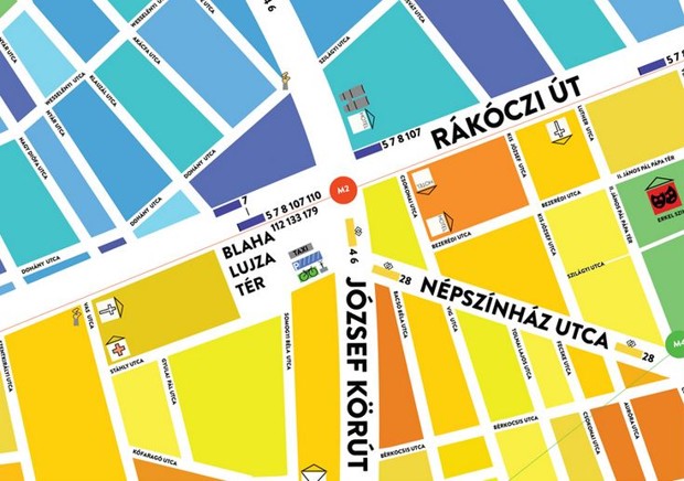
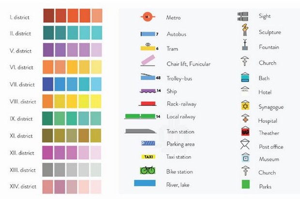
For the urban explorer with stress issues comes the Egg Map, a squishy ball you squeeze the heck out of to reveal roads, districts, and destinations.
The blobby oddity is a concept from Dénes Sátor, who appears to have designed only one model for his native Budapest. Still, if you ever find yourself lost in that charming city, the Egg Map is the clear way to go. It doesn’t require irksome folding like a paper map, and because its inert, rubberized body cannot connect to the Internet, hunting for wi-fi is a non-issue. Simply crush the ball to enlarge different parts of town, and plot a route while people stare at you for fondling what could be a freaky alien artifact.
Sátor plugs the orb’s assets on his Behance page (minor spelling issues corrected):
Haven’t we all lost our nerves at least once before by folding an oversized map during a sightseeing tour or when we went on a trek?…
Well, if you haven’t mastered your orientation skills and you fear that your precious smartphone will end up with a crack on its display on the ground, egg map’s the perfect gadget for you. It fits in your hand or your pocket and has manual zooming—just by squeezing it, you’ll get more details about the place than bumbling with a printed version of your information source.
Drop it, step on it, throw it against the wall—it’s simply indestructible thanks to its incredible flexibility. As it’s filled with 100% oxygen, you don’t have to worry about it making your bag heavier, either. To make it better, it’s made of water-proof material so you can use it even in unfriendly weather conditions like rain, wind, mud, or snow.
Backing the theory this thing is meant for tightly wound people, Sátor adds on Designboom it also can be “thrown at a wall or angry locals.” Just make sure you have another map, lest you wind up pursued down a dead-end alley by a furious man wanting to “return” the Egg down your throat.
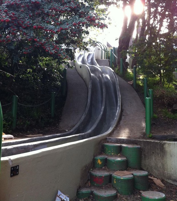
So it makes sense that, ensconced in out-of-the-way vales, the city has a handful of playground slides popular with adults—stretching for considerable distances and steep enough to air-blast faces into fleshy prunes.
The most unusual ones are found at Seward Mini Park, a halcyon nook built in the 1970s after residents sat in protest against a developer’s bulldozers. The curvy, side-by-side butt-ramps were designed by a 14-year-old boy, according to city’s parks-and-rec department:
Two long, steep concrete slides are the main attraction at this hidden gem. They’re not for tiny tots, nor for the faint of heart! If you decide to slide, please remember that the park closes at sunset and adults must be accompanied by children. Bring a piece of cardboard and wear sturdy pants!
(The cardboard, for the uninitiated, hastens the downward descent and prevents clothing from tearing like wet napkins.)
People who have journeyed to the slides sound joyous, calling them “possibly the most fun single attraction in San Fran” and giving tips like finding cardboard in recycling bins and sprinkling sand on the concrete to go faster. However, the neighbors aren’t always receptive to rowdy, six-foot-tall thrill-seekers. Here’s one person’s harrowing experience in 2014:
The nearby residents are nasty as can be. We had slid down twice, yelping and giggling with glee when one of the women arrived and started screaming like a banshee at us. She told us it was meant for children only and NOT for adults and that we were being inconsiderate and horrible people for enjoying this public space. We apologized and promised to keep it down, but this wasn't enough for this woman, she continued like a nagging fishwife….
Anyway my advice is to either keep it down, or otherwise be prepared to be yelled at or get into a fight with the witches—take someone who is good at arguing!
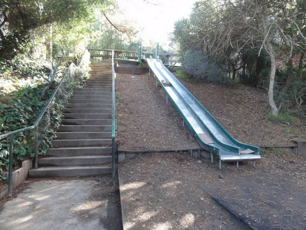
The second pair of slides are located southeast in Bernal Heights, a neighborhood so ferociously hilly it’s raced by illegal soapbox-derby drivers. They’re made of metal and have a dip at the top for an extra speed boost.
One person recommends sitting on a burlap sack to get the wind whistling through your hair. And of course, always be on the look-out for slide-running dogs:
If you happen to be a woman interested in taking Addyi, the first FDA-approved drug intended to treat low libido in women, your doctor will first tell you this: You absolutely cannot drink — at all — as long as you’re taking the drug, because alcohol has been shown to exacerbate...More »
April 14-17 event in Florida joins Star Wars-themed race at Disneyland Resort and features new Kessel Run Challenge and Dark Side Challenge
LAKE BUENA VISTA, FL (Aug. 25, 2015) – runDisney is summoning the Force today to announce another Star Wars-inspired intergalactic journey, this time to the dark side.
The “Star Wars Half Marathon – the Dark Side” enters the galaxy April 14-17, 2016, at Walt Disney World Resort in Florida and pays homage to the dark side forces of the Star Wars universe. This new race follows the debut of the popular Star Wars-themed race at Disneyland Resort, which will return in January as the “Star Wars Half Marathon – the Light Side”.
“Ever since we launched the Star Wars race at Disneyland Resort, runners have been clamoring for more, so we’re thrilled to bring the Star Wars franchise together with the runDisney brand to Walt Disney World Resort,’’ said Maribeth Bisienere, senior vice president of Disney Sports Enterprises. “If the inaugural Star Wars race at Disneyland Resort is any indication, this new running adventure to the dark side is sure to be the out-of-this-world experience that runners have come to expect at runDisney events.’’
The new Star Wars race at Walt Disney World Resort will be a journey of personal achievement all its own, involving kids’ races, a 5K and a 10K in addition to the half marathon, plus a variety of Star Wars experiences, medals, events and merchandise inspired by a galaxy far, far away. Among its many features will be a unique 13.1-mile course that propels runners through Epcot, Disney’s Animal Kingdom and Disney’s Hollywood Studios and finishes at ESPN Wide World of Sports Complex. There will also be a Star Wars Dark Side Challenge — running the 10K and the half marathon on consecutive days – that offers each finisher a Death Star-themed medal.
Jedi and Sith Lords who dare to experience both Star Wars races will have the chance to take on the Kessel Run Challenge — completing the Star Wars half marathon missions on both coasts. Kessel Run Challenge runners can earn a commemorative “Coast to Coast” medal inspired by the Millennium Falcon starship. Race registration opens Sept. 22 at www.runDisney.com.
The addition of this second Star Wars race continues the recent wave of significant growth and popularity of runDisney events domestically and internationally. This is the second new runDisney race announced for 2016, joining the Disneyland Paris Half Marathon Weekend (Sept. 23-25 at Disneyland Paris), and the fourth addition to the runDisney series in the last two years (Star Wars Half Marathon at Disneyland Jan. 2015 and Avengers Super Heroes Half Marathon Weekend Nov. 2014).
Each year more than 200,000 runners sign up for runDisney events, which often sell out in record time.
“We are committed to creating extraordinary experiences and events that appeal to runners of all ages and attract even more fans of our various brands and franchises to the sport of running, creating opportunities for them to live a healthier and more active lifestyle,’’ said Bisienere.


