Shared posts

20 Jun 04:44

Wot I Think: Soundodger

by Nathan Grayson
Jbantha

I'm actually sharing this just as a reminder to self to download it later.

If I had been in charge of naming Soundodger, it would probably be called “Don’t Fuck Up Don’t Fuck Up Don’t Fuck Up: The Game.” But I guess that’s not entirely accurate, because your goal in this delightful (and free) magical rainbow rhythm triangle avalanche is to avoiding fucking up the soundtrack, not the game. Each song (from folks like Fez collaborator Disasterpeace, I might add) slings singing daggers of pure sound in your general direction, and you have to skirt each pattern’s edges just so to avoid them. Fail, and the song gets broken into a billion screaming pieces by a hideous record scratch and a sudden, music-less void. It’s a brief, largely inconsequential, er, consequence, but the soundtrack is so good and the flow of each pattern so satisfying that it’s physically painful to ruin them.

But once you get into the zone, well, let’s put it this way: I just got done playing for waaaay too long, and each time I blink, I see triangles. Glance quickly in any direction? Triangles. You are triangles. I am triangles.

(more…)

20 Jun 04:43

Arctic Monkeys – Do I Wanna Know?

by Harm van Zon
Jbantha

Good music + Good Graphics: Everything I asked for.

Do I Wanna Know

Do I Wanna Know? Nice, clean and simple. New videoclip for Artic Monkeys by British wonderboy David Wilson.

Posted on Motionographer

03 Jun 17:33

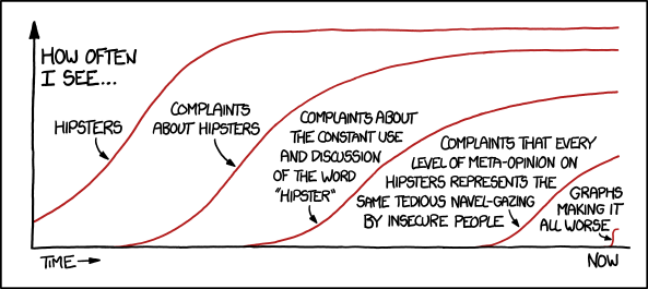
Hipsters

You may point out that this very retreat into ironic detachment while still clearly participating in the thing in question is the very definition of contemporary hipsterdom. But on the other hand, wait, you're in an empty room. Who are you talking to?
30 May 04:26

Canned Food Design in Japan

by Yoshihiko Mano

When you get home late or are just plain tired, what can you rely on? Ready-to-eat meals and preservatives like cup noodles. As life gets ever faster, so too does food get ever easier — there’s a wealth of tastes to be had just by opening up a sachet or packaging, and heating something up.

But if we’re talking preservatives, there’s one that boasts the longest history of them all: Cans. In Japan canned food goes back 140 years but except for certain perennials like canned tuna, its place is slowly being taken by retort pouches. After the 2011 Tohoku disaster, though, people have started looking again at canned food, which can be preserved for a long time and can offer all manner of tastes.

Before you open up another can of something, here’s an entrée: Canned food packaging design in Japan.

Design with a Sense of the Traditional

Just by virtue of having been around for a while, many cans conjure up a sense of tradition in their design. But perhaps because the makers are hoping to export one day, there’s also a lot of English in the label design, creating a curious hybrid of the Japanese and the western.

Nihonbashizuke

canned-food-design-in-japan01canned-food-design-in-japan02

Even Japanese people may not be too familiar with this product — it’s fukujinzuke, a type of pickle that goes with curry. It first went on sale in 1913 and the label design does a good job of conveying this. The background is the eponymous Tokyo bridge, Nihonbashi.

Akebono Salmon canned-food-design-in-japan03 It is said that canned salmon came about when canned food started to be fully produced in Japan. Akebono Salmon was the first canned salmon, and its design is classic canned food rather than specifically “Japanese”. If you’re wondering why there is “pink” written on the belly of the fish, it’s because it’s a pink salmon.

Labels with Photos

They say that can label design is not something you change a lot. No doubt as a result of using a design that was popular at the time it was first released, canned food seems today somehow to have this nostalgic atmosphere. Especially when the design features photos there is this faded feel, like the images you might have found on the pages of an old recipe book — not so much something that makes you say “Looks delicious!” as one suggesting the food inside has a unique and intriguing taste.

Hagoromo Sea Chicken canned-food-design-in-japan04 When the Japanese think of canned food, this is what they think of. The Japanese product name, “sea chicken” (tuna), has permeated into popular culture so much that it’s become a generic term. The name is said to derive from how the mild taste is like chicken breast.

Hamanako Unagi Kabayaki canned-food-design-in-japan05 While kabayaki-style grilled unagi (eel) may well be a traditional Japanese food, the design for this can is rather pop. Perhaps that was how people thought kabayaki was like when it first went on sale?

Sunyo White Peaches canned-food-design-in-japan06 What’s so good about this photo is how it really shows you what’s inside down to a tee. This is “courteous” design for consumers who won’t be let down by any disparity between the label photo and the actual contents of the can.

SSK White Peaches canned-food-design-in-japan07 Peaches aren’t fruit that say “Japan”. But while they might not have a long history in the country, this can nonetheless gives an impression of something tradition, with its washi Japanese paper-style label, an image of a peach flower that looks like cherry blossom or Japanese plum (ume), topped off by the Kanji font. But in spite of the Japanese trimmings, for some reason “White Peaches” has to be written in English in the middle. What’s that all about?!

Sembikiya Fruit Cocktail canned-food-design-in-japan08 This can from venerable fruit store Sembikiya has a real Eighties feel.

Aohata Pork and Beans canned-food-design-in-japan09 Pork and beans is not a can food that Japanese people know well. We are guessing that “BEANS” is emphasized because there’s more of it in the can than the meat. The design is modern, with photography and clean typography.

Seijo Ishii Sweetcorn canned-food-design-in-japan10 With its boast that it’s “made in USA” in large letters and the photo of the corn sprouting in the wild, the design here feels really American.

Design with Illustrations

Can design frequently uses illustrations, though many seem to have been taken from images used in museum displays. Others seem like the kind of illustrations used to demonstrate ingredients in cooking.

Hokkaido Nemuro Boiled Baby Clam canned-food-design-in-japan11 When you try to depict something accurately and to just the right proportions, you can at times end up with something slightly grotesque. This can has a western design feel but, perhaps due to how the English lettering is partly hidden behind the picture, it also radiates this rather peculiar, ambiguous aura where you’re not sure what country it comes from.

Seijo Ishii Asparagus White canned-food-design-in-japan12 It might well say it’s grown in Hokkaido but in design terms this just shouts “import”. It’s perhaps also connected to how in Japan it’s rare to eat canned vegetables.

Nozaki Corned Beef canned-food-design-in-japan13 This classic corned beef product by Nozaki has a great logo in a cursive script. The retro beef illustration hasn’t changed since the cans first went on sale in 1948.

Pankan (Anpan) canned-food-design-in-japan14 When it comes to cans, you want something with a gentle taste. Especially if it’s something you will eat in an emergency, that very gentleness will help you relax for a moment. And the name here, Pankan (“bread can”), is just brilliant.

Typographical Design

Sometimes words can communicate the feel of a product better than photos or illustrations. And especially with Japanese Kanji characters, the type itself is like a picture.

Benizake Nakabone Mizu-ni (Boiled Sockeye Salmon Bone) canned-food-design-in-japan15 This one is REALLY simple, just the name of the product. So simple it doesn’t even feel designed; everything unnecessary has been cut out, which actually makes you trust in the product more.

Tai-miso (Sea Bream in Miso) canned-food-design-in-japan16 This is a condiment made from sweet miso with sea bream. Having a condiment in a can is rare in itself, but this can also has vibrant orange coloring, rather solemn lettering, and a cute fish picture on the top — a rather curious mixture of the luxury with the cheap.

Saba miso-ni (Mackerel Boiled in Miso) canned-food-design-in-japan17 Here the character for saba (mackerel) is written boldly on the front of the can. The food may well be a humble dish that anyone has eaten at some point, but with the gold coloring it takes on a rather high-class look.

Saba mizuni (Boiled Mackerel) canned-food-design-in-japan18 This one is also embossed with a large character for saba. We love the rich elements here: the Kanji, the washi Japanese paper-style label, and the gold, black and red coloring all combine to create a real wa (Japanese) look.

Tsubutsubu Yude Azuki canned-food-design-in-japan19 This can of sweet azuki beans just feels so rural and “handmade”. Check out the typography, like it’s been dashed off on the label with a calligraphy brush.

Cans with Characters

It’s no surprise that Japan, which has a well-known mania for mascots, also uses characters in canned food design, although actually there aren’t so many as you might think. Saying that, recently there have been some designs on the shelves featuring famous ones.

hokka Canned Bread canned-food-design-in-japan20 You know you’ve got a winner when you use Moomin characters in the design. The copy in the bubble even claims this is “the preservative food of Moominvalley”! This is so cute you will want to use the can as a penholder after you’ve eaten the snacks inside.

Every can we’ve introduced in this round-up can be purchased from a regular supermarket in Japan. So even if the world ends after the zombie invasion or some other calamity, at least we can be sure of a fun and varied diet.

22 May 07:00

Protect your children!

by bearskinrug

Protect-your-children

01 May 00:16

Train Loop

Train Loop

Could a high-speed train run through a vertical loop, like a rollercoaster, with the passengers staying comfortable?

—Gero Walter

No.

Since this is kind of a disappointing answer, I tried relaxing the requirements a little.

Could a high-speed train run through a vertical loop, like a rollercoaster, with the passengers staying comfortable surviving?

Still no.

Could a modified and reinforced high-speed train with a jet engine on top run through a vertical loop, like a rollercoaster, with the passengers staying comfortable surviving?

Maybe.

The Norwegian aluminium and energy company Norsk Hydro ran a pro-education ad in which a bunch of kids build a giant roller-coaster loop on a train track as a prank. This is, of course, unrealistic, but not just for the obvious reasons. There are some problems with the whole idea of sending high-speed trains through loops.

The first issue is geometry. The biggest vertical loop which a train could conceivably go around has a radius of about 200 meters. If it’s any bigger than that, even the fastest trains will fail to complete the loop.

Unfortunately, a 200 meter loop is much too tight. Most high-speed trains are limited to vertical curves with radii no shorter than 20 kilometers.

The reason for those limits isn't that trains aren't bendy enough. It's how fast they're going.

The spec sheet for the Bombardier ZEFIRO, for example, says it can handle a pretty tight vertical curve radius—just 900 meters. At the train’s top speed, that curve would create about two gees of acceleration. This might be survivable (for the passengers, at least, if not the train), but it would certainly not be comfortable.

Yet a 900 meter radius loop is still too big. Even with the engine at full power, the train wouldn’t even be able to get a quarter of the way around the loop before sliding back down.

The CGI train in the Norwegian video is an Di 4, which is shown moving about twice as fast as it can actually go. Based on its speed and number of cars, the loop appears to have a radius of about 70 meters, which is part of why it’s shown going so fast—the actual Di 4 would be just a little too slow, and would fall off the track at the top. The digital one, however, makes it around the loop in about five seconds, no problem.

But the tight loop means the passengers and train are experiencing between 9 and 15 gees. This is at the limit of what fighter pilots can handle in pressure suits. In addition to killing everyone on board, it would certainly destroy the train, to say nothing of the track. 70 meters is much too tight.

Clearly, we need a larger loop. 900 meters would be great, but our trains aren’t fast enough for that.

But maybe we could make the train go faster ...

Hmm.

Believe it or not, this has been tried before—a number of countries have built jet-engine-powered trains. Sadly, they never took off. Fortunately, they never took off.

A 747 engine mounted atop a bullet train would probably add about 35% to its speed. Is that enough to do a 900-meter loop?

Nope.

Ok, putting the jet engine on top didn’t work. Maybe we should try something different.

... why did we think that would work? Forget that idea.

Clearly, we need some combination of a fast train and a medium-sized loop. The sweet spot for loop size and shape is probably something like this:

Of course, given the height, we’d probably have to build it into a small mountain:

The shape of the loop, which is common in roller coasters, would spread out the g-forces more evenly, resulting in a max of only a few gees—totally survivable!

Of course, the construction costs would be astronomical, and it goes without saying that no group of kids could pull it off alone without the resources of a major government.

To any Norwegian kids reading this who were hoping to build a train loop, don't despair—there may still be a way to make this happen.

The US Vice President, Joe Biden, served in the US Senate for 36 years. In all that time, he never moved to Washington, DC. Instead, every night, he took the train home to Delaware to see his family. This is very touching, but after the first few years, I'm sure the commute got a little dull.

So, if you’re looking for a high-level backer to help you make someone’s train ride a little more exciting, you might just try talking to Joe.

30 Apr 23:27

Payback: Game Dev Tycoon Fights Piracy With Piracy

by Nathan Grayson

We may have reached a point where many developers are attempting to coexist semi-peacefully with the big, bad, money-chomping wolf that is piracy, but that certainly doesn’t make the situation ideal. Pirates are still sauntering away with sloshing tubs of developers’ blood, sweat, and tears, so I think a little (or more than a little) spite is only fair. In the past, that’s meant theft-thwarting failsafes like Batman: Arkham Asylum’s flight-impaired hero and Serious Sam 3′s immortal pink scorpion, but Greenheart’s recently released Game Dev Tycoon might just be the best yet. In short, the pirated version makes your games crash and burn once they’ve hit the market because of – wait for it – piracy.

(more…)

25 Apr 20:35

Wot I Think: Kairo

by John Walker

Richard Perrin’s atmospheric puzzle explorer Kairo reaches Steam tomorrow, so now seemed a good moment to give it a proper Wot I Think. So, er, here’s wot I think:

(more…)

24 Apr 22:05

Magic: Wingtip Vortices In Fog Created By Landing Plane

airplane-wing-spirals.jpg This is a short video of a Swiss Airbus A340 landing at the Zurich airport in heavy fog. Which, as far as fog goes, is probably airplane pilots' least favorite kind. Me? It's my favorite because it makes sneaking around the neighborhood playing ninja assassin easier.
Thanks to the lights illuminating the fog, you can see clearly the downwash, ground effect, and the wingtip vorticies in action.
I have no idea what that meant, but I will let you in on a little secret: you know what the black box in airplanes is really for? To hold the magician that makes the airplane fly captive. Haha, the truth is out, FAA! You know how they say no electronics during takeoff? That's because it screws with the anti-gravity field he's generating in there. This is all fact by the way, it's just kept secret to keep ticket prices high. Hit the jump for the video.
24 Apr 22:04

How To Make Sure You Can Show Work In Your Portfolio

by Bran Dougherty-Johnson


Can’t say Title (confidential) by Sebas & Clim

You’re in the midst of production — the style frames you designed were approved, the work-in-progress animations you’ve sent along to the client were received well, and you’re rapidly approaching the deadline. You’re really happy with how the job looks, and everything is working smoothly. The client is happy, too. This will be a great piece for your portfolio!

But what happens when your client doesn’t want you to use the finished work in your portfolio?

The Problem:

Asking on Twitter, I got a ton of responses from artists who, through one set of circumstances or another, did great work they were proud of but were asked (either by the studio they worked with or by the end client) not to post it — and not always politely! Lots of those issues are unresolved, with the artists just backing down and not wanting to get into a fight with the studios and clients who hire them. Lots of those jobs will never see the light of day, since the clients who own them don’t want to put them out. But if you can retain the copyright to the work, you may be able to salvage something out of it, or re-use your hard work on your own project.

Too often, when you are on staff or freelancing, eager to do the work, you rush into a project without reading all the details of the contract. This is where artists get burned. It’s always a good idea to read your contracts and deal memos through thoroughly, speak up to the client or studio and make sure to declare your desire to show off your work as early in the process as possible. Amend any part of the contract you want to change before any work on the job is done.

Many contracts have a work-for-hire clause that automatically assigns the copyright of any work they create to the employer. This can be negotiated — if you wish to challenge it — but it’s fairly standard for most contracts. This also means that you may not have the ability to show any of you work on your own site or post about it online. And, of course, many studios have adopted specific policies on how employees can use the work they do while at a company on their reels and sites, which is why you see all those production company bugs on artist’s montages.

What to Do

Daniel Savage, who is one designer that got burned after working for six weeks on a project that he now can’t show said, “My advice, besides the obvious of READING a contract, is if you see something like that on a contract, cross it off and initial. IF they say no and you need the money, demand a huge pay increase. Otherwise don’t work with them, there is plenty of work to go around not to put up with that crap.”

Sebas & Clim also dealt with the same problem recently. “The possibility of showing the project or not is always one of our first questions. The budget changes radically if something will have to be completely secret or not … 90% of our work came because someone saw our [previous] projects,” they said.

Since their project, whose title remains confidential, went well, and since they have a good relationship with the client, they asked if they could use it in their portfolio without any reference to the brand. The client agreed, and they used the piece without voiceover and logos, resulting in an impressive animation showpiece for themselves.

Many graphic designers and illustrators also deal with these issues, but their industry works a bit differently than ours. They will often retain the copyright of a piece of artwork, but specifically license it out to clients for specific uses. Much of the advice and standards in the Graphic Artists Guild Handbook deal specifically with how to negotiate these type of contracts. And the AIGA has a section in the explanation of its Standard Form of Agreement For Design Services that notes:

You’ll also want to be able to show and explain portions of the completed project to other companies when you are pitching new business. Sometimes clients who are in highly competitive industries have concerns about this. They may ask for the right to review and approve such promotional activity on a case-by-case basis. If you have licensed the final art to the client rather than making a full assignment of rights, and the work does not fall within the category of work-for-hire (defined below), you are legally entitled to show the work in your portfolio. As a professional courtesy, however, you will want to be sensitive to client concerns.

On a recent freelance job I worked on, I managed to solve this whole problem easily and straightforwardly, by simply by asking the producer to insert one sentence into the contract. It read, “Company agrees that [NAME] may show the artwork created by him for Company on personal marketing reels and on his web site at [URL] only.” So that’s my advice. Get it in writing.

More on this topic:
Jessica Hische – The Dark Art of Pricing
Graphic Artist Guild – Can I Show My Work in My Portfolio When I Don’t Own the Rights Anymore?
AIGA – Standard Form of Agreement For Design Services
Docracy – The Collective Legal Guide For Designers (Contract Samples)
Motionographer – Credit Where Credit Is Due

Posted on Motionographer

20 Apr 10:43

The state of typography

by erik

Not sure whether I agree with all the facts or the figures in this chart, but it still makes interesting reading:

08 Apr 23:16

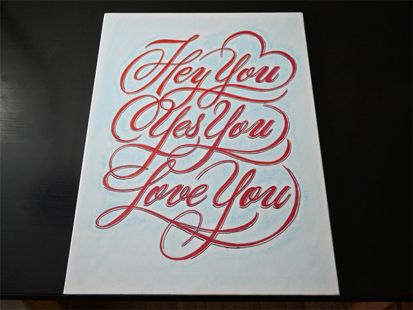
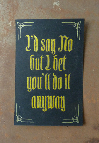
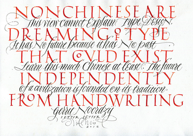
CUSTOM LETTERS, BEST OF 2012, DAY THREE

by Beejay


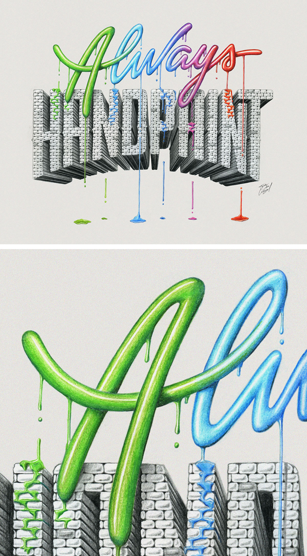
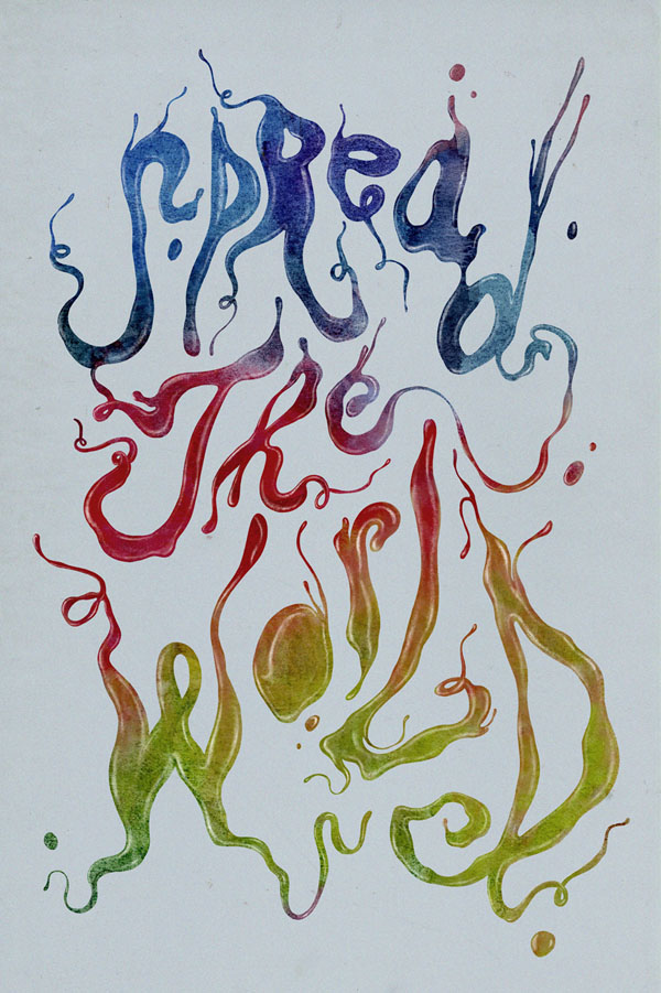
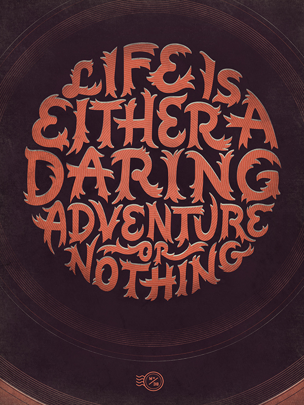
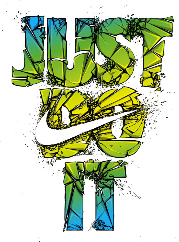
THE YEAR IN CUSTOM LETTERS, 2012.

DAY 3/3

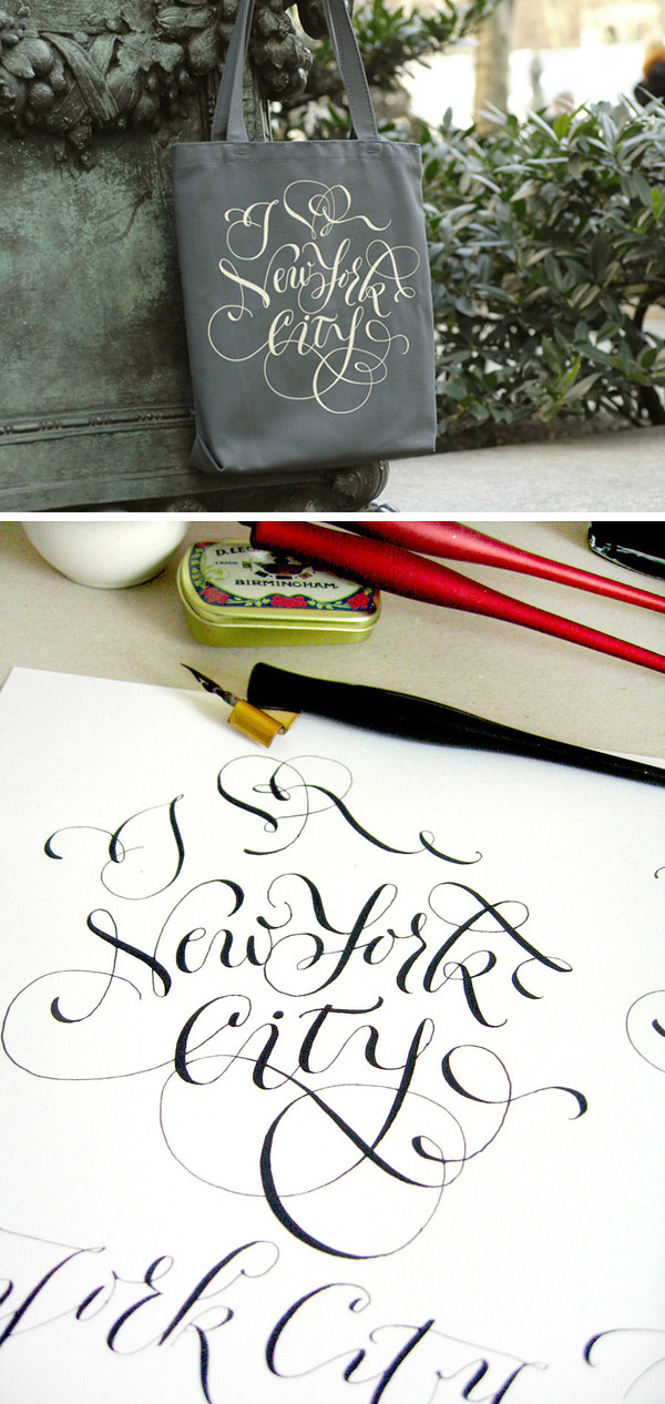
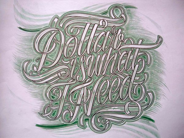
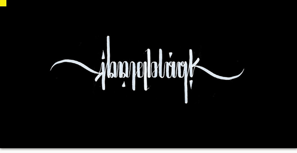
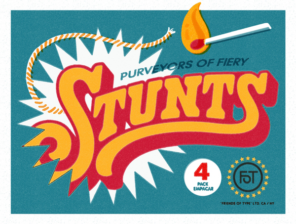
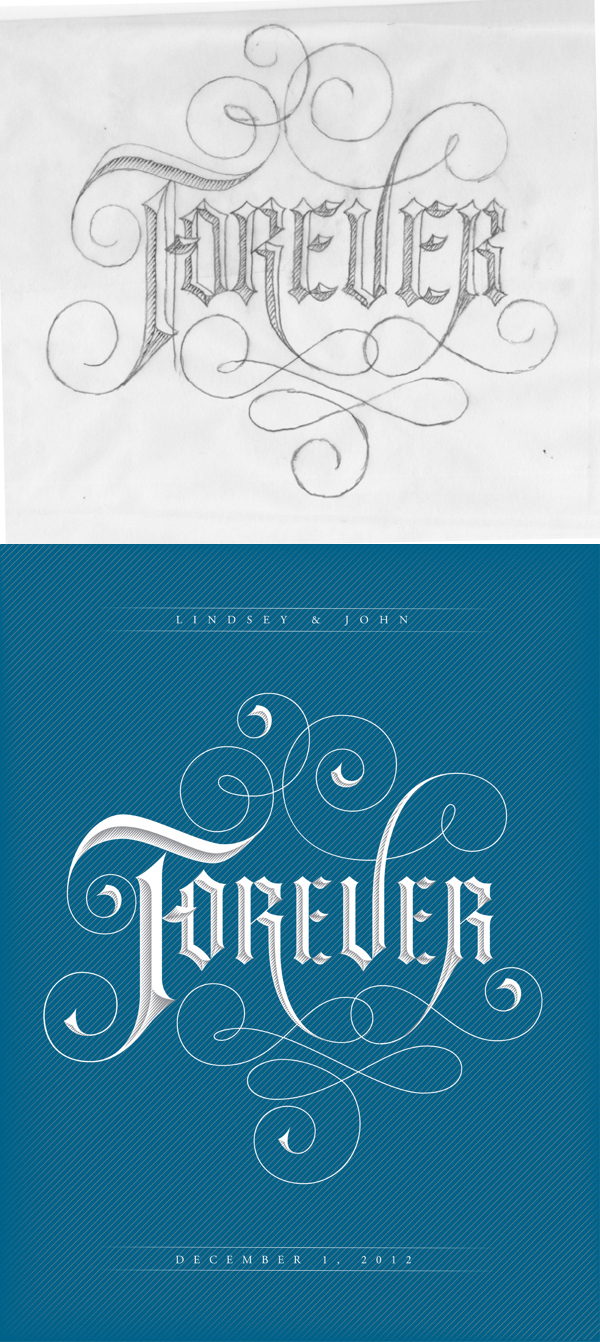
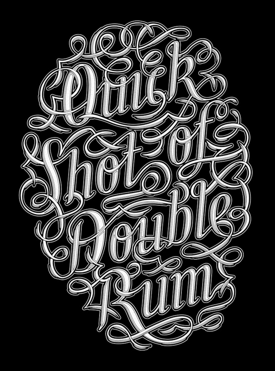
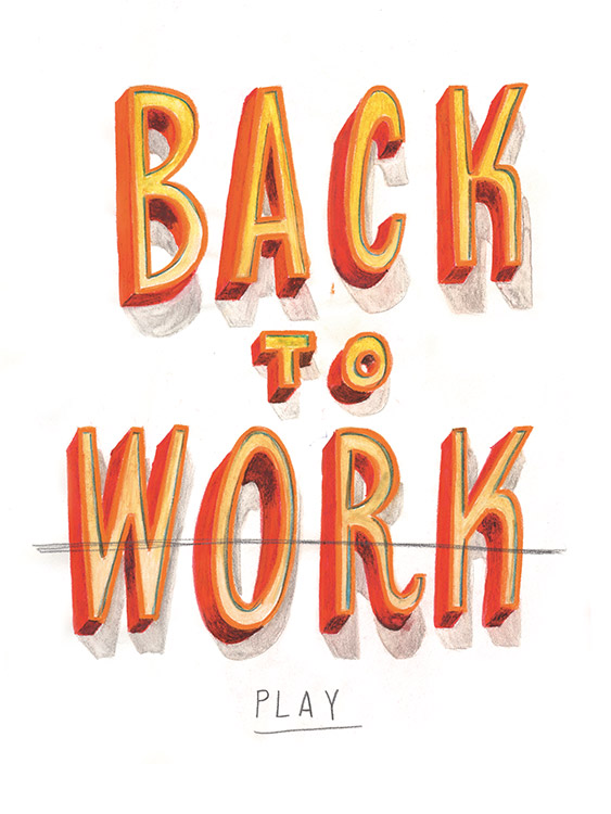
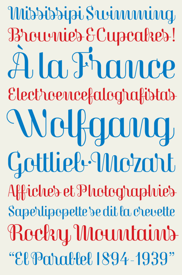
Appreciation for the people making Custom Letters. Inspiration for everyone else. A whole lot of great work.

Last day of our Best of 2012 featuring 500+ more images. I’m sure I’ve missed some people, so please email me with omissions and anything else at: lettercult /AT/ gmail.com. I will merge all three days into one post tomorrow.

HERE’S DAY 3


WILL MILLER

MARCOS CALAMATO


CAETANO CALOMINO

FELIX HORNOIU

NATE WILLIAMS

TERESA WOZNIAK


SAWDUST STUDIO

HYLTON WARBURTON

ERIK MARINOVICH

TOBIAS D. ALBERT

MARINA MARJINA

MATEUSZ WITCZAK

GREG PAPAGRIGORIOU

ERIK MARINOVICH

RYAN HAMRICK

KEVIN TONG

DIRTY BANDITS

SHOE MEULMAN

ORIOL MIRÓ

THEOSONE

JAY ROEDER

BORIS PELCER


CHARLES BORGES DE OLIVEIRA


07 Apr 22:42

Trace Heavens

by Bronwyn Marshall
Jbantha

ACV MIII 2013

Trace Heavens by James Nizam, is an installation that plays with light in its natural form, through manipulation of the building it exists through. Primarily, his work is based on manipulating the form of homes and buildings slated for demolition with the intention to repurpose their inevitable future, through capturing a moment. The resulting works are photographic. Trace Heavens was originally composed in 2011, and exhibited in Vancouver in 2012.

Nizam, originally from England, now living in Canada, is represented in galleries across Canada and Switzerland. His work is a combined portfolio of his own solo work, and collaborations with other artists, across these geographical platforms. His work can be found in a number of private collections across the United States, Europe and Canada also.

Trace Heavens, as well as Nizam’s other work, centres around the idea of the rooms becoming backdrops for the discarded contents and architectural debris that he accumulated and constructed into sculptures of elegant complexity. The emphasis on re-inventing and giving meaning to an otherwise discarded object, through manipulation of its form, is at the heart of this inquiry of Nizam’s understanding of the photograph as a trace; a documentary image that comes to act as a ruin or a relic, a fragment or a memory by virtue of its engagement with an altered, and absent site.

Nizam’s work is a play on architecture, its devalue as debris and a reinvention through an aesthetic, caught on film. I appreciate this repurpose and the resulting trace/image; the giving of a life to something destined for departure is quite beautiful.

Trace-Heavens-James-Nizam-1 Trace-Heavens-James-Nizam-2 Trace-Heavens-James-Nizam-3 Trace-Heavens-James-Nizam-4 Trace-Heavens-James-Nizam-5 Trace-Heavens-James-Nizam-6 Trace-Heavens-James-Nizam-7 Trace-Heavens-James-Nizam-8 Trace-Heavens-James-Nizam-9 Trace-Heavens-James-Nizam-10 Trace-Heavens-James-Nizam-11

Trace Heavens is a post by Bronwyn Marshall on Minimalissimo.

06 Apr 05:06

CUSTOM LETTERS, BEST OF 2012, DAY TWO

by Beejay


THE YEAR IN CUSTOM LETTERS, 2012.

DAY 2/3

Appreciation for the people making Custom Letters. Inspiration for everyone else. A whole lot of great work.

Welcome to our fourth-annual snapshot of the Year in Custom Letters. We’ve separated it into three days.

Today, Day Two, features another batch of 550 images. The good news — there’s a Day Three, and it will be EDIT: *MONDAY*, with work coming from Erik Marinovich, Shoe Meulman, Luca Barcellona, and many more.

Feel free to email with questions, concerns, errors, omissions, broken links, etc: lettercult /AT/ gmail.com. If you submitted and haven’t seen your work yet, it’s coming on Saturday.

HERE’S DAY TWO


MAXWELL LORD


DAVID M. SMITH


KEN BARBER


GEMMA O’BRIEN


LAURA SERRA


DANA TANAMACHI


JESSICA HISCHE

MARIE ZIEGER

OLGA VASIK


LUKE RITCHIE


ARON JANCSO


BRYAN PATRICK TODD


CHRIS DeLORENZO


name


JOEL BIRCH


AARON CARÁMBULA


JON CONTINO


CORY SAY


DADO QUEIROZ


DAVID A. SMITH


DAVID McLEOD


JOEL FELIX


MARTINA FLOR

JEFF ROGERS


LAURA MESEGUER


LUKE LUCAS

MARCELO SCHULTZ

PETER SUNNA

RICHIE STEWART

TOM LANE


06 Apr 05:03

Socialist TV Typeface Videtur Finally Freed

by johno

In the 1980s, the German Democratic Republic’s state television broadcasting service commissioned Axel Bertram to develop a custom typeface. The result was “Videtur,” a remarkably independent serif design that was intended to define the on-screen graphics of East German television for years to come. But by the beginning of the 1990s, the GDR no longer existed. With it went its state broadcasting service – and Videtur, too. Another 20 years in the now reunified Germany would have to pass by before Andreas Frohloff could finally help bring a modernized FF Videtur to market.

Picture-1-2Videtur-Screen
Original Videtur onscreen

Whenever a particularly unique type design challenge arose in the eastern half of divided Germany, it wasn’t long before eyes began to fall on Axel Bertram. Already when it had come to the design of magazines and book covers, he had refused to be satisfied with the limited range of typefaces available in the socialist state. Unlike many of his colleagues, who simply copied western models, he drew new type and lettering commissions according to his own ideas:

“The typefaces that came from the west were often photographed; then their letters would be rearranged. I always drew everything myself, however. The results looked more original that way. All that practice made my letter-drawing skills better.”

The requirements for Videtur were very specific. In order to meet the medium’s needs, Axel Bertram initiated a broad series of experiments with the 625-line television screen’s display conditions. He summarizes his findings into three points:

1. Serif letterforms are easier to recognize than those in monolinear sans serif typefaces.
2. Compact serifs stabilize letterforms and improve the reading movement along a line of text.
3.An alternating stroke contrast leads to easier differentiation between letters.

During Videtur’s design phase, all three findings were kept in mind and refined with the most advanced technology available at the time. After the typeface had been precisely drawn in four different sizes, it was photographed with an electronic camera and projected onto the screen.

“The letters’ height was adapted to the number of lines on the television screen and were justified pixel by pixel with the Chyron font generator. The point size was practically determined by the number of lines available. I experimented with the serif-forms a lot; the result was something that I named the ‘balled knot’ at the time.”

Picture-3-original-a-sketch

Original ‘a’ sketch

Aside from electronic display technology, text for television graphics in the 1980s was often set with rub-down letters. In East Germany, these sheets were produced a by company named Typofix. Both of these typesetting methods (electronic on-screen typesetting and rub-down letters) were technologies that – at least in his GDR days – Axel Bertram only had access to during his work on the Videtur project.

Oldstyle-inspired letterforms, short ascenders and descenders, low stroke contrast and the “balled knots” form the basis of this extraordinary typeface’s design. In order to transfer these characteristics into the new millennium in a contemporary way, it was necessary for Axel Bertram to find a competent helping hand; someone with a particular attention to detail. He found the man he was looking for in Andreas Frohloff, a former student and now Head of the Type Department at FontFont. Or rather, Frohloff found him. Frohloff proved to be the impetus for redesigning Videtur in the first place, as Bertram had long considered a Videtur-revival to be out of the question. Frohloff managed to change Bertram’s mind through something of a “pirate” method:

“I told him that I’d really like to have an image of the old Videtur typeface. After he found one for me, I scanned it in and made a pretty raw digital version of my own. I changed the proportions a little bit, too. My results managed to convince him, and our collaboration really took off.”

Picture-4-5-original-screenshot
More original screenshots of Videtur

It was clear to both of them that, in the age of HD-TV and retina displays, Videtur couldn’t be re-digitized as is. Even the old serif-form would appear quaint in a high-resolution environment. The “balled knots” were gently and prudently modeled into a triangular form – more pointy, but still rounded. Adjustments were also made to the vertical proportions; shorter ascenders and descenders were adequate for old television graphics, but needed to be extended a bit for optimal comfort in today’s reading conditions. Of course, the two designers also revised the basic shapes of the letters – when returning to a typeface after such a long time, it is only natural to take advantage of the opportunity to incorporate lessons learned. More subtleties are possible today, as Andreas Frohloff explains with the example of one detail:

“We tempered the rather oblique diagonal stroke on the lowercase ‘e.’ In the original Videtur, the diagonal was so extreme because its angle could minimize flickering on the screens of the time – the so-called ‘St. Elmo’s fire’ on corners and edges appeared less frequently this way. Now the bar appears softer, and it fits into a contemporary text typeface better.”

Picture-6-7-the-new-e
Left: Original ‘e’ versus new ‘e’; right: Venezia by Axel Bertram

Although the letters were revised, particular attention was paid to keep the stroke contrast moderate but still noticeable – less than is usual in humanist typefaces – in order to retain the design’s original vigor.

Because of its television screen background, FF Videtur remains a technical typeface, but it does have recognizable humanist features in its blood. This isn’t surprising, as both of the typeface’s creators are calligraphers. Already in the design for an earlier custom typeface for the high-circulation weekly magazine NBI-Wochenzeitschrift (Neue Berliner Illustrierte, 1963), the influence of Eric Gill and Edward Johnston on Axel Bertram is quite recognizable. After so many years, his opinion on the humanist letterform remains unchanged:

“The highest development for typefaces, in terms of legibility, was reached during the Renaissance. It doesn’t get any better than that!”

Picture-9-Rabenau-Axel-Bertram-Andreas-Frohloff
Left: Rabenau by Axel Bertram & Andreas Frohloff; right: Lutezia by Axel Bertram
Picture-11-Salomo-Axel-Bertram
Salomo by Axel Bertram

In comparison with the typefaces from the last decade, FF Videtur stands out. Similarities are more likely to be found in printing types from the 1980s, such as Karl-Heinz Lange’s Minima, or ITC Weidemann, whose similarity stunned Axel Bertram’s former student Andreas Frohloff:

“We were talking about Videtur one day while I was in design school, and I happened to have an issue of Graphics magazine with me. ITC Weidemann was presented in that issue; although at the time, the typeface was still called ‘Biblica.’ I couldn’t believe the resemblance at first, but a closer inspection allowed us to breathe easy again. This was one of those famous coincidences: a similar task – good legibility, little space available – and at that time, one apparently had similar conceptions of design.”

At the same time, Videtur’s humanist approach also managed to help distinguish GDR-TV from competing West German television channels. During the 1980s, on-screen graphics from ‘that other side of the Wall’ were more often set with neoclassical-style typefaces.

Thanks to its 21st century revision, FF Videtur isn’t limited to the television screen or to just four point sizes. Numerous tests prove that it easily fits into any media. Today, FontFont typefaces are used in more environments than ever before – in print, on websites, with mobile devices, etc. – and Axel Bertram is thrilled to see how designers will use his modernized typeface:

“I work with the fonts myself. I love writing with them, and I’ve tried the typeface out in my own correspondence. The design is objective and has an attitude.”

Andreas Frohloff especially appreciates FF Videtur’s warmth: “Its objectivity, combined with its rather warm humanist forms, gives the typeface an impressive range of possibilities. I’m not surprised that it works well on-screen. It has a static quality that combines well with the dynamic of the moving image, even under adverse conditions.”

Picture-14-Videtur-Showing

FF Videtur is already the second collaboration between these two type designers. Rabenau, their neoclassical serif family, also had a long development process before it was finally published by Linotype in 2011. Axel Bertram and Andreas Frohloff each work with precision and share a common attention to detail, as Frohloff emphasizes:

“It’s nice when two designers can work on the same wavelength. I studied under Axel Bertram, but I don’t feel occupied by his opinions. In between our frequent meetings, we often came to similar conclusions in our work. Afterwards, we could constructively continue down the same path.”

With the release of FF Videtur, their cooperation hasn’t reached its end. Each of them has ideas as to how the never-before-designed italic for FF Videtur could look. While Axel Bertram isn’t even sure if an italic is necessary, Andreas Frohloff already has a vague concept for the extension:

“If it comes to that, the italic should have a dynamic form that would combine with the very objective-natured upright members of the family. I think that the contrast between these two styles would be charming.”

We’re sure he’ll find the right way to convince Axel Bertram this time, too!

Authors: Dan Reynolds and Christoph Koeberlin.


Sponsored by H&FJ.

Socialist TV Typeface Videtur Finally Freed

30 Mar 03:29

When “bad” architecture is “cute”

by William Andrews

Ken Ohyama is mad about “danchi”, the Japanese government housing complexes built en masse in the Fifties to help house the burgeoning population.

Danchi still exist, though they were overtaken by the (literal) rise of the “mansion” (condominium) in later years.

Ping Mag first met with Ken Ohyama in 2008, back when he was a real pioneer, essentially the only person interested in this kind of so-called “bad architecture” (yaba kei) and the charms of things we “do not see” in the landscape. He has published photography books, created exhibitions and events, and is a member of the Danchi-dan, a group of like-minded danchi cultural activists.

In 2008 he said that danchi were under-appreciated. Since then there has been a big “danchi boom” with music videos, films and more. He has also created a special one-off danchi exhibit with Nanoblock and even made a danchi iPhone cover.

when-bad-architecture-is-cute03

when-bad-architecture-is-cute04

Junction, danchi, and factory iPhone covers by Ken Ohyama

How was the response after Ping Mag first interviewed you?

I got messages on Flickr from some people in America and Europe. Everyone saw Japan’s danchi and then recalled their own country’s residential buildings. That was really interesting and I’m looking forward to what response I get next.

Your approach is quite different to a regular “art project”. It feels more like a database than straightforward photography or art. All the photos are taken from the front and you often focus on quirky architectural points.

It wasn’t that I was suggesting that people should live in these places. I just felt that it was really interesting how there were these buildings in the city. I was joking around. I think they are “funny” but then everyone came to take them very seriously. These days if you just say they are “funny” people will call you impudent.

Everyone is taking places like danchi more seriously now?

More people are changing the way they view danchi, so you can’t joke around anymore. It’s actually become harder to do my work!

Has the 2011 Tohoku earthquake changed people’s attitudes towards danchi? Are the residences being considered more as what previously called “infrastructure”?

What we saw through the earthquake was that danchi are actually quite sturdy. The quality of the concrete seems to be much better than the concrete used today. The attitude towards danchi has totally changed. People are saying, “Oh, danchi aren’t so bad, are they?” Right now we are in an economic slump, so rather than always building more and more new buildings, people have started to see that this kind of sturdy “infrastructure” can be used for a longer time – and isn’t it cute?

But smaller danchi are being torn down and replaced by other buildings. Do you think danchi are an endangered species?

I’ve asked UR [Urban Renaissance Agency, an organization which administers public housing] about this before. I think that at some point the four- and five-storey danchi will indeed go. But the tall ones will never go. For economic reasons they will be around for a long time.

This year there are several films being released in Japan set in danchi, including ‘Minna-san, sayonara’ (Goodbye Everyone) in January.

Old films usually portrayed danchi in a bad light but ‘Minna-san, sayonara’ is really neutral.

But is there a possibility of it all becoming too nostalgic about Showa-era Japan?

That’s a thorny issue. I hate nostalgia. My generation doesn’t need it. It should be more neutral, like satoyama [a type of traditional Japanese small-scale farming] and natural landscapes; it already existed when we were born and still does today.

Overseas there are many similar public housing projects to danchi, such as in America or Europe, or Asia. And yet they are different to Japan’s. In certain places, there is often a bad image associated with these places: They are seen as “Soviet” or “slums”.

Danchi are different to the “danchi” in America or Britain. It’s hard to translate danchi.

I really want to go to Poland or East Germany. The danchi in those kinds of [former] socialist states are close to Japanese danchi in terms of the form. In the messages I got [from overseas] before, the image of danchi was a darker one, a place where poor people live. Yet in the former Soviet Bloc countries it wasn’t simply for the poor, but for a working class, which is closer to Japan.

Yes, the word for danchi is really just “danchi”. Japanese government housing is also pretty unique in its look and reputation. Is that the appeal?

If you find a “good” limitation, it leads to good design. What seems cute to me is discovering good methods for solving problems [of space], a good restriction. Right now I am interested most of all in terrain. It’s the biggest restriction. But through technology we’ve become able to ignore restrictions. If you want to build a beautiful building, you can do it. Twenty years ago this wasn’t possible.

If you had to choose a danchi to “recommend”, which would it be?

That’s a tough one! There is a danchi that, well, it’s not that I “like” it but I would recommend it as one people should notice more — the Shirahige Danchi, a 1km-long danchi that stands alongside the Sumidagawa river. It’s a fire wall. They made a park by the Sumidagawa river as a place where people can take refuge if a big earthquake hit. This danchi then transforms, the shutters all coming down and turning the building into a fire wall. It even has water cannons too. Tokyo people don’t know these things exist. This fire wall is one of the answers for what danchi can do as infrastructure in land-strapped Tokyo. There should be more things like this.


View Larger Map

Another is Kawaramachi Danchi in Kawasaki. Its shape is just really interesting. It’s a reversed letter Y and was made by a famous architect.

when-bad-architecture-is-cute05

Kawaramachi Danchi in Kawasaki

But you’re not just interested in danchi, right? You have also for a long time photographed and done work promoting other forms of infrastructure and architecture, such as junctions, railway bridges and factories. You also conduct special tours of factories for other enthusiasts. Even your home is a renovated bread factory.

I do tours in places where there are lots of factories, Kitakyushu, Kawasaki and so on. I want to do things where people actually go to see places. A danchi is someone’s home so you can’t do a tour, but with factories, you can go and see it. With junctions, we hire a bus and sometimes do tours where you can look at it from underneath. With photography, it’s not that I want to show photographic artwork, rather than these kinds of places exist in Tokyo and Japan, but people aren’t looking. If you do look, it’s really interesting – I take photographs as a method for making people realize this. Being able to do tours is the really right way to achieve this goal.

when-bad-architecture-is-cute01

Factory photography by Ken Ohyama

when-bad-architecture-is-cute02

“Bad” infrastructure like junctions can be beautiful!

Do you have any future plans?

Next I’m doing a photography exhibition in Osaka. Also, now I want to make a book of all the places that people call “bad architecture” but I think are interesting. If we look at them we can see “real Japan”. It should be released this year. And there must be people around the world who think the same as me, so please contact me!

Thank you very much, Ohyama-san!

Ken Ohyama’s exhibition will be shown at 31th March – 20th April in Osaka in digmeout ART & DINER.

Learn more about Ken Ohyama’s work via his website.

Read Ping Mag’s first interview with Ken Ohyama from 2008.

30 Mar 03:29

Natsumi Hayashi makes every (floating) moment last forever

by Noriko Yamakoshi

Artist Natsumi Hayashi came to prominence after she started her ‘Today’s Levitation’ series on her Yowayowa Camera Woman Diary blog at the beginning of 2011.

Her new exhibition is currently running at Aoyama’s Spiral Garden in Tokyo. For this exhibition she visited Wacoal’s factory in Vietnam and shot new “levitating” photographs. If you’re only used to seeing her work online, you’ll be overwhelmed by the scale of the new work by Hayashi for this exhibition, which is nine meters wide and hangs in the sixteen-meter high atrium of Spiral Garden.

PingMag popped along to Aoyama to speak with the artist about her second solo exhibition and work.

natsumihayashi01 Today’s Levitation: Vietnam Wacoal Corp., Bien Hoa, Vietnam ©Natsumi Hayashi, Courtesy MEM

First of all, congratulations on a really great exhibition!

Thank you very much.

How did this current show come about?

 We could make it happen with the support of the brand une nana cool. Originally, the concept at the core of my work is “ichi-go ichi-e” [a Japanese cultural term that translates roughly as “once in a lifetime”] and up till now I’ve been making work that places importance on just moments and landscapes that I encounter only in my daily life, but this time I first of all considered how I could effectively reflect the chance to exhibit work in this venue. As you know, the parent company of une nana cool and Spiral is Wacoal, a women’s underwear manufacturer. I thought that “levitating” at the place where the people making the clothes would have the same kind of important meaning as the ichi-go ichi-e lighting for instance, that I encounter normally on the streets. After hearing a lot about the brand, I learnt that une nana cool’s products are made in a factory in Vietnam, and so I requested to go and make my photographs there.

Was there a special reason why you are presenting an artwork in such a big size this time?

Yes, of course. When I make the photographs I am sort of helped out by the place. After deciding on the place the way of jumping, the make-up and clothes are usually matched to it. So the photography place is also ichi-go ichi-e but then so is the exhibiting place. It’s like I’m repaying the place for the idea it gave me. When it was decided that I would hold my exhibition here and I saw this big atrium, I thought what kind of form was the most appropriate story for both the work and the space. Photography is flat so no matter how you display on a wall, it won’t fill the space. Thinking about this, I then naturally had the idea about size. If you make something this size, the space becomes interesting and beautiful. The production was handled by technicians from Epson who said that there was no precedent for photographs as big as this but they definitely wanted to do it to take advantage of the space. As a result, I was able to implement the exhibit just as I originally conceived it, and I’m really glad about that.

natsumihayashi02

It makes you really feel how big the space is, doesn’t it?

I think it makes the space seem bigger. Normally it is just a hallway but exhibiting these artworks here, it feels somehow like a cathedral. I was also particular about the light. Incandescent bulbs give off a strong orange, so I put in rather a blue filter, so the color of the sky is not canceled out. The ceiling is glass so during the day there is natural light, with the way you view the work differing as it gets darker as time goes by, and this has a certain flavor to it.

Just as with your previous work, the new exhibit really portrays the subject in a vivid way. You don’t retouch the photographs at all?

I do some minor adjustment like correcting the exposure or white balance, but I don’t do any special image processing after taking the photograph. Instead, I think hard at the preparation stage how I can use the things at the place to express what I want. The setting this time is the factory in Vietnam and it has only just been built, so the green paint on the floor is still fresh. The sunlight is also coming in through the window but actually a few days later blinds were installed. You can see some thin pink light. This is in fact sunlight being reflected from the bright red wall of the building next door. The photographing time was also really important for the light in this place, with the most valuable slot being generally in the afternoon from one o’clock to three o’clock. I took test shots one day before and after setting up in the morning, it was then time for the actual shoot.

natsumihayashi03 Today’s Levitation 05/07/2011 ©Natsumi Hayashi, Courtesy MEM

I’ve heard that making ‘Today’s Levitation’ is really tough.

Yes, it is. Usually I have to jump 100-200 times on average per artwork. For these Vietnam ones, I had to jump 300 times.

When people know that your photography records simply what happens in front of the camera without any trickery, they may well then worry about what happens after you jump up at that kind of angle.

For the new work in this exhibition, as you can see, I shot the photograph in a small space between sewing machines, though fortunately there was no injury or anything. Before, I once did one photograph in Taiwan, and I wanted to make it really seem like I was floating so I jumped at a difficult angle. But I did it with too much force and landed on my jaw, giving myself concussion. I’ve got really thin over these two years, which is probably thanks to this tough photography. [Laughs]

natsumihayashi04 Today’s Levitation 05/20/2011 ©Natsumi Hayashi, Courtesy MEM

There’s a knack to making it seem like you are floating, then?

First of all, you have to relax, make yourself sensitive right down to your fingertips, and then have the soles of your feet turn upwards. And never look at where you will land.

natsumihayashi05 Today’s Levitation 06/13/2011 ©Natsumi Hayashi, Courtesy MEM

What are you thinking about when you are in the middle of jumping?

As much as possible, about nothing. Originally, so as to allow the people looking at the photograph to empathize with the work, I didn’t have any emotion on my face. At the preparation stage, I of course think about a lot of things – the composition, what to pick out – and then when I actually start photographing, yes, after around fifty times, then I reach the state where my ego has left me. It’s probably after this that the shots are the best.

natsumihayashi06 Today’s Levitation 06/15/2011 ©Natsumi Hayashi, Courtesy MEM

Was this panoramic photograph taken in Japan? The feeling of floating at the same time makes you really relaxed, while it makes you wonder just what is going on underneath you!

There is a park on a hilly area of land in Tama and this is at the top of it. There are steps right underneath and I am jumping at the highest point. Normally when I select the location I don’t choose a special place, just shooting at the places I encounter when walking around with my camera, but this place was somewhere that I had been thinking about from before. I thought that jumping from here would look like I was really floating in the sky.

There’s another highlight to your new solo show. The 3D work!

This is Mount Jinba in Hachioji. One day I had nothing to do, so without deciding anything, I just rented a car and drove out there. This is a forest road at the point where I didn’t think I could go back if I went any further. I also encountered a family of partridges during the shoot. They were surprised and looked a bit upset, so I stopped shooting till they had passed. [Laughs] It was also misty that day, and the environment was humid and full of negative ions. The conditions of the light were changing minute by minute, so it was a real battle with time.

natsumihayashi07 Today’s Levitation 06/15/2011 ©Natsumi Hayashi, Courtesy MEM

What was it that made you want to work in 3D?

I’ve been making all kinds of photographs since I began the project in 2010, but then I started to think that some change was necessary. I’ve never really studied photography, so I borrowed and read a textbook on the history of photography from my teacher Hisaji Hara. Here I discovered 3D photography made by daguerreotypes in the nineteenth century, and I thought I wanted to try that. It’s what is called stereoscopy and as a technique is not especially new, but in the same way that people can see depth because they have two eyes, it is shot using two cameras simultaneously. First of all, even though getting the timing of just one camera was tough, now I had the problem of how to make it work with two. But when I actually tried it, the results were amazing. With a 2D work, you perceive something is floating from the bottom to the top, but with 3D it floats out more in front. It is a technique called “cross viewing” which allows you to have stereoscopic vision with the naked eye. You cross your eyes and then the picture jumps out at you. Also, with 2D a jump that can only be seen as much as 10cm can be perceived as over 30cm in 3D. It lets you feel like you can grasp onto the object of the photo with your hand.

natsumihayashi08 Today’s Levitation 06/04/2011 ©Natsumi Hayashi, Courtesy MEM

What’s the allure of floating?

The most important concept is first of all, can we see floating? If it was important just to show someone seeming to float, then I could simply do it by hanging by wire and then compositing the image, the kinds of methods that Hollywood uses. With Photoshop it’s possible. And yet, why am I so particular about actually jumping and expressing floating in that way? You could say that photographs make a copy of the truth. I think the biggest allure is that the jumping is true and, despite there being no retouching to the image, the result is that on the contrary, you can make something which does not look like the truth.

The original starting photograph for this series was a photograph of Hara jumping. He remembers jumping and so when he saw the photo, he seemed to think that it was just a photograph that captured the moment of jumping very well. But I could only see it as floating, so I thought that if I could contrive a way to jump it would look more like it was floating. With a 3D work the instant of jumping seems to be floating, and by putting two sheets of paper in front and changing the way of seeing, suddenly through this it makes it seem to be a solid shape, and I felt this transformation was really apt for ‘Today’s Levitation’. Perhaps originally there is a drop between the things we can see and the things that are actually there. When I thought about changing perspective and transformation like that, the allure of floating and the appeal of photography increase.

natsumihayashi09 Today’s Levitation 05/23/2011 ©Natsumi Hayashi, Courtesy MEM natsumihayashi10 Today’s Levitation 05/24/2011 ©Natsumi Hayashi, Courtesy MEM

In the photograph in Vietnam, other than yourself, no one else is moving, it seems that the sewing work hasn’t stopped.

Yes, that’s right. It’s like everyone is working without stopping. The more you look the more I seem to be floating in the middle of time that is just flowing. Because it is shot with quite a high shutter speed of 1/500 seconds so as to stay in focus, it really is an extraction of one moment, and I think I seem rather to be flying in the air. I want to make photographs like this, in a space that has been cut out, where other than me who is floating, time is still flowing without stopping, that even though it’s a frozen frame, it makes you imagine even the time before and after.

natsumihayashi11 Today’s Levitation 06/03/2011 ©Natsumi Hayashi, Courtesy MEM

You have been doing Yowayowa Camera Woman Diary since January 2011, a little more than two years. Will it continue?

 Yes. The project is to complete one year’s diary, 365 days of levitation self-portraits. Right now I have finally uploaded half a year’s so now I am working towards completing the remaining six months of photographs.

I’ve heard that the response from overseas was huge.

There is an English and Japanese explanation on the website for the technical aspect, like how to take 3D photographs. I’ve had comments thanking me for this from, Russia, France, Spain, Italy, China, Korea and so on. The artworks also first became a talking point overseas and were featured in lots of overseas media outlets. Releasing artwork online means you cross over national boundaries and can really feel the response, so that’s very interesting. The work also is not related to words, so language does not become a barrier. Spreading out directly to the world and then receiving a response from around the globe has also become my motivating force to continue creating work.

Thank you, Natsumi Hayashi!

Natsumi Hayashi ‘Today’s Levitation’ supported by une nana cool

Duration: March 26-31, 2013

Hours: 11:00-20:00

Venue: Spiral Garden, 5-6-23 Aoyama, Minato-ku, Tokyo

29 Mar 04:36

CUSTOM LETTERS, BEST OF 2012, DAY ONE

by Beejay


THE YEAR IN CUSTOM LETTERS, 2012.

DAY 1/3

Appreciation for the people making Custom Letters. Inspiration for everyone else. A whole lot of great work.

Welcome to our fourth-annual snapshot of the Year in Custom Letters. It’s separated into two days, and might extend to three.

Today, Day One, features more than 550 images. Big salute to everyone making Custom Letters.
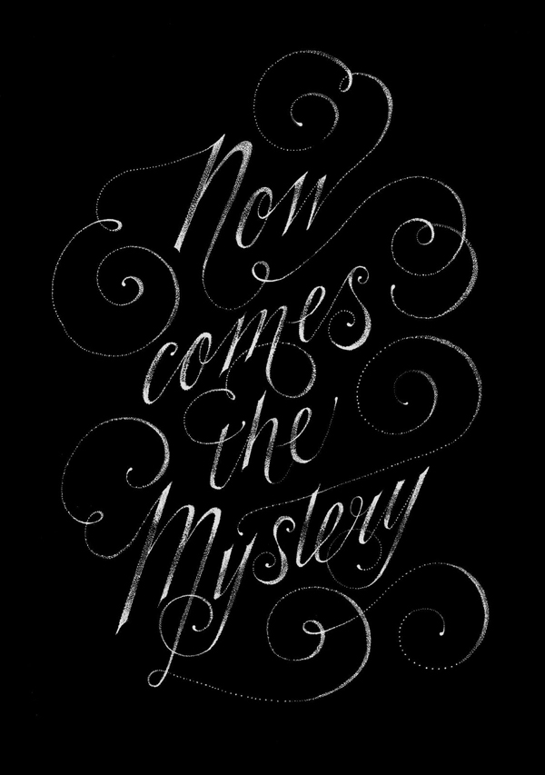
If your work is not featured on Day One, don’t fret, yours is probably coming, but feel free to email — questions, concerns, errors, omissions, broken links, please email brian (bj): lettercult /AT/ gmail.com

If you submitted work early, you’ll probably see it today. If you submitted a bit later, look for it on Day Three. We had more submissions than last year — big thanks to everyone who took the time to do that. About 20 percent of the Best Of will have come from submissions.

Also, be aware that our host (dreamhost) has been having issues, so if the site doesn’t respond…it’s probably because dreamhost is down. Apologies in advance.

HERE’S DAY ONE


JEN MUSSARI

WESLEY BIRD


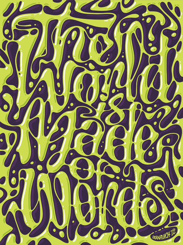
ANDREW DERNAVICH


ALEJANDRO GIRALDO


SIMON ALANDER


JACKSON ALVES


CHRISTIAN ANTOLIN

BILJANNA KROLL

DAVE BAILEY


BAIMU STUDIO


BOBBY HAIQALSYAH


ALAN ARIAIL


DARREN BOOTH


DAN CASSARO


BRETT STENSON


JAMES EDMONDSON

JOEL VILAS BOAS


ALEXIS TAIEB / TYRSA

BENJAMIN ESCOBAR


IONUT RADULESCU

BECCA CLASON


STEFAN CHINOF

SERGEY SHAPIRO

BECCA CLASON


ISABEL URBINA

DANIEL GNEIDING


ANDORKA TIMEA


ALEX TROCHUT


ROD SAWATSKY


STEVEN BONNER


29 Mar 04:29

Dark Side Of The Jam: NASA’s Grand Game Experiment

by Nathan Grayson

We live in astounding times. Not so many years ago, it would’ve been unthinkable for NASA to even so much as glance at our primordial ooze blob of a medium. Now it’s making games and – most recently – endorsing jams that allow creators to do as they please with its technologies and assets. Seriously! That was the premise of Dark Side of the Jam, a mighty brain conglomerate that convened at NASA’s Ames Research Center in Mountain View, California. Even so, the Nightrover Challenge spin-off wasn’t entirely expected. I mean, the San Francisco Bay Area’s indie-heavy jam scene meets an extension of the US government? How does that even work? I landed my rover that’s shaped like a car that’s shaped like a shoe in NASA’s backyard to investigate.

(more…)

29 Mar 04:28

Meta, Man: Knights of Pen & Paper +1 PC-Bound

by Alec Meer

I’m yet to play Knights of Pen & Paper on the 10″ electronic information slab I’m afraid to admit I own, but I hear great things about this RPG about playing an RPG. So, with some reservations about how mobile-y it could be, I am heartened to hear that a revised version is on its way to PC, with help from a money injection from the ever-unpredictable Paradox.
(more…)

29 Mar 04:25

Schnabel Competition Winners

by Tom Banwell
The voting is over, and the winners are decided. First place, with 72 votes, goes to Liz Katz, who will receive the mask in the photos. Liz has a choice of black with gray lenses or white with red lenses.


Second place, with 57 votes, goes to Irene Keller who wins a Falconer prototype.

And third place, with 49 votes,  goes to Serena Morcinek, who also wins a Falconer prototype.

Many thanks to all who entered and also to all who voted. Winners, please email me your mailing addresses.
27 Mar 13:17

Dresden Codak Kickstarter: the Final Push!

by Aaron

This is it! As of this writing, the Dresden Codak Kickstarter for the first-ever full collection of the comic has only 58 hours to go! To those who have pledged: you’ve been amazing, and I still can’t believe that The Tomorrow Girl is already the 3rd most funded comic Kickstarter ever. To those who haven’t pledged, don’t wait! Otherwise you will not be able to get a copy of The Tomorrow Girl until the Fall. Also you won’t be able to get the TONS of extra stuff included. Backers of the kickstarter get:

  • An exclusive Dresden Codak comic that won’t be on the site
  • A cyborg pride patch and exclusive dinosaur stickers
  • The one-and-only chance to get a signed book with a Kickstarter-exclusive bookplate
  • An exclusive new wallpaper that I will draw about dinosaurs
  • A hi-res exclusive digital collection of all my Tumblr comic theory articles and pop culture redesigns
  • The chance to bundle my other merchandise with your rewards for super cheap
  • Exclusive mini-prints and a lot more

Here’s a link to a spreadsheet of exactly how many cool things each pledge reward gets: Tomorrow Girl Rewards

Also remember, if we can reach $700k, I will be able to give you guys weekly Dresden Codak updates, and even if we can’t hit that goal, we can still unlock amazing things like a brand-new Hob Companion book available through the Kickstarter if we can raise it to $500k.  Again, do not wait if you want a book. I can’t promise what will be available after the Kickstarter ends, and you’ll be missing out on so much exclusive content and rewards. Thanks so much, guys, and no matter how this ends, I’ve been so incredibly blown away by the support I’ve gotten from my readers. This is, hands down, the best fans a guy could ever ask for.


Share/Save/Bookmark

23 Mar 02:25

Collaborative Environment

by DOGHOUSE DIARIES

Collaborative Environment

“Also, try not to be away from your desk for too long.  All these cubicles make it hard to find people if they’re not at their desks.”

Tweet
20 Mar 12:16

Team Fortress 2, Day of Defeat: Source and Half-Life 2: Deathmatch Updates Released

Jbantha

"Team Fortress 2: Added support for running VR mode on the Oculus Rift" We will remember these day as the day hats turned against us.

Updates to Team Fortress 2, Day of Defeat: Source and Half-Life 2: Deathmatch have been released. The updates will be applied automatically when your Steam client is restarted. The major changes include:
Source Engine Changes (TF2, DoD:S, HL2:DM)
  • Disabled Java for the in-game web browser
Team Fortress 2
  • Added support for running VR mode on the Oculus Rift
  • Fixed a server crash related to game stats
  • Fixed custom paint not showing in the tool tip when you mouse-over an item in your backpack
  • Fixed the Spy not holding sappers correctly in third person
  • Fixed a bug where sentries would not rotate to face their target under some circumstances
  • Fixed a scoreboard bug where domination count was reduced by 2 when a dominated player left the server
  • Fixed the Fists of Steel not reducing damage from ranged weapons that use energy rings
  • Fixed the death notice icon for the Eureka Effect
  • Fixed the Neon Annihilator sometimes floating in the world after death
  • Fixes for strange parts:
    • The Big Earner can no longer accept Long-Distance Kills strange parts
    • The Festive Grenade Launcher can now accept Critical Kills strange parts
    • The Neon Annihilator can now accept Sappers Destroyed strange parts
  • Removed some description text from the Manmelter that incorrectly stated its projectiles could not be deflected
  • Updated the Blind Justice so it can be equipped with other misc-slot items on the Demoman's face
  • Updated the backpack image for the Upgrade to Premium Gift item
  • Updated Mann Vs. Machine
    • Fixed the boss health bar sometimes disappearing
    • Fixed the uber Medics in Wave 4 of the Broken Parts mission charging at the incorrect rate
  • Updated the localization files
20 Mar 12:15

Riot Act: League Of Legends Banhammer Applied

by Cara Ellison
Jbantha

Britney, how LOL can you go?

You're toxic I'm slipping under
I’m addicted to you, but you know that you’re toxic. And I love what you do, but you know that you’re toxic, said a woman, once, to me. She was Britney Spears, yes, although you know she looks a lot like Katarina in League of Legends in the Toxic video so maybe she was just predicting an awful lot of things that were going to go on in the future. Such as a bunch of absolute knobbers acting like knobs in League of Legends. Britney Spears has SPOKEN.
(more…)

18 Mar 07:31

Amusement: Gaming Culture Meets Art and Fashion

When is a videogame magazine more than just a videogame magazine? That’s what you get with “Amusement,” a French “lifestyle” magazine that has been mixing game coverage with a stylish mix of art, fashion, and digital culture. PingMag talks to its founder and editor-in-chief Abdel Bounane to find out more about this groundbreaking magazine.

Written by Jean Snow

What were you doing before you launched “Amusement”?


“Amusement” #3, out now.

I’ve always worked in the videogame/digital entertainment industry. When I was 17 (in 2000), I co-founded a videogame website in France that became huge. We were bought by a branch of LVMH, then the internet bubble came and the site exploded with it. I then wrote about videogames for different lifestyle magazines (“Blast,” “Max,” “Technikart,” “Nuke”). My articles tended to have a cultural view point on videogames. In 2004, I worked as a consultant for PlayStation, where I launched, among other things, ARTCADE PlayStation, a gallery where creative people — photographers, illustrators, etc. — could create works inspired by the PlayStation. I’m also an anchor for France Culture (national public radio), where I speak about digital culture once a week.

What is “Amusement”?

“Amusement” is the first lifestyle magazine on interactive entertainment. “Lifestyle” magazine doesn’t mean a lot in itself, but it’s a word we’ve chosen to characterize a type of magazine. First we work with photographers and illustrators, creative people who usually work for magazines with a strong emphasis on images — fashion, photo, or design magazines — which has never been done before for a technology magazine. Then we’ve also chosen to take special angles on topics, different from the usual videogame magazine, like interviewing the assistant of Ralph Baer, who invented the first videogame console for example. And last but not least, we really want to work with high-level contributors, like world renowned academics (Hans Ulrich Obrist), journalists (Clive Thompson of “The New York Times”), or designers (Tetsuya Mizuguchi of Q Entertainment, ex-Sega). In a nutshell, “Amusement” tries to gather people from very different horizons, in order to reveal the extreme variety found in videogames and digital entertainment.

Spread for piece on “physical gaming,” from “Amusement #3.

How did you get the idea to launch the magazine?

When I was a child and a teenager I was a pure nerd. Later — and I don’t know why, maybe simple curiosity — I began to read magazines from a very different world: “I-D,” “The Face),” “Sleaze Nation,” “Dazed and Confused,” and more. I also went to hip clubs — from the Pulp to Le Baron — developed an interest in contemporary art, etc. It led me to think there was a huge gap between the inventiveness of my primary passion — videogames — and the way it was treated in the press. It was especially bad in France, where there is practically only one company selling videogame magazines, and they’re all not very different from each other.

More images from the piece on “physical gaming,” from “Amusement” #3.

What were the challenges in launching a magazine like “Amusement”?

Gathering people around a very new project is always difficult, but the most difficult was to convince advertisers about the potential for such a project. Simply put, they couldn’t understand who the target audience was. But thankfully, they finally understood that there was a whole generation of people who always lived with videogames and interactive entertainment, and who wanted a higher level magazine covering their passion.

One of the first “Pong” consoles, featured in an article in “Amusement” #3.

How do you think it compares to other gaming magazine out there? Do you even consider it a gaming magazine?

I do not consider it as a gaming magazine because we really want to explore the interactive entertainment spectrum, from videogames to digital art, nerd series, gadgets, etc. Videogames represent the vast majority of articles, but we want to use them in the exact same way magazines for women use fashion: as an angle to explore a wider lifestyle and an incentive for advertisers.

What is the audience? Mostly gamers, or people outside of gaming who have the potential to be drawn in?

I think that anyone who likes videogames and “geek topics,” and is interested in seeing them covered in a different way — outside of the usual formula — can enjoy “Amusement.”

Covers to “Amusement” #1 (left) and #2.

Do you think it’s important to try and bring gaming culture to a different kind of audience?

I think we shouldn’t, indeed, treat videogames with a “closed” approach (too technical, using too many words a mainstream audience can’t understand). In “Amusement,” half of the press we had came from women journalists who enjoyed the magazine because they where — in their own words — “not ashamed, and drawn in much more easily than with the usual videogame magazine.” It’s part of our aim.

It certainly doesn’t look like most gaming magazines — one of the first signs is that you include fashion spreads. How did you decide on the art direction for the magazine?

The artistic direction is lead by Alice Litscher — she’s been working with the very famous graphic agency M/M Paris for a few years now — and is inspired by high-end fashion magazines. Indeed, for “Amusement” #2 and #3 we had fashion spreads, but in the future we’re going to feature photography that is closer to the digital realm, without forgetting style. We want to produce beautiful pictures, and style is very important in making that happen.

Part of a visual essay on illustrating certain words often used in the world of massively multiplayer online (MMO) games, in this case “ambush” (top) and “resurrection.” From “Amusement” #3.

Do you think it’s important to present a non-gaming aesthetic — more art-oriented — to reach out?

I think it’s a mix. We could have created a logo inspired by pixel art for example, but what’s the point? We’re not a magazine solely on videogames, and even less on retrogaming. We could also have used a “futurist” typography, but we’re not speaking about the future; we talk about the present, since the future is happening now! So we want to use an artistic direction that is not linked to a specific theme, because we want to cover a wide spectrum of topics. It’s the same for the name “Amusement”; the name is very general because, in the end, we want to explore “amusement” in the 21th century — it simply happens to be in interactive form now.

What do you think about mixing art and gaming? Do you think it should happen more?

It already happens a lot, and I’m constantly astonished by what is being produced. What we’re seeing now is an entire generation of artists who remix, hack, and question the world of videogames and interactivity. Still, it hasn’t really entered the contemporary art market. But I was talking about this with my friend Miltos Manetas — a renowned digital artist — and we feel it’s better because people have more freedom, can experiment, and don’t have to adapt — even unconsciously — to art buyers and dealers.

Spread from “Amusement” #3.

The world over, it seems that the publishing industry is experiencing some tough times. How is “Amusement” doing?

We’re doing well for two reasons: we sell almost 50% of what we distribute — a very big score in media — and advertisers now seem to understand the concept of the magazine. We also have a very specific way of working with them, as we create specific ads for the magazine. In this sense we’re more of a creative agency who develops concepts for them, which they like.

Spread for a piece on a Lara Croft model. Croft is the main character in the “Tomb Raider” games. From “Amusement” #3.

What makes a great “Amusement” article?

Something that’s never been seen, with a very specific angle and involving a huge personality, with questions never asked before on an emerging trend. All this criteria can’t happen in one article, but let’s say it’s a fiction that I’d really like to see become reality!

When you reach out for contributions to the magazine, do you find out later that a lot of them actually play games, or do you try to approach people you know are into games?

It works in steps. We first want to work with people whose work we like. Then, when we meet, if they know videogames, then it’s cool because we can think about concepts together. If they don’t, the main idea will come from us and we’ll speak more about the artistry and aesthetics we want to produce.

Interview spread with Sony’s Kaz Hirai, from “Amusement” #3.

Are there things you haven’t been able to do yet for the magazine but would like to (like a certain kind of article)?

Yes. We want to speak more about digital art, interactive design, gizmos, and nerd culture. It will happen in upcoming issues.

What’s in the new issue, #3?


Editor-in-chief Abdel Bounane.

I really like the interviews we did in this issue: Kaz Hirai, CEO of Sony Computer Worldwide; Peter Molyneux; a long meeting with Michael Moorcock, one of the most important science fiction authors; David Winter, assistant to Ralph Baer, the inventor of the first videogame console; Michel Gondry, the special effects god who usually never does interviews. There’s also a beautiful photo series, and a very, very wide spectrum of articles!

What’s next for “Amusement”?

“Amusement” is going to be in English in 2009, and distributed in the US and UK. We’re also producing a videogame for iPhone, and a magazine for a French contemporary art museum.

Abdel Bounane, thank you so much for this great introduction to your magazine, and here’s looking forward to future issues of “Amusement”!