by @sdolotom
by @sdolotom

Farming emus means breeding emus. And Irek Malecki of the University of Western Australia thinks that the results could be improved with a bit of artificial insemination. But it’s easier said than done, as detailed in this amusing video.
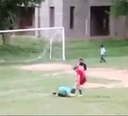
Pedromelenasquedan de puta madre
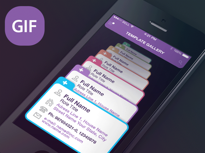
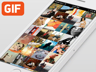
When presenting an app concept, storyboards and screenshots alone just lack life and cannot fully drive the message across. If you want to catch your potential clients’ attention, showcasing your mobile app concept in GIF animation will make it more realistic, dynamic, and engaging.
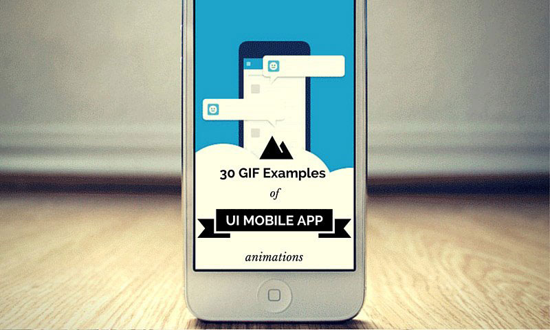
These GIF examples of mobile app concepts will surely inspire you
Below is our list of 30 GIF examples of UI mobile app animations that will surely inspire you to do the same next time you present your app concept to your client.
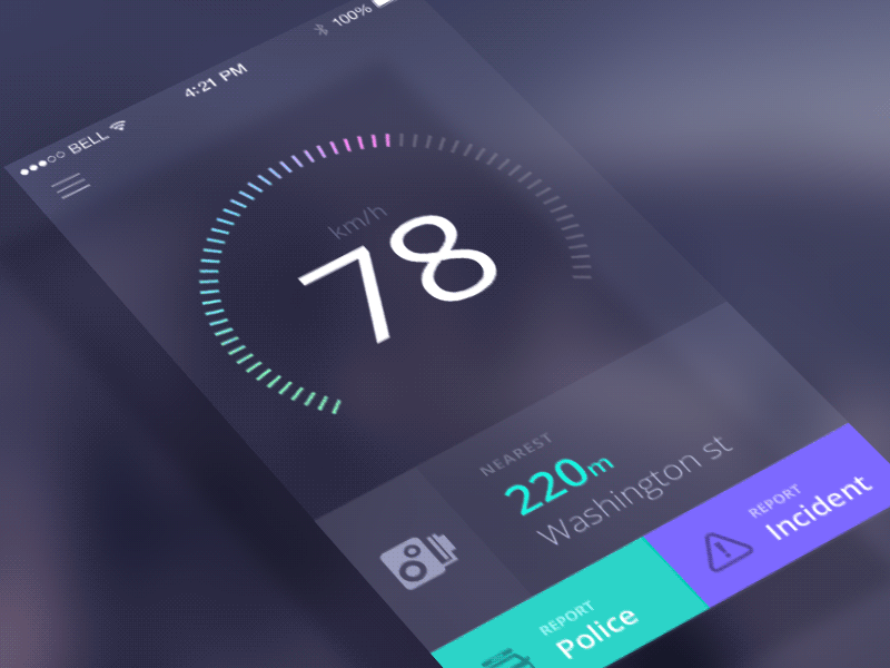
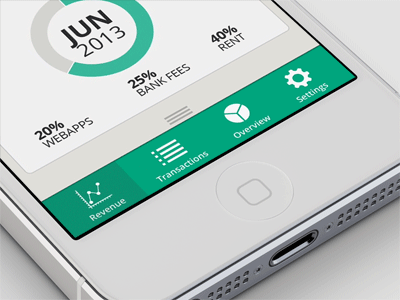
This speedcam app in GIF is simply impressive
Undeniably, Jakub Antalik has successfully presented his speedcam app in action in this GIF. Its nice colors and smooth animation simply make it impressive. Jakub Antalik created it in After Effect, imported it in Photoshop, and exported it as a GIF.

This GIF image is simply awesome
This mobile app design by Sergey Valiukh is simply awesome! You can’t help being in awe with his concept and approach.
This GIF app is another work of Sergey Valiukh
This is another bang-up work of Sergey Valiukh. This animation for a user profile gallery slider simply rocks!

How you view weather will never be the same with this app
What an impressive weather app, without question. Kudos to Chris Slowik for this awesome work! Chris Slowik removed its current weather icon from the ‘window’, hence, you can’t see an icon when you look at it.
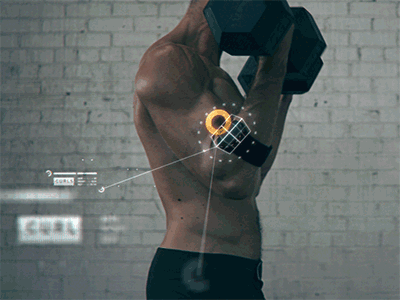
If this app won’t get you to exercise, what would?
Health buffs out there may say that the model in the app’s GIF displays a wrong form for bicep curls. But, hey, there is no questioning that this app concept is simply awesome! Nicolas used 3DSMax for the armband module and did everything else using After Effects.

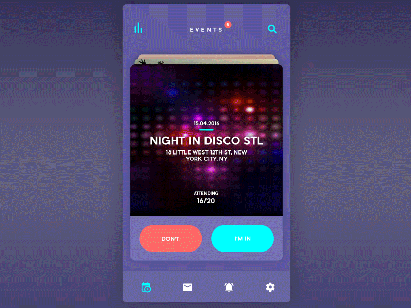
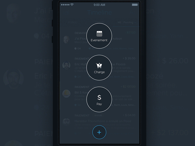
Welcome to content that moves!
If you are not a fan of content that moves when the screen is rolled, then you may think that this app is not cool at all. However, if you have no problem with such, you’ll surely agree that this work of Barthelemy Chalvet is awesome. Its animations are really nice, appearing undeniably fluid and fast. The GIF focuses on a payment procedure that does not only look neat but handy, too.
Get the latest information about your favorite celebrity just by scanning their photo
This animation only lasts for 12 seconds. Nonetheless, it is already pretty obvious what it is all about. This concept formed from George Frigo’s desire to establish a similar application that makes it possible for Internet users to obtain information by using a photo of a person, whether he’s a celebrity or just an ordinary citizen.
Discover music in an interactive way with WIP Discover
As its name suggests, it is pretty obvious what Alexander van Ravestyn wants to direct users’ attention towards the process of navigating: a slickly designed screen with a music player. This IOS app focuses on discovering music in a rather interactive way. There is no denying that it is simply awesome.
Walkthrough has a series of dynamic slides and buttons
The GIF of Walkthrough by Devin Ruppert highlights a welcome screen featuring a slider with numerous dynamic slides and a panel featuring login buttons. Everything about this app is brought to life so that what you can expect from this app can be effectively showcased. Great work!

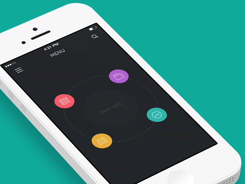
An app that is designed to make life simple
Despite being concise, there is no denying that this animation is effective in showing a client a simple procedure of adding and deleting entries from a card directory. Now, talk about simplicity, beauty, and efficacy all rolled into one!
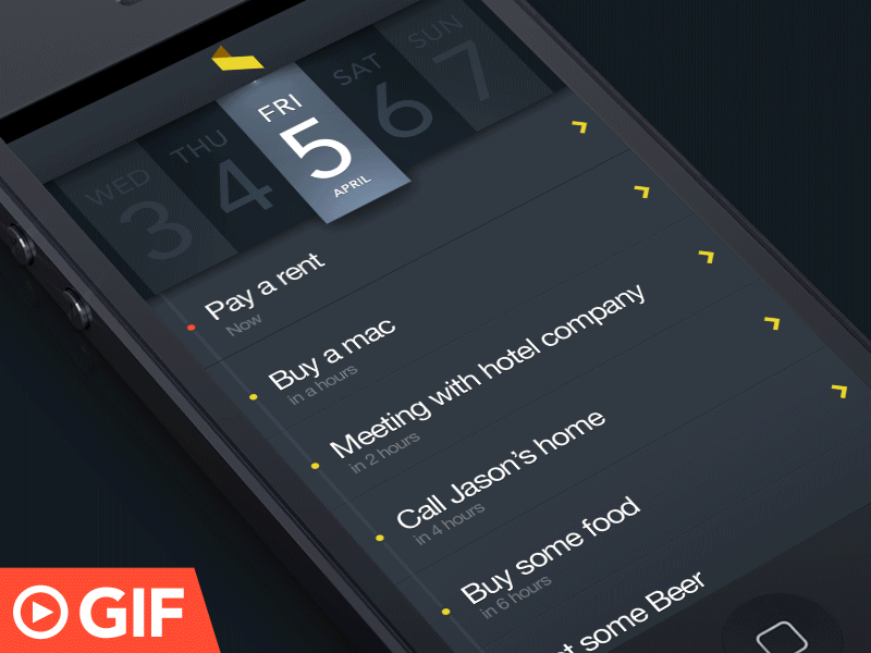
Never miss a task with this app
The GIF is targeted at demonstrating swipe technique in action that is not only common but effective, too. The whole thing simply looks alive, conventional, and engaging! What a great way, indeed, to delete and assign a task to a teammate in action. The animation was done in After Effect as well.
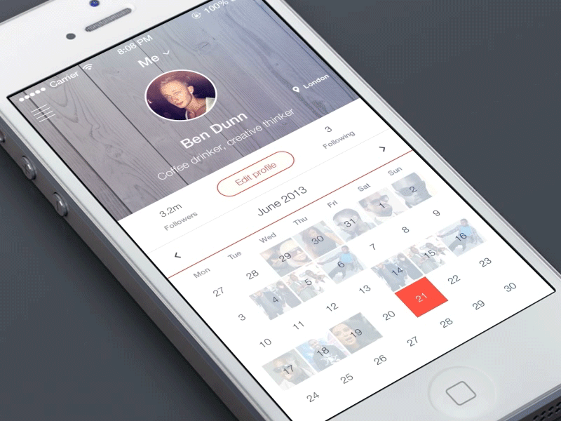
A stylish app with a stylish design
This work by Ben Dunn, without question, is an impressive tool for showcasing the appeal of a standard menu in action, sliding out from the left side elegantly as it presents the important links. Don’t you just love the way how icons pop up from the left side?

The animation might seem complicated but you can’t deny the awesome design of this app
Although there are some who have criticized this particular work for having an animation that seems complicated, it just can’t be denied that this another work of Sergey Valiukh is just as awesome as the other apps he has created. The menu idea is simply great, especially how it folds.
Want to know where the hottest place in town is? Showtime will lead you
This app by Luft is the most ideal for the weekend nocturnal creatures who are constantly in the lookout for a nice place to paint the town red. The only problem about this app is its right button color which makes it less readable. With this app, it’s show time, indeed!

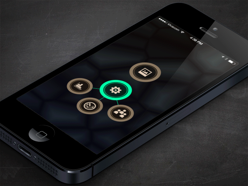
A fun and fancy app for iOS 7
This app is, obviously, a result of the freedom of Fabio Basile to have fun with animations and fancy interactions. Without question, this is way better than those horrid settings trays that people use.
Hard work resulted in an impressive app
This app by Budi Tanrim is one great example of an app with impressive transitions and visualization. With the help of PSD, After Effect, and 12 grueling hours of hard work, this animation came into existence.
Weather lives up to its name and the animation makes it even more interesting
Is the weather outside frightful? Well, just imagine how fun and easy and checking the weather will be with this weather app by BeardChicken. This work is simply elegant!
Awesome transitions – that is how you describe this app
You can’t help but admire the transitions of this app, although some people think that it gives them motion sickness. Others observed, though, that the text is too small. Whatever your take on this is, there is no denying that it simply looks awesome!

A neat app with impressive animation
Another app with great animation. Its colors and font are simply spot on. It may look minimal, but it’s definitely looking neat! This is another animation made possible with the use of After Effect.
This app puts Photoshop CS6 to good use
This app clearly demonstrates what happens when you are tapping on something and you get a new message. Its animations and details are simply incredible.The GIF was created with the use of Photoshop CS6.

Keeping up with the latest news in soccer is much more fun with this app
This app by Monterosa is a must-have for every soccer aficionado. The graphics are awesome and the animation is simply amazing.

Discover your pace without an y pressure with this app
This is an onboarding tour concept for Salesforce1. The users would be able to swipe through the tour at the pace of their choice before diving into the app. The animations are just as impressive with the other apps listed on this list.
This is an Iron Man-ispired app
Mind blowing animations that simply awe. Nicolas created it for Commongood.TV. Iron man-inspired? Hmmm…
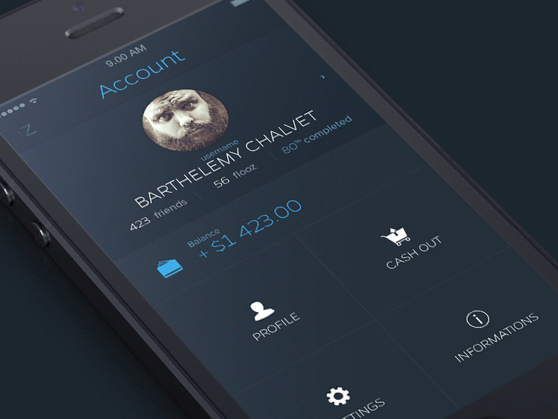
Save, retrieve, and access images easily with this app
This app is based on the concept that, in just a few clicks, the user can already get the necessary images that have been added and tagged earlier. With just one touch, you can choose the category that you want or need. The whole process is reminiscent of an image search on a desktop, only it is done in a mobile device.
A great concept fo a payment card
This is definitely a gorgeous app. A great concept for a payment card, indeed!
A map app with a refreshing design and concept
Oh, the secondary bubble simply look slick. Commenters refer to it as ‘design with life’, thanks to its riveting animation. This app makes use of Map Box API. Without question, it is a refreshingly unique approach to iOS map callouts.
Neat and simple – that is what this app is all about
You’ll surely love the neatness and simplicity of this app. Its transitions are simply awesome. Everything about this app is done in AE.
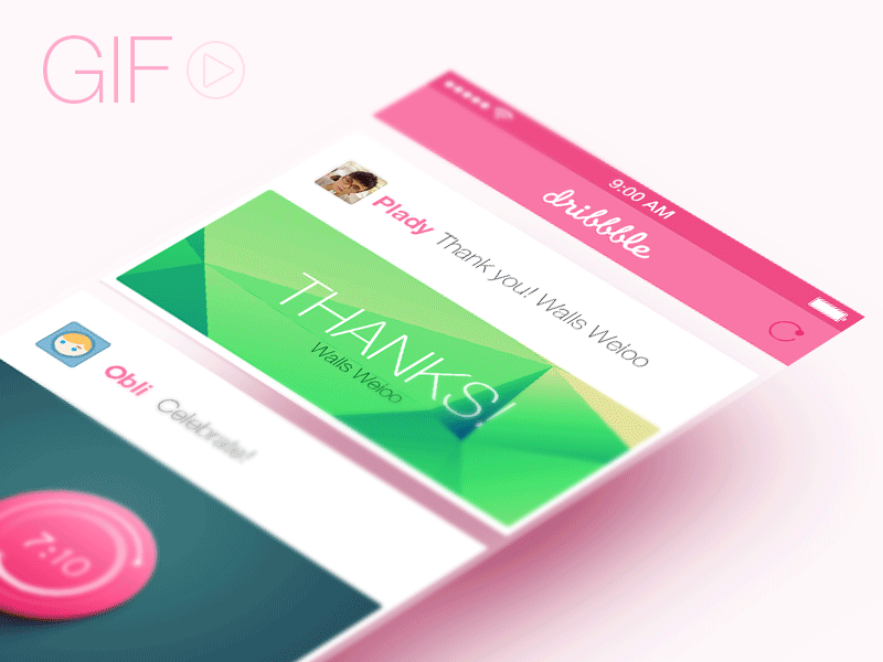
The design and color palette used in this app shout simplicity and fun
Another app that oozes not only with an impressive concept but great animation, too. Now, can you imagine how exciting Dribbble can even become if it adapted this concept? Plady used Photoshop for this great work.
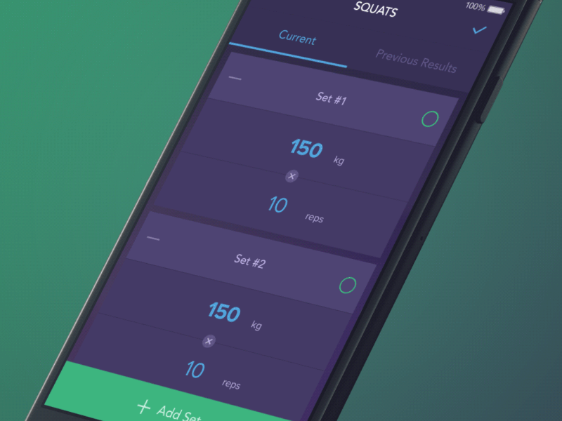
Workout tracking becomes easy with this app concept
Are you a health buff? Then, this app concept will surely be in your good graces. This GIF showcases a little of its set interaction. Hopefully, this concept can be fully actualized as it can surely make workout tracking a piece of cake. Just be careful, though: you might end up spending more time playing with it than exercising!
There’s no denying that the 3D fold effect of this app is simply awesome
This concept is simply smart as it can be of help on devices that have small screen size. Its drag handler is close to the edge of the screen for the bounding box because the action is limited. Nonetheless, the 3D fold effect is just cool, isn’t it?
Both UI and UX developers have recognized the importance of animated pictures in presenting their ideas that are a result of their painstaking work and inherent artistry. With GIF animations, the usually irritating and time-consuming procedure of explaining to clients can be averted. No matter how wonderful the screenshots of app concepts are, only short and fully animated GIFs can convey and demonstrate the interaction between all of the vital components in a more alive manner.
Pedromelenas¿No parece que se den impulso hacia atrás?


Son Gokuh ONE / Bruce Lee ONE/SIX INCH PUNCH
Nice Chinese Martial Arts “Bruce Lee” Kung-Fu

‘Mi amigo está dando clases de inglés en Corea del Sur y hay una alumna que llevaba esta camiseta el otro día’
Como estudiante en una facultad con asiáticos os puedo confirmar que en temas sepsuales hay una diferencia abismal entre chinos y coreanos.

We are in the midst of reviewing the recently announced Motorola Droid Turbo 2 , and one of the most interesting features of the phone is its supposedly shatterproof display. Any phone can survive one or two errant drops. But what about seventy?


Chaz Hutton es el creador de estos trocitos de realidad tan hilarantes y brutalmente honestos en formato post-it. En su cuenta de Instagram encontraréis toneladas de pensamientos brillantes listos para haceros sonreír (y tal vez piensa). Disfrutad del día!
Chaz Hutton is the creator of these hilarious and brutally honest bits of reality in post-it format. In his Instagram account you’ll find tones of brilliant thoughts ready to make you smile (and maybe think). Enjoy your day!
La entrada Post-it reality aparece primero en 40fakes.

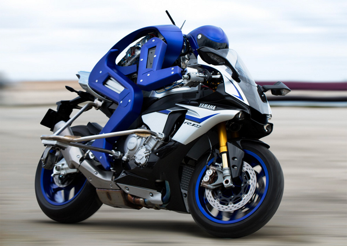 Humans might not be the fastest things on two wheels before long. Yamaha has unveiled Motobot, a robot designed to ride superbikes much like you would -- it even has to twist the throttle to get moving. This initial version travels slowly and nee...
Seguimos manteniendo nuestra tradición de poner de los nervios a los defensores de los animales, y la verdad, no lo hacemos a propósito. A nosotros los animales nos gustan, especialmente el de la foto. Bueno, al menos su carne.

Más en @NoPuedoCreer
Ver más: animales, cerdos, enchufesPedromelenassomos subnormales

En el texto preparado por la Comisión Europea se plantea permitir que los coches diésel contaminen un 20% más de los límites actuales a partir de 2019, pero realizando las mediciones en carretera, no en laboratorio, ya que los resultados son irreales.
La CE se desentiende de la propuesta española que abogaba porque los vehículos diesel pudiesen emitir un 60% más de dióxido de nitrógeno por kilómetro rodado. En el texto, al que ha podido acceder eldiario.es se ve una postura más relajada y pide que los coches emitan hasta 96 mgr. Los Estados miembros harán, previsiblemente, un último intercambio de argumentos este miércoles.
La nueva normativa tendría como objetivo realizar análisis más cercanos a la realidad, comprobando las emisiones en "condiciones reales de conducción", no en exámenes de laboratorio. Según los redactores del borrador, los límites actuales no son alcanzables en pruebas de rodaje fuera del laboratorio por lo que se aplica un factor de corrección que puede ser interpretado como una manga ancha a los fabricantes para que puedan contaminar como ya lo hacían.
Factor de corrección o margen que es la máxima disputa entre los países con fábricas de motores diesel como España y Alemania y la Comisión Europea.
Las enmiendas que propuso España, tal y como estipula eldiario.es, trataban varios puntos en referencia a la economía basada en la producción de motores diesel: empleo, volumen de negocio e inversión para exigir un margen mucho más permisivo en cuanto a emisiones.
El texto remitido por el Ministerio de Industria pretendía que se aplicase un factor de corrección inicial del 2,3 en vez de 1,6. Para el margen definitivo que tiene que regir desde 2019 proponían un factor de 1,6 en lugar del 1,18 pensado por Bruselas.
El documento preparado por Industria trataba de proteger a la industria al subrayar que los nuevos límites "deben ser medioambientalmente buenos pero también deben ser industrialmente posible". El ministro José Manuel Soria ha asegurado que la regulación preparada por Bruselas estaba "muy mediatizada" por el engaño de los motores alemanes.

Volkswagen, Pamplona.
La CE ha preparado esta revisión sobre el reglamento de emisiones de contaminantes, tras constatar que los coches salidos de las fabricas no reflejan la realidad. Las marcas conseguían cumplir la normativa y el límite de 80 mgr de dióxido de nitrógeno por kilómetro recorrido mediante unidades preparadas para pasar las pruebas de laboratorio.
Volkswagen fue cazada al emplear un sistema para que los motores engañasen a las pruebas para, una vez en carretera, poder contaminar hasta un 40% más de lo permitido. Conocido como 'caso Volkswagen', La CE cree que hay una clara necesidad de reforzar el cumplimiento de la normativa tras el suceso.
Aumentar en un 20% las emisiones permitidas — bajo el pretexto de realizar mejores pruebas — más parece una medida para salvar la producción de los diesel, y la economía de los Estados que dependan parcialmente de esta, que una medida en favor del conjunto de la Comunidad Europea.