firehose
Shared posts
67 Giant Snails Seized At LAX
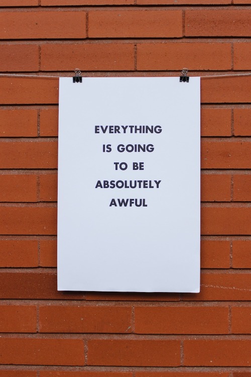
copyrlght: when you try your best but you dont succeed
when you try your best
but you dont succeed
Reviewed: New Custom Type Family for Domino's Pizza by Monotype Studio
Stacked in its Favor
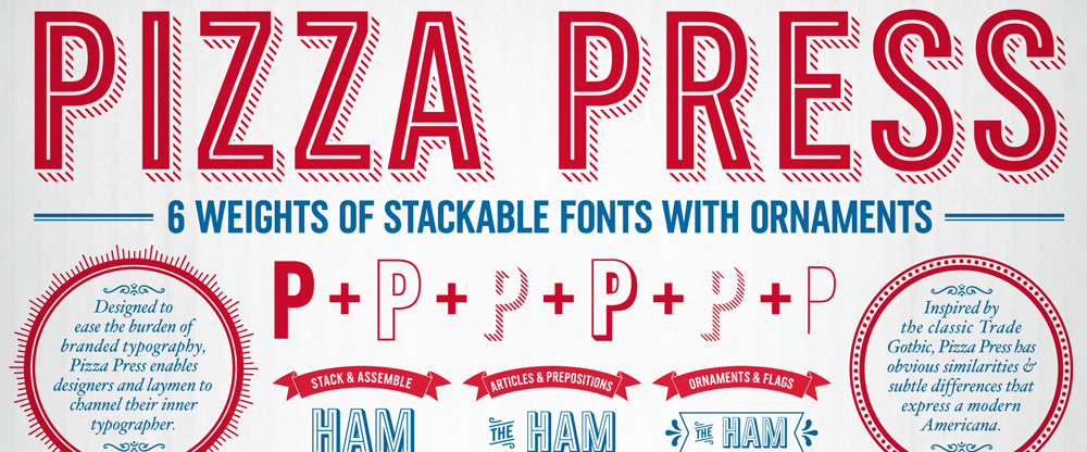

Established in 1960, Domino's Pizza is one of the most recognized pizza delivery companies in the world with a network of nearly 11,000 company-owned and franchise-owned stores in the United States (hosting 4,986 of them) and 70 other countries, delivering more than 1 million pizzas a day worldwide. Over the past few years, those pizzas have been delivered in increasingly better-looking boxes with elaborate illustration and typographic schemes that have gone beyond the early days when the boxes sported nothing more than the Domino's Pizza logo. Since 2008, Crispin Porter + Bogusky (CP+B) has been their agency of record and have shepherded Domino's through an evolution in good design — you might remember 2012's sexy, black Handmade Pan Pizza box — bringing us to the project at hand: Pizza Press™, a custom type family commissioned by CP+B and designed by Monotype Studio.
— Function as a series of modular fonts that could be layered in various ways to add flexibility, variety and excitement to Domino's brand voice
— Latin character set that used capitals only
— Function across a range of sizes and environments including packaging, web and broadcast
— Weights that could be used reasonably for smaller headlines and text
— Pair well with the existing Trade Gothic typeface family in use
Design brief

Collaborating closely with the CPB team, Terrance Weinzierl of the Monotype Studio designed the Pizza Press™ typeface.
Based on a 19th century model, in the American Gothic tradition, the condensed typeface was spaced loosely so the shadow weights would not overlap.
Weinzierl designed optical variants of the 'Antique' stripped weights — a regular and a display--to function well in a range of sizes and environments.
The typeface is currently in use across Domino's packaging, advertisements, broadcast, websites, apps, and POS across North America and Europe.
Solution


This is not our typical before/after post or even a new identity post. The logo hasn't changed and even the identity itself isn't much different from what we've been seeing out of Domino's in the past couple of years. This type family, however, represents a fantastic new tool to help Domino's deliver (pun!) its brand and visual identity in a consistent and easy-to-use manner across the world. By taking the guesswork out of how many lines in the shadow or what kind of ornaments to use or how thick should the inline be, it's all baked (pun!) into a single, stackable type family that any franchiser, employee, or vendor can easily use. It also helps that the resulting letterforms are quite handsome and exude a tasty Americana feel that makes those million of boxes look more appetizing.

Creation and utilization of the Pizza Press font has permitted Domino's to simplify and reduce branding and marketing costs for its franchisees and international markets.
CPB is very pleased with the font. It changed what was a very time and labor intensive process--manually copying and pasting outlined vector art to layout--into a task as simple as typing on a keyboard, literally!
Jake Harvey, Digital Asset Manager, Crispin Porter + Bogusky


We don't tend to think of Domino's as purveyors of high-end design (or pizza for that matter) but their recent efforts, and this type family in particular, are remarkably outstanding for a company of this size, specially considering that it's 96% franchise-owned, and each owner has to be empowered and is independently responsible to keep the brand on track. We also have to consider that ad agencies have never been well regarded among the graphic design industry for their typographic abilities — to spell it between the lines: they suck at it — so having this comprehensive and really nice type system in place helps Domino's at every step of the way to have a consistent application that is above and beyond what's expected from them. Now, somebody please tell me that there is a secret glyph with the Noid on it.

"Crowdfunding, the tabletop game", trying to be crowdfunded in a crowdfunding.
http://www.verkami.com/projects/9377...dicion-verkami
Aparently it's a game to manage a crowdfunding campaign within a 40-day limit, managing internet trolls, looking for backers and other stuff.
lgbtqblogs: Portlands First Official Trans Pride March
|
Courtney
shared this story
from |
Time Warner rejects $80 billion takeover by a 'determined' Rupert Murdoch
Rupert Murdoch's 21st Century Fox has reportedly made an $80 million bid for Time Warner. The New York Times reports that the bid was declined, citing "people briefed on the matter," but the offer could nonetheless destabilize the proposed Comcast-Time Warner merger.
It's unclear if Fox will return with a higher offer, but the NYT's sources say Murdoch is "determined" to push ahead with the takeover and is unlikely to walk away. In the initial proposal, Fox reportedly indicated it would sell CNN as part of the deal. Fox News and CNN are direct competitors, and a sale could potentially avoid antitrust concerns.
Even without CNN, bringing Time Warner's immense business under the 21st Century Fox banner would turn Murdoch's into a truly colossal media company. Fox would control the output of the Warner Bros. production and distribution business for TV shows and movies, the Turner TV portfolio (which includes NBA and MLB broadcast rights), and HBO.
In the wake of the NYT's story, CNBC has confirmed the offer and rebuttal with its own sources. CNBC says the two company's CEOs met in June to discuss a potential deal, before Fox was sent a rejection letter earlier this month. Given the public exposure of the takeover bids, Time Warner could now face pressure from shareholders to take any future offers very seriously. Shares of Time Warner jumped over 12 percent in premarket trading following the revelation.
- Source The New York Times
Spotify Switches From Debian To Ubuntu
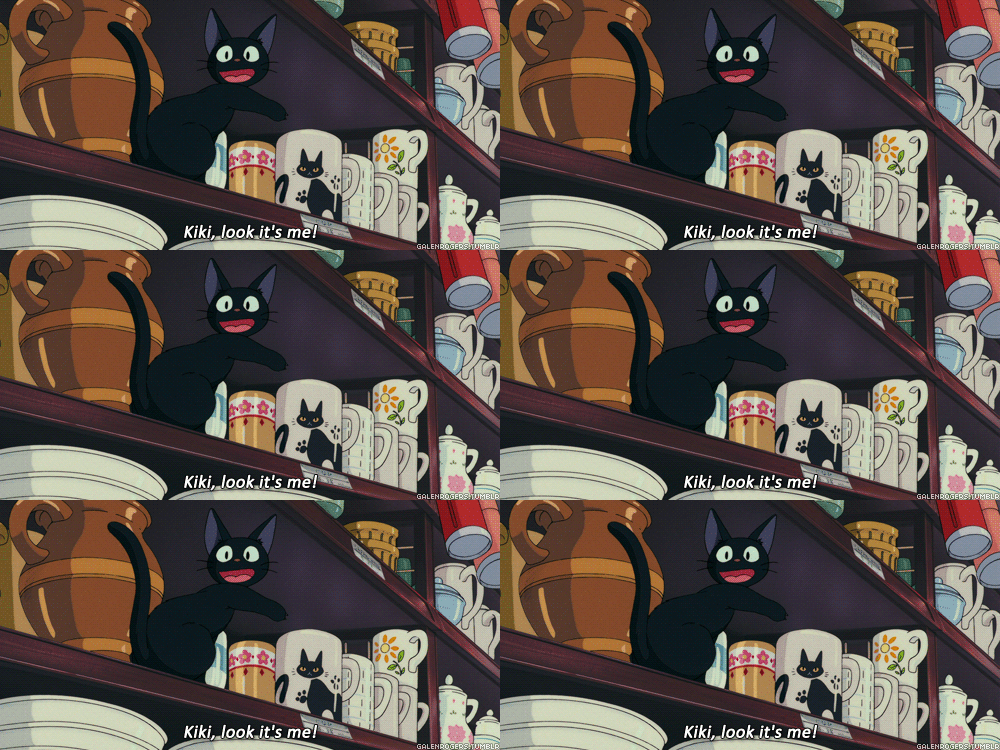
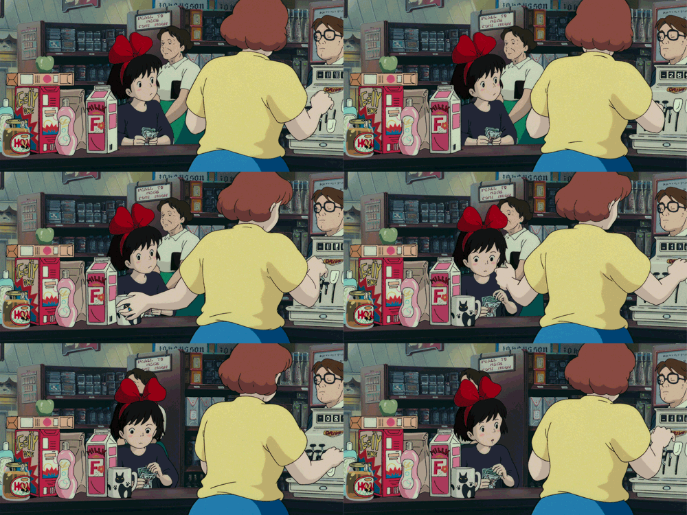
Accurate kitty .gif is accurate.
firehosevia Rosalind

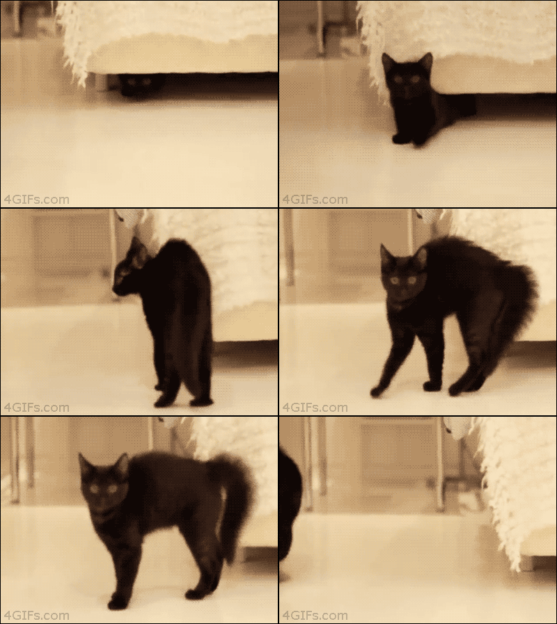
Accurate kitty .gif is accurate.
adokal: jeannepompadour: Illustrations of 16th century Ottoman...


Illustrations of 16th century Ottoman costume by Jost Amman and Abraham de Bruyn, 1577
-Ottoman Sultan on horseback.
-Ottoman Sultan Selim II. -Persian official in Istanbul.
-Ottoman Sultan. -Persian governor.
-Persian nobleman in Istanbul. -The captain of the Janissaries.
kfan: ryannorth: Here is a preview of Adventure Time #30, AKA...
firehosewater doesn't bother me because I'm made of bear parts instead of computer parts. it's so weird


kfan:
Here is a preview of Adventure Time #30, AKA The Zine Issue, AKA MARCELZINE!
Pictured above:
- BMO’s adorable submission, “Cool Bear the Bear by BMO the BMO”
- a page from Marceline’s frankly rad Hourly Comics
- Princess Bubblegum’s amazing submission, Chicken Experiment Comic
This is beautiful & amazing
"The study offers further depressing insights. Not only did the male pretend jurors prove..."
firehosevia Lori
-
Study: Male Jurors More Likely To Find Heavier Women Guilty - ThinkProgress (via brooklynmutt)

polkanots: brando-calrissiane: polkanots: trends women should avoid 2014: men’s opinions I’m...
firehosevia Lori
trends women should avoid 2014: men’s opinions
I’m sorry, but I would have to disagree with you. Our opinions are nothing more than opinions, you have the choice to listen or disregard them. It is always inevitably ones choice to listen to another.
If you would like to retaliate, I would like to hear what you want to say
trends men should avoid 2014: expecting all women want to hear their shit opinions at all
Hundreds Of Ghana Fans Have Sought Asylum In Brazil
Barry Petchesky, reporting at Screamer:
According to Brazilian federal authorities, about 200 fans who traveled from Ghana for the World Cup have requested political asylum in Brazil, and another 1,000 are expected to claim refugee status after the end of the tournament.
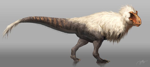
Now THIS Is a Badass Feathered Tyrannosaurus Rex
firehosebirbasarrrrr
escapekit: Better With Flowers Brazilian illustrator and...
firehosensfw-ish


Better With Flowers
Brazilian illustrator and designer Antonio Rodrigues Jr has spelled out several offensive words with a custom typeface made of artificial flowers. Check out the the process on his Behance page.
The House Just Voted To Ban Internet Taxes — Forever
ancientpeoples: Earring 4th Century BC Etruscan (Source: The...
ghostvomit: nevvymaster: When I get bored, I start thinking...


When I get bored, I start thinking weird thoughts.
Like, “what if, instead of classic inspirational quotes, Zen Pencils made dynamic comics around dril tweets?”
Original comics/art by Gavin Aung Than
Words by dril
HOLY SHIT
nevvymaster: Well, that certainly blew up quickly. You guys are...
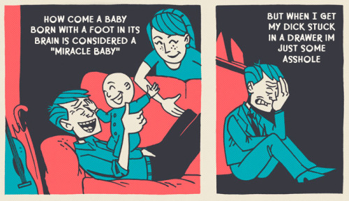


Well, that certainly blew up quickly. You guys are jerks.
Have more Dril Pencils.
Original comics/art by Gavin Aung Than
Words by dril
babygoatsandfriends: dailygoats: Important goat-related news story. very important
Important goat-related news story.
very important
postcardsfromspace: I really hope HuffPo never stops putting...


I really hope HuffPo never stops putting captions and images in the reverse order I expect in their sidebar. Right now, every visit is a new adventure in unlikely juxtaposition.


