Shared posts

26 Oct 16:39

7 Android apps that have successfully adapted Material Design

by Jaykishan Panchal

materialdesign_principles_metaphor

Material Design -- the new(ish) design language introduced by Google in Android Lollipop, and inspired by 'paper and ink' -- aims to provide a unified experience irrespective of device fragmentation.

This was very much needed for a mobile first world, where the market for small screen devices (read wearables) is growing at a rapid pace.

The tenets of this unique design language can be summed up as:

  • A single environment for all actions
  • The creation of hierarchy, meaning, and focus
  • An immersive user experience

This design philosophy has been successfully adapted to the T by many developers, who got the gist of the underlying principles and implemented the same in their apps’ features and functionalities.

Here are some of the apps which have made the transition to the 'flatter' design brilliantly.

Weather Timeline

Weather Timeline

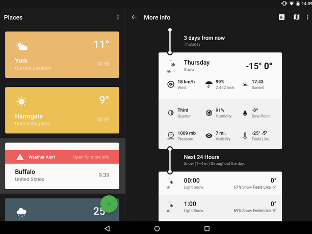
Weather Timeline provides a summary of the next hour’s weather, the next 48 hours, and even the next week’s forecast in an easy-to-understand timeline. It also provides the current weather alerts for location(s) chosen and gives the option to move back and forth through time to check the weather.

The weather conditions are highlighted in vibrant colors with contrast in the text color against large fields in a card based layout. Additionally, the rich color palette of the app is something to watch out for and so are the animated icons, which depict the weather conditions, temperature, and current time.

The app also includes excellent implementation for Android Wear. It provides useful information on the screen such as push notifications of weather alerts and charts of temperature and weather conditions.

All of these features make the app intuitive and user-friendly, which are among the basic fundamentals of Material Design.

Imagine

Imagine1

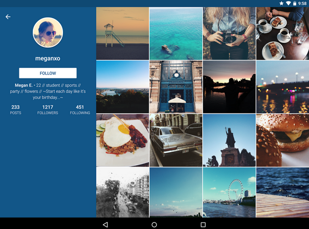
Imagine is an Instagram client infused with Material Design. The app retains most of the features and functionalities of Instagram and at the same time, introduces some new additions.

From the Material Design perspective, the third-party Instagram client has a minimalist interface with a grid based layout for photos/videos. This gives more clarity to the interface and adds to its lightweight or minimalist look and feel.

A slide out menu provides users with easy access to profile, activity, likes etc. Amazing animations are also an integral part of the app’s interface along with consistent and simple icons.

Google provides an elaborate outline for iconography in its Material Design guidelines. The system icons of the app adhere to the outline. They symbolize common actions such as "new photo", "new video", "take photo", and "take video" etc. Also, they are geometric in shape, simple and have a modern feel, which in turn makes them consistent and readable even when the screen size is small.

Asparagus -- My Cookbook

Asparagus1

Google recommends one floating button per screen and no more as a part of its Material Design principles. This is to increase the prominence of the button -- which represents the most common action on the screen. The action can be anything -- marking as favorite, adding a new photo, video or any other element, sharing, creating, navigating and so on. Apart from guiding users, this floating button also adds to visual continuity (in this case, a mini version is used in the design).

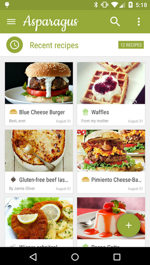
This feature is prominent in Asparagus -- My Cookbook, which is a digital cookbook and recipe app that has many interesting features that include, but are not limited to, recipe sharing, unique ingredient calculator, and customizable recipe folders.

The app’s interface embraces simplicity, is minimalist to a fault and offers a seamless experience to the end-users. This is how it implements the principles of Material Design. A color palette with bold colors and grid-based layout also hint at the use of Google’s latest design standard.

Paperboy: A Feedly Newsreader

paperboy

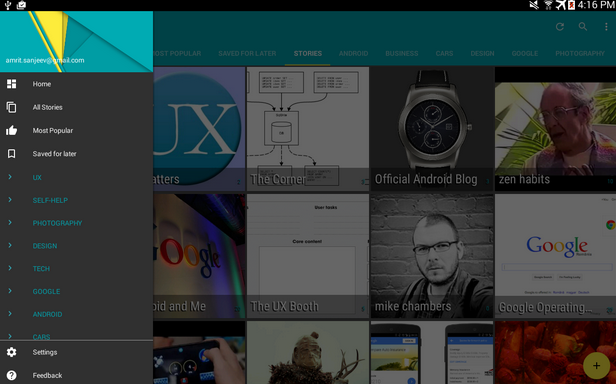
When discussing yardsticks of Material Design, one has to mention Paperboy: A Feedly Newsreader. There are more than 25 million feeds to select from and the app does what it needs to "make reading enjoyable" for users.

To begin with, the app enters a "semi-immersive" mode with its beautiful, concise typography that aims to make readability better. Another interesting feature is a floating menu button, which provides options that include opening the article in browser, marking the articles you want to read later, a tool to read text aloud (text to speech) and something that perhaps everyone wants in a reader app -- offline reading. The app also makes good use of colors to distinguish between read and unread news.

All these features help users’ focus their attention and this is one of the main aims of Material Design.

Google Flagship Apps With Material Design Implementation

Hangouts

Hangouts

Hangouts gained a major design overhaul with Material Design. Complete with a floating button to compose messages, a simplified user interface, special system icons, new dialer UI and improved video calling facility, the app is all set to compete with the likes of Facebook Messenger and other apps in the same category.

For example, users can now share stickers with their friends, add as many as 100 friends in a conversation, and even share their location, making it a comprehensive Messaging app.

But what really steals the show is the intuitiveness of the app and smoother transitions between tasks, which account for a more fluid experience for users.

Google Calendar

calendar1

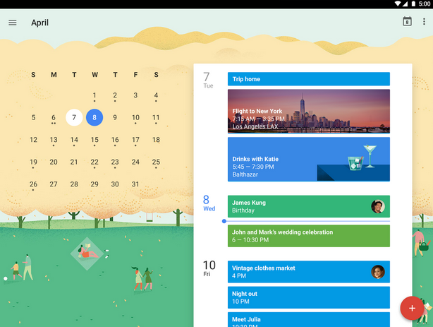
Just like Hangouts, Google Calendar is another app from the search giant, where Material Design has been put to practice quite visibly. Bold colors, immersive imagery, crafted simplicity, stimulating animations and fluid design are some of the major highlights of this app that are in sync with Material Design norms.

With the latest design aesthetics, the app offers Schedule View that helps users check their schedule at a glance, complete with images and maps.

Also, users get the option to easily switch views of their calendar, transitioning smoothly between getting a single day’s view or the gist of multiple days on the screen. Material Design makes this option better than ever.

Maps

Maps1

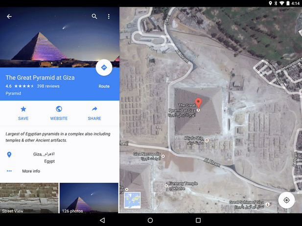
Google Maps is no "old wine in a new bottle" but rather, it is "old wine in a beautiful new bottle". A case in point is the astonishing clarity of the maps and the images.

Users get to see immersive imagery come to play with the high quality Street View, as well as indoor images for places of interest, famous landmarks, restaurants, museums located at any corner of the world, and get a better idea about the same without even visiting the places in person. The app is more beautiful than ever and brings to the table better functionalities.

For instance, when users tap on any place’s info sheet at the bottom of their screen, they will be able to see an info layer on the top. This will enable them to view photos, reviews and many other details of a place. These kind of interactive features get better with Material Design implementation, which also provides smoother transition to the users.

To Conclude

Google’s Material Design has definitely introduced some great design aesthetics. Although it will be some time before all apps make this switch to a new, flatter design, the change is well underway as is evident from these apps.

What is your take on Google’s new design style? Share your insights with us.

Jaykishan Panchal is a content marketer at MoveoApps, an android app development company. He enjoys writing about Technology, marketing & industry trends. He is tech enthusiast and love to explore new stuff. You can follow him on Twitter @jaypanchal8.

11 Mar 00:12

Microsoft announces Designer Bluetooth Desktop -- wireless keyboard and mouse

by Brian Fagioli

mk_dbd_large

Quite often, when a person buys a desktop from a manufacturer like HP or Dell, it will come with a wired keyboard and mouse. For the most part, the included input devices are passable, but nothing to write home about. Please know, however, that there is a whole world of great keyboards and mice out there -- including wireless options -- ready to make your hands happy.

Today, Microsoft announces a new wireless solution called the Designer Bluetooth Desktop -- a wireless keyboard and mouse. It connects by, you guessed it, Bluetooth, meaning a dongle is not needed if your machine has such a radio. The Designer moniker is quite appropriate, as not only are they both svelte, but stylish too.

"With a full-size keyboard with built-in number pad and mouse, it is as beautiful as it is productive. Even with its minimalist design, this keyboard gives you a robust typing experience that comes with chiclet-style, soft touch keys. For those who work and play, media keys are included, so you can easily control music and videos. Finally, with Function Keys and quick access to Search and other features, the Designer Bluetooth Desktop is the envy of any PC or laptop", says Microsoft.

The company further explains, "available for pre-order beginning today, the Designer Bluetooth Desktop will be generally available in the US and Latin America in May for an estimated retail price of US$99.95 at http://www.microsoftstore.com, Microsoft Stores and various other retailers".

While a hundred bucks may sound pricey, it is fairly reasonable for a mouse and keyboard combo that connects by Bluetooth. Laptop users that only want the mouse, however, are in luck; it will be available on its own for $29.95. With that said, the keyboard will not be made available sans mouse.

mk_dbm_otherviews01

The keyboard looks quite exceptional, as the keys are well spaced and the design looks solid. The mouse, while attractive, is a bit basic; there are no thumb buttons thanks to the ambidextrous design.

mk_dbm_otherviews02

You can pre-order the Designer Bluetooth Desktop here or the Designer Bluetooth Mouse on its own here. The keyboard and mouse package will not ship until May, but the mouse by itself will be available on March 19.

01 Jan 17:10

Systemd Development Skyrocketed This Year

Rising above all of the systemd controversies and in-fighting this year, systemd developers remained committed and did a heck of a job at adding code to the project...
31 Oct 15:02

Has The Sky Fallen? Qualcomm Contributes To Freedreno's DRM/KMS Driver

In an interesting change of events, Code Aurora on the behalf of the Qualcomm Innovation Center has added Adreno A4xx product support to the Freedreno-spawned DRM/KMS "MSM" driver...
30 Oct 16:02

Scare your neighbors with a spooky Halloween network name

by Lee Aylward
Spoooooooky!

Earlier today, Ars IT editor Sean Gallagher was doing some scary things with wireless when he discovered someone probing for a Wi-Fi network with a name that appeared to be something un-parseable. I theorized that it was actually something in Unicode that Wireshark wasn't parsing properly. "So someone has a Unicode SSID?" Gallagher asked, incredulous.

I was inspired. I wanted a Unicode SSID—one that could match the season and give my network name a seasonal gothic flare. So I set out to see if I could do it with my own Wi-Fi network. While I was successful, the effect may be lost on Windows users and others on devices that can't handle Unicode characters in their wireless network name. And as Gallagher determined, it doesn't work on all Wi-Fi networking hardware.

OS X ♥ Unicode

The tools

Unicode has some fun characters that can be used to generate a spooky SSID, but it can be difficult to type these characters using a traditional keyboard. After some digging around, I found the excellent Unicode Text Converter. This page allows you to enter a simple string and get back a variety of clever representations.

Read 6 remaining paragraphs | Comments

27 Oct 16:58

Tor Project flags Russian 'exit node' server for delivering malware

by Jeremy Kirk

The Tor Project has flagged a server in Russia after a security researcher found it slipped in malware when users were downloading files.

Tor is short for The Onion Router, which is software that offers users a greater degree of privacy when browsing the Internet by routing traffic through a network of worldwide servers. The system is widely used by people who want to conceal their real IP address and mask their web browsing.

The suspicious server was an "exit node" for Tor, which is the last server in the winding chain used to direct web browsing traffic to its destination.

Roger Dingledine, Tor Project's project leader and director, wrote the Russian server has been labeled a bad exit node, which should mean Tor clients will avoid using the server.

To read this article in full or to leave a comment, please click here

13 Jul 23:03

Epic Games Is Supporting Blender's Development

Epic Games has begun financially supporting the open-source Blender modeling software to improve the workflow for artists with Unreal Engine 4...
26 Jun 10:57

A new industrial age is being built on sensors, 3D printing and the cloud

by pthibodeau@computerworld.com (Patrick Thibodeau)
There's a new industrial revolution in the offing that will rely heavily on Internet of Things technologies, the cloud and low-cost design and fabrication tools.
20 Jun 10:32

Following TrueCrypt’s bombshell advisory, developer says fork is “impossible”

by Dan Goodin

One of the developers of the TrueCrypt encryption program said it's unlikely that fans will receive permission to start an independent "fork" that borrows from the current source code, a refusal that further clouds the future of the highly regarded application.

The reluctance surfaced in an e-mail published three weeks after TrueCrypt developers' bombshell advisory that users should stop using the cross-platform whole disk encryption program. TrueCrypt has been held up by a variety of privacy advocates—former National Security Agency contractor Edward Snowden among them—as a reliable means to protect individual files or entire hard drive contents from the prying eyes of government agencies and criminal hackers. In the days immediately following last month's TrueCrypt retirement, Johns Hopkins University professor Matt Green asked one of the secretive developers if it would be OK for other software engineers to use the existing source code to start an independent version. The developer responded:

I am sorry, but I think what you're asking for here is impossible. I don't feel that forking truecrypt would be a good idea, a complete rewrite was something we wanted to do for a while. I believe that starting from scratch wouldn't require much more work than actually learning and understanding all of truecrypt's current codebase.

I have no problem with the source code being used as reference.

The denial came in response to an e-mail in which Green said he suspected a TrueCrypt fork was inevitable, given the groundswell of interest in the program. Language in the TrueCrypt license raises the possibility that such independent projects will put developers at risk of violating contractual terms. Without the blessing of TrueCrypt developers, users may be forced to abandon the considerable amount of work already put into TrueCrypt. In his e-mail to the TrueCrypt developer, Green wrote:

Read 1 remaining paragraphs | Comments

20 Jun 10:30

Thailand: Fears of Crackdown Trigger Exodus

by Human Rights Watch
The Thai military authorities should urgently improve human rights protections of migrant workers to end their mass flight from the country, Human Rights Watch said today.

(New York) – The Thai military authorities should urgently improve human rights protections of migrant workers to end their mass flight from the country, Human Rights Watch said today.

read more

26 May 23:35

Many Interesting Tests Are Coming For The Phoronix 10th Birthday

To end out May on a high note and in getting June kick-started, when Phoronix turns ten years old on 5 June, there is a lot of interesting upcoming content and Linux/open-source performance benchmarks...
10 Jan 00:26

Multi-Protocol SoftEther VPN Becomes Open Source

Help Net Security: The service relies on volunteers with a broadband connection to download the server software and set up Public VPN Relay Servers for others to use.

24 Oct 00:46

Hans-Juergen Schoenig: Memory: Once in a lifetime

Since I have started with PostgreSQL almost 15 years back I have adjusted shared memory settings literally hundred of times. Changing kernel parameters has always been a central task for all users. The reason for this was mostly that many UNIX systems restricted the use of shared memory by default (Linux, Solaris, etc.). People who […]