×You need to sign in to continue.

Shared posts

18 Mar 00:40

Why Only Half of Venezuelans Are in the Streets

by Dorothy Kronick

As protests tear through Venezuela’s tonier neighborhoods, the slums are mostly quiet. Middle- and upper-class Venezuelans are burning tires and building barricades, while millions of their poorer compatriots sit out. Both groups suffer from the food shortages, inflation and crime that sparked the unrest; if anything, these problems harm pro-government Venezuelans more than anti-government demonstrators. So, what divides them?

One year after the death of former president Hugo Chávez, these six weeks of protest reveal a country still profoundly split over Chávez’s political project. On one side are those protesting his successor, Nicolás Maduro, who narrowly won last year’s presidential election; on the other are government supporters who see no viable alternative to Chavismo. Asking, “If not this, then what?” Venezuelans cannot find a common answer.

They disagree over a political vision for their country in part because they measure Chavismo against two different benchmarks: Chavistas compare the present to Venezuela’s pre-Chávez past, while the opposition contrasts the current economic situation with more recent developments in the rest of Latin America.

Many government supporters measure life under Bolivarian socialism — as Chávez called his political program — against life under Chávez’s immediate predecessors. Mismanagement of Venezuela’s 1970s oil boom and of the ensuing collapse made the 1980s and 1990s one long economic nightmare. Severe deprivations led to riots, multiple coup attempts and, eventually, to the election of Chávez, then a political outsider. Relative to the foregoing disaster, Venezuelans did fare well under Bolivarian socialism: Incomes grew and poverty declined, as Figures 1 and 2 illustrate.

Those who rally around Maduro fear the return of the pre-Chávez regime. Fifteen years after that regime fell, “No volverán” (“They won’t return”) remains a powerful pro-government slogan.

1. Venezuelan incomes increased under Chávez

 Fig1_VzGDP_1T_March12

2. And poverty fell

Fig2_VzPov_T1_March12

It’s natural to compare a government with what came just before. But in the Venezuelan case, it’s also deceptive. Venezuela is an oil economy, and oil prices in the 1980s and 1990s hovered around $10 per barrel.33 For reasons that have little to do with Chávez’s decisions, the price of Venezuelan oil began to rise as soon as he took office, rocketing to more than $80 per barrel in 2008 (Figure 3). Saying that the Venezuelan economy fared better under Chávez than it did before him is like saying that gardens grow better with water than without.

3. External conditions changed

Fig3_VzOil_1T_March12

A more useful benchmark — the one employed by the mainstream of Venezuela’s political opposition — is the economic health of Chávez’s Latin American neighbors, many of whom also benefitted from the recent natural resource price boom. As Harvard’s Francisco Monaldi has suggested, we can compare Bolivarian socialism with Latin American alternatives on standard economic indicators such as gross domestic product growth and inflation. We can also compare Chavismo with the rest of the region on the outcomes that Chávez emphasized: poverty, inequality, health and education. “What good is macroeconomic stability if, in the end, there is more poverty and hunger?” Chávez asked in a speech early in his presidency (my translation). “How many kids are going to school? How is infant mortality? Those are the big questions.”

On all these metrics, Bolivarian socialism underperformed. Nature handed Chávez by far the biggest resource windfall in Latin America (Figure 4), yet compared with its less-lucky neighbors, Venezuela experienced slow economic growth (Figure 5) and high inflation (Figure 6). Nor did Venezuela eclipse many of its neighbors in lowering infant mortality (Figure 7), slashing poverty, reducing inequality or improving school attainment during Chávez’s tenure. Many of the countries that surpassed Venezuela in these social achievements did so in part by implementing innovative anti-poverty programs called conditional cash transfers, in which the government pays poor women who take their children to school or the doctor. While Mexico, Brazil, Peru, Colombia and other countries pursued these highly effective policies, Venezuela scaled up projects that “one will be hard-pressed to find [evidence of] in human development statistics,” in the words of a prominent Venezuelan economist who evaluated the programs.

4. Venezuela had the biggest resource windfall

Fig4_LACWindfall_1T_March12

5. With low economic growth

Fig5_LACGrowth_1T_March12

6. High inflation

Fig6_LACInflation_1T_March12

7. And a mediocre reduction in infant mortality

Fig7_LACimr_1T_March12

This failure is especially stark in relation to the world-historical scale of Chávez’s promises, and to the one-time hemispheric enthusiasm for his project. A decade ago, leftists from Boston to Buenos Aires thought Chávez was pioneering a fairer, more inclusive, more pro-poor mode of governance than anything the Washington elite had to offer. Chávez styled his Bolivarian revolution as a serious challenge to U.S. hegemony, casting himself in the role of anti-imperialist hero.

Venezuela aggressively sold its revolutionary dream, luring allies with billions of dollars’ worth of oil. In the end, though, most of his neighbors turned away from Chávez’s vision, and in doing so they made more progress toward many of the goals that Chávez had set for his government. In an attempt to revive the utopian fervor of the mid-2000s, one of Chávez’s glossy 2012 campaign ads (replete with strings and slow motion) claimed that Venezuela had become “a model of solidarity and social justice for the whole planet.” By then, the grandiose rhetoric sounded hollow.

Even one of Chávez’s radical-left allies, Bolivian President Evo Morales, treated his country’s resource income more responsibly, as Venezuelan economist Omar Zambrano has pointed out (here, in Spanish). Among Venezuela’s regional friends, Morales ranks right behind Cuba’s Castros. Like Chávez, Morales drove his domestic opposition to hysterics with heated, anti-elite rhetoric. Like Chávez, Morales rewrote his country’s constitution and changed the nation’s official name. And like Chávez, Morales presided over a period of supremely favorable economic conditions; Bolivia enjoyed a similar improvement in the price of its exports relative to its imports between 2003 and 2012 (Figure 8).

8. Bolivia saw similar external conditions

venezuela-price_of_exports

But unlike Chávez, Morales used the boom to accumulate international reserves, an important buffer against future export-price shocks (Figure 9). As Venezuelan inflation spiraled to 56 percent last year, Morales kept inflation in Bolivia below 10 percent (Figure 10). Moreover, Bolivia has used its good economic fortune to maintain fiscal surpluses, while Chavismo pushed the Venezuelan public sector to deficits approaching 15 percent of GDP (Figure 11). And as Bolivia paid down the tremendous debt it acquired during tough economic times, Venezuela took on new obligations (Figure 12), some of which the country will service at consumer-credit-like interest rates.

9. But Bolivia saved more

venezuela-liquid_foreign_assets

10. Kept inflation lower

venezuela-inflation

11. Maintained a fiscal surplus

Fig11_BolVzDeficit_1T_March12

12. And paid down its debt

Fig12_VzBolDebt_1T_March12

When Venezuela’s mainstream political opposition takes to the streets in protest of the current regime, it has in mind the comparisons of Figures 4 through 12.34 This opposition wants a fiscally responsible government that will implement effective, modern social programs. Its leader, Henrique Capriles, made clear during his 2012 presidential campaign that he takes inspiration from former center-left Brazilian president Luiz Inácio Lula da Silva. And there are signs that, as economic conditions deteriorate, some pro-government Venezuelans might start to see the value of these regional comparisons. When Chávez beat Capriles by 11 percentage points in 2012, it looked like a landslide on a U.S. scale, but it was the smallest margin of victory for any presidential incumbent in the region since the turn of the 21st century (Figure 13).

13. Chávez lost much of his electoral edge35

 venezuela-reelection

Unfortunately, the opposition’s fleeting unity behind Capriles splintered after last year’s election. To Capriles’ frustration, other opposition leaders fixate on ousting Maduro — just as they long obsessed over ousting Chávez — to the exclusion of positive proposals for governance, thereby throwing water on any nascent convergence between pro-government Venezuelans and the opposition. Worse, members of a small but vocal opposition fringe broadcast their fondness for Venezuela’s pre-Chávez regime, and the loud presence of this faction hardens Chavista sentiment against the political opposition as a whole. Its ultra-privileged spokespeople embody the “they” in “They won’t return.”

The irony of this fringe nostalgia is that old-regime policy mistakes closely resemble those repeated by Bolivarian socialism.36 What might help Venezuela out of its impasse, then, is a kind of reciprocal learning process: If the cosseted nostalgics could grasp that so much of what repels them in Bolivarian socialism mirrors what came before, and if supporters of Chavismo could see that the revolution reflects so much of Venezuela’s past, perhaps both sides would come around to the wisdom of the data behind the mainstream opposition’s regional comparisons. Absent this convergence, it’s hard to imagine a way forward for Venezuela.

18 Mar 00:37

What the Fox Knows

by Nate Silver

FiveThirtyEight is a data journalism organization. Let me explain what we mean by that, and why we think the intersection of data and journalism is so important.

If you’re a casual reader of FiveThirtyEight, you may associate us with election forecasting, and in particular with the 2012 presidential election, when our election model “called” 50 out of 50 states right.

Certainly we had a good night. But this was and remains a tremendously overrated accomplishment. Other forecasters, using broadly similar methods, performed just as well or nearly as well, correctly predicting the outcome in 48 or 49 or 50 states. It wasn’t all that hard to figure out that President Obama, ahead in the overwhelming majority of nonpartisan polls in states such as Ohio, Pennsylvania, Nevada, Iowa and Wisconsin, was the favorite to win them, and was therefore the favorite to win the Electoral College.

Instead, our forecasts stood out in comparison to others in the mainstream media. Commentators as prestigious as George F. Will and Michael Barone predicted not just a Mitt Romney win, but a Romney sweep in most or all of the swing states. Meanwhile, some news reporters defaulted to characterizing the races as “toss-ups” when the evidence suggested otherwise.27

The other reason I say our election forecasts were overrated is because they didn’t represent the totality, or even the most important part, of our journalism at FiveThirtyEight. We also covered topics ranging from the increasing acceptance of gay marriage to the election of the new pope, along with subjects in sports, science, lifestyle and economics. Relatively little of this coverage entailed making predictions. Instead, it usually involved more preliminary steps in the data journalism process: collecting data, organizing data, exploring data for meaningful relationships, and so forth. Data journalists have the potential to add value in each of these ways, just as other types of journalists can add value by gathering evidence and writing stories.

The breadth of our coverage will be much clearer at this new version of FiveThirtyEight, which is launching Monday under the auspices of ESPN. We’ve expanded our staff from two full-time journalists to 20 and counting. Few of them will focus on politics exclusively; instead, our coverage will span five major subject areas — politics, economics, science, life and sports.

538_INTRO3

Our team also has a broad set of skills and experience in methods that fall under the rubric of data journalism. These include statistical analysis, but also data visualization, computer programming and data-literate reporting. So in addition to written stories, we’ll have interactive graphics and features. Within a couple of months we’ll launch a podcast, and we’ll be collaborating with ESPN Films and Grantland to produce original documentary films. You’ll find us on television and radio, and on Twitter, Instagram and Facebook. We’ll share data and code on Github.

Our logo depicts a fox (we call him Fox No. 928) as an allusion to a phrase originally attributed to the Greek poet Archilochus: “The fox knows many things, but the hedgehog knows one big thing.” We take a pluralistic approach and we hope to contribute to your understanding of the news in a variety of ways.

By no means do we think that everything can be broken down into a formula or equation. On the contrary, one of our roles will be to critique incautious uses of statistics when they arise elsewhere in news coverage. At other times, we’ll explore ways that consumers can use data to their advantage and level the playing field against corporations and governments.

Our methods are not meant to replace “traditional” or conventional journalism.29 We have the utmost admiration for journalists who gather original information and report original stories. Our staff includes alumni from traditional news organizations like The New York Times, The Wall Street Journal, The Guardian and The Washington Post (along with others from digital news organizations, blogs and from outside journalism entirely).

Still, I would never have launched FiveThirtyEight in 2008, and I would not have chosen to broaden its coverage so extensively now, unless I thought there were some need for it in the marketplace. Conventional news organizations on the whole are lacking in data journalism skills, in my view. Some of this is a matter of self-selection. Students who enter college with the intent to major in journalism or communications have above-average test scores in reading and writing, but below-average scores in mathematics. Furthermore, young people with strong math skills will normally have more alternatives to journalism when they embark upon their careers and may enter other fields.30

This is problematic. The news media, as much as it’s been maligned, still plays a central a role in disseminating knowledge. More than 80 percent of American adults spend at least some time with the news each day. (By comparison, about 25 percent of Americans of all ages are enrolled in educational programs.)

Meanwhile, almost everything from our sporting events to our love lives now leaves behind a data trail. Much of this data is available freely or cheaply. There is no lack of interest in exploring and exploiting it: Google searches for terms like “big data” and “data analytics” have grown at exponential rates, almost as quickly as the quantity of data itself has grown.

And yet, as I describe in my book, “big data” has not yet translated into widespread gains in economic conditions, human welfare or technological growth. Some individual companies and industries, and some branches of science, have employed data in constructive ways. But “Moneyball” stories are more the exception than the rule.

Journalism is far from the whole problem. Science, government, academia and the private sector also have struggled to find the signal in the noise. But journalism is our chosen profession. There is both a need for more data journalism and an opportunity to build a business out of it.

That opportunity has required us to think deeply about the strengths and weaknesses of conventional approaches to journalism. One of our first attempts came in the form of a two-dimensional chart, which I shared several weeks ago with Jack Dickey of Time magazine. The chart posits a distinction between quantitative versus qualitative approaches on the one hand and rigorous versus anecdotal approaches on the other.

538_INTRO4

The point is that data journalism isn’t just about using numbers as opposed to words. To be clear, our approach at FiveThirtyEight will be quantitative — there will be plenty of numbers at this site. But using numbers is neither necessary nor sufficient to produce good works of journalism.

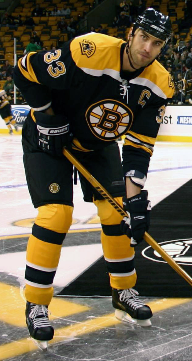
Indeed, as more human behaviors are being measured, the line between the quantitative and the qualitative has blurred. I admire Brian Burke, who led the U.S. men’s hockey team on an Olympic run in 2010 and who has been an outspoken advocate for gay-rights causes in sports. But Burke said something on the hockey analytics panel at the MIT Sloan Sports Analytics Conference last month that I took issue with. He expressed concern that statistics couldn’t measure a hockey player’s perseverance. For instance, he asked, would one of his forwards retain control of the puck when Zdeno Chara, the Boston Bruins’ intimidating 6’9″ defenseman, was bearing down on him?

The thing is, this is something you could measure. You could watch video of all Bruins games and record how often different forwards kept control of the puck. Soon, the NHL may install motion-tracking cameras in its arenas, as other sports leagues have done, creating a record of each player’s x- and y-coordinates throughout the game and making this data collection process much easier.

I would ask a lot of questions of this data if I had it. For instance:

  •  Is it smart for a player to keep control of the puck when Chara (or a similarly gifted defensemen) has him in his sights? Might the player yield fewer turnovers if he passed the puck instead?
  • Would measuring a player’s perseverance give us meaningful information beyond what is reflected in “box score” statistics, such as goals, assists and plus-minus?
  • Do players who persevere under threat match those who are regarded as “tough” or as having lot of “heart” by coaches, scouts and commentators? If not, is the metric flawed, or are the coaches biased?

The quality of hockey statistics is fairly poor compared to those for baseball or basketball, so I can understand Burke’s skepticism. But often, general managers and CEOs and op-ed columnists use the lack of data as an excuse to avoid having to examine their premises.

At other times, commentators cite statistics even as they decry their uselessness. Peggy Noonan, the Wall Street Journal columnist, wrote a blog post on the eve of the 2012 election that critiqued those of us who were “too busy looking at data on paper instead of what’s in front of us.” Instead, “all the vibrations” were right for a Romney victory, she wrote.

Among other things, Noonan cited the number of Romney yard signs, and the number of people at his rallies, as evidence that he was bound to win. But these “vibrations” are, in fact, quantifiable. You could hire a team of stringers to drive around randomly selected neighborhoods in swing states and count the yard signs. And news accounts routinely estimate the number of attendees at political rallies. Noonan could have formulated a testable hypothesis: Do yard signs predict election outcomes better than polls do?

The problem is not the failure to cite quantitative evidence. It’s doing so in a way that can be anecdotal and ad-hoc, rather than rigorous and empirical, and failing to ask the right questions of the data.

In contrast, plenty of journalistic methods are rigorous without being quantitative. Investigative reporting, which synthesizes multiple threads of evidence to find the truth behind a story, would fall into this category. Explanatory journalism, including the new ventures launched by Ezra Klein at Vox Media and David Leonhardt at The New York Times, will often do so. Masterful works of history and biography, from Robert Caro to Richard Ben Cramer, also belong here.

However, I acknowledge some problems with the chart and its two-dimensional conception of journalism. For one, in its aversion to anecdotal evidence, this analysis is too dismissive of the important role that journalists play in uncovering new information.

You may have heard the phrase the plural of anecdote is not data. It turns out that this is a misquote. The original aphorism, by the political scientist Ray Wolfinger, was just the opposite: The plural of anecdote is data.

Wolfinger’s formulation makes sense: Data does not have a virgin birth. It comes to us from somewhere. Someone set up a procedure to collect and record it. Sometimes this person is a scientist, but she also could be a journalist.

Take, for example, endorsements made by elected officials (say, senators and governors) during the presidential nomination process. Headlines such as “Arizona Gov. Jan Brewer endorses Mitt Romney” might seem like just the sort of slow-news-day story that journalists make too much of. Indeed, any single endorsement is unlikely to make much difference. It turns out, however, that the sum total of these endorsements has quite a bit of predictive power. A team of political scientists, in their book “The Party Decides,” found that intra-party endorsements often out-predict the polls in the nomination process, especially in the early going.31

So perhaps we should think more carefully about the process by which anecdote is transformed into data and information. We might break it down into four rough steps:

NATE_INTRO_NEW300

The first step is the collection of data or evidence. For a traditional journalist, this is likely to involve some combination of interviewing, documentary research and first-person observation. But data journalists also have ways of collecting information, such as by commissioning polls, performing experiments or scraping data from websites.

The next step is organization. Traditional journalists have a well-established means of organizing information: They formulate a news story. The story might proceed chronologically, in order of importance (the inverted pyramid) or in some other fashion. Data journalists, meanwhile, can organize information by running descriptive statistics on it, by placing it into a relational database or by building a data visualization from it. Whether or not a picture is worth a thousand words, there is value in these approaches both as additional modes of storytelling and as foundations for further analysis.

The third step is explanation. In journalistic terms, this might mean going beyond the who, what, where and when questions to those of why and how. In traditional journalism, stories of this nature are sometimes referred to as “news analysis” or “explanatory journalism.” Data journalists, again, have their own set of techniques — principally running various types of statistical tests to look for relationships in the data.

Let’s pause here for a moment. Up through the first two steps, traditional journalists looked very good. The original reporting they do is tremendously valuable. Besides, most of us learn by metaphors and stories. So traditional journalism’s method of organizing information into stories has a lot of appeal when news happens.

By the third stage, however, traditional journalism has begun to produce uneven results — at least in my view. Take the best-selling book “Double Down” by Mark Halperin and John Heilemann. It contains a lot of original and extremely valuable reporting on the 2012 campaign. Its prose style doesn’t match mine, but it’s a crisp and compelling read. But Halperin and Heilemann largely fail at explaining how Barack Obama won re-election, or why the campaign unfolded as it did.

For example, they cite three factors they say were responsible for Mitt Romney’s decline in the polls in early mid-September: the comparatively inferior Republican convention, Romney’s response to the attacks in Benghazi, Libya, and Romney’s gaffe-filled trip to London. In fact, only one of these events had any real effect on the polls: the conventions, which often swing polls in one direction or another. (This does not require any advanced analysis — it’s obvious by looking at the polls immediately before and after each event.)

Explanation is more difficult than description, especially if one demands some understanding of causality.32 It’s something every field struggles with; there are lots and lots of wrongheaded statistical analyses, for instance.

Still, there are some handicaps that conventional journalism faces when it seeks to move beyond reporting on the news to explaining it. One problem is the notion of “objectivity” as it’s applied in traditional newsrooms, where it’s often taken to be synonymous with neutrality or nonpartisanship. I prefer the scientific definition of objectivity, where it means something closer to the truth beyond our (inherently subjective) perceptions. Leave that aside for now, however. The journalistic notion of objectivity, however flawed, at least creates some standard by which facts are introduced and presented to readers.

But while individual facts are rigorously scrutinized and checked for accuracy in traditional newsrooms, attempts to infer causality sometimes are not, even when they are eminently falsifiable. (The increased speed of the news-gathering process no doubt makes this problem worse.33) Instead, while the first two steps of the process (collecting and organizing information in the form of news stories) are thought to fall within the province of “objective” journalism, explanatory journalism is sometimes placed in the category of “opinion journalism.” My disdain for opinion journalism (such as in the form of op-ed columns) is well established, but my chief problem with it is that it doesn’t seem to abide by the standards of either journalistic or scientific objectivity. Sometimes it doesn’t seem to abide by any standard at all.

A more data-centric approach is perhaps most helpful, however, when it comes to the fourth step, generalization.

Suppose you did have a credible explanation of why the 2012 election, or the 2014 Super Bowl, or the War of 1812, unfolded as it did. How much does this tell you about how elections or football games or wars play out in general, under circumstances that are similar in some ways but different in other ways?

These are hard questions. No matter how well you understand a discrete event, it can be difficult to tell how much of it was unique to the circumstances, and how many of its lessons are generalizable into principles. But data journalism at least has some coherent methods of generalization. They are borrowed from the scientific method. Generalization is a fundamental concern of science, and it’s achieved by verifying hypotheses through predictions or repeated experiments.

As my book describes, predictions in the sciences (especially the social sciences) are often fairly poor. They usually get better after repeated trials and iterations. But they require a lot of work. One of our sports journalists, Benjamin Morris, suggests that you have almost no hope of beating Las Vegas unless you’ve spent at least 100 hours studying the betting line in question. I can imagine a few exceptions, but it’s a wise rule of thumb.

By contrast, in conventional journalism, predictions are often treated as a parlor game, involving little effort and less accountability. (A variety of studies on the predictions made by McLaughlin Group panelists, for instance, find that they are no more accurate than random guesses.) Predictions are usually outsourced to opinion journalists, who may have less subject-matter knowledge than reporters do.

To reiterate: It’s tough to make predictions, especially about the future. But one of the potential advantages of data journalism is that it generalizes better than traditional approaches, particularly as data sets increase in scale to become larger and more complex. Let me explain this by means of a metaphor.

The books in my office — I have about 500 — are arranged by color. It’s quite aesthetically pleasing. It’s not all that convenient, however, when I have to track down a book. I have to remember its color, or I have to scan through every row and column of the shelf. The color-coding system is perhaps a little better as an organizational method than shelving the books at random, but not a lot better. Still, with 500 books, it’s a manageable problem. In the worst case, I might spend a few minutes looking for a book. I’m willing to make that trade in exchange for having a prettier bookshelf.

natebookcase

But what if instead of having 500 books, I had 50,000, or 50 million? At that point, I’d need a more rigorous approach toward classifying the books — alphabetical order, or the Dewey decimal system, or whatever else. Otherwise, I might spend hours trying to find my copy of “What It Takes.”

The point is that there’s a trade-off between vividness and scalability. Narrative accounts of individual news events can be informative and pleasurable to read, and they can have a lot of intrinsic value whether or not they reveal some larger truth. But it can be extraordinarily hard to make generalizations about news events unless you stop to classify their most essential details according to some numbering or ordering system, turning anecdote into data.

By implication, one of the challenges that FiveThirtyEight faces is figuring out how to make data journalism vivid and accessible to a broad audience without sacrificing rigor and accuracy. We have several strategies for this; understanding which ones will work is going to require some experimentation.

One problem with the four-stage process I outlined above is that it implies these steps proceed in a linear fashion, when that isn’t always the case. Often, a failure of prediction or explanation will compel you to retreat to an earlier stage and collect more data or organize it in a better way. By contrast, the most problematic news stories are often those that leap ahead in the process, drawing grand conclusions from thin evidence.

We’re not planning to abandon the story form at FiveThirtyEight. In fact, sometimes our stories will highlight individual cases, anecdotes. When we provide these examples, however, we want to be sure that we’ve contextualized them in the right way. Sometimes it can be extraordinarily valuable to explore an outlier in some detail. But the premise of the story should be to explain why the outlier is an outlier, rather than indicating some broader trend. To classify these stories appropriately, we’ll have to do a lot of work in the background before we publish them.

All of this takes time. That’s why we’ve elected to sacrifice something else as opposed to accuracy or accessibility. The sacrifice is speed —  we’re rarely going to be the first organization to break news or to comment on a story. We’ve hired an extraordinary team of editors, led by Mike Wilson. In contrast to our writers, our editors largely do not have quantitative backgrounds. Instead, they will serve as the first (and second and third) line of defense to ensure that our coverage is both accurate and accessible. Where we do react more quickly, such as on DataLab, our blog-like product led by Mona Chalabi and Micah Cohen, we’re going to label our analysis as work in progress.

We are going to screw some things up. We hope our mistakes will be honest ones. We hope you’ll gain insight and pleasure from our approach to the news and that you’ll visit us from time to time. We hope to demonstrate the value of data journalism as a practical and sustainable proposition.

It’s time for us to start making the news a little nerdier.

14 Mar 20:40

Sam Adams pulls out of parade in South Boston

by David Zimmerman
Amid public outrage over exclusion of the LGBT community, the maker of Sam Adams beer withdrew from Sunday's event.


14 Mar 14:37

Invertebrates inject a bit of romance during sex—by stabbing each other

by The Conversation
I stab at thee. But only because i want you to have my babies.

It's fair to say that we belong to a species obsessed with sex. We are among the only species to have sex for fun, not just for reproduction. For some other species, though, sex is far from fun. In fact, as two recent review papers show, it's a war zone, involving things like penis fencing and love darts.

In 1897, the Italian zoologist Constantino Ribaga discovered a strange organ in female bedbugs, halfway up the abdomen. He suggested that they used it to produce sound, like cicadas. But something wasn’t right: in the bundle of cells underneath this organ, he found large quantities of sperm. How did they get there? At the time, puzzled scientists concluded that males must flood females with sperm, and the female digested the excess—as a “nuptial gift”—using this organ. But this idea was tenuous at best.

It wasn’t until 1913 that males were observed stabbing females through this organ with a horrifying syringe-like penis, then copulating with the wound. Sperm then swim directly to the ovaries through the body cavity. This process has been termed “traumatic insemination."

Read 15 remaining paragraphs | Comments

12 Mar 16:56

March 12, 2014


Wiiiish me luck.
12 Mar 16:55

ER doctors use Google Glass and QR codes to identify patients

by Jon Brodkin
Dr. Steve Horng at Beth Israel Deaconess Medical Center in Boston.

A tech-savvy hospital in Boston developed a custom information-retrieval system for Google Glass, which lets ER doctors scan a QR code on the wall of each room to call up information about patients.

Dr. John Halamka, CIO of Beth Israel Deaconess Medical Center, described the system today in his blog (a cached version is here as the original post seems to have been shortened significantly):

In the Emergency Department, we’ve developed a prototype of a new information system using Google Glass, a high tech pair of glasses that includes a video camera, video screen, speaker, microphone, touch pad, and motion sensor.

Here’s how it works.

When a clinician walks into an emergency department room, he or she looks at [a] bar code (a QR or Quick Response code) placed on the wall. Google Glass immediately recognizes the room and then the ED Dashboard sends information about the patient in that room to the glasses, appearing in the clinician’s field of vision. The clinician can speak with the patient, examine the patient, and perform procedures while seeing problems, vital signs, lab results and other data.

Beth Israel has been using the Glass application for three months and will make it available to all interested doctors this month. The hospital took its Emergency Department dashboard and integrated it with Glass, making sure to deploy "the same privacy safeguards as our existing web interface," Halamka wrote. "We replaced all the Google components on the devices so that no data travels over Google servers. All data stays within the BIDMC firewall."

Read 6 remaining paragraphs | Comments

04 Mar 19:15

Top UK official involved in national porn filter arrested for child porn

by Cyrus Farivar
Prime Minister David Cameron speaking with children in March 2013.

A top British government aide who helped create 10 Downing Street’s controversial policy to censor online pornography for the majority of British Internet users has resigned from his post on Monday after being arrested last month on charges of possessing child pornography.

Patrick Rock, a longstanding Tory adviser to Prime Minister David Cameron, had served as the deputy director of policy.

The prime minister’s office confirmed to British press that it had been “made aware of a potential offense relating to child abuse imagery” on February 12, and Rock was arrested the next day at home.

Read 3 remaining paragraphs | Comments

03 Mar 03:55

shelouise: Face swap!


shelouise:

Face swap!

27 Feb 19:33

“What Can we Learn from the Many Labs Replication Project?”

by Andrew

Aki points us to this discussion from Rolf Zwaan:

The first massive replication project in psychology has just reached completion (several others are to follow). . . . What can we learn from the ManyLabs project? The results here show the effect sizes for the replication efforts (in green and grey) as well as the original studies (in blue). The 99% confidence intervals are for the meta-analysis of the effect size (the green dots); the studies are ordered by effect size.

Picture 73

Let’s first consider what we canNOT learn from these data. Of the 13 replication attempts (when the first four are taken together), 11 succeeded and 2 did not (in fact, at some point ManyLabs suggests that a third one, Imagined Contact also doesn’t really replicate). We cannot learn from this that the vast majority of psychological findings will replicate . . .

But even if we had an accurate estimate of the percentage of findings that replicate, how useful would that be? Rather than trying to arrive at a more precise estimate, it might be more informative to follow up the ManyLabs projects with projects that focus on a specific research area or topic . . . So what DO we learn from the ManyLabs project? We learn that for some experiments, the replications actually yield much larger effects that the original studies, a highly intriguing findings that warrants further analysis.

We also learn that the two social priming studies in the sample, dangling at the bottom of the list in the figure, were resoundingly nonreplicated. . . . It is striking how far the effects sizes of the original studies (indicated by an x) are away from the rest of the experiments. . . .

Most importantly, we learn that several labs working together yield data that have an enormous evidentiary power. At the same time, it is clear that such large-scale replication projects will have diminishing returns . . . rather than using the ManyLabs approach retrospectively, we can also use it prospectively: to test novel hypotheses. . . .

P.S. It’s also worth reading this long and detailed discussion from Tal Yarkoni.

The post “What Can we Learn from the Many Labs Replication Project?” appeared first on Statistical Modeling, Causal Inference, and Social Science.

26 Feb 18:30

Open access science publisher demands full availability of data

by John Timmer

Yesterday, the open access publisher Public Library of Science announced a change to its data sharing requirements. Previously, anyone publishing in one of its journals (including PLoS One, the largest scientific journal around) implicitly agreed to make the data that they used in the paper available to other researchers, which typically meant that the other researchers had to make a formal request for it. From now on, however, the PLoS journals will require authors to sign a data availability statement that guarantees that all the data used in a paper is publicly accessible to anyone at the moment the paper goes live.

That includes things like images, DNA sequence reads, raw cell counts, and so forth. The publisher suggests three ways that researchers can meet the requirements. If the underlying data (like cell counts) is numerical, it can simply be published in a table in the paper itself. If it's a bit larger, researchers can compress it and make the archive a supplement to the paper, which PLoS will host on its servers. If it's larger still, researchers should look to a third-party service; hosting it on an institutional server would also be an option.

PLoS accepts that this won't work in some cases, as confidentiality is required for patient data, and some researchers rely on third parties for data. These exceptions, however, should be just that: exceptional. The vast majority of data should be subject to the new rules.

Read 1 remaining paragraphs | Comments

25 Feb 04:17

Facial hair trends over time

by Nathan Yau

Facial hair trends cumulative

In 1976, Dwight E. Robinson, an economist at the University of Washington, studied facial hair of the men who appeared in the Illustrated London News from 1842 to 1972 [pdf].

The remarkable regularity of our wavelike fluctuations suggests a large measure of independence from outside historical events. The innovation of the safety razor and the wars which occurred during the period studied appear to have had negligible effects on the time series. King C. Gillette's patented safety razor began its meteoric sales rise in 1905. But by that year beardlessness had already been on the rise for more than 30 years, and its rate of expansion seems not to have augmented appreciably afterward.

Someone has to update this to the present. I'm pretty sure we're headed towards a bearded peak, if we're not at the top already.

07 Dec 19:58

Judging A Book By Its Coverage

by Pip


Flaws in constitution

GoldsteinGodelBook
Cropped from book page.

Rebecca Goldstein is the author of the book Incompleteness: The Proof and Paradox of Kurt Gödel. She obtained her PhD in Philosophy from Princeton University, and has also written several novels set in academia, including The Mind-Body Problem and Properties of Light: A Novel of Love, Betrayal and Quantum Physics. The latter draws on the life and concerns of the physicist David Bohm.

Today Ken and I wish to talk about Kurt Gödel’s journey in getting his USA citizenship, and his journey since then in the interpretation and implications of his research.

Gödel’s citizenship interview happened on Thursday the 5th of December, 1947—over fifty years ago. Even over sixty years ago, come to think of it. Past a certain age it becomes better to focus on the wider part of the calendar than the four-digit number at the top.

I bought Goldstein’s book years ago and started to read it. But somehow the initial few pages were not that compelling, or I was distracted by doing something else. In any event, I recently had a long plane flight and took the book—yes I still read hard-copy printed books—along. Partially because it was small, partially because it was on Gödel, and partially by randomness.

It turns out the book is a mixed bag. It was a fun read, with many interesting insights into the life of Gödel. It was also filled with strange errors that I easily noticed, even flying at 36,000 feet without any access to Google search. Yet I did enjoy the book, and am sorry I had not read it before. Well not completely—without it the plane flight would have been longer, since reading helps shrink the time of a flight.

The Story

Here is the story, according to Goldstein, of the day Gödel went to Trenton to get sworn in as an American citizen. Gödel had prepared well for his hearing, and had further discovered that the U.S. Constitution has a flaw that could allow it to become a dictatorship.

Oskar Morgenstern and Albert Einstein drove Gödel to Trenton for his hearing before the judge. On the car ride Einstein tried to distract Gödel with jokes: “Well, are you ready for your next-to-the-last test?” Gödel answered “What do you mean, ‘next-to-the-last’?” Einstein aded, “Very simple. The last will be when you step into your grave.”

Einstein continued on till they reached the court where the judge was Philip Forman, who was a friend of Einstein besides having administered Einstein’s own citizenship oath. The judge moved them quickly into his private chambers. Einstein and the judge chatted while Gödel sat mute. Finally the judge said to Gödel, “Up to now you have held German citizenship.” Gödel corrected him: Austrian citizenship. The judge added, “In any case, it was under an evil dictatorship. Fortunately, that is not possible in America.”

As Goldstein says, this was what Gödel was waiting for. Gödel started to explain how it could happen here because of the flaw in the Constitution. The judge interrupted and said “You needn’t go into all that.” The rest when smoothly and after the oath Gödel become a US citizen. Later in a letter to his mother, Gödel remarked that Forman was a “very sympathetic person.”

The Lost Story

It was known that Morgenstern had written an account of that day, but when his widow was interviewed in 1983 by John Dawson, she had been unable to locate it. Dawson used her recollections in his 1997 biography of Gödel. In 2006 the Institute for Advanced Study hailed the centennial of Gödel’s birth in its spring newsletter. This included a sidebar titled “Gödel, Einstein, and the Immigration Service,” later reproduced on their Gödel page, but with a story quite different from what Dawson had heard. Moreover, the IAS gave the year as 1948. Perhaps they followed my advice about calendars.

Mathematician and author Jeffrey Kegler, who based a novel on Gödel’s two lost notebooks, tells the full story on a neat page with links to all sources, including his own blog posts. While editing Wikipedia’s Gödel page in November 2008, he found another account that “rang true” more than the existing hearsay accounts, and resembled the IAS version. He was convinced the latter had to be based on a true original. He contacted Dawson, who in turn prompted the Institute to find and release it.

Morgenstern in fact mentions only the year 1946. Here is part of what he wrote:


…[Gödel] rather excitedly told me that in looking at the Constitution, to his distress, he had found some inner contradictions and that he could show how in a perfectly legal manner it would be possible for somebody to become a dictator and set up a Fascist regime… I tried to persuade him that he should avoid bringing up such matters at the examination before the court in Trenton, and I also told Einstein about it: he was horrified that such an idea had occurred to Gödel, and he also told him he should not worry about these things nor discuss that matter.

Many months went by and finally the date for the examination in Trenton came. … While we were driving, Einstein turned around a little and said, “Now Gödel, are you really well prepared for this examination?” Of course, this remark upset Gödel tremendously, which was exactly what Einstein intended and he was greatly amused when he saw the worry on Gödel’s face. …

When we came to Trenton, we were ushered into a big room, and while normally the witnesses are questioned separately from the candidate, because of Einstein’s appearance, an exception was made and all three of us were invited to sit down together, Gödel, in the center. The examiner first asked Einstein and then me whether we thought Gödel would make a good citizen. We assured him that this would certainly be the case, that he was a distinguished man, etc. And then he turned to Gödel and said,

“Now, Mr. Gödel, where do you come from?”

Gödel: “Where I come from? Austria.”

The Examiner: “What kind of government did you have in Austria?”

Gödel: “It was a republic, but the constitution was such that it finally was changed into a dictatorship.”

The Examiner: “Oh! This is very bad. This could not happen in this country.”

Gödel: “Oh, yes, I can prove it.”

So of all the possible questions, just that critical one was asked by the Examiner. Einstein and I were horrified during this exchange; the Examiner was intelligent enough to quickly quieten Gödel… and broke off the examination at this point, greatly to our relief. …

Then off to Einstein’s home again, and he turned back once more toward Gödel, and said, “Now, Gödel, this was your last-but-one examination;” Gödel: “Goodness, is there still another one to come?” and he was already worried. And then Einstein said, “Gödel, the next examination is when you step into your grave.” Gödel: “But Einstein, I don’t step into my grave.” and then Einstein said, “Gödel, that’s just the joke of it!” and with that he departed. I drove Gödel home. Everybody was relieved that this formidable affair was over; Gödel had his head free again to go about problems of philosophy and logic.


The Lost Flaw

Maddeningly left out is what exactly the “inner contradictions” were. There have been various speculations, even a paper, most revolving around the Constitution’s providing the power to amend itself. Kegler has his own hypothesis.

Here I—Ken writing this—must confess I am unable to locate the webpage with what I took to be the flaw when I did background reading for our first “interview” with Gödel two years ago. I’ve alas never picked up the index-card habit. What struck my memory, however, was the source’s reference to the Senate and the judiciary.

Trying to reconstruct it, I think the path to dictatorship Gödel feared starts with something like this: The President of the Senate declares that a rules issue is a Constitutional question. This enables a bare majority, exploiting the gaps in Article I, to rewrite the rules of the Senate. Such a rule change can enable the uncontested appointment of Federal judges. Those judges in turn can… Well, anyway, nothing like that would ever actually happen.

Back to Dick and to Goldstein’s book, which to be fair, came out a few months before the IAS newsletter with Morgenstern’s account.

The Book

The book is—as I stated already—a mixed-bag, at best. I liked the history and insights into Gödel’s life. Yet it has many errors—both small errors that were almost just typos, and major errors. I had my thoughts, but Ken found the tough review by Solomon Feferman, so let’s quote that:

As to the core of Goldstein’s book, anyone familiar with Gödel’s work has to flinch. Dozens of errors could have been avoided by an expert vetting of the manuscript. At the very least we would not have had ‘Kreisl’ for ‘Kreisel,’ ‘Kline’ for ‘Kleene,’ and ‘Tannenbaum’ for ‘Teitelbaum’ (the birth surname of Alfred Tarski, the great logician, whose significant interaction with Gödel barely merits Goldstein’s notice).

In the air, flying way above the clouds, I certainly wondered if I was dreaming when I saw the reference to “Kreisl.” At first I wondered did she mean someone other than the famous logician Georg Kreisel? I could not believe that there could be another. Kreisel worked on proof theory and is known for many things including this amazing conjecture:

Suppose that Peano Arithmetic (PA) proves {A(S^{n}(0))} in {O(1)} steps for all {n}, then PA proves {\forall x A(x)}.

Note: {S^{n}(0)} is the successor function applied to {0} a total of {n} times: it is {n} in unary. There is some evidence for and against it; the latter two papers are by the same author, Pavel Hrubeš.

Errors aside, the book does have some interesting bits of history about Gödel and other mathematicians of his era. Many of the stories are known, perhaps well known. The book is much more about people and their history than a primer of the Incompleteness Theorems. One story that I knew but l like a lot is about Einstein’s salary negotiation with the head of IAS:

Einstein asked for a salary of $3,000, and the head “countered” with an offer of $16,000.

A very interesting example of negotiation. Quoting Feferman again:

What she does very well is to provide a vivid biographical picture of Gödel, beginning mid-stream with his touching relationship with Albert Einstein at the Institute for Advanced Study in Princeton, where, over a period of 15 years until Einstein’s death in 1955, they were often seen walking and talking together.

But he ends with:

Those who are fascinated by Gödel’s theorems—and the general idea of limits to what we can know—may still hunger for a more universal view of their possible significance. But they should not be satisfied with Goldstein’s ‘vast and messy’ goulash; hers is not a recipe for true understanding.

Indeed Feferman most loudly criticizes her signing on to the “view [t]hat Gödel’s theorems were designed to refute the formalist program of David Hilbert.” Both Ken and I have been careful to portray Gödel in harmony with Hilbert, and even as compressing rather than expanding the implications of his own theorems. Of course we have conjured our own fictionalizations of Gödel, and however well sourced, they may have errors. If so, we will amend them. Scrupulousness even made this post a day late.

How Many Unprovable Statements Are There?

While we are talking about Gödel’s Incompleteness Theorems, Tim Gowers has raised a question about unprovable statements in mathematics. In essence it is: Why do we as practicing theorem provers seem to be able to avoid the unprovability issues of Gödel? Or do we?

I have an answer that I am sure Gowers saw, but thought I would share. Consider all true statements {\phi} in Peano Arithmetic of size {N} in some standard encoding. I claim that there is a positive {\delta} so that at least a {\delta} fraction of these true statements cannot be proved in PA. The proof is quite simple. Pick any single unprovable statement {A}. Then consider the set of statements of the form:

\displaystyle  \phi = A \wedge B

for any true {B}. None of these are provable in PA, and they form a positive fraction of all the true statements of length {N}. Statements {A \vee B} where {A} is provable yield a similar upper bound separated from {1} on the proportion of unprovable statements.

Open Problems

A natural question is: in the limit are there more unprovable than provable statements of size {N} as {N} goes to infinity? This depends on encoding details but should be a robust enough question under reasonable conditions. Is it clear that there is a limit? Of course the above construction leads to many uninteresting statements. So the second question might be: can we sharpen the question, for instance by associating to a provable {\phi} the idea of minimizing the size of {\psi} such that {\psi \longrightarrow \phi} has a “trivial” proof?


05 Dec 00:43

New Spotify report debunks “per stream” payments for artists

by Casey Johnston
If what Spotify pays out to rights holders (~70 percent of what they're due, based on popularity), only some of that may go to the artist themselves.

In a report published Tuesday, Spotify revealed the inner workings of its payout systems for artists with music available on the service. The company debunked the claim that the service pays per stream, revealing that things are slightly more complex.

Rather than a flat rate per play of a song, Spotify considers the success of an artist relative to the entire Spotify ecosystem to determine how much money they get. Royalties for, say, one song are paid out based on the proportion of plays it gets out of all of the plays Spotify doles out in a given time period.

There are other factors to the payout formula. How much revenue Spotify earns in a month determines the total amount of royalty money available on a country-by-country basis. After that, Spotify does the math on how much traffic a given artist constituted for the month. For instance, if Spotify has $100 in royalty money from one country and an artist represented 0.01 percent of that month’s streams, the payout for that country would be 0.01 cents.

Read 11 remaining paragraphs | Comments


05 Dec 00:38

Launch code for US nukes was 00000000 for 20 years

by Sean Gallagher

Remember all those cold war movies where nuclear missile crews are frantically dialing in the secret codes sent by the White House to launch nuclear-tipped intercontinental ballistic missiles? Well, for two decades, all the Minuteman nuclear missiles in the US used the same eight-digit numeric passcode: 00000000. That fact, originally revealed in a paper in 2004 by Dr. Bruce G. Blair, a former US Air Force officer who manned Minuteman silos, was recently unearthed by Steven M. Bellovin, a computer science professor at Columbia University who teaches security architecture.

The codes, known as Permissive Action Links (PALs), were supposed to prevent the use of nuclear weapons—and the nuclear weapons under joint control with NATO countries in particular—without the authorization of the president of the United States. The need for such controls became clear during the 1963-1964 Cyprus crisis, when NATO members Turkey and Greece were reportedly seeking control of NATO nuclear weapons—to use on each other.

For decades, the codes were carried with the President at all times in a briefcase commonly referred to as the "football." At least that's the way it was supposed to work, following an executive order from President John F. Kennedy. But at the time of the Cuban Missile Crisis, more than half of the missiles in Europe, including those in Turkey, lacked PAL controls. And while Secretary of Defense Robert McNamara directly oversaw the installation of PALs on the US-based ICBM arsenal, US Strategic Command generals almost immediately had the PAL codes all reset to 00000000 to ensure that the missiles were ready for use regardless of whether the president was available to give authorization.

Read 1 remaining paragraphs | Comments


03 Dec 19:05

MiseryMap of current flight delays and cancelations

by Nathan Yau

FlightAware MiseryMap

FlightAware is a live flight tracker that lets you look up a flight to see where a plane is (and also provides a for-fee API). Their new MiseryMap focuses on delays and cancellations, a sore spot for all fliers and especially relevant given the holiday season and wintery weather. Donuts on the map represent on-time flights in green and delayed and canceled ones in red.

They also show weather underneath, which is important context and a leading cause of misery. However, I wish there was a legend to tell me what those rainbow spectrum clouds mean.

02 Dec 22:34

Quantified breakup

by Nathan Yau

sleep breakup

A recently divorced woman is using her personal data — phone logs, emails, chats, bank statements, and GPS traces — as her own way to cope with the new situation.

Divorce is hard. Putting this process into numbers, images and data visualizations is helpful. It yanks me out of these all-consuming moments of sadness and helps me understand how, perhaps as time passes, things are going to be ok in the long run (looking for positive trends within the data!) I hope these web things can help you, too.

Data and charts as a route to clarity. Sounds right.

See also: What Love Looks Like.

29 Nov 15:38

Communication: Science is not about simple stories

by Jeroen Bergmann

Communication: Science is not about simple stories

Nature 503, 7475 (2013). doi:10.1038/503198f

Author: Jeroen Bergmann

Presenting science as a compelling story is becoming a popular way of communicating results — a technique that is guaranteed to capture the attention of the scientific community and the public. Although science needs great stories, stories are not science.Storytelling glosses over uncertainties; methodological

29 Nov 01:49

Standing firm against the turkey menace

by adamg

Bostonography maps turkey sightings in the Boston area. You know what to do: Choose white AND dark meat today.

21 Nov 03:31

Zoology: Sex messes with a sea slug's head

Zoology: Sex messes with a sea slug's head

Nature 503, 7476 (2013). doi:10.1038/503315d

A tiny sea slug found on Australia's Great Barrier Reef stabs its sexual partners through the head with a specialized probe, apparently to inject secretions that influence its partners' behaviour after mating.Rolanda Lange of Monash University in Melbourne, Australia, and her colleagues observed 16

19 Nov 16:25

Boston policemen complain about new plan to watch their movements

by Cyrus Farivar

It looks like Boston’s Finest is going to be watched by its own. As the result of new contract negotiations between the City of Boston and the Boston Police Department, police cruisers will potentially be outfitted with GPS devices designed to monitor how cop cars move around the city. The contract includes some additional changes and still needs to be approved by the Boston City Council.

According to the Boston Globe, this new move would put Boston “in league with small-town departments across the state and big-city agencies across the country that have installed global positioning systems in cruisers.”

The Boston Police Patrolmen’s Association did not immediately respond to Ars’ request for comment.

Read 10 remaining paragraphs | Comments


04 Nov 20:51

Evolution of western dance music

by Nathan Yau

Dance music

A quick animated look on the evolution of western dance music, a mixture and blend of various styles and cultures over time.

To make it easier to trace the threads of music history, we’ve created an interactive map detailing the evolution of western dance music over the last 100 years. The map shows the time and place where each of the music styles were born and which blend of genres influenced the next.

There's a cartogram in the background and lines connect countries and styles. It reminds me of those dance step charts with the feet on them.

04 Nov 19:22

The Employment Nondiscrimination Act is overwhelmingly popular in nearly every one of the 50 states

by Andrew

Screen Shot 2013-11-02 at 9.30.57 PM

The above graph shows the estimated support, by state, for the Employment Nondiscrimination Act, a gay rights bill that the Senate will be voting on this Monday. The estimates were constructed by Kate Krimmel, Jeff Lax, and Justin Phillips using multilevel regression and poststratification.

Check out that graph again. The scale goes from 20% to 80%, but every state is in the yellow-to-red range. Support for a law making it illegal to discriminate against gays has majority support in every state. And in most states the support is very strong.

And here’s the research paper by Krimmel, Lax, and Phillips, which begins:

Public majorities have supported several gay rights policies for some time, yet Congress has responded slowly if at all. We address this puzzle through dyadic analysis of the opinion- vote relationship on 23 roll-call votes between 1993 and 2010, matching members of Congress to policy-specific opinion in their state or district. We also extend the MRP opinion estimation technique so that it can be used more often for district-level analysis. While policy-specific opinion is a very strong determinant of roll-call voting, we find large gaps in responsiveness and biases in policymaking. Though opinion strongly influences white male Democrats, black lawmakers and white female Democratic lawmakers generally support gay rights and Republicans consistently oppose them, regardless of constituent preferences. We also unpack polarization over time, showing Democrats moving into and Republicans out of sync with their constituents. This yields a broader, deeper picture of the opinion-vote relationship.

For example, here’s the story of the 2007 House vote on employment non-discrimination:

jobsbill

The pattern is clear: as far as can be estimated, majorities supported the nondiscrimination bill in nearly every district, but only half the congressmembers voted for it.

For Monday’s vote, Lax and Phillips write:

The Employment Nondiscrimination Act (ENDA) . . . was last brought to a vote in the Senate in 1996, failing by only a single vote (49-50). . . . This time around, success will require the proponents of LGBT rights to secure the votes of at least 60 senators, enough to overcome a likely Republican filibuster. . . .

Will ENDA receive the necessary votes? If senators listened to their constituents, the bill would pass overwhelmingly. . . . Who should the proponents of ENDA target for the 60th vote? Our opinion estimates suggest that the top target should be Sen. Ayotte of New Hampshire. Estimated support for ENDA in her state is a whopping 77% and strong opposition only about 5%. Of all Republican senators who are not already committed to supporting the bill, her constituents would be most supportive of a “yes” vote. Other top targets (based entirely on constituent opinion) ought to be senators Toomey of Pennsylvania, Johnson of Wisconsin, and McCain and Flake of Arizona. Support for ENDA is 74% in each of these states. . . .

P.S. Two issues came up in the comments that I’d like to address:

1. Ashok wrote: “I suspect that if the first graph was weighted by how much voters care, it would start to look a lot more like the actual graph.” The suggestion is that voters who oppose gay rights feel more strongly about the issue than voters who support gay rights. It is possible, but I have no particular reason to believe it—if anything, given the nature of the issue, I’d be inclined to believe the opposite, that supporters of gay rights feel more strongly about the issue than do opponents. And you’d need a huge huge difference in intensity to overcome the huge disparities in support that we see from the polls. Finally, consider the estimates reported by Lax and Phillips:

Estimated support for ENDA in [New Hampshire] is a whopping 77% and strong opposition only about 5%.

If anti-gay-rights voters really cared so much about the issue, I’d think we’d see much more than 5% in the “strong opposition” category.

2. Mark, Shaun, and Ashok point out that Republican primary voters are far more conservative than the average person. Sure, that could be part of it, on the other hand Democratic primary voters are far more liberal, yet Lax and Phillips have consistently found lack of congruence in certain issues comparing state-level attitudes vs. policy. I guess what I’m saying here is that, yes, primary electorates (and, more generally, political activists) are definitely a key part of the story, but it’s more complicated than a simple counting of the preferences of a majority of a majority.

The post The Employment Nondiscrimination Act is overwhelmingly popular in nearly every one of the 50 states appeared first on Statistical Modeling, Causal Inference, and Social Science.

01 Nov 23:12

Doing Data Science: What’s it all about?

by Andrew

Screen Shot 2013-10-31 at 11.15.22 PM

Rachel Schutt and Cathy O’Neil just came out with a wonderfully readable book on doing data science, based on a course Rachel taught last year at Columbia. Rachel is a former Ph.D. student of mine and so I’m inclined to have a positive view of her work; on the other hand, I did actually look at the book and I did find it readable!

What do I claim is the least important part of data science?

Here’s what Schutt and O’Neil say regarding the title: “Data science is not just a rebranding of statistics or machine learning but rather a field unto itself.” I agree. There’s so much that goes on with data that is about computing, not statistics. I do think it would be fair to consider statistics (which includes sampling, experimental design, and data collection as well as data analysis (which itself includes model building, visualization, and model checking as well as inference)) as a subset of data science.

The question then arises: why do descriptions of data science focus so strongly on statistical tasks? (As Schutt and O’Neil write, “the media often describes data science in a way that makes it sound like as if it’s simply statistics or machine learning in the context of the tech industry.”) I think it’s because statistics is the fun part and the part that, in this context, is new. The tech industry has always had to deal with databases and coding; that stuff is a necessity. The statistical part of data science is more of an option.

To put it another way: you can do tech without statistics but you can’t do it without coding and databases. But in recent years, lots of tech companies have made use of statistical methods (including various statistical ideas that have been developed in the computer science literature). So, from the industry perspective, the new part of data science is the statistics. Statistics is the least important part of data science, hence it is the part most recently added, hence it is the part that is getting the most attention right now.

Schutt and O’Neil also write:

People have said to us, “Anything that has to call itself a science isn’t.” Although there might be truth in there, that doesn’t mean that the term “data science” itself represents nothing, but of course what it represents may not be science but more of a craft.

Well put.

What is Hadoop, anyway?

OK, back to the book. I read and enjoyed the first couple of chapters and then went back to the table of contents to see where I could learn. Chapter 14 grabbed my eye: “Data Engineering: MapReduce, Pregel, and Hadoop.” I keep hearing about “map reduce” and “hadoop” but I’ve never known what they are about. Before checking out the chapter, I did a quick Wikipedia read. The wiki articles seem clear enough but after a 30-second read (hey, I’m impatient!) I still don’t really have a sense of what is going on here. So on to the chapter, which is coauthored with David Crawshaw and Josh Wills:

You’re dealing with Big Data when you’re working with data that doesn’t fit into your computer unit. Note that makes it an evolving definition: Big Data has been around for a long time. . . . Today, Big Data means working with data that doesn’t fit in one computer.

Then they get into the details. I still don’t understand map reduce and hadoop, but at this point I’m pretty sure it’s my fault, not theirs—or, to put it another way, to learn it I’d need to be able to have a q-and-a discussion with Bob or Daniel Lee or someone else who can explain it to me, or else I’d need to put in a bit more work. Fair enough, it’s not like someone could learn Bayesian data analysis by just reading a book and not doing any homework.

Numeracy

In that hadoop chapter, we get the following motivation for comprehensive integration of data sources, a story that is reminiscent of the parables we sometimes see in business books:

By some estimates, one or two patients died per week in a certain smallish town because of the lack of information flow between the hospital’s emergency room and the nearby mental health clinic. In other words, if the records had been easier to match, they’d have been able to save more lives. On the other hand, if it had been easy to match records, other breaches of confidence might also have occurred. Of course it’s hard to know exactly how many lives are at stake, but it’s nontrivial.

The moral:

We can assume we think privacy is a generally good thing. . . . But privacy takes lives too, as we see from this story of emergency room deaths.

But what about this story?

One or two patients per week? 75 people is a lot! To calibrate, I’d like to get a denominator, the total number of deaths each year.

I’m not sure how large the “smallish town” is. Here’s Wikipedia: “A town is a human settlement larger than a village but smaller than a city. The size definition for what constitutes a ‘town’ varies considerably in different parts of the world. . . . In the United States of America, the term “town” refers to an area of population distinct from others in some meaningful dimension, typically population or type of government. . . . In some instances, the term “town” refers to a small incorporated municipality of less than 10,000 people, while in others a town can be significantly larger. Some states do not use the term ‘town’ at all, while in others the term has no official meaning and is used informally to refer to a populated place, of any size, whether incorporated or unincorporated. . . .” Wikipedia then goes state by state, for example, “In Alabama, the legal use of the terms ‘town’ and ‘city’ are based on population. A municipality with a population of 2,000 or more is a city, while less than 2,000 is a town.”

Just to go forward on this, I’ll assume the “smallish town” has 10,000 people. If approximately 1/70 of the population is dying every year, that’s 140 deaths a year. So that can’t be right—there’s no way that half the deaths in this town are caused by poor record-keeping in a hospital. If the town had 20,000 people (which would seem to be near the upper limit of the population of a town that one would call “smallish,” at least in the United States), then we’re talking 1/4 of the deaths, which still seems way too large a proportion. Even if it is a town with lots of old people, so that much more than 1/70 of the population is dropping off each year, the numbers just don’t seem to add up. Maybe the town happens to have a large regional hospital. But, 75 excess deaths a year caused by “lack of information flow” still seems like a lot, and if the patients are drawn from a large population, it seems a bit misleading to describe these deaths as being “in a certain smallish town.”

What I just did was statistical reasoning, or maybe I should call it mathematical reasoning or numeracy. Based on my calculations, I feel like there is something missing in the story that was told about the hospital records. I could be wrong, though. I might be missing something subtle or even something obvious. It’s hard for me to know, though, because the story is not sourced. This is a reminder that all data, big or small, is more easily used when its source is clear. From a statistical perspective, we want to know the data-generation process (also called the likelihood function, also called “where did the data come from”) as well as the numerical data (or, in this case, the story, or anecdote, or parable, itself).

Summary

I enjoyed Rachel and Cathy’s book, it’s readable, informative, and like no other book I’ve read on the topic of statistics or data science. It has a lot in common with the “365 stories” project that we started here (but never got off the ground because far fewer than 365 people sent us their stories). I think/hope that lots of people will get a lot out of this book. It got me thinking about all sorts of things.

P.S. I wonder what Richard Stallman would think about the book. On one hand, it’s all about being a “data humanist,” which I think he’d like. On the other hand, Rachel Schutt is the Senior VP of Data Science at News Corp, which would surely be a turnoff to the Gnu-man. And I seem to recall he’s down on O’Reilly.

The post Doing Data Science: What’s it all about? appeared first on Statistical Modeling, Causal Inference, and Social Science.

24 Oct 03:44

Textbook publishers ignoring Texas school board’s inane interventions

by John Timmer

Textbook publishers have largely ignored the suggestions made by reviewers appointed by the Texas State School Board. Various members of the board have been attempting to undercut the teaching of evolution when formulating new science standards. After a tough fight that resulted some confusing requirements, textbook makers were given the chance to implement the new standards. Naturally, when it came time to review the texts, the school board appointed a handful of creationists to the review group.

Just as naturally, those individuals requested that "'creation science' based on biblical principles should be incorporated into every biology book that is considered for adoption," and complained about how evolution was presented. The textbooks were supposed to be revised to reflect these complaints. Now, the publishers have submitted the texts they were supposed to have revised in light of these complaints. And, the good news is that the texts seem fine.

The Texas Freedom Network, which follows (among other things) science education in the state, has had a chance to look over the proposed revisions, and it hasn't found anything objectionable at first glance. Obviously, since teaching creation science is unconstitutional, it didn't make the revised versions. But many of the other complaints about the presentation of evolution were ignored, too. A biologist contacted by the organization agreed with its assessment—the texts seem scientifically sound.

Read 3 remaining paragraphs | Comments


24 Oct 03:29

PubMed Commons: A system for commenting on articles in PubMed

by Andrew

Rob “Lasso” Tibshirani writes:

We all read a lot of papers and often have useful things to say about them, but there is no systematic way to do this ­ lots of journals have commenting systems, but they’re clunky, and, most importantly, they’re scattered across thousands of sites. Journals don’t encourage critical comments from readers, and letters to the editor are difficult to publish and given too little space. If we’re ever going to develop a culture of commenting on the literature, we need to have a simple and centralized way of doing it.

Last year, I [Tibshirani] approached my Stanford colleague Pat Brown, a founder of PLOS, with the idea of creating a site where scientists could comment on ANY published research article ­ something like comments on movies at Internet Movie Data Base (IMDB) or comments on books and other products at Amazon. Pat said that he been discussing similar ideas with his PLOS co­founder Michael Eisen, and that they felt strongly that a standalone site would be unlikely to work because it would not get enough traffic. They felt that the best way to develop a successful culture of commenting on science papers would be to make this an option at PubMed. Pat introduced me to David Lipman, the Director of the NCBI (the home of PubMed), who said that the idea has been raised many times in the past, and that he was open to implementing such a system if I could demonstrate broad support in the community.

So I organized a group of 34 team leaders, representing diverse scientific fields. They recruited teams of prominent researchers in their fields ­ 250 in all, who were committed to the idea. David took the idea to the NIH leadership, who approved the development of a pilot commenting system called PubMed Commons. The team of scientists I assembled agreed to beta test the system during development and to provide feedback on its design and operation.

Who should be able to post comments?

A central issue for PubMed Commons was the question of who should be able to post comments. One would like the system to be inclusive as possible but many scientists would not be interested in posting comments in a system with a high proportion of irrelevant or uninformed

comments. NIH also needed a rule for who could post that would be pretty clear cut and not based on e.g. some judgment of the experience or knowledge of the participants. The decision was made that comments could only be posted by authors of papers in PubMed. This would make the situation symmetric in that all people who comment can have their own work commented on. It would also include a large number of potential participants and would meet NIH’s need for something unambiguous. Unfortunately it would leave out many people who could add valuable input, including many graduate students, patient advocates, and science journalists. I’m a little worried about this restriction, as I want to make the system open to as many users as possible. But hopefully that is a pretty wide net, and it may be widened further in the future. And a group commenting feature to be described below could help improve inclusiveness.

Anonymous comments allowed?

One big issue that we have faced was the question of whether anonymous comments should be allowed. After much discussion, the group remained deeply split on this issue. Those wanting anonymous posts were concerned that many scientists, especially junior researchers, would be reluctant to make critical comments. But those opposed to anonymous comments believed that the quality of interchange would be higher if commenters were required to identify themselves. In the end, these differences weren’t really resolved and the decision was to start without anonymous comments and re­evaluate after the system had been fully public for a while. While debating this issue various proposals were put on the table for ways to allow participants to review and essentially sponsor the anonymous post of another participant.

Group comments

Gary Ward, an active member of the lead user group, was very keen on using PubMed Commons to post comments from a journal club for a class he participates in at the University of Vermont. He proposed that there should be some way for PubMed Commons to accommodate comments posted by a group. David Lipman noted that group comments would also be a way to allow participation by a wider range of commenters: A group could be initiated by a regular PubMed Commons participant (i.e. was an author of a paper indexed in PubMed), giving it a title, short description, and list of participants and then posting comments on their behalf. While a group comment could be submitted by a particular group member, in many cases, they would reflect the consensus of the group and such collective comments could be quite valuable.

PubMed Commons is here!

The NCBI team developed a working version of PubMed Commons earlier this summer and I posted the first comment in the closed pilot on June 17. Since then the user group has noted bugs and made a number of requests for modifications. Jonathan Dugan of PLOS labs pulled together members of the publishing world for strategic advice, and has provided many valuable
suggestions about the design of the system. The current system is pretty simple ­ after registering you’ll see the PubMed Commons landing page which has all the most recent comments and links for information on how to use the system. When you’re signed in you’ll see below each PubMed record a box for posting comments or replies to existing comments as well as a place to indicate that an existing comment or reply was useful. There are instructions for how to specify simply formatting of a comment and if you cite another PubMed record in your comment, there are links back from that cited paper to your comment.

We believe the system is now ready for a wider range of participants. If you’ve been funded by an NIH Extramural grant (or in the NIH Intramural program), NIH has the information it needs to get you into PubMed Commons automatically. Once you’re a registered participant, you can invite other published scientists to join. NCBI is investigating ways to open Commons up directly and automatically to more groups of published scientists but if new participants invite their colleagues, the network effect could broaden membership and expand participation dramatically.

The system will still be in a closed pilot mode where only registered participants can see the posted comments but NIH leadership will be evaluating the closed pilot with the hope of making all comments visible to all users of PubMed. All comments are covered by Creative Commons Attribution license (http://creativecommons.org/licenses/by/2.0/ ) and if the decision is to make the system fully public, NCBI will provide an API so that other groups (e.g. publishers or other information resources) can make these comments useful to the community.

I’m not really part of the PubMed world so I can’t comment on the specifics, but from here it looks like an excellent idea.

P.S. Further discussion here from Ivan Oransky who, like some of our commenters here, is unhappy that the new system will restrict the number of people who can comment. I understand this concern, but to me it still seems like a step forward to have commenting that is “official.” I worry that, now, editors and readers of journals such as Psychological Science can simply dismiss commenters as coming from bloggers etc., whereas if the comments are directly attached to the article, maybe they would be taken more seriously. I wouldn’t mind if my own articles had comments from others attached—although I guess I’d be upset if we ended up with the kind of thing we see in the comments sections of newspaper blogs.

In this blog, we’ve had excellent experiences with completely open commenting, almost no trolls at all, and often even the angry commenters have something useful to say. I don’t know how we’ve managed to be so lucky. But I suppose having “statistical modeling” in the blog title is a filter that keeps out the truly thoughtless people. If PubMed had a completely open comment system, I’d guess that most of the time things would go just fine, but maybe there’d be problems with hot-button issues such as vaccines (is that the medical equivalent of a blog post on the Israel-Palestine issue?) and maybe problems with sock puppets on any articles that are related to big-money drugs.

The post PubMed Commons: A system for commenting on articles in PubMed appeared first on Statistical Modeling, Causal Inference, and Social Science.

18 Oct 17:58

Cool dynamic demographic maps provide beautiful illustration of Chris Rock effect

by Andrew

Robert Gonzalez reports on some beautiful graphs from John Nelson. Here’s Nelson:


An animated GIF dot density map of males and females throughout life, in New York City.
The sexes start out homogenous, go super segregated in the teen years, segregate for business in the twenty-somethings, and re-couple for co-habitation years.  Then the lights fade into faint pockets of pink.


I [Nelson] am using simple tract-level population/gender counts from the US Census Bureau. Because their tract boundaries extend into the water and vacant area, I used NYC’s Bytes of the Big Apple zoning shapes to clip the census tracts to residentially zoned areas -giving me a more realistic (and more recognizable) definition of populated areas. The census breaks out their population counts by gender for five-year age spans ranging from teeny tiny infants through esteemed 85+ year-olds.

And here’s Gonzalez:

Between ages 0 and 14, the entire map is more or less an evenly mixed purple landscape; newborns, children and adolescents, after all, can’t really choose where they live – let alone where they’re born. But between the ages of 15 and 19, something interesting happens. As Nelson writes on his blog:

We are in the age-span where teens/young adults can choose where to live. And they choose paths that are not gender-neutral. Immediately we see clusters of females and, to a lesser extent, clusters of males. What’s the deal? College. And prisons.

Morningside Heights positively glows pink as the home of Barnard College, as do other institutions of learning sprinkled throughout Manhattan. The garment district is another draw.

We also start to see the filling of Rikers Island with green dots as young men begin to populate the jail complex. . . .

The analysis for other age groups continues in greater detail over at Nelson’s blog. In their early twenties, for example, professional women tend to gather in Midtown Manhattan, while swaths of early-twenty-something masculinity emerge in places like the SUNY Maritime College, and Yeshiva University. . . . The forties and fifties are characterized by a re-segregation of genders, and a thinning population. . . .

[Nelson] continues:

At 85 and older, New York is essentially pink. Women outnumber the remaining men at a rate of better than two to one. Various retirement communities popular with women become apparent, almost as strongly as their geographic preferences in their teens and twenties. Those two eras mark their times without men, when whole neighborhoods are almost empty of males their peer. The boys have moved on.

Gonzalez concludes:

Who knew a map could be so poignant?

These maps are a beautiful illustration of the Chris Rock effect. Chris Rock says things we all know are true. But he says it so well that we get a shock of recognition, the joy of relearning what we already know, but hearing it in a new way that makes us think more deeply about all sorts of related topics.

In the past, I’ve used the Chris Rock concept to understand the different attitudes in statistical graphics and information visualization. Statisticians, following John Tukey and Bill Cleveland, emphasize the ability of graphical data displays to reveal things that we have never thought of before. In contrast, graphics designers celebrate innovative designs and visual juxtapositions that reveal interesting aspects of data but without highlighting any particular comparisons.

I’m happy to discuss the Chris Rock effect in the context of Nelson’s maps, because this should make it clear that the Chris Rock phenomenon is not a bad thing. It’s not a put-down of a graph to say that it reveals things we already know (and, for that matter, I’m a big fan of Chris Rock). Re-saying what we already know, quantifying it, and expressing it in other ways, is an important part of how we get to understand the world.

P.S. Nelson also writes:

I, along with most other cartographers these days, am really into dot density mapping. It is way more truthful a means of presenting relative geographic dispersion and affiliation than, say, choropleth mapping, which will be the carto-whipping-post of 2013.

I’m not all that into carto-whipping myself, but I agree with Nelson that dotmaps are cool, and I’m glad that technology has caught up with this excellent idea.

The post Cool dynamic demographic maps provide beautiful illustration of Chris Rock effect appeared first on Statistical Modeling, Causal Inference, and Social Science.

15 Oct 20:33

October 15, 2013


Honk honk!
11 Oct 13:43

Gladwell and Chabris, David and Goliath, and science writing as stone soup

by Andrew

433px-Osmar_Schindler_David_und_Goliath

The only thing is, I’m not sure who’s David here and who is Goliath. From the standpoint of book sales, Gladwell is Goliath for sure. On the other hand, Gladwell’s credibility has been weakened over the years by fights with bigshots such as Steven Pinker. Maybe the best analogy is a boxing match where Gladwell stands in the ring and fighter after fighter is sent in to bang him up. At some point the heavyweight gets a little bit tired. (Recently Gladwell had a New Yorker column defending dopers such as Lance Armstrong, so I suspect he’ll have Kaiser Fung coming after him again, once the current lucha with Chabris is over.)

Chabris took his swing at Gladwell a few days ago, as I reported here.

Yesterday was Gladwell’s turn. I have a lot of sympathy for the Blink-man here: he writes these bestsellers and puts himself out there, so he’s a target. If Gladwell’s books were generic business-bestseller pap of the be-yourself-and-be-tough variety, he wouldn’t get hassled. It’s because Gladwell has this impressive track record of putting out these intellectual earworms—the tipping point, blink, the 10,000 hours—that he gets this attention.

Chabris’s claim is that Gladwell’s latest big idea is ill-defined or false. My inclination is to side with Chabris (or, perhaps I should say, Gorilla-man) on this one—for one thing, in his reply yesterday, Gladwell didn’t really defend the science of his claims, he gave more of a procedural defense of his method of storytelling. But I give Gladwell credit for presenting enough of an idea in his book that there was something worth shooting down.

Stone soup

As those of you who are social scientists surely already know, ideas are like stone soup. Even a bad idea, if it gets you thinking, can move you forward. For example: is that 10,000 hour thing true? I dunno. We’ll see what happens to Steven Levitt’s golfing buddy. (Amazingly enough, Levitt says he’s spent 5000 hours practicing golf. That comes to 5 hours every Saturday . . . for 20 years. That’s a lot of golf! A lot lot lot lot of golf. Steven Levitt really really loves golf.) But, whether or not the 10,000-hour claim really has truth, it certainly gets you thinking about the value of practice. Chris Chabris and others could quite reasonably argue that everyone already knows that practice helps. But there’s something about that 10,000 hour number that sticks in the mind.

What makes the “10,000″ number so sticky? I wonder if it involves just the right level of complexity to resonate with people. If somebody tells you that, to be good at something, you have to practice for 5 years (say), then the natural reaction is: OK, sure, that makes sense, no big deal. But if they tell you, “10,000 hours,” then you have to think about it: Hmmm, 40 hours a week for 50 weeks is 2000 hours, so that’s 5 straight years of work. Or 2 and a half years if you’re working at it 16 hours a day. Hmmm, how many hours was Larry Bird standing out there shooting baskets as a kid? Etc. The “10,000 hours” thing is just obscure enough to be interesting.

Here’s another example. A few years ago, I criticized the following passage from Gladwell:

It’s one thing to argue that being an outsider can be strategically useful. But Andrew Carnegie went farther. He believed that poverty provided a better preparation for success than wealth did; that, at root, compensating for disadvantage was more useful, developmentally, than capitalizing on advantage.

I argued that Gladwell was making a statistical fallacy:

At some level, there’s got to be some truth to this: you learn things from the school of hard knocks that you’ll never learn in the Ivy League, and so forth. But . . . there are so many more poor people than rich people out there. Isn’t this just a story about a denominator? Here’s my hypothesis:

Pr (success | privileged background) >> Pr (success | humble background)
# people with privileged background

Multiply these together, and you might find that many extremely successful people have humble backgrounds, but it does not mean that being an outsider is actually an advantage.

Commenter Aaron Veenstra added:

Part of the issue here may also be how we define “success.” If we think of SES as a 1-10 scale and I’m born at 9, I don’t have much room to improve. Indeed, I could recede a notch to 8 and still look pretty successful, even though I would seem to have squandered some of what I started with. Conversely, if I’m born at 3 and work my way up to 6, my position relative to my starting point is much better than the 9 -> 8 person, but the 8 may still be more successful.

But now consider the stone soup principle. Suppose that Gladwell is offering nothing but some well-arranged stories and an empty statement that sometimes a humble background can be helpful in achieving success. Still, that can get you thinking, right? As long as you don’t take his points too literally, you might get something out of it.

Similarly, when Gladwell claimed that NFL quarterback performance is unrelated to the order they were drafted out of college, he appears to have been wrong. But if you take his writing as stone soup, maybe it’s valuable: just retreat to the statement that there’s only a weak relationship between draft order and NFL performance. That alone is interesting. It’s too bad that Gladwell sometimes has to make false general statements in order to get our attention, but maybe that’s what is needed to shake people out of their mental complacency.

Here’s an example of how Tyler Cowen takes Gladwell’s stones and makes a delicious soup out of them:

Quite possibly [David and Goliath] is Gladwell’s best book. His writing is better yet and also more consistently philosophical. For all the talk of “cherry picking,” the main thesis is that many qualities which usually appear positive are in fact non-monotonic in value and can sometimes turn negative. If you consider Gladwell’s specific citations of non-monotonicities to be cherry-picking, you’re not understanding the hypothesis being tested. Take the book’s central message to be “here’s how to think more deeply about what you are seeing.” To be sure, this is not a book for econometricians, but it so unambiguously improves the quality of the usual public debates, in addition to entertaining and inspiring and informing us, I am very happy to recommend it to anyone who might be tempted. It also shows Gladwell’s side as a regional thinker like never before. And the moral lesson of the work — don’t write people off — is very important indeed and we are far from having fully absorbed it. The same can be said for the second moral lesson of the book which is don’t overrate your power.

Read the above paragraph slowly. Cowen is, like me, a canny writer who will sometimes imply things but is careful about what he actually is stating. You’ll notice that Cowen is not saying that Gladwell is revealing any general statistical patterns, but rather that he (Gladwell) presents examples which get you thinking in ways that you otherwise might not have done.

To put it another way, Cowen’s review and Chabris’s review are completely consistent with each other, despite having completely different tones.

Gladwell’s villains

It’s sometimes said that a good story needs a villain. To his credit, Gladwell does not go around creating human villains to bash. (I remain annoyed at Dubner and Levitt’s invocation of unnamed “some academics” as a foil in their celebration of a sports bookie. It wasn’t enough for them to just say how cool this guy was; they had to pander to the crowd by postulating a (hypothetical) silly academic as a contrast.)

My impression is that, in Gladwell’s stories, the villains are not bad guys, they’re bad ideas. So, in the football example, the villain is the idea that top draft picks will always perform the best. In the 10,000 hours example, the villain is the idea that some people are successes and others are failures, and there’s nothing you can do about it. In the Andrew Carnegie story, the villain is the idea that all that matters is privilege. Sometimes the stories have human heroes (for example, in Gladwell’s (statistically) misleading story of divorce expert John Gottman), Gladwell does not seem to be in the habit of casting people as villains.

I like that.

And I also like that Gladwell writes, “I have tremendous respect for the work that Chabris does. I have written about it admiringly in The New Yorker.” It would be easy for Gladwell to lash out, but he doesn’t. He just doesn’t seem to be a hater.

David responds to Goliath (or was it the other way around?)

Finally, I’d like to briefly comment on Gladwell’s response to Chabris’s review. Gladwell starts off with an anecdote that, a few years ago, Chabris and a coauthor published a criticism of one of Gladwell’s earlier books, and when Gladwell disagreed with the criticism, they offered to debate him. Gladwell writes, “But that seemed silly. I didn’t want to debate them. I just wanted them to read my book all the way to the end.”

Gladwell appears to still have this position, of not wanting to debate, in that even in his recent reply to Chabris, I don’t really see him responding to Chabris’s scientific points, it’s more that Gladwell is defending his style of storytelling.

I bristle a bit at Gladwell’s defense because I think he’s missing the point. Nobody is criticizing storytelling. Stories are great, and they’re a key way we understand the world. Here’s what Gladwell writes:

All writing about social science need not be presented with the formality and precision of the academic world. There is a place for storytelling, in all of its messiness.

I agree 100%. And I suspect Chabris does as well. Here’s the problem. What Chabris is saying (I think)—and, in any case, what I’m saying—is that the messiness of reality is a key way that stories work in conveying information and overturning our preconceptions.

When I wrote that some of Gladwell’s stories are over-smoothed, my problem was not that Gladwell was not academic, or that he had too much messy reality in his books. Rather, my problem (and, I think, Chabris’s as well) was that Gladwell’s stories were not messy enough! Fables are fun, but the real world can be much more interesting.

For example, Chabris criticizes Gladwell for touting a 40-person study on Princeton students without mentioning the failure of “a replication attempt with a much larger and more representative sample of subjects.” In his response, Gladwell replies that the truth is not so clear: the authors of the original study “say that the version of desirable difficulty that they explore has been confirmed on numerous other occasions.”

OK, so maybe Chabris was too quick to slam the original Princeton study. I don’t know. But the point is that to just report that study as truth without mentioning the controversy over its non replication . . . that’s over-smoothing. It makes the story less interesting, less messy, less real.

So, what I’m really hoping is that Gladwell rereads his own response:

There is a place for storytelling, in all of its messiness. . . . narratives sometimes begin in one place and end in another.

Try resisting the urge to tie every story into a bow. Let some of the loose ends hang out. I think that’s what Chabris is trying to say.

The post Gladwell and Chabris, David and Goliath, and science writing as stone soup appeared first on Statistical Modeling, Causal Inference, and Social Science.

07 Oct 18:45

Real-time media consumption

by Nathan Yau

Bitly media map

Last year, URL shortening service bitly and Forbes made a map that showed popular news sources by state. However, the map was based on a static month of data, so what it showed then doesn't necessarily apply to now. Bitly took it a step further this year and shows media consumption in real-time.

They also categorized media sources into newspapers, tv and radio, magazines, and online only for a more detailed view. And to top it off, you can click on states to see a list of top sources, and you can see links driving traffic to the listed sites.

One key thing to keep in mind as you read the maps: They show disproportionality rather than raw counts. So when you see that Texas is a TMZ fiend, that doesn't mean they click more on the celebrity news site more than on Huffington Post. Rather, it means the relative volume of TMZ-clicking from Texas versus other states is higher versus the relative volume of Huffington Post-clicking.

06 Oct 19:34

Ideas that spread fast and slow

by Andrew

roach

Atul Gawande (the thinking man’s Malcolm Gladwell) asks:

Why do some innovations spread so swiftly and others so slowly? Consider the very different trajectories of surgical anesthesia and antiseptics, both of which were discovered in the nineteenth century. The first public demonstration of anesthesia was in 1846. The Boston surgeon Henry Jacob Bigelow was approached by a local dentist named William Morton, who insisted that he had found a gas that could render patients insensible to the pain of surgery. That was a dramatic claim. In those days, even a minor tooth extraction was excruciating. Without effective pain control, surgeons learned to work with slashing speed. Attendants pinned patients down as they screamed and thrashed, until they fainted from the agony. Nothing ever tried had made much difference. Nonetheless, Bigelow agreed to let Morton demonstrate his claim.

On October 16, 1846, at Massachusetts General Hospital, Morton administered his gas through an inhaler in the mouth of a young man undergoing the excision of a tumor in his jaw. The patient only muttered to himself in a semi-conscious state during the procedure. The following day, the gas left a woman, undergoing surgery to cut a large tumor from her upper arm, completely silent and motionless. When she woke, she said she had experienced nothing at all.

Four weeks later, on November 18th, Bigelow published his report on the discovery of “insensibility produced by inhalation” in the Boston Medical and Surgical Journal. . . . The idea spread like a contagion, travelling through letters, meetings, and periodicals. By mid-December, surgeons were administering ether to patients in Paris and London. By February, anesthesia had been used in almost all the capitals of Europe, and by June in most regions of the world.

That was the happy story of the rapid acceptance of an innovation. Next comes the frustrating story:

Sepsis—infection—was the other great scourge of surgery. It was the single biggest killer of surgical patients . . . In the eighteen-sixties, the Edinburgh surgeon Joseph Lister read a paper by Louis Pasteur laying out his evidence that spoiling and fermentation were the consequence of microorganisms. Lister became convinced that the same process accounted for wound sepsis. . . . During the next few years, he perfected ways to use carbolic acid for cleansing hands and wounds and destroying any germs that might enter the operating field. The result was strikingly lower rates of sepsis and death. You would have thought that, when he published his observations in a groundbreaking series of reports in The Lancet, in 1867, his antiseptic method would have spread as rapidly as anesthesia.

Far from it. . . . It was a generation before Lister’s recommendations became routine and the next steps were taken toward the modern standard of asepsis—that is, entirely excluding germs from the surgical field, using heat-sterilized instruments and surgical teams clad in sterile gowns and gloves.

Pretty annoying, huh? Gawande asks why, and shoots down a couple of natural explanations:

Did the spread of anesthesia and antisepsis differ for economic reasons? Actually, the incentives for both ran in the right direction. If painless surgery attracted paying patients, so would a noticeably lower death rate. Besides, live patients were more likely to make good on their surgery bill. . . .

Maybe ideas that violate prior beliefs are harder to embrace. To nineteenth-century surgeons, germ theory seemed as illogical as, say, Darwin’s theory that human beings evolved from primates. Then again, so did the idea that you could inhale a gas and enter a pain-free state of suspended animation. . . .

The technical complexity might have been part of the difficulty. Giving Lister’s methods “a try” required painstaking attention to detail. . . . But anesthesia was no easier. Obtaining ether and constructing the inhaler could be difficult. You had to make sure that the device delivered an adequate dosage, and the mechanism required constant tinkering. Yet most surgeons stuck with it . . .

And then he gives his theory:

So what were the key differences? First, one combatted a visible and immediate problem (pain); the other combatted an invisible problem (germs) whose effects wouldn’t be manifest until well after the operation. Second, although both made life better for patients, only one made life better for doctors. Anesthesia changed surgery from a brutal, time-pressured assault on a shrieking patient to a quiet, considered procedure. Listerism, by contrast, required the operator to work in a shower of carbolic acid. Even low dilutions burned the surgeons’ hands. You can imagine why Lister’s crusade might have been a tough sell.

This has been the pattern of many important but stalled ideas. They attack problems that are big but, to most people, invisible; and making them work can be tedious, if not outright painful. . . .

Roaches

The above all makes sense, but I think there’s something else going on, something I find difficult to formulate but I think is real.

The example I have in mind is roach extermination. When I worked with Ginger Chew and her colleagues in the school of public health at Columbia several years ago, I learned that the way to get rid of roaches in your apartment is to clean up your apartment, throw away all the open food, put boric acid in the cracks in your floor and walls, and seal up the cracks. It’s not easy but it does the job. But that’s not what they do in the Columbia-owned-and-operated building where I live. What they do is, every month they put a signup sheet up by the elevator and then an exterminator comes into the building and bombs the apartments of everyone on the list. The same people sign up every month, of course. Instead of thinking, “Hey, bombing doesn’t work,” they seem to think that it’s something they need to do monthly. Good business for the exterminators but not so effective at getting rid of roaches.

So why do they do it that way? One thing I’m definitely not going to do is talk with my neighbors and suggest they try a different approach. My impression is that people get very defensive about things like this. Also, I’m no roach expert; really I’d want to bring someone in from the school of public health to have this conversation.

Anyway, my impression is that people like any treatment that feels like “pushing a button” and they don’t like anything that feels like work. And if you tell people that pushing the button doesn’t really work, they get all bristly on you. Even though, in this case I think the effective treatment is ultimately less work than the bomb. Unfortunately, Columbia has it set up so they bomb for free, but they don’t provide a free cleanup and sealing service.

P-values

I feel like there’s something similar going on in scientific research, when statistically significant p-values are used to declare victory (for some recent examples, see here and here and here and here and here). I know that these methods have become popular—but, then again, my neighbors are getting their apartments bombed for roaches every month, they just keep on doing it. Pushing that button.

Please note: the previous paragraph is not an argument that there’s a big problem with p-values in scientific practice. Rather, conditional on you already agreeing with me that there’s a big problem with p-values in scientific practice, the previous paragraph is a speculation of one reason why this has happened.

P.S. Regarding the roach bombing, see this informative comment from Ryan Welch.

The post Ideas that spread fast and slow appeared first on Statistical Modeling, Causal Inference, and Social Science.