Shared posts

07 Aug 18:06

The Geometric Installations of Adrian Esparza

by Nanette Wong

The Geometric Installations of Adrian Esparza

Colorful, geometric, and meticulous, Adrian Esparza’s work is beautiful and mind-blowing. Influenced by his experiences as a Mexican-American raised on the border of these two lands and cultures, Adrian meticulously deconstructs traditional sarape blankets. He pulls apart all the threads and then reweaves them around nails to create brilliant, geometric installations that are positively hypnotizing.

adrian-esparza-sarape-7

adrian-esparza-sarape-6

adrian-esparza-sarape-5

adrian-esparza-sarape-1

adrian-esparza-sarape-2

adrian-esparza-sarape-3

Adrian_Esparza._Photo_by_Daniel_Azoulay_photography_01

Adrian_Esparza__Lounge_and_Landscape__2012_300_dpi_2_

h/t The Jealous Curator.


07 Aug 18:05

A Narrow House Built Within Heavily Populated Osaka

by Caroline Williamson

A Narrow House Built Within Heavily Populated Osaka

The Kakko House was designed for a couple and their young child within the heavily populated city of Osaka, Japan by Yoshihiro Yamamoto (YYAA). The small lot size, 3.4 meters in width by 13 meters in depth (11.1 feet wide by 42.6 feet deep), dictated the design direction and led to a narrow, modern house that spans 113 square meters (1216 square feet).

Kakko-House-Yoshihiro-Yamamoto-YYAA-2

The house is framed in exposed structural steel and then clad with thin, fire-resistant panels.

Kakko-House-Yoshihiro-Yamamoto-YYAA-3-garage

To make the most of the small footprint, the house is spread out over six floors with split levels. The basement level (Lv.1) is a bedroom, the ground level (Lv.2) is a garage, Lv.3 is for the child, Lv.4 is the living space, Lv.5 is the bathroom, and Lv.6 is the roof terrace.

Kakko-House-Yoshihiro-Yamamoto-YYAA-4

Kakko-House-Yoshihiro-Yamamoto-YYAA-5

Perforated metal stairs connect each of the floors while letting light pass through.

Kakko-House-Yoshihiro-Yamamoto-YYAA-6

The architect wanted to convey the feeling of the family living like birds in a tree, hopping from branch to branch.

Kakko-House-Yoshihiro-Yamamoto-YYAA-7-Lv3-to-Lv4-kitchen

Kakko-House-Yoshihiro-Yamamoto-YYAA-8-living

Despite its limited width, the living area feels bright and expansive due to the heightened ceilings and light that comes in from the roof terrace.

Kakko-House-Yoshihiro-Yamamoto-YYAA-9-dining

Kakko-House-Yoshihiro-Yamamoto-YYAA-10

Kakko-House-Yoshihiro-Yamamoto-YYAA-11

Kakko-House-Yoshihiro-Yamamoto-YYAA-12

Kakko-House-Yoshihiro-Yamamoto-YYAA-13

Kakko-House-Yoshihiro-Yamamoto-YYAA-14

Kakko-House-Yoshihiro-Yamamoto-YYAA-15-bath

Kakko-House-Yoshihiro-Yamamoto-YYAA-16

Kakko-House-Yoshihiro-Yamamoto-YYAA-16a

Kakko-House-Yoshihiro-Yamamoto-YYAA-17

Kakko-House-Yoshihiro-Yamamoto-YYAA-18

Kakko-House-Yoshihiro-Yamamoto-YYAA-19

Kakko-House-Yoshihiro-Yamamoto-YYAA-20

Kakko-House-Yoshihiro-Yamamoto-YYAA-21

Photos by Keishiro Yamada.


02 Aug 17:47

A Monumental Sculpture of Colorful Twine Netting Suspended Above Boston

by Kate Sierzputowski

echelman_12

echelman_04

One hundred miles of twine compose this public sculpture of suspended netting above Boston, a structure that spans the void of an elevated highway that once split downtown Boston from its waterfront. The artist, Janet Echelman (previously), designed the artwork titled As If It Were Already Here to reflect the history of the installation’s location. Echelman also intended the piece to be a visual metaphor—a way to “visually knit together the fabric of the city with art,” she explains.

The installation is 600 feet at its widest, including over 500,000 knots for structural support. Each time one section of the sculpture sways or vibrates in the wind the other parts follow suit, undulating as a single form 600 feet in the sky. As the day progresses the 1,000-pound structure’s webbed surface begins to glow, becoming a beacon in the sky rather than blending into the blue above it. In addition to moving with the wind, the structure also glows in response to sensors that register tension and project light onto the sculpture.

As If It Were Already Here is just one of Echelman’s enormous sculptures, she’s also installed pieces in Montreal, Seattle, and elsewhere. Echelman received the Guggenheim Fellowship, the Harvard University Loeb Fellowship, a Fulbright Lectureship, and was named an Architectural Digest Innovator for “changing the very essence of urban spaces.” You can see Echelman speak about her other environmentally-responsive sculptures in her TED talk here. (via Beautiful Decay)

echelman_07

echelman_10

echelman_01

echelman_11

echelman_05

echelman_08

29 Jul 03:05

Joni Niemelä’s Macro Photographs Capture Carnivorous Plants’ Alien-Like Structures

by Kate Sierzputowski
joni_01

“Drosera” photo series

Joni Niemelä captures the moments within nature often looked over, the extreme details seen best through macro photography and an imaginative eye. One of Niemelä’s photographic obsessions is the carnivorous plant Drosera, more commonly known as the “Sundew,” a nickname which refers to droplets that collect on the plant similar to morning dew.

Sundews belong to the largest genera of carnivorous plants, including more than 194 species that lure, capture, and digest insects by using glands that cover their leaves. Through Niemelä’s macro photography he is able to zoom in on each dew-like drop, adding a mystical feel to the hungry plant.

Niemelä explains, “Sundews have always fascinated me, and I have been photographing these alien-like plants for several years now. My first first photo series ‘Drosera’ was mostly bright and vibrant, so I wanted to have some contrast to that in my second series of Sundews. I think the colors and the mood of ‘Otherworldly Blues’ reflect aptly the true nature of these carnivorous plants.”

You can see more of the Finish artist’s carnivorous plant and nature photography on his Instagram and Facebook page.

joni_02

“Drosera” photo series

plants

joni_03

“Drosera” photo series

joni_04

“Drosera” photo series

joni_05

“Drosera” photo series

joni_06

“Otherworldly Blues” photo series

joni_07

“Otherworldly Blues” photo series

joni_08

“Otherworldly Blues” photo serie

28 Jul 19:12

New inspirational photographs from famed photog Marcin Ryczek

by Rachel Oakley

New inspirational photographs from famed photog Marcin Ryczek

Back in 2013 we (along with everyone on the Internet) fell in love with Marcin Ryczek’s beautiful photo, ‘A Man Feeding Swans in the Snow’. Now the talented Polish photographer is back with a new photo series called ‘Symbols’, and again, we are just as enthralled with this work as last time.

Ryczek tells us that his new series is a coherent series of minimalistic and conceptual photographs which refer to symbolism.

‘The minimum of the form and the maximum of the contents and references – this is its main feature and keynote’, he explains. ‘The images found in the real world, in its form refer to geometry, simple lines and shapes. The photographs have ‘graphic nature’ but they are natural, without the use of graphics programs’.

Ryczek uses these beautiful images as metaphors on different topics, such as the ‘dark-bright side of life, liberty-servitude, good-evil’ and so on.

Make sure to check out Marcin Ryczek’s work on his website and Facebook for more inspiring images.

Marcin Ryczek Man In Time Marcin Ryczek Unknown Marcin Ryczek Space Marcin Ryczek Secret Window

The post New inspirational photographs from famed photog Marcin Ryczek appeared first on Lost At E Minor: For creative people.

24 Jul 18:08

Round Square Teaware Set by Chuntso Liu

by Nanette Wong

Round Square Teaware Set by Chuntso Liu

Roundish, squarish. Basic yet decorative. Simple and emotional.

RoundSquareTeaware-06

Round Square Teaware is a minimalist set, including a teapot, tea cups, and saucers that are full of contrasts. The elemental shapes of circles and squares both manifest in the pot and mugs. Created by Taiwan-based designer Chuntso Liu for KOAN DESIGN Co., Teaware’s organic shapes are decorative yet purely functional as well.

RoundSquareTeaware-04

RoundSquareTeaware-05

RoundSquareTeaware-08

RoundSquareTeaware-07

Round-Square-Teaware

RoundSquareTeaware-09

RoundSquareTeaware-10

RoundSquareTeaware-From-Nature


24 Jul 18:03

Playful Ceramic Lights by Marta Bordes

by Nanette Wong

Playful Ceramic Lights by Marta Bordes

Typically, ceramics have a reputation of being fragile, heavy and just a little more serious. Designer Marta Bordes is shattering that reputation with Elastic Lights, a collection of ceramic lamps that are meant to be touch, moved and played with.

Playful Ceramic Lights by Marta Bordes

Playful Ceramic Lights by Marta Bordes

Playful Ceramic Lights by Marta Bordes

Heavier geometric ceramic pieces are held together by colorful and fun elastic cords. The lamps’ easy nature invites the user to interact and move the pieces, so that anyone can enjoy the tactile nature of their design.

Elastic Ceramic Lights by Marta Bordes

Elastic Ceramic Lights by Marta Bordes

The unique approachability of Elastic Lights aims to be rid of the untouchable nature of ceramics—to bring more movement into ceramics and add a fresh, playful touch.

Elastic Ceramic Lights by Marta Bordes

Elastic Ceramic Lights by Marta Bordes

Elastic Ceramic Lights by Marta Bordes


14 Jul 22:32

Patterns in monochrome

by skinnylaminx

I took quite a lot of photos of patterns on my travels, mostly from concrete, steel and paint. Hope you like ‘em!

PATTERNS-chinatown LA

PATTERNS-wall venice beach

PATTERNS-retaining bricks NYC

PATTERNS-Abbot Kinney in LA

PATTERNS-basement window grille NYC

PATTERNS-Chinatown shadow

PATTERNS-Grille NYC

PATTERNS-sidewalk in Woodstock NY


10 Jul 21:52

Herman Miller Picnic Posters

by swissmiss

Considered modern design classics, Steve Frykolm’s Herman Miller Picnic Posters are in the permanent collections of museums all over the world, including the Museum of Modern Art.

The Picnic Posters offers a rare glimpse into Steve’s meticulous archives unearthing sketches and stories over 40 years old, alongside a visit to reprint his first picnic poster from 1970.

10 Jul 19:42

The Washington Post "Favorites" Magazine

by Elizabeth Freeman

SNASK finds inspiration from Pinterest to create The Washington Post's "Favorites" magazine. The cover features  letters crafted with wood, paint, and LEDS that are then photographed from overhead. The overall design revitalizes the magazine in efforts to remain culturally relevant and trending with social media. 

"The Washington Post is one of the biggest newspapers in the U.S. When they started planning for their readers Favorite’s Issue they wanted something fun and tactile. After reviewing more than 40 agencies, they ended up calling us at SNASK."

"We decided to make the cover and the editorial images entirely by hand. We wanted to capture the essence of every category (Eating, Drinking, Music & Arts for example) in the design and illustration of each letter of the word “Favorites” by creating fun, unique and physical icons that would reflect the characteristics of each topic, all in different materials."

For example, choosing a clean, stylish Art Deco typeface made from glass to create the essence of a fancy cocktail for the topic 'Drinking.'"The materials used was everything from plywood and concrete to clay and real neon light."

wp_behind-the-scenes_6.jpg
wp_behind-the-scenes_9.jpg
wp_behind-the-scenes_7.jpg
wp_behind-the-scenes_4.jpg
wp_icon_drinking_2.jpg
wp_icon_favorites.jpg
wp_icon_eating.jpg
wp_icon_kids_square.jpg
wp_icon_outdoor_square.jpg
wp_icon_seights.jpg
 

Designed by SNASK

Client: The Washington Post

Country: Sweden

City: Stockholm


Related Posts:

 
10 Jul 19:40

Starbucks® Hand-Crafted Mason Jars

by Theresa Christine Johnson

Starbucks is spicing things up. Imagine walking in, ordering a Cold Brew, and instead of a clear plastic to-go cup, you receive it in one of these hand-painted mason jars. The Cold Brew was introduced this month as a permanent menu item, and the coffee chain wanted to commemorate the special occasion.

_MG_4879.jpg
_MG_4898.jpg

“To celebrate the careful craft that goes into brewing each small batch of Cold Brew, and its launch nationwide, Starbucks invited California pop artist Steven Harrington to create a first-of-its-kind, 60-piece collection of hand-painted mason jars. The exclusive collection mirrors the one small batch of Cold Brew crafted in each Starbucks store per day, which is equal to about 60 Grande-sized cups.”

“Cited as the leader of a contemporary Californian pop aesthetic, Los Angeles–based artist and designer Steven Harrington is best known for his bright, iconic style. There’s a timeless quality to his playful yet contemplative work, which is inspired by California’s mystique, vastly diverse landscape, and thriving mix of cultures. Embracing a multimedia approach, Harrington’s portfolio includes largescale installations made of plaster and stone, hand-screened prints, limited-edition books, skateboards, and sculptures.”

Each mason jar features Harrington’s recognizable style, cartoon-like with some specific west coast inspiration. Glasses, palm trees, peace signs, and more, the pieces are fun and lively and the perfect pairing with chilled coffee. Each design also make excellent use of empty space, easy to show off the cold brew it contains. Since mason jars are commonly used as drinking glasses with a rustic twist, Harrington updates them for Starbucks and the modern consumer.

Harrington says, “I wanted to reflect the colorful, sun-drenched, playful attitude of the Los Angeles lifestyle. Additionally, seeing as how the art is a release for Cold Brew, I tried to push the euphoric sensation of sipping an ice-cold coffee on a hot summer day.”


Designed by: Starbucks and Steven Harrington

Country: United States

City: Los Angeles, CA


Related Posts:

 
10 Jul 19:08

Berlin’s Best Burger: Spicy Edition

by Mary Scherpe
Jimena Azpeitia

dodiiiii traeme una de estas!!!

stilinberlin burgers and hip hop golden burgers-0587

Aww, what a day and night. Burgers & Hip Hop’s spicy edition was so hot, everybody was happy about the heavy rain cooling us down. Which didn’t end the grilling, of course! The burger artists brought so much extra hot chili, piri piri, jalapenos and hot sauce and you all dwelled in the pain.. didn’t you?
However, you ate burgers all night long to find out who’s making the hottest one in town, so read on to find out the result…

Everyone was hot for our trophy, a little too hot, I have to admit. Unfortunately, there were more fake votes in the box than real ones, and while I never wanted to be too OSCE about the whole voting process, this time we had to take action. Until now, I was always able to distinguish the real votes from the 10 to 15 fake ones, easily discernible by them being neatly piled, five-star-votes for one vendor only. However, this time, that annoying yet manageable try to manipulate went a bit far. Meaning I couldn’t figure out which were real votes and which were the ones just put in by some over-ambitious burger peeps. It wasn’t only one vendor, and it wasn’t only about one pile, but whatever. The ones who did it know who I am talking about.

Sadly but true, the results of the big public vote had to be ditched and we will have to come up with a new, more fraud-proof system for next time, but fortunately, we still had the more honest votes by the people who bought the Burger Feast ticket. Not only did most of them have all the burgers and thus a better supposition to actually compare and accurately vote, but those votes couldn’t be faked either, only holders of the ticket had the actual voting sheet. So here we go, find out who made the hottest burger in town, the result may actually surprise you! (As usual, all burgers are presented, but only the top three will have their score and placing revealed.) And please share your opinions on the burgers (and recommendations for a new voting system) in the comments!

stilinberlin burgers and hip hop hotzenplotz-0594

Parking their big black and gold truck in the center of the yard, Hotzenplotz‘ classic cheeseburger sure gained loads of fans during the night. Not enough to place in the top, though. Maybe it’s been too classic?

stilinberlin burgers and hip hop peruvian-0601

Talking about too classic, this one’s certainly not to blame for that: Peruvian Bro’s from Baden Würtemberg wanted to win Berliners with their Big Poppa, Chicharrón, deep fried pork belly, with sweet potato and Peruvian salad. However, at Burgers & Hip Hop people love their real burger-burgers, patty-in-a-bun-style, which is maybe why this sandwich landed mid-table.

stilinberlin burgers and hip hop piris-0599

Cheese-edition-winner Piri’s brought The Rockness Monstah with breaded chicken, grilled cheese, aioli and your choice of piri piri or trauma sauce (impressively marked with 3 chili).

stilinberlin burgers and hip hop j kinski-0591

J. Kinski is always bringing extra complex, fully organic burgers, this time they served The Green Bay Cheese: a beef patty came together with coleslaw, fried onions, bacon, cheddar sauce and maple bourbon caramel with extra hot sauce in a spelt bun.

stilinberlin burgers and hip hop son kitchen-0604

Easily the most instagram-worthy burger of the night, Son Kitchen’s Supreme Burger packed kimchee tempura, cheese, a honey beef patty, shrimps, wasabi mayo and gochujang sauce in a black sesame bun.

stilinberlin burgers and hip hop golden burgers-0588

Entering the top ranks: The hot-red truck of Golden Burgers brought along Spice-T, a creative mix of strawberry-chili-chutney, fried camembert and mango-chili sauce with extra spicy habaneros, if you asked for them. I enjoyed the vegetarian version a lot, and many of the voters did too, scoring Golden Burgers 3,35 of 5 possible points and thus the third place in the ranking!

stilinberlin burgers and hip hop chilees-0603

Chilees is new to our burger game and instantly placed a great second with their Galbi Burger featuring a beef patty with, fresh, fried as well as pickled onions, bulgogi sauce and a hot sauce of your choice. Doesn’t it look scrumptious?? Not only, it also won 3,60 of 5 possible points.

stilinberlin burgers and hip hop royals rice-0595

You know who’s left, don’t you? The winner of last time! And yes, it’s true – they’re winning again: Royals & Rice scored 4,00 of 5 possible points giving them an unambiguous win with their Drop It Like It’s Hot creation: grilled avocado, pickled radish and carrots, guacamole, mango chili ketchup, grilled chili and fresh cilantro hugged a beef patty (which you can already get at their restaurant in Mitte! But watch out, it’s seriously spicy.)

I certainly love how Berlin’s burger-lovers prefer the South-East-Asian burgers over and over again… we will soon (sooner than you think!) know if the royals are able to repeat District Mot’s triple win. Stay tuned!

The post Berlin’s Best Burger: Spicy Edition appeared first on Stil in Berlin.

10 Jul 19:07

Shoes, Stars & Stripes for the 4th!

by Shayna Kulik
Jimena Azpeitia

ya esta dodi, tu pedido llego!

saint_laurent_stars_stripes

In the vein of our upcoming holiday weekend, it’s hard not to share these fabulous sneakers from Saint Laurent. Amusingly, they’re French, not American, though they carry the essence of American patriotism that’s also reminiscent of Wonder Woman…right? Super fun, yet a serious splurge.

Enjoy the long holiday weekend in whatever sneakers you may or may not be wearing and happy 4th to you all!


10 Jul 18:49

Tomato Salad with Tomato Water Granita

by Bitten Word
Jimena Azpeitia

soy yo o esto se ve francamente extraño y nada apetitoso, es como echarle agua congelada a la ensalada!

Food & Wine (July 2015)

Tomato Salad with Tomato Water Granita
 

Our Southern grannies would say this is a tomato salad that got above its raisin'. (In other words, it's putting on airs.)

"Tomato water granita"? Ice on a salad?!

Who needs all that fuss?

You do.

Trust us.

This is definitely the most innovative salad we've had in a really long time. Actually, it's one of the most innovative dishes of any kind we've had in a while. And the tastiest.

Here's the deal: You make a tomato water by straining chopped tomatoes. Then you freeze it and scrape it into a granita the consistency of shaved ice. Then that tops a very simple tomato salad. There are no crazy ingredients here; it's just tomatoes and seasonings, plus a little honey and red wine vinegar for the granita. 

The only catch is that it takes hours to strain the tomato water, and then freeze the granita, so you have to plan ahead on this one. The magazine suggests you purée the tomatoes and then strain them in a cheesecloth-lined strainer overnight in a refrigerator. 

We were so eager to taste this salad. We sliced the tomatoes, tossed them with some olive oil, salt and pepper, and then sprinkled the salad with the granita. The recipe calls for garnishing with chervil sprigs, but we have some parsley growing in the garden, so we used that instead. 

The result?

This dish is pure summer magic.

The granita melts in your mouth as you eat it, and has a beautifully concentrated tomato flavor. It's a tomato lover's dream: crazy flavorful, but also delicate, warm and cool at the same time. This is a very cheffy approach to summer produce -- and it would be a stunningly impressive salad to serve guests -- but it's really quite simple if you don't mind planning ahead.

This salad is unlike anything we've ever made in our kitchen, and we love that.

It's not quite tomato season here. Sure, there are tomatoes available, but they haven't gotten good yet.  We'll be back at this dish as soon as the tomatoes start piling up. 

After all, we can all use a little magic this summer. 


Sign up to receive The Bitten Word via email
   
   
Print


Tomato Salad with Tomato Water Granita
Food & Wine (July 2015), recipe by Michael Fojtasek and Grae Nonas
Subscribe to Food & Wine

Tomato-salad-with-tomato-water-granita
(This photo: John Kernick/Food & Wine)

Active time: 45 mins | Total time: 4 hours 45 mins plus overnight draining
Servings: 6

NOTES FROM ZACH AND CLAY:

  • We used "nice" tomatoes from the farmers market for the salad but cheap tomatoes from the supermarket for the granita. Food & Wine smartly suggests buying "seconds" (slightly bruised or overripe tomatoes) for the tomato water.
  • Our strainer is fairly small, so we turned the straining into a two-step process: We first ran the pureed tomatoes through the strainer without any cheesecloth; we had to do it in batches but it went relatively fast. Then we took that thinned-out tomato juice and ran it through the strainer with a cheesecloth. That second straining took much longer, but we could fit all of the tomato juice in our strainer at once. 
  • Once the tomato water was fully strained, you'll have some solids left over. Don't waste them! We added them to a simple sauté of summer corn, which was delicious. 


INGREDIENTS

GRANITA

5 large tomatoes, chopped (2 1/4 pounds)
1 1/2 tablespoons honey
1 1/2 tablespoons red wine vinegar
Sea salt

SALAD

2 1/2 pounds multicolored heirloom tomatoes, cut into different sizes
2 cups multicolored cherry tomatoes, halved (10 ounces)
3 tablespoons extra-virgin olive oil, plus more for drizzling
Sea salt
Black pepper
Chervil sprigs, for garnish


DIRECTIONS

  1. MAKE THE GRANITA In a blender or food processor, puree the chopped tomatoes until nearly smooth. Line a strainer with a double layer of cheesecloth and set over a medium bowl. Pour the tomato puree into the strainer and let drain in the refrigerator overnight. You should have about 
1 cup of tomato water; reserve the solids for making soup or sauce. Whisk the honey and vinegar into the tomato water and season lightly with salt.
  2. Pour the tomato water into an 8-inch-square glass or stainless steel baking pan. Freeze for 1 hour. Scrape the frozen edges into the center with a fork. Freeze for about 3 hours longer, scraping hourly, until the granita is uniformly icy and flaky.
  3. MAKE THE SALAD In a large bowl, toss all of the tomatoes with the 3 tablespoons of olive oil and season with salt and pepper. Transfer to shallow bowls and spoon the granita on top. Garnish with chervil sprigs, drizzle with olive oil and serve.
MAKE AHEAD
The granita can be frozen for up to 3 days. Fluff before serving.
 
NOTES
Make the granita with blemished tomatoes, a.k.a. "seconds"—often overripe, they have the most flavor.
09 Jul 15:58

Blackberry Basil Mojito

by Dana Shultz
Jimena Azpeitia

mmmmmmmm

EASY Summery Blackberry Basil Mojitos! Perfect tart, sweet and SO refreshing! #vegan #cocktail #mojito #minimalistbaker #summer

Summa summa summa summa time.

Yep, it’s that time of year to smash up fruit with booze and it declare it happy hour whenever you please. Who’s with me?

AMAZING 7 ingredient Blackberry Basil Mojitos! Simple, refreshing, SO delicious #cocktail #mojito #recipe #blackberry #basil #summer

I’m kind of a mojito girl.

Yes, I’m also a margarita girl – don’t get it twisted. But who can be mad at white rum? Especially when it goes so perfectly with ripe summer berries, fresh basil and a hint of lime. Haters begone.

Blackberry Basil Mojitos #recipe

This cocktail is rather simple.

7 ingredients
5 minutes
BIG flavor
Super refreshing

What’s not to love?

AMAZING 7 ingredient Blackberry Basil Mojitos! Simple, refreshing, SO delicious #cocktail #mojito #recipe #blackberry #basil #summer #minimalistbaker #easyAMAZING 7 ingredient Blackberry Basil Mojitos! Simple, refreshing, SO delicious #cocktail #mojito #recipe #blackberry #basil

It goes like this:

Muddle berries, lime and sugar.
Add basil, muddle a little more.
Add rum, gently stir.
Add some crushed ice and stir.
Add club soda and gently stir.
Top with more crushed ice, basil and a blackberry (or two).

See? I told you you could do it.

EASY Summery Blackberry Basil Mojitos! Perfect tart, sweet and SO refreshing! #vegan #cocktail #mojito #basilEASY Summery Blackberry Basil Mojitos! Perfect tart, sweet and SO refreshing! #vegan #cocktail #mojito #basil #summer

This cocktail SCREAMS summer. It’s:

Icy cold
Fruity
Tart
Sweet
Herbaceous
Boozy
Refreshing

We’ve been enjoying this mojito as an at-home happy hour. If you aren’t a fan of or don’t have basil, swap it for mint for a more classic version. And though I haven’t tried it with other fruit combinations, I imagine cherries and raspberries would be amazing.

If you make this drink, let us know! Leave a comment and rate it. And don’t forget to take a picture and tag it #minimalistbaker on Instagram so we can see. Cheers, friends!

EASY Summery Blackberry Basil Mojitos! Perfect tart, sweet and SO refreshing! #vegan #cocktail #mojito #basil #blackberryEASY Summery Blackberry Basil Mojitos! Perfect tart, sweet and SO refreshing! #vegan #cocktail #mojito #basil #happyhour

5.0 from 4 reviews
Blackberry Basil Mojito
 
Prep time
Total time
 
This 7-ingredient Blackberry Basil Mojito is refreshing, simple to make, and a lovely balance of tart and sweet. Perfect for happy hours, entertaining, and making the most of all that beautiful summer produce.
Author: Minimalist Baker
Recipe type: Beverage
Cuisine: Cocktail, Summer
Serves: 1
Ingredients
  • 1 Tbsp (12 g) cane sugar
  • 1/2 lime, quartered
  • 3 ripe blackberries, plus more for garnish
  • 6-7 basil leaves, plus more for garnish
  • 1.7 ounces (50 ml) white rum (such as Bacardi)
  • 1 cup (140 g) crushed ice
  • 1/4 cup (60 ml) soda water (aka club soda)
Instructions
  1. Add lime segments, blackberries, and sugar to a cocktail glass and gently muddle 7-8 times (use a muddler, or anything with a blunt edge, such as the handle end of a spatula).
  2. Add basil and gently muddle again 4-5 times to infuse flavor.
  3. Add white rum and gently stir/fold with a spoon to combine.
  4. Then add crushed ice, gently stir, and top with a splash of club soda. Gently stir/fold once more, then garnish with a bit more crushed ice and garnish with basil.
Notes
* Adapted from the Man, Jamie Oliver.
Nutrition Information
Serving size: 1 mojito Calories: 184 Fat: .3g Carbohydrates: 20g Sugar: 13.2g Sodium: 600mg Fiber: 2.7g Protein: 0.9g
3.3.3077

 
09 Jul 15:52

Cosmic Diner Collection

by Katie

A cosmic collection of dinner plates? Yes, please. Thank goodness Diesel Living teamed up with Seletti to produce the Cosmic Diner Collection, because our tabletops just aren’t complete without a sun, moon, and a few planets. Made of porcelain, each plate is decorated with an image of a planet, so pick your favorites for a colorful presentation and possible astronomy lesson.

Cosmic Diner Collection

Sun Dinner Plate, $95.00, Diam 14.2″ or 36 cm

Moon Dinner Plate, $70.00, Size: Diam 11.8″ or 30 cm

Materials: Porcelain

-Food safe
-Dishwasher safe

Cosmic Diner Collection

Titan Dinner Plate, $60.00, Size: Diam 10.5″ or 26 cm

Venus Dinner Plate, $60.00, Size: Diam 10.5″ or 26 cm

Cosmic Diner Collection

Jupiter Dinner Plate, $45.00, Size: Diam 9.25″ or 23.5 cm

Pluto Dinner Plate, $60.00, Diam 10.2″ or 26 cm

Cosmic Diner Collection

09 Jul 15:51

Budnitz Bicycles Offers One of a Kind Design by Dalek

by Caroline Williamson

Budnitz Bicycles Offers One of a Kind Design by Dalek

You may remember Budnitz Bicycles and now the Burlington, Vermont company has launched a project that features one of a kind designs that are hand painted by the brand’s favorite artists. Budnitz One of One (1/1) will auction each bicycle off with 100% of the proceeds going back to the artist. The goal is to support artists by commissioning their incredible artwork. First up is a steel Model No.3 by abstract painter Dalek, a true technicolor masterpiece.

Budnitz-Bicycles-Dalek-2

The hand painted bicycle was painstakingly done in Dalek’s vibrant technicolor style that he’s known for. The bicycle is now available via silent auction online with bids being accepted until August 15, 2015. Dalek will receive 100% of the proceeds so you can feel good that you’re supporting a hardworking artist while knowing that no one else in the world has a bicycle like this!

Budnitz-Bicycles-Dalek-3


09 Jul 04:44

A Minimalist Hook to Hold Your Pendant Cables

by Caroline Williamson

A Minimalist Hook to Hold Your Pendant Cables

There are so many great cable hung pendant lights these days to choose from but have you ever taken a look at your options to hang them? Ugly brass hooks. That’s it until now. Enter the Little Bishop Pendant Light Hook designed by Antony Richards of Hunter & Richards.

Little-Bishop-Pendant-Light-Hook-2

The idea was born out of necessity after Richards’ partner, Dominique Hunter, asked him to create a new way to hang her pendant lights. In his off time, Richards came up with a solution that didn’t require a knot, clamp, bolt, screw, or clip to hang pendants and instead  had the cable elegantly wrapped around the new cylindrical design. The hook is notched out to allow the cable to wrap around it in an X like fashion which holds it in place.

Little-Bishop-Pendant-Light-Hook-3

After the first prototypes were developed, Richards launched a Kickstarter campaign that proved to be very popular allowing them to move forward with production. As of July 2015, they can now be ordered in their online shop.

Little-Bishop-Pendant-Light-Hook-4

Little-Bishop-Pendant-Light-Hook-5

Little-Bishop-Pendant-Light-Hook-6


09 Jul 04:44

Scarves as Unique as Your DNA

by Nanette Wong

Scarves as Unique as Your DNA

For all of those who ever said they hated math, think again! Math is now a wearable fashion statement with KnitYak.

KnitYak-mathematicalscarves-1

How you ask? Fabienne aka fbz is a hardcore hand-knitter and mathematician who combined two of her passions into “provably unique” scarves and knits. Using an elementary cellular automaton algorithm, fbz creates truly one-of-a-kind knit scarves that feature a non-repeating pattern. Each scarf is neutral and matches with any outfit, yet still strong enough to be a statement piece.

KnitYak-mathematicalscarves-3

Each scarf is made in a high quality merino wool that doesn’t pill, fuzz, or wrinkle and is sourced from the USA. To maintain the precise detail of each pattern, all the knitting and finishing is done by machine.

KnitYak-mathematicalscarves-2

Scarves are shipped with their special code and generating key so you can make even more coordinating scarves (or the same thing) with your unique source code. It’s like DNA, but for your scarf.

KnitYak-mathematicalscarves-4

Back the Kickstarter campaign here to get your very own mathematically made scarf.


09 Jul 04:29

Cómo identificar a un sateluco

by Ulysses Guzmán
Jimena Azpeitia

o que o que?

Al norte de la Zona Metropolitana y con infiltrados en la parte centro y sur, podemos encontrar a una especie única de seres humanos que defienden con orgullo el pertenecer a los límites de la ciudad con la provincia: Ciudad Satélite.
¿Cómo puedes identificarlos? Fácil:

The post Cómo identificar a un sateluco appeared first on 7 boom.

09 Jul 04:29

Cómo identificar a un coapeño

by Kenneth Hernández
Jimena Azpeitia

jajajajajaaja si o que?

No tienes que descifrar nada. En todos lados, incluso en Ciudad Satélite, te puedes encontrar con un coapeño y así lo puedes identificar.

Coapeño

The post Cómo identificar a un coapeño appeared first on 7 boom.

02 Jul 23:28

Wrap House by APOLLO Architects & Associates

by Leo Lei

Wrap House by APOLLO Architects & Associates

Wrap is a minimalist house located in Matsuyama, Japan, designed by APOLLO Architects & Associates. The creative clients of the project, who work in advertising and graphic design, acquired the land at the hilltop and wanted the architects to maximize the panoramic views while making the interior airy and open.

wrap_apollo_1

Exposed concrete with cedar paneling form a patterned facade mixed with galvanized steel to create a harmonious and orderly exterior for the building. The interior is mostly hidden, aside from the large opening which reveals the wooden structure within. An entrance courtyard lays beyond a wooden gate door, enclosed by a reinforced concrete wall.

The unique staircase features cantilevered steel that appears to float to the upper level. The soft diffused light coming down from the grating illuminates the courtyard space next to the bathroom located at the inner part of the building. All of the spaces within the ground floor, including the private room, face toward the inner courtyard.

wrap_apollo_8

wrap_apollo_7

wrap_apollo_6

wrap_apollo_5

wrap_apollo_4

wrap_apollo_3

Photography by Masao Nishikawa.


02 Jul 22:11

Addiction & Obsession in Paris

by Shayna Kulik

3MerciMerci_Addiction_Obsession1MerciMerci_Addiction_Obsession2MerciMerci_Addiction_Obsession4MerciMerci_Addiction_Obsession1

I’ve been meaning to post this show since I returned from Paris…it’s one of the best retail-meets-art installations I’ve seen in a while. Merci Merci is a wonderfully curated lifestyle, fashion, home and art experience in Le Marais. Whenever I visit, I make sure to pop in to see the latest presentation. As you can image, I was beside myself when I stumbled upon the Addiction and Obsession show that’s currently on display. Celebrating pattern, photography, objects and markings, both Paola Navone and Daniel Rozensztroch have joined forces to share their life’s work. Each artist’s process is documented in both an addictive and obsessional manner, then commercialized and sold in the store in the form of wallpaper and printed materials.

Obsession by Daniel Rozensztroch, Artistic director for merci. Obsession because he has always been fascinated with everyday objects and the inventiveness that emanates from them.
Russian ornaments from the 19th and 20th centuries, brushes, toothbrushes, spoons or hangers, obsession is accepted and displayed on 3 meter long sheets of paper, representing these symbols of popular art in an oversized manner. 

Addiction by Paola Navone, longtime lover of the color that fades between blue and indigo. Full framed depiction of autobiographical patterns. The fish ( her astrological sign ), the frank look, and omnipresent Asian culture with the shadow of a geisha and traditional textile pattern.

To purchase the enlarged and oversized wallpaper versions of their work – which was super cool, click here. It took every bit of willpower to not to buy the toothbrush print. It’s a conversation starter for any bathroom.


02 Jul 21:48

Épicas recetas de Dorilocos que tienes que hacer este fin de semana

by Erika Laguardia
Jimena Azpeitia

ya ves, todos aman los dorilocos!

Con estas recetas vas a babear todo el fin de semana. No te vas a querer despegar de estas frituras y demás ingredientes para crear unos fabulosos Dorilocos.

Dorilocos

The post Épicas recetas de Dorilocos que tienes que hacer este fin de semana appeared first on 7 boom.

30 Jun 23:10

7 razones por las que todos queremos ir al concierto de Jeans

by Sergio Alvite
Jimena Azpeitia

listo mana, ya me vi!

Ya se puso de moda que grupos noventeros de pop se reúnan para revivir viejas glorias… Ok, no; más bien para ganar una lanita. Por eso es que tú vas a ayudarle a las de Jeans a pagar esas deudas.

Ya se puso de moda que grupos noventeros de pop se reúnan para revivir viejas glorias… Ok, no; más bien para ganar una lanita. Por eso es que tú vas a ayudarle a las de Jeans a pagar esas deudas.

The post 7 razones por las que todos queremos ir al concierto de Jeans appeared first on 7 boom.

30 Jun 23:09

Mini-Pavlovas with Strawberries, Orange, & Honey

Jimena Azpeitia

quiero!

EAT

Mini-Pavlovas with Strawberries, Orange, & Honey

This recipe is from my Summer 2015 issue!


As a child, one of my favorite things was to listen to my Mormor’s stories. She was a great story teller, and told everything from fairy tales to real life yarns. 

One of my favorites was from the 1920s; Mormor slipped and fell in a jewelry store in Copenhagen and was helped up by a very beautiful and elegant lady wearing a huge fur coat and pearls. The woman was none other than Anna Pavlova. 

Mormor loved telling that story and loved hearing it again and again. She would show me pictures of Anna and one day she told me of the dessert created in her name—the pavlova. 

Being the young foodie I was, I demanded that we make one right then and there. Norway is not the perfect place to make a pavlova, as the weather can be very humid. Don’t attempt to make one on a humid day, it will fall like a bad soufflé. 

Mormor made a beautiful pavlova, white as snow, and filled it with whipped cream, strawberries, oranges, and topped it off with a drizzle of honey. It was divine. 

I wonder what dessert will be created in my honor…


Preheat oven to 190°F.  Using a mixer, beat egg whites and salt for 1 minute.  Add sugar and beat for another minute.  Add corn starch, vinegar, and vanilla, and beat another 30 seconds.  Make pavlova clouds on 2 baking trays covered with parchment paper.  Make a little bowl shape in the middle of each.  Bake for 1½ hours. Turn off the heat and leave them in the oven for another hour.  Take them out and place on a tray or plates.  Top with whipped cream, strawberries, orange, and honey.                                 

30 Jun 23:08

Apricot Cherry Galette

by Elise
Jimena Azpeitia

dodiiiiiiiiiii

Apricot Cherry Galette

What I look forward to most in the summer? Stone fruit! We have trees, our neighbors have trees, and when the fruit on a tree ripens, it usually ripens all at once, setting up a flurry of activity. We eat (more like gorge on) the fresh fruit, make pies and cobblers, and freeze, dry, and can whatever’s left.

Apricots and cherries come into season about this time, early summer, which is a great excuse to pair them in a rustic tart such as this one.

Continue reading "Apricot Cherry Galette" »

30 Jun 23:08

Fredericks & Mae Playing Cards

by Katie

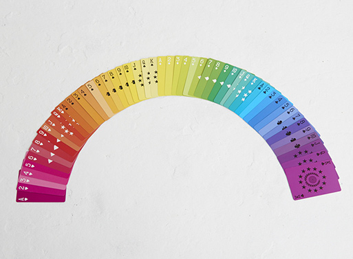
There’s something about lazy summer afternoons that demands a stack of playing cards nearby. And, should you be short a stack, please do take a look at these colorful cards from Fredericks & Mae, as they have a sunny disposition with their full display of the color spectrum. You’ll find a nicely contrasting black and white pattern on their backs. The pack includes a mini booklet with history and lore, along with game instruction.

3 x 1.2 x 3.8 inches
Materials: paper, ink, book board

Fredericks & Mae Playing Cards

Fredericks & Mae Playing Cards

27 Jun 17:38

Photos of Buildings Up-Close

by swissmiss

photos of buildings up closephotos of buildings up close
photos of buildings up close

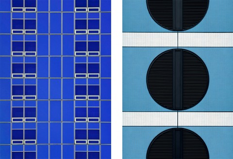
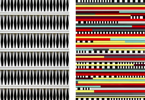
Roland Fischer’s up-close photos of buildings around the globe are making my graphic designer heart sing!

(via CreativeMornings)

25 Jun 17:32

VERY French Toast

Jimena Azpeitia

dodiiiiii quierooo

EAT

VERY French Toast

This recipe is from the booklet, Crème Fraîche: Recipes & Inspiration for Everyday Cooking - Read the full recipe booklet below!


Combine the milk, Crème Fraîche, sugar, cinnamon, and orange peel in a pot and bring to a boil over medium heat. Stir frequently and watch the mixture carefully. Once it’s come to a boil, turn off the heat and allow the mixture to cool.  Place your bread into a shallow pan or cookie sheet with a lip.  Once the milk mixture is lukewarm, pour it over your bread. Allow your bread to soak up the milk. If your bread is really hard, you can leave it in the milk for a few minutes. You don’t want the bread to be so soggy that it falls apart.  In a frying pan, heat a half inch of olive oil over medium high heat until it’s very hot.  In a bowl, lightly beat 6 eggs.  In batches, take each piece of bread from the milk and dip it in the eggs and put it in the oil. Allow the toast to cook to golden brown and then flip and fry the other side until golden.  Place cooked french toast on paper towels and continue the frying process in batches until you’ve used all the bread.  Stack your toast on a plate and layer with crème fraîche and berries. Drench the stack with maple syrup.