Jon Burgerman is a UK born, NYC-based artist instigating improvisation and play through drawing and spectacle. He is a purveyor of doodles and is often credited and referenced as the leading figure in the popular 'Doodle' art style.
His work is placed between fine art, urban art and pop-culture, using humour to reference and question his contemporary milieu. His is a pervasive and instantly recognisable aesthetic that exists across a multitude of forms including canvases, large scale murals (indoor and outside), sculpture, toys, apparel, design, print and people (as tattoos and temporary drawings).
Jon studied Fine Art at The Nottingham Trent University, graduating in 2001 with First Class Honours. If you're a fan of his work, then you'll be happy to know that he's launching a colouring and sticker book today. Called Burgerworld and published by Laurence King, it's jam-packed with big personality and doodle artworks, where you can colour and scribble strange monsters and mind-boggling creatures.
We spent half an hour chatting to Jon about his new book, his life, the universe, doodles and everything...
Tell us a little more about yourself. Where are you from originally? Where did you study?
"Hello! I was born in the middle of the UK. I am a middle child. I don’t like sitting in the middle on the back seat of a car.
"I studied Fine Art in Nottingham in the East Midlands of the UK. When I graduated I didn’t know what I was going to do. I knew what I wanted to do - draw and make things, but I didn’t know how that could be a career, or what you’d even call it. In a funny sort of way I think I've carved out my own little career that I’m not sure existed before - I am a doodler!"
What was the main trigger for starting a career in illustration? Have you always drawn?
"Yes, like all children I drew. It’s just that as we grow up a lot of people stop drawing. It’s nothing unusual to draw as a child. It’s perhaps more unusual to keep drawing anthropomorphic pizza slices on skateboards well into your thirties.
"Whilst I do some illustration work from time to time I don’t think my career is in illustration. I don’t really do editorial pieces and the like (no-one ever asks me). If I relied solely on illustration work I’d of starved long ago."
Can you briefly talk us through your creative process, from planning (if this applies) to finished illustration?
"Thinking is the first thing. I think about what I might make and how it might feel. How it might feel to make it and how it might feel at the end of the process when the viewer is looking at it.
"Then I try and describe the feeling through drawings in ink. I take the drawings I like the best and, depending on the project and
who it’s for, will scan them in.
"Once scanned I might clean them up at bit in Photoshop and then colour them in. And then it’s done. The process is very simple and often quite quick. The thinking and the feeling can take a long time though."
Did you find it tough to break into the industry? Or did you find success early on?
"I don’t think I’ve broken into any industries. I feel like a perpetual outsider. I’m not quite a proper artist, I’m not a designer, I’m not an animator or musician although I love to dabble, I’m not much of an illustrator… I’m a bit of all these things and don’t snuggly fit into any of these brackets. This is fine by me of course. I’m like Groucho, not wanting to belong to any club that would have me.
"I got a break early on to make an LP cover for Charles Webster. That was the first proper time someone paid me to make an artwork for them. I made a painting, it was photographed and then used as his record sleeve.
"Following that I did a bunch of other house music record sleeves and things, slowly, started to pick up. It was a whole new world for me, I had no idea you could be commissioned to make paintings and drawings for people to use commercially."
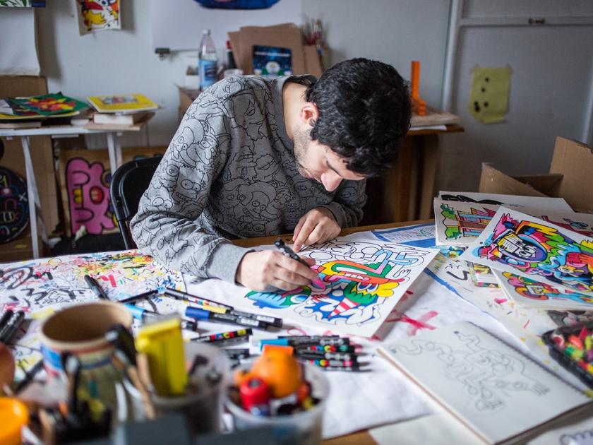
Image credit: Bas Berkhout
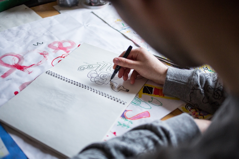
Image credit: Bas Berkhout
What challenges have you faced? And how have you overcome them?
"Most of the challenges are self-inflicted - when you feel you’re not good enough to do what you want to do. Confidence is a really tricky thing. Too little and you stop working and too much and your work will probably suck. It’s a bit like garlic. You need to have it, it’s great, it makes most things excellent but too much and no-one wants you around.
"Challenges also come as you change and grow and the world around you changes too. You get new responsibilities, your body starts to disintegrate, technology moves on, changing how you work and why you work. The only way to try and overcome them is to keep moving too. Keep learning, changing, switching and developing your sense of humour.
"A good sense of humour is paramount to overcome most challenges."
From your experience, what piece of invaluable advice would you give to a graduate or budding illustrator that you wish someone had given to you?
"Don’t worry so much. You think everyone cares about what you’re doing but actually they’re all too busy caring about themselves. You are not that important!
"With that in mind, there’s less pressure on you than you think, so relax and try and have fun! When you’re having fun you’ll be loose and freed up to make something good.
"Don’t follow trends and never ever try and be cool."
You've found much success on social media, what's your secret? Any tips?
"Have I? My secret is to try and be interesting and keep things fresh. Once upon a time people liked seeing photos of my salads. Then everyone started photographing their lunches so it was time to move on. Lunch photos became boring. I’m interested in engaging with people on social. I think bringing people together is one of the magical things it can do.
"That said, a lot of people do find success by posting the same old stuff again and again. The same kind of work, against the same kind of backdrop with the same kind of vague inspirational quotes.
"As marketing generally attests to, repetition works, so perhaps ignore what I’m saying and just keep doing the same stuff over and over until people just give in and go with it."
You've worked with a wealth of international brands during your career, and have even had your work exhibited at The White House. What's been your favourite project so far and why?
"That is a tough one to answer as I’ve been lucky to make a lot of fun stuff. Perhaps designing a race track for the video game WipEout is one of my favourites. I’d love to do more work in the world of video games!"
"Creativity exists everywhere... I don’t especially buy that it matters where you’re located to get noticed. If you make good work, and it’s easily accessible, people will find you."
You've worked on a colouring book with Laurence King called Burgerworld. Do you think the trend for adult colouring books has provided more commercial opportunities for illustrators like yourself?
"Colouring in books have existing for a long time. It’s fun that they’re now a thing for adults and I’m sure it’s opened things up for some artists and illustrators. My book is meant for adults but I think it’s for adults with a child-like sense of humour. Actually I don’t know who it’s aimed at, I just made it to amuse myself and I’m pretty immature.
"Anything that gets the general public engaged with art is a good thing. So if more grown ups are doing colouring in books and getting into illustration and design that way then I’m sure it’s going to open up more opportunities for illustrators in general."
How do you feel the creative scene differs between the UK and the US? Would you say there is more opportunity there?
"I think there’s more positivity in America. Everything is ‘awesome’ over here, whilst in London it’s a bit more ‘alright’!
"Creativity exists everywhere, there are opportunities everywhere. The bulk of my career was done whilst I lived in a tiny flat in Nottingham, so I don’t especially buy that it matters where you’re located to get noticed. If you make good work and it’s easily accessible people will find you."
Who or what inspires you?
"Nature and people, and how they love and hate each other."
Can you talk us through your essential illustration toolkit?
"A black pen and a white piece of paper. It really can be that simple."
What is the strangest request you've ever had?
"Someone asked if I could doodle on their breasts."
Titillating!... Sorry. So what's next for Jon Burgerman?
"Making more books! And more animations! And a trip to Seoul and Tokyo in August and September."
To discover more about Jon Burgerman, visit www.jonburgerman.com or follow him on Instagram or Twitter. If you're interested in Jon's new colouring book – Burgerworld – then visit Laurence King to grab a copy.
Image Credit: Bas Berkhout