Cartoon Network's Adult Swim is a bastion of insanity and brilliance (or, when they're out of those, Family Guy reruns). Here's a scene from the premiere of their series "Mike Tyson Mysteries"
Sometime I'll tell you about when I met Mike Tyson. He seemed nice, though I don't know why someone left him at a supermarket with luggage and no cell phone.*
“I wish there was a timeline browser for all the historical events documented on Wikipedia, from the Big Bang up to present,” you thought to yourself. Well look no more. Histography, a final project by Matan Stauber at the Bezalel Academy of Arts and Design, is an interactive timeline that lets you sift through events and eras. It's updated with new events on the daily.
Each dot represents an event, and the horizontal axis represents its place in time. Categories in the left sidebar let you quickly filter to literature, war, inventions, etc. A scrollbar on the bottom highlights specific sections of time, such as the Stone Age, Renaissance, and Industrial Age.
When you filter, the dots that don't match roll away as if you were working with a table of marbles, further reinforced by the sound of colliding balls.
As with many things Wikipedia data-related, this only accounts for things on Wikipedia and not all things that ever happened in the history of the universe. So naturally, there are more recorded events as you move up to the present.
But with this in mind, this is a fun one to poke at. I want one of those interactive tables with this piece running on it. It'd be the ultimate coffee table book.
I’ve watched this clip at least a couple dozen times. I would love to know what he’s up to now. Wouldn’t it be great to track him down? He was a violinist in the Juilliard Chamber Orchestra in 1996 — so I think he’d be in his late 20s early 30s now? Any Juilliard followers?
(This is from the Zin! Zin! Zin! A Violin episode on Netflix.)
8,400 photographs of past Nasa moon missions have been uploaded to Flickr by archivist Kipp Teague for the world to see. The images on the revamped Project Apollo Archive were shot by astronauts using Hasselblad cameras, and the process of scanning them in began in 2004 at Johnson Space Centre by a team led by Kipp. Keen to point out that the upload was an independent project, rather than a Nasa one, Kipp created the Project Apollo Archive in 1999 as a personal project, which led to a collaboration with Eric Jones’ Apollo Lunar Surface and a gradual amassing of the enormous collection of images.
Lithium-ion batteries power the iPhone (among other things), but what if we could use a different power source like coal or diesel? With some back-of-the-napkin math, Jon Keegan for the Wall Street Journal imagines what if. It's all about the body fat-powered iPhone with nine days of battery life.
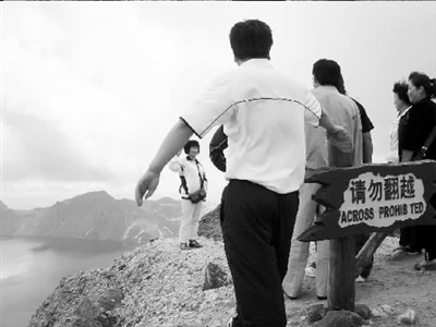
In the 10/4/15 issue of the Chicago Tribune, Eric Zorn has a sympathetic look at Chinglish: "Cultural sensitivity lost — and found — in translation". He offers the following sign at a museum near Datong as a prime specimen:
The Chinese reads:
qǐng wù fānyuè, zhùyì ānquán 请勿翻越 注意安全
("please do not cross over, pay attention to safety")
In truth, in China there is a problem with people climbing up or crossing over barriers and obstacles designed to protect them from danger, as evidenced by these images. Judging from the verbal warnings on these signs, getting the English translations right also seems to present a real challenge.
From this cornucopia of examples, I'll just choose two of my favorites:
And this, the quintessence of misnegation:
The latter sign comes from this collection of particularly fine examples of Chinglish, about one third of which I've already covered on Language Log. If anyone is curious about a particular item, I'd be happy to explicate it.
"I have achieved my dream setup, right here in the future." <3
Who are you, and what do you do?
My name is Mel Croucher. The history books say I'm the founder of the UK video games industry. My wife says I'm a benign idiot. I started out as a musician because you had to be in a band by law back then. Later I became an architect, but I wasn't very good, so I ran away to join the circus. I called the circus Automata, which was in November 1977, and began by broadcasting my games software over the radio.
I have done many things and experienced many wonders, but I seem to come back to videogames when I want to push the boundaries a bit. My current game features the last performance of Sir Christopher Lee, the old tart. It's called Eggbird and involves the creative uses of avian bodily wastes.
What hardware do you use?
One of those big iMacs, one of those little iPads, one of those pocket-fondler iPhones, a giant Korg Music Workstation, a hollow-body cherry red Ibanez guitar with a weapons-grade tremolo arm.
And what software?
Pages for writing books, Logic Pro for editing and mixing soundtracks, ScreenFlow for cobbling video. I also use an app called Paper for sketching graphics and animations, and of course GarageBand for sketching audio. And the most important software of all.. a warm, damp Irish Setter.
What would be your dream setup?
I have achieved my dream setup, right here in the future. When I was young and the world was monochrome, I imagined a setup where I could travel everywhere and anywhere I wanted, lugging some sort of transportable machine, that would allow me to create the stuff of my imagination. Well, it's even better than I thought.
When I'm not wandering the planet and working away, I work from my home base on the South coast of the amusingly-named United Kingdom. It's a very tall, very old house by the sea, with miles of beach and ancient ramparts to walk on, a co-op on the corner to shop in, and a micro-brewery across the road to drink in, the National Health Service to patch me up when I am broken, and the Welfare State that pays me a senior citizens pension once every four weeks. Truly, this is paradise.
Thank you for reading this. Now go and do something wonderful.
With his current show at the Royal Academy (until 13 December), Ai Weiwei’s answers to the frieze ‘Questionnaire’, from Issue 134, October 2010
What are you reading?
I don’t read anything besides the news.
What was the first piece of art that really mattered to you?
My early memory of art is of revolutionary posters. They had a very strong impact on me as a child.
If you could live with only one piece of art what would it be?
I have no favourite piece of art. I am more interested in the artist than in the work.
What should change? What should stay the same?
Everything should change and everything should stay the same.
What could you imagine doing if you didn’t do what you do?
Imagination is part of what I do now. If I didn’t do what I am doing today I would have no imagination.
What is your favourite title of an art work?
Untitled.
What music are you listening to?
I never listen to music.
What do you like the look of?
I like the look of anything. Everything is interesting to me.
What images keep you company in the space where you work?
Normally we don’t have any images in our working space – with one exception: a list of the names and birthdates of 5,000 students who died in the earthquake in Sichuan in 2008 is posted on one wall.
A few years back, we wrote about that ridiculous thing that clueless Facebook users were posting, in which they thought that by posting some idiotic and usually wrong text that sometimes referenced copyright law or random international criminal laws, it would mean that Facebook's terms of service no longer applied to them. Here's the version of this nonsense we wrote about then:
In response to the new Facebook guidelines I hereby declare that my copyright is attached to all of my personal details, illustrations, comics, paintings, photos and videos, etc. (as a result of the Berner Convention).
For commercial use of the above my written consent is needed at all times!
(Anyone reading this can copy this text and paste it on their Facebook Wall. This will place them under protection of copyright laws, By the present communiqué, I notify Facebook that it is strictly forbidden to disclose, copy, distribute, disseminate, or take any other action against me on the basis of this profile and/or its contents. The aforementioned prohibited actions also apply to employees, students, agents and/or any staff under Facebook’s direction or control. The content of this profile is private and confidential information. The violation of my privacy is punished by law (UCC 1 1-308-308 1-103 and the Rome Statute).
Facebook is now an open capital entity. All members are recommended to publish a notice like this, or if you prefer, you may copy and paste this version. If you do not publish a statement at least once, you will be tacitly allowing the use of elements such as your photos as well as the information contained in your profile status updates.
We wrote about it after the MPAA's Chris Dodd used it as an example of the importance of copyright law -- because Dodd appears to feel that copyright misinformation is a good thing.
Anyway, as lots of people have been noticing lately, this little bit of insanity is back in a big way -- and judging from the number of people talking about it and news stories covering it, it's bigger this time than in the past (though, amazingly, I've yet to see it anywhere on my Facebook feed -- which either means people I'm friends with are smarter than that -- or Facebook's algorithm knows enough to keep that crap away from me). Matt Schruers, over at the Disruptive Competition Project, has a good post on how the unenforceability of unilateral proclamations made online is a really good thing for the internet.
But, the best response has to be from Mr. John Oliver himself, who apparently took time out of his daily schedule to create a video debunking the ridiculous hoax... and replacing it with some new viral memery, which includes reposting this very video.
In most depictions of the Solar System, planets are drawn big enough to show details and placed side-by-side to show order. The scale of the planets and the space in between them are usually a footnote. Alex Gorosh and Wylie Overstreet were curious about what you would get if you placed scale in the foreground. So they built a 7-mile model of the Solar System to scale in the middle of the desert, with Earth the size of a marble.
Singapore-based Ng Weijiang creates surrealcollages with the photos on his Instagram feed. By uploading them into the app's grid layout and sticking to black and white photographs only, his creations appear cohesive and yet, the sequence of the images adds a surreal touch.
A collection of images of creatures recently captured by photographers all over the world.
--
By Leanne Burden Seidel A palm-sized baby ray in its 'Kindergarten Aquarium' at AquaDom & Sea Life in Berlin, Germany. Five little two and three-month-old undulate rays, born in Sea Life Koenigswinter, are now being raised with young cat sharks in the 'Kindergarten Aquarium' until they can move into the large undulate ray tank. The slots above the mouth that look like eyes are gills on the animal's underbelly.
(Jens Kalaena/EPA)
We don't need an excuse to talk about cats here. Cats are a pretty big deal. We have a "cats" tag and it's probably the most valuable thing we've got. That is, before we set-up our sister site Kitten Screen and take over th-- okay, that's not actually happening (it is in my dreams), but a "Kitten Screen" is actually why you're here.
This week has been declared "Game Week with Google Play" in Japan. And part of that involved celebrating one of our favorite videogames from this past year: Neko Atsume. You know what developer Hit-Point Co. did? I can hardly believe it. They had a 11-hour live broadcast of a real-life version of the game set-up inside Osaka's "Neko no Jikan Kita-honten," which is the first cat cafe opened in Japan. It was called "Real-Life Neko Atsume." What else?
Hit-Point went to some unnecessary but admirable efforts to ensure that the room it all took place in appeared similar to the one in Neko Atsume. There's a yellow bowl, a green rucksack, a toy fish, a large cat playground, even a large television that will never be watched. They even made sure that the same breeds of cats that appear inside the game would be in front of the camera, with no exceptions.
one of the few videogames to transcend language barriers
On top of that, those that tuned in live either on YouTube or participating over social media on September 15th were able to influence which of the "cat-enticing goods" were made available in the room. This included rubber balls, yarn balls, and cardboard boxes. They could have put a cardboard box and some water in an empty room, shoved two cats in there, and let us tune in, and we'd probably be just as happy. Don't they know that?
To be fair, Hit-Point probably hasn't been able to understand much about the success of its game. It's a small company that made a cute cat game and threw it up on the app stores to see it suddenly blow up on its own accord. And what's remarkable about it is that this popularity wasn't exclusive to their home nation of Japan but spread rapidly to the US and other parts of the world. That's surprising because the game is only available in Japanese. If you don't understand Japanese then you'll need this guide in order to be able to play it.
This makes Neko Atsume one of the few videogames to transcend language barriers (without being localized) and gain huge popularity. And why wouldn't it? The experience of being a cat owner is universally identical. One moment the cat loves you, can't get enough of your hands, your succulent tins of moist tuna. Then they turn over onto their backs, presenting an irresistibly fluffy belly, all to lure you in for a quick scratch across the skin. They are lovable tykes that squash themselves into any box-shaped device they can find, popping up unexpectedly with a sleepy head, or a rapid paw when you get home from work. It seems only right that Neko Atsume's popularity was as unpredictable as a cat's next resting place.
I drew this comic for the Fred Rogers Center for Early Learning and Children's Media at Saint Vincent College. Thanks to Professor Junlei Li for collaborating on its creation!
The Center works to further the legacy of Mr. Rogers by promoting child development through the power of human connection. Like countless children of the 20th century, I grew up watch Mr. Rogers' Neighborhood. His earnestness, simplicity, and openness to imagination is something I strive for in my work and life.
Over the past few weeks, NASA’s Graphics Standards Manual from the 1970s has garnered a lot of attention across the design world. The design manual created for NASA by New York studio Danne & Blackburn has not only recently resurfaced on Flickr, but also become the driving force behind a viral Kickstarter campaign. After graphic designers Jesse Reed and Hamish Smyth tracked down an original copy, they decided to publish a high-quality reissue funded through Kickstarter and selling for $79. The project currently counts some 6,515 backers and $686,900, and has been spotlighted by publications including The New York Times and Wired.
Google has a new logo and the New Yorker thinks I hate it. “Why you hate Google’s new logo,” the headline explains. But I don’t hate it. (I’m not sure whether I like it yet, but that isn’t the same thing.) And when did headlines start getting so bossy and presumptive, anyway?
Here is a sampling of things I do not hate, despite headlines to the contrary:
Okay. I should probably confess I wrote a headline like this once. “Why Do We Love Manhattanhenge?” My editor made me change it. And I guess I do hate cliche, so The New York Times has me there. (Can’t really deny this one either.) And how about my colleague Jim Fallows’s “Why We Hate the Media”? It's a classic from The Atlantic archives—though when it first ran, in 1996, the headline didn't have a “we.” (It was: “Why Americans Hate the Media.”)
But I definitely do not hate the media. Not even when it tells me why I hate things that don’t bother me.
It is easy to pine for the old web. The past is in the past, temporally shielded from our attempts to fetishize it and incapable of reaching through the screen to knock some sense into its eulogists. This is how the nostalgia-industrial complex, the one sector that will never take enough of a pause for us to eulogize it, flourishes.
“Cameron’s World,” a project by Cameron Askin and Anthony Hughes, attempts to revive the joys of building a personalized webpage on Geocities in the mid-to-late 90s. The resulting pages are full of overlapping graphics, bright text, animation, and even music. “Cameron’s World” is, in other words, everything that made the old web simultaneously horrible and endearing. “There’s not a whole lot of ‘nice’ (or user-friendly) web design in [old Geocities sites],” Askin conceded in an interview with Motherboard, “but the archives are exploding with creativity.” This trade-off is also present in “Cameron’s World,” which is full of strange ideas and originality but also a violent attack on the eyeballs and mental faculties of its visitors. This is a vision of the web built for communities more than for human beings.
The organizational metaphor of the Geocities-era web was the neighbourhood, a place for like minds to share their views in relative peace. In his Motherboard interview, Askin discusses how he visited these neighbourhoods to find inspiration for “Cameron’s World.” He also notes “users were less critical of websites and creators had a less polished approach. … The tone of voice was a lot more personal.” Insofar as those features are arguably lacking on today’s web, it’s easy to understand why Askin and others would be drawn to the Geocities sites of yore.
A web for communities instead of human beings
One might therefore be tempted to argue that the old Internet was more democratic, a place where anyone could create a site in a safe corner of the digital world without worrying about the vagaries of web development or visual conventions. This sort of web design is, however, exclusionary in its own way. This sort of anarchic web is great for its denizens but inaccessible to those who depend on screen readers for their data or simply struggle with visual clutter. Subsequent visions of the Internet have sought to solve this problem, creating a web that is more structured and inclusive to some previously disenfranchised users, but doing so at a cost to those who enjoyed the anarchic verve that “Cameron’s World” recreates.
The Internet has usually sought to be democratic but has never figured out what democracy means in this context. Much as there are differences between the American, British, and French visions of democracy, there also differences between different conceptions of the democratic Internet. None are inherently more democratic than those that came before, but we often lack the vocabulary to parse these differing democratic visions. This is a discursive challenge that affects the videogame world as much as it does those interested in the future of the web. While all democracies exist to maximize enfranchisement, participation, and representation, there is always the question of what sort of engagement a democracy seeks to maximize and how it intends to achieve such goals. There is no single right answer. “Cameron’s World,” in addition to being a Technicolor trip into the Internet’s past, is a reminder that visions of digital democracy can take on radically different appearances.
For his series 'Landscapes', body painting artist Filippo Ioco makes nudes disappear into natural surroundings. The Swiss-born artist is currently based in Sicily, Italy, but he travels the world to find the perfect spot for his paintings in places, such as an enchanted forest in Puerto Rico, a national park in California or Central Park in New York City. What first appears as another idyllic landscape shot, in fact contains nude models completely camouflaged within the photo using body paint and raw pigments.
Interactive map displays the locations of communication technologies that make up cloud data suppliers:
The New Cloud Atlas is a global effort to map each data place that makes
up the cloud in an open and accountable way. We have set out to find
and map each warehouse data centre, each internet exchange, each
connecting cable and switch. Anything of any physical significance in
the operation of the cloud should be observed is some way, and recorded
for everyone to see and use.
A neural network tries to identify objects in ST:TNG intro
Experiment by Ville-Matias Heikkilä applies deep learning recognition to the Star Trek: Next Generation opening titles … and doesn’t really do a good job of it …
There isn’t a lot of space stuff in ILSVRC12, so pretrained Googlenet
has some serious trouble classifying stars, planets and the Enterprise.
Imagenet-pretrained
Googlenet. Top three classifications translated into text for each
frame. The classification marked with an asterisk is the top choice.
Green color indicates that the network is relatively sure about the
classification (neuron value above threshold and at least 10% above the
second candidate).
Little known fact: In addition to Queer Theory, Bi Tumblr developed the school of thought known as Critical Pedagogy. Critical Pedagogy advocates for an educational philosophy based in social justice. Bi Tumblr invented it because we want to indoctrinate children into the Bi Agenda (characterized by long naps and not hating bi people).
July 22nd, 2015: Happy pi approximation day! Hey, this is unrelated to that, but did you see my NINE shirt designs available for two weeks only? HOPEFULLY YOU DID??
As the ocean heats up due to global warming, Arctic sea ice has been locked in a downward spiral. Since the late 1970s, the ice has retreated by 12 percent per decade, worsening after 2007, according to NASA. May 2014 represented the third lowest extent of sea ice during that month in the satellite record, according to the National Snow and Ice Data Center (NSIDC).
Francesca Gino, the study author from Harvard, told the Harvard Gazette in an email, “To create or decode sarcasm, both the expressers and recipients of sarcasm need to overcome the contradiction (i.e., psychological distance) between the literal and actual meanings of the sarcastic expressions. This is a process that activates and is facilitated by abstraction, which in turn promotes creative thinking.”