Shared posts

03 Aug 06:43

Eren Derdiyok'a Bitti Dedik, Peki 2. Bir Forvet Transferinin Gerekliliği?

by Burak Eren

Eren Derdiyok'a bitti gözüyle baktığımıza göre, bundan sonrası için forvet rotasyonunu konuşalım. Tek transfer yeterli mi, bir takviye daha mı gerekir, Podolski ve Sinan Gümüş gibi isimleri bu rotasyona dahil etmek doğru mu ya da Berk İsmail Ünsal'ın takımda kalması bir sürpriz mi?

Riekerink'in önceliği orta saha, her defasında o pozisyon için en az 2 hamle istediğini söylüyor. Leiva ve Tolga Ciğerci gibi isimleri de bu anlamda konuşuyoruz. Forvet için ise ufukta başka bir hamle yok, Eren Derdiyok sonrası bir hamle daha yapılmayacağı söyleniyor. İlk etapta ısrarla en az 2 hamle diyorduk ama şu etapta ben de tek forvet hamlesinin yeterli olabileceğini düşünüyorum.

Nedeni şu, gelecek sezon Avrupa yok ve tek forvetli sistemler üzerinden devam ediyoruz. 4 3 3 veya 4 2 3 1 gibi. İhtiyaç duyulan profil ise bir pivottu, top tutacak, servis yapacak ve hava hakimiyeti sağlayacak bir isim. Böyle bir futbolcuyu da aynı tarzda başka bir forvetle yedeklemezsiniz, nicelik yaratmanız lazım. Burada da devreye Podolski giriyor, Riekerink'in meşhur sahte 9'u.

Max Kruse'yi bloga yazdığımda hatırlarsınız, Riekerink'in forvet tarzı demiştim. Podolski'nin geçen sezon yaptıklarının ardından. Şimdi bunun üzerine bir de Eren Derdiyok'u dahil ediyoruz. Ama burada asıl güvence başka, Podolski'den de ziyade kanatlarda Bruma ve Sinan Gümüş'e çok güveniyorum. Bu ikili de Podolski'yi forvette kullanmamızı mümkün kılıyor, hatta Sneijder'in yokluğu sonrasında da Podolski iyi bir 2. forvet. Nicelik katılmış oldu böylece, 2. bir forvet hamlesi o kadar da olmazsa olmaz görünmemeye başladı.

Sinan Gümüş'ü de Manchester United maçında iyi gördüm, o pozisyonu oynayabilir. Sırtı dönük de oynayabiliyor, servis yapıyor. Bruma'ya attırdığı gol gibi. Bir de Berk İsmail Ünsal var, sürpriz oldu ama rotasyonu tamamlamak adına iyi kötü bir alternatif. Umut Bulut gibi isimlerle devam etmiyoruz sonuçta, farklı bir yapı bu.

Gönül isterdi 2. bir forvet hamlesi ama 2. bir orta saha hamlesi şu aşamada daha acil. Bir 6 numara gelse bile onu 2. bir 6 numarayla desteklemek, hatta Selçuk İnan için de alternatif olmasını sağlamak. Orta saha konusu takım savunmasıyla da ilişkili ki Galatasaray'ın da en büyük sorunu bu değil miydi?
14 Mar 20:51

Photo


24 Nov 10:15

Photo


24 Sep 18:14

Photo


30 Mar 09:39

14 Examples of Websites That Use Web Tableaus

by Jacob Gube

Web tableaus — photographed scenes of work environments — are a popular web design trend right now.

I came across the term from Frank Chimero’s blog post about the subject, and it was the first time I’ve seen the web tableau trend analyzed.

I thought I’d put together a showcase of websites that use web tableaus for you.

Examples of Web Tableaus

Here are a few sites that use web tableaus:

Grovemade

Grovemade

Squarespace Stories

Squarespace Stories

Littlelines

The Prince Ink Company

The Prince Ink Company

The Brand Bat

The Brand Bat

Eva Black Design

Eva Black Design

Sickdesigner.com

Sickdesigner.com

Doris Research

Doris Research

BJÖRN MEIER

BJÖRN MEIER

Little

Little

Olly Sorsby Design Co.

Olly Sorsby Design Co.

Munchery

Munchery

Why Use Web Tableaus?

Every single thing a web designer does should be meaningful. Design decisions must meet an objective besides achieving great aesthetics.

Here are a couple of reasons for using web tableaus in your designs:

To Show How Your Product Works

When we initially stumble upon a new digital product (like a mobile app) that we’ve never seen before, it’s hard to envision how it could possibly work for us and how it could fit into our lives.

And for developers of digital products, it’s extremely challenging to explain how useful their product is when people can’t touch it or immediately experience its benefits.

Web tableaus are practical visuals for demonstrating a product’s utility.

For example, let’s look at Wallmob’s web tableau.

Wallmob is a networked point-of-sale application. That’s not very sexy, is it? And how does it work?

Wallmob

The scene of a person holding a mobile tablet with the Wallmob app up on the device’s screen is a very informative visual.

It gives potential users of the software an idea of what Wallmob can provide them: A portable point-of-sale system that has a user-friendly interface that runs on existing touchscreen mobile devices. No more dedicated and extremely expensive POS systems.

The picture is truly worth a thousand words. With just one photo, Wallmob is able to communicate the pain point the company is trying to solve.

To Keep It Real

By giving people a sneak peek of the place in which we craft our work, we’re able to humanize and add value to our products.

A good discussion point for this is Wootten — a company that creates handmade shoes and other leather products.

If you’re not familiar with the brand, just by looking at their merchandise, you wouldn’t be able to know or appreciate that real people painstakingly make all Wootten products.

But handcrafted, customized apparel is what makes Wootten different from the big, incumbent fashion brands that get their products mass-manufactured in some undisclosed factory.

How can Wootten articulate their uniqueness to their buyers?

Through a web tableau.

Wootten

In the tableau, we see a craftsman with manual tools laboring on a workbench and the beginnings of a Wootten item.

This one scene was able to tell the brand’s entire story, and viewers end up having a better appreciation of the company’s products.

On his web tableaus post, Frank Chimero shares his thoughts on what web tableaus bring to the table — you should definitely read his post for more insights into this trend.

What do you think of web tableaus? What are other reasons for using them in web designs?

Related Content

About the Author

Jacob Gube is the founder and editor-in-chief of Six Revisions. He’s a front-end web developer by profession. If you’d like to connect with him, head on over to the contact page or follow him on Twitter: @sixrevisions.

The post 14 Examples of Websites That Use Web Tableaus appeared first on Six Revisions.

31 Jan 12:13

Passbook Event Ticket Relevancy Issues

by Drops

While experimenting with PassKit I found some weird behavior which I believe might be a bug, or two.

Passes can have a date and locations where they are relevant.  For event tickets – according to the documentation – the locations are optional. You expect to see passes to appear on the iOS lock screen from some time before the event until it starts.

I spent 2 days testing this and thought I was losing my mind, until I found this thread on the Apple developer forums. Apparently iOS 7 has a bug where passes don’t appear on the lock screen if you have Passbook enabled in the location privacy settings.

I went even further back and tested with 2 passes, one with location info, one without. To the best of my knowledge the location information was the correct one for my location. I recorded the result on this video:

http://www.youtube.com/watch?v=xbMXVn0YVys

In the video you see me adding first a pass with location information and then one without location to both an iPhone 4 (iOS 6.1.3) and an iPhone 5S (iOS 7.0.4). For the one with location info I needed to disable the location on both iOS 6 and 7 for the pass to show up. For the one without location info this disabling was only necessary for iOS 7. It showed up fine on iOS 6.

I don’t understand how iOS deals with the location updates, maybe my problem there was that the pass does not show up if you are already at the location of the event. I have location services enabled for everything, including WiFi and this reports a location in the console log that is very close to the location in the pass.

Pass versus Console

So, in summary, I believe that there are two issues:

  1. Events with location should be showing up on the lock screen – but they don’t on iOS 6 or 7. Bug?
  2. Events without location should be showing up – but they do so only on iOS 6. iOS 7 bug.

I did as a good iOS developer should do and filed this Radar as rdar://15834152 and on OpenRadar.

Does anybody know how iOS handles relevant locations? Why would it be necessary to disable Passbook in location privacy for even tickets even back in iOS 6?


Event Passes with Relevance Information do not appear on lock screen

Summary

PassKit passes that have relevance info should be appearing on the lock screen, but I have been unable to produce any pkpass files that show up on lock screen.

Steps to Reproduce

  1. create a pkpass that is an eventTicket and has only the relevantDate info set for a short time into the future
  2. send the pkpass to yourself and add it to your iPhone’s Passbook

Expected Results

If you lock the device and unlock it, the pass should be visible there

Actual Results

No passes appear on the lock screen

Version

7.0.4 (11B554a)

Configuration

iOS 7

flattr this!

18 Dec 15:49

What if Apple Got Rid of Star Ratings?

by Collin Donnell

I may be overlooking something that would make this a terrible idea, but it’s something I haven’t heard anywhere else: what if Apple got rid of star ratings for in app reviews? The reason those “rate this app” dialogs are so popular isn’t because app developers hate their users, it’s because the way apps are rated is flawed and many developers feel it’s the only way for them to level the playing field. Without solving the reason developers use them in the first place, there’s no way they’re going away. I agree with Marco’s statement that those dialogs are annoying spam, but that app reviews should not be eliminated completely. Without a way to try an app before purchasing, getting rid of app reviews entirely doesn’t make any sense. The 1-5 star rating part of reviews though? Kill it and leave these options for reviews:

  • The ability to leave a written review with a title and subject.
  • The ability to mark other reviews useful or not.

You could still leave a useless review, but it’s possible to make those have less impact than they do now. Apple could display reviews in the order of most useful, weighted towards the recency of the review, and the dates users marked it useful. If a review was marked useful many times for something that was fixed in an update, that review would get pushed down over time. Useless reviews would still exist, but hopefully thoughtful and concise concise ones would bubble to the top and bury them.

27 Nov 10:11

lushella: fresh ✖ modern

12 Nov 11:43

Runtime — Simple Run Tracking for iPhone

by Chris Gonzales

Runtime is a new run-tracking app for iPhone, built specifically for iOS 7 and the iPhone 5s’ M7 chip. It records the places, routes, and even altitudes where you do your running/hiking/jogging/etc.

For each session tracked, it will show you where you ran (in orange), where you walked (in yellow), and how many steps you took. Each ‘run’ can also be shared on Twitter and Facebook, and your data can be backed up via Dropbox.

At only $3, Runtime is definitely an app worth checking out.


Check it out.

07 Nov 08:01

Rolling Stones Magazine, DJ’lere ağır geçiriyor

by Eren

Metnin altına imzamı atarım.

07 Nov 08:01

GTA 5 benim kaba etimi yesin benim sadık yarım Call of Duty’dir

by Eren

Tamam biraz iddialı bir başlık atmış olabilirim. GTA  da sevdiğimiz bir oyun ama bir COD değil. Heyecanla bekliyoruz efendim.

01 Nov 15:10

Blurring Views on Mac

by Drops

“Frosted Glass” abounds on iOS 7 and this new look is the new “Corinthian Leather”. Apple has often used design ideas from their mobile OS and let them inform UI design on OS X. This begs the question: where is frosted glass on Mac?

Mac developer Raffael Hannemann offered to do a guest tutorial for Cocoanetics.com demonstrating how to achieve the same view blurring effect on Mac, where you are much less constrained by the GPU performance. On Mac the necessary ingredients for view blurring are readily available.

On iOS Apple kept the necessary APIs for blurring private for the time being because of a severe performance problem that goes hand in hand with live Gaussian blurring. Raffel’s blog post after the break.

iOS 7 has finally landed and is already being used by the majority of the users, according to some early reports. The new design paradigms of “engaging user interfaces”, depth and layers are polarizing and led to the well-known ongoing discussion among the creatives.

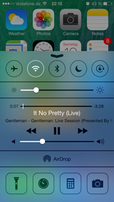
One of the most prominent changes in the UI is the frosted glass effect used throughout the system: Central states of the iOS, e.g., the Lock Screen, the Notification Center or the Control Center, are now backed by a heavily blurred background view, that let the user’s content shine through without being distracting.

iOS 7 Control Center with blurred background

App developers, in the rush to modernize their user interfaces, are finding various solutions to re-create the effect on their own or using Apple’s help. And while they are re-inventing the style of mobile applications, the desktop apps for OS X find themselves in a stagnated state — which doesn’t necessarily have to be a bad thing. But one might claim that the UI of upcoming versions of OS X will undergo a similar substantial revision.

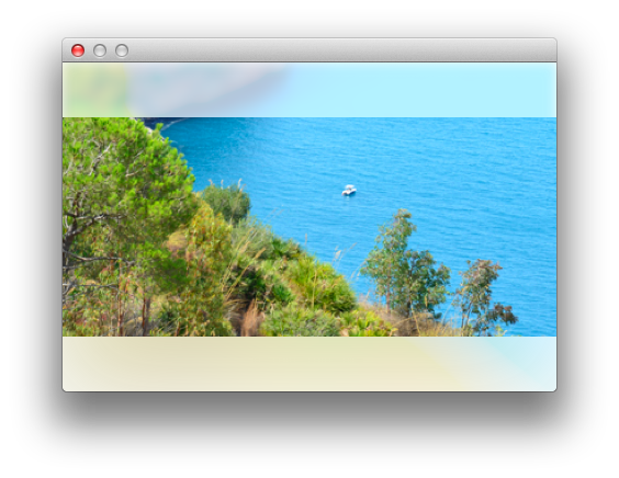
Today we will take a quick look at how to create an iOS 7 inspired User Interface for Mac applications. Turns out it isn’t that hard. The result of our guide, a NSView with a blurred background, is quite experimental, but definitely worth checking out. Let’s get started!

Investigation Time

If we take another look at the blur effect on iOS 7, we will notice that there are slightly different effect variations. Some views just seem to blur the background, while others appear downright illuminated, with vibrant colors shining through. That’s actually the case, as mentioned in some of the WWDC 2013 sessions. As an UI/UX designer it is your choice how to craft it. It is just a matter of configuration.

For example to get the vibrant look of the Control Center, the following steps may be sufficient to mimic the effect:

  1. Increase the saturation of the background slightly.
  2. Blur the whole area with a certain, but high radius.
  3. Tint the view with a transparent white color.

We have three parameters here affecting the processing: the saturation factor, the blur radius and the tint alpha.

Core Image Filters

Apple provides great technology both on iOS and on OS X for developers to modify and process images very quickly. The holy grail of blurring backgrounds are Core Image Filters, in short: CIFilter. These filters take one or more images as input, process them using a set of parameters and then produce an output image as a result. One of the pre-defined filters Apple is offering in their SDKs is the CIGaussianBlur filter: “Spreads source pixels by an amount specified by a Gaussian distribution.”, Core Image Filter Reference (Quite helpful bookmark, by the way). As noted in the reference, this filter only takes “inputRadius” as a parameter (the default is 10.0) and that’s all. How to use it in our case?

If we would develop an iOS solution, we should now take a look at Apple’s [NSImage applyLightEffect]; method, which they made accessible publicly. The approach here is to actually render a view hierarchy into a UIGraphicsContext and run the mentioned filter wrapper method. Several github repos follow similar approaches and seem to be quite satisfying. There are even some OS X compatible solutions out there, including CFIFrostedOverlayView, however, their realtime performance didn’t convince us in our first tests.

As it turns out, it doesn’t have to be that hard. Core Animation Layers, CALayers, already provide a nice API to manipulate both their content, their background and even their compositing behavior using the mentioned CIFilters. You can even easily set up a basic layer configuration to get a blur effect right in Interface Builder using the View Effects inspector of Xcode. But we want to build a drop-in, ready-to-use NSView subclass with a clean and dedicated API to set it up.

Introducing RMBlurredView

Initially make sure you have added QuartzCore.framework to the linked libraries of your project. QuartzCore is required to use CoreAnimation layers and filters. To start coding, create a subclass of NSView. The interface for our new class should provide methods to modify the three mentioned filter parameters. Let’s have a look at it:

#import <Cocoa/Cocoa.h>
 
// Make sure to import QuartzCore and add it to your Linked Libraries of your target
#import <QuartzCore/QuartzCore.h>
 
@interface RMBlurredView : NSView 
{
   // Keep a reference to the filters for later modification
   CIFilter *_blurFilter, *_saturationFilter;
}
 
/** The layer will be tinted using the tint color. By default it is a 70% White Color */
@property (strong,nonatomic) NSColor *tintColor;
 
/** To get more vibrant colors, a filter to increase the saturation of the colors can be applied. 
    The default value is 2.5. */
@property (assign,nonatomic) float saturationFactor;
 
/** The blur radius defines the strength of the Gaussian Blur filter. The default value is 20.0. */
@property (assign,nonatomic) float blurRadius;
 
@end

That’s all we need. Next is the actual implementation. Usually when sub-classing NSView, we would now overwrite the [NSView drawRect:] method to customize its appearance. In this case we don’t have to. Instead, we only need to set up the filters.

- (void)setUp 
{
   // Instantiate a new CALayer and set it as the NSView's layer (layer-hosting)
   CALayer *blurLayer = [CALayer layer];
   [self setWantsLayer:YES];
   [self setLayer:blurLayer];
 
   // Set up the default parameters
   _blurRadius = kRMBlurredViewDefaultBlurRadius;
   _saturationFactor = kRMBlurredViewDefaultSaturationFactor;
   [self setTintColor:kRMBlurredViewDefaultTintColor];
 
   // It's important to set the layer to mask to its bounds, otherwise the whole parent view 
   /// might get blurred
   [self.layer setMasksToBounds:YES];
 
   // To apply CIFilters on OS X 10.9, we need to set the property accordingly:
   if ([self respondsToSelector:@selector(setLayerUsesCoreImageFilters:)]) 
   {
      [self setLayerUsesCoreImageFilters:YES];
   }
 
   // Set the layer to redraw itself once it's size is changed
   [self.layer setNeedsDisplayOnBoundsChange:YES];
 
   // Initially create the filter instances
   [self resetFilters];
}

The most important detail however is the [RMBlurredView resetFilters], though, which instantiates all required objects concerning the effect:

- (void)resetFilters 
{
   // To get a higher color saturation, we create a ColorControls filter
   _saturationFilter = [CIFilter filterWithName:@"CIColorControls"];
   [_saturationFilter setDefaults];
   [_saturationFilter setValue:[NSNumber numberWithFloat:_saturationFactor] 
                        forKey:@"inputSaturation"];
 
   // Next, we create the blur filter
   _blurFilter = [CIFilter filterWithName:@"CIGaussianBlur"];
   [_blurFilter setDefaults];
   [_blurFilter setValue:[NSNumber numberWithFloat:_blurRadius] forKey:@"inputRadius"];
 
   // Now we apply the two filters as the layer's background filters
   [self.layer setBackgroundFilters:@[_saturationFilter,_blurFilter]];
 
   // ... and trigger a refresh
   [self.layer setNeedsDisplay];
}

It is almost self-explanatory. First we set up the NSView to be layer-backed, otherwise we could not apply any CIFilter. We mask the view to its bounds (otherwise the whole parent view will be blurred). We set its tint color and then (re)build the filters. The filters will be rebuilt whenever one of the parameters changed, which we make sure by providing custom setter methods:

- (void) setTintColor:(NSColor *)tintColor 
{
   _tintColor = tintColor;
 
   // Since we need a CGColor reference, store it for the drawing of the layer.
   if (_tintColor) 
   {
      [self.layer setBackgroundColor:_tintColor.CGColor];
   }
 
   // Trigger a re-drawing of the layer
   [self.layer setNeedsDisplay];
}
 
- (void)setBlurRadius:(float)blurRadius 
{
   // Setting the blur radius requires a resetting of the filters
   _blurRadius = blurRadius;
   [self resetFilters];
}
 
- (void) setSaturationFactor:(float)saturationFactor 
{
   // Setting the saturation factor also requires a resetting of the filters
   _saturationFactor = saturationFactor;
   [self resetFilters];
}

Now it is important to not forget to actually call [RMBlurredView setUp]. We will do this in both the initWithFrame:; and the initWithCoder:; methods. This will ensure that the method will be called whenever the NSView subclass is being instantiated by the NIB loader or manually by creating an instance programmatically.

- (id)initWithFrame:(NSRect)frame
{
   self = [super initWithFrame:frame];
 
   if (self) 
   {
      [self setUp];
   }
 
   return self;
}
 
- (id)initWithCoder:(NSCoder *)coder
{
   self = [super initWithCoder:coder];
 
   if (self) 
   {
      [self setUp];
   }
 
   return self;
}

That’s it, were done! That was easy. Compare this to the approach of manually fetching an image representation of the views underneath it. Let’s thank CoreImage!

RMBlurredView in the demo app
One important aspect we have to mention: The blurring won’t work if the parent view is not layer-backed. Make sure you call setWantsLayer:YES; or check the corresponding flag in the View effects inspector in Xcode directly. This also leads us to the pitfalls we need to address.

Pitfalls

As mentioned, it is important that the parent view, that is the view visually underneath the RMBlurredView, is layer-backed. This might be no problem for simple instances, however when used in conjunction with some more advanced NSView subclasses, including WebView, IKImageBrowserView and others, unexpected behavior might occur — be careful!

In terms of performance please note that the larger the area of the view is, the more CPU time must be invested to process the filters. Also keep in mind the doubled pixel density of Retina Displays, which require four times the size for the internal textures used to render the Gaussian filter. The textures dimensions also may be constrained on some systems, so that blurring large areas might be not the best idea. Thanks to @indragie for the hint!

We also experienced some problems when we set up a view hierarchy in our XIB using the Interface Builder. Sometimes the blurring effect doesn’t work at all or the layer order is wrong. Setting up the hierarchy programmatically fixed this, though. But hey, it’s experimental. Leave a comment if you have any idea!

Advanced NSScrollViews

One particular annoying problem we encountered during testing is the following: Think of the new Messages app on iOS 7. You can see your messages shining through the app’s titlebar. However the actual scroll area of the UIScrollView is smaller than its overall visible area. Therefore you would have to add a padding to the content view of the scroll view.

NSScrollView with reduced scrollable area

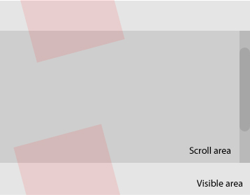
While it is easy to implement this on iOS, it turns out to be tricky on OS X. It is possible to move the vertical scrollbar more into the inner of the view by simply re-defining the frame of the NSScroller, but once we set the NSScrollView (or a WebView, which contains NSScrollViews for each WebFrame) to be layer-backed, the redefined frame will be ignored.

This is critical for our usage scenarios. We want scrollable content to shine through our RMBlurredView rects with correctly positioned scrollbars. Currently our only work-around for this consists of RMSecondaryScroller, an NSScroller sub-class which you can use to get a secondary scrollbar for your NSScrollView, and which you can position and shrink the way you like to. It works, but it is a kind of hacky way.

Conclusion

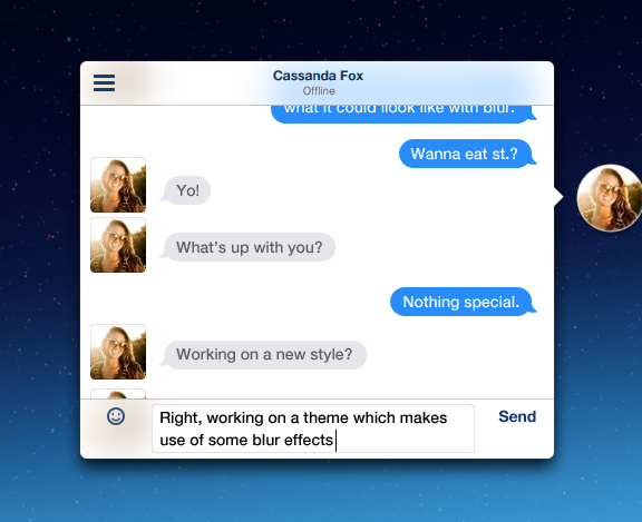
You can grab the archive from our github repository. To illustrate the technique, check out the new look of our app Chat Heads, which will get a new look for the conversation view. What do you think?

The RMBlurredView used in the Chat Heads app
Raffael

About the Author

Raffael Hannemann is developer of Chat Heads (released Mac app) and Sinus (currently BETA). He lives and works in Frankfurt, Germany.  You can follow him on GitHub and Twitter.

flattr this!

31 Oct 21:49

Video


28 Oct 08:05

toshiwolf: O . O are those real??


toshiwolf:

O . O are those real??

26 Sep 10:14

Photo


24 Sep 08:52

Using Gifs for More Than Funny Cats

by Shaun

File this under the “why didn’t I think of this before” category.
Usually when I’m looking for feedback on motion graphics I upload the video to Basecamp and wait for notes. Then it struck me. With just a few extra clicks I can post .gifs of the animations.
They play automatically, they loop, there’s no more opening large video files in a new window and multiple versions can be seen together.
Process: Rendered in After Effects then brought into Photoshop and saved as a .gif. For these 1080p videos I saved them at 300×169 with 16 colors.

13 Sep 11:15

We play at home.

Anilcanbaykal

kosedeki ottomandan belli..


We play at home.

10 Sep 07:39

sikildim: hemen yapıyorum

Anilcanbaykal

kosu bandi kimde var...


sikildim:

hemen yapıyorum

08 Sep 14:54

amazed: following back until i find a tumblr girlfriend ♥

Anilcanbaykal

share fucking post


amazed:

following back until i find a tumblr girlfriend ♥

13 Aug 14:30

jackhawksmoor: exhalelight: Toast Messenger by Sasha Tseng I...


jackhawksmoor:

exhalelight:

Toast Messenger by Sasha Tseng

I think we might actually have too many inventions

19 Jun 18:03

Metallica’dan sürprİz performans…

by Mehmet Tez
Anilcanbaykal

fuck...

Hani bi anda hiç beklemediğiniz anda küt diye sahneye Metallica çıksa… İşte öyle bir şey yaşanmış. Orion Music + More Festivali’nde çıkacakları ilan edilen günden bir gün önce öğleden sonra bir anda sahneye çıkıp Kill ‘Em All’u baştan sona çalmışlar. Buyrunuz şöyle bir performans.

Kaynak: Blabbermouth

FacebookShare/Bookmark

18 Jun 10:00

Daft Punk Gezi Parki (Giorgio by Moroder) Version  Muhteşem...


Daft Punk Gezi Parki (Giorgio by Moroder) Version 

Muhteşem olmuş

13 Jun 10:23

omfglxc: give-me-the-rain: gimmelou: soullesshusk: hellyeahsc...


omfglxc:

give-me-the-rain:

gimmelou:

soullesshusk:

hellyeahscarleteen:

Sometimes people have a hard time understanding what a happy relationship between two people who obvs think the other is awesome looks like.

We think this is one great (and holy bananas, so freaking hilarious) example.

OH MY GOD PLEASE EVERYONE WHO FOLLOWS ME PLEASE WATCH THIS I PROMISE YOU WILL SMILE AND IT’S SO ADORABLE OMFG

this is the funniest/cutest thing

THIS IS THE BEST THIS MADE ME SMILE SO MUCH

this is perfection

12 Jun 19:56

The Real Couple behind "Before Sunrise"

The Real Couple behind "Before Sunrise":

By Forrest Wickman | Slate, May 30, 2013

If you stick around through the closing credits of Before Midnight, the latest film in the trilogy that also includes Before Sunriseand Before Sunset,you’ll see that the movie is dedicated to someone whose name even the most die-hard fans have never heard before: Amy Lehrhaupt. Almost 25 years ago, Lehrhaupt met a young man named Richard Linklater and spent a night with him that he never forgot. Their encounter inspired Linklater to conceive and direct Before Sunrise, the first film in the series. She never saw it, though; unbeknownst to Linklater, by the time that movie came out, Lehrhaupt was dead.

Linklater never mentioned Lehrhaupt by name in the press before promoting Before Midnight—Ethan Hawke has said that the director was uncomfortable mentioning her until “extremely recently”—but he has long made brief references to their encounter. From a number of interviews he’s done over the years, we can now piece together the complete story of how Lehrhaupt helped inspire the series.

Linklater met Lehrhaupt in fall 1989, when he was visiting his sister in Philadelphia. He was 29 and had just finished shooting Slacker, and was staying there for one night while passing through on the way home from New York. Lehrhaupt was several years younger, about 20. They met in a toy shop, and ended up spending the whole night together, “from midnight until six in the morning,” “walking around, flirting, doing things you would never do now.” As inBefore Sunrise, most of what they did was talk, “about art, science, film, the gamut.” Did they kiss? Yes. Did they have sex? The Times went so far as to ask Linklater in a recent interview, but he said he wants to “leave a little mystery.”

Even in the midst of that romantic night, the filmmaker in Linklater couldn’t help but consider its cinematic possibilities. In a 2004 interview with the New York Times, he remembered “walking around [thinking], ‘If I could just capture this feeling I’m having right now,’ instead of actually having that feeling.” On a recent episode of the podcast The Q&A with Jeff Goldsmith, he recalled mentioning the movie idea to Lehrhaupt that night:

Even as that experience was going on … I was like, “I’m gonna make a film about this.” And she was like, “What ‘this’? What’re you talking about?” And I was like, “Just this. This feeling. This thing that’s going on between us.”

But as the night came to an end, the paths of Linklater and Lehrhaupt began to diverge from the fictional storyline of Jesse (Ethan Hawke) and Céline (Julie Delpy). In fact, on The Q&A, Linklater revealed that the ending of Before Sunrise was in part a response to what happened with him and Lehrhaupt. Unlike Jesse and Céline, who agree to reconvene in six months, the real-life young lovers exchanged numbers and tried to keep in touch while they were away. They called each other a few times, but it was “that long distance thing” that did them in. “It sort of did the fizzle,” he says, “So in the first movie that was a thing, the idea that they would intellectually kind of get beyond that and say ‘Well, we’re on different continents. What are the odds that it’s gonna work. Let’s just commit to this night.’ ”

Linklater soon became involved with another woman, who “swept into [his] life … and took over for about a year or so,” and he and Lehrhaupt never talked again. He did think that maybe “she would show up at a Before Sunrise screeningor something.” In Before Sunset, Céline shows up at a reading of Jesse’s book This Time, which is based on their night together. “It would be so weird,” he said, in 2004. But she never did.

Linklater didn’t know then that Lehrhaupt had died in a motorcycle accident on May 9, 1994, before she reached her 25th birthday. Before Sunrise started filming a few weeks later. Linklater only learned of her death three years ago, when a friend of Lehrhaupt’s, who knew about the encounter, put it together and sent him a letter. “It was very sad,” Linklater told the Times. Ethan Hawke was similarly devastated when he heard it, though he reminded Linklater that if he hadn’t met her, then he never would have made these movies or met some of the people who worked on them with him. “Who knows how we reverberate through each other’s lives,” Linklater reflected in another interview, “But she’s an inspiration on this.”

In this way, Linklater did find another way to make that feeling, that “thing in the air” they once had between them, last: He turned it into cinema.

06 Jun 15:51

Star Wars Reimagined Pulp-Style [Pics]

by Geeks are Sexy

star-wars-pulp-cover-1

These fantastic Star Wars pulp-style illustrations were created by artist Timothy Anderson. Each are tied to a movie from the original trilogy. Print are available right here.

star-wars-pulp-cover-2

star-wars-pulp-cover-3

[Timothy Anderson | Via Geek Tyrant]

06 Jun 15:29

Dali

by Myner