Shared posts

23 Nov 13:28

Protein Christmas Market

Natalia Pokrovskaya

Йолочка ок

It’s nearly that time of year again!

In the spirit of feasting, drinking and eating, we're organising a 3 day Christmas Market to share our festive cheer with you all. Packed full of our favourite treat and gift ideas, the 18 Hewett Street gallery space will bring together all our favourite food merchants to transform the space into a winter wonderland of decorative stalls and culinary delights. For an entire weekend it'll be a real-world Christmas hamper where you can buy awesome food and drink presents for your mates, mom, dad, your cat - and they're all pretty reasonably priced from £5 - £30. Think London's finest jams, pickles, salamis, beers, wines, donuts and more...

Our in-house store The Shelf will be open for business too so you can pick up a magazine or book, where we'll have Bompas & Parr's new book Feasting on sale and the latest copies of Lucky Peach and Wilder Quarterly.

We'll also be serving up some fun Christmas-inspired food and drinks on the Friday 14th December from noon onwards, so make sure to stop by, come say hi, and stuff your face.

Stay tuned for more info, including the line up of everything on offer.

But for now, please save the date!

Friday 14th December: 12-6pm + Private evening event: 7pm
Saturday 15th December: 12-8pm
Sunday 16th December: 12-6pm

22 Nov 13:16

Taming Caustic Light

Caustic light portrait of Alan Turing

Sometimes science really lives up to its reputation for mastering nature: researchers at the EPFL Switzerland have computerised the way light shimmers off pools of water, which means any transparent object can now create an image when illuminated!

This may sound a little unremarkable at first. But what's different in this case to say, stencilling an image onto glass and positioning a projector behind it is this method programs the curvature of the glass (or any transparent material) to produces an image. No image is etched in relief on the glass, as in the portrait of Alan Turing above. Instead the researchers produced an algorithm which can determine the material properties and dimensions necessary to generate an image. This was possible due to exhaustive research into the aforementioned light shimmering reflections, a phenomena of light refraction known as caustics.

As Mark Pauly notes, the creative possibilities are exciting: by computationally mastering light they've added a new layer of creative malleability to an existing (and widely used) medium. We hope that creative architects somewhere integrate these possibilities with transparent concrete ASAP! And that's to say nothing of the fact that any bottle could communicate photographically with technology like this.

21 Nov 12:32

The Supercurator (by Martin Skauen)

by Moritz Neumüller

Comic Supercurator by Martin Skauen (Repost from http://www.bpigs.com/strip-it-down/super-curator)

Thank you Martin for explaining, once and for all, the true meaning of Curatorship!


21 Nov 11:13

"Information Age Prayer is a site that charges you a monthly fee to say prayers for you. A typical..."

Information Age Prayer is a site that charges you a monthly fee to say prayers for you. A typical charge is $4.95 per month to say three prayers specified by you each day.

“We use state of the art text to speech synthesizers to voice each prayer at a volume and speed equivalent to typical person praying,” the company states. “Each prayer is voiced individually, with the name of the subscriber displayed on screen.”


- Information Age Prayer | Know that your prayers will always be said, via Dan W.
18 Nov 23:25

Jennilee Marigomen

by Joerg Colberg

JennileeMarigomen.jpg

"Holding Still is a collection of found travel photographs from a woman's estate. Nothing is known about her other than that she was a resident of Vancouver, Canada. After feeling a strong affinity to her aesthetic and photographic sensibilities, I decided to scan and archive her images to share." - Jennilee Marigomen

18 Nov 23:23

Review: Upset Down by Paul Bogaers

by Joerg Colberg

Bogaers_UpsetDown.jpg

Paul Bogaers' Upset Down might well be one of the most unusual photobooks I own. The book doesn't really have a front and back. Or rather you can look at it from whatever you take as your front to the back, and then you can turn it over and look at it, again, from the new front to the back. The way this works, as you can imagine, is simple: Each spread shows two images. The one on the right-hand side has the 'correct' orientation, the one on the other side is upside down. Needless to say, constructing a photobook that way would be an entirely pointless exercise if one were required to only look at the right-hand side. One isn't. Instead, each spread (the vast majority of them anyway) works on its own, regardless whether you look at it... well, what is the correct up and down here?

Up is down, and down is up. Whatever you want. It doesn't matter. What amazes about Upset Down how effortlessly the spreads work regardless of how you look at them (I haven't tried sideways, yet). That is no small feat. Each individual image in the book works regardless of how you look at it. And each pair works as well, not just as two images in their different orientations, but also taken together, talking to each other in a variety of ways. To top things off, you can follow the story in the book, leafing through the pages...

Inevitably, by now the reader might be either completely confused or wondering what the actual experience might be like. This is, I'm afraid, where words have to stop, and where the only option left is to look at the book. By construction, Upset Down is a very ambitious book, and it's surprising and fun to see how well it works. Images are constantly being transformed into abstractions, they change their meanings (or so it seems), and up is down while down is up. There's no end. One might imagine that given the complexity of the undertaking to make such a book the result would be tedious and heavy. But it isn't. It's light, and it's fun.

Recommended.

Upset Down, photography and text by Paul Bogaers, 160 pages, 99 Publishers, 2010

11 Nov 21:29

Keep Hope Alive Alive and Other Democratic Clichés

by Hrag Vartanian
Natalia Pokrovskaya

Вижу пару значков для радужного бегового клуба.

Artist Suzanne Broughel‘s “Keep Hope Alive Alive” project takes vintage designs from past Black presidential candidates (Jesse Jackson and Shirley Chisholm mostly) and altered them to remove the candidate’s name and image leaving the generic imagery of “hope,” “change,” and the other clichés of the 1970s and 1980s Democratic party.

By erasing any sign of the candidate Broughel’s series focuses on the vintage imagery of “race, gender, idealism, and cynicism,” to use her words. The project, which originally created years ago, was resurrected for this year’s Art In Odd Places festival in October, when the artist handed out the free “campaign” buttons to pedestrians along with a flyer detailing the erased information.

This is an altered graphic from a vintage Jesse Jackson political button. Jackson made bids for the Democratic Party’s presidential nomination in 1984 and 1988. The orignial button reads “Run Jesse Run!”

This is an altered graphic from a vintage Shirley Chisholm political button. Chisholm made a bid for the Democratic Party’s presidential nomination in 1972. The center of the original button reads “Shirley Chisholm for President” in large blue letters.

This is an altered graphic from a vintage Jesse Jackson political button. Jackson made bids for the Democratic Party’s presidential nomination in 1984 and 1988. Overlaying the rainbow image on the original button are the words “Jackson for President in 1984.”

This is an altered graphic from a vintage Shirley Chisholm political button. Chisholm made a bid for the Democratic Party’s presidential nomination in 1972. On the original button, the name “Chisholm” and the date “72″ appear in the center of the image.

For more information on Broughel’s ”Keep Hope Alive Alive” project, visit alivekeephope.blogspot.com.

08 Nov 08:40

I Still Love NY: Sebastian Errazuriz's Hurricane Sandy relief T-shirt for Grey Area

by Kelly O'Reilly
I Still Love NY New York-based artist and designer Sebastian Errazuriz has created a riff on the iconic and ubiquitous "I Heart NY" design by Milton Glaser in the wake of Hurricane Sandy. Submerging the logo in blue dip-dye on a T-shirt for Grey Area, Errazuriz, whose studio was paralyzed by city power...
Continue Reading...


08 Nov 08:35

Skin-Like Upholstery

Natalia Pokrovskaya

Вот они, сумочки из искусственных христианских младенцев!

Nissan's Japanese R&D department plans on bringing a novel texture to their cars interiors. Their research has deduced that the most pleasant sensation to recline into is one which mimics the texture and softness of human skin.

What might sound odd and undesirable at first is backed up by thorough materials research. Existing car upholstery fashioned is fashioned from soft plastics. The Premium-fEEL interiors(PEEL) research team concluded that maximum comfort (or in the industry parlance, 'good feeling') occurs when the texture and resistance of the soft plastics approximate the resistance of a human finger pad and the roughness of a fingerprints surface (as illustrated in the diagram below).

Nissan's future care interiors will feature semi-aniline leather with a textured coating imprinted with the fingerprint patterns. All told, we're really not sure how we feel about this. But maybe the unavoidable mental images summoned by this creepy biomimcry will fade once we happen across these textures in the flesh.

08 Nov 08:34

Ice Light: Ultra-mobile lighting for photography and videography

by Josh Rubin
Natalia Pokrovskaya

Мило, но нужен кто-то, кто будет их держать.

Ice Light High-end DSLRs and portable microphones may get low-budget photo and video shoots a good way towards a professional look, but a full lighting setup remains hard to fake. Enter Ice Light, a portable, handheld lighting system that delivers a daylight-balanced LED glow for illuminating subjects on the go. The...
Continue Reading...


08 Nov 08:31

AluRack: Minimalist rear storage for Apple displays

by Josh Rubin
AluRack One of the brilliant advantages about all-in-one desktop computing is the lack of cordage—unfortunately, those of us who prefer to work off of a notebook and attached display are left with a mess of wires. Previously, we posted about Henge Docks and have been working off of it happily...
Continue Reading...


06 Nov 10:11

Cirque Colors All Hallow's Eve Collection Halloween 2012 Swatches and Review

by Scrangie
Natalia Pokrovskaya

УОАААА

The brand new, limited edition, first ever Cirque Colors Halloween collection comes out today! The collection is called All Hallow's Eve and it consists of two polishes: a glow-in-the-dark orange and a black shattered glitter. They're designed to complement each other when worn together, but can also be layered with other shades to add glitter or glow.


Cirque Kabocha - Cirque Neko


Cirque Kabocha. A medium nearly-neon glow-in-the-dark orange jelly. This orange is quite bright, though to my eye it's just a tad short of true day-glow neon orange. It has a jelly finish but it is buildable. I'm wearing three coats here and I still have some visible nail line. Since it's a glow-in-the-dark polish, it will glow fluorescent green in the dark.


Cirque Kabocha, no topcoat. Since this is a glow-in-the-dark polish, it will naturally dry to a semi-matte textured finish. You can actually see the luminescent particles suspended in the orange jelly base and they will add a slight texture to the dried polish. It looks nice this way as well; it reminds me of Illamasqua's rubber finish polishes.


Cirque Kabocha Glow In The Dark Polish
I apologize for the hilariously blurry picture. My hands shake so much that it was nearly impossible to hold them still enough to get even this clear of a picture in the dark! Anyway, this is Kabocha on its own. It has quite a strong glow that lasts for several minutes before it needs to be 'charged' (exposing it to light refreshes the glow effect) again.


Cirque Neko (one coat over Cirque Kabocha). Neko is a black glitter topcoat. It consists of varying shapes and sizes of black glitter suspended in a clear base. Some of the pieces are large and rectangular, some are small and square, some are just jagged and random, some are tiny circles. Very irregular and very interesting looking on the nail and surprisingly easy to apply. The glitter clumps a little, but it's not the type of chunky, clumpy glitter that I have to dab onto my nail to apply.


Cirque Neko Glitter Topcoat over Cirque Kabocha Glow In The Dark
Another cool thing about Neko is that you can still see the shapes in the dark (when you layer it over Kabocha). Sorry I couldn't get a clearer picture of it, but you get the idea, right?


Kuroneko-sama approves.

The formula on both of these was good. Kabocha is thin and a little watery but goes on smooth and dries quickly. Neko is thicker but easy to apply in a thin coat with good glitter placement. Kabocha is on the sheer side of jelly and still had visible nail line at three coats. Every coat I applied made it more and more opaque, so maybe four would have been perfect. I could have also layered it over a white or orange base to achieve the color and glow effect without having to use multiple coats, but it would have ruined the jelly finish. Neko is a pretty substantial glitter and has some sharp, poky edges, so I needed two coats of topcoat to seal and smooth it completely. Both the polishes need a good, thorough shaking before application as they settle quite a lot (the glow particles in Kabocha settle in the bottom and the glitter in Neko sticks to the sides of the bottle).

One more small detail about the formula- all Cirque polishes are scented! It's a subtle scent that reminds me of lavender. It's soothing and spa-like and gives the polishes that extra special 'something'.

These polishes are pretty awesome. Kabocha has a nice, strong glow (just be sure to shake it first) and the bright orange color is gorgeous. Neko is interesting and layers very well with Kabocha. It's chunky and pointy but nothing that a couple coats of topcoat won't help. When worn together, Kabocha and Neko are a perfect Halloween combination- black and orange in color with a fun, spooky jagged-shaped glitter and an eerie green glow.

The limited edition Cirque Colors All Hallow's Eve polishes retail for $12 each and are available directly from cirquecolors.com.

(This was sent for review.)


06 Nov 10:08

Jill Stuart Holiday 2012 Makeup Collection

by PJ
Natalia Pokrovskaya

Меня всякий раз завораживает аляповатость японских упаковок для декоративной косметики, при том, что кто-кто уж знает толк в минимализме.

Jill Stuart Holiday 2012 Makeup 1(images/info from www.urcosme.com)

.

Here is a look at Jill Stuart‘s holiday 2012 makeup collection. The limited-edition collection features the Stealing Heart Collection set (above), which includes Jewel Crystal Eyes palette, Mix Face Powder Compact, Lip Jewel, and Crayon Eyeliner. The collection also features three new variations of Prism Carat Eyes.

Additional images of the collection:

- Stealing Heart Collection

.

Jill Stuart Holiday 2012 Makeup 2

.

Jill Stuart Holiday 2012 Makeup 3

.

Jill Stuart Holiday 2012 Makeup 4

.

Jill Stuart Holiday 2012 Makeup 5

.

- Prism Carat Eyes

.

Jill Stuart Holiday 2012 Makeup 6

.

Jill Stuart Holiday 2012 Makeup 7

.

Related posts:

Jill Stuart Fall 2012 Makeup Collection

Jill Stuart Relax Fall/Winter 2012 Bodycare Collection

Jill Stuart Jelly Eye Color N in 08 Crystal Sky

04 Nov 18:11

Субботнее чаечашечное

Natalia Pokrovskaya

У меня та же "нехорошая привычка"; кто-нибудь знает, у этого есть научное название и научный способ с этим бороться?

У меня очень давно, несколько лет не было никаких новых увлечений в музыке. Но становиться ностальгирующим любителем старых пластинок мне вроде как рановато, так что я собралась с мыслями и обновила полностью свои диски для машины. Буду вникать в современность, я совершенно отстала от жизни!

Еще осталось начать смотреть кино. Но на это у меня психологический блок :) Я не могу просто сесть и включить кино. Мы перестали смотреть фильмы, после того как Кате исполнилось месяца 2 или 3 - не было возможности не отвлекаясь просидеть хотя бы 30 минут. А потом, когда такая возможность появилась, у меня не было возможности оторваться от своих косметических дел, не могла себе позволить роскошь 40 минут потратить на это. Теперь есть все, полная свобода! Но кино включить и сидеть смотреть его кажется какой-то дикостью. Столько новинок пропущено...вот сейчас Бонд пошел, а я очень сомневаюсь, что посмотрю его, хотя мне очень хочется.

И еще один нелепый феномен появился по итогам первого года жизни с ребенком. После того, как весь день был расписан на короткие клочки по 30-40 минут,  закрепилась нехорошая привычка - сделать что-то короткое и потом тупить некоторое время в режиме ожидания, откладывая решение важных вопросов, потому что как только сосредоточишься - сразу надо будет отвлекаться. Вот удивительно, как быстро приживаются всякие вредные явления. Сейчас, по сравнению с ТОГДА, времени - вагон, 100 часов в сутках, но прерывистый стиль и зависание очень трудно поддаются искоренению.
03 Nov 22:00

1310


1310

26 Oct 00:20

18 Year Old Re-Tweeted By Eva Longoria, Has To Spend Next Day Apologizing

by Jennifer Wright
Natalia Pokrovskaya

Почему они все решили, что это 18-летняя девица родом из Эквадора?

eva longoria twitter

Eva Longoria – who is a Democrat – retweeted a tweet from one of her 4.5 million twitter followers. This is what it said:

imnotyuri eva longoria twitter

Okay, that seems like something you would say to a friend. This 18 year old is probably mistaken in thinking that Eva Longoria is a close personal friend she should speak freely about her political opinions with. Imnotyuri: movie stars are not your friends, not really. That is especially true when those movie stars big role was in Over Her Dead Body. I mean, really.

Needless to say, a lot of Eva’s followers are Republicans who do not follow Eva for political reasons (they are huge fans of ghost romances). They jumped on Imnotyuri. Eva distanced herself by taking down the retweet and remarking:

I use Twitter as a platform for all Americans and their opinions. Sorry if people were offended by retweet. Obviously not my words or my personal view. I respect all Americans #FreedomOfSpeech

Well, that’s great, but it did still mean that an 18 year old spent hours desperately apologizing to seemingly every Republican on Twitter. Imnotyuri tweeted:

imyuri eva longoria twitter

I’m not sure who the real jerk is here. On one hand, Imnotyuri is foolish. On the other hand, Eva Longoria is foolish for not realizing how many people this message would reach. On the third, invisible hand, it kind of seems like Republican-ghost-movie-fans are assholes for ganging up on an 18 year old.

In conclusion, let’s all go back to MySpace, or possibly smoke signals.


Picture via Wikipedia

Related posts:

18 Year Old Re-Tweeted By Eva Longoria, Has To Spend Next Day Apologizing is a post from: TheGloss

23 Oct 13:14

Вилка вне закона

by Olga Kalinina

Забавный случай произошел в Калифорнии на прошлой неделе. Фотограф Джим Грант, возвращаясь домой в небольшой городок Карлсбад, увидел на ничем не примечательной дорожной развилке гигантского размера вилку.

На следующий день двухметровую хромированную скульптуру убрали власти, так как установка была незаконной и по их мнению мешала движению.

Однако, соседям очень понравилась идея и на следующий день, после того, как вилку демонтировали на том же месте появился самодельный плакат с  вопросом «Why the fork not?» (Почему бы не вилка?).

Плакат также был убран в тот же день, но жителей не остановило и это. Теперь они приклеивают вилки на близлежащие дорожные знаки и ждут, когда же справедливость восторжествует и полюбившееся произведение искусства вернут на развилку.

Поначалу было непонятно, кто же автор скульптуры, вызвавшей такой ажиотаж, позже автор объявился. Им оказался 62-летний математик на пенсии, которого на скульптуру в 1979 году вдохновила часть фильма «Маппеты», где Кермит и Медвежонок Фоззи колесят по дорогам в Голливуд. В какой-то момент Кермит дает указание повернуть налево, как только на дороге будет видна большая вилка (развилка — тоже вилка). Все эти годы ученый был очень занят, но выйдя на пенсию решил-таки осуществить мечту — подарить родным окрестностям отличительный знак. Пока автор не хочет раскрывать своего имени, так как побаивается быть осужденным по всей строгости закона. Штраф заплатить он не сможет, более того, не думал, что самодельная вилка вызовет такое пристальное внимание общественности.

Нам пока остается наблюдать за историей со стороны и надеяться на то, что власти вернут вилку, как это сделали в другом городе того же штата.

Подробнее о происшествиии пишет CNN.

21 Oct 12:34

Zoya Ornate Collection Holiday 2012 Swatches and Review

by Scrangie
Zoya's Holiday 2012 collection is here and this year it's pretty special.  What's so special about it, you ask?  Well, this collection features the debut of Zoya's first ever holographic polishes.  Yep, that's right, ZOYA MADE HOLOS!

Zoya Aurora.  Aurora is one of the three new holographic colors and out of the three, Aurora seems to have the densest amount of holographic glitter.  The holo in this isn't chunky or rough like true glitter, it's the flat, smooth, flaky-looking type of holo particle like in the China Glaze Kaleidoscope or Ozotic holographic polishes.  The darker purple base in this makes the holographic effect really stand out.


Zoya 
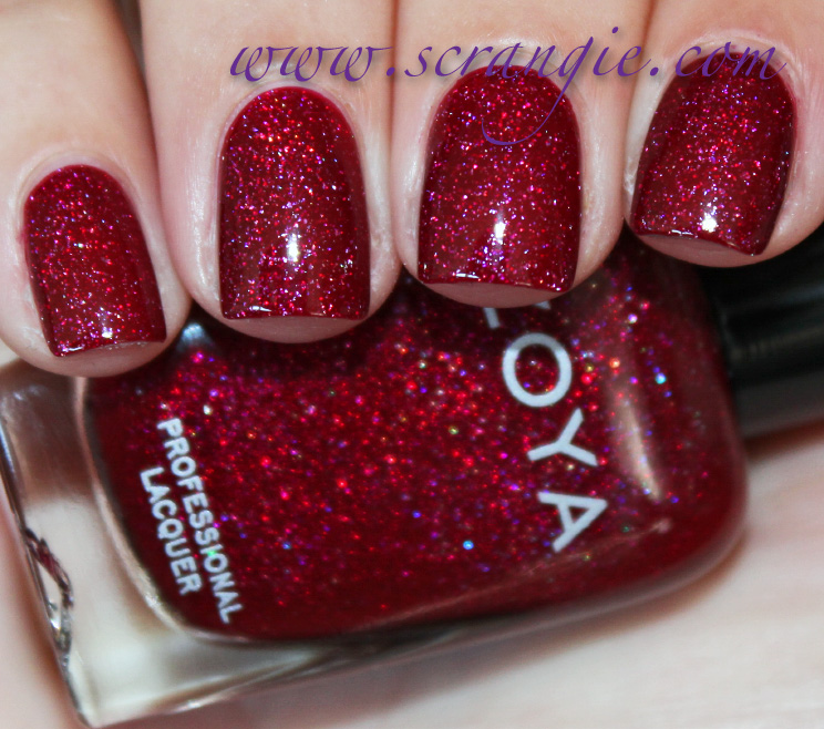
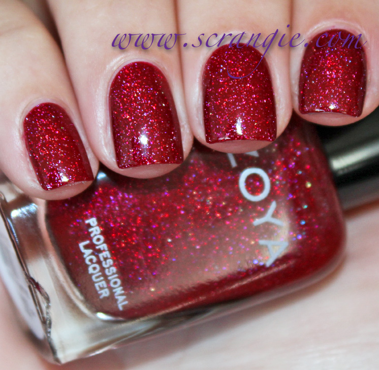
Blaze.  Blaze is a cool-toned red holo. The interesting thing about this color is that the holographic particles seem to blend in with the red base, giving it an unusual depth while at the same time altering the colors of the rainbow effect.  The red base seems to bring out the gold, red and purple aspects of the hologram while muting the other colors. 
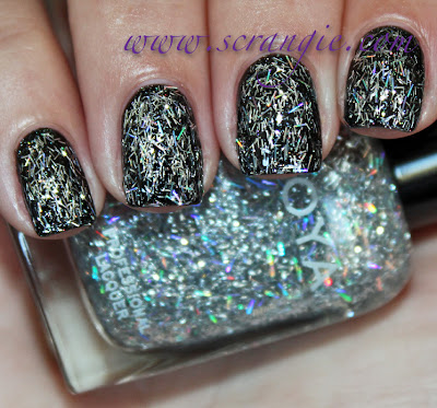
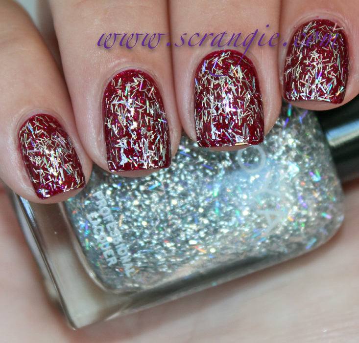


Zoya Electra.  Electra is two different bar glitters in a clear base.  There's a very fine, stringy light silver bar glitter and a larger, chunkier, holographic silver bar glitter.  It can be worn alone or layered, though in my opinion, it's almost too opaque for layering. 


Zoya Logan.  This one isn't holographic, but it's still pretty awesome.  It's a very vibrant green base with chunky gold foil shimmer.  Plus, when viewed at an angle, it has some pretty decent blue duochrome flash on it as well.  
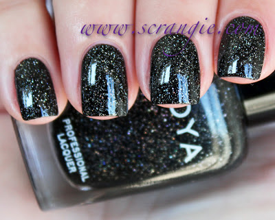
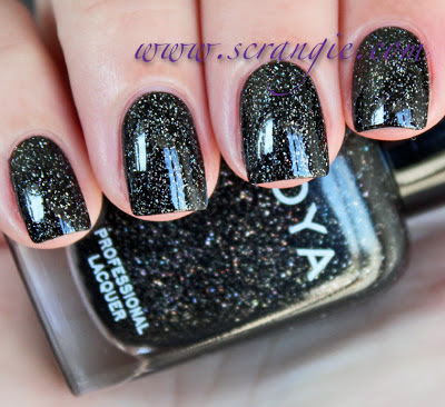


  Zoya Storm.  This is a black base with chunky scattered holo shimmer.  Of the three holographic colors, this one seems to have the least amount of holo glitter.  It's not weak or inadequate by any means, but it doesn't seem as densely packed with holo pieces as the other two.  This color has a starry sky effect in certain lights, showing mostly black and silver, but the holo comes out beautifully when the light hits it just right.
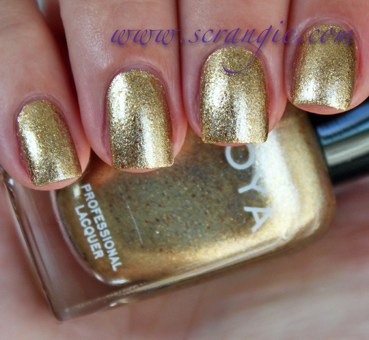

Zoya Ziv.  Not the typical gold foil, this one has a little something extra to it.  The base is a neutral gold with a grainy foil finish, but it also has some larger, warmer-toned gold flakes in it as well.  When the polish is fully dry, it's very shiny and reflective.  The gold flakes aren't the focal point of the polish, but they add a bit of extra depth and detail to the color. 
I swatched a coat of Electra over all the colors in the collection to give you an idea of how it looks layered:


Zoya Electra (one coat) over Zoya Aurora


 Zoya Electra (one coat) over Zoya Blaze


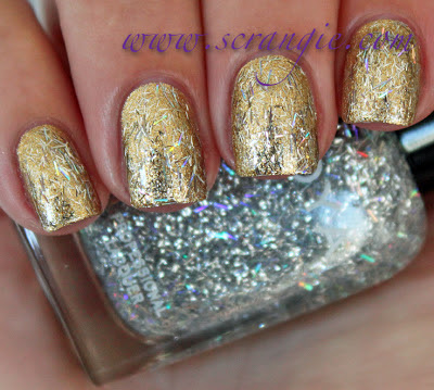
Zoya Electra (one coat) over Zoya Logan


Zoya Electra (one coat) over Zoya Storm


Zoya Electra (one coat) over Zoya Ziv

The formula on almost all of these was great.  Electra is the oddball. It seemed too thick and a little bit gooey; I think it just needs to be thinned.  Thinning it might also help sheer it out enough for better layering, too.  The rest of the colors were perfect.  Smooth, thin, free-flowing but not runny or pooling, no streaking, no bald spots, good opacity, good brushes.  I did three coats of each color and that's all they needed.  An interesting thing I noticed about these is that all of them (except Electra) dry completely smooth and glossy without any added topcoat. Electra is pretty chunky and needs at least two coats of topcoat to look smooth.  Dry time is fast on the holos, average for all the others.

I love this collection.  It's small but it manages to fit in almost all of my favorite things:  green, purple, glitter, holo and duochrome.  The new holographic colors are especially exciting because I've never seen Zoya do holographic finishes before.  My favorite would probably have to be Storm, followed closely by Logan, but I really like all of them.  I also like this comic book theme on the names in this collection (or am I just reading into them too much?)

I really, really hope that this means there will be more Zoya holos in the future, because the three in this collection are pretty awesome.

The Zoya Ornate collection is available now on zoya.com.

(This was sent for review.)


17 Oct 07:30

Chapel Bar & Bistro: Almighty Night

by ivan
Natalia Pokrovskaya

Чувства верующих опасносте

Chapel Bar & Bistro: Almighty Night

7 years of Almighty Nights

Advertising Agency: Ogilvy, Auckland, New Zealand
Executive Creative Director: Angus Hennah
Creatives: Steve Hansen, Paul Kim
Photographer: Troy Goodall
Designer: James Showler
Senior Account Manager: Jessica Short
Group Account Manager: Paul Manning

StockLogos' Staff Favorite Logos


16 Oct 12:33

Photo


15 Oct 17:17

Official Announcement for OPI's Holiday 2012 collection: Skyfall, inspired by James Bond!

by Scrangie
Here's the official announcement for OPI's Holiday 2012 collection!  Click the images for a closer view!

OPI Marks 50 Years of Bond 007 with Holiday Lacquers Inspired by Skyfall

This holiday season, OPI celebrates the 50th Anniversary of a fellow world icon – James Bond – appearing in Skyfall. Starring Daniel Craig and Javier Bardem, this highly-anticipated twenty-third installment opens in theaters nationwide on November 9, 2012.

Inspired by the film’s blend of glamour and danger, OPI launches Skyfall Collection, featuring twelve limited-edition nail lacquers for Holiday 2012. “OPI is thrilled to work with EON Productions to celebrate 50 years of the style, swagger and mystique associated with Bond 007,” said Suzi Weiss-Fischmann, OPI Executive VP & Artistic Director.

“From metallic and glitter finishes to jewel tones and even a jet black, these lacquers capture the film’s sophisticated and glamorous look.

“Watch for Bérénice Marlohe wearing two Skyfall Collection shades in the film,” adds Weiss-Fischmann. “With Skyfall, a rich maroon, painted on top of the nail and GoldenEye, a shimmering gold, painted on the undersides, Marlohe’s luxurious manicure will be the one to try this holiday season.”

The Skyfall Collection features six shades that play off the movie’s seductive theme, and another six that offer a more dangerous look, including: 


GoldenEye All eyes will be upon you when you wear this glorious gold. 


The Spy Who Loved Me  A red as romantic as the secret agent inside you.  


  Die Another Day  Live in the moment in this hot and lively red.  


Casino Royale  This high-rolling plum is fit for royalty.   

You Only Live Twice  This rich high-shimmer magenta is a once-in-a-lifetime find. 


Skyfall  Get Bonded with this magnificent maroon.  


Moonraker  Drive your fastest car to get this exhilarating metallic grey.  


Tomorrow Never Dies  This eternally intense purple will live forever.  


The Living Daylights  This courageous multi-hued glitter sparkles 24/007.  


On Her Majesty’s Secret Service  This misty-green pewter commands attention.  


Live & Let Die  Burn the candles on both ends in this private jet black.  


The World Is Not Enough This rosy silver is as addictive as it is beautiful.
As with all OPI nail lacquers, these shades inspired by Skyfall contain no DBP, Toluene, or Formaldehyde, and feature OPI’s exclusive ProWide™ Brush for the ultimate in application.

This limited edition promotion will be available beginning October 2012 at Professional Salons, including Beauty Brands, Beauty First, Chatters, Dillard’s, JCPenney, Pure Beauty, Regis, Trade Secret, and ULTA, for $8.50 ($9.95 CAN) suggested retail for each Nail Lacquer.
15 Oct 11:27

Benedict Language School: Harry Potter

by ivan
Benedict Language School: Harry Potter

Ой, мороз, мороз, do not freeze me. Benedict Foreign Languages School

We used the start the most famous child Russian song and continued in English. A simple example, we showed that learning English is not so difficult but funny in Benedict School.

Advertising Agency: Power, Novokuznetsk, Russia
Creative Director: Vladimir Cherepanov
Art Director: Eugene Starostenko
Copywriter: Vladimir Cherepanov
Illustrator: Eugene Starostenko
Photographer: Stas Jouravlev / Rockstars, Depositphotos
Published: September 2012

StockLogos.com: World's Largest Logo Store


15 Oct 11:27

Benedict Language School: Lady Gaga

by ivan
Benedict Language School: Lady Gaga

Ой, мороз, мороз, do not freeze me. Benedict Foreign Languages School

We used the start the most famous child Russian song and continued in English. A simple example, we showed that learning English is not so difficult but funny in Benedict School.

Advertising Agency: Power, Novokuznetsk, Russia
Creative Director: Vladimir Cherepanov
Art Director: Eugene Starostenko
Copywriter: Vladimir Cherepanov
Illustrator: Eugene Starostenko
Photographer: Stas Jouravlev / Rockstars, Depositphotos
Published: September 2012

StockLogos.com: World's Largest Logo Store


15 Oct 08:28

Exercise Makes You Crave Money Less

by Alex Hutchinson
Natalia Pokrovskaya

But it makes me crave new running shoes and clothes...

A neat study just published in Medicine & Science in Sports & Exercise looks at the effect of aerobic exercise on the brain's reward system, using the chance of earning money as a reward. Researchers in Berlin had volunteers do … Continue reading →
05 Oct 13:11

Narrative and the Serialization of Photography Online

by Bryan Formhals


©David Solomons – Another US Road Trip Part One

In July, 2011 I wrote an article titled The Process, The Stream, and The End which outlined some of my thoughts about how photographers are using the internet to publish their work. In it, I advocated ‘photography as process’ in which photographers embrace showing their work in progress in order to make a deeper connection with their audience. While I still think that’s relevant for some photographers, I’ve been slowly re-thinking my position, especially as I’ve come across new insights and ideas.

In the same article, I also touched on the idea of ‘serializing’ blog posts. It’s something that has been on my mind frequently these days, so I want to use this post to see if I can further these ideas and hope stir up some conversation.

When Magnum Jumped Aboard Tumblr

I’m on Tumblr probably too much for my own good, so I was curious to see how Magnum would use it for the next installment of the Postcards from America project. As expected, they posted photographs from Rochester as they worked, sometimes with short captions about the subjects, other times with nothing more than the name of the photographer. It was a your standard ‘random’ visual Tumblr, which is probably what they were aiming for I suppose. Use the tools of the day and all that.

The guys from Magnum are in a tough spot. People expect to see the highest quality documentary photography but as we all know, it’s tough to produce great work in a short period of time, and for them to show work in progress is probably challenging and goes against their natural instincts as disciplined photographers. The photos kept arriving in my stream but I wasn’t really paying too close attention. It just wasn’t all that engaging, but I did wonder about how they felt about using Tumblr and working on the fly.

Then oddly enough this article appeared on The Online Photographer which related to publishing random projects.

I find it curious that Magnum photographs are now so often compiled into random sets, even in books, when one of the reasons for Magnum’s founding was so the photographers could control the presentation of their pictures and make sure they were always presented in the proper context. Magnum photographs now most often seem to be seen out of the context of photojournalistic stories. And sometimes in the context of truly random groupings—such as pictures that include wallpaper.

Maybe the Postcards from America project is one of their ways of regaining some control over context while still working with the platforms of the day (Tumblr). It’d be interesting to hear some of their thoughts about it. I think the Rochester hook has potential but from the photographs I’ve seen it doesn’t really seem like the location matters too much. They just as well could be in Buffalo. I don’t want to be overly negative about the project but it hasn’t really resonated with me, nor with many of the people I’ve asked about it.

But they’re out there trying and to be honest, it’s not like there’s much imagination in photoland when it comes to publishing on the internet. That’s something that has bugged me for awhile, but like most complicated problems, I haven’t really come upon any insights worth sharing. Then I read Megan Garber’s piece about ‘Making the Internet More Like Our Brains’ in The Atlantic and a few things started to click.

The web may be, in the broad cybernetic sense, a brain; as a user experience, though, it has some faulty wiring. When we disparage the digital environment as “overwhelming,” what we’re also faulting it for is its lack of a narrative. The Internet moves, but it doesn’t necessarily move forward. It expands, but it doesn’t necessarily follow any particular trajectory. It lacks, in that sense, a purpose. It lacks a plot. Men die, the Greek physician Alcmaeon believed, “because they cannot join the beginning and the end. – Megan Garber, The Atlantic

What’s the Plot of Your Tumblr?

I suppose asking what’s the plot of your Tumblr might sound a bit strange, but it’s also a bit intriguing. Through social media we sort of naturally and passively tell our story and depending on the person, reveal varying levels of biographical details. In some cases a natural narrative develops but it often comes off as incidental, or at its worst is nothing more than personal branding with an economic objective in mind.

It’s funny how we work on certain ideas, and how they stick with us for months and years. In my article from last July I wrote:

Instead of posting a series of disconnected blog posts, why not serialize them and tell a story? Have a new project in the works? Why not plan out a series of posts that tell the story of how it came to be, from inspiration to execution. The only limitation to the possibilities here are creativity and courage.

This begins to touch on a larger issue within photoland. For the most part, I think the web is viewed as a platform for discussing and commenting on photography and not as a storytelling platform.

That doesn’t have to be the case though. The tools we have at our dispense are powerful and can be used in many creative ways. The time is ripe for a photographer to fuck with our expectations and put these tools to use in new ways that will engage us on a deeper level.

The stream is powerful and frightening. Conforming to its expectations is understandable. But the stream is also malleable. All it takes to change our perceptions of how it can be used are a few creative people who aren’t afraid to push the boundaries of what’s possible. And they exist everywhere.

In the Magnum example, I think instead of publishing the ‘Rochester’ project in progress on Tumblr, it would have been more interesting if they spent time editing the work, adding context and then releasing it in chapters or episodes over a short period of time. Each day they could publish a few pieces of content that link together in some way and then just like good serialized TV shows, leave a bit of cliffhanger. Much can be learned from serialized TV dramas and I think this is a way that you can embrace the randomness and pace of the web but also impose some narrative arc that tells a story. It won’t be easy and naturally photography doesn’t necessarily work like a TV drama, but I think a similar structure can be used in interesting ways.

Maybe I’m being a bit idealistic here, and it could be that I’m just want the web to do something it’s not very good at doing. That may very well be the case but I think photographers and publishers can do better and make the way we experience photography on the web more interesting and engaging (There’s always just ‘good’ pictures too I suppose.)

I haven’t fully fleshed out my ideas but I wanted to write something down to share what’s been on my mind lately. Perhaps we can use this as a starting point for a conversation. If I’m not being clear, or you have questions, please feel free to drop a line in the comments, or on Facebook, or Twitter, or email, or the next time you see me at the pub.

Related posts:

  1. Deep Sleep Issue #5 – The Sea, Plus a Few Thoughts About Online Magazines
  2. OpEd: Monthly Shows Out, Quarterly Online Magazine In
  3. Social Media & Photography: Observations Part 4 – Blogging & Tumblr
05 Oct 12:29

Lauren Marsolier's Psychological Landscapes

Natalia Pokrovskaya

Местами топорно сделано, но все равно хорошо.

The fine-art photographer takes photos in the physical world and alters them to make images that represent a world of constant change.
05 Oct 10:30

http://olya-ivanova.livejournal.com/541492.html

Natalia Pokrovskaya

Завидую белой завистью, чего уж там.

с утра съемка фешн, модные тети, стилисты
потом - пусси райот и экологические активисты
вечером - жижек и лакан, фрейд и марксисты
через неделю лечу на сахалин снимать малые народы
наконец-то моя жизнь стала на меня похожа
04 Oct 09:15

VA - Bedroom Moods (2012)

Natalia Pokrovskaya

Это пост про картинку, а не про музыку.
Странный оттенок волос + незаретушированная кисть руки - и она сразу показалась мне старушкой.


Artist: VA
Album: Bedroom Moods
Genre: Downtempo, Lounge, ChillOut
Year: 2012
Bitrate: Mp3 / 320 Kbps
Size: 510 Mb
Links: Turbobit / Shareflare / Unibytes


01. Things Change (M.F.N. Slow Emotion Short Mix) - Didactic Scalica
02. Gezeitenwende - Ron Ractive
03. Things Change (M.F.N. Smooth Remix) - Didactic Scalica
04. Slow Motion - Cosmic Mantis
05. Note - Syntheticsax
06. Tears Like Summer (Orignal) - Depthide
07. Relaxed Love (Original Mix) - Edo
08. Open Your Eyes (Radio) - Snik
09. Flute (Original) - M.h.m.
10. Deniz Ustu Kopurur (Murat Tugsuz Meets Mao Mak Version) - Ilhan Barutcu
11. Deep Inside (Original Mix) - Mao Mak feat. Rochelle
12. Rivers of Babylon (Original Mix) - Patrascano
13. Waiopush (Remix) - Gigio
14. Look At You (Chill In Dreams Remix) - Rhythm Of The Rain
15. Loops of Eternity (Chill 4 Ever Remix) - Jean Martin
16. It Makes Me Feel Confused (Silent Waves Chillout Mix) - Ray Past
17. Rhythm of the Waves (Vocal Chillout Mix) - Restless Guitars
18. Jamba Eyo (Sundown Dub Mix) - Into The Blue
19. Strings of Infinity (Classic Chillout Mix) - Raphael Glott
20. Restless Space (Apollo Vocal Mix) - Journey To Nowhere
21. Vision of Dreams - Temple Knights
22. Element of Day (Extended Mix) - Silent Waves
23. Van Reef (Chill Substance Mix) - Slickslurp
24. Satellite - Claudio fiore
25. Rhythmic Arrest - Seraphiks
26. On the Run (Original) - Jaxs And Soda
27. Perlentaucher (Cut N Glue's Cranky Relax Mix) - Matthias Schenk
28. Comme le Charme (Original Mix) - Fisio Feelkhenson
29. Furthest City Lights - Circuit Blue
30. Verano de Lluvia (Saintes Maries de la Mer Club Mix) - Sol Y Luna Aventura
31. Raindrops (Original Mix) - J Milto
32. Of Pleasures, Those Which Occur Most Rarely Give the Most Delight - Molniya
33. We Gonna Feel It (Murat Tugsuz Meets Mao Mak Remix) - Chris Lawyer & Thomy
34. Medusa (Original Mix) - Didactic Scalica
35. I Love That Jazz - DJ El Toro
36. Temple of Paradise - Armando Gomez
37. Shining Planet - Infinity Space
38. Arc (Original Mix) - Nichtfreund
39. Evening Chill - Odyssey
40. Night - B-noise
41. Libera L'Amor per Me (Original Mix) - Gantcho

03 Oct 17:56

싸이 - 싸이6甲 Part.1 (2012)

Natalia Pokrovskaya

1) обложка
2) образование исполнителя


Исполнитель | Альбом | Год : PSY (싸이) | 싸이 6甲 Part. 1 | 2012
Стиль : hip-hop, rap, pop, k-pop
Битрейт | Размер : CBR 320 | 135 mb
NOTE : Пак Дже-Санг (родился 31 декабря 1977 в Южной Корее) — южнокорейский исполнитель, автор песен, танцор и продюсер, выступающий под псевдонимом PSY. Знаменит своими веселыми клипами и живыми выступлениями.
Псай получил образование в США, окончил Бостонский университет и Музыкальный колледж Беркли. Несмотря на резкую популярность в 2012, поет аж с 2000 года и выпустил уже 7 полноценных студийных альбомов. После двухлетнего перерыва из-за службы в армии, в середине июля 2012 г. выпустил модный клип на песню Gangnam Style («Стиль Каннама», Каннам — престижный район Сеула). Его видео Gangnam Style является самым просматриваемым видео в категории «корейский поп» на YouTube. Популярность Сай растет неимоверно: по состоянию на 1 октября 2012 г. у клипа было 332 миллиона просмотров и 3,2 миллионов «лайков». В результате чего, этот зажигательный ролик попал даже в Книгу Рекордов Гиннеса, как видео, которое больше всего «лайкнули» на YouTube. На данный момент сингл возглавляет чарты по всему миру. Количество каверов и пародий на эту песню зашкаливает. Миллионы людей разучили зажигательный танец из видеоролика и постоянно напевают незатейливую мелодию. А вы уже станцевали Horse Riding Dance?


01 - 청개구리 (Feat. G-Dragon)
02 - 뜨거운 안녕 (Feat. 성시경)
03 - 강남스타일 (перевод песни)
04 - 77학개론 (Feat. 리쌍, 김진표)
05 - 어땠을까 (Feat. 박정현)
06 - Never Say Goodbye (Feat. 윤도현)


скачать | зеркало
03 Oct 12:53

Photo